Quantcast
Channel: Core77
Viewing all 19151 articles
Browse latest View live

The Core77 Guide to COMMON

$
0
0

common_one.jpg

Core77 is headed to Design Indaba in South Africa, where we'll be on-hand to cover the international debut of the social innovators from COMMON. Here's our guide to everything you need to know about the next big thing and "doing shit that matters."

So what exactly is COMMON?

COMMON is a "creative community for accelerating social change...under a unified and collaborative brand." According to co-founder John Bielenberg, whom we last heard speak at ABWBD, the original idea was to provide a more engaging platform to help social entrepreneurs pursue their projects. Instead of merely incubating these rising stars, the platform would take a page out of the Virgin Group's book and "create a global brand called COMMON" as an umbrella for all of these separate ventures. COMMON takes the idea of a corporation and turns it on its head. "Corporations rival nations in power," says Bielenberg, "So what if you embedded good core values into capitalism? This could drive positive change, not just accumulate value."

Who's behind COMMON?

Well, there's John Bielenberg, who is best known as the tour-de-force behind "thinking wrong" and Project M, which puts young designers and creatives into under-served communities to create change. There's also husband and wife duo Alex and Ana Bogusky who, along with friend Rob Schuham, founded the FearLess Revolution (and Cottage) in Boulder, CO, which serves as home base for COMMON.

common_two.jpg

common_four.jpg

(more...)


Salone Milan 2012 Preview: Kaspar Hamacher

$
0
0

KasparHamacher-DerStein-1.jpgPhoto by Jonas Löllman

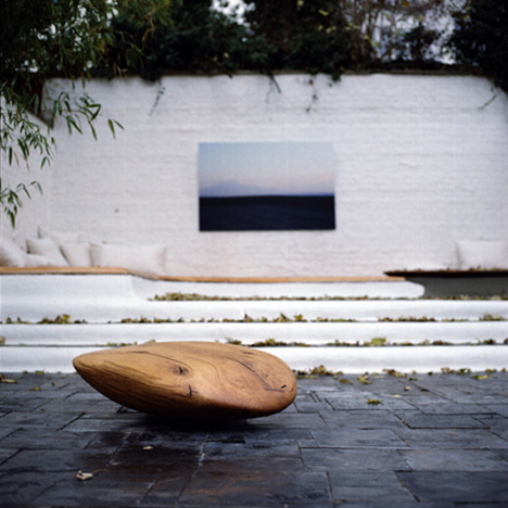
We've seen some of Kaspar Hamacher's excellent woodwork before, but his latest piece, "Stein No. 1," is perhaps his most minimal work yet. Intended to resemble a skipping stone, the low coffee table is carved from the trunk of an oak tree.

KasparHamacher-DerStein-2.jpgPhoto by Jonas Löllman

KasparHamacher-Ausgebrannt.jpg

In anticipation of the forthcoming furniture fairs, Hamacher has released a short video of the production of an older piece, "Ausgebrannt," which actually debuted in 2010 and made festival rounds last year, but the Belgian designer only recently debuted a video the production of the piece. If you don't happen to know the concept behind the piece, the video is a nice surprise (though if you know German, you're out of luck). Go fullscreen and sit back for this one: it's a bit of a slow build, but the lush cinematography is a nice treat.

(more...)


Fuse, an MSG Company, is seeking a Sr. After Effects Graphic Designer in New York, New York

$
0
0

coroflot-joboftheday.jpg

Sr. After Effects Graphic Designer
Fuse, an MSG Company

New York, New York

Fuse TV is seeking an amazingly talented HIGH END senior level after effects graphic designer with extensive knowledge of television graphic production who ALSO has great managerial and organizational skills.

The candidate will design, develop and produce high quality graphic design and animation concepts. Create unique visual images and effective designs or communicate a message according to the needs of each project. The designer will work closely with the Creative Director, Broadcast Design to brainstorm ideas, create mock ups, and animate those designs using After Effects (C4D knowledge is a plus).

» view

The best design jobs and portfolios hang out at Coroflot.

(more...)


Design in the Wild: WORK Category Winners and RELAX Open for Submissions

$
0
0

It's Friday morning here in New York, but it's already the weekend for some of our overseas readers, which means you're done with WORK for the week! Of course, we know that many of you are in school or have independent projects that could be considered WORK in the broad sense, and your entries for the Core77 and Braun Design in the Wild photo challenge reflect as much. We saw a whole range of implements, from a favorite pencil to a trusty hand drill, as well as particularly handy digital-age tools. Meanwhile, freshly-made prototypes and decommissioned machinery alike had an overtly design-minded sensibility, yet the gallery as a whole is a fascinating portrait of how you work whether you're a designer or not.

JURY WINNER
System vs Chaos
Nour Malaeb, United States
We all have a system for the way we work. "Organization" is a very relative term; what might make total sense to you will look like complete chaos to the casual observer. Ultimately, you design the way you design.

POPULAR WINNER
Just a Pencil...?
Arina Fjodorova, Latvia
When choosing the object for this challenge, I could think of numerous things which to describe and which are interesting for me, but I felt that that was not enough. After writing down many pages notes and ideas, I realised that all this time I was holding the greatest invention of anything made by man—a pencil. Could you imagine that pencils were used by world famous scientists, artists, musicians to complete their magnificent works and give inspiration to all of us? Cheap and erasable pencils were used by astronauts instead of expensive ink pressurised pens. With pencils only Roald Dahl wrote all his books. With a pencil one can draw a line up to 56 km and still write with it if it is not sharpened. Thomas Edison and Van Gogh used for their creations only specially made pencils. Annually, 1 million pencils are used on the New York Stock Exchange.

I am a designer and I have to draw a lot. I have new markers, gel ink pens and permanent fine liners to make my work clean and understandable. But nothing makes it look more creative and impressive than a simple pencil drawing does.

It is thrilling to acknowledge how such a small and insignificant thing has affected life of human kind and has shaped the way the world likes today.

(more...)


"This is My Home" Short Looks at Man Living in Antique Shop

$
0
0

0timhdoc.jpg

Wow—this short documentary by Departure|Arrival Films has nothing to do with design, but everything to do with object culture. It involves a New York City man who lives in a storefront filled with antiques and vintage objects he's collected—like a tasteful, manageable version of a hoarder—and how the mere act of him leaving his front door open creates something greater than the sum of the objects. It's a Friday, so treat yourself to a watch:

(more...)


Flotspotting: Brian Begley's Ready for Brooklyn Ballers

$
0
0

0begleynets.jpg

Your correspondent met Core77 founders Stu and Eric while all of us were attending Pratt and living in Brooklyn. While Core77 doesn't have any official link with Brooklyn, many of us staffers live or haved lived there for many years. That being the case, we're excited that the borough will soon be getting their own basketball team in the New Jersey, soon to be Brooklyn, Nets.

We had to give a shout-out to Coroflotter Brian Begley, whose well-designed (if unofficial) logo design for the team, shown up top, blends Brooklyn's iconic bridge with the graphic lines of a regulation basketball.

Begley, as we're sure you've noticed, the Nets' website does not yet have any Brooklyn-centric logo on it. Time to get Jay-Z on the phone.

(more...)


Two Folding Electric Bikes Offer Twofold Urban Mobility Solution

$
0
0

CMYK2-FLM.jpg

They call it the first and last mile, an urban planning issue that has only recently crossed the threshold of collective consciousness, thanks to the ZipCar and bikeshare programs alike (Audi's "A0" doesn't count). Cliff Kuang neatly summed it up in GOOD back in 2009:

You know it, intuitively. Let's say you'd like to commute on public transit. But if you live in a suburb—and ever since 2000, over half of Americans do—it's unlikely that you live close enough to a station to walk. The same problem arises once you get to your destination: You probably don't work anywhere near the closest bus or train station.

CMYK2-COMP.jpgCCommuter-Grid.jpg

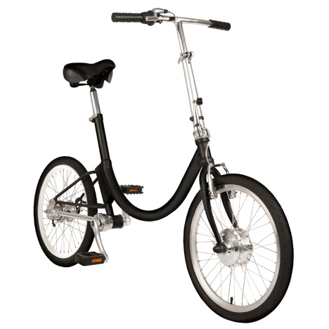
The bicycle is an obvious solution, though it remains stigmatized on several accounts, including portability and hygiene—specifically, carrying them on trains and elevators during rush hour, and the telltale perspiration of physical exertion. Thus, a pair of (independently designed and produced) folding electric bicycles represent a noteworthy step towards a viable solution to the 'F&LM.'

CCommuter-34.jpg

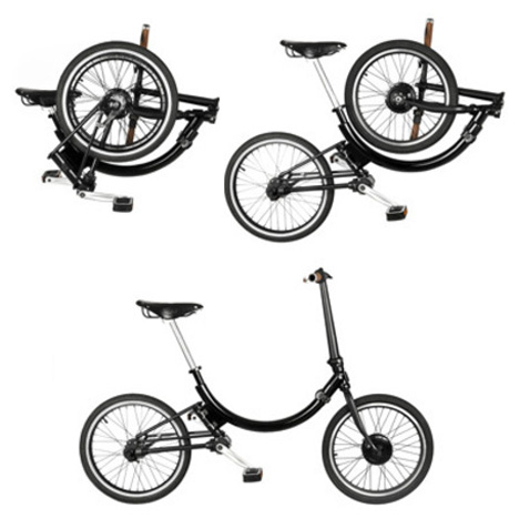
Los Angeles-based Gabriel Wartofsky's "Conscious Commuter" is easily distinguished for its 'U' shape—an arc that circumscribes the 20” wheels when the bike is folded—and shaft drive. It turns out that the vaguely parabolic frame is a contortionist: the frame twists on two axes that are parallel to the frame at two attachment points, such that the wheels overlap in the middle.

CCommuter-Sequence.jpg

CMYK2-Full.jpg

The "CMYK 2.0" folding e-bike by Manuel Saez, on the other hand, consists mostly of straight lines: the oversize aluminum tubing has a single angle at the seatstay cluster, set on appreciably smaller wheels. In fact, its length is fixed; the handlebars fold and the seatpost retracts in order to cut its total size in half, but the frame and wheels do not shift. This means that the basket (above the rear wheel) doesn't add much bulk at all, but the reduction in moving parts comes at the expense of its size on both accounts: the folded "CMYK" is bigger than other folding bikes (it looks like it's roughly the size of a golf bag), while the unfolded e-bike is smaller than the "Conscious Commuter," for one.

CMYK2-onRoof.jpg

(more...)


Tide Pods: Useful or Silly?

$
0
0

0tidepods001.jpg

Procter & Gamble is making a major marketing push with their new Tide Pods, which seek to "[add] a whole new dimension to laundry, with an innovative look, feel and performance." Question is, is this innovation for the sake of innovation, or does this truly provide a measurable benefit to the end user?

The Pods are little dissolvable packets containing three washing ingredients that are kept separate, like epoxy or explosive chemicals. The idea is that you throw one packet into the wash—relieving yourself from the difficult strain of pouring liquid into a cup—and then it dissolves.

0tidepods002.jpg

Something that surprised me is that the commercials for the product (click here if you want to see them, I can't embed them, they're just too dopey) don't seem to target the people who'd benefit from this the most: Laundromat users. Back when I was living in an apartment with no washing machine, I would have definitely preferred to take a couple Pods down the block rather than hauling the gallon jugs I'd buy to save money.

Also, an amusing metric touted in P&G's product announcement is that the Pods "took years in development...and over 450 packaging and product sketches." Four hundred and fifty presentation boards would impress me; four hundred and fifty sketches, not so much, particularly over the course of years.

In a write-up on Tide Pods, the Times made an interesting assertion:

Tide Pods is indicative of a trend that is gaining traction in the marketing of mainstay household brands, which could be termed Apple envy. Giants like Procter, Clorox, Reckitt Benckiser and Unilever are seeking to continually deliver distinctive new products that pique the curiosity of consumers who dote on high-technology items like smartphones and tablets (the iPad kind, not the laundry kind).

I admire the thinking insofar as things like smartphones and tablets can greatly improve our experience of often unexciting tasks we need to get through; but do you readers feel this thinking can be accurately translated onto household chores? Let us know in the comments.

(more...)


BIG builds a log cabin in the sky for the new Kimball Art Center

$
0
0

BIG1.png

If you caught the Valentine's Day heart installation in Times Square earlier this month (a.k.a. the only good thing about V-Day) then you already know Bjarke Ingels Group (BIG), the Copenhagen and New York-based architecture firm that just nabbed the commission for Kimball Art Center's massive renovation and expansion project (and whose URL, big.dk, made me do a double-take). BIG has designed a host of impressive projects, including the Waste-to-Energy plant in Copenhagen, named by TIME as one of the top 50 most inspired ideas of 2011.

The $10 million expansion project for Kimball Art Center includes a renovation of the current site, a former garage in Park City, Utah that KAC has called home for the past 35 years. Ingels' design for the new building pays homage to the history of Park City, which was founded by miners in the 1860s. In 1901 the iconic Coalition Building, an 80-foot-tall timber structure, towered over the town for 80 years until it burnt down in the early 80s. BIG's new KAC museum, also 80-feet-tall, will draw on the Coalition Building's stacked timber construction in a form that gradually twists, resembling what Ingels calls "a highly evolved log cabin at an unprecedented scale."

A grand staircase will mimic this spiraling movement, leading visitors up through the exhibition spaces and out onto a rooftop terrace and sculpture garden. Materials will include reclaimed train track piles from the Great Salt Lake as well as new timber, marrying old and new in "a highly contemporary expression."

Construction will begin in 2013 with the new museum will open in 2015.

BIG2.png

BIG3.png

(more...)


The Design of Basketball, Part 2: Adapting to Human Behavior, and a Clock Becomes the Game Savior

$
0
0

0bballdesign2001.jpg

My brief stint in environments design consisted of exhibit design, where we were faced with the difficult task of trying to direct an unpredictably flowing crowd through a confined space, hopefully controlling how they would encounter and interact with elements within that space. But even designers with far more experience in that area can tell you there's no accounting for what humans will do, despite your efforts to channel them with design rules.

So it went with the evolution of basketball.

Player Hack #1: Self-Passing

James Naismith's original rules only allowed the ball to be passed from one player to another. At some point a "bounce pass" became allowed; this was a clever way for a player to get the ball to a teammate when the opponent's persistent coverage made an air pass impossible.

This is where the unpredictable nature of human behavior comes in. Clever players began to "hack" the bounce pass by essentially bounce passing the ball to themselves while running. Naismith admired the ingenuity of this move, and by 1910 it was part of the game, referred to as "dribbling."

0bballdesign2002.jpg

As you can see by the photo above, the manufacturing technology of the time could not produce an absolutely perfect sphere. Which meant bouncing or dribbling the ball could not produce consistent and predictable results. But in the 1940s it became possible to mold rubber pieces in hemispherical sections, and a more or less perfect ball could be produced. Using this better ball, dribbling could be executed with precision, and it became a major part of the game.

0bballdesign2003.jpgModern-day mold with "pebbling" for texture

0bballdesign2004.jpg

The basketball of today, made from a non-toxic synthetic leather composite

(more...)


Forget Shoes. What You Need are Kevlar Socks

$
0
0

0sprotsoc001.jpg

Last week, we showed you Nike's forthcoming Flyknit kicks, which seek to combine the comfort of a sock with the support and protection of a sneaker. Now it's come to our attention that a Swiss company has already been on this track, with a slightly different approach: Get rid of the sneaker altogether.

0sprotsoc002.jpg

0sprotsoc003.jpg

The somewhat misleadingly-named Swiss Barefoot Company wants you to wear their socks, which are made from kevlar with polyester nubs on the sole, and nothing else. The tone of the copy (and the voice in the video below) has that same no-nonsense Teutonic tone as the Materialica competition brief:

There are shoes that proclaim the barefoot feeling recently. Shoes can not do so naturally, a sole separates the foot from the ground and they also don't protect against injuries... The Swiss Protection Sock (SPS) is designed for people who like to go barefoot without the risk of injury from sharp objects or the feeling of rubber soles.

The special and patented fabric with a polyester nubbed sole offers protection from shells, broken fragments, other natural elements or dangerous objects and offers at the same time maximum freedom as if one is only wearing a sock.

(more...)


GROHE AG is seeking a Industrial Design Internship in Dusseldorf, Germany

$
0
0

coroflot-joboftheday.jpg

Industrial Design Internship
GROHE AG

D¨sseldorf, Germany

GROHE AG, Europe's largest and the world's leading single-brand manufacturer and supplier of sanitary fittings, is looking for creative and motivated interns to take part in its Creative Educational Program.

The Creative Educational Program, developed by Paul Flowers, Senior Vice President Design, integrates students into the complete design process of a project. Working with an international team of 14 senior and junior designers, brand visualizer and project managers, successful applicants will gain practical experience in a multicultural environment with a multiple award-winning team.

Students with an intermediate diploma are welcome to apply. It is preferable that an internship is an obligatory part of your studies.

» view

The best design jobs and portfolios hang out at Coroflot.

(more...)


Case Study: Ento, the Art of Eating Insects

$
0
0

Ento-LogoSquare.jpg

Ento-Experience.jpg

Ento is a roadmap for introducing edible insects to the Western diet. It is the outcome of a project undertaken by a team of four postgraduate students from the Royal College of Art and Imperial College London who wanted to tackle the growing issue of food supply in an increasingly hungry world. Motivated by the failings of the livestock industry, as well as the environmental and nutritional benefits of insects, the team wanted to see how this provocative new food source could be introduced to Western diets. The project is about driving cultural change through understanding human perceptions, using strategic design thinking, as well as through creating innovative and compelling experiences.

click to enlarge
Why eat insects?
As postgraduate design students, our team wanted to tackle the issue of sustainability with an innovative design-driven approach. We first came across the idea of eating insects when researching solutions to global food security. Food demand is accelerating, and agricultural productivity cannot keep up. By 2050 global demand is set to double to 40 giga-calories per day, and much of this increase will be due to demand for meat.

Ento-Demand.jpg

The livestock industry is notoriously resource-hungry, consuming a third of all crops and requiring 70% of agricultural land. It also accounts for 20% of greenhouse gas emissions, through production, transport and animal digestive gas.

It is against this backdrop that edible insects offer an exciting alternative. They are extremely efficient at turning feed into meat and can be farmed at a very high density. This means that their embodied energy is low—a tenth of that of beef cattle—and that at high volumes they are very cost efficient. Taking their nutritional benefits into consideration as well, it is easy to understand why the UN, the EU, and the Dutch government are some of the major players investigating the potential of edible insects.

Ento-Efficiency.jpg

But despite the fact that a lot of people taking this idea very seriously, most of the research to date has focused on the supply side. We realized that there was an opportunity to address one of biggest obstacles on the demand side: acceptance.

Currently there is a major cultural taboo against eating insects. The idea of eating insects is generally imagined to be dirty, gooey and unsafe. None of these preconceptions are true, but it doesn't change the fact that edible insects are certainly not seen as an exciting future food! We realized that changing these beliefs would be a major challenge.

(more...)


"Alphabet Topography" is A-Z in 3D

$
0
0

SynopticOffice1.png

Lately Synoptic Office has been exploring the physical space of letter forms, not as they appear on paper, but as they might look if they were mountains, for example. That's essentially what they've done with their latest project, "Alphabet Topography," a landscape of laser-cut letter forms whose height is determined by how frequently it's used in our lexicon. When viewed altogether this new typeface "maps the rhythmic ebb and flow of the English language." You can see that E is used a ton whereas P, not so much.

Prior to this they created "Swell," another experiment with the physicality of language. It's based on the same idea of height in accordance to frequency, but in this case it's represented by black tape on a wall that maps out "a complete digital open typeface with letterforms reminiscent of the screen." It sounds abstract when you try to describe it, but Caspar Lam and YuJune Park, the founders of Synoptic Office, have the ability to visualize high-concept ideas in an open and expressive way.

SynopticOffice2.png

SynopticOffice3.png

See also: Arkitypo: A 3D History of Typography.

(more...)


Winners of The Best Newspaper Design

$
0
0

Newspaper-Excelsior.png

If you read American newspapers you're probably not aware that in other parts of the world there are newspapers so well designed that there's an award for it. And no, The New York Post was not a contender. Hosted by the Society for News Design, The Best of Newspaper Design Creative Competition has actually been going on for 33 years now. This year five papers that vary widely both typographically and stylistically were nominated. They are: Excelsior (Mexico City, Mexico), The National Post (Toronto, ON, Canada), The Grid (Toronto, ON, Canada), Frankfurter Allgemeiner Sonntagszeitung (Frankfurt am Main, Germany) and Politiken (Copenhagen, Denmark).

From the judges:

Excelsior uses a bold color palette and a multiple photographs on virtually every page to give it vigor and urgency. FAS and Politiken use sophisticated typography, masterful illustrations and wide broadsheet display to give them an authoritative look. The National Post revels in its narrow page width and tells stories visually as well as any newspaper in the world. The Grid has the feel of an underground paper minus most of the political coverage, but there are engaging story forms on every page that make its readers laugh or shake their head. The Grid's journalists know their audience and they reach it brilliantly.

Newspaper-Frankfurter.png

Newspaper-National Post.png

The judges also noticed some newspaper trends, like an overall move from broadsheets to tabloids. Some unexpected newspapers caught the judges eyes, like the bold design coming out of South China, a sophisticated style from Portugal and Buffalo and continued excellence from Hamburg and New York (no, they're still not talking about The Post)

(more...)


Live Long and Smell Nice...?

$
0
0

cologne_redshirt.jpg

I hate to perpetuate the stereotype that geeks smell bad, but hopefully these licensed fragrances from Jads International can help to end that notion. I'm actually almost a fan of the design of the Avengers fragrances, which are all reminiscent of the Minimalist Superhero Posters. The Smash (Hulk) and Worthy (Thor) products are rather uninspired, but I think Patriot (Captain America) and Mark VII (Iron Man) nicely incorporate the essence (no pun intended) of each of the characters into the packaging design. Unfortunately, the bottles themselves are exceedingly boring.

cologne_avengers.jpg

Now, the Infinity Formula as a concept (an immortality serum that keeps Nick Fury alive) seems like it was just made to be turned into a cologne, yet the actual execution again leaves me feeling unfulfilled. OK, I realize licensed products are often poorly produced, but there's just so much potential here!

cologne_infinity.jpg

The Star Trek line of colognes is where things start to take a turn for the worse...

(more...)


Leger Wanselja's Car Parts Shed

$
0
0

0legerwanselj001.jpg

California-based architecture firm Leger Wanaselja has a flair for repurposing materials, like the three insulated shipping containers they integrated into the three-bedroom house seen above. But what really caught our eye was their 100% Salvaged Car Part Shed:

0legerwanselj002.jpg

The trunk logo at the corner is a dead giveaway for the provenance of one part, but the exceedingly broad, flat shapes of the hoods used makes me think they're all from '80s- and '90s-era BMW 5- and 7-classes, while the two darker panels (lower left and lower center) say Volvo 740 to me. Any auto geeks among you care to venture a guess?

Here's an interior shot. (Gotta love the skylight made out of car windows.)

0legerwanselj003.jpg

(more...)


Mid-Air Gesture Control for Interface Design: Yea or Nay?

$
0
0

0ionglove.jpg

I'm not yet sold on mid-air gestures as a means of interfacing with a computer, and here's why:

A computer mouse is a precision tool, and back in the days of the original Mac's tiny 512×342 pixel screen, when the mouse made its popular debut, that precision tool was a great way to hit those tiny icons with accuracy.

Human gestures, on the other hand, are not precise. Unless you study kung fu or modern dance or are a neurosurgeon, chances are you simply don't have the muscle control to consistently perform very fine hand motions in mid-air.

It's my opinion that in order for gesture-based interface design to work, it needs to be paired with a flat physical surface. Not necessarily on-screen; I've found Apple's Magic Trackpad and the built-in trackpad of the MacBook Pro to be suitably precise. Placing four fingers on a flat surface and swiping sideways is easy to learn, easy to do and difficult to screw up.

That hasn't stopped Bellco Ventures from releasing their Ion Wireless Air Mouse Glove, seen up top. The wearable $80 device calls on the user to hold their hand in midair and point with accuracy at a screen, and watching the demo video, I'm not convinced:

(more...)


See the World Differently through Eyebombing

$
0
0

Eyebombing-2.jpg

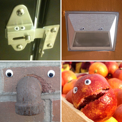
Nope, it's not a new version of the EyeWriter: "Eyebombing" is a far more low-tech—and perhaps expressly meme-friendly—form of urban intervention.

EyeBombing-COMP.jpg

Kim Nielsen and Peter Dam coined the term late last year: "Eyebombing is the act of setting googly eyes on inanimate things in the public space. Ultimately the goal is to humanize the streets, and bring sunshine to people passing by." Their intentions are contrary to those of traditional tags, which Nielsen and Dam see as "egocentric behavior... using vandalism to [get respect]"; eyebombing is "only about the message itself."

It's not a fight for the public space, it's to be seen as a lovely addition to that space. An addition that hopefully brings a smile, and brightens someones day. The eyebomber use humor and wit to reach its audience, not vandalism or provocation.

EyeBombing-3.jpg

Eyebombing-1.jpg

We're certainly past the point of crass Krylon tags—see Marko Manriquez's "fight for the public space" (and no disrespect to Katsu, of course)—but Eyebombing is unique in that it is a simple yet uncanny diversion from the mundane fixtures of the post-industrial world. Where Yarn Bombing, a similarly absurd variant of street art, is characterized by tactility and a sort of Oldenburgian scale that ultimately comes across as rather abstract, Eyebombing is altogether Tweet-like in brevity (suffice it to say that Tumblr is the proper venue for the movement). The fact that it's frivolous and disposable is precisely the point... after all, there may come a day when "googly eyes" refers to a certain search engine's panoptical data mining service.

EyeBombing-0.jpg

(more...)


Artsy Hockey Medal Wins Design Comp

$
0
0

0kettunen001.jpg

We recently looked at Helsinki's design-celebrating coins, and now Finland is the source of another award-winning design on a round piece of metal—though this time, the design is an award in itself. Artist Tapio Kettunen, from Vesilahti in western Finland, has designed the medals for the forthcoming Ice Hockey World Championships.

Kettunen's entry, which won a design competition held by the International Ice Hockey Federation, pushes the 2D boundaries of traditional coin/medal design by depicting a mid-flight hockey puck straining against a goal net that appears to stretch up out of the surface of the medal.

0kettunen002.jpg

Kettunen's artsy approach opts for abstraction over a pictographic illustration that tells the whole story; the simple linework triggers the viewer to conjure up the unseen before-and-after images of a slapshot and a flailing goalie, the buzzer and the rotating light.

"I was about to turn in another, more traditional design, as well, but when I heard [IIHF Vice President Kalervo] Kummola mention the Helsinki World Design Capital year, I thought that a more modern design would be the way to go," says Kettunen.

0kettunen003.jpg

(more...)


Viewing all 19151 articles
Browse latest View live


Latest Images