Quantcast
Channel: Core77
Viewing all 19132 articles
Browse latest View live

Cinelli's Antonio Colombo on the 'Infinite Possibilities of the Bicycle'

$
0
0

AntonioColombo.jpg

Just prior to the release of Rizzoli's "Cinelli: The Art and Design of the Bicycle" last October, Antonio Colombo sat for a rare interview on the occasion of the Milan edition of the 2012 Bicycle Film Festival. As the president of Cinelli since Columbus tubing bought it in 1978, Colombo has overseen the continued growth of Cino Cinelli's eponymous company—founded in 1948, upon his retirement from the pro race circuit—through the contemporary cycling boom.

In the subtitled video interview, Colombo covers many of the same points that he mentioned at the Designers and Books Fair last fall, where he spoke as part of a panel on bicycles and design, concluding that "good design is good not only for the company that makes the product but [also for] the whole of society."

AntonioColombo-atDesignersandBooksFair.jpg

As for the book itself (Colombo kindly signed my copy after the talk), a pair of three-star reviews on Amazon note that the book—per its title—is largely focused on the current incarnation of the company, featuring high-resolution, full-bleed images of the company's innovations since 1979 at the expense of the technical nitty-gritty of, say, Cino's bivalent hub. This is a fair assessment, more a caveat emptor to fans looking for a full history of the company than a critique of the book itself. While it's not perfect—frankly, I was a little put off by the proportions of the text within the layout—it's certainly an outstanding visual compendium of the aspirational cycling brand (especially for those of you who are familiar with the work of Garrett Chow). It so happens that Cinelli has also posted a short promotional video of the book along with the interview..

CinelliLaser.jpg

Via Prolly Is Not Probably

(more...)

New Work by 2013 Maison & Objet Designers of the Year Barber & Osgerby

$
0
0

BarberOsgerby-AscentWesternFacade.jpg

As of this week, Edward Barber and Jay Osgerby have been named the Maison & Objet Designers of the Year, an auspicious start to 2013 for the London design duo. In addition to exhibiting several previously-seen projects, they unveiled the new Tobi Ishi table for B&B Italia in Paris last week, shown alongside the Tip Ton chair for Vitra and Ascent collection for Haunch of Venison—which we saw at last year's felicitously-titled Designs of the Year 2012 exhibition—as well as the Western Façade bench for Established & Sons and the Bell Lamp for Louis Vuitton.

BarberOsgerby-TipTonAscent.jpg

BarberOsgerby-TobiIshi.jpg

BarberOsgerby-TobiIshiAscent.jpg

Barber & Osgerby are also pleased to announce that the £2 coin that they designed for the Royal Mint—commissioned on the occasion of the 150th Anniversary of the London Underground this year—has just gone into circulation.

BarberOsgerby-2PoundCoin.jpg

(more...)

Specialized Bicycle Components is seeking a Lead Bike Graphic Designer - Women's Category in Morgan Hill, California

$
0
0

coroflot-joboftheday.jpg

Lead Bike Graphic Designer - Women's Category
Specialized Bicycle Components

Morgan Hill, California

Specialized Bicycle Components is seeking a Women's Lead Graphic Designer who will be responsible for the creation and management of graphic designs on women's bikes from concept through production. This includes and involves research, mood board creation, graphic strategies, presenting your work and the ability to take creative direction. This position works within the graphics department and in collaboration with the Performance Mountain, Performance Road, ATB, and Core bike groups.

The Lead Graphic Designer will work with the most talented designers in the industry at Specialized's newly remodeled in-house design studio. He or she will have full shop access to make your design dreams become reality; a state of the art downdraft paint booth, top of the line vinyl cutting, SLA machine and much, much more.

(more...)

Core77 Design Awards 2013: Announcing Our Jury Captains, Part 3

$
0
0

2013awards-blogpost-header-lrg.gif

With the EARLYBIRD Deadline for the Core77 Design Awards less than a week away at this point, we're pleased to announce five more Jury Captains to complement the ten that we've already announced. Remember, you have just one more weekend to finish your entry by the Earlybird Deadline on JANUARY 31st to receive 20% off your entry fee.

The Core77 Design Awards proudly offers 17 progressive categories honoring the richness of the design profession and its practitioners. From Consumer Products to DIY, Service Design to Writing & Commentary, the Core77 Design Awards provides designers, researchers and writers a unique opportunity to communicate the intent, rigor and passion behind their efforts. We also offer 15 designated student sections within our 17 categories. And with globally distributed jury teams, the individuals who will be considering your work are expert practitioners in the field.

Without further ado:

* * *

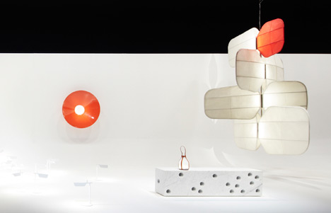
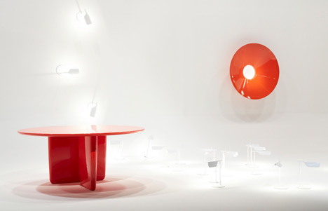
FURNITURE & LIGHTING
Judging location:Paris, France

Furn-MataliCrasset-468x312.jpg
» Matali Crasset Jury Captain
Founder and Creative Director at Matali Crasset Productions

Matali Crasset is by training an industrial designer; a graduate of the Ateliers - E.N.S.C.I. (Workshops - National Higher School of Industrial Design). At the beginning of 2000, after her initial experience with Denis Santachiara in Italy and with Philippe Starck in France, she set up her own studio in Paris called Matali Crasset productions in a renovated former printing firm in the heart of Belleville. She considers design to be research, working from an off-centered position allowing both to serve daily routines and trace future scenarios. Her work revolves around searching for new coordination processes and formulating new logics in life. She defines this search as an accompaniment towards the contemporary.

Always in search of new territories to explore, she collaborates with eclectic worlds, from crafts to electronic music, from the textiles industry to fair trade, realizing projects in set design, furniture, architecture, graphics and collaborations with artists, young furniture-making companies, municipalities and communes. This experience acquired over the years has led her to currently work on more participative projects, on a local and global level, both in rural and urban settings. It's ultimately the core question of living together, which defines her imaginative designs, writings and the sense of Matali's work.

VISUAL COMMUNICATION
Judging location:New York, USA

Viscom-EddieOpara-468x312.jpg
» Eddie Opara, Jury Captain
Partner at Pentagram

Eddie Opara studied graphic design at the London College of Printing and Yale University, where he received his MFA in 1997. He began his career as a designer at ATG and Imaginary Forces and worked as an art director at 2x4 before establishing his own studio, The Map Office, in 2005. He joined Pentagram's New York office as partner in 2010.

His clients have included the Menil Foundation, Jazz at Lincoln Center, the Queens Museum of Art, Prada, St. Regis Hotels, Morgan Stanley, New York University, UCLA, Grimshaw Architects and Princeton Architectural Press. Opara has won numerous awards including a Gold Cube from the Art Directors Club and honors from the American Institute of Graphic Arts (AIGA) and I.D. magazine. His work is in the permanent collection of the Museum of Modern Art and has appeared in publications such as Archis, Surface, Graphis and I.D.

Opara is a visiting critic at the Yale School of Art and teaches narrative design at the University of the Arts, Philadelphia. He has taught at the Rhode Island School of Design, the Columbia University School of Architecture and the Yale University School of Art. He is a member of the Alliance Graphique Internationale, on the board of the New York Chapter of AIGA and was recently featured in Ebony Magazine's Power 100 list for the December 2011 / January 2012 issue. Most recently, Opara was named one of Fast Company's 100 Most Creative People in Business in 2012.

TRANSPORTATION
Judging location:London, United Kingdom

Trans-PaulPriestman-468x312.jpg
» Paul Priestman, Jury Captain
Designer and Co-Founding Director at Priestmangoode

Paul Priestman is a Designer and Co-Founding Director of leading multidisciplinary design consultancy Priestmangoode.

Priestman studied Industrial Design at Central Saint Martins and at the Royal College of Art. He was a member of the UK Design Council and Chair of the Design Sector Skills Panel from 2004 to 2006. He was also President of the Design Business Association from 2001 to 2003, and a member of the D&AD Executive from 2005 to 2007. He is currently a member of the Royal College of Art Council. In 2010, Priestman was selected to represent the UK's creative industries on the Prime Minister's Trade Delegation to China, flying the flag for British design around the world.

He is a leading voice in the industry and an experienced speaker on the subject of design and innovation. Last year, the Evening Standard—London's leading newspaper—voted Priestman one of London's 1000 most influential people of 2012.

WRITING & COMMENTARY
Judging location:London, United Kingdom

Wrt-JustinMcGuirk-468x312.jpg
» Justin McGuirk, Jury Captain
Writer, Critic and Curator

Justin McGuirk is a writer, critic and curator based in London. He is the director of Strelka Press, the publishing arm of the Strelka Institute in Moscow, and the design consultant to Domus. He has been the design columnist for The Guardian and the editor of Icon magazine. In 2012 he was awarded the Golden Lion at the Venice Biennale of Architecture for an exhibition he curated with Urban Think Tank. He is currently working on a book about activist architecture and social housing in Latin America.

DIY
Judging location:Sebastopol, USA

DIY-GoliMohammadi-468x312.jpg
» Goli Mohammadi, Jury Captain
Senior Editor of MAKE Magazine

Goli Mohammadi is Senior Editor of MAKE magazine and has worked on MAKE since the first issue hit newsstands in 2005. Covering the vast and amazing world of DIY provides her with endless brain candy and gives her hope in the future of the human race. Maker Faire is, without a doubt, the most inspirational event she's had the pleasure of working. 

Born in Tehran, Iran, and raised in Chicago, she has forever been amazed by the complexities of language, and the cultural differences therein. Goli is a word nerd who particularly loves to geek out on how emerging technology affects the lexicon as a whole. When she's not fawning over perfect word choices, she can be found on the nearest mountain, finding the ideal backcountry lake or hunting for snow to feed her snowboard addiction.

Don't forget to Register today for updates and ENTER by January 31st to receive 20% off in our EARLYBIRD DEADLINE!

(more...)

Hell in a Handbasket: The Anti-Loneliness Ramen Bowl

$
0
0

antilonlinessramenbowl-01.jpg

Just a little bit closer...
Just a little bit closer....

I hear driving while texting is a problem out in L.A. Here in New York it's walking while texting. On at least a weekly basis I'm stuck behind some idiot on the sidewalk who's moving like two miles an hour with his nose buried in his phone. I keep praying he'll walk into an open manhole, become flattened by a falling piano or be wiped off the sidewalk by a swinging wrecking ball, but apparently the patron saint of 1920s Slapstick Deaths has better things to do than listen to me.

If there's a single shot of a product design that could sum up this sad state of affairs, where every spare second you have requires you keep your eyes glued to your phone, it's this:

antilonlinessramenbowl-02.jpg

That's the Anti-Loneliness Ramen Bowl, designed by NYC-based MisoSoupDesign. And it's real, they're currently taking pre-orders. If they can figure out how to rig up a harness so you can wear this while walking, they're going to have a serious hit on their hands.

antilonlinessramenbowl-03.jpg

(more...)

App to the Future with Windows Phone 8

$
0
0

The best design meets our needs before we can even articulate them. With the App to the Future design challenge, Windows Phone and Core77 intend to foster the circumstances for intelligent, practical and beautiful design. The ingredients to get designers started are all here on the contest site: a smartly conceived UI, clear and helpful developer tips, and an evolved Windows Phone 8.

We held our first call for Windows Phone app designs last year and had incredibly conceived winning entries. This year, contestants will be designing for the next generation device. Windows Phone 8's changes include a new OS, faster processing, additional user features and general bug-stomping after careful review of Windows 7.5 feedback. The results have delighted developers and users alike. Many updates built upon well-received, existing elements like Live Tiles and grew them—literally. Live Tiles can now be resized with the added option to personalize content hierarchy based on user preference.

The 120k+ apps in the Windows Phone Store (formerly Marketplace) are a strong beginning for a phone that initially received the mixed praise of being a superior choice to Android but a latecomer to the game. Microsoft is aware that its well-built platform requires the buy-in from app developers and community in order to flourish. Developers new to Windows Phone could be understandably reluctant to invest their resources in building for a smaller market, but Microsoft has greatly expanded global access to the Windows Phone Store in just a year and continues to promote Windows Phone apps through various channels and provide regional Windows Phone Champs tasked to help developers locally. And this chicken/egg cycle yielded its own positive side effect: a remarkably clear design, development and submission process to the Windows Phone Store. After creating the platform and outlining hardware standards, Microsoft understood that removing barriers to creation and encouraging innovation are key in both catching up with iOS and Android app offerings and building their own app process.

Windows Phone's particular design principles mean that apps run nearly identically across different hardware. That reassurance of similarity is one less headache for users and developers alike. For example, Kid's Corner—a terrific feature that gathers all the games, apps, music and videos for your child into one place while securing the rest of the phone from prying fingers—will be precisely the same experience on Nokia, Samsung and HTC models.

Adding to the list of features developers can play with and users can enjoy, the technical overhaul includes support for HD screens and multicore processors. Business users can happily edit a Word document or create an Excel spreadsheet. And linked email means you can view all messages from different accounts in one inbox (something iOS users are accustomed to), then save your documents, photos and chats to Microsoft's cloud, SkyDrive.

For this challenge in particular, we suggest going through the Boot Camps on Windows Phone Design Language. After considering the app you'd like to design and mocking it up, have a Windows Phone interface designer take a look by signing up for a Lighting Design Review. Afterwards, you'll be able to integrate their feedback and further refine your app. Then, there's the business of actually getting 'er done. If you're not a seasoned developer, you still might want to give app dev a try via the Windows Phone Dev Center (their 2-day Jump Start has been widely lauded as great watch-and-do training). We had three winning teams last year develop their own apps (with one team being total—but gifted—noobs at developing) and submit them to the store. And developers that are looking for new design ideas to implement and grow (or simply would like a chance to win a Windows Phone 8) can offer their dev muscles.

So, onwards, potential Windows Phone 8 designers and developers! You probably have an incredible idea brewing in your noggin. The resources to make that concept a reality are at your fingertips...and now you've got a little fire under your tush with this contest. Good luck and happy designing your App to the Future!

[Editor's Note: For some great tips on designing for Windows Phone, check out 8 insights from Senior Interactive Designer Lincoln Anderson, who hosts the lightning design reviews!]

(more...)

The Braun Design Collection Motherlode for Sale on eBay!

$
0
0

braun-design-coll-ebay-01.jpg

From the Holy Cow Department: A collector in Heidelberg, Germany spent years amassing an impressive collection of Braun-designed objects—radios, phonographs, clocks, speakers, televisions, blenders, coffeemakers, toasters, you name it—made from 1955 to 1985. And s/he is now selling the entire collection off, roughly 1,000 objects, on eBay!

braun-design-coll-ebay-02.jpg

In addition to Dieter-Rams-designed icons like the SK 4 "Phonosuper," s/he's got classics like the SK 1 designed by Artur Braun and Fritz Eichler, the Florian-Seiffert-designed KF 20 Aromamaster, the Herbert-Hirche-designed HF 1 TV set, the list goes on...and on...and on.

braun-design-coll-ebay-03.jpg

The good news is you've still got five days left to get in on this! All you've gotta do is pony up the cash and get your ass to Heidelberg for pickup, about 100 miles north of Stuttgart.

braun-design-coll-ebay-04.jpg

The bad news is, the bidding starts at €350,000. But look, man, that Bauhaus museum you've been meaning to start isn't going to open its damn self.

braun-design-coll-ebay-05.jpg

Hit the jump to see the video that the seller kindly made... to torture us.

(more...)

The Peugeot Design Lab's Pleyel Piano

$
0
0

Peugeot_Design_Lab_Pleyel_piano.jpg

To our British readers: We Americans like stealing your TV shows, like we did with your language, and we use both of those things differently over here. So most of us don't know who Ella Henderson is, since she was only on your version of "The X Factor" before you fools voted her off early.

Anyways this morning, footage of Ms. Henderson was released showing her playing a rather crazy-looking piano that was designed by...the Peugeot Design Lab.

We'd written before that France's PDL was looking to stretch their design muscles, but had no idea they were tackling something this complicated, less than a year out of the gate. (They didn't do it alone, they worked in conjunction with piano maker Pleyel, but still.)

And to our French readers: You guys don't have to worry about us stealing your language, 'cause we can't pronounce those freaking R's.

(more...)

A Lamp Worthy of All-Star Nomination: Grotesk x Case Studyo's "6FT - 6IN"

$
0
0

Grotesk-CaseStudyo-6FT6IN-sq.jpg

If you're not familiar with the work of Kimou Meyer, a.k.a. Grotesk, we recommend checking out his excellent 2010 monograph. But even those of you who have never heard of the Brooklyn-based graphic designer ought to appreciate a recently-launched edition he has created for Case Studyo of Ghent, Belgium.

Grotesk-CaseStudyo-6FT6IN-tall.jpg

Limited to an edition of 23 (after Jordan, we hope) plus four artist proofs, "6FT - 6IN" is a baller lamp that is distinctive for its "blocky sneaker feet, as not only a signature Grotesk output, but also a design incubation decades in the making." Contrary to the height given in its name, the lamp measures 75cm (30 in.), or just under half the height of Mugsy Bogues, it's clearly intended to be a table lamp, featuring a cylindrical abat-jour set on skinny "string bean" legs are more Kevin Durant than LeBron. These minimalist components serve to underscore the unexpectedly playful base, featuring a classic Bulls color scheme.

Grotesk-CaseStudyo-6FT6IN-boxOpen.jpg

Last week, I took issue with the plain rectangular box that served as the packaging for Taylor Simpson's MONIKER bicycle handlebar concept. Here, it serves as a remarkably felicitous concept: the custom packaging for "6FT - 6IN" resembles a giant shoe box—it's hard to tell from the photos, but I imagine it's upwards of three feet long—executed in custom screenprinted wood. It's a veritable triple-double of brilliant design: ten points for style, ten points for substance, plus another ten for packaging.

Grotesk-CaseStudyo-6FT6IN-boxDetail.jpg

(more...)

The Sharpener Image: Craighton Berman's 'Campaign for the Accurate Measurement of Creativity'

$
0
0

CraightonBerman-SharpenerJar.jpg

I don't know how accurately it measures creative output, but the Sharpener Jar is definitely a practical alternative to the underground artisanal pencil sharpening movement. So it should come as no surprise that designer, entrepreneur, teacher and sometime Core-toonist / Sketch-notetakerCraighton Berman (a.k.a. Fueled by Coffee) has nearly quadrupled his $2,500 Kickstarter goal in just four days.

Every day professional "creatives" spend their waking hours sketching, writing, doodling, brainstorming, drawing, and scribbling on paper—hoping that their next amazing idea will eventually appear. This process fuels a unique angst in the modern-day artist; they spend most of their time merely thinking about what to make with nothing physical to show other than a pile of sketches. Can you get credit for creative effort without showing an end product? How is your boss going to know that you spent most of the day working and not just surfing Tumblr? How can you prove to your clients that your rates are justified despite the absence of actual finished work? Can creative output really be measured?

As in the Dux Inkwell sharpener, an extant glass vessel takes on a new purpose as a reservoir for pencil shavings, underscoring the ritualistic appeal of paring down a stick of wood and graphite.

CraightonBerman-SharpenerJar-schema.jpg

On the other hand, unlike the Cuppow, Berman has opted to include the jar (and lid and threaded ring) with the sharpener, which surely adds a bit of unnecessary shipping/packaging expense to the product. Hence, the $39 pricetag for a single Sharpener Jar—assuming that the 32 remaining "first editions" at $34 will sell out shortly. (Still, it could be worse: $210 worse.)

CraightonBerman-SharpenerJar-Thanks.jpgWe'd love to see these letterform pencils IRL...

(more...)

Core77 Design Awards 2013: Today's the Day!

$
0
0

c77da2013_468x242_TODAY_BLOG.jpg

Today's the day! Our Earlybird deadline ends at 8PM Eastern Time. To get the exciting 20% discount, you'll need to prepare your best work and submit your entry to the Core77 Design Awards within the next eight hours. You definitely won't want to miss out on getting your finest projects in front of our all-star jury and in the running to get the awesome trophy. Be a part of the most celebratory and inclusive design awards program yet: Submit Now!

(more...)

New Corvette Video Opens with... the Designers

$
0
0

2014-corvette.jpg

Guess what we're making

The 2014 Corvette has been unveiled, and the video being used to promote it reminds me how far the public perception of industrial design has come. Years ago, a commercial for a new Corvette would feature the car cruising down an idyllic country road, tearing up a track or whipping down an American highway. But as you'll see, the ad below starts off with footage of the team scraping out the full-sized clay model, with accompanying soundbites from designers Kirk Bennion and Tom Peters. We're then teased with some fleeting computer modeling and wall-o'-sketches shots before they hand it over to the aerodynamics team.

Sexy logo update, no? We'll get to that in a minute.

(more...)

Red Paper Heart Creates "A Screen You Can Swim Through"

$
0
0

redpaperheart.jpg

How do you project moving images onto water? That was the challenge faced by Red Paper Heart, a Brooklyn-based collective of designers and coders. Tasked by nightlife tracker UrbanDaddy with creating an event featuring "a memorable interactive experience in water," RPH decided to "create animations that partygoers could swim through."

Sixty-five thousand ping pong balls later, they had their solution:

(more...)

A Visual History of Corvette Logos, Part 1

$
0
0

orig-corvette-logo.jpg

When Chevrolet was preparing their new Corvette sports car in the early '50s, the task of designing the logo fell to Chevy interior designer Robert Bartholomew. Bartholomew's design (above) featured two crossed flags: One, the checkered flag that symbolized race victory, the other, the American Stars 'n Stripes.

However, using the American flag to promote commercial products was illegal at the time, and Chevy execs reportedly decided at the last minute to nix that part of the design. (It's not clear why they waited until four days before the car's unveiling, but you can practically picture Bartholomew sitting at his drafting table going goddammit.) Bartholomew's last-minute replacement was a flag sporting both the Chevrolet logo and a fleur-de-lis, a French symbol that was reportedly part of Louis Chevrolet's family crest. (See our post on heraldry here.)

corvette-logos-53-01.jpg

New badges were whipped up based on Bartholomew's drawings, and the Corvette debuted in 1953 at New York's Waldorf-Astoria hotel.

corvette-logos-53-55.jpg

Sadly, after that story, all mention of specific designers associated with subsequent logos are nil. What we do know is that Bartholomew's design stuck around until 1957, then underwent multiple tweaks and changes throughout the years. Amassing a photo list has proved trickier than expected, as there were multiple emblems for the hood, tail and fenders, but we've tried to put together a visual chronology focused on the nose badges.

In 1956 and '57, a Chevrolet chevron was added to the design:

corvette-logos-57.jpg

In 1958 we see a typographic update that persists until 1961:

corvette-logos-59.JPG

(more...)

Designing Things to Hold Other Things: The Staybowlizer for Commercial Kitchens

$
0
0

staybowlizer-02.jpg

Smartphones need cases, coffee mugs need coasters, hunting knives need sheathes. It's weird to think about how many products are not designed with their own base or carrying case, and as it turns out, that's an opportunity for sharp-eyed product designers. Designing an object whose sole purpose is to protect or augment another object is something we never covered in design school, but apparently it's lucrative.

The latest case in point: The Staybowlizer silicone thingamajig you see above. Your standard mixing bowl is made out of stainless steel or glass, which has a tendency to slide on your standard commercial kitchen prep surface of stainless steel or wood.

staybowlizer-03.jpg

The Staybowlizer provides a little "nest" to keep the bowl stable.

staybowlizer-01.jpg

Set it with the wide side up and you can have it hold the bowl at an angle, making it easier for you to pitch in whatever you're chopping up...

staybowlizer-04.jpg

...or turn the ring upside down and it turns into a huge suction cup, keeping your bowl firmly fixed in place so you can mix one-handed.

staybowlizer-05.jpg

(more...)

A Visual History of Corvette Logos, Part 2

$
0
0

corvette-logos-77.jpg

In 1977, Chevy ditched the "sunburst" design for their Corvette logo and went with (above) this clean, graphically-stylized update on the original crossed flags. The fleur-de-lis from Louis Chevrolet's family crest is still up front on the red flag, with the Chevy "bowtie" partially obscured behind it.

1978 was the Corvette's 25th Anniversary, and cars released that year got this fancy badge:

corvette-logos-78.jpg

Corvette's from '79, however, reverted to the design of the '77.

In 1980 a new decade arrived, bringing with it more angular designs. The '80 Corvette saw a weird kickback to the 1963 design by arranging the flagpoles in such a way that they formed a "V." Conspiracy theorists will see a Firebird or Thunderbird logo in their mind's eye, but I don't think those cars were truly competitive fears, as the former wasn't in the same price range and the latter wasn't in the same performance category. In any case, the logo persisted through '81.

corvette-logos-80.jpg

Buyers of the 1982 "Collector Edition" Corvette had this special badge with the throwback circle from the '63 or '73 ot '76. It's also unusual in that the fleur-de-lis is dispensed with altogether, and for the first time in years we see an unobstructed bowtie.

corvette-logos-82-coll.jpg

For 1983 to '84, the fleur-de-lis again takes a hike, and the bowtie reigns supreme. The graphic treatment of the waving flag is dispensed with and the flags switch sides; I have no idea why, but it screams "focus group." The circle also makes a comeback.

corvette-logos-83.jpg

(more...)

More Next-Level IKEA Hacking: Matt Hope's Air-Filtering Beijing Bicycle

$
0
0

BeijingSmogviaReuters.jpgImage by Reuters, via SMH

Cycling has long been regarded as a sustainable alternative to fossil fuel-based modes of transportation, but in rapidly modernizing Chinese cities, the boom in the latter has discouraged the prevalence of the former. Beijing, for one, is notorious for its poor air quality, which typically hovers at the threshold of being a full-fledged public health hazard. Hence, a Chinese millionaire is now hawking canned air at 5RMB (80¢) a pop1 in a highly publicized campaign to raise awareness about the oppressive atmosphere of the capital city (so to speak).2

MattHope-BreathingBike.jpg

Yet the bicycle remains an inexpensive, efficient and altogether practical option for many of the city's 20 million residents, perhaps now more than ever before, considering that automobiles clog major thoroughfares around the clock (lest we forget the infamous ten-day traffic jam from last August). Beijing-based artist Matt Hope has come up with a clever solution: he's rigged up a homemade 5,000V air filter to his bicycle, and it's pretty rad:

(more...)

Military Airdrops, Part 2: How Do You Say "Crazy" in Russian?

$
0
0

BMD-1-airdrop.jpg

Russian Core77 reader "WR" provided some interesting information about how they conduct airdrops in his neck of the woods. First off the Russian military has got a fighting vehicle designed to be airdropped, the BMD-2. (Similar but earlier BMD-1 pictured above.) The problem encountered, according to WR: "Deploying vehicles and their crews separately meant even bigger loss of time and potentially deadly exposure for the crews reaching their vehicles on foot. Even worse: quite often crews simply couldn't find their rides."

Well, apparently something about wearing portyanki makes you freaking fearless, as the solution they developed is to drop the 11.5-tonne BMD-2 with people inside of it. Here's how they pull it off:

I'm not sure what they're saying in Russian at the end of the video, but I assume it's "You guys are all crazy, and you're all getting promoted."

(more...)

Aqua Lung is seeking a Sports Fashion/Textile Designer in Nice, France

$
0
0

coroflot-joboftheday.jpg

Sports Fashion/Textile Designer
Aqua Lung

Nice, France

AQUA LUNG France is recruiting a sports fashion / textile designer (Man/Women: permanent contract) to join the Creative and Textile Product Development Department. The position is based at the head office situated north of Nice. The position involves the development of the range of swimwear, swim shorts, triathlon garments, and apnea and lycra tops / rash guards.

The textile designer should develop original ideas for the design of swimsuits (new fabrics, technical fabrics or basics, neoprene categories), as well as designs and graphics according to the brief and specifications of the Product Development Manager.

(more...)

Revisiting and Revising Design History: George Nelson Associates, Irving Harper and a Pair of Chairs

$
0
0

GeorgeNelson-HermanMiller-CSS-viaArtnet.jpgImage via Artnet

Timelessness, it seems, is a matter of taste: while Dieter Rams' recently-revisited Vitsœ 606 is at the top of my list for furnishings when I eventually settle down, a couple commenters begged to differ. Those of you who prefer the warmer aesthetics of Mid-Century Modern heirlooms are perhaps duly predisposed to the Comprehensive Storage System by George Nelson for Herman Miller.

GeorgeNelson-HermanMiller-CSS-viaWright20.jpgImage via Wright20

While the CSS certainly rivals the 606 as a paragon of functional beauty, the Michigan-based MCM manufacturers have long since discontinued the product—it's only mentioned in passing as a 1959 milestone in Herman Miller's company timeline. As such, well-preserved examples command healthy resale prices—from around $4,500 to upwards of twice that—on the secondary market.

GeorgeNelson.jpgMore on the Pretzel Chair below...

However, as of the new Millenium (or Century, as it were), the mystique of George Nelson Associates was beginning to dissolve. It turned out that many of the iconic products and graphics to Nelson's name, produced during his 25-year tenure as Design Director of Herman Miller, from 1947–1972, were actually the work of lesser-known and often uncredited designers. Which is not to say that Nelson was a designer himself: he was an architect and writer by training and trade, and he made few, if any, decisions regarding the designs for which he is widely credited (and acclaimed).

Case in point, Chief Designer Irving Harper has only recently been recognized as the creative force behind the long-canonized Ball Clock and Marshmallow Chair, as well as Herman Miller's logo. The chronicle started with Paul Makovsky's seminal profile of Harper for Metropolis back in 2001 and culminates this month with the forthcoming release of Skira/Rizzoli's Irving Harper: Works on Paper, a 12-year effort by Michael Maharam of textile fame to shine light on the unsung genius in his lifetime (the designer is just a few years shy of triple digits).

IrvingHarper-WorksonPaper.jpg

(more...)
Viewing all 19132 articles
Browse latest View live


Latest Images