Quantcast
Channel: Core77
Viewing all 19151 articles
Browse latest View live

The U.S. Mint's Production Materials Problem: Nickels Cost 11 Cents to Make. Here's Our Design Solution

$
0
0

us-currency-01.jpg

It makes such little cents

You probably know that the U.S. penny used to be made out of copper, which was once inexpensive. As the cost of copper began to rise, it would have cost more per penny than the penny's own value, so the U.S. Mint switched over to a zinc alloy.

us-currency-02.jpg

But the price of zinc has been steadily rising since 2005. Which is why U.S. currency is in the absurd situation it is now: A one-cent piece costs about 2.4 cents to make. A penny is 97.5% zinc and 2.5% copper, and that zinc ain't cheap.

us-currency-03.jpg

The nickel's got it even worse. This five-cent coin costs 11.2 cents to manufacture. That's because 75% of it is zinc and 25% is, well, nickel, another expensive metal. Which means that a nickel costs more to produce than every U.S. bill from a one-dollar bill (5.2 cents) all the way up to a C-note (7.7 cents).

us-currency-04.jpg

The money math starts to make a little more sense when we get to the smaller dime (92% copper, 8% nickel), which rings in at a production cost of 5.7 cents. The quarter, which has the same ingredients as the dime, is only a slighly better bargain at 11.1 cents.

us-currency-05.jpg

Clearly the U.S. Mint needs to start researching cheaper alloys or phasing out the penny and the nickel. It's true that the math is a little more complicated than it would be for pure product manufacturing; for example, while you'd quickly go broke selling a product for $100 that cost $240 to make, currency is a little trickier. The government has an obligation to produce and circulate currency because it enables commerce, so it's okay if they lose a little in manufacturing costs, as its citizens will theoretically make it back up by creating wealth. But if we don't do that fuzzy math and look at it in terms of straight production, in 2012 alone the U.S. government lost $58 million dollars just by making pennies.

(more...)


Smithsonian to Receive a BIG Redesign

$
0
0

smithsonian-BIG-01.jpg

It was announced yesterday that BIG, a.k.a. the Bjarke Ingels Group, has won the $2.4 million contract to design the Smithsonian Institution's master plan. The fittingly-named BIG is tackling a gargantuan task: The Smithsonian is the world's largest museum and research complex, spanning 19 museums, nine research facilities and the National Zoological Park. As Ingels explains,

The abundance of historical heritage, the diversity of architectural languages and the cacophony of exhibits are tied together by a labyrinthine network of spaces above and below ground - inside and outside. Our task is to explore the collections with The Smithsonian and together attempt to untie the Gordian Knot of intertwined collections to unearth the full potential of this treasure chamber of artifacts.

While details are not yet fleshed out, the new master plan will reportedly include "a striking grand entrance for the [Smithsonian] Castle and adjacent Museuems," as well as a network of underground tunnels to better connect the collections. This will make it easier for the 30 million visitors who come through each year to better access the 137 million items in the Institution's holdings.

smithsonian-BIG-02.jpg

If you're wondering how one firm could possibly tackle a job this size, the answer is, they won't do it alone: BIG will be leading the following diverse team into the fray.

Landscape Architecture - Surface Design
Historic Preservation - Traceries
Structural Engineers - Robert Silman Associates
Sustainability Consultants - Atelier Ten
Mechanical, Engineering & Plumbing - GHT Limited
Civil Engineering - Wiles Mensch
Security & Anti-Terrorism - Weidlinger Associates
Cost Consultants - VJ Associates
Fire & Safety Consultants - Protection Engineering Group
Food Services - FDS Design Studio

BIG is expected to deliver the master plan inside of twelve months' time.

(more...)


International Home + Housewares Show 2013: Casabella's Super Sponge & Squeegee

$
0
0

ihhs2013_blog_hdr-1.jpgcasabella_sponge_squeegee1.jpg

Seventy years after Du Pont invented the synthetic sponge in 1942, the folks of Casabella are introducing a new innovation in the cleaning category—a combination kitchen sponge and squeegee.

casabella_sponge_squeegee2.jpg

The "Super Sponge & Squeegee" line is being introduced in three distinct shapes for Kitchen, Dish and Flatware, and bathroom. The slits in the sides of the Dish & Flatware sponge aids in scrubbing knives, forks and spoons while the squeegee gives some extra support for the chore of drying. The Kitchen and Bathroom sponges work for surface cleaning and swiping, the squeegees can also work to scour corners and grout. All three scrubbers are gentle enough to be used on glass, teflon and tile.

casabella_sponge_squeegee3.JPG

(more...)


Cross Campus Collaborations: The Granoff Furniture Project

$
0
0

granoff-suite.jpg

Reporting by Sarah Pease

A reception earlier this month marked the official completion of another successful collaboration between the Rhode Island School of Design (RISD) and neighboring Brown University. Four RISD students, Taylor McKenzie-Veal, Scot Bailey, Ian Stell, and Yumi Yoshida, along with faculty advisor Christopher Specce, worked for almost two years to design and produce a suite of site-specific furniture for Brown's newest building, the Granoff Center for the Creative Arts. [Ed. Note: We'd previously been impressed with work from Mckenzie-Veal, Bailey and Stell at Ventura Lambrate in Milan last year.]

granoff-center.jpg
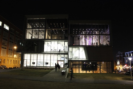
Brown University's Granoff Center for the Creative Arts

The furniture designs were conceived and produced to resemble the familiar furniture typologies present in a living room. "The suite of furniture can be rearranged, adjusted, and adapted to the multifunctional program of the building. These furnishings extend the utility of each landing and breathe life into the space with a punch of inviting color," described McKenzie-Veal. The collection includes the following three pieces:

granoff-sofa.jpg

The Granoff Sofa

The Granoff Sofa is a flexible seating system design specifically for the landings within the building. In its complete couch arrangement, the furniture fills the full width of the landing. At once, the sections of the sofa can be pulled apart to become three independent seating surfaces. Users can rearrange the sofa into a large variety of formats to cater specifically to the task at hand.

granoff-chair.jpg

The Granoff Chair

The Granoff Chair is a geometrical lounge chair that utilizes the formal language of the building to create a surprisingly comfortable seating experience. Designed to mirror the triangular, planar forms of the building and contrast with the organic forms of the couch, this chair provides a counterpoint to the other furnishings as well as a wonderful spot to sit and enjoy the building.

granoff-stool.jpg

The Granoff Side Table / Stool

The Granoff Stool & Side Table is a multifunctional task surface that directly interfaces with the couch and chair. A set of three can nearly double the seating quota of a particular landing or simply provide users with a surface to place their belongings or kick up their feet.

(more...)


Are Dining Table Social Interactions a Solvable Design Problem? Plus Alex Cornell on How to Choose the Right Seat at a Dinner Engagement

$
0
0

lastroundtable.jpg

I recently attended a friend's 40th birthday party at a popular, crowded and loud family eatery in Bensonhurst. Sixteen of us at a long table, eight per side. We were hemmed in too tightly to seat-swap, and for the 2.5 hour meal could only talk to whomever was immediately adjacent. And when the person in the Jesus position of this Last Supper attempted to toast the birthday boy (at the far end of the table) with a series of amusing anecdotes about them, it fell flat, as the speaker could only address half the table at time, meaning most of us only heard half of each story.

Are dining table social interactions a solvable design problem, or is it doomed by simple geometry and space constraints? For sixteen people a round table would have been even worse (cutting off cross-table communication) not to mention completely unsuited to a packed, space-tight restaurant.

Best I can come up with, implausible as it is, is to create long, narrow tables modeled after kaiten sushi or baggage claim conveyor belts. The perimeter of the tables, as well as the chairs, slowwwwly rotate around the table's footprint. Your food stays in front of you, but each person across from you is slowly replaced over the course of a meal; let's say it's programmed to perform a complete revolution in two hours. You get to chat with everyone and it becomes impossible to monopolize someone's time. When you see the first person again, you know the meal is winding down.

(more...)


International Home + Housewares Show 2013: Scanwood Offers Thoughtful Design from Material to Packaging

$
0
0

ihhs2013_blog_hdr-1.jpgIMG_6317cc-scanwood.jpg

It didn't even occur to me that we featured a Core77 Design Awards honoree in our most recent Holiday Gift Guide—after all, the desk set and the packaging for their utensils aren't related in any obvious way. Yet the Danish brand lies precisely at the intersection of the minimalist aesthetic of the former products and eco-conscious imagery of the latter—as Scanwood's Jens Moller explains below:

IMG_6348cc-scanwood.jpgNew acacia serving boards and platters

(more...)


Make Listening a Visual Affair with Zarca Interactive in Washington, D.C.

$
0
0

Work for Foursquare!


wants a Visual & Motion Designer
in Washington, D.C.

Them: An online survey platform and associated educational and professional service that enables better listening. They also happen to be looking for a full-time, on-site Visual & Motion Graphic Designer to work closely with their top-notch team of designers, writers, animators, programmers and creative tinkerers.

You: An experienced, Bachelor's degree holding, Visual & Motion designer who understands the power of time-based motion, has a strong sense of design principles, crushes obstacles regularly and can create a wide variety of compelling collateral.

Next Steps: Click the link below to read more about this opportunity and decide if it's the kind of awesome career choice you want to make.

Apply Now

(more...)


Zaha Hadid at Harvard GSD: "Space is Supposed to Enrich your Life"

$
0
0

Zaha-Hadid-43030.XL.jpg

Upon entering the lobby of the Harvard Graduate School of Design last Wednesday, one might be surprised to discover a line of people from the GSD auditorium doors, down the hallway, and spilling into the ChauHaus (i.e. student cafeteria).

First thought: What are all these non-architects doing here?

Second thought: Oh... Zaha Hadid is lecturing.

The chance to hear a world-renowned, Pritzker Architectural Prize-winning and former Harvard GSD faculty architect inspired an impressive turnout for good reason. As one of the few contemporary architects to gain widespread fame outside of design circles, Zaha Hadid holds a unique place in the contemporary architectural landscape—pun intended. Over the course of her wildly successful career, she has been referred to as everything from an architectural trailblazer to a design diva (and not in the good way).

Whether you love or hate the sweeping curves or fragmented geometry that have become her trademark, the hype has vaulted Hadid to the upper echelon of fame and recognition amongst the black-turtleneck-wearing architecture crowd and mere mortals alike. If you're not sold, she also designed the London Aquatics Center for the 2012 Olympic Games and some great plastic shoes.

Zaha.jpg Photos: Paul Fiegenschue

The lecture began with a brief introduction from Mohsen Mostafavi, Dean of the GSD, friend and former classmate of Hadid's. Mostafavi said of Hadid:

When she first started to develop her work, some people talked about how it was about the calligraphic line.It's interesting to see how the office has managed to bridge that line, between the calligraphic and the whole domain of digital culture and the impact of computation on the firm.

The auditorium was abuzz with GSD students anticipating a talk from a giant of contemporary architecture. Likewise, several impromptu simulcasting rooms throughout the GSD were also abuzz with muffled complaints about not being able to see Zaha in person.

Zaha2.jpg

The presentation was a rapid-fire roll-call of conceptual and completed works from across the globe by Zaha Hadid Architects, the London-based studio Hadid founded and runs with partner Patrik Schumacher (also in attendance at the lecture).

Marsailles-Hadid.jpgCMA CGM Headquarters, 2010

A particularly interesting view into Hadid's process came in her discussion of a series of tower concepts that the firm had been working on for over a decade. The concept renderings and sketches shown appeared to develop their own distinct language for how the towers met the ground, often splaying out and connecting to the preexisting urban topography.

Marsailles-longshot.jpg

(more...)


2013 James Dyson Award Opens for Entries Today-- With Double the Prize Money

$
0
0

dyson-award-2013.jpg

This year's James Dyson Award design competition, which as always carries the appealingly simple brief of "Design something that solves a problem," opens today. What's different this time around is the reward money. Whether in a bid to attract more competitors or to more richly reward the victors, the International Winner's purse has been doubled to US $45,000 for the student or student team, and a further $15,000 to their associated university department.

The prize for the International Runners-up is nothing to scoff at either: Both will receive $15,000, while National Winners will take home $3,000 for their troubles.

Though he only won half of what's on offer this year, Dan Watson put the money to good use after taking home last year's top prize. The designer of the SafetyNet (see video below) forwent the Porsche-leasing I'd have been tempted into and instead set up a company, SafetyNet Technologies: "I have used the prize money to improve and test my prototypes," he writes. "The exposure the award has given me has opened a lot of doors for me, from television appearances to meetings with government officials. The future for SafetyNet is extremely promising."


You've got until August 1st to get your act together and make like Watson. Get started now!

(more...)


Core77 Photo Gallery: International Home + Housewares Show 2013

$
0
0

IHHS-2013-Gallery.jpgPhotography by LinYee Yuan and Ray Hu for Core77

As always, the 2013 International Home + Housewares Show was the destination for the latest and greatest kitchen gadgets, ergonomic utensils, winsome gift items and even cleaning robots from around the world. We had the chance to catch up with some familiar faces as well as several newcomers looking to establish themselves at the largest show of its kind in the U.S.

This year also saw the 20th Anniversary of the Student Design Competition, which has seen some 4,000+ entries since the program launched in 1993. We had the chance to catch up with this year's winners, whose work is among our 100 favorite products from this year's show.

» View Gallery

(more...)


'Backtouch' UI Design, Yea or Nay?

$
0
0

backside-touch-01.jpg

Way back in '07, we learned Apple had patented touchscreens with interactive backs, meaning you could perform on-screen manipulations while keeping your finger out of the way. By 2010 we were calling it "backtouch" and (incorrectly) predicting the iPad would have it. Now that we'd given up hope on this UI technology ever hitting the market, Google is bringing our hopes up once more (even though we're afraid to love again).

Patent Bolt has announced that Google has patented "Simple backside device touch controls":

backside-touch-02.jpg

We thought the whole point of a patent was that they're not awarded to duplicate technologies, but apparently there's something in Google's secret sauce that makes it different. From a user standpoint though, the benefits appear the same: You tap the back of your phone or tablet, and that registers a hit on-screen, enabling you to manipulate apps or perhaps type.

We're curious as to how ergonomically sound this is, as the opposable thumbs my dog always complains about not having seem more agile than the fingers we'd use to access the back of a device. I just picked up my phone and spent a few minutes pretending to type on the back versus actually typing on the front, and while the former feels a little awkward, I already suck at the latter. (One sure benefit though, backtouch would leave less fingerprints on the glass.) Try it yourself, assuming you're not out in public and don't want to look like a tool, and let us know if you think backtouch has got legs.

(more...)


Spider's Camera Holster Systems

$
0
0

spider-holster-01.jpg

Remember our earlier entries on holsters, both modern-day and cowboy-style? These days there's another breed of shooter that can use a waist-mounted system for quickdraws:

spider-holster-02.jpg

That's the Dual Camera System designed by Spider, a company that produces on-body photographer's gear. Two cameras too much? They've also got a Single Camera System that you can stick on an ordinary belt.

Regardless of whether you're single- or double-gunning it, the company has put some careful thought on how best to hang heavy DSLRs off the side of your body without damaging the gear.

spider-holster-03.jpg

This video provides a closer look. I like the wisdom of the two-pin system, and the way they've designed it so that you can still grab the camera from the bottom while shooting in portrait mode.

(more...)


The Airow Gun: Paintball Archery, Anyone?

$
0
0

airow-gun-05.jpg

The few times I'd played paintball, what made it not-so-fun were the large-capacity hoppers we all had on our guns. Isolated from the rest of my team, I spent a good ten minutes pinned down, as the virtually unlimited firepower each gun possesses means your opponent can lay down suppressing fire indefinitely; it's not like in the movies where you can wait for him to reload while you sprint to a better position. (On the flip side, when I finally succeeded in flanking someone, I admit I kind of spazzed out and put a few more rounds onto them than was decent.)

The Airow Gun Combo would make things more interesting. Combining a Diamond Archery compound bow with a paintball-firing barrel, the Airow is a CO2-free way to launch paintballs at 260 to 300 feet per second. And even though the gravity tube up top looks like it'll hold a dozen rounds or so, at least your opponent will have to draw for each shot, giving you a fighting chance of getting out of trouble.

airow-gun-06.jpg

If you've already got a compound bow, you can buy just the paintball-firing portion and knock it all together.

airow-gun-03.jpg

What they ought to make next: A crossbow version for Walking Dead fans with Daryl aspirations.

airow-gun-04.jpg

(more...)


A Friendly Reminder...

$
0
0
C77DA-ODL-653x300.gif

» Enter your best work today!

(more...)


Bose Seeks a Brave Industrial Design Co-op in Framingham, Massachusetts

$
0
0

Work for Foursquare!

wants an Industrial Design Co-op
in Framingham, MA

Close your eyes and imagine 6 months of working at Bose in the advanced space of product development. Imagine telling your classmates you're going to be working in an environment where opportunities to explore new materials are often endless and the freedom to take initiative on most products is yours for the taking. Imagine having your ideas influence the shape and function of Bose products that will become a reality one day.

Now, open your eyes and come to the exciting realization that this internship opportunity isn't just your creative and overactive imagination acting out. It's right here in front of you, waiting for your application. You'll have to be a brave designer, creative thinker and ready to take on a challenge.

Apply Now

(more...)


International Home + Housewares Show 2013: Savora, Q+A with Sid Ramnarance

$
0
0

ihhs2013_blog_hdr-1.jpgSavora_GarlicPress.jpg

Launched in the Fall of last year, Savora is a unique line of kitchen tools designed for both discerning home cooks and car enthusiasts alike. Launched as an in-house project for Lifetime Brands, Savora not only represents a new design language but also a new business approach for the company. Led by Sid Ramnarance, Vice President of Global Brand Integration and former GM and Ford designer, Savora's design is heavily influenced by the fluidity and sleek finishes normally associated with car exteriors.

At this year's International Home + Housewares Show, Savora added three new products to their popular foundational offering. A can opener, peeler and ice cream scoop are offered in eight colors along with their rotary grater, garlic press and oil mister. All of the kitchen tools have a nice weight and feel balanced in the hand with comfortable grip for control.

Savora_Group.jpg

Core77 had an opportunity to speak with Sid about the business of launching a kitchenware line, the influence of his automobile design background and a peek into the design process for developing Savora.

* * *

Core77: You started out designing for the auto industry, including work on the fifth generation Ford Mustang. What got you inspired to launch a kitchenware line?

Sid Ramnarance: The inspiration was rooted in the realities that our parent company Lifetime Brands faces as a business. Our business model in kitchenwares had been predicated on two paths for growth; private label and licensing. We came to the realization that while those pillars are very important, we needed a third pillar that could more effectively take advantage of the resources and skills that exist under our roof—we needed an incubator that would serve as a launch pad for new, home-grown brands. By having a home grown brand, we'd have the ability to sell products across housewares categories around the world all with a unique point of view.

Now at the same time, we realized that we live in an age where food and food culture have never been as intertwined with our lives. There's a whole generation of people who have grown up watching Food Network and who routinely use Yelp or Open Table for recommendations on where to eat. The rise in awareness of what we eat, cross-pollination of foods from around the world, food blogs and celebrity chefs have become a part of our social fabric—think about this; every culture has events, holidays and celebrations where food is a core element; it's how we celebrate and share company. We wanted to be a part of that conversation—we wanted to develop a line of kitchen tools that was an extension of the passion we have for food. Just think of the cultural shift which recently occurred where a soap opera, once a dominant tool for marketing consumer packaged goods (CPGs) was bumped for a daytime talk/cooking show on a major network—the fact that a show like "The Chew" exists shows how closely we all align ourselves with food and food culture.

So really, the decision to launch this line was based on a convergence of ideas: the need we identified internally, and an opportunity we saw externally.

Savora_RotaryGrater.jpg

What are some of the design principles that you bring from auto design into your housewares line?

It's an approach in which one tries to balance the tangible and intangible benefits. The tangibles are rooted in classic product design—anthropometric studies, quiet observation to illuminate unmet needs and better solutions, and continuous study of competitive products and user reviews. Lifetime Brands is very good at this; they have been in the housewares business for over 50 years.

However, as an automobile designer, I find ways to give form to ideas and concepts that are sometimes very visceral, but somehow less tangible. Design and marketing coalesce into a type of narrative, where the elements of the design convey a concept or illicit an emotional reaction from the consumer. Human beings are not rational beings, and we make decisions everyday based on emotion; what color clothes to wear, which people to associate with and of course, what food we eat. Designing products which appeal to our emotional nature, which are arresting, and have visceral appeal was a core goal. The name is rooted in the term "savor," the way we want good flavors to linger on the tongue—and we designed a full concept that would facilitate enjoyment in cooking and entertaining.

From a marketing perspective, we conducted a series of archetypal studies, looking for an appealing narrative—a storyline that would carry through into every manifestation of the brand; the logo, the colors, the packaging, etc. I learned this from J Mays during my 10 years at Ford Motor Company who brought a distinct marketing-based approach to how cars were designed. His ability to communicate ideals through visual icons and metaphors were a great foundation to how I approach design. By finding visual clues that fit our archetype, and our communicated our ideals, we put in place a point of view that is noticeably different from other housewares lines.

can04.jpg

can08.jpg

At the onset of this program; we encouraged every designer to put down the mouse, and begin from an emotional place—by drawing. We looked at classic gesture drawings of the human body—and how the simplicity and efficiency of line captured the essence of motion. We examined why some drawings appear to emphasize tension; while others through "contrapposto" appear more relaxed. Our designers began by trying to capture a gesture for each item they were designing—until they had the minimum amount of information on the page to make a dramatic statement.

Some of the automotive design principles we used include a detailed approach to form development and surfacing; class "A" automotive surfacing is paramount in that industry because reflective surfaces are extremely revealing. We took this type of approach for Savora—where surface continuity was important and curvature conditions carried highlights across a body. The proportions of all of our items are based on cleanliness and expressiveness of side view profiles; which ultimately was a result of the early gesture sketches we did to define each item.

(more...)


International Home + Housewares Show 2013: Savora, Q+A with Sid Ramnarace

$
0
0

ihhs2013_blog_hdr-1.jpgSavora_GarlicPress.jpg

Launched in the Fall of last year, Savora is a unique line of kitchen tools designed for both discerning home cooks and car enthusiasts alike. Launched as an in-house project for Lifetime Brands, Savora not only represents a new design language but also a new business approach for the company. Led by Sid Ramnarace, Vice President of Global Brand Integration and former GM and Ford designer, Savora's design is heavily influenced by the fluidity and sleek finishes normally associated with car exteriors.

At this year's International Home + Housewares Show, Savora added three new products to their popular foundational offering. A can opener, peeler and ice cream scoop are offered in eight colors along with their rotary grater, garlic press and oil mister. All of the kitchen tools have a nice weight and feel balanced in the hand with comfortable grip for control.

Savora_Group.jpg

Core77 had an opportunity to speak with Sid about the business of launching a kitchenware line, the influence of his automobile design background and a peek into the design process for developing Savora.

* * *

Core77: You started out designing for the auto industry, including work on the fifth generation Ford Mustang. What got you inspired to launch a kitchenware line?

Sid Ramnarace: The inspiration was rooted in the realities that our parent company Lifetime Brands faces as a business. Our business model in kitchenwares had been predicated on two paths for growth; private label and licensing. We came to the realization that while those pillars are very important, we needed a third pillar that could more effectively take advantage of the resources and skills that exist under our roof—we needed an incubator that would serve as a launch pad for new, home-grown brands. By having a home grown brand, we'd have the ability to sell products across housewares categories around the world all with a unique point of view.

Now at the same time, we realized that we live in an age where food and food culture have never been as intertwined with our lives. There's a whole generation of people who have grown up watching Food Network and who routinely use Yelp or Open Table for recommendations on where to eat. The rise in awareness of what we eat, cross-pollination of foods from around the world, food blogs and celebrity chefs have become a part of our social fabric—think about this; every culture has events, holidays and celebrations where food is a core element; it's how we celebrate and share company. We wanted to be a part of that conversation—we wanted to develop a line of kitchen tools that was an extension of the passion we have for food. Just think of the cultural shift which recently occurred where a soap opera, once a dominant tool for marketing consumer packaged goods (CPGs) was bumped for a daytime talk/cooking show on a major network—the fact that a show like "The Chew" exists shows how closely we all align ourselves with food and food culture.

So really, the decision to launch this line was based on a convergence of ideas: the need we identified internally, and an opportunity we saw externally.

Savora_RotaryGrater.jpg

What are some of the design principles that you bring from auto design into your housewares line?

It's an approach in which one tries to balance the tangible and intangible benefits. The tangibles are rooted in classic product design—anthropometric studies, quiet observation to illuminate unmet needs and better solutions, and continuous study of competitive products and user reviews. Lifetime Brands is very good at this; they have been in the housewares business for over 50 years.

However, as an automobile designer, I find ways to give form to ideas and concepts that are sometimes very visceral, but somehow less tangible. Design and marketing coalesce into a type of narrative, where the elements of the design convey a concept or illicit an emotional reaction from the consumer. Human beings are not rational beings, and we make decisions everyday based on emotion; what color clothes to wear, which people to associate with and of course, what food we eat. Designing products which appeal to our emotional nature, which are arresting, and have visceral appeal was a core goal. The name is rooted in the term "savor," the way we want good flavors to linger on the tongue—and we designed a full concept that would facilitate enjoyment in cooking and entertaining.

From a marketing perspective, we conducted a series of archetypal studies, looking for an appealing narrative—a storyline that would carry through into every manifestation of the brand; the logo, the colors, the packaging, etc. I learned this from J Mays during my 10 years at Ford Motor Company who brought a distinct marketing-based approach to how cars were designed. His ability to communicate ideals through visual icons and metaphors were a great foundation to how I approach design. By finding visual clues that fit our archetype, and our communicated our ideals, we put in place a point of view that is noticeably different from other housewares lines.

can04.jpg

can08.jpg

At the onset of this program; we encouraged every designer to put down the mouse, and begin from an emotional place—by drawing. We looked at classic gesture drawings of the human body—and how the simplicity and efficiency of line captured the essence of motion. We examined why some drawings appear to emphasize tension; while others through "contrapposto" appear more relaxed. Our designers began by trying to capture a gesture for each item they were designing—until they had the minimum amount of information on the page to make a dramatic statement.

Some of the automotive design principles we used include a detailed approach to form development and surfacing; class "A" automotive surfacing is paramount in that industry because reflective surfaces are extremely revealing. We took this type of approach for Savora—where surface continuity was important and curvature conditions carried highlights across a body. The proportions of all of our items are based on cleanliness and expressiveness of side view profiles; which ultimately was a result of the early gesture sketches we did to define each item.

(more...)

Core77's Hand-Eye Supply presents the IXL British Army Knife

$
0
0

IXL_Circle_LG.jpg

At Hand-Eye Supply we love a good pocket knife, and we're always looking out for another one that will tickle our fancy. It's definitely a bonus when it has a compelling story to it as well.

Historically, Sheffield has been the center of Steel and Cutlery in the UK for more than 700 years—in fact, the term 'Cutler' was first used on Sheffield tax return in 1297. The IXL British Army Knife has its roots in the 19th-Century military knives that had evolved from 'workman' knives that were used by coachman and tradesmen.

The marlin spike featured on these knives was an invaluable tool for the mariners who would use them to tie specialized functional knots for nautical purposes.

The rounded-off tip of the blade also reflects the mariner history, albeit a slightly grimmer side of it. This can also be seen in the Anchor knife we carry at Hand-Eye Supply. Sea conditions were often terse with many of the sailors being indentured, 'Shanghai'd' or enslaved. A stab wound was almost certainly a death sentence at sea. The rounded blade prevented stabbings.

The tin opener showed up in the late 1800s, allowing soldiers in the field to open their canned food rations.

During WWI and WWII, Joseph Rodgers was the primary manufacturer of these knives, but the torch is now carried on by Egginton group, originally Egginton Bros. Ltd., formed in 1872, who have sought to preserve the once ailing Sheffield cutlery industry.

Sheffield-Genuine-British-Army-Knife01.jpg

The British Army Knife offers a 2.25-inch sheepsfoot blade, can opener, forged marlin spike, and built-in flathead screwdriver. At four inches long and a slim quarter inch wide, it is very pocket-friendly but not misplaceably small.

$44.00 at Core77's Hand-Eye Supply store

More images after the jump...

(more...)


Kickstarting Haptic UI: An Interview with Michael Roopenian on Taking Your First Product to Market

$
0
0

Logokeyboard.jpg

One of the greatest accomplishments for a young designer is to bring their first product to market. For many designers right out of school, it can take years to see a project put into production and is often a learning process in itself. We are happy to report that one of our featured and favorite Coroflot projects is taking the next step.

We first featured Michael Roopenian's Engrain Keyboard prototype on Coroflot in 2011 when it was his Master's Thesis project at the Pratt Institute. At the time, the project was simply a thoughtful response to incorporating natural tactility into a user interface. Roopenian used a combination of traditional woodworking, sandblasting and lasercutting to produce and prototype. While the project was nice for school, it wasn't immediately scalable for production.

EngrainPrototype.jpgThe original 2011 prototype

4175757ce6ef312703887fd99af7be9c_large.jpg

Two years later, Roopenian looks to produce the keyboard for production with new packaging, updated materials list and, of course, a good ol' fashioned Kickstarter campaign. After spending six months of development, the production version of the Engrain Keyboard emerged in sassafras with a Danish Oil finish (the original prototype was pine), complete with a sleek packaging design.

We caught up with Michael to hear about the new developments, scaling up production and lessons learned.

Core77: What are some of the major design developments since the 2011 version?

Michael Roopenian: The biggest development was the switch from using Pine wood to Sassafras. As you can imagine, the soft pine also just doesn't hold up like a hardwood. Sassafras, when sandblasted, provided a more toned-back texture with similar properties, and ended up being a good compromise between tactility and true keyboard functionality. From the beginning, I knew I had a concept that people were interested in, but bringing it to reality was all about finding the right balance.

The other major developments revolved around the system of installation, which uses the off-cut wood as a mounting bracket. This simple method of installation was another key to really making it a viable product that anyone could buy and install flawlessly themselves.

Installation.jpg

Installgraphic.jpg

(more...)


Save the Date: MEX 2013, Meeting of Mobile UX Minds, in London from March 26-27

$
0
0

bodyspacedata_SMALL.jpg'Dare We Do It Real Time' by body>data>space (photo by Jean-Paul Berthoin)

Over an intensive two days at the end the month, 100 delegates at MEX 2013—the international forum for mobile user experience, in its 12th iteration this year—will gather in central London to discuss and attempt to envision the development and future impact of mobile technology.

With speakers at last year's forum including Dale Herigstad, four-time Emmy award winning creator of the iconic Minority Report conceptual user interfaces, as well as connected car experts from Car Design Research, this year's event boasts inspiring input from the likes of content strategist at Facebook Melody Quintana, UX research guru of WhatUsersDo Lee Duddell and Ghislaine Boddington creative director at experimental connected performance outfit, body>data>space.

Right in the fallout from SXSW, and amidst mounting debate surrounding the launch of Google's Glass project, the MEX forum will explore six 'Pathways', each focusing on a particularly pertinent issue in the world of mobile UX:

Insight - How should we improve understanding of user behaviour and enhance how that drives design decisions?
Diffusion - What are the principles of multiple touch-point design and the new, diffused digital experiences?
Context - How can designers provide relevant experiences, respect privacy and adapt to preferences?
Sensation - What techniques are there for enhancing digital experience with audible and tactile elements?
Form - How can change in shapes, materials or the abandonment of physical form be used to excite users?
Sustainability - How can we enable sustainable expression in digital product choices? Can we harness digital design to promote sustainable living?

Sam Dunne, Design Strategist at Plan and Core77 UK Correspondent, will be reporting live from the event.

MEX, Mobile User Experience
Walllacespace St. Pancras
22 Duke's Road
London, WC1H 9PN
March 26–27, 2013

A small number tickets still available here.

(more...)


Viewing all 19151 articles
Browse latest View live


Latest Images