
If there's any genre of book you'd want to jump right into, sci-fi would probably be at top of the list. Sculptor Grant Louden brings us one step closer to our nerdy fantasies with his series of 3D models based off of popular sci-fi book covers.
The debut piece in the series is straight from the 1978 Sphere edition painting that graced the cover of James Blish's Star Dwellers. Louden teamed up with Colin Hay, the original artist behind their first model's inspiration, after showing him his artist renderings for the project. "I first came across this wonderful picture in Spacewreck in the late '70s, and still find it fascinating," Louden says in an interview with Sci-fi-o-rama. "Not only the mystery of the dead spacemen, but the nature of the small open craft in outer space—like a non-airtight midget submarine. The awkward angularity is also intriguing."
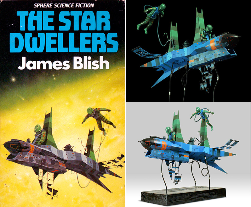

But the astounding level of detail of the final model is just the tip of the iceberg, so to speak. The duo also saw fit to meticulously document all of their steps from preliminary sketches to finished product online. When I say meticulous, I mean it—the project's archive of work goes back 24 pages on the site. Needless to say, they went above and beyond the efforts of the average hobbyist, homebrewing an unconventional production method to make some of the parts.
(more...)


 The design evolution, from sketch to the first-generation unit now being tested in the field.


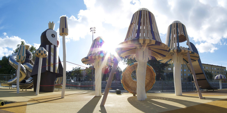 Kristine Slott Park in Stockholm
 Gulliver Park in Valencia, Spain


 Jeff Zelevansky/Getty images


 Left: Friedman's 1988 Fountain table for the Formica Corporation. Right: Friedman in front of his 1985 assemblage The Wall. Top image: Astral shelving and wall elements (left) and Friedman's apartment circa 1982
 Left: the Corona chair for Neotu (1991). Right: a Friedman collage for the Cultural Geometry show at Deitch Projects in 1988


