Quantcast
Channel: Core77
Viewing all 19151 articles
Browse latest View live

MeshFusion for MODO: The Best Design Software in a Decade?

$
0
0

MeshFusion-0.jpgMeshFusion-1.jpg

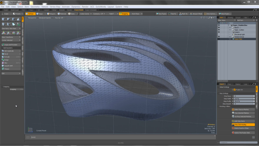
Every once in a blue moon, some piece of 3D software comes along and just makes one wonder "How'd I ever survive without it?" The Foundry's new plug in for MODO, MeshFusion, is what I'd consider to be the most amazing piece of software written in a decade. I know it's a bold statement to make, but for the designer in me, it's brought something to the table that no one else has quite put together so eloquently.

When it comes to 3D software, MODO is an amazing rendering, sculpting and animation design suite, featuring materials systems for renderings that work very much like Photoshop. It also runs native on Mac, PC, and Linux and, if nothing else, fits nicely anywhere into the design pipeline that's asked of it. I wouldn't even know where to begin when it comes to the list of features in Modo but let's start with just a few:

Tool Pipeline: Gives the ability to create your own tools based upon existing ones. No scripting needed, just pick and choose the features need and go. This offers an almost unlimited amount of combinations of functionality. This quick video showcases the capabilities.

Particles and Dynamics: Just scratching the surface on these opens up the possibility to help set up shots for renderings in a whole new way. Think of creating a table; add a flat surface above it and some curves above that. Now add the option for the table to be a Passive Rigid Body, the flat surface to be a Softbody and the curves to be an emitter... now let gravity take over. The flat surface falls and wraps around the table and the particles add rain all calculated in a matter of minutes. Now add textures and you're well on your way to rendering out an outdoor picnic scene.

Fall-offs and Action Centers: Think of the 2D gradient tool in Photoshop... now think of the possibilities of this in 3D. Throw in the ability to add in the Move/Scale/Rotation based upon what's selected and it's a field day for 3D design.

Rendering Booleans and Volumetrics: Creating that "Just in Time" photorealistic shot always requires some extra finessing that usually requires a work around. If nothing else this aspect of Modo just makes the creation of a product shot that much easier. The Render Boolean works by using geometry to cut away from geometry (think about a block of swiss cheese), that can be used in both renderings and animations. Volumetric can be used to add smoke, fog, clouds, in ways that use to take a ton of postproduction work in Photoshop, After Effects...etc.

MeshFusion-2.jpg

(more...)

Tonight at the Hand-Eye Supply Curiosity Club - Amanda Wall-Graf of HENO Shop

$
0
0

021114_Image_03.jpg

Core77's Hand-Eye Supply Curiosity Club is back for 2014. Tonight's exciting presentation is from furniture maker Amanda Wall-Graf of HENO Shop.

Tonight's talk starts at 6pm at the Hand-Eye Supply store in Portland, Oregon. Come early and check out our space or check in with us online for the live broadcast!

Amanda Wall-Graf
HENO: "The Power of the Hustle: Passion, Community and Creativity in a Town Where You're a Dime a Dozen"
Hand-Eye Supply
23 NW 4th Ave
Portland, Oregon 97209
Tuesday, Feb. 11th, 6pm PST

(more...)

Carla Diana, Emilie Baltz & Arone Dyer Let You to Have Your Ice Cream and Lickestrate It, Too - 'Taste Test' in NYC Tomorrow, February 12

$
0
0

CarlaIceCream-Lead.jpg

As if we already didn't have enough reasons to indulge in a bit of ice cream, a trio of designers/musicians have turned the crowd-pleasing treat into a musical performance. Carla Diana—smart object designer and author of the whimsical MakerBot book we reviewed and loved so much—has teamed up with food designer Emilie Baltz and musician Arone Dyer of Buke&Gase to create LICKESTRA, a sort of edible ensemble based on the consumption of conductive ice cream. Diana explains:

LICKESTRA plays with the experience from tongue to taste by presenting a series of conductive ice creams that trigger various baselines and tones when licked. Riffing on the "ice cream stand," guests are invited to stand inside a classic white pedestal and lick the ice cream that is presented to them. The result is a "4-piece band" that operates only by the licking of each guest.
(more...)

SCAD ID Students Rock Cintiqs

$
0
0

0scadidcintiq.jpg

Is it a commercial for SCAD's ID department, or a commercial for Wacom? We don't care; anytime you take us inside a school's industrial design department, we're all eyes and ears. (Advertisers please take note.) Here we get inside SCAD's Gulfstream Center for Industrial and Furniture Design, where the current generation of students has been graced with Cintiqs aplenty.

To you SCAD ID kids: As someone who clawed my way through an ID program carrying an ArtBin full of markers, pens, pencils, rulers, French curves and geometric templates, I officially hate you. Do you realize that if we wanted to do a rendering in, say, orange, we had to run out and buy markers in a half-dozen shades of orange? And that when you or the store ran out of orange, you were screwed? Enjoy your digital color pickers, you little...

(more...)

True I.D. Stories #19: The Accidental Designer, Part 1 - Shop to Hell

$
0
0

true-id-4.jpg

Editor: Here "Accidental Designer" tells us the epic tale of how he backed into a career in designing and building by discovering something no one else had. We won't tell you the name of our protagonist for now, as we don't want you to Google him yet and find out how the story ends. Just sit back, enjoy, and see how a man with no formal industrial design training launched into a career many of us would envy.


I knew that I'd screwed up, but knowing it didn't make it any better. I was made to stand up in front of the class, where thirty pairs of wide eyes all stared at me, afraid of what was going to come next, yet glad that it wasn't one of them up there.

You see, before I had any inclination that design was going to make me a success, and before I even learned how to design, I learned how to build. I read in a previous True I.D. Story that the designer learned how to build in his grandfather's woodshop as a kid. Well, I didn't have a kindly grandfather teaching me: Instead I had a hard-ass I'll call Mr. Barkington, who ran the Wood Shop class in my high school. And I thought he was a complete asshole.

Wood Shop was a mandatory class, and Mr. Barkington was quite the ball-buster. For our first assignment, we had to make a checkerboard—pretty basic, cut squares out of two different colors of wood, then put them together in an alternating pattern. Well, I forgot to account for the kerf, the thickness of the blade, when I cut my pieces up. Add up a 3/32" kerf across the entire board, and by the time I got it all together the damn thing was a couple inches too short on each side.

0TID19-001.jpg

Mr. Barkington called me out in front of the entire class. "Take a look, everybody," he said, "take a good look at what this fucking idiot did! Jesus Christ!" He held my board up so everyone could see. "Does that look right to you? Hey asshole, do you even know what a kerf is? Jesus, Saint Mary and Joseph!"

As you Millennials can probably tell, I went to high school a long time ago, back when it was perfectly acceptable for a teacher to say these kinds of things to a student. Today Mr. Barkington would probably have been fired, but back then, I dunno, I think we didn't take stuff so personal, or we learned to endure it for our own betterment. When he humiliated me in front of the class, sure, my cheeks were burning, but I didn't cry, or go tell the Principal (who wouldn't have given a shit) or go whine to my parents. And no, I didn't throw the checkerboard out; it became a cutting board for my mom.

0TID19-002.jpg

(more...)

Why Flappy Bird Was Canceled. Would You Do the Same?

$
0
0

0flappybirds.jpg

The urchin followed me down the street, cajoling. I was backpacking through Hanoi, and this poor kid living on the street had latched onto me with his broken English, claiming that no matter what it was I wanted, he could find it and sell it to me. In fact I'd been looking for a particular book written by Vietnamese writer Bao Ninh, and in those pre-Amazon days I asked the kid if he could find an English-language copy, as there were no bookstores I could see on Hang Bac Street. I was shocked when he returned with a faded copy of the book in an hour, and I gladly paid him the asking price: US $15.

I'd become friendly with Quang, the young Vietnamese manager of my hostel and showed him the book. Quang was surprised I wanted it and asked how much I paid for it. When I told him, he became incensed: "That book is $1.50, not $15," he said. He barked something to a cyclo driver outside and the two of them set off. Thirty minutes later they returned and pulled me out into the street, where a crowd had gathered.

Quang knew the urchin, had tracked him down, and bloodied his nose. I was horrified. Quang stood up on a box, cupped his hands to his face and began yelling an explanation in Vietnamese to the passersby, which caused more of them to stop and listen. The cyclo driver translated for me: Quang was telling everyone that this kid was a thief who had ripped off a visitor to their country. The crowd grew visibly disgusted and a small queue spontaneously formed. People—housewives, day laborers, people carrying stuff to the market—each took a turn approaching the urchin and unleashing a one-sentence verbal smackdown before departing. At the end, despite my protests, they forced the kid to apologize to me.

Coming from a then-high-crime neighborhood in Brooklyn, where my neighbor's apartment was robbed so thoroughly that they took the sheets off of her bed, this was astonishing to me. My limited experiences in Communist countries like Vietnam or Cuba has shown me that things weren't about the money there, because there was no money to be had. And when people are not motivated by profit, they instead adhere to whatever moral code they were raised under. Nowadays the economic structure is different in Vietnam than it was thirty years ago, and you can legally earn an American buck, as young game developer Dong Nguyen has done with his Flappy Bird app. So it probably seems shocking to us Americans that after raking in US $50,000 per day with his app—this in a country where most earn just US $2,000 per year—Nguyen shut the app down.

(more...)

Core77 Photo Gallery: Maison&Objet Paris 2014

$
0
0

MO-Paris-2014-Gallery.jpgPhotography by Brit Leissler for Core77

There has always been a big buzz about the Maison & Objet show, which happens twice a year in Paris—and, as of a couple of years ago, Asia, where the brand has expanded to include a large tradeshow in Singapore as well as various "road shows" in different Asian cities.

Whereas the September event in Paris coincides with the Paris Design Festival, the show in the end of January is a pure trade fair on its own, sans side events celebrating the more artsy end of the design world by investigating ideas and concepts. No, this is all about sales, no bones about it.

Unfortunately, I'd say that the majority of the objects on view was unimaginative, average product overload at best—and kitsch at worst. Happening upon a booth that was full of taxidermied animals, most of them dressed up and put into ridiculous poses, I was compelled, in a disgusted kind of way, to take a picture, and briefly considered compiling a truthful photo essay, reflecting an unfiltered version of the 'real' Maison&Objet. After all, as a designer you often hear that "your portfolio is only as good as the weakest project that you present in it." Does this not also apply to design shows?

But then I remembered the conceit of digging through the muck in order to find the truffles—in order to present the "best of Maison&Objet" to our readers. And so I did, the result being yet another photo gallery showing lots of "nice stuff."

What remains undocumented, though, is the halls full of tacky goods aimed at buyers who intend to decorate the interior of a five-star hotel in the Middle East or Russia (or worse, still, a private client in one of those locales). Nor can you feel the headache caused by getting lost in—and overexposed to—the smell of a hall full of fragrance products (how design is that!) due to the poor signage of the whole fair.

Which brings me to the point of user experience, which started with a press room where there wasn't even a working wifi connection... or even a free glass of tap water. In almost every hall, I stumbled at least once over some unmarked bumps, thick cables visually but not physically smoothed over by carpet, which makes me wonder about the percentage of visitors who break their ankles at Maison&Objet. Considering that this show charges every visitor €65 even if they stay only for a day, as well as the rather proud prices for exhibiting, I would have expected a higher general level of experience design.

But once a show is established, the organizers can justify their "laissez-faire" attitude towards these details, since they know they can get away with pretty much anything. But being a critical member of the design community, I do feel very strongly about pointing out the flaws of it all, instead of just tuning into the general praise anthems about Maison & Objet.

As you can see in the gallery, there was of course a great number of delightful design objects on show - but they should be seen as a "best of selection", rather than the standard. The overall experience of my visit is certainly not marked as "delightful" in my memory.

» View Maison&Objet 2014 Gallery


(more...)

Want to Shape the Future of Mercedes-Benz Cars? Here's Your Chance

$
0
0

Work for Mercedes-Benz!

It's not every day you get the opportunity to design and define the digital experience of such an iconic brand as this. The Mercedes-Benz Advanced User Experience Design studio in Silicon Valley is looking for a Senior UX Designer who will be responsible for shaping the form, function, and emotion their customers experience through the digital interfaces in their cars.

They are looking for a highly creative, visionary, and passionate designer who wants to design experiences that are built to stand the test of time. A minimum master's degree in interaction design, information design, visual communication, digital media design or a related field is required, along with an intellectual curiosity about social, cultural, and technological developments. Does this sound like you? Apply Now.

(more...)

Interaction14: The Languages of Interaction Design

$
0
0

1.jpg

What can Interaction Designers learn from other disciplines? At Interaction14, many speakers challenged the community to look at Art, Architecture, Industrial Design, Graphic Design and Animation as a lens for Interaction Design.

Gillian Crampton Smith, Head of the Interaction Design program at University of Venice, questioned if there is a language of interaction design. She shared the ways in which Art and Architecture have distinct languages that can be understood across many cultures. However, Interaction Design lacks the same universally understood common language. Smith mentions the word "design" as being problematic and shared examples of how it is translated and understood in other cultures and languages such as English, French and Italian. Smith discussed the functional limitations of interaction design and how humans interact with computers as proof that we still have a long way to go in defining the language of Interaction Design.

Antonio De Pasquale included this video in his presentation; more on that below

Scott McCloud shared the many ways in which visual storytelling is used and how we are narrative-seeking creatures. He talked about how people create meaning on the fly through visual stimuli. McCloud was very poetic in the way he schooled us on visual storytelling and talked about our medium not being paper and pencils, but instead the knowledge and expectation of our users. He challenged us to think outside of the box, or the screen in this case, and consider how we can guide a user through a story digitally in a non-linear way.

(more...)

Meet Your 2014 Core77 Design Awards Jury Captains, Part 2

$
0
0

C77DA-WonB.jpgJCAnnouncement2-Lead.jpg

The Earlybird Deadline may have come and gone, but that doesn't mean it's too late to get in on the Core77 Design Awards. We announced our first round of jury captains at the very beginning of this year and gave you a look into the professional backgrounds of seven of the people who will be judging your work. To add a little motivational fire to your creative process, we're introducing five more jury captains (with the final five to come). Read up—and take notes—on the jury captains for the Visual Communication, Social Impact, Writing & Commentary, Speculative and Service categories:

(more...)

Tune in to Made in Brunel's 24-Hour Design Challenge, Kicking Off Next Tuesday, February 18, at 6pm GMT

$
0
0

MadeinBrunel-unmelt.jpg

On February 18 at 6pm, Made in Brunel's 24-hour Design Challenge will begin. Over 150 design students will work on eight briefs from some of the most recognizable brands all over the world. This unique event has been organized to give people an insight into the design process of Brunel University's top design students as they develop concepts live on camera.

Never before has such a large group of students worked together in this way, providing them with the opportunity to directly show their abilities to potential employers. Working in small teams, briefs will be answered in just three hours; conceiving, developing and delivering their ideas under high pressure. In just one day, talented young designers will collaborate on a range of real-world briefs and we are really excited to see what our students can achieve.

To find out more visit the website, MadeinBrunel.com, and don't forget to tune in live next week!

(more...)

The Efficient Passenger Project vs. the MTA: Is Good Signage a Bad Idea?

$
0
0

0epp.jpg

I just came from a Dunkin' Donuts, where some idiot left their bag and an iPhone on top of it completely unattended. The iPhone was charging, plugged into an outlet in the wall near the pick-up queue, which was well away from the tables; and of the folks seated at the tables, no one was bothering to keep an eye on the bag, even as a steady line of strangers moved past it. That wouldn't have happened here 20 years ago, when living in then-high-crime NYC actually required street smarts and common sense.

Common sense also has its place while not just riding, but boarding the subway. Every native I know with a regular commute has learned which I-beam to stand next to when the train arrives, in order to hit door X of car Y, which perfectly places you by the desireable stairwell Z when you exit, speeding your commute. But now the anonymous person behind the Efficient Passenger Project, as they're calling it, is seeking to install signs that do all of that work for you. By tracking which areas of the platform will line you up with particular transfers and exits, the EPP seeks to "[facilitate] a faster, more enjoyable commute."

From a design standpoint, the EPP has kept the Helvetica, in an effort to make the signs look like the MTA commissioned them. Which they haven't; and in fact, as the EPP surreptitiously gets the signs up, the MTA is just as quickly taking them down. Why are they opposed? The MTA cites it will unbalance the trains, leading some cars with desireable areas to be stuffed while others go empty.

I myself think the signs are a dumb idea. Regular commuters should be smart enough to figure this stuff out for themselves, and as for the tourists riding the subway for the first time, are they really in a rush? They're not, judging by the way they slowly traipse down sidewalks and platforms four abreast, blocking the passage of people who actually have some place to go.

Part of what made NYC, NYC was that it was once a tough place to get by in. People here were survivors, and if they weren't clever, they got clever, or else they washed out and moved someplace else where they could actually cut it. In short, I think a coddled New Yorker is no New Yorker at all.

(P.S. Guess what, stop walking around with your mouth agape and your nose buried in your phone, and your phone won't get snatched.)

(more...)

Forget Passwords, Soon Your Heartbeat May Open Your E-mail

$
0
0

Bionym-Nymi.jpg

Forget passwords, your heartbeat can unlock your laptop, phone and even your car. Passwords are considered to be not as secure as some would like for them to be, and are often a total pain to recall, so many comapnies are trying to cash in on replacing them entirely. Authentication using fingerprints, iris scans, and facial features is the trending field in security. But one company is going deeper into identification and personalization by tapping our heartbeat.

Nymi, created by the Canadian company Bionym, is a wristband that confirms your identity through electrocardiogram (ECG) sensors that map your unique heartbeat. It translates that pattern to authenticate various devices, via Bluetooth, like smartphones and cars.

See their demo video here:

It was in the 1960s that scientists learned that our cardiac cycles are unique because the position, shape and size of each heart is different. (Fun fact that might disrupt Nymi's function: During pregnancy a woman's heart can move four inches.) But the unique pattern means that it can accurately identify you—and according to the CEO of Bionym, Karl Martin, is harder to fake than fingerprints, irises or facial features.

(more...)

Rinee Shah Puts 'Faces' to the Made-Up Words We Grew Up With

$
0
0

RineeShah-MadeUpWords-Screen1.jpg

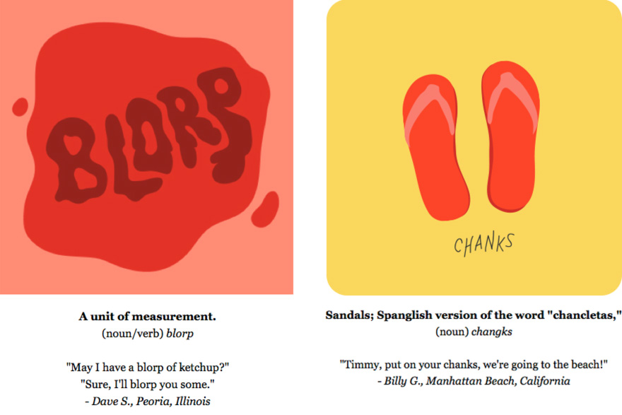
Every family has their own lingo that's only understood within the doors of their abode. Some of my fondest memories growing up involve fighting my younger brother over the dobber in an attempt to nix the constant stream of college football that graced our home's living room and the never-ending injury-inducing dobber tosses from my mom to my dad. After a few confused looks from visiting friends, I eventually realized that not everyone referred to their television's remote control like we did. In fact, we were probably the only ones in the world to call it a dobber—which made it that much more special. No one in my family knows where the term came from or when we started using it, but we never skipped a beat using it in conversation—and every time I make the trek back home, it slips right back into my vocabulary. Luckily for families like mine (and yours, I'd be willing to bet), San Francisco-based illustrator Rinee Shah is compiling a collection of niche neologisms and creating illustrations to go with their descriptions in a series called "The Made-Up Words Project."

RineeShah-MadeUpWords-Comp.jpg

(more...)

Styfall: Wild GoPro Footage That Has Nothing to Do with Extreme Sports

$
0
0

GoProPig-Lead.jpgA lost GoPro's unfortunate view for eight months

GoPro has done it before—survived a plane jump, that is. Now the gamechanging extreme-sports-cam can claim another feat of strength: Following a similar freefall, a GoPro has successfully endured months lost in the muck of a pig pen and the occasional curious chewing and gnawing from its porcine occupant—probably the last place the GoPro tossers expected it to end up. Mia Munselle of Cloverdale, California, found the camera on her property eight months after its crash landing. Take a look at the footage (and be glad it's from a GoPro and not one of these):

(more...)

Join the Entrepreneurial and Fast Moving Team at Brinkmann in Dallas, Texas

$
0
0

Work for Brinkmann!

The Brinkmann Corporation is one of the world's leading outdoor lifestyle companies that markets some of the most recognized products in hand held lighting, gas and charcoal grills and landscape lighting categories. As they continue to grow, they want to secure top designers that have a passion for innovation and cutting edge designs.

You must be able push the envelope of design innovation combining an understanding of current and emerging market trends as they relate to products, style, and color. IMPORTANTLY, knowledge of materials and processes including metals and plastics; exceptional conceptual and hand-sketching skills along with 3D CAD, (Solid Works is a must); the ability to handle multiple projects, are all a must. If you're ready to join this FAST MOVING company, Apply Now.

(more...)

Two Art Projects that Prove There's Still Hope in the Workday Commute

$
0
0

SubwayArt-Lead.jpg

For those of us who rely on the MTA to get to our day jobs, this morning is probably the worst of the worst, and commiserating with fellow straphangers on drafty platforms and sputtering trains is (literally) cold comfort as we collectively brave the blizzard that is pummelling the New York City this morning. We all have our commute rituals—reading the paper, listening to music entirely too loud, making small talk with the tourists, dodging bodies for a handhold; the list goes on. Let's face it, we're not at our best on public transportation.

Here are a couple of projects that transform that at-times dreaded daily routine into a creative exercise. Who knows, you may even be a part of their work without even knowing it.

SubwayArt-Cartoons.jpg

"How to Pass Time on the Train"

Joe Butcher, an illustrator based in the UK, may have the most productive (and creative) 35-minute trip to work out of all of us. For two years, Butcher has been turning the people around him into cartoon characters with Post-It notes and a few markers while sharing his creations via Twitter. From Mickey Mouse to The Incredible Hulk, it seems that anyone with their back to the artist is a potential candidate.

SubwayArt-CartoonComp4.jpg

I can imagine that the exaggerated faces of the cartoons aren't far off from the actual facial expressions of the subjects, which is probably my favorite part of this series. Check out the full collection of drawings here.

SubwayArt-CartoonComp3.jpg

(more...)

Building-Vs.-Weather Design Solution: The Schneestop for Snowy Roofs

$
0
0

0schneestops-001.jpg

Dude, you need some Schneestops

We wondered how our neighbors across the pond deal with roofborne snow and ice hazards, and Switzerland-based reader Christian put us on to Schneestops. Having been used in the Alpines for over 30 years, Schneestops ("snow stops") are a simple, clever, and retroactively-installable solution to prevent large chunks of ice or snow sliding off of your roof and harming whatever's beneath them. (Check out the wrecked Honda in our last entry on the subject.)

The idea behind Schneestops is pretty brilliant: Assuming your roof is built strongly enough to handle the weight of snow, as they are in the Alpines, and assuming your roof is watertight, as it should be, then it's better to actually hold the snow in place on top of your roof, like this:

0schneestops-002.JPG

Snow serves as an excellent insulator, so you might as well get a little extra R value from Mother Nature's wintry gift.

To that end, Schneestops are metal brackets with a right angle placed in the bottom end:

0schneestops-003.jpg

What happens is, when you space them out into a diamond grid on your roof...

0schneestops-004.jpg

(more...)

Design for Small Spaces: Desks with Storage

$
0
0

Geoffrey-Keating-Horace-desk.jpg

Many of you who have designed desks have done so in a studio. But as a professional organizer for nine years, I've been inside hundreds of people's homes and offices and have made this simple observation designers could benefit from: Not all end-users will have space next to their desks for file cabinets, credenzas, etc. Those customers may appreciate a desk designed to provide storage, so critical papers and tools can be kept close at hand. There are many ways to provide this storage, using traditional techniques or more unusual approaches. Here are a variety of designs for you to check out, with the scale swinging both ways on the style-vs.-utility balance, as per the designers' tastes.


Traditional: Desks with drawers

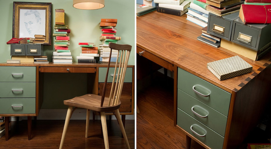
The photo above illustrates a great example of updating the style of a basic design. The standard way to provide storage is simply to have drawers—on one side, or on both. The Horace Desk from Geoffrey Keating provides this while adding a dash of retro, combining sheet-metal drawers with handsome hardwood. Also note the elegant dovetails not only on the drawer fronts, but in the surface of the desk itself, where you rarely see them. And don't forget that if you're putting drawers on both sides, you'll want to ensure there's enough leg space left so the customer doesn't feel cramped and uncomfortable. The drawers may be various sizes, and some customers will want at least one drawer which accommodates hanging file folders.

Colors-Cartesia-desk.jpg

For an example on how a basic idea like drawers can get re-thought, look at the Cartesia desk from Colors—where the drawers can open to the front or to the side. This allows you to access two adjacent drawers at once—an interesting feature, though this utility can really only be taken advantage of in offices of particular and minimalist layout; since you need room to pull out those side drawers, the design effectively kills the possibility of placing more furniture adjacent to the desk. Note that the bottom three panels front one deeper drawer, and there's a small drawer at the top rear that allows stored items to use the cable feed slot.


Traditional: Desks with matching pedestals

CBox-Doppio-Dieffebi-mobile-pedestal-under-desk.jpg

Some end users need to shift their workspaces throughout the day—for example, they might be sitting alone at their desks in the morning, then sitting side-by-side with a co-worker to collaborate on something in the afternoon. For situations like this, where more legroom is spontaneously needed, a mobile pedestal that fits under a drawer-less desk provides flexibility in how the storage is placed, but doesn't use all the under-desk space as well as built-in drawers do. The CBox Doppio from Dieffebi, designed by Gianmarco Blini, has a nice touch: the fitted cushion that allows the pedestal to serve as seating.

(more...)

Not Quite Robocop: Congolese Traffic-Bot Marks the Intersection of Technology and Public Safety

$
0
0

KinshasaRobot-HERO.jpgPhotos via Getty, which may or may not be working with Google on a 'special collection' of robot images

The jury's still out on the new remake of Robocop, which hit theaters yesterday, but it so happens that the stalwart police force of Kinshasa has had a couple of automata on duty for at least a few weeks now. The stationary 'bots have been installed in a busy intersection in the Democratic Republic of Congo's capital city as a pilot program to replace the all-too-fallible humans who take shifts directing traffic on the ostensibly chaotic streets of Africa's third-largest city.

KinshasaRobot-COMP.jpg

Designed by Isaie Therese of the Kinshasa Advanced Institute of Applied Techniques, the robots are essentially anthropomorphic semaphores (yeah, that term isn't catching on any time soon) that look something like cousins of Chinese DIYer Wu Yulu's homegrown mechas; in addition to the LED panels on each side of the solar-powered robots, they're also equipped with traffic cameras and have reportedly been more issuing tickets to scofflaws. Although the upshot is twofold—increased compliance and revenue for the local DOT—others note that the tradeoff is that a mechanized approach to law enforcement may not account for exceptions, i.e. first responders in case of an accident.

Francophones can learn more in this this video; "le vert" and "passé facilement" are easy enough, but unfortunately my French is not nearly good enough to understand what they're saying. Still, I was interested to hear the crossing-guard-o-tron's matter-of-fact baritone at 2:48 and again at 4:20, though it's not clear if they also pipe out muzak for pedestrians' dubious enjoyment.

KinshasaRobot-detail.jpg

(more...)
Viewing all 19151 articles
Browse latest View live


Latest Images