Quantcast
Channel: Core77
Viewing all 19136 articles
Browse latest View live

Core77 Design Awards 2014: The Best Interaction Designs of the Year

$
0
0

C77DA-WonB.jpgDARoundUps-InteractionLead2.jpg

Interaction design has increasingly been supplementing (if not outright supplanting) industrial design when it comes to many of the products that we use on a daily basis, and technology continues to promise new ways to interact with objects, both within and without ubiquitous touchscreens. The Internet of Things may not yet be evenly distributed, but the Interaction category of the Core77 Design Awards continues to celebrate not only what's new and next but also the experiments and breakthroughs of the future made real.

Even so, the content itself is often familiar—if not outright commonplace—which only underscores how new modes of interactions have the potential to reinvent age-old experiences such as socializing, storytelling and wayfinding. Led by Jury Captain Aaron Siegel of Fabrica, the jury selected these projects and products—over a dozen in all—for top honors in the Interaction category of the 2014 Core77 Design Awards.


DARoundUps-SadlyByYourSide.jpg

Professional Winner: Sadly By Your Side, by Angelo Semeraro and Davide Cairo

Turn your iPhone into a visual and musical remixing tool with Angelo Semeraro and Davide Cairo's Sadly By Your Side. Bring each song in the 8-track album to life by using the app in conjunction with the imagery in the accompanying booklet, or by 'scanning' the real world. By deeply integrating disparate media—an album, book and iOS app—the project easily stood out to the jury: "Sadly by Your Side captivated us visually and emotionally. It explored an interaction paradigm that was new to most people, and it bridged a number of disciplines and mediums while also rethinking how we experience music, causing the user to become a part of the composition process."

» Learn more about Sadly By Your Side


DARoundUps-Inform.jpg

Student Winner: inFORM: A Dynamic Shape Display, by Tangible Media Group

MIT Media Lab's Tangible Media Group turned heads with their Dynamic Shape Display, and for good reason. The device turns digital data into virtual objects that can be manipulated in real life, allowing users to play with things that aren't actually there. "The integration of telepresent characteristics helps bridge the virtual divide with the additional fidelity of experience through haptic feedback," says the jury. "While we would love to see this scaled, we thought that even this prototype demonstration was extremely compelling and the fact that it got us talking for a lengthy amount of time about its different applications in the world very much pointed to its worthiness."

» Learn more about inFORM: A Dynamic Shape Display


(more...)

Tonight at Curiosity Club: Kate Bingaman-Burt "8 Days A Week"

$
0
0

bingburt1.jpg

Tonight's Curiosity Club is "8 Days A Week" with the prolific Kate Bingaman-Burt, illustrator, educator and all-round creative badass. As she puts it: Kate will involve colorful visuals, excitement about personal projects (both hers and others), her path from wanting to be a morning TV personality (watch out Kathie Lee) to teaching (it was an accident, I swear) to drawing every day (my hand is cramping as I type this). Also, she has a problem with slipping from third person to first person while writing (I am so sorry). Also, she usually gives away stuff at her talks (Will the TSA confiscate a t-shirt cannon? What if it shot confetti? Hmmm...how about hot dogs? I love hot dogs). Bring your own ketchup and mustard. I look forward to seeing you all.

Come by Hand-Eye Supply at 6pm PT, or tune in as we stream live.

bingburt2.jpg

bingburt3.jpg

About Kate Bingaman-Burt

Kate makes piles of work about the things that we BUY (and want) and the emotions attached to our STUFF. She also happily think and draw for good people and companies. She has been making work about consumption since 2002, teaching since 2004 and drawing until her hand cramps since 2006 (ouch).Along with being an educator and illustrator, she organize events, installations, workshops and she probably talks a bit too much.

Her first book, Obsessive Consumption: What Did You Buy Today? was published by Princeton Architectural Press in 2010. Since then, she has collaborated with them to produce two more titles about documentation and consumption in 2012 and 2014. Her design clients include Chipotle, Hallmark, IDEO, VH1, Girl Scouts of America, Madewell and the Gap as well as locally loved institutions like the Museum of Contemporary Craft, Reading Frenzy and Know Your City. She am also actively involved in the organization of Design Week Portland.

Kate is an Associate Professor of Graphic Design at Portland State University. In 2013, she was the recipient of the 2013 College of the Arts Kamelia Massih Outstanding Faculty Prize as well as a TEDXPortland Speaker. She is the faculty advisor for the PSU.GD student design group Friends of Graphic Design (FoGD) and the in-house student design studio A+D Projects. She also coordinates the weekly Show & Tell Lecture Series. For her, teaching and making go hand in hand. Without one, the other wouldn't exist.

(more...)

Oregon Manifest 2014: Industry on Working with Ti Cycles and Immersing Yourself in Portland

$
0
0

OM2014-Industry_Ti-Logo.jpgOM2014-Industry_Ti-1.jpg

This weekend saw the unveiling of the collaborative bicycle designs that are going head to head in the third edition of the Oregon Manifest, in which five teams in as many cities set out to create and craft the best urban utility bike. As of Monday morning, the public is invited to vote on their favorite one, which may well be produced by Fuji Bikes in the near future. We are pleased to present exclusive Q&As with each team so they have a chance to explain why their bicycle is the best before the voting period closes this Sunday, August 3.

Yesterday, we heard from NYC's Pensa × Horse Cycles. Here's the story behind Industry× Ti Cycles's "SOLID," representing Portland, Ore.

Core77: Did you and Ti Cycles know (or know of) each other before the collaboration? What was the matchmaking process like?

Garett Stenson (Industry): We knew of Ti Cycles' reputation, their 25 years of experience, and expertise in bike craftsmanship. They are experts in metal, most notably, pushing the boundaries of titanium. The matchmaking and selection process for us was about close collaboration—is our builder willing to change the game, redefine the category, and truly make things better?

By its nature, the design/fabrication relationship for this collaboration is far more intimate than your average designer's relationship with a contractor or manufacturer. To what degree did you educate each other on your respective areas of expertise?

To disrupt any category you need friction. Innovation hurts—tension is an important part of the process. We believe the best idea needs to be stress tested and the process, iterative. Bringing together Ti Cycles' craftsman mentality with INDUSTRY's modern and agile approach was the perfect marriage. We aligned on pushing the boundaries early on, yet respected each other's expertise. At the end of the day, it was about creating a meaningful (and winning) result—together.

(more...)

Todd St. John on Hiring Good People, Getting Sawdust in the Computers, and Striving to Make Designs That Seem Inevitable

$
0
0

ToddStJohn-HunterGatherer-1.jpg

This is the latest installment of our Core77 Questionnaire. Previously, we talked to IKEA creative director Mia Lundström.

Name: Todd St. John

Occupation: Designer/illustrator/animator. Founder of HunterGatherer.

Location: Brooklyn

Current projects: We are doing some ongoing work with Pilgrim, which is a surf shop in Brooklyn run by a friend. We just finished up some animation for AM Labs, which is a cleaning-product company based in Denmark. And we're working on our own product designs.

Mission: Striving to make designs that seem inevitable

ToddStJohn-HunterGatherer-2a.jpgFrom Photo-Graphics, an ongoing series of cameras rendered in wood

ToddStJohn-HunterGatherer-3.jpgCover images for a Money Mark LP and the New York Times Magazine

When did you decide that you wanted to be a designer? When I was younger I was interested in too many things. At some point in school, when I understood what design could encompass, it really appealed to me. Since it was so expansive, you could do quite a number of things and still call them "design."

Education: My degree is in graphic design, from the University of Arizona. Later I taught a design class for 10 years in Yale's graduate program, and I feel like I learned quite a bit from the faculty and students there. I also absorbed a lot about woodworking and engineering from my father.

First design job: In school, my first "design" internship was in Hawaii, where I grew up. I worked for a small agency, doing illustrations for a local ice cream shop and coffee packaging and things like that. Out of school, it was for a small firm in San Diego, doing identities and packaging.

Who is your design hero? The answer to that question changes. But I recently read a Jim Henson biography, and I've always thought really highly of him and how he combined communication and fun and visual innovation in ways that do great things for the world.

ToddStJohn-HunterGatherer-4.jpgInside HunterGatherer's studio in Brooklyn

(more...)

Onboard Storage Design: Why Vikings Never Fought For Overhead Bin Space

$
0
0

0vikingchest-001.jpg

Vikings loved to brawl, with both their enemies and with each other. Viking sagas are filled with tales of even longstanding friends happy to settle disagreements with steel. But as they piled onto their longships to go pillaging, their boarding process was a good deal more civilized than the melee that is modern air travel. For one thing, their storage was one-to-one; when 30 Vikings got onto a ship, there were 30 places to store things.

VikingChest-02.jpg

That's because they carried their seating on board with them, and their seating doubled as their storage. Prior to boarding, the decks of a ship were bare. Each Viking plunked his chest down at his own rowing position.

0vikingchest-003.jpg

Enough Viking chests have been found, and replicas made, that we can take a look at their design. It's both intelligent and purposeful. The first thing you notice is that the tops were rounded to shed water, and perhaps to provide a modicum of comfort.

(more...)

Ready to Be Part of What's Next? Join 3M as a Graphic Designer in Maplewood, Minnesota

$
0
0

Work for 3M!

3M captures the spark of new ideas and transforms them into thousands of ingenious products. As a 3Mer, you'll have opportunities to make a substantial impact, fueled by competitive pay, comprehensive quality benefits and recognition of your achievements. They are currently looking for an enthusiastic Graphic Designer to join their Global Design Lab who will develop, create and execute upon concepts and visual ideas for product, packaging, and various communication vehicles.

With a bachelor's degree in graphic design and at least 3 years of experience, you'll possess exceptional attention to detail in graphics, layout, and typography, demonstrated flexibility in multiple task assignments while maintaining a high level of accuracy and a knack for translating business objectives into creative solutions. If this sounds like you and you want to be a part of what's next, Apply Now.

(more...)

Core77 Design Awards 2014: The Best DIY Designs of the Year

$
0
0

C77DA-Banner.jpgDA2014-DIY.jpg

There's something singularly rewarding—magical, even— about sketching an idea, taking stock of materials on hand, crunching numbers on backs of envelopes, and then actually making it into a real thing... which is why we're always excited to see the projects in the DIY category of the Core77 Design Awards. And while many of the honorees seen here can be reproduced, with a bit of time and effort, by any maker out there, Awards duly recognize the folks who came up with them in the first place. Moreover, these projects are fun—which, as well all know, is as one of the most important aspects of DIY culture.

Led by Ayah Bdeir of littleBits, the jury team selected eight projects, which they felt best manifested the vitality and enthusiasm of the DIY community, for top honors this year.


DARoundUps-NeoLucida.jpg

Winner: NeoLucida, by Pablo Garcia and Golan Levin

Inspired by the 19th century Camera Lucida, NeoLucida is a drawing aid that helps artists reproduce subjects by tracing a superimposed image from a prism. The jury was most impressed with Pablo Garcia and Golan Levin's ability to update a historic tool into a modern and functional device: "There is something beautiful about art that allows other people to make art. It takes an old technology that is obsolete, revitalizes it and makes it open and accessible to people everywhere to make for themselves."

» Learn more about Neolucida


DA2014-DIY-Tri.jpg

Runner Up: Tri-Horse, by Brian Campbell

On a search for stability, woodworker Brian Campbell designed a three-point sawhorse design fro Fine Homebuilding Magazine that faired much better than the quadruped designs out there. Tri-Horse is made completely from plywood and serves a myriad of purposes—from miter saw and table saw stands to a general catch-all station for your portable workspace. The jury appreciated the way the design encourages DIY spirit: "The Tri-Horse takes a very common tool whose flaws we have come to accept and re-engineers it in a simple but effective way. Like the Neolucida, we like tools that empower people to make their own DIY objects."

» Learn more about Tri-Horse


(more...)

An Ingenious Little Plastic Gizmo that Makes Up for an Apple Design Flaw

$
0
0

0jimiusbext-001.jpg

I'm a heavy Apple user and I love their products, but I'm bewildered by some of their design decisions. The one that drives me the most nuts is that my Thunderbolt Display's USB ports are on the back. As someone who is frequently connecting and disconnecting things, this gets super-annoying.

So I was excited when I saw this little gizmo by BlueLounge, the Jimi USB extension:

(more...)

Oregon Manifest 2014: Huge on Collaborating with 4130 Cycle Works and Designing a Commuter That Can Handle Trails in San Francisco

$
0
0

OM2014-Huge_4130-Logo.jpgOM2014-Huge_4130-1.jpg

This weekend saw the unveiling of the collaborative bicycle designs that are going head to head in the third edition of the Oregon Manifest, in which five teams in as many cities set out to create and craft the best urban utility bike. As of Monday morning, the public is invited to vote on their favorite one, which may well be produced by Fuji Bikes in the near future. We are pleased to present exclusive Q&As with each team so they have a chance to explain why their bicycle is the best before the voting period closes this Sunday, August 3.

Yesterday, we spoke to Industry × Ti Cycles of Portland; today, we've got San Francisco's own HUGE Design× 4130 Cycle Works on EVO.

Core77: Did you and the team at 4130 know (or know of) each other before the collaboration? What was the matchmaking process like?

Chris Harsacky (Huge): We didn't know of 4130 but after interviewing several builders we knew he was a great fit. Tom's background in product development made for an easy collaboration. He was also the builder that seemed most open to doing things different. From the outset, we knew our concept would be a departure from traditional frame design.

By its nature, the design-fabrication relationship for this collaboration is far more intimate than your average designer's relationship with a contractor or manufacturer. To what degree did you educate each other on your respective areas of expertise? Has the collaboration yielded broader lessons?

It was certainly different from other partnerships. The very first meeting was more like a Q&A. Tom is a trained industrial designer so it made it a lot easier. The two major areas where we needed educated on were bike geometry and fabrication techniques/ materials. While we set out define a fresh gesture with new functionality, we wanted to make sure we were following acceptable ride geometry and using practical build techniques.

Transitioning into fabrication was pretty fluid actually. We had a CAD database that we based the build on. Things fell in place remarkably well. The hardest part was trying gauge how much time it would take to finalize the final bike. Its basically and appearance model that needs to function like a production unit.

(more...)

The TSA Wants You-- To Design a Solution to Our Collective Airport Security Woes (For a Chance to Win to $5K of Prize Money)

$
0
0

TSA-Seinfeld.jpg

The airport security line is the kind of universally despised ordeal that extraterrestrials, should they exist, would dread; even a seasoned traveler will bristle at the thought of the rigmarole of boarding pass / I.D., uncooperative scanners, doffing footwear, unwieldy bins, more scanners. At best, it's a mildly demeaning nuisance, but what are you going to do about it?

Well, it turns out that the TSA wants to know—they recently announced an Ideation Challenge soliciting proposals for expediting the process, specifically for TSA Pre✓ passengers but ostensibly for us plebs as well. "America's Next Generation Checkpoint Queue Design Model" may not roll off the tongue, but, hey, that's what we're up against (...and, as we saw a couple of weeks ago, this is what the TSA is up against).

TSA is looking for the Next Generation Checkpoint Queue Design Model to apply a scientific and simulation modeling approach to meet the dynamic security screening environment. The new queue design should include, but not limited to the following queue lanes:
· TSA Pre✓™
· Standard
· Premier Passengers (1st class, business class, frequent fliers, etc.)
· Employee and Flight Crews
· PWD (wheelchair access)
The Challenge is to provide a simulation modeling concept that can form the basis to plan, develop requirements, and design a queue appropriately. The concept will be used to develop a model to be applied in decision analysis and to take in considerations of site specific requirements, peak and non-peak hours, flight schedules and TSA staffing schedules. Solvers are expected to provide the concept and provide evidence that it works as described in the requirements.

As in the MTA's 2012 "App Quest" competition, the Transportation Security Authority is offering a total of $15,000 as, um, Innocentive. (I know it's a portmanteau of 'innovation' and 'incentive,' but I can't help but read it as 'innocent'—see also Rapiscan; cf. Dr. Tobias Funke's business cards.)

TSA-wide.jpg

(more...)

Martha Stewart Loves Drones

$
0
0

0marthastewertdroning-001.jpg

If you asked me a year ago which famous persons are advocates of drones, homemaking maven Martha Stewart would not have topped that list. But after receiving a camera-outfitted drone for her birthday last year, she became enamored of it while flying it around a New England beach and observing the vantages from her iPad. Pronouncing herself "hooked," she continued using the drone to capture subsequent parties, nature hikes and outings.

Earlier this year, a member of Stewart's security team purchased a similar drone, and was given permission to learn to fly the thing over Stewart's expansive Bedford, New York farm property. Stewart became so enchanted with the subsequent photos that she posted an entry on her blog entitled "Amazing Aerial Photos of My Farm."

With captions like the following...

0marthastewertdroning-002.jpg

This beautiful aerial shot of my home, which I call the Winter house (center), includes the flower room, carport and studio in the one long structure to the left, the Summer house to the far right, one of the horse paddocks and my beautiful peony garden in full bloom below.

...it's easy to see why media outlets, perhaps unfairly, began to skewer her. Even before the blog entry was released, Vanity Fair caught wind of her new kick and allowed her to explain her drone attraction before giving her a gentle ribbing:

[As Stewart explains,] "You can control the altitude, you can control the speed, you can control where it's going. It's easy to use, actually. You can really control it, it's gentle. It's lightweight, too; it's very beautiful."
Have the neighbors called the authorities, reporting a U.F.O.? "No. I don't have any neighbors," she said, laughing.

The latter statement, of course, is in reference to the fact that yeah, a 153-acre farm doesn't subject you to a lot of Joneses peering over your fence.

0marthastewertdroning-005.jpg

(more...)

Core77 Design Awards Spotlight: SOAK Charging Side Table

$
0
0

C77DA-Banner.jpgC77DASpotlight-ChargingTableTop.jpg

Ever more powerful portable devices increasingly enable our always on-the-go lifestyles, yet even the fastest microprocessor needs a power supply, and we find ourselves tethered to outlets in moments of repose, and (mis)managing the wires, cables and cords that serve as veritable lifelines for our power-hungry handhelds. It should come as no surprise that the backup battery industry is booming, but what about the way we reboot at home?

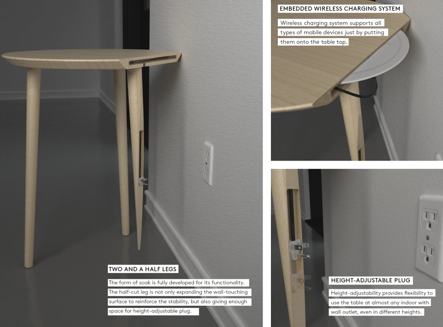
Instead of attempting to achieve invisibility through reduction, Youmin Vincent Kim has seen fit to hide a charger in plain sight. Jury captain Naihan Li and her team recognized the Korean designer's SOAK Charging Side Table as the winner of the Furniture & Lighting category of the 2014 Core77 Design Awards.

Like many of us, Kim was frustrated by ad hoc solutions. "When I see designers try to combine furniture with technological devices—like cords hanging from the center of a work conference table—it ceases to look like furniture to me, or at least it's not something you would want in your home," Kim says. "It's messy and unconstructed." The only thing that betrays SOAK's embedded functionality is its proximity to an outlet, which peeks out from a half-leg that appears to be melting into the wall.

C77DASpotlight-ChargingTableLead.jpg

It's not just for show: the back leg conceals a power cord, which is connected to a wireless charging plate embedded in the tabletop. Although the plug itself fits neatly into the hollowed-out dummy leg, a short length of cord offers the flexibility to accommodate different outlet heights. Similarly, Kim is also considering international standards. "There are several types and sizes of electrical outlets depending on what country users live in. I have been working on making the plug universal so that it will work anywhere."

C77DASpotlight-ChargingTableBreakdown.jpg

(more...)

A New Wearable Battery: More Flexible and Durable than Anything Else

$
0
0

0PHOTO1_ImprintEnergy.JPG

0PHOTO3_wearables.jpg

There are at least two big challenges with creating wearable technology. The first is to actually design something that people will want to buy and use, and the second is to keep the device in juice. Here we're going to look at the second.

The battery design and function of a wearable device is anything but trivial. We need to develop batteries that are flexible, thin, long-lasting and durable...a huge set of requirements that is very difficult to achieve. But one startup, Imprint Energy, thinks it's got a leg up with a printable, durable battery.

(more...)

"Driving Dreams" Documentary Seeks to Highlight Unsung Heroes of Italian Automotive Design

$
0
0

0drivingdreams.jpg

Up above you see snippets of exotic cars. What you don't see are the faces of the Italian men, now in their 70s and 80s, who designed them. "Almost everything we know about cars, we conclude unconsciously from [the] silhouette, face, details," writes Gianluca Migliarotti. "Isn't [it] strange that people who shaped our dreams through design [remain] virtually unknown?"

Filmmaker Migliarotti and automotive historian Daniel Tomicic are trying to rectify that with Driving Dreams, their documentary focusing on the second golden era of car design—the one that came not from America, but from Italy. In addition to looking at the big dogs like Giorgetto Giugiaro and Marcello Gandini, the DD team seeks to lens lesser-known but influential designers like Tom Tjaarda (who designed the DeTomaso Pantera), Aldo Brovarone (Ferrari Dino Berlinetta Speciale), Paolo Martin (Ferrari Modulo) and others. Here's the trailer:

Like what you see? Then help fund it--the team is running an IndieGogo campaign to finance the doc here.

(more...)

Oregon Manifest 2014: Teague on Working with Sizemore Bicycle and Rethinking the Seattle Commute

$
0
0

OM2014-Teague_Sizemore-Logo.jpgOM2014-Teague_Sizemore-1.jpg

This weekend saw the unveiling of the collaborative bicycle designs that are going head to head in the third edition of the Oregon Manifest, in which five teams in as many cities set out to create and craft the best urban utility bike. As of Monday morning, the public is invited to vote on their favorite one, which may well be produced by Fuji Bikes in the near future. We are pleased to present exclusive Q&As with each team so they have a chance to explain why their bicycle is the best before the voting period closes this Sunday, August 3.

Yesterday, we spoke to San Francisco's HUGE × 4130 Cycle Works; here's a few words from TEAGUE× Sizemore.

Did you and Sizemore know (or know of) each other before the collaboration? What was the matchmaking process like?

Roger Jackson (Creative Director, TEAGUE): Oregon Manifest did a great job pairing us with two incredible potential bike partners; we visited and spent time with both of them at their workshops. That alone was a privilege. To see true craftsmanship in the flesh, both makers had their own unique style and preferences for bike building. But this project was going to be a longterm engagement (nine months), so it was important that there was the ability to meet up regularly and a shared vision for what we wanted to achieve. Taylor Sizemore was a natural fit for our team, but was also excited to go beyond his own comfort level with the build, which excited us.

By its very nature, the design-fabrication relationship for this collaboration is far more intimate than your average designer's relationship with a contractor or manufacturer. To what degree did you educate each other on your respective areas of expertise? Has the collaboration yielded broader lessons?

Intimate is right! Taylor is now part of the TEAGUE family! We've been fortunate with just how much time and energy he's put into this endeavor. From the first brainstorm, he was there, sparing and inspiring us. As for the education, he was fascinated with just how quickly we could get into 3D CAD and spit out prototypes on our 3D printers. I would also say from a technology stand point, being able to quickly mock-up and test lighting and haptic feedback concepts using arduinos, was also something we offered Taylor. As for us, the advantage of Taylor building custom bikes is that he knows exactly what works and what doesn't from an ergonomic standpoint. Something that may look cool or unique could negatively impact the ride comfort and quality. It was truly a mutual learning experience.

(more...)

Core77 Design Awards 2014: The Best Furniture & Lighting Designs of the Year

$
0
0

C77DA-WonB.jpgDARoundUps-FurnitureLead2.jpg

When you think about it, the basic forms of quintessential articles of furniture—I'm talking desks, chairs, couches, stools, work lamps and pendant fixtures—largely consist of variations on a theme. As such, furniture designers innovate through the details from new manufacturing methods and materials to integrating functionality that speaks to our mobile, tech-enhanced lifestyles. This much is apparent in seing the honorees for the Furniture & Lighting category of the 2014 Core77 Design Awards.
While the selections from Jury Captain Naihan Li and her Beijing-based jury team may look familiar at first glance, closer inspection reveals that each one is customized to fit a certain lifestyle-driven need.


DARoundUps-Gesture.jpg

Professional Winner: Gesture, by Steelcase Design and Glen Oliver Loew

As more and more of us spend more and more time basking in the warm glow of a screen, so too do we spend more time in our office chairs. With these digital tendencies in mind, Glen Oliver Loew designed Gesture for Steelcase (with help from its internal design team). The jury appreciated the chair's origin as a research project: "This project began as a global study on human body gesture and resulted in a stylish chair that will not only carry you comfortably in a work environment, but support you in every move you make while seated. Furniture design can be as advanced as any new technology we use today and an advance in office chair design has the potential to benefit thousands as our lifestyles evolve. By providing a more dynamic support to the body, this chair attempts to encourage movement while we interact with the handheld digital devices we love."

» Learn more about Gesture


DARoundUpds-Soak.jpg

Student Winner: SOAK Charging Side Table, by Youmin Vincent Kim

Recently graduated from the Youmin Vincent Kim's SOAK charging station redefines the humble side table as a 'platform' for mobile devices. Furthermore, the Art Center College of Design student cleverly managed to tuck the power supply for the induction charging surface into its very construction: "The leg emerging from the wall to accommodate the main power plug is an artistic solution to the inelegance of wired products. Our daily need to repeatedly charge our digital devices can now be achieved casually by leaving them on a side table—a thoughtful and functional object design that surprises you by the advanced technology embodied within a playful yet elegant form."

» Learn more about SOAK Charging Side Table


DARoundUps-Lightwing.jpg

Professional Runner Up: Lightwing, by Jean Marie Massaud

Lightwing brings a new level of interaction to the way we illuminate our spaces while remaining relatively inconspicuous. Designed by Jean Marie Massaud for Foscarini, the lamp features adjustable screens, allowing the user to cast a glow wherever it's most needed. The jury noted the artistic aesthetic of the lamp: "Minimalist and elegant, this is a delicate and fluid lighting design. The history of elegance can only be enhanced by new technology, which is the case here where a clever magnetic sphere provides fluid, multi-directional movement as the light transforms from an ambient light to a reading lamp. It utilizes a new LED lighting system and technically advanced industrial production to make a bold and artistic statement in its form and in the interactive nature of the motion the lamp achieves."

» Learn more about Lightwing


DARoundUps-DynamikDesk.jpg

Student Runner Up: Dynamik Standing Desk, by Brian Pughe and Conor Brown

Virginia Tech's Brian Pughe and Conor Brown have developed an interesting take on a contemporary trend with the Dynamik Standing Desk. Made from steel and wood, the desk has a sleek appeal for users of all stripes, but it's the the strap of felt that serves as a knee rest that wowed the jury: "Clever usage of something as economical as a belt makes this desk design more than a place to lay your books. It is a simple yet effective solution to rest in public space, allowing one to fully engage with others even if the interaction will last longer than your legs can hold out. This standing desk also gives new function to an existing furniture type with minimum alteration.

» Learn more about Dynamik Standing Desk


(more...)

Does No One Else Find This Ridiculous?

$
0
0

KitBike-COMP.jpg

Bike Grouch Alert: So it's come to this.

That there is Lucid Design's "Kit Bike," which, like an IKEA shelving unit, can be assembled and disassembled into 21 parts for ease of transport. I didn't mind Paolo de Giusti's asymmetrical concept bike and I can appreciate the over-the-top hipster chic of Van Hulsteijns, but this is exactly the kind of thing that the general public will eat up with nary a thought about whether it would actually work. After all, it turned up in a couple of reputable design blogs, one of which notes that:

The bike frame is made from hollow aluminum tubes that twist together and can be secured with a key. Since the frame attaches only on one side of the wheels, the bike can be assembled and disassembled while it leans against a wall. When it's not in use, the parts and wheels can each be stowed in sections in a custom-designed bag.

Sounds too good to be true, right? Well, that's because it is.

Don't get me wrong—I personally would love to have a bicycle that I could snap together like a tent (a well-designed one, of course), but then again, I don't know if I would trust the contraption to hold up on the road. I'm no engineer, but the very thought of applying torque to that rear wheel—note that the hub is connected only at a single, non-driveside dropout—makes me feel like I'm breaking something. Meanwhile, if the grossly oversimplified componentry and lack of brakes can be written off, the fact that the drivetrain is on the wrong side suggests that the Bangalore, India-based firm lacks a basic understanding of a bicycle in itself.

(more...)

Designing for Drivers: Organizing the Car

$
0
0

Handstands-StickyPad.jpg

As a professional organizer, I've helped people organize their homes and offices—and their cars. One challenge drivers have is finding a good place to keep things like smart phones and sunglasses close at hand. (Hopefully, no one is texting while driving, but there are other reasons to keep a smart phone nearby; I need mine to hear my turn-by-turn driving instructions.)

Here's one solution to that challenge: The StickyPad from HandStands is one of several non-adhesive, non-magnetic pads that goes on a dashboard. There's an interesting balance here—the pad should be sticky enough to hold items even when the car is taking a sharp curve or coming to a sudden stop, but not so sticky that it's hard to remove items when the end-user wants to. And here's one drawback: Unless the end-user moves the pad around, the part of the dashboard covered by the pad won't fade uniformly with the rest.

Renault-Twingo-grass-mat2.jpg

An alternative dashboard design is the "grass mat" that came with the Renault Twingo II. It seems like a cool idea—but at least one reviewer, Ivo Kroone, said the grass mat was better in theory than in practice. Kroone found it "annoying trying to fish small objects out from amongst the stalks." And it seems that larger items didn't fit well, since Kroone left them just "sitting on top." The positioning behind the steering wheel was also problematic for Kroone.

Cocoon-Grid-It-car-sun-visor-organizer.jpg

Another way to keep things close at hand is to make use of the sun visor. We've praised the Cocoon Grid-It products before, but the sun visor organizer is worth some additional attention. The Grid-It can hold a wide range of items; the one complaint I've seen is that the Velcro straps are not long enough to go around a large sun visor.

Vertically-Driven-visor-notes.jpg

Sun visors have other potential uses, too. The Visor Notes from Vertically Driven provides a white board for any information a user wants to see or note, when stopped. There's a holder for the dry erase pen, and the cap of the pen holds an eraser. This product uses clips to attach to the visor, rather than the straps that many visor-mounted products use—and unlike many other products, it flips up so the vanity mirror is still accessible.

(more...)

Tonight: It's the Hand-Eye Supply Summer Quarterly Party!

$
0
0

Summer-Quarterly-c77.jpg

Hey Portland people, it's that time again. The Summer Quarterly is here and we couldn't have done it without help. While we rounded up awesome stuff for summer, cool creatives from all over sent in sweet selfies with their tools and gear, and we can't wait to share their style!

Drop by the new and beginning-to-be-improved Hand-Eye Supply garage at 714 NW Glisan, pick up a free people-populated poster and we'll announce the winners of our All Geared Up photo contest! Then eat some unbeatable treats from Pacific Pie co., and rub elbows with the great minds of the HES set. Come tell us about your projects and dreams while we dig on grooves from DJs The Beatles and Tobias, spinning "your uncle's records" and weird classics from multiple decades.

Come for the poster, tunes and food, stay for the incomparable company!

6-9pm TONIGHT
714 NW Glisan
Portland, Oregon

(more...)

Company Invents Shotgun Suppressor and a Strange Superhero

$
0
0

0shotgunsilencer.jpg

I've got a friend from Alabama who told me that growing up, most families she knew kept shotguns in the house. When you heard a noise in the middle of the night, the shotgun was the go-to item, and she explained that the CHIK-CHIK sound of "racking" it carried across the porch and was enough to discourage the casual burglar.

Another sound shotguns make is the actual blast, and I'm told it's deafening. Twelve-gauges reportedly top out around 150 to 165 decibels, and inside a house, where there are walls to bounce the sound around in, likely more. That's enough to cause permanent hearing damage. "Shotgun owners have been without a real solution for ear protection," says a Utah-based company called SilencerCo. "Some choose hearing preservation in the form of earmuffs or plugs for relief in controlled environments, but spurn their use in the field or in a home protection scenario, where the ability to detect other sounds is critical."

With that in mind the company has invented the Salvo 12, "the first and only commercially-viable shotgun suppressor on earth." Interestingly enough it's modular, made up of little Lego-like sections of roughly two inches in length that the user can add or subtract to hit their preferred balance of length, weight and noise level.

The noise reduction is pretty nuts:

(more...)
Viewing all 19136 articles
Browse latest View live


Latest Images