Quantcast
Channel: Core77
Viewing all 19147 articles
Browse latest View live

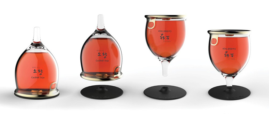
'Bottlass' Beverage Packaging Concept Looks Cool, Probably Wouldn't Work

$
0
0

0bottlass-001.jpg

Here's one of those design concepts sure to make the blog rounds, even though it's more neat-looking than practical. The "Bottlass"—meant to be a portmanteau of "bottle" and "glass," but perhaps they ought have gone with the less titillating "Glottle"—in essence turns beverage packaging design on its head. The idea is that a glass container shaped like an inverted wine glass, minus the base, is sealed and shipped with an aluminum base nested into the bottom. After purchase, the consumer is meant to remove the base, flip the container, open the top via a pull-tab, and insert the glass stem into the base, via "screw tab joining," as per the description—can anyone tell me what that means?—or "forced insertion."

While other websites have claimed these designs are "manufactured in Korea," this is clearly a concept that isn't in production. And here's why I don't think it's practical.

User Experience: Opening the Thing

Imagine holding any of these shapes in your hand, and trying to pull the seal off of that wide mouth without spilling any of the contents. Think you could do it? How much concentration and time would it require versus opening a bottle top or popping a tab on a can?

0bottlass-002.jpg

User Experience: Drinking From It

Looking at the renderings above, I'm not convinced that the hole in the base—whether threaded or press-fit—is deep enough to provide the stability necessary to securely support the stem.

(more...)
2014 Core77 Design Awards Spotlight: Food Maps, a Delicious Look at Cuisine Trends Around the World

$
0
0

C77DA-WonB.jpg

Some of us plan vacations based on a region's culinary specialties—which, for the record, is completely legitimate and delicious. Scouring travel books for information on locavorous delights is one thing, but in the interest of making cuisine more, um, digestible, we recommend Food Maps, by photographer Henry Hargreaves and chef/stylist Caitlin Levin. Joining forces as Hargreaves and Levin, the duo recently received a DIY Notable in the 2014 Core77 Design Awards for a series of maps depicting each country made up with its popular foodstuffs.

But the maps are much more than messes waiting to happen. "We have taken many of the iconic foods of countries and continents and turned them into physical maps," says the team. "These maps show how food has traveled the globe—transforming and becoming a part of the cultural identity of that place."

DASpotlight-China.jpg

DASpotlight-FoodMapsComp.jpg

The work is detailed, demarcating different states and provinces with different ingredients. The use of perishable materials served as de facto deadlines for creating work. "The food was perishable, so we had to make it quickly so the ingredients didn't start to turn and look awful," says Hargreaves. Because who wants to look at an Italy made up of mushy, bruised tomatoes?

The finished products look good enough to eat, but the process was just as painstaking as any recipe you'd find in a Julia Childs cookbook. Check out this behind-the-scenes video:

(more...)

In the Details: Good Thing Reinvents the Ceramic Coil Pot, Among Other Household Goods

$
0
0

GoodThing-PlasticCoilPot-1.jpg

We first covered Jamie Wolfond's work when he was still a student at the Rhode Island School of Design, stuffing plastic pellets into fireproof molds and slumping them over other objects to create his Frumpy Chair series. Now, just a few months after graduating, Wolfond has launched Good Thing, a Brooklyn-based company that takes a new approach to manufacturing by building production into the ideation phase, collaborating with designers, artists and vendors to create a seamless process for realizing new products.

Experimentation with manufacturing is a motif throughout the Toronto-bred designer's work, as he utilizes techniques usually reserved for the mass production of industrial products to create small runs of household goods. At the onset of a new project, Wolfond often begins by working with an outside vendor—even before he knows what exactly it is he's designing. "By allowing the strengths and limitations of a producer to influence the product from a very early phase, I am able to design an object that does not need to be compromised for production," explains Wolfond. "Not only does this idea yield considered objects, but it also lends itself to efficient and inexpensive production."

Good Thing was born from that concept, applying the idea to a much larger scale with more products and larger production runs. Its debut collection features a series of collaborations with local NYC designers, artists and vendors, with household objects ranging from hand-spun copper vessels to sand-cast aluminum trivets. One standout piece is the Plastic Craft Pot, a collaboration between Wolfond and Benjamin Kicic that drew inspiration from ceramic coil pots, but reimagined in biodegradable plastic.

GoodThing-PlasticCoilPot-2.jpg

Kicic, also an alumnus of RISD, had been playing with the archetype of the coil pot since before he and Wolfond graduated last May, making several rapid-prototyped porcelain vessels over the past year. Given that they are both interested in the parallels between 3D printing and clay coiling, Wolfond and Kicic decided to collaborate on a piece for Good Thing, but quickly realized that rapid-prototyping coil pots was not a very efficient method of producing in volume. "It is one of the few processes that does not become less expensive with quantity," Wolfond says.

(more...)

Friday Eye Candy: Best of the Risk-Taking Rooftop Russians

$
0
0

01vitalyhk.jpgVitaliy Raskalov, Hong Kong

Maybe it's because I just came across the 10,000th social media selfie I've seen this month that's making me snap. It was another of those inane pics taken in the safe confines of a bar that looks like every other, so I burned the morning looking for more dangerously-shot selfies. In particular the famous ones I'd seen those Russian maniacs shooting high up in the Dubai sky.

02remnev-dubai.jpgAlexandr Remnev, Dubai

03remnevdubai4.jpgAlexandr Remnev, Dubai

As I clicked through the work of Alexandr Remnev, Vadim Makhorov and Vitaliy Raskalov, I couldn't help but pull my faves from their (primarly non-selfie) archives. Not just from Dubai, but from Shanghai and Hong Kong, that particular trio of cities being the most photogenic from high up. These guys may be in their twenties, and they may be crazy, but usually when you say to a kid "It's just a matter of time before you wind up dead or in jail," it's not SLRs they're toting around. So my hat's off to these spider-climbing psychopaths, whom I hope have never shot a selfie indoors and below 1,000 feet.

04makhorov-hk2.jpgVadim Makhorov, Hong Kong

(more...)

Watch Ford and IDSA's 'Designing Innovation' Panel Discussion Featuring Eric Anderson, Charles Austen Angell, Ed Boyd and Kevin George

$
0
0
Content sponsored by the Ford Motor Company
DesigningInnovation-LeadAugust.jpg

A myriad of design topics have been covered in the past two panel discussions Ford and IDSA have hosted, from the effect of video games on players to the intricacies of automotive design. (If you missed them the first time around, you can watch them here and here.) This time, we have four solid panelists ready to take on the customer experience and how designers can create meaningful interactions between their products and the consumer, among many other areas of interest, of course. Eric Anderson of Carnegie Mellon's Integrated Innovation Institute will be moderating the conversation among Charles Austen Angell, Founder of Modern Edge; Ed Boyd, VP of Experience Design at Dell; and Kevin George, Exterior Design Manager at Ford Motor Company (read our recent Q&A with him here).

The discussion kicks off at 12:20pm ET. Remember, if you submitted a question on Twitter using the hashtag #DesiginingInnovation, you might hear it asked on stage. Tune in below to see the 'Designing Innovation' panel live from the annual IDSA Conference in Austin, Texas.

Read up on the panelists onstage:

(more...)

Redefine Classroom Communications as a Product Designer with Remind in San Francisco

$
0
0

Work for Remind!

Remind is on a mission to connect every teacher, student and parent in the world to improve education. When you improve education, you can solve many of the world's problems. Using the tools Remind is developing, teachers can quickly and safely connect with students and their parents to enhance communication and free up their time for more important things. With user-centric design skills and great visual design chops, you could join them on their mission to solve problems.

If you are familiar with technical challenges, design patterns, and asset production for iOS and Android, plus you have 5+ years experience as a Product Designer, Interaction Designer, or User Experience Designer, this could be the perfect job for you. In addition to knowing you're helping move the world forward, the perks of working at Remind include trips to design conferences, stocked kitchen and fridge, foosball table and daily team lunches. Apply Now.

(more...)

How to Read a Cheese Wheel

$
0
0

CheeseWheel1.jpg

Cheesemaking is a millennia-old industry, full of straightforward food science as well as dark corners of tradition and biological happenstance. Understanding the variety of traditional cheese production can make for a very long grocery trip, but some of the salient details may have escaped you by hiding in the packaging. Many cheese counters prominently display the reserve wheels of cheese that haven't been parceled out into dinner-party-sized chunks, and almost every counter sells wedged cheeses with clearly visible rinds. This isn't just to conjure delicious old-world charm. If your cheesemonger is nowhere to be found, or if you're generally foodie-shy, here are a few fun facts you can find built into the hard rinds of fine cheeses.

Country of origin. Like many wines, some types of cheese are regionally specific. Parmesan, or Parmigiano Reggiano (the so-called King of Cheeses), hails from a land of salty paternalism—Italy and Italy alone. Because by law it must be produced in the provinces Parma, Reggio Emilia, or Bologna, that wheel of cheese must sport at least one prominent D.O.P. stamp to be legit. On French products you'll see an A.O.P (possibly A.O.C), and regional American makers (like those using Wisconsin milk) use their own stamps too. Some cheeses give more subtle clues, like Spanish Manchego which virtually always has a basket-weave rind, having been historically pressed in grass baskets traditional to the La Mancha region where it is produced.

CheeseMarkings2.jpg

Cheese type and region. Though we rely heavily on our local cheese counter for proper labeling, most rind-bearing wheel-born cheeses do what they can to clear up the basics. It's very common for the basic info about type, brand and region to be carefully written in multiple orientations around the perimeter of the wheel, so it can be seen even in small segments. Bold dotted-line letters are often used, likely because stamps and dyes used on living, breathing cheeses tend to become less distinct as the rounds age, like that tacky text tattoo you got in college. Certain shapes often correspond with cheese type too. Pecorino Romano often uses a repeating dot pattern, along with a sheep's head icon within a dotted diamond. Grana Padano is completely covered with ovaloid "lozenge" symbols and four-leaf clover icons.

(more...)

Core77 Design Awards 2014: The Best Strategy & Research of the Year

$
0
0

C77DA-WonB.jpgDARoundUps-StratLead.jpg

At the heart of every design, there is a problem—or rather, a solution. The end result might broadly be called a product, but insofar as this definition doesn't specify a physical artifact, design practice can take a number of other forms. In fact, Strategy and Research suggests a more rigorous approach to design in general, at once more fundamental than a given instance of a problem and more profound than a single product. The 2014 Core77 Design Awards honorees in the Strategy & Research category represent a worthy selection of these projects.

Larry Keeley, President and Co-Founder of Doblin Inc., led the jury team in choosing their top 13 entries of the bunch. Learn more about each one below.


DARoundUps-Pearson.jpg

Professional Winner: Pearson Common Core System of Courses, by POSSIBLE Los Angeles

While information is becoming more digital by the day, one end user may have had the most benefit from the transition: student. Physical textbooks can be incredibly heavy for the students wo have to tote them around and expensive for the school providing them, and once you get to college, you're subject to both inconveniences. POSSIBLE Los Angeles has introduced the Pearson Common Core System in response—a digital experience for the classroom, specifically early learning atmospheres. "This is a bold action taken by a textbook market leader to solve an important and gnarly problem: textbooks are wildly anachronistic," says the jury. They are too costly for school districts, too heavy for students, and nowhere near interactive enough for the way young people learn now. It is rare to see the market leader be this bold in disrupting their core products—and for this reason it rose to the level of being truly strategic."

» Learn more about Pearson Common Core System of Courses


DARoundUps-AirAmbulance.jpg

Student Winner: Redesigning the Air Ambulance, by Sean Jalleh

Tending to medical emergencies in the air is a delicate task, given the size and weight constraints of the setting. North Carolina State University student Sean Jalleh accepted the challenge of strategizing the best way to house patients, medications and equipment during inter-hospital air travel. The jury weighs in: "This is a thorough, rigorous, solution-oriented approach to rethinking the interior design of helicopters used as air ambulances. The emphasis is clearly on physical and cognitive human factors, and we liked the way the problem was tough enough that everyone involved knows you can't afford to be wrong. We also liked the way that the recommendations were communicated well--—including clear diagrams that revealed how the design was completely optimized for effective medical care in tight spaces.

» Learn more about Redesigning the Air Ambulance


DARoundUps-GiraffePath.jpg

Professional Runner Up: Making the Giraffe Path, by Aki Ishida and Lynnette Widder

NYC Parks that date back to the 20th Century are easily overshadowed by the novelty of the quasi-futuristic High Line. Architect Aki Ishida and Columbia University Professor Lynnette Widder are shining a light on five of the city's parks through workshop events and explorative artifacts to help visitors pull the connections between the five areas. The duo delivered a "play book" that visually documented data and strategies for future path-making. "We have entered a new era of urban design where amenities like parks and public spaces are finally getting the professional attention they deserve," says the jury. "This project is a bold attempt to open up the design of an engaging trail way that would connect five Northern Manhattan urban parks in ways that could make them as collectively engaging as New York's High Line or Chicago's Millennium Park. We especially liked the way this team reframed their urban design challenge from trail mapping to trail making, and especially commend them for the 3D dynamic development techniques they used and the lovely human scale feel of the work."

» Learn more about Making the Giraffe Path


DARoundUps-AdolescentGirlTools.jpg

Professional Runner Up: Physical Assets for Adolescent Girls, by Yves Behar & fuseproject

This project from Yves Behar and fuseproject for the Nike Foundation's Girl Effect program looks to empower girls and help break the cycle of poverty. The team developed four prototypes and tested them on a two-week immersion study in Rwanda, bringing research and reactions back to improve the designs. While the jury wasn't so crazy about the title, they did appreciate the way the team rose to a difficult design challenge: "We felt this was a terrible name for an important idea: use solid design tradecraft to identify the smallest number of artifacts to reinvent that would make the greatest difference in the daily lives of young girls growing up in war-torn Rwanda. Often the really tough challenges demand and deserve the best design methods, and this design team rose to the challenge effectively."

» Learn more about Physical Assets for Adolescent Girls


DARoundUps-VisPo.jpg

Student Runner Up: VisPo - Visual Poetry, by Stephanie Bhim

Poetry is one of those artforms that means somethin different to every reader. University of Technology – Sydney student Stephanie Bhim is adding another layer of interpretation with her work, VisPo. The app houses a series of poems, each with their own set of visuals—devices that display various objective language and poetr7 techniques. "We all agreed that it was visionary: It makes the subtle, sometimes abstruse and technically complex conventions in poems and makes reading and interpreting poetry more engaging, accessible and beguiling," says the jury. "We were especially impressed with the way a student from the University of Technology Sydney, acting alone, made poetry visual, artful and emotional—in ways that go far beyond anything that could be done in an analog, print-only form... Of all entries— student and professional—in the too often dry arena of strategy and research, this was the only entry with a sense of wonder."

» Learn more about VisPo—Visual Poetry


DARoundUps-MLKL.jpg

Student Runner Up: MLKL, by Jeongdae Kim

University of Arts Bremen student Jeongdae Kim takes to areas plagued with logging and fire damage with his work, MLKL. The eco-friendly material effectively turns topsoil into a net, helping plant roots stay rooted and thrive. This solution is intended for areas prone to landslides, where it can be hard for trees to develop expansive root systems. The jury's thoughts: "Sadly, we seem to now be in a new era where natural calamities are more frequent, more severe, and more diverse. One smart design response is to be resilient—design to anticipate and prevent or lessen the severity of calamities. This team from The University of the Arts Bremen did precisely this by creating a new system that will help protect the land from catastrophic erosion following logging and/or fires... We expect this theme—design for resilience—to be crucial on our overheated planet."

» Learn more about MLKL


(more...)

Brilliant Butter Knife Re-design

$
0
0

0butterup1.gif

From Australia comes this clever re-think of the common butter knife. Sydney-based industrial designers Sacha Pantschenko, Norman Oliveria and Craig Andrews put their heads together and came up with the ButterUp, which adds a row of precisely-shaped holes to the blunt edge of the blade. This enables one to "grate" a cold stick of butter, creating easier-to-spread ribbons:

It's not surprising that the ButterUp quickly reached (and tripled) its Kickstarter funding target, garnering AUD $126,213 at press time over a $38,000 goal; what is surprising is how badly, and quickly, people want this design. Rather than opt for the least-expensive, $12-per-unit buy-in with a March 2015 delivery date, nearly a hundred backers opted to pay $60 to have a single unit delivered by this September! These people take their toast seriously.

0butterup2.jpg

(more...)

2014 Core77 Design Awards Winner Spotlight: Hyperform Breaks Out of the Build Platform to Expand the Horizon for Desktop 3D Printing

$
0
0

C77DA-WonB.jpgDASpotlight-HyperformFish.jpg

The 3D printing revolution has been a long time coming—but, to borrow William Gibson's famous quote, it's just not very evenly distributed. Or rather, it's limited to the constraint of a relatively small build platform, at least when it comes to affordable consumer- and prosumer-level machines. "At one extreme, software tools are empowering individuals to envision, create and share their own designs; while at another, low-cost digital fabrication machines are allowing these one-of-a-kind creations to be built and consumed from the comfort of our homes," says designer Marcelo Coelho. "However, while 3D printers are becoming increasingly accessible and capable of rivaling the quality of professional equipment, they are still inherently limited by a small print volume, placing severe constraints on the type and scale of objects we can create."

Working with fellow designer and technologist Skylar Tibbits, Coelho developed Hyperform, an algorithmic software solution that marks the growth—literally—of digital fabrication. The project was named a Professional Runner Up in the Speculative category of the 2014 Core77 Design Awards.

DASpotlight-Process.jpg

DASpotlight-HyperformComp.jpg

In order to virtually expand the build volume of the FORM 1 desktop SLA machine, Tibbits and Coelho developed an algorithm that transforms a desired form—which can be larger than the printer itself—into an origami-like chain structure, which can be unfolded into the bigger final product. Where the conventional method is to default to piecemeal fabrication, Hyperform allows the object to be printed in a single piece. "Hyperform encodes assembly information into the actual parts, so there is no need for a separate assembly instruction sheet and parts don't need to be individually labeled and sorted," says Coelho.

Just to put this into perspective, check out the 50-foot chain that was made using the printer's 5” × 5” × 6” print volume:

You've seen what the machine is capable of—creating crazy long links of fiber—but check out how it's done:

(more...)

Creative Minds: Cansu Akarsu on Socially Conscious Design, Networking Like Crazy and Unexpected Results

$
0
0

MD_CM_Cansu_00.jpg

Cansu Akarsu is one of those people who you can't help but notice when she enters a room: Her bubbly and positive energy more than makes up for her small stature. I met her during the INDEX: Design Awards a few years back, and have had the great pleasure of seeing her grow as a designer with her many socially conscious projects. Her résumé includes projects such as Happy Baby Carrier, Pad Back and Soap Shish. She moved from Copenhagen to Stavanger, Norway, this year and is now working at Laerdal Global Health.

Tell us a bit about your background?

Cansu Akarsu: I was born and raised in Istanbul, Turkey. I studied at an American high school called Robert College in Turkey, followed by studies at Istanbul Technical University (ITU),
which lead to an exchange semester at TUDelft, Netherlands, and a year as an exchange student at Korea Advanced Institute of Science & Tech.

MD_CM_Cansu_05.jpgMD_CM_Cansu_01.jpg

What led you to study design?

At the international school, I had a chance to chose courses more focused on my various interests, which gave me a chance to study and experiment with web design and graphic design. I was very lucky, my school was very good in this way. They also conduct various personality test as to help you understand where you fit on the job market, and how you can direct your studies in that direction.

If you think about your closest family and friends, have they influenced you in any way?

If you ask my mom, my 'design genes' came from my father's side :). They fell in love at the university as my dad helped my mom with her technical drawing courses. So far, I am the only industrial designer in my family of engineers. What fascinates me most about design is the human aspect—that we focus more on the everyday behaviors of people than technical solutions to products.

For the last few years, you have been working with socially conscious design. How did you get started with that?

There were many small events to lead to this decision. One of them being a trip to the eastern part of Turkey that I took with my class at ITU. I had traveled a lot to different countries, but i had never visited cities outside of Istanbul, and I thought that they were going to be more or less on the same level when it came to the standards that I knew growing up. I was surprised and shocked to see the lack of resources that existed in my own country. This inspired me to see what sort of impact that I, as designer, could have on peoples' everyday lives. I understood that I could do something to help the development of my country and the world as a whole and that was really exciting for me. This is one of the reasons why I decided to participate in OpenIDEO. Here I attended the design challenges, and it was one of the places where I found that design skills could be used to address worlds' biggest problems.

MD_CM_Cansu_06.jpg

(more...)

Core77 Design Awards 2014: The Best Visual Communication Designs of the Year

$
0
0

C77DA-WonB.jpg

DARoundUps-VisCommLead.jpg

Visual communication is perhaps the most accessible design discipline, both for its sheer ubiquity and its broad mandate to convey an idea as clearly and memorably as possible. It could be a poster, billboard, pamphlet or even a simple design element like a calendar on the wall that initially pulls us into the work of the designers and firms around us. The 2014 Core77 Design Awards honorees in the Visual Communication category turned out to be the second largest group of honorees. From fictitious brand identities to an anthology of infographics to a good ol'-fashioned student-produced zine, there's enough work in here to keep you browsing for a couple of hours.

The jury team—led by designer, typographer, writer and illustrator Marian Bantjes—shared the 18 projects that they thought best showed the spirit of visual communications. Read on to learn more about the honored work:


DARoundUps-InfographicBook.jpg

Professional Winner: The Infographic History of the World, by Valentina D'Efilippo

As its title suggests, "The Infographic History of the World" is a veritable trove of graphic design gems. Valentina D'Efilippo's compilation of infographics follows everything from galactic families to the evolution of man—in short, you're getting nearly 14 billion years of information in one volume. "This is a conflation everything the world needs right now: a rediscovery of the joys of reading and the printed page; seductive and clever graphic representations of historical data and a joyful immersion in learning," says juror Mark Mushet. "The seamless video helped this one past any hurdles. Bonus points for being an attractive product that will appeal to absolutely anyone!"

» Learn more about The Infographic History of the World


DARoundUps-LaxartMuseum2.jpg

Student Winner: LAXART Museum, by Young JooTak

Art Center College of Design student Young JooTak rebranded the LAXART Museum's identity down to its very last design element. The project included a new website design, interactive communication, print campaigns, media art, 3D graphics, product packaging, book and magazine layouts, virtual environments and creation of graphic identities and branded experiences. "I was really surprised this was a student project. It looked so real: completely plausible, with many levels of engagement worked out," says Bantjes. "I like the mark a lot: a very high-tech-looking X with all sorts of spin-off possibilities. It successfully combined the clean/modern thing with a really recognizable identity."

» Learn more about Laxart Museum


DARoundUps-Bezos.jpg

Professional Runner Up: Bezos Center for Innovation, by Studio Matthews with Olson Kundig Architects

The 5,000 sq. ft. space that Studio Matthews and Olson Kundig Architects designed pulls its inspiration from a well-known design buzzword: innovation. The goal of the exhibition is to inspire and help visitors learn about Seattle's creative history, as well as it's reputation for standout global companies. "You would expect that a healthy budget for design would guarantee success, but this is certainly not always the case," says juror Paul Roelofs. "In this instance, that budget was used to create an incredibly fresh package of interactive displays to describe the complex concept of innovation. The multitude of approaches designed to tell that story are themselves seamless with the content. It is a brilliant and engaging execution."

» Learn more about Bezos Center for Innovation


DARoundUps-HermanMillerCollection.jpg

Professional Runner Up: Herman Miller Collection, by Hello Design

Herman Miller is by no means a new name to anyone with a bit of interest in design, and the Herman Miller Collection—designed by Hello Design—highlights precisely the allure we've come to expect from the storied brand. The collection was designed to be photographed in the Eames Case Study House. The design team also launched a video showcasing the ins and outs of the line's production."Sexy, sexy," says juror Shelley Gruendler. "We oohed and aaahed over the imagery, and despite the cliché of awarding a prize to such an obvious project, we really were seduced by the interface, the navigation and the wealth of information."

» Learn more about Herman Miller Collection


DARoundUps-512Stew2.jpg

Student Runner Up: 512Stew, by 512stew

512Stew is a one-off zine that covers Austin culture through photography, illustrations and text. 18 University of Texas at Austin design students put the 300-page book together and ran an Indiegogo campaign to raise the funds for printing, limited-edition dust jackets, bookmarks and the ever-important launch party. "As an educator I can really appreciate the benefit of this project for students," says Gruendler. "Many students come out of school with too much concept and not enough execution, but this project, to teach people to actually get a publication done from start to finish including costing and printing and launching is just a really great experience and a wonderful result.

» Learn more about 512Stew


(more...)

New Car Feature at the Intersection of Technology & Paranoia: Valet Mode Recording

$
0
0

0corvettevaletmode.jpg

Carlos Tomas dropped his Mazda 6 off for a detailing appointment at a shop in Toronto. When he returned to pick it up, he noticed some cosmetic damage to the front of the car that he swore wasn't there before. But the body shop denied responsibility. A suspicious Tomas brought another car to the shop the following week, a sportier RX-8, and this time he secretly photographed the odometer before handing over the keys.

When Tomas picked the RX-8 up five days later, he noticed an extra 449 kilometers had been racked up on it. And amazingly, he received a CAD $45.60 bill in the mail from the local automatic toll collection agency.

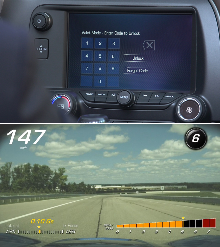
We're guessing the designers and engineers over at Chevy have heard stories like this once too often, as they've actually cooked up a feature to solve this with their 2015 Corvette:

What's interesting is that the technology already existed as part of the Corvette's Performance Data Recorder package, which uses a small camera to shoot HD footage from the driver's POV, while a mic records the in-cabin audio and a computer records the vehicle data and telemetric info. The PDR was originally designed for track-heads who wanted to improve their lap times, but "We soon realized the system could have many more applications," Corvette product manager Harlan Charles said in a press release issued yesterday, "such as recording a scenic drive up Highway 101, or recording when the Valet Mode is activated."

The info and video can be viewed in-car immediately after recording, and it's also downloaded onto an SD card if you want to take the proof to the cops or just upload it onto YouTube. "Think of it," says Charles, "as a baby monitor for your car."

(more...)

Wave Hello To Minimal Music Posters: Kickstart Your Favorite Waveform Dance Tracks

$
0
0

Waveform2.jpg

Second verse, better than the first. Alex Szabo-Haslam made delicate waves last year with elegant printed visualizations of his favorite electronic songs, and he's back at it with an even wider range of artists. The project was born when Szabo-Haslam, a designer with a background in music promotion, had the urge to turn the Aphex Twin song Windowlicker into something more physically tangible. Using waveform visualizations of frequencies in iconic songs, he bent and paired the resulting forms with bold colors and called it good. So did everybody who managed to grab one of those early editions. The first series of bold prints was a quick hit, and now he's widened the scope and deepened the beautiful options. Where last year there were 12 prints on offer with one special edition, this time around there are 28 limited edition options and a special edition—this time the gorgeous gold on bronze print for the LFO track We Are Back seen above.

While still heavy on the deep dance tracks, the breadth is awesome. He's featured Donna Summer to Daft Punk, Left Field to Jeff Mills, Cabaret Voltaire to Surgeon... And the stylized graphics, while conceptually limited, manage to stand out beautifully with the interesting waveforms and colors chosen. The silkscreened prints come on heavy paper from GF Smith, including some beautiful metallics and cool pebbled textures. I may be impressionable but each color does seem to fit its track. I'm also no dance music historian, so I'm particularly amused by the grouped sets of prints, stuck trying to decide exactly what makes each mini collection internally distinct. The project is just a couple days in and already funded, so get in quick if you want one of these sweet limited edition prints for music dorks. If nothing else, it's a great excuse to re-listen to some key classics.

WaveformPosterSets.jpg

(more...)

True I.D. Stories #32: The Entrepreneur, Part 2 - Yanking My (Supply) Chain

$
0
0

true-id-4.jpg

Editor: Designer and entrepreneur Pat Calello explains that in order to grow your business, you've got to start relying on other people. But what happens when those people let you down?

(If you missed Part One, where Calello first conceives of Automoblox, catch up on it here.)


As an entrepreneur, your roles expand exponentially and change by the moment. Sure, you're the President and CEO, but pursuing your own gig means you're also a Marketing Project Manager, Product Development Manager, Supply Chain Manager, Design Director, Public Relations Manager, Business Development Manager, Director of Customer Service, Mechanical Engineer, and a Lawyer... among other things. You won't have the competence needed in these areas, so you'd better have access to people who do. I have been blessed with a network of professional colleagues that were vital to this project, and my wife, Susan, can step into many roles when she's not changing diapers and chasing our two-year-old.

TIDS-1-700.jpg

A good friend, Brett Marshall, called to tell me about a book he had just finished called The Mouse Driver Chronicles. He said that while reading the book, he was constantly reminded of me and my toy car project. I immediately went out and picked up a copy. It was written by John Lusk and Kyle Harrison, two Wharton MBAs who, upon graduation in 1999, took a pass on high-paying dot-com jobs and instead decided to manufacture and market a product (a computer mouse designed to look like a golf-club head) they dreamed up during their entrepreneurship class. With some seed money from their professor and tons of their own, they set up shop and were quickly in business. Their success was modest by their own account, but they did develop an impressive following. An e-mail update to some friends turned into a web journal that eventually became course material for entrepreneurship clases around the country, and, before long, guest lecture gigs turned into a book deal.

At the conclusion of the book, Lusk and Harrison welcomed people with new product ideas to contact them for advice. Not shy and always willing to take advantage of an intriguing offer, I promptly contacted them. At this point in the evolution of Automoblox, I was still at Colgate, and I had yet to select a supplier for the line. The three initial Automoblox products required quite a bit of tooling, which meant that a significant capital expenditure was needed to get started. Lusk and Harrison had positive experiences with their supplier, and suggested I contact the company for a quote.

Within a few days, I was on the phone with the Hong Kong trading company, Swift Tread*. (*Denotes that I've changed this name to protect the guilty.) Vinnie Meola* was a 30-something American who had been in Hong Kong for over 10 years getting his former employer's sourcing business off the ground. The company eventually folded, but Vinnie stayed and started his own trading company. His partner, Lenny Chang*, a Hong Kong native in his 50s who pretends to understand enough English to inspire a certain amount of confidence, is the actual liaison between the factory and the customer.

Doing business with an overseas supplier created some anxiety, but since Vinnie is an English-speaking American, I felt confident in Swift Tread. The fact that Vinnie and I are both Jersey boys further helped me to sleep at night—at least for awhile. Swift Tread submitted the low bid on the tooling and per-piece price, and came highly recommended by my entrepreneurs-turned-book-writers friends. It seemed that the stars—at least in the Far East—were lining up for me and my new toy company.

0TID31_2.jpg

(more...)

Sneakerhead's Delight: 40+ Years of Nike Kicks in a Genealogical Motion Graphics Treatment

$
0
0

Nike-GenealogyofInnovation-1.jpg

Nike has recently launched its "Genealogy of Innovation" campaign, and the promo video by Golden Wolf is an impressive piece of footwear-centric eye candy, featuring some 200 shoes in all, including signature styles by the Hatfield brothers, Hiroshi Fujiwara, Mark Parker et al. Check it out:

Nike-GenealogyofInnovation-2.jpg

(more...)

Join the Dolmen Team in Dublin, Where Questions Are Answered Before They Get Asked

$
0
0

Work for Dolmen!

Dolmen is made up of designers, strategists and they are very good at answering the questions their clients haven't even asked yet. Their clients range from entrepreneurs to multinationals and for 21 years, they've been developing award-winning new products and experiences for a diverse range of industries. As part of their ongoing growth strategy, Dolmen is looking for a sharp industrial designer with 2 to 5 years experience to join their team in Dublin, Ireland. Perhaps you'd like to jump on board?

You'd be joining a fast paced but fun environment where you'll work with the senior creative team to interpret client requirements while developing innovative new product propositions using a range of ideation techniques. In exchange, you'll get a competitive salary and an opportunity to contribute to the continuing development of exciting new products. Hint: loving good coffee, bad music, surfing and frisbee is not required, but are helpful to have. Apply Now.

(more...)

'Designing Innovation': Consumer Involvement in Designing the Future, Transparent Collaboration & the Democracy of Autonomous Designs

$
0
0
Content sponsored by the Ford Motor Company
FordRecapAugust-Lead.jpg

On Saturday, August 16, Ford and IDSA brought us the third panel discussion in a series on 'Designing Innovation.' We've been following along as the two organizations have brought together some of the biggest names in the design world to discuss and hash out real-life design topics onstage. While this panel's theme loosely focused around designing customer experiences, the four designers onstage took us into the inner workings of their own designing processes and shared the ways they incorporate their customers into the creation of their future products. Read on to see what Modern Edge CEO Austen Angell, Dell VP of Experience Design Ed Boyd and Ford Motor Company Exterior Design Manager Kevin George had to say on involving the consumer in today's design feats.

The Challenges of Customer-Led Innovation

The conversation began with a backgrounder on the panelists' respective companies and how each one approach predicting the future of design and technology. Seeing that all of the products have some sort of production timeframe, it's important for the design teams to nail down an idea and time it out to fit the needs of a group of consumers. Boyd shared some insight on the timeframe his team considers: "We look about three generations out and think about where technology will be and how will we solve these problems. You're looking at anywhere from six to ten years out." Ford's Kevin George discussed the practice of using consumer's own descriptions for the cars to lead future automotive design projects. When working on Ford's newest release, the Edge, two words stood out and informed the design direction of the recently launched car. "We take the words that they use to describe the car—some said dominating, some some accommodating. Very different. So we said, why don't we blend them?"

Finding the sweet spot in terms of a timeframe or design skeleton is one thing, but the real challenge comes with translating consumer insights into something innovative that the designers can stand behind. Angell had some words on designers' intuition that stuck with me for the duration of the panel discussion:

You need the rigor of academia, the rigor to have the proper amount of skepticism about your own assumptions, but we also recognize that there's part of the investigation that needs to take some risks. Designers have this intuition. It's marrying those two that we think produces some tangible results with the right amount of credibility that people can act on.

As exciting as it may seem, the toughest critics might be within company itself. "As a large company, if you talk about blowing things up, it's pretty challenging," says Boyd. "At Sony, we were holding on to legacy business, but I think today you need to be willing to blow that up in a really objective way. Every new idea that's very disruptive and different starts with a lot of anti-bodies before it's adopted."

FordRecapAugust-Comp.jpg

(more...)

PSFK Labs Presents the 'Maker's Manual,' Available Now for Free Download

$
0
0

PSFK-MakersManual-1.jpg

Yesterday, our friends at PSFK released a report on a movement that is within our purview much as it is in theirs: The first edition of the "Maker's Manual" "provides insights into how people can learn, program, prototype and even sell their projects." Available for free download, it goes beyond your average trend report to offer "a wealth of tools, support and services available for every project size—from the hobbyist's tinkering to the entrepreneur's hack."

The "Maker's Manual" a fluent top-level survey of the technologies, services and communities that are out there today, online and off, and while the the report is not by any means comprehensive, it's certainly an excellent place to start if you're looking for, say, a Maker Shop or Collaboration Hub. There are nods to the usual suspects—Inventables, Makerbot, IFTTT, Techshop, etc.—but also more obscure or otherwise emerging projects and companies such as
GaussBricks and Craftsman Ave. Sure, there's a good chance that some of these resources may be too experimental or as-yet-inchoate to have a long-term impact, but this is precisely why the "Maker's Manual" serves as a kind of State of the Union. Indeed, the introduction includes a pithy Obama quote, from the recent White House Maker Faire: "Today's D.I.Y. is tomorrow's 'Made in America.'"

And although some of the headings and copy might read as hype, the "Maker's Manual" does well to addresses pragmatic issues such as fundraising and IP. All told, the 33 pages are chock full of solid information, presented in an appropriately skimmable format, one that invites readers to further investigate the companies and services that strike their fancy.

PSFK-MakersManual-2.jpg

Unfortunately, the PDF is encoded in a way such that the text isn't searchable; not only does this mean that there's no quick way to find a keyword but also none of the links are clickable—not even the one for Intel, which underwrote the whole thing—which, considering the inclusion of bit.ly links, seems like an egregious oversight. After all, the availability of new tools and resources is a cardinal tenet of its subject matter, and the utility of the "Maker's Manual" as a reference guide is rather diminished by the lack of search- and clickability.

(more...)

Andy Tran's Multifunctional Tahoma Field Knife Design

$
0
0

0tahomaknife-001.jpg

A bunch of industrial designers sitting around a table and poring over research can come up with some awesome stuff, but I also love seeing that breed of object designed by insightful end-users. Those items that a person is subconsciously designing in their head, out in the field, while performing a task over and over again with its predecessor and thinking: Wouldn't it be cool if this object had X right here, wouldn't this work better if this part was shaped like Y, et cetera.

Enter Andy Tran, a cinematographer who makes his living shooting outdoor and sports footage. When he's not on the clock, Tran is out in the wilds of the Pacific Northwest, shooting educational wilderness videos for his InnerBark YouTube channel. Informative and (naturally) well-shot, Tran's videos aim to teach you how to get by "If hiking, camping, hunting and fishing were a day job," and among the product reviews and tutorials, his latest videos feature a well-thought-out knife of his own design.

0tahomaknife-002.jpg

As an avid outdoorsman who was taught outdoor living skills by his father, Tran has had a knife strapped to his hip since the age of 7, so the design of his Tahoma Field Knife must've been brewing a long time indeed. Check out the features and functionality of the design, produced by Rocky-Mountains-based TOPS Knives:


(more...)
Viewing all 19147 articles
Browse latest View live


Latest Images