Quantcast
Channel: Core77
Viewing all 19151 articles
Browse latest View live

Beautiful, Potentially Short-Lived Tabletop Made from Pallet Wood

$
0
0

While it seems to be the darling of Facebook-friendly DIY furniture roundups, there are lots of reasons not to use pallet wood in your projects. Chief among these is that a subset of pallets have been fumigated with toxic pesticides by their manufacturers, making the material a poor choice for cutting boards, baby cribs and dining tables. But perhaps the biggest reason not to use the stuff is simply that it's a royal pain in the ass to "harvest" and machine into something usable.

A good case in point is this beautiful tabletop made by this fellow. While he and his girlfriend managed to skip the torturous nail-pulling step by simply cutting around them…

…he still had a boatload of work to do to get usable strips for his tabletop project:

You can read details on what he had to go through here.

Unfortunately, I suspect the tabletop won't last long due to wood movement. I'm no expert at wood identification, but in this shot…

…I see what looks to be cedar, southern yellow pine and poplar. The reason different woods are not often mixed in cutting boards, tabletops and the like is that they will expand and contract at different rates as the seasons change, eventually leading to joint failure.

Still, I think the results are beautiful and that the project was a worthy undertaking, both to develop skills and as a learning experience. And the anonymous builder has a good eye; I like the way he isolated and alternated the darker- and lighter-colored strips.


Made-in-USA Pants Guaranteed to Last for 25 Years

$
0
0

These were my favorite work pants right here, Carhartt's Loose Fit Canvas Carpenter Jeans. I bought them just over two years ago. They're comfortable as hell and have good utility with all of the pockets and hammer loops, but despite the name, they're certainly not made for a carpenter—I don't even work in the trades, and here's what they look like now:

A tape measure clip has made short work of pockets on both sides.


The coin pocket has been abraded by nothing more than the physically-smooth Zippo lighter I carried (before I managed to quit smoking).

I'm not breaking rocks in a salt mine or clearing logjams on the Mississippi, just shuffling plywood through my weekend warrior shop. Under such use, shouldn't a $50 pair of pants last longer than two years, particularly from a workwear brand? Or am I out of touch with the times? Either way, when I tried to replace them this week, I discovered Carhartt no longer manufactures them in my size. So that's the end of the line for me and this model.

During a search for more durable pants, this Kickstarter campaign caught my eye. Manuel Rappard is the founder of jeans company RPMWEST, and recently launched The Quarter Century Pant project. While these are not branded as workwear, Rappard's aim is to provide "the most durable pants you've ever had" and is backing that up with a crazy 25-year guarantee. What's even more insane is the price: Just $85 a pair, yet they're actually manufactured in America.

For those curious about what makes these pants different from a materials perspective, Rappard explains:

What is 3-Ply twill? A plied yarn is one where multiple strands of yarn — already spun yarn — are put together and twisted in the opposite direction from that in which they were first twisted. A 2-ply yarn has two strands; a 3-Ply yarn has three.
Any time you ply your yarn, you’re making it stronger. This is because twisting adds strength; multiple directions of twist add even more strength. You’re also tucking some of the surface of the yarn inside, away from the elements and wear and tear. Plied yarns will always be stronger and sturdier than singles yarns.

But this is only one reason to ply your yarns. Plying can also even out unevenness. Plying regularizes yarn, and also changes how the yarn behaves, how it feels, and how finished fabrics made from it behave and feel. You will notice that our pants are incredibly soft and durable.

Success for the campaign came swiftly: At press time it had netted $65,000-plus on a $20,000 goal, and there are still 31 days left to pledge.

Mouffe: The Daydream Simulator Played With a Blanket Controller

$
0
0

This post originally appeared on Kill Screen, a videogame arts and culture website. Story by Chris Priestman.

Did you ever have a magical night mobile to lull you in the crib? Mine sprinkled blue stars and pale planets across my polystyrene ceiling to a lazy tune. Thinking about it, it would probably be beneficial for anyone who struggles to get to sleep as an adult to push aside the sleeping pills in favor of a night mobile. I think we could all enjoy the wonderment they bring, actually. It'd probably be a relief to retire all the expectations of adult behavior and go to sleep surrounded by cuddly toys, looking up at a galaxy swirling above us, secure and comforted. Maybe that's why Mouffe has such great appeal.

VISUALS AND SOUNDS MORPH AS IF PART OF A SHARED REVERIE.

Mouffe is a daydream simulator played in a tent with a blanket controller. It was made in a month as part of an experimental games incubator at Concordia University called "Critical Hit." You slip inside, lie down on a soft quilt, and admire as splashes of color form an abstract animation projected on to the tent's ceiling. Putting pressure on different parts of the blanket has the visuals and sounds morph as if part of a shared reverie. Its combination of visual, aural, and tactile stimulation is intimate and playful.

Sounds lovely, doesn't it? Almost as fascinating as being inside that tent and experiencing all of this is the story of how Mouffe came to be. Its small team of creators had to cast themselves back to their childhood more than once during the process.

At its prototype stage, Mouffe was 2D and played on a screen that was precariously taped to the ceiling. The blanket controller was there from the beginning alongside the idea of touching a button to change the visuals. But Mouffe didn't really take shape until the team built it to operate inside a tent. "It felt so right being in an enclosed, comfy, magical, light show dome," artist and animator Hamish Lambert told me.

"THE SKY WOULD OPEN UP ABOVE YOU INTO A DIFFERENT DIMENSION"

To explicate the feelings that the tent had introduced, each team member had to rethink their approach, including Zachary Soares who was working on the sound for Mouffe. His problem was that the instruments he had to hand only produced ill-fitting digital and choppy sounds. Nothing he tried with them worked. Luckily, the answer Soares sought was playing in his ears the whole time, as the team was listening to the soft acoustics and calming tunes of Lullatone while working on Mouffe.

"[Lullatone's] little trick was using toy instruments for some of their sounds and I figured it wouldn't hurt trying it on Mouffe," Soares said. This is why he headed out one day to buy a range of children's toys. "In the end, it worked out great! Adding in some extended sounds, giving off an ominous and large feeling made it all the better," Soares added.

Working on Mouffe's art was Lambert (mentioned above) and Ben Swinden, who also programmed it. Lambert's background in animation allowed him to bring in influences such as the blossoming, whimsical work of David OReilly and Chris Morphitis. "We were interested in creating this large space, so that you would go into the tent and the sky would open up above you into a different dimension," Swinden said. Despite all of these aspirations, Lambert and Swinden struggled to match them with actual illustrations at first. This is why Kim Hoang, who did all the sewing work on Mouffe's blanket, stepped in.

"Kim had us do this drawing exercise that she did with children that she taught," Swinden explained. "The idea was each of us had a sheet of paper and crayons and we had a minute to draw some kind of creature. Then we'd pass the sheets along and the next person would write an adjective and a verb to describe it. From there we talked about which ones we liked and Hamish took those and turned them into this weird playful world."

CONNECTING WITH THE WAY CHILDREN HEAR, SEE, AND TOUCH THE WORLD.

Hoang was under pressure herself with the blanket controller. It wasn't for lack of inspiration or skill, but time. She was able to obtain a giant Tajima embroidery machine from the university, but not until the 11th hour. "It was definitely worth waiting for, because a lot of the super detailed work really relied on accurate sewing. The quilt buttons rely on a pretty specific interlacing of the positive and negative charges in order to work without the player holding the ground," Hoang said.

"In the end, the most intricate patterns were done by me, and though I had to learn to set up vector files for the Tajima, it was ultimately a really cool process!"

The team affirms that creating Mouffe was as much a process of exploration and discovery as it is actually being inside the tent and experiencing it. There were some struggles, but they all found the fun in working through them and, for the most part all it required was connecting with the way children hear, see, and touch the world. That's what Mouffe manages to capture.

"We never quite knew exactly what we were making but we were having a really good time doing it," Lambert said. "I think that reflects well in the project. A lot of players aren't exactly sure just what is going on inside this magic Mouffe tent but they have a blast doing whatever it is they're doing."

Mouffe is currently on Indiegogo where the team is seeking funds to make it portable, and to have other creators make projects for it.

Watch the RKS Sessions Presentation: Why Every Entrepreneur Needs to Think Like a Designer

$
0
0

Design is such an integral part of business these days, it's nearly impossible to succeed as an entrepreneur without thinking like a designer. Last week, RKS presented the 7th installment of their Sessions Series and asked their founder, Ravi Sawhney, to speak about why a design oriented mind set is crucial to start up success. From apps and products, to services and branding, Ravi illustrated the RKS Psycho-Aesthetics design thinking methodology that has consistently delivered highly successful and innovative products and services. Watch the full video here to learn more. 


The Deckstop: Desktops Made From Trashed Skateboard Decks

$
0
0

Just when I thought making this tabletop out of pallet wood was laborious, these guys might have topped it.

Your average skateboard deck is made out of seven layers of maple ply. The form has an angled tail, and overall it'll have some side-to-side concavity to it as well. But there are still some portions of the deck that are perfectly flat.

Well, the maniacs over at Rotterdam-based Focused Skateboard Woodworks take trashed decks, and painstakingly cut them up to harvest whatever flat pieces they can get out of them. They then glue them all up to get a visually-striking tabletop.

It takes 33 decks to get a 200 x 90 x 77cm "Deckstop," as they're called, and 39 decks to get a 240 x 90 x 77cm one. You can see snippets of the process here:

The raw material may come to them free, but with all that labor, these puppies ain't cheap: It's €2.726,45 for the 33 model and €3.222,31 for the 39. Add the EU's whopping 21% Value-Added Tax and you're looking at grand totals of €3.299 (USD $3,732) and €3.899 (USD $4,411).

Via Hi Consumption

Is Living in a Highrise Un-African?

$
0
0

Advertorial content sponsored by Design Indaba.

Increasing urban populations are putting new pressures on African cities but changing traditional living habits is proving to be a slow process. Now there is an emerging generation of African architects who are coming up with interesting strategies to deal with the challenges faced by urban Africa.

To do this however, means a transformation of old-established living habits. Citizens who are not used to the idea of living in apartments are resisting attempts at densification. The call for innovative urban planning is stronger than ever, but the number of local architects who can answer it is tiny in comparison to the more developed West. 

Image from the series Found Not Taken, 2009-2013, by Edson Chagas, which featured in “Luanda, Encyclopaedic City”. Courtesy of Edson Chagas, APalazzo Gallery.

Overseas studios, working remotely, are often the ones who win the large contracts for new housing and urban developments in Africa. Paula Nascimento, one of the founders of Beyond Entropy in Luanda, Angola, laments the need to seek design from abroad. 

“There are still a large number of projects designed in foreign countries by foreign studios and simply imported and constructed in Angola, which is a big shame,” said Nascimento in an interview with Design Indaba. Each unique problem needs a solution that investigates its deeper cultural discourse.

Issa Diabaté at Design Indaba Conference 2014.

To address the need for African architects and urban planners, Ivorian architect Issa Diabaté—who spoke at Design Indaba Conference 2014—announced in his talk that he was in the process of setting up the first school of architecture in the Ivory Coast, with a curriculum that would focus on design and urban planning to help tackle the specific realities of African living.

Diabaté also tries to address the challenges of the contemporary African city in Abidjan in the Ivory Coast. Koffi & Diabaté Architects has designed a couple of housing developments that confront the negative social perceptions of high-density living.

Cocody Bay landscaping project by Koffi & Diabate Architects is an urban planning and architecture project designed for the rehabilitation of the lagoon bay area located in the centre of the city of Abidjan, Ivory Coast.

“We are trying to promote a different kind of living,” says Diabaté. “We shouldn’t shy away from apartments and collective environments, because if you are a bunch of people you can do so much more.”

In another example, Kigali, Rwanda’s swiftly growing capital city, is on the course of a conceptual master plan for its urban development. City planners were brought in from Singapore to help lead the planning process. “We need to make people understand that living in an apartment is just as good as living in a house,” says Joshua Ashimwe, acting director of Urban Planning for Kigali City, in an African Report on designindaba.com

Map of Kigali showing its hilly terrain and the central city area slightly to the left of centre. Green areas are open land, while the red, orange and yellow areas are high-, medium- and low-density zones, respectively. The purple areas are industrial.
Phase one of the city’s CBD transformation is the area located at the junction of two major arterial roadways that forms the “gateway” to the CBD from Kigali International Airport. Large, modern mixed-use office complexes and hotels are being planned within a pedestrian-friendly environment, central plaza with fountains and pools, and neighbourhood of amenities such as cafés and restaurants.

Kunlé Adeyemi is a Nigerian architect who is trying to address the problem of rapid urbanization alongside the problems of climate change. In this video interview, Adeyemi discusses his African Water Cities project. Makoko is a waterborne, informal settlement on the edge of Lagos, whose population faces a lack of infrastructure and sanitation. Adeyemi created a structure that could be used as a floating school, made from local materials and with local resources. With environmentally friendly features such as solar panels and natural ventilation, these structures serve as both a school and a community centre. 

Makoko is an aquatic community of some 100 000 people who live on housing units built on stilts in the water. Photo courtesy of NLÉ.
Makoko Floating School by NLÉ. Photo courtesy of NLÉ.

The challenges faced by architects and city planners in urban Africa demand innovative solutions and are creating exciting opportunities.

“Luanda is chaotic and glamorous, primitive and futuristic, huge and unexpected,” says Stefano Rabollo Pansera of Beyond Entropy Africa. “It is the combination of many contradictory spatial conditions that make it a wonderful and challenging city.”

As African cities continue to urbanize, architects are playing a critical and urgent role in shaping the spaces in between these extremes both now and for the future. 

To find out more about how designers and architects are leveraging creative thinking to combat Africa’s urban problems, go to designindaba.com, an online publication with daily content on global design.

11 Designs for Organizing with Shelves

$
0
0


Large shelving systems along a wall are great for storage, but there's not always space for such a system. In these situations, a smaller wall-mounted shelf can still be helpful to hold books, display a collection, and much more.

The Agnes wall-mounted shelves, designed by Sarah Kay and Andrea Stemmer, allow the user to display items of varying depths. However, there’s no flexibility to adjust the height of the shelves; they either work for the user as-is, or not.

Insert Coin, designed by Neuland Industriedesign for Nils Holger Moormann, provides the user with some flexibility. The shelves can be slotted in where they are wanted, and the whole unit can be hung either horizontally or vertically. With this design, the shelves can accommodate items of varying heights, but the shelves themselves are pretty short—so that’s going to limit their use.

Mark Righter at Cambium Studio created these slippery shelves which take care of the “tall items” problem by allowing the users to slide the shelves as far to each side as they like; the shelves slide through a dovetail in the back. Ecologically minded users will be glad to know the shelves are made from bamboo, FSC hardwoods or reclaimed timber.

Users who are concerned about things falling off the shelf might appreciate the Perch Shelf from Dino Sanchez, with the lip around the edge. However, the lip does hide the bottom part of what’s being stored, so it wouldn’t work well for displaying items where the entire item needs to be visible.

Book Bound by Jennifer Delonge is a shelf with a higher edge, designed specifically for storing children’s picture books with the cover facing out—the best way to store such books.

Wall-mounted cubes, such as these from Soapbox, don’t have a lip—but they do have sides, which would make them especially useful for storing books. Items could also be places along the top of the Soapbox if more storage/display space is needed.

I’ve seen many shelf designs that move away from the basic flat surface—and while those designs are often eye-catching, they aren’t as practical. The Tubola shelf from AK47 looks cool, but it certainly limits what can be stored inside it. (Some of that book storage makes me cringe.) However, the Tubola could work nicely to display certain collections or to hold things like a knitter’s yarn collection.

Designers can certainly get creative with a shelf’s looks while still maintaining the flat surfaces. The Transistor glass shelves from Tonelli, designed by Barberini & Gunnell, are just one example.

Thinking about glass shelves in general: Such shelves can create a lighter look than wood or metal shelves, which is especially helpful in smaller spaces. But they aren’t going to work in every home or office. Fingerprints are an issue on many glass shelves. And since some users will have safety concerns, designers of glass shelves may want to consider offering safety glass or Lexan as an option.

The modular Fläpps shelving system from Ambivalenz has shelves that fold and unfold, as needed. For example, lower shelves could be closed (and anything on them moved elsewhere) when small children came to visit. This is another design allowing for taller items; if there are multiple shelves one above the other, the user could simply not unfold the shelf above the taller item.

Rivelli shelving, designed by Mark Kinsley, takes the folding shelf idea to a new level—ensuring the shelves are a work of art when they are closed. Shelves can be finished with laser etching or with custom printed magnetic artwork. Since the images are magnetic, users can change them out as their decors and their tastes change over time.

The Floyd Shelf, as provided, is a set of brackets; the users provide the flat surface. This gives users a lot of design choices, and allows them to change out the surface as their needs (or tastes) change. Another nice feature: The vertical lip of the bracket acts as a bookend.

Clever No-Spill Paint Tray Design

$
0
0

Contractor Ben Mayberry made an interesting discovery: When paint is poured onto a surface with a microfiber texture, it stays there. Even if you flip that surface upside-down. With the right amount of surface area and the right amount of paint, you essentially have a spillproof pallet with more paint capacity than you'd think. Take a look at this thing:

While Mayberry managed to get the Paint Handy on the market, he appears to have suspended sales; we received an e-mail saying he'll shortly launch a crowdfunding campaign to raise the $30,000 he needs to increase manufacturing. You can keep abreast of when it launches here.


This Heat-Map Microwave Would Let You See Exactly How Hot Your Food Is

$
0
0

Innovative designers draw connections between things that no one else has thought of yet. And this insight from Mark Rober is particularly brilliant. He observed that:

1) Putting food in a microwave is often a crapshoot; we've all eaten too-hot or too-cold food.

2) The price of infrared cameras is coming down.

Wouldn't it be awesome, Rober thought, if we could actually see the temperature of our food via an infrared lens and screen built into your nuke? Here's how he envisions these elements coming together:


By the bye, science enthusiast Rober is no armchair quarterback—the man formerly worked at NASA's Jet Propulsion Laboratory, for chrissakes. And like he said in the video, he's not asking you for money a la Kickstarter to realize this idea; he's already lined up investors, but now needs signatures on a petition to prove consumer interest. So if you'd like to help this project along without laying out any scratch, click here.


Driverless Cars Now Hitting UK Streets for Testing

$
0
0

Well folks, it's happening: Driverless car trials have begun in the UK. Denizens of the test neighborhoods of Milton Keynes in Buckinghamshire and Greenwich in London can see the electric, hackless cabs cruising in designated areas, and while they don't have the punch of Tesla's Insane Mode, they're fully capable of safely ferrying passengers from one point to another.

The UK is getting behind driverless cars in a big way, and the math explains why: While the British government has provided a relatively paltry £19 million to jump-start the testing, they reckon the robocars will be a £900 billion industry in just ten years' time. Not a bad return on investment, and if traffic accidents go down as a result, there's bound to be additional savings there.

I realize my views here will be unpopular among my freedom-lovin' American compatriots, but I would welcome a future filled with driverless cars, particularly in urban areas. Driver distraction is readily visible in Manhattan traffic, and driver error is of course an everyday reality; just last night, 60 Minutes reporter Bob Simon was killed in a livery cab crash on the West Side Highway. The badly-mangled wreck looks to be the result of driver error, and photos of it were splashed across all of our dailies this morning.

As for the rest of you, what's your opinion on driverless cars? And if you do sound off in the comments below, please let us know what country you're from—and how likely you think uptake would be among your countrymen.

This Combination Treadmill-Bicycle is a Lot Cooler Than It Sounds

$
0
0

Bruin Bergmeester earns his living the same way many of us do, these days: Sitting on his ass. To counteract his sedentary office lifestyle, he bought himself a treadmill to exercise with at home. But looking out of the window, he realized he'd rather be exercising outside.

While Bergmeester's native Holland is bicycle-crazy, he realized that sitting on a bicycle is still sitting, and he didn't want to sit anymore. So he came up with the idea of this fascinating treadmill bicycle that he calls the Lopifit:


The bike is actually battery-powered, but rigged so that the motion of the belt moving backwards is what triggers the "gas."

We're not sure why Bergmeester didn't just ditch the treadmill and go for a long walk outside, but then the man clearly has an inventor's mind.

He's taking pre-orders for the bike now in the EU and is currently seeking a U.S. manufacturer.

Flat Touchscreens with Physical Buttons that Magically Grow Out of Them

$
0
0

We were excited when we first heard about Tactus Technology, a company that created a way for physical buttons to morph up out of a touchscreen. But it was nearly three years ago when we first encountered one of their prototypes. Now, however, the wait may be over. The company has announced they're releasing an iPad Mini cover called Phorm that features their magic button technology.


The Phorm works by embedding blisters that, when triggered via a physical switch, swell up with fluid inside the transparent, touch-capacitive and otherwise flat screen cover.

iPad Mini users will have to live with slightly bulking up their tablets with this cover; unless Apple buys Tactus, there's virtually no chance they'll integrate the technology directly into their tablets. Android users, on the other hand, might have a different experience: Tactus is seeking manufacturing partners that will build the technology straight into the tablet.

The Phorm is expected to start shipping by end of summer, with a retail price of $149. Earlybirds can pre-order one here for $99.


Test Tubes: Piet Hein Eek on the Making of His Sleek New Clocks and Speaker for LEFF Amsterdam

$
0
0

This is the latest installment of In the Details, our weekly deep-dive into the making of a new product or project. Last week, we watched SO–IL shrink-wrap Storefront.

While Piet Hein Eek has made a name for himself building chunky, patchwork furniture from discarded wood scraps, his latest project, a collection for LEFF Amsterdam, brings a new delicacy and sleekness to the Dutch designer’s repertoire. Appropriately dubbed the Tube Series, the collection includes a bedside clock, a table clock and a small speaker, all elegantly—and nearly impossibly—encased in slender metal tubes.

But Eek would disagree that the collection is a major departure from his previous work. “My designs in scrap wood are just a part of the work,” Eek says. “In all my work, material, technique and craft are the major themes and inspiration. It's like the chicken and the egg—if I wouldn't have been inspired by materials, I wouldn't have recognized the beauty and possibilities of scrap wood. The collaboration with LEFF opened new doors!”

The collaboration began in 2013 with a call from Arno Ruijzenaars at LEFF Amsterdam. Ruijzenaars had seen a series of wallpaper designs (also wooden patchwork) that Eek had done for the company NLXL, and was keen on the designer creating a clock for LEFF, the company he founded in 2011 with his brother, Dennis, and the designer Erwin Termaat. 

Piet Hein Eek's Tube Clock and Tube Audio come in steel, copper or brass (pictured).
The Tube Clock in copper

Eek was hesitant to commit to anything before having a strong idea for the project. During his first meeting with Ruijzenaars, however, he came up with the concept of a timepiece in two parts: an unadorned block of wood and a small, tube-shaped clock. Eek’s idea was that the customer would drill a hole in the block of wood and stick the clock in the hole, creating his own DIY design. “To create a tube shape was quite obvious, because it gives the buyer the possibility to drill a hole in a surface and put the clock in,” Eek says. (This is all assuming, of course, that the buyer has access to a drill with a hole saw, or perhaps a drill press—something that can drill a two-inch-diameter hole, which is the size of the clock.) 

Upon designing the timepiece, however, Eek and the team at LEFF found the object so beautiful on its own that they decided to develop it further, rather than creating a full-blown DIY product. As the technical design of the object evolved through a series of prototypes, the original tube form remained pretty much unchanged, other than the addition of a pair of removable cylindrical legs.

And Eek did not completely abandon the idea of encasing the tube clock in a simple block of wood—one version of the clock comes pre-embedded in a piece of brown oak, black ash or natural Hevea wood.

The Tube Wood clock—in steel and natural Hevea wood—with the steel Tube Audio speaker on top

During the design process, Eek handled ideation, sketches and model-making, while the technical designers at LEFF took care of everything within the tubes, engineering the positioning of internal electronic pieces to fit within the limited space. “I only have to have ideas and make some drawings and sometimes a small example, but in general they’re doing everything,” Eek says. Fitting all the necessary pieces into the tube proved to be the project’s greatest challenge. “Basically, the entire tube is filled with components, jammed between the front and the back of the tube shape,” Eek says. “The approach is very simple—we tried and tried until everything fit between the front and back wall of the tube.”

As part of the development process, Eek also came up with the idea for an extruded ring indicating the hours of the clock. “The guys at LEFF Amsterdam could not believe that such a signing did not already exist,” Eek says. “It’s such a simple idea. They searched like mad, but it had not yet been done.” The extruded piece is cut on a water jet and placed directly behind the glass face. To achieve this, the team used thread to help position everything in perfect alignment. Other components were added in a similar way: Starting with an empty tube, elements were stacked in order and then carefully placed inside the tube using thread. “Very simple,” Eek says of the seemingly very stressful, complex process.

The idea to create a speaker was secondary, coming from LEFF—while traveling, Ruijzenaars saw the need for a bedside speaker in addition to a bedside clock. So Eek and the LEFF team created a small Bluetooth speaker with the same form as the clock, adding an antenna to circumvent challenges with having a Bluetooth connection through the copper, brass, or steel casing. “The antenna was a challenge because it had to come out of the back in a beautiful way,” Eek says, adding that LEFF finally found a pull-out style antenna that fit the bill. He recommends pairing the speaker and the wood-encased version of the clock, with the speaker perched on top. “It becomes an even more beautiful and functional setting,” Eek says.

With the successful reception of the Tube Series, Eek and LEFF are already developing a more complete collection, with tube watches, digital versions of the clock, and a bigger tube speaker currently in the works. For Eek, this part of the collaboration is a departure. “Normally, we take care of all the production and distribution ourselves,” he says, “but the great thing about a partnership like this one is that you ultimately develop something that you would not have been able to achieve on your own.”

Raising the Bar: Because We Can's Fantastic Social Space for the Long Now Foundation

$
0
0


The Long Now Foundation is not your typical nonprofit. Formed "to creatively foster long-term thinking in the context of the next 10,000 years," they undertake unusual projects like building a thought-provoking super-clock that "ticks once a year, bongs once a century, and the cuckoo comes out every millennium." (It's designed to last for ten millenia, and they're actually building it.) So when they needed an atypical, multifaceted gathering space, they turned to atypical, multifaceted design-build firm Because We Can.

Called The Interval, the resultant design is an amazing combination bar/café/library/conversation space and event space with so many layers that it's difficult to know where to start this photo tour. So I'll begin with my normal difficulty-breaker in life, the booze. Because We Can brought the Japanese practice of keepu—whereby patrons can purchase their own private bottles of libations which are reserved for them at the bar—and put a little twist on it. For bottles they use globular laboratory flasks, which are suspended from slots in this overhead rack.

The silver canisters contain tea, for non-boozing patrons.

When you want your bottle, the bartender pulls it down. And being located in the Bay Area, the rack is hung from anti-earthquake hardware.

Another cool detail is that the bottoms of the bottles resemble light bulbs but obviously aren't, yet they reflect what look to be LED lighting strips hidden within the hanging structure.

You might be wondering how those round-bottomed flasks are meant to stand. Here you see the solution.

The bases are custom-made from walnut, and the keepu hooch is made in-house.

If you prefer to forego keepu and just want common booze, there's off-the-shelf stuff populating the back bar.

But what makes the back bar decidedly not common is the centerpiece, this animated, kaleidoscoping art piece designed by Brian Eno.

It constantly changes patterns.

Even knowing that bar-goers' eyeballs are going to be drawn to the Eno piece, and probably not looking down, the design-builders poured attention into the custom foot rail. I'm loving the exposed end of the dowel. And in this close shot we can also get a good look at the locally-sourced walnut the bar is made from.

Although the space is sprawling, Because We Can couldn't resist pulling one of their space-saving moves: To utilize the space beneath a spiral staircase, custom-made curiosity cabinets display pieces of the Foundation's projects.

Remember that clock we mentioned earlier? An early prototype of it has been harvested to create the large communal table.

The bookcases stretch two stories high behind this centerpiece in the entryway, also made from clock prototype parts.

And what's cool about those bookcases is, one of them is actually a hidden door leading to the office upstairs.

That's not a gimmick: In addition to providing some extra storage space, the book-filled door serves as sound insulation from the space below.

As the Long Now Foundation describes the space:

The Interval provides all our visitors with a place that is welcoming and inspiring whether they are students, tourists, local residents, and whether it's their first visit or they are long-time members
The design vision was to create a compelling venue for conversation that invites visitors to spend time in a place that itself encourages long-term thinking. It's a work in progress, but we are off to a great start.e students, tourists, local residents, and whether it's their first visit or they are long-time members.With The Interval we have re-made our space to better represent Long Now and serve all our guests. 
We partnered with the design-build studio Because We Can to create a gathering space that features a floor-to-ceiling library, state-of-the-art A/V system, unique art by Brian Eno, and Long Now prototypes and artifacts. We serve artisan tea & coffee by day and inspired cocktails by night. The Interval also hosts live events and activities for our members and the public.


Cool Photos Showing What Happens When Balloons Freeze

$
0
0

When I took the dogs out this morning here in NYC, the "realfeel" temperature was negative-8 degrees Fahrenheit (-22 Celsius). In other words it's cold. Fitting, then, that I just came across these photos of what happens when an ordinary child's balloon, left outside, is covered by freezing rain—and then deflates:


As you can tell by this photo…

…these were not shot in New York City. They were snapped during a cold winter in Morley, Missouri way back in 2007. Interestingly enough the man who shot them, a former engineer for the Missouri Department of Transportation named Bob Lannert, has a place in history where U.S. winters are concerned. Stay tuned and we'll explain.

Via Equipment World


Designing The Moment Case: The Good, the Bad, and the Work Most People Don't Show

$
0
0

Images Courtesy of The Moment Case. Story by Erik Hedberg.

If you asked Erik to describe himself, designer would come after "snow surfer." A native of the Pacific Northwest, his two biggest fears as a designer are being chained to a desk and creating products that fail. Neither of which has yet to happen.

As a young designer, Erik is part of the team that recently launched the wildly successful Moment Case,  a phone case that enhances the photo-taking experience on an iPhone 6 by incorporating a shutter button, lens and strap attachment. At press time, the Moment Case has more than quintupled its fundraising goal. With nine days left, we've asked Erik to share how his team was able to produce game changing work on a startup budget.

It Starts In the Mountains

Our customer breakthroughs rarely happen in the office, especially not from 9-5. They don't come from hiring researchers, and they definitely haven't appeared from a product PRD. Instead, our process starts where people take the best pictures: Outside.

Because you can't stage good photography, we spend a lot of time trekking around the Northwest with amazing mobile photographers and observing everything they do. We take visual notes and ask a lot of questions about the tools they use, the process they follow, and the emotions they experience. Call us nerds, but we love diving headfirst into this stuff. 

We then compliment this research with our own experiences. At Moment, we are all passionate about mobile photography. We have some incredible photographers on the team who are always inspiring the rest of us to get better. But more importantly we go outside and use the products together. It opens our eyes to the diversity of picture takers on the team, discovering subtle problems that we would have missed just sitting at our desks. I'm a big believer that you have to go live it and put the products through their paces to really understand the core problems that need solving.

With this project we stumbled on a few insights we never would have prioritized without doing this work:

• Speed is all that matters with mobile. Despite people's ability level, taking a great picture quickly was more important than anything else.

• People get tired of digging into their pocket to find their phone. We found this action loses the nostalgia of taking pictures.

• Without adventure, most people don't have the creative ability to take great pictures. Every time the scenery and subject were new, people took better pictures.

We Force Ourselves To Write Stuff Down

I'm especially bad at this, but we force the entire team to take time out of their day to move key learnings from sloppy notebook scribbles to a visual customer journey. Using 4x8 foam core and sticky notes, we list out the key problems we want to solve and then list all the ways we could potentially solve them.

Over the last year in working on Moment we have developed a large mobile photography journey from how people travel to how they share and re-live their best shots. We don't know if it's entirely accurate, but we do know an insane amount about all the little idiosyncrasies of mobile photography.

From here, deciding which of these problems we solve first is by far the hardest part. Many of the ideas we generate out of this exercise could never be executed by our small team of 8, but we keep them up there anyway because we have to continue to dream big. There were a lot of areas we looked into, but over the last five months we've said the Moment Case has to do three things really, really well.

1. Capture clean photos as fast as possible.

2. Be accessible.

3. Always work.

I wish I could say we were smart enough to create this process on our own, but we owe a lot of credit where credit is due. It took a good friend of ours, Steve McCallion, to start punching holes in our early concepts to realize that documenting, mapping the customer journey, and filtering ideas are critical to success.

Finding Our Metaphor

We also like to use metaphors in our work. We've never designed a phone case before. When we started looking into doing one, we realized that people take tons of pictures with their phones, but they don't think of them as cameras—they think of them as phones. We love the vintage quality and novelty of traditional cameras, and wanted to pay homage to that. We wanted to recreate that pride people take in wearing a beautiful Leica around their neck. So we set out to make a case that turns your phone into a camera.

Sketch -> Prototype -> Break -> Repeat

The design process is a beautiful thing because it's never the same for every project. It's actually quite similar to riding down a mountain or surfing a wave. You start out knowing what you want to do, but once you get riding you might hit a bump, you might suddenly change direction, or you might even make the best turn of your life and become enlightened for a small second. You also eat shit sometimes. When that happens you have to learn from it, get back up and try again. 

Our process can be all over the place, but three things always remain constant: sketching, prototyping and field testing. Our main goal is to solve a problem, or a series of problems, and these are the ways we go about doing it. With the case, we started out field testing, learned which problems needed to be solved, sketched some ideas, prototyped them, field tested them, repeat. Ideally this cycle is pretty fast so you can keep iterating as much as possible to learn what doesn't work and what should stick around.

This project was our first Moment System (Lens, Case, and App) so we also had to add hardware and software engineering to the prototyping mix. No matter how rough and primitive they are, having functional prototypes is huge for being able to iterate early on the whole user experience, not just the shape and form.

Crafting The Form

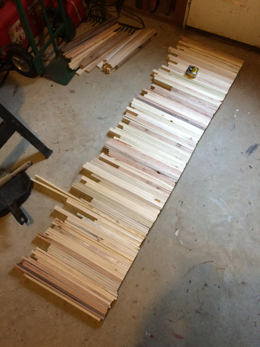
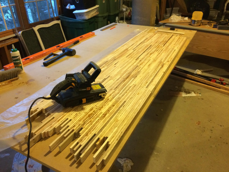
There's something about making things with your hands that you don't get from doing CAD. Cutting and sanding are good for the soul. You make it, hold it and it doesn't quite feel right, so you just sand it a little more and it's perfect. That stuff is magical. At the same time, the things we can do with modern tools like laser cutters and 3D printers help us a ton during the prototyping phase. Having that precision to simulate small features and details is clutch.

With the Moment Case, we did a lot of iteration on the overall volume and ergonomics. We knew we had to keep it as thin as possible so people would actually use it as their every day case. But at the same time we needed some volume to accommodate the electronics stackup. We worked to shave that size down and add the volume in a place where we could create a camera style grip. From there we prototyped dozens of different shapes and forms for the grip using a combination of wood, foam, 3d prints and sharpies. We took them on adventures, carried them in our pockets, and got people with big hands and small hands to test them and give feedback. Sometimes this process can take a while, but it's worth it to get that feel right so people love using it. 

The Struggle

Anytime you combine hardware and software, you're going to run into some issues. We've spent the last six months working on the Moment Case and not everything has worked. 

One of the toughest problems to solve was the lens detection. We prototyped 4 or 5 different electronics sensors and struggled the entire time. Between magnetic fields, metal compositions, and tolerance issues, that was by far one of our biggest challenges yet. When these issues arise, it can bring the team down, which is never good. 

We got into some heated discussions along the way about how to solve this problem. In the end, you have to try to keep everyone's confidence up and keep the train rolling, even if things aren't going according to plan.

Good news is the current prototypes can detect that a lens is attached. Bad news is we're still iterating on how to know which lens is attached 100% of the time.

What Didn't Make It

Saying no to things is a lot easier when you don't have the big team and resources to execute. By only having 8 people and a minimal bank account there are a lot of trade off decisions that came naturally to us during the creation process.

Minimal Color Options

Inspired by custom cameras of the past and all the amazing work Kodak did back in the day, We saw an opportunity to make this product personal. By offering a bunch of curated color and material combinations, we could create different personalities for each case and allow people to express their personal taste by using it. But as a startup, a large SKU number can kill you. It bleeds cash, requires more tooling, and forces us to make production volume decisions we have no data for. So in the end, we had to make the hard decision to keep the options minimal. This isn't to say we can't expand on that and do some cool collaborations, but we won't get into that.

We're starting with two primary colors (black with white and black on black) and one Kickstarter exclusive (black on black with walnut grip).

No Tripod Mount

With traditional cameras, you always have a tripod mount. Since we wanted this case to turn your phone into a better camera, we definitely looked at how the Moment Case could use the industry standard connector; a 1/4-20" screw. 

After several iterations we kept hearing customer feedback that size was critical if this was going to be an everyday case. And no matter what we did, the 1/4-20" made the case bulky.

The Mountain Still To Climb

The Moment Case isn't done. We have three beautiful, fully functional prototypes, and thousands of amazing Kickstarter backers expecting us to deliver in June.

The manufacturing gauntlet is the hardest part of the journey and although we feel experienced there, we know that small mistakes can destroy everything we have worked so hard to create. This challenge is what pushes us as a team. 

We have an amazing community on Kickstarter trusting us to deliver, and we will do everything in our power to do it well. We owe it to them for helping us make our dreams a reality. We're not scared of the long nights, bad seafood, and sleep deprivation. We're not afraid of the countless hours spent tweaking details, finessing packaging and working with vendors. We're not scared that we're a small hardware company in a software town. 

This stuff is a grind, but when it all comes together in the end, it's fun. When your product shows up on people's doors and it makes their world a better place because they're stoked on it— that's an amazing feeling. That's why we do this.

The Moment Case is available for pre-order on Kickstarter starting at $49.


Interview: Johan Liden on the Value of the Core77 Design Awards

$
0
0

Johan Liden is the co-founder of aruliden, a progressive brand strategy and product design agency that bridges the gap between marketing and design through their process of producting (trademarked and explained here). His ability to bring innovation across disciplines and product categories has led him to be recognized by companies such as NIKE, LG, AM Labs and the Estee Lauder group where he has developed products that have contributed to the company’s overall success. He’s passionate about making things simple. 

This is precisely why we invited him to be a Jury Captain for last year's 2014 Consumer Products category in the Core77 Design Awards. We wanted his insight and perspective to help guide the selection process and lead his team toward a group of winners that best represents the innovative and progressive spirit that define the Design Awards. Here's what he finds most valuable about the Core77 Design Awards and what the program contributes to the broader design community. For those considering the Design Awards this year, make note of his advice before you submit your entry

Why are the Core77 Design Awards important to the Consumer Products industry?

Johan Liden: Like any award this is a chance for designers to really tell their product story and to get the recognition they deserve in a space that is constantly growing, evolving and shaping the world we live in. The importance of recognizing innovation, new thinking and design excellence is also a way for our industry to set the benchmark and influence the direction it takes.

What was most memorable about being a Jury Captain during the 2014 Design Awards?

JL: The most memorable thing about leading the judging process for me was the chance to over some intense days, dive deep and go between agreement and light conversations to healthy arguments and elaborate justifications and ultimately finding a way to bring it all together.

What, to you, makes a great project stand out?

JL: I think each winner did it in a very different way, there is no silver bullet. Of course each winning entry told a compelling and clear product story but more importantly, changed the way we think about, interact with and ultimately redefines, a paradigm associated with a particular product category while being completely obvious and honest. When you see a product and you ask yourself, “Why hasn’t anyone done this before?" your on to something.

What surprised you the most when you were a Jury Captain?

JL: I was surprised to see how many entries struggled with the translation between idea and execution and embodying the concept into a simple and understandable product that spoke for it self. 

What advice do you have for those entering for the first time?

JL: Great products speak for themselves and seldom do they need much explanation. Keep it short, to the point and always make us believe.

The 2015 Core77 Design Awards are open and there's still time to get your entry in before the Early Bird Deadline on Tuesday, March 3rd at 9pm Eastern. Enter your designs today!

In the Studio with Frackenpohl Poulheim and the Making of the New BeoSound Moment

$
0
0

On a cold sunny day in January, I make my way to the south of Cologne to visit Andre Poulheim and Thorsten Frackenpohl in their studio.

I have come to sneak a peek at the studio's latest project, the BeoSound Moment for Bang & Olufsen (which was launched at CES last month), and to learn more about the processes behind the studio's services, defined as 'Design driven product innovation' on the company website.

Touch wood: Andre Poulheim and Thorsten Frackenpohl with the BeoSound Moment

The rooms are a bright and lofty affair, steal beams and arched ceilings reminiscent of the building's industrial past as a shoe factory. The team buzzes through in the main room, which has conference rooms, a workshop, kitchen and 3D printer room grouped around it. A friendly, albeit slightly neurotic, dog named Femi makes the studio complete.

First things first: I get to play around with their latest toy. The BeoSound Moment is a music system that integrates the user's music and streaming devices into one wireless interface. And... it has a wooden touch interface!

The sleek oak surface is completely bare except for a B&O logo on the left, and a smoothly milled ring-shaped indentation on the right. The ring is the interface for the most common interactions: it lets the user control power and volume, and skip songs backward and forward—meaning no buttons, sliders or flashy screens would disturb a B&O styled home.

For more in-depth interaction, the tablet can be turned around to a combination of a screen interface with an aluminum version of the ring, where all the other functionalities are accessible. However, a mood-based software on the inside promises to get to know the user over time and reduce the need for interaction to a minimum by always providing the right tunes at the right time. 

Designer Johannes Neusel amidst sketches, wood samples and components of the BeoSound Moment
Designer Fedja Delic lets me glimpse into the engineering of the body of the B&O Moment

I am keen to find out more about the studio's way of working, and am introduced to the team, shown former projects while the team explains what's behind what they call the 'LEAD' process.

Apart from the two founders, the team is made up of three designers, administration, and an ever extending network of freelance collaborators ranging from service designers to graphic designers and brand specialists.

On an award-clad (red dot, iF, good design, universal design) wall, shelves showcase completed projects including an exoskeleton for a robot in collaboration with Bayer MaterialScience, avalanche shovels for Ortovox, and the socially sustainable Webbox for Vodafone's emerging markets. I spot the much-celebrated inflatable tent Cave for Heimplanet, which they kindly inflate for me on the terrace. Bucky Fuller would have loved it.

Inflating the 'Heimplanet' tent, which is based on a geodesic net of pneumatic beams

"We strive to design the future" Thorsten explains with a grin. "Design driven product innovation means concentrating on products that are truly new and give the client a competitive advantage. The LEAD process stands for the steps we have developed to achieve that: Learn, Evaluate, Activate, Develop."

Learn & Evaluate: research toolkits for sex toys

"Before we design anything, we need to get to know the user. The user's daily routines should always have an impact on decisions for the design of the product, but also on strategic decisions for a product portfolio", says Thorsten. He shows me through their research cabinet and opens some boxes with delicate contents. For a project revolving around innovation in sex toys, they prepared toolkits for the (anonymous) testers containing detailed logbooks with photos and charts for evaluating different toys and lubes. Talk about an intimate relationship with the user.

Activate: In-house prototyping, both with modern techniques and old fashioned paper and glue are an integral part of the process.
Activate: Tinkering for an avalanche rescue device for Ortovox

Andre shows me some prototypes for an avalanche rescue device: "This is probably the most classic design phase of our process, where we do extensive prototyping for both the whole product architecture, and individual components."

Thorsten, who is about to get on a flight to China to supervise the application of some new materials for a client, explains why the last step of the design process is just as important as the others: "Technical requirements have to be fulfilled, but we also need to make sure the design details are executed accurately on an industrial scale".

Develop: manufactured samples for snowboard boots and electronic device shells

The studio is currently working on extending their service portfolio to an even more holistic process, by emphasizing the research aspect on one hand, and expanding to simultaneous in-house user experience design on the other. "We have a product design background, but we believe expanding the product development process on all sides, and even into business segment development is the natural next step."

And... does it work for a small design studio to try and meddle in end-to-end processes of their clients?

"Absolutely. In the end, letting design be an integral part of a company structure simply makes better products."


"Missouri Farm Boy"-Turned-DOT-Engineer Invents a Better Snow-Clearing Vehicle

$
0
0

As we saw in the rooftop snow removal post, getting rid of the white stuff provides unique design challenges for individual snow-clearers. And those challenges grow exponentially when spread over the community level. When entire towns and highways are buried under snow, local officials are tasked with an economic problem: How can we remove as much snow as quickly as possible while using the least amount of resources? Every hour of every day that a road remains unplowed, the local economy suffers; yet there are only so many plows, drivers, and fuel to spare, and there may be another storm coming next week, meaning resources have to be carefully managed.

When the storms start to stack up, traditional snowplows start to look like a hopelessly inefficient investment. Consider a local government tasked with clearing a multi-lane highway, and using this typical solution:

You've got to pay for all of those trucks, their maintenance, the fuel that goes into them, the wages of the drivers, the time it takes to gas each of those trucks up, et cetera. And having five or ten drivers tied up in one location means there are dozens of other locations left unattended. Plowing the highways isn't much good if there's no one left to plow the local roads leading to the highways.

Enter Bob Lannert, an engineer for the Missouri Department of Transportation in the '90s (and the guy who took those frozen balloon photos). Lannert's a man with a background unlikely to be duplicated by America's latest generation: Raised on a farm, Lannert worked his way through engineering school as an ironworker. This gave him an insight into 1) farm machinery, 2) engineering and 3) building things out of metal, and this cocktail of experiences made him the perfect man to solve this problem. Here's his solution, called the TowPlow:

What you're looking at is a towed unit hitched to a regular plow. During ordinary travel it rides in a straight line behind the truck—"I want to be able to go through a 10 foot tollbooth," Lannert told Kansas City Public Mediabut when the driver flips a switch, the wheels can be steered to the side at up to a 30-degree angle.


Once the unit is fully deployed, the single driver has effectively increased his clearing width by 250%. This means one man can now do the work of two, with a fuel savings, and your total fleet of drivers can be spread to cover more areas of the community.

The TowPlow carries tanks filled with salt brine (which will not freeze), and these serve as ballast to keep the wheels in place. The contraption can safely be dragged along at 55 miles per hour, and can also be fitted with salt-spraying hoppers to do double duty.

In the '00s, after experimenting with two lawnmowers on his farm--one pulling the other one behind and slightly to the side of it—Lannert was convinced his concept would work and patented the idea. He then convinced Canadian manufacturer Viking-Cives LTD. to begin producing them, with a classic sales pitch: "During an evening dinner when visiting the Ontario plant," writes trade publication Equipment World, "[Lannert] drew the idea on a table napkin."


“Ninety percent of engineers I talked to said it wouldn’t work because it was too big,” Lannert said. Other naysayers said, “it can’t be stable,” or “it can’t plow in deep snow.”

Despite whatever skepticism Lannert had encountered elsewhere, Viking-Cives bit, releasing the first TowPlow in 2005, and it quickly became a hit. Today the DOTs in Alaska, Indiana, Kansas, Maine, Minnesota, Missouri, North Dakota, Ohio, Pennsylvania, Tennessee, Utah and Wisconsin all use TowPlows; up north, the Canadian provinces of Alberta, New Brunswick, Ontario and Quebec have all added them to their fleets as well.

“Almost everyone who has bought one came back and bought more," says Gerald Simpson, Viking-Cives VP of Sales. "They didn’t park them in the corner and say, ‘Well, it was a novelty, and it was cute, and it was nice, but it doesn’t work for us.' Almost everyone has bought more."

The units aren't cheap—we found conflicting sources online indicating they cost anywhere from $67,000 to $100,000—but with states spending millions of dollars on diesel fuel each year to clear snow, the TowPlow is still a no-brainer investment. "TowPlows can pay for themselves the first year in many states," the company claims, and the math adds up: While it increases the fuel consumption of the vehicle towing it by 10-15%, that's still an 85-90% savings over having two vehicles do the work.

Lannert's home state of Missouri now has more than 130 TowPlows in their fleet, and found that they do such a good job of clearing the snow that less salt needs to be sprayed on the roads. That also adds up to a savings. "For every ton of salt we don’t use in the winter, that’s a ton of asphalt we can use in the summer," Missouri DOT Maintenance Superintendent Mike Belt told The Missourian, pointing out that the two materials have similar pricing.

As for Lannert himself, he retired from the Missouri DOT in 2007 after putting in 34 years of work. He now runs self-founded civil engineering firm Snow King Technologies, where he continues to tweak the TowPlow's future iterations, consult with Viking-Cives, and still trains TowPlow drivers personally. And he credits his background, particularly his familiarity with farm equipment, with his success: "[The TowPlow] would not have happened if I had not been a Missouri farm boy who learned that one can no longer compete by using four-row planters."

Here they are in action:


Gadi Amit on Assimilating Technology Into Society and His Favorite Productivity Trick

$
0
0

This is the latest installment of our Core77 Questionnaire. Previously, we talked to Constance Guisset.

Name:Gadi Amit

Occupation: I call myself today a “technology designer.”

Location: San Francisco

Current projects: Some of the ones that I can speak of are Fitbit trackers; Sproutling, which is a new type of baby monitor; and Project Ara, the modular phone by Google. And then we have a variety of yet-to-be-announced projects for very large technology companies and very small budding startups. 

Mission: To assimilate technology into the broad society in the most captivating, democratic and cultural way possible

Gadi Amit
Project Ara is a modular phone system that allows users to swap in different CPUs, screens, cameras, batteries and other components.

When did you decide that you wanted to be a designer? I was born into a family of architects, so I’ve been designing—or playing with design in my dad’s studio—since about age two. But I officially decided to pursue industrial design at around age 23.

Education: I studied industrial design at Bezalel Academy of Arts and Design, in Jerusalem.

First design job: As an intern model-maker at Scitex, an Israeli tech company that built really large computers. 

Who is your design hero? I don’t have a design hero, per se. I admire certain work by certain people. I definitely admire the story of Apple, and Steve Jobs’s intuition and insights. I wouldn’t call him a great designer, however, because he wasn’t exactly a designer; he was a great entrepreneur. 

Otherwise, I lean more toward the Italian side of design heritage—Mario Bellini and Ettore Sottsass and Michele de Lucchi. Those are my inspiration for the energy of objects. At the same time, I’m definitely enamored with a lot of the colder, more German designs, whether it’s Dieter Rams or Jony Ive. 

Inside NewDealDesign's studio in San Francisco

Describe your workspace: We have an open environment where a lot of things are placed on the walls. These are a combination of tack walls, where we can place hand sketches, and whiteboard walls—they’re basically painted to be whiteboard, so we can actually sketch on the wall itself.

Within this space I have a small office where I can talk on the phone without interrupting everyone else. This office is dimly lit and has very nice couches and is more of an intimate, secluded area. 

Other than the computer, what is your most important tool? A pencil. I have yet to find any tool that is comparable in value to a good pencil or a good thin pen in terms of creating ideas, or conversing with yourself about ideas. 

What is the best part of your job? Being able to influence really large technology endeavors in a substantial way

What is the worst part of your job? Dealing with stubborn and conservative individuals

NDD has been designing the Fitbit wellness trackers since 2008.
Lytro is a device for creating "living images"—photos that can be focused after they're captured.

What time do you get up and go to bed? I usually get up around 6:45 to 7:00 a.m. and go to bed at 11:00 p.m. or so.

How do you procrastinate? I’m not a big procrastinator; I’m actually a very actionable guy. But I do spend time ruminating through issues while I’m either running or cycling. This is my best time to reframe issues, if you will. 

What is your favorite productivity tip or trick? Leaving the issue. My best trick is that if you get stuck in a problem, you should leave it for a day or two and come back to it. That has proven itself time and time again. Find something else to do in the next day or two, and once you get back to the issue, you’ll find yourself coming from a different perspective and most likely you’ll make progress. 

What is the most important quality in a designer? The ability to listen and understand not only the verbal cues but also the subtleties and undercurrents of a conversation. You could also call it emotional intelligence. 

What is the most widespread misunderstanding about design or designers? That we deal with styling or fashion. Most people don’t really understand how deep we go and how significant our input is to what engineers are doing. Most people think we do just the external skin—picking colors and so on.

Sproutling tracks and predicts babies' sleep patterns and optimal sleep conditions.
TYLT is a line of mobile-charging accessories with a "vibrant, urban aesthetic."

What is your most prized design possession? I have an original Bird Chair by Harry Bertoia, which is my favorite chair. That’s where I start my weekend, just chilling, getting my cup of coffee, looking at my beautiful garden on my Bertoia Bird Chair.

What is exciting you in design right now? I think we are in a very dynamic era, with a lot of mergers of software and hardware, and of cultural and technological values. The richness of the object vocabulary we deal with is amazing—not only in what we call form factor, but also in interactivity and the objects’ ability to influence the lives of people. Dealing a lot with wearables, for instance, and dealing with wearables that are more and more medical and more and more able to guide you through your life—that level of relevance to actual human experience has never been there before.

You know, a chair—let’s say even my Bird Chair, which I like a lot—it’s still a relatively innocuous object in its relevance to my life. However, the mobile phone and the data that is on my mobile phone and the experiences that are embedded or channeled through it are a lot more essential to my life today. And this is just going to increase more and more. So to some degree, what I do now is more relevant to human life than what designers have done 50 or 100 or 200 years ago. 

If you could redesign anything, what would you choose? Every second object I see, more or less. For instance, in our office we have a water cooler with these big, heavy jugs of water. And they have the most horrific handle on them—the type of handle where, basically, when you pick it up, it cuts your hand. So just yesterday we sat in the kitchen here and started having a discussion about how we would redesign this damn thing. 

What do you hope to be doing in ten years? More or less what I’m doing now, but with more ability to influence bigger endeavors. There are a lot more complex issues now, and I think we’ll probably have increasingly complex issues coming on the boundary between technology and the human experience. I hope to be in a position to influence these positively. 

Lastly, who's more fun to have a drink with: architects, industrial designers or graphic designers? I gotta say graphic designers. I think they have more emotional quirkiness to them, and they’re somewhat less full of shit compared to architects. I think industrial designers tend to be relatively good guys and somewhat dry. So if I’m talking about having a drink with someone who is jovial and having a lot of fun, I’d say graphic designers.

Viewing all 19151 articles
Browse latest View live


Latest Images