Quantcast
Channel: Core77
Viewing all 19132 articles
Browse latest View live

This Beehive Design Produces Honey on Tap!

$
0
0

With industry endorsements like "F%#$ That's the Holy Grail of Beekeeping," you know these guys are onto something.

Stuart and Cedar Anderson are apiarists—that's a fancy word for "beekeepers"—that have spent ten years trying to create said Holy Grail: An artificial beehive that lets them remove the honey without opening the hive and disturbing the bees.

There's no need to put the spacesuit on, and if their prototype is to be believed, it's ridiculously simple: Honey flows, apparently on-demand, out of a tap protruding from the side of the hive. Have a look:

Some of you may be wondering why they don't show how their Flow Hive design actually works in the video. It's possible that it's something easily duplicable that they don't want to reveal, or maybe it's just a surprise they're saving for later. In any case we did some snooping and found the patent filings and, interestingly enough, discovered they've applied for patents in not only the U.S., Australia and Canada, but China. Our optimistic side says these are the target market countries; our cynical side says they're worried about being knocked off. In any case, the Andersons' crowdfunding campaign to launch the Flow Hive will launch next week.


Fresh In: Le Laboureur Farm Coats

$
0
0

Cool old gear, new at Hand-Eye Supply! These distinguished jackets from Le Laboureur bring a potent blend of features and backstory. Le Laboureur has been making traditional French workwear since the early 1950s, and their high quality production and materials have barely changed. Made from dense, breathable virgin wool, or tight-woven cotton moleskin, they're tough enough to hold up to life on the farm and trim enough to stay out of your way while you work. That said, the cut is so simple and comfortable that the workwear ages gracefully, and fits the contemporary urbanite's wardrobe just fine.

Tough sewn and impeccably finished. They layer beautifully for cold times, and still hang nicely for cool summer evenings at the riverside (or what have you). Patch pockets will keep you well organized, and the flashy interior label will remind you of their proud French aesthetic. Nothing rustic about these jackets, just raw comfort and style. Now $100-$140 at Hand-Eye Supply.

These qualities make them well suited for the well traveled adventurer, Architect and Environment Designer, Michael Kingery. Hand-Eye Supply joined him for a day-time outing, visiting his local haunts and checked in on a few of his current projects such as the Nuvrei Bakery in the Pearl District. See the full photo essay here.


Bookniture Looks an Awful Lot Like Molo's Softseating. What Say You?

$
0
0

In the 1992 action movie Under Siege, Steven Seagal plays a kick-ass-type hero who must disable the terrorists he's trapped on a ship with. Reviewing the movie that year on SNL, comedian David Spade was not kind: "I liked this movie better the first time I saw it," he quipped, "when it was called Die Hard."

There is a fine line between advancing an idea into a valid evolution and simply knocking something off. Aggrieved parties can settle these matters in a courtroom, but for this project here, I would like to hear the opinions of you, the design community.

The project in question is Hong-Kong-based designer Mike Mak's Bookniture, currently up on Kickstarter. Before I say anything, have a look:


Yes, it essentially looks like one of Molo's Softseating units with the addition of a book cover. Let's look at the Molo product below:

Molo Softseating
Molo Softseating

Here's Mak's design:

Bookniture
Bookniture

By adding the book cover Mak has arguably altered the functionality in that his version is intended to be stored on a shelf.

Bookniture
Bookniture

But is attempting to stretch that context enough, in your minds, to distinguish the design? Is it enough in an IP lawyer's mind, or a judge's mind?

Also, look at the choice of font and appearance of the Bookniture:

Bookniture

That instantly made me think of this, and not just because the word "Field" is in both images:

Field Notes

Is it just me, or do you think one has influenced the other? Or do you think that coming from a design background, I'm oversensitive to font and color similarities, and that this is merely a coincidence?

What's not in question is that Bookniture will be funded: At press time it had reached $301,515 on a $50,000 goal with a month left to pledge.

The "homage card" cannot be played here, by the way. Mak doesn't mention Molo's name or any inspiration other than his own throughout the campaign.

Of course, the similarities have been brought up in the campaign's comments page. The most depressing ones are from people who have never heard of Molo. As far as sounding off on the debate, comments range from this:

I support this even if claims are made about it being a counterfeit.

To this:

Several features of Bookniture set it apart from other designs. And if no one ever dared to improve on pre-existing concepts - essentially creating new and different designs (remember, it's all in the details) - then design and innovation would stagnate.

To this:

looking at the molo system this stuff is total copy, intentional or not. I cant see them allowing it to happen with out a law suit and I really cant see you winning. I think i'll drop out of this one, think I would rather pay a bit more for a retail model then lose my money on the kickstart. Nice Idea, shame someone beat you to it.

Your thoughts?

The Forced Finger Project: Can A Machine Help You Sketch Like a Pro?

$
0
0

If the early days of your time at design school were anything like mine, you probably look back fondly (maybe a bit too rose-tintedly) on simpler days of 'getting back to basics' with hour after hour of practice drawing free-hand straight lines, ellipses and cuboids in perspective (kids still do this these days, right?)—developing all the basic building blocks for the sketching skills you now wield so expertly. 

As AI, algorithms and robotics continue their seemingly inevitable march towards human usurpation, could this nobel tradition be next in line for a bit of technology rendered redundancy?

Saurabh Datta is a recent grad of Copenhagen’s Institute of Interaction Design who's final year thesis work, set out to explore the increasingly complex relationship between the agency of intelligent technological tools and our own free will and human faculties.

Datta's first thought experiments and prototypes explored a perhaps not too distant future where learning to play the piano is dramatically changed or made redundant with the use of a strap-on device that physically manipulates the fingers into tuneful performance—later augmenting the experiment with a complementary  contraption to move the wrist simultaneously. Part-intriguing, part-amusing (with only a pinch of disturbing), these experiments point to the radical impact robotics could have on human life and culture—what if a complete beginner could strap in their hands and perform a pre-programmed masterpiece? Could this be a new, faster way to learn or could it spell the end for hard earned skills?


Datta soon shifts focus to experiment with the simulation of another hand-skill—sketching. Grabbing the drawer by the fore-arm, Datta's free-hand cheat-machine renders the desired shapes (rectangles or circles for example) and corrects the movements of the drawers hands as s/he tried to draw them. Similarly to the pre-programmed piano masterpiece playing, this device presents the tantalizing possibility of sitting down, strapping in and retracing the pencil strokes of a digitally recorded master draughtsman.

Although clearly pretty rudimentary at this stage (apparently built in a week), Datta's contraptions are an interesting glimpse into our possible future robot assisted lives. This little experiment raises some interesting questions around the future of learning and design practice. Does robot-empowered repetition lead to real learning? What does this mean for the un-robotically enhanced? What do we lose (a lot I would suggest) when we disconnect the training of our appendages from the application of the mind?


Is This Crazy Machine How Spiral Turnings Were Produced in the 18th Century?

$
0
0

Lead image courtesy of Kim Vedros, who also created the work in the image.

YouTube is great for seeing how things were made, as long as you're not going further back than the 20th Century. For manufacturing techniques that predate the invention of the camera, we have to rely on written accounts and records to try to puzzle out how various items were manufactured. Obviously this gets trickier the further back you go, as documentation gets thinner and thinner—but that doesn't stop some people from trying.

A woodworker whose Facebook handle is "Mike Pod" (we're not "Friends," so we can't verify his personal details) is attempting to reconstruct "pre-industrial production techniques" from whatever old texts he can get his hands on. The video below shows his latest creation, his best guess at how they might have mass-produced spiral turnings prior to the Industrial Revolution:

When one commenter on the video asks if this is in fact how spiral bannisters were made back then, "Mike Pod" responds:

At this point there is no documentation, just first principle deduction: reciprocating (pole lathe) turning, spiral mandrels as used to rifle gun barrels, great wheels for power, and a crank and shaft to convert circular to reciprocating motion. All available, indeed common (to one degree or another) in the 18th century. I'm looking for consensus as to the probability of this manifestation and then a place to publish.

Given that lack of documentation, "Pod" has to guess at what might have been used from incomplete materials. He posts the following image as a starting point, and the description beneath is his:

NOT the same machine, but clear documentation of the well-established general approach.

This illustrates ornamental spiral turning equipment for either ivory or very hard wood. Probably cut as Gabriel suggests with a pre shaped blade in rotary motion as opposed to the linear motion provided by the likes of a ripple molding machine. Doable, and with visually exciting results (as all ornamental turning has) but not applicable to simple production work as is seen in many 18th century houses in the North East, as well as much more detailed, yet still production turning, in the English country house. It is hardly a giant step from this slow, carefully tended hand cranked work to "Hey, mates, how about we whip this thing back and forth and I'll just cut the shape quickly with my regular turning tools like on the pole lathe! We can blast out a balustrade in no time!"

He also envisions that the power to provide the contraption came not from a buddy with a strong back, but from a nearby source of moving water:

Actually…I personally believe it would have been hooked up to a water mill somewhere along the drive train. However, when I broached that idea earlier in the development, it scared the horses. Thus, the more familiar hand driven great wheel. If I get the cutting end of the concept accepted as most-plausible by the gang, I'll see about one of the various historic water mills around the North East.

RISD Welcomes a New President

$
0
0


Photo by Jo Sittenfeld / RISD

Today the Rhode Island School of Design announced the appointment of their 17th president, Rosanne Somerson. Somerson has played a role at the institution for almost 40 years—she was a student there in the '70s, returned in the '80s as a faculty member and helped found the school's first freestanding Furniture Design department in 1995. 

As provost, Somerson was instrumental in the creation of the college's current strategic plan, Critical Making | Making Critical, which articulates a comprehensive vision for educating and preparing artists and designers for a changing world. She has also been leading the organization as the interim president since John Maeda stepped down in 2013. In a statement released by the school, the RISD board explained the process which lead to the unanimous recommendation of Somerson:

During a nine-month search process, a Board-appointed search committee comprised of 11 members of the RISD community took suggestions from a broad range of constituents before evaluating presidential candidates. Working with the search firm Isaacson, Miller, and informed by eight special advisory groups, the committee reviewed a talented pool of more than 100 candidates from around the world, with the goal of identifying finalists with the global vision, leadership capabilities and passion to educate artists and designers for a rapidly changing future. This week the Board endorsed the search committee’s unanimous recommendation.

Since 1979, Somerson has maintained her own studio practice where she designs and makes furniture. Her work has been exhibited internationally and included in collections including the Smithsonian American Art Museum and the Museum of Fine Arts, Boston.

From the collection of the Museum of Fine Arts, Boston. "Bench," 1986.

In last week's Home & Garden section ofThe New York Times, Julie Lasky tours the Colonial Revival house where RISD presidents have resided since 1962. Because Somerson was serving as an interim president, she called on RISD students, faculty and alumni to fill the home with furniture and artwork creating a showcase where, "trustees, parents, visiting lecturers, local politicians and even trick-or-treaters who cross the threshold are wrapped in its culture," Lasky writes. Now that Somerson has the opportunity to fully move into the president's residence, we look forward to the follow-up tour.

Café ArtScience Offers Inhalable Scotch, Ice Cream with Skin, and Smelephony

$
0
0

Harvard professor David A. Edwards is a biomedical engineer whose medical research has made him a rich man. With a need to make profit no longer a pressing concern, he is now free to engage in his wondrous experiments with how we consume things as human beings.

We don't mean "consume" as in "buy"—we mean literally consume. One of the free-thinking Edwards' inventions is Le Whaf, a kind of booze-vaporizing carafe that lets you inhale Scotch whisky, among other libations. Then there's his WikiPearls, balls of ice cream that come wrapped in edible skins. And his oPhone devices provide something like smell-based telephony—smelephony, we'll call it—allowing users to remotely send each other scents.

If these inventions sound difficult to wrap your head around, well, Edwards knows that. That's why he's opened up Café ArtScience in Cambridge, Massachusetts, a café-restaurant-bar that not only serves proper meals, but showcases his inventions in hopes of acclimating folks to these new ways of thinking.

Sound like a kooky vanity project with no hope of mass uptake? Guess again:

Edwards says Café ArtScience brings in $10,000 to $15,000 a day—the average entrée is $22—and he’s on track to pay back its five outside investors in two years. Prime dinner reservations have been tough to get since it opened.

Via Bloomberg Business


Snow-Melting, No-Shovel Sidewalks and Driveways Sound Amazing

$
0
0

Yesterday in snowy Manhattan I fell on the sidewalk, like some kind of freaking invalid. Half of the sidewalk was covered in that blue-colored chemical salt. Since that burns my dogs' paws, I was walking with them on the snow-covered half of the sidewalk—unaware that there was a layer of slippery ice underneath the powder. I went down like a soccer player trying to get a flag thrown.

As my dogs stared at me with big eyes, I sat there in the snow, infomercial-style, thinking There's got to be a better way!

When it snows on my block, it's up to whichever store owners are afraid of getting sued to shovel off the sidewalk in front of their businesses. Most do a feeble job and instead prefer to throw chemical salt. We residents then track this stuff inside our buildings, creating a disgusting slurry on our lobby floors.

But there is a better way. Heated sidewalks!

They have them in places like Iceland, Chicago, Utah, and in New York some businesses and luxury buildings pay top dollar to have them installed around their buildings. Couple years ago we even caught wind of a snow-melting footbridge in Sweden, and Holland has considered installing geothermal-powered snow-melting bike lanes.

Geothermal power is probably what Iceland is using as well. But according to the links above, the heated sidewalks in use in Chicago and New York are fiendishly expensive to install and expensive to run, and probably not eco-friendly; some work by heating electrical wires beneath the sidewalks, others by running hot water through embedded pipes, like outdoor radiant-floor heating.

Even more mind-blowing is that out in the suburbs, there are folks with heated driveways. Can you imagine? It snows, they flip a switch, and the driveway melts its own snow while the owner's snowshovel sits untouched in a closet.

Still, I know my building and my block will never get this technology. And as I wrote in the original post on the Swedish bridge, heated sidewalks would be impractical in New York, even aside from the cost. Because they'd be covered in sleeping homeless people.

So for now, here's my $17.29 solution:


See Inside a Restored 100-Year-Old Antarctic Exploration Base

$
0
0

A decade ago, the New-Zealand-based Antarctic Heritage Trust took on a rather challenging project: To restore four Antarctic explorer's huts built nearly a century earlier. Utilized by British explorers led by Ernest Shackleton and Captain Robert Falcon Scott, the structures served as base camps—and were the last buildings many of the ill-fated men ever occupied.

Captain Scott

The restorers had their work cut out for them. Here's what one of the structures looked like in 2005:

Here's the same building, now cleared of snow, being stripped and rebuilt by the team:

Here in 2015, ten long years after they began the project, the team's work is complete. And it is amazing how much stuff has survived inside the structures. "Luckily," reports National Geographic, "the extreme cold preserved many of the huts' artifacts—newspapers, scientific equipment, furniture, cans of food, even a stuffed penguin—in place."

In the video below you'll get to look around inside the amazingly well-preserved, not to mention well-restored, interior. 

And if you're wondering how these structures were built in the first place—Antarctica isn't exactly a timber-rich environment—they were originally designed and prefabricated in London, then broken down, shipped, and rebuilt on-site. Pretty impressive considering it was the early 1900s.


FLINT Studio Tools' Dial Caliper

$
0
0

I've wanted to switch to Metric for years. It's clearly superior to Imperial: You try quickly calculating the midpoint of 15 13/16" versus the midpoint of 402mm. Or drill a hole with a 7/32" bit and discover it's a smidgen too small: Do you need the 13/64" or the 15/64"?

I've also been suffering with a crappy Titan digital caliper for years. It snags on the foam lining when you pull it out of the case; it spontaneously re-zeroes itself mid-reading; changing the battery is a chore and always needs to be done at an inconvenient time. So I always said one day I'd treat myself to one of the nicer $100 dial calipers.

Due to both of these things, I've just found the perfect Kickstarter. FLINT Studio Tools is a startup consisting of entrepreneurs Jonny Jensen and Thomas Bender, along with Spencer Nugent of ID Sketching fame, and for their first Kickstarter project they've designed a promising-looking metric dial caliper—with an early-bird buy-in of just $60. Here's the pitch:


I'm really digging the design of the dial, which looks easier to read than the expensive dial calipers I had access to at my last design consultancy gig. Here's a closer look:

I could do without the distractingly chunky capital "F"—I dislike being distracted by branding when I'm trying to focus on using a tool—but I guess these guys are trying to leave their mark, and I'm willing to roll the dice on them. This is the first Kickstarter I've actually backed rather than just writing about it.

If they hit their target, I'll be the owner of a FLINT caliper around August of this year.

I'm really looking forward to switching to Metric, as I've always admired the precision possessed by those who use it. Did I ever tell you about the time I lost a bar fight in Germany? This guy beat me to within 25.4 millimeters of my life.

Photoshop Turns 25 Years Old Today

$
0
0

In the past 25 years, nothing has affected our perception of images more than Adobe Photoshop. By allowing users to adjust, fix, tweak and wholly invent images, the software has worked its way into our portfolios, our family lives and our media consumption.

It's staggering to think that it was released 25 years ago, on February 19th of 1990, when people still dressed like this:

The software came out at a time when a large part of the struggle was getting an image into a computer in the first place. Our older readers will recall that taking photos once involved driving to the edge of a parking lot and dropping a roll of film off at a little booth, which is actually reflected in the very first Photoshop icon:

You'll also notice, above, that color didn't even make it into the icon until Photoshop 2 (which was technically the third icon).

And how about the evolution of the toolbar? Most of you are familiar with the one at far right, below, but how far back to the left does your memory reach?

Then there's what the software could (or couldn't) actually do back then. In this video from 2010, Photoshop co-creator John Knoll recreates, complete with old-school computer and monitor, the very first Photoshop demo he gave in 1990:

Contrast that with what Photoshop can do now. While the video below shows just a few of the latest features, the software has become so absurdly powerful that a large part of the improvements have to do with helping you actually find and manage those features:

Of course, the power of the software still lies with the user who wields it; if you've got no sense of lighting, composition and scale, all the Photoshop in the world won't help you. Case in point, this ham-handedly retouched photo of the more recent 90210 cast:

Ouch.

Organizing the Bathroom: 13 Designs for Taming the Towels

$
0
0

Many people discover their homes lack sufficient places to hang the towels which are in use. They may decide to add hooks or some basic towel bars and towel rings—but designers have provided these users with numerous other options, too.

One small luxury that many users appreciate is a heated towel bar. Besides providing some welcome warmth, these bars also dry the towels, avoiding musty odors. The towel warmer above, from Tubes Radiatori, comes in versions heated by electricity, hot water, or a combination of the two. Users getting the electric version may want to consider not heating the warmer 24/7 in order to minimize power usage as well as the resultant electricity bill.

Designers have provided users with many options when it comes to towel warmers. The Montecarlo from Tubes Radiatori, designed by Peter Jamieson, comes in a rectangular form and a square form, allowing it to fit where other towel warmers won't.

Towel warmers don't have to be wall-mounted; the Scaletta comes in both free-standing and wall-mounted versions. However, free-standing towel warmers can't be positioned with the flexibility of other free-standing towel racks, since they still need to be plugged in.

Another towel warmer design that can save wall space is the Totem, since it mounts perpendicular to the wall. It will tend to serve as a small partition, which will work well in some rooms and not in others.

The Linea double swivel towel bar from Zack uses the same space-saving design principle as the Totem towel warmer, but it has the added advantage of letting the two bars swing apart, making it easier to hang the towels and providing more air circulation for drying—useful here, since there's no heat to dry the towels.

These towelrails from Decor Walther look nice, but many people I know would never take the time to nicely roll the towels to fit into the rails.

This product from Antonio Lupi'sQJini line of bathroom accessories combines a towel rack and a shelf, which will help some people make the best use of limited space. The Qjini is made from lacquered stainless steel. It was designed by Daniel Debiasi and Federico Sandri of Something.

Here's another combination of shelf and towel rack; this one comes from Ethnicraft. In this design, one side has the towel rack while the other, larger side has the shelf. It looks lovely, but it's going to be somewhat harder to hang the towel up than with other designs—so it won't work well for all users.

People lacking in both floor space and usable wall space might appreciate a ceiling-mounted towel rack; this one from Decor Walter is called Move.

Wash basins that incorporate a towel rack provide a handy place to hang a towel or two. This one from Planit, made of Corian, has the towel rack off to the side, where it's less likely to get in the way than if it were right in front of the basin.

The Cup wash basin from Artceram shows just how creative a designer can get in incorporating a towel rack into the basin's design. That's an easy place to toss a towel, too.

There are lots of countertop towel racks—and sometimes that's just what the user needs. But this Handi hand washing valet is the only one I've seen that incorporates a valet for jewelry the user removes while washing up. It's such a good idea that I'm surprised to not find more designs like this. This one also incorporates a soap dispenser, which would save countertop space but would also mean fiddling around to refill the dispenser, so it's got both pros and cons.

Another combination product that might work well for the elderly or anyone concerned about bathroom falls is the Grabcessories combination grab bar and towel bar. Sometimes people try to use a handy towel bar as a grab bar, which doesn’t work; this product might avoid such problems.


Bondic: Handheld Plastic Welder for Micro-Repairs

$
0
0

One possession I use the crap out of are these Bose noise-canceling headphones. Over a year ago the cable began to fray near the minijack prong, and here you see my inelegant solution:

That's your standard plumber's PTFE tape, the stuff you wrap over the threads of a pipe before you fit the connection. That tape too is starting to fray, so I've been poking around for something else to use and came across this: Bondic Liquid Plastic Welder.


This stuff sounds nuts. It's something like two-part epoxy, except Part 2 is the LED light on the back of it. You basically squirt liquid plastic out of the nozzle, then hit it with the UV light to cure it. Even more impressively, the resultant weld can be shaped after curing. Check this out:

I like the way the tool is designed; it looks like you'd be able to apply the stuff with precision. At $25 a pop it's quite a bit more expensive than a tube of glue, but it seems a helluva lot more versatile. And of you have experience using this?

New Lights In The Dark: LlumBCN 2015

$
0
0

Though the dark days of winter are hardly over, Barcelona recently celebrated a festival of light. As part of the International Year of Light and in conjunction with the annual celebration of the city’s patron saint Eulalia, LlumBCN lit up a series of spaces with light installations, innovative lighting design, and live light art. The series was hosted by the city’s Institute of Culture, installed in historic public buildings, and featured works largely created by young local designers and students.

LlumBCN wayfinding design: Michela Mezzavilla and artec3 Studio for APDI, photo: Esther Torelló

Despite the frigid February weather, thousands braved cold night air and walked the network of installations throughout Barcelona’s oldest neighborhood, Ciutat Vella. The three routes for installations, art and light projections were marked by yellow, red or silver chains hung from the district’s antique street lights, drawing the viewer through the narrow streets with anachronistic pops of color.

Dead Snow, design: Barcelona School of Architecture, photo: @estherk__

The installation highlights included “Dead Snow,” Barcelona School of Architecture's tactile trip-out opportunity for edgy artists and pious saint fans alike. Long cotton ropes running floor to ceiling in an outdoor hallway glowed without a clear light source. The quiet, eerie passageway offered a static, modern reference to the stories of heavy snow following Saint Eulalia’s (apparently super horrific) martyrdom back in 4th century Barcelona. A serene, barrel-of-knives-free way to reflect on the city’s long history, or contemporary uses for black light, or what it’s like to be a clownfish.

Light Rain, design: IAAC, photo: IAAC
Light Rain, photo: IAAC

“Light Rain” was an interactive piece by the Institute for Advanced Architecture of Catalonia, imagining the tears of Saint Eulalia as a rain shower of light emanating from a tree in the small central courtyard of the Barcelona Historical Archive. The piece featured many two-story, translucent tubes centered around a small fountain and palm tree, along which light “fell” in time to a soft soundtrack of rain. Both light and sound quickened as viewers gathered on the second story. Looking down at the fountain the "rain" appeared to fall from the tree indefinitely, reflected by mirrors on the ground below.

Light Work, design: Andrew Chappel and ICFO

Playing with both visual and physical balance, "Light Work" harnessed light as if it commanded physical force. In it a massive metal beam is poised at one end of its swing, seemingly kept in place by the strength of the spotlight on it. Produced as a collaboration between artist Andrew Chappel and ICFO, it makes a fun concept into lovely courtyard art...though it was admittedly even more hypnotic while actively moving during installation.

An Epic Dinner design: UAB team

“An Epic Dinner” was a beautiful, moody scene created by lighting design instructor Josep Aregall and students from the University of Art and Design Centre of Barcelona (UAB). It was dominated by geometric lighting, an ominously dark table, and slightly abused oranges. The piece was inspired by Heraclean mythology, framed by a hypothetical dinner between Catalan poet Jacint Verdaguer (writer of inspiring Heraclean poems) and the Marqui of Comillas (owner of the historic palace where the installation was housed).

5 Features of Light design: Elisava, Barcelona School of Design and Engineering team

Of the live light projections, the biggest was the most entrancing. Students in the Elisava Masters in Art and Advertising programs transformed the face of the enormous Barcelona City Council Building with five animated and soundtracked projections representing the nightlife, food, and even public transportation of the city. Part cartoon, part giant music video, part mind-bending site-specific sculpture. It's not often you feel like you're in a pinball machine.

La Pedrera, Emotions In Motion, design commissioned by La Pedrera Catalonia Foundation, photo by Pilar Vidal Clavería 

Another show-stopping projection turned the facade of Gaudi’s beloved la Pedrera (or Casa Mila) into both screen and stage. “La Pedrera, Emotions In Motion” paired interactive projections with eight live dancers who performed in different balconies and windows, interacting with the lightshow, the architecture and each other. Overall, a surprising and exciting use of one of the weirder architectural sites in the city. Other projections turned sculptures and fountains into active characters, and (like the whole of LlumBCN) breathed color and fun into cold dark spaces.

La Pedrera, Emotions In Motion photo: Pilar Vidal Claveria


Apple Reportedly Working on an Electric Car

$
0
0

It's been said that Steve Jobs' greatest invention was not any of his company's signature devices, but the company itself. Before his passing in 2011, he had essentially built an incredibly effective—and highly profitable—creation machine, one capable of tackling increasingly sophisticated problems and creating singular devices that would solve them.

That the company has flourished after Jobs' passing—they've currently got $178 billion in the bank, and there's talk of them becoming the first $1 trillion company by market cap—is a testament to both Jobs' vision, and the talent roster he had assembled to carry that vision forward. Jobs' creation machine is of course made up of individual human beings, and when provided with the right leadership, inspiration and motivation, they have been able to accomplish what others could not.

And it is Apple's now-growing talent roster that has apparently given away what they're rumored to be working on next: An electric car. Industry analysts could not fail to notice Apple has begun a highly focused hiring spree, wooing "battery experts from LG Chem Ltd, Samsung Electronics Co., Panasonic Corp., Toshiba Corp. and Johnson Controls Inc.," and a lawsuit brought by battery maker A123 Technologies complains of poaching. Then there's this:

Tesla CEO Elon Musk told Bloomberg Businessweek this month that Apple was seeking to hire away his workers, offering $250,000 signing bonuses and 60 percent salary increases.


And as the Financial Times has reported:


Dozens of Apple employees, led by experienced managers from its iPhone unit, are researching automotive products at a confidential Silicon Valley location outside the company’s Cupertino campus, [several people familiar with the company] said.

The WSJ provided even more detail:


[Apple's] veteran product design Vice President Steve Zadesky…a former Ford engineer…was given permission to create a 1,000-person team and poach employees from different parts of the company, one of the people familiar with the matter said. Working from a private location a few miles from Apple’s corporate headquarters in Cupertino, the team is researching different types of robotics, metals and materials consistent with automobile manufacturing, the people said.

In September, Apple hired Johann Jungwirth, who had been the president and chief executive of Mercedes-Benz Research and Development North America, which has operations in Sunnyvale, Calif., near Apple’s campus, according to his LinkedIn profile.

Apple's history of creating products from the ground up has left analysts certain that they're not just working on some part of a car, but that they're working on an entire car. Even more surprising is the latest rumor suggesting it would be ready by 2020, just five years from now. Here's what the talking heads are saying about "Project Titan," the supposedly leaked code name:


The Little Robot That Keeps Time On Your Whiteboard

$
0
0

We've all been there. Just one all-nighter too many—holed-up in a sticky note littered and whiteboard marker covered 'war room'—and a normally diligent calm, collected and competent design professional (or team there of) can descend into a mania of complex over-contemplation and panicked wicked problem scab-picking.

Wicked...problems...EVERYWERE!! 

In this absence of time spent outdoors in the real world, what we really need is something to keep us grounded. And what better moral guide for the post-it jockey on the edge of crazy, than a 3D printed robotic whiteboard companion that calmly keeps time?

Redditers have been gleefully upvoting the spectacle of this time keeping whiteboard attached robot arm this week. In a minor miracle of maker genius, the little contraption holds a maker pen to scrawl down the digits of the time at five minute intervals, before cleverly grabbing a purpose made eraser and wiping the board (almost) clean for it's next reading.

Of course there is nothing new under the sun nor internet—and this wee novelty has its origins at least as far back as February last year with smaller (but perhaps slightly more meticulous) Plotclock created by a hacker going by the name 'Joo'. 

Plotclock doing its thing


Chicago's Museum of Contemporary Art Announces Redesign

The Auto Icon Screen Prints Series

$
0
0

It's always interesting to see folks using design skills to earn a living in ways not directly related to their original field. A good case in point is Jerome Daksiewicz, an architect/designer who produces sharply-designed 2D prints. Nomo Design, the firm Daksiewicz set up five years ago, is a successful business that turns minimalist plan views of airport runways, golf courses and sports stadiums into artful prints.

Now Daksiewicz has turned his crisp pen (or mouse) towards another distillation of form via lines: His Auto Icon Screen Prints series turns the front ends of cars—the headlights, the grills, sometimes the bumpers—into icons representing certain brands' most iconic designs.

From the 1908 Ford Model-T to the 1955 Chevrolet Bel Air to the BMW i Series, I've tried to depict the most important and iconic vehicles in each manufacturer's history. All icons are drawn to the same scale. Shown together on one print, you can see their design evolve through the years.

The project is currently up on Kickstarter, but already well past its paltry target; Daksiewicz was seeking a mere $1,500 to hit his minimum print run, but at press time the funding was at $14,434 with 25 days left.

The quick success prompted Daksiewicz to add another manufacturer, Porsche, to the line-up. (The original run included Ford, General Motors and BMW.)

"With additional momentum, I'll be able to add new prints to the series," he writes in an update. "Mercedes Benz, Ferrari, Lamborghini... I'd love to hear what everyone else wants to see."


Blowing Glass Into High-Performance Pillowcases, or How Bocci Created Its Cloudlike Pendant Lights

$
0
0

This is the latest installment of In the Details, our weekly deep-dive into the making of a new product or project. Last week, we talked Tube Clocks with Piet Hein Eek.

For Omer Arbel, design never starts with an idea. “Our approach to making stuff always has to do with inventing new ways of fabricating using existing equipment or re-calibrating existing manufacturing techniques,” says the creative director of the Canadian lighting company Bocci. “I never start with an idea of what something should look like or what it should do; I just walk into workshops.”

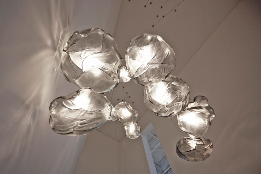
The latest result of this tinkering-first approach is Bocci's 73 series of pendant lights, featuring clusters of delicate, cloudlike glass forms suspended on thin metal cords. The project began after Arbel coerced a pilot friend into showing him his airplane. “That’s how I usually end up in these situations,” Arbel says. “My friend is showing me the engine and there’s this fabric bag—you sometimes see them in Formula 1 racing, these very beautiful little woven baskets. It struck me immediately. It was pristinely white in this engine of all gray or black pieces.”

If it's good enough for NASA . . .

The pristine white basket was constructed of 3M Nextel, a high-grade ceramic fabric developed to handle tremendous amounts of stress and heat, including rapid changes in temperature. Like so many high-performance materials, the fabric was initially used to protect NASA space shuttles and satellites, selected for its strength, fire resistance and very necessary ability to withstand meteoroids. 

Needless to say, Arbel’s interest was piqued. “We have a glass shop and the temperatures are around 300 degrees Celsius,” he says. “Anything that can withstand that kind of heat immediately catches my eye.” After doing some research, he purchased an entire roll of Nextel and sent it to his shop, where his team quickly set about learning how to work with the industrial material. An early challenge was simply cutting and sewing the fabric. “You need very special shears and you have to cut with the grain,” Arbel says. “You need the thread to be exactly the same material, otherwise it burns. These things all took a while to figure out.”

Once the team understood how to work with the material, the project became an exercise in upholstery. Arbel decided on pillowy forms for glass to be blown into—resulting in those cloudlike shapes—and tasked his team with sewing the ceramic fabric into a series of loose structures. “That simple concept took months and months to figure out,” he says. “It became very important that [these forms] remained quite loose. If the glass completely filled a taught pillow shape, it would mean that every piece looked the same, so we left a vast excess of the fabric with each pillowcase.”

With that variation in mind, the team created an array of slightly differing pillowcases from the material. Then a glassblower placed a small bubble of glass with thick walls into each case, for controlled, yet unique, glass forms. A bed of sand was created to support the form, providing just enough structure to “not make a mess,” but enough to support the glass and give it the freedom to move freely within the fabric case during the glassblowing process. At the right temperature, the glass form expands, taking the shape and texture of the fabric volume around it. Once the glass cools to the point where it is able to retain its form, the pillow is stripped away and the glass is placed in an annealing oven, where it gradually cools to room temperature over 12 hours . 

From there, it was a matter of figuring out how these forms would attach within a system to create a light fixture. “Instead of sourcing or just buying parts, we pride ourselves in making all our own hardware for each of our lights,” Arbel says. “It’s hard and the approval process is very difficult, but—for us—it’s worth it. If we were limited by what we could buy off the shelf, we would be doomed.” Arbel and his team had to create four size variations of the hardware to hold the variously-sized glass pieces—and he says that the hardware used for the 73 series is Bocci’s most sophisticated and complex yet: “The component had to create diffuse light and suspend an organic piece of glass with a variable center of gravity and weight—all while appearing elegant and visually subtle.”

Achieving the right quality of light was another challenge. “It was important to me that the glass shape be filled with a diffuse and non-directional light—as if the glass was a container, full of liquid light,” Arbel explains. “If there is any light that has a direct point source, it destroys the magic.” Deciding to work with LEDs just made things more difficult, given their color temperature and limited dimming abilities. “These are both things you really need to make a magical light, so you’re going into the ring with one hand tied behind your back.”

Ultimately, the Bocci team decided to go with a hemispherical lens inside the light, paired with a doughnut-shaped lightbulb of their own creation. As Arbel explains it, this was a matter of making the light feel “present”—but not too present. “That part of the project I consider almost etiquette,” he says. “It’s having good manners. It is supposed to do what it is supposed to do and let the rest of the piece exist. It’s like a well-tailored suit.”

The final piece is hung as a group, in small or larger clusters, and will go on sale starting in April.

Theory that Gearshift Lever's Design Contributed to Horrific Accident

$
0
0

A New York newspaper is looking at the design of a Mercedes gearshift lever as the potential cause of a horrific car-and-train collision earlier this month. 

On February 3rd, 49-year-old Ellen Brody's ML350 was struck by a commuter train north of New York City. The car exploded, the train pushed it for 1,000 feet and the first train car burst into flames. Brody was killed, along with five passengers in the train.

So what role could the gearshift lever have played? These days when I hear of a car accident, I usually wonder if the driver was texting rather than suspecting some ergonomic fault with the car's design. But the gearshift argument makes sense given the following information and the eyewitness account:

Brody was in a line of heavy stop-and-go traffic, waiting to cross the railroad tracks. This was an unfamiliar route for her; traffic had been detoured due to an earlier accident on the nearby highway she normally traveled on. As Brody's turn came and she inched her car forward, the crossing gate suddenly came down onto the back of her car and she stopped. The car behind her then began to reverse, assuming Brody would do the same to free her car of the gate.

According to an eyewitness account, Brody got out of the car to see what had happened. She touched the gate but did not, or was not able to, remove it off of her car.

Brody then entered her vehicle and sat there for a moment, which the witness described as “enough time to put on her seat belt.” The witness said Brody then suddenly pulled forward, directly onto the tracks, and the train struck her car.

"I just knew she was going to back up—never in my wildest dreams did I think she'd go forward," the eyewitness said.

It makes no sense—until you consider what must have happened. Brody gets back into her car, presumably pauses to put her seatbelt on, then puts the car in reverse, to back up and snap the gate off if need be. Instead the car moves forward directly into the path of the train.

Take a look at the stalk-style gearshift lever in the ML350:

With this arrangement, when it's in "Park" and you pull it down one notch, it goes into "Drive," i.e. forward.

Brody was 49 years old. Thirty-three years ago, when she was sixteen and presumably first learned to drive, column-mounted, automatic-transmission lever-style shifters were common in America. They looked like this…

…and the sequence was always the same: P, R, N, D. In other words, one notch down from "Park" was "Reverse." I believe Brody, like most Americans of that age who learned to drive on such a car, had it hard-wired into her brain that when you're shifting something mounted to the column, one notch down from "Park" is "Reverse." I think she meant to back her car up away from the tracks, muscle memory took over, and she unwittingly lurched the car forward. There was no time for either her or the train driver to react.

Records show that Brody had registered the car in December, meaning it was new-to-her and perhaps she hadn't gotten the hang of the transmission yet. But even if she had, that may not have made a difference. In an online forum for Mercedes owners, one owner of a GL-series—which has the same shift lever arrangement as the ML-series—writes:


I have [13,000 miles] on my GL and really don't like the stalk shifter. I still must consciously think about shifting, especially going from either R or D into park, unlike the automatic motions I use with a center console mounted shifter. Even the standard column shifter of days gone by and which are still on some vehicles is more intuitive. I think it's because the position of the shift lever, be it on the floor or the column, is an obvious visual indicator of shift position rather than the not so obvious lights on the dash.

The type of shifter in Brody's car—which is a function of drive-by-wire and is not mechanical—is not unique to Mercedes; some BMW models have an identical arrangement. But given that these are for drive-by-wire systems, it must be a relatively recent convention.

Older European cars had predominantly manual transmissions, and in my own anecdotal experience, every older European I've met that can drive learned on a manual. In automatic-transmission-crazy America, however, most older Americans learned to drive under the P, R, N, D convention. Perhaps we cannot expect a European car company to adhere to a convention not of their making. But to a generation of drivers raised on column-mounted P, R, N, D, the newer design approach seems a very poor one indeed.

Viewing all 19132 articles
Browse latest View live


Latest Images