Quantcast
Channel: Core77
Viewing all 19151 articles
Browse latest View live

Bringing Solar Power to Stained-Glass Windows

$
0
0

Marjan van Aubel began her love affair with energy-harvesting technologies while studying product design at London's Royal College of Art in 2012. During her studies, the Dutch designer created a collection of solar glassware that collects energy and stores it in a cabinet, as well as a table made up of solar cells that can power devices while you work. Her latest sun-powered endeavor is a modern take on stained glass, using dye-sensitized solar cells (DSSCs) to bring new utility to the Medieval-era art form.

DSSCs are relatively inexpensive compared to other solar cells on the market, starting at around $200 each. The name comes from the organic dyes used on their surface, which are available in a range of colors and which allow the cells to convert light to energy in the same way that chlorophyll does during photosynthesis. The cells are made up of a permeable layer of titanium dioxide nanoparticles, which is then coated with a layer of organic dye to absorb sunlight. As sunlight passes through the cell, it hits electrons in the dye that flow to the nanoparticles. A transparent electrode on top collects the energy and sends it to a battery for storage and eventual use.

Marjan van Aubel's Current Window

While most people are drawn to DSSCs' low cost, van Aubel was fascinated by the material's colored properties. "I think solar cells are quite ugly, and we don't want to live with them," van Aubel says. "Most people, on their roof, they don't want to see that. That's why I think it's really important to think aesthetically. How do you want to live with these technologies and integrate them into our daily lives?" Both van Aubel's Current Window and her earlier Current Table use orange-colored cells, chosen for their reliability and steady harvesting of energy over time.

Picking the color is the easy part. "The solar cells have to fit in this frame and then there had to be a battery," van Aubel says. "It's a quite nice challenge. For me, it is a bit like a puzzle to make all these elements you have to work with come together." Aubel describes the wiring process, however, as "actually quite straightforward." Each panel has an anode and a cathode that all wire to one battery source. "So you just make enough space for the wires to go through," she explains. "The size of the battery partially defines the [frame's] shape and how much energy you can store."

Van Aubel doesn't go at it alone, however. The designer is very quick to thank her collaborators, a slew of scientists, designers and manufacturers who help her realize all of her projects. The stained-glass pattern, for instance, was produced with the graphic designer Marine Duroselle, who helped create a delicate balance of aesthetics and function—designing the stained glass pattern to have as many cells as possible while still achieving an eye-pleasing arrangement. "If you want to make the solar cells, you have to understand that the more you take out, the less efficient it will be, so there has to be a nice balance of making it aesthetically nice and also working efficiently," van Aubel says.

For the solar-cell manufacturing, van Aubel turned to Solaronix, whom she first contacted while a graduate student at the RCA. "I think it's easier to get into things if you're a student," she says. "I just called them up and I went to work in the lab to visit them. We've been working together for three years now." For each of her projects, van Aubel has also had to manufacture custom batteries for her specific cell configurations.

Van Aubel's Current Table

On the Current Window, harvested energy is stored in the window's ledge, which also houses a few USB ports for powering small devices. (An indicator light lets users know how much power is available.) Unfortunately, even small devices will drain the battery pretty quickly; while DSSC technology has come a long way, it's still fairly inefficient. With both van Aubel's Current Table and Current Window, for example, it takes roughly eight hours of indirect sunlight to fully charge all of its cells, equivalent to about two cell phones' worth of battery life. Van Aubel would love to see the technology advance to allow her to power larger devices; she envisions her tables and windows being used in libraries to power users' laptops and tablets, possibly even through induction.

And she's not the only one who is optimistic about this kind of scenario. Recently, van Aubel was approached by Cognicity, a London-based accelerator, which wants to help grow her solar projects into a business. She just brought on a partner and started up a company called Caventou to develop her Current Table further. Van Aubel is now in the process of designing a version that could be mass-produced, and has hopes to bring it to market for less than $5,000.

Naturally, van Aubel is excited about the future of solar power, arguing that once these kinds of energy-harvesting products start to make their way into people's daily lives, the technology will improve rapidly. "That's what I think the role of designer is as well—to make that bridge between technology and the user," van Aubel says. "I try to be the human aspect of technology a little bit."


This "Throw and Shoot" Camera is Like a Flying GoPro That Follows You

$
0
0

GoPro's variety of harnesses let you mount their cameras to your head, chest or even your dog. But a new company has developed a flying camera that you needn't wear at all. You simply throw the Lily, as it's called, into the air, where it takes flight and follows you on your adventures.

Just over ten inches square, the aluminum and polycarbonate Lily is a dual-camera-equipped quadrotor drone with 20 minutes of flight time. 

It hones in on a tracker you wear on your wrist, hovering anywhere from five to 50 feet above your head, and runs a tracking path of your choosing (i.e. follow shot, side shot, Michael-Bay encircling shot). 

And it'll keep up with you as long as you're moving 25 miles per hour or less. It seems pretty unbelievable:

The Lily is expected to retail for $999, but the developers are currently selling pre-orders for just $499.

I keep thinking of the applications it could have beyond adventure videography. Given a longer flight time and a workable way to navigate overhead obstacles, a fly-'n-follow camera could be useful for everything from tracking animals on a farm to less confrontational police pursuits. We'll have to see how well the device actually works when it begins shipping in February of next year.

4 Examples of How Cradle to Cradle Fosters Product Design Innovation 

$
0
0

Stemming from the belief that revolution starts with designers, Autodesk partnered with The Cradle to Cradle Products Innovation Institute for a new kind of competition. The Product Design Challenge, tasks participants to consider the impact of their material choices on industry, nature and economy, the inaugural edition focuses on drawing attention to the fact that throwing something away is no longer a viable option. The challenge received both student and professional submissions from 16 countries in diverse categories: home and furniture; outdoor, landscape and garden; electronic and entertainment; vehicles and structures; apparel and others. 

Three winners and one honorable mention were chosen for thoughtful proposals that celebrate an inclusive approach to industrial design. "With 10 billion people soon to be living on the planet with finite amount of resources, designing for a circular economy is the only way forward. Solving today's epic challenges requires bold new approaches to how we design and make things. Creative young talent in many cases is leading the charge, leaving the linear economy in the dust," said Lynelle Cameron, senior director of Sustainability and Philanthropy, Autodesk.

A key design detail of the Finite Faucet is that the handle is moved into the sink so that your hands are already in the stream of water when you turn it on. 

Fusion 360 Winner: Finite Faucet 

Cole Smith's Finite Faucet was awarded the Fusion 360 award—recognizing the best use of Autodesk tools in realizing a design from initial sketch to fleshed-out concept—for his sleek upgrade to the often testy public restroom faucet. "I conceptualized Finite as a waterfall faucet. I imagined that the flowing water might be a suitable enough reminder of the user's impact on the environment—that their water was, at some point, coming from an actual waterfall somewhere," explains the Virginia Polytechnic Institute student. The cylindrical vessel holds just enough water to allow users to wet their hands for 20 seconds before it completely empties. It then refills over the course of another 20 seconds, reminding users to lather and scrub adequately before rinsing off. By adapting the habits of users, the faucet attempts to not only do "less bad, but more good," an effect that is compounded by the use of primarily recycled materials, including copper sourced from standard plumbing fixtures. 

The Pure If Hide chair prototype uses two layers of 1.1mm leather sewn together with a layer of canvas sandwiched between to reduce stretch while increasing strength and durability. 

Professional Winner: Pure If Hide

Jerri Hobdy's chair and stool collection aims to merge elegant design with easy recyclability. "These designs are inspired mostly by the intense need for healthy home furnishings and how to inspire minimal but adequate lifestyles through refined forms," explains Hobdy. Using solvent-free vegetable tanned leather and steel, the design invites easy recyclability as well as the option to update with new leather and different colors. As Hobdy says, "the chance to create lower cost goods with a higher actual and perceived value is a real opportunity using the Cradle to Cradle process."

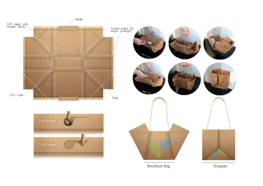
The Venlo bag is made out of Cradle to Cradle office paper and flax fibres. It also makes use of the first certified biodegradable printing ink made by Austrian company Gügler. 

Student Winner: Venlo Bag 

Each year, between 500 billion and 1 trillion plastic bags are produced throughout the world. Though most people only use each bag for a short period of time, they can take up to 1000 years to completely degrade. This staggering figure has prompted the European Union to vote for the reduction of plastic bag use by 80% in 2019, though the need of plastic bags shows no signs of subsiding. Tjitte de Wolff 's Venlo bag is designed to meet this continuous demand for shopping bag alternatives. It is a glue-less, self-assembling bag designed to take on a second life as a soil-cover in the garden, promoting the creation of humus rich soil. "The main challenge I think is skepticism amongst large producers as they are not used to think in a circular way. However I feel this will change when sustainable design starts to show its full potential," remarks de Wolff.

The MetroWay is designed to be implemented in a three phases, eventually becoming an alternative for museum admission method as well as credit card and identification card systems. 

Honorable Mention: MetroWay

A team of Pratt students comprised of Cody Miller, Daniel Penge, Carla Ramirez, Rebecca Travis, and Bryan Wong created a contactless, personalized and refillable MTA card system. A system of embossing and die cutting to allow for the separation of materials into their separate nutrient cycles separates the MetroWay from existing contactless cards.  The proposal is a poignant reminder that change can be enacted even through the smallest of objects. As Miller describes: "We were inspired by the sheer volume of lives the subway transit system affects every day and the idea that a Cradle to Cradle inspired product could instantly be held by seven million New York City residents. The opportunity we saw with the MTA MetroCard was a 'bigger picture' concept for the future of sustainable design. If it is possible to design and implement sustainable products in an infrastructure as large as the New York City subway system, it can be done anywhere. A big idea that fits inside your pocket."

Matthias Pliessnig's Gorgeous Bentwood Benches are Growing

$
0
0

We've covered Matthias Pliessnig's excellent bentwood work since the early days of Core77, and it was impossible to miss his canoe at Design Week two years ago. What we didn't realize is just how large his benches have grown over the past several years. Have a look at this conceptual Rhino/V-Ray rendering from his Facebook page, of a 3/4-scale model coming in at 16.5 feet long:

Well, that's just a rendering, right? Wrong, he of course built it, and several others of similar scale:

Pliessnig's gargantuan benches, some of which max out around 32 feet(!) in length, have been shipped off to Harvard Business School and Beirut's Platinum Towers. And we're guessing he's recently racked up some New-York-based clients; the designer/builder has recently relocated his studio from Philadelphia to Industry City, Brooklyn. Here's what the space looked like prior to the move date:

That's a lot of room to fill with a lot of long benches. In the days since, he's unsurprisingly been filling it up. Look for Pliessnig's stuff at this year's Wanted Design Brooklyn with a special Open Studio on Saturday, running until May 19th.

He also released a rendering, shown below, providing a hint of what we might see in future: Negative space beneath the piece, if he can figure out the structural implications.

Ex-Anthrax Guitarist Turned Master Watchmaker Designs an Ergonomic Workbench

$
0
0

Dan Spitz was Anthrax's co-founder and lead guitarist since the early '80s, and when he quit in 1995, it was a bit of a shock. Seen from afar, his actions could have been misinterpreted as a meltdown: Spitz "started tearing the stereos out of his cars, removing all music from his house of all forms and nature and gave more than fifty touring and studio guitars away to hang on the walls of the Hard Rock Cafes around the globe."

Spitz, however, had a plan, one that dated back to when he was eight years old. "Ever since my [grandfather] showed me the inside of a Patek Philippe as a young child I could never see straight again," he writes. "I fixed everything in my house I could get my hands on." Thus Spitz, after leaving the band, began studying both micro-mechanical engineering and micro-electrical engineering, with the goal of becoming a Swiss-trained Master Watchmaker.

After attending the Joseph Bulova School of Watchmaking and completing several apprenticeships, Spitz won a scholarship to the WOSTEP (Watchmakers of Switzerland Training and Educational Program) in Neuchatel, Switzerland.

Today Spitz holds a laundry list of watchmaking diplomas, runs two luxury watch service centers, serves as a watchmaking instructor and has held titles like "Master Watchmaker of Complications Specialist" for Chopard and Leviev. His latest endeavor has been to design a highly specific type of furniture: An ergonomic watchmaker's bench.

As Spitz explained in an interview with Hodinkee,

I brought over a few benches from Switzerland, since I wanted a bench with my specific requirements, but they were $10,000 or more. So I designed something out of raw ergonomic design – I spent 3 years designing the bench in CAD and making prototypes. The result was the best bench I have ever used. Watchmaking is an ergonomically horrible job, you are hunched over, your arms are falling asleep, and you are just asking for carpal tunnel syndrome. The first thing new watchmakers should save for is not tools, but a really good bench.

From the description on the product page:

The working surface where the green matting sits has been thought out for months for its unique shape. It leaves a wider mouth where your larger tooling sits at the back end, and oil cups can be brought in or out and still leaving the extended main working surface angling out from the beautifully rounded front edge where your chin often sits giving you the feeling of much more room to work comfortably. Use your own green or white matting as it comes pre routed at the common depth for the usual.

Spitz points out that the $10,000-plus Swiss-made watchmaker's benches typically have 1.5-inch thick tops; he reckons his design is a better buy at $2,275 for only the top, which is double the thickness at three inches for stability, with the thought being that the customer adds their own legs. "You can buy the top and slowly upgrade your bench as your funding allows you to," he writes.

There are manufacturing shots and more details on the bench's construction viewable here. Judging by both, Spitz seems pretty obsessed with the quality of his product, right down to the shipping. "It comes crated so well," he writes, "you will wonder how long the crate took to make before you even open the bench."

Obscure Design Classics: Angelo Mangiarotti's Maritime Table Clock

$
0
0

Any designer among us would be lucky to have one of our objects still in production some 60 years later. Angelo Mangiarotti's beautiful Maritime Table Clock was designed in 1956 and can be purchased today, being produced under license by Germany's Klein & More.

Porcelain down below and Plexiglas up top, the battery-powered desktop clock seems to be the one thing on your worksurface that's looking back at you. Closer inspection reveals the hash marks representing the numbers thicken as they get closer to twelve, a subtle piece of graphic design.

The "Maritime" in the name comes from the fact that Mangiarotti initially designed it for a luxury yacht. Thankfully, Klein & More licensed the design from Mangiarotti in 2002, and today the piece can be purchased online for a reasonable US $265 to $285.

If you're wondering about the scale, the clock is just over six inches tall, and roughly 4.5 inches wide.

The Mid-Century Car Design Documentary We Were Never Meant to See

$
0
0

Hollywood is famous for optioning things they'll never make into movies. They buy rights to stories to keep them away from competing studios, and once they don't get greenlit, the concepts are scuttled, their creators kept quiet with the paycheck they optimistically cashed.

Sadly, a similar thing happened with auto manufacturers, a real tragedy during what filmmaker Robert Edwards calls "Detroit's golden age of automotive design," from 1946 to 1973. Designers slaved over renderings that not only never saw the light of day, but were actually shredded.

[Some design concepts] were beyond the imagination of the top executives. Wary of competitors stealing concepts, companies prohibited the art from leaving the studios. …The artwork was destroyed to keep it out of the hands of the competition.

But luckily, a handful of plucky designers snuck their renderings out of the studio:

Some designers saved their artwork from the shredders with a rarely issued permission via a "package pass," others devised ingenious ways to secret them out. Only a small fraction of the concept drawings survive, but this body of work constitutes an unheralded chapter in American art history.

Edwards managed to locate some of these designers and intended to create a documentary, "American Dreaming," showcasing their work and recording their stories:

American Dreaming Teaser from FREE AGE on Vimeo.

Sadly, we heard about this one too late. Just two days ago the doc came woefully short of its crowdfunding target, amassing just $8,335 though all it needed was a lousy $20,000 to get the ball rolling. (The producers had hoped to eventually reach the full projected $100,000 budget.)

We hope that the lack of funding was simply a failure of awareness rather than interest. If you would have pledged to see this documentary, please say so in the comments below; should we amass enough support, we can try to forward it to Edwards as a kind of petition to try again.

Organizing Tools for Vinyl Fans and Book Lovers

$
0
0

Anyone who's been in a record store knows the look: numerous bins of LPs with dividers to help customers find the records they want. Book lovers have seen shelf labels and dividers in libraries and bookstores. These avid collectors of records and books may benefit from having similar organizational tools in their homes.

Filotrax has sets of LP dividers for records that are flexible enough to work for almost anyone. The dividers, which come in white or black, are made from 800-micron plastic and have blank tabs. The dividers can be used either horizontally and vertically, so they'll work for both bin and shelf storage. Collectors can write on the good-sized tabs with marker pens, or they can put adhesive-backed labels on them.

For collectors who don't have the time or the inclination to create their own labels, Filotrax created label kits which include inkjet-printed A-Z labels and genre labels. (It's also possible to purchase just the dividers and the A-Z labels.) For some people, having these labeling products will make the difference between finishing their record-organizing project and leaving it just halfway done.

The tabs on the plastic dividers from Vinyl Guru extend for the whole divider width, allowing the collector to do a more staggered A-Z labeling. Full-length tabs are also good for those who want to create custom labels that might be longer than what fits on a half-width tab. The A-Z labels that come with the dividers would drive me crazy, though; they'd only work for those who don't mind seeing that logo all the time. 


Photos for Kate Koeppel Design: Cera Hensley

But some vinyl collectors will agree with Mike Fenton, who said: "I've always enjoyed the idea of my record collection being a display exhibit, a conversation piece, easily accessible. I love records as aesthetic presences in the house." And those collectors might appreciate dividers that are both functional and beautiful, such as the handcrafted dividers from Kate Koeppel Design

These are laser-cut wood panels; specifically, they're made from high-grade European birch plywood. The tabs are either laser-engraved (on both the front and the back) or stenciled. There are horizontal dividers, vertical dividers, and some that work in either orientation. Kate designed these to be durable and also neutral, allowing the albums themselves to be the main visual attraction. 

But as a professional organizer, what most impressed me was how she had considered the many ways people might choose to organize their vinyl.

Besides the A-Z and  genre dividers, there are decade dividers (1960s, 1970s, etc.); dividers based on how the records would be used (cocktail party, for example); and dividers such as New, Rare, and Favorites. There are also alphabetic dividers in ranges (A-H, I-P and Q-Z) which could be helpful to subdivide a genre. For the non-alphabetic dividers, collectors choose just the specific ones they want, to fit their individual needs. 

Dividers (or other labels) aren't as critical with books, since owners can usually read the book spines to determine where they are in the collection. But  labeling can help someone get to the right place quicker, and can help anyone who isn't familiar with the collection (a house guest, for example) find books of interest.

While permanent shelf labels are annoying when books get re-arranged, magnetic labels on metal shelves can work just fine. With this design, the labels get cut to size from a roll. Using wet-wipe markers means they can be erased and reused as needed. It's a quick, easy and inexpensive solution, which is exactly what some people need.

The steel Indice bookends from R.F. Yamakawa provide support for the books while they divide them into sections. Without any labels, these dividers provide less guidance as to what's where than dividers that are labeled. But since the book spines will more or less indicate what each subdivision is, many people won't be bothered by the lack of labels. (Book owners could certainly add something like A-Z labels if they wanted improved functionality.)

Of course, you can design for both book support and labeling, as this label holder/support shows; there's just a trade-off between cool looks and functionality. One possible design problem: A purchaser noted that the labels tend to slide out.

The plastic Animal Index from +d, designed by Hiroshi Sasagawa, could serve as a visual cue as to what goes where for book owners whose minds work best with non-traditional organizing approaches. (And again, as noted with the Indice bookends, sometimes all that's needed is an indication of where each subdivision begins and ends.) Alternatively, these could be used as placeholders to indicate where a book was removed from the shelf. 

Kate Koeppel began her product line with record dividers, but she's expanded it to include book dividers, too. One nice benefit: The book dividers can be made from wood left over from creating the record dividers that might otherwise be scrap.

Again, Kate has provided an impressive list of divider choices. There's a wide range of genre options, as well as A-Z dividers. I was especially pleased to see the "borrowed" divider, which is one that many book lovers could use.


The LaSquare: A Large And Luscious... Combo Square! 

$
0
0

You know the pain of using a tool that just isn'tquite what it should be. Robert LaGesse is just like us except, as a skilled machinist, he refused to leave his "there's got to be a better way" idea on a napkin. Say goodbye to floppy layout tools and anemic rulers, and say hi to LaSquare! Born out of LaGesse's frustration with the skinny combo squares he used daily, its big fat claim to fame is its big flat 2 inch wide base. It's a simple but very helpful update to traditional combination square technology, allowing increased positive contact with your work surface. By increasing the width of the face you get a more secure, sturdy position to base your measurements and markings on, resulting in more accurate work. It's wide enough to clamp to a work surface, wide enough for work on tubing and round material, and it makes marking and scoring possible on a second axis! The LaSquare comes with a thick stainless steel 12" rule, stout knurled adjustment knob, and integrated level. Precision cast and machined here in the US. Now $45 on Hand-Eye Supply.

But don't just take our word for it... This weirdly perfect promo video should be all you need to come 'round on their square. 

A Preview of Tribeca Design District

$
0
0

Those of you visiting for NYCxDesign may have noticed, as New Yorkers surely have, that iOS autocorrects "tribeca" to the rather more awkward "TriBeCa"; neither abbreviation nor portmanteau, the unusual capitalization connotes its coinage. The neighborhood may be Below Canal, but it's shaped more like a trapezoid than a triangle; perhaps "Trabeca" just doesn't quite have the same ring to it (then again, tourists will mispronounce "How-ston," but everyone knows "So-HO"). Prescriptive keyboard notwithstanding, Tribeca is known for its eponymous Film Festival and a Jay Z line or two: Surely you've caught a glimpse of the neighborhood from his and Beyoncé's balcony in the "7/11" music video or in an establishing shot in any given Casey Neistat short — or, of course, in any of the films that have been shot in the vicinity (Ghostbusters, for one).

As of this week, this wedge of the Manhattan, f.k.a. the Lower West Side, will assume yet another designation as the Tribeca Design District — thanks largely to a colonizer, of sorts, who is looking to codify the neighborhood's status as a bona fide design destination.

The initiative finds its origins in a conversation last summer, over lunch, between then-new kid on the block Jean Lin and David Weeks, a Brooklyn-based veteran designer who'd expanded his eponymous studio to a storefront on Walker Street in October 2013. A writer and sometime designer/retailer by training and trade, Lin had first established herself as a community-builder through a charity auction in the wake of Hurricane Sandy, for which she rallied local designers to donate their work, with proceeds going to relief efforts. Reclaim, as it was known, returned six months later as a group show during the first annual NYCxDesign festival in 2013; a third edition marked the inaugural exhibition at her permanent showroom during NYCxDesign last year. Based in Tribeca, Lin is the proprietor of Colony— a design co-op, one year old as of this week — on the second floor of 324 Canal Street, where a new edition of Reclaim will be on view this weekend, alongside work from Moving Mountains, KWH, Hiroko Takeda, and VIDIVIXI, among others.

"David came to our exhibit last year," says Lin. "He was really nice... we were talking about the neighborhood and we thought of the idea." Initially conceived as a semi-regular art crawl — think Chelsea, the first Thursday after Labor Day — the event series was pushed back to the point that it simply made more sense just to launch during NYCxDesign in May. "We're still going to do that; we want to have group openings and stuff like that throughout the year." For now, though, the festivities kick off tonight, May 14, Tribeca Design Night, at over 20 participating galleries and showrooms, including UHURU (who are opening their first showroom, on White Street), Shinola, Best Made, Schoolhouse Electric, Espasso, Property, Stillfried Wien, and Double Knot, to name a few.

Eclectic though the mix may be, all of the galleries, showrooms, and dealers largely cater to high-end clientele from near and far. Although Tribeca is widely known as one of the most expensive property in Manhattan (and, by extension, the country), commercial space has remained remarkably affordable for independent showrooms looking to stay in the orbit of Soho without the overhead. For Weeks, it's all upside: "I like the understated aspect of Tribeca, and the scale of the spaces... There's plenty of money and people here, but it doesn't have the Soho vibe."

Exhibition view of Cody Hoyt's exhibition at Patrick Parrish

Nevertheless, the proximity offers the best of both worlds, as design-seekers working their way down from Houston increasingly find themselves crossing the border into Tribeca. Gallerist Patrick Parrish, among the first to move to Tribeca in the early 2000's, noted that "There's always been design here, but it seems this little tip of Tribeca, was ignored for lots of reasons." He's referring to the northeast corner of the neighborhood — the nexus of Soho and Chinatown — where he relocated last year, after a ten-year run on Duane Park. "That part of Tribeca has changed a lot."

Just as Weeks cites his former employer Ted Muehling as a kind of pioneer — on Greene St, in Soho, then Kenmare, and now White — Parrish recalls seeing the Duane Street space for rent when he was walking home from an opening at R&Company (then known as R20th Century); founders Zesty Meyers and Evan Snyderman are veritable elder statesmen in the neighborhood. Paul Donzallo is also widely cited as a trailblazer in the pre-Design District days, having established his eponymous gallery in 1997; like Parrish and R&Company, Donzallo is exhibiting at the concurrent Collective Design Fair. (Best described as a well-edited version of DesignMiami/, the third incarnation of this tentpole event of NYCxDesign is as far downtown as it's ever been, just a few blocks north of Tribeca, across the Gordian scrum of traffic where Canal Street turns into the Holland Tunnel.)

RO/LU exhibition at Patrick Parrish

Now, with upwards of two dozen permanent galleries and showrooms in the vicinity and counting, Lin is determined to bridge the generation gap with geographic concentration. But it's not so much a case of a tipping point or critical mass as it is a willful effort. After all, the Tribeca Design District is loosely analogous to Colony's business model as a designer co-op, which entails a delicate balance between and consensus and leadership; in both cases, it's just a matter of "organizing a bunch of people who have strong opinions." To that end, Lin forged ahead with the map and website — to overwhelmingly positive response from her compatriots — and she's paying it forward precisely because she's already gone all-in. Weeks, for his part, split the production cost, but with his retail experiment underway, he admitted that he's "a little old for the all the effort that goes into building a community… but Jean's a perfect person for that."

Indeed, Lin is felicitously positioned, in terms of both time and place, to serve as a gateway from points north. At the outset, the second-floor space was a mixed blessing for Lin: Literally across the street from Soho, the graffiti'd door and otherwise anonymous buzzer — favorably likened to a relic of a grungier era by Weeks — was a hard sell at street-level, even as Colony itself offered a refuge from the rough-and-tumble squalor of Canal Street. Thanks to word-of-mouth, though, Colony has gradually attracted more walk-ins: "A lot of the Soho shops send people here too, because people are constantly asking, 'Where else should I go?' — they want to discover things in real life."

Parrish agrees. "It's harder and harder to get people [to come] out — with the Internet, they can just stay home and shop all day long — so if there are more places for them to go, it's better for everyone." Like the other stalwarts, he expresses measured optimism about the Design District, having long witnessed the transformation of the neighborhood. "Two years ago, it looked like it was from 1989; ten years ago, it looked like it was from 1970," Parrish wryly observes. "But since I've been here, it's radically changed — there are apartments next to me that are $10 million. I feel like I got in there right at the last moment."

He continues: "The lot across from me" — where Colony is, not to mention the now-shuttered Pearl Paint — "is the original lot that was a 'Triangle Below Canal.'" It turns out that artists who had been priced out of Soho, in the early 70s, ventured south and dubbed their enclave on Lispenard the "Triangle Below Canal Block Association" — TriBeCa for short — and the name eventually came to refer to the whole neighborhood.

Now, 40 years later, with the inauguration of Tribeca Design District, the Triangle Below Canal has come full circle. For Lin, "It's saying that we believe in this neighborhood."

Tribeca Design Night is on Thursday, May 14 from 6-9PM

Texture Mapping in Real Life

$
0
0

Hydrographic printing, a/k/a "dip coating" or "camo dipping," is a neat way to get complicated graphics onto complicated objects. It doesn't work well with undercuts, but as we showed you here, if you want to get a carbon-fiber graphic onto a game controller or a camouflage pattern onto an animal skull, it's pretty much the only game in town.

It's also woefully catch-as-catch-can. Trying to line the 2D pattern up with 3D contours is virtually impossible. But at this year's SIGGRAPH, a research collaboration between students from Columbia University and Zhejiang University presented their method for correcting this.

We're oversimplifying the description a bit, but the researchers essentially used texture mapping to figure out how a checkerboard pattern would wrap around various objects they modeled. They then skew their pattern to match the resultant distorted checkerboard and print the pattern out. Next, assuming they line the object up carefully over the pattern when they submerge it, they can convincingly dip-coat things like a cat, a zebra, and even Shia LaBeouf with a bad haircut.

Here's the process in action:

Photo Showdown: Classic Car Designs Versus Their Redesigns

$
0
0

Automotive engineering objectively improves each year, with cars inarguably getting faster, safer, and more efficient. But can we say that something as subjective as the design has improved? Have our fancy CAD programs enabled us to create shapes more aesthetically pleasing than what our design forebears, limited to pencil/paper/clay, could produce?

If ever there was a discussion that designers could drag out while closing the bar, this is probably it. So before you buy the first round and tuck in, here's your ammunition: The collection of "classic cars alongside their modern-day counterparts" that has been floating around the web.

Aston Martin DB9 vs. DB5
Ford Mustang
Dodge Challenger
Land Rover Series I vs. DC100
Porsche 911
Porsche 911
Nissan Skyline
Chevrolet Corvette
Volkswagen Beetle
Volkswagen Beetle
BMW M-Class
Mercedes "Gullwing" 300SL vs. SLS AMG

Snowpeak's Folding Cutting Boards

$
0
0

For as long as I've been seeing these things, they're consistently sold out. But for those of you lucky enough to score one, Snowpeak's Folding Cutting Boards seem a good way to transport a knife and cutting surface, at least for car-based picnics (we doubt you'll want to carry the bulk and weight of these in your backpack).

The hardware consists of a simple stainless steel piano hinge and clasp, and the rubber feet are offset so that when folded shut, the feet nest in cavities without hitting each other.

The boards come in two sizes: The $39.95 M gives you a 10.2" x 7.9" cutting surface and weighs 16.6 ounces, while the $55.95 L (with beefier knife) expands to a 14.1" x 9.25" worksurface--but nearly doubles the weight at 30 ounces.

Apple Releases Apple Watch CAD Drawings

$
0
0


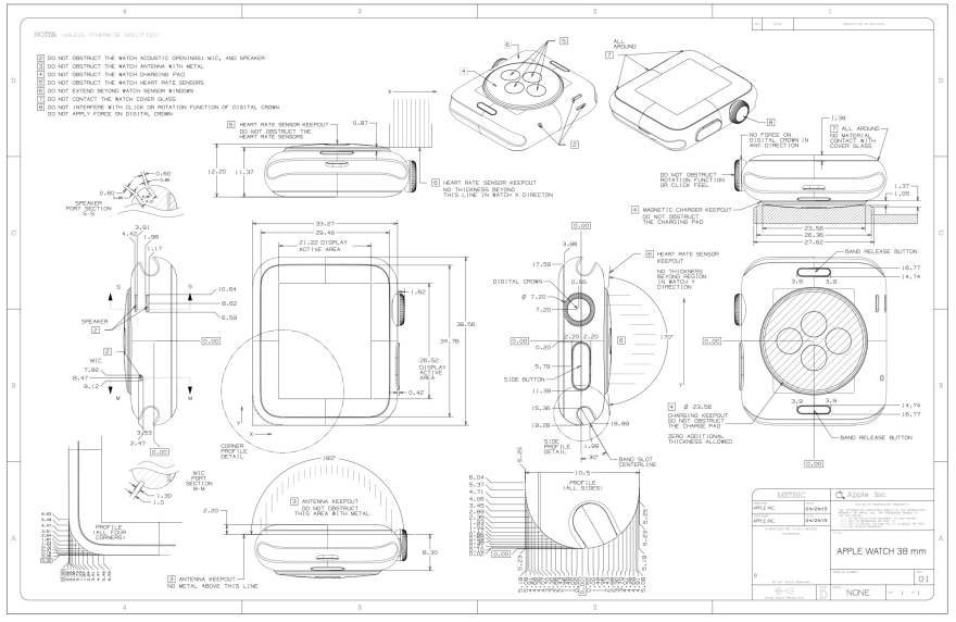
For those of you looking to create watchbands or cases for the Apple Watch, they've released the CAD drawings for both the 38mm and 42mm versions. And boy they are a doozy.

They're filled with "keepouts" warning would-be accessories designers which parts oughtn't be obstructed, to maintain functionality.

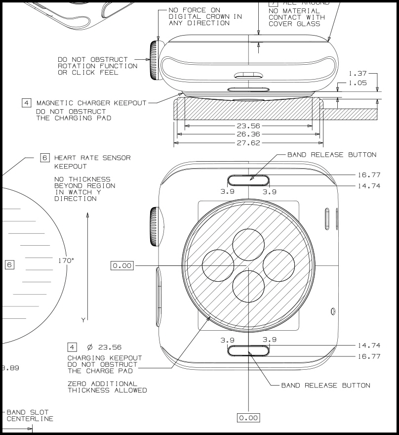
To us CAD-reading ID'ers the drawings provide glimpses of numbers we could only have guessed at. Like the corner details:

You didn't think that those were all one radius, did you?

Or the bottom of the side profile?

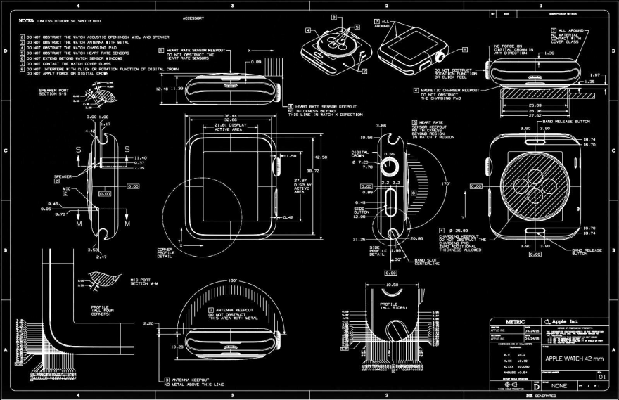
While the drawings are provided black-on-white…

…Yeah, we inversed them, for no reason other than that they look cool.

You'll find the CAD drawings here, embedded within the PDF.

Why Designers Should Shift the Vocabulary from Objects to Ecologies

$
0
0

It's likely that NYCxDesign visitors will soon experience sensorial exhaustion from the deluge of beautiful designs filling New York. This atmosphere sets a perfect background for Bruce Mau's lecture/call to arms—part of the Morse Historic Design Lecture Series at the Cooper Hewitt—where he humbly, yet powerfully, expanded on his ideas about the future of design.

The crux of the message lies in a simple idea: If you imagine our surroundings as a film, and you turn off the sound, you should still understand the action. If you don't, you need to redesign the action to tell the story you want to tell. Mau envisions the designer as an advocate, a channel uniquely capable of returning a sense of humanity to industry and expressing desires and conversations as objects and opportunities. The core of his talk is the realization that designers care. Using examples from his own work—like the ¡GuateAmala! campaign that uses a simple spelling change to shift a nation's self perception—as well as compelling industry precedents (think Apple, Tom's Shoes and the Roadster) he exemplifies the empathy and ethics that so much define design as an impulse. 

In between trade shows and parties, you can watch the full lecture below. And keep in mind, "We either do it by design or we do it by accident."


Transforming NASA Imagery Into an Otherworldly Wallpaper Line

$
0
0

Previously associated with your grandmother's living room or that one scene from Garden State, wallpaper has been making a decorating resurgence these past few years. Leading the charge have been Rachel Mosler and Nick Cope of Brooklyn's Calico Wallpaper, best known for their metallic, marbled designs that are painstakingly made by hand, scanned and printed to create custom installations. The paper-making duo is moving more into digital techniques, however, with a new series that uses images taken by the Hubble Space Telescope to create celestial swaths in gold and silver.

The series, titled Inverted Spaces—which was unveiled in Milan last month and made its Stateside debut on Friday as part of New York Design Week—is a collaboration with Boaz Cohen and Sayaka Yamamoto of the Amsterdam-based design studio BCXSY. The partnership arose from a mutual admiration that blossomed when both teams finally met in person at Design Miami in 2013, and immediately hit it off. They met again later that year and agreed to collaborate. "[BCXSY] looked at our work as a way to create these environments with wallpaper," Cope says. "They called us space explorers because we were exploring the space of an interior, so what they proposed as a motif was this exploration of outer space."

BCXSY showed the Calico team a simple graphic constructed by inverting NASA imagery; Calico agreed that this was fertile ground for a collaboration, and both teams began scouring NASA's extensive archives to source high-resolution images of constellations and galaxies, manipulating and collaging their findings in a range of digital experiments. 

Accustomed to creating large, original pieces of art that are then digitized at extremely high resolutions, the Calico team realized that the big challenge of this project would be preparing the already-digitized Hubble images for that format. "We were limited because the images that NASA shares—although they're quite large—they're not nearly large enough for us to output our usual high-resolution digital prints with metallics with lots of layers and masks," Cope says. "We needed to develop a technology for resolving the size of the images we're working with."

Cope gets really excited about this next part. After settling upon a few collaged compositions, he and Mosler reached out to a matte-painting studio for assistance in scaling up the images. The technique, reserved mostly for the entertainment industry (think Castle Black or any other cinematic fantasy world), allowed Calico and BCXSY to enlarge their celestial collages for printing at a much larger scale. "Back in the day, matte painting was was actually an artist and a brush," Cope says. "Although there's a lot of artistry involved, now they're working with styluses directly in the computer. So, in the end, there's no scanning necessary. It was a real breakthrough for us because now it has enabled us to create even more highly detailed master files for printing."

Inverted Spaces on display in Milan last month

With matte painting, a digital matte painter (known also as a DMP) uses programs like Corel Painter or Adobe Photoshop to create photo-realistic environments using pressure-sensitive styluses and tablets. Since the entire process is created digitally from a blank canvas, the painting can easily be scaled for higher resolutions while still maintaining the quality of the overall image.

For a studio that has always relied on enlarging and digitizing hand-made designs, Calico was thrilled with the solution. "In the past, we've been using this hybrid technique where we create artwork by hand on a really large scale and then digitize it for printing," Cope says. "What's nice about this technique is that we are creating the print files already in their digital form, so that line quality is just a total different ballgame. We still, of course, love both processes, but I think we'll be using matte painting again for future collections."

Beyond the technical hurdle of enlarging the images, the distance between the Brooklyn and Amsterdam studios was one of the most challenging aspects of the partnership. "It's a funny thing, but the fact that we were separated by six hours made it so easy to lose a day of progress," Cope says. "Not being able to work directly made us really feel how helpful it is to sit across a table and play around with the sample material and meet face to face on a project. Skype just doesn't always cut it—especially when looking at metallic wallpapers."

All the difficulties proved worthwhile, however, when the final wallpaper came back from the printer—where it had undergone a process entailing UV printing and some proprietary secrets that the teams could not reveal to us. Calico and BCXSY are proud of the debut at Milan's Salone del Mobile, and say that the response has been phenomenal. "I don't think we expected space to be a hot trend," Cope says. "It was the same with marbling for us. We found these old marbleized papers and we fell in love with them and we decided to explore them as a design, and then all of a sudden, marbling is this  huge trend. We're seeing the same thing now with space."

New Yorkers who want to see the collection in person can do so at The Future Perfect's Manhattan showroom during New York Design Week.

The Phree Lets You Write Off-Screen, Beams Your Marks On-Screen

$
0
0

Using a stylus to write on a smartphone is not a very ergonomic experience. Even for me, someone used to jotting things down on a notepad cub-reporter-style, it just feels off.

Realizing this, an Israeli company called OTM Technologies has designed a solution called Phree. While it looks like a chunky stylus, they're billing it as a mobile input device; what it does is allow you to write on virtually any surface, rather than the screen itself, and the penstrokes are beamed back to your device to appear on the screen.

It has another neat trick, albeit one that looks rather odd. There are times when you're talking on your phone and need to look something up to communicate to the other party, and it's awkward to take the phone away from your ear, tap through your calendar or contacts or whatever, and move the phone back and forth while you try reading some piece of data into the phone. For this situation, the Phree takes over bluetooth headset duty.

Here's what it looks like in action:

It's already gone through the crowdfunding roof, netting nearly $300,000 at press time, tripling its $100,000 target. Most of the Early Bird specials are gone, but there are a few left at a US $168 buy-in.

The device has not yet been perfected, by the way; testing will begin in November of this year, and the manufacturing is slated to begin in February of next year. If all goes right, the Phree will begin shipping in March of 2016.

Ward Bennett: Making Sense

$
0
0

Some designers are inextricably linked with a moment in time. Frank Lloyd Wright and Charles and Ray Eames helped define the mid-century modern era. The Memphis Group created the aesthetic now synonymous with the graphic style of the 1980s. Ward Bennett, a furniture designer whose career ranged from the early '60s through the late '80s is also one of those dynamic figures—albeit, one with quiet yet long-lasting influence. A designer with a fascinating background, in his heyday Bennett shared a studio with artist Louise Nevelson while also creating custom chairs for Lyndon B. Johnson; facts like this help demonstrate his atypical position within the design world.

The new exhibition Ward Bennett: Making Sense at Project No. 8's Chinatown location distills the design icon's highly original point of view regarding the relationships between material, form and feeling. A collaboration between design institutions Herman Miller and Geiger as well as Various Projects, a creative agency co-directed by married partnership Elizabeth Beer and Brian Janusiak, the exhibition celebrates Bennett's multidimensionality. The show includes original designs re-imagined by Various Projects—the traditional forms are given new life through modern color washes and surprising new material trajectories; note Bennett's classic Landmark Chair, reupholstered in an of-the-moment fluorescent orange leather. Or his originally austere Scissor Chair refurbished for the exhibit with a luxe 1970s-esque Icelandic sheepskin pelt.

Though references to past eras are present in the show, they should not be confused as a lament for the past. "We didn't want [this showcase] to be nostalgic because we felt like the pieces aren't." said Janusiak. "They're incredibly well designed, they're of the moment even if this is a design from 30 or 40 years ago. We wanted to think about it more like, 'Well, how would we do it now?'"

The pieces are displayed in an environment that not only includes books directly referencing Bennett's philosophies, but also supplementary elements chosen by Various Projects that make it feel personal; Beer and Janusiak even included a picture painted by their daughter, which feels simultaneously surreal, intimate and appropriate. Beer said that, "it's not like we wanted to put ourselves in his place, but more just intuiting kind of a fullness of the experience—that every place you look there's going to be something that's engaging". This idea of creating a 'total experience' is something continuously mentioned in relation to Bennett's life's work. The designer was once quoted saying, "I love to watch people respond to my furniture…the real compliment is to watch them, perhaps unconsciously, trace the flow of the arm with their fingers, or caress the curve of the upholstery".

Janusiak poignantly helped sum up the overall intention behind Making Sense: "Bennett at one point said the most successful thing he was able to design was a life; and that's just kind of amazing. There's nothing that characterizes all of it better."

"Ward Bennett: Making Sense" runs until May 22 at Project 8 from 12-7 daily.

Watch This Kid Forge Old Drill Bits into Super-Sharp Whittling Knives

$
0
0

He's only fifteen years old, but the unnamed British teen behind the Art of Weapons YouTube channel already has 100-plus videos posted. Though loosely based around creating knives and projectile-firing items like crossbows and slingshots, his channel also delves into product reviews, tool-using tips and material-upcycling how-to's. 

The central takeaway is that this kid really knows how to make stuff, has a fantastic grasp of materials and explains each step of his processes in satisfying detail.

In his latest video, he takes a bunch of old drill bits, melts them down in a forge made from a soup can, then shapes them into functional knives. He also makes the handles. Perhaps what's most fascinating is his sheer DIY resourcefulness and how little money he appears to have spent:

To date, the anonymous maker has been funding his projects with YouTube advertising fees; but judging by his frugality, the revenue is still small. "As my channel has grown and improved so has my passion to make these videos and creations," he writes, "but the problem is making all of these videos and projects take money and lots of time." Thus he's launched a Patreon page in hopes of attracting donors. If you'd like to support him, you can do it here.

Video of Kids Trying to Figure Out How to Dial a Number, and Send Text Messages, on a Rotary Phone

$
0
0

First off, this video making the social media rounds is giving folks a quick chuckle:

As you can see, it's a kid apparently bewildered by seeing a payphone for the first time. From a designer's perspective, it's interesting to see him tentatively move the receiver towards his ear; however foreign the device appears, the form of the receiver seems to provide some clue as to its function.

But what about the rest of the phone, or say, a rotary phone? For that we turn to YouTube channel The Fine Bros, which regularly posts videos exposing kids to old technology (or old folks to new technology) to record their confusion. In this one below, they ask kids if they can figure out how to dial a number--and send text messages, in a bit of misdirection--using a rotary phone, and it is nothing short of fascinating. We've queued the video to the appropriate part:

Watching it dawn on the kids that text-messaging once did not exist was priceless. But to be fair to them, perhaps the early interface design of a rotary phone is not as intuitive as we old-timers imagine it to be. In fact, when rotary phones were first introduced, adults had to be taught to use them too; the phone companies produced actual training videos for the public.

Viewing all 19151 articles
Browse latest View live


Latest Images