Quantcast
Channel: Core77
Viewing all 19147 articles
Browse latest View live

Father Designs/Builds Transforming Lego Storage Unit & Workstation for His Son

$
0
0

We designers are perhaps biased in thinking the best thing a parent can do is support any creative interest shown by their child. But bias aside, I've gotta put Australia-based Tez Gelmir forth as a candidate for the Father of the Year award.

"My son has recently developed an interest/obsession with Lego," Gelmir writes. "I pulled out my old Lego collection and instructions, and as we browse through them he says "Lets make a fire truck daddy!" The problem:

We proceed to sift through the pile for the parts...2 hours later I might have all the parts needed to build his fire truck. After a few of these situations I decided something needed to be done to make our Lego sessions as productive as possible. A few days of thought later I came up with [the following] design.

The handy and digital-fabrication-savvy Gelmir managed to turn this…

…into this:

Which transforms into this:

It's organized, space-saving, functional, and Gelmir's sized it to be "big enough to last years of my son's growth." There's an Instructable on how he designed and built it here.

Assuming they celebrate Father's Day in Australia, I'm guessing Gelmir will be getting more than a lousy necktie.

Via Technabob


Video of Plants that Explode

$
0
0

If a parent plant wants its children to travel, it can grow delicious fruit that will be eaten by an animal. Said animal will roam around and poop out the seeds, creating offspring some distance away from the mother plant.

But some plants don't have the patience to grow fruit. So instead they've evolved this crazy "ballistic" method of dispersing their seeds, known as explosive dehiscence. The folks over at the Smithsonian Channel have captured this phenomenon on video, and the sound effects they've added are awesome:

The segment is part of SC's "Amazing Plants" series, where you can watch them eat bugs, "talk" to each other, and undergo an experiment to see if classical music can actually make them grow faster.

Via Reddit

Tonight at Curiosity Club: Making A Photography Book & Seeing Inside Myanmar with Geoffrey Hiller

$
0
0

Tonight, Curiosity Club welcomes Geoffrey Hiller to discuss his photo documentary work in the once-closed country of Myanmar in his talk "Making A Photography Book." Starts 6pm at the Hand-Eye Supply store in Portland, and streaming on the Curiosity Club homepage

Myanmar in Southeast Asia is one of the least known places in the world, due to the military dictatorship that has isolated the country for the past sixty years. Now that the government is making the transition to democracy, the veil is slowly lifting, as are travel and economic sanctions. In Daybreak in Myanmar these images of a place once frozen in time are unique and timely. Photographer Geoffrey Hiller has been documenting the people of Burma since 1987 and has returned several times since the historic opening in 2011 to capture evidence of change, not only images of rallies for Aung San Suu Kyi, but the anticipation, hope and concerns of a nation forgotten by the world. Following his award-winning web documentary from 2000, Burma: Grace Under Pressure, Hiller recently published Daybreak in Myanmar. It includes over 170 color photographs and six interviews with leading Burmese writers and political prisoners whose words add depth to the images, covering topics such as native spirits and Buddhism, being arrested for blogging, and growing up in an ethnic village on the border.

Geoffrey Hiller's work has been published in magazines in the USA, Europe, and Japan including Geo, Newsweek, Mother Jones and the New York Times Magazine. Hiller was a Fulbright Fellow in Dhaka, Bangladesh in 2008–2009. Since then he has worked as a media trainer in India, Cambodia and Pakistan. He is the creator and editor of Verve Photo: The New Breed of Documentary Photographer. Visit his website at www.hillerphoto.com.

The Apprentice

$
0
0

In 2013, Chris Hardy had just launched his collection of Helix tables for Design Within Reach when the furniture retailer approached him about another project. DWR wanted Hardy to meet Jens Risom, the legendary Danish-American designer who helped introduce Scandinavian design to the United States and created iconic furnishings for Knoll in the 1940s and '50s. Risom, now 99, was unable to develop an entire new collection on his own, and DWR hoped that Hardy, 68 years his junior, would be a good match for an intergenerational collaboration.

Needless to say, Hardy jumped at the opportunity. "I went up to meet with him and started spending time with him, just getting to know him, and trying to develop a relationship with him," he says. That relationship-building was a success, and last month, after two years of work, DWR launched Hardy and Risom's Ven Collection of modular storage. (Ven means "friend" in Danish.)

The Ven Large Wall Unit in walnut
Chris Hardy and Jens Risom

From the beginning, it was a defiantly low-tech collaboration. "Jens doesn't travel and doesn't do e-mail or anything like that, so it was face-to-face meetings, which is the really the best way to meet," Hardy says. The Atlanta-based designer made frequent trips to Risom's home in Connecticut; following every meeting, Hardy would spend a month making sketches and mapping out alternative options before bringing them back to Risom to discuss. "I would bring up these packets of drawings and all these ideas, and Jens would give me feedback on what he liked, where the opportunities were and what he thought would be successful," Hardy says. "I would take all that critique and go back, maybe change the direction of the project, or introduce new ideas from our discussion." Through these conversations and extensive research, the two arrived at Risom's S.624 Cabinet, dating back to the 1970s, as a starting point, for the possibility and opportunities surrounding its customizable units.

Hardy and Risom worked to bring the S.624 into the 21st century, expanding the piece's modularity while simultaneously incorporating new technologies for production. "Most people during Jens's time had their own factories for doing their own manufacturing," Hardy says. "Jens had the option to take customization to the extreme where one person could order any kind of configuration they wanted, and he could give it to the factory and the factory would make a very particular product for that customer." Today, that manufacturing arrangement is much less common, so Hardy worked with Risom to create a modular system that would allow for pieces to be produced uniformly, so that they could be purchased right off the shelf, as opposed to hand-crafted for each consumer.

Hardy's drawings of cord-escape and handle options for the collection
Drawings of the frame and legs
A drawing of the Ven Sliding-Door Credenza
The finished product

To accomplish this, Hardy turned to CNC milling for all the modular components, ensuring a level of precision that was previously unattainable. "Another thing that you see [in Risom's earlier pieces] is that the tolerances were a lot higher," Hardy says. "If you placed an order for a certain measurement, it was maybe plus or minus a quarter of an inch, but now tolerances are millimeters, and we can pretty much guarantee that the size that you specify is what the customers will get." For the Ven Collection, customers are able to choose options from five modular components—a door unit, a cabinet unit, a sliding-door unit, an open-shelves unit and a filing cabinet—mixing and matching pieces to best suit their needs.

Hardy spent months finding the right factory to build these components in the best way possible. "The biggest challenge was definitely the manufacturing," he says. "It's just really a product that needs to have a lot of attention paid to it when you make it. There are so many details that go into it and they're all very important."

Ven File Cabinet
Ven Mixed Wall Unit

One of these details was the frame that everything sits on. "It's something you don't actually see, but it really took quite a lot to figure out," Hardy says. "The frame can expand as long as needed, while still staying level and creating a solid foundation for everything else to be put on. A lot of time spent with that, how these tolerances are going to be made, how the welding is going to be put on, these steel segments underneath, a lot of small details like that."

Stock steel tubing was used for the frame, which resembles a ladder beneath the wooden cabinetry. An earlier version used a wood frame, but the weight of the modular pieces created too much flex and gaps formed, making it difficult to shut drawers. The strong metal frame promises rigidity, no matter how many pieces are swapped in and out of the final cabinet. Brass brackets attach the legs to the rest of the cabinet, and can be moved and placed on different part of the frame depending on the length of the final assembly.

Hardy says that he and Risom plan to continue the collaboration and are already working on new storage products for the Ven Collection slated to be released near the end of the year.

Water Slide Ringed with LEDs

$
0
0

It's probably not what the lab techs who invented LEDs had in mind. The "Black Hole" water slide attraction in Bremerhaven, Germany is ringed with programmable LEDs, giving riders of the the 78-meter journey some visual trippiness on their way down:

I'd like to ride this thing, and would eagerly anticipate coming out of the other side to find I'd been transported to 1873. 

Others are more cynical: "I wonder how many people," writes one YouTube commenter, "have had seizures on this."

Why Does This Bucket have a Hole in the Handle?

$
0
0

Japanese brand Hachiman has been making plastic products since 1965, and their mastery of the material shows in their Omnioutil bucket. The polypropylene body has been molded into a corrugated shape, adding strength; the 20-liter bucket weighs just 2.5 pounds but can support 330 pounds in weight (it's meant to double as a stool).

You'll also notice that, curiously, there's a hole molded into the handle:

The grommet ringing it is made from polyethylene, which is softer, more flexible and a bit grippier than polypropylene. Here's why that hole is there and why it's ringed with polyethylene:

If you're wondering why there's no handle or hole for removing the lid, a handle would interfere with the stool functionality and a hole would render the inside susceptible to rain. Instead they've simply made the rim slightly wider than the bucket's lip, so you're meant to remove it the way one removes a record from a turntable.

Today in the 'States, the Omnioutil is sold at The Container Store, where it gets all positive reviews. Not bad for an object that was designed in 1993; looks like this one stands the test of time, at least by modern-day standards.

Thanks to s.o.s. for the tip!

Nexcare Nana is Fearless

$
0
0

Warm weather has finally decided to stay and, after such a drawn-out winter, we wouldn't blame anyone for rushing outside as quickly as possible. But, all our pent up energy might quickly lead to the scrapes, cuts and insect bites that easily accompany the summer season. 

One ally for fending off any summer foes will be Nexcare™ Waterproof Bandages which, in a humorous new campaign, encourages us all to step up to the tough and fearless Nexcare™ Nana. The 360 degree seal of Nexcare™ Waterproof Bandages provides superior protection against water, dirt and germs, preparing Nana for any activity, including possibly….

Diving into an algae-filled pond...

Swimming with sharks...

Or even braving the fast-paced world of motocross...

As a fun, quirky kick-off for summer, Nexcare™ Brand is inviting you to submit ideas for Nana's next big adventure in the "What Will Nana Do Next" contest. Will she go bungee jumping? Or skateboarding, perhaps? Nana's next challenge is yours to write, and, of course, the winning idea will be brought to life in a new video featuring the brave heroine. For additional incentive, the winner will also receive a $2,500 gift card and a year's supply of Nexcare™ Bandages, just in time to start crossing things off your summer bucket list. 

Visit www.nexcare.com/nana to submit an idea for your chance to win.

NO PURCHASE NECESSARY TO ENTER OR WIN THIS CONTEST. Open only to legal residents of 50 US/DC, who are at least the age of majority in their state of residence. Void where prohibited. Contest ends 7/20/15 at 11:59:59 p.m. CT. For complete governing Official Rules and details, visit www.nexcare.com/nana. Sponsor: 3M Consumer Health Care, a division of 3M Company, St. Paul, MN 55144.

Core77 Visits Festool, Part 7: Ten Modern-Day Innovations

$
0
0

In Part 2 we looked at Festool's early days of inventing, from 1925 until the 1980s, which doesn't span their full 90 years of existence. Since the 1990s, not only have they not slowed down, but the innovation appears to be getting more diverse. It's impossible for us to cover all of it, but we'll catch you up on ten of their innovations from the '90s to present day.

1993 - Better Tool Storage

Systainers

Festool's signature modular, stackable, rackable and attachable tool cases made things way more convenient for tradesmen through brilliant industrial design. We previously covered them here, and stay tuned for the next entry to hear about the design competition that brought them into existence.

1996 - A New Form Factor for Drills

CDD 12 Cordless Drill

The company pulled some fancy engineering footwork, breaking the T-shaped form factor of cordless drills in order to create one that could get into tighter spaces. A boon for cabinet installers, the CDD is succeeded by today's C-series line of cordless drills, which all have brushless motors.

2000 - Inventing Ways to Sand Odd Shapes

LS 130 Linear Sander

Handheld power sanders are designed to work flat surfaces. But in 2000 Festool came out with the LS 130, which was specifically designed to sand contoured profiles—think handrails or molding—with linear motion.

You're probably wondering how you get the shape of the sanding pad to match whatever contour of the thing you're sanding. At one of Festool's training facilities, Festool instructor Georg von dem Bussche showed us how you use the workpiece itself to create a custom sanding pad. He's placed sandpaper against the workpiece, abrasive side out, and he rubs the hard foam pad against it; he then wears it down to create a positive that perfectly fits the negative space of the material. Pop that pad onto the LS 130, attach the sandpaper and you're good to go.

Festool trainer Georg von dem Bussche creates a custom sanding pad

2006 - A Faster Way to Join Wood

Domino

The handy Domino changed the ease and speed of wood joinery and has to be one of the best tools Festool has ever produced. We covered it in detail here.

2009 - Maintaining Superior Dust Collection, All Job Long

CTL 36 E AutoClean

Festool started producing their own CT (CleanTec) mobile dust extractors in 1999, and has continued to evolve them. The most advanced is their CT 36 AutoClean, this one aimed at folks using their Planex drywall sanders.

When you're extracting something as fine as drywall dust, it doesn't take long for filters to get clogged—and if that happens, you lose suction. The AutoClean function prevents this from happening. The video below is shot inside the vacuum, where a user has purposely allowed the filter to become clogged, then turns on the AutoClean feature to show you how it breaks the cake:

2010 - Compact Drilling and Driving

CXS

Festool's diminutive-but-scrappy CXS cordless drill gets into places others can't, but punches well above its weight. Speaking of weight, at sub-two-pounds it's roughly half the weight of an 18-volt that you'd use for heavy drilling, making this the go-to for all-day work with less fatigue. We looked at it here.

Also: If you really want to read what makes this little tool so special, don't take it from one of the many avowed Festool fanatics out there; read a review written by a guy who previously hated the very idea of Festool.

It is reviews like this that make you understand the power of design and engineering. He still hates on Festool at the end for reasons you may or may not consider rational, but you can see that he's clearly hanging onto the CXS.

2010 - Even Better Tool Storage

T-Loc Systainers

Festool's sister company Tanos managed to improve the design of the original Systainer with the T-Loc Systainer, which replaces four latches with a singular rotating latch. Ergonomically ingenious, it allows you to lock two cases together with one motion, and even open the bottom case with the top still attached. We previously looked at the T-Locs here.

2010 - A Sander with Triple Utility

Rotex RO 90

Festool invented the dual-mode Rotex RO 150 sander way back in 1984, offering a single sander that provided both an aggressive gear-driven rotary mode and a random-orbital mode. It was two tools in one.

The Rotex RO 90 released in 2010 is three tools in one. The 90mm-diameter sanding pad is meant for sanding narrower stock and offers both the gear-driven and random-orbital modes; but the addition of an innovative delta head gives it a third functionality, the ability to get into corners that the round head can't. And it is, like all Festool sanders, virtually dust-free when used in conjunction with their CT dust extractors. See it in action in the video below. (If you're in an office, turn the sound down on your computer—the audio levels are too high.)

2014 - Assistant-Free Assistance

CT Wings

The CT Wings are a clever way to get an extra set of helping hands on-site using your vacuum. We looked at these earlier here.

Festool trainer Georg von dem Bussche spreads his wings

By the way, I really regret not having taken a close look at these on-site. Because now that I'm looking at this press shot, I can clearly see that the elbow in the photo has been 3D-printed; I wonder if they all are.

2014 - Cordless, Dust-Free Cutting Convenience

TSC 55

The TSC 55 is Festool's signature TS 55 tracksaw, but cordless—and virtually dust-free even when it's not hooked up to a vac. (Not much point in going cordless if you're still connected to a vac, is there?) We checked it out here.

_______________________________________________________________________________

To cap this list at ten, I had to skip a couple dozen other innovations I'd have liked to write about. Up above is just a smattering of what Festool's come up with in the past 20 or so years. As you read this, there's a small army of Festool engineers (and an industrial designer or two) working on the next generation of products, like whatever was sitting underneath that sheet we spotted in their testing center.

There's also new stuff that is already available in Europe, but not yet available in the 'States. It will be interesting to see what Festool comes out with for the U.S. market in the coming year. Well, interesting for you, anyway, who may be in the dark; I'm sitting here on a stack of embargoed press releases so I already have an idea, but am bound not to say anything until they ship. Sorry, folks.


University Adds "Texting Lanes" to Staircases

$
0
0

Last year we wrote about those sidewalk "texting lanes" in China, which were thankfully de-bunked. But now an American college, Utah Valley University, appears to have actually added the things to the staircases in their Student Life & Wellness Center.

The news report from Salt Lake City's KTSU indicates it was done "tongue-in-cheek." Do you think the students know that?

Crowdfunding Advice From the Kickstarter Consultant with an Amazing 100-Percent Success Rate

$
0
0

Crowdfunding is no easy business. While it might seem effortless to shoot a quick video and upload some copy, successful Kickstarter and Indiegogo campaigns are months—if not years—in the making. Strategically and systematically planned out, these campaigns can sometimes take just as much effort as the projects themselves. That's where Alex Daly comes in.

Dubbed the "Crowdsourceress," Daly has a unique knack for running successful Kickstarter campaigns. It's likely that you've even helped fund a few of them. Through her company Vann Alexandra, Daly has helped launch and run campaigns such as the Joan Didion Documentary, TLC's final album, the Standards Manual (co-created by her boyfriend and collaborator, Hamish Smyth) and Eric Reis's latest book, The Leader's Guide (which we wrote about here). The company has a 100-percent success rate so far, and has several new campaigns in the works, including NYCTV, an initiative to help independent video creators and filmmakers.

Daly has proven extremely adept at organizing others' funding campaigns, but she had never attempted one of her own until yesterday, when she and Smyth Kickstarted a limited-edition poster with all 468 New York City subway stations painstakingly hand-drawn and arranged in alphabetical order. Perhaps not surprisingly, the project exceeded its $29,800 funding goal on the first day. As that project was about to launch, we caught up with the Crowdsourceress to tease out some of the secrets of her success.

Alex Daly in the office of her crowdfunding consultancy, Vann Alexandra. All Photos by Kenneth Bachor.

This interview has been edited and condensed.

How did you get into the business of crowdfunding?

It was a very organic evolution. I was working as a production manager at a boutique documentary-film company, pushing grants out, when an editor came up to me and told me about a documentary he was working on. He wanted to use this new platform, Kickstarter, and I said, "Oh, that thing where you raise money online?" That was three years ago.

We built the campaign page together and did everything from scratch. It did extremely well, raising over $80,000. I ran another campaign for the company, which was also successful, and soon after I got a phone call from a woman who said, "I heard you were the girl that knows how to raise money for documentary projects on Kickstarter." And, I was like, "Yeah, I guess I can do that." I worked with her while I was still working as a production manager, and then I left the company and began working as a freelancer.

People kept on calling me, and the topics started bleeding out of just documentary film and into theatre, music and nonfiction film—so I had this double life as a filmmaker by day and then a "crowdsourceress" by night.

Last year I ran the Neil Young campaign, which raised a whopping 6.2 million dollars, and that was when I was like, "Okay, I must be really good at this; I need to focus just on this." I left my kitchen table in Williamsburg, where I was working by myself, moved into an office space, got a freelancer and now we've grown. We have our own office and a team that runs up to four campaigns at a time.

The video for Daly's first personal Kickstarter campaign, created with her boyfriend and collaborator, Hamish Smyth

How do you maintain your 100-percent success rate?

We're very selective. We probably have around 80 to 100 people per month trying to work with us, and we only work with three of those, if that. We accept about two percent of the projects that come to us.

The first thing we look for in a project is a built-in audience. With the Standards Manual, they built a website where they put a photograph of every page of the book and had a quarter of a million visitors in a few days. There's your audience. If there's a way to test the fan base there, I think that that's an important determinate of something's success. We worked with TLC—the best-selling girl group of all time—and they have these dedicated, loyal, obsessed fans. I think the fan bases and the built-in audiences are crucial to determining if something's going to do well. So when I see something, I immediately think about that. Who's going to be supportive of this?

There's also a difference between if somebody has a huge, built-in audience and if that built-in audience is willing to give money. I used to believe that just because someone had a big social media following, that meant that his or her project was going to do well—which is not really the case. We worked on a documentary about this famous skater and there were millions of followers for the skater and for the director of the film, but that didn't convert because the audience was 13-year-old kids without credit cards. So it really depends on if that built-in audience has the resources to donate money.

I think that there's this misconception in crowdfunding that you can just put it up and everybody's going to go to it, but there's definitely a way to design a campaign to go viral or to catch attention, and that's where we come in. It's a multipronged approach.

Vann Alexandra organized the campaign for a Philip Glass documentary now funding on Kickstarter.

Say someone approaches you with a project. What are some of your next steps?

People come to us in various phases of development. Sometimes it's just an idea. Sometimes it's a film that's already in post-production. For example, right now, we're raising money for a documentary about Philip Glass and the film is done, it just needs the final touches. It's then this huge data dump. They just drop off everything that they have and we determine what needs to be done.

Most of the time, the first thing that we do is work on a video because the video is the most crucial thing about the campaign. In a way, looking at these crowdfunding campaigns is like flipping through Tinder. You're basically just going from project to project to project, and the best-looking one and the one that's the most compelling is the one you stay on and try to find out more about. That's what you see in the video. The video has to be so well thought out from the storytelling perspective. You can't get away with just sitting in front of a camera and explaining why your project is the best one. You actually have to craft a story around it, so that people fall in love with the story first, before realizing that they have to give money to it.

The video is the most crucial thing about the campaign. You can't get away with just sitting in front of a camera and explaining why your project is the best one. You actually have to craft a story around it, so that people fall in love with the story first.

So first you want to make that video perfect. Then you can pull the messaging out, write the page, determine the reward, build a profit plan and social media plan around it. We work on creating the page, writing a story, coming up with a budget to make these rewards, and the campaign itself. We also build a press plan around it, trying to get us the most press as possible on day one.

I always tell clients that it's literally like building a business. You're building a business, you're launching it for 30 days, and then you're done. That's the amount of work that goes into it in terms of preparation. I like to send the page to everyone to make sure it's clear and makes sense to every single person. You don't want to just tap into that built-in audience I talked about, you really want to make it accessible to everyone. I always say that before you launch your campaign, everyone from a 12-year-old to your mom needs to understand what the page says, what it means and if it's worthy of a donation. I actually send every campaign that we run to my mom.

Awesome. What would say is the biggest mistake you see crowdfunders making?

There are two things. Having a bad video is really a fatal mistake. That video is your brand. If it's not well done, or if it's shot on your iPhone, or if the sound is really bad, there's this psychological connection. People think that if this is what it looks like now, the product is not going to be good. If you don't put the time and energy into making that look perfect, and making your page look perfect, there's a close association that the finished product is not going to be good either.

Also, the budgeting of the rewards is a seemingly small piece of the pie, but if you don't budget all the costs that go into producing a reward and shipping it, you can wind up losing a lot of money. If you put as a five-dollar reward that you're going to print out postcards and mail them, you basically just lost all the money there.

I always tell clients that crowdfunding is literally like building a business. You're building a business, you're launching it for 30 days, and then you're done. That's the amount of work that goes into it in terms of preparation.

When we're building a page, we actually make a really well thought out budget on an Excel sheet. And that includes everything from how much it is to produce it to how much it is to ship it, the Kickstarter and Stripe fees, the platform fees themselves, the service fees for working with us and for working with other people on the project, taxes—and making sure that you actually build in some cushion there, because there's always unexpected costs that come in. All those little things really add up and you could end up having to do out of pocket if you don't budget it well.

The video for the Standards Manual campaign, which raised more than $800,000 on Kickstarter

What haven't you worked on that you would love to work on? Any dream projects?

I'm definitely interested in the gaming side of things because that is such a big category on Kickstarter with a real a built-in audience. There are rabid, very intense fans there and it would be a lot of fun to be involved in that.

I started as a filmmaker, which is why I've worked on so many films, but my favorite category is the design category, because designers really understand know how to communicate their ideas to people. I learned that with the Standards Manual. They have a leg up on everybody else without really even trying.

Of course, you still need a good idea and a good product, but I think that being a designer is a huge advantage. They also just make things look really nice. That's really helpful.

What advice would you give to designers looking to crowdfund their projects?

I would say that there's something really special in these exclusive, limited-edition, Kickstarter-only products. That worked so well for the Standards Manual and the Eric Ries project. Making something limited-edition is very successful because it functions almost like a flash sale. You only have 30 days to be able to get this, and once this campaign is done you can never get it ever again.

I always say that before you launch your campaign, everyone from a 12-year-old to your mom needs to understand what the page says, what it means and if it's worthy of a donation. I actually send every campaign that we run to my mom.

I would also suggest creating some rewards around the product that can be exclusive, like a T-shirt or a print. Limited-edition rewards are great. Again, the video needs to be perfect and the storytelling around it has to be clear. You want everything on your campaign page to be incredibly consistent, because it's the brand you're exposing to the world. The copyrighting has to be clear. The rewards need to be clear. You don't want too many rewards because people get lost in clutter.

So to sum it up: limited-edition products, a professional video, make sure the story's clear and then be consistent through the rest of the campaign page with clarity and messaging.

Speaking of rewards, I know that's always such a challenge for campaigns. Do you have any other advice on how to approach those?

First, really figure out what is going to be a time suck and a money suck. What kind of product is really going to drain your resources? Then try to stay away from that. Or, if you need to do it for your product, just make sure that you think of every single cost that needs to go in it and give yourself a bit of a margin, because you probably will go over that estimate.

Try to make the most compelling rewards at the lower level—and it's better if they're digital because there's no cost involved. For the Joan Didion campaign, we did that extremely well. We basically made everything below 100 dollars digital, and they were all incredibly compelling.

A close-up view of Daly and Smyth's limited-edition New York City subway poster

Turning to your latest campaign—how is it different running your own Kickstarter project as opposed to someone else's?

It's sort of like a fun experiment for us, to be honest. I've never done my own campaign before. I've now run 30 campaigns for other people and I've taken all of those projects on as my baby. I become so intimately involved and I put so much pressure on myself to make them successful because I really believe in the projects that we take on. I think this will be—in a weird way—a little less pressure because it's my own and I'm doing it with my boyfriend, who's also a very frequent collaborator of mine.

We want to experiment with all the things that I just told you about. We're making this project exclusive and limited-edition. We're making the video as short and compelling as possible. We're making the page as clear as possible. There's no clutter involved. And the only reward is the project itself. So we're sort of experimenting with the advice that I preach to my clients. We're not aiming at a huge goal, just enough to break even and to get by, and I'm seeing what it feels like to do something on my own.

That's exciting.

It's really exciting. Although I feel a little less pressure because it's my own project and I'm doing it with someone I really trust, it's still scary because we're putting something out there. I'm sure it's a little scarier for Hamish since he designed the poster, but I think that that's why these campaigns are so intense. These people that come to me have been working on these projects for years and are now releasing it out into the world and saying, "Is this worthy of your money?" It's such a big risk to take as a creator, but hopefully it all pays off.

2015 Core77 Design Awards: Between Hi-Fi and Lo-Fi

$
0
0

This year we found a notable balance between hi-fi and lo-fi entries, demonstrating the unique and technologically contrasting ways a design can find success both functionally and aesthetically. The designers approached ideas and solutions typically situated at one end of the spectrum with concepts and adjustments from the opposing side. Here are a few of the projects that successfully straddled both ends of the spectrum.

August Smart Lock—Consumer Products Professional Notable

The August Lock effectively removes the need for keys while creating a digital record of anyone who enters your home. 
The accompanying app notifies homeowners when there is any activity at their door and also has a unique social element, allowing guests to leave notes for the homeowner. 

Installed over an existing deadbolt, August is a device that uses bluetooth technology to automatically recognize homeowners—and anyone they have added to a list of invited guests—unlocking and then locking again without the user having to do anything. "Even with the rise of the connected home, the front door was a market that had remained relatively untapped," notes the project team. "However, the value that August provides to its users is unparalleled—the ability to have your door unlock for you simply through proximity; being able to let guests in from anywhere in the world; having a clear record of anyone who is entered your home—capacities we would have never thought possible before, and will now become a standard of homeownership." 

BioPod—Commercial Equipment Student Notable

The ribs on top of the outer shell have embedded LED's within the silicone. They monitor how light or dark it is outside and automatically turn on when the sun sets. 
On the interior, a weight distribution mat responds to pressure, opening up when stepped on to allow waste passage and then closes back up when the user steps off. This feature eliminates a touch point and eliminates odors. The seat is also re-designed so that "hovering" is much easier and less messy. On the exterior, the back of the structure has been retrofitted with a public urinal, complete with swinging partitions on either side to insure privacy. This feature also collects bio materials and stores them to be used as fertilizer.

"If asked, 'What is one of the most common worst experiences known to the contemporary person' what would you say," asks designer Cassie Stepanek. "After having conversations with approximately 200 people from 6 different countries the answer was obvious: using a port-a-potty." That's where the BioPod comes in. To drastically redefine our experience of transportable bathrooms, the BioPod is an ergonomic take on this not-so-loved design category. It comes equipped with features that improve ventilation, consider sustainability measures, cater to both male and female needs and improve the way portable toilets are stored and transported. 

Flood Preparedness Kit—Social Impact Runner-Up

"I was inspired by the "No Waste" Issue published by Pentagram papers...The book showcased how communities in Cuba became creative in using recycling resources that were already considered as junk and re-using them to provide various functional purposes," explains Alvarez. 

The Flood Preparedness Kit is a simple information board intended for use in public school and evacuation shelters throughout the Philippines in regions of flood-prone communities. The kit is composed of a calendar charting average monthly water levels and temperatures; information about storm signals, emergency hotlines and proper safety measures; a toolkit with important tools for flood safety and survival; a 6'x8' SOS Distress Signal. Designer Melvin Alvarez sought a resourceful, accessible material approach that would invite interaction and community involvement. "The use of duct tape strips instead of vinyl allows the community to participate in the improvement and customization of the template, making the kit their own and allowing them to learn more from it while also helping their community become more informed and safe against flooding and its harms," he explains. 

Cardboard—Interaction Professional Runner-Up

"We wanted to highlight the experience of immersive media, rather than the hardware required to experience it," notes the design team at Google.
"We specifically built Cardboard for people who wouldn't otherwise experience virtual reality because of its technical complexity or its cost, but even seasoned VR developers wanting to quickly prototype VR experiences have found Cardboard useful and captivating," explains the design team at Google. 

Cardboard is a new, low-cost virtual reality viewer. It's die cut from a single piece of cardboard, arrives flat-packed and can be assembled by the user in under a minute. The humble material is simple to manufacture industrially and templates freely available on the internet make it easy for people to replicate and construct at home. Cardboard makes use of some ingenious design features: A ring magnet on the left side creates a sliding input that requires no physical or electronic connection to the phone; An NFC sticker launches the app automatically when a device is inserted; A simple rubber band keeps the phone from sliding around. "What we really liked about this is that it really democratizes the access to a virtual reality and we think it opens up totally new possibilities for both interaction and content creation," remarked our jury. 

New Digital Fabrication Tech Can "Print" Welded Steel in Mid-Air

$
0
0

The crew at R&D organization MX3D had a brilliant idea: What if we could get a 6-axis robot arm to squirt molten steel, through a nozzle that welded it as it came out?

Then they actually got it to work. Because the arm can move in any direction, you can do crazy stuff like this:

To display the technology to the public, this autumn MX3D is going to "print" a footbridge in their home base of Amsterdam. But they're not going to print the bridge in their facility and transport it to the site. Instead, the idea is that multiple robots will be used to print their way across a canal, creating their own support structure beneath them as they go; at the end, a usable footbridge will be left behind.

A short animation in the video below suggests the team will use robots on opposite banks that then meet up in the middle, and one press outlet has reported this is the case, but I can't find any actual evidence of this on the team's project page. In fact, the rendering directly above would suggest otherwise.

The bridge will be designed by Joris Laarman using Autodesk software (see form concepts below). And the project is scheduled to break ground—er, break air—this September.

Core77 Visits Festool, Part 8: The Wrap-Up

$
0
0
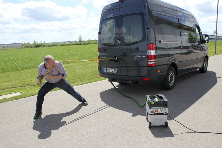
A Festool employee demonstrates the strength of the CT dust collector's suction by towing a Sprinter van. (It's not staged, I was there, he was actually pulling the van.)

As we wrap up our trip to Festool, we wanted to touch on the role of professional tool users versus hobbyists, tell our working-designer readership about some unique company qualities, and drop some random fun facts for Festool fans. These are the things that we found of interest on the trip, but which didn't quite fit into the previous installments. Here they are, in no particular order:

Where Systainers Came From—and Where They Go at the End

When Festool released the Systainers, their signature modular tool cases, there was nothing like it on the market. The modular ABS cases were stackable and locked together, making transportation a snap and bringing some much-needed uniformity to mobile tool organization. And interestingly, they were invented as the result of a design competition.

In the early '90s, Festool (then Festo) sold their tools inside of cardboard packaging, as everyone else did. In a search for something sturdier and more innovative, they held a design competition to see if someone could come up with something better. Industrial designers Martin Topel and Herbert Pauser rose to the challenge.

Topel and Pauser's original Systainer won not only the Festo competition, but 11 other international design awards. The Swiss Design Award's jury called the product a "jewel of industrial design."

You might ask why a company would intentionally produce more costly packaging, as Systainers are made from ABS plastic, which is obviously more expensive than cardboard. Interestingly, Festo only intended the Systainers to get the tool from the distributor to the customer's shop—and then to never be seen again. "The idea was that the customer should send the packaging back," explains Regina Rittler, of Tanos Marketing. "But the Systainer never came back."

Realizing they were on to something, Festo's parent company, TTS Tooltechnic Systems, set up Tanos (sister company to today's Festool) to develop and produce Systainers full time. Tanos has their own individual design department and sells Systainers to other fields, like the medical, photography and hand tool industries as well as plumbers, woodworkers and a variety of technicians. Anja Haug of Tanos' Sales Department cited that she uses Systainers for her sailing gear while her co-workers use them to store fishing gear.

Tanos even sells them to power tool companies that compete with Festool. "This is what makes Tanos as big as it is now," says Rittler. (They've sold 19 million units to date.) "And, okay, Mafell doesn't like that Festool has the Systainer, and Festool doesn't like that Mafell also has the Systainer. But the customer likes that they can combine a Mafell Systainer with a Festool one."

The funniest moment during the Tanos presentation was when a journalist innocently asked if Systainers could be recycled. Haug seemed positively taken aback:

"It could be, but why—why—" She recovered and recomposed her sentence. "It's possible, because it's one hundred percent ABS. But it's like Regina said: It never comes back."

Why You Won't See a Festool Laser Anytime Soon

During one of the Q&A sessions, a journalist asked Festool CEO Christian Oltzscher if Festool would produce a laser level. It turns out they had looked into it and decided against it, at least for now. Oltzscher explains why: 

We don't have any expertise concerning those products and knowledge. So we'd have to either build the expertise, or buy [components from a supplier].
And we thought about it for a while. But it's really difficult to find the right supplier. For example, if you're a supplier and you have DeWalt as a customer, they sell some things in the hundreds of thousands; when you deal with Festool, we have very high quality requirements and [will order] smaller quantities compared to companies like DeWalt.
So it didn't seem that we'd find a supplier who could offer something that's better than anything else out there—or develop something with us that's our quality. Sometimes we [don't have the expertise of] how to make something better. And then, we'd rather keep our hands off, than just adding something to the product line for the sake of it. Those 'me too' products don't work for us.
Don't hold your breath

The Dichotomy Between Professional Tool Users and Hobbyists

In Part 4 we discussed how Festool designs tools specifically for professional tradesmen rather than hobbyists. I asked Oltzscher and Steve Rangoussis, Festool USA's Chief of Marketing and Sales, about the breakdown between the two categories in Festool's American end users. Their answers explain why there was previously a perception in the U.S. that their products were purchased primarily by hobbyists:

Oltzscher: We have rough estimates that nowadays it's about sixty percent professional, forty percent [hobbyists]. That has changed over the years. The first time we looked into it was maybe 2004 or 2005, when the brand started to take off. And back then, it was seventy percent hobbyists, thirty percent professionals.
Rangoussis: Part of the hobbyist draw [during Festool USA's early days] was that we had extremely limited distribution, and brought on a large dealer with a lot of locations: Woodcraft. They cater to the hobbyist market. As a result of that we grew our hobbyist base significantly faster than our professional base in the very beginning.
Of course, we [subsequently] started opening up more dealers that catered to professionals. Because that's who these tools are built for, and that's how we do it around the world. In Germany for instance, you don't have a large hobbyist base; if you want to be a woodworker there, you need to go to school for training, you know?
Oltzscher: As I said earlier, even though it's really nice that the home hobbyist is buying our tools, we build tools for professionals. And it's changed now from 30/70 then to 60/40 now [pro/hobbyist]. And the professional segment is growing. The hobbyist segment doesn't grow as fast as the professional.
We found that the early adopters are usually the hobbyists. Because when it comes to professionals—let's take the most extreme example that I know, which is a solid surface countertop fabricator: If you try to convince him to change his process, you have to reallyconvince him. Because he has used the same abrasives, the same grit, the steps, the same sander for years, and he knows exactly how he gets to the finish he needs. And then you show up with something like the Rotex, and the different kind of abrasives. It takes a lot of convincing.
So professionals are not normally early adopters. They rely a lot more on the word of mouth than the hobbyist. They look around, and when they see more and more tools showing up [on job sites], then they think about it. The professional needs to know before using a tool that it's going to work for their application. The hobbyist can try things, and if it doesn't work, they haven't [risked their livelihood.]
So with the 60/40 numbers, we can see we are getting the message across. That Festool is something you use to earn a living.

Why It's Probably a Good Thing that Festool Doesn't Sell in American Big-Box Stores

Big box
Festool dealership

Some of you may wonder why Festool doesn't sell at the big-box stores where you can buy many other power tool brands. First, here's an official reason:

"We are very careful about choosing the dealers we partner with," says Rangoussis. "They are typically progressive in the sense that they are willing to challenge the status quo by providing customers with actual sales services to help customers with their businesses instead of just taking an order or directing customers to an aisle.

"Festool dealers undergo extensive training so they can best advise customers about their unique business or application. At the end of the day, we are striving for a long term relationship with our dealers and our customers."

That makes good business sense, particularly when you look at a product as sophisticated as the Conturo; you can easily imagine, in the absence of a demonstration or a detailed explanation of what it does, that sitting on a store shelf forever while confused customers walk past it.

But our industrial design readership knows there might be more to the story. For those of you unfamiliar with the world of product design and mass-market retail, there's a lot of stuff going on behind the scenes. Let's look at an example, in broad strokes, of how a big-box transaction can go down with a manufacturer:

Let's say you're a power tool company offering four levels of circular saw. Models A, B, C and D, with A having the most features and being the most expensive, transitioning downwards to D having the least features and being the cheapest.

The retail chain will say something like "We'll order X-hundred-thousand units of model B—if you can sell it to us for the price of model C." Any company with shareholders is going to be under immense pressure to take that deal. But model B's cost isn't arbitrary, so to get it down to the cost of model C, that money has to come out of somewhere.

So you take it out of manufacturing, moving to a cheaper facility of lower quality. You take it out of the BOM—that's Bill of Materials, a product design's ingredient list, where every last screw, washer, wiring harness, etc., are all broken down into precise amounts. All of those parts have an associated cost. You lower those costs by going with cheaper components, replacing metal with plastic, selecting lower-quality buttons, et cetera. You take it out of the quality control, letting tolerances slide. The end result is that you get the sales order, but the product's quality suffers.

I suspect that Festool wouldn't take that deal if it were offered. That's pure speculation on my part; being a privately-held company, Festool won't release their sales details—even when I pressed Rangoussis on whether their numbers fell during the recession in 2008, he would only say "That was the only year we were flat"—so they're darn sure not going to tell me if such a talk had ever happened.

But Rangoussis had also said that Festool doesn't build to a price point. Based on what I saw at their facilities and learned of their development processes, it doesn't seem the company's style to start with a price point and work backwards from that number to determine their BOM.

So the bottom line is, it's probably better for both Festool and Festool's end users, under the current realities of large-scale retail, that their products are not available there. They are able to call their own shots and maintain the quality that got them onto the map in the first place. And I hope the example above makes it a bit more clear why some brands that used to stand for quality have lately declined. It's just a business reality of that situation, a deal-with-the-devil that some can't refuse.

Departments in the Proper Order

At the risk of being too "inside baseball," I'll again address our industrial design readership:

Many of us have seen or worked in organizations where the departments seemed scrambled or at odds with each other. Some of you work in design groups that report to Marketing, and you know the trouble that can bring. Other times the Engineering Group is at odds with the Design Group, and we'll all seen finished products where it was clear that one group "won" at the expense of the other. (This often means that, really, it's the end user who "loses.") Other times we're meant to integrate "design research" from well-intentioned parties who have the wrong background or are not asking the right questions.

In contrast Festool's product development process, as we saw in the Conturo post, is rational and well-ordered. The research is conducted by professionals with prior experience in the field they're researching. Additional studies are commissioned from outside parties, providing fresh eyes. And despite engineers vastly outnumbering designers, the parties have clearly reached agreement.

Marketing is not brought in until the end of the development process, when the design is already "ninety to ninety-five percent" locked, according to Leonhard Zirkler, Festool Business Development Manager, and they're given the time they need to understand the product and prepare for its release: "We had [the Conturo] probably one and a half years before we launched it," says Zirkler.

And during that year and a half, the product was having the heck tested out of it in the field: "We had 200 demonstration machines tested down to the last detail," says Robertine Koch, Festool Communication Manager." During this testing we used 249 miles of edge banding and four tons of glue. So, we're very, absolutely, 100 percent sure we had the perfect product."

In the Q&A post with Festool Industrial Designer Timo Kuhls, he mentioned that figuring out the order of what steps to work on during a project "comes naturally." On an organizational level, I don't know if the steps in their larger development process come naturally or as a result of careful planning, but the quality of their finished products indicates that their system works pretty well.

Why are Festool Products So Expensive?

In online tool forums, for every Festool convertee, you can find plenty of folk expressing sticker shock at Festool's prices—and sometimes entire tirades bordering on open hostility. Ditto with say, Apple's products. That's to be expected as this is America and we can vote with our dollars, and increasingly our internet posts, but what bugs me is when people don't think about the manufacturing and development of a product design and assume that profit margins are the only factor in retail cost.

In addition to all of the things we've written in this series about their development process, testing and quality control, consider also that the company manufactures 80% of their products in Germany, at their plants in Neidlingen and Illertissen pictured below. (The remaining 20% is produced at their Ceska Lipa factory in the Czech Republic, gained via their acquisition of Protool.) German labor isn't cheap, but the country and particularly the region they're in have a history of craftsmanship. 

The bottom line is that all of the product development steps we've written about in this series cost money. The more you do, the more it costs, and from what we saw, Festool does a lot. And for a growing base of American end users, the expense of buy-in is producing a worthwhile return for their business.

_______________________________________________________________________________

For those interested in Festool's stuff, I hope some of what we've printed here has been interesting or illuminating. For those of you who own Festool products, I hope this series helps you see where your money goes. And for our ID readership, I hope it was fun to read about an industrial designer with a dream gig at a company that gets it right.

Organizing the Books So You Can See the Covers

$
0
0

Many children's books aren't conducive to storing on bookshelves the way other books are shelved. They don't have large spines to identify the books—and anyway, young children identify books by their covers, not by the words on the spines. Some adult books have the same storage challenge; for example, I've picked up small cookbooks that have no spines. So book storage designed to display the covers can be very useful.

Wall-mounted racks can be placed low for children or higher for adults. The Booksee Shelf from Ubabub fastens to the wall using the series of pre-drilled holes on the back panel of each shelf. The clear acrylic means the entire book cover is visible. With the open ends, two shelves can be placed side by side with a barely noticeable gap. 

Book Bound from Jennifer Delong is enclosed at the ends, which eliminates the chance of books falling out. While the bottoms of the books are hidden, a good amount of the cover is still visible. (It won't work for small board books, though.) Book Bound is made from formaldehyde-free MDF and has a high gloss, low VOC finish. It's available in five colors to fit various room decors. 

Other things could be stored inside the boxes, which is both good (because it provides for flexible uses) and bad (because I can see things getting hidden inside). Those little soldiers stored on the rim? They're going to fall onto the floor or into the box in no time.

The Restoration Hardware bookrack stores books very securely, with closed ends and both a ledge and a rail. It seems as though the rail would make the books harder to remove, though. And because the three tiers are all part of a single piece, there's a set limit on the book heights in the lower tiers.

Not all parents will want wall-mounted book racks; floor models avoid installation hassles, although taller ones like this one from Pottery Barn Kids should still be secured to the wall for safety purposes. (It wisely comes with the appropriate mounting hardware.) This design seems to have enough space between the tiers to hold tall books, and the shallow ledge means it might work for short books, too. And it wisely comes with mounting hardware to secure the rack to the wall.

The photo illustrates another advantage commonly found with this style of bookshelf, besides the ease of finding a book by its cover—it's less deep than a traditional bookshelf and might therefore fit where other bookshelves will not.

The New Issue Bookcase from Land of Nod makes it very easy to see all the books, take the books out and put them away. But with the short ledge and no rail, it seems best suited for hardcover books; tall paperbacks and coloring books, which don't stand upright as well, might bend over or fall out. One nice feature on this bookcase is the rounded corners, making it less likely someone will get hurt on a sharp edge.

Sling bookcases, such as this one from KidKraft, are another popular design; children find them very easy to use. These will not work for short books, though.

One Step Ahead tackled the short-book problem by staggering the depth of the shelves. With the storage bins, this is a bookshelf and more; some families will appreciate the combined storage. One concern: A purchaser noted that "there is no easy way to take the cloth slings off to wash them." 

For younger children, a bookshelf might not always be the best storage solutions. The Toddler See-Thru Book Browser from Jonti-Craft makes it easy for little ones to find their books and pull them out. One purchaser mentioned how durable it was, standing up to the abuse a 1-year-old can subject things to. 


This Low Level Kinderbox from Gresswell comes with lockable castors that can be added to easily move the box around. The shelf at the bottom handles books that are too large for the kinderbox compartments. That's a really nice design feature, since storing such oversized books is a problem that I often see.

For those who already have bookshelves but would like to include some front-facing book storage, one option is to just put books into a sturdy bin or basket that fits on the shelf. That's what I've done in my own home. 

But a nicer (and much more expensive) alternative comes from 3branch: the Magbrowz bins (for picture books) and trays (for board books). 

On a related note: As we've mentioned before, there's an interesting way to make books that do have nice spines easier for some people to find. If you store them on their sides, as Karl Lagerfeld does, you can read the titles on the spines without twisting your head.

Ex-Industrial-Designer's Hyper-Clean Vintage Car Illustrations

$
0
0


California-based Nik Schulz took so long to get through ID school—seven years—that his folks asked if he was "going for a PhD." His education might've been longer than his career; Schulz eventually ditched industrial design altogether for illustration. Which is fine by us, because then we get to see these cool prints of vintage cars that he makes. 

1968 Mercury Cougar
Since the early 2000s I've been an illustrator, working with magazines such as Wired, Fortune, Time, and ESPN. A few months ago I realized it had been a long time since I'd drawn anything just for fun. So I started drawing cars again, something I'd spent many happy hours doing as a kid.
1986 Ferrari 288 GTO
I like vintage ones. I like slightly obscure ones. I like to distill their forms down to the purest state, to create these almost ideal images.
1975 Lincoln Continental
I suppose that when I draw, I seek perfection. These illustrations are as close as I can get.
1973 Ford Bronco

All of the prints are for sale through Schulz's L-Dopa Design + Illustration Print Shop—except for that sweet Lincoln, which was a custom commission. Yeah, he does those too.

1997 Mini Cooper S
1965 Ford Mustang GT
1986 Ferrari 288 GTO

Better Than a Calculator: This App Solves Math Problems Using Your Phone's Camera

$
0
0

I was the worst type of high school student: The kind that gets dumber over time rather than showing improvement. I aced Geometry, passed Algebra, started bombing in Trig. By the time we got to Calculus, I did so poorly that I probably made the students around me worse by sheer osmosis.

Geometry is (or at least was) invaluable to an industrial designer doing CAD work, and I still use algebra on a regular basis to figure things out when I'm buying studio supplies in bulk or making stuff. And I just found out there's a free app that can help you with algebra. It's pretty cool, you don't even have to type stuff into your phone:

Called PhotoMath, it's been around for at least a year for iDevices, and earlier this year they released an Android version. Reviews are mostly positive, and as you'd expect, some high school students are using it to cheat. Another reviewer makes this comment:

Newest update says it supports trigonometry problems but it doesn't :/ that part completely fails.

Every time I see the words "trigonometry" and "fails" in the same sentence, I still feel a little twinge.

The LiliLite: A Better Way to Read in Bed

$
0
0

Here's a brilliant little piece of industrial design: Amsterdam-based Thijs Smeets has carefully considered the way people read in bed, and devised the LiliLite to meet every need within that seemingly simple act.

The light comes from directly overhead, providing even light on both sides of your book, as opposed to the sidecast light that comes with having a lamp on an endtable.

The very form provides the bookmark, allowing you to simply hang your open book onto the Lililite's peak. The side can be used to hold more books (Smeets write that it will hold five kilograms, about 11 pounds).

Most clever is that the light is automatic. When you place your book onto the peak, a sensor turns the light off. Pull the book off and the light comes on.

And the design can be mounted in either direction by swapping the light around.

Here's the video for the Kickstarter campaign:

I do wish he hadn't Photoshopped the power cable out of the press images, as that's an important consideration for the buyer.

Additionally, there are a couple of practical issues. The LiliLite was formerly sold through Smeets' website, and by comparing photographs of the original object with the new images for the Kickstarter campaign, we can clearly see that he's Photoshopped the mounting bracket out. (You Photoshop users will easily spot the marks.)

Before, un-Photoshopped
After, Photoshopped
Close-up of mounting bracket Photoshopped out

That makes us wonder if there is some issue with the mounting brackets, or if Smeets has simply redesigned them to not be visible.

On both the campaign page and his original website, there is no mention of how the LiliLite is meant to be attached to the wall. Simple physics, however, dictate that it's attached at the two vertices of the form. Given that the horizontal distance between them is certainly shorter than the 16-inches-on-center of wall studs in American houses, at least one bracket will require a drywall anchor or toggle bolt. With things that are mounted over your head as you sleep, correct installation on the part of the end user is obviously very important. (Not to mention getting the height correct, something I could see me screwing up.)

If Smeets can communicate these important issues to would-be buyers—perhaps a video showing the do-ability of installation—I think he stands a good chance of reaching his $70,000 goal (at press time he was at $15,000 with 28 days left). I think the LiliLite is a clever design that really considers the user experience, and I've never seen anything like it on the market. Well done!

Scott Hudson of Henrybuilt on the New American Kitchen

$
0
0
Scott Hudson, Founder of Henrybuilt.

When Scott Hudson founded Henrybuilt in 2001, he named the kitchen system company for his grandfather—a cabinetmaker, carpenter, stone mason and farmer. Carrying forward the tradition that Henry Spurgeon Hudson began on his own farm in rural North Carolina, Henrybuilt is dedicated to craft, functionality and quality embodied by a distinctly American company. "When Henry worked, there was no break between his head and his hand," Hudson recalls in the company's history. "He did his thinking with one as well as the other."

Henrybuilt is the first American company to manufacture kitchen systems—a bespoke offering that is a unique combination of system engineering and holistic design solutions for the most important room in the house. With a new showroom now open in  New York City, Hudson took a moment to chat with Core77 about the rise of the kitchen as a tool, the R&D process for new Henrybuilt products, and why integrating technology into the cabinetry may not be the answer home cooks are looking for.

Core77: Over the last 15 years of designing kitchen systems, there's been a lot of development regarding the place of the kitchen in the home. Can you talk about some of these changes?

Scott Hudson: It's kind of funny. It's almost like the kitchen got left in time. The kitchen is behind the rest of the design culture—people are very sophisticated about buying their phone, clothes, camera, car or bicycle, but not about their kitchen. But it's starting to change.

There's a lot more understanding because of the home cooking trend. The kitchen had already started to be the center of the home in the late '90s—builders of suburban homes were already featuring a relatively open plan with the kitchen in the center. But, the cooking part turns the kitchen into a tool. It's not just a living room; it's actually a functional thing.

Henrybuilt pioneered the idea of an American kitchen system. Can you explain what that means—both in terms of a kitchen system versus a custom kitchen or modular kitchen. And what makes it American?

It's a story of parts. When people say a custom kitchen it's really about the process not the end result—it means certain parts of the kitchen are being manufactured. A custom cabinetmaker or an architect would have had to put all these parts together, in some ways, from scratch. In industrial design language, every custom kitchen is a prototype—like buying a car made of parts that you go out and pick and put together. You can imagine how that would come out.

A kitchen system is rooted in a European approach to kitchen design where everything is integrated—the outside and the inside— and improved iteratively, over time. Modular is just a subset characteristic. It might mean that there are certain relationships between units that have to stay the same, but the dimensions can change. So, the difference between modular and system to me is that modular describes the base configuration of a kitchen. A system might be modular but it really encompasses everything—like how the pulls, countertop, backsplash and the lighting all relate.

The American part reflects the differences in the way that things are built here versus in Europe. Here, there's more new construction and a lot of the European systems have a really processed look. They look almost alien in our homes. So the challenge is, how do you develop the system and make everything integrated, but also make it configurable for architecture so that it feels like it's really blended in. And that's our goal.

One of your newest products is the Open Case system. What is your R&D process for new ideas and how do you decide what products to integrate into the kitchen system?

There are three levels that we look at. Improving and refining what's already there is ongoing. It might be a functional—something based on user feedback—or it might be how easy it is to install because our goal is to make the system feel completely made for your home but be like Lego's to install. It also might be technical—our LED lighting system is based on California's new spec so when that happens that drives improvements.

The Open Case system for kitchen, wardrobe and home.

The next level is small products—for example, finding a new way to store things or solutions for charging your phone.

And then there's big products like Open Case which took two years to develop. The interesting thing was that it came out of a client in Mexico City who wanted an open wine storage for his concrete cellar. And that's how the rod system developed. Once we realized this has potential, we spent the next two years figuring out how you modularize it and the system. It's based on panels, rods, spanners and accessories.

The Open Case system for the closet.

And from a client's kitchen-related request, you're integrating the system into different parts of the home.

Yes, because people are more sensitive to the functionality of those other parts of their home. How does it feel to have a wardrobe that's really optimized? Open Case is a good example where you start thinking about doors and windows and how all those things relate to the interior plotting which becomes functional. That is really interesting. Integrating lighting makes a lot of sense but it's very complex. It's a slow process to make sure that you don't undermine the quality of what you've already got there. In some of our whole house projects we're really creating a holistic environment.

What are some of the trends in what people are demanding in new kitchens?

That's a hard question. I think that a lot of it has to do with what we were talking about earlier. Some of it is driven by appliances—when Wolfe started doing industrial level/professional level stuff for the home, people started realizing that things could be much more sophisticated. And the fact that those appliances are tools changes the perspective of the kitchen.

Henrybuilt for the home.

To me, it has to do with function. It's not really a trend, but there's definitely a higher level of taste coming along. The internet helps a ton. In the old days, you had to go buy the magazine and it's a really slow process. Now it's just, bam, it's everywhere.

And what about the dialogue about integrating appliances and new technologies into the kitchen systems themselves? We recently saw the example of IKEA's Kitchen of 2025 in Milan

That's a good question. We also buy a lot of expensive equipment to manufacture a product. The worst thing about it is that the software is integrated with the hardware. So, say you spend $300,000 for a machine that's a computer, and when that software ages out and is not supported, you have to replace the whole thing. So, I'm actually sort of anti-integration. Not visual integration and not in terms of the way it should feel when you use it. It's kind of entrancing to think about having digital wood—really making an electronically integrated object but I don't think it really adds much value for the user.

Imagine if your countertop had to be replaced every time your range has a problem? Just doesn't make sense. So, I think making beautifully flexible systems is much better for the client.

The new Henrybuilt showroom in New York is open at 12 Crosby Street.

Automatic Ramen-Making Machine with Laser-Cut Chopsticks and Drone Delivery

$
0
0

It doesn't take you long to realize this is a gag, but it's a funny one, particularly for those of us that well remember eating plenty of dorm-cooked ramen noodles. A fictional South Korean company called "Natural Waters'" asks, why do we have machines to dispense coffee, water and ice cubes, but no automatic ramen-dispensing machine? And what could such a machine do, outfitted with the very best of today's technologies?

The answer is the Ramenia 21:

I can't decide if my favorite feature is the VCR-like feed, the automatic garbage-folding or the laser-cut chopsticks (particularly the time required for the latter).

I hate that I'm so easily susceptible to suggestion when presented with on-screen food, but after watching that I now have the ramen itch. And I need to scratch it. 

David Adjaye on His New Line of Textiles for Knoll

$
0
0

Today, the Cooper Hewitt, Smithsonian Design Museum, opens David Adjaye Selects, an exhibition of 14 West and Central African textiles drawn from the museum's permanent collection by the Ghanian-British architect. Adjaye's work curating the exhibition was also the inspiration for a new line of textiles he designed for Knoll, which debuted at NeoCon earlier this week. The line—six upholstery fabrics, two draperies and one wallcovering—was developed by Adjaye with KnollTextiles' creative director, Dorothy Cosonas, over the course of two years. On Tuesday, we spoke to Adjaye about the patterns, colors and processes behind his first textile collection.

David Adjaye

How did you go about taking these traditional textiles from the Cooper-Hewitt's archive and modernizing them, or making them work for a contemporary interior?

The whole project for me is not about ethnic mimicry, which I think is a kind of Disneyfication, but about craft traditions and honoring craft traditions. You know, weaving and print-making on the African continent have this incredible history of figuration and abstraction, and I wanted to note that in the body of the collection. We had nine different processes from nine different mills—everything from digital printing to woven systems and new weaves that are three-dimensional and so on. So it's trying to acknowledge the notion of different kinds of operations; it's not from any singular place. But then it's also trying to inherently understand certain structures within these different disciplines. Tempe weaving, thatch weaving, reed weaving—all of these different techniques are honored, while trying to find contemporary conditions.

For instance, there's a piece called Djenne where we spent a lot of time looking at using cotton and nylon to create this waterproof, reed-like shimmer and mass and texture. I'm really excited about that. When you look at it, you think it's reed but actually it's a completely new hybrid material. And it's waterproof and performance-rated and fire-rated.

Djenne, a cotton-nylon upholstery inspired by a woven raffia-and-wool men's cap from the Cooper Hewitt's permanent collection

Was it difficult to capture the feeling of a handmade textile in a product that has to meet these strict specifications for commercial use?

There was always this idea of the handmade, the way in which the work is kind of unraveled slightly by gestures that try to mimic, for example, a string being pulled out of certain textiles in Africa. In Nigeria especially there's a technique where you weave and then you pull out string to kind of destabilize the weaving. That creates a human quality that makes the fabric much more endearing and gives it a particular energy. I really wanted that in the work. If you look at the entire collection, all nine different systems, there's always this idea of a kind of imperfection which is perfectly made. That's really important, that we celebrate imperfection—which is not about mistakes but about the idea of the human being behind the process.

The Lagos upholstery pattern is based on Akwete cloth, a hand-woven textile from Nigeria.

As an architect you have used pattern extensively in your facades—was it liberating to get to use color to a much greater extent in these textiles?

Absolutely. For me, the colors are also an expression of the kind of context that I was looking at. So there's a whole range of what I call mineral tones—for the wallcovering and certain drapes and fabrics—which was very much about different kinds of earth, different iron and magnesium contents in earth, which you see on the continent so readily. Or different pigments of sand, from the red in Namibia to the yellow sands of the Sahara. And then you have the lush, tropic region where you have these deep greens—and also at the same time, what people don't always realize, is there are dense cities and very vibrant metropolitan junctions. So there's always this idea of a kind of non-static nature that I wanted in the patterns and the forms and the colors. There's a kind of vibrancy and movement, but it's not intense; it's not something that's supposed to trip you out. It's there as another detail as you go into it.

A lot of people were looking at the work and saying, "Wow, it looks very strong." And then we've shown them samples on the wall and they were shocked at how it recesses. And that's the whole thing—woven systems reveal different layers of tonality and color as you come closer and your eyes are able to adjust them, or they fade and melt into a composition that is more muted and subtle as you're in the environment.

For me, it's like being in the forest. You come close and the details are vibrant and verdant, and when you go back it visualizes into a really beautiful emerald green or dark brown-green. It's those kind of ideas.

Aswan is a digitally-printed upholstery inspired by a traditional African kente cloth in the Cooper Hewitt's archive.
The Cairo upholstery is based on Adjaye's pyramidal line drawings.
Dakar is one of two draperies in the collection; Adjaye's own artwork was used as a jumping-off point for this pattern.
Harare is a PVC wallcovering based on the pattern of an Adinka wrapper from Ghana.

Was it hard to get the colors to look right?

Yes. Not easy. Dorothy is the woman with the wand. She has very deep relationships with these weavers, and she would come back and I would say, "Oh my god, that's incredible" or "It's the wrong tone." And they would find a way to bring it down or find another process. That's the beauty of working with a company like Knoll, which is amazing at this stuff, and working with someone like Dorothy, who's a master at this. She's really adept at reading the situation and knowing who in the world would be the right person to go to. That made it easier for me. Probably something that would have taken six to ten years for me to do has taken two years, which is incredible.

Some of the patterns are from your own drawings and artwork. Are you the kind of person who is constantly drawing patterns, and do you come to pattern from that approach? Or is a more considered, research-based process?

Yeah, it wasn't from a catalogue of patterns that I had been working on—it was much more from the research. As I started to think about what I was trying to do, for instance with the Aswan pattern, which is this incredible digital print, this sort of blurry, pixelated thing—I was thinking about kentes, and what would a kente be now with the technology we have? So it was about, one, blurring the image, to deal with a kind of inability to pinpoint exactly where things are, but then also structuring it with a pixelating system, so that it became grouped into different stacks.

Is there one piece from the new collection that is most special to you, or where you feel like you pulled off something that you're most proud of?

For me, I'm very much a fan of collections and of archives. So it's a body of work—each one relates to a body of work, these nine systems, that give you a clue to what I've been thinking about in my mind. So I don't have any favorites; to pull out a favorite would dislocate it in a way that doesn't make sense to me. It's really about a body of nine systems that gives you a window into understanding inspiration from nine parts of the world.

David Adjaye Selects is on view now through February 14, 2016, at the Cooper Hewitt, Smithsonian Design Museum. The Adjaye Collection launches this September from KnollTextiles.

Viewing all 19147 articles
Browse latest View live


Latest Images