Quantcast
Channel: Core77
Viewing all 19132 articles
Browse latest View live

The MIMIC Wall: Rethinking the Workplace

$
0
0

From standing desks to open plans, the modern workplace has become a leading site for design innovation, swapping the generic office structure of past decades for more flexible and friendly alternatives. At the forefront of future-facing office design is the MG2's recent release, the MIMIC Wall digital prototype.

Conceptualized in collaboration with Eastman Innovation Lab, the flexible system is made of hexagonal tiles that can open, close and change their appearance depending on the needs of the user and environment. "The workplace of the future is not an environment that you have to work around, but, very simply, an environment that works around you," notes Zac Feltoon, one of the industrial designer's on the transdisciplinary design team.

The portable, modular system can satisfy a host of daily scenarios: from pop-up meetings to presentations or even just provide a slight enclosure for a quiet moment amidst a hectic schedule. The tiles use Saflex, a material that can be laminated between glass to provide acoustic insulation.

The MIMIC Wall can be employed as a full wall or a partial barrier in an open space. As a wall, it can function as a large video screen, making it easier than ever to connect with team members who are spread around the world.

The wall uses the Vanceva color system, allowing for 3,000 color combinations which allow users to personalize their space while maintaining a high level of luminosity. "Our future vision for the MIMIC Wall is to make it completely interactive," states the design team.


The Transforming Cubrick Cabinet Comes from "Chaos Technique"

$
0
0

What would the Fletcher Capstan Table look like if it wasn't a table at all, but a storage cabinet? It would probably be this:

That's the Cubrick, the result of a collaboration between industrial designer Cairn Young and cabinet maker Ian Spencer. Together the UK-based duo are known as Yard Sale Project, and in their South London workshop produce "small batch pieces of furniture that combine the unique design skills of Young with the making talents of Spencer. [The aim is] to bring together the 'cool' of the world of design with the obsessive applied skills of handmade one-offs."

You're undoubtedly wondering how the mechanism works, and while CAD drawings won't be forthcoming, we do have a sort-of answer: What YSP refers to as the Chaos Technique. One of the pillars of their philosophy is...

...how to make items of furniture without using the traditional construction techniques that tend to force a limited array of design possibilities. By using a "chaotic" construction technique Yard Sale Project has broken free of traditional boundaries whilst still retaining an understanding of how to work with wood. A technical appreciation of wood that is borne of the Arts & Crafts movement has been able to escape their sometimes overbearing attitude towards "truth to materials" and "honesty". This rejection of tradition has crossed over into Yard Sale Project's attitude to other materials [as well].

The made-to-order Cubrick comes in four sizes and a variety of finishes and colors, with the lowest-priced model starting at £4,698 (US $7,335) for the twelve-box unit in semi-matte, stretching up to £7,484 (US $11,684)for a variable-height 20-cube model done up in Nextel Suede. There's an interactive demo for buyers to virtually snap their choices together here.

8 Visions of the Future of Transportation Design from RCA

$
0
0

True to form, the RCA's 2015 MA Automotive Design show featured some challenging abstract concepts that shun outright technical feasibility for provocation of thought. As usual, the standard of work was high, with a diverse cultural perspective. From a Stradivarius-inspired sportscar to an autonomous crop-munching tractor, here are some of the highlights.

Element - Gareth Rees

Armed with the data to prove that 94% of farmers are over the age of 25, Gareth Rees's proposal for an autonomous tractor, Element, is a vision of a benign creature tirelessly toiling away in the fields, with a minimal carbon footprint. It addresses a real socio-economic need—how to entice bright young things into the world of farming. It's an interesting interpretation, one that imagines a remote-farming style, perhaps appealing more to a new professional-farmer than the salt-of-the-earth of old.

Orion's Belt - Cal Craven

New, responsible luxury was the theme with Cal Craven's 68m super-yacht, Orion's Belt. Aimed at the hyper-rich (read Elon Musk) who desire to show off their wealth but in an ecologically aware way. Gone are the glitzy metallic surfaces, heliports and launches. Orion's Belt is a craft that attracts plastic particles floating around in the ocean, and harvests them for use, either by the crew to 3D print spare-parts for the craft itself, or perhaps to create furniture pieces for use on board. The three-tiered architecture reflects the owner's aspiration towards adventure and expedition.

No Infrastructure Needed - Simon Haynes

MIT's 4D-printing process was put to use in No Infrastructure Needed by Simon Haynes. Inspired by the Lunar Rover and aimed at inaccessible non-urban environments, the car is self-building. Structural elements blend from the interior to the exterior frame that both supports the body and protects the occupants. A single central hoop acts as a safety frame for the occupants, yet crucially enables the vehicle to be packed compactly for economic crate transportation to remote areas. A refreshingly lightweight and minimal concept; that no infrastructure is needed hints towards a lighter car-footprint than we currently experience.

Limbo-Final Journey - Floriam Kainz

Limbo-final journey, by Florian Kainz, explores the ultimate application of customization: the interior of a hearse. Linking with the traditions of many of our cultural ancestors of personalizing burials by including mementos, Kainz imagines death as an interconnected social-media event—with the response of family and friends generating an algorithm that 3D prints the hearse interior in bio-plastics. Funeral-goers can add their own messages and items to the interior creation, making the last drive a memorable and inclusive event.

Scar - Tainquin Bao

Winner of the Pilkington-sponsored award 'Best use of Glazing' was Tainquin Bao, an ex-Coventry graduate, with Scar. Challenging our obsession with replacing cars every few years, Scar explores a method of 3D-printing new panel elements to replace damage over the lifetime of the vehicle. Bao believes the relationship between man and car can be more meaningful when the car evolves and ages too. Inspired by architectural materials, Scar intersperses the body with copper surface elements that grow an ever-changing patina for an always-unique look. A modular and updateable powertrain system could allow the car to live as long as its owner.

Happie - Yibo Wu

Happie by Yibo Wu takes the Google autonomous car through a refresh to a version 2.0, with a far more open interior architecture. Electro-magnetic 'cushions' that have multiple uses such as lighting and storage, can be snapped into the interior allowing a more personalized take on a shared car-ownership model. Wu retains the Google cars' friendly, approachable aesthetic but adds charm and personality.

Infiniti Autonomous - Mark Hinton

Mark Hinton's Infiniti Autonomous future imagines a new aesthetic for the Japanese company and a move away from mono-volume autonomous cars. Without crash-test requirements why does the car need a conventional windshield, for example. Taking Infiniti's dynamic sculptural form language to a more extreme solution, the result is an unusual and challenging aesthetic.

Kinesis - Farhana Safa

Farhana Safa re-imagines the Automotive design process with Kinesis. Previously a neurosurgeon, Farhana looks at the implication of using the tools of a craft as an intuitive creative device. In this case, the starting point was a sphere in a CAD package, which was sculpted into the final form influenced by the organic fluidity of liquid-metal alloy—a material that shape-shifts through the application of an electric current. Combined with the re-positioning of packaged components—as an example, an advanced aluminum battery sandwiched within the car's surfacing—the result is a remarkably fluidic rolling sculpture.

_______________________________________________________________________________

Overall, the RCA students had an inspiring optimism about the future of self-driving transport, alongside some fresh takes on personalization, innovative use of materials, and design solutions that actively improve our environment.

SINO - Tom Henwood
Sketches from No Infrastructure Needed by Simon Haynes
Model by Sepehr Amirseyedi
Model by Seunghwan Jung

Tupperware's Ripcord-Based, No-Electricity-Required Food Processor

$
0
0

I cook three nights a week out of necessity and I hate it. I am a horrible cook. The prep work takes me forever, and I lack the patience and dexterity to chop, dice or mince vegetables into consistent sizes.

That's why this Tupperware Chop 'N Prep contraption looks pretty good to me. 

Here's a video of it being reviewed, and for the impatient among you we've cued it up to right when the usage starts:

(Is it me or was there a quick edit shortly after she begins shredding the carrots? Hmm.)

To vet the device I forwarded the video to my girlfriend, who like me is an industrial designer, but who unlike me is a talented cook. I asked her if she thought this thing was legit, or gimmicky. "Gimmicky!" she wrote back. "It looks like a gadget that'll just take up space in your kitchen. This isn't different from a food processor which is way more efficient."

Yeah, but the ripcord is so cool I wanted to say.

Anyways, experienced cooks among you: Does this seem at all useful, would you ever use this? Would the hassle of washing the thing out offset the convenience? Do you think the ripcord will last over time? This design looks like it would solve one of my problems, but I am admittedly an idiot in the kitchen. Am eager to hear feedback from industrial designers that cook frequently.

Organizing the Silverware When There Isn't a Drawer

$
0
0

We've talked about tools for organizing a silverware drawer. But not everyone has a drawer that can be used for the cutlery. In some cases the kitchen drawers are too narrow to store the silverware; in other cases, drawers got removed to add a dishwasher. Some people even wind up in apartments where the kitchens have no drawers at all. So other products are needed, such as cutlery caddies.

This caddy from Core Bamboo is rectangular, so it makes better use of space than a series of round containers would. And since the handle goes down, it might even fit in a cabinet. But the back section is designed to hold napkins; some end users might have liked it better with more silverware compartments. 

Other caddies have removable storage cylinders, which makes for easier cleaning. If there are multiple cylinder colors or styles to choose from (as is the case with this caddy from Cal-Mil) the owners can easily adjust if they move to new places with different  color schemes. The revolving base can make it easier for end users to reach the silverware they want.

Since kitchens without adequate drawers often lack counter space, too, a caddy with a vertical orientation (such as this one from Pottery Barn) can be useful. 

Many caddies have three compartments, which won't work for those who want a finer degree of separation than forks, knives and spoons. This revolving-base six-ring caddy from Cal-Mil is the type of design that might work for such end users. Because it has three rings on each level and no handle, it's only 15 1/4" tall, which is shorter than the Pottery Barn caddy above. Height can be critical if the end user wants to place the caddy toward the back of a countertop, under the top cabinets.

Other designs that can work when there are no drawers are flatware sets that come with their own countertop racks. This requires the end user to be satisfied with the flatware style and selection of pieces, as well as the rack, so it's a more complex design challenge.

There are a variety of ways the flatware can hang from its rack. The 16-piece Tanja set from Essmeyer uses cut-outs in the handles to hang the pieces.

The Victoria cutlery set from FNS has the end user put the pieces through slots. This design will lead to the pieces being picked up by the tines or the bowls rather than the handles, which some end users won't like.

The pieces in the Carnival set from Cambridge Silversmiths hang by the handles, which thread onto the rack. 

All three of these designs might be challenging for end users who have problems with fine motor movements; some might be easier to use than others.

I'm always interested in wall-mounted designs, as they are often helpful in small spaces, but there don't seem to be many wall-mounted silverware storage products. There's the basic cutlery holder that hangs from a rail, and a similar product that can be wall-mounted with no rail system required.

Mixzone's 3-cylinder storage rack is a wall-mounted option for cutlery, but it sure seems like a complex design. Those cylinders are made of a frosted acrylic rather than the more common stainless steel. 

Another way to save counter space would be an under-cabinet option. These flatware cylinder holders from Steril-Sil are designed for commercial use, under a bar, but a similar design might work in some homes, too. 

This domed design from Godinger would work for those who like the idea of a cutlery caddy but don't like the idea of the flatware sitting out and getting dusty. However, it's very fussy, with each piece of silverware fitting into a set of notches—another design that will be too physically challenging for some to use.

How Bicycles Can Stay Balanced by Themselves

$
0
0

Of all the mean-spirited games we played as children in the '70s, perhaps none was more cruel than the "Coastie" or "Ghostie." (I was never clear on what the correct title was, both made sense.) It consisted of you being pushed off of your bike, and the other kids picking it up, setting it on two wheels, and firing it down a hill to see how long it would stay balanced before crashing into something or falling over. This sucked when it was you and your bike, but was fun enough when it wasn't.

At that age—hell, at this age—I wouldn't have understood the physics of how something that took me forever to learn to ride could balance by itself for so long. But here the guys at MinutePhysics explain the science:

If the demonstrator could travel back in time to my childhood neighborhood in the '70s, I think we kids would have interrupted his explanation by pushing him down, grabbing his bike and firing it down the hill. In retrospect, we were total animals.

Volvo's New Child Seating Design: Safer for the Child, More Ergonomic for the Parents

$
0
0

A few months ago, we showed you a Volvo concept where the designers ripped the front passenger seat out and replaced it with a multifunctional cabinet. Li Shufu, the Chinese billionaire who has owned Volvo since 2010, recently reviewed the concept and reportedly "thought about how else the space left by removing a front passenger seat could be used."

Volvo's design team had the answer: Dedicated seating for infants that is safer for the child and more ergonomic for the parents. As Tisha Johnson, Chief Designer Interiors at the Volvo Cars Concept and Monitoring Centre explains,

We started by asking ourselves if we could make life easier for parents and safer for their children when it comes to the child seat experience. We focused on three key benefits – making it easier to get the child into and out of the child seat from an ergonomic and comfort perspective, providing the child with a safe rearward facing seating position that enables it to keep eye-contact with either the driver or the rear passenger and of course including enough storage for those vital child accessories, such as diapers, bottles, wipes, and so on.

The result is the Volvo Excellence Child Seat Concept, which makes it much easier for parents to place the child into the seat, yet still manages to hew to Volvo's infant safety doctrine that "small children should travel rearward facing as long as possible (at least up to the age of 3 or 4). This is primarily due to the lack of muscular strength in the necks of small children and the disproportionate head size and weight."

This is presumably something that would be installed at the dealer, and replaced with a conventional seat once the child had outgrown infancy. But like the prior seat-replacement concept, there's no word on whether this will actually be rolled out.

Japanese Bathrooms are Designed Really Differently From Western Ones

$
0
0

As an American living in Japan for a year, I expected the apartments to be smaller. What I didn't expect were the functional design differences in living styles. Three things in particular took some getting used to: 1) Having to constantly remember to turn the apartment's gas off when not in use (due to earthquakes), 2) washing machines but no dryers (due to expensive electricity), and 3) the bathroom designs (due to different views on ablutions and elimination).

The bathroom in my apartment was like everyone else's there: Completely waterproof, like it was in an RV. As space-tight as the apartment was, the toilet was off in its own little room and had a sink built into the top of it, like they have in American jails. The sink faucet was on a pivot and also served as the bathtub faucet. And on and on.

To get a good sense of how Japan's distinct view of bathrooms influences their design, watch this little girl run down the design features:


Your Car is Probably More (or Less) American Than You Think

$
0
0

Every year on Independence Day, millions of Americans tackle the same series of questions: Where can I go to see the fireworks? What kind of snarky Facebook status update can I write that will make me feel superior while irritating my British friends? And what does it really mean to be American?

Well, here's a new one: What does it really mean for a car to be American? Once it was as simple as Chevy=American, Honda=Japanese and BMW=German. But global manufacturing, global design centers and global supply chains have muddied those distinctions. If a car is designed at Toyota's Californian studio by American industrial designers, then produced by American workers at Toyota's Mississippi factory, is that a Japanese car?

American University's Kogod School of Business has released an index to help answer questions like these. They've looked at the big picture by taking all of the following into account:

- Profit Margin: Where the automaker's global headquarters is located 
- Labor: Where the car is assembled 
- Research and DevelopmentInventory, Capital, and Other Expenses: Location of assembly 
- Engine and Transmission: Location of production 
- Body, Interior, Chassis, Electrical, and Other: Location of production 
- National Highway Traffic Safety Administration AALA "Domestic Content" Score

By crunching the numbers, they've determined a ranking of what are, in essence, the most- and least-American cars. Top of the list is nothing to brag about, I'm afraid: The 2015 Buick Enclave is ranked #1 with an 87.5% domestic content figure.

But the list gets more surprising the further down it you go. Honda's Odyssey minivan is more American (78.5%) than Chrysler's Jeep Grand Cherokee (75%). The Toyota Camry is more American (78.5%) than the Ford Mustang (77.5%). The Acura RDX beats the Tesla, the Hyundai Santa Fe beats the Chevy Camaro, the Honda Accord beats the Dodge Viper, et cetera.

Take a gander at the list here, type your car model into the search box, and see just how Yankee your ride is. The answer might surprise you.

Ten July 4th Ideas for Your Most Inspired Festivities 

$
0
0

Happy Fourth of July! As we salute our fine nation, most of us will partake in at least a couple of the activities that define this summer holiday: a little bit of BBQ, maybe a day trip to the beach, and probably, whether on a screen or live, we'll watch some fireworks. For those of you looking for a little inspiration (or, for our non-US audience, just some fun videos to watch) we've compiled a list from our archive including extreme water sports, some tips to upgrade your backyard boozing (with universal appeal), swanky grills and an amazing IKEA hack for starting a fire—cue the perfect s'more moment! 

01. The United Sketches of America

02. Jeremiah Warren's Different Perspective on Fireworks

03. Bompas & Parr Are Back Again, and This Time They've Managed to Make Fireworks Edible

04. The Girandola: Re-Usable Fireworks That Put On a Surprising Display

05. This is Too Good Not to Post

06. Designs for Better Boozing, Whether Hard Liquor, Wine or Beer

07. David Rockwell Tries to Make Grilling a More Social Experience

08. Eddie Licitra's Traverse Concept: A Fold-Flat Barbecue Grill for Better Tailgating

09. Best Ikea Hack Ever: Starting a Fire

10. Happy Birthday America! For This Year's Fireworks Shows, Please—No Dogs or Computers 

Core77 Introduces DiResta's Cut, Episode 01

$
0
0

Most of you have seen a Jimmy DiResta video by now.  As 228,000 subscribers agree, it's fun watching him turn piles of wood, metal, plastic, leather, etc. into objects and furniture, using every tool known to man and techniques both conventional and unconventional.

As Jimmy—or occasionally Super Jimmy, wordlessly moving at 200x speed through the magic of video editing, making hand tools turn into power tools—moves from task to task, experienced builders can puzzle out what he's doing and why. But we thought the Core77 audience might dig a narrated variant, where DiResta walks—and talks—us through what he's doing, and why, and how.

The result: We've commissioned this Jimmy DiResta Director's Cut series, a/k/a "Diresta's Cut." In this first episode, he takes a 9-foot-long, 16-inch-wide slab of 10/4 oak, some steel rods, some brass fasteners, and produces one burly-ass bench using techniques and tools you might not have thought to reach for:

Montana Couple Develops American-Made 5-Axis Desktop CNC Mill that Retails for $3,300!

$
0
0

What do you get when a machinist marries a mechanical engineer? If you're Matt (the machinist) and Michelle (the mechanical engineer) Hertel, you get what may be the world's first desktop-sized 5-axis CNC mill, and is certainly the world's most affordable at just $3,300.

The Montana-based couple spent four years developing the device, picking up some help along the way: Another machinist named Gary and a software guru named Duane (sorry, no last names available). Here is the result of their collaboration, dubbed the Pocket NC:

Now for the bad news: The darn thing sold out after just one week on Kickstarter. As the Hertels explain,

We are SO excited about the machines sold and ready to head into production. So ready, that today we took delivery of about 1000 pounds of aluminum so that we can get to making chips on some of your frames.
For those of you wondering if we will be adding more machines to the campaign, the answer is that we don't plan to. The number we limited the campaign to is based on the manufacturing plan that we have developed and our capacity to grow over the coming months. While it kills us to not sell as many machines as we can through the campaign, we want to make sure that we are well equipped to follow through with the delivery dates that we have set.

That I can respect. And not to worry, as the Hertels plan to eventually launch pre-orders for the next batch. To get onto their notification list, click here and enter your e-mail address.

Of course, if you just can't wait and are dying for a Pocket NC from the first batch, there is a long shot you can look into: "Another option," the couple writes, "is to watch over the next few weeks to see if another backer cancels their pledge." While $3,300 is small potatoes for a 5-axis machine, it's not chump change; so if one of the pledgers gets cold feet, that could be your gain.

Nike's Virtual Reality, 360-Degree "The Neymar Jr. Effect" Video

$
0
0

Congratulations to the USWNT! Yesterday, for the first time since 1999, the U.S. National Women's Team brought the World Cup back to U.S. soil. Among the many thrilling moments in the game was Carli Lloyd's incredible 16th-minute goal from midfield, where she cleverly lofted the ball—from some fifty yards out--to put the sun directly in goalie Ayumi Kaihori's eyes.

That stunning goal aside, sadly, women in soccer worldwide are similar to women in industrial design worldwide: Largely invisible, unsupported, and not as well-compensated as their male counterparts. All of New York City was in the fever grip of the men's World Cup last year; for this year's women's World Cup, you could hardly find a bar playing the matches. Much has been made of how the women were forced to play on Astroturf this year while the men enjoyed grass last year. And we've yet to see a sporting goods manufacturer like Nike create a viral footie video centered around a female star, although we've now got the best women's team in the world.

That being said, we'd be remiss not to show you the following men's soccer vid. For those that remember Guy Ritchie's seminal "Take it to the Next Level" video from six years ago, shot entirely POV, Nike has taken this one up a notch by making it 360 and VR-style: If you watch it on your phone via the YouTube app, or on your desktop in a Chrome browser, you can pan around to see everything (it's much more interesting to look down and see what's going on with the ball):

Nike released the video to promote their new Hypervenom II cleats. But while watching the video I wasn't thinking about the shoes; I was thinking I really want to see one of these featuring Megan Rapinoe, like when she's evading numerous defenders as in this clip vs. Australia:

We're attempting to remedy the lack of spotlight on female ID'ers with our Designing Women series. As for getting more attention on women in soccer, only you can do that, by watching them; more eyeballs will equal more advertising dollars, which will lead to higher visibility. Post-World-Cup, you can continue watching women's soccer—the Olympic qualifiers are coming up—and there's a list of links to get you started here.

A Suitcase with Built-In Expandable Shelves

$
0
0

As the phrase "living out of a suitcase" indicates, most road warriors don't bother to transfer their clothes to the bureaus provided in hotel/motel rooms. You would think that simple observation would influence luggage design, but instead the suitcases we've seen are only meant to transport your clothes, will little thought given to how the product is actually used once you've arrived.

Enter the ShelfPack. Designed by software engineer and frequent traveler Ken McKaba, the rollie contains a nifty set of shelves on telescoping supports. Look at how it works:

To be clear, the ShelfPack is not a carry-on; the 26 x 18 x 14 will need to be checked, and the 17-pound weight will influence how much you'll want to pack into its 3.7 cubic feet of storage space to avoid paying overweight fees. But a subset of frequent travelers are bound to find these trade-offs worth it, and McKaba's design garnered strong interest at the 2015 Travel Goods Show, winning the Travel Goods Association's Buzz Award for Best New Product of the Year.

Lastly, this "portable closet" is no mere concept; McKaba has fired up production and expects to begin shipping the $300 suitcase next month.

Passion Projects from the Designers at Specialized

$
0
0

I don't know Robert Egger, but I remember seeing his picture in a 1992 issue of Bicycling Magazine (along with David Schultz, the other Specialized S-Works designer at the time). When I read that article about "Future Bikes" 20+ years ago, I was about to graduate with a degree in Industrial Design, and the two guys featured were the first product designers that I was aware of in the bike industry.

Robert Egger, Creative Director of Specialized, with his Eff You See Eye bike.

Egger mentions in interviews that he was originally hired by Specialized after Mike Sinyard walked into the bike shop where he worked. Thinking he was just a regular customer who was "new to cycling," Egger proceeded to tell him everything that was wrong with the Specialized products that he kept asking about. Once he realized that he was talking to the founder of Specialized, Egger was horrified, but Sinyard gave him the chance to fix all those design problems that he had mentioned. Twenty something years later, Egger still works for Specialized , now as the Creative Director, and is in large part responsible for the culture of design at the company. In addition to contributing to the design of products that Specialized has produced for the last two decades, Egger is known for his (sometimes wacky) concept bikes. You can see a few of his personal project bikes in a 2008 interview on Bike Radar, in past posts here at Bicycle Design, and in a quite entertaining short documentary titled, I Bet Robert Egger Hates Me.

These days, there are many more designers and engineers at Specialized, and several of them follow Egger's lead by working on "passion projects" in their free time. Some pretty interesting ideas can come out of those personal projects, so it is great to see that Specialized has created a new website to showcase the best of them. VERY SPECIAL THINGS is a "home for passion projects created by the people of Specialized." So far, the site features only six project images and a few "coming soon" posts, but I am really looking forward to seeing how it evolves.

The concept bike pictured above, with Egger peeking through the frame shooting a bird, is called "Eff You See Eye." I assume that could alternately be written as F UCI (or maybe F the UCI), and is intended as a subtle message to everyone's' favorite governing body. If so, I hope to see more of that attitude from VERY SPECIAL THINGS in the future. The site seems to be off to a good start.

This post originally appeared on Bicycle Design.


Disguising Your Car with Fake Rust Looks Interesting, But Won't Prevent Someone From Stealing It

$
0
0

Having your car painted is a lot of time and work, and is of course not easily reversible. Hence the popularity of companies like UK-based Clyde Wraps, which specializes in re-coloring vehicles by applying custom vinyl wraps:

The vinyl is easy to remove when the lease is up. Fleet owners also find wrapping more attractive than painting, as they can buy vehicles in whatever color is cheapest or most readily available, cover those vehicles with their company's branding, yet still remove the stuff when it comes time to sell the vehicles.

Ironically, the thing that has just gotten Clyde Wraps on the viral map is not one of the vehicles that they made look good. It's a project where they made a vehicle look awful, on the customer's request.

"We were delighted," the company writes, "when a customer came in and asked our in house designer to create one-off rust artwork that made his brand new top-of-the-range Volkswagen T5 Transporter Sportline look like the paint had rust all over."

Traffic for Clyde's website has gone through the roof as photos of the van went viral last week.

At least one car-based website is reporting that the owner requested the van be rendered ugly in order to prevent theft. We believe this is incorrect for two reasons: One is that this statement doesn't appear anywhere on Clyde Wraps' project description page for the van, and two is the notion that cars are primarily stolen for being attractive is false, at least in America. Motor vehicle theft is typically executed by sophisticated rings operating out of chop-shops—not joyride-seeking individuals--trying to acquire car parts for specific models for resale.

Don't believe us? Check out the National Insurance Crime Bureau's most recent list of the Top Ten Most Stolen Cars via Forbes:

1. Honda Accord, 53,995
2. Honda Civic, 45,001
3. Chevrolet Silverado, 27,809
4. Ford F-150, 26,494
5. Toyota Camry, 14,420
6. Dodge/Ram Pickup, 11,347
7. Dodge Caravan, 10,911
8. Jeep Cherokee/Grand Cherokee, 9,272
9. Toyota Corolla, 9,010
10. Nissan Altima, 8,892

Unsurprisingly, those models correspond with the most popular models on the road. When plenty of people need a replacement brake cylinder for an Accord, and there are plenty of Accords on the road to steal one from, a theft ring will pop up to connect those dots. Exterior rust is not likely to deter them.

U.S. vs. Japan Robot Fighting Match is Happening!

$
0
0

The U.S. and Japan might have been on the same team in Pacific Rim, but that was a movie, and this is real life. Last week America's MegaBots, the robotics firm that's partnered with Autodesk to make giant fighting robots (that admittedly fire paint cannonballs rather than live rounds), threw the gauntlet down. They've brazenly challenged Japan's Suidobashi Heavy Industry, which has developed their own giant fighting robots (named Kuratas after company founder Kogoro Kurata), to a duel.

First off, here's the American challenge:

Suidobashi was silent for nearly a week. But on Sunday, the same day that the USWNT trounced Japan in the World Cup Finals, Suidobashi CEO Kurata posted his response:

I love the trash-talking, which is as cutting as it is accurate: "Come on, guys, make it cooler," said Kurata. "Just building something huge and sticking guns on it [is so] Super American." Also cool is Kurata's insistence that melee combat be part of the deal, because you have to be super-confident to send your multi-ton robot at another multi-ton robot where both are going to punch the crap out of each other.

The melee demand likely means each company's current robots will have to be modified. But if we look at their current offerings, we can get a sense of how the battle might shape up. First off, let's look at what MegaBots recently pulled the sheets off of at Maker Faire:

That was three weeks ago. Now contrast that with what Suidobashi was scarily rocking three years ago:

Between the Kurata's crushing claw, the dual Gatling Guns, the rocket launchers and the automatic targeting, I think we Americans might be in for some trouble. Not to mention the Kurata is wheeled and will probably dance circles around MegaBots' tracked creation.

However, there is one—or should I say two—rays of hope for the U.S.:

The Kuratas are all currently single-pilot affairs, whereas MegaBot's mecha are designed to be piloted by two. If we choose our duo carefully, we've got a good shot. My votes are Tim Howard operating the defensive mechanisms and Carli Lloyd on offense.

Tonight at Curiosity Club: Explore The World Of Caves With Josh Hydeman

$
0
0

Tonight at the Hand-Eye Supply Curiosity Club we'll get deep and cold and very cool with Josh Hydeman, a nature photographer and cave explorer in the Pacific Northwest. Josh will be sharing basic information about caves and their different forms; Limestone caves, glacier caves, and lava tubes and the features found within them. Josh will explain a bit about the difficulty of access to caves and how humans safely transport themselves through these dangerous and fragile environments. Josh will be giving a slideshow of his cave photographs giving brief trip reports to accompany his images. 6pm PST at the Hand-Eye Supply store, and streaming on the Curiosity Club homepage!

Josh Hydeman is a nature photographer who resides in the Pacific Northwest. Josh specializes in cave photography. Josh's photography has recently been featured on the cover of the NSS NEWS, Yahoo News, The Weather Channel, The Uk Daily Mail, Grind Tv, Lowepro's blog, and Arcteryx's blog. Although you can commonly find Josh underground he does quite a bit of landscape photography and makes large prints of his work.

Lella Vignelli, Passionate Pragmatist

$
0
0

This is the latest installment of our Designing Women series. Previously, we profiled the Swiss graphic designer Lora Lamm.

"If Lella doesn't like it, it goes in the basket" —Massimo Vignelli

Lella Vignelli, New York, 1980

The Vignelli surname probably doesn't need much introduction. Synonymous with punchy corporate logos, enlightened product design and a bold diagrammatic redesign of New York City's subway map, the name has come to signify the modernist design credo championed by Lella and Massimo Vignelli. Behind their sophisticated graphics, furniture, exhibitions, interiors, household objects, jewelry and even clothing was an indelible commitment to quality and to collaboration as equal partners. But throughout their long and prestigious careers, they both struggled to overcome the perception that Lella was merely playing a supporting role.

Lella and Massimo first met at an architectural conference in Milan while she was still in high school. Lella, who came from a family of Italian architects, went on to complete her degree at the University of Venice's School of Architecture, where she was one of just three women in the class of 1953. Massimo transferred to Venice to be with her, but never completed the program (he was later given an honorary degree from the school). They married in 1957 and promptly came to America, traveling widely and spending two years in Chicago, where Lella worked at SOM designing interiors and furniture, before returning to Italy and beginning their lifelong collaboration. In 1965, Massimo became a founding partner of Unimark International, and he and Lella moved again, this time to New York to oversee the company's fledgling office there. However, due to company policy against spouses working together, Lella was forbidden from holding a position, and instead worked behind the scenes as a consultant while Massimo became the public face of their designs.

Advertisement for Heller Compact Stacking Dinnerware, designed by Lella and Massimo Vignelli in 1964; the set won the Compasso d'Oro Award for good design the same year and is still in production.
Glass bakeware designed by Lella Vignelli for Heller in 1970

In 1971, they walked away from Unimark to start their own firm, allowing them to officially operate as equal design partners and collaborate at virtually all levels of the design process. At Vignelli Associates, Massimo was president and Lella CEO. He oversaw all of the two-dimensional work, like graphics, corporate identities and publications; she focused on their three-dimensional work, including designs for products, furniture, interiors and exhibitions. While they both carried heavy design loads, Lella also handled the day-to-day running of the business, provided critiques of Massimo's graphic design work and was a pragmatic force for the execution of the firm's projects. In the book Lella and Massimo Vignelli: Two Lives, One Vision, former employee Michael Bierut says of their dynamic, "Massimo is purely about design—it is you, him, the project. Lella is a passionate pragmatist. She was the boss who called the shots on budgets, salaries, personnel­—and she freed Massimo to drive his vision single-mindedly forward."

When they couldn't find a sofa they liked for their own home, the Vignellis designed the 1964 Saratoga Line for Poltronova. The modular elements allow for different seating combinations; the collection is still in production.
Lella Vignelli's stylish 1971 design for a bed supported on four brass cylinders, also for Poltronova

Lella, however, was often frustrated that her managerial and organizational capabilities tended to overshadow her contributions as a designer. Making matters worse, magazines often published the Vignellis' collaborative designs without giving Lella proper credit. (Massimo has recounted in interviews how he would try to open the mail before her, hiding any magazines that gave him sole credit for a design.) One of their strategies for combating the public perception that Lella didn't have an equal hand in the firm's designs was to start another business in 1978, called Vignelli Designs. As president of the new venture, Lella focused on developing royalty-based product designs for housewares, furniture and jewelry.

Pitagora theater-seating system for Poltrona Frau, designed by Lella Vignelli, 1995

Her product design work is recognizable for its simple, clear lines and geometric volumes, often with a modular component. This modularity also crosses over into her design for interior spaces, where it lends floor plans remarkable flexibility. It's impossible to do justice to all of Lella's work here, but some of her most crucial projects included furniture lines for Poltrona Frau and Poltronova; seating for Sunar-Hauserman and Knoll; tables for Rosenthal and Casigliani; interiors and furnishings for Saint Peter's Church in New York; store designs for Joseph Magnin and Barney's New York; a multitude of showrooms for companies like Poltrona Frau, Knoll, Artemide and Steelcase; and train-cabin designs for Great North Eastern Railways. Her product designs included successful lines for Heller bakeware, Sasaki tableware and CIGA Hotel's silverware, as well as an elegant suite of silver objects and jewelry.

Teapot for Faraone Silver designed by Lella Vignelli, 1996
Section drawings for the teapot, from the Massimo and Lella Vignelli papers at the Vignelli Center for Design Studies

Massimo passed away last year at 83, ending one of design's greatest love stories and collaborations; and Lella, who turns 81 next month, now suffers from Alzheimer's disease and is no longer able to continue her design practice. Before Massimo died, he published a book devoted to Lella's prolific work titled Designed by: Lella Vignelli, as both a moving homage and spirited plea on behalf of female collaborators: "For decades the collaborative role of women as architects or designers working with their husbands or partners has been under appreciated . . . At best the woman's creative input and professional influence was only vaguely accepted; often her contributions were dismissed and sometimes even forgotten . . . It is not holding a pencil with four hands that makes a partnership; it is sharing the creative act and exercising creative criticism which is reflected in the end result."

The Metafora #1 coffee table for Casigliani, designed by Lella and Massimo Vignelli, 1979. The four geometric volumes are not attached to the glass top, so "you can place them at your whim." Brochure image from the Massimo and Lella Vignelli papers at the Vignelli Center for Design Studies.
Handkerchief stacking chair designed for Knoll by Lella and Massimo Vignelli, compression-molded fiberglass, 1982
The Vignellis considered the 1977 interior design of St. Peter's Church in New York a "total design concept," creating every element, from the pews to the organ. Image from the Massimo and Lella Vignelli papers at the Vignelli Center for Design Studies.
Silver objects designed by Lella and Massimo Vignelli for church services
Lella Vignelli's colorful design for the pew cushions
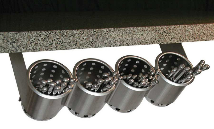
San Lorenzo silver jewelry designed by Lella Vignelli; the form of the silver bracelet pivots to create varied shapes.
CIGA Hotels silverware designed by Lella and Massimo Vignelli, 1979
Rotunda chair designed by Lella Vignelli for Sunar-Hauserman, 1979
Interior design by Lella Vignelli for the first class compartment of Great North Eastern Railways, United Kingdom, 1997

Shocking Infographic of American High School Graduation Rates by Geography

$
0
0

America has some great colleges, and folks send their kids from around the world to attend our Ivy League schools and design schools. So what the heck is wrong with our high schools? The Hechinger Report's Data Editor Sarah Butrymowicz put together this infographic showing U.S. high school graduation rates by geography, which believe it or not, no one had thought to do before. And the results are pretty shocking.

As you can see, whether or not you graduate from high school has a lot to do with your state. Take a look at this:

The southern states are doing horribly, with the exception of Texas, which is really kicking ass. 

I was also surprised to see that my home state of New York has a totally undeserved reputation for being an "educated" state; we've got way more of the lower 75% green than the 100% dark blue.

This should also put paid to the notion that the coasts are covered in intellgentsia and the flyover states are dumb. The midwest is delivering some solid results.

We can also see that district policies apparently go a long way towards influencing graduation rates. Look at the stark difference along the Texas-Louisiana border:

With these dismal figures thus exposed, you may be surprised to learn that there is a trend for families around the world to ship their childrn to the U.S. to get an American high school education. According to an article in the L.A. Times,

The number of [foreign] students attending American high schools on F-1 visas has increased from about 1,700 in 2009 to more than 80,000 in 2014, according to statistics compiled by the Council on Standards for International Educational Travel.

I hope the foreign parents thinking of doing this in the future take a look at that map first.

Viewing all 19132 articles
Browse latest View live


Latest Images