Quantcast
Channel: Core77
Viewing all 19132 articles
Browse latest View live

Japanese Over-Design FTW: The Beetle 3-Way Highlighter

$
0
0

Never thought I'd have a follow-up post for "Japanese Over-Design FTW: A Highlighter with a See-Through Tip," but apparently the island of Nihon is not through with highlighter design innovation. Pen manufacturer Kokuyo has a model called the Beetle Tip 3 Way Highlighter Pen:

Jokes about over-design aside, I could actually see this dual-color model being useful for highlighting figures on a sheet—say, using one color to highlight numbers that have exceeded expectations, another color to tag the ones that need improvement.

On the other hand, the intended functionality of the monochromatic models seems a little iffy to me:

Unlike a lot of unique Japanese products, these aren't tricky to find; they can be had on Amazon, nine bucks and change for a five-pack.

That's for the monochromatic ones. The dual-color jammies are $5.80 for a three-pack.


Fantastic Concept Work from the FZD School of Design

$
0
0

Practicing industrial designers: Are you getting sick of doing ID? Maybe you should switch to ED, or Entertainment Design. That's the field where you generate blue-sky concepts for interiors, objects, vehicles and even characters for movies or videogames, without having to worry about the hassles of mass production.

The overlap in skillsets between ID and ED is pretty strong, as I realized when clicking through the website of the FZD School of Design. The students must first learn perspective, as we did in ID:

They learn shading, as we did:

They learn that peculiar combination of loose and tighting sketching, as we did:

They learn to consider how items physically open and close, as we did:

They learn to clean up their drawings for client presentation, as we did:

They learn to sketch and render interiors and spaces, as we did (although they're doing pirate ship interiors whereas we had to draw exhibition booths):

And despite the fact that ED doesn't involve mass production, students still have to think of how physical items—a prop monster, for instance—might be constructed. This giant bug exercise below is intended to "[show] students how to think within materials and manufacturing restrictions."

Need more ID similarity? Take a look at the course breakdown, which only lacks a few ID courses like Prototyping and Materials & Methods:

It's really fun to look through the school's blog, where they publish the work of their students, and try to guess what they're working on: Is this a theater set for the stage? A matte painting for a backdrop? Vehicles for a sci-fi movie? A videogame interior?

It's also fun to see the freedom these guys have versus industrial designers. Entertainment designers can create bi-pedal cats that live in a feudal society and have distinct vocational roles. Or they can imagine what Michelangelo's workshop looked like. Or they can decide that Vikings slept in designey lodges with loft beds.

For those willing to travel to Singapore, where the school is located, they offer an attractively-short (if intensive) one-year program in Entertainment Design. There's also an eight-month Advanced program for those who have completed the first course. They claim an 80% job placement rate, with their graduates working at Lucasfilm, Ubisoft, Activision and other big dogs in the film, CG and videogame world.

Would-be ID defectors among you too scared to jump ship, don't fret, there is a way to dip your foot in the water first. The school has a LOT of free video tutorials, lectures and explanations up online. Note that these are not quick videos that you sneak a peek at in the office; most of these are over 30 minutes, some stretch to an hour and a half. That's because these videos cover the skills, coursework, and case studies you'd learn at the school, and some even explain business elements of the entertainment industry.

If you're wondering what the "FZD" stands for, that's Feng Zhu Design. Former Art Center instructor Feng Zhu has been an entertainment designer since the '90s; he's worked for George Lucas, Michael Bay, James Cameron and seemingly every videogame company under the sun. Zhu opened the FZD School of Design fairly recently, in 2009, with the aim of "[providing] a world class entertainment design education."

It might be a school, but it seems like a lot of fun! It's a Friday, so dive into the students' work here.

Creating an IKEA Alternative in America

$
0
0

Yes, I admit it: I have IKEA furniture. While my design degree has given me a deep appreciation for high-quality, midcentury furnishings, my budget hasn't quite caught up to my taste, and I'm left sheepishly amassing an array of tiny IKEA Allen wrenches in a junk drawer. Maybe that's why I was excited to see Greycork's Indiegogo campaign. The furniture startup hopes to take a bite out of IKEA's market, luring consumers with higher quality goods at a similar price point. At the cornerstone of its recently launched collection (available for pre-order only through the campaign) is a sofa, which Greycork promises can be assembled in four minutes, no tools (not even Allen wrenches) required.

Spurred by the founder's own frustrating experience assembling and disassembling furniture over the course of several moves, Greycork was established in June 2013 by John Humphrey. "I thought there could be an opportunity to create something better looking that I could have a stronger connection to," he says. With a background in manufacturing, Humphrey had spent time working on assembly lines at the age of eleven for his family's lumber business, which dates back to the 1880s. In 2014, the Rhode Island native invited Bruce Kim, a RISD alumnus, to join him as a co-founder—and the team grew from there, as they brought on two more RISD alumni, Alec Babala and Jonah Willcox-Healey.

After a few missteps with their initial product line, a series of tables, the team took a step back. "We went too fast, too soon," Babala says. "We changed course to focus on human-centered design, IDEO, and their three phases: inspiration, ideation, implementation." Last January, the team sat down with a design kit from IDEO, and began a series of interviews with users that continued until late March. "After that first round, we decided to go deeper with it," Babala says. "This time, we started to do more personal interviews. I think between the four of us we got about a hundred one-on-one interviews about what makes a personal space, what makes a social space, what makes a productive space." The interviews led the team to focus on the living room as the central part of the home, and the sofa as its most crucial element. "So, that's where we started," Humphrey says.

The team employed another set of criteria, a decision-making matrix, to help them hone in on their idea and make critical decisions around their product offering. "Our decision-making matrix was: transportability, affordability, aesthetically appealing, ship-ability, durability," Babala says. After understanding their users' needs, as well as the price-point they were willing to meet, the team looked at options for manufacturing—adding a new layer of constraints.

"Starting with materials, we knew we could use ash, MDF and thin-plated steel because they're relatively cheap," Kim says. "And also we limited ourselves to working with these two partners—Panel Processing, which is the biggest panel fabricator in North America, and Waddell Manufacturing, who primarily do wooden components that involve turning." Limited by panel-and-dowel construction, the designers began sketching, looking to Japanese aesthetics as a source of inspiration. "[Japanese design] uses really, really simple geometries and forms that work with our constraints," Kim says. 

Sofa sketches

Another limitation was the material sizing itself. Stock paneling comes in two sizes, 4-by-8 and 5-by-8 feet, so the designers had to work within those dimensions to use material efficiently. "If our seat panels were an inch thicker or an inch wider, we would have only been able to get one piece out of a whole sheet of 4-by-8 [feet]," Kim says. "Every single component on the sofa has been designed to get better yield from stock materials." Any leftover material was repurposed for another component in the collection.

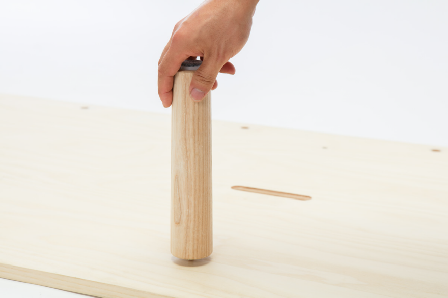
Kim and Willcox-Healey did numerous sketches—roughly 30 iterations—of how components could go together before moving their designs into CAD. On the computer, the designers were able to see how the couch looked from all angles. The team used the decision-making matrix to narrow down their choice to two or three designs, and then started full-scale prototyping in-house using lathes and small-scale machinery. Knowing its manufacturer's capabilities, Greycork tailored the designs to Waddell's equipment, leaning on them to produce as many similar components as possible. As a result, the sofa features six dowels along its back, six legs and a rail, which all screw into a standard panel base produced by Panel Processing.

Shipping and handling posed yet another challenge to the small team, who had to scale their design to keep it within budget and under freight rules. All shipping through UPS and FedEx is calculated by dimensional weight, a system put in place to avoid shipping any excess air and to have a better box-to-internal-item ratio. Calculated by multiplying length by width by height and dividing by 166, that dimensional weight is then combined with another formula for larger packages (like Greycork's sofa). Length and girth are added together, doubled and that resulting number has to be greater than 130 to make the minimum billing weight 90 pounds. "This second equation makes it difficult to have a large box since you can be charged for something that weighs more than it really is... thus it's more expensive to ship," Willcox-Healey explains.

The other tricky part of shipping large boxes involves standard shipping versus freight shipping. If the number from the second equation exceeds 165 inches, then the package has to be charged for freight shipping—moving it to a whole other price zone. "Keeping our packaging size under 165 has really been our biggest restriction," Willcox-Healey says. And right now they are just under that magic number—77 plus 5 doubled equals 164. "We're exactly a half-inch away from our shipping costs jumping three times," Kim says. The team employed several techniques to keep the sofa within the necessary dimensions, including getting the seat frame as thin as possible and using compression foam for the seat cushions. 

The magic number for the seat frame itself ended up being three-fourths of an inch, a number derived from "having a bunch of people jump on it," as well as some slightly more scientific tests of frame warpage. "We put a panel vertical to the seat frame, and we put load onto the panel, and marked how much it deflected," Kim says.

As for the seat cushion, the team was quickly educated on the ins and outs of compression foam, learning how to compress them properly, what kind of foam to use to make sure that it would rebound later, as well as how to order and source the material. Greycork worked with an overseas manufacturer to get the best amount of yield from one bun, a stock foam standard that comes in 12-inch cubes. "We had to get the whole package down to five inches of height, leaving one inch for the upholstered cushions," Kim says. "We couldn't be over six inches of foam, or it wouldn't compress down and we would have to ship freight."

The Greycork team used the same machine used by foam mattress companies like Casper to compress the foam down for shipping. "Basically, we're using the same process of putting it in a bag, sealing it, and then when it's opened by consumers it expands to the full form," Willcox-Healey says. "With that, you have to use a very high-quality foam. If you use a low-quality foam, it will stay at 60 percent of its compressed form, like a pancake." The same process was used for the pillows, which were compressed down to three-fourths of an inch, stuffed into machine-washable foam slipcovers and sealed in bags for shipping.

The foam itself has multiple layers, including a plush polyester fiber, two inches of soft foam and three inches of firm foam. That layering of various densities was another lesson learned by the Greycork team, who had very little experience with soft goods and upholstery prior to this project. "When you sit on something, you don't always understand that there can be three different or four different types inside so that you have that soft-but-firm feeling," Willcox-Healey says. "Visually, you're using something that just looks like a square piece of foam, but that can actually be very harsh to sit on. What can you do to a piece of fabric in how you stitch it together or how tight it is to look more presentable to a consumer?" Aside from the foam and upholstery, all other manufacturing for the sofa was completed in the U.S.

The Greycork team on their sofa and chaise

When that perfectly sized 78-by-35-by-5 inch box from Greycork first arrives, a user will lay it on the ground, snip the force wraps and open it up. Laying on top is a poster with an orthographic view of the sofa and, on the back, instructions for assembly. "You can either choose to assemble it like a baller with the poster, or flip it over to use the instructions," Willcox-Healey says. Inside the box are three flat-back pillows, a back rail, a frame, six legs, six washers and six thumbscrews. After attaching the back rail to the base frame using the thumbscrews, the legs are bolted into the base and cushions are fluffed back out to full size. "No tools required," Babala says.

The Greycork sofa will eventually retail for $650, but it's currently available for $450 through the Indiegogo campaign (with free shipping in the U.S.)—a price that is indeed very competitive with IKEA sofas, and finally gives lean-budget design lovers like me a viable new furnishing option.

Signs of Life

$
0
0

In the world of communication design, perhaps no word is less sexy than wayfinding, which inevitably conjures up images of dull-yet-necessary signage, maps and, well, even more signage. And yet anyone who has tried to navigate an unfamiliar airport, museum or public-transit system can attest to the power of a good wayfinding system (and the extreme frustration of a bad one). So we were interested to hear that this year's Domaine de Boisbuchet workshop series—an annual happening in the French countryside sometimes referred to as "summer camp for designers"—included a weeklong exploration of wayfinding's wider possibilities. Called "The Social Life of Signs," the workshop was led by Emily Smith, a Berlin-based designer, educator and researcher, and Prem Krishnamurthy, a founding principal of the New York design studio Project Projects, which won the Cooper Hewitt's 2015 National Design Award for communication design. Recently, we caught up with Krishnamurthy to find out what a 19th-century French estate can teach designers about building a 21st-century wayfinding system.

Prem Krishnamurthy with one of his students in "The Social Life of Signs" workshop at Domaine de Boisbuchet last month. All workshop photos by Ivy Tzai

What was the impetus for this workshop, and what were your main goals in developing it?

Boisbuchet, as a site for summer workshops, has typically focused more on product design and architecture; it hasn't included as much graphic design. One of the reasons is that most of the workshops engage with the entire site itself—and I think there's this idea that graphic designers mainly only use the computer to make things. Which is really a misconception of what we do and how we do it.

Much of my work begins with exploring particular spaces, and trying to understand how they function on an architectural and physical level—while also exploring spaces in a social and psychological manner. How does a place—whether a museum, a company, an office, a national park or even a country estate—operate? What are the interpersonal dynamics and the social systems that make a space tick? This was a really central interest, to apply such an approach to Boisbuchet.

“There's this idea that graphic designers mainly only use the computer to make things. Which is really a misconception of what we do and how we do it.”

Right now, we're working on a lot of wayfinding projects here at Project Projects. We're developing the wayfinding system for MoMA's new expansion, with Diller Scofidio + Renfro, and working on large-scale public parks in New York and throughout the country, alongside smaller commissions. When you work on these larger wayfinding projects, oftentimes just the sheer complexity of the spaces and the requirements take over. The danger is that you can get into a very functional mindset that only allows for, "How do people get from A to B in the most effective way? How do you resolve X and Y specific concerns?"

So I wanted to take Boisbuchet as an opportunity to go back to first principals, and to say, "OK, this is a chance to think about wayfinding again in an experimental and experiential way."

Project Projects' recent work includes the exhibition identity and graphics for Repetition and Difference at the Jewish Museum in New York.
The studio's signage projects include a 2012 identity system and temporary signage for Harvard Plaza.
Project Projects also created a sculptural timeline display and interior graphics for Knoll's new Manhattan headquarters

Can you give me a better idea of what you were working with, in terms of the landscape to be navigated?

Domaine de Boisbuchet is a large French country estate that's been subdivided many times over the last centuries. When Alexander von Vegesack acquired the estate, roughly 25 years ago, he started to add architecturally significant buildings to it. So now there are different architectural pavilions that function as workshop spaces, residences, meeting rooms, workshops and more. The portfolio of buildings is always growing.

What was really interesting to us is that the people who form the backbone of the estate are the staff. They're the people who are there for the entire summer season—whereas the workshop residents are coming there for a week, completing a workshop and then leaving. And otherwise there are tourists, who might only ever visit for a day tour.

So while there is a creative community of workshop participants, the staff are actually the primary users of the site. That was an unexpected realization. Our group of students interviewed various people involved in the site, at every level of the organization. We set out to understand the staff dynamics and how that could play into the whole identity, self-image and outward perception of the site.

Emily Smith and Krishnamurthy leading a workshop session
Students collaborating on a subjective map of the estate

Were you giving your students much direction in terms of the end goalor did Boisbuchet have wayfinding needs that you were asked to address?

No. One thing I would say about the workshop—and this might sound a little weird—is that it was incredibly empowering for us as instructors. We were allowed absolute open-ended freedom in terms of what would come out of it. On the first day, one of the students asked the program director of Boisbuchet, "Do do you have any specific expectations of what should come out of this workshop?" The answer was no.

The point of these workshops at Boisbuchet is for the process to lead the result. Mathias Schwartz-Clauss, who is the program director, said, "You know, I just hope that you guys figure out a new way to think about the space, wayfinding and the topics you're pursuing." And he also said: "I'd be quite disappointed if you came back at the end of this week having made a signage system."

It was great that he said this, because it totally freed us. We didn't have to feel forced to create a single predicable outcome. It allowed us to think about the fact that sometimes you are in a situation where you think you're supposed to make one specific thing, but actually the possibility of making something else that's far more resonant and functional in a long-term way might be very close at hand.

The workshop participants ended up developing an alternative tour of Boisbuchet.
As part of the tour, Krishnamurthy hosted a mini talk show with Boisbuchet's founder.

So then how did this research and experimentation ultimately take shape into a final product?

What ended up happening was that we as a group created a new guided tour of Boisbuchet—a kind of unofficial or alternative tour, that explored the site in unexpected ways. It was a one-time event that lasted about two and a half hours. It involved not only the students but staff as well. Everyone at Boisbuchet—from the owner and management to all the general, administrative, kitchen and workshop staff—came along. We moved through different stations of the landscape and of the site, exposing stories and narratives that were sometimes secret or contentious, that were points of miscommunication. Putting it into the form of a tour allowed the group to think about it in a new way. We were trying to tweak people's perceptions of the place by pointing out problems, but we also tried along the way to suggest some close-at-hand solutions.

“The program director said, ‘I'd be quite disappointed if you came back at the end of this week having made a signage system.’”

This multipart event took a number of formats. In addition to sections that followed a more "typical" tour form, there was a short yoga class in an ill-used building (but which turned out to be great for that purpose). There was a mini talk-show embedded into the workshop, in which I interviewed the founder about his interactions in the '70s and the '80s with the Eames office, and his own research into the dark underbelly of utopian communities.

One of the students made a board game, called "The Hazing Game of Boisbuchet," which basically taught the rules of Boisbuchet to the staff through a hilarious board game. There was a new cocktail that was invented, which used an apple juice made at Boisbuchet—the only local agricultural production. Another part of the tour visited a strange site called "Trauma," a set of slightly more distant buildings that a lot of the staff had never visited but which are almost the unconscious of the site. It serves as storage for a part of Alexander's collection of design objects that he's gathered over the years. So we opened up this warehouse—almost like a Raiders of the Lost Ark moment— filled with all these fascinating objects that almost no one working there had ever seen.

One of the students created a board game to teach staff the unofficial rules of Boisbuchet.
The tour also included a cocktail with apple juice made on the estate.

You're back in the office now, and Project Projects has all of these wayfinding projects. Did leading this workshop make you think about them differently, or give you new approaches to try in your work?

Absolutely. I feel like the whole experience is still percolating. But I'm sure that, for myself and everyone involved in the workshop, it will open up some of the processes by which we make things. We've created a lot of wayfinding projects; after working on any type of project for a while, you develop a methodology, you develop a process. The way you talk with clients, the way you figure out the functional requirements for a space, the way you approach schematic design, how you sketch and develop designs, et cetera.

So the workshop was a really good exercise; it reminded me that sometimes this kind of open-ended, iterative process can be useful, because rather than thinking that we know the answers and the approach, we can work with people and specific contexts to figure something new out and prototype it quickly.

There are lots of wayfinding problems that can't be solved by a sign. They might be solved by a different way of interfacing with different publics, or an alternative form of communication. There are other ways to achieve wayfinding goals than signage. It may be more challenging to track the efficacy of some of these methods, but they have a potential viability and they're definitely worth testing.

It was also a good reminder that you have the desires of a client or of the people who are organizing a situation—but you also have to weigh the desires and needs of the people using a space, which aren't always one-to-one with those of the client. A truly successful wayfinding system should respond to both of those levels. It should reflect the official narratives, the unofficial ones, the hidden desires and the conflicts—and it should nurture the process of navigation through all of this.

Awesome Swing-Arm Design Alleviates a Major Ergonomic Flaw of Backpacks

$
0
0

Most backpacks are designed while ignoring a simple ergonomic reality: One must shrug out of the backpack and bring it in front of you to access the contents. That's why you'll often see a pair of backpackers on a trail accessing each others' packs for them.

The Wolffepack design we showed you here attempted to tackle this, as it's designed to flip around to the front of the wearer's body. We thought that was super-cool, but now Washington-state-based husband-and-wife inventors Paul and Cathy Vierthaler may have one-upped that design. Check out their own creation, the Paxis:

Want. The bags come in 18" and 20" heights, run roughly $250 and weigh between five and 5.5 pounds unladen.

At just one year in length the warranty's not that impressive, and does make me wonder just how robust that mechanism is; in the photo below I spy a spring and what look to be plastic latches (the bright green things), and we all know those things tend to wear out. I'm going to look back in on these guys in a year to see how the long-term reviews have panned out.

Also, what is it with husband-and-wife inventor teams? The Vierthalers should get drinks with the clothes-folding Kuipers and the CNC-tinkering Hertels, at the bar designed by Because We Can's Jeff and Jillian.

Nanna Ditzel, First Lady of Danish Furniture Design

$
0
0

It is reported that Nanna Ditzel used to exclaim, "three steps forward and two back still means I've taken a step in the right direction!" This optimistic worldview helped propel an ambitious 60-year-long career that included furniture, textile, jewelry and product design. 

Nanna Ditzel reclining on her wicker lounge chair and footstool, designed in 1961

Dubbed the "First Lady of Danish Furniture Design," Ditzel started her career as an apprentice cabinetmaker at the Richards School in Denmark before moving on to study furniture at the School of Arts and Crafts. In the furniture program she would meet her future husband and collaborator, Jørgen Ditzel, and together they began entering (and winning) design competitions and exhibitions while they were still students. Nanna graduated in 1946, and that same year she married Jørgen and they formally established their design studio together. Jørgen had trained in furniture upholstery (his original intention to become a cabinetmaker was stymied by the trade's lack of left-handed tools), a skill that allowed their curvy experiments with chairs and sofas to flourish. Together they won numerous accolades, including silver medals at the Milan Triennale in 1951 and 1957 and a gold medal in 1960, and the prestigious Lunning Prize in 1956. But their life and work together ended abruptly when Jørgen passed away unexpectedly in 1961 at the age of 40. 

Two-seat sofa by Nanna and Jørgen Ditzel, 1949
Nanna and Jørgen Ditzel's first piece of wicker furniture was a hanging chair produced in 1957. 

Toward the end of their collaboration, Nanna and Jørgen had been experimenting with wickerwork furniture, a medium that Nanna would pick up again in the '70s—but her first great success as a solo designer was her line of Toadstools from 1962. Originally designed as multipurpose stools and tables for children, the Toadstools quickly expanded into adult-size tables and barstools, and their simple design proved so popular that they are still in production today. Her 1963 Hall Stand also shares the Toadstools' rounded wooden simplicity, as does the Lulu Cradle from the same year.

Ditzel posing with a stack of her child-friendly Toadstools and the Lulu cradle

The late '60s found Ditzel in swinging London, having relocated to marry the British-based furniture businessman Kurt Heide. Together they created an international design center and showroom called Interspace that also housed her independent studio. As her practice expanded, she began experimenting with synthetic materials like foam, fiberglass and plastics that could be formed and molded into the groovy shapes of the era. Beyond her furniture designs, Ditzel's studio also took on commissions for textiles, interiors and a range of product designs. This chapter of Ditzel's life came to a close when Heide's death prompted her to return to Copenhagen in 1986 and reestablish her studio there.

Ditzel's experimentation with synthetic materials in the late '60s included a molded stool with bolted arms and back, 1969

Ditzel's prodigious output from 1986 to her own death in 2005, at age 81, was marked by a number of novel designs. Perhaps the most legendary was the 1989 Bench for Two, where occupants are seated at a conversational right angle to each other. The bench and its accompanying quarter-circle table are made from one-millimeter-thick plywood that has been silkscreened with a hypnotic circular pattern. Awarded a gold medal at the International Furniture Design Competition in Ashikawa, Japan, they were followed the next year by the Butterfly chair, which was cut from a single two-millimeter-thick folded fiberboard and supported by six insect-like legs. 

Ditzel's Bench for Two has a base of solid maple and an extremely thin plywood back, 1989
A view from above of the bench with its accompanying quarter-circle table nestled between the seats
Ditzel's love of butterflies inspired her 1990 chair of the same name.

Ditzel's greatest commercial success came in the stackable form of the Trinidad chair, whose slotted seat and backrest helped to keep the chair lightweight and well ventilated. Introduced in 1993, it became an instant hit for the furniture manufacturer Fredericia—which at one point was producing a thousand chairs a month to keep up with demand.

Ditzel's use of a newly introduced five-axis CNC router made it possible to produce the Trinidad chair's intricate design at an affordable price.
Trinidad chair prototypes, 1993

A selection of Ditzel's furniture is currently on view at the Trapholt Museum in Denmark through January 2016, as part of an exhibition celebrating women in Danish furniture design. Her work is joined by examples from 65 fellow female designers, including the 20th-century luminary (and Ditzel classmate) Grete Jalk and the contemporary powerhouses Louise Campbell and Cecilie Manz.

Ditzel created the 1993 saddle chair when a friend complained that his horse's saddle was the only relief he could find for his back pain.
Silver corkscrews designed by Nanna and Jørgen Ditzel for Georg Jensen, 1957
Nanna Ditzel's necklace design won the 1950 Goldsmiths' Association award and was produced in gilded silver. She would continue to design jewelry throughout her career, collaborating with Georg Jensen.
Nanna Ditzel's clever 1997 watch design for Georg Jensen also sits upright as a bedside clock.

This was the latest installment of our Designing Women series. Previously, we profiled the Ford design pioneer Mimi Vandermolen.

Tonight at Curiosity Club: Cutaway Images with Melody Owen

$
0
0

Exploded diagrams speak to us on a deep level, but Melody Owen has taken that appreciation and run with it. Tonight at Curiosity Club she'll share some of her incredible collection of cutaway imagery and ideas about why we're attracted to them. She is also posting a cutaway a day until she runs out on her Tumblr Cutaway World

Talk starts 6pm PST at Hand-Eye Supply and streams on the Curiosity Club homepage!

"For over twenty years, I have been collecting cutaways. These are illustrations (most often found in Encyclopedias, medical books and text books) which depict the surface of a building, machine, animal, plant, or human—cut away— to reveal the insides. I have hundreds of these images and will show a selection of them while talking about why they interest me. It has something to do with how we perceive reality. Something to do with surfaces and systems that we cannot see or touch, but which pervade our lives. All the mysteries around us and inside us. How things tick. What makes my fingers move to type. Where is that spark of soul located inside the eye?"

"I was a small child, crouching over a swampy pond, watching tadpoles. enormous, soon to be frogs, they swarmed around the bank. Through the thin membrane covering their distended bellies, the tangle of intestines was clearly visible. Heavy with the process of transformation, sluggish, they provoked one to reach for them. Pulled out onto shore with a stick, touched carelessly, the swollen bellies burst. the contents leaked out in a confusion of knots. Soon they were beset by flies. I sat there, my heart beating fast, shaken by what happened. the destruction of soft life and the boundless mystery of the content of softness. It was just the same as confronting a broken stem with sap flowing out, provoked by an inexplicable inner process, a force only apparently understood. the never fully explored mystery of the interior, soft and perishable." ~ Magdalena Abakanowicz

Melody Owen is an artist/writer/person based in Portland, Oregon. She is represented by Elizabeth Leach Gallery and has also shown work at The Portland Art Museum, Core Sample, Modern Zoo, PDX Gallery, Nine at Blue Sky, The Nines, The Art Gym, PICA, TBA, PDX Experimental Film Festival, and elsewhere out in the world. She has travelled to artist residencies in Iceland, Paris, Quebec, Switzerland, Eastern Oregon and Western New York, and published books with Publication Studio, Future Tense, Scout Books and Container Corps.

In the Future, Might Google Design Products to Fit People's Queries?

$
0
0

Apple's traditional way to solve a problem started with the brass: Steve Jobs wanted his music library in his pocket, and he bet that others did, too. Following that hunch, we got the iPod.

Google's way to solve a problem needn't rely on hunches, as the company has a massive database of what people are actually Googling. They know precisely what people are searching for in their lives. So when a Google engineer in Boston noticed that a lot of local queries were related to solar panels, he began analyzing the nature of the questions.

Turns out that the process of getting solar panels onto the roof of your house is a royal pain in the ass, beginning with the research. People want to know the basic things, like how much money they'll actually save and what the up-front cost of the panels is. But these answers are different for everyone depending on where your house is located, which way it's facing, what your local utility costs are, and how friendly your local government is to alternative energy.

Thus Google formed Project Sunroof, which cleverly harnesses the data they've already amassed for Google Maps, Google Earth and plain ol' Google. Residents of the three pilot areas for Project Sunroof—Boston, San Francisco and Fresno, California—can type in their address, and Google's data reveals exactly where your house is and how much sun coverage it gets. Local obstructions to light are seen and calculated. The project can ballpark how many panels your specific roof will need, and generate estimates to send to local installers. Local solar incentives are added up, and end users can thus get the magic numbers of "How much will it cost" and "how much will it save."

While it's too early to tell if the project will be successful, it does point the way towards a potential future approach to product development. Remember the woman who searched online—undoubtedly using Google—to find a device that could help her blind dog? Unable to find an existing product, she invented her own. Imagine if Google had a team of industrial designers waiting around to see what people were searching for, and once the queries hit critical mass—X-thousand number of people—they then designed a physical product that fit the description.


Product Tank Prototypes a Slick One-Handed Camera Tripod

$
0
0

The industrial designer known only as Product Tank is a frequent contributor to the Core77 boards, and we always enjoy looking in on his work (see list at bottom). PT's latest: A camera tripod that can be operated with one hand.

Your average tripod is a real pain in the ass to set up, having three legs and two latches per leg that must all be individually adjusted. PT figured he could do better and started with the user experience, envisioning a system that could be worked one-handed, then building his design around that principle:

I love that he's worked out the mechanics with plywood and commonly-available materials; it reminds me of Prototyping class at ID school, and shows how doable it is to work out complicated mechanical problems even if you don't have access to a high-tech lab.

In terms of design, the fact that you can release the legs down onto uneven terrain is brilliant, and the one-handed operation/adjusting would surely be a boon to those missing a hand or arm. We're looking forward to seeing where this project goes.

See more of our Product Tank coverage:

- Clothes Pins for the Arthritic

- Ruler for the Visually Impaired

- The Clamp Lamp

- Wristwatch Concepts

A Giant-Sized LED Lite-Brite, Without the Choking Hazards

$
0
0

Were toy designers trying to kill us in the '60s and '70s? The original Lite-Brite came with dozens of little candy-colored translucent plastic pegs that practically define the term "choking hazard." We plugged these little pegs into the Lite-Brite's grid to draw our primitive images off of templates. It wasn't a particularly fun toy, but compared to the Slinky it was a freaking Xbox.

Now California-based Hero Design, a firm that creates interactive exhibits, has created a giant-sized Lite-Brite called the Everbright. While you'd guess they were just trying to make the pegs too big to swallow, in fact they've replaced the pegs with permanently-mounted large knobs that have LED faces; rotate them to change the color.

Check it out:

Everbright from Hero Design on Vimeo.

I don't want to nitpick, but they clearly got the aspect ratio wrong. How are we supposed to draw the lame sailboats of our youth? Not to mention that lousy clown with the tall cap.

Travel Much? Explore Places and Spaces with dsgnfix

$
0
0

For those who travel often for work or pleasure, it can be difficult to find recommendations for destinations beyond the expected tourist sites. That's where technology can help fill the gap. At a recent conference we learned about dsgnfix, a search and discovery app for designers, architects and artists.

"dsgnfix links like-minded design enthusiasts to their passion — great design — and also links them to each other," Chuck Routhier, Creative Director and co-founder of the app told Core77. "The app speaks our language. It offers the design-focused content and experiences we crave."

There are two ways to explore and discover on dsgnfix. You can conduct your own search of user-generated content or let a celebrated curator guide you with their recommendations. From Billie Tsien + Tod Williams, Paul Miller, aka DJ Spooky, Bruce Hanna to Allison Cross, some of the industry's most recognized and respected voices share what influences and interests them.

dsgnfix connects users to everything from contemporary and historic architecture, galleries, vintage shops and sculpture parks to neighborhood walks and views. The powerful search engine and targeted filters allow you to narrow down your search by category to find exactly what you are looking for. "It makes it easy to sift through content and quickly discover design-focused experiences," Routhier explains. Users can share moments by taking a photo, adding a comment or description and uploading new discoveries to the stream.

Community building was foundational to dsgnfix from the beginning. To bring the concept to life, Chuck teamed up with friends who shared his passion— Polly Carpenter, Dee Dunn and Jennifer Routhier. As Routhier shares, "We all love design. Our goal is to create a mobile community of people who feel the same way."

Prototyping dsgnfix

Together with an IOS developer, the team developed a simple, clear interface to make it easy for users to participate and contribute. "This project went through several iterations and design concepts, from bold and in your face to something more subtle," Routhier tells Core77. "Landing on the simpler, wire-frame approach was driven from the concept of dsgnfix being a tool—a means to an end—to put others in front of inspiring places and spaces." 

This is important, as the dsgnfix team isn't looking to create a virtual world in users' pockets. "There are plenty of apps and websites where you can passively view cool design," Chuck says. "We want to get people out to see the real world through a creative lens. We believe that the only way to fully appreciate design is through direct experience."

The iOS dsgnfix app is available through the Apple App store. Currently launched in New York City, dsgnfix is quickly expanding into more neighborhoods. For more information, visit dsgnfix.com.

The 2015 Core77 Conference: Collaboration Now

$
0
0

Last year, in Brooklyn, Core77 held its first-ever design conference, a daylong affair that explored neomaterialism, wearables, cycling culture, the "spectacular vernacular" and plenty more. This year, emboldened by that success, we're hosting an even more ambitious event in downtown Los Angeles, with more speakers (23!), more parties (two!) and a half-day of LA design tours wrapping up with a picnic lunch. And that's just the stuff we can tell you about right now.

Early-bird pricing ends August 31

As programming chair for this year's CoreCon—which we're calling Designing Here/Now—I led the charge on developing the conference themes and securing a roster of fascinating speakers working on some pretty mind-blowing projects. It's been months in the making, and now I'm excited to be sharing our lineup in a series of posts over the next few days.

Our first conference session is called Collaboration Now, and in it we will look at how designers are forging creative partnerships for enlightened product development and potent social change. Kicking off this session is a moderated conversation between Ivan Poupyrev, technical program lead at Google's Advanced Technology and Projects (ATAP) division, and Paul Dillinger, vice president of global product innovation at Levi Strauss & Co. Poupyrev and Dillinger will be discussing Project Jacquard, a Google-led initiative to weave touch-interactive fabric into everyday materials:

Levi's is Jacquard's first design partner—but not its last. As the Jacquard team explains in the above video, the project aims to create a blank slate for fashion designers, furniture makers, software developers and others to come in and invent new uses for conductive textiles.

After that conversation, we'll have a presentation by Tad Toulis, vice president of design at Sonos. As he told us in an interview last April, Toulis works at the intersection of industrial and user-interface design, and a key part of his job is figuring out how to interface effectively between the hardware and software sides of the equation. Toulis will talk about what he's learned in this role, and how those lessons can apply to anyone trying to create beautiful objects that also function beautifully.

Sonos's PLAY:1, PLAY:3 and PLAY:5 wireless speakers

Our next speaker is John Bielenberg, a designer and entrepreneur with an extensive resume bringing together creative professionals to generate ideas for solving global challenges. In 2003, he founded Project M, an influential platform for designers to create projects bigger than themselves:

More recently, Bielenberg co-founded Future Partners, a Silicon Valley–based innovation firm, and he's also helping to run Secret Project, an immersive, cross-departmental class at California College of the Arts. In his lecture, Bielenberg will talk about how this has all come together, and why "thinking wrong" is a crucial step for designers looking to drive positive change.

Wrapping up our Collaboration Now session, Sly Lee will present his work at The Hydrous, where he has formed an eclectic team for an ambitious quest to capture all of the world's coral reefs in interactive 3D. He'll talk about the goals and challenges of this project, and how he's combining design, science and robotics to create a global community of DIY ocean explorers:

Tomorrow, we'll have a look at our second CoreCon session, Making Now, featuring spectacular water fountains, made-in-LA lighting, socially-minded crafts and an interactive conversation on making your life your biggest design project.

If you can make it on October 23, be sure to take advantage of our early-bird pricing, which expires at the end of this month.

Illustrators, Animators and Louis C.K.: Art Commenting on Smartphone Life

$
0
0

When it comes to the unintended consequences of technology, no one could have foreseen the social side effects of smartphone usage. Marrying a small screen with mobile connectivity was meant to add convenience to our lives, and it predictably has; but it has also fundamentally changed how smartphone users communicate with people—to our detriment, I believe—and examples of this can be seen indoors and out, all around the world.

Part of me is relieved it isn't just Americans. By now you've surely seen this photo, which began circulating earlier this year:

That's Rembrandt's The Shooting Company of Frans Banning Cocq and Willem van Ruytenburch, a/k/a The Night Watch, being ignored by schoolchildren in Amsterdam's Rijksmuseum. (One blogger insists they are merely consulting the Rijksmuseum's app, but does not back this up with any evidence.) The internet being an unkind place, parodies of the scene began popping up:

Perhaps the funniest was this one, which arms the Night Watch characters with modern kit, transforming a pole-arm into a selfie stick and adding iPads and Beats headphones for good measure:

The American comedian Louis C.K. had this to say about the drawbacks to allowing children to learn early communication skills via a smartphone:

Of course, we all know it's not only kids that are being held in the thrall of smartphones. The New Yorker periodically skewers a wider age range of society with its trenchant cover art and cartoons:

So that's Western society for you. Meanwhile, how are things over in China, the world's largest smartphone market? According to award-winning animator Xie Chenglin, not much better. This piece by Xie, which won Beijing's Central Academy of Fine Arts Annual Award, is dialogue-free so anyone can understand it. It's also marginally NSFW:

The term "phubbing" was first coined a few years ago and referred specifically to the act of snubbing someone in person by burying your phone in your nose instead. It's since expanded to signify a person's total absorption into their phone, allegedly "connecting" to people and places remote to their location, while completely oblivious to the actual world around them.

In broad strokes this isn't a new phenomenon; when I was growing up we had a similar (but bulkier) device with black-hole-like properties, it was called a television. The people in the trance of one were known as "shut-ins" or "couch potatoes." The key difference is that "phubbers" can practice their vice whilst remaining mobile. So I guess we have made some progress.

CNC + OCD: Making a Drill Bit Organizer

$
0
0

My assortment of drill bits is a mess, scattered throughout several different manufacturer's containers, and I'm getting sick of fishing through them all to find the one I'm looking for. So I wanted to make a compact object that would store the ones I use most and keep them neatly organized.

I also wanted to 1) Make it out of plywood scraps, to keep the materials cost at zero, and 2) Use the ShopBot, to create something I could not easily create with conventional tools.

Here's what I came up with. (And I'll be the first to admit I'm blatantly taking a page out of Jimmy DiResta's book here, shooting a narration-free video with liberal use of fast-motion.)

For those curious as to why I made some seemingly goofy design choices, I'll explain the "design thinking" in the next video.

Ford's New Injection Molded Airbag

$
0
0

The challenge for automotive engineers is to make cars lighter, as less mass equals less gas. And when you can use less components to deliver comparable functionality, that's a win on both the balance sheet and on the assembly line.

Thus the engineers at Ford's German facility, in Cologne, took a hard look at the new Mustang to see where there was fat to trim. They realized they could do away with part of the bulky passenger-side airbag assembly if they replaced the lower portion with this novel arrangement, which ditches textiles for injection-molded plastic:

Unlike Volvo's crazy disappearing front seats, this is no concept; if you're rolling around in a 2015 Mustang, you might not have realized it, but these puppies are already installed in there.

(Via The Engineer, a UK-based publication that insists on spelling it "injection moulded")


Desktop Organizing: Keeping Small Pieces of Paper From Getting Lost

$
0
0

As a professional organizer, I've worked with people who take notes on Post-its and other small pieces of paper—and then wind up with those notes getting buried in piles of papers on their desks. I've seen bills get buried and neglected, too. We've mentioned desk organizers before, but there are some other designs which focus specifically on keeping papers visible.

The A Clip from Monkey Business, designed by Yaakov Kaufman, nicely serves two functions: it holds blank notes and it provides a place to display them. The end user just presses the base and the clip opens. 

I'm wondering how easy to use that clip would be for an end user with arthritis, though. Also, it's unclear what size those notes are; will the end user be able to readily get replacements when the original supply runs out?

Barbara Flanagan's Tower of Clips holds a lot of papers—and can hold other items, too—with a vertical orientation that saves space. Another nice thing: It's made of remnant steel from the tabletop industry. One disadvantage is that the papers will be held flat, which makes them harder to see. And again, working those clips might be a challenge for some end users.

Babel, from Adam+Harborth Design, has the same vertical orientation but uses slots for the papers rather than clips; that will be easier on the hands for some end users. 

Other designs take standard bulletin boards and convert them for desktop use. Can Uludag did that with his design of Corcho, a desktop cork board. 

Susie Frazier did something similar, creating a desktop magnetic board made from reclaimed steel. Both of these designs are simple to use and could work well for end users who are only concerned with a limited number of small papers. End users who want a design that will also handle larger papers, such as bills, will want to look elsewhere.

End users who take notes on index cards might appreciate the note card bleachers from Levenger. One nice feature: There are slots in the back for extra cards and four pens. However, I can see those note cards flying everywhere on a desktop frequented by cats or in a room with a poorly directed fan. 

Berra is a paper holder from Karimoku New Standard, designed by Lucien Gumy. It uses wooden counterweights on a sloped base to hold papers in place; that seems more secure than the note card bleachers.

The Fierzo desk organizer from Alessi, designed by Julie Richoz, allows papers of various sizes to be readily visible. There are two bended steel frames, held together with clamps; the papers are inserted between the two frames. One drawback: This is another design that some end users with physical limitations might find difficult to use. 

The Snap-It-Up Organizer designed by Barbara Flanagan, with its big rubber bands, looks easy to use, and it can hold some pens or pencils along with the papers. The only problem is that those rubber bands could break, especially if they are overstretched or kept in direct sunlight. And some purchasers have indeed reported problems with the bands breaking. 

The 2015 Core77 Conference: Making Now

$
0
0

The 2015 Core77 Conference kicks off in Los Angeles just nine weeks from today. Yesterday, we introduced our first conference session, Collaboration Now, featuring speakers from Google, Levi's, Sonos, The Hydrous and Future Partners. Today, we're back with a preview of our second session, Making Now, which will look into the literal making-of process behind a variety of innovative design projects.

Our first speaker is Nadine Schelbert, director of design and branding at WET, the firm responsible for spectacular water features at the Bellagio in Las Vegas, the Dubai Fountain and New York's Lincoln Center, to name just a few of its more than 200 installations. Schelbert leads a multidisciplinary team of conceptual designers, illustrators, animators, interaction designers, cinematographers, photographers and others. In her presentation she'll give us a behind-the-scenes look at how WET designs, engineers and fabricates its own plumbing, wiring, circuitry and software to realize its fiendishly complex installations.

The Dubai Fountain employs nearly 1,500 individually choreographed water jets and over a thousand fog jets.

(Conference attendees will also have the opportunity to tour the WET facility in Sun Valley, with its rich environment of studios, labs, shops and playgrounds—it's one of the optional field trips we're offering the morning after the conference.)

Next, one of Core77's editors will sit down for a conversation with the Los Angeles lighting and furniture designer Brendan Ravenhill. As he told us in a 2013 interview, Ravenhill started out as a wooden boat builder but transitioned into mass-producible objects via RISD, starting his own company after graduating in 2009 and moving it west the following year. In LA, his practice is based on finding local manufacturers to partner with, and figuring out how those manufacturers' particular skills and capabilities can drive a design. You can see the results of one recent collaboration in the following video:

A look at the making of Ravenhill's Grain Drum pendant light

After that conversation, we'll have a presentation by another prominent LA maker, Tanya Aguiñiga, an artist, designer and activist whose work spans textiles, furniture, accessories and installations. As she told us in an interview earlier this year, her work is "constantly evolving, but a lot of it is about making community and being a responsible human being—using craft and art as a way to diversify conversations in society, and to bring attention to social issues that are in need of attention."

An Aguiñiga installation for the exhibition SHEvening in Los Angeles last May
Ayse Birsel's Design the Life You Love comes out October 13.

Finally, we've invited Ayse Birsel to lead an interactive conversation that interprets our Making Now theme a little differently. Birsel is the Chief De:Re Officer of Birsel + Seck—and she's also the architect of a series of Design the Life You Love workshops that teach participants how to make their lives their biggest design project. Now she's publishing a book of the same title, which comes out just a couple weeks before the conference. In her presentation, Birsel will describe how her ID practice led to these life-design activities—and lead audience members in an exercise from the new book (pens and sketchbooks will be provided).

Following her presentation, we'll break for lunch—and Birsel will be signing copies of her book. Then the afternoon will kick off with our third conference session, Business Now, featuring a design firm that gives away more than half its work to pro-bono services, and a pair of back-to-back conversations on the realities of running a design studio today. We'll have a preview of those speakers on Monday. If you're ready to buy tickets, don't forget to pull the trigger by August 31, the last day for early-bird pricing.

What Does the Way That You Interact With Objects Say About Your Personality?

$
0
0

Handwriting analysts once claimed they could deduce elements of your personality by examining your penmanship. Now that no one writes longhand anymore, that method of analysis is probably dead. But I'm guessing that if we could see your desk right now, or your office or apartment, we could tell certain things about you with even cursory glances.

Lisbon-based Art Director João Rocha knows this, and has created a series of illustrations sure to have a (harmlessly) divisive effect. Rocha's "Two Kinds of People" Tumblr presents side-by-side depictions of objects that have been interacted with by their owners, with the gist being that each variant says something about that user's personality.

Some are easy to understand, and depict personality differences that will be familiar to anyone who's ever lived with an unlike spouse or roommate:

But most of Rocha's illustrations are a bit more subtle. Most of them are technology-based, and half of the fun is figuring out what two types of people he's attempting to pigeonhole:

I have to say that with each of these, I fall firmly into one of the camps. There's more for you to go through here. And props to Rocha for successfully inhabiting the key rule of good visual storytelling: "Show, don't tell."

Via Quartz

This Smartphone Anti-Slip Solution Has the Best Kickstarter Video Ever

$
0
0

I've often lamented that the iPhone is a beautifully-crafted object that we must hide inside a protective case. But Structures Engineer Nathan Cobb refuses to cover his up, presumably because he appreciates structures. So how does he manage to keep a grip on his slippery phone? Well, like this:

Okay, so the product is somewhat silly, but it's only a dollar for two pairs. (Edit: At press time, the Early Birds have run out and it's now $3 for two pairs.) Cobb needs your help!

The Lil Grits that you see in my pictures and the ones in my video were all handmade. I laminated the silicone film and the adhesive with a spoon and cut the Lil Grits by hand with a hobby knife. That's fine for making a few sets here and there but producing larger quantities is going to require a much larger spoon and custom tooling.

This one may or may not make it; though the target's just eight large, it had barely cracked $2,000 at press time. There are, however, still 18 days left to make Lil Grits happen.

3M's Impressive, Science-y Rube Goldberg Machine

$
0
0

We've all seen a lot of Rube Goldberg machines, but this one starts off with something we've never seen before: A ball being suspended by an electromagnetic device moving along a sloped track. 3M threw their considerable technical might into creating this branding vid, building an RG machine based on "physics, thermodynamics, chemistry, energy" and even sound:

Pretty neat, no? This brief "Making of" video isn't as good, although we do get some glimpses of them knocking it together in the shop:

Am I the only one who was surprised to see them using a spade bit in the drill press? I haven't used one in years, and always assumed they were only for folks who didn't have the budget to buy a Forstner bit. So this is slightly off-topic, but do any of you use spade bits, and if so, why? I can't think of a single benefit they confer over a Forstner aside from cost and taking up less space in a toolbox.

Viewing all 19132 articles
Browse latest View live


Latest Images