Quantcast
Channel: Core77
Viewing all 19151 articles
Browse latest View live

Combining Bed Risers with Power Strips—Badly 

$
0
0

We here at Core77 are always on the lookout for things that need designing, in hopes of inspiring you entrepreneurial designers to attack the problem and make yourself some bread. So take a look at this thing, the unwieldily-named Studio 3B 4-Piece USB Bed Lift Set:

It's ugly as sin, innit? Yet it exists and people are buying it, because there's a need. Folks want power near their beds to charge up their phones and tablets, and adding height to the bed is meant to clear up storage space beneath it.

The reason we say it's an opportunity is because although the product is sold at major outlets like Target, Bed Bath & Beyond and Amazon—indicating there's demand—it's getting awful reviews. (Sample: "Don't waste your money. Wish we'd bought cinder blocks and a power strip instead!")

The problem, according to the reviews, is that the product doesn't seem to last for more than a couple of months. Those ugly vertical ribs that are apparently meant to strengthen the structure don't appear to offer true durability and the product breaks. One person reports that their bed collapsed, another writes that they bought three sets and all of them broke, et cetera.

So you've got your work cut out for you. Can you design something durable that fits a variety of bed post sizes and perhaps has different height options? How would you handle cable management, which this product does not appear to offer? And for those of you that don't want to go through the UL certification process, perhaps you could design your product to simply integrate, say, a commonly-available Ikea power strip? Lastly can you hit, or beat, the $29.99 price point?

If your answer to some or all of these is "yes," we've got one word for you: Kickstarter. Get it right, and we'll help you promote it here with an entry.


Harvard Launches Design Engineering Master's Program to Tackle Multi-Scale Problems

$
0
0

The evolution of design education will take another step forward in the fall of 2016, when Harvard University will begin offering a Master in Design Engineering. The two-year program—which will be taught by faculty from both the Graduate School of Design (GSD) and the John A. Paulson School of Engineering and Applied Sciences (SEAS)—has its origins in a lunchtime conversations series called "Now?" which, over the course of several years, brought together people from throughout the campus to discuss their work with a focus on problem-solving in the present, rather than the past or for the future. 

GSD's dean, Mohsen Mostafavi, spoke in a recent interview about how the new program fits into the current discourse around design thinking, while highlighting its emphasis on "preparing individuals to take a multidisciplinary mindset into a project environment and work across fields." 

[Editors Note: For more on interdisciplinary design programs, see Matthew Kressy's piece on MIT's Integrated Design and Management program's approach to engineering, business and design.]

The goal is not to turn designers into engineers or engineers into designers, but rather to foster a "genuinely collaborative" environment where students develop a robust, multi-disciplinary toolkit. The curriculum will emphasize the studio model and include four classes per semester, culminating in a design project during the second year. The types of real-world questions that the students will tackle will ring similar to these:

• What would it take to convert the U.S. transportation system from its almost total reliance on gasoline to more stable, economical, and environmentally friendly alternatives?

• How could the health care delivery system be transformed to yield better outcomes at lower cost?

• What steps can cities take to adapt to rising sea levels and other climate change-induced environmental impacts with minimal disruption to society?

• How can homes be designed to consume zero net energy by minimizing year-round heat transfer and incorporating on-site generation of electricity?

• In developing products that integrate into the Internet of Things, how should companies design devices and services that balance individual privacy and security with the benefits of networked intelligence?

Initially, the program will look for candidates with backgrounds in design, architecture and engineering. But will ultimately extend their reach to people of different backgrounds including, "urban planning, the various fields of engineering, industrial design, manufacturing, even the arts." 

Mostafavi also underlined the entrepreneurial dimension of the program, noting that "the combination of design and engineering needs to be understood in the broader context of how future leaders will realize projects." Regarding potential career paths after the program, the Deans believe "there will be a lot of possibilities for people who don't want to work for anybody else, who want to start their own companies to develop their own ideas, people who really want to be innovative entrepreneurs."

An Unusual Design for a Massive Bit Holder with Moving Parts

$
0
0

Variety is useful for a designer to encounter, and I love seeing how different people solve a shared design problem. It's also fun to try to figure out, absent a clear explanation, what a particular designer was thinking just by studying the form they've come up with.

The CNC + OCD drill bit organizer I made had a chest-of-drawers form factor because, as I explained in the design process video, that was what the object demanded; it basically designed itself. But a fellow CNC mill user named Jerry Burks, who needs to store a heckuva lot more bits than I do, came up with something very different:

Staring at just that one photo above, I couldn't figure out some parts of the design. Assuming form follows function, the little "fingers" sticking out from the sides of each "leaf" seemed to indicate the leaves were meant to be lifted out. But then what? Those leaves could presumably could not be set down on edge or they'd topple over, and the fact that the bits load from the top mean setting it on its side would be inelegant to use. And what are those routed slots in the sides of the overall piece for?

Thankfully there was another shot, this one from the side:

Aha. Here we can clearly see there are dowels resting in the routed slots and pegged into the sides of the leaves. We can also see the tops of the side members are wavy, with the fingers resting in the valleys. Now the fingers make more sense: The leaves can indeed be lifted, but their travel is limited by the dowel in the routed slot. So it appears the leaves can only be moved forward or backward by one valley, perhaps to make access easier, or highlight which leaf is currently being used by creating space around them.

Here we can see some of the bits sitting in plastic bushings, that I imagine are friction-fit into the drilled holes:

The color-coding appears to be the sole method of "labeling," which wouldn't work for me; but I'm guessing Burks has a better memory than I do.

One thing I can't figure out, by looking at that last photo above, is why there are two long slots machined into the faces of each leaf. Anyone have any ideas?

The City Disrupted: How MIT's Changing Places Group is Redefining Urban Futures

$
0
0

A future where cities are any more crowded than they already are is commonly imagined as a dystopia. But when Kent Larson looks at the current estimates placing 60% of 9 billion people in cities by 2030, he only sees opportunities to radically reimagine the way our cities work. As the director of the Changing Places Group and co-director of the City Science Initiative—both at the MIT Media Lab—the architect has found his bearings fostering the field of mechatronics (equal parts mechanical, electric and systems engineering) as he spearheads research initiatives in his main areas of expertise: responsive urban housing, new urban vehicles, ubiquitous technologies and living lab experiments. Working across these emergent fields, he proposes that as today's cities become connected and automated, design can, and should, make sustainable living the easiest option.

One of his early projects, the electric CityCar, is a personal vehicle that takes up a fraction of the space a traditional car does on the streets, and even less when it's parked. CityCar began questioning new ways for people to relate to their city, and Larson's following projects pushed the notions of mobility further. The ideal transportation system, Larson says, would be shared, electric and self-driven. 

These principles take the form of the Persuasive Electric Vehicle (PEV)—a bike system that Larson describes as a "driverless, lightweight Über system." Users would "flag down" the bike with an app and either hop on or use it to send packages. Afterwards, the PEV could drive off by itself to meet the next customer, virtually eliminating the need for parking space. As a self-driving vehicle, it runs on electric energy; but the PEV also has a pedaling option for the more athletic commuter. 

The lego buildings in CityScope reflect data in real time, which means that planners can play around with landscapes and immediately 'see' their effect on social patterns.

One of Larson's most exciting explorations involves big data as a tool for urban planners. CityScope taps into crowdsourced data to display colorful information onto model cities made out of white legos. Buildings and streets light up to reflect Twitter feeds, traffic density, weather patterns, and more.

CityHOME changes from living room, to dining room, to study or bedroom at the will of its occupant.

The future will likely see people living in tighter quarters and for Larson's latest scenario, CityHOME, his team proposes an optimistic angle on density. Their tiny apartment model is configured with a system of robotics that allow dynamic transformations to take place, keeping the space flexible while satisfying all the purposes of the traditional home—with only a few pieces of (adaptable) furniture. 

As our cities and homes grow increasingly more dense, designers and technologists find that multipurpose and shared technologies are quickly becoming the standard. But, as Larson shows, that could be the best way forward.

Unusual Door Designs from Brazil, Part 1: The Boxtail Hinge

$
0
0

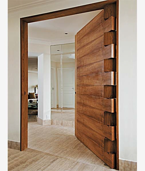
Here's a door with a rather unusual hinge design:

Because this exact photo has been so passed around on social media with no attribution, I am sadly unable to determine whom the original designer, or even the fabricator, are. But it appears that the door came from Brazil, and poking around on various Brazilian designer's and fabricator's websites reveals doors of this design are readily available for purchase there.

In this shot of a similar design, we get a slightly better look at the hinge. Notice that the boxtails affixed to the frame have their grain running north-south, in contrast to the east-west grain orientation of the door:

This variant of the design appears to be made from reclaimed lumber, or has convincingly had the wood distressed. It's also got much shorter tails, though ones affixed to the frame contain both the odd- and even-numbered members:

These two below have super long tails, and the grain of the frame-mounted fingers running in the same direction as the grain of the door:

Here I got excited thinking there was a double-door version, but alas, it appears the one on the left does not open, judging by the lack of a handle:

If any of our Portugese-speaking readers have any idea who designed this—Google Translator has failed me, I'm afraid—please do let us know in the comments, so that we may properly credit them.

Designs for Small Kitchens: Dish Racks

$
0
0

Many apartment dwellers and homeowners need to cope with small kitchens, or at least kitchens with limited counter space. A big countertop dish drainer isn't going to work, but they need something for those dishes, glasses, pans and cutlery that don't go into the dishwasher (if they even have a dishwasher).

The client who asked me for help with this challenge wound up choosing an in-sink dish drainer; that's a nice solution for end users with a large enough sink.

The Basin from Umbra, designed by Helen T. Miller, is intended for use either on a countertop or in the sink. Purchasers generally find the design works well; the slots are big enough to hold thicker plates just as those from Fiesta, the cutlery section is appreciated, and the size is good for small countertops. However, they note one major drawback (in some kitchens): the spout doesn't work well when used on a countertop with a top-mount sink. The spout is fairly short and doesn't extend over the sink edge, and putting the drainer on the sink edge messes up the drainage angle.

The DishGarden Dish Rack from Chef'n is also designed to fit in a sink—although it could also be used on a countertop (perhaps with a drainer mat or a towel). It has an unusual round design, which seems as though it would waste space, but purchasers note how much it holds for such a small dish rack. As one purchaser wrote, "Hanging cups on the outside frees up the inside, the little plastic posts on the bottom allow for much more versatile loading than the usual wire separators, and large pieces like cookie sheets fit beautifully with their ends through the sides." The two utensil holders can be placed wherever the end user likes, adding yet more flexibility.

Another sink-based design is an over-the-sink drainer, such as this one from Polder. It's made of stainless steel to resist rust, and it's adjustable to fit varying sink sizes. Purchasers miss having a silverware holder, though. 

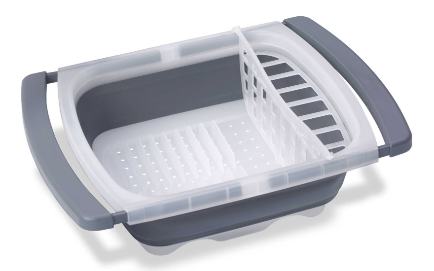
The Prepworks over-the-sink dish drainer also has extendable arms, and it does include a utensil holder (which can be removed for users who don't need it). Additionally, it collapses to 1/3 its original size for easy storage. It's a more closed design than the Polder dish drainer; that means there will be a reduced air flow, and dishes won't dry quite as quickly. 

Surpahs over-the-sink multipurpose roll-up dish drying rack takes a different approach, providing a rack that would work for glasses or pans but not for a stack of dishes. (And some end users might be nervous using it for glasses, since it would be pretty easy to knock them off of this rack.) It's made from silicone-coated steel. It has the added advantage of being a dual-purpose product, since it can also be used as a cooling rack. And it rolls up for easy storage.

Other collapsible or foldable racks are not designed for in-sink or over-sink use, but they still save on storage space. Most of these are X-shaped, such as the Hutzler folding dish rack. As with most other racks of this type, there's no drip tray included, so end users will need to come up with their own solutions for that. While purchasers of some other such racks sometimes complained about the racks collapsing (yikes!) or dishes slipping out of the grooves, this rack gets much more favorable reviews. It's a nice reminder that a good design starts with ensuring the basics are solid.

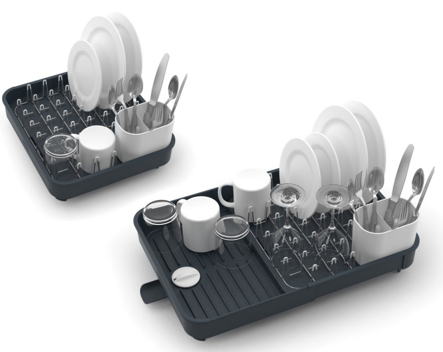
The Extend dish rack from Joseph Joseph is expandable, which means users can use it in a small space and take advantage of the extra drying space if they move to a place with a larger kitchen. The designer was Studio17 Design.

Dish drainers can also be hung on the walls over a countertop; Ikea's Grundtal dish drainer is an example of that approach. Not all users will have free wall space, or be allowed to attach something to the walls in a rental situation, but for other end users this could be a nice space-saving solution for their countertops. The drainer folds up when not in use.

Photo by Jarno Elonen, via Wikimedia Commons

Dish draining closets are common in countries such as Finland, Spain, Italy and Estonia. With an open bottom, the cabinets allow dishes to drain into a stainless steel sink (or onto a stainless steel countertop) as they dry. Since kitchens in North America don't come with such cabinets, designers have developed products to help users modify existing cabinets or build new ones

A Smaller, Sportier Rolls Royce: A Look at the New Silver Dawn Convertible

$
0
0

The new Silver Dawn is a re-think by Rolls Royce, reaching toward a new slice of the market (hopefully younger) to those who had considered a Phantom convertible but weren't ready to take on that much car. The idea of a smaller Rolls Royce convertible as compared to the huge Phantom is a good one. The Phantom convertible (which the Brits call a "drophead coupe") is fine as a luxury conveyance but even with four people on board the car is so big that people look tiny—lost in the splendor of it all. The car is daunting. It is almost embarrassing to drive a car that large. The Silver Dawn, on the other hand, is smaller and lighter and represents a car aimed at a different age range with more sporting potential considering its size.

Last month at Monterey Car Week, I had an opportunity to preview a pre-production prototype of the new Silver Dawn in a small garage at Pebble Beach. The car is not all new. It is based on the existing hardtop coupe but Rolls says 80% of the body panels are new—not straight off the coupe model. 

Below is a preview of the new Silver Dawn and thoughts on why Rolls, with the Phantom DHC still in production, created a second-tier ultimate luxury convertible.

FRONT

Setting the grille a few inches inside a brushed metal surround was a brilliant decision as it makes the whole grille look solid as a rock (hewn out of solid steel). The front hood (or bonnet as they call it in England) has a central chrome bar, reminding one vaguely of the old Rolls Royce Silver Cloud and the Phantoms of the '60s, with two lines spreading out from it which they describe as a, "tapered wake channel" emanating from the radiator mascot's (Spirit of Ecstasy) wings. Rolls got a little too poetic when describing it, saying it, "evokes the sight of a jet's vapour trail, hinting at the car's dynamism."

About the headlamps. The LED surround encircles the whole headlamp (I hate when they go 3/4s of the way around as if they ran out of money to finish the job) but I don't care for the odd shape—why couldn't they just go rectangular? The LED display is part of the car's image, Rolls saying they, "give the car a distinctive signature whilst augmenting safety at the same time."

Aside from the LED surround, the lights themselves are: 

"...Significantly enhanced by adaptive technology. Electronically controlled reflectors move in the direction of travel in response to wheel turns to give a greater depth of vision when cornering and a whiter, brighter light ensures effortless and safe driving on dark roads whilst helping reduce driver tiredness."

A very space-age feature of the lights is that they employ a heat detection system that detects both human and animal heat signatures, and when it detects either in the car's path issues an audible warning to the driver.

SIDE

In the side view Rolls says that they sought to maintain a 2:1 wheel height to body height ratio with a long bonnet, a short front overhang (beyond the wheelwells), a long rear overhang, and, "an elegant tapering rear graphic" (meaning as you go rearward the body tapers inward) and a high shoulder line.

Windshield pillars are now "normal,' i.e. body colored not brushed stainless as in the optional package on the larger Phantom DHC. This Rolls has a bit of bright metal in the cabin area for a more "private" look, a stainless steel "waist line finisher" designed to "work in harmony with the stainless steel door handles, polished wheels, visible exhausts and front and rear bumper jewellery, to create a priceless look and feel." They may be right, as there are plenty of lower cost convertibles that lack this bright "waist line" trim and thus have a more formless look.

By far the most timeless feature offering a bit of prewar glamor is the "opera" door—a stroke of brilliance carried over from the larger Phantom that adds to the Dawn's appeal. 

"Evocative of the classic sports car profile, they add considerably to the easy entry and egress of rear passengers from Dawn's luxurious embrace. The rear passengers do not merely 'get out' of a Rolls-Royce Dawn, but rather stand and disembark as if from a Riva motor launch onto a glamorous private jetty in Monaco or on Lake Como." 

In other words, the opera doors allow one to make a grand entrance, as dramatic as that of the driver or passenger exiting a Mercedes gullwing coupe of the Fifties.

The C-pillar—the third pillar, the windshield being "A" and this having no "B" pillar— is blind with no window cut into it. Surprisingly, Rolls likes the privacy angle and the bit of rakishness that adds, saying when viewed from side-on and roof up,"the car looks akin to a low-slung 'hot rod'."

The car has run-flat tires—if the tires get a hole in them, they deflate but the car can still be driven 100 miles The stock wheels are 20" tall while optional 21" wheels with 10-spoke rims are available. Alas for traditionalists like me, the presence of run-flats means no spare wheel and jack, which frees up space in the luggage compartment.

TOP

The first question might be: why did they have a soft top, a cloth one, when the technology exists to have a hardtop convertible? The first reason is that a hardtop convertible takes up a lot of trunk room, and presumably buyers of this ultimate luxury car might need the room for grand touring. Also, a soft top is very traditional in a Rolls drophead. As the press release explains:

"The only choice for a Rolls-Royce was a fabric roof for reasons of aesthetics, romance and brand appropriateness. There is nothing more romantic than driving a convertible in the rain at night and hearing the drops pattering on the roof. In conversation with its customers, Rolls-Royce realized that they felt the same way."

So forget that much lower priced four seater convertibles are available with a retractable hardtop. That is irrelevant—romance is what this model sells.

The convertible top achieves its smooth look with a six layer top, and the wood on the rear deck is what they call "open-pore Canadel paneling" that is chosen by the customer to suit their individual taste. In addition to being on the tonneau, it flows down into what Rolls calls a 'waterfall' between the rear seats, and around the cabin clothing the interior door panels.

Rolls is quite proud of the woodworking in the car. Rolls really went to town on the wood, making sure the wood on the surfaces of the console trays are also book-matched down the center console in a chevron pattern pointing forward providing an accelerated feel.

For some reason, automakers compete with each other in bragging about soft tops that are deployable while the car is still moving, Rolls claims their top can be erected in 20 seconds at speeds up to 50 km/h. My question is: why would you want to take the chance of going a tad too fast and blowing it out if the wind catches it?

INTERIOR

Rolls chose to not only have the wood on the rear "hard boot" covering the top but on perhaps 80% of the doors, and even a large patch between the two rear seats. I think this last piece is going too far, as if they looked at the interior and said, "where can we have even more wood" and put it in a place you wouldn't expect. The dashboard though, has about an equal amount of wood to the'50s and '60s Silver Clouds and Phantoms, thus eschewing the temptation to use polished aluminum, swirl-finished stainless, carbon fiber or other materials that stray too far from what you expect in a Rolls. Overall, I think it's too much wood, especially those vast areas on the doors, but then again their marketing research must show that Rolls customers expect wood and leather.

The treatment of the instruments show great attention was paid to the material used (metal if possible) and the finish of the metals. For instance, the instrument dials have individually applied polished metal chaplets around the dials not unlike you would see on a hand-made, luxury wrist watch, whilst the matte chrome centers 'float' in the middle of each instrument.

Having two rear center console air conditioner vents is recognition that, for at least 70 years, there has been precious little offering of rear seat blowers to give the rear seat passengers air cooling equal to that being enjoyed by the front seat passengers.

Just behind the two rear seat headrests, one can see sections that cover the hidden roll-over protection device roll bars that deploy in just a fraction of a second. A ratchet system then locks them in place. This roll-over protection system also encompasses the entire windscreen surround of the car.

REAR

The rear is solidly traditional in shape, a combination of other themes already used by Rolls—the width of the chrome bar over the license plate area automatically conveys that "this is a car used by Europeans" because over there, license plates are about one third wider. The use of chrome horizontal exhaust tips is sporty, yet not as sporty as the round ones on Ferraris. Oddly I find the badging on the rear very discreet—merely a vertical RR insignia in the center of the chrome bar that houses the license plate light. It doesn't spell out "Rolls Royce" or "Silver Dawn"—those who know what it is know, those who don't recognize it, so be it.

MECHANICALS

Under the hood is a twin-turbocharged, 6.6-liter V12, same as in the Ghost, rated at 563 horsepower with 575 pound-feet of torque. I would have preferred the V8 with a twin turbo but then you are talking a car that weighs 5,644-pounds. That engine is coupled to a ZF eight-speed automatic transmission. With that many gears, up shifts are almost imperceptible.

________________________________________________________________________

Rolls has accomplished a lot with this car, and it will no doubt achieve market penetration to those who, previously, had been put off by the sheer size of the Phantom DHC feeling it, "made too much of a statement."

In effect, they created a Junior Phantom drophead that still maintains its own distinctive style.

The inclusion of the wood on the rear boot continues what they had on the Phantom DHC, but the Dawn goes further in the use of the wood. Not offering the brushed metal finish on the bonnet, which is available on the Phantom, separates the two cars further. Now the only question is: will they go sportier in optional packages in the future in order to blunt Bentley, who with various packages, markets their GTC convertible as a luxury car with the performance of a sports car (even having a package that goes over 200 mph!) . Bentleys, even when they were produced by Rolls and merely rebadged, were always more sporting than Rolls. But it remains to be seen today, now that they are two separate and competing companies, if Rolls, in response to Bentley's endless reinventions of itself, might also be tempted to offer a more sporting model.

Even if one never plans to be in the market for such an ultimate luxury car, as a design critic I enjoy seeing how many of the features of ultimate cars may indeed "trickle down" to cars occupying levels a few steps below. We at those lower price levels live in hope.

2015 Dyson Award Finalist Faves: A Clever Way to Carry Clean Water in a Dirty Oil Can

$
0
0

We're pleased to see that design students around the world are killing it! This year's James Dyson Award received a record 710 entries, and the judges have finally whittled them down to 20 finalists, released today. We're going to show you some of our faves.

First up is Chloe Louisin, an Industrial Design student at France's Strate École de Design. On a humanitarian mission to Togo and a trip to the Congo with Doctors Without Borders, Louisin saw firsthand how difficult it is for folks in those places to obtain clean water. They often have to travel far to get it, and the most readily available vessels they can use to tote it are old plastic jerrycans formerly used to carry oil or gasoline.

The jerrycans are ergonomically sound. They have handles for carrying and are robust enough to survive the journey. They're also readily available. However, the petrol and bacteria within the containers contaminates the water.

Louisin's clever solution, the Wat'bag, was inspired by "bag in a box" wine. She developed a sterile plastic pouch, with its own neck and cap, that the user inserts into the jerrycan. They then simply fill the plastic bag, and the water inside is kept clean and separate from the dirty insides of the container.

Whether or not Louisin wins a JDA, she's already achieved something very important: Doctors Without Borders has chosen to develop the Wat'bag. Congratulations to Louisin!


2015 Dyson Award Finalist Faves: An Easy Way to Turn All Plugs into Mag-Safe-style Connections

$
0
0

This next Dyson Award finalist is Matthew Burton, who's studying Industrial Design at the University of Houston, where he crossed paths with fellow student Justin Farley.

Farley, who has cerebral palsy, is the founder of UNlimiters, a website that showcases product designs that help the differently-abled live independently. Some of these objects are electric and may need to plugged in or unplugged every day, like an electric wheelchair that needs to charge.

During a study with Farley, Burton learned how the constant need to plug and unplug electronics impacts Farley's daily life:

Justin is constantly cycling through and making use of electronic devices in attempts to ease his daily tasks. It was made immediately clear that dealing with the cords and plugs of electric devices was difficult for him. In fact, I found that Justin came into contact more frequently and had more issues with electronic plugs than kitchen utensils during an average day. This problem spurred on the development of a new outlet system that could ease Justin's daily tasks.

Burton came up with Connect, a cleverly-designed module that plugs directly into a standard outlet, providing three perfectly circular, magnetic, female connections. The user then caps the plugs on their devices with male magnetic projections. With this system in place, all plugs essentially become Mag-Safe-style connections that are easy to plug or unplug, and which obviate the need to rotate the plug to any particular orientation.

I dig that it transforms two plugs into three! And Burton is forecasting a wide market for the system. "While Connect is specifically designed to increase the functionality and usability of electrical outlets for those with physical limitations," he writes, "I found that it can be of great value across markets and across generations. Whether it is a lack of grip strength, or failing eyesight; a bad back, limited dexterity, or a lack of height; Connect is the answer to easing the process of using household electronics; especially those which are frequently plugged in and out."

2015 Dyson Award Finalist Faves: Shock-Absorbing High Heels

$
0
0

I have plenty of female friends who enjoy wearing high heels for their aesthetic value, but I don't know a single one who claims they're comfortable. And I think we've all seen the woman with the spaghetti strap dress walking home from the party barefoot at the end of the night, stilettos dangling from her fingers, preferring to get sidewalk grit on her bare feet rather than enduring another minute in those shoes.

Dyson Award finalist Yasuyuki Yamada, a grad student at Japan's Science and Technology program at Keio University, reckons he can make high heels more comfortable. "in order to achieve both the style of high heels and comfortable walking without impact," Yamada writes, "I developed YaCHAIKA's heels with leaf spring plates and high-vibration damping rubber sheets."

If you're wondering about the capitalized part of the name, Yamada explains: "CHAIKA is the call sign of Valentina Tereshkova, who was the first female astronaut. I named my design in honor of her great contribution to science. It also means 'seagull' in Russian. The heel shape is inspired by the seagull's shape as it is flies, gracefully spreading its wings."

The shoes look a bit strange to my eyes, but certainly appear more comfortable than the alternative. However, who cares what I think: I am a male writing about a male-designed product intended for usage by females. So to those of you actually in the target market, what do you think of these? Would you wear them?

1-888-FUTURES

$
0
0

Core-fave Extrapolation Factory has teamed up with The Situation Lab to produce their latest caper; 1-888-FUTURES is a new telephone-based delivery service which allows anyone in the US to request a gift from the future, created to order and shipped to their chosen recipient.

The service is a playful research endeavor aimed at tapping collective creativity and experimenting with new techniques for crowdsourcing visions of future scenarios. It is part of the ‘Futurematic’ series run by The Extrapolation Factory and Situation Lab, two groups both focused on exploring design-driven strategies to bring alternative futures to life. 1-888-FUTURES will be hosted by the Visions and Voices initiative at the University of Southern California in Los Angeles, culminating on September 20th.

Once a request is registered at 1-888-FUTURES, workshop participants at USC will interpret the recordings and fabricate artifacts that respond to the visions. When the artifact is complete, it will be boxed up and sent to the addressee of the caller’s choice—not to be opened until the visioner’s chosen date.

You can send a “future present” to someone by calling 1-888-FUTURES before September 20th. Just be sure you have a future dream in mind, together with a specific individual recipient and current delivery address. “If you need some time to prepare these, please hang up and call back later.”  More information can be found at www.donotopenbefo.re

(Photo: Bernard Pollack, CC2.0)

Peeling Fruit with a Drill

$
0
0

In an earlier post I asked who among you uses spade bits, as I couldn't think of any reason to use one over a Forstner bit. Some of you sounded off on positive reasons to use them, but none of you proposed using them like this:

Yes, I know it's totally silly. But I have to admit that if my girlfriend left me alone in the kitchen after one of her annual apple-picking trips, she'd probably return to find an enormous mess (and me holding a drill with a dead battery). And it might be worth getting yelled at for.

Eye-Catching Pillows Made from Leather Waste

$
0
0

The last time we saw someone trying to recycle leather waste, the results were mixed (literally). But designer Lars Beller Fjetland has managed to create a beautiful, finished, production-ready product from leather scraps.

The line of pillows is tellingly called Link. If you don't understand the construction of the cover, have a look at the reverse side:

As you can see, Fjetland has gathered hundreds of leather cut-offs and presumably created a custom cookie-cutter-like tool to punch out the shapes. He's then painstakingly assembled them, tab-and-slot style.

And as Fjetland points out on his website, the process can be scaled up, "ranging from small pillows to carpets." The labor-intensive Link-creating process must require both patience and nimble fingers, but we can't argue with the results.


So, You've Decided to be a Freelancer...Now What?

$
0
0

Almost everywhere I go (today it was while waiting to have my salad mixed at Chop't) I overhear someone talking to a friend about the travails they're facing as a new freelancer. That's why I was particularly excited to hear about the launch of Home/Office, a web series revealing the sometimes-exciting and often-terrifying details of what happens when a web designer takes the plunge and starts working for himself from the comfort of his own home. Co-created by Josh Shayne and James Darling—whose film production company is aptly called Good Worker—the series takes a comical lens to the culture of freelancing, which is as much a lifestyle choice as it is a career move.

The inspiration for the project came from personal experience. "I have been a freelancer for over 10 years and my parents ran their own design firm through the '80s and '90s so I actually grew up in a home/office," explains Josh. "When you're working for yourself, life and work tend to blend together. I remember growing up and my family would talk/think about client work and relationships all the time: over meals, on weekends, after school—it was always intermixed seamlessly with the rest of life." 

The duo recently created a "How to Storyboard" video for Tina Eisenberg's Creative Mornings Skills Series. The advice on planning ahead and communicating effectively across a team of creatives is both specific enough to be helpful and general enough to apply to other types of design projects. 

Of course freelancing comes with its own set of problems. Josh told me about a time when he had to deal with scheduled construction on his building, mitigating client phone calls with jackhammer blasts. "Because they were pouring concrete, I couldn't leave the building for the day," he remembered. "Just to hear my clients talk, I ended up taking most of those calls at the back of my apartment, with my head and laptop draped beneath a thick blanket to dull the sound." Home/Office highlights some of these tricky situations, but the overall tone of the series is optimistic, suggesting that, at the end of the day, "the flexibility and independence that comes with freelancing foster creativity, happiness and life satisfaction—which is good for both workers and clients."

In the first episode, as the show's protagonist sets up his new home office, he struggles between making due with the bare necessities and the impulse to outfit his space with top-of-the-line equipment. 

The quick episodes, clocking in around 4 minutes each, take the form of distinct, mini-lessons on what it takes to be a freelancer today: from landing your first client, to finding time for dating and staying physically fit and, of course, meeting your deadlines. Aside from whimsical sound effects, the narrative is driven forward by a calm narrator, "guiding the hero along, but also providing a little helpful criticism," as a play on the structure of 1940's-era instructional videos (not that we're encouraging you, but if you must procrastinate–as all good freelancers do—this archive of vintage educational films is a goldmine).

You can check out the first episode, "Starting Your Own Business," below, and make sure to tune-in (possibly over your morning cup of coffee, like I did) to the upcoming episodes of the first season, which go live every Monday at 7 AM PT/10 AM ET here.  


Crazy Fast Drawing Skills That are Totally Opposite from ID Sketching

$
0
0

Generally speaking, industrial design sketching is fast and loose. You start with a rough idea, put pen or pencil to paper with expressive, fluid marks and start to find the form on the page. Traditional instruction dictates that we draw the entire form, including what the viewer cannot see if it were a photograph; for instance, if sketching a 3/4 shot of a car, you still draw all four sides, even if the far parts will later be obscured by fresh linework. And you typically go from big to small; if sketching sneakers for example, you start with the general shape and sole, and the eyelets for the laces come last.

Those of us trained in this ID style are bound to find Kim Jung Gi's drawing method bewildering. The South Korean artist "has the ability to visualize the drawing before making his marks," according to the bio on his website. What this means is that if drawing a car, for instance, he can start with the headlight, jump to the C-pillar, add the rearview mirror, etc. He does not find the form on the page, but appears to transcribe it from some spiritual source, and no marks are made unless they would be directly visible to the viewer.

If you're not sure what I mean, check out this demonstration, and prepare to have your mind blown:

Never mind that there's not a single perspective or contour line—did you see the way he bounces around the page, completely detailing one small item, then moving on to another small item on totally different part of the drawing? Who the hell draws like that? Who the hell can draw like that?

This week Kim launches his first solo U.S. exhibition at the Art Whino Gallery in Washington, D.C. For those of you in the New York area, he'll be appearing next month at New York Comic Con in the North Pavilion L4's "Artist Alley."


The Samurai Carpenter Shows You How He Made His Functional, Ergonomic Leather Tool Vest—On the Cheap

$
0
0

I recently ripped the caulk out of six window frames, which required using a half-dozen hand tools in alternation. It was a real pain because I haven't found a good on-body tool storage method; I won't wear tool belts or pouches because I'm a klutz and I'll snag them on the ladder, and I don't like leaving tools on top of the ladder ever since the time I forgot a Crescent wrench was up there and landed on my head when I moved the ladder. So it was up-and-down, up-and-down.

Jesse de Geest, a/k/a The Samurai Carpenter, doesn't like wearing tool belts either. But unlike me, he's a bit of a maker genius, so he handmade his own custom leather tool vest--on the cheap. It is absurdly functional and the ergonomics are all very well-considered. In the following video, he walks you through the features, explains how he fashioned various items, and will hopefully inspire you by just how do-able he makes it all look:

The saw-storage feature sounded crazy to me at first, but the more I think about it, the more sense it makes.

Via Tools of the Trade

Hand-Eye Supply Exclusive: The American-Made Screwdriver Set

$
0
0

It's hard to beat a set of simple tools, and really hard to beat a properly made set. This new Hand-Eye Supply Screwdriver Set features six common sizes of Phillips and flat heads, with tough high carbon steel blades and comfortable oiled hardwood handles. 

The set comes packed snug in a canvas bag, making them easy to carry or keep track of in your toolbox. The bag is thick stitched heavy canvas, bottom reinforced, and opens smoothly with a fat YKK zipper and leather pull. 

Take your pick from the #0, #1, #2, 1/8", 3/16", or 1/4" options, and meet fixes and builds head on. Then stash them right back where they belong - your travel tool set, kitchen catch-all drawer, or uncomfortably well-stocked backpack. 

Pick up your own set or jump-start a friend's toolbox for $48 at Hand-Eye Supply.

Watch These Quadrotor Drones Autonomously Build a Suspension Bridge Out of Rope

$
0
0


Imagine a disaster-relief scenario where people need to be transported from one side of a ravine to the other, in an area not easily accessed by ground vehicles. What could a series of lightweight quadrotor drones do to help, besides record overhead video or drop off a few candy bars at a time? Amazingly, they could build a rope bridge to span the chasm.

Researchers at ETH Zürich (the Swiss Federal Institute of Technology) have rigged up a series of drones with spools loaded up with rope. Because the spools are motorized, the drones can control the tension on the rope they deploy as they fly. The researchers then programmed the things to build a rope bridge between two scaffolds—freaking autonomously:


The project came about after the researchers factored in the key positive and negative aspects of a quadrotor. The positive: Can travel anywhere. The negative: Small payload capacity. Thus they struck upon the construction of lightweight tensile structures as being an ideal fit for drone duty.

The rope bridge acts as a demonstrator, showing for the ?rst time that small ?ying machines are capable of autonomously realizing load-bearing structures at full-scale and proceeding a step further towards real-world scenarios.

Except for the required anchor points at both ends of the structure, the bridge consists exclusively of tensile elements and its connections and links are entirely realized by ?ying machines. Spanning 7.4 m between two scaffolding structures, the bridge consists of nine rope segments for a total rope length of about 120 m and is composed of different elements, such as knots, links, and braid.

You can read more about the projecthere.

Marc Newson on Modernizing the Fountain Pen

$
0
0

While all eyes are on a certain Pencil announced a few weeks ago, let us shift our gaze to another writing instrument: the fountain pen. Last June, Montblanc announced the M, the product of a new partnership with Marc Newson, arguably one of the most influential designers alive today (and, coincidentally, now also an industrial designer at Apple). With this partnership, the first of its kind for the luxury brand, fountain pens take a long-awaited step into the future.

The fountain pen dates back to 1827; it was invented by the Romanian Petrache Poenaru, who received a French patent for a pen with a replaceable ink cartridge. That internal reservoir is the defining feature of the instrument, which deposits its water-based ink through a nib thanks to the help of gravity and capillary action. While a lot has changed since the 1800s, the fountain pen has remained largely the same, with small improvements to reduce leaks and specialize nibs.

The Montblanc M has been modernized, at least in its aesthetic. The pen features a magnetic cap—amazingly, a first for fountain pens everywhere—and it relocates the positioning of Montblanc's signature white star, a first for the brand. OK, admittedly, the changes aren't all that revolutionary, but when you look back on how the pen has evolved in the past 188 years, it's a decent-sized stride. And these relatively minor changes required major technological innovation for the company.

Newson had previously worked with the Richemont Group, owner of Montblanc and other luxury brands, designing the Atmos 561 and 566 watches for Jaeger-Lecoultre. That collaboration led to the invite from Montblanc, and the project kicked off with a team meeting in London in December 2013. The entire timeline for the project, from concept ideation to production, spanned one and a half years. "We consider this to be short for a production process where we also had to come up with new techniques to finalize the product," says Jens Henning Koch, executive vice president of marketing at Montblanc, referring to the magnetic closure system.

During that initial meeting, both parties pitched concepts for the design, going back and forth until they arrived at a suitable starting point. "I begin by thinking a lot, pondering, daydreaming, a form of mental doodling," Newson says. "Even before I receive a brief from a client, I usually have thought about how I would design something. It's, shall we say, an occupational hazard or a professional affliction to always be thinking how I would improve something that already exists—or at least how I would do it my way. Then I sketch." Newson always carries his sketchbook with him, where he jots down thoughts on whatever design problem he's trying to solve, as well as other ideas for new products or improvements on existing designs.

Newson's sketches

From the sketchbook, Newson moves to the computer. "Only after that [sketching], do I sit down to begin the process of getting my ideas onto the computer with a colleague and special 3D software," he says. "And so the process begins—learning about and choosing the various processes and materials we may use for the design, refining the design bit by bit, meetings with the client, then to prototype."

“It's, shall we say, an occupational hazard to always be thinking how I would improve something that already exists.”

In the case of the Montblanc M, the materials were a unique black resin used by Montblanc for decades and a 14K (AU585) gold-, ruthenium- and rhodium-plated nib. Manufacturing for the pen takes place in Hamburg, Germany, where a team of master goldsmiths and stone setters work alongside other craftsmen to fashion each utensil. "Countless meticulous steps are involved in the process," Koch says.

Production begins in Montblanc's surface technology department, which creates the main body or barrel of the pen from black resin. The form is milled down using a diamond bit chosen for its strength and accuracy. The emblem of the Montblanc M, a white star, is ultrasonically welded to the barrel of the pen before it is polished down. Next, the pen heads to the metal technology department, where the magnetic clasp is attached to the body of the pen.

"The magnetic closure is a totally new technology for Montblanc," Koch says. "The main challenge here is finding the right balance in terms of magnetic force. If it's too weak, the alignment of cap to plateau doesn't work and the cap could fall off by itself; if the force is too great, the impact as the cap hits the barrel is too hard when you close the pen. This could feel quite unpleasant in your hand and, what's more, could result in ink spraying into the cap." The solution was to use a magnet to both align the cap and to act as part of the snap-fit mechanism, to dampen the closing process and to act as an additional closing force. "It added a certain level of mechanical complexity to the manufacturing of the pen, but the end result is both intuitive and practical, giving it a certain playful character," Newson says. "There is something quite magical about a magnet. Fundamentally, it is a force that you cannot see. It's seductive, a kind of alchemy." The cap alone, including the magnetic closure and clip connection, is made of 11 individual parts.

Meanwhile, in the nib manufacture department, a strip of gold is rolled before cutting the blank in the shape of the nib. That cut blank is then formed, welded, cut and ground by hand before being added to the rest of the pen. "In addition to the way a piece feels when writing, a good ear plays an important role: the nib grinder listens attentively to the sound each nib makes as it glides over the paper," Koch says. "Only nibs that do not scratch or snag, and thus generate a continuous sound, will pass the special quality inspection." Each nib is set by hand into the pen "and finally the 100 percent writing by hand," Koch says. Altogether, roughly 100 working steps are required for each Montblanc M pen, with more than 35 dedicated to the nib alone.

Koch considers the pen a technological triumph for the company, and Newson hopes that it will last as long as Montblanc's other products. "Good design has always been about creating objects that have stood the test of time…that don't date…that have a sense of quality and timelessness," he says.

Is It Possible to Design a Personal Airplane So Simple That Anyone Could Fly It? Icon Thinks So

$
0
0

Personal flying transportation is coming. When we first looked in at the Icon A5, a folding-wing personal aircraft designed in a collaboration between multiple bodies including IDEO and Art Center College of Design, it was just a bunch of renderings and grainy images we assumed were Photoshopped. That was over five years ago, so let's look at what the resultant company, Icon Aircraft, has got today:

It doesn't have to land on water, by the way; terra firm will also do. But perhaps what's most notable here is the business approach the company is taking, and how the UI design is a key part of that approach. Rather than going after wealthy folks who have already invested in pilot's licenses and already own Cessnas, Icon's mission is "to democratize aviation the same way that great brands like Apple, BMW, Ducati, or Oakley democratize their products: by fusing outstanding engineering with world-class consumer product design."

To that end, they've designed the aircraft's crucial feedback-providing gauges to be closer to what you'd find in a passenger car rather than an Airbus.

"A high goal for us is that there is a very intuitive user interface," Icon founder Kirk Hawkins told Bloomberg. In concert with the physical design of the craft itself, this makes the A5 easier to fly. As an example:

One [feature] is an easy-to-read Angle of Attack (AoA) gauge, a feature common to military aircraft but virtually unknown in civilian planes. In general terms it tells you how your wings are performing, or rather how much lift they're providing in whatever maneuver you're currently in. Keep the needle in the green zone, you're good; hit the yellow zone, and an audible alarm goes off to tell you to correct; hit the red, and you've stalled (i.e. there's no lift on the wings). At this point the plane starts to shake and protest physically—clearly something is wrong.
[Stalling is countered by] a Spin-Resistant Airframe…. A main danger of a stalled plane is that it can enter an uncontrolled spin should there be any yaw (lateral) movement—say, in a turn while on approach to land, which could result in a crash; 41 percent of pilot-related fatalities are due to stall/spin crashes.
In the A5, you may stall—and Hawkins intentionally did during our flight (to my chagrin) to show me this feature—but you don't lose control or lift, and it's fairly difficult to enter a spin. (Or as I assumed might happen as a non-pilot, drop like a bowling ball.) For newer pilots, the ease of recovery is an obvious boon.

That the A5 will see uptake is not in doubt; there are already 1,500 pre-orders logged. The craft doesn't require Jet A and can be filled up with ordinary premium unleaded at any gas station. Even more surprising is how little training is required: Just 20 hours, which Icon reckons you can complete in two weeks.

There's no word on when they'll begin shipping, but their website indicates that those placing pre-orders now—i.e., at the end of the line—will receive their A5 in 2019. We imagine we'll start seeing A5 earlybirds cruising the Hudson River before then.

Viewing all 19151 articles
Browse latest View live


Latest Images