Quantcast
Channel: Core77
Viewing all 19136 articles
Browse latest View live

How Compact Cameras Can Survive in the Smartphone Era: By Radically Changing Their Form Factor

$
0
0

Here are the facts: Smartphones are ubiquitous, the compact camera market is fading and GoPro's got the action market locked up. So you'd think the last thing an upstart design firm would do is create a new type of compact camera and attempt to launch it themselves. But Seoul-based BOUD reckons they can pull it off.

What BOUD—that's an acronym for the Bridge of Unique Design—has come up with is the Flex Cam PIC, which has an entirely new form factor unlike anything on the market. 

On top of that the retail price is an absurdly low $89. When I first saw it I thought it looked frivolous and a bit silly, but the video and some of the proposed applications got me turned around:

While I'm not going to be hula-hooping or entering b-boy competitions anytime soon, the ease with which the PIC can be attached, as in the cooking video or the dog shots, makes me think it could come in handy for instructional videos.

But two things remain to be seen. One is if end users will find that the 124-degree lens adequately compensates for what I assume will be an inability to precisely position it.

The more pressing issue is whether BOUD can really get the thing to market. They managed to crowdfund it earlier this year on IndieGogo, netting $154,750, but they've already missed their ship date (September) and have not revealed a hard deadline; an update from a week ago says they're doing "last-minute tuning" and urges backers to "please wait a little more."

Despite that, the Flex Cam PIC has reportedly already been awarded the CES 2016 Innovation Award in the Digital Imaging Category. Backers will no doubt be waiting to see if actual units are on hand for the show in January.


Eye-Opening Info-GIF of Different Commuting Methods

$
0
0

Cameron Crowe's Singles perfectly captured what dating was like in the pre-Tinder, pre-cell-phone, pre-internet early '90s. Today the film looks quaint, revealing a bygone time when single minglers met at bars/cafes/concerts, garage-door openers were presented as signifiers of relationship commitment, faulty answering machines accidentally destroyed messages by eating tape, and Matt Dillon could play a more amusing side character than Kevin Dillon.

Anachronisms aside, one thing presented in the movie as wishful fiction actually became a reality. Protagonist Steve Dunne works for Seattle Transit and is trying to push through a project called the Supertrain (not this Supertrain) intended to get cars off of the roads and whisk commuters along on rails. 

In real life, Seattle's Sound Transit launched their South Line commuter rail service in 2000, linking Seattle with Tacoma and beyond; in 2003 the North Line debuted, traveling as far as Everett.

If Steve Dunne were a real person, perhaps he'd have made the modern-day GIF below, which reveals the physical space taken up by different commuting options:

In reality the images were created for a poster produced by Seattle's nonprofit International Sustainability Institute, then transformed into a GIF highlighted by the Washington Post.

If you want to learn more about the ISI's community-building and sustainability efforts, click here. And if you want to learn what it was like to try to randomly meet some girl/guy at a bar and chat them up, without anyone staring into their phones or scouting online profiles, go watch Singles.


Different Ways to Store Pliers, from Store-Bought to DIY

$
0
0

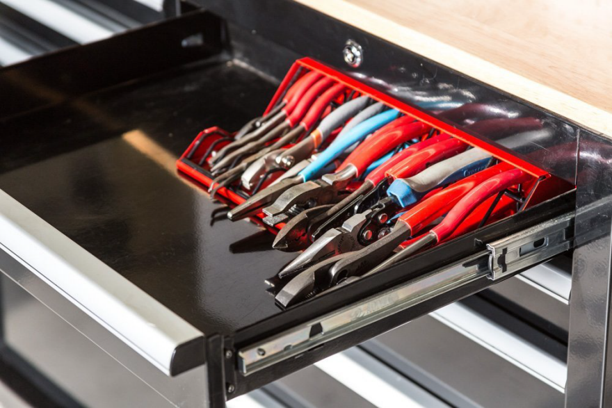
Pliers are tricky things to store. They don't lend themselves to pegboad, as wedging them into a hook by their crotches is defeated by simple gravity. If you obey gravity and store them flat in a drawer, their awkward splay-handled shape takes up an undue amount of space, and they don't neatly "nest" the way wrenches do.

Thus folks have devised manifold ways to store them. The only consensus seems to be that, no matter how they are oriented, pliers ought be stored face-to-face (in the manner of books) as opposed to side-by-side (in the manner of pictures on a wall).

Vertical, Jaws-Up

This rack by Plyworx aims for flexibility. It can be rested on a shelf/worksurface or hung from a wall, if you want to keep the tools exposed and stored vertically. 

Alternatively it can be placed in a drawer, jaws-out. That makes it easy to see which pair is which, but isn't convenient for grabbing them.

Horizontal, Handles-Out

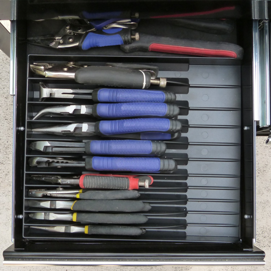
In contrast, this simple Pliers Organizer is meant to be stored in a drawer, handles-out.

The paradox of handles-out/easier-to-grab means that you must pull the drawer all the way out to see which jaw style you're grabbing. But you can get 'round this by storing the thing sideways, as long as your drawer is 12 inches wide.

Magnetic, Any-Which-Way

At first glance, this Torin Magnetic Plier Holder doesn't look like much:

But it has magnets both to hold the individual tools in place, and along the back to allow it to stick to a metal cabinet. Which means it can be oriented any way you want:

Horizontal, Wire, Jaws-Out

Another solution is to go with wire, as with this rather inelegant rack:

That design seems like it requires fiddling to get the tools in and out, but I suppose it's functional. And the benefit of wire is that you can trim it to fit your drawers.

Horizontal, Wire, DIY

This toolie on YouTube shows you how to make a DIY plier rack out of your average wire closet shelf. To do it, he makes his own brake out of a couple of 2x4s:

Wedge Method, Jaws-Up, DIY

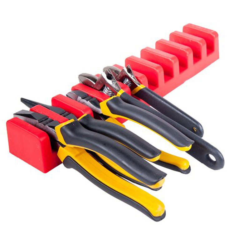
For a really quick-'n-dirty option, you can take a 2x4, do two angled cuts on a table saw, and book-end it with scraps to get this system:

Jaws-Up, Uniform Handles

If you're like me, you buy your pliers piecemeal and the handle widths, sizes and colors all vary widely. But companies like Wubbers Pliers that manufacture complete sets, like these 28 different jeweler's pliers, can pick a single handle profile and apply it to everything they offer. They can get away with that because the leverage required to produce jewelry may not vary as widely as it does in a shop with more broad needs. And the advantage of that uniformity is that one can create elegantly simple holders for them:

As much as the simple Wubbers holders scratch that OCD itch, and allow you to clearly see the jaws, they don't seem all that ergonomic; imagine grabbing one from the middle.

So, it seems there's no silver-bullet solution, particularly since everyone has different needs.

I confess I haven't purchased or DIY'd any of these solutions—my own pliers are still messily shoved in a drawer and mixed in with wrenches. How do you guys and gals store yours?

Fantastic Design Student Experiments from Japan

$
0
0

We last looked in on Kobe Design University's "Design Soil" student experiments in 2011, when we got a look at Akinori Tagashira's killer flatpack Corker stool:

In the years since, KDU's students have continued to produce excellent conceptual work. Here are some of our faves:

Furniture for Things That Grow

Growth Coatrack

Ryosuke Akagi's Growth coatrack features height-adjustable protrusions. "Just like a height scale, a family can measure one's height with a movable hook, and hang clothes at each suitable position," Akagi writes. "Thus, this coat rack reflects the [members] of the family with their clothes hung [up]. The child's coat will move up to higher position as [s/he grows] older."

Water Balance Vase

Risako Matsumoto's clever Water Balance lets you know when it's time to water a plant by relying on our natural ability to spot things that are out of level. Fill in the appropriate amount of water the first time, then slide the weight to the correct position to achieve balance. Once the water begins to evaporate, gravity does the rest.

Experiments with Tension

Tensile Shelves

Hiroyuki Ikeuchi's Tensile shelves use thin plywood for the horizontals. But sagging is averted by inserting thin strips of wood, slotted into notches in the verticals and shelves in such a way as to cause them to be sprung, providing rigidity through tension.

Warp Hanger Rack

Jun Akada's Warp is a simple array of thin steel leaf springs that are slightly too long to lay flat within their frame. When one is pressed in and the one beneath is pulled out, enough distance is created to cantilever a thin shelf.

Creative Re-Use

Rollin' Rollin' Stool

Ever have an old, favorite wool sweater that's too worn-out to wear? Hiromi Manabe's spooling stool gives it a second life as a seat. Just unravel and wind, and the sweater will stay in your life a while longer.

Outside In

As your shipping boxes pile up, here's a great way to upcycle them. We know cardboard is stiff when placed on its edge, which is why they use it to make hollow-core doors. Here Rie Asaka uses the principle to bolster tabletops that are surfaced only with thin veneers, yet maintain rigidity because they're stuff full of old cardboard strips.

Lighting and Sheets

Up Floor Light

Yuji Suzuki's Up Floor Light is a bulb covered by a floppy polypropylene sheet. As the user draws the cord down, a ring tightens around the bottom of the polypropylene; as this stiffening effect travels upwards, the sheet essentially snaps to attention. During its transition from flaccid to erect (I said it, sue me), it serves as a natural dimmer switch.

Coni Table Lamp

Megumi Wada's Coni table lamp is about as minimal as you can get. It's just two circular sheets of vulcanized fiber or PVC and an LED. The circles each have a deliberate slit cut ito them. Roll each into a cone, pin it fixed, stack one on the other, and you've got your lamp.

Check out more Design Soil projects here.

Core77's Top 5 Ultimate Gift Guide Showdown: Week 1 Winners

$
0
0

This holiday, share your Ultimate Gift Guide with Core77 for a chance to gift yourself some fun prizes. We're on the lookout for your Top 5 gift ideas for the holidays and will reward the best gift guides with awesome prizes like Hand-Eye Supply gift certificates, SONOS speakers and the Apple Watch!

To kick off the showdown, our three favorite gift guides of the week will be receiving a Hand-Eye Supply gift certificate and be in the running for the big enchilada on December 8: an Apple Watch or SONOS speakers. 

Alan Platner's "Make Your Own Damn Gift, Guide" is a maker's dream. Consisting of a laser cutter under 400 bucks (some hacking required) and some tools for creating off-beat Christmas decorations—Santa robot anyone?— this gift guide was a clear Core77 standout.

Who doesn't want a gift they will actually use for the rest of time? Pete Schirmer fulfills this with a sleek collection of black kitchen accessories, each of them highly compatible and essential to maintaining a quality kitchen.

And finally, a collection from Canadian fellow Todd Falkowsky features his Top 5 products made by our northern neighbors. We love how the list ranges from cozy to outdoors-y, all with a particularly Canadian flair.

____________________________________

Thanks to all of those who submitted, and congratulations to our winners! You'll be receiving a $25 Hand-Eye Supply gift certificate— check out all the potential items you could snag with your prize here!

Want in on the fun? MAKE YOUR OWN ULTIMATE GIFT GUIDE HERE and you could win a $25 GIFT CERTIFICATE TO HAND-EYE SUPPLY (you'll also be in the running for our envy-inducing grand prize, an Apple Watch).

Furniture that Hides

$
0
0

I don't own many pieces of furniture due to the space they take up. And while I am fine with making my guests sit on the floor while I sit up high in an expensive office chair, some folks with overblown notions of hospitality feel visitors and hosts ought sit at the same eye level. What to do?

Director's Sideboard

I suppose I could pick up some space-saving furniture, like the CÓM-ODA ("comfortable," in Spanish) by Valencia-based design firm Mr. Simon. When it's not busy being a sideboard, it turns into a bunch of director's chairs:

Perfect unless you're inviting friends over for a buffet, in which case you've got a real O. Henry situation on your hands.

If Voltron was a Bench

The AA Stool by Torafu Architects has a similar concept. At first blush it's a bench…

…but in fact it's a bench made up of a bunch of little friends.

Had to be CAD

For something fancier-looking that nests, there's Shin Azumi's AP Stool:

If only subway seats looked like that. If the sitter kept their feet within that little valley, there'd be no way for them to manspread.

A Patiently-Carved Fit

Crave something more simple, and of a heftier weight that will make the deliveryperson earn his money that day? There's Sakura Adachi's chunky Zig + Zag stools, which are 2-in-1:

Wall-Hanging Table

Of course, seating isn't much good without a table. Ivy Design's Mirror Table is a good choice, at least for those of you that are spiritually strong. I say that because as you stare into the mirror, it steals your soul, turning you into a white shade:

To rectify this, you must first deploy the fold-out legs using only the power of your mind:

Then you can begin to lower the table, and as you touch it you are magically restored to being a person again. (The bottom legs will be curiously out-of-perspective, but you'll be too thankful to care.)

Unfortunately, as the table touches the ground you now turn completely invisible. 

Should you prefer a table like this without the sorcerous side effects, they also make a model that replaces the mirror with a picture of a younger version of Sigourney Weaver from Aliens. And the table is actually detachable from the wall, as you'll see in the video below:


Weekly Maker's Roundup

$
0
0

Thankfully for those of us looking to learn, YouTube is now awash in makers regularly posting new videos. Through their efforts we can learn new techniques/tips/tricks, gain insights into tools and materials we're unfamiliar with, and just plain get inspired.

What's different about YouTube versus a DIY television show is that these YouTube makers frequently do not edit out their mistakes. When you see one of these guys or gals screw up, then backtrack and talk you through how to correct their mistakes, that is a valuable learning experience too—and provides the helpful honesty we often can't get from a TV program.

Keeping track of all these folks can be tough. We recommend you subscribe to their individual channels, but for those of you who don't have the time to monitor every single one, we've gathered their recent updates here on a single page. (If you've got a favorite maker you think we should add, please let us know in the comments!)

Creativity Exercise

Jimmy DiRestaisone of those guys that not only uses tools as tools, but often uses tools as his raw material. In this exercise in creativity, he makes not one, but ten unique beer bottle openers, all of them quickly fabricated from an unlikely assortment of shop leftovers:

Transforming Furniture

Remember Izzy Swan's amazing folding table from earlier this year? He's updated the design, halving the weight, refining the knockdown size and getting the fold-up time down to just five seconds:

Beaming with Pride

Jesse de Geest, a/k/a The Samurai Carpenter, is in the midst of setting up a new shop and had an issue to deal with: The sagging ceilings that are the result of a 24-foot span. To solve the problem, de Geest went big n' burly and recruited a gang of helpers:

Adjustable Furniture

Matthias Wandel makes an adjustable, knock down rolling desk that goes from couch height to standing desk height.


Shop Storage

Frank Howarth adds some much-needed shop storage by creating high-up shelf units that hang on French cleats.


Two-Tool Project

No fancy tools? No problem: Steve Ramsey shows you how to build a bed frame using nothing more than a circular saw and a drill.


Shop Tip

Marc Spagnuolo, a/k/a The Wood Whisperer, shows you a simple trick for avoiding tearout on the table saw, even if you don't have a zero-clearance insert:


Basic Construction

For the past several weeks, April Wilkerson has been walking you through building an addition onto her shop: First she poured the concrete slab, then she framed out the structure, and now she's onto the trim and insulation.


DIY Router Jig

Continuing his tradition of teaching you to save money in your shop via DIY, Jay Bates reveals the design and construction of his Universal Router Edge Guide and Mortise Jig.


Money-Saving Shop Air Filtration

Also in the saving money vein is David Picciuto, who shows you a quick, sub-$30 DIY alternative to buying a $370 air filtration system.


Domestic Furniture

Alaskan homesteader Ana White completes a two-part project, first walking you through how she built the base for a farmhouse table, then finishing it up with the top and aprons.


Demystifying Tech

For those of you makers that are good with wood but intimidated by tech, Bob Clagett has posted a Maker 101 episode that demystifies Arduino.


One from the archives: 

Flattening Boards at the Hand Tool School

As The Renaissance Woodworker, Shannon Rogers is one of the leaders in the movement of makers who forego power tools in favor of hand tools. And sometimes hand tools are the only available option, like when you need to flatten a board that exceeds the width of your jointer. So let's say you flatten one side of a wide board with a hand plane—now how do you get the other side parallel to the first? Here Rogers shows you the chamfer trick:


CNC Machine Made Out of Lego Helps You Produce Stop-Motion Animations

$
0
0

Industrial designer Arthur Sacek has an unusual blend of specialities: Product design, LEGO, computer graphics and digital fabrication. A current project of his, the Lego Pinpoint Animator, is a good example of how this cocktail of skills manifests itself in the form of an innovative tool.

Sacek's device is largely built of Lego, and uses a CNC-manipulated robotic arm and finger to manipulate a series of pins held within a frame. The pins essentially become 3D pixels, producing an image that is then snapped by a camera. The arm then takes another pass, altering the pin-image slightly, whereupon another photo is snapped. Rinse-and-repeat, until the machine has created a stop-motion animation:

It's not fast, but it is cool. "To create one frame the robot takes 30 minutes," Sacek explains. "To create this animation, the robot worked for two days."

Sacek is the Director of Research & Development at the Brazilian branch of Zoom Educational Publisher, a Lego partner organization dedicated to promoting Lego education. In a sense, he's returning a favor: During his own youth a Lego Robotics Lab was installed in his school, exposing him early on to the joy of building. Coupled with a later job working for a company that developed lab equipment, Sacek "concluded that my wish was to study Industrial Design and become a toy designer."

You can see more of his work, including a Lego-based CNC mill, on his website.


Making an Affordable Luxury Candle

$
0
0

It should come as no surprise that somewhere in Brooklyn there exist two bearded men in a giant warehouse running a candle start-up. While the story reads like something out of a hipster fairy tale, the road to starting your own candle franchise is littered with more than just scented wax and wick debris—there's a Kickstarter campaign, too. Harry Doull and Stephen Tracy are the force behind Keap, which aims to make better, more affordable candles while also making the world a better place.

"We began discussing the need for a better candle a year ago," Tracy says. "Harry and I had been roommates, so we often gravitated toward the topic of home design. We loved well-designed candles for their power to transform any space into a home through form, scent and light, but we were frustrated by how much the really good ones cost." Both ex-Google employees, Doull and Tracy quit their tech jobs last July to pursue candle-making full-time.

"We spoke to manufacturers initially," Tracy says. "We found that they wanted us to stick to the status quo. This meant the same old materials and very large order volumes. We wanted to ask questions, to iterate, to fail and learn fast, so this was a dead end." Instead, Doull and Tracy turned to their own kitchens, where they began developing a candle recipe from scratch. "We started with two critical principles: simplicity and sustainability," Tracy says. "We did not want to use anything unless it was truly necessary, and we wanted to find materials that were not part of unsustainable industries."

Reading up on the process, the duo scoured forums and their personal networks for ideas on waxes, vessels and fragrances, learning through trying, failing and—quite frequently—"spilling wax everywhere," Tracy says. "We developed a system of recording what worked well: We noted how the candle looked, how well it burned, how it smelled and so on. We tried everything from beeswax and jojoba wax to rice-bran wax." Their final candle material is a pure blend of coconut wax, with no dyes or additives, that is sustainable and clean-burning and that lasts longer than paraffin or soy wax.

The Keap founders tested a variety of base materials before settling on a pure blend of coconut wax.
Perfume testing 

Valuing fragrance above everything else, Doull and Tracy took evening classes in perfumery at Pratt and brought on an expert perfumer to help. "We found an amazing, family-run perfumer in the Bronx who has been operating for three generations and was a perfect fit for our scientific approach," Tracy says. 

The perfume-making process kicked off with Doull and Tracy presenting ten "fragrance concepts," each inspired by the kind of warm, happy memory that anyone could relate to. "The process of creating a perfume is highly iterative," Tracy explains. "You start with a creative concept, and next arrive at a specific idea, such as 'Waves.' You spend a lot of time identifying what specifically you are trying to evoke. Is it the saltiness of the sea air, or the dryness of the dune grass? The perfumer needs to understand this to have a hope of creating the scent you're after." From there, the perfumer creates a "first modification," or his best attempt to translate the idea into a fragrance. Then everyone lives with the scent for a while, and returns to the table for discussion and further modifications. This process can continue for quite a while. "We've made many, many modifications of each of our perfumes to get to the final variants," Tracy says.

Doull testing one of the perfumes
Assembling the candles in Keap's Brooklyn headquarters

In the end, the team came up with four aromas: Hot Springs, Green Market, Waves and Wood Cabin. Since online shoppers can't smell Keap's wares, the company has tried to get creative with how to "break the scent barrier online," Tracy says. The founders invited a friend and poet, Rawaan Alkhatib, to describe each scent—leading to descriptions such as "water sings around you in cascades and ripples," "open jam jars whisper sweet nothings as you stroll by" and "glittering sun-lit scatter diamonds in the peripheries of your vision." (Editor's note: That last one is a spot-on description of how the Core77 office smells.)

Keap's founders also put a lot of thought into their candle vessel. After researching and testing a range of shapes, thicknesses and materials, including copper, ceramics and concrete, the team opted for a glass container that could also function as a whiskey tumbler. "It is simple to clean out any remaining wax, and perfect for your favorite tipple," Tracy says. Each wick is hand-applied using beeswax (rather than glue), so the wicks are easy to remove when the candle is done.

Chopsticks are used to hold the wicks in the center of the glass during the wax pouring. 
Doull and Tracy pouring wax

To make each candle, Doull and Tracy first prepare the glass containers for pouring. Next, wax is measured out and melted in a wax-melting stove at 170ºF to ensure that any air trapped in the wax is released. Then the perfume is measured out. For each fragrance, Keap uses a different ratio of perfume to wax, as each fragrance has different properties and intensity. Once the wax has cooled (generally to around 150–160ºF), the perfume is lightly blended with a whisk.

"Manufacturing candles is much like baking—it involves the combining of a series of ingredients and the close control of temperature," Tracy says. (And, for now, he and Doull are doing all the manufacturing themselves, in the work space they rent in Brooklyn's Industry City.) Once the wax and perfume blend is ready, it's hand-poured into the glasses. A chopstick is used to hold the wicks in the center of the glass vertically to prepare for wax pouring. Then the candles are left to cool and cure for two days.

Packaging concepts

Once the candles have cured, Keap hand applies each label and packages the candles with inserts, boxes and matches designed by the London studio Gunter Piekarski—and then they're ready to ship out to customers. Doull and Tracy brought on Gunter Piekarski early in the process, to help refine their vision and provide artistic direction on the final packaging and design. Since Keap's main point of purchase will be online, the team decided to reduce the amount of text appearing on labels, opting instead for icons that reflect each fragrance. "Of course, it's no good if they're glued on, leaving a mess on the whiskey tumbler," Tracy says, "so they use no glue and peel right off the glass when the candle is fully consumed." Not the types to miss a detail, the team also created Keap matchboxes and matchbooks, hand-assembled in the U.S.

So what about the price? Keap has strived to create an affordable "luxury candle" primarily by cutting out the middlemen. With most high-end candles, traditional retail markups and middleman fees lead to bloated pricing for a product that doesn't actually cost too much to make. By selling directly to consumers online, the startup can offer its candles at a fraction of the price—$28 for one eight-ounce candle as opposed to around $70 from most luxury-candle purveyors.

In addition to providing a more affordable product, Doull and Tracy describe themselves as the "Warby Parker of candles"—with each candle purchased, the fledgling chandlers support the distribution of solar lamps through SolarAid. Keap is also founded as a public-benefit corporation with a built-in social mission to bring light to those off the grid. Solar lamps provide a clean, sustainable solution (as opposed to many kerosene-burning lamps, which are inefficient and can be a health hazard). "Right now, we're really happy with our one-for-one program: every candle sold supports the distribution of a solar lamp," Tracy says. "But we want to do more than just be a charitable donor for SolarAid. We have a great relationship with them, and we want to re-think how companies and charities can work together more closely.... This is something that makes us really excited about growing Keap."

Meanwhile, Kickstarter users are embracing the idea—Keap has so far raised almost twice its goal of $25,000—so it looks like they'll be keeping the lights on a little longer.

Nohemi Gonzalez, Industrial Design Student at CSU, Killed in Paris Attacks

$
0
0

On Friday, as the horror unfolding in Paris began popping up on news outlets and social media, administrators at California State University Long Beach began to worry. "[We have] 18 students participating in international exchange programs in Paris," they wrote in the News section of their website. "The university is in the process of connecting with each of our students to ensure his or her status and is monitoring the situation in Paris very closely."

By Saturday the awful news had come in. Twenty-three-year-old student Nohemi Gonzalez, a CSULB Industrial Design major doing a semester abroad at Paris' Strate Ecole de Design, was at La Belle Equipe bistro with friends when a black vehicle began spraying the venue with gunfire. While her friends were lucky enough to survive, Gonzalez was one of 19 people slaughtered on site.

On Sunday a vigil was held at CSU's Student Union, where faculty, students and family shared words and memories of Gonzalez. As the L.A. Times reports,

"Nohemi was an absolute delight," said David Teubner, a professor of design at Cal State Long Beach. "She was funny and warm and such a kind person.... She was involved in everything."
A senior, Gonzalez had declared industrial design as her major, focusing on product development and production. In addition to her studies, she was a teaching assistant in the department and a shop technician, overseeing lower-division students on their design projects.
…"Nohemi was a very gifted student," said Martin Herman, chairman of the design department. "Her spirit and enthusiasm infused the department in so many ways. She had an indescribably sweet spirit and imagination. It's unbelievable that this could have happened."

"She was a great person," classmate Alex Schumacher told The Daily News. "She was always the last one to leave the shop. She would yell at you if you didn't clean up your area. She'd always be the first person to help you as well. She was one of the hardest workers in our group."

Just last month, Gonzalez posted good news on her Facebook page: She and ID student teammates Ana Ramirez, Kim Jarboe and Angela Marquez had won Second Place in the Student division of the Biomimicry Global Design Challenge for their Polli Snak, a seed-impregnated biodegradable food package design that can be grown into a plant post-use.

The Strate Ecole de Design will hold a service in Gonzalez' memory tonight.

CSU reports that "[Design Department Chair Martin] Herman said faculty and staff of the department are having an emergency meeting to determine how to 'most honorably remember Nohemi and how to deal with our own mourning and grief.'"

As a design blog we don't know quite what to do in this situation. It's not our place to comment on the larger political issues and the impact of events like these, which encompass far more than one person. Our job is to write about informative, interesting or inspirational goings-on in the design world, and now there is at least one less person who might have contributed to that world.

When someone passes away as a member of an educational institution, there are occasionally scholarship funds or facilities or rooms that are then named for that person. We don't know what CSU and Gonzalez' family will decide to do, but we think it would be amazing if, with their blessing, any unfinished projects of Gonzalez' were shared with the community—and allowed to be brought to completion by her fellow designers, in her memory.

Rest in Peace, Nohemi.

Making it Modular: A Talk with BLOCKS Co-Founder Serge Didenko

$
0
0

As people who build hardware know, there are important reasons both from the electronic and manufacturing standpoint that you reduce complexity, limiting the number of PCBs, parts and components. Streamlining electronics increases viability that the product will work and decreases the bill of materials —meaning you can afford to produce what you've designed and even make some money.

This is why when you hear 'modular electronics,' images of press-savvy Dave Hakkens or the ambiguous delivery date of Project Ara spring to mind. Instead of market-ready products. Suffice it to say, most recent modular consumer electronics products have left much to be desired, if delivering at all. 

This is one reason that BLOCKS, a modular smart watch product currently funding on Kickstarter, is of particular interest. Having already gained over a million dollars in funding and boasting a dedicated team of 20+ and a partnership with Taiwanese manufacturer Compal Electronics, BLOCKS might actually be positioned to deliver in a way other projects have not.  

The BLOCKS team is led by co-founders Serge Didenko and Alireza Tahmasebzadeh. Having met as classmates at the Imperial College London, Serge and Ali had a shared interest in wearables with differing views on functionality. Ali, a fan of gesture control and haptic interface and Serge, passionate about fitness and tracking, began development on a customizable smart watch solution back in 2013. 

The result was a hot-swappable band design with the watch face acting as a core. Each link in the watch's band is made of of an interchangeable module with functions ranging from a battery to heart rate tracker to eventually a sim card, programmable button module and more. 

BLOCKS is no doubt compelling as a concept. To get the story on feasibility, we caught up with co-founder Serge Didenko to ask about modularity and why their smart watch is much more than just a great concept video.  

Core77: A number of modular consumer electronics have been getting press as concepts, but never been put into production. Why do you think BLOCKS will be different?

Serge Didenko: BLOCKS is using already proven technology to tackle technical challenges of modularity—namely the physical connector and data transmission. This includes a standard pin design to hold the modules together, that has been used in classic watches for hundreds of years, and a common variant of a serial communication protocol to pass the data around the modules, which is used in most electronics. The challenges of building a modular phone are much more significant than that of modular wearable.

Another modular project, namely Project Ara, had to solve the same challenges but on a much harder level. It needed to build a new type of strong physical connector with much higher communication speed between modules, because neither can be solved by an already existing solution. Also, it is important to remember that modularity has been extremely successful in some very specific markets—for example a professional photo camera with exchangeable lenses, stands and flashlights. 

Do you think we are at the beginning of a major trend toward electronics build as modules? What do you this is driving this shift? 

Major trend - yes. 

Current business model for consumer electronics companies is based around obsolescence. By introducing new products every year, such companies are able to sell new units to their customers every year for a full price. We believe in a new type of business model. It is focused on customization as a need, rather than 'trend selling'. Modularity is beneficial on the business level as it keeps customers in the modular ecosystem and helps drive more profits by sale of separate modules. Once again, take an example of professional photo cameras. 

What are the major benefits of building your product to be modular beyond customizability? 

Upgradeability - We are forced to upgrade our devices every year by buying an entirely new device for one or two feature improvements. With modularity, users can upgrade their devices module by module, reducing both the cost and electronic waste as a result. 

Open platform - Being modular also means that separate modules can be built by any companies at once and offered in the marketplace. Users can buy basic or advanced modules from various companies, and have a much greater variety to choose from.

What have been some of the biggest learnings so far from the crowdfunding campaign?

We particularly learned that our customers really care about premium finish on the watch and that there are certain modules that are much more popular than others, such as the extra battery. We were able to better define the product specification by communicating with our backers. As a result, BLOCKS will be built with customer feedback in mind from thousands of people. That is a benefit of doing Kickstarter.

Thanks to the BLOCKS team for talking with us in their final days of funding. To read more about the project and team check out their Kickstarter page or website

Car Vending Machines

$
0
0

When your business' profits is based on repeat customers, you have a built-in incentive to provide good customer service. But when your business is based on selling one-time purchases, there is a darker motivation to gouge, to wring as much profit as possible out of a customer you'll never see again. That latter misalignment between what's best for the customer and what's best for the business are partially why used car salespeople have lousy reputations.

A company called Carvana reckons they can do better. Their aim is to use technology to analyze and ameliorate all of the "pain points" associated with buying a used car, building an Amazon-like brand in the process that they hope will attract more customers through ubiquity and word-of-mouth. Here's how their model works:

(Did you spot their car photographing facility? If you dug that, check out this.)

Shortly after launching in 2013, the company produced a so-called "car vending machine" in Atlanta. It was a bit of a gimmick in that it was really just a three-bay garage where customers could pick up their vehicles. But now they've taken it a step further, reportedly building the structure you see below in Nashville, Tennessee:

It's still a gimmick, but at least the architecture tries harder to ape the form of a vending machine.

Incidentally, the Chinese city of Hangzhou also has a car vending machine, albeit one with a more eco-friendly bent. Kandi Technologies is a Chinese company that produces electric vehicles for the home market, and they're combining the vending machine dispensing style with the ZipCar model:

It would arguably be better for the environment if vehicle vending machines dispensed bicycles, but people do love their cars.

Core77 Questionnaire: Michael Bierut

$
0
0

This is the latest installment of our (slightly revamped) Core77 Questionnaire. Previously, we talked to Rolf and Mette Hay.

Name: Michael Bierut

Occupation: Graphic designer. We're in a world now where people seem very eager to expand or cross boundaries, to redefine or subvert the traditional definitions of design. I'm very proud to be a graphic designer. That's what I always wanted to be and that's what I am.

Portrait by Jake Chessum. All images courtesy Pentagram.

Location: New York

Current projects: I work in Manhattan at Pentagram. The projects I'm working on this week include: rebranding a law firm; creating an image and signage program for a brand new museum in Los Angeles; coming up with a new image for a cultural center in Canada; a fundraising campaign and admissions materials for a private school in Manhattan; all the on-air graphics and the look and feel of the website for a television news show; and coming up with a new messaging program for a large advocacy non-profit. I'm going in alphabetical order, and that's just through the C's.

Mission: I'm not sure this is my mission exactly, but what I like to do is work with people I like, who are doing things that I admire that I think in one way or another will make the world a better place. My contribution is to figure out how, in the communication of their goals, we can make that communication more effective, more engaging, more appealing and sometimes prettier.

Bierut's new book, How to, is part manifesto, part design manual and part career-spanning monograph.

When did you decide that you wanted to be a designer? I had two formative moments. The first was when I was a really little kid, maybe 5 or 6. My Dad pointed out a logo for a Clark forklift truck that he thought was clever. In the logo, the letter L lifts up the letter A, in just the same way the truck does. The ingenuity and the beauty of that idea knocked me out. I was so thunderstruck that I then and there vowed that somehow being involved with the making of those things was something I really wanted to do. It seemed to be art but it involved lettering, not drawing. It involved words, not pictures. It would take me ten more years to find out that that had a name.

Once I found out that it had a name, and I found out that name in a book called Aim for a Job in Graphic Design/Art by a guy named S. Neil Fujita, who is a fairly well-known art director and graphic designer, then I realized, Oh my god, this is what I want to do.

This all took place in suburban Ohio, in the middle of nowhere in the 1970s, where I had never met anyone who did this kind of work.

BAM poster sketches from Bierut's notebooks
The finished poster, part of a larger identity design for the Brooklyn performance venue

Education: In high school I took an independent study course just doing what I thought was graphic design. I volunteered to design anything for anyone in the school — covers for sports recognition programs, posters for the school play, logos for the marching band, anything like that. Then eventually I went to the University of Cincinnati to their College of Design, Architecture, and Art, where I got a degree in graphic design.

First design job: A week after I graduated college, I got a job working for Massimo and Lella Vignelli at Vignelli Associates.

What was your big break? That was my big break. I grew up in Ohio, went to school in Ohio, but in those days it was actually hard to imagine a career in a lot of fields, including graphic design, in Cincinnati or Cleveland or anywhere in the Midwest outside of Chicago. I had an internship for WGBH television in Boston one summer, working for Chris Pullman, a brilliant art and design director. One of the guys I worked for was college friends with someone who worked at Vignelli Associates. It was a smaller world back then. I dropped off my portfolio and when I picked it up I got to meet Massimo.

When I look back at it with the knowledge I gained later, my portfolio had a lot of the kinds of things in it that I would later learn Massimo liked. It was the same portfolio I showed everyone, but it so happened that I sketched in a similar way that he did, and certainly the aesthetic I was in the process of mastering at the University of Cincinnati, which was based on a kind of a reductive, Swiss modernist style of graphic design, was very sympathetic to the kind of thing that Massimo was famous for. It wasn't my calculation but just luck, and that was a surprisingly big break for me.

Signs at the Cathedral Church of St. John the Divine, in New York, reminding visitors to curb and leash their dogs 

Describe your workspace: At Pentagram everyone works out in the open, and no one has a private office. Along with my seven partners, each of us has a desk that measures about three feet by five feet, with some shelves next to it. My desk here at Pentagram is inferior to the workplace that I had in my first internship, when I worked for a low-level ad agency in Cincinnati. That one at least was near the fountain Coke machine. Now I sit adjacent to a hallway, so if I pivot my seat and put my foot out, it's literally right where people walk up and down.

The partners all sit together on this mezzanine, so that we can be in contact with each other. It's me, Abbott Miller, Michael Gericke, Eddie Opara, Natasha Jen, Emily Oberman, Luke Hayman and Paula Scher. I can look down and see about half of my ten-person team, who sit on the first floor. It's very cluttered, very un-Vignelli-like in terms of the overall sense of order and minimalism. Massimo had a very neat office, but it was enabled by the fact that he had this entire wall of shelves behind doors with concealed hinges and latches. Inside those doors he would stick all his stuff to preserve this pristine working space. Neatness kind of comes at a cost, and people just eventually figure out a way of working that suits their own style.

What is your most important tool? I'm not sure you'd call it a tool, but I carry around these black-and-white composition books. I do not go to a meeting, an appointment outside of the office, a trip or do anything without one of these notebooks with me. I've been keeping them since 1982 and I have nearly all of them. I'm on the 109th one right now.

What is the best part of your job? When I can actually sit down and do design. You'd think that's what one does all the time, all day every day. But of course running a business involves, as it turns out, lots of things, or anything but that. Because of the way we're set up at Pentagram, the partners are independent and there's no managing director, so no one is assigning work or checking up on you. I can, in theory, do whatever I want.

Some of my projects have multi-year timelines, are extremely complicated with big teams and long, painstaking approval processes, and often the payoff is substantial. But then I can get a call from the New York TimesBook Review and they'll say, "We're doing a cover on healthcare in America and we want you to the artwork for it. Can you have an idea for us by the day after tomorrow, and can we have it finished by the end of the week?"If you say yes to both of those things, the piece will run in the paper the week after that. You get the pleasure of working on something with your own hands, testing the virtuosity required to do something fast and make decisions really quickly, and get an approval from a single person. There's something so gratifying about that. Whether you're working on it for three days or three years, that process of going back and forth with something interesting and bringing it to life, is the best part of the job.

What is the worst part of your job? I really like my job. I can't say it's the clerical part, or the parts that have to do with money or spreadsheets. I actually like that sort of thing to a certain degree. I would say the worst part is when I'm working on a project and the answer is eluding me, and I know it. There's nothing you can do. You can't spin around three times, stand on your head and it falls out. You generally just have to wait, and you have to hope you have patient clients and collaborators who are willing to wait with you. Sooner or later you probably need the courage to abandon some of the premises that you've been working from and start afresh. I'm so temperamentally adverse to that, that's probably the hardest thing I have to do. Sometimes you realize that it's not that you're not hitting it hard enough, it's that you're hitting the wrong thing, in the wrong hole, with the wrong tool. You really need to put everything down, take a deep breath and rethink the whole thing from scratch.

Sketches for a visual identity for the MIT Media Lab 
The finished identity on display

What time do you get up and go to bed? I get up really early. On a normal morning I get up at 5:30 a.m., and I try to run three miles unless it's raining or really, really, really cold. Then I have to walk the dog, and do chores. Sometimes I stay up really late, past midnight, and still get up at 5:30 a.m. the next morning. But a lot of times I turn into this old person who around 9:30 p.m. or 10 o'clock, just starts thinking, Can I go to bed yet?

How do you procrastinate? Like everyone else, I just go on the Internet and read things. The worst kind of procrastination I've found is the stuff that actually seems worthy and educational and mind-expanding. Someone you know and trust says, "You must look at this link, it's just incredible." Or the New Yorker sends me a bunch of links every day to current articles and things from their archive. Each one of them you could spend a minimum of 10–15 minutes reading all the way through. As you're doing it you're thinking, It's important that I learn this thing about Nicaragua. But you're just doing that instead of whatever else you're supposed to be doing.

Identity and packaging for Saks Fifth Avenue

What is your favorite productivity tip or trick? The three miles that I jog every morning. I've found that if I decide I'm going to do nothing but work through something in my mind while I'm running, a lot of times I can make serious headway on it. Usually I'm already in a procrastination-induced panic; I've realized that I'm behind schedule and unless I get this thing figured out today, I'm not going to be ready for the presentation at 3 o'clock tomorrow. And that fear will get me focused.

I bragged about wasting time on the New Yorker,but that's probably just to make me sound intelligent. I look at enough other crap that's completely unedifying, that fails to enlarge me intellectually. But when you're alone in the woods for 45 minutes, you have nothing but you and your mind. Depriving yourself can be really powerful. It sounds kind of scary, but mostly I don't have the discipline to do it any other way.

What is the best-designed object in your home? I swear to you I have no answer to that. I'm a really unenthusiastic shopper, and there are hardly any objects I own that I care that much about. There are books that I'm enthusiastic about, although picking one of the best-designed would be hard and nothing I would do willingly. What do people usually say? Do they name a letter opener or something? I just don't think that way. I dare say most designers and architects, and anyone else that practices design, seem to care more about their physical environment and have better taste in acquisitions than I do. I don't know why that is and I don't know what's wrong with me.

Signage for the New York Times Building
Identity for WalkNYC, New York's pedestrian wayfinding system

Who is your design hero? There are two people who hold that joint title for me. One is my first real boss, Massimo Vignelli. The other is Bill Drenttel. They both died in the same year actually, Massimo at the beginning of the year, and Bill at the very end. Massimo was in his 80s, and Bill had just turned 60, so he died tragically too young. The two of them had an influence on me for very different reasons. Massimo was there at a moment in time when I really was ready to learn what it was to be a designer, what a designer did, and what it was to live the life of a designer.

I met Bill when I was young but we became friends, and better friends as I got older. He was someone who had a really expansive view about what design could be. He cared about ideas, he cared about subjects, he cared about problems that weren't ordinarily defined as "design problems," and maybe weren't even design problems. The two of them challenged me quite a bit in terms of expanding my narrow definition of what I conceived my profession to be.

In their own ways, neither of them really put a limit in terms of how they designed, or what design was. Massimo famously would say, "A person can design anything from a spoon to a city." With Bill, it was less about the disciplines or the genres of design, and more about the kinds of problems that designers were capable of handling. Not just "How do I make a nice logo" but "How can you reform education? How can you transform the way a patient experiences a health trauma? How can you make people care more about poetry?" Those are the kinds of things he thought about. He cared about beautiful typefaces and everything else, but his real passion was expanding the subject matter of design.

What is the most important quality in a designer? Curiosity.

Identity for the paper company Mohawk
Poster for a Bierut lecture at the Architectural League of New York

What is the most widespread misunderstanding about design or designers? The biggest misconception that's easy to have about graphic design, and I know a lot of really good graphic designers that have it, is that graphic design is somehow the same as other kinds of design. I have come to think that it's really different. Graphic design is about communication, and there's something about communication that is fundamentally social or even civic in its nature. If you ask an anthropologist to describe how civilization as we know it came to be, one of the things that they would cite first is spoken language, then written language, and our ability to communicate written language and messages from one person to the next over time, over space. Whether it's hieroglyphics or smoke signals, it's playing a different role in society than architecture or fashion design or product design, because it has this intimate relationship with the communication of ideas.

If you're a graphic designer, one way or another that's what you do. The challenge to communicate and to do it in a way that's not just clear but also arresting and provocative and persuasive, that adds something to people's lives, as communication is meant to — as we all do with each other — that's actually so fundamental to what design is. I don't think it's a misconception as much as something that takes you a long time to learn, even if you're a designer.

First you're just overwhelmed by the technical requirements of laying out a brochure or doing a logo. It takes you a long time to realize what role those things play in the society that we live in. And I think every project that we do, whether it's an overtly public-spirited one, or whether it appears to be something that's bluntly commercial and discharging some low-level function, all of it is contributing to the lives we lead as citizens, as human beings, as members of the same species.

I don't think it's about self-aggrandizement, or to say that graphic design is more important or that it's superior in any way to any other design discipline. I just think it's fundamentally different. That difference is something it's taken me a long time to personally understand, and it's something I'm still trying to understand.

“The biggest misconception that's easy to have about graphic design, and I know a lot of really good graphic designers that have it, is that graphic design is somehow the same as other kinds of design. I have come to think that it’s really different.”

What is exciting you in design right now? People who are alive right now are fortunate to live in an age where the fundamental goal of graphic design—communication—has been radically transformed. When people are talking about the digital revolution, they're really talking about a communications revolution. They're talking about our ability to communicate ideas, images and words with a kind of immediacy and range that is completely inconceivable. The clichéd progression you'd imagine from a cave painting to an instant-message emoji, that leap is so blinding and inconceivable, and we were there to experience it.

I think what's really interesting is, What new demands does this put on the people that are giving those messages form? We've had answers to that every step of the way. The Gutenberg Bible is one kind of answer, the typeface Helvetica is another kind of answer. Every single invention from typesetting and printing to the development of the World Wide Web, all those things are just different thresholds that I think we, as human beings, keep somehow passing through—first by accommodating, sometimes grudgingly, but then figuring out ways to really bring them to life, to really add surprise and beauty, and to come up with some transcendent way to create art out of them.

ArtCenter in the City

$
0
0

ArtCenter College of Design has unveiled plans to expand their campuses into an urban center of art and creative education. Designed by Michael Maltzan Architecture with contributions from Tina Chee Landscape Studio, Sherwood Design Engineers and electrical engineers from ARUP, the master plan includes a transportation hub, a cycleway, an elevated park-like quad and a student housing village. 

Spanning 4.7 miles, the proposal extends across the College's existing Hillside and South Campuses, bridging the existing buildings and transforming new areas along the way with a focus on strengthening four basic pillars: Place-Making, Community Building, Student Living and Sustainability. From retail spaces to green living quarters, art galleries and basketball courts—the newly connected ArtCenter will turn into a veritable district of education, art and design.

A bird's eye view of ArtCenter's South Campus master plan. [Image courtesy of Michael Maltzan Architecture]

To synthesize all the various connective elements, the proposal adopts a vertically layered organizing strategy. The ground-level layer is oriented to the street and is defined by vibrant, transparent and accessible programming that welcomes in the surrounding city. The second-floor layer includes academic spaces and campus-specific services, all connected by the CycleWay—a pedestrian-oriented path that connects to each building and the main quad. The third-floor layer is composed of elevated quads, open green spaces and connective roofscapes. The six student residential houses rest on this layer and will house 1,000 students.

Unique to the College's expansion plan is the inclusion of the surrounding community. Auditoriums, exhibition spaces and outdoor workshops, for example, will be open to benefit the larger Pasadena community. "The close proximity of South Campus to public transportation enables the College to invigorate art and design learning for all ages through continuing education, special events and public programs that help enrich our culture and society," said Senior Vice President of Real Estate and Operations, George Falardeau. 

A view from Arroyo Parkway of the proposed ArtCenter master plan featuring the Mullin Gallery where classic and futuristic vehicles will be displayed, a Black Box Theater and a stairway leading to a park-like quad. [Image courtesy of Michael Maltzan Architecture]
View to the San Gabriel mountains from the ArtCenter main park-like quad. [Image courtesy of Michael Maltzan Architecture / Tina Chee Landscape Studio]
A view from South Raymond Avenue of the proposed ArtCenter South Campus mobility hub, student gallery and main park-like quad. [Image courtesy of Michael Maltzan Architecture / Tina Chee Landscape Studio]

A few of the ArtCenter north quad featuring a fitness zone and a community garden. [Image courtesy of Michael Maltzan Architecture / Tina Chee Landscape Studio]

Further details in the visionary proposal include making the nearby Raymond Avenue pedestrian-friendly, a walkable bridge, safer passage over the city's Metro Gold Line tracks and solar panel canopies in the College's parking lots. "This is truly a gateway project that will connect to the spirit of creativity and innovation that have defined the history of Pasadena and the region over the past 100 years," said architect Maltzan, who collaborated with the College to create the proposal. Pending the City's approval, the two-phase construction is scheduled to begin in 2017.

A Screwy Alternative to Floating House Numbers

$
0
0

Designer/builder Bryan Scott was "looking for a way to save money on modern standoff house numbers (which can cost up to $50 per number online)," he writes. Using a box of leftover stainless steel screws, Photoshop and a printer, he came up with this system:

My first thought, looking at a close-up…

…is that this method would expose the exterior cladding to the elements, particularly in Portland, Oregon, where Scott is based. However, he shortly came up with a better method, driving the screws into a piece of ipe that will then be attached to the house:

Scott put his method up on Instructables and readers responded positively, creating their own variants:

By Nicoläs Brony Martinez

With the board serving as a middleman, the technique can be used over a brick surface:

By PeterP_DIY
By PeterP_DIY

I like how the aesthetic changes slightly with pan-head screws:

By amikolajczyk
By amikolajczyk

And of course, depending on the font and color you choose, you can still get a more classic look, at least from a distance:

By immaculatelation

I'm not sure the method achieves the original aim of saving money—stainless steel screws ain't cheap—but the aesthetic is certainly interesting.

Scott, by the way, runs the design-build firm Zenbox Design in Portland, Oregon. You can check out their work here.

See Also:

Spicing Up Your Address with Floating House Numbers


Wall-Mounted Standing Desk, Yea or Nay?

$
0
0

Much of the furniture we use—chairs, tables, desks, dressers—has been in existence in some form for centuries or millenia. So it's always exciting to see someone attempting to create furniture with a new form factor in an attempt to meet modern-day needs that would have stymied our design ancestors.

The question, as always with design intended for mass-market consumption, is whether a bold new piece of furniture that solves the designer's needs will also serve the market's needs.

Washington-D.C.-based engineer Jamie Terbeest designed his StandCrafted desk to suit his particular situation: With a baby on the way and a small apartment that can't support both a nursery and a home office, he needed a place to perch his computer. Already a standing desk convert, Terbeest figured that given his space constraints, the logical location for this new piece of furniture ought be the wall.

(By the bye, the "workshop" Terbeest refers to in the video is the D.C. outpost of TechShop. Hey, weren't they supposed to open one of those in New York? WE WANT IT!)

The skeletal spine of the StandCrafted is pure form-follows-function, but I'm not as curious about your take on the aesthetics as I am on your opinion of the form factor. How do you use your current desk, and could you switch to something as minimal?

My current desk measure 80" x 32" and it's become a landing pad for crap. It's not even reference material, just random stuff that I need to deal with during the course of the day, and absent careful management the pile grows each week. For those of you with the same predilections, could you/would you work on a desk that did not allow for the accumulation of detritus? By dint of not providing a lot of surface area, the StandCrafted seems like it would enforce anti-clutter discipline.

Terbeest is betting the demand is there and has launched the project on Kickstarter. At press time the pledged amounts were not promising, with just $1,465 garnered towards at $70,000 target, but there's still over a month left. So: Do you reckon the demand is there, and that he'll make it? Or do you think desks have remained the size they are, independent of sitting/standing demands, for a reason?

Reference: The Ultimate Wood Joint Visual Reference Guide

$
0
0

Dating all the way back to Neolithic times, the mortise and tenon is the oldest wood joint known to mankind. While the specific provenance of the joint is unknown, I'm willing to bet the inventor wasn't a virgin.

NSFW

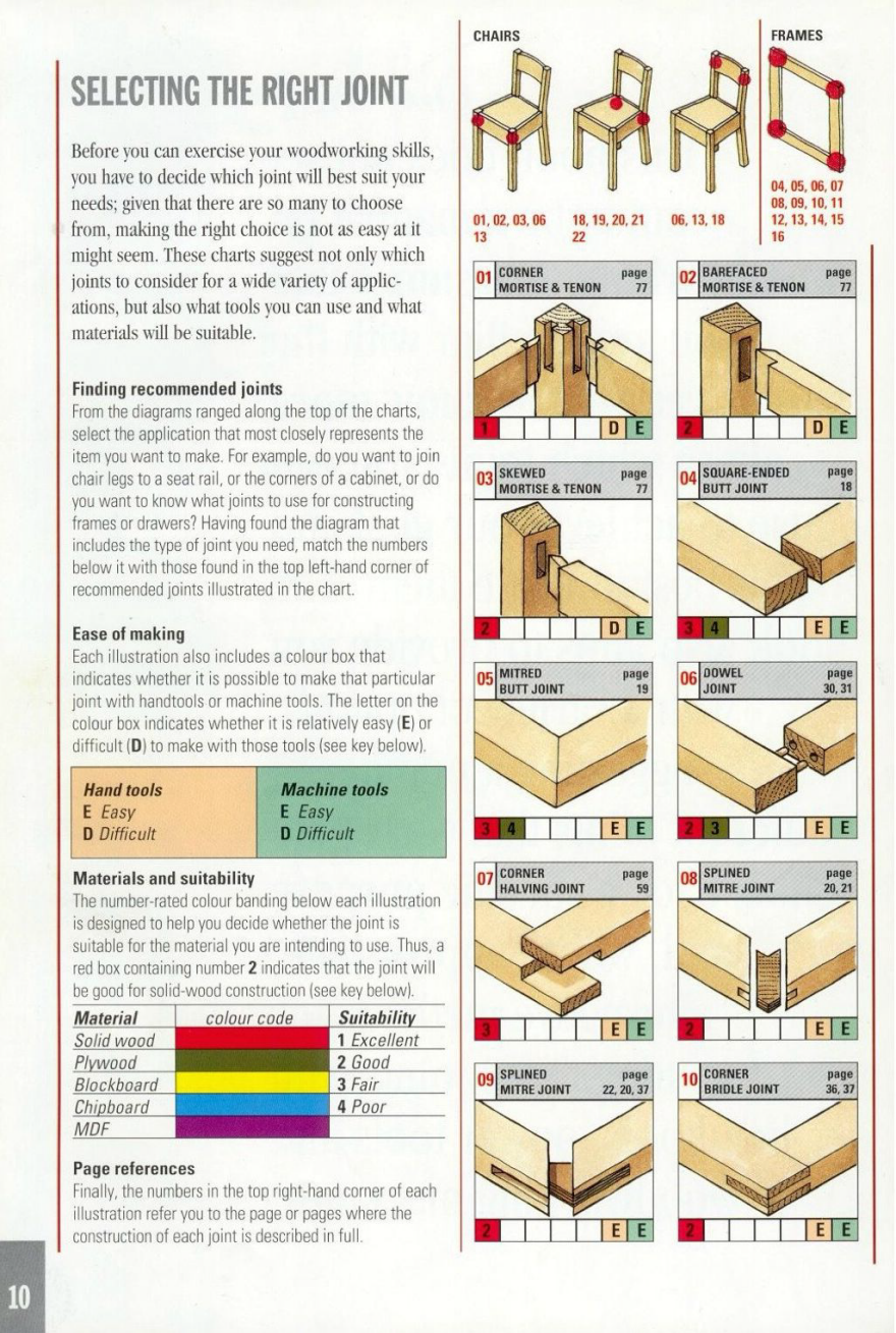
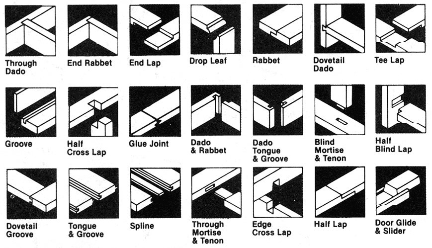
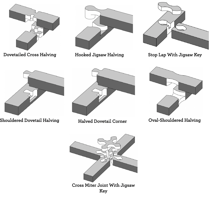
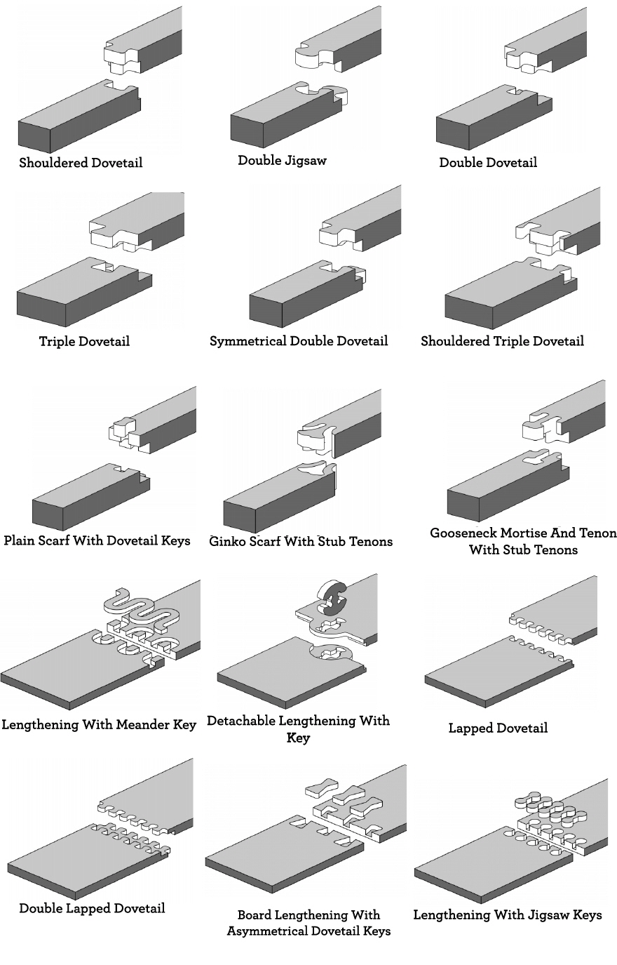
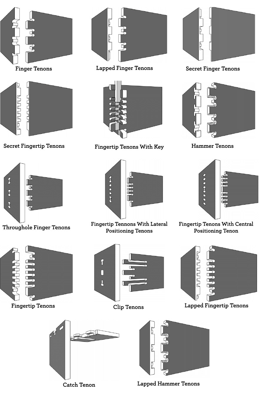
In the thousands of years since, craftspeople have developed an almost absurd variety of joints, some of which you learned in the ID shop at school, some of which you've never heard of, and that one that you can always see in your head but have forgotten the name of. To help you remember for the next time you're building something out of wood, or to give you some alternatives for any current designs you're working on, here are some visual guides:

Joints by Application:

Joints for Chairs, Frames and Tables

[This unattributed image has been floating around the web. If anyone knows the provenance, please let us know in the comments so that we can properly attribute it.]
[This unattributed image has been floating around the web. If anyone knows the provenance, please let us know in the comments so that we can properly attribute it.]

Joints for Tabletops and Cabinets

[This unattributed image has been floating around the web. If anyone knows the provenance, please let us know in the comments so that we can properly attribute it.]

Joints for Boxes and Drawers

[This unattributed image has been floating around the web. If anyone knows the provenance, please let us know in the comments so that we can properly attribute it.]

Joints by Machine:

Typical Router Joints

CNC Mill Joints, Corner

CNC Mill Joints, Tee and Cross

CNC Mill Joints, Splice

CNC Mill Joints, Box

CNC Mill Joints, Miscellaneous/WTF

Books

Here are some books that those of you researching or making joints may want to peruse:

The Joint Book: The Complete Guide to Wood Joinery


The Complete Guide to Joint-Making


Joining Wood: Techniques for Better Woodworking


Classic Joints with Power Tools


The Art Of Japanese Joinery


The Complete Japanese Joinery


If you've got any more joint resources you'd like to see included, please let us know in the comments and we'll expand this section.

Rethinking the Toothbrush

$
0
0

For this first video, I considered something quite simple that popped into my mind and seemed worth exploring further: the size of things. We don't really think about this too much—well, unless it's an iPhone. But we could often benefit from making things smaller, without loosing function or aesthetics. And in todays world where we produce things in big quantities, a small change can lead to a big impact. The following video is an example of this way of thinking, applied to a simple toothbrush. 

What other products do you think could make do with a little trim? 

This story originally appeared on Story Hopper, a collection of design stories worth sharing squeezed into short videos. 

Story Hopper: Design Stories Worth Sharing

$
0
0

I always say that I try to make the world better by making things, and usually I (and most designers) do this by making a thing or a product. My training in design taught me to create physical things in order to address issues, but the more time I spend in this problem solving mindset, the more I realize that making more STUFF isn't always the most effective way to tackle certain problems. Sometimes the world doesn't need another new product. Often, I think that sharing a story, idea or experience can end up having a larger impact—not to mention stories are easier to spread around and never end up at the landfill.

The stories you'll see on Story Hopper are snapshots of my life, the things I do on a day-to-day basis. Of course, this isn't everything I do, just what I think makes sense to share. I imagine Story Hopper as a place for videos that go beyond amusement—that try to inspire, inform, educate or trigger people to think differently about the world around us. Over the next few months, I'll be sharing my videos here on Core77 as well. Feel free to share your ideas and comments below.


Max Lamb's Simple Story of "Man, Rock, Drill"

$
0
0

Man, Rock, Drill is a pretty direct way to title a show of handmade marble pieces, but in the case of furniture designer Max Lamb's current show at Johnson Trading Gallery, its forthrightness is entirely appropriate. A collection created exclusively with Vermont marble, the idea behind the show was both spontaneous and simple—Lamb sent 300 pounds of tools from the United Kingdom to America, drove to a farm in Vermont and got to work.

The pieces ranged from clearly functional to simple explorations of form. 
Lamb's show statement along with a visual guide to the exhibition on the back. 

Well-known for his exploration of process, the premise of Lamb's show seems more allegorical than technical with, "a man in a van with a drill looking for stone." After acquiring a core drill, Lamb explored what he could accomplish in marble with his own bare hands. 

Produced on a farm just outside of New York in Danby, Vermont—home to the largest underground marble quarry in the world—Lamb worked endlessly, rain or shine, on the pieces for about a month. He woke up early with porridge and coffee and then headed outside each day to work through the night, hacking at marble. 

Spread in a grid across the gallery, those in attendance had inevitable interactions with the pieces.

The results of this test of skill and determination are somewhat mysterious, beautiful, and only partially indicative of their inherent function. The timeline and story of the pieces bring to mind historical mysteries like Stonehenge where the original function of the formations may be lost, but the abstraction and the mystery of them enhance their beauty. Each piece sits in the gallery within a grid-like formation. Their materiality connects the collection yet each stands alone in its particular beauty. What stands out most from these works is the clear determination that went into creating the piece. "It is this commitment and drive, focus and passion that makes his work interesting," says Johnson Trading Gallery director Paul Johnson. "Of course the work is interesting in its own right, but it is his effort and ability to get the job done without complaining, just hard work, that makes me admire it more." 

What makes the work interesting is simply the captivating narrative behind it; the story of a man, carving at rock with his trusty drill.

"Man, Rock, Drill" is on view at Johnson Trading Gallery, 72 Franklin Street in New York, through December 15.

Viewing all 19136 articles
Browse latest View live


Latest Images