Everyone knows that print is dead, but anyone who visits the newsstand regularly has probably noticed that there are an awful lot of good-looking independent magazines that seem to be flourishing in these digital times—titles like Pin-Up (architecture), Apartamento (interiors), and Fantastic Man and The Gentlewoman (men’s and women’s fashion, respectively). Now industrial design enthusiasts have their own idiosyncratic indie publication in the London-based Modern Design Review, which has published two issues so far and is working on its third for March. MDR is the brainchild of Laura Houseley, who started her career as an editor at Wallpaper* and has since worked as a freelance design journalist and consultant for a variety of publications and brands. Last month, we spoke to Houseley about the enduring allure of print, the delicate art of advertorials, and why eBay is a design editor’s best friend.
This interview has been edited for length and clarity.
![]() The first issue of MDR came out in 2014. The cover integrates elements of several stories inside, with parts of products by Martino Gamper, Yrjö Kukkapuro and Muller Van Severen arranged in a foam brick—a reference to a story on the Japanese art of ikebana.
The first issue of MDR came out in 2014. The cover integrates elements of several stories inside, with parts of products by Martino Gamper, Yrjö Kukkapuro and Muller Van Severen arranged in a foam brick—a reference to a story on the Japanese art of ikebana.What led you to create a print design magazine and not, say, a blog or a website?
Well, I’ve been at this for a long time. I started out my career at Wallpaper* magazine, and that must be 18 or 19 years ago now. So I’ve always been involved in print media—that’s my craft, in a way. And I’d just become increasingly frustrated at not having platforms to write the kind of design stories that I wanted to write. That really was the nucleus of the idea.
Can you define these stories that you felt you weren’t able to write online?
I felt that design as a discipline was growing and getting ever more creative. I was, and I am, constantly inspired by the discipline itself, and I felt that design media had perhaps not sought to keep up with that evolution. I felt that there was plenty of opportunity to explore stories in a more creative way, to not be encumbered by the news aspect of design—that was something that I wanted to rid myself of, the pressure of keeping up with the latest and newest. I was quite interested in spending a lot of time on more obscure stories and exploring them visually as well as through written essays—basically, approaching the subject in a different and perhaps more surprising way.
I noticed that the magazine doesn’t even have a news section.
That was a decision really early on. As you know very well, so much design journalism has gone online, and people do it very well. There’s no reason, I felt, to try and compete with it. If people want news-led stories, they will go online; I really can’t see the point in a paper publication even attempting to match that, whereas there’s so much you can do on paper that you can do better than online. So I felt it was only sensible to focus on those aspects. And to me, making a magazine, no matter what the subject, has a level of skill to it, and exploring those kinds of possibilities is exciting.
![]() Above and below: spreads from MDR issue one
Above and below: spreads from MDR issue oneWhat magazines did you look to for inspiration?
Not many, surprisingly. I’m very edited in what I read and look at myself, and I didn’t sit down with a whole host of publications, to be really honest. I think my inspiration was gleaned over years of looking at what’s out there and making a choice edit of what I look at. But I didn’t do that kind of structured market research where I picked and chose inspiration from different places, because for one thing I think you can see it in publications; I see a lot of new magazines now which are inspired and influenced by other magazines, and I really wanted Modern Design Review to be like nothing else. I wanted it to be something that was constructed from the bottom up, and for people to feel that when they looked at it.
How long was the gestation process leading to the first issue?
It was a long time. In all honesty, it was an idea that I first had when I left Wallpaper*, which was quite a long time ago. I’d always had the ambition to make my own publication. But from first speaking to Graphic Thought Facility, who are my art directors—and that began the real creative process—it was maybe a year and a half to the first issue hitting the newsstand.
And is the financial situation for a print magazine as dire as I imagine it is?
Yes! You can just put that. [Laughs]
But Modern Design Review is able to support itself through advertising?
Just about, but it’s a struggle. We are produced on a shoestring, effectively. As many other independent magazines of our type do, we kind of beg, borrow and steal in order to get it published and on the newsstand—it is very difficult. But then I always saw Modern Design Review as a flagship product for other projects as well, and I think a lot of people that publish at the moment have a similar attitude.
You mean for exhibitions and that kind of thing?
For exhibitions, for other future publishing projects, for consultation, for any number of things. I think the old model of a magazine purely being paid for by subscriptions or advertising is very hard to achieve now.
![]() Each issue has a series of stories devoted to a material. In issue one it was wood; in issue two, textiles.
Each issue has a series of stories devoted to a material. In issue one it was wood; in issue two, textiles.![]() With MDR, Houseley largely did away with magazine sections—there is only the feature well and a small collection of “Endmatter” in the back.
With MDR, Houseley largely did away with magazine sections—there is only the feature well and a small collection of “Endmatter” in the back.Are you open to sponsored “advertorial” sorts of arrangements? I’ve noticed a bit of that in other independent magazines, and I think sometimes it works quite well and other times . . .
Yeah. I think you’re right; it can be successful or not. And it depends on the type of magazine. But I think it’s a good thing if a brand is open to some sort of creative interpretation. Producing an independent title is all about the freedom and being choice about the people that you work with and the people that you represent, and I think that puts you in a good position to be picky about projects. I hope that we could produce things with equally quality-driven brands, and that would make a good result. But I agree that sometimes those things don’t work.
So what kind of a team do you have? You said it’s a pretty shoestring operation.
So shoestring. It is mainly myself and the art directors, Graphic Thought Facility. And then it’s a merry band of collaborators and contributors, really. It changes from issue to issue. I have editorial assistants and interns, but other than that the editorial staff is me.
I have the second issue in front of me, and I noticed that it has quite a bit of uncredited writing—I’m assuming that all of that is by you?
That’s me, yes.
It feels like it’s about 60 or 70 percent your voice. That must be a challenge, to have it feel like a magazine and not just you.
Yes. I think that percentage will go down as we go along. We’re putting together issue three at the moment and already there’s more contribution. It was a decision for issue one especially, because I was very keen that Modern Design Review establish its own tone of voice, and for the time being that had to come from me, until it was something that I could pass on to other writers. So I was fine with it being largely me to begin with, but as we evolve obviously we’ll seek out more people to come and write for it.
![]() The cover of MDR issue two, from spring/summer 2015, references its stories on textiles, Andrea Branzi’s neo-primitivism, hardness in design, and buttons in consumer products.
The cover of MDR issue two, from spring/summer 2015, references its stories on textiles, Andrea Branzi’s neo-primitivism, hardness in design, and buttons in consumer products.![]() A story from issue two on a series of birthday gifts given to Ettore Sottsass by his friend and colleague Johanna Grawunder
A story from issue two on a series of birthday gifts given to Ettore Sottsass by his friend and colleague Johanna Grawunder![]() Also in issue two, a short essay by Ronan Bouroullec about creating comfort in design
Also in issue two, a short essay by Ronan Bouroullec about creating comfort in designWhat are your other ambitions for the Review moving forward?
Well, I’d like to keep it going. [Laughs] I think that’s the number one ambition. And I’d just like to see it grow, in influence, in size—and to achieve some of these extracurricular projects as well. I’d like to do more exhibitions. We did one exhibition in September at the Ace Hotel in London. It was great, really satisfying, and I’d like to do more of that. And I’d love to do more publishing, whether it’s with newsstand titles or some book ideas I’m considering at the moment.
Can you tell us anything about what will be in issue three?
I don’t know if I can—we’re very secretive. This is something that print magazines have to grapple with all the time, how much to reveal online before the issue comes out, versus how much you want to push people toward the print publication by holding back information. We purposely didn’t do a whole lot of promotion for issue one; I really wanted people just to discover it and wonder where this had come from. And we don’t put a lot online for the same reason, because I want people who part with their hard-earned money to really feel like they’re getting something that they’re not going to be able to find elsewhere for free.
So we don’t give much away. But I can say that issue three is definitely bigger—we’re growing, we’ve got more stories in there. We keep the same editorial principle where we daisy-chain stories. It’s very much a thought process, how we format the magazine—so one story inspires or flows into another one, which has a knock-on effect to the one after. It’s a representation of how I see design at the moment.
![]() Issue two includes an 18-page feature on “the subtleties of the button and the simple pleasure in can evoke,” with photos of the buttons on a Braun alarm clock, a Muji remote control, a Ronson Rio hairdryer and several other consumer products.
Issue two includes an 18-page feature on “the subtleties of the button and the simple pleasure in can evoke,” with photos of the buttons on a Braun alarm clock, a Muji remote control, a Ronson Rio hairdryer and several other consumer products.![]() From the feature on buttons, photos of Braun’s Regie 308 control unit by Dieter Rams (1973) and Kodak’s Instamatic 300 pocket camera by Kenneth Grange (1983)
From the feature on buttons, photos of Braun’s Regie 308 control unit by Dieter Rams (1973) and Kodak’s Instamatic 300 pocket camera by Kenneth Grange (1983)Between issue one and issue three, have you changed much about the magazine? Or do you feel like with the first issue you hit on a formula that works?
The formula is pretty much the same. But it’s such a simple formula; it can adapt to different content. It is essentially two sections in the magazine. I was really keen to do away with the idea of sections. As somebody who’s worked for a lot of magazines, I’ve been a slave to sections for a while, so it was quite freeing. We basically have the main well, which you go straight into, and then a section called “Endmatter” at the end, which is for smaller, more immediate stories. So the format has stayed the same, and it's really about those daisy-chained themes and ideas that make up the bulk.
I think one of the things about Modern Design Review that a lot of people don’t understand, and maybe we don’t say it blatantly enough, is that we shoot the vast majority of the content ourselves, and that is quite an unusual thing for a publication of our size to do, because it is expensive. And, you know, getting a marble chair from A to B isn’t the easiest thing. And so that is one of the more extraordinary things about what we do, and I think when people understand that, they have a different appreciation of the magazine.
Yeah, I loved the photo essay on buttons in issue two. Was it difficult to get your hands on all of these objects?
Oh, it so was. We joked that we should have classifieds to sell the stuff that we had to buy for issue two. Yeah, we had a huge—well, not difficulty, but it’s interesting how awkward it is to find objects like that. We ended up buying most of it on eBay, to be honest. Objects like that are quite difficult to borrow from museums; they weren’t too keen to lend them to us, so we ended up purchasing a lot of it. So I now own that typewriter and that hairdryer and that camera. It’s quite amusing how cheap some of those design classics are; I was amazed at what you can buy. But that shoot was great fun to do, and it was a story that we really liked and felt quite strongly about—and I think that’s a typical Modern Design Review story, actually, to take what is essentially a quite small subject that is perhaps in design consciousness but isn’t directly related to a particular designer’s work or a particular item, and turn it into an extensive story, something that we can really investigate and enjoy exploring.
![]()


 Image: Fine Woodworking


 Photos and work by Mike Thompson
 Photos and work by Mike Thompson
 Photos and work by Mike Thompson
 Image: Easthampton City Arts
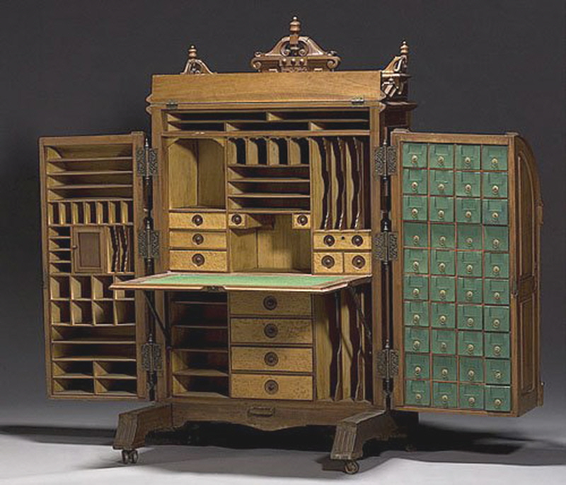
 Image: Copake Auction Inc.
 Image: Fine Woodworking