Quantcast
Channel: Core77
Viewing all 19151 articles
Browse latest View live

Cini Boeri’s Odes to Joy

$
0
0

This is the latest installment of our Designing Women series. Previously, we profiled design polymath Ilonka Karasz.

Cini Boeri seated in her Ghost armchair, 2006. Photo via the New York Times

Napping probably isn’t the first thing you associate with modern Italian design, but delve into Cini Boeri’s archive and it comes up again and again. Benjamin Pardo, Knoll’s design director, describes the sofa Boeri designed for his company in 2008 as having “great nap potential.” Boeri herself assures us that the cushions of her 1974 Bengodi sofa for Arflex “will follow your body and you can obviously fall asleep.” Even better, her 1972 Strips sofa for Arflex comes with fully removable quilted covers that can be unzipped and used as a blanket, so that you can actually tuck yourself into the sofa as if it were a giant sleeping bag.

The inventiveness of the Strips design was rewarded with a Compasso D’Oro. It is a true modular system, with countless available sizes and configurations. The internal frame is composed of different densities of polyurethane foam, hearkening back to Boeri’s first experiments with monobloc seating from the late 1960s. By replacing the typical internal framework of wood and metal with a dense polyurethane structure, Boeri created one of the first examples of a monobloc seat made exclusively from foam. This pioneering use of the material liberated the shape of her furniture along with its function.

Boeri designed removable quilted covers for her 1972 Strips collection that were meant to be unzipped and used as blankets, transforming the entire sofa into a giant sleeping bag. 
An eye-catching spread from the January 1974 issue of Design magazine showcasing the Strips collection

Of course, the Milan native is known for much more than just nap-friendly foam furniture. Having graduated from the Polytechnic University of Milan in 1951, she collaborated with Marco Zanuso for several years before opening her own office in 1963 to focus on industrial design and architecture. Since then, the now 92-year-old has built a number of serene residences in Italy, designed showrooms around the world for Knoll, and taken interior commissions for banks, stores, villas and galleries. But it’s her playful use of form and unexpected materials in her product and furniture design that have become her most enduring legacy. This is especially apparent in her 1098 and 602 lamps for Arteluce, which she made with humble PVC piping that allows the arms to pivot while creating a zany, cartoon-like appearance. The same is also true of her 1971 Serpentone seating for Arflex, whose industrial material (polyurethane again) could be formed into endless snaking configurations and sold by the meter for indoor and outdoor seating.

Boeri’s 1967 Bobo Relax lounger for Arflex was one of the first seats to use dense polyurethane foam for internal structure.
Her 602 table lamp for Arteluce used simple PVC piping components to build a friendly and functional table lamp.

Perhaps one of Boeri’s best-recognized forms is the Ghost armchair she designed in collaboration with Tomu Katayanagi, produced by Fiam in 1987. The chair is made from a single sheet of 12-millimeter-thick glass that has been slit along its length and molded while hot into its graceful shape. Boeri also used glass in a more traditional fashion for the design of her geometric Cibi glassware set in 1973. Movie buffs will recognize the tumbler as the futuristic glass that Harrison Ford’s Rick Deckard drinks from in Blade Runner.

Deckard takes a swig from his Cibi Double Old Fashion tumbler in Blade Runner.
Boeri’s angular Cibi glassware collection for Arnolfo di Cambio included an ice bucket, a carafe, an ashtray, a lighter and variously sized glasses, all in hand-cut crystal.

It’s little surprise that Boeri’s long career has resulted in designs that are as delightful to use as they are to behold. As a designer she has concerned herself with what she describes as “a broader functional dynamic for the object, and for a way of life which is more in harmony with real necessities, and less tied to tradition.” When designing with this in mind, Boeri finds there is a greater chance of creating less conventional and more personal objects that can inspire joy. In 2012 she gave a lecture at the MAXXI in Rome titled “Designing is a joy but also a commitment.” When Domus magazine asked her to elaborate on the idea behind her lecture, she responded with a succinct design manifesto: “Joy is inherent to the act of designing, to the proposal of the new and to its creation with responsibility and passion. The design work corresponds with certain moral and intellectual ethics, that should always accompany our work, in all its aspects.”

Boeri and Tomu Katayanagi fashioned the 1987 Ghost armchair from a single sheet of 12-millimeter-thick glass.
Plan view of Boeri’s 1971 Serpentone sofa, made of injection-molded polyurethane foam
The Serpentone’s flexible nature and customizable length meant it could be fit into any space.
Boeri’s 1976 Taboga chair was reissued by Arflex in 2011.
Boeri’s 2008 collection for Knoll included designs for an armchair, a sofa and an ottoman.
She also designed the Bebop sofa for Poltrona Frau in 2010.
Boeri continued her longstanding collaboration with Arflex in 2014 with the Ledletto bed, which comes with a modular headboard with a built-in LED strip.


Happy International Women's Day!

$
0
0

Take some time today to enjoy our archive of the Designing Women Series, Core77's bi-weekly look at the achievements of lesser-known and underappreciated female design pioneers.

View the full content here

How Long Should Your Design Portfolio Be? 

$
0
0

Every Tuesday, we'll be bringing you a pressing topic of the week straight from our reader-controlled discussion boards! This week, we ponder over the question: what's the perfect balance for a design portfolio?  Core77-er Alex asks: 

"I am a student graduating in May. Currently my whole portfolio is roughly 50 pages, or 25 spreads. This seems way too long to include in an email and expect professionals to look through for a potential job position.
 
My question is, what do you typically send out for a job application? A shortened work sample? A teaser? How long is this document? What does it include[...]? Professionals, what do you want to see? How many pages per project, on average? 

Currently I have made a "work sample" document that is 7 pages long (cover, one page for each of my five projects, resume, and an about me page). It covers my project topics and gives a teaser of the ID work and final product. Ideally, this would spark interest and then I could follow up by sending my full portfolio with a more thorough process." 

Have any firsthand experiences to help answer this question, or simply strong-rooted opinions on the topic? Contribute in the comment feed below and help get the conversation going! Also feel free to check out the original post and contribute on our discussion board.

Backpacks Made from Blankets

$
0
0

Based in SophiaTown, Soweto, The Soulart Foundation is run by local social entrepreneur Sibusiso Mokhachane. Deeply rooted in his local community, Mokhachane directs his efforts to youth development and community upliftment. He recently launched a very well received range of backpacks made from Sotho blankets called "Unlearn Africa." Mokhachane is one of Design Indaba's Emerging Creatives 2016.

Photo by Tseliso Monaheng

"I'm the founder of the Soulart Foundation, an organization I started in 2015 that focuses on recycling and youth and community development. We are currently working on developing an open air art studio in a dumping site. It will be created from 100 per cent recycled materials," says Mokhachane. "Under the Soulart Foundation umbrella, there's a company called Unlearn Africa, Which focusses on textile design and we also have a range of backpacks."

To Mokhachane, being a social entrepreneur means being someone who contributes positively to society—someone whose efforts and intentions seek to develop people and the communities they live in. He tries to allow this ethos to define the work he does.

"TheUnlearn Africa Backpacks are a celebration of who we are and the beauty of Africa. We use traditional Sotho blankets as the brand identity and main textile for the bags. I'm Sotho and it's an honour to celebrate my culture through art and design," says Mokhachane.

The range is named "Unlearn Africa" because of the attitude people have about the continent. "Most people see Africa as a dark dysfunctional continent, yet there is so much light and beauty to be celebrated," says Mokhachane. "It's about unlearning the stereotypes about Africa and learning the true beauty that is Africa."

The backpacks are inspired by Mokhachane's passion for art and his experiements with different materials. "And honouring my culture—there were no backpacks on the market that spoke to me."

The upcycled materials used in the backpacks are sourced from local upholstery firms, who give The Soulart Foundation offcuts, and manufacturing factories around Krugersdorp and Johannesburg CBD, who provide discarded cotton dust from production to mash with different materials. The Sotho blankets all come from the Johannesburg metropole.

As a young entrepreneur working in South Africa, Mokhachane often finds himself frustrated by the lack of access to funding. But on the other hand, with Unlearn Africa he is embracing the freedom to create and trying to be an agent for change.

To see the full collection of featured South African creatives go designindaba.com/southafricandesign

Improving the UX of Salt & Pepper Mills

$
0
0

Improving the UX of an everyday object can be tricky. When something already has a well-established design and a simple function, our instinct is to assume the item is as good as it's going to get. It takes a keenly observant designer to spot where there is room for improvement.

Nicolas Brouillac is one such designer. When tackling the design of the Alaska Salt & Pepper Mills for Peugeot, he aimed to have them operable by one hand, a boon for cooks. You've seen such one-handed designs before, either manually operated by means of a squeeze mechanism, or power-operated with a button atop a cylinder; both designs can be problematic for those with arthritis. Brouillac's approach was to opt for power-operated, but he's placed the pleasingly large button at an angle that requires minimal thumb movement to actuate.

[Editor's Note: See more of Brouillac's work on his Coroflot portfolio]

The form almost recalls one of those Vipp cans, and the way the tactility of the button is presented makes one really want to press it.

The killer feature for me is that he's placed an LED light at the bottom (I'm not sure why that's not illustrated in the images). One of the biggest complaints I have about cooking in my poorly-lit kitchen is that I often can't see exactly how much salt I'm dumping into a pot or pan whilst cooking. I've only ever seen LEDs on the bottom of one other salt mill, but I suspect this is a feature we'll see appearing more in future.

We previously highlighted Brouillac's work on elegant decanters here.

Back in Vantablack: After Signing Away Rights to Original, Clever Company Creates Even Darker Version

$
0
0

Talk about sneaky: Following news that artist Anish Kapoor had acquired the exclusive rights to Vantablack, the darkest substance known to man, developers Surrey Nanosystems went ahead and developed an even darker version.

First off, we know it's difficult to visualize the difference between black and Vantablack, but take a look at this and you'll understand. On the right is ordinary matte black paint, the one in the middle is NASA-grade black and the one on the left is Vantablack:

Zero reflection. Impressive, no? But while Kapoor's Vantablack can absorb 99.6% of light, the newer version can block 99.965% of light. Here it is, below:

And here's what happens when you paint a crumpled sheet of aluminum foil with the stuff:

As you can see, the human eye cannot perceive anything coated in Vantablack as a three-dimensional object.

We explained how Vantablack works in the last entry, but to refresh your memory, the surface of Vantablack consists of carbon nanotubes all standing perpendicular to the surface (Vertically Aligned NanoTube Array, hence VANTAblack). The light bounces around between the tubes with no way to reflect back outwards. Some 99.965% of the light is thus absorbed, and while I'm no scientist, I believe the remaining 0.035% of rays become so depressed that they just give up before reaching your eyeballs.

What Can We Use It For?

Now that the newer Vantablack is no longer the domain of a single person, let's put our ID heads together and talk about wider applications. The obvious one would be to incorporate Vantablack into products specifically designed for the ninja market. It's well-known, for example, that ninjas never travel while carrying sandwiches wrapped in aluminum foil; the reflective material is simply too easy to spot, and most ninjas would rather go hungry than take the chance. But a ham-on-rye wrapped in Vantablack would be absolutely undetectable.

There's just one problem: Vantablack can't be touched. Pressure screws up the nanotubes. The only way to maintain the surface is to cover it with a sheet of something transparent and protective. That's why, as The Economist reports, luxury watch firms are apparently interested in the material. A watch face sits behind a disc of sapphire anyway, and the thought is that a watch face of infinite blackness will appeal to the high-end buyer.

The same article points out that Surrey Nanosystems is also working on a spraypaint version of Vantablack called S-Vis, which will absorb 99.8% of light. This opens up more possibilities:

S-Vis can be used over larger surfaces, opening up another design application: architecture. Foster + Partners have expressed interest, as has Asif Khan, a 36-year-old architect from London whose designs were shortlisted for the new Guggenheim museum in Helsinki. Among the properties that appeal to architects is the way Vantablack can absorb heat. Used properly, it could be harnessed to drive the movement of air in order to cool buildings down.
More exciting, though, are the paint's visual properties. A lot of modern architecture, made of glass and steel, is designed to appear weightless and light-filled. This sounds desirable, on the face of it, but Khan thinks the nuance has been lost: that we have forgotten the value of darkness and, through overexposure, of light too. He hopes that architects could use these blacks to "create moments of complete contrast to our daily lives", like punctuation marks. His ideas are expansive: chapels, cinemas, libraries, even entire buildings, which would add intense spots of depth and stillness in cities bristling with reflective, glass-skinned skyscrapers.

Strangely, the article doesn't mention anything about using S-Vis on the headquarters or satellite offices of a ninja organization. But if Khan is smart, he's probably already thought of this.

BMW's New Concept Car Features Morphing Skin, Beast Mode. Sorry, Boost Mode.

$
0
0

Reading through their press release I drifted into a little dystopian Boston Dynamics/BMW co-lab fantasy of M-series Robo-Cheetahs slashing through traffic in 2116. 

Fortunately, BMW has a much more urbane vision for the future of transportation and it takes some cues from the lithe forms of big cats. It is hard to dig down to it in their site but the functionality of the morphing skin is much more interesting than the simple surface modulation noted on many blogs. In particular the (Bao Bao -esque) triangular grid structure would hypothetically move with the wheels, as indicated in the GIF below, reducing drag but also introducing a kinetic sense of muscularity to the vehicle's operation. 

To those familiar with the clichés of auto concepts, this is also a welcome, if possibly accidental, way of making those sexy zero-clearance covered wheels practical in uneven road conditions. (Which one would likely encounter while fleeing high performance robotic predators.)

There is plenty of conceptual candy for your perusal on BMW's site. Here are a few of the highlights. Check it out and let us know what you think.

As with Mystique from the X-men, or any Star Trek lizard race, texture is used sparingly and to good effect.
Heads-up Cintiq Mode?


Watch Two Guys Build This Gorgeous House From Scratch Using Only Hand Tools

$
0
0

We can just about guarantee you've never seen a home built this way. Nor witnessed every step of the process. Literally every step; these two guys start off by felling the freaking trees that they will themselves process into lumber, then proceed to erect an entire house, with a process and results that are about as green as you can get:

(Did you spot the shou sugi ban wood-burning-and-preserving technique being used?)

So who are these guys? One of the men in the video is Jacob, the founder of Latvia-based John Neeman Tools. That's a small company of craftsmen and friends who produce hand-forged hand tools and knives, with multiple skillsets between them: Traditional carpentry, bladesmithing and leather crafting. I believe the other gent is Siluan, one of the company's master carpenters, judging by the company's crew page.

The fact that they haven't splashed their names, nor even the company's name, across the video is telling; they seem less interested in self-promotion and more interested in sharing their craftsmanship. Which as you saw, is crazily impressive. "In the building process [we] used mostly traditional carpenters hand tools—axes, hand saws, timber framing chisels and slicks, old Stanley planes, augers, draw knives and mostly human energy," Jacob writes. "All the [foundation digging] was done by hand with shovels."

Some of the details:

Built Using Local Materials

[We built the] house from trees that [we] felled with an axe and two man crosscut saw in my own forest.
The foundation consists mostly of bigger and smaller rocks and boulders. Lime, sand and concrete mixture are using only in small amounts—to hold the boulders together. The visible part over the ground level—boulder mosaic has been masoned with hand split local granite.

Done on Nature's Schedule

[We felled the trees] following the research of old carpenter's calendar that coniferous trees should be felled in January's first days when the new moon rises and the deciduous trees should be felled in the winter time during the old moon. In winter time trees are sleeping and the juice and moisture content is very low in them. As time passes timber felled in winter becomes light and strong.

Multiple Design Influences

The House has been built based on the western part of Latvia - Kurland/Kurzeme (German influence) historical wooden architecture typical technique—Timber Frame construction with sliding log walls between the posts. House is two carpentry technique union—Timber Frame (that is typical in France, Germany, Great Britain, North America and other countries) and traditional Latvian log building technique, between the logs using moss from the local swamp.

There Are No Fasteners

In the walls, timber frame and roof construction there I used only wood joints and wooden pegs to hold the main construction together—no nails, screws or steel plates.

Primarily Natural Materials, Yet High Thermal Efficiency

Walls are insulated with 250mm thick dry pine and larch shaving layer (leftover from the local cabinet makers workshop). Overall exterior wall thickness is 50cm. In the walls (except wind vapour breathable membrane over the roof) has not been used any plastic or modern synthetic materials.
Roof walls are insulated with ecological wood fibre wool and wood fibre panels. Over the wood fibre panels are plastered natural plaster—mixture of sand, clay powder, lime, linen fibre, salt, wheat flour. Overall thickness of the plaster is 20mm and over all amount of plaster used on the walls are 5000 kilos. It works also as thermal mass and improves energy performance.
Exterior measurements of the house is 6.5 x 13 meters. Living space in both floors are 120sq/m. The house is being heated with clay plastered brick bread oven and smaller oven made of clay tiles in the kitchen. To heat up both floors of the house, when outside it is minus 10 degrees (Celsius) only small oven is heated once a day. When [the temperature] gets below -15, -20 C, we heat up the bread oven. Once it is heated, because of it+s thermal mass of 5 tons, it keeps the warmth 2-3 days. To heat up all the house (120 sq/m) in the winter time we use not more than 4 m3 of dry firewood. This is 2nd winter we are living there and we still heat up the house with the leftovers of lumber from the building process. And it will be enough for 3 more years.

Built to Last for Five Centuries

To preserve the wood from the spoiling, fame posts, sills, top beams and final cladding boards are treated with fire and pine tar mixed with Tung oil. This wood preservation technique was adapted from the Japanese traditional wood preservation technique Shou Sugi Ban ( ??? ).
Exterior cladding boards [require] recoating each 10-15 years. [With the] Tung oil and pine or birch tar mixture, the house can last more than 500 years. As an example [there are] Norwegian stave churches that [have stood] more than 500 years until [today].
Roofing is three layer white oak shingles (each 10mm thick, 120mm wide and 720mm long) laid in two directional technique. Overall amount of shingles used is 15 000 pieces.

Why Do It This Way?

I have fulfilled my vision to a build natural, ecological house with high thermal efficiency, low energy consumption, sustainable, using local materials such as—wood, stone, old and new clay bricks, moss, linen fibre, clay, water, lime, wheat flour, salt and wood shavings.


Another Design Entrepreneur Maps Her Way to Success

$
0
0

For design entrepreneurs, the path to success is often a random one. Sometimes the things you think you're meant to do are not, and something seemingly inconsequential becomes the thing that makes you. Take Sophie Kirkpatrick's story, for instance. Six years ago she was a design student majoring in Furniture at the UK's Loughborough University when she designed the following desk:

Called the Duplex Workspace Desk, it was intended to provide a modicum of privacy. The design was unusual enough that it began to make the blog rounds in 2010, the same year Kirkpatrick graduated. Between the blog love and Kirkpatrick's talent, it wouldn't be unreasonable to expect that she'd follow up with more furniture pieces, capitalizing on the free publicity.

Instead, that year Kirkpatrick moved to London to continue the part-time job she'd picked up in college, working as an office manager for an event planning company. What she found in London was what fresh grads also find in New York: It's a horrendously expensive place to live.

Hard up for cash, she decided that 2010's Christmas presents for her family would have to be DIY items as opposed to store-bought. "I had some old maps I had collected over the years," Kirkpatrick told SME Insider, "which I cut up and made into artworks, featuring shapes and locations that were relevant to the recipient of each gift."

The map-based gifts were a hit. "They loved them so much that they asked me to produce more for their friends," Kirkpatrick says, "who in turn wanted me to make more to give to their family and I realized that this could be a successful business."

Thus in 2011 Kirkpatrick launched Atlas & I, her brand of gifts—created by herself, on a dining table in the flat that she shared with roommates—incorporating vintage maps into leather stationery, fashion accessories, wall art, greeting cards, journals, photo albums and more. 

She began selling her self-made wares on NotOnTheHighStreet.com (the site is something like a British version of Etsy, but with careful curation) and while sales grew, they were initially not enough for Kirkpatrick to support herself. Thus in 2012 she took a full-time job with an interior design company that stages apartments for sale.

But Kirkpatrick kept Atlas & I going on the side, and in June of 2013 experienced a boon: Ikea came calling. Not for the desk she'd designed those years earlier, but because they'd spotted one of her creations (below) and wanted to mass-reproduce them for sale as posters in exchange for royalties. It wasn't until August of 2014 that her poster was for sale at the store, but in the meantime, in late 2013, her online sales had grown to the point where she was able to quit her day job.

Today Atlas & I is going strong, and here's what Kirkpatrick's venture produces:

Here's to hoping that some of you find Kirkpatrick's story inspiring. For reasons unknown, she passed on an early potential opportunity (perhaps furniture wasn't her bag), struggled to make ends meet, utilized her creativity, incorporated a passion of hers into her work, and didn't give up. Today she's a successful and self-made design entrepreneur. And ironically, her unusual journey could not possibly have been accomplished by following a conventional map.

Design Job: Juggle Multiple 3D Exhibit Stand & Interior Design Projects with Ease at Emirates Exhibition Services in Abu Dhabi

$
0
0

Seeking designers with a good eye for detail, proficient in 3D modeling/rendering programs, and most importantly, a patient and cooperative team player. Candidate will be handling several projects simultaneously from concept phase to delivery and handover. Should have 1-3 years of experience and be willing to work in Abu Dhabi!

View the full design job here

What Is A Bottle Cutter For?

$
0
0

The Plastic Bottle Cutter by Pavel & Ian will make spaghetti out of your recyclables. This hand-held shredder has already blown past its Kickstarter goal and you still have weeks and weeks left to pick up your own. Why do you need one? The makers believe it will help with recyclability by helping in the reuse department.

The design seems to be based directly on the traditional strap-cutter used in leatherwork, and the output is pretty obvious. Plastic! In strips! Can you use it in a weed whacker? Does it recycle more easily? We're not sure.

Crafts? You betcha.

Since the tool is effectively a notched wooden rectangle with an adjustable throat and a slot for a box cutter, the mechanics are pretty straightforward. Cut the bottom off your bottle, fit it in the gap, twist, and start pulling out plastic ribbon.

At risk of being way wrong about the demand for DIY plastic strip art, this thing is a simply designed tool for an uncertainly defined need. According to the suggestions here, DIY plastic cord could be used around the home and garden as a durable alternative to wire and rottable twines. They also (more sketchily) advocate it's use for load-bearing capacities as well.

Need a tow? I've got a Pepsi and a bottle cutter in my trunk.

Reduce, reuse and recycle are all important parts of a more ecological demand and production cycle (and ordered by importance). But does this speak to a need for more plastic twine, to a craft movement I'm unaware of, or to the need to reduce our dependence on disposable plastics?

Why do so many people want one? What would you use it for?

Please Buy This Disneyland

$
0
0

In an era where outsider art is both appreciated and bulldozed in the interest of land value, I implore you: please buy Hamtramck Disneyland. This sprawling complex of bizarre yard art was started by Dmytro Szylak in 1992 and added to for more than two decades. It is a one-man creative haven of weird hand-lettering, folk interpretations of Americana, and probably tetanus, and as good a reason as any to move to the Detroit area.

Szylak emigrated from Ukraine after WWII and landed in Detroit, where he worked at General Motors for 32 years. Upon retirement, he began hunting for a new project to occupy his time. How he settled on making his yard into an odd homage to Disneyland isn't entirely clear, but the resulting sculptural collage is now an internationally recognized destination.

Szylak's Disneyland is built on top of two adjacent garages, reaches two stories high, and continues into the 30' back yard. It incorporates erratic wooden structures, wind-powered figures and ornaments, carousel horses, holiday lights, massive photos of Elvis, carved characters, and a lot more. The site functioned as a weirdly inverted theme park: you could enjoy the majority of the spectacle from the alley, but with luck and a donation ($2, $5 or $10 by different accounts) you could see behind the scenes with its proprietor.

Like many conspicuous works of folk art, Hamtramck Disneyland has had its run-ins with disgruntled neighbors and concerned zoning inspectors, but by and large the place is beloved. The guest book has been signed by adoring visitors from around the globe, and Szylak's chaotic creativity has been celebrated locally with art shows and awards.

Fittingly, this wingnutty Disneyland might be a complicated purchase. Since the death of its creator and creative steward in May of 2015, the property has been in limbo as his will was contested. But this week, just one of the Disneyland houses showed up on Zillow with a mention of the property's "historic significance" and a $60k asking price.

As recently as June of 2015, the area's Mayor Karen Majewski publicly supported preservation efforts, going as far as saying, "There is no alternative but preservation." But at this stage it seems to be well out of the community's hands and destined for public sale. At risk of being a reverse-NIMBY (Please Keep Cool Crap In Your Back Yard?) for a community I'm not part of, I really hope this weird project finds a buyer interested in preserving it.

Folk art has long been seen as more disposable and temporary than works of formal art, despite its ability to creatively critique and provoke. Outsider art is often built on public land, borrowed real estate, or loaned time, all of which can dry up quickly. But as public sources of inspiration and innovation, oddities are worth consideration. As beloved long-running projects die slow deaths (see also: The 24 Hour Church of ElvisKullaberg Nimis), it's worth taking a good look at the ones we still have. And who knows? Maybe a sculptural Disneyland is worth $60k.

For now you can see it manyplacesonline or in person, at 12087 Klinger St., Hamtramck, MI 48212.

Furniture Design Reference: Diagrams of 18th Century Furniture Broken Down Into Its Components

$
0
0

Before the internet, we had encyclopedias. One of the oldest is France's Encyclopédie from the 18th Century, where editors Denis Diderot and Jean le Rond d'Alembert gamely tried to cram the world's knowledge into a comprehensive series of volumes. But the funny thing about French people is that they tend to write in French, so for years the University of Michigan has been translating this massive work into English and posting entries on their website as they become available.

The 18th Century was a bit before the time of industrial designers, but we sifted through the Encyclopédie to find the closest related field and came up with furniture design. Within the Menuisier en meubles ("Art of the cabinetmaker") entry are some twenty plates cataloguing the various parts of fine furniture of the era. Detailed descriptions are nonexistent, but we get to see the components, the joinery, the templates, the weaving patterns of the wicker and even how some of the parts are meant to be cut from the timber:

Plate I: Art of the Cabinet Maker, Seats
Plate II: Art of the Cabinet Maker, Seats and Benches. [Conversion of timber sections from a beechwood plank, together with assembly details.]
Plate III: Art of the Cabinet Maker, Seats. [Constructional and decorative details of different types of ornamental legs.]
Plate IV: Art of the Cabinet Maker, Chairs. [Chair construction.]
Plate V: Art of the Cabinet Maker, Armchairs
Plate VI: Art of the Cabinet Maker, Armchairs and easy chairs
Plate VII: Art of the Cabinet Maker, Easy chair and smal couch.
Plate VIII: Art of the Cabinet Maker, Couch
Plate IX: Art of the Cabinet Maker, Sofa
Plate X: Art of the Cabinet Maker, Duchesse [day-bed or reclining sofa].
Plate XI: Furniture Carpenter Veilleuse [day-bed or reclining sofa].
Plate XII: Art of the Cabinet Maker, Day-bed or reclining sofa [with a circular frame].
Plate XIII: Art of the Cabinet Maker, Sideboard [with cabinet].
Plate XIV: Art of the Cabinet Maker, Wardrobe.
Plate XV: Art of the Cabinet Maker, Polish Bed
Plate XVI: Art of the Cabinet Maker, French Bed
Plate XVII: Art of the Cabinet Maker, Italian Bed
Plate XVIII: Art of the Cabinet Maker, Templates
Plate XIX: Art of the Cabinet Maker, Templates
Plate XX: Art of the Cabinet Maker, Templates

Thanks to the University of Michigan for undertaking this project, and keeping it Creative Commons!

Reader Submitted: 'Less Quantified Self, More Qualified You' Translates Emotions Into Physical Form

$
0
0

"Self-tracking" or "Quantified-self" means the self-determined collection of body data. It involves the automatic and mostly chronological recording of biological, physical, mental and behavioral data. "Less Quantified Self – More Qualified You" is based upon the hypothesis that human body perception and intuition are likely to be influenced by the present form of self-tracking. This trend is highly characterized by quantification, the communication of body data via numbers, lists and diagrams and a gapless documentation. As an interface designer I try to find ways to challenge this development. Numbers are objective. Human perception is subjective and cannot be reduced to a common denominator. I would like to introduce two innovative and unique self-tracking devices. Both communicate body data in a purely haptic and visual way by using physical surface transformations. This reproduction of data corresponds with the human body perception and delivers adequate space for our innate intuition.

View the full project here

Brain Food: Learn the History of the Japanese "Wabi Sabi" Aesthetic

$
0
0

When it comes to design, the Greeks and Romans gave us mathematic and geometric perfection. This is starkly different from the contribution of the Japanese, particularly their notion of wabi-sabi, which is both a philosophy and an aesthetic. The term is just about impossible to cleanly translate into English, and instead must be described with a number of words that can seem confusing: Natural flaws, imperfection, assymetry, patina. Roughness, irregularity, impermanence, mortality.

A broken chair you have repaired with a visible splice can be said to possess wabi-sabi. The pattern of rust on an old bicycle, a handrail worn smooth from years of use, the patina on a favorite hand tool, all of these things have wabi-sabi too.

Perhaps the best way to grasp this concept, and hopefully integrate it into your own designs, is to learn the history of the philosophy, where it came from, and how it was first incorporated into the design of physical objects and spaces. There are entire books written on this subject, but we've located a well-edited video that sums it up nicely:


Why Do We Need New Cables?

$
0
0

Cables are everywhere around us. We need them to light our lamps, power our computers and make our kitchen tools spin around. There are a lot of power cables out there but they are all pretty much made the same way and do the same thing—they're not the kind of object that gets upgraded frequently, so they've basically remained unchanged for years and years. 

And yet every time we buy a new electric product, we also get a new cable. Even if the cables we already have are not broken, outdated or obsolete, we still replace them, because, well, we have a new one now...and that must be better, right? 

Actually, most of the time we don't need that new cable at all. (And although it looks like a good deal, you're definitely not getting it for free, by the way.) Instead of perpetuating the piles of messy cable boxes in our homes and the tons of e-waste around the world, what if we just kept our cables? 

The idea to "replace the device, not the cable" is an effort to get the ball rolling in the right direction for this widespread problem. Let me know if you have other suggestions in the comments below.

This story originally appeared on Story Hopper, a collection of design stories worth sharing squeezed into short videos.

In Case You Missed It, Here's What Yesterday's Solar Eclipse Looked Like

$
0
0

Yesterday our planet experienced a solar eclipse, that odd phenomenon where the sun, the moon and the Earth are lined up as if the sun is a cue ball, the moon is the eight-ball and Earth is the pocket.

As scientists have explained, the rare event only occurs when Earthlings have paid ample fealty to the sun god through sacrifice, tribute or by performing certain types of rhythmic dances. Citizens of Indonesia and Micronesia were apparently the most pious this time around, as they were treated to a view of a total eclipse; Australia and parts of Southeast Asia only rated a partial eclipse due to their lackluster, half-assed worshipping.

Folks gathered at locations around the world to watch the event, either in-person or via video feed. NASA, setting up camp on an atoll in Micronesia, unsurprisingly captured the best footage and had the best camera gear. So if you missed it, here's their recording of the four-minute event:

(Those moments when the sun suddenly flickers brighter or darker are presumably not natural; I imagine the cameraman was stopping the lens up and down.)

As you saw and heard in the video, many observers spotted the tall, reddish protrusion near the 11 o'clock position of the sun. While the NASA narrator keeps referring to this as a Corona, it seems highly implausible that a beer company would be able to launch and land a bottle that large onto the surface of the sun. Just goes to show you that those folks over at NASA aren't as smart as they make themselves out to be.

Nendo Resurrects Metabolist Architecture in Total Adorbs Fashion: For Pets!

$
0
0

Japanese design studio Nendo, whose work we love—2015 coverage included their Disaster Kit, Nest Shelf, House Slippers, Suitcase, and A Year in the Life of Nendo—has just dropped a whole little design eco-system for the pet-set. The house/bed reminds us of a miniature base unit from Metabolist Kisho Kurokawa's Nakagin Capsule Tower, which, we noted last year, is both a piece of architectural history AND a ruin you can stay in

Petabolist Architecture by Core77 In-house Architectural Visualization Department
Beautiful shot of the Nakagin Capsule Tower by Jordy Meow 

So though Nendo's soft-sided houses are entirely NOT intended for use in this way, we figure with a little engineering work, your menagerie can have its own taste of utopian living! Scroll Down for more photos of the actual cubic pet goods...

All Photos Courtesy of Nendo, Photographer : Akihiro Yoshida


Meet Your Jury Captains for Strategy & Research, Design Education Initiatives and Visual Communications

$
0
0

With just under a month left before the Final Deadline of the 2016 Core77 Design Awards hits, it's time to consider the greater value of participating in this annual celebration of design excellence. Your work has the potential to influence and inspire others on a much larger scale and contribute to a global conversation about the future of design, especially if our independent and internationally distributed jury teams are impressed and decide to honor it.    

Give some thought to what your entry could mean to the broader design community and get to know the esteemed leaders of this year's jury. In Part 3 of our interview series, we're introducing the Jury Captains of the Strategy & Research, Design Education Initiatives and Visual Communication categories. Make sure to check out Part 1 and Part 2 as well, and don't miss the March 23 Late Deadline!

Malin Oreback - 2016 Strategy & Research Jury Captain

Director of Design Strategy, Veryday

Malin is leading the Veryday creative team with a focus on service business and customer experience. She is coaching the design and innovation teams to challenge customers and deliver world class, innovative and meaningful service and customer experience solutions. Malin is responsible for building and supporting multidisciplinary teams to leverage the power of a people driven, engaging, innovation approach for solutions that are meaningful to people and that really make a difference to individuals, environment, society and business.

You've described your firm's collaborative ideation process as "wheelchair rugby," can you tell us more about this?

We work very collaboratively on our projects, often bringing in and engaging stakeholders from many different parts of our clients' business, or even outside experts. When driving innovation processes in multidisciplinary teams it is key to recognize each individual's unique competence, but also their history. All players bring their own skills and are handpicked to the team for a reason. We often have very different backgrounds and frames of reference; design, technology, management, business development, marketing and science to name a few. Facilitating this kind of collaboration requires a deep understanding of where people come from in terms of thought-models. As designers we are often hybrids, but just like everyone else we also have world views that are limited to our experiences.

I started using this metaphor after watching wheelchair rugby in the 2012 Paralympics. I saw amazing power and radiant personalities in a seemingly chaotic game, but with clear rules of engagement and focus. I feel this very much resembles our multidisciplinary work. It may seem chaotic at times to get very different people to work together, but the whole point is to create magic out of people's differences.

You worked as an industrial designer before focusing on design direction and management, what led you to that?

As a young designer I was engaged in a couple of pretty large projects that for various reasons did not make it to market. Many of my nights and weekends had gone into those projects. I was deeply frustrated with my inability to influence the decisions made inside our client organizations. Eventually I realized I needed to understand the mechanisms behind business decisions in order to become a better designer. What difference will a great idea make for people if it ends up in a drawer?

How has the impact of research and strategy on design development changed in recent years?

Design research has become an established capability that the successful companies of the world have come to recognize as a strategic asset. Today the conversation is more about how to build lean processes that still deliver the richness of insights needed for innovation. Basically, how to get there fast and smart. We don't often need to argue about why design strategy and research is important anymore.

What is the most pressing topic in need of design research today?

I would like to see more companies and governments turn to designers to help find solutions to some of the critical challenges the world faces today; like environmental issues, crime, education, food waste, refugee crises and more. I don't mean to naively claim that designers are world saviors, I just think designers are a hugely untapped source of creativity when it comes to interpreting human behavior and shaping the ecosystems of tomorrow. I hope to get to review great contributions in this area.

Pradayumna Vyas - 2016 Design Education Initiatives Jury Captain

Director, National Institute of Design

Pradyumna Vyas acquired a Masters in Industrial Design from the Indian Institute of Technology, Bombay. In June 2010, Vyas was conferred with an honorary Master of Arts degree from the University for the Creative Arts in Farnham, United Kingdom in recognition of his contributions to design education and design promotion. Vyas has more than 30 years of professional and teaching experience in different spheres of design. In the last 25 years, he has been associated with the National Institute of Design (NID) as a faculty in the Industrial Design discipline.

What are some of the most urgent challenges facing design education?

Systems thinking is most crucial where one needs to understand the eco-system of the society, culture and tradition. There is fast-growing technological development and virtual reality, reducing people to people interaction. Human values and ecological sustenance is taking a back seat, which has to be strengthened in design education and an inclusive approach has to be encouraged.

In these evolving times, what new skills or traits must designers adopt?

Technology is overshadowing the situation. Design should be contextual. Use of technology should only be an enabler to address the issues in the context. We need to nurture interdependency for inclusive development. Inclusive development will result in a more harmonious society. We need to create a future that works for one and all.

What is holistic learning and what types of benefits does it bring to design students?

An interdisciplinary approach and co-creation with stakeholders keeps the diverse socio-economic and cultural backgrounds in mind. Holistic learning that offers a new model which goes hand-in-hand with economic development as well as environmental sustainability will give an edge to students for handling the complex future.

Mackey Saturday - 2016 Visual Communication Jury Captain

Principal, Chermayeff & Geismar & Haviv

What are some guiding principles to designing branding that stands out in an information saturated age?

Regardless of the era, amount of information, or any other variables really, there are a few principles that stand true. Simplicity in form will always be effective. The necessity for something to be easily replicable is always an advantage for identity design. Distinctiveness is a must for helping an idea stick in the mind and quickly become that pleasurable point of recognition. Lastly, appropriateness should always be evaluated as it really can make or break any concept. Aesthetics often are over valued, and though the are very important, if not paired with the correct concept, they can actually hinder a design.

How has the role of communication designers evolved since you started in the field? 

The most obvious area is the development of digital platforms. Mobile is ever growing and it has been amazing to watch how that platform has become a litmus test of kinds for good communication design work. The limitations from screen size to the requirements of app icons have forced designers to reduce and focus their work, and thus has produced some very effective and compelling solutions. The role of the designer as we continue to create these new platforms is ever transforming and multiplying. The most staggering evolution I've observed is the necessary growth of the industry as a whole. Communication designers are needed in such a different capacity now, it's really amazing to think of how integrated we'll be into every part of business in the next decade or so.

What should designers pay attention to in work and in life to be the most effective in their practice? 

This is a very interesting and personal question. I assume for everyone this will be different as we all find value in, and thrive off, different conditions. For me it's an effective balance of observing the smaller things in every moment mixed with intentionally putting myself in awe inspiring situations. In work I strive to soak in what people seem to gravitate toward consistently, what sticks out to them immediately, and what quickly transforms their opinions. I look at these experiences and observations just like any other tool and rely on them when I have problems to solve, so balance is very important in assuring I'm as well prepared as possible to develop these solutions.

Impress the 2016 Core77 Design Awards juries by entering your best work by March 23rd when Late pricing ends. The final deadline to enter is April 6th. Don't miss it! 

Giovanni Socci's Incredible Transforming Mechanical Desk

$
0
0

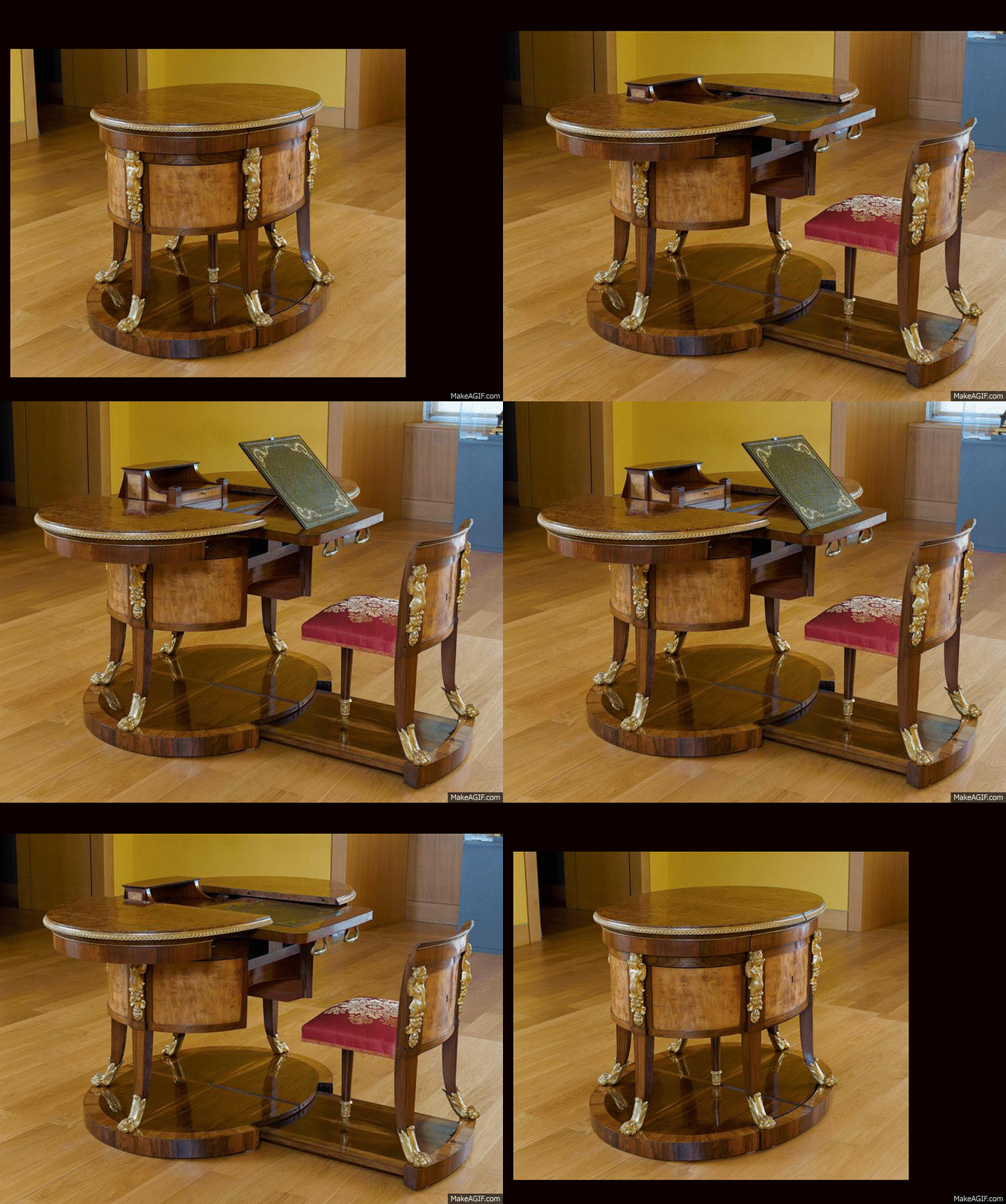
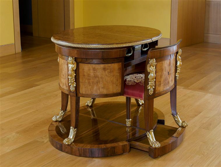
Tucked away in the Louvre is this odd-looking elliptical table.

A museumgoer could be forgiven for assuming the base was a modern-day add-on for staging purposes, but the sharp-eyed might notice the odd center leg, as well as the track leading up to it. What the heck are those for?

Sadly we couldn't locate any video, but this GIF does demonstrate the table's function:

It was constructed by Giovanni Socci, an Italian craftsman from Florence, at some point during the 1800s. And it wasn't the only one he built. Socci, part of a family of craftsmen that supplied furniture for Florentine palaces and assorted royalty, apparently produced at least four of these according to France's Clostermann Antiques. In their description, they reveal that the act of pulling the chair out is what causes the desk to transform: "The counterweights and gear mechanism, when pulling the Chair, by this single gesture opens the plateau—releasing a small grandstand forming reading Secretary topped with goatskin."


Viewing all 19151 articles
Browse latest View live


Latest Images