Quantcast
Channel: Core77
Viewing all 19132 articles
Browse latest View live

Emerging Portugese Designers Offer Critical Perspectives on Design Practice

$
0
0

During this year's Triennial exhibition in Milan, Portugal is offering an extensive program of exhibits and workshops that reflect on the critical and social potentials of design. Under the general theme "Objects After Objects"—which echoes the Triennial's theme this year, "Design After Design"—a series of curators were invited to interpret the state of contemporary design practice in Portugal.

Within the larger show, design writer José Bártolo curated New Practices in Design, a small exhibition highlighting 13 emerging designers from Portugal. The selected objects exemplify an approach to design that values experimentation, aesthetic innovation and social responsibility. Below are five of our favorite works on display:

Core by Samuel Reis

Many trees suffer from internal decay that rots their inner cores and leaves them hollow, a structural blow that often leads to the tree's destruction. Samuel Reis uses this void to create drinking vessels made of blown glass, molded from the hollow core of a carob tree. 

Bees by Susana Soares

Scientific research has demonstrated that bees have an extraordinarily acute sense of smell and can be trained to perform health checks by detecting specific odors in peoples' breath. This cocneptual project proposes a series of alternative "diagnostic tools" that use bees to diagnose the early stages of a variety of diseases.

The Journey by Fernando Brízio

Much of Fernando Brízio's ceramic works allow chance to impact his process. To create this series of vases, he loaded still-wet clay forms into the back of a Land Rover and drove along a predetermined route, causing the vases to move along with the motion of the car and retain the shape of their movement in their final, lopsided form.

Kite by Manuel Amaral Netto

This simple suspension lamp—Netto's student diploma project—is inspired by the immateriality of light. A lightweight structure of suspended strings holds together a light source and a diffuser, which can be easily moved to guide the light toward different areas.  

Filter Mirror by Luís Nascimento

Filter is a table mirror inspired by the proliferation of photo apps which seem to suggest that the more filters you apply to your original images, the better it gets. The mirror (whose stand is made of marble) can adopt five different positions in the user's search for the perfect angle and has two filters on either side, a golden one and a blue one. 

"Objects After Objects" will be on view at the Leonardo da Vinci National Science and Technology Museum as part of the XXI Triennale di Milano through September 12, 2016. 

More from Core77's coverage of Milan Design Week 2016!


Hilarious: If the Atlas Robot Could Speak

$
0
0

A few months ago we showed you Boston Dynamics' most recent Atlas robot, who had to struggle with uncooperative human co-workers. Since then, Chicago-based photographer and media producer Mr. King has dubbed the video to reveal what the 'bot would sound like with a "swearing module" programmed in:

He bleeped the curses out, so it's technically SFW, no? In any case, as presented here the 'bot has more personality than Siri and Alexa put together.


Bike Planters Bring Tiny Bouquets To Your Bicycle

$
0
0

Is your bike ready for the spring? Probably not quite. Wearable Planter now makes a boutonniere for the style-forward cyclist, but you don't pin these on your jacket or jersey. Their tiny geometric vessels put pops of color and a cozy home for fashionable floral arrangements anywhere with a tube to stick them to. With an easy clip or band, your bike can finally feature the flowery centerpiece it deserves.

While still in school, professors dismissed Colleen Jordan's ideas for 3D printed accessories as outlandish. Ever since she's been focused on making those ideas real, designing and selling tons of tiny planters and wearable vases, starting through her Etsy shop. They come in a myriad of shapes and colors, with both elastic and clip attachments to accommodate your different display regions and orientations.

Sorry, not available in 31.8

Though the idea of keeping real rooted succulents or sprouts strapped to your bike (let alone your body) might seem incongruous, the oblong shapes give decent depth and coverage for mini plants, and the site offers good tips for rooting tiny plants from cuttings. For a smooth cruise to work or the farmers market, a simple elastic strap is likely plenty strong, unless you're the type to take the stairs without dismounting. If it's good enough for your actual lights, it's good enough for your stylish bohemian add-ons. 

Do I recommend mounting them on your seat tube right where your leg will squish your new plant friends? Do I think they'll hold right on anything but gently ridden hybrids and "cute" vintage cruisers? I'll let you decide, because in this grump's opinion bikes deserve more harmless cheer, and if it can reach that rare bike n00b/green thumb market or make people interested in their bikes, I'll stand for it. It's better looking than playa-bound el wire projects, and if it fails it's entirely unlikely to screw you or your bike up much.

By and extra-large I want function forward bike design, but guys, it's April. Even the surliest bikers are stir crazy, allergy-ridden, and completely spiritually ready for sunny riding season. If you (like everyone here in Portland "Self-Declared Bike Capitol of Everywhere" Oregon) are sick of rain or snow, and are longing for long days of balmy biking, a tiny floral arrangement might cheer you up on your last gritty gray commutes. 

So brush the sleet/pollen/lingering tax season feelings out of your eyes and consider the spirit-lifting value of a simple colorful widget.

Design Job: Diehard Core77 Fan? Good News, We're Hiring an Editorial Assistant in New York City

$
0
0

The Editorial Assistant of Core77.com is responsible for maintaining the resource areas of the site – producing original content, providing research and monitoring community feedback in its various forms. Additionally, he or she is responsible for production support in a moderate technical capacity: social media, newsletters and site-wide maintenance as

View the full design job here

The Jacob Lego Javits Center

$
0
0

Next month is the ICFF, which designers both aspiring and established will descend upon to display their wares. But Brooklyn-based Sean Kenney's work is already inside the Javits Center. Earlier this year, Legomaniac Kenney built a 114,470-piece replica of the Javits that is now on display there.

The model is nearly 7 feet long and over 5 feet wide, contains 114,470 LEGO pieces, built over the course of 2 months with 4 of my assistants.
I designed the model using any information I could find online: satellite photos, photos taken by tourists, floor plans from convention web sites, lots of Google Street View… I even found some panoramas taken inside parts of the building (above) and a drone video which I watched frame-by-frame. The entire model is built in two sections to make it easier to move around.

He's got all the details right down to the taxi line and the Citibike docking station.

Here's a time lapse showing the massive endeavor:

Troll comment: "Why didn't you build the ICFF booths and furniture inside?"

Holy Cow: Video of Rival Contractors Battling Each Other With Heavy Machinery

$
0
0

This is astonishing. It appears that two rival contracting firms in Hebei Province, China, both showed up with their front-loaders for the same job. Apparently they could not agree on whom the job rightfully belonged to, and then this happened:

I love how the machine operator comes in from the left and attempts to raise his fallen comrade.

The video, by the way, has been duped at least a dozen times on YouTube, with the words "Bulldozer Battle" in each of the titles. Folks:

Bulldozer:

Front Loader:

I think a bulldozer battle would've been far lamer.

What we'd like to see next: Some Stegosaurus-like Backhoe action!


Classic, Practical Furniture Design: Hans Wegner's Valet Chair

$
0
0

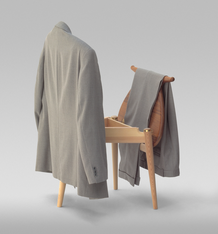
You get undressed for bed, but your clothes aren't dirty enough to go in the hamper. Nor are they clean enough to go back in the dresser/closet. What do you do with them? I usually throw mine onto a chair.

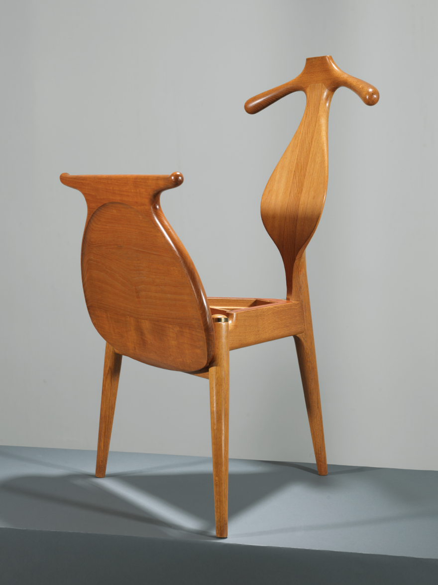
This would look a darn sight neater if I had Hans Wegner's classic Valet Chair.

Designed in the early 1950s, the Valet Chair has an interesting story that involves Wegner keeping a King waiting for two years. According to PP Møbler, the Danish workshop that has licensed the design and produces and sells it,

Wegner came up with the idea for the Valet Chair in 1951, following a long talk with Professor of Architecture Steen Eiler Rasmussen and designer Kay Bojesen about the problems of folding clothes in the most practical manner when it was time for bed. But the process of completing the design was not initiated before the Danish King Frederik IX ordered one after seeing the first four-legged version.
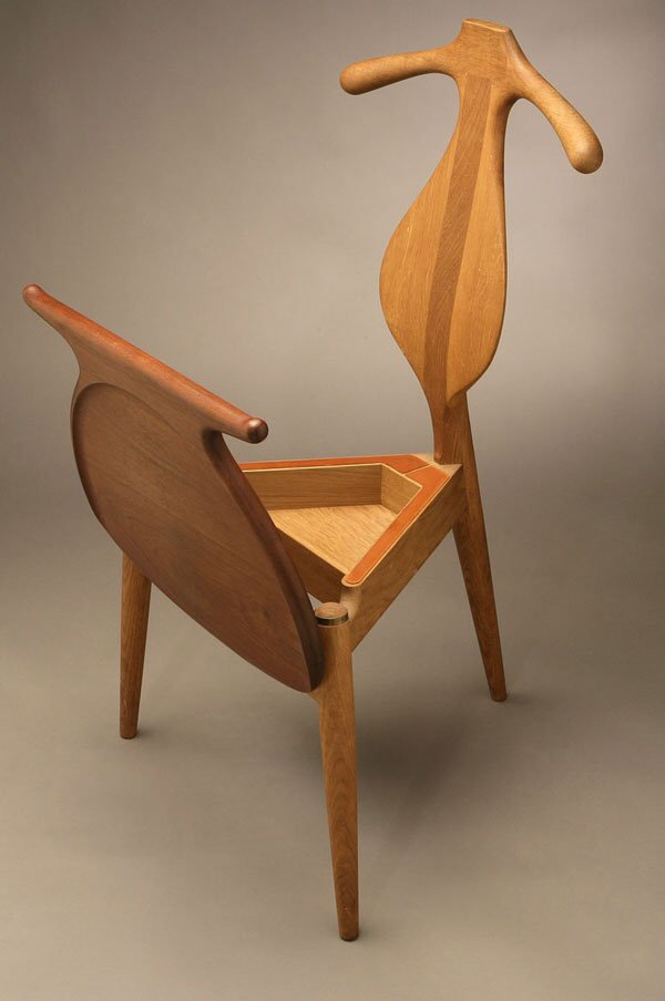
Wegner was dissatisfied with the four-legged version and continued working on the design for two years, before the King could finally receive his chair. By then the three-legged version had been created and made for the King in pine with a teak seat. Wegner wanted to show the King what an extraordinary beautiful chair he could make in even the cheap pinewood. Teak was used for the seat to stretch the exclusivity of the design. The Danish King ended up ordering a total of ten Valet Chairs.
The back of pp250 [PP Møbler's designation for the chair] works as a hanger for a jacket. The seat is hinged and can be placed in an upright position so the trousers can be neatly folded. Underneath the seat a box is revealed for keys, wallet etc.

The three-legged design is an interesting choice, and was presumably made for aesthetic reasons. (We'll have more for you on the practicality of three-legged chairs after we finish reading Christopher Schwarz's The Anarchist's Design Book, which tackles the subject.) Also interesting is that Wegner opted for humble pine for the bulk of the chair. The top three photos in this entry clearly feature pine, at least for the legs, though all of the other shots reveal oak instead.

While I wouldn't want to see a wire coming out of the back of the chair, I suspect that if it had a charging dock in the seat compartment and was reasonably priced, this thing would sell like hotcakes.

See more Valet stands from our Organization expert here.

Station #2: Considering a Decaying Firehouse

$
0
0

We're back with another iteration of Worn Warriors. Last time, we wrote about the Datsuns of downtown. This time around, we're a little less jovial, a little more thoughtful, and we might even have a touch of melancholy as we consider the history and future implications of a dying firehouse in Portland. As we were putting this one together, Luke said, "You know, old buildings never have a funny history. It's never like: In 1923, the Marx Brothers did a funny thing here." And indeed, we didn't find the ghost of Groucho at Station #2. Here are our thoughts...

Luke's Thoughts...

The city of Portland is dotted with small brick buildings that used to be firehouses. If you train your eye to spot them, they become pretty easy to pick out. Most of Portland's firehouses and fire boats were designed by Lee Gray Holden, one of Portland's early fire chiefs. This is quite impressive when you stop to consider Portland's remaining historic firehouses. They are all handsome buildings, well-proportioned, and designed to blend with the buildings around them. An impressive feat of engineering and taste for a man who was a professional fireman, not an architect.

When Firehouse #2 was built, firefighting looked much different than it does today. It was incredibly dangerous and difficult work (not that it isn't dangerous or difficult today). Structure fires were far more common due to a lack of modern fire suppression and prevention technology, primitive, fire-prone wiring in houses, and greater use of open flame in the household. Fire safety equipment was rudimentary with firemen wearing wool suits with shiny buttons. The city began adopting steam driven fire engines around the time Station #2 was built, helping to transition from horse drawn pumps. Even still, the city required many fire houses as the fire engines were slow, making a broad network of neighborhood stations necessary to respond quickly to fires.

As the Portland Fire Department and the city grew, the old firehouses became obsolete. Judging by fire stations built in the last 60 years, they were just too small. Many of the old buildings found new lives. There are two slightly younger siblings to Station #2 within a few blocks of my house. One is a museum, while another is a pot dispensary. #2 was used as office space up until 2000, at which point it was abandoned. Currently, it's owned by the city of Portland, who is open to sell it to a party willing to restore the building.

Jeff's Thoughts...
As city folk, we're accustomed to death and decay. Not that country folk aren't, or any other sort of folk, but in the city, and especially in a city like Portland, we're a little immunized when it comes to taking notice of our brick and stone neighbors that dust slowly to the sidewalk below. Maybe we fail to see them because our faces are parallel to said sidewalk, maybe it's because for every building that crumbles lightly into itself, we see another brighter, shinier, more sterile one going up, putting the original in it's shadow.

And if we do ever look up at it, give it a passing glance, we certainly fail to see it as living, especially on a hot day when the sun bakes it, dries up the coolness of it's bricks, stones, and leaves the building itself gasping for it's last breath; we certainly have no time for a breathless, blighted building like that. And even if we do stop and think!, we likely fail to consider the hearts that once beat within its walls, and in this week's case, Luke and I were asked to imagine firefighters in their prime, sitting around, drinking, cleaning, waiting for the next grease fire, discussing the prospects of this little town called Portland.

Okay, my bit of drama done, here's what a little pause offers me when looking at this old firehouse. It truly does put the growth of the city in perspective. This city that's busting at the seams once fit comfortably and charmingly into slim-fit, hardly-metropolitan slacks. And it inspires a little bit of misguided nostalgia, a nostalgia I can't put anywhere because I don't know the people that occupied this space back then, but it's a nostalgia inspired by a glisk of the clichéd (but surely honest) "simpler times." It makes me undeniably conscious of the direction of this metropolis, and the direction of those that are yet to be deemed a city, but still maintain "town" status. And now channelling my most Huxley-ian energy: I'm afraid that when our children, and our children's children, walk the streets, faces parallel to the ground, there won't be even a fragmented facade for them to look at if they wanted to, because the idea of the "town" itself is starting it's own slow dusting, self-crumbling, and is falling into the shadows.

Written by Luke Murray & Jeff Rutherford, originally for Hand-Eye Supply.


Reader Submitted: Love, Optimized: Design Fiction on the Future of Love

$
0
0

Having flirted with modern inconveniences, Object Solutions broaches the most intimate realm of human experience: love.Love, Optimizedis a multimedia experience that envisions the high-tech future of romantic relationships – with a dark, satiric twist. Couples enjoy only the rewards of romance and none of its obstacles, having outsourced those to our laboratory. With each new obstacle, they need only obtain the designated Object Solution.

The diligent NeurAlign orchestrates your romantic success while the two of you sleep soundly at the first date dinner table. With your brains comfortably entangled in its electrode network, the NeurAlign sends evocative nerve impulses between you to determine your romantic potential. The experience calibrates your nervous systems to amplify your points of greatest harmony at a fraction of the standard time.
The TouchTrainer is a navigation system for your hands across the terrain of your lover's body, where the journey is just as critical as the destination. The built-in Corporal Positioning System (CPS) provides reliable directions, routing hands to locations pre-requested by each lover. Both participants now know precisely where their partners prefer to be touched—and how.
With the Intimatum (Intimate Utility Meter) your smart home becomes a stakeholder in your ongoing romance. The system administers your home services—from high-speed internet to basic drinking water—granting their access based on your intimacy frequency with your partner. Abundance of intimacy brings continuous utilities. Absence risks gradual shutdown.
The Ring Finger Spotlight is a micro-drone with a mission: to illuminate and document the ring on your finger at all times—or, as circumstance will dictate, its absence. The device is a satellite accessory, hovering over your hand while you complete scheduled activities. Its everlasting ray of light bestows cinematic brilliance upon your finger, while adapting to the many lighting scenarios of your eclectic life.
View the full project here

A Free Trip to the World's Largest Electronic Waste Dump

$
0
0

I've had to travel a lot over the last few years, and doing so I ended up collecting many frequent flyer points. Eventually, I collected enough to book a free trip! Even with all the world's most beautiful destinations at my fingertips, the place I really wanted to go to was more...off the beaten path. I had heard about a city in Ghana called Agbogbloshie where pretty much all our electronic waste is being dumped, and decided that I wanted to see exactly where our old computers, dishwashers and blenders end up. Turns out there are amazing things going on there! It's essentially one big recycling village, and a very fascinating place.

This story originally appeared on Story Hopper, a collection of design stories worth sharing squeezed into short videos.

With These DIY Machines, Anyone Can Transform Plastic Waste into New and Useful Objects

$
0
0

The statistics around plastic waste are astonishing. Over 100 million tons of plastic are manufactured around the world each year, but according to an EPA study from last year, only 9% of what we make is successfully recovered through recycling. The reasons behind this are many, starting with general consumer confusion about what can and cannot be recycled. Moreover, the complex industrial processes that execute the sorting and transformation of plastic material have pretty high margins of error. Because of this, many companies refuse to use recycled plastic as it tends to be less pure and can damage their machines and slow down production.

Dutch designer and Core77 contributorDave Hakkens is pursuing a grass-roots approach to this problem by creating at-home versions of industrial recycling machines that are far simpler and offer a more productive way of handling our plastic waste. Last month he released version 2.0 of Precious Plastic, a project that he has been developing for years. "The project started as my graduation project at Design Academy Eindhoven back in 2013, but at that stage it was more a proof of concept—the machines worked but were still quite hard to re-build," Hakkens told us. "Over the last year we've spent a lot of time re-developing the machines so they only use easily available materials that can be found all over the world. The machines we came up with can be made using only basic tools and by referencing our instruction videos. We've been working really hard to make the process as easy as possible for others to get started."

He developed four machines—a plastic shredder, an extruder, an injection molder and a rotation molder—that all center around a modular system for easy repairs and customization options. Blueprints and a robust series of instructional videos are available online, so anyone can download them and become a "craftsman of plastic."

So far, Hakkens has used his machines to create a a bunch of everyday objects—including, hats, tableware and clipboards—but this is just starting to scratch the surface of possibilities. "Personally, I'd love to have a collection of plastic objects that show the true value of the material," he said. "But for know the focus is still on getting the information spread and helping people around the world get started."


Experimental Materials and the Handmade Digital: Highlights from Milan's Ventura Lambrate Design District

$
0
0

In the Ventura Lambrate district of Milan, material explorations and experiments at the intersection of craft and technology were on show. Packed into the warehouses, abandoned garages and galleries of the district were over 160 exhibitions from emerging designers and independent design galleries. Craft reigned supreme in Lambrate but young designers are challenging the very definition of handmade employing new technology, machine processes and manmade materials in new and unexpected ways. 

More from Core77's coverage of Milan Design Week 2016!


Envisions -- Products in Process
Exhibition view of 9 Dutch designers presenting prototypes, works in progress and materials explorations. Read more about it here.
Photo credit: LinYee Yuan
Envisions -- Products in Progress
Material experiments from Envisions. Read more about the exhibition here.
Photo credit: Core77
Envisions -- Products in Progress
Material experiments from Envisions. Read more about the exhibition here.
Photo credit: Core77
Envisions -- Products in Progress
The exhibition design gave a sense of order and texture to the objects organized on plinths in a warehouse in Ventura Lambrate. Read more about the exhibition here.
Photo credit: LinYee Yuan
NANI bench by Studio Joa Herrenknecht
Studio Joa Herrenknecht's project for the Form & Seek Collective show used salmon leather to create the seating, which is an ample waste by-product from the food and fishing industry.
Photo credit: Core77
Phases Vases by Studio Jeroen Wand
A part of the "Maybe Blue Would Have Been Better" installation, Studio Jeroen Wand's ceramic vases are made using one continuous mold, and then each vase is dipped in other plasters to create a one-of-a-kind profile
Photo credit: Core77
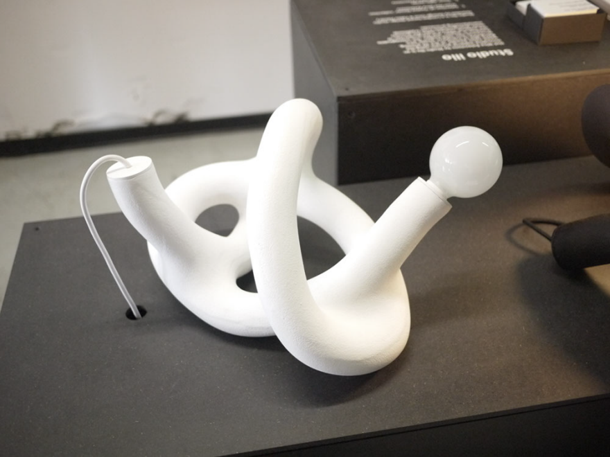
Hot Wire Extension Stools by Studio Ilio
Studio Ilio's benches and lamps are made using an innovative heating process that makes solid objects from hot wire and waste 3d printing powder.
Photo credit: Core77
Hot Wire Extension Lamps by Studio Ilio
Studio Ilio's benches and lamps are made using an innovative heating process that makes solid objects from hot wire and waste 3d printing powder.
Photo credit: Core77
Cosmetic Surgery Kingdom by Bora Hang
This chair collection by Bora Hang compares the trend of plastic surgery in South Korea with the practice of design by hacking old chairs and reforming them into the familiar shape of the classic Eames LCW Chair.
Photo credit: Core77
Cosmetic Surgery Kingdom by Bora Hang
This chair collection by Bora Hang compares the trend of plastic surgery in South Korea with the practice of design by hacking old chairs and reforming them into the familiar shape of the classic Eames LCW Chair.
Photo credit: Core77
View the full gallery here

Hilarious "Enter Your Phone Number" UI/UX Fails

$
0
0

Coder Stelian Firez recently tweeted this screenshot of what has to be the world's worst web form for entering one's phone number:

The gauntlet thus thrown down, fellow coders tried to top it in badness:

Who knew coders had such senses of humor? In any case the list goes on, and you can see more here.

Via Kottke

Design Job: Demonstrate Your Creative Thinking as a Packaging Designer at Jazwares, LLC in Sunrise, FL

$
0
0

Seeking talented, self motivated designers to design and develop packaging for licensed products. Must have 2+ years of Packaging Design experience, a clear understanding of consumer packaging design and print expectations (bleeds, die lines, retouching, formats, resolution, mock ups, etc.) and a solid understanding of design, layout and type usage.

View the full design job here

The Making of Reutpala Trophy for the World Retail Congress

$
0
0

Last week, the World Retail Congress brought together leading industry figures for the annual conference and awards program. On this occasion, we're taking a moment to remember an interesting design that was a centerpiece of last year's event—the REUTPALA trophy designed by the team at iGNITIATE

The trophy was given to each of last year's award recipients, including lifetime achievement winner, Alberto Alessi. The design—which prominently features WRC's branded logo—involved an intense manufacturing process. The team worked for almost a year with more than 10 international partners and manufacturers experimenting with different materials and the latest in 3D-printing technologies.

The process of working with different R&D labs in Paris and London impacted the final design of REUTPALA because the iGNITIATE team had to constantly experiment with many different algorithms and many, many prototypes. In fact, their own 3D-printers got damaged during the process of prototyping REUTPALA. Along the way, the team had to make strategic material decisions—starting with PLA, then moving to ABS and clear resin to be electroplated. Finally, they found and settled on printing 3D printing metal with nickel alloy and cobalt chrome. It wasn't until they started using the .45micron stainless steel that things really started to
gel in terms of being able to produce REUTPALA in a way dense enough to
create a beautiful finish and with a clean feeling. Ultimately, it is all about how
it feels in your hands and how the light reflects through it.

The video compilation below shows the process, from the initial design concept through the various material tests:

This year iGNITIATE is working on launching their design thinking program, iGNITE. After a successful initial run with the US Navy, the program will be implemented at several other multinational corporations and universities worldwide.


Clever Use of Graphic Design to Ease International Travel

$
0
0

Three travel-loving friends have started Iconspeak, a T-shirt company that uses graphic design to help backpackers overcome language barriers. While on the road, abroad, "Many times we were confronted with a language barrier that was only to be overcome by drawing signs, symbols or icons on a piece of paper, map, or into the dirt," write George, Steven and Florian, the trio of founders. "We thought it would be great to have an essential set of icons with you, permanently, so that you could just point on whatever you need—and people would understand."

Here's what they came up with:

The trio print the set on T-shirts ($33) and bags ($22).

Of course, with smartphone translating apps getting better by the day, one could argue that these shirts will be short-lived. However, as they point out, "A shirt does not need to be recharged and still, you can have it on as long as you please.

"Furthermore you won't have to worry that we will send you software updates to your shirt which will make it uncomfortable to wear, slow to wash or any such thing. It's a shirt."

Cheers! 12 Solutions for Organizing Wine

$
0
0

Lots of people with wine bottles don't want or need a fancy wine cellar; they're just looking for some sort of rack to keep their wine bottles organized. (Hopefully, if the wine is good, they will keep that rack in a place with a fairly constant moderate temperature.)

The Winebowl, designed for Mogg by Cory Grosser, is an eye-catching piece—but it's also a reasonably practical way to hold 10 bottles. It's made of cedar and has a metal ballast.

Some end users will prefer a modular solution that can expand (or contract) as the size of their collection changes. The Noè bottle holder from Alessi, designed by Giulio Iacchetti, comes in sets of six modules; each module can be connected to others by using a groove located along the base.

Multiple sets can be combined, as long as the overall height doesn't go over 1 meter (about 39 inches). The rack is made of thermoplastic resin.

The WineStack from Lonc comes as a set of three flat sheets which can then be folded into three triangles that interconnect to create a pyramid. (They can also be used to create a row holding five bottles rather than four.) Having something that can collapse into almost no space when not in use would be handy for end users who expect their wine collections to both grow and shrink. 

And with more sets the rack can expand to hold more bottles. The WineStack is made of galvanized steel.

The Infinity from Kartell, designed by Ron Arad, comes with 16 pieces that slide together to form the rings of the rack. Purchasers say the Infinity racks are easy to assemble, and some call them "Lego for wine." The pieces are made of polypropylene.

A single set can be create a rack with rows, or one shaped like a pyramid. But they can also be stacked quite high to meet the needs of end users with more substantial collections (and thus the name Infinity). Since I live in earthquake territory, I'd be nervous about going too high unless the rack could be secured in some way, as it may be with the under-the-stairs design shown by Hostore.

WineHive is a product that is somewhat similar in appearance to the Infinity, except it's made from satin-anodized aluminum. To play it safe, the creator (John Paulick) originally limited the height to just four levels, but later found it could go higher. WineHive was successfully launched on Kickstarter about four years ago. However, over the years, Paulick discovered ways he thought the design could be improved.

With WineHive 2, which is an active Kickstarter until May 6, Paulick has made two design changes. First, to avoid sagging problems, WineHive 2 uses rigid hexagons instead of multiple pieces that get assembled into the hexagons. 

And to avoid sliding problems, Paulick has replaced the adhesive locking tab (which sometimes lost its adhesive) with a steel set screw.

Grape comes from Goods; it was designed by Robert Bronwasser. Each rack holds 12 bottles; they can be stacked, and they can also be wall-mounted. (Made sells a wall mounting kit.) However, there doesn't seem to be any mechanism for locking multiple racks together, so this design might be more precarious than some others.

Grape stores bottles with a maximum diameter of 9 cm; it fits most champagne bottles, unlike many other racks. (And why don't they all specify what size bottle they accommodate?) The rack is made from EPP foam.

Numerous wine racks are designed specifically for wall mounting. The Cioso wine rack from Blomus holds bottles with necks that fit in its 1.25 inch opening. 

But see how straight those bottles are? When you look at photos from purchasers, the bottles aren't perfectly parallel like that. (However, purchasers are generally happy with the rack.) Because the bottles must extend out on both sides of the rack, the Cioso takes more wall space than some other designs.

Some users would be hugely irritated by bottles not hanging in perfect alignment, and they might be happier with a rack such as the one from Cyan Design, where the rack cradles each bottle.

The Climb wine rack from D-Italy, designed by Francesco Sette, has a neck-holding design I've never seen before. Climb was specifically designed for Bordeaux-style bottles—and not champagne bottles.  It's made from solid oak. Again, end users who want the bottles perfectly aligned will not want this rack.

Another way to design a wall-mounted wine rack is to provide pockets that the bottles slip into, as with the Mr. Butler wine rack from Amorin Cork Composites. This rack doesn't look all that sturdy, but Amorin says it holds up yo 25 kg (about 55 pounds). One disadvantage of this type of rack is that the labels are mostly hidden. 

One other wall-mounted wine rack style has the bottles mounted perpendicular to the wall, rather than parallel with it. This style requires more careful placement, given how the bottles extend into the room, and how easy if would be for people to hit their heads one of them.

The Esigo 6 aluminum wine rack has another drawback; if the wine rack isn't full, the end user winds up having empty holes in the aluminum panel, which isn't the nicest of looks. (The Winebowl, on the other hand, looks nice with empty holes.)

We're on Twitter Chatting About Sustainnovation

$
0
0

How can sustainability practices drive innovation? We're on Twitter with Eastman Innovation Lab (@Eastman_EIL) chatting about Sustainnovation with Nanette Stowell of@Patagonia, Heidrun Mumper-Drumm (@mumperdrumm) of Art Center, Dawn Danby (@ecoworkshop) of Autodesk and Nathan Jones of Fluid Technology Solutions (@ftsh2o) who will share their thoughts on the most important sustainability practices driving innovation and the role of material research and development. 

Thursday, April 21st at 1PM EST

If you need a refresher, watch the video below with Dawn Danby sharing some principals of whole systems design from Autodesk's Sustainability Workshop:

Feel free to ask questions yourself or answer the ones we ask. Just use the hashtag #EILConvos—we'll be tracking and retweeting your ideas.

Follow us on Twitter @Core77 now!


A Brief History of Women on U.S. $20 Bill Designs

$
0
0

This week the U.S. Treasury Department announced that Harriet Tubman will be featured on the next generation of $20 bills. Countless news articles have already covered the social implications, so we'll turn our attention to the aesthetics. First off: How awful is the Photoshop job being circulated by the major news outlets? I mean look at this:

Are you kidding me? Which intern did they get to mask off Ms. Tubman's head and place it, out of scale, onto Obi-Wan Kenobi's robes? This is the best they could do?

We've yet to see a good illustration of what the new bill will look like. So let's look backwards and look at some other $20 bill designs that featured women:

This one's from 1863. You'll notice the design is completely chaotic; the goal here was presumably not aesthetic pleasure, but to give a would-be counterfeiter a splitting headache.

Also, look closer. This was a few decades before the French gave us the Statue of Liberty, which cemented our modern-day image of Lady Liberty as a librarian trying to illuminate a dark room while being confident in her underarm deodorant.

But you can see, below, that the Lady Liberty on this bill doesn't play. It looks like she was hauling vegetables, then dropped them behind her and pulled out a sword and shield because something's about to go down. Her face looks like "I dare you."

By 1880 Lady Liberty has to split the bill, so to speak, with Alexander Hamilton. 

Hamilton is presented like he's taking a 1920s mob mugshot, and the serial number right beneath doesn't help.

Lady Liberty has swapped out her sword for some type of pole-arm, and she's upgraded her shield to a Captain-America-style one. Additionally, some prankster appears to have hung a sack over the business end of her weapon. Lastly, she's either being photobombed by an eagle or has supremely weird taste in helmets.

By the way, the design looks less chaotic than the 1863, but they're still making it difficult for counterfeiters with these tiny details:

By 1887, the $20 bill has swapped Lady Liberty out for her sister, Loyalty.

Loyalty's not so much for the weapons, but the dude behind her with the scythe doesn't look like he's planning on doing farming with it.

On the left we see what looks like cowboys duking it out, but it's in fact meant to represent the Battle of Lexington. The sole woman in this frame is tending to a wounded or dead man.

The overall composition of the front is a bit weird. The rifleman on the left looks like he's aiming his rifle at the man with the scythe, or at Loyalty herself.

On the back there is another woman, and in fact a woman of color, but portrayed in a scene sure to rankle today's politically-correct: It is Pocahontas being baptised, at which point she changed her name to Rebecca (I'm not making that up).

After that, women disappeared off of the $20 bill and won't be reintroduced until we see the new Tubman bill. Speaking of which, we'd like to see a talented illustrator step up and release a better-looking rendering of what the Harriet Tubman $20 might actually look like. We previously looked at a master craftsman creating the engravings used to print money, and whatever he comes up with for the Tubman $20 is bound to look a damn sight better than the hack job above. 

See Also:

Were Older U.S. Currency Designs More Aesthetically Pleasing?


The Best-Looking-Ever U.S. Money was Designed in the 1890s

An Introduction to Wood Species, Part 15: Jatoba / "Brazilian Cherry"

$
0
0

Jatoba

Hymenaea courbaril

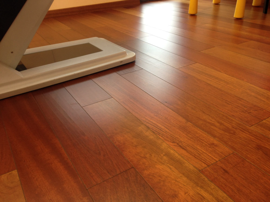
Jatoba is probably most commonly known in North America as "Brazilian Cherry" and it has been adopted largely by the flooring industry. The deep red color is stunning and the hardness and stability make it an excellent flooring option so this adoption is pretty natural. But Jatoba is no one trick pony and its applications span from inside to outside construction and is commonly used as decking, siding, and exterior furniture. Like most tropical woods, Jatoba is highly resistant to rot and insects, but it can actually be the more preferable wood to use. While dense it is not nearly as dense and heavy as some of its other Brazilian brothers like Ipe and Cumaru. This slightly lower density means it is still very durable yet it will acclimate better during the adjustment period from lumber yard to installation and from season to season.

Freshly milled Jatoba is a light reddish brown
Here is a sample of Jatoba that has been sunned for several days

Jatoba is another wood that will change color after it is milled. Initially the wood is quite light in color and over time it darkens into a deep red. Eventually, like all wood in exterior situations, it will gray in sunlight unless regularly treated. The color change is pretty fast and freshly milled Jatoba can darken after an afternoon spent in the sun.

The greatest feature of Jatoba is the versatility to use both inside and out. With a strong trend towards outdoor living spaces and merging them to the interior spaces, Jatoba is an excellent choice for your flooring and decking to create a unified living space with beautiful and durable wood throughout.

J Gibson McIlvain carries Jatoba for both exterior and interior applications. It is important to recognize that while the same species, these are essentially different products. The exterior decking product is sold as an S4S, E4E (surfaced on 4 sides, eased on 4 edges) that is air dried to around 18% moisture content to allow it to acclimate to most exterior conditions. The interior product is a typical kiln dried hardwood with a moisture content of 6-8% and is sold as rough sawn or it can be milled to whatever profile your project needs here at our onsite millworks.

_________________________________________________________

This continuation of the Wood Species series is written by Shannon Rogers, a/k/a The Renaissance Woodworker and founder of The Hand Tool School. It has been provided courtesy of the J. Gibson McIlvain Lumber Company, where Rogers works as Director of Marketing.

_________________________________________________________

More Wood Reference:

Species:

» An Introduction To Wood Species, Part 1: Properties & Terminology
» An Introduction To Wood Species, Part 2: Pine
» An Introduction To Wood Species, Part 3: Oak
» An Introduction To Wood Species, Part 4: Maple
» An Introduction To Wood Species, Part 5: Walnut
» An Introduction To Wood Species, Part 6: Cherry
» An Introduction To Wood Species, Part 7: Mahogany
» An Introduction To Wood Species, Part 8: Rosewood
» An Introduction To Wood Species, Part 9: Ebony
» An Introduction To Wood Species, Part 10: Teak

How Boards are Made:

» How Logs Are Turned Into Boards, Part 1: Plainsawn
» How Logs Are Turned Into Boards, Part 2: Quartersawn
» How Logs Are Turned Into Boards, Part 3: Riftsawn

Wood Movement:

» Wood Movement: Why Does Wood Move?

» Controlling Wood Movement: The Drying Process

» Dealing with Wood Movement: Design and Understanding

Viewing all 19132 articles
Browse latest View live


Latest Images