Quantcast
Channel: Core77
Viewing all 19147 articles
Browse latest View live

Who Turned Conan O'Brien Into a Superhero for Comic-Con? A Look Inside Ironhead Studio

$
0
0

Of all the fields an ID skillset will allow you to enter, Hollywood movies might be one of the more fascinating. Whether you're designing futuristic vehicles like Daniel Simon, crafting bad-ass props like Shari Finn or creating conceptual environments like David Levy, you get to bring your creative talents to bear without having to worry about mass-manufacturability.

The bad news is, these Hollywood designers are typically just as unsung as industrial designers are. Most of you can recall the costumes from Batman v. Superman, at least from the posters if you didn't see the movie, but you likely have no idea who designed them. That's because effects house Ironhead Studio was, gallingly, not even credited in the film!

They did receive some notoriety, however, following a visit by a famous funnyman last week. When it came time to suit up for Comic-Con, Conan O'Brien's people sent him to Ironhead Studio for a bodyscan and custom-designed costume. Here we get a little look behind the scenes (although it's primarily comedy—some of it NSFW):

Now that the laughs are out of the way, some of you interested in pursuing this field might be curious as to what's really required to succeed within it. Below is a much more informative interview with Ironhead Studio founder Jose Fernandez, who has a list of on-screen creations longer than Loki's cape (and including his helmet, by the way). The interview is great because the Tested interviewer really knows his stuff, and Fernandez touches on everything from SLS using nylon to the unpredictability of materials to how much—or how little—freedom he may have to design any given piece:

You can see more of Fernandez and Ironhead's work here.


Patricia Piccinini Redesigned A Human To Survive Car Accidents

$
0
0

What would it take to make car travel safe? Rather than waffle over where to put airbags, sculptor Patricia Piccinini redesigned a human who can withstand a standard road collision. 

Piccinini's project yielded "Graham," an otherwise normal guy grotesquely reconfigured for maximum durability on the road. Conceived with input from trauma surgeon Christian Kenfield and road safety engineer David Logan, this concept human is intended as a PSA about the seriousness of auto accidents and our bodies' delicate mortality.

With our whole soft, squishy bodies controlled by an even softer, squishier brain, a better designed human would double down on the dome protection. Graham's horrifying upper half is heavily muscled and padded to stabilize against brain and neck injuries caused by whiplash. His face is flattened and fattened to hold its own against nuisances like windshields and steering wheels. His skull is also designed to dissipate impact, breaking away under force like a bike helmet, or supremely gory tearaway pants.

His torso is also thickened, both in bone and muscle. Ribs are already well-designed to withstand the compression and force of impact, but the rest of the stuff in there could use some beefing up. Graham's final trunk is more sacklike than ours, with airbags placed between the ribs and around vital organs. More efficient than relying on that 3-point seatbelt!

His legs and feet are a bit more articulated than normal, with joints added to help him spring away from oncoming vehicles while on foot. The result is…off putting, and may be the most thought-provoking of the body-mods, since increasing victim accountability is almost always the least efficient way to solve a serious issue. 

All in all Graham is a beautiful specimen of creative and technical thinking. We're probably evolving in his image already.

See all of Graham's design features here, and check out more of Patricia Piccinini's beautiful and unsettling art here.

Sage Project is Changing the Way We Learn About Food

$
0
0

The only time I formally learned about food labels was in a sixth grade "health class" through a crossword puzzle containing the words "calories," "fat," "protein," "carbohydrates," etc. What do all of those words even really mean? I'm still figuring it out, and the FDA's new, still poorly designed, data dump food labels certainly don't clearly communicate product content. With an education system that fails to provide students with a comprehensive knowledge base in relation to personal health, is it really so surprising that many of these students grow up to have confusing relationships with food? Food apps are intended to make nutrition easier, yet few seem to reach that goal. According to The New York Times, "Apple's app store already lists more than three dozen apps offering users information and advice about calories, nutrition data and weight loss, but research shows that many consumers have a failed relationship with their food apps."

With so many already on the market, you're probably wondering, do we really need another food app? The simple answer is yes. Most food apps available are marketed in a way that encourages dieting and weight loss over consumer education. To understand the complex processes of industrially manufacturing food, and the effects these foods have on our bodies and the environment, we need more than a meal tracker or digital database of FDA labels. That's where Sage Project comes in. By using colorful graphics and food characters, the app makes food research surprisingly entertaining and enjoyable.


The project was started by Sam Slover for his graduate thesis under the name Wrap Genius, which won the 2014 Kantar Information is Beautiful Award, with the mission of creating a visual framework to address his own questions: Where does my food come from? What are my healthiest and unhealthiest choices? Which foods have GMOs? Sage Project is the dream food label, designed for the interests of the consumer.

"The food we buy matters. As our food systems become increasingly complex, the food we choose to consume affects not only our own health, but also the environment, our ethical framework, the Earth's biodiversity, and so much more."

Once backed only by design competition winnings with only a couple thousand products, the platform now lists tens of thousands of items and is in partnership with Whole Foods. While Wrap Genius was all Slover, Sage Project was born from the work of a team whose backgrounds range from government to nutrition to architecture. With the goal of providing honest and accurate information in an understandable way, the platform makes food data accessible to anyone with phone or computer access.

Foods are awarded badges based on the standards they meet
"We're seeing a push for authenticity, something that feels like it can help consumers purchase the thing that's right for them, for their lives, for their values."

Only eat food Made in the USA? Or from woman-owned businesses? Or made with renewable energy? How about wild-caught, cage free, farm raised? The app can filter all of those, and more. The program can even sort food by packaging, informing users about which brand of the desired product uses biodegradable or recycled packaging.

Sage offers users a wide variety a of food restrictions and lifestyle preferences to choose from

Have specific dietary restrictions? The app allows users to set preferences for anything from "Good Nutrients for Price" to "Yeast Free" to "No Artificial Colors or Flavors." It even tells you where in the world your food comes from. And with a comprehensive database boasting over 20,000 products, 7,000 of which are from Whole Foods, finding food to fit your needs is easy.

"For food, as science progresses rapidly, consumers are often left behind because it's an impossible deluge of research to keep up with," says Slover "We want to provide meaning and personal context." With personalized profiles and comprehensive graphics, Sage Project definitely gives context to the data in a way that other nutrition apps just don't. By providing dry information to consumers in a way that makes the numbers fun and visually engaging, Sage hopes to build customer loyalty and defy the trend of failed food app/user relationships.

Now imagine if this product was applied to education? Ten-year-old me would have definitely preferred this over a "nutrition themed" word search that failed to actually define the words I was searching for. Maybe if I had this in elementary school, I wouldn't have spent the following ten years feeling confused by food labels. And come on, who doesn't want to learn about food from a jump-roping chocolate bar, a pear doing yoga or jogging french fries?


Design Job: Calling All Cycling Enthusiasts! Quality Bicycle Products is Hiring an Industrial Designer in Minneapolis, MN

$
0
0

QBP is currently looking to expand our Industrial Design team and is in search of individuals with a passion for cycling and pursuit of design innovation at their core.

View the full design job here

Learn How to Sharpen Knives and Communities with Yohhei of Sato Sharpening Tonight at Curiosity Club

$
0
0

Knife sharpening is an art, a craft, and a way to communicate. And from our work and time spent with Yohhei Sato, he really lives and breathes this stuff. He's a passionate craftsmen and he'll join us tonight for Curiosity Club to talk about the art of knife sharpening.

Sato grew up on his family's rice farm in the countryside of northern Japan and learned sharpening skills from his uncle who is a tuna butcher and his grandfather who also taught outdoor skills. Now, Sato rides his bike all around Portland teaching skills and involving the community in the craft. 

Join us for his talk tonight where he'll speak about the importance of a strong work ethic and involving communities in craft. He'll surely sharpen some knives, too.

See you at 6 PM PST at Hand-Eye Supply (427 NW Broadway, Portland, OR 97209) or head to the Curiosity Club homepage for a live stream.

3 Tips to Transform Designers Into Agents for Social Change

$
0
0

The series of violent events that have rocked the United States in just the past few months have exposed deep rifts in our social fabric that are rooted in history, injustice and a sense of isolation. From the mass shootings in Orlando to the targeting of police officers by snipers to the deaths of unarmed black men at the hands of law enforcement, many feel helpless to change the reality with little space to participate in the national conversation. 

Antionette Carroll, a native St. Louisan and AIGA chapter president, felt a similar sense of despair in 2014 after the fatal shooting of an unarmed black teenager by a white police officer in nearby Ferguson, MO sparked massive protests and civil unrest in the community and around the nation. She founded the Creative Reaction Lab (CRXLAB) in response to the events with a mission to cultivate creative leadership through collaborative efforts between civic and social communities. CRXLAB has since hosted a number of workshops using design thinking to empower participants from various sectors to develop products, programs and services "by, for and with the community."

At this year's annual Core77 Designing Here/Now conference our theme explores how design-led co-creation will lead interdisciplinary teams to build successful, game-changing products. Antionette will share more about the work CRXLAB has been doing in St. Louis in collaboration with social and civic leaders, businesses, community members, law enforcement and designers including ongoing projects that sprung out of a 2014 design workshop around police brutality. In anticipation of tonight's AIGA virtual Town Hall on Racial Justice by Design, Antionette shares three tips for designers to start transforming their own communities today:

De Andrea Nichols' project #StickyNotetoSelf

TELL A PERSONAL STORY

Instead of trying to address grandiose systems, look at the people who are impacted by these issues. Instead of saying "I want to address racism," you can say "I want to help someone who is affected by racism," by telling those stories, of someone's journey and what they've gone through. Some of the most impactful design that has organized our society are those videos, those interactive websites, where people can see the stories of the individuals effected. The same happened with the civil rights movement and television where people across the nation were able to see what was happening in the South. This type of storytelling removes us from an ignorant space.

Recent video from the Nike Foundation's Girl Effect project

Two examples of this type of storytelling include the work of De Andrea Nichols and the organization, Girl Effect. De Andrea lives in St.Louis, she is a designer but also has a masters in social work. Her work, specifically the #stickynotetoself project, reflects her journey around racism, sexism and the issues we have in society. That's how I view art and design—we are really the historians. I also really love Nike Foundation's Girl Effect organization and how they use design for change. Their recent video was so powerful and moving. 

IMMERSE YOURSELF

Immerse yourself in the topic and the community. You cannot have a fishbowl perspective. Don't be on the outside looking in. Design "with" not "for." You have to be part of the community. One of the biggest issues we had in Ferguson was artists coming into the community that had no idea what it was like to be a St. Louisan. And it wasn't that they were trying to cause more harm than good but it created an "other" effect, where we felt like we were in a movement where people were trying to capitalize on the situation. To this day, it doesn't sit well with many St. Louisans and the same with designers.

Designers have the unique ability to be empathetic and we are navigators of complexity. That is our job. We are given a sheet of paper and a pen and told to create. Because of that skillset, we are able to come up with these solutions to these major problems, but to do that we have to be immersed in the topic, be immersed in the community.

Graphics from the "Guerilla Art Warfare" project by Jordan Thompson from CRXLAB's 2014 workshop on police brutality.

The most effective projects from our 2014 workshop on police brutality didn't come in and say, "I have the best solution, I have the best idea." They came in and 1) they listened 2) they partnered—worked with individuals on the ground or in the community. That's when we can create the most change. With CRXLAB, we intentionally try to make sure there are certain stakeholders at the table, not just the thought leaders in the space. We want the civic and social sector, the creative sector, we want the community members because they are the living experts of the day-by-day issues. And the business sectors because they're experts of scale.

MOVE BEYOND YOUR CRAFT

As designers we have the tendency to pigeonhole ourselves. We want others to understand the value of the work we do but we continue to fall into the status quo. When CRXLAB was first created, I was not received with open arms by design leaders. We want to be problem solvers and change agents but we keep telling ourselves that the only way we can solve your problem is by giving you a website or if I give you a poster. My greatest advice to give designers is to challenge the solution. Don't come into a situation saying, "I know I'm going to create an artifact." Move beyond the craft—you may create a service, you may create a program, many of the projects had a design element but they also built curriculum, built workshops, partnered with established entities. Designers need to learn to apply our way of thinking to intangible solutions. But then also recognize these are all different drops in the bucket. Do the due diligence to make sure its the proper response. Don't create just to create. Create for impact.

Learn more about CRXLAB and strategies for designing social justice at this September's Core77 Conference in Los Angeles. Buy your ticket before July 31st for Early Bird pricing!


Reader Submitted: Latitude Lamps Change Their Shape Based On Your Location

$
0
0
The Latitude Lamp is an indoor/outdoor solar-powered lamp that emits atmospheric light. It can be fabricated in many different ways according to the user's location or latitude.
View the full project here

How Can Designers Easily Create Their Own Color Palettes? 

$
0
0

Color theory is a topic in school often glossed over, arguably seen as a second-tier subject as opposed to a core component of a design education. Despite this tendency, the truth is that if you want to be a well-rounded designer creating products you should also probably have a fairly good grasp on color theory. 

On our discussion boards, designer and Core77 reader DeeDee brought up a nuanced question perhaps all-too-familiar to designers not working primarily within the scope of color. DeeDee writes:

"New to the footwear area of design. Went to university for fashion design so I am familiar to a certain extent to the idea of color palettes. However, I am concerned how to put a color palette together for footwear. My previous experience with color palettes was spread across multiple pieces on a line of people. So color was spread out across multiple pieces creating the color unity.
Now [that] I'm designing footwear I feel limited. I'm having difficulty picturing my shoes across a line. Just so many material breaks... and no one outfit wears multiple pairs of shoes. Difficult for me to pair just shoes together since it's not part of one outfit.
Does anyone have anything to help me look at color palettes for footwear? Just need a different way to look at it.

This question, although pointed, got us thinking—what are some good basic color theory pointers for designers? Looking not only into the science of what works, but also the very important psychological aspects, here are a few pointers we dug up in our research. 

Color for Beginners—Monochromatic

To give ourselves a base understanding of color schemes, we should first analyze the most basic and harmonious of all palettes: the monochromatic color scheme. A surefire way to ensure your color palette is harmonious, you can stick to a collection of different shades of the same color. Although a bit boring, this is often a safe bet.

So how do we spice it up a bit if we're looking to add more than one color to our collection of available hues?

Add More to the Mix—Analogous

The next baby step toward creating a truly striking color scheme is the analogous color palette, or a collection of colors that all sit next to each other on the color wheel. This strategy starts to introduce new colors within the same warm or cool family, making the scheme harmonious but not necessarily highly predictable.

Be careful with complementary colors

Choosing complementary colors, or colors on the opposite side of the color wheel i.e. orange & blue or red & green, is one step up from an analogous color scheme and can often be a good strategy for creating a color palette as these hues are striking in their perfect contrast. The only problem is that these colors are so dissimilar when placed side to side, the combination can be quite jarring, creating a visual vibration effect. So unless you are going for a highly graphic effect, make sure to give them some white space in between or add another compatible color within the mix. 


Be aware of the psychological factors

As nice as it is to believe that a color can have a universal meaning (for example, yellow evokes happiness while white portrays innocence and purity), there are simply too many cultural factors at play for a color to be universally understood in one particular way. There are certain factors regarding color in relation to the consumer market though that are important to consider in a psychological context:  

1. Market researchers have discovered that up to 90% of impulse buys can be heavily influenced by the presence of color, whether it's being used on a product or in an advertisement. So yes, color matters! 

The Isolation Effect

2. A psychological theory called the Isolation Effect shows that an item that sharply stands out from its surroundings is more likely to be remembered. Research also shows that consumers often prefer color palettes that include one highly contrasting accent color. 

One suggested way to achieve this accent color effect is to create a palette that consists of analogous colors, or colors that sit next to each other on the color wheel, and contrasting those hues with one complementary color or the complementary tertiary (for example, a color that is 50% green 50% yellow green, which would be the direct complementary color for the magenta in this chart to the left).

Technology Is On Your Side

While it is important to exercise your knowledge in areas like color theory, it's also good to realize that today we have many tools at our disposal to help us through complex problems. There are a number of great apps to help you explore color relationships such as the Yale Interaction of Color iPad app based off the studies of color master Josef Albers, which chronicles a large vocabulary of color terms while also having an interactive palette section that allows you to experiment with colors and see them side by side. 

At the end of the day, the fact of the matter is that color theory within the scope of design is a soft science. There is no singular surefire way of creating a harmonious, elegant, and truly original color scheme. On top of all this, it's important to note that beautiful and effective color schemes don't only rely on science and psychology but also factors like incoming trends—which is why we want to hear your thoughts on it! 

What are your tips when it comes to formulating your own color palettes? How do you go about organizing them? Where do you draw inspiration from? We want to hear from you—

(Comment on the thread below with your ideas or check out the original post and contribute on our discussion board!)


Google It! Plus 4 More Steps to File a Provisional Patent Application That Actually Has Value

$
0
0

If you want to license your concepts for new products, you need to be able to test them quickly.

Because, like I've said before, licensing is a numbers game. The strategy I described in my last article, "Why a $65 Patent Application is All You Need to License a Product Idea," was devised in response to these facts, which are pretty much indisputable. To summarize: Filing a provisional patent application, or PPA, can establish enough perceived ownership to get a company to license a simple idea from you. For this strategy to work, of course, your PPA needs to be strong. The key to writing strong intellectual property—intellectual property that actually has value—is to become an expert first. Not an expert on intellectual property in general, which you could easily spend a lifetime doing, but on your idea specifically. Here's how.

Before you consider filing even a provisional patent application, you need to answer the following questions in the following order. 

+ Is your product idea marketable? 
+ If so, is it unique? 
+ Is there a chance it might be patentable? 

Studying the market is the best way of answering these questions. Conveniently, you can do so from the comfort of your laptop. Studying the market is essential for a number of reasons. For one, you need to determine whether your product idea offers a meaningful point of difference or not. The only way to do that is by familiarizing yourself with existing products that purport to do the same thing. Are there any popular features similar products offer that you haven't thought to incorporate? You can devise a way if so. And of course, you need to confirm your idea is actually new—that there isn't a product already on the market exactly like it. Studying the market in the following ways will help you identify potential licensees, as well.

Approach this process with an open mind. Set your ego aside. It's not about better or worse. You will discover similar ideas. Which is great! They confirm a market for concepts like yours exists. When I'm excitedly told, "There's nothing like my idea out there!" I want to cringe. That's probably not true. But beyond that, ideas that are too new are unlikely to be licensed because they're too risky. If you discover your concept isn't new, you may be able to innovate or refine it based on what you learn.

A quick google image for "Butter Stick"

Search Google Images first. Start broad and then narrow in. You don't want to miss anything along the way, but eventually, you should make your search terms as specific as possible, including potential manufacturing materials. As you scroll through the thousands of images that appear, click on similar-looking products and examine them closely. Your goal is to learn as much as you can about these other products. What are they made of? How much do they cost? Where are they sold? Who manufactures them? Make a note of how the products are packaged and marketed. As far as the category itself is concerned, is it crowded? Is it stale? Is there an opportunity?

You need to determine whether your product idea offers a meaningful point of difference or not.

Reading product reviews on Amazon can be extremely enlightening. What do consumers appreciate about the product? What do they wish were different? You may uncover some nugget of insight that motivates you to improve your idea right then and there.

As you study these products, consider how your concept stacks up. Does your concept differ from others in terms of its features? (Is it made of a different material? Is it shaped differently? Does it have more of this or that?) How is your concept different in terms of benefits? (Is it easier to use? Will it cost less? Is it more easily cleaned? These are some examples of benefits.) Take note of which companies manufacture these products, so you can submit your sell sheet to them later on. These aren't actually your competitors — they're your potential licensees.

You can learn a lot about a category by visiting a brick-and-mortar retailer in person. For example, prime real estate is located at eye-level. Where are similar products found? How many variations of essentially the same product are there? If the same company has numerous SKUs, it's a power player.

Be as objective as you can. Ask yourself, "How does my concept fit into this category?" You are trying to verify that your idea has a benefit vis-à-vis existing products. If it doesn't, you've come up with a me-too product, which companies won't want to license. You need to be able to concretely identify your uniqueness. Remember, you don't have to reinvent the wheel to license an idea. And in fact you shouldn't. It's small improvements that matter.

Search for prior art next. I most often use Google Patents. Gene Quinn, founder of the leading website on intellectual property, IPWatchdog.com, defines prior art as: A reference of some type (i.e., a patent or a printed publication) or some type of knowledge or event (i.e., public knowledge, public use or a sale of a product) that demonstrates that the invention in question is not new. Searching for prior art is another way of surveying the landscape of the category as well as the history of invention as it relates to your concept. Understanding what's already been done—what's come before you—will help you key in on your concept's uniqueness.

At first, digging through patents may bewilder you. Stick with it. The United States Patent and Trademark Office, among others, offers tutorials. Please note: You will not be able to find everything. And that's okay. Endlessly searching for prior art is not a good use of your time. You can hire a firm to help you, but I think you're much better off teaching yourself how to do it. Looking at the drawings first will save you some time. (If the innovation is in fact relevant to yours, then read the patent.) Keep in mind: A lot of prior art is worthless. The more patents you read, the more you'll agree with me.

When you discover relevant prior art, read the claims section closely. What prior art does that patent reference? Examine it. Soon enough, you'll be flipping back and forth between patents that cite one another, gaining a grasp of how they all fit together.

If the innovation described is exactly like yours and the patent is written well (meaning defensively) and still in play, you might be better off walking away. Or, you could decide to contact the patent owner with a few questions. Like, what happened? Why isn't the idea on the market? Go slow. Open the conversation by telling him you love his idea. You might be able to work together. If you understand licensing, you could offer to license the idea from him with the intention of trying to license it to a manufacturer. In the past, I've negotiated the exclusive right to try to license someone else's idea for one year. If I were successful, we'd split the royalty equally. Either way, his insight could be priceless. You might be the best call he's received in years.

Armed with the research you've done, I now want you to try to steal your idea from yourself. If someone wanted to work around you, how would they? To file intellectual property that actually has value, take your time considering this. Try to brainstorm as many variations of your idea as you can, including applications, manufacturing methods, and materials. In my experience, so many patents fail to incorporate manufacturing methods. Knowing how to manufacture your idea more quickly and cheaply than anyone else is one of the best ways of protecting your ownership. You will prevent others from easily working around you if you do.

A final note, for now: The PPA you file will never become a patent. That's my guess, anyway. Patents aren't the goal. Not for you, and certainly not for your potential licensee. This strategy is about solidifying your perceived ownership over your idea—and in turn, convincing potential licensees it's better to work with, and not against you.

Hand Eye-Supply Debuts an Ode to Classic Sign Painting

$
0
0

Before the 1980's, nearly all of the commercial art in the country was either hand-painted, bent from neon tubes, screen printed, or a combination of these. Sign men drove around in trucks, vans and station wagons spattered with stray enamel paint in all colors, sometimes themselves sporting subtle to wild graphics advertising the tradesman's services. Sign painters were often eccentrics, men who had chosen what was a solitary trade. As a craftsperson, it was also one of the few trades one could make a living from at the turn of the century. In an increasingly mechanized world, fine woodworkers, blacksmiths, and others of their ilk were being made obsolete by factory-built furniture and modern welding techniques. 

Photo via Shorpy

It wasn't until the 1980's that we figured out how to replace sign painters with something faster and cheaper. To say the hand-painted sign industry was decimated by computers and vinyl plotters would be an understatement.

Colt's design for HES

Within a few years, the bulk of sign work was feeding stock fonts into a machine that would spit out perfectly uniform stickers that any rube could slap on a window or car door. Skill and practice were no longer required. Anyone with the ability to use a word processor could go into the sign business. No longer was it a trade that required practice to develop an eye for colors and composition. There are even faux vintage templates for giving signs that ol' time hand-painted look. 

But it's not all doom and gloom. In the last decade or so, many younger folks have begun to appreciate the challenge and skill required to create something with their own hands. There are more young furniture makers and neon benders now than there have been in decades. One of the old trades that is making a comeback is sign painting. Any tattoo shop or fancy bar worth its salt will opt for a hand-painted and gilded sign. Small businesses of every kind appreciate the statement a hand-painted sign makes about them. It suggests an appreciation for quality and tradition.

Colt Bowden

One of the most vocal supporters of modern sign painting culture is Colt Bowden. Colt runs Mac Sign Painting out of McMinnville, Oregon, where he uses an elderly Vandercook Press in his garage/studio to publish books on sign painting by himself and members of the Pre-Vinylite Society, as well as reprints of books by the now deceased master sign painter, Lonnie Tettaton. 

Colt drives a faded red ’63 Ford Pickup that leaks a little oil and has a hole in the muffler — the roar is greatly appreciated by his kid, Fox. The old Ford can be seen throughout Northwestern Oregon as he rambles around emblazoning store fronts with loopy casual letters hocking a good cup of coffee or stern Roman type warning of a no parking zone. He can also be found all over the country with his painting kit in hand taking jobs as far flung as Salt Lake City and Brooklyn, New York. His sign painting chops have been used to decorate album covers and dust jackets of books, and we can now proudly say he has painted Hand-Eye Supply our very own pocket tee.

José of Orox Leather wears the new Hand-Eye Pocket Shop Tee designed by Colt Bowden

A couple of us here at Hand-Eye were pondering what makes the best kind of graphic tee. We decided it’s the sort of shirt you might find secondhand, advertising a business you aren't familiar with, but is basic and comfortable enough that you don't feel self-conscious wearing it for twenty years and will mourn its loss when the neck seam finally gives up the ghost. The ink only needs be one color, white is fine, and the shirt should be black or gray, as this is a color anyone can wear (not to mention it will hide stains!). It should also have a pocket to stick your pens in. We tasked Colt with whipping up a timeless graphic that could find a home at a 1950's hardware store or right here on the shelves of Hand-Eye Supply.

You can grab the timeless tee here.

Snag one of Colt’s books while you’re at it.

And finally watch his talk on Portland area sign painting here.

Carol of Fuller's Restaurant in the new tee

Beer Trough Picnic Table, Yea or Nay?

$
0
0

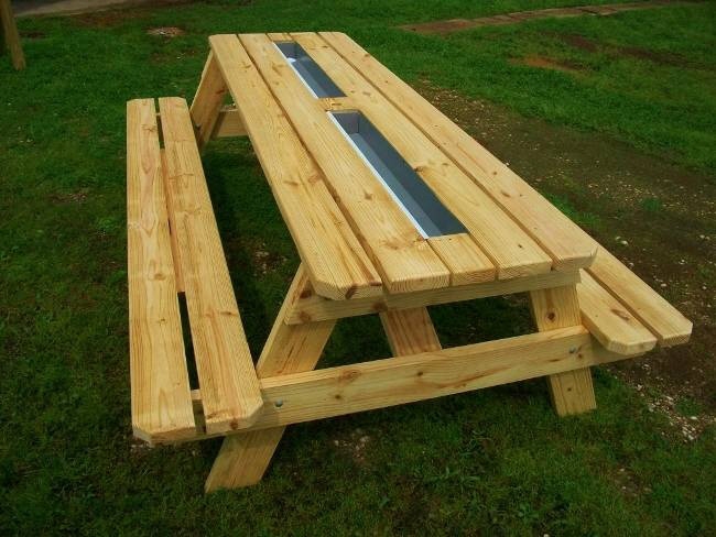
As industrial designers we're meant to look at things critically, and to consider the full breadth of the user experience. So take a look at this and tell me what you think:

At first I thought, that's a great idea. You've got nice, frosty beers right at hand. Picnic tables aren't difficult to build, as furniture goes, and the handy among you could bang one of these out using dimensional lumber and a single saw. The trough wouldn't be terribly difficult to add, or retrofit to an existing table; all you'd need are some rain gutters and caps. Should this be one of the summer furniture DIY projects Joel was talking about? 

Then I started thinking about how you'd actually use this. When a layperson sees one of these photos, they're only going to picture one moment of its usage: The moment a person is sitting at the table and reaches over to grab a bottle.

As designers, however, we should be thinking about all of the moments before and after, and considering how the user experience of this design stacks up, overall, against the alternative.

The Conventional Beer Cooler

Filling

At every backyard picnic or barbecue I've been to, the cooler is filled with ice from the freezer's icemaker in the kitchen. Or if the cooler is large, occasionally with a purchased bag of ice. And you always put the beers in first, or at least I do, because then the ice fills up the negative space far easier than if you did it the other way 'round. The cooler is then lugged over to the outdoor dining area.

Cooling

I like when the bottles are completely submersed in ice. If you avoid overloading it and you keep the lid shut, the beers stay frosty for a good while. If you overload it and keep the lid off, the sun melts the ice in no time and the beers don't stay as cold. In my book, people who leave the lid off are worse than people who leave the door open with the air conditioner on.

Draining

At the end of the day you dump it out on the grass or over a drain, then put the thing away. There is no maintenance.

Beer Trough Picnic Table

Filling

Obviously you're not lugging the thing over to the freezer, so you're bringing the ice to it. If you're using the freezer's icemaker, you need some sort of container to carry the ice. Or you use the big store-bought bags of ice.

With a design like this, inserting the bottles first, then the ice, will be a lot more difficult than just dumping ice into a bottle-filled cooler. Alternatively you could add the ice first, then burrow each bottle down, but I think both are time-consuming.

Cooling

We're not wine snobs here, so we're going to blow right past the fact that they're drinking Gallo in the photo above. Instead we'll mention two other things I've decided I don't like about this design, which are 1) the limited contact area of the ice, and 2) the exposure to the sun. I like my beers cold.

Draining

Then there's the maintenance afterwards. You'll need some sort of drain hole and plug, ideally with the bottom of the trough tilted towards it. Once it's drained, and anytime after it rains, you'll have to ensure there's no standing water. Because if there is, at least in New York City in the summertime, you'll create a breeding ground for the most annoying picnic guests of all: Mosquitos.

Table Space

Lastly, the beer trough takes up what is arguably one of the more important pieces of real estate on a picnic table, the center. That's typically where the napkins, condiments, bowls of chips and platters of communal food and sides are placed.

Thus, the beer trough picnic table is a no-go for me. What say you?

Last Day to Pitch a Workshop for the 2016 Core77 Conference in Los Angeles

$
0
0

Got ideas? We want YOU!

Share strategies around leading interdisciplinary teams to success at this September's Core77 Conference Designing Here/Now and win a complimentary pass to this year's festivities. We're looking for dynamic workshop presentations that share practical knowledge around this year's theme of design-led co-creation. 

Send us an email by WEDNESDAY July 27th by 11:59PM EST to conference@core77.com with: 

+ Workshop title
+ 2-3 sentence overview 
+ Any technical needs 

The 1-hour workshops take place on Friday, September 30th. Workshop leads will receive a complimentary pass to the 2016 Core77 Conference.

The Core77 Conference is an immersive, two-day exploration on how design will lead interdisciplinary teams to build successful, game-changing products of our near future. Focusing on compelling storytelling, human-centered design in the age of technology and lean startup strategies, this year's conference will inspire innovative ways of working and equip attendees with the tools for cultivating exceptional interdisciplinary talent.

Scenes from the 2015 Core77 Conference

Learn more about design-led co-creation at this September's Core77 Conference in Los Angeles. Buy your ticket before July 31st for Early Bird pricing!

Design Job: The Dream of the 90s is Alive! Nickelodeon is Hiring a Graphic Designer in New York, New York

$
0
0

The Graphic Designer is responsible for execution of comprehensive brand design and graphic design projects within the Nickelodeon Brand Group. Successful candidates will demonstrate superior ability to drive design thinking from ideation thru concept development, refinement, and execution across media.

View the full design job here

A Workspace in a Briefcase

$
0
0

I'm mightily impressed by the efficient design of this Modeler's Briefcase:

That's the MT02, created by a Spanish company called ModelMaq, which caters to miniature-painting enthusiasts. It's portable and makes fantastic use of its interior space. The base elevates the models up to a better working height for the painter and the storage is generous. I'm especially digging the little flip-up tool holder on the right with the perforated top. If it's not obvious in the photo, the paint bottles are all stored by their necks and rotate around a spindle. Also note the swing-out light fixture up top.

Here's their MT012, which eschews the base but seems to provide just as much storage:

Photo by Exminis
Photo by Exminis
Photo by Exminis
Photo by Exminis

Same rotating carousel for the paints.

Photo by Exminis
Photo by Exminis

The pop-out light fixture:

Photo by Exminis

The brush storage is great. It fans them out up top, making it easier to both see which is which and to grab:

Photo by Exminis
Photo by Exminis

Sadly, it seems these items are no longer being sold, and the model MT012 isn't even on their website. I'm guessing the price was too high or the market was too small. But they're impressive pieces of portable storage design nonetheless.

Fatal Tesla Crash Photo and Findings Released, Musk Explains What Foiled Car's Radar

$
0
0

We're now getting a much better picture—literally—as to what happened with the fatal Tesla crash from earlier this year. First off, yesterday the National Transportation Safety Board released findings from their preliminary investigation. The unfortunate driver was in fact using Tesla's Autopilot features, with both the Traffic-Aware Cruise Control and Autosteer features being engaged. He was also, the report notes, speeding—doing 74 miles per hour in a 65-m.p.h. zone.

This photo of the aftermath gives you an idea of how horrific the accident was:

To refresh your memory, the Tesla was traveling along a divided highway when a tractor trailer coming the other way made a left turn directly into its path. The Tesla passed beneath the trailer at 74 miles per hour and the top of the car was sheared off. Reuters explains the violent nature of the crash:

…The force of the initial impact of the crash resulted in the battery disengaging from the electric motors powering the car. After exiting from underneath the truck, the car traveled 297 feet, then collided with a utility pole. The car broke the pole and traveled an additional 50 feet.

This diagram put together by Electrek makes it even more clear:

The big question is, how did Autopilot fail to sense such a large obstacle? The earlier explanation provided by Tesla was that the car's camera could not pick up the white body of the trailer against the brightly-lit sky. But what about the radar? Here's a Twitter exchange where Musk is challenged and answers:

Clearly there are kinks to work out. The tricky part here is that regulations will likely outpace actual investigations; for instance, Automotive News reports that "[The] NHTSA is expected to announce guidelines as soon as this month that will set some parameters for self-driving cars on U.S. roads," whereas the NTSB states that "The preliminary report does not contain any analysis of data and does not state probable cause for the crash…. While no timeline has been established, final reports are generally published 12 months after the release of a preliminary report."

This means that laws will emerge before we have all of the data required to craft them. Transportation Secretary Anthony Foxx is apparently aware of this challenge, according to AN: "[Foxx] told reporters Wednesday the agency would be as exact as it could without being overly prescriptive. 'We're crafting a Declaration of Independence, not a Constitution,' Foxx said."


How Much Should You Design Freelancers Charge?

$
0
0

How much should you design freelancers charge? Discussion Board member TZD recently posed the famously tricky question, and got some great answers from our resident pros.

Some background info: TZD has been working full-time at a "decently sized manufacturing facility (100 plus CNCs) as a Product Engineer," with "about 4-5 years working experience in related fields." A client recently came in and asked for design work outside the scope of his company. With his boss' permission he took the job on, and now he's looking to do more—but he needs to get the money straight.

The Question:

I'm now branching out [into freelance work] and am wondering how you guys are handling pricing. Up to this point I have been tracking my hours and billing at an hourly rate. I am not sure this is the best solution, and I am unsure of the rate. I have also been working with no contract.
So how do you guys handle your pricing? What kind of hourly rate is reasonable for [what] type of work?

Here are the answers, edited for clarity:

Figuring Out the Basics

1. Start With a SOW

I typically create something called an SOW (Statement Of Work). A document like this outlines key milestones, deliverables, and costs associated with those milestones and deliverables and the timing of payments.

--Michael DiTullo, California, Chief Design Officer

2. Flat Rate vs. Hourly

I prefer working with hourly contracts where you simply track all hours worked through a piece of software that includes screenshots and written memos, so the client always has an overview of the progress.

--Ralph Zoontjens, Netherlands, Product Designer

I find it easier to quote as flat fees. How I do that is I estimate how many hours it will take me, multiply that by my hourly rate and generate a price. You will never get the estimation right, and general rule of thumb is that you will under estimate it so round up and include anytime for communications (phone calls, reviews, meetings).

--Michael DiTullo, California, Chief Design Officer

3. How to Calculate Your Hourly Rate

To calculate an hourly fee, figure out how much you want to make per year. Be sure to factor in healthcare costs, rent, savings, things like that. The average work year is 2,000 hours, but as a freelancer you might spend half of that time chasing work, so divide your annual desired earnings by 1000 and you should have a pretty good idea of an hourly rate.

--Michael DiTullo, California, Chief Design Officer

What Other Factors Determine Rates?

4. The Market

Price is determined by what the market will bear. Yes, I am a broken record but it is true.

--Iab (location/occupation unknown)

5. Experience

Experience [also matters], I'd gladly pay [DiTullo] $175/hour, but not even near that for someone just out of college. But experience is not absolute as pricing is a dark art [see "Client Size," below].

--Iab (location/occupation unknown)

Depends on your level of experience. In San Francisco, a good freelance rate for a recent grad is around $50-60/hr. If you're a more mid-level designer you can probably tack another 50% on top of that.

--John Mewriello (location/occupation unknown)

If you are a design engineer with any competent level of tooling design experience, there's no reason you shouldn't be charging $100+/hr. The product engineers I've worked with have ranged in price from about $85 on the low end for an experienced CAD jockey with solid part design knowledge, to $250 on the high end for someone with extensive experience in mechanical design and part analysis.

--Bcpid (location/occupation unknown)

6. Client Size

I try to determine what I can get from a client and go for the max and readjust if they balk. For example, a Fortune 500 will likely pay more than a startup, but not in every case. So the "exact same" project between two different clients would be priced differently.

--Iab (location/occupation unknown)

My estimate would be around $40-50/hr for you. But you will have to determine for yourself based on the kind of projects you are looking to do and what clients would be willing to pay given your experience and specialization level.

--Ralph Zoontjens, Netherlands, Product Designer

7. Services Provided

Then of course price will depend on the services provided. For example, concept development will have a higher hourly rate over CAD work.

--Iab (location/occupation unknown)

8. Repeat Clients

You also need to consider the precedent you have made with existing clients. They will not like you raising the price. It is so much easier to lower a price than to raise it.

--Iab (location/occupation unknown)

9. What To Do if They Don't Like Your Prices

If they do balk at your price, don't just lower your price to get the job, be sure to adjust your SOW to reflect your reduction of work. If you don't, they will know to always ask for a price reduction.

--Iab (location/occupation unknown)

10. Don't Forget These Things

Don't forget to factor in taxes! For freelancers, remember about 30% is not your money.

--Sketchstone (location/occupation unknown)

Keep in mind, tax rates are higher [for a freelancer], you have to pay your own insurance, you can't bill for time spent on the phone with the client or meetings, you have to pay thousands of dollars for your own software, generating leads, etc. Ultimately, it comes down to what the market will bear (as someone else said), but I would highly recommend starting much higher than you think you should.

--John Mewriello (location/occupation unknown)

11. How to Avoid Getting Screwed on Revisions

For fixed-term contracts I factor in 10% extra work due to iterations needed to be done. You can consider the amount of iterations/revisions you offer to prevent putting in too many hours. I charge non-creative activities such as research and communication at 70% of my hourly rate. You can work with an upfront fee to ensure professional conduct and establish some trust with a client. I also advise you to include a Terms & Conditions document stating your rates, cases where your rate or project fee may be changed, the scope of the project and its deliverables, file handling and legal disclaimers.

--Ralph Zoontjens, Netherlands, Product Designer

12. Overall

A good rule of thumb that I once heard is about double what you'd normally be paid as a full-time employee. So if you want $60,000 a year at a standard entry level ID job (which averages to around $30/hr if you work 50 weeks per year), you should charge around $60/hr as a freelancer if you want a similar pay by the end of the year. The reason for this is that only about half your hours will be billable each week.

--John Mewriello (location/occupation unknown)

TZD and all of you reading this, we hope that helped! 

Don't forget to head over to the Discussion Boards and ask your own questions—or share your own expertise. Our members are design-savvy, business-savvy and experienced!

Ice Cube Trays That Extend the Life of Homemade Baby Food

$
0
0

With easy-snap, airtight lids and a soft silicone bottom for easy removal, Baby Garden Glaciers allow you to freeze fruits and veggies from your garden, turning them into ice cubes to be used for future cooking or to save money and use natural ingredients in your child's diet.

View the full content here

Tools & Craft #9: I Finally Got the Machine of My Dreams!

$
0
0

I know that city kids today want iPhones and Pokemons and Bluetooth speakers. But when I was growing up in Manhattan I only wanted one thing, and I wanted it badly. This came about because my father had given me a book called "How to Run a Lathe." My father knew I liked mechanical things, and the super in our building was an ex-machinist and had left it behind, so my dad scooped it up and gave it to me.

Well, that did it. I read it, I dreamt about it. I wanted a lathe, a real lathe. Never mind that I was six years old; I had a great plan for how to get one.

See, in those days there was a huge machinery district around Grand and Canal Streets, where you could buy any machine tool you could think of. There were just blocks and blocks of machine shops on the ground floors and through windows and open storefronts you could see big lathes and milling machines that were always running.

A few blocks down from this area were the New York City court buildings. My dad told me he'd been called for jury duty, and then I found out what jury duty was, and then I realized he had to go downtown to the courts--and would have to pass Grand and Canal to get there! So I made him promise he would get me a lathe. I remember his answer being vaguely unsatisfying but I was sure he would come back with a lathe, and I couldn't wait to get home from school that day.

Well, he didn't get me a lathe. He got me a timer. A wind-up timer. It was one of the big disappointments of my youth.

Later, when I graduated high school, my father did buy me a small Unimat Lathe. I used that lathe for years, but it's very small and the roundways aren't very stable. Still, as I started Tools for Working Wood it got dusted off, oiled and proved pretty useful. We made a lot of shop jigs on it and prototyped a bunch of things we needed for tools we were developing, like the Gramercy Tools Bow Saw and even the saw nuts on all of our backsaws, like our Sash Saw. (See how I snuck some plugs in there?)

Anyways, last week I crossed something off my bucket list, and got what I have been waiting for since I was six years old:

This beautiful machine is 1951 LaBlond Regal Lathe! Fourteen-inch swing! Thirty inches between centers! Power cross-feed! And very little wear despite the fact that it's older than I am. I saw an ad online from a close-out guy selling this thing and I had it in my shop three days later. We also got a milling machine at the same time. These tools are mostly for prototyping rather than production but we needed a big lathe badly, much more badly than I did when I was six.

The lathe as it arrived in our shop on 33rd street

As of now the lathe is all leveled, the machine is mostly cleaned and the electrician comes Wednesday. I am thrilled, even if it'll be my guys, and not me, who will be using it most of the time.

It came with a fair assortment of collets and chucks. We use them all the time. 
The elegance of the various levers, not to mention how good they feel in the hand make this lathe a pleasure to use
The gearbox with it's forward, reverse and gear changer for screw cutting and power feeds is the coolest part of the lathe for those of use who never had a machine with power feeds

Oh, one more thing. The lathe came out of a stamping company somewhere in the Northeast; might've been upstate, or Jersey, or PA, and who knows how many times it's changed hands or moved. But we do know from a plate on the base (see below) that originally the lathe was purchased from a store in downtown New York City. So, after wandering around for 50 years, our boy has finally come home!!!

An Update: I wrote the above a few years ago, and allowed Core77 to reprint it here. Since then the electricians came, and then last year the riggers came and moved the lathe to our new location on 26th street in Brooklyn and then the electricians came again. Incidentally, in case you are unfamiliar with moving machine shops, the lathe weighs about half a ton. That's actually pretty light for a big machine tool, but it also has to be level or the bed will be out-of-accuracy at best, or it'll break, at worst. So whenever you move machines like this you don't let regular movers touch it. You call riggers, who basically have the cranes, jacks and levers to move just about anything precisely and carefully. You really have to think about where exactly you want this machine--it's not like moving a coffee table.

The lathe and our Bridgeport mill are from a dead age of totally analog machines. And the 1950s design attracts tons of comments. (By comments I mean actual verbal comments from people walking through our space, not the kind you tap out on a keyboard.) It might be an industrial machine but it is also a thing of beauty, at least in my eyes. We use it a fair amount and we take care of it. It does leak a little gearbox oil, but that's not uncommon.

And who knows, in ten, twenty years it might move into another shop with some person who will be as pleased with it as I am.

By the way, that "How to Run a Lathe" book still occupies a treasured place on my bookshelf.

_______________________________

We love a good tool story. If you liked this one, check out this other one here by David Waelder, about a very different tool. --Ed.

Fascinating Hack: How to Get Your Car Out When It's Stuck in Soft Sand

$
0
0

Watching smart people solve problems with their hands is always fun, particularly when you can't figure out what the hell they're doing in the beginning. Here we see a bunch of people traveling through the desert. One of their vehicles becomes bogged down, in fine sand that appears to be the consistency of flour.

This obviously isn't their first rodeo, as they've brought all of the equipment needed to free them: A shovel, rope, webbing, and…an empty sack? Watch and learn how to essentially fight sand with sand:


Smoked Out in Kathmandu

$
0
0

One day during my recent trip to Kathmandu, the capital city of Nepal, I got back to my guesthouse, hopped into the shower and I noticed that my face was black—almost entirely covered in dirt. I hadn't done anything extraordinary though, just spent a day walking around the city. Later that evening, I couldn't stop coughing. 

The next day a local guy told me I should wear a facemask for my health. As it turns, out the air quality in the city is drastically going down. Just by walking around you breathe polluted air. Some kids grow up here and don't even know what fresh air feels like. The problem is only getting worse and affects everyone that lives in the city. I wish I had the time to work on this problem, but I'm stuck on plastic for the time being. Hopefully this will trigger some of you to get started...

This story originally appeared on Story Hopper, a collection of design stories worth sharing, squeezed into short videos.

Viewing all 19147 articles
Browse latest View live


Latest Images