Quantcast
Channel: Core77
Viewing all 19136 articles
Browse latest View live

MoMA Releases 87 Years' Worth of Their Exhibition Photos for Free Online

$
0
0

Ever since they opened in 1929, the Museum of Modern Art has been photographically documenting their exhibitions. After the displays were all set up, staff photographers would capture the scene. Well, this month the MoMA announced that they've spent years digitizing all of that stuff, and they're now posting it all online for free!

"Bauhaus: 1919–1928" - December 7, 1938–January 30, 1939

The shots are not close-ups of the work—and heck, you've already seen those images in your Art History or History of Design classes—but instead convey what the overall exhibitions looked like.

"Bauhaus: 1919–1928" - December 7, 1938–January 30, 1939
"Modern Architecture: International Exhibition" - February 9–March 23, 1932

Even better, they've scanned the exhibition guides that were printed up for their members. Some of these things are hundreds of pages long, providing a sort of freely-downloadable textbook on that particular subject.

"Machine Art" - March 5–April 29, 1934

At this point there's a whopping 3,537 exhibitions on their website, and they're still updating it.

"Architecture and Design: Inaugural Installation" - November 20, 2004–November 7, 2005

It's a lot to go through, but we're going to do some digging to find the best of the best in the coming weeks. If you yourself dive in and find one you think would be of interest to the Core77 reader, be sure to let us know in the comments!

"8 automobiles: an exhibition concerned with the esthetics of motorcar design," autumn 1951

Check it out here.

"20th Century Design from the Museum Collection" - December 17, 1958–February 23, 1959


Cyber Protection That Applies to New Systems and Adapts to Already Existing Ones

$
0
0

Firmitas Cyber Solutions Ltd., is a technology company that provides cyber protection solutions aiming to change the face of communication security as we know it by treating the cause rather than the symptoms. Firmitas develops software-based cyber-defense solutions to protect connected systems, specifically mission-critical systems. These next-gen cyber defense technologies enable improved efficiency and reduced exposure to cyber risks. The cyber-protection can be applied to new systems as wel

View the full content here

Tools & Craft 15: Use Triangular Marks Prior to Final Assembly

$
0
0

Nothing is worse than accurately cutting out all of your parts for a project, then screwing up during the assembly process. This is easy to do with a project made from wood, where a lot of the pieces can look the same. So it's good to have a system to quickly, easily mark the pieces, such that if you pick one up hours, days, or months later, it will be clear where it goes.

The system I use (which has been around for ages) is the triangle. Here it's being used to show the sequence of glue up on a series of boards. I think the method is better than using a bunch of lines because a triangle is clearly not a stray pencil mark. Even with the pieces apart, it's pretty easy to figure out where they go.

Clearly the two pieces are left and right and the top piece is clearly the top piece. If the top piece only had part of a triangle one would assume that another piece was missing on the bottom.

Clearly the two vertical pieces are left and right, and the top piece is clearly the top. If the top piece only had part of a triangle, one would assume that another piece was missing on the bottom.
Front and back to a drawer - when otherwise everything matches. The notation also gives a clear indication of inside and outside which is very important. And spread apart, it also makes sense.

You can put the marks on the front or the back or a project - it doesn't matter as long as you are consistent. What is important is that you are preserving the orientation of one board with respect to the next.

The last picture shows that a method for keeping track of your reference surfaces on a specific board is using triangles. The mark that looks like an "X" is actually two "V"s put on one at a time after I first plane the face, then the edge, of a board. In any case, if you find yourself getting confused if a part of a project belongs on the left or right, or facing in or out, try changing your system of notation. This system of triangles might be the answer.

Note: the wood is marked in marker just to make it easy to photograph. On real projects I use pencil like everyone else.

________________________________________________________

This "Tools & Craft" section is provided courtesy of Joel Moskowitz, founder of Tools for Working Wood, the Brooklyn-based catalog retailer of everything from hand tools to Festool; check out their online shop here. Joel also founded Gramercy Tools, the award-winning boutique manufacturer of hand tools made the old-fashioned way: Built to work and built to last.

How to Indicate Soft Materials in a Backpack Concept Sketch

$
0
0

I haven't been able to record a sketch video for a few weeks since I have been traveling in China visiting factories. Since my last video, a few of you requested that I sketch some softgoods. In today's video I sketch up a backpack concept and show you a few key techniques including: basic backpack constructions, simulating leather, and simulating textiles in a rapid concept visualization. 

A few important notes on this sketch:

First, notice how I start with very light line weight, even with this Papermate Flair pen. Only once I have the form and concept roughed in do I come back with heavier lines. Pay close attention to the pressure you put on your pen to control this.

Second, check out how minimally I use markers. This is a quick sketch. There is no need to over render. Simply indicate form and materials...I also got to use my favorite marker color in this video, "Cinnamon Toast"! Who names these things? I wish I was on that project!

Yo! C77 Sketch is a monthly video series from Core77 forum moderator and prolific designer, Michael DiTullo. In these tutorials, DiTullo walks you through step by step rapid visualization and ideation techniques to improve your everyday skills. Tired of that guy in the studio who always gets his ideas picked because of his hot sketches? Learn how to beat him at his own game, because the only thing worse than a bad idea sketched well is a great idea sketched poorly.

The Little-Known Eames Intermediate Chair

$
0
0

This year the Vitra Design Museum opened a new building, the Schaudepot, on their campus. Inside is a recreation of Charles Eames' personal office, "just as it was when he passed away in 1978." (What is Ray, chopped liver? Sadly there's no mention of her office.)

Inside we can see that Charles worked on a George Nelson desk. The chair, however, was of he and Ray's design: The Eames Intermediate Chair from 1968. As Eames Office reports:

Unlike many of Charles and Ray's designs, the Eames Intermediate Chair is not part of a furniture group. Aside from upholstery options, the only configurations for the design were with or without arms and a stationary or tilt-swivel seat. The unique cast aluminum frame was only suitable for a desk chair. It had some very interesting details, as seen in the images below.
The horizontal bar of the chair's arms is fitted through holes in the vertical parts of the frame.
The "antler" shaped stretcher under the seat fits through holes in the horizontal portions of the frame.

The model was dubbed "Intermediate" because it was between the Eames Aluminum Desk Chair and the Eames Executive Chair in terms of both heft and price. Sadly, the year after it was released, Herman Miller released the line that would inadvertently kill it: The Eames Soft Pad Group.

The SPGs sold so well in comparison that in '73, Herman Miller killed the Intermediate. Having been in production for just five years, the Intermediates are reportedly scarce on the secondhand market; Eames Office states that you're more likely to find one in Europe than in the 'States, as Herman Miller International produced more of them over there.

Next we want to know what chair Ray preferred!

Design Job: Help Products Like the Fidget Cube Rise to Fame Through UX as Kickstarter's Product Designer in Brooklyn, NY 

$
0
0

We’re seeking a top-notch product designer to work on beautiful and functional tools to help our community create, discover, explore, back, and share creative projects. You’ll collaborate with teams across Kickstarter to solve new problems, ensure a consistent user experience, and push the needle forward for creativity so Kickstarter is always engaging and inspiring.

View the full design job here

Unsung Danish Modern Design: Furniture by Louis van Teeffelen

$
0
0

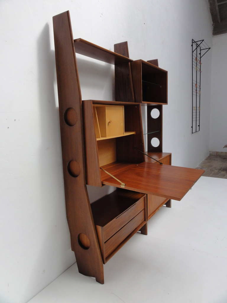
While most fans of Danish Modern or mid-century modern furniture are aware of Hans Wegner, Arne Jacobsen, the Eameses et. al., Louis van Teeffelen's name may not ring a bell. Which is a shame as the Dutch designer created furniture every bit as striking as the work of his contemporaries.

Along with sometime collaborator Jaap Ravelli, van Teeffelen put Dutch furniture company WéBé on the map in the 1950s, becoming their head of design in 1955.

Van Teeffelen designed chairs, sideboards, desks, coffee tables, dining tables, storage units and more.

WéBé's furniture became so popular throughout the 1950s and '60s that they amassed their own shipping fleet.

Shortly after van Teeffelen left the company in the late '60s, WéBé went into a decline from which it never recovered. Sales slumped through the '70s and '80s, and the company was shuttered for good in the '90s.

Today van Teeffelen's pieces are sought after on the secondhand market.

Umbra Fall 2016 Collection Helps You Organize Your Kitchen, Jewelry and More

$
0
0

Umbra has always had numerous relatively inexpensive organizing-related products, and the company's newest releases include some items that definitely caught my eye.

The Peggy drawer organizers expand from 17 inches to 21.5 inches, so they can fit a wide range of cabinets and closets. The two boards come with 16 pegs, which can be positioned wherever they are needed.

These organizers provide end users with an easy way to handle the ever-present "what to do with the lids" problem. And for those of us without table saws, they're easier to properly size than cut-to-size peg system drawer organizers. The trade-off: There's less opportunity to get a perfect fit, since there's only one width. 

When I recently wrote about avoiding kitchen sink clutter I hadn't yet seen Umbra's Sling flexible sink caddy, made of plastic-coated wire that can form to the shape of the end user's sink.

The Sling can hold a brush (vertically or horizontally) or a sponge, and it can hang from a faucet neck or a sink wall—so it's a very versatile product. One purchaser even chose to hang it from the end of a dish drying rack. 

The Tug paper towel holder isn't a new product; only the copper finish is new. But it's an interesting item, with a curved rubber center to secure the roll and a weighted base; it's designed to let an end user remove paper towels one-handed. And most purchasers seem to agree that it does indeed do that. Purchasers also like that they don't need to unscrew an end piece to replace the roll; a new roll can just slip onto the holder. 

There are plenty of other paper towel holders designed for one-handed use, including those from OXO (with a spring-activated arm), Joseph Joseph (with a tearing blade) and Kamenstein (with a ratchet system to prevent rolls from unraveling). The Umbra one seems like the simplest design, with fewer parts to possibly wear out than some of the others. 

The Terrace jewelry organizer has three removable trays: one is just a large open space, one has small compartments, and one has ring holders (and an open space on the other half). Trays are a nice jewelry storage device both for ease of use and visibility. I've worked with clients with lidded jewelry trays; this might be a somewhat easier-to-use alternative, with no lids to deal with, although it wouldn't fit in a dresser drawer as the other trays do. (And those concerned with dust won't like having open trays.) 

Also, I wish the end users could specify which tray designs they wanted, rather than only having the option of one of each. An end user who doesn't wear rings (to take just one example) would have half a drawer of wasted space.

The Circa jewelry organizer is interesting in that the top portion can hold rings as well as bracelets and watches; that's a clever design. However, the earring storage space is quite limited (and may be a bit awkward to use). Most earring wearers I know regularly rotate through more pairs than this organizer would hold.

The Hangit desk frame has two rows of twine and comes with six clothespins. Although it's shown as a way to display photos, I look at it and see another way to keep small pieces of paper from getting lost on a desktop or other work surface. Including a few more clothespins might have been nice, but at least it's easy and inexpensive for the end user to get more from any number of sources selling clothespins.

The Estique multi hook can be mounted over a door or directly on the wall; hardware is included. The wood balls are nice for ensuring the clothes don't wind up with snags. The one drawback with this type of design: Large items like coats, hung on anything except the bottom hooks, will often hide other items. And even if the other item is something long like a scarf, it will be somewhat difficult to reach if a coat is hanging above it.

The Holdit umbrella stand, designed by Wesley Chau, has a weighted resin base. It accommodates both standard umbrellas and compact ones, which can hang over the frame using their wrist straps. (That's a somewhat different approach than most designs that work with compact umbrellas.) My favorite umbrella has a somewhat short strap, but after measuring I think it would indeed fit over the frame. 

The Strum shelf can be mounted in three different orientations; it looks like it would be good for holding things such as magazines and file folders. Each shelf can hold up to 10 pounds. It's one more nice alternative for making good use of wall space.


How Quantum Physics Might Help Us Design More Elegant and Scalable Solutions 

$
0
0

As the founding director of Parsons' Transdisciplinary Design program, Jamer Hunt has been championing the possibilities of a systems-based, postindustrial design approach to social innovation and service design for over a decade. Using New York City as an academic laboratory, students work to, "define the next phase of design practice globally." In addition to Hunt's role at Parsons, he has curated a number of provocative programs including the Design and Violence series and Headspace: On Scent Design exhibition at the Museum of Modern Art.

In anticipation of his keynote address at next week's Core77 Designing Here/Now Conference, we speak to Hunt about design for social innovation, the ripple effect in systems and how design might create more elegant and participatory solutions to complex problems.

* * *

Core77: Since founding the Transdisciplinary Design program at Parsons in 2010, how has the field evolved and what are some of the current challenges that have emerged for your students?

While I'm not sure that there even is a field called "transdisciplinary design," I would say that the field of design for social innovation has exploded over the past six years. There are now many academic programs that teach design for social impact, and in fact there has been a boomlet in consultancies that do this work, too. 

Softwalks by Howard Chambers and Bland Hoke activates sidewalk sheds by providing a kit of parts to create more functional public places. Thesis project from Parsons Transdisciplinary Design program.

That said, I'm still not quite sure what the field will look like in ten years. I worry that there's a huge amount of good will and good intentions to take on intractable social challenges, but I don't know if the economy can sustain all of this (relatively) non-commercial work. The good news is that there has been a influx of new types of clients—NGOs, government agencies, foundations, universities, research organizations—who are bringing new resources to the table. The flip side of this growth, however, is the question of the efficacy of this kind of work. Are we able to claim that we are producing real value and change, or just feeling good doing meaningful work? It's a question that we're only now starting to find the tools and techniques to address.

The other seismic shift has been the rise (in parallel) of design thinking and strategic design. Most of the graduates from the Transdisciplinary Design program are taking jobs with consultancies as "strategic designers," a category that barely existed ten years ago. This has led both to a huge demand for design and designers (witness the gobbling up of design firms by bigger agencies), but also drift away, as I see it, from what designers do best—make things.

Parts of The Liberator, a 3D Printed gun by Defense Distributed. Part of the Design and Violence series co-organized by Jamer Hunt and Paola Antonelli at MoMA.

Your talk for the Core77 conference references quantum mechanics. How did you first engage with this difficult subject and how did it begin to influence your own work in designing systems.

I became interested in scale because I kept coming across the strange behaviors that systems generate when they scale up or down in size. In particular, since we now see so many of the more complex problems that we face as system-level phenomena, I became fascinated by the idea that small perturbations in complex systems can sometimes create cascading change. I'm no quantum physicist, but what caught my eye was the fact that at the quantum scale we see systems operate in counterintuitive and almost counterfactual ways. It became another point of reference for me in thinking about the unanticipated behaviors of systems, and whether we could draw any inferences about larger systems, and what is possible, from the unexpected behaviors at the quantum scale.

I also see quantum phenomena as a further example of our own, human disorientation in the face of scalar shifts. I feel as though we have lost touch, literally, with scale, and that the rise of digital work and sprawling networks have subtly but meaningfully remade our relationship to scale. Given that, the question is how we develop tools and methods—scalar framing, mesoscale design—that can help us to manage that disorientation and make sense of the complex world around us.

Prodega is a service for bodega owners that seeks to incentivize the sale and consumption of healthy foods. Thesis project by Ashley Graham, Chisun Rees, and Leah Cabrera Fischer from Parsons Transdisciplinary Design program.

The term mesoscale is typically used in describing weather systems but in your newest work, you apply it to designing participatory and open systems. How do you hope this approach will be applied in designing consumer products of the future?

I think that we can imagine more open systems for designing things that leverage the power of networks to create more dynamic, almost "living" processes of production. I've always beaten my head against the wall of choosing between top-down and bottom-up systems of production, because each has its evident flaws. My idea of a meso-scale approach to design requires designers to design the scaffold or the platform for the emergence of unanticipated outcomes. But these systems cannot be only bottom-up, they require design intelligence to generate the platform for effective and even elegant participation. I think we're only just beginning to scratch the surface of this sort of design practice.

Learn more about design at the mesoscale at next week's Core77 Conference in Los Angeles. Buy your ticket today!

Reader Submitted: A 3D Printed Box That Aims to Control Your Cigarette Intake

$
0
0

How many times a day do you crave for your nicotine shot, almost unconsciously? Can't remember how many smokes you had at the end of the day?

Take5 is a nifty little box with room for just 5 cigarettes, a lighter and 5 mints. Fill it before you leave home. Spread your dose during the day. Keep count, without even opening your Take5.

View the full project here

Hand Tool School #3: Difficult is Just Easy Work Done Slowly

$
0
0

What was the last difficult moment you had with a project? Was it a particularly complex joint or a nasty bit of figured grain? How did you tackle it? I bet the solution, regardless of the tools being used, was to slow down and take care of it meticulously. If you think about it, "difficult" tasks just force us to slow down. Sometimes to glacial speeds.

So when you look at it that way, no project is really that hard to make, but rather just slower.
It's quite liberating!

I'm a firm believer that any woodworker of any skill level should feel free to tackle any project that strikes their fancy. Woodworking is just a series of individual tasks, often repeated many, many times. Break down those tasks far enough and you will see just how simple a project can be. For that matter, the tools we use to do those tasks play a major role in how "difficult" it is to accomplish.

Consider the humble groove for, say, a drawer bottom:

Option 1

Cut with a router and a bearing guided bit, this is fast and easy. The slow part is in setting the bit height and securing the workpiece. Now drop that router into a table with a lift and the groove becomes even easier (faster). 

Option 2

On the non-powered front, using a plow plane is just as easy. Set the fence and depth stop and the joint is a cinch. 

Option 3

Take away the plow plane and hand the woodworker just a chisel. Funny how "difficult" that simple groove is now. In actuality, the act of using a chisel to chop out a groove is as simple and easy as can be, but you have to go slowly and meticulously lay out the extents of the groove. And you've got to be careful of taking too heavy a bite with the chisel while ensuring you maintain an equal depth. There are a lot of variables to keep track of that, with other tools, we could rely on fences and depth stops and bearings to take care of.

It's the same joint, but each method discussed above takes different amounts of time and can therefore be perceived as more difficult than another.

Now I have cut grooves using all of these methods (plus a few more) and one quickly learns that this "difficult" joint can be made easier by bringing to bear a different tool. But that's not always the case. Whether because the best tool is cost prohibitive or just so specific as to not be logical for a unique situation. But there are also times when no matter what tool you throw at the problem, it won't speed things up. These tasks are the truly difficult ones that scare many a woodworker away.

For me it was the ball and claw foot. There were several lovely furniture pieces I wanted to build but they all included the ball and claw foot. I loved this detail and didn't want to skip it so I seemed to have no option but to either cower in fear or suck it up and learn to carve this detail.

My first example took me about five hours, but when finished it looked really good. I would not have hesitated to use it in a project. There was no way to speed this up other than make some more and to get more comfortable with the steps and with the carving gouges. But as evidenced by the respectable appearance of my first foot, it wasn't hard at all, just slow.

Hopefully you are starting to see what I'm talking about and perhaps that bucket list project of yours went from scary and difficult to something that you just need to slow down and get done.

Your Turn

Name a difficult woodworking task that has you stumped. I bet we can figure out an easy way to do it slowly.

________________________________________________

This "Hand Tool School" series is provided courtesy of Shannon Rogers, a/k/a The Renaissance Woodworker. Rogers is founder of The Hand Tool School, which provides members with an online apprenticeship that teaches them how to use hand tools and to build furniture with traditional methods.


How to Grow Objects With Mushroom Mycelium

$
0
0

You might be familiar with Danielle Trofe's Mush-Lume lighting collection and the concept of growing objects with mushroom mycelium—we've covered both stories on our site before. Thanks to Trofe and Ecovative Design, I learned how to DIY my own mushroom-grown container in the comfort of the GROW studio space at Industry City, Brooklyn. Yes, I really did grow a mushroom mycelium planter in my kitchen last week—here's a breakdown of the process. Learn the basics and then freestyle—post your creations in the comments!

Trofe's Mush-Lume lighting collection.

Much to my surprise, the process isn't complicated at all—I was intimidated by the strange live material at first, but I quickly realized how friendly it can be. All the mushroom material needs to start its new life as a planter are flour, water and patience (about a week of patience, to be exact). Just add regular flour and water to a mixture of dry chopped mushroom roots and agricultural waste (seed husks, corn stalks, etc.)—the flour acts as a food source, and the water activates the growth process. 

White fibers are a good sign!

During the next three or four days, the mushroom mycelium will recognize the agricultural waste and flour as food and begin coming back to life. The mixture will form white fibers in the process. Break the material up again by hand (don't forget gloves!) to prepare it for its growth into your desired shape—in this case, small planters.

Before molding into a tool (a growing container), poke a generous amount of holes in the lid and a few on the bottom of the tool to allow air flow. We used plastic containers as our tools, but feel free to get creative with your material choice—wax, wood and clay are all in the clear, just make sure your material is waterproof and non-porous. During the molding process, the mushroom material feels like it won't stay in place due to its relatively dry and crumbly texture. This is OK—the mushroom material's bonding power is stronger than you'd think. Make sure to pack the material in tightly, but keep it loose enough to allow air flow—fungi is alive, after all.

Once left to sit in the mold for four days, the mushroom mycelium needs to sit for one extra day in a sealed plastic bag, allowing the material to set itself. Air flow is key throughout this whole process—blow air into the bag and situate it in a way that none of its sides are touching the tool (except the bottom). After one day, remove the planter from the bag and its mold, and let it sit on a cookie cooling rack for one extra day. I also put mine in front of a fan to help with drying, which worked out well. You'll notice that the planter feels strange to the touch. After racking my brain for awhile, I came to the conclusion that it feels exactly like the moldy rind that encases brie cheese.

Looks like brie, but avoid giving your object a taste test!

Since mushroom mycelium is live matter, it needs to be heated in order to lose its activity. I found myself feeling guilty thinking about killing the fungi I'd spent the last week nurturing. However, if this step is skipped, little mushroom spores will start growing out of your product, which is not the desired result. 

My finished planter coming out of the oven—note the slightly browned edges.

Bake the pot at 200 degrees F for 30 minutes. I panicked when I realized my oven starts at 250 degrees F—luckily I'm a baker and thought to bake mine at 250 degrees F for 25 minutes instead, and it turned out well. When you remove the planter from your oven, you'll notice that its moldy hand feel has been replaced by a stiff, paper mâché-like one. This means you've done well, and your final product is ready to function as a planter, or whatever else you have in mind. Drill or poke a small hole in the bottom of your planter to allow water drainage, and you're all set to plant your small plant—one that doesn't require a lot of moisture works best. Yes, it really is that easy.

An example of one of Trofe's finished products. She chose to use this one as a bowl instead of a planter, but it would be just as safe to pot her plant directly in the bowl.

After awhile, your planter will start to degrade and lose its shape. No worries! Simply re-pot your plant in a larger planter while still inside of your mycelium one. The mycelium material will break down, acting as a food source for your plant as it adjusts to its new home.

Want to try this process out yourself or learn more? Go for it!

'Crocs With Rocks' and Other Questionable Footwear Collaborations 

$
0
0

Those of you keeping up with the Spring/Summer 2017 Fashion Weeks know that it's been a time for self-expression and boundary pushing design within the realm of footwear. However, it's not the wacky animal heels or plastics that are getting people riled up this season—it's three internet breaking collaborations. We round them up here for your viewing pleasure, followed by a trip down awful footwear collaboration memory lane:

Channel Your Inner Ewok

The Teva X UGG Hybrid. Image courtesy of Teva.

Ever wondered what would happen if you could merge your surf shearlings and river sandals into one, watery, all-weather shoe? Well, Teva and UGG have blessed the Earth with two children this season: The Teva x UGG Sandal and the Teva X UGG Hybrid.

The Teva X UGG Sandal. Image courtesy of Teva.

Teva describes the shoes as a marriage between the ocean and the river, but this elusive description sheds no light onto what context these sandal-boots are meant to be worn in. With or without socks? What climate? During what activity?

It's very rare to see two footwear brands join forces to create a collaboration shoe, and this could be why. At least someone is future gazing solutions to uncomfortable ankle braces.

Don't panic, both shoes are still available for purchase.

Spring/Summer 2017 is Off to a Rocky Start

Image courtesy of popsugar.com

It appears as though Christopher Kane hates Crocs too, so he found a way to stone them through design. I have a certain level of respect for that. 

Kane and Crocs could have gone for an abstract concept because otherwise, this shoe is downright lazy. Nothing about this design screams Christoper Kane—missing the point of a collaboration. Crocs could have been feeling earthy one day and decided to switch their removable rubber charms to rocks without the madness of this collaboration. It's called fashion, people.

Putting the Wild in Wild West

These double-sided Hood By Air X Frye boots are arguably the most inventive of the three collaborations, but they are getting the least attention. It's difficult to find words to express my conflicting emotions, but the question, "were the models walking forwards or backwards?" comes to mind.

* * *

Let's not forget that jarring footwear collaborations are nothing new. We're feeling nostalgic for the the over-designed, the lazy and the sloppy collaborations we've seen over the past few years—let's take a look at our favorites:

Try to Hide in These Bad Boys

Image courtesy of Sole Collector

Yes, Jeremy Scott and Adidas went there. While Scott can be applauded for taking sneakers to a whole new level of comfort, this 2013 camo version of his classic teddy bear shoe took things a little too far. If only the bears could come to life like Ted—now that would be an interesting conversation.

Bringing Fashion to the Campsite

Here's a head scratcher from Supreme and The North Face. Supreme is known for their sought after shoe collaborations with Nike and Vans, but the pattern choice/placement on these 2014 ThermoBall Traction Mules is concerning because the pattern is disrupted in a strange way by the quilting. Hopefully this situation resulted in some takeaways for Supreme, including the importance of selecting the right pattern for your material.

To Infinity and Beyond

Last but not least, we have the problematic sequel to the The Kobe, The Kobe 2, circa 2002. The three-way collaboration between Audi, Adidas and Kobe Bryant was a success the first time around with The Kobe, but they should have quit while they were ahead. Is it possible for something to look so futuristic and minimal it feels outdated?

Here's to hoping the new direction of footwear collaborations moves away from brand overload and instead incorporates real technology—I'd love to see an updated version of Shaq's cellphone sneaker in the near future.

What's your favorite/least favorite footwear collaboration of all time and why? Let us know in the comments section below.

Conor Coghlan's Bow Spring Chair

$
0
0

Conor Coghlan might be an architect, but as part of his studies at Harvards' Graduate School of Design he participated in a furniture making workshop. Tasked with producing an original design, Coghlan writes that he became "interested in how the arms and legs of the chair could work in unison as a type of double bow spring structure—becoming extremely strong under direct loading, yet flexible and responsive to the shifting load of the user."

Here's how he executed his plan, and it's fun to watch because we see every step from the sketching to the modeling (both physical and computer) and then the fabrication:

"The legs/arms of the chair are made from steam bent, glue laminated strips of ash," Coghlan writes, "and the seat is made from glue laminated birch plywood. Throughout the semester I employed many different techniques of fabrication from hand files to CNC lathes."

Looks pretty darn good!


How To Make Affordable Student Housing: Stick It In the Bay?

$
0
0

How do we deal with skyrocketing rent and housing shortages? Housing start-up Urban Rigger wants to build more low cost apartments on fancy boats. Their first freshly finished Copenhagen project was designed by Bjarke Ingels and it offers a few slick twists on the traditional dorm. The boat apartments are modular buildings, constructed from shipping containers, and located in industrial waterways. The 12-person buildings feature private bedrooms, baths and kitchens, with shared living spaces. And, most crucially, rent is set to be just $600 a month.

Copenhagen, like most popular post-industrial cities, is gripped by a rising cost of living and housing options that can't keep up with demand. This intense housing market leaves low income but high-value residents like university students with so few options as to discourage staying, or moving to the city at all. This uninviting market for students can have lasting negative effects on a city's economy. To address this, Urban Rigger has examined the frustrating housing economics, considered the common proximity of city centers to trade hubs, and rolled out their aquatic alternative.

Urban Rigger found that some 80% of European universities are located within the urban core of large cities, while the majority of students who live off campus are forced to dwell far outside. City center and waterfront property is almost universally inhabited by upper class citizens, so Urban Rigger hopes to move into underutilized water spaces left over or not needed by industry. Giving students an option to live closer to central neighborhoods creates greater opportunity for social connection and community building, and cuts down the opportunity costs of commuting. 

Like the beloved lofts and warehouses that jumped the shark before it, low income use of waterfront (water-on?) property could provide room for lower income citizens in areas they can't normally afford. This type of intentional inclusion of creatives and students in central areas is seen as provably beneficial as large cities shift to more "knowledge-based" economies and enrollment remains high. 

The floating apartments are built in Hungary and wind up costing just $700-800 per square foot, thanks to the structural leg up from the shipping containers. While the appeal of shipping container homes is largely an optimistic aesthetic, traditional dorm life is cramped, expensive and depressing, so a nice view and lower rent sounds fine. The start-up is currently independently paying for its own access and mooring, but anticipates greater municipal support and land will be offered as the project proves viable. 

Urban Rigger, like the Bjarke Ingels Group, hopes to harness resources seen as negative or neutral, to build social resilience. The fact that the homes are floating is hardly coincidental. As environmental instability looms, making value out of cheap real estate that stays valuable is a boon. In this case, houseboats might literally float above the turmoil. 

Ingels is quoted as saying "It's the only building type that will never flood." Though I appreciate the sentiment, I'd recommend a hearty chat with anyone who's ever lived on a houseboat as to how strong that "never" really is. It's just as fair to say that most apartment buildings can't sink. Or make you seasick if your neighbor is throwing a rager.

The novelty and success of this particular project aside, I'm fascinated by the long term impact of residentializing industrial areas, particularly for lower income use. Adding density is clearly necessary, but sometimes it takes more than building. Houseboats may skirt the issue of topsoil contamination, and most students probably won't be fishing for a mercury-eating fish dinner, but ports have long been the site and source of pollution. Hip mixed-industrial neighborhoods in places as eco-conscious as Portland, OR regularly make the news for slowly poisoning residents with both old uncleared waste and fresh poorly-regulated contamination. To say nothing of the dangerously low environmental standards held for public and low income housing.

That said, this type of start-up is entirely unlike the austerity measures and homeless camp sweeps currently happening in America's largest cities. So what do I know? Efforts to incentivize and beautify mixed income housing in urban areas are vital to cities' long term stability, and I hope to see more momentum around this type of project, both privately and publicly. 


Design Job: Clean Up Your Life. iRobot is Seeking a Sr. Industrial Designer in Boston, MA

$
0
0

iRobot, one of the world’s leaders in the design and development of AI technologies and consumer robots, is seeking an amazing Senior Industrial Designer to join our Industrial Design/User Experience (ID/UX) team in Greater Boston. With iRobot’s sharpened focus on home robots and connectivity, the ID/UX team is central to delivering on the Brand promise of “Empowering people to do more” – with designs that embrace simplicity, approachability and seamless usability as a means of humanizing robotic technology.

View the full design job here

Medical Hackers Reveal How to DIY an EpiPen for Just $30

$
0
0

Since acquiring the rights to market the EpiPen in 2007, pharmaceutical company Mylan has raised the wholesale price of a two-pack from around 100 bucks to over $600. This trend will only continue, because the drug companies know there's not a damn thing anyone can do about it.

Or is there? A collective of medical hackers called Four Thieves Vinegar has developed DIY instructions for consumers to create their own EpiPens, using off-the-shelf parts, for about $30. In the video below, head hacker Michael Laufer shows you how doable it is, and yes, he sticks himself with the autoinjector to prove that it works:

FTV is calling their version the EpiPencil. The Parallax reveals why they created it: "You know there are people who are just not buying an EpiPen because they can't afford it," Laufer says. "That's unconscionable."


Surprise! Watching A $2.6 Million Watch Get Made Is Gorgeous

$
0
0

Nice watches live in a weird world of engineering and opulence. This video shows some of the tight tolerances, subtle labor and utterly bonkers design that went into Patek Philippe's 175th anniversary wrist watch: the Grandmaster Chime 5175. 

If you aren't familiar, the Patek Philippe brand is legendary for skilled watchmaking and an objectively batshit level of mechanical complexity. We design likers tend to be familiar with fancy objects of all types, but the realization that a $2.6 million watch really exists was a shock for me. While its price tag will never feel reasonable, this commemorative edition was intended to push the brand's already famous limits on design and execution. While it's ludicrous as a watch it succeeds at pushing an envelope. The result is a mind boggling mess of solid filigree gold and frivolous functions, and the process shots are fittingly dramatic and exacting:

I too stare somberly at my estate before commissioning multi-million dollar hubris projects

When the Grandmaster debuted in 2014 (after a decade of conception, design, troubleshooting and meticulous Swiss wizardly construction) it was the most mechanically complicated wristwatch anywhere on record. Its final design utilizes both front and back faces, flipped with a mechanical pivot, to add room for more complicated gadgetry. 

Its jam packed features include a manually wound movement, chiming minute repeater, alarm with time strike, date repeater, a second time zone, a second time zone day/night indicator, a perpetual calendar, day and month indication, date indication (NOT to be confused with day) on both faces, leap year cycle (god forbid you have to look it up), and real time moon phases. 

By now the hyper-limited run of 7 pieces probably all live in temperature controlled safes, rather than on the wrists of international unicorn trading tycoons. But it's kind of fun to imagine these overwrought masterpieces hanging out of a sleeve, ready to offer up a zillion types of time.


Attractive Baking Tools That Save Time and Reduce Mess

$
0
0

A2's newly-hatched brainchild, Bakelicious, is a creatively cohesive line of baking tools that adds a touch of personality to practical objects. Just a little icing on the cake for your weekend baking needs!

View the full content here

A Table That Seamlessly Blends Walnut and Brass

$
0
0

Brass and walnut are two great tastes that taste great together. But I've never seen the two materials integrated in such a beautiful way as this:

That's the Nola Dining Table by Brooklyn-based Wüd Furniture Design. The description states that the table is constructed from "bronze encased in resin," and I have no idea how they pulled this off. Wüd founder Corey Springer is a sculpture design graduate from the University of Massachusetts, and presumably the man knows a thing or two about bending materials to his will.

Unsurprisingly, there are not a bunch of these sitting in a warehouse; Springer & co. make them to order, with a lead time of 10 weeks.


Viewing all 19136 articles
Browse latest View live


Latest Images