Quantcast
Channel: Core77
Viewing all 19137 articles
Browse latest View live

Design Job: And the Rest Was History! MICA is Seeking a Full-Time Art History, Theory and Criticism Professor in Baltimore, MD

$
0
0

The Department of Art History, Theory, and Criticism is seeking to fill a full-time, renewable position teaching the history and theory of industrial, product, and graphic design in a department that offers courses to undergraduate and graduate students. We are especially looking for candidates who can teach both general and specific courses in these areas of material culture across a broad topical, chronological, and geographical range.

View the full design job here

A New Design Studio Tackles 26 Design Briefs in 26 Hours

$
0
0

Have you ever wondered what it would take to start your own design studio? Despite all of the open-source information for a variety of subjects available on YouTube and Reddit, it's still a topic that lacks instructional transparency. HAWRAF, a very newly formed New York based studio housed in NEW INC hopes to demystify this process by showing their journey to becoming a design studio—day by day, step by step. "Part of our studio practice is making work where we learn in the public space. It's part of an initiative we're doing to make the creative industry a little more accessible," the team notes in their press release for A-Z, their kickoff public project as a studio.

HAWRAF's mission with A-Z? To establish a structured design process by responding to 26 design briefs over 26 hours. Every hour, the team will choose a word from the dictionary and create a design brief around it—the first hour they will tackle a word beginning with the letter A, the second hour a word beginning with the letter B, etc. The team will document this process through live streaming and will rate each project based on how well they worked together to execute each project (read up on the objective of the A-Z project here). 

This long-form process will inevitably highlight all the successes and mistakes the team goes through. The live streaming element is incorporated in hopes of exposing the true chaotic nature of design work and the amount of teamwork it takes to form clear design objectives—so it's sure to be an eye-opening ride.

Check out HAWRAF's live stream here, which will be running live today until November 16, 9:00 AM EST. 

Fighting Coastal Erosion With The Power of Mangroves

$
0
0

Leggy concrete tetrapods are commonly used as a bulwark against coastal erosion and tidal violence, but they can leave a bit to be desired. In designer Sheng-Hung Lee's opinion, they're both ineffective and unattractive. Looking at Taiwan's bleak beaches he began to notice that the heavy concrete blocks aren't as permanent as they appear, and that they appear… pretty ugly. The solution is the TetraPot, an amended tetrapod that taps the structural benefits of mangrove trees. 

Mangroves are rightfully famous for their resilience in stagnant and saltwater environments. Their long rooting structures add strength against erosion in swamps and coastal areas all around the world. Designed around a 3-part mold similar to the traditional model, the TetraPot adds a central chamber where a biodegradable planter and seedling tree can be installed. 

Placed densely, the concrete blocks would provide initial stability while the quickly growing trees develop root structures that reach towards the water. As they grow, the trees would create a deeper tie to the soil, protecting the concrete blocks and each other from watery abuse. 

The concrete and trees would provide a helpful sanctuary for local animals and other plants, adding to the ground stability in the area and improving the visual landscape immeasurably.

As oceans rise and coastal security becomes a more pressing issue, this type of ecologically minded resilience tool will become increasingly valuable. The TetraPot has won a host of attention this year—from a James Dyson Award to the Red Dot—so maybe you'll see some growing on a coast near you. 


Reader Submitted: A Magnetic Pen for the Fidgeter in All of Us

$
0
0

The Quotidian Pen is a minimalist ballpoint-pen that features a magnetic propulsion mechanism, which will change the way you see, use and fidget with a pen. The entire experience of the Quotidian Pen is sure to fascinate.

View the full project here

Look Inside a Private Jet Designed by Marc Newson

$
0
0

En route to cover Autodesk University, I did JFK-to-McCarran in a cramped Airbus A320 where my seatback screen's controls were located on top of a shared armrest. Because the enormous gentleman next to me fell asleep with his arm atop the rest, changing the channel and adjusting the volume required waking him each time. Not the ideal UX.

Naturally, upon landing I asked myself what the opposite flying experience would be. No, not first class; I mean a private jet kitted out by a top designer. And I found it. Behold: A private Boeing 737 with an interior designed by Marc Newson, for the UK's Freestream Aircraft.

Even though there's no one sitting next to you, Newson knows better than to design seat-mounted controls where your arm is going to go. So, he's got them tucked away in a little alcove in the armrest.

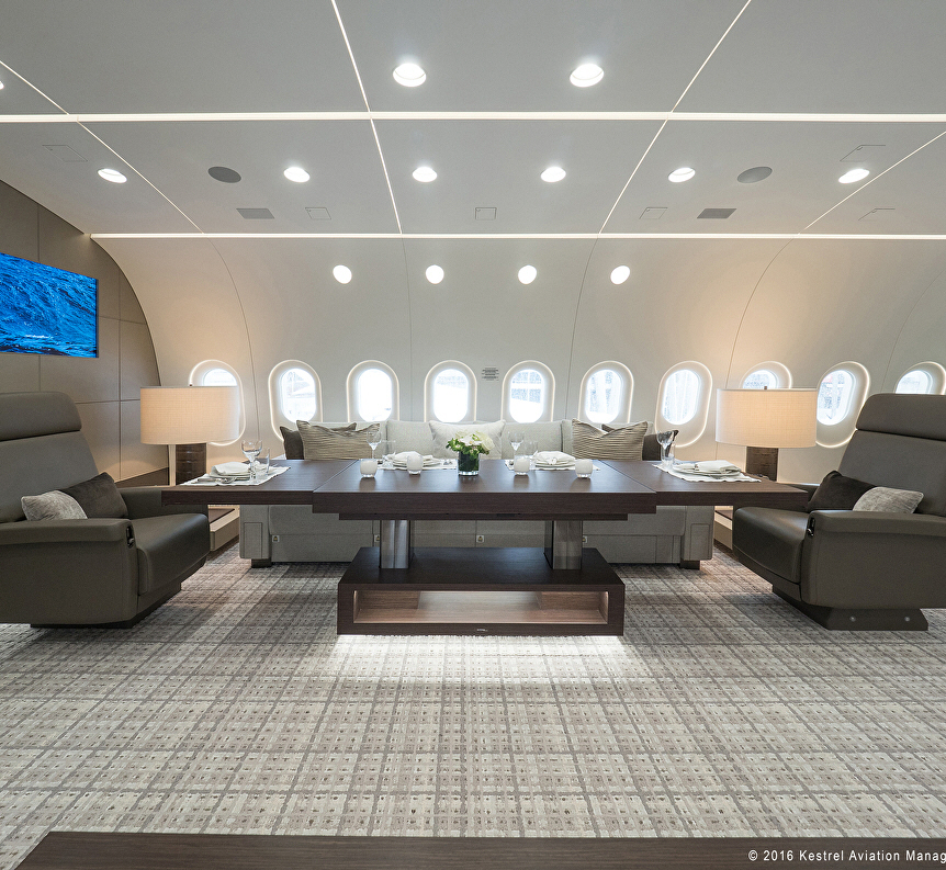
Here's the on-board conference room, with an image of the world you and your co-masters-of-the-universe are about to dominate displayed on the flatscreen.

I love that all of the seats, including the couch, have seatbelts. This way you can tell meeting participants to "buckle up," and mean it literally, before you make a momentous announcement.

Meeting participants who express hesitation at your plans for world domination are banished to this small chamber seen at left.

Inside the chamber they sit at this small nook, where they are instructed to read an entire issue of Vanity Fair and prepare a book report on it. The backless seat is meant to communicate a loss of status.

Yes-men, meanwhile, are treated to tea and sweets in this lounge area. Two books are provided for their reading pleasure: The first is your autobiography. The second is a leather-bound collection of book reports on various Vanity Fair issues, to remind them of what happens when they step out of line.

Below you can see that the owner has managed to save up for this jet by sticking with an older MacBook Pro that still has the CD slot in the front. Good things come to those who hold off on upgrading.

On to the master bedroom. Speedboat racing is beamed onto the screen, 24-7, via satellite.

At first, the design language might seem a bit strange: This light fixture over the bed recalls a turbine, perhaps providing a sensation that you'll get sucked up into it while snoozing. Then there are those odd keyhole-shaped fixtures in the leather headboard.

The keyhole shapes turn out to be form-follows-function. They're reading lamps that tuck away when not in use. I don't have a wise-ass comment about these, and I think they are pretty cool.

The master bathroom looks pretty awesome. For starters, the shower is bigger than the one in my Manhattan apartment.

So is the sink and vanity area.

You'll note there is no sign urging you to wipe out the sink basin as a courtesy to the next passenger.

I noticed that the toilet is not shown, and I thought it would be funny if this was actually the toilet. As in, you lift the lid and there's nothing there, just empty sky whizzing past beneath you while your hair starts to blow around.

Anyways, see you in coach.

Some Design Fails from My Las Vegas Hotel Bathroom

$
0
0

I think a great example of simple-but-effective industrial design is the curved shower curtain rod. Having grown up in a household with a straight shower rod and spent countless cumulative hours fighting off a wet, clingy curtain, I think the curved ones are the bee's knees. So I was pleased to see that my hotel room in Vegas has one.

However, in this bathroom, you can see what happens when things are designed in isolation, as opposed to within a cohesive system. First off—the shower curtain rings. You've undoubtedly seen these, with the little balls on them so that they roll smoothly:

Well, the diameter of the curved shower rod does not jive with the curtain rings, which have an interior diameter further reduced by the balls. If you lock the rings shut, they bind on the rod and the curtain won't slide. So, Housekeeping's solution is to leave the rings open.

Also, the thing about the curved shower rod in this bathroom is that it intrudes into the path of the door.

Whomever does maintenance here has thus outfitted the door with a rubber stopper, which you can see in the photo above. However, the cantilevered weight of the shower rod and curtain has caused the shower rod mounts to pivot out of vertical (I can freely wiggle them with my hand). 

Thus, the shower rod sags in the middle. So when you open the door…

…it bangs right into the rod, metal on metal, below the stopper's location. The impact makes an unpleasant noise.

The shower rod is predictably dented...

...and the door is marred as well.

So why am I writing about this? Because I'm jetlagged,  I've been up since 3:30am and the conference I'm covering doesn't start until 10am. Earlier, I was walking around in the casino and taking photos of design features on the slot machines and gambling tables in hopes of writing about them, but a guy from Security started looking at me a little funny, and I don't want to get my fingers smashed with a hammer like that guy in Casino.

"Don't do this—I work for Core77! I write about design! Come up to the room and look at my shower rod!"


How Tall Is Your Butter, and Why?

$
0
0

Ever had a butter dish that didn't fit your butter? Not to put too fine a point on it, but it might be a territorial thing. East coast butter sticks are long and thin and West coast sticks are thick and stout. They each clock in at 4oz., but the dimensional difference is real and noticeable. Beyond the obvious fact that east coasters are tall and neurotic while the left coast leans thick and athletic, there's a slightly silly reason why. 

At the turn of the 20th century, before our country had gone fully packaging bonkers, a very simple invention changed how we visualize and buy a lot of our food. It was created by designer, Frank Peters, and first showed up in his packaging for Uneeda brand crackers back in the 1880s. The game changing "Peters Package" technology was the idea of wrapping a food in a sealed container, and then putting that container inside another cardboard carton. Sounds obvious now, but it was revolutionary. Suddenly, freshness lasted longer, delicate foods could be stacked and food portions became regularized. 

Butter had previously been distributed in large wooden tubs, portioned off and sold to the customer in one pound lumps, wrapped in wet cheesecloth. Yum! A huge butter lump may have had its benefits (I bet it would be a real game changer in snowball fights), but after a Louisiana restaurant magnate asked his distributor to Peters package his butter, the idea caught on like wildfire. A package of four quarter-pound sticks became the norm as the public became endeared with the cleaner and more easily measured units. 

By the middle of the 20th century, the leftward side of the country was lagging behind national average on dairy byproduct production. The western market was booming to the point where there was hardly any milk left for cheese and butter after drinkable, pourable milk was portioned out. Maybe it was all our surfing, hiking and fad dieting that drove us to drink up all our milk, but dairy production was hurting. By the '60s, the state of California had stepped up its production aggressively. Its far newer machinery differed in several ways to the older tech, resulting in "butter printers" that made a shorter and stouter sticks. As the state acquired a majority stake in the butter scene, the thicker sticks became standard west of the Rocky Mountains. 

Despite zero functional differences, the regional size divide remains today thanks to tradition, and some national manufacturers produce both sizes to meet both markets' expectations. The eastern style sticks are known as "Elgins," likely after Elgin Machine Co., the manufacturer behind the majority of butter processing equipment in early US, who also—naturally—specialized in watchmaking tools. And out west? We get the cute if less appetizing "West coast stubbies."

Boeing 787 Dreamliner Converted to Private Jet

$
0
0

In addition to the Marc Newson plane, I found another opposite-of-coach flying experience, and this one's a doozy: A company called Kestrel Aviation Management was hired to transform a freaking Boeing 787 Dreamliner into a private jet. "This 2,400 sq.ft., 40-seat corporate aircraft," the company writes, "has a nearly 9,800 nautical mile range and the ability to fly over 17 hours, non-stop between almost all major cities on earth."

The floorplan is interesting: As you can see below, the master bedroom is located in the front of the plane, just behind the cockpit. Since I'm a plebe who's thinking in bus terms, I wrongly assumed it'd be in the back. But getting it forward of the jets probably makes it a much quieter space.

The design is broken up into three parts. The central portion is taken up by this lounge area:

The tables can switch from coffee table to dining table height, and have wings that telescope out of the ends.

In the back of the plane, you've got a sort of business-class-style seating section, two bathrooms and a galley in the tail.

Up front is the aforementioned master bedroom, with an en-suite master bath. The pilots access the cockpit via a hallway that does not intrude on the master bedroom space, so you needn't learn the pilots' names.

These before-and-after shots of the main cabin are pretty striking.

Via Australian Business Traveler, via Reddit


Design Job: Chill Out—Puffco is Seeking an Industrial Designer in Brooklyn, NY

$
0
0

About Us: Join the fastest growing industry in the world. Puffco is the leading cannabis technology company, with awesome business practices that are reflected by an award-winning 2015 & 2016. We are proud to represent innovation and dedication to the consumer’s needs and interests, and we constantly strive to bring the best technology and experience to the vaping community.

View the full design job here

The Flipclip Lets You Attach Multiple Drawing Utensils to Your Sketchbook

$
0
0

I always envy people who can do everything with a single ballpoint pen. But for those of us who carry sketchbooks/notebooks around, a subset of us are Multiple Utensil People. If I'm sketching, I like to use a 0.3mm for interior linework and dimensioning and a 0.7mm for outlines and titling. When writing out plans in a notebook, I like black ink for the bulk of the text and red ink for the crucial bits.

British architect Michael Ruthenbury is an M.U.P., and for himself and the rest of us, he has designed the Flipclip, a handy way to keep your multiple preferred mark-makers on hand:

I cam't say it's the perfect solution—my notebooks tend to live in a bag, and I imagine the protruding Flipclip might "hang up" on the other junk in the bag when I try to pull it out—but I think it's a step in the right direction.

Apparently, fellow Multiple Utensil People agree. The Kickstarter campaign has been successfully funded, with $14,904 pledged on a $7,484 goal. At press time, there were just four days left to pledge for the $11 object.


An Intuitive Audio Control Unit for Gamers

$
0
0

The Tournament Audio Controller (TAC) is the ultimate weapon in a gamer’s arsenal. Designed by the team at Ink, the TAC had to allow gamers intuitive access to audio controls often in low or no light environments. The iconic wedge shape acts as a funnel of information putting most essential controls towards the user and less essential functions away from accidental actuation. Rich textured knobs and sliders allow gamers haptic feedback in low light conditions while LEDs light up customized settings.

View the full content here

Is There An Easy Way to Come up with a Name for Your Business?

$
0
0

Let's be honest: Companies can be prone to making some very questionable branding decisions. As many business owners may be familiar with, there is no magic formula for executing this daunting task of giving your company a voice—in fact, branding fiascos nowadays have become so familiar they become rich parody material in the entertainment and marketing world.

Virgin gets it

The path to a good branding track record, of course, starts with a catchy name for your business. Recently resurfaced on the Core77 discussion boards, reader William Stoneback in 2014 brought up the topic that still finds relevance two years later:

"This question is towards the freelance designers out there... Why did you name your business after yourself, or why did you name your business something else? I see pros and cons to both."

____________

The topic brought up a number of thoughtful responses that perhaps shed some light on how to streamline this frustrating and long-winded process:

Name Vs. Brand

"Branding is all about personality and creating a DNA with meaning. To me, naming the consultancy with your own name had no meaning unless people already know you...a non personal name also has the advantage that it's perceived as more than an individual or personal opinion and can live on if you sell, incorporate or pass on to a new generation. (Though there are obviously examples of firms named for an individual still going when they are gone)."— rkuchinsky 

Yes, using your own name is obvious if it is already established or you jump onto the market with a lot of momentum, for example if a designer opens his own shop after heading another design firm successfully for years. I feel that going with a branded name should generally be reserved for firms where several people are involved. Personally, if a designer wants to set up his own freelance shop, I'd recommend going with your own name...

Branded names from young designers looking for freelance work that try to be whimsical or clever just feel contrived and a bit silly to me, in the worst cases just arrogant and ridiculous. No client will refer to the freelancer by his brand name anyway if it is only that one guy. — bepster

Strategies for Properly Naming a Business

Brand naming is just another design process

"The branding process requires the same iterative method as the design process: research, strategy, implementation—rinse and repeat. Without the process, choosing whether you use your name or not your name is akin to choosing blue or red for a product."— iab

Don't forget about copyrights

Hello! For naming a company you have to be careful with the "copyright" of the name. Also it is very helpful to make a business a simple yet catchy name. If you plan to go international, as said before you need to be careful with the translating. There is a case that when a big company was becoming international it could go to one region because the name was a bad word. So it depends too where do you want to expand.—Stephanie_L_Diaz_Llorens

Been through the experience of naming a business? Have your own tips to share? Any sure-fire dos and don'ts? Interesting creative exercises to spark inspiration? Contribute your thoughts in the comment feed below or on the original discussion board!

Tools & Craft #22: Chairs from China

$
0
0

About 65 years ago, my father bought six Made in USA, modern, Paul McCobb dining chairs and a glass-topped table to go with them. The table ended up with my cousin many years ago, and I've had the chairs for over twenty years. The chairs are light and strong, but mass produced. The legs aren't attached as well as they should be, and 65 years of use have taken their toll. I love the chairs' devoted service to my family and their utilitarian but elegant lines. (This photo is a little deceptive: The dining chair doesn't usually hang out on my balcony, but—as in the old joke— the light was better here.)

What are their contemporary equivalents? On a family walk this weekend, I ducked into a store to check my email without the sun's glare. The shop was West Elm. West Elm is a furniture chain that caters to stylish young people who would be insulted if you thought they shopped at Ikea, with "modern" styles and better built quality. A dining table and chairs were right in the front of the store, tempting shoppers with primo product placement and a 20% off sale. What caught my eye was the chairs' obvious resemblance to my own chairs, albeit in a clunkier version. I had some questions for the very nice salesman, and he seemed surprised by my questions. What wood? I asked. He said the sales staff wouldn't know, but he thought the chairs were made Mango wood. Where were the chairs made? He said probably India or Vietnam. I thought Mango wood was improbable—more likely, the chairs were made of whatever tropical hardwood that was available to manufacturer. The salesman turned the chair over, revealing a "Made in China" label. Screwed to the bottom of the seat was a steel strap held on with four big screws. There was no allowance for wood movement. My guess is there is no real expectation that these chairs be built to last. I think that no strap would be needed at all if the wood were properly dried, but the salesman said there were issues with drying and shrinkage.

The chairs were priced at $249 each—a fifth or so of the price of the chairs that I wrote about in my blog entry about US maker Thomas Moser last summer, but they won't last. Needless to say, I had no interest in them.

When I thought about my experience at West Elm, I realized that what's being sold isn't a well made chair that's less expensive because it came from China, but a poorly made chair that is designed to look stronger than it is—it's made out of a random rain forest wood that the company can't even identify, sold by a multinational company. I bet it is far more profitable to sell this chair than the Moser chair. I assume, however, that West Elm employees earn less than the Moser counterparts, just because the commission on a sale of a more expensive item would be higher.


Core77 Conference Designing Here/Now 2016

$
0
0

For the second year in a row, Core77's 2016 Designing Here/Now Conference in September provided similar thrills from previous years while also focusing on fresh insight into the evolving, collaborative landscape of design. This year's co-creation theme opened up doors to fascinating talks intersecting design with other fields, on top of a number of eye-opening and meaningful experiences attendees shared together. From a day's worth of presentations by trailblazing designers, to workshops exploring less-discussed topics in relation to the future of design, to tours giving inside access to fun or rarely-seen destinations like L.A.'s SkySlide and the elusive Hyperloop One headquarters, the conference was a 2-day celebration and educational experience not to be missed.

Day 1: Morning Check-In
Last year's conference at Vibiana in downtown L.A. went over so well we decided to do it all over again!
Mingle at Morning Check-In
Attendees were greeted at the door with conference swag like tote bags and pins along with a delicious breakfast spread.
Name badge wall
After signing in, attendees scavenged for their name badge on our magnetized conference wall, which also got people interacting and talking.
Volunteers
Core77's passionate troupe of volunteers ranged from eager design students ready to meet designers in the industry to several friendly, curious creatives.
This year's conference was filled with attendees from past years along with a number of new faces from around the world.
A peek at the stage setup, equipped with an illuminated plywood Core77 sign.
A Friendly Welcome
Attendees were escorted to the conference hall, where they were greeted by a choir who helped kickoff the day's festivities.
The Conference Begins...
Attendees and speakers all ready to hear a day's worth of fascinating talks.
Speaker Jamer Hunt
The morning roster of lectures began with a talk from founder and director of the Transdisciplinary Design Program at Parsons School of Design.
View the full gallery here

ASIYA's Athletic Hijabs Help Muslim Women Get in the Game

$
0
0

It's not often we see fashion design working to empower a community—clothing is usually about the individual. For this reason, among many other important ones, ASIYA's line of culturally appropriate activewear instantly caught our eye. Through the sleek design of their athletic hijabs, ASIYA aims to encourage Muslim women of all ages to participate in team sports and lead more active lifestyles with confidence.

According to ASIYA, the participation rate of Muslim girls in sports is extremely low—about half that of their peers, to be exact. Part of this problem is due to the culturally appropriate clothing Muslim women wear on a daily basis. Hijabs and modest garments are usually too bulky to wear in active environments, and they're different than what girls with other cultural backgrounds wear during games. Many Muslim women opt out of participating in sports for these very reasons. 

ASIYA's Kickstarter video shows before and after videos of young women playing basketball without and with ASIYA's athletic hijabs:

Athletic hijabs already exist, but ASIYA's sleek, form fitting design is what sets them apart. They're more subtle than competing versions and feature a built-in headband to tightly hold hair in place—something all female (and even some male!) athletes struggle with during games. The hijabs come in three styles—Lite, Sport and Fit—to accommodate every athlete.

"ASIYA honors and encourages Muslim women of all ages—young girls, tweens, teens, mature women—to experience a new level of confidence, cultural integrity, comfort, and health."

ASIYA is further proving that design has the potential to offer beneficial solutions to everyone's particular needs. We're excited to see where ASIYA's first athletic hijab line takes them.

ASIYA has already been funded on Kickstarter, but there's still a few hours left to contribute to the powerful campaign. Learn more and contribute here.


Max Zorn's Astonishing Images Created with Packing Tape

$
0
0

At design school, they taught us that we can draw with just about anything. Well, here are some astonishing testaments to that philosophy:

Artist, Max Zorn, "drew" all of those images with brown freaking packing tape. Watch how he constructs a scene:

And a face:

In the first two, he appears to be using a lightbox as the canvas. In the following, it's tough to tell, but it looks like he's doing it on a regular window with some kind of cut-proof underlayment:

Zorn should be the first artist sponsored by Staples or UPS.

Check out more of his images here.


Design Job: Hey Hot Stuff! Mattel Inc. is Seeking a Senior Hot Wheels Track and Playset Designer in El Segundo, CA

$
0
0

Mattel, Inc. is seeking an experienced and self-motivated Senior Designer to join its Hot Wheels Track and Playsets product design team. The Hot Wheels Track and Playsets team focuses on delivering exciting innovative product for a wide range of vehicle segments. Cover Image Credit: Hot Wheels illustration by Syd Mead

View the full design job here

Bringing the "Awards" to the Core77 Design Awards

$
0
0

Manufacturing the Core77 Design Awards trophies is not meant to be easy.

Not only does each trophy receive customized engraving to reflect the category and project title of each recipient, but the nature of the trophy as a mold demands that the interior be specially etched in line with the exterior.

For the 2016 Core77 Design Awards season, Xometry took on the challenge of producing the Winner's trophies. Not only did they offer an estimated budget well below competitors, they worked with us to improve the fit and finish of the final pieces. The final result: arguably the most impressive collection of trophies to date.

The finished trophies in all their glory

Revolutionizing an Inefficient System

Like most companies, Xometry was founded to address a problem—two problems, to be more specific. Established in 2014, Xometry set out to reduce the time and effort it takes for companies to identify ideal manufacturing solutions for their custom parts, as well as minimize the number of ultimately unfulfilled requests incurred by machine shops involved in the production of said parts.

To this end, Xometry developed a proprietary software platform that creates an expedience and ease of use that has long eluded the manufacturing sector. Bill Cronin, Senior Vice President of Marketing at Xometry, explains, "by simply uploading a CAD file and making a few clicks, product designers and engineers can access the lowest prices, fastest lead times, and a nationwide network of manufacturing facilities to ensure their parts are sourced as efficiently as possible."

Xometry's easy to use platform at work

Xometry hopes that by facilitating this mutually beneficial connection between customer and manufacturer, more jobs can stay in the country, and the custom manufacturing industry as a whole can expand and develop.

Ordering Made Easy

From the beginning, it was clear that Xometry's promise of fast, inexpensive results wasn't an exaggeration—nor was their guarantee of simplicity. After a single 30-minute phone call, Xometry's team of expert engineers knew exactly what we were looking to accomplish, and they also provided the option to quote online through their digital platform. From their end, it was never a question of if they could do it, but how they could do in the most efficient way possible. After this initial call, it was just a matter of submitting the CAD files for the Core77 Design Awards trophy. Xometry came back with an estimated budget and delivery date—both of which surpassed our expectations. Mark Gallagher, Project Engineer at Xometry commented:

"We were thrilled to work with a great customer like Core77. Our work on these trophies was a great example of how the Xometry platform works. We were able to provide a quote for the completed trophies very quickly, and then most importantly provide very high quality finished parts."

Behind the Scenes

The story doesn't end there. As an added bonus, Xometry gave us a behind the scenes look at the work that goes into producing the Core77 Design Awards trophies. The following images show the oft-unseen mechanics, machines, and processes—both hi-tech and lo-fi—that go into creating the Core77 Design Awards program's highest honor.

Xometry uses state of the art equipment throughout their production process. 
Cutting the mold cavity on the backside of the trophy required a significant amount of care to give the proper surface finish. The mold cavity was then polished after machining to remove feed lines.
To improve repeatability between each trophy, the machining operations were completed in stages. First, the material blank was roughed to size. Then, the part was media-tumbled after the mold cavity and top face were machined.
The final operation on each trophy was engraving the name of each individual award winner.
Very small (1/64") end mills were used to engrave the winner's name into the trophies.
The outer surfaces of the trophy were media-tumbled prior to finish-cutting to lend a bit more contrast to the finished part.
All parts manufactured by Xometry go through a comprehensive inspection to ensure they are manufactured to the required specifications. In this image, our inspector is verifying that the depth of the mold cavity is within tolerance.
Though not used specifically in the production of the trophies, Xometry also offers 4 & 5 axis machining as well as complex turned parts using live-tooling lathes.

After all was said and done, Xometry had made the typically complex, often cumbersome task of producing the Core77 Design Awards trophies as easy as ordering a customized t-shirt. We could not have been happier with the process—or the people involved—and would strongly recommend anyone looking to have custom parts manufactured to take a good long look at what Xometry has to offer.

HP Unveils Stunning, Tiny CAD-Centric Workstation at Autodesk University

$
0
0

"During your whole week at AU," said Autodesk CEO Carl Bass, delivering the keynote at this year's Autodesk University, "look around for all the disruptions and all the opportunities that are happening in your industry." 

We didn't have to look far. In the AU Exhibition Hall next door, a buzz around Hewlett-Packard's pavilion was drawing a crowd. HP had just debuted a rather wicked-looking piece of Mac-busting hardware, their Z2 Mini G3 workstation, aimed at architects, designers, engineers and other CAD users:

In person, it is ridiculously sexy—which is a bit ironic, as the tiny-but-powerful machine is meant to be hidden away. In one configuration, the HP guys had it clinging to the back of a monitor stand, totally invisible to the user.

In another configuration, an HP rep had it sitting flat on a work surface, and you could really appreciate how small it was—roughly 8.5 inches square, and just 2.3 inches tall.

Even more impressively, the rep had this machine—the base model—hooked up and driving six displays at once, including one running AutoCAD and another playing video. He popped the machine's top off (it's designed to be easily removed without tools) and let us hear the sound of…nothing. The cooling fans were spinning nearly silently. "It's designed to bring airflow in from the front and blow it out of the back in a very efficient way," he said. "You can see that the fans aren't even spinning that fast." (Both the Intel CPU and the Nvidia GPU each have their own fan.)

While it may look like it was designed by a Cylon, the Z2 Mini is form-follows-function as much as it is style. The corner bump-outs protruding beyond the ventilation grills are in case you're using it on a crowded desktop. Even if you've got stacks of papers or other stuff butted right up against the machine, "It's impossible to block the cooling vents," he explained.

I even love how HP has updated their logo on the side.

The company reckons the machine is 90% smaller than your average desktop, yet "twice as powerful as any commercial mini PC on the market today."

The HP Z2 Mini was designed for the millions of CAD users demanding smaller hardware without compromising acoustics and performance and mission-critical reliability.
The workstation, running Windows 10 Pro or Linux, comes equipped with next generation Intel® Xeon® processors5, NVIDIA® professional graphics and the availability of HP Z Turbo Drive for handling large files remarkably fast.
The HP Z2 Mini design and engineering ingenuity will transform the way people think about workstations and workspaces.

The machine, which starts at $699, will be available in December.

I'm pleased to see that companies like Microsoft and HP are stepping up to fill the design void left by Apple's relative negligence towards creative power users. Between the Z2 Mini and the Surface Studio Pro, it seems the future of our workstations will become more exciting, design-wise, without us having to wait for Cupertino.

Reader Submitted: Roll Into the Weekend With the Adult CERO e-tricycle

$
0
0

The CERO e-tricycle for adults is designed with specific medical conditions in mind—the tricycle's safe low center of gravity and sturdy backrest make it the ideal mode of transportation for recovering patients. With three modes, varying in level of electric assist, users can choose the type of experience they want to have each time they ride.

View the full project here
Viewing all 19137 articles
Browse latest View live


Latest Images