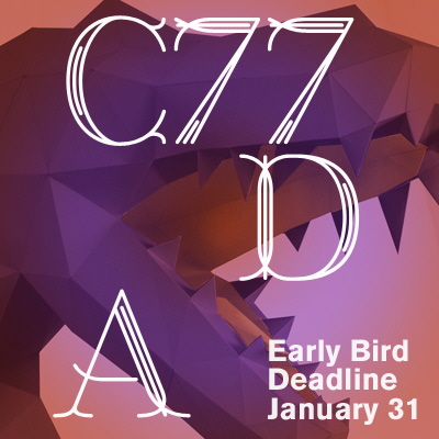
The Early Bird deadline for the 2017 Core77 Design Awards is today, January 31st! Submit your work before 9PM EST to take advantage of our discounted pricing!
View the full content hereThe Early Bird deadline for the 2017 Core77 Design Awards is today, January 31st! Submit your work before 9PM EST to take advantage of our discounted pricing!
View the full content hereLogic-pushing designers Philippe Starck and Jerome Olivet have brought us the swoopiest and most titillating smartphone concept I've seen in a few years. Intended to push the boundary of the interactive touch screen past the two dimensional, the Alo Smartphone incorporates holographic displays with voice control and a downright alien form factor.
While obviously a conceptual project, there are some very cool features the two futurists feel are coming our way. The design's intensely fluid appearance and elongated "gelatinous" body are an unequivocal departure from the touch-oriented technology bricks we're familiar with. This would emphasize hand ergonomics over screen display (or pocket friendliness?).
The Alo would also do away with touch input altogether in favor of voice, which seems a bit out of sync with the current still relatively private nature of touch typing. Though I find the idea of constant dictation wildly undesirable, the Alo framework picks up on the dramatic trend towards voice engaged digital assistants.
Perhaps more telling is the phone's shape. If we're going to be comfortable dictating every search string and personal message in the future, who will care about talking into a glowing silver AI vibrator?
At NIO, we’re rethinking the future of cars and mobility to make this world a better place to be. As the UX/UI team, we’re at the core of it. We envision and craft unique experiences for our users, in the car and beyond it. We challenge conventions and believe design
View the full design job hereI'm a sucker for color based entertainment, and this game is even better than those anxiety producing chromatic puzzles from Clemens Habicht. While similarly nice to look at, the geometric tiles offer a functional and tonal take on dominoes. The game, creatively called the Grid Game, was designed by Mexico's Estudio Victor Alemán and will be distributed by Left Furniture.
If you've ever played dominoes the principle will be familiar. A full set of the tiles contains many combinations of colors, each player will draw a handful, and you begin by laying a heavier or non-black piece. Points accrue as you match tiles by hue and shape, and the first player to run out of tiles wins the round.
The best part of games like this is the simplicity of play, which allows for all manner of house rules and and shouting. The second best part of this particular game is the cool pattern produced, which I'd readily leave on my desk as a kinetic toy.
The Grid Game comes in a flat original design and an attractively formed "Rad" version.
Durrell Bishop and Robert Poll are no strangers to AI and robotics—their combined experience includes over 50 years in product design, interaction design, design education, photography and technology. Meet Line-us, the duo's beautifully quirky creation:
The initial idea for the "little robot drawing arm," emerged during a chance meeting between Bishop and London based kinetic artist, Tim Lewis. Bishop became inspired by Lewis' mechanical sketch-producing artworks to make a simple, Internet connected electronic drawing machine.
At the time, Poll was looking into Internet connected micro controllers that had just come onto the market. Bishop and Poll got to talking about merging the two technologies with simple low-cost components and quickly realized the full potential of their idea. Within just a few months, the design duo was already on their way to setting up their Line-us Kickstarter campaign.
You may not think of robots or sketching as community based, but through Line-us' open source design, Bishop and Poll aim to change that notion. Line-us is designed for anyone to use, from designers and sketching enthusiasts to students and kids. The robot arm's design allows users to experiment with basic functions like simply drawing with it, but it also allows for experimentation. There's potential for illustrators to live draw using multiple Line-us devices and for even hooking Line-us up to AI devices like the Amazon Echo. Line-us' retail price of around £99 is also quite accessible considering its wide range of functions.
The device's accompanying app allows users to share drawings and subscribe to other users' drawings, but Line-us is unique in that it doesn't rely on the app to function—you can easily control the lil' guy manually with just a few knobs.
One of the most interesting aspects of Line-us' concept is its process. Instead of drawing by hand on a digital interface and having that drawing simply live in the computer like most modern sketch aids, Line-us kicks your drawing back out into the physical realm:
Line-us is fun to play with and watch in action, but the robotic arm does raise an interesting question: If an illustrator is using Line-us, is the sketch they produce an original, a reproduction or something in between? We'll leave that one up for debate.
The designers admit to the open nature of Line-us' potential, but agree that this is what makes the robot so exciting. Through the use of Kickstarter, Bishop and Poll hope to reach a creative audience that is ready, able and willing to experiment with Line-us' endless functions:
"We have lots of ideas [for various uses] and have experimented with things ourselves, but honestly, we don't know, and we're really excited to find out [what Line-us can do]. That's why we're going to Kickstarter—to find creative, interested people that can see what the machine can do." —Robert Poll
And it's working—after only two hours, they've raised almost $13,000 out of their $49,035 goal.
Nostalgia Electrics makes this 1950s-styled Family Breakfast Station machine:
I was about to slam it—what need for this thing could there possibly be?—but headed over to Amazon first to read the reviews on it. The majority of them are positive, with three out of five people giving it five stars. Reading through the reviews, I see that my initial distaste for the machine stems from the same myopia currently gripping American politics.
Since I live in an apartment with a stove and own a frying pan, coffeemaker and a toaster, I don't have a need for this. But there are plenty of people living in trailers without these amenities, or looking to outfit their campers. These folks have a need for the machine, do not mind that you can't toast and grill at the same time and are completely happy with their purchase.
Yes, the machine makes no sense for an already-outfitted conventional kitchen. So you might wonder why it's not being marketed specifically towards folks that live in trailers. I imagine it's because of the stigma.
In the future I'll be looking out for more products that address sizable but largely invisible subsets of the population. If you know of any, please drop a line in the comments.
Walljam is an integral training wall offering ball rebound and smart technology to enhance individual and group performance whilst also improving fitness and technique whatever the level of the player. Walljam, acts as a coach, competitor and teammate while revolutionizing play through repackaging the way sport is taken up and delivered. It is specifically designed to improve a player’s game while benchmarking their performance and development.
View the full content hereWay back when, people told the "time" by looking up at the position of the sun in the sky. Then we transferred to hands going around a clock, an abstraction that we had to learn how to read. Now most of us look at digital numbers on our phones or computer screens, an abstraction of the abstraction.
Wouldn't it be cool if you could tell the time—or at least see just how much sunlight you had left—by looking at a globe? A company called Edu-Toys makes a mechanical globe that allows you to do so:
Alas, it appears the $100 globe/clock isn't very well made: Reviews indicate it starts to go out of time in as little as two days and will lose an hour in two weeks. A pity, as the concept is cool.
Editor's Note: For those unfamiliar with the functional differences of using different sorts of fasteners, you may want to read "Why You Should Use Nails, Not Screws" for some background.
Up until the mid-19th Century, all nails were either heated in a forge and then shaped, or cut. "Cut" means each nail was sheared off of strip stock and upset at one end to form a head.
Both of those styles of nails began to disappear during the late 19th century as cheaper nails made from steel wire took over. That might have been better for the manufacturer, but it wasn't necessarily better for the user. That's because cut nails (or forged nails for that matter) grip better than wire nails. Here I'll explain why:
1. When you bang a nail in, you're push the fibers of wood down. So in order for the nail to pop out it has to overcome the force of thousands of wood fibers acting like little barbs that grip the nail (see diagram below). Wire nails are round and only taper at the tip, so the wood fibers along the shaft of the nail are only bent a little. But since cut nails are tapered, as the nail goes deeper more and more wood is bent away with increasing force, resisting pullout.
2. More wedging action all around also mean more forces that can cause a split in the surrounding wood, which is obviously undesirable. When you hammer a wire nail in, the pointed tip wedges the wood in all directions. A large wire nail will have more force holding it in than a small wire nail, but also more force trying to split the wood. On the other hand, cut nails are tapered, but only in one dimension; so when installed properly—with the wedge parallel to the grain of the wood—the taper of the nail is with the grain so it doesn't force a split. And the parallel sides of the nail won't cause a wedging action that would split the wood. So, for a given size and length of nail, a cut nail gives you a lot more holding power with less chance of splitting.
3. The wedging action of a wire nail is fixed by the diameter of the point. Far more wedging action can be achieved in the continuous increasing taper of a cut nail. Some cut nails (boat nails) have a wider section in the middle, so that the wood at the top of the nail can swell back around the nail for even more strength.
4. Since it's cylindrical, a wire nail can easily twist inside the wood. The square section of a cut nail resists twisting, and this naturally helps keep the nailed structure stable.
5. Because cut nails are tapered, the top workpiece being nailed down is held down by the taper of the nail and you don't need much of a nail head. This allows for a much smaller nail head, which the builder can easily set flush with the wood. With a wire nail, which has less gripping force, the enlarged head is needed to keep the joint from separating—and leaves a more visible result.
6. While not related to holding power, the tops of cut brad nails are smooth and don't deflect away from the hammer blow as much as the pinched top of a wire brad. So the cut nail is more easily and reliably nailed in.
Where do you get cut nails? Funny you should ask. You can click over to our nail salon for cut nails in small or large quantities.
We stock a large selection of cut nails made in the USA by Tremont Nail, the country's oldest manufacturer of cut nails. (They've been making them ever since they were invented in the early 19th century.) We repack the nails into small, convenient resealable bags. We understand that you don't always need a huge quantity of any specific type of nails so our bag sizes range from 1/8 of a pound for small finishing nails, to typically a 1/2 pound for everything else. Some of the large nails are sold by the pound. If you order 4 or more packages of any mix of nails you automatically get 10% off.
Whether or not you buy from us, I hope that this has helped you better understand the nature of cut nails and how they might apply to one of your projects.
_______________________
This "Tools & Craft" section is provided courtesy of Joel Moskowitz, founder of Tools for Working Wood, the Brooklyn-based catalog retailer of everything from hand tools to Festool; check out their online shop here. Joel also founded Gramercy Tools, the award-winning boutique manufacturer of hand tools made the old-fashioned way: Built to work and built to last.
Lofree's keyboard features a geometrically-pleasing, minimalist design that will appeal to fans of classic Braun products. But what about folks on the other end of the aesthetic spectrum? Lofree's low-key aesthetics may be a bit too quiet and boring; wouldn't shiny golden keys with backlit RGB functionality treat your fingertips the way they deserve to be treated?
Linus Tech Tips thinks so, and thus combined a set of gold keycaps with a G.Skill keyboard. The video's rather long, so we've cued it up to the relevant parts. First is the assembly, which does not begin well:
And the end result:
Kenny Bania approves:
This month Jimmy rehabilitates a vintage retail showcase, using a variety of tricks and techniques to retain the vintage look while shoring up the structure:
Pourover coffee is about as simple as coffee can get, but thoughtful tweaks are always welcomed. The newly released Twin Carafe by John Arndt and Wonhee Jeong Arndt at Studio Gorm takes the familiar funnel-plus-vessel set up and adds some nice material angles.
The body is a borosilicate carafe with a hand-friendly double wall. The top is a ribbed silicone stopper that plugs neatly into the mouth. Remove your filter after the pour and the silicone will act as a gentle lid while the dual wall insulates. The assembly can also be used for loose leaf tea, with the stoppers thin flanges intended to act as a filter.
The result is reminiscent of both French press assemblies and modern tea sets, while maintaining a distinctive profile. I wonder if the silicone would be easier or worse to clean than a French press filter, but I bet I'd also be less likely to let it sit guiltily on my counter for days.
Boston Dynamics has yet to release this video, but a bunch of folks recorded the presentation and have leaked it online. Here's a look at their latest creation, "Handle," an eerie and agile wheeled robot:
I'm not disturbed by the robot as much as I am by the guy in the audience making noises like he's watching a porno.
Opportunity Kai USA Ltd. The manufacturer of Kershaw Knives, Zero Tolerance Knives and Shun Cutlery in Tualatin, OR, has an immediate opening for a Product Designer. Responsibilities The primary duties of the Product Designer will be to: • Prepare sketches of concepts, detailed
View the full design job hereTokyo has a reputation for being an eye-wateringly expensive city. It's also known for being population-dense and having extremely limited land. So I was shocked to learn that your average middle-class family can buy their own detached house there for just $300,000, which won't even get you a studio in Bushwick these days.
Even if your average Japanese house is smaller than your average American house, how is this possible? Some of you may remember the "Life Where I'm From" YouTube channel, which gave us the video of the adorable little girl running down 13 design differences between Western and Japanese bathrooms. In this video, her father explains how everything from Japan's urban planning to their projected population decline have helped keep homes within reach of middle-class folk:
Have you been having a rough week or two? Probably! In case you're feeling as claustrophobic or erratic as the rest of the world, let yourself be moved (emotionally) by this (literally) moving fish tank robot.
Scuba Suresh is the intrepid aquatic pilot of this distinctive fish-powered autonomous vehicle. Unlike the divisive Korean mech unveiled a month ago, Scuba and its robo-whip (named the Just Keep Swimming™) are both fun and bona fide real. This footage of the voyage was captured at the Build18 robotics tournament held at Carnegie Mellon University, where the fish-powered vessel was designed by a team of students.
It's a crazy future we live in. If a goldfish can self-propel on hostile dry land, you can probably power through too.
The Core77 Design Awards poster has always been a staple of the program. Each year, a unique visual identity is given to the Awards program as a way to stimulate designers and encourage participation. Typically, in line with most promotional tools, these posters feature an array of colors and images assembled in an aesthetically arresting or pleasing way, which draw the eye and induce it to linger.
This year's poster is different.
Designed by Brendan Griffiths and Frank DeRose of Zut Alors! Studio, on first glance it feels like a reversal, an inversion of what is expected. Instead of a pleasant union of vibrant colors, the poster is printed in stark black and white tones. Replacing explicitly motivational words and a call to action is the seemingly upbeat phrase "It's all good." This sentiment is then turned upside down, however, with the insertion of the word "not" literally hand-drawn onto the paper.
It's a curious phrase to represent a design award competition. At face value, those four words feel inherently negative, almost discouraging. A declaration that failure is unavoidable. A raincloud reminding you to despair.
Yet, ultimately the poster's message is profoundly optimistic.
As with any piece of visual communication like this there are layers of meaning and understanding to the message. As Griffiths explains:
"the poster contains some kind of embedded ambiguity, and through this ambiguity it attempts to elicit a response. Is it all good, or is it not all good? We don't think the poster renders a verdict either way, instead it asks the recipient to answer with their submission."
The most deliberately ambiguous element of the piece is the identity of the "It". What, exactly, is the pronoun referring to? There is no clear answer, and this lack of clarity is what makes the reader stop and think, and to render their own conclusions.
The "It" as a manifestation of design on a conceptual level resonates particularly deeply, as the underlying sentiment of that phrase, despite the ostensible pessimism, speaks to the central pillar of the industry.
Design was born out of a need to solve problems. In large part, design exists because what surrounds us is not all good. The nature of the field is dependent on this perennial truism. Should the world transcend into utopia, there would no longer be a need for designers, for change makers, as any alteration to a product, service, structure, would be implicitly negative. At the mantel of perfection there is only a downward slope.
The fact that everything in the world is not all good implies there is room to improve, that there's a capacity for positive change. This is the essence of the design process—explore, understand, ideate, prototype, fail, learn, repeat, and, ultimately, achieve. Find what's not good and strive to make it better.
On a more individual level, the phrase communicates that not every finished design is going to be successful—just as not every entry into the Core77 Design Awards is going to be honored. This understanding is not meant to demoralize, but to galvanize, as the nature of competition is such that there is no achievement without simultaneous failure. There's a bluntness to it that is refreshingly realist.
The message taps into that core trait that binds all designers—persistent self-doubt. Designers toil in the studio until their eyes bleed, resisting the urge to settle for mediocrity, to accept anything less than their best. They brood over that small, nagging "not" until they feel a semblance of satisfaction. Indeed, the majority of effort expended on any given design project ends up in the dustbin, as they move through prototypes and drafts toward a final product.
Even when a finished product is seemingly perfect, designers fight complacency as if it is a poison, refusing to accept that anything is ever as good as it can possibly be. That is how the process works, and that is how great solutions are born. Interpreting the poster in this way celebrates that inexhaustible tenacity.
On the most macro level, the poster refers to the global state of affairs. DeRose concedes that the current turmoil plaguing much of the world heavily informed their design.
"There was a very clear moment in the process of designing the poster, and the presentation that the poster was originally a part of, where it became obvious, to us at least, that making a typical design award poster just didn't make any sense given the state of the world."
It's a sentiment with which many of us can commiserate. Our world is in flux. Economically, politically, environmentally, things are not all good. Poverty and homelessness, though trending downward, are still a far too prevalent reality for many across the globe. Divisiveness and fear have risen exponentially in recent years, and mendacity has seemingly become subjective. Climate change threatens the future existence of the earth itself, and the life that resides upon it.
In truth, the world, at times, can feel like a gray place, and it would be easy to get lost in delusional contentment. Yet, rather than bury our heads in the sand and tell ourselves everything is fine, the hand-written "not" reminds us to avoid complacency, and that ongoing progress requires continual effort.
The multiple interpretations of the message are reinforced by the graphic layout of the work. There is a complex narrative behind the finished form, which proves the poster is more than the sum of its words. The letters consume the frame aggressively, pushing even the punctuation off the page, as if making a brash, propagandist declaration. The severe black letters and forceful weight of the Zut Gothic typeface subvert the intended sentiment of this common phrase. What, on the surface, should be reassuring, is instead formidable. The period at the end forbids dissent, conveying the statement as a decree rather than a belief. The reader is led to infer that agreement is not necessary—only acceptance.
In this narrative the hand-written defacement of the poster becomes a rebellious voice for change. This defacer is not trying to shatter positivity, but to challenge false security and manufactured serenity. The "not" is small, but not meek. It is a rallying cry against blind acquiescence, and call for those who can to make it better.
The "not", more than anything, is a call to action. Says Griffiths, "We think, particularly in a field like design, we have to start asking ourselves what the point or purpose is of the activities we are busy with. So in that regard, the poster could be seen as a kind of challenge or provocation toward making, or submitting, more engaged work."
Ultimately, on all levels, the poster serves as an incitement against passivity. It implores all of us to take what exists and refine it, indefinitely, because it's not all good. There is hate. There is hunger. There is hurt.
There is also hope, however. And it's that hope we latch onto, that gives us purpose. It may not all be good, but it can be improved, amended, rectified. And it's our responsibility as designers to do just that.
Monkey Faction is on a mission to get people riding bicycles again. Whether you are young or old, your health and quality of life improves by riding a bike.
In today's culture, bikes are too often viewed as being relics of the past or uncomfortable to ride. The new Capuchin by Monkey Factionaims to bring bike riding dynamically into the present.
This article is part of the Design for Impact series, a collaboration between Core77 and Autodesk focused on designers using their craft to promote environmental and social change.
Do you track your trash? How carefully do you sort your garbage—organic waste in a composter, recyclables separated into the right bins, non-recyclable waste isolated into its own receptacle? How cautiously do you ensure that hazardous materials are excluded from the recycling bin or that your bottles and cans are clean?
As Americans, we all contribute to the more than 250 million tons of solid waste generated in the U.S. each year, around 34% of which (87 million tons) makes it way to recycling facilities that employ unskilled, low-wage workers to operate heavy machinery.
While recycling is recognized as a societal good, the working conditions in these facilities are cause for concern. In a 2012 report entitled "Promoting Safety and Health in a Green Economy", the U.S. Department of Labor's Occupational Saftey and Health Administration division outlined the risks for workers who are often poorly paid, inadequately trained, and exposed to hazardous conditions at recycling facilities among other "green" jobs.
Sorting and picking through chemical waste, batteries, scrap metal and organic materials, workers have been burned, lost limbs, and been exposed to all manner of noxious inhalants. A 2016 investigative report published in Mother Jones outlines the dangers to workers and tells the stories of some who have died from working in these hazardous conditions.
Entrepreneur Matanya Horowitz is on track to address those concerns with AMP Robotics. With precision, speed and accuracy, their robotics technology is designed to take over the most dangerous jobs that humans now do at recycling facilities, mitigating what Horowitz calls "dull, dirty and dangerous work."
Automation for Efficiency and Safety
"At the beginning, we saw ourselves as a computer vision company. We were going to just apply robots to this problem. When we started getting deeper into the recycling industry, we just saw so much potential. Even without robotics, technology in recycling is improving at a steady clip," says Horowitz.
AMP Robotics technology aims to make the industry profitable and safe. Compared with landfill use, the economics of recycling are appealing to waste management companies, as an efficiently run recycling facility can achieve higher profit margins for managing their waste.
"In the industry, there's something called tip fees [also known as disposal fees]. If the tip fees for a recycler are lower than the landfill tip fees, recycling becomes not just the right thing to do, but it's the economically efficient thing to do. Now we're basically just digging in as deep as we can and seeing how could we help bring the cost of recycling down." says Horowitz.
With their current recycling facility partners in Boulder, CO, Horowitz estimates that they are saving 50% of sorting costs using AMP Robotics systems. Calling what they do scalable recycling solutions, Horowitz's team leverages machine learning to teach the robots to identify valuable materials amid the clutter of fast-moving conveyor belts.
Their comparative efficiency shows that their robots can make 50 - 100 accurate "picks" per minute, while their human counterparts can achieve between 30 - 60 picks per minute. With smart technologies they can constantly improve their accuracy as new forms of recycled materials are introduced to the marketplace.
Even more important than that is the improved safety that comes with AMP Robotics system. By utilizing the AMP Robotics systems, recycling plant workers aren't exposed to harmful contaminants, and significantly reduce their risk of serious injury. Efficiency combined with improved safety is the key to profitability.
"When you start getting deeper and deeper into a problem, it becomes even more rich with opportunity," says Horowitz.
Creative Risk-Taking
With a Ph.D. in Robotics from CalTech and time spent at NASA's Jet Propulsion Lab, Horowitz knows how to create a wickedly efficient algorithm. Designing the robots, however, was not as intuitive. His start-up team consisted of programmers with no mechanical background.
"Our premise with these robots was that it was the vision system in the software that needed to improve to solve this recycling project problem and not necessarily the mechanical design. For the most part, we made very bad mechanical parts."
Then they were introduced to Autodesk Fusion 360 and everything changed. "Fusion 360 is democratic," says Horowitz. As he explains, the software had a catalyzing effect. "Okay, we can actually make this right the first time. It actually enabled us to create things, going from just a couple of sketches on a piece of paper to actually having real CAD and actually being able to make designs that fit the first time."
The accessibility of Fusion 360 turned a deficit into an opportunity. Suddenly the team could actually see what they were making, creating 3D models that aligned with their vision of an algorithmically pure solution.
Horowitz credits the Autodesk Entrepreneur Impact Program and Fusion 360 for making AMP Robotics come to life. He says, "It's making it so that as a programmer I can converse with my mechanical designers in an intelligent, efficient way."
Inspiration Everywhere
Horowitz's path to robotics wasn't obvious from the beginning. As he tells it, he was convinced that getting an MBA and working in business was going to be the direction his life took. He remembers thinking, "Oh, this kind of stuff is kind of silly and kind of pointless, so I'm going to go do the adult thing. Maybe get an MBA."
The moment of clarity for him was seeing the DARPA Grand Challenge. Run by DoD's Defense Advanced Research Projects Agency, the competition was intended to spur the development of autonomous cars. To Horowitz, the Grand Challenge felt like a page out of his childhood where he recalled playing with Transformers, an early window into robotics beloved by many children. That passion was further fueled by his older brother, Benjamin, who taught him how to program, which ultimately took him to CalTech.
Running parallel to his love of robotics was an appreciation for recycling. Growing up in eco-savvy Boulder, he was first introduced to the recycling industry as a Kindergarten student when some representatives from the local Eco-Cycle plant spoke to his class. A later visit to the massive Puente Hills recycling facility in Los Angeles set the wheels in motion.
These experiences, seemingly random and unconnected, collectively combined to create a set of experiences that launched AMP Robotics.
"I think for so many of these things, they didn't seem to have any meaningful impact immediately, but it created a context and a culture around these ideas. The result is sooner or later, you put the dots together and go after the important things," Horowitz says. "I just can't speak highly enough of the kinds of programs that create a community around ideas."
Amped Up and Looking to the Future
For their part, AMP Robotics is hoping to inspire more passion in recycling and robotics. The company has worked hard to connect with meaningful investors in their work; companies like the Oskar Blues Brewery, a company that is already active in green causes and recently awarded AMP Robotics a grant to advance their work.
"The money from Oskar Blues Brewery let us buy our first conveyor belt and build a test set-up in our facility," Horowitz says. More investors will mean greater advances and more opportunities to improve AMP Robotics offerings throughout and beyond Boulder.
As for the AMP Robotics team, Horowitz offers them an opportunity to work in a technologically innovative field while also furthering a cause that matters.
"Someone will join our team because they're excited about the robots. A couple of months after joining, they start to visit the recycling facilities, talk to the people working there; and they actually become more excited," says Horowitz. "They are excited about solving an important problem and not just hacking away at some typical business program."
For the local Boulder community, particularly the recycling plant workers and their families, AMP Robotics offers a window into what robotics can do for them and, perhaps, offers new opportunities for the future.
"It's that kind of interest and passion for doing the right thing that matters. There are always little things that connect the dots. If we didn't have some of those early opportunities, we wouldn't have been able to get this far."
Shop space is one thing we can never seem to have enough of. But we deal with tiny spaces and build highly efficient workflows to get things done. What if space were not an issue? What would you do differently in your shop? Would you buy more tools to fill the space, or just spread out a lot more? The answers to this question might just be wishful thinking, but they also might provide some key insights into how to structure your real life shop today.
I would spread out, I don't really need any more tools. Though I must admit that if space weren't an issue that there might be a few power tools finding their way back into the shop. I got rid of quite a few of them just because they rarely got used and they space they took up didn't justify their existence. These examples are rare but usually they relate to more DIY type projects where it is less about joinery and more about nails and caulk. Specifically a place to set up my track saw for plywood projects and a place for my dust extractor and random orbit sander come to mind. Certainly a dedicated space for my 20? planer would be welcome.
Mostly though, this dream shop space would allow me to segment my work and spread out. Things like creating a lathe corner where I could place racks for my turning tools and chucks and other accessories. I could even set up all of my lathes with some dust collection specific to them as well. It would be cool to have the space to run an actual spring pole along the ceiling too.
I could ditch my shaving pony (while very effective) and build a shave horse and small bench specific to Windsors and other chair styles. I could keep all of my chair specific tools like inshaves, drawknives, travisher, reamers, steam box, etc in cases or racks right around the bench and horse and call it the chair making corner.
I would wall off a section and make a finishing room with a dedicated ventilation system and a central rotating finishing table. I'd move my finishes into their own cabinet and keep all the other sundries like rags and filters and HVLP cleaning products right in the same room.
For the main part of the shop I would set it up with my workbench and joinery bench and keep my saws and sawing bench close by. Invariably this area of the shop would get the most attention with organization and creature comforts. Everything would key off the workbench and like my other dedicated areas only the tools I used in that space would be stored nearby.
In other words it would look pretty much like my shop now.
This "what if" exercise is exactly what I went through when I remodeled my shop last summer. What I discovered was that all my dedicated areas would be nice but would only be used in very specific situations and projects. For example when I'm turning that's all I'm doing and I can assemble my pole lathe or wheel my treadle lathe into a good position. The I turn some chair legs or a stand alone turning project like bowls or small spindle stuff. I can pull out my turning tools and other accessories for that operation and put it all away when I'm done. It is rare that I would ever need to hop onto the lathe for something quick then back over to the workbench so its not a problem to transform my shop into a turning centric set up for the day or even a couple of weeks (typical at Christmas time).
The same applies for Windsor chairs. I've only built 4 of them and I thoroughly enjoy it and plan to do it again. But it is a fairly self contained type of work and I really only need the specific tools and work holding for chairs and I can set it all up and break it all down when the chair is done.
You can make the same case for any offshoot of woodworking. Even the specific stuff that would cross into typical furniture making. For instance, if I want to add a carved element or some marquetry the specific tools and sundries to those tasks can come out of storage and then pack back up when I'm done.
This realization was a pretty big deal to me. Maybe its obvious to many but it was liberating to know that it was okay to stick stuff in a box and put it on a shelf in my laundry room or a closet. What's left is only the stuff that I turn to every day on every project. These every day items are a surprisingly small amount of tools that store in a single cabinet, saw til, a sharpening area, and a cabinet for finishes and glue. So here I sit in a 250 square foot shop with everything I need and a lot of elbow room. I keep thinking I should hang a cabinet here or there to put stuff in and then wonder if I really need it or if I'm just trying to fill the empty spaces.
Its an interesting perspective on the work shop that immediately transforms even the tiniest of spaces into an efficient work place. So while we all dream of cavernous spaces I'd wager to say that very few of us actually need that much space.
___________________________________________________
This "Hand Tool School" series is provided courtesy of Shannon Rogers, a/k/a The Renaissance Woodworker. Rogers is founder of The Hand Tool School, which provides members with an online apprenticeship that teaches them how to use hand tools and to build furniture with traditional methods.


