Quantcast
Channel: Core77
Viewing all 19147 articles
Browse latest View live

DesignMarch 2017: Highlights from Iceland's Annual Design Festival

$
0
0

This past weekend saw the ninth edition of DesignMarch, a proverbial diamond in the rough when it comes to the annual design-festival calendar. From March 23–26, Iceland's homegrown design festival once again featured hundreds of events and exhibitions—possibly the highest rate per capita for a country of a mere 330,000 inhabitants, 40% of whom reside in capital city Reykjavík, where the event has taken place since 2009.

The "Added Value of Architecture" exhibition at the Harpa Concert Hall

Of course, the jam-packed official event guide (roughly the size of two iPads stacked) belies the understandably modest scale of the festivities, which generally emphasizes quality over quantity, even as it encompasses product design, architecture, visual communication, and fashion. Despite the prevalence of posters at bus stops and cultural institutions alike—free copies of the guide were even available in a magazine display rack at the airport—the advertising efforts were lost on the majority of the (mostly American) tourists. It seemed that nature, not culture, remains the main attraction for most of the travelers in town ("Crazy Iceland" and "I Survived Iceland" were among the slogans laser-cut into souvenir refrigerator magnets).

IDEO's Paul Bennett related three case studies from his work in the field to offer a new definition of design
The opening reception of FIT2017, the Association of Icelandic Graphic Designers' annual awards program
The launch of sustainable swimwear label Swimslow featuring a live musical performance and runway show 

But it is precisely the contrast between, say, the tourist-infested Blue Lagoon and the well-attended design-week events that affirm the strong sense of camaraderie among members of the local creative community, starting with the one-day conference that marks the beginning of the festival. Broadly addressing the theme of "Brut Nature," Thursday's DesignTalks featured a healthy mix of local and international designers, whose practices spanned critical design and visual art to research and ethnography. From IDEO's globetrotting Paul Bennett to a trio of Icelandic porcelain-seekers, the speakers offered a healthy dose of inspiration to inaugurate the ninth edition of DesignMarch.

The "Roundabout Baltic" exhibition at the Nordic House was a highlight; stay tuned for more coverage.
The Culture House hosted the exhibition "Peekaboo - Polish & Icelandic Illustrated Children's Books"
"Peekaboo" featured six Icelandic illustrators and 16 Polish ones, including Marta Ignerska, whose work is pictured here
Icelandic textile company Istex collaborated with Danish designer Astrid Skibsted to produce "A Colour Map of Icelandic Wool"

The exhibitions themselves offered more local flavor, at times alongside projects and presentations from Continental Europe, namely Scandinavia and Poland. Now more than ever, Icelandic designers working in various scales and media are looking to carve out their niche in the broadly Nordic tradition, and DesignMarch is the de facto platform for them to do so.

Thorunn Arnadottir, "Shapes of Sounds"

For example, we first encountered Thorunn Arnadottir's "Shapes of Sounds" project in Tord Boontje's cacophonous Electro Craft exhibition during London Design Festival, their understated simplicity was a disadvantage amidst the multimedia onslaught of the dense group exhibition. In her native Reykjavík, Arnadottir's interactive objects occupied an intimate gallery apropos their essential element of sound, displayed with sketches and schematics.

The FÍT2017 exhibition, on the other hand, was among the few for which the texts and catalog were not bilingual. The Association of Icelandic Graphic Designers presented the winners of its 17th annual awards program at the Hafnarhús, one of three buildings of the Reykjavík Art Museum (each one hosted a design exhibition). In this case, the language barrier underscored the quality of the projects on view, from bold craft-beer packaging to books and illustration as well.

Installation view of FÍT2017
Detail view of FÍT2017
Detail view of FÍT201
Hugdetta recently opened a flagship store, where they presented their own products alongside new pieces in the 1+1+1 collection, an ongoing three-headed collaboration with Sweden's Petra Lilja and Finnish studio Aalto+Aalto. Each studio independently designs a piece with a key constraint — say, the dimensions of a mirror — and they convene to mix and match the pieces, sight unseen, only just before they are to be exhibited.

Yet Icelandic design is hardly an insular affair: On the contrary, designers from the island nation are engaging with their counter-parts in Sweden and Finland—literally, in the case of the Design Diplomacy event series and the 1+1+1 project—in the interest of establishing their own identity. It is these kinds of dialogues that reveal common ground as much as they cast Icelandic design in sharp relief.

As DesignMarch looks forward to its tenth anniversary next year, the only thing that is clear about the future is that there is no endpoint but rather a continuous process of self-discovery.


Furniture Design Mystery Solved: Who Designed That Table, Ebbe Gehl or Barber & Osgerby?

$
0
0

In last week's "Design Minutiae" I ogled the display tables used by Australian brand Mud, and wondered at the provenance.

Two sharp-eyed readers wrote in with information. Sarah Sitz pointed out that it was surely the Home Table designed by the UK's Barber & Osgerby:

Home Table, Barber & Osgerby

Reader Ian D. suggested it could be the Mira table designed by Denmark's Ebbe Gehl:

Mira, Ebbe Gehl

The two tables do indeed look very (almost disturbingly) similar. But if we look closer, there are a couple of visual giveaways that indicated the tables at Mud are the Barber & Osgerby variant. The first is the height of the Mira's apron, which appears slightly shorter than that of the tables at Mud.

Mira, Ebbe Gehl

The second is the notable reveals on the longer apron sides of the Mira.

Mira, Ebbe Gehl

Those are there not because the joinery is poor, but because they're drawers containing leaves. The Mira was designed as an expandable dining table.

Mira, Ebbe Gehl

Both tables are made from solid oak, providing a similar appearance. But Mrs. Sitz found definitive proof that the Mud table is Barber & Osgerby's. As she writes:

DesignOffice, who consulted for Mud Australia's retail spaces, list the Home Tables on their portfolio page for the Melbourne retail space.

Nail in the coffin. Er, table.

Some of you may be wondering, which came first, the Mira or the Home Table? I have an idea, but instead of just stating it up front, I'm going to show you some of the hell that a blogger goes through when trying to find what should be a simple answer. (Warning: Boring detective work up ahead.) Here's what I could find:

1. Barber & Osgerby's table was designed in 2000 and is currently in production by Isokon.

2. Gehl designed the Mira for John Lewis, year unknown, and it's still sold there.

3. Gehl has been around longer. He started Nissen & Gehl, his design firm with partner Søren Nissen, way back in 1970, just a year after both Edward Barber and Jay Osgerby were actually born. (Barber & Osgerby, the firm, came about in the 1990s.) 

4. Gehl, not Nissen & Gehl, is credited as the designer of the Mira. This indicates Gehl designed it after he and Nissen parted ways. However, there is no record of the two splitting.

5. Neither Nissen & Gehl, nor Ebbe Gehl, has an active website.

6. John Lewis, the company the Mira was designed for, is a K-Mart-like department store in the UK that sells everything from furniture to baby clothes to appliances.

None of those provide a definitive answer, but no. 6 is the clue. Given the nature of department stores, I find it unlikely that Gehl's design antedates Barber & Osgerby's 2000 design and has remained in production for 18 years. I can't say for certain, but my guess is that Barber & Osgerby designed their Home Table first.

Anyways, now you know why no one wants to talk to me at cocktail parties. (Might also be my breath.)

Thanks to Sarah Sitz and Ian D. for contributing!

Reader Submitted: h0nh1m x NikeLab's VaporScape: An Interactive Soundscape Installation that Reacts with Body Data

$
0
0

VaporScape is an interactive soundscape installation in collaboration with NikeLab's The Vision-Airs project, globally launched to celebrate Nike's new VaporMax technology.

View the full project here

Eight Reasons Why Being Able to Fly Would Actually Suck

$
0
0

It's a standard bar-room debate: "If you could have a superpower, what would it be?" The options offered are usually invisibility, flight and X-ray vision.

A lot of people pick the ability to fly. Well, those people are idiots. If you could fly it would be a disaster. Here's why.

1. You'd Constantly Lose Things

Our pockets are designed to work with gravity: You drop stuff inside them and they sink to the bottom. But since people always fly horizontally, stuff is going to fall out of your pockets.

In a crowded city that's dangerous; in a crowded and litigious city that's disastrous. Best-case scenario is I lose my keys over Central Park and have to get them all replaced. Worst-case scenario is my iPhone falls out of my pocket over 5th Avenue, punches through the roof of a cab and breaks somebody's arm. The cops unlock the phone and find my personal info. Next thing you know I'm being contacted by a law firm and being sued for damages.

2. It's Cold Up There

Where I live in Manhattan, you can't fly low or you'll smack into traffic lights and tree branches. To get up above the buildings you need some altitude. Well, temperature drops 5.4 degrees Fahrenheit for every 1,000 feet of altitude. Then there's the wind, which would increase in severity the faster you went. So during the winter, every time you wanted to fly you'd have to bundle up like you were going on an Arctic expedition. And you would probably lose a lot of hats because they would always be flying off of your head.


3. You Wouldn't Be Able to See Well

The wind would be in your eyes all the time, particularly if you flew fast. If you wore glasses they'd just fly off. So you'd have to wear goggles with a headband and they'd have to be on tight. Bugs would still slam into them and obscure your vision. Plus when you arrived at work and took the goggles off, you'd have red circles around your eyes for like fifteen minutes, your hair would be messed up, there'd be bugs in your teeth and you'd just generally look like a mess.


4. Airborne Accidents are Worse than Earthbound Ones

At least once a week I'll slam a shin into a coffee table or stub my toe. We're all capable of klutzy, distracted behavior, and accidents would be way worse high up in the air. Let's say I'm taking off from the sidewalk and still thinking about what I should have said to that jerk on the subway. So I'm distracted and I fly straight up into a street lamp and hit my head. Now I fall twenty feet back down to the street and break both of my legs.

5. You Can't Carry Much

If you need to transport a lot of stuff on the subway, you can use a roller bag and schlep it up and down the steps. But if you're flying you're limited to a backpack. Backpacks are designed for upright use, where they harmlessly transfer weight to your shoulders and lower back. But in that horizontal flying position, all of the weight is going to be pressing directly against your spine. Even your MacBook Air and a couple of books are eventually going to send you to the chiropractor.


6. Landing Would be a Hassle

Let's say I want to cross the East River from Manhattan to visit Brooklyn Heights. I can't just touch down in the middle of Montague Street or I'm going to get hit by an Uber. So I have to find a stretch of sidewalk that's not obscured from above by tree branches and I have to avoid pedestrians so I don't land on somebody and get sued.

If I do manage to find an uncrowded spot and land, there's going to be a commotion. People are not used to other people dropping out of the sky. They'll point and panic, some will scream. Store owners will grab bats from underneath the counter. Cops will approach me with their hands on their holsters. Hordes of people will whip out their phones and start recording me. Imagine what a pain in the ass it'd be if that happened every time you climbed out of a subway station.

So you think, "Well, just land on a rooftop, where there's no people." Yeah? Then what, genius? I still need to get down to street level. Rooftop stairwell doors in New York City are always locked to prevent thieves getting into the building. Am I gonna fly from rooftop to rooftop trying to find one that's unlocked? At that point it'd be faster for me to take the train.

7. Bird Strikes

Believe it or not, pigeons can do 50 miles per hour. If a semi truck is coming at you at 50 miles an hour, at least you can see the damn thing since it's huge. Pigeons are tiny and hard to spot from far away. So let's say I'm flying across the Hudson because I got tired of waiting for the ferry, I'm flying west at 50 m.p.h., a pigeon is flying east at 50 m.p.h. and we collide. That's basically like I got shot in the chest with a pigeon going 100 m.p.h. If its beak shattering my sternum doesn't kill me instantly, I'm still going to fall into the Hudson River where I will now drown.

8. You'll Get Sick

If it's raining out, you can't fly with an umbrella, it's simple aerodynamics. So anytime there's precipitation and you want to take flight, you're going to get soaked. Coupled with the colder air up there, you're going to get sick constantly. You'll be flying to the pharmacy a lot to stock up on Sudafed.

Also, if you're carrying anything metal during a thunderstorm, there's a good chance you'll be struck by lightning. Then you will fall out of the sky. Afterwards the coroner will examine your smoking, shattered corpse to determine if you were killed by being electrocuted, by the impact of hitting the ground or by the blunt force trauma from the crosstown bus that then ran you over, like it makes any damned difference.

So yeah, being able to fly isn't all it's cracked up to be. And don't even get me started on invisibility. Folks, you always choose X-ray vision, at least you do if you're a designer. In the next post I'll explain why.


Mid Century Modern Find of the Week: Bruno Matthson's Pernilla 69

$
0
0

For our first Mid Century Modern Find of the Week, we're showing you this Pernilla 69 chair, designed by Bruno Mathsson and produced by Swedish manufacturer DUX. I consider it a truly iconic mid century chair, but one that not a lot of people know about (probably because they don't sell it at DWR).

This Swedish modern Pernilla high back lounge chair has a beech frame and leather upholstery.

Its tall, structural back not only creates beautiful bentwood lines but offers back support and ergonomic comfort.

This chair is covered in original button-tufted black leather which snaps in place to a canvas lined back. It is in excellent original condition with typical wear for its vintage.

Piece:Pernilla 69

Designer: Bruno Mathsson
Year of Design: 1944
Year of Manufacture: 1969
Country of Origin: Sweden
Manufacturer: DUX
Dimensions: 35" wide x 32" deep x 39" tall
Price: $2,600

Core77 readers get 15% off of any purchase at Mid Century Mobler. Enter promo code MCMCORE77 at checkout.

__________________________________________________________

Note: The Core77 editors are going to fill you in on the backstory of this chair with a companion entry. Stay tuned!

Hand Tool School #25: Quality Tools are Worth the Wait

$
0
0

This may seem strange in an age of instant gratification, but there's an attribute of the current hand tool marketplace that makes me very happy: We have to wait for good products to arrive. Whether because the manufacturer has been "Schwarz'd"* and cannot keep up with the demand, or because the manufacturer makes each product to order. We have gotten so used to placing an order online and having it in our hands within a few days, or walking into a local store and and walking out with our treasure.

But in the past ten years or so, a plethora of small boutique tool makers have emerged. When you place an order, you talk directly to the craftsman making your item, or if you order online, you will receive a direct email thanking you and sometimes asking about customizations. This intimacy between dealer and buyer extends to the products themselves as you can see how each product was lovingly crafted and even packaged. For instance, look at how Blue Spruce Toolworks packages their chisels:

It is this revelation in tool making that is truly exciting in our marketplace today. I waited almost 3 months for my wood screw vise from Big Wood Vise to arrive because Joe Communale couldn't keep up with the sudden demand for his screws. I have even waited close to a month for tools from Lie Nielsen because they schedule small production runs of their tools. Finally after two months, my Benchcrafted end vise showed up. This situation sounds completely out of place in our fast paced world, but it is the time and attention to detail that sets some of these manufacturers apart and keeps the quality of our tools very high.

These companies know that they are at a disadvantage to the large manufacturers who can churn out products and deliver them in days, but they make no apologies and often times the lead time on an order is shown like a badge of honor. Quality takes time.

Now I need to convince my wife that it is the high quality of my work that takes me so long to complete anything in my own shop.

—*Editor's note: "The Schwarz Effect" is when noted woodworking journalist/author Christopher Schwarz, who has an enormous following, publicly praises any book, tool or implement. Said object then tends to rapidly go out of stock! 

_______________

This "Hand Tool School" series is provided courtesy of Shannon Rogers, a/k/a The Renaissance Woodworker. Rogers is founder of The Hand Tool School, which provides members with an online apprenticeship that teaches them how to use hand tools and to build furniture with traditional methods.

Understanding Furniture Design and Construction by Looking at Chair Skeletons

$
0
0

Given a choice between having the superpowers of invisibility, flight or X-ray vision, designers should always choose X-ray vision. The ability to see how something is made, or observe the structure that's holding it all together, should appeal to us more than undetectable shoplifting. (And as I've already covered, with unassailable logic, being able to fly would suck.)

As an example, at left you see what Tom Dixon's wingback chair looks like. (Speaking of wingback chairs, here's why they have wings.) Some years ago Dixon had an exhibit where he showed you the chair in its various stages of construction. I always thought that was really cool because you could see exactly how they were made.

You could learn a lot by looking at a classic piece of furniture like, say, Hans Wegner's Papa Bear chair…

…while your X-ray eyes allowed you to see the structure underneath:

Take a look at this chair from an article in Fine Woodworking. The legs look to be Cherry.

In a photo of the naked chair, they reveal that while the legs are indeed Cherry, the unseen frame of the chair is actually made from Maple and Poplar. This makes sense as Maple is strong and Poplar is easy to work. The Cherry is just the show wood.

There's a company called Dutch Connection in the UK that specializes in duplicating period furniture (Georgian, Regency, Chippendale, Victorian and French) in the original hand-carved method of manufacture, and supplying them to hotels, film productions and designers. On their website they've got a lot of photos of their chairs in the skeletal stage, allowing you to see where bracing has been applied, where the structures have been built up, etc.

These are based on the designs of master craftsmen, and it's interesting to see just how little material they can get away with using, yet still make the chairs structural. Even if you don't care for the styles, if you're designing your own chair in a different style it may still help you to see where the old masters reckoned there ought to be support.

Here's some terminology that might be helpful for communication, for example if you're designing the chair but someone else is building it. (Sorry for the lousy photo.)

Fully-upholstered furniture can be pretty impenetrable. For example, do any of you really know what the insides of a sofa or an easy chair look like?

Furniture manufacturer Holly Hunt has some cutaway images showing you what's inside their stuff. Their frames are Maple, not the plywood I was expecting.

While the photos above may not tell you much on their own, they've got an interactive on their site that reveals details of the construction.

In fact if you look around the web you can also find untraditional manufacturers touting their abilities by showing their furniture in skeletal form. For example, here's a custom sofa (clad in carbon fiber, for chrissakes) that UK-based digital fabricator The Cutting Room built from a client's Rhino3D file:

My only gripe with all of these photos is that they're so small. If I had X-ray vision I could walk into any showroom and see all of the details up close.

Design Job: Drop a Beat! inMusic is Seeking a Senior Industrial Designer in Cumberland, RI

$
0
0

inMusic is seeking a seasoned Senior Industrial Designer to join our accomplished design team. inMusic consists of 14 brands including 11 hardware brands; ION (Consumer Audio and Lighting), Denon DJ (Premium DJ equipment), Alesis (Digital Piano and Electronic Drum), Numark (DJ Equipment), Akai Pro

View the full design job here

A Roundabout Route to Reykjavík 

$
0
0

Iceland happens to be almost exactly 1,000 miles from the Baltic Sea as the crow flies, but it is an honorary member of region for the intents and purposes of an noteworthy exhibition at the Nordic House in Reykjavík. On view from March 13–31 at the Alvar Aalto-designed cultural center, DesignMarch was the occasion for the fourth iteration of Roundabout Baltic, which has traveled to Tallinn and Riga since its debut in Malmö in June 2016.

A well-curated survey of contemporary design from the eight countries that form the coastline of the body of water, curator Agnieszka Jacobson-Cielecka has duly seen fit to bring Iceland into the fold with projects from seven local studios, interspersed among the 60-odd other pieces from the northeastern corner of the Continental Europe. Mostly based in Reykjavík, the new contingent joins designers from Estonia, Latvia, Lithuania, Poland, Germany, Denmark, Sweden, and Finland in the ground-floor gallery space of the Nordic House.

From left: "Nouvelle Vague" by Lisa Hilland (SE); "Cavi" side table by Rikke Frost for Bolia (DK); "Sipp op Hoj!" hammock and swing by Thorunn Árnadóttir (IS); "Weave" cabinet by Ringvide (SE); lamp by Margrét Gudnadóttir (IS)
Clockwise from top left: "Deform" chair by Milena Krais (DE); "Tubo Motus" by Alicja Patanowska (PL); "Bendy" bench by Studio Fem (DK);

If the sparse snippets of wall text are any indication, Roundabout Baltic is an unapologetically auteuristic exhibition. Billed as "a personal narration of the curator," the show "portrays the visual connection between the designers, their work and the seaside landscape etched into their creative sensitivity through design, usable and decorative objects."

While the theme of nature can at times risk coming across as facile, Jacobson-Cielecka does well to present the motifs in varied permutations of material, palette, and craft. The objects are organized not by nationality or typology but rather landscape features such as sand dunes, beaches, and vegetation, as well as maritime touchstones such as fishing nets.

All told, it's a strong showing of small-to-medium-scale work from independent studios, and if you're not planning to be in Reykjavík before the end of the month, perhaps you can catch Roundabout Baltic in Gdynia or Stalowa Wola later this year.

From left: ceramics by Maria Kristofersson (SE); "Forefathers' Eve" rug by Kosmos Project (PL); "Farming" pouf by Sampling (LV/BE); "Warm up Home" by Mare Kelpman (EE)
From left: "Touch of Blue" by Modus Design (PL); "Inblue" tableware by Monica Förster (SE) for Rörstrand; "Blue Line" by Modus Design; "Yacht" stools by Malafor (PL); "Float" carpet by Annike Laigo (EE) 
From left: "Warm up Home" by Mare Kelpman; "Meet the Wicker" basket by Chudy and Grase (DE/LT); "August" stool by Aamu Song & Johan Olin (FI/DE) for Nikari; "Earth Stone Wood" by Anna Bera
Installation view. Glass pieces, from left: "Plantation" by Alicja Patanowska; plates by Marija Puipaitè (LT); vessels by Hanna Krüger (DE) for Rosenthal. (Other pieces are identified in previous captions.)
Installation view. (Pieces are identified in other captions.)
From left: vessels by Pia Wüstenberg (DE) for Utopia&Utility; "RGB" by Hanna Krüger; "Pi-no-pi-no" vase by Maija Puoskari & Tuukka Tujula (FI) for New Works; "Aquarelle" side tables by Meike Harde (DE); "Mjölkpall" stool by Fredrik Paulsen (SE)
At left: "Bombay" vases by Anki Gneib (SE). (Other pieces are identified in previous captions.)
At center, from left: "Hnúturinn" by Helga Björg Jónasardóttir (IS); "Bow" chair by Lisa Hilland for Gemla; "Compiled" lamps by Sebastian Jansson (FI). (Other pieces identified in previous captions.)
Clockwise from top left: "Gesso" Lamps by Jonas Edvard (DK); "Biophilia" vessel by Stoft Studio (SE); "Nordic Mash Up" candle holders by 1+1+1 (FI /SE / IS); "Sirens" lamps and mirrors by Olga Bielawska (PL) for Trizo 21; "Concrete Meets Porcelain" by Raili Keiv (EE); vases & mirror by Chmara Rosinke (PL/AT)
Detail of vases & mirror by Chmara Rosinke
From left: "Bridge" armchair by Variant Studio (LV); "Naula" coatrack by Mikko Laakkonen (FI) for Inno; "Vanamo" pendant by Maija Puoskari (FI); "Zick Zack" side table by Olga Bielawska for No Sir; "Tripod" lamp by Ringvide


MCM Furniture Design History: The Evolution of the Pernilla Chair

$
0
0

This is a companion entry to Mid Century Møbler's "MCM Find of the Week: The Pernilla 69 Chair." 

Here we'll explain, to MCM fans and/or students of design, why the chair is significant, how it evolved and where it fits within the mid century landscape. We'll start with a little background on its designer, then follow his journey to create the perfect chair.

Bruno Mathsson

Most people think of snow as weather, but innovative designer Bruno Mathsson saw it as a tool. An early proponent of ergonomics, he would press his body into snowbanks to make imprints, trying to create an ideal shape for seating that he could replicate in his workshop.

Mathsson was born in 1907 in Värnamo, Sweden, an area surrounded by dense forests and flowing waterways whose power the locals harnessed with waterwheels. The combination of a ready supply of wood and a free energy source to power sawmills made it an ideal location for furniture fabrication.

Karl Mathsson, Bruno's father, was a fifth-generation master cabinetmaker who trained his son in the craft. Bruno gained both technical competency and a deep understanding of wood, but was spurred to push past traditionalism by curiosity. In 1929 he began studying design books that he arranged to have shipped to him by train, borrowed from the Röhsska Arts and Crafts Museum in Gothenburg.

The following year, Mathsson won a prize at Värnamo's Arts and Crafts exhibition for a traditional-style baroque chair he had produced in his father's workshop. The prize included both a stipend and a ticket to visit the 1930 Stockholm Exhibition, which launched the Functionalist design movement in Sweden. The Exhibition formed a deep impression on Mathsson and, along with his self-study of the Röhsska books, led him to develop his own style.

His chance came almost immediately. That same year Mathsson won a commission to design the chairs for Värnamo Hospital. Rather than incorporating the traditional method of spring upholstery, Mathsson created an experimental design where the seating surface consisted of woven webbing slung between a frame of steam-bent birch. Here's what he came up with:

"The Grasshopper" chair, 1930

It's difficult to convey how unorthodox and shocking this chair must have seemed in 1930. It's safe to say Mathsson was ahead of his time. The hospital staff, who derisively nicknamed the chair "The Grasshopper," reportedly found it so ugly that they put them into storage and stuck with their traditional chairs. But it is here that Mathsson started developing a line of chairs that would eventually evolve into the Pernilla.

In 1933, Mathsson designed a chair for work (later renamed, in the 1970s, Eva):

Eva Chair, 1933

A considerably more complex design than the "grasshopper," the chair was startlingly organic. The year prior, Alvar Aalto had designed the Armchair 41 and Armchair 42, below, which also made use of wood that had been steam-bent and laminated into strips:

Alvar Aalto's Armchair 41 (left) and 42 (right), both designed in 1932

In my opinion, Mathsson's technical prowess exceeded Aalto's here, with the Eva's complex curves certainly being more difficult to produce:

Eva Chair, 1933

In 1941, Mathsson revised the chair with an ergonomic improvement, increasing the chairback's height and adding a headrest:

Eva Chair with high back, 1941

As with its previous iteration, the chair used bentwood for the arms and legs, but the seat frame itself was carved from solid pieces of beech.

Eva Chair with high back, 1941

The same year he also designed an easy chair variant (later renamed the Miranda). This chair had a lower angle for the seatback, and Mathsson designed the chair with a companion footstool. You can also see here that he's experimenting with a waterfall front for the seat:

Miranda Chair, 1941

Still tweaking the design, in 1944 he created the first of what would later be called the Pernilla line of chairs. It was similar to the Miranda, but here Mathsson discarded the waterfall-style front, instead having the chair terminate in the manner of a ramp. He also moved the sitter's center of gravity lower to the ground.

Pernilla Chair, 1944

As with the Miranda, there was also a companion footstool.

Pernilla Chair with footrest, 1944

Mathsson also created a proper chaise longue variant of the Pernilla:

Pernilla lounge variant, 1944

The architecture of this chair is significantly more complex. Note the transitions where multiple bent pieces split apart into different directions and the tapering of the feet, which does not appear in any of the previous chairs' designs.

Pernilla lounge variant, 1944

Finally we arrive at the Pernilla 69 that Mid Century Mobler showed us. In the 1950s, Mathsson had shifted away from furniture to focus on architecture, but in the 1960s he returned to the genre, collaborating with Swedish manufacturer Dux, who was interested in bringing the Pernilla back. They released the Pernilla 69, upholstered in more modern leather, in 1969.

Pernilla 69

The Pernilla chair, which is regarded as a classic by furniture lovers (if not as well-known as chairs by Mathsson's contemporaries) is significant in that it embodies the evolution of Mathsson's constant quest for better ergonomics. Mathsson was also an early proponent of bentwood craftsmanship and his mastery of the technique shows in the chair's form. Lastly, how many chairs do you know of whose form was partially created in a snowbank?

[A final note: There is some confusion with terminology where the Pernilla chair is concerned. Bruno Mathsson International alternately refers to the easy chair variant as the "Pernilla" and "Pernilla 2," without explanation nor distinction, whilst referring to the chaise longue variant as the "Pernilla 3." Swedish manufacturer Dux, who licenses the version of the chair re-released in 1969, calls theirs the "Pernilla 69." Others simply use "Pernilla" as a catch-all to refer to all three chairs. As far as we can tell, only the chaise longue is different from the others.]


Pay in Full with Rakuten's Digital Payment System

$
0
0

Rakuten NFC Reader Piu is the first in-store payment device in Japan equipped with NFC functions to support 14 major electronic money brands, Apple Pay, and Android Pay. Elemental8 is proud of working closely with Rakuten in Japan to define, design, develop, and produce its digital payment systems.

View the full content here

MINDCRAFT Exhibition in Milan Will Explore Notions of Time

$
0
0

An arguably refreshing aspect of Milan Design Week's smaller contender shows are their concentration on the importance of spontaneity and experimentation—Salone offshoots such as Ventura Lambrate and Rosanna Orlandi embrace the unconventional, giving way to a new understanding of designers' processes and research. 

A view of MINDCRAFT's 2015 exhibition

In the latest installment of MINDCRAFT at Salone, the affinity for thoughtful and conceptual origins is no different. MINDCRAFT is an annual exhibit that highlights works from emerging Danish Designers. For their 2017 show, MINDCRAFT veers from the conventional by recruiting Danish fashion designer and quasi-surrealist Henrik Vibskov to curate the latest collection of objects on display. Entitled "TIME", the inspiration behind the exhibit derives, for one, from its setting: the ancient San Simpliciano cloister. 

2017 MINDCRAFT curator, Danish fashion designer Henrik Vibskov

In the show's press release, Vibskov notes that "time has a strong presence at the exhibition site," which is precisely what the show hopes to react to in the displayed objects. Each of the 18 participating designers will "explore how time can help explain what makes us tick, for example with regard to the rhythms and rituals of life, but also how time affects the the creative process—from the drying time of a ceramic glaze to considerations about when or for how long an object will be used."

The theme sparks a few ideas that stem from a poetic intent—designer Isabel Berglund's piece called "Spinning Time Machine" essentially operates through material and form as a visualization of time and the movement associated with it (you're also free to throw in a proper "fabric of time" pun right in here). 

"Spinning Time Machine" by Isabel Berglund

For other designers, this theme strikes a clear note relating to topics like sustainability and industry. Carl Emil Jacobsen's 'Powder Variations' is a series of sculptures mean to comment on the standardization of color through industrial processes. Jacobsen creates his own colors from scratch using materials like fieldstones, tiles and bricks to pigment these one-off objects. 

A powder variation sculpture by Carl Emil Jacobsen

And for the staunch designers out there, don't worry—there are also some more straightforward furniture pieces included in the show exploring concepts of time through material and process.

"Bricks of Time" by MBADV

MINDCRAFT kicks off next Tuesday, April 3 at Chiostro Minore di San Simpliciano, Piazza Paolo VI 6, 20121 in Milan and will run until Sunday, April 9.

Design Experience that Matters: How to Create a Killer Design Portfolio

$
0
0

Building a portfolio is one of the most challenging parts of pursuing a career in design. On one hand, there's no strict formula and no defined requirements, but on the other hand, we're creatives. Isn't that supposed to be where we thrive? In six months, I've had the opportunity to see both sides of this portfolio enigma—first in assembling my own portfolio and applying for positions, and more recently reviewing others' portfolios with DtM CEO Tim Prestero to find a good fit for the company. This puts me in a unique position: I can still clearly remember the dozens of questions I had at the outset of my job search, but now I'm equipped with the context to give answers! 

The best advice I can give is this: Design your portfolio as well as the projects it contains. Who is your audience, what are they looking for, and what's the most effective way to deliver it to them?

Who is your audience?

Before you even open InDesign, do some research. What is the standard for portfolios in your design niche? Furniture designers have vastly different portfolios from medical designers. Use this standard as a starting block. If you have a specific company in mind, you can look up the current employees. How do the staff members talk about their work? What skills do they most emphasize? This is a great place to start, but don't stop there! Design portfolios needs a unique, well-considered approach to properly communicate.

As a student, it's important to realize that teachers are a very different audience from employers. More often than not, I see people simply transfer class deliverables into a PDF, and presume the portfolio done. In a pinch, this may get the job done, but it can lead to a portfolio that doesn't communicate anything more than technical skills. We've all seen the beautiful page of drawings photoshopped onto a moleskine notebook entitled "SKETCHES." Employer Malory wants to know WHY you did those sketches. Were you thinking through closure details, or looking for a form that is consistent with a brand language? Most importantly, do your best to communicate your intentions succinctly -- preferably in the page title.

What are they looking for?

Or in other words, what purpose does my portfolio serve? Student Malory would have told you that a portfolio is to show people your work, explain how you tackle problems and show the happy clients you've worked with. Now, employer Malory says that a portfolio's main purpose is to substantiate the skills you claim to have. The shift in this thinking came from reviewing resumes. "Proficient with solidworks" can mean vastly different things from different applicants. Show me the results of paying attention in your CAD classes and it will set you apart from the other candidate who says the same thing but slid by. This goes beyond just technical skills, use pictures and stories to show me how you think!

As a student, one of the most common questions is how to present group work. There's a duality of advice given about this subject. One school of thought says, "You will rarely work by yourself in the professional world, so show us that you can excel on a team of designers." The other says, "Group work in a portfolio is never safe. How am I to gauge your skills when I don't know how involved you were in this project?" There is still no clear answer, and every employer will tell you something different. The most I can offer is this: Be transparent about your contribution to the project. If someone else created the 3d model and render that shows your design concept, be sure to clearly call that out on the picture.

What's the most effective way to deliver your portfolio?

As students, we're tempted to ask for a blueprint. How many pages should my portfolio be? How many projects? What's the best format, PDF or website? The answers are never consistent, but that's because they are beside the point. Instead of asking, "How many pages?" think "How long will it take to review?" The problem with page count is that someone hears "three pages per project," and then they populate those three pages with so much content that it becomes too busy to communicate anything. Take time to simplify the points of your project, dedicating a page to each point and designing the page to communicate that point as clearly and visually as possible.

Website and PDF portfolios have their applications. Ideally you should be ready to go with both. I remember thinking as a student that website portfolios were so cool and professional. Employer Malory still thinks that's true, but the challenge is that websites are impersonal. For a job application, personalized touches set you apart faster than anything else. Pick the most relevant projects for the company you're applying to and use those to populate your portfolio application. That being said, there are ways to be personable with a website: instead of sending an employer to your site's homepage, consider linking them to a specific project within your website and explain why that project is relevant.

Evaluate your portfolio after it's done.

Like any design, your portfolio needs to be tested. Sleep on it, then skim it. What does your portfolio communicate when you only read the titles and look at the pictures? Is that on message? Present your portfolio to someone, and take note of their questions. Look for points that require the most verbal explanation. This indicates a problem with either the story, or the communication of the page.

Your portfolio can be a powerful advocate for your work if you want it to be. Take as much effort to design your portfolio as you have the projects inside of it. It will show!

_____________________________________

This "Design Experience that Matters" series is provided courtesy of Timothy Prestero and the team at Design that Matters (DtM). As a nonprofit, DtM collaborates with leading social entrepreneurs and hundreds of volunteers to design new medical technologies for the poor in developing countries. DtM's Firefly infant phototherapy device is treating thousands of newborns in 21 counties from Afghanistan to Zimbabwe. In 2012, DtM was named the winner of the National Design Award.


Accidents Waiting to Happen Thanks to Design, Early PlayStation Logo Concepts and the World's Most Popular Car Colors

$
0
0

The Core77 team spends time combing through the news so you don't have to. Here's a weekly roundup of our favorite finds from the World Wide Web:

This infographic shows the most popular car colors, by world region.

"Skyscrapers are not 'long', they're tall."

Just a few casual accidents waiting to happen.

BHQFU on how to run a free art school with the "worst" business model.

Apretty incredible remodel that inverts the notion of a Victorian house.

There are 2 types of horror game players.

Winners of the 2017 International Bicycle Design Competition.

Man creates "passive-aggressive art gallery" for his roommate's mess.

Well, this is comforting.

The most Finnish product design of all time: A dish-drying storage cabinet.

A Panda Mansion designed by Bjarke Ingels Group.

The new 1 pound coin in UK was designed by a 15 year old high school student!

A laser cut bust of Vin Diesel made of ham and cheese by @crabsandscience. That is all.

This is what you daydream of when you're stuck in the Holland Tunnel.

An interview with Darby Barber, 23-year-old auto designer for GM.

Bicycle pizza cutter (both wheels do the cutting).

Early PlayStation logo concepts by Manabu Sakamoto. Which one is your favorite?

Hot Tip: Check out more blazin' hot Internet finds on our Twitter page.

Using the Glowforge Laser Cutter, Improving an Improbable Sawmill Design, Building a Disney Prop & More

$
0
0

Bulleit Sign Build and Install

It's fun watching Jimmy DiResta install the letters of this steel sign he made for Bulleit HQ down in Kentucky. I like the layout trick he uses:

Blower Housing Shape Experiments

This will appeal to the technical-minded among you. Matthias Wandel combines science and functional design, conducting a series of measurable experiments in order to determine the ideal shape of a blower housing for a dust collector. He makes an interesting discovery concerning which is more important, CFM or static pressure:

Bandsaw-on-a-Dolly Sawmill Improvements

Matthias analyzes the flaws of his bandsaw-on-a-dolly rig, designs and builds some improvements, then identifies more potential improvements. Be sure to check out his excellent explanation at the end, which cleverly uses a carrot as a demonstrative tool:

Building a Metal Carport - Part 1

Seems like there's nothing April Wilkerson can't do. This week she tackles her largest project to date, a 20' x 24' steel carport for her folks' property:

Kid Size Maui's Hook from a 2x4

Marc Spagnuolo's son loves the Disney movie Moana, so here makes him a version of demigod Maui's magical hook:

Using the Glowforge Laser Cutter

Glowforge backers have had to be patient, but here David Picciuto's got his hands on a pre-production model and demonstrates its use. There is a brief hiccup with a hold-down issue, which he handily fixes with a couple of pennies:


How to Make a Passive Concrete Speaker, Build a Tabletop Workbench, Forge a Damascus Steel Chisel & More

$
0
0

Forging a Damascus Steel Chisel

The aptly-named Andy Steele is an enthusiastic, improbably-young-looking 21st-Century blacksmith and the latest addition to our Makers Roundup. Here he forges Damascus steel into a Japanese-style chisel for The Samurai Carpenter:

How to Make a Large Bluetooth Scoreboard

Bob Clagett walks you through how he made this Arduino-based remote-controlled scoreboard. Along the way he runs into a couple of issues and solves them on the fly:

The GluBot, and a Discount

Ron Paulk runs down his favorite glue bottle, his sponsor FastCap's GluBot, and also offers a discount code:

Concrete Passive Speaker Cube

Linn from Darbin Orvar creates a no-electricity-required passive speaker for her phone out of concrete and wood:

Mini Tabletop Workbench

Laura Kampf builds a nifty benchtop mini workbench, complete with dog holes and a tailvise:

Drill Press Depth Stop And Key Holder

This one reminds me of prototyping class at ID school. Here John Heisz creates a more ergonomic depth stop and chuck key holder for his drill press:


Aw Man: 3 April Fools Products I Actually Wanted 

$
0
0

I'm not a prank person. I already have to wade through bad facts online all day, so I'm not crazy about April Fools' and its inevitable slog of brand attempts at soulless humor alongside friends you've ignored since high school making uninteresting fake baby announcements. Worse still, there are usually a few things I'm secretly sad aren't real, like the shady "Custom Timestamp" for Gmail I'm still thinking about years later.  Here are a few of my favorite "Aw man" moments from this year's garbage pile.

Guaranteed friendlier than most mechanics

If the bike industry was a bike shop, Park Tool would be the crotchety, sharp and nearly indispensable old manager. Fittingly, their prank was well-specced, neurotically named, and narrated by someone's semi-retired dad. 

Their April release was the SA-K9: a workshop apron for shop dogs. Announced via Facebook, I saw it shared straight faced enough times to make me worry about my friends. It's a cute joke, but pop a top flap and velcro closure on there and I'm about 300% sure it should go to market. 

Scaled one to five, the SA-K9 got 5/5 Aw Mans, heavy on the aw

Trigger Warning: nice calipers poorly attached to a running dog

Also hailing from the bike industry, Dakine launched the Keg Laps Hip Pack, a personal portable keg carrier. In a fanny pack. Meant for mountain biking. Now, even squinting at those words from a distance it is clearly a brilliant idea and I'm offended that there isn't already an elegant industry standard option for trail kegging. Maybe it's just because most drunk bikers spend their energy on things other than soft goods design. Maybe it's because beating the hell out of a mini keg all the way up a mountain is hilarious, but I don't care, I want one anyway. I'd just make someone else carry it. 

This thing is designed around a 128 oz. DrinkTanks system and their own Lowrider waist bags. It's so convincingly shot that readers in every comments section got into brawls about both whether it's real and who wants it the most. The answer is that we all suffer from desire, maan. 

I want one but I don't want to drink with at least two-fifths of the world's MTB brahs so the Keg Lap gets 3/5 Aw Mans and a sober sigh. However, I did find the yet-to-arrive Trailkeg, so maybe there's hope.

Portrait of the author as a young bike

Lastly, Duolingo is a trusted household name for cheap approximations of foreign languages. As such, the promise that they could teach my parents (and my quickly aging late-millennial self) how to "Learn emoji in just 5 minutes a day" was a brief but beautiful beacon of hope in an era still marked with texts signed "Love, Dad." 

I'm not mad, Duolingo. I'm just hurt. 5/5 Aw Mans.

I like jokes, and I like seeing people fall down, but I don't like combining the two. Thankfully the holiday for the digital equivalent is over and I can go back to pouring over press releases for imaginary products in peace. 

A Medicine Alert Wearable that Incorporates Amazon Alexa

$
0
0

Wellnest is the creator of the worlds first medical wearable using Alexa, Amazon's smart technology. We are proud to be the design partner in bringing this project to life. Our goal was to develop a groundbreaking design that would enable users to easily track there daily medicine needs. Our concept design features a slim band that is evocative of modern fashion wearables. The design seemlessly blends into your everyday style.

View the full content here

Kvadrat x Really and the Rise of the Circular Economy Mindset

$
0
0

At the beginning of 2017, IDEO launched a website meant to serve as a guide and resource for designers hoping to support the "circular economy", or, the idea that designers and industries should imbue in their design consciousness the need to create products that may continually be used and recycled. Examples that IDEO use as ideal system models are the recent material trend of creating products using mycelium and Patagonia's "repair and refurbish" services, which allow customers to essentially own a piece of clothing as long as they'd like. Although it's a concept that been around for decades (refer also to Cradle to Cradle), it's certainly gaining relevance as designers, brands and manufacturers increasingly realize the importance of their direct involvement in the sustainability movement if change is to happen. 

In accord with this growing sustainability design initiative, Danish materials company Really announced in March that textiles giant Kvadrat had acquired 52% stake of their operation. A sustainable materials company founded by Wickie Meier Engström, Klaus Samsøe and Ole Smedegaard in 2013, Really is a company that recycles wool and cotton from the fashion and textile industries to create entirely new materials. Their debut collection of solid boards created from these textiles, which will debut in Milan, will be presented in pretty impeccable fashion thanks for Kvadrat's commission for Max Lamb and Christien Meindertsma to interpret the material for the occasion. 

Although the details pre-reveal are blurry, Meindertsma's book project for the brand seems to break down the composite material being debuted at Salone. Known for her academic dives into the origins of materials, particularly her book that details how pigs parts are utilized in a vast number of consumer products, Meindertsma's Really book aims to highlight the textiles that come together to a make a single sample of the sustainable material. According to Really's press release, the process of creating the boards involves milling each textile into minuscule fibers and mixing them with a special binder that "does not involve the use of dyes, water or toxic chemicals and generates only recyclable waste." They also claim that this material can be used as a structural substitute for woods and composites in both furniture and architecture. 

A few of Lamb's material experiments with the Really textile board.

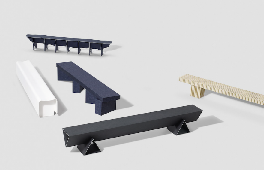
To show what the material was capable of, Really and Kvadrat recruited designer and material enthusiast Max Lamb to create several benches using their new material. Prior to building, Lamb produced a number of compelling material experiments with a CNC to see how the textile board pieces could connect, bend, flex, and form in order to create a piece of furniture. The pieces are, unsurprisingly, thoughtfully designed, creating a look that suggests an airiness akin to foam core while allegedly being quite structurally sound.

Lamb proves to be a wise choice for the debut of this progressive new material, as he's a designer who not only embraces new materials but also makes best of their sometimes raw nature—for example, the closeup of the lattice bench reveals several un-sanded edges. This detail hints to me that the material might be one that requires a delicate handle during build, perhaps something best suited for CNC milling. That said, the material in final form does reflect a beautiful matte tone that I could easily see being used time and time again in high-end furniture—though the question remains how durable the material will be over time. 

Questions aside, Kvadrat and Really's contribution to the circular economy, creating objects that derive from previously consumed products, is a step in the right direction as it speaks to a pressing issue in the conscious design community—how do we make best of waste and refurbish it to create something lasting that people will hope to hold onto for years to come? 

The launch of Really's debut collection of Solid Textile Board takes place Tuesday, April 4th and will run til the 9th at Project B on Via P. Maroncelli 7 in Milan. 

On Wednesday, April 5, designers Max Lam and Christien Meindertsma will take part in a panel discussion surrounding the topic of circular economy. 

Biophysicist Designs Drip-Free Wine Bottle

$
0
0

Here's a reminder that there are plenty of everyday objects around us that still need a re-design. The observant industrial designer should note that water tends to pool around the base of a hand-pump soap bottle, leaving a dark ring on the countertop over time, or that pouring from a fresh wine bottle tends to come with a little drippage. Yet it is biophysicist Daniel Perlman, not a designer, who has observed and solved the latter problem.

Oenophile Perlman studied slow-motion footage of wine being poured. He then experimented with a diamond file to create the following fix:

If you can't tell what's going on, the channel that Perlman has machined into the lip of a stock bottle is precisely-sized so that liquid cannot flow across it and thus drip down the neck of the bottle. If that seems simple, consider that it took Perlman three years to develop the idea and perfect the depth and width of the groove.

Some of you may also say that this is already a solved problem. But as Brandeis University, where Perlman is a professor, points out:

There are already products on the market designed to prevent wine spillage, but they require inserting a device into the bottle neck. Perlman didn't want consumers to have to take an additional step after they made their purchase. "I wanted to change the wine bottle itself," he says. "I didn't want there to be the additional cost or inconvenience of buying an accessory."

Perlman is currently in talks with bottle manufacturers.


Viewing all 19147 articles
Browse latest View live


Latest Images