Quantcast
Channel: Core77
Viewing all 19119 articles
Browse latest View live

How Many Industrial Designers are in Each U.S. State?

$
0
0

After seeing the graphic below posted by Business Insider, folks on social media have misinterpreted it to mean that "Fashion Designer" is the most popular job in New York. It's not. It's the most disproportionately popular job in New York, meaning that fashion designers nationwide account for 1.4 out of every 10,000 jobs, but in New York it's 8.3 out of 10,000.

Anyways, the hell with fashion designers. We accessed the Bureau of Labor Statistics' 2016 figures to find out how many industrial designers are in each state, and who has the most. Here's what we found, and take it with a grain of salt--note that they list the profession as "Commercial and Industrial Designers."

Commercial & Industrial Designers, by State

Alabama - 240
Arizona - 180
Arkansas - 100
California - 3,880
Colorado - 420
Connecticut - 330
Florida - 770
Georgia - 640
Hawaii - 50
Idaho - N/A
Illinois - 1,450
Indiana - 700
Iowa - 400
Kansas - 170
Kentucky - 270
Louisiana - 350
Maine - 150
Maryland - 290
Massachusetts - 770
Michigan - 6,600
Minnesota - 640
Mississippi - 70
Missouri - 500
Montana - 40
Nebraska - 80
Nevada - 80
New Hampshire - 100
New Jersey - 1,050
New Mexico - 40
New York - 2,910
North Carolina - 800
North Dakota - 30
Ohio - 1,210
Oklahoma - 240
Oregon - 330
Pennsylvania - 880
Puerto Rico - 70
Rhode Island - 240
South Carolina - 710
South Dakota - 80
Tennessee - 440
Texas - 1,100
Utah - 300
Vermont - 150
Virginia - 410
Washington - 400
West Virginia - 120
Wisconsin - 790

Commercial & Industrial Designers, by Employment Figures

Michigan - 6,600
California - 3,880
New York - 2,910
Illinois - 1,450
Ohio - 1,210
Texas - 1,100
New Jersey - 1,050
Pennsylvania - 880
North Carolina - 800
Wisconsin - 790
Florida - 770
Massachusetts - 770
South Carolina - 710
Indiana - 700
Georgia - 640
Minnesota - 640
Missouri - 500
Tennessee - 440
Colorado - 420
Virginia - 410
Iowa - 400
Washington - 400
Louisiana - 350
Connecticut - 330
Oregon - 330
Utah - 300
Maryland - 290
Kentucky - 270
Alabama - 240
Oklahoma - 240
Rhode Island - 240
Arizona - 180
Kansas - 170
Maine - 150
Vermont - 150
West Virginia - 120
Arkansas - 100
New Hampshire - 100
Nebraska - 80
Nevada - 80
South Dakota - 80
Mississippi - 70
Puerto Rico - 70
Hawaii - 50
Montana - 40
New Mexico - 40
North Dakota - 30
Idaho - N/A

Commercial & Industrial Designers, by Mean Salary

Alabama - $69,340
Arizona - $69,690
Arkansas - $68,650
California - $74,780
Colorado - $74,390
Connecticut - $59,870
Florida - $62,600
Georgia - $66,000
Hawaii - $54,300
Idaho - $74,910
Illinois - $66,780
Indiana - $63,700
Iowa - $56,050
Kansas - $56,330
Kentucky - $59,600
Louisiana - $69,560
Maine - $59,870
Maryland - $63,200
Massachusetts - $84,100
Michigan - $78,300
Minnesota - $59,570
Mississippi - $68,790
Missouri - $55,950
Montana - $60,680
Nebraska - $70,990
Nevada - $78,590
New Hampshire - $69,240
New Jersey - $88,170
New Mexico - $52,480
New York - $69,630
North Carolina - $75,810
North Dakota - $44,030
Ohio - $64,440
Oklahoma - $54,710
Oregon - $62,150
Pennsylvania - $66,680
Puerto Rico - $34,680
Rhode Island - $68,960
South Carolina - $80,240
South Dakota - $42,830
Tennessee - $51,120
Texas - $74,840
Utah - $57,320
Vermont - $61,060
Virginia - $53,100
Washington - $75,910
West Virginia - $66,860
Wisconsin - $59,910

The Bureau of Labor Statistics provides a very general breakdown; the figures above do not include architects, UI/UX designers, CAD jockeys, et cetera. 

For a much more detailed breakdown, check out our Coroflot Design Salary Guide. It's loaded up with helpful infographics and statistics for specific design fields, includes both salaried workers and freelancers, and provides a more accurate overall picture.


High Design: The Growing Role of Design in the Cannabis Industry

$
0
0

Happy 4/20! To celebrate the dankiest day of the year, we'll be taking a mini tour through the elevated design of the contemporary cannabis industry. Have you ever wondered how people in those states do things? How do weed stores work? Or why is vaping such a thing? How do you accurately label recreational drugs? Are all bongs doomed to be ugly? Over the next few High Design posts, I'll do my best to lift some answers out of the haze and spark more interest in America's fastest growing industry. We'll talk to budtenders at cutting edge cannabis shops, break out product trends and failures, and talk about where weed needs design most in 2017.

After years of slow breakthrough in the legalization of recreational marijuana, 2016 was a turning point for public vending, and it has skyrocketed the popularity and profitability of cannabis. As you'd expect, savvy designers have been along for the ride. Weed churned over $7.4 billion in sales in 2016—and America could only claim five recreationally legalized states until the November election, when it added four more... where vending is still only legal on paper. Oregon alone sold over 11,000 pounds of cannabis in the first three months of 2016 and netted the state over $5.5 billion in tax revenue by year end. Investments in cannabis are crackling, and the value of the national industry is estimated to top $24 billion by 2020. Not to sound like a conspiracy theorist, but I doubt Pantone's "Greenery" came out of nowhere, man. It's a lucrative niche to work in, and it owes a good deal to good design. 

If the retail trends of the last two years are any indicator, working in cannabis is more than just lucrative —it's a big career booster for product designers. Local shops are more than a pickup site for a score, they're increasingly positioning themselves at the intersection of technology, design, and user education. 

Serra, Portland OR
Journey Pipe at Sweet Flag

While the history of microbreweries offers several easy corollaries for product specialization, cannabis retail has the unique feature of bringing previously illegal and underrepresented products and desires to light and using design to redefine the market itself. If anything, the pivot in cannabis design harkens how sex toy designers and stores worked to redefine customer comfort with better product design and branding, beautiful displays, bright lighting, and knowledgeable female staff. 

Still life with 

Legal status has sparked a concerted push for rebranding everything from familiar pipes to the buying experience to the high itself. In such a rapidly opening field, distinctive new products are extremely in demand. Once rebellious, silly and secretive, the cannabis industry is hungry for classier tools, inoffensive packaging, and professional grade problem solving. 

This also means the chances of a design being picked up are unusually high. Though not a tiny industry, its newness, innovation and powerful profitability currently make it easier to get new product ideas all the way to production.

Additionally, with the logistics of how folks are getting high shifting to brick and mortar stores and an explosion of delivery methods, new and old users are both likely to encounter new products. This means lower brand loyalty and fewer deeply ingrained patterns of use. It's a thrilling time for designers hoping to make a splash. 

A beautiful and geometrically dosed cannabis bar by Defonce Chocolatier

Thanks to tricky federal laws against cross-state trade on some but not all products, cannabis is a highly localized supply chain. This means that for now, markets are fairly self-contained, which can be a great boon for developing a brand or following, or a design problem to push against (with oversight from your legal team). 

The mounting pile of positive medical applications and less psychoactive CBD varieties maintains a wide range of target users and angles for designers to consider. The mix of legal constraints, cultural cache, personal haptics, and enormous range of use make problem solving around cannabis particularly interesting. 

No don't

The design questions range from fun to serious, with as much or little tie-dye as you like. Are traditional pipes off-putting for first time users? Is anyone making glass pipes and bongs tasteful enough for your mom to use? Which stash boxes are cool enough to leave on a desk? How do you make childproof containers for people with limited mobility? Can homegrowing be made easier? 

With an increasingly destigmatized product, appealing to traditional stoner culture is just one tiny fragment of the cannabis design puzzle. 

Coming up in the series, we'll tour beautiful weed shops and explore how they work, talk with budtenders and vape designers, and take a look at some of the most important cannabis-adjacent design innovations. While you may still be thrilled to score a word of mouth baggie and enjoy it in a glass pipe your brother forgot when he left for college… smart designers have been hard at work to build better and more attractive ways to partake. And we're going to talk about it.

Stay tuned and stay safe!

Your Laundry Wastewater is Killing the Ocean. Here's How to Stop It

$
0
0

All of us wear laundered clothes, yet few of us think about where the dirty water coming out of the washing machine goes. But Rachel Miller is a cofounder of the nonprofit Rozalia Project, which deals with marine waste on America's East Coast, and she knows exactly where it goes: Into the ocean.

This presents a major textiles-based pollution problem. "We are eating our fleece," Miller writes. "Every time we do laundry, our clothes shed tiny microfibers (including plastic), which go down the drains of our washing machines, through wastewater treatment facilities and into our waterways.

The single biggest pollution problem facing our ocean is microfiber: trillions of pieces of tiny fibers flowing into the ocean – every time we use our washing machines. Our clothing is breaking up, sending this microfiber (made of plastic and chemical-covered non-plastics) out with the drain water – just one fleece jacket could shed up to 250,000 pieces per garment per wash [source]. New York City, alone, could have 6.8 billion microfibers flowing into its harbor every day. We are all contributing to this problem.

To combat this, the Rozalia Project designed a simple solution: The coral-inspired Cora Ball.

The Cora Ball is made entirely from recycled plastic (which is why the color combinations may seem odd; the sourcing varies). We're pleased to see it's been nearly 3,000% funded at press time, with $274,965 in pledges on a measly $10,000 goal. If you want one of your own, you'd better hurry—there's just five days left to pledge.

I just pledged myself, as I own two dogs and have been seeking a way to get their hair out of my laundry batches. Side benefit to saving the ocean.

Spotted On Coroflot: A Slick Stashbox With A Hidden Humidor

$
0
0

To celebrate the seasonal greenery, today's Coroflot find is a deep cut with lasting appeal. The Greenskeeper was designed by Colin Jackson of Ink Studios to address the insufficient options for attractive and material-wise stash boxes. You might think you're fine hiding those little baggies of dead oregano in your sock drawer, but it's 2017 and you deserve better. 

The core premise of the Greenskeeper is the value of keeping your weed in a well controlled environment, and keeping it well organized while you're there. Like any plant, exposure to UV radiation and oxygen can sap the juicy life force out of cannabis and turn dank nugs to depressing ones. The Greenskeeper addresses this is a couple interesting ways. 

First, the little capsule itself is closed with a simple protective UV resistant dome. The form and plastic tone feels reminiscent of 1970s humidifiers. Or a tiny popcorn maker, which would make a great second item in the collection.

Second, the need for controlled atmosphere is accomplished with an air locking fit, and a one-way air release valve. Once closed this cuts our odor leak and keeps humidity at the desired interior level. 

Third, the humidity level can be tailored for your own space by stowing humidity packs or beads in the base as needed. 

The other charming feature is the Greenskeeper's tidy storage. While some cannabis consumers are one and done once they find their ideal strain, many don't. Particularly now that regulation has allowed for tested and labeled product and smarter buying decisions, it's not unusual for a medical user or enthusiast to have multiple strains on hand. The inner containers tidily keep from 3 to 5 vials ordered by type, date and other important information (think side effects or comparison notes).

Though the darker plastic lid dims some of the flashy green inside, the labels are visible from the outside of the container, making correct selection easy. Keeping the label see-through is also a nice way to get around possible medical or pill caddy vibes without resorting to boring opacity or ham-fisted graphics. Though if I had five different strains in my house at any given time I'd be double fisting ham regularly, so maybe that would be fine too.


Milan Design Week 2017: Form Follows Fiction

$
0
0

As the industry's biggest annual trade fair, the Salone del Mobile is certainly an occasion to reflect on the state of design today—both implicitly and explicitly as certain schools and organizations take the opportunity to critique the commercial pretense of both the Salone and the mobile. This year, two venues in particular captured a more cerebral notion of design week, though the skepticism—about making more stuff—also took various forms around Milan.

Once again, Atelier Clerici—a perennial exhibition set in the eponymous Palazzo in the heart of Milan—served as a kind of embassy for Dutch design, anchored by the Design Academy Eindhoven and a half-dozen kindred spirits. (Full disclosure: I am currently a student in the Masters Design Curating & Writing program at the DAE.) Curated by Jan Boelen, the head of the Masters in Social Design, the heady exhibition was conceived as a high-concept critique of contemporary newsmedia in the context of design weeks, Milan, and reportage in general. Set in a darkened mock TV studio, the slick production value of #TVClerici relegated artifacts to the periphery of the double-height space, such that the daily performances would literally take center stage. 

Enter a uccaption (optional)

Once again, Atelier Clerici—a perennial exhibition set in the eponymous Palazzo in the heart of Milan — served as a kind of embassy for Dutch design, anchored by the Design Academy Eindhoven and a half-dozen kindred spirits. (Full disclosure: I am currently a student in the Masters Design Curating & Writing program at the DAE.) Curated by Jan Boelen, the head of the Masters in Social Design, the heady exhibition was conceived as a high-concept critique of contemporary newsmedia in the context of design weeks, Milan, and reportage in general. Set in a darkened mock TV studio, the slick production value of #TVClerici relegated artifacts to the periphery of the double-height space, such that the daily performances would literally take center stage.

With the galleria transformed into a black-box playhouse, #TVClerici could best be described as an overambitious bit of theater, brazenly skipping ahead to meta-meta-level critique as a performance about media. In that sense, the concept soared over the heads of visitors without quite scratching the surface of the sensationalist culture it set out to expose, not so much a mirror for society but rather another spectacle among others. After all, a daily series of scheduled performances — staged, semi-scripted segments—are not fictional events but decidedly real ones.

Contrived though the "look behind the curtain" may have been, the concept stopped short of onanism, thanks largely to the pseudo-professional production (down to the trucker caps) and earnest dramaturgy (i.e. recent grad Olle Lundin). All told, #TVClerici did offer commentary on specific issues in culture —gender, identity, etc. — precisely by renouncing design and aspiring to art.

The balance of the offerings at Atelier Clerici were rather more conventional, with several notable presentations in the gilded halls of the neoclassical former residence. As a counterpoint to the void of the stage, two other exhibitors opted for a single massive plinth in the center of the room. Amsterdam-based periodical MacGuffin (pictured above) literally and figuratively examined the sink—each issue explores a single subject at length—while the Envisions collective reprised their graphically arresting mise-en-scène of models and form studies. (Other participants included Het Nieuwe Instituut, Fictional Journal, Space Caviar, Z33, and more; see more images below and find more details here.)

See more images of Finsa by Envisions here.

If Boelen's boldest statement was to bring the Design Academy from the periphery of Milan (i.e. Ventura Lambrate) to the very heart of the city, it was another exhibition tucked in a relatively quiet corner of town that posed a veritable counterpoint. Isolated if not insulated from the other design week festivities, Cascina Cuccagna, a converted urban farmhouse, hosted another polemical group exhibition. 

Forgoing the knowingness of a hashtag for a pithy declaration, Capitalism Is Overwas clearly billed as "a provocation or parody," its overarching message (per the title) at once blunt and pointed. Curators Raumplan commissioned editorial and documentary photography to illustrate the point, the former imagery serving as a kind of ad campaign, the latter physically and metaphorically sited at the center of the second-story space. (In the wings around the courtyard, smaller galleries offered an eclectic mix of projects in varied media, from data visualization to spoken word, to round out the exhibition.)

The spirit of the Capitalism Is Over comes in the guise of architecture photography: On one hand, "But It Used to Be So Cool" documents Olivetti's headquarters in Ivrea as a throwback to post-war prosperity; on the other hand, "Bigger Faster Cheaper" offers Gursky-esque imagery of IKEA and Amazon logistics hubs in Piacenza. The typewriter company, of course, represents the boom time between 1945–1975, Trente Glorieuses, since eclipsed by the rise of neo-liberal economic models that have resulted in the likes of IKEA and Amazon. The two series of photographs invite facile, fertile comparison—vaguely nationalist nostalgia versus unbounded robo-futurism—in the face of a so-called post-capitalist era, the "fictional framework" of the entire exhibition.

It was a sentiment that resonated not only throughout the Cascina Cuccagna—Capitalism Is Over also included a few room-sized installations and a single "stockroom" gallery with design objects (pictured above)—but also in other exhibitions in Ventura Lambrate.

While Kvadrat launched the much-publicized upcycling initiative Really., Design School Kolding took a more poetic approach to repurposing waste materials and offcuts. For Super Supermarket, the Danish academy partnered with the textile manufacturer and 13 other brands, from Fritz Hansen to Ecco to Royal Dansk, repackaging scraps of leather, metal, plastic, and even potato pulp into faux-grocery items. Thoughtfully conceived and executed, the retail setting offered a delightfully subversive twist on both consumption and upcycling, coming as close as possible to having one's cake and eating it too.

But perhaps the most compelling fiction came from yet another school. Further afield in the Lambrate district, Burg Halle staged How Do We Deal with This?, a performative investigation into the topic of borders. The chainlink fence and whitewashed medical setting alluded to more pressing problems in society, those for which design alone may not be able to offer a solution, literally encapsulating the placebo effect of late-capitalist consumer culture in the form of a pill.

Ostensibly about geopolitical borders, the metaphor applies to design as well: Where do we draw the line between art and commerce? At Atelier Clerici, the DAE's transgressive presentation format was a kind of sleight of hand, eliding the distinction between the design and how it is represented. Did #TVClerici overstep the definition of design by extending it to include media writ large—i.e. conflating TV "production" with the design and manufacturing of objects? Moreover, will capitalism ever be "over?"

Either way, the show must go on.

Sketch Jam – Final Day to Apply to Our Live Sketching Showdown

$
0
0

Are you a wet-behind-the-ears student looking for an angle into the big leagues of product design? Are you a grizzled design veteran desperate for a last shot at glory? Can you sketch like a fiend? Ideate in your sleep? Are you only truly at peace while bathing in the heat and pressure of deadlines? Yes?  Then get in the game!

As a part of Design Week Portland, Core77 and Coroflot are hosting a bracketed design sketching tournament in Portland, Ore. on the 26th of April. Today is the last day for you to apply to be among the 16 contestants facing off that evening. Application is as easy as filling out our new Coroflot talent profile and confirming your interest.

All contestants will get some cool swag and one will walk away with a 27" Wacom Cintiq.  So if you have the skill and the will, start your journey to the top now...

Spectator?  We are bringing in the bleachers for this and beers, and tchotchkes – Get a $5 ticket while you still can!


Hand Tool School #28: How to Apply Masterpiece Wood Finish

$
0
0

After I finished building a pedestal table based on the Hancock Shaker Table, I thought I'd try a finishing system I hadn't used before. I went with the 3-part oil-and-wax finish made by Masterpiece Wood Finish. Here I'll share my experience with it.

Deciding if This Finish is Right for Your Piece

First off this isn't a highly durable finish, and not maintenance free either; if your furniture will get a lot of heavy use then this may not be the best solution, or you may want to combine it with a varnish topcoat or something similar. For this table it will be fine, as it won't see more than a vase of flowers or the occasional paperback book.

The real winner about this type of finish are the oil basecoats that sink into the wood and give it that depth of color and natural luster. I built this table from some beautiful Walnut that already had lots of contrasting purples, tans and chocolate browns in it as well as a bit of curl figure on the central column. I knew the oil would highlight this character well. The addition of wax gives the woodworker the ability to adjust the shine of the finish while still keeping that depth and close-to-the-wood, finished look and this seemed like the perfect thing for my lovingly created table.

How Does This System Differ From DIY Oil and Wax?

As best I can tell, the Masterpiece system, while not terribly different from a can of Linseed oil and some paste wax, does simplify some elements and make the application pretty idiot proof. I haven't been able to get a clear answer on what "blend of oils and waxes" they employ (trade secret no doubt) and how this makes their finish superior to the DIY method, but the step-by-step instructions and premixed jars of finish do make the whole thing a lot easier with no guesswork. So if we assume the actual finish is no different, then I think this system still comes out ahead in application ease. But I'm getting ahead of myself, lets break down the process:

Step 1: Two coats of the oil basecoat

This is the money coat! The dry wood is very thirsty and will soak up the oil quickly. You want to apply a very wet coat, and give each about 20 minutes to penetrate then wipe off the excess. Then allow at least 24 hours to dry between each coat. It doesn't get any simpler than this. I even rubbed it on with just my fingers (with gloves). Immediately it brought the wood to life.

Step 2: Two coats of oil and wax blend

I do think the midcoat step here is a plus over the DIY oil and wax finish, as it acts as a pore filler to give you a ridiculously smooth final surface. If your project is using a closed-grain wood like Maple or Cherry then this may not be a big deal to you, but with a semi ring-porous wood like Walnut, it really leveled and smoothed out the surface nicely.

Unlike the basecoat, this step is more like applying a really viscous wax. It is even a bit grainy in texture. I found this step worked best if I heated the jar a bit in my glue pot water bath; it allowed the finish to flow more readily.

You slather on a heavy coat, let it soak in for 20 minutes then come back and wipe it off. Allow another 24 hours to dry between coats here as well, as there is still oil in the mix and without proper drying time the surface will be tacky. Don't panic it goes on in a white, waxy, pasty mess and covers up your beautiful oil finish; you might immediately start to panic thinking you just ruined it, but when you come back and wipe it down with a paper towel you see the magic come to life.

Use a little elbow grease here to build up some heat and you will start to see a lovely warm luster spring up out of the wood. One coat at this phase would probably work for most species of wood, but I found the second coat to be an insurance policy to make sure I had a perfectly smooth surface for the final step.

Step 3: One coat of wax

The final step is all wax, and it looks and applies just like you would expect it. The key here is less is more. Wipe too much wax onto the surface and you will end up with a hazy white-ish surface later on.

The process is to wipe on the wax, let it dry, then buff to the desired luster. The drying time really depends on how thick a coat you apply. Again, err on the side of a really light coat and you can expect it will be dry and ready to buff in a few hours (or to be safe, twelve hours later). If you find that you didn't apply enough wax, you can always apply another coat, but I can't overstate how you want to be careful how much wax you apply.

I actually waited almost 36 hours for the wax coat to dry (life intervened) and buffed the surface to a nice satin finish just using a paper towel. I then waited another two weeks for the finish to fully cure before going back and buffing again. If a high gloss finish is desired I would definitely wait at least two to three weeks before attempting it as you want the wax to be dry and hard. Though if a high gloss is your aim, then perhaps going with a different finish altogether is a better option.

Conclusion

There is no question this is a labor intensive finish; expect to take at least five to six days to complete the finishing process. Then add a few more weeks to the mix for that curing time, during which you want to put the piece in a well-ventilated area and put nothing on the surface. The results I think speak for themselves; the hand rubbed finish looks nice but most importantly feels incredible. This is a good thing because the finished look begs to be touched and you will find everyone who sees it immediately reaches out to run their hands over the wood.

Another nice factor of this specific finishing system is they provide you just enough to complete a typical project. For my small little table I had about half of the volume left over but I imagine a chest of drawers or a chair or table would use up the entire amount as designed. I would plan on having topcoat left over and for at least an annual reapplication as needed to maintain the luster. This is one of the drawbacks to a wax finish, as ongoing maintenance may be required. A lot depends on where the project sits and what kind of use it gets and how it is cleaned. Some dust products have oil and wax in them while others actually strip away wax.

If more durability is required, then you might skip the topcoat of wax and apply a varnish top coat. If you are worried about adhesion after the oil and wax midcoat, then a wash coat of 1/2- to 1-pound cut Shellac will ensure a good bond for your topcoat. I would use a super-blonde Shellac too, so as not to impart any additional color.

In the end, I have a mixed review on this finish. It worked as advertised and I have no complaints, but the lazy woodworker in me was not happy with the amount of work and the long application period. As someone who mostly uses Shellac and is used to applying several coats a day this process was painfully slow. I don't think that is a reflection on Masterpiece Wood Finish, but just a commentary on the type of finish.

However, looking now at my finished table I am really glad I took the time and effort to create this wonderfully touchable finish. Now my table sits in a corner with its best "come hither" flirtatious look. Put it this way, this is the first piece I have built that my wife noticed and commented on without me having to solicit her opinion.

Milan Design Week 2017: Exhibitions Around Town

$
0
0

There are always the industry veterans who lament a decline in the quality of Milan design week, but all told it was a solid one, with as many highlights as ever before. Sure, that might be attributable to the surfeit of events and exhibitions, but rest assured there is far more to see than we can possibly include in our photo galleries.

From the cavernous spaces of the new Ventura Centrale district to showrooms and palazzos throughout the city center, here is a selection of photos from the Fuorisalone to complementing our picks from the student exhibitions.

Maarten Baas, "May I Have Your Attention Please?"
For the inaugural Ventura Centrale design district, Maarten Baas came up with an attention-grabbing audio installation.
Photo credit: Ray Hu
Maarten Baas, "May I Have Your Attention Please?"
The exhibition marked the debut of the Maarten Baas 101 Chair for Lensvelt
Photo credit: Ray Hu
Maarten Baas, "May I Have Your Attention Please?"
The chair takes the Dutch designer's signature child-like style.
Photo credit: Ray Hu
Ventura Centrale
The new district, launched by the same folks behind Ventura Lambrate, repurposes the tunnels underneath the train tracks leading to the central station.
Photo credit: Ray Hu
Ventura Centrale - Baars & Bloemhoff presents "Transitions II"
The materials consultancy brought the second edition of its "Transitions" exhibition series to Ventura Centrale, following its debut at Dutch Design Week in October
Photo credit: Ray Hu
Ventura Centrale - Lee Broom presents "Time Machine"
Always up for a spectacle, London-basedLee Broom celebrated his tenth anniversary with "Time Machine" in Milan
Photo credit: Ray Hu
COS x Studio Swine, "New Spring"
The sensory installationmay have been pure spectacle, but it was widely regarded as a must-see during design week.
Photo credit: Ray Hu
Formafantasma, Foundation: "Ellipse"
For their solo exhibition "Foundation," the Amsterdam-based duo presented several new lighting experiments at Spazio Krizia.
Photo credit: Ray Hu
Formafantasma, Foundation: "Magnifiers"
Some pieces are from their "Delta" collection for gallery Giustini/Stagetti, Galleria O. Roma.
Photo credit: Ray Hu
Formafantasma, Foundation: "Riflesso - Test 2"
Others are experiments for their first industrial-scale project, for FLOS.
Photo credit: Ray Hu
View the full gallery here

Motion Magic's Trippy Endless GIFs

$
0
0

A graphic designer going by the handle Motion Magic has mastered a new art form. Neither still photograph nor video, s/he has struck upon a mesmerizing balance between the two:

"When creating this effect on still images, I take great care in the small details that help to add a more realistic feeling in the movement," the designer writes. "It's as if the moment captured is brought back to life with an endless mesmerizing motion effect." 

As for how s/he does it, s/he starts with a still image and transforms it using a program called Plotagraph Pro.

You can check out more of Motion Magic's work here and here.


Design Job: It's Electric! Tesla is Seeking a Color, Material, and Finish Designer in Los Angeles, CA

$
0
0

The Role As a Color, Material, and Finish Designer at Tesla Motors, you will be part of a creative team that is responsible for designing the future of transportation. You will work to translate trends into award winning designs that inspire customers throughout the world.

View the full design job here

High Design: How Cannabis Dispensaries Actually Work

$
0
0

It's a complicated but exciting time to talk marijuana in America. The medically invaluable and minimally harmful drug is fast becoming a socially normalized staple crop. But for folks in states where progressive values and massive tax income are less important than ineffective and racist drug policy, the idea of buying a scheduled substance so openly can feel mysterious and complicated. In part it is, but dispensaries are using design to fix that.

Cannabis stores in legalized states are at the crossroads of innovative retail and shifting legal constraints, and how they work IRL is fascinating. To get a sample of where the visionary edge of the industry is headed I toured Farma and Serra, two of the most cutting edge dispensaries in green-obsessed Oregon, to interview their buyers and budtenders. Farma was founded by cannabis researchers with an eye towards consumer education. Serra (Italian for "greenhouse" but rumored to be a reference to sculptor Richard Serra) was opened with an aim to bring cannabis to the more sensual and modern lifestyle.

Let's start with a standard tour. When arriving outside a modern dispensary you'll usually be met with tasteful signage and frosted glass windows, or a peek into a chic waiting room. This is because some jurisdictions disallow direct view into the sales floor, much like sex toy shops or strip clubs. Similarly it can double as security for the shops themselves - cannabis is not cheap merchandise. 

Farma, Portland OR

On entering a shopper will often be greeted by a front facing attendant who checks your ID for age, and might direct you to wait for a few moments. This is to manage the number of shoppers to salespeople - usually referred to as "budtenders" - to meet a legally required balance. While it might be mandated for security purposes, the high ratio of staff to shoppers also makes for ready access to product and information.

At this point the experience diverges a bit by each shop's ethos, but certain trends are already blooming. It's not common to see many symbols of traditional stoner culture - you'll find more attractive tilework and exposed brick than blacklight posters, and the color green and cannabis imagery are played down. You will however find clearly labeled and presented examples of the merchandise, be it flowers, oil, cartridges, concentrates, or edibles. Each shop tends to specialize in a particular category or a brand-tailored selection. 

Farma, on entering
Farma, looking back toward lobby
Farma

Farma for example prides itself on an exhaustive and deeply researched array of flower. Serra offers a more curated range, with an eye for experiential categories. Whatever the focus, each store usually has an internal method for communicating the "type" of high or range of experiences each offering can confer. There are often visual scales showing how intense the effects will be cerebrally or physically. This leads to the second important trend.

Farma

Budtenders are crucial to the modern dispensary. You can treat it like a liquor store - order by brand name and get out - but you shouldn't. All cannabis sold is tested by the state to ensure it is safe for consumption, and this usually includes a chemical breakdown of the active elements (the different cannabinoids and terpenes) in each strain. But because research linking strain chemistry to user experience is still nascent, the chemical fact sheet can only say so much about what users can expect. At shops like Farma, that fact sheet is both part of the buying process and part of the staff's research work well before it hits the shelves. They collect multiple user accounts from within the team, comparing their different dispositions and outcomes and triangulating with the vendor information.

Pairing the concrete testing information with a range of subjective experiences allows the budtenders to make exacting buyer-specific recommendations. Some users struggle with pain, anxiety, insomnia, low THC tolerance, or not laughing at stupid cartoons enough. Knowing first-hand how each strain may interact with personal factors is vital in making helpful suggestions for customers. 

Ben Frothingham, a budtender ("and some other things") at Farma describes the small team's genuinely excitement about triangulating official research and crowd-sourced industry data. "The impact of better information on people's lives is incredible. [Budtending] can be treated casually, but helping people make better decisions about their bodies is amazing."

If this sounds more complicated than the old Indica-vs.-Sativa, upper-vs.-downer way of describing weed experiences, it is. Every cannabis professional I talked to described the incredible value of working with customers directly, as a chance to explain how much broader the range of possible experiences really is. A seasoned budtender at Serra (called 'docents' in house) noted that convincing shoppers to consider other factors than THC content per dollar results in some of the biggest improvements in user experience. Getting high isn't a single line spectrum from sober to fucked up, it's a three-dimensional map, like wine or whisky if those could also alleviate multiple sclerosis symptoms. 

Serra, Portland OR
Serra

Because of this, budtenders are a cross between research librarians and boutique attendants - they're equally ready to give you a closer look at a sample or to break down common side effects if you're the paranoid type. 

The third macro trend in cannabis retail and design is pushing the sales and use experiences to reflect the breadth of options already present. Rather than emphasizing strain name or chemical breakdown alone, dispensaries are starting to break strains out by the general field of experience they fit into. Not everyone wants to dig into the science, but they deserve to have clearly delineated options for "invigorating and not distracting" or "plaster me to the couch." 

Serra

While trying to class up the appeal of weed, shops like Serra maintain a tactile and cheery attitude about the stuff. Their store isorganized to help shoppers peruse by vibe, with standalone tables full of beautifully arranged product and accessories, a far cry from the sterile glass cases of more traditional dispensaries. Letting shoppers interact with product without having to ask is a great shift in hierarchy in an industry traditionally run on insider knowledge and secrecy. Serra highlights their categories through the full product line, offering options like locally made co-branded chocolates that feature their curated cannabis blends. 

Serra x Woodblock Chocolate

The docent I met with also waxed poetic about the sculptural ceramics and accessory design coming out of the woodwork now that in-state sales are legal. Serra has previously teamed up with designers like Ben Medansky to make design inspired pieces that look perfectly at home in trendy households.

Soleri-inspired pipe by Ben Medansky

When it comes time to buy things get a little oldschool again. Some shops post pricing on boards like at the bar, others have tasteful menus like your favorite overly serious pop-up restaurant. In any case you just ask a budtender for the strain and amount you've decided on, and they leave to their vaults to get it. Thanks to The Man, credit card processing isn't a good idea, so get ready to use an on-site cash machine and pay by hand. 

Once cash has been exchanged, you'll usually be holding an airtight container of product inside a larger child-proof bag. Swankier places might send you out the door with a cute gift bag. None of it is terribly low-key, but that's kind of the point. Shopping at a dispensary is a normal high-ticket shopping experience, with a few federal kinks thrown in. By blending the sterile authority of medical spaces with the friendliness of local boutiques, modern dispensaries are positioning themselves as welcoming gatekeepers for a previously off-limits culture.

Reader Submitted: Say Hi to LoLo, Kitchen Storage with a Smile

$
0
0

Traditional compact kitchen cabinets take up unnecessary space in the office and end up cluttered with junk.LoLo, themodular micro-kitchen, is a modern and flexible kitchen alternative for small spaces in offices, hostels or even at home. Designed in Russia, it is produced by furniture design start-up LLLOOCH.

The uniqueness of the LoLo concept is that it organizes space and provides an aesthetic solution for public areas such as meeting rooms, receptions or open offices.

View the full project here

Mid Century Modern Find of the Week: Kai Kristiansen Cupboard

$
0
0

This small, two door teak credenza was designed by Kai Kristiansen for Feldballes Møbelfabrik in the 1960s.

Originally, this piece would most likely have been paired with a modular wall unit.

These are typically found in small flats in and around city centers like Copenhagen, being used as hallway or entry chests.

Two sliding doors open to reveal two bays with an adjustable shelf and two drawers.

To provide context, Core77 is producing a companion entry on Kai Kristiansen and Feldballes Møbelfabrik. Stay tuned!

_________________

This post is provided courtesy of Mid Century Møbler, which specializes in importing vintage Danish Modern and authentic Mid Century furniture from the 1950s and 1960s.

MCM Furniture Design History: Kai Kristiansen, Danish Modern's Last Living Legend

$
0
0

In the last MCM Furniture Design History post, we mentioned that Kaare Klint founded the furniture design department at the Royal Danish Academy of Fine Arts in 1924 and influenced the next generation of Danish furniture designers. The designer in this week's MCM Pick of the Week, Kai Kristiansen, is one of those designers.

Kristiansen's style, presumably informed by Klint, is known for clean lines, functionalism, and Kristiansen's own outside-the-box thinking.

Born in 1929 in Denmark, Kristiansen began studying under Klint at the Academy in 1949. At the age of 26 Kristiansen had set up his own studio, and produced his first "hit" design in 1955:

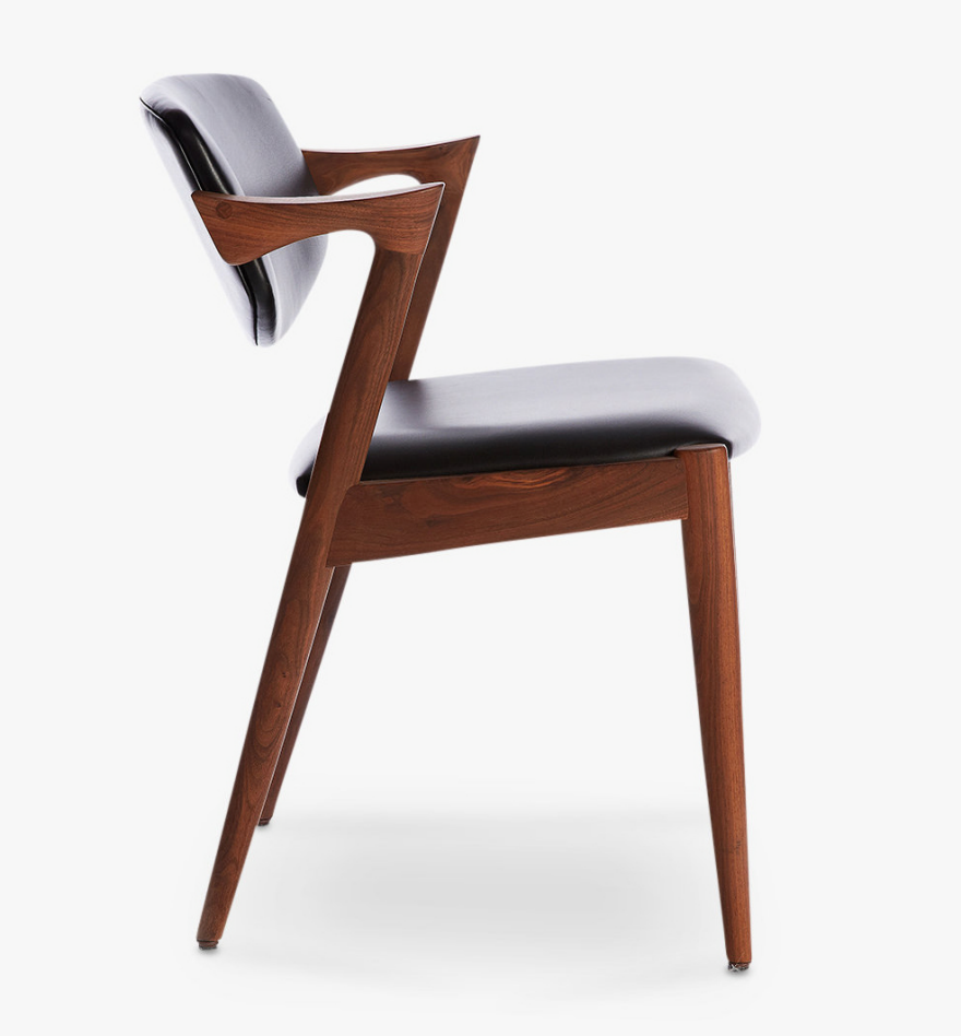
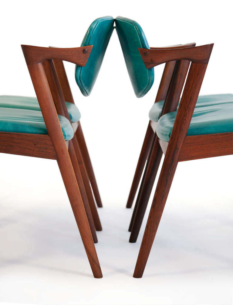
That's the #42 Chair, created for manufacturer Schou Andersen. It was radical at the time in that the rear legs, not the front legs, were what supported the armrests. Also note that the suspended backrest appears to float, with no vertical support members coming into contact with it. This chair is recognized as a classic example of the Danish Modern style.

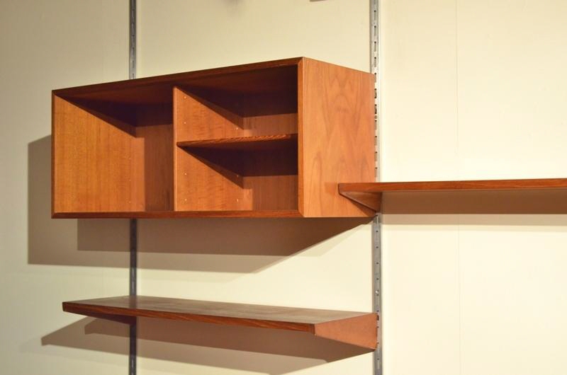
Kristiansen scored another hit two years later with the design of a modular wall system. In 1957, three years before Dieter Rams designed the 606 Universal Shelving System for Vitsœ, Kristiansen designed the Reolsystem Wall Unit:

It was well-received, both domestically and internationally. While much more of a commitment than purchasing a standalone wall unit, the Reolsystem was popular because the end user could arrange and customize a variety of storage components on it to their specific needs.

The Reolsystem was produced by Danish manufacturer SB Feldballes Møbelfabrik, one of the many manufacturers Kristiansen was contracted by. (Others include Fritz Hansen, Magnus Olesen and FM/Fornem Møbelkunst, who took over production of the Reolsystem in the '60s.) Kristiansen designed chairs, desks, sideboards and wall units. The sideboard that Mid Century Mobler showed us as their Pick of the Week was also produced by SB Feldballes Møbelfabrik:

This is not one of Kristiansen's smash hits; it is a more workmanlike piece, designed for people's homes rather than a museum, and we must look closely at it to see what is significant about it. First off this piece was designed in the 1960s. To provide some context, let's look at this earlier sideboard designed by Kristiansen in the 1950s, here integrated with the Reolsystem:

As you can see, both the bureau and the sideboard have legs connected to each other by an apron or stretcher:

The Find of the Week sideboard, in contrast, has no apron at all. Kristiansen has pared down and minimalized the supporting structure as much as possible; the legs are connected only by two lintels running front to back, and these make the connection to the casework.

Photographed from this low angle, the lintels, though recessed slightly, are visible:

However, when seen from the angle at which this unit would most commonly be seen and interacted with--which is to say, standing height--the lintels disappear from view:

On the thin legs, the casework thus seems to float.

Like most mid century modern pieces, the casework itself appears seamless. The corners are mitered.

The faces of the drawers inside are pure form-follows-function, with a gentle curve cut into each face to admit fingers for pulling.

No fasteners are visible throughout, and the use of materials other than wood is sparing. Felt lines the drawers to prevent objects within from sliding as the drawer is opened, and the tracks that the sliding doors run on are presumably metal, but that's about it.

In the photo directly above, you can also see that the sides of the drawers are grooved, to accept the wooden runners affixed to the interior of the case. And looking inside the case, below, we can see three rows of holes beneath the two existing drawers:

These are undoubtedly to support additional runners, and it's likely that the customer had the choice, at the time of purchase, to specify how many drawers they wanted the unit to contain. It might not be as configurable as the Reolsystem, but there was still a measure of customization available.

Kai Kristiansen is alive today, and still actively engaged in design work, well into his 80s. Just last year Kristiansen released a new line of entryway drawers called Entre, produced by Danish manufacturer Great Dane. 

You can read the story behind those here.

Design Experience That Matters: Here's a Look at Our Build Process

$
0
0

Fabrication is always a blast, second only to field research in the hierarchy of excellent things about working in social impact design. It's an opportunity to escape our desks, and trade the abstractions of post-it notes and design frameworks for the satisfaction of creating tangible, physical things. 

At the end of last July, our focus on the summer design sprint for our Otter newborn warmer shifted from background research and product positioning to prototype fabrication. We drank lots of coffee and racked up the miles, dividing our time between DtM's Salem studio and the Autodesk BUILD Space in Boston.

Our goal was the development of the Otter's "alpha prototype," i.e. the first generation prototype that integrates both how the product works (warming elements) and how the product looks (user interface and overall aesthetics). A successful prototype would help us test our most critical assumptions about product features, manufacturing methods and price point.

Here's a look at that build process.

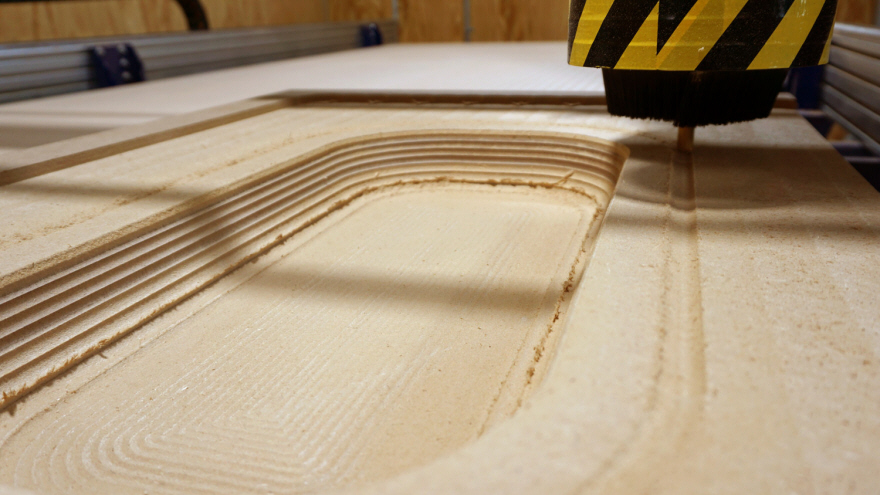
Machining molds with a CNC

Vacuum forming the bassinets

Designing and testing the temperature control system


Fashion Trends We Don't Understand, Using AI to Analyze Fonts, Inside a Legendary Piano Factory & More

$
0
0

The Core77 team spends time combing through the news so you don't have to. Here's a weekly roundup of our favorite finds from the World Wide Web:

A New York apartment like the one in Friends will cost you about 5 large. Plus, how much apartments cost in the post-war era.

Don't use this waffle iron pre-caffeine unless you want sticky fingers.

Core77 has you covered on the shoe design beat—the clippity clop horse-shoe design beat, that is… (Part 1, Part 2)

STAR WARS LAND DETAILS.

One month left to catch Hippie Modernism in Berkeley.

This week in fashion trends we don't understand: not fully putting your feet into your shoes and this $2,145 IKEA bag. Fashion, man. 

Along those same lines:

Congrats to our friend Michael DiTullo for launching his own studio!

IDEO's new 'Font Map' uses artificial intelligence to surface new relationships across fonts.

More Tesla news: They're making a pickup truck. We can't wait to see what it looks like (swoopy F-150?).

Barbie is now a YouTuber. There is so much, yet so little to say about this.

A car-free Earth Day in Manhattan should be... interesting.

A photo tour documenting the production process at Steinway & Sons, the world's most legendary piano factory.

Hot Tip: Check out more blazin' hot Internet finds on our Twitter page.

Kickstarter Goes Public with First Ever 'Request for Projects' 

$
0
0

Kickstarter is arguably the most well-known crowdfunding platform out there. At any given time, you can pledge to support virtually any project you could imagine, from magazines on the future of food to sand-cast metal bowls to desktop digital fabrication tools.

The wide range of projects the platform attracts is all fine and good, but what projects do the Kickstarter team actually get excited over? It's something we've always wondered, and now Kickstarter is finally giving us some insight through their very first 'request for projects'. 

Desktop waterjet cutter, Wazer.

Written by Kickstarter's Director of Technology and Design, Julio Terra, the request focuses on three project categories the Kickstarter team is specifically seeking out: Tools for Creating, Boundary Pushers, and Delightful Design. 

The three categories still cover a wide range of possibilities, but they do speak to Kickstarter's values as a public benefit corporation. Basically, even though making money is great, that's not the only way the company wants to measure success. Kickstarter is a platform to help innovative projects hit their business goals, and they are focused on maintaining that mission while looking towards the future. 

To learn more about each category, give the full request for proposals a read. If you're working on a project that falls under any of these three categories, Kickstarter wants you to reach out to their team through this response form.

How to Build a Modern Stool, Create a 3-Way Portable Bandsaw Holder, Apply a Durable Outdoor Finish & More

$
0
0

Porta-Bandsaw Stand

Whoa. Using a CNC plasma cutter, Jimmy DiResta designs and builds an effective 3-way portable bandsaw stand:

DIY or Pay Somebody to Do It?

Matthias Wandel answers the classic question here by inventing a series of experimental contraptions to help him refinish a floor. Some very interesting trial-and-error here:

How to Make a Simple End Table

A speedy build with humble materials: Izzy Swan taks on the "2x4 Challenge," where you're meant to produce something useful using only a pair of 2x4s as raw material.

Hourglass Time-Out Stool

A funny project for parents, maybe not so funny for kids: Izzy makes a time-out stool with an integrated hourglass to denote the time length of punishment.

Building a Modern Stool

April Wilkerson's in the UK this week, building a modern-style stool designed by Rhiannon from J Smith Woodwork:

How to Make a Ravioli Rolling Pin

Like Bob Clagett, I had no idea how raviolis were made using a specialized rolling pin. Here he demonstrates:

Wood Turned Plum Bowl

An experiment three years in the making, Frank Howarth has a lot of problem-solving to do on his way to turning a rather unusual-looking object:


How to Emboss Leather, Create a Sheet Metal Bender, How Much Linn's Shop Cost to Build & More

$
0
0

Steel Bender

Wicked! Laura Kampf builds a contraption to help her bend sheet metal into curves of different radii:

How to Glue Perfect Miters

As a bonus tip within this trick for gluing long miters, the Samurai Carpenter demonstrates an excellent way to glue miters of any size without getting squeeze-out glue-lines marring the very corners:

The Miracle Latch

Ron Paulk tells a story illustrating how this ingenious little device saved him a lot of work. It's a great example of how whomever invented this really knew his or her industry and invented something small but brilliant:

Durable Outdoor Finish

If you've got something made of wood that needs a tough, low-maintenance finish, you might want to consider marine-grade finishing products. Here the Wood Whisperer demonstrates:

How Much Did it Cost to Build the Shop?

Linn from Darbin Orvar runs down a bunch of small projects she's been working on, then delves into a Q&A where she reveals how much it cost to build her shop out:

Leather Box Embossing Experiment

Ben Uyeda pays homage to a certain space smuggler, and his eventual captor, as he experiments with embossing leather using a vacuum bag:


Design Job: Stay Cool! Hydro Flask is Seeking a Graphic Designer in Bend, OR

$
0
0

As the world's premier company for insulated products, Hydro Flask began with a challenge: to create a reusable water bottle that truly performs in any environment. It had to keep hot liquids hot and cold liquids cold. Period. We are hiring a Graphic Designer who will work

View the full design job here
Viewing all 19119 articles
Browse latest View live


Latest Images