Quantcast
Channel: Core77
Viewing all 19151 articles
Browse latest View live

Mid Century Modern Find of the Week: Bertil Fridhagen Club Chair

$
0
0

This elegant teak framed club chair was designed by Bertil Fridhagen for Bröderna Andersson in the 1960s.

Sophisticated teak banding runs from the arms to the back of this lounge chair.

The upholstery you see is not original, by the way; we had the chair recovered with new foam and blue wool by Kvadrat.

Here's a few more detail shots:

Chairs like this aren't available too often, and this is a great example of mid century design from Sweden, which is commonly overlooked.

_________________

These "Mid Century Modern Find of the Week" posts are provided courtesy of Mid Century Møbler, which specializes in importing vintage Danish Modern and authentic Mid Century furniture from the 1950s and 1960s.


A Device to Whip Out at the Movies When Your Neighbor Hogs the Arm Rest

$
0
0

A folding device that doubles the area of an armrest, clipping onto a seat (such as airplanes, buses, movie theaters, etc.) to give users on either side their own space. Also known as a Portable Armrest Extender/Divider. Solves the problem of fighting for armrests.

View the full content here

Design Experience That Matters: Four Design Principles that Turned a Prototype into a Bestselling Product

$
0
0
The final Firefly phototherapy device (left) and its predecessor, the Bilibed phototherapy prototype (right) at Da Nang Women and Children's Hospital in Vietnam.

Design that Matters uses the power of human-centered design (HCD) to solve problems for and with the poor in developing countries. In a partnership with the East Meets West Foundation (EMW) and Vietnamese manufacturer Medical Technology Transfer and Services (MTTS), we developed the Firefly Phototherapy device to address the health crisis of untreated newborn jaundice in low-resource settings.  Our goal was to build on MTTS's novel Bilibed phototherapy prototype, which they had already piloted in several Vietnamese hospitals.

The Firefly project involved the work of hundreds of volunteers and input from countless medical experts in the US and potential users in a dozen countries overseas.  To maintain our focus throughout the Firefly design process, we defined four design principles: effective, comforting, maintainable, and user-friendly.

These four simple principles lead to Firefly's high-tech aesthetic, comforting bird's-nest environment, wipeable surfaces, and hard-to-use-wrong design. These features directly led to end user adoption and the extensive impact Firefly has seen since its introduction.

This is the story of how we interpreted those design principles for Firefly, and how user feedback gave us confidence that we were on the right track.

Left: The Bilibed prototype was not well trusted due to its outdated aesthetic. Right: Firefly is designed to look like a modern medical device.

1. Effective

A high tech aesthetic drives perceived efficacy and user adoption.

Everyone knows what an effective piece of medical equipment looks like; everyone has seen them on TV, and nearly every hospital has received donations of high-end western medical equipment. Unfortunately, the materials and manufacturing techniques available in Vietnam constrained EMW's and MTTS' equipment to a utilitarian, but outdated "Soviet" aesthetic. Though their equipment works incredibly well and is designed to be much more suited to the rugged context, people didn't trust the equipment on first impression. From Bilibed to Firefly, we updated the aesthetic with a shift to rounded corners, modern materials and manufacturing processes, for a modern medical aesthetic healthcare providers and parents could trust.

Feedback about Bilibed:

"We don't use the bilibed alone because we don't feel it illuminates enough of the baby."

- Dang Van Tai, Head Nurse, Moc Chau District Hospital, Vietnam

"The sex appeal of the bilibed is low. When I was visiting Vietnam to provide training, some parents insisted the doctors use the overhead phototherapy instead of bilibed because they looked more modern."

- Dr. Steven Ringer, Chief of Neonatology, Brigham and Women's Hospital

First impressions of Firefly:

"My first impression when I saw Firefly was that it was very modern and probably very good."

- Vu Thi Huong, Nurse, National OBGYN Hospital, Vietnam

Left: The Bilibed prototype didn't look safe and comfortable to many caregivers. Right: The Firefly device better secures the infant and surrounds them in soft curves.

2. Comforting

Better engaging caregivers with the High Tech Bird's Nest.

A surprising finding from our field research was that Bilibed's overall design was not only outdated, but it also did not set parents or healthcare providers at ease. Adults, whether parents or healthcare providers, have natural instincts when it comes to caring for babies. We saw healthcare providers showing preference for closed incubators over open beds due to the all-encompassing, womb-like environment. We frequently observed naked newborns receiving phototherapy while lying on rolled-up cloths wrapped around the newborns like nests.

The Bilibed's aesthetic with sharp corners and low sides made caregivers hesitate to use it for newborns. Dr. Binh of Moc Chau District Hospital asked DtM to, "the bed should look like a bird's nest." The result is a rounded bassinet just the right size for a newborn and clear sides just high enough to keep the baby safe, but enable caregivers to keep close watch on the newborn. Additional features include the ability to remove the bassinet to keep baby comfortable during a quick check-up and a rounded top light to prevent bumps and bruises when being taken in and out of the device.

Feedback about Bilibed

"It is important for the device to be comfortable, providing enough space for the infant. Once the baby feels comfortable, he will not cry, and his family will feel more confident about the treatment."

– Dr. Nguyen Van Loc, Doctor, Ninh Giang District Hospital

Feedback about Firefly

"Firefly creates a safe condition for the patient. The shape is like a bird's nest wrapping the infant and comforting him. With overhead phototherapy, the baby just feels like they are out in space and the light is hanging over them. In Firefly, the baby feels very safe and families and doctors feel comfortable."

– Dr. Khuat Thanh Binh, NICU Director, Moc Chau District Hospital

Left: The Bilibed prototype was difficult to clean. Right: Firefly incorporated smooth curves and removable baby bed for easy wipe-down.

3. Maintainable

Easy to clean means wipeable to reduce infection.

Cleaning is a long-standing challenge in low resource settings, with few personnel to treat the newborns, cleaning often falls by the wayside. EMW and MTTS knew the key to cleanability was wipability. The most common available cleaner in Vietnam is rubbing alcohol. With the Bilibed, MTTS made an attempt at wipability, but found the quilted vinyl cover provided plenty of nooks and crannies where germs could hide. Cross infection is a serious concern with neonates, with sepsis as a leading killer. The resulting Firefly bassinet is perfectly smooth with no sharp corners making dirt visible and wipeable. The bassinet is also removable to enable occasional deep cleaning in a sink.

"Firefly is easier to clean than the Bilibed because it's plastic, while the Bilibed has crevasses and is made of leather, so it never quite feels clean. We use a wet cloth to wipe down the overheads while we use a chloramine disinfectant to clean the Bilibed and Firefly because we don't have enough alcohol."

- Cam, Head Nurse, St. Paul General Hospital, Vietnam

Left: Healthcare providers didn't trust Moms to be alone with the Bilibed prototype. Right: Healthcare providers ask to put the more durable and easy to use Firefly in the room with mom.

4. User Friendly

Bringing phototherapy into mom's room by going beyond "User-Friendly" to "Hard to Use Wrong".

As the Bilibed phototherapy is only lit from the bottom, we observed a number of people felt the need to turn the baby from back to stomach. With Firefly, the top and bottom configuration provides light on both sides of the baby, saving precious time for misguided staff who would otherwise turn the baby.

In addition, some healthcare providers in rural hospitals reported the vinyl surface of the Bilibed did not seem comfortable enough for babies. As a result, many healthcare providers would lay down a blanket that also blocked the light.

Firefly also has a cleanable plastic bed surface, so we added a top light that can provide effective phototherapy on its own. With Firefly, any hospital should be able to provide effective treatment, even if someone unknowingly blocks the bottom light with a blanket.

Feedback about Bilibed

"We'd like to put the Bilibed in bed with mom, but we're afraid she'll break it by spilling water or getting baby's milk or urine on it."

- Dang Van Tai, Head Nurse, Moc Chau District Hospital, Vietnam

First Impressions of Firefly:

"Firefly has only one button. You turn it on and it can't go wrong. No one needs to think about the brightness. It is very easy to use with one button."

- Nguyen Ngoc Loi, NICU Director, National OBGYN Hospital

After Firefly use:

"For use in the mother's room, I prefer Firefly. This is because it can be right next to the mother so she can better take care of the baby and it takes up less space."

- Trung Thi Nhu Huen, Doctor, Da Nang Women and Children's Hospital, Vietnam

"During these past months, I have noticed that with Firefly, moms never make a mistake in using it. With the Bilibed, the head is often where the feet should be which blocks more of the light."

– Dang Van Tai, Head Nurse, Moc Chau District Hospital

"I am very happy! This is the first time I have been able to be with him since he was born"

- Nguyen Thu Tuyet, Mother, Da Nang Hospital for Women & Children, Vietnam

Human-centered design was critical in uncovering these insights that transformed the Bilibed into what we know today as Firefly. Our close partnership with EMW and MTTS and the HCD process enabled us to connect with more than 200 doctors, nurses, administrators, technicians, parents, (and newborns) in Vietnam, the Philippines, Cambodia, Nepal, Bangladesh, Indonesia, and India. As a result, Firefly phototherapy has become EMW's flagship product enabling their newborn healthcare program to expand rapidly to rural hospitals throughout Southeast Asia and Africa.

Summary

In order to design Firefly phototherapy, Design that Matters used human-centered design to collect feedback about the Bilibed phototherapy prototype developed by partners East Meets West Foundation (an affiliate of Thrive Networks) and manufacturer MTTS. The resulting four design principles led directly to Firefly's successful adoption by healthcare providers in nine developing countries.

* Effective: A high-tech medical aesthetic drives perceived efficacy and user adoption.

* Comforting: Better engaging caregivers with the "high-tech bird's nest".

* Maintainable: Easy to clean means wipeable to reduce infection.

* User-Friendly: Bringing phototherapy into mom's room by going beyond easy to use to make it hard to use wrong.

We've discovered that with a little modification, these Firefly design principles serve as excellent guidelines for just about any medical device.

The collaboration between DtM, EMW and MTTS from 2011-2013 was made possible with visionary support from the van Otterloo family, the Lemelson Foundation and many other donors.  Firefly has gone on to win loads of design awards, including the Edison Award Gold, the top Spark! design award and IDSA IDEA Silver.  Even better, Firefly devices have now reached 23 countries from Afghantistan to Zimbabwe, and as of May 2017 they have treated more than 100,000 newborns.  Go design!

_____________________________________

This "Design Experience that Matters" series is provided courtesy of Timothy Prestero and the team at Design that Matters (DtM). As a nonprofit, DtM collaborates with leading social entrepreneurs and hundreds of volunteers to design new medical technologies for the poor in developing countries. DtM's Firefly infant phototherapy device is treating thousands of newborns in 21 counties from Afghanistan to Zimbabwe. In 2012, DtM was named the winner of the National Design Award.


The Small NYCxDesign Shows Worth Seeing This Weekend

$
0
0

So it begins... the height of NYCxDesign, and perhaps at its highest ever? 2017's New York May design calendar has turned out to be its most packed yet, and this weekend is the start of the real madness. Beginning this weekend, larger fairs such as ICFF, Sight Unseen OFFSITE and WantedDesign Manhattan will open their doors to the public along with a number of smaller exhibits around the city that are not to be missed. Here's a list of some alternatives to the "big kahuna" shows that you should definitely check out this weekend:

Stephen Burks Debuts Works from his A/D/O Design Residency

A/D/O's first designer in residence, New York based furniture designer Stephen Burks, will debut new pieces in his 'Man Made' collection made during his time in the residency. He will also lead a talk at the Brooklyn Space, speaking to how he's explored the fusion of craft and technology within his recent collection (the exhibition will also include a piece made in collaboration with our Core77 x A/D/O residents byjimmi! Stay tuned).

"Stephen Burks Man Made at A/D/O" takes place Saturday, May 20th 2pm-4pm at 27 Norman Avenue in Brooklyn—RSVP for the event here.

The Strong collection

Tom Strong isn't just any collector. His love for Dieter Rams' electrical products lead him to collect over 250 items within 50 years, including hair dryers, sound systems and a table cigarette lighter. For NYCxDesign, Vitsoe organized around 75 of Strong's objects into a lovely and very personal exhibition showcasing Rams' work over the years through the eyes of a dedicated fan. The exhibition is littered with fun quotes from the collector himself who believes, "the desire to collect is as insidious as marijuana." 

The Strong collection is on view at Vitsoe at 33 Bond Street, runs May3-24 10am-6pm

Open Monday-Saturday (select Sundays only) 10am-6pm

Salvage Lab

An exhibition of works from designers like Fort Makers, Wintercheck Factory and Brendan Timmins—designers who tend to toe the line between art and design—Salvage Lab is an exhibition in Soho worth noting. The motive of Salvage Lab is to breathe new life into reclaimed materials like isolation foam, porcelain and plastic, and the results of this sustainable experiment are just as unexpected as they are beautiful.

"Salvage Lab" at Castle Fitz Johns Gallery, 98 Orchard Street New York, runs May 19-22 10-7 pm.

Sight Unseen Presents

Sight Unseen has helped curate a special event series held at retail spaces and restaurants around Soho. See "millennial pink" in a new light at Drunk Tank Pink, eat pink ceviche inspired by the late architect Luis Barragan at Lalito, check out a new series of ceramic-topped tables on turned-wood legs by Brooklyn ceramicist Natalie Weinberger and more.

Various Soho locations

OVER / UNDER 

Ladies & Gentlemen Studio and new Australian design brand SP01 have joined forces to create a concept shop showcasing work from both design teams, along with rugs from CC-Tapis. The space is filled with pink, aqua and tan hued furniture, objects, lighting and rugs that come together to create one harmonious setting. It's tempting to plop down here for the rest of design week.

OVER / UNDER is on display at XOCO 325 at 325 West Broadway, runs April 28-May 31 11am-6pm

Furnishing Utopia

Photo by Charlie Schuck

Furnishing Utopia, an exhibition of objects by contemporary designers honoring the diligent design work of the Shakers, makes it back to NYCxDesign for the 2nd time in a row. This time, they've teamed up with Design Within Reach to display the work in the company's Soho retail space. Along with all the works from their debut 2016 collection, the exhibition includes new works coming from Furnishing Utopia's founders, Oregon-based Studio Gorm, as well as Studio Tolvanen, Tom Bonamici, Anderssen & Voll, Vera & Kyte, Urbancase and more.

"Furnishing Utopia" at Design Within Reach Soho Studio 110 Greene St New York, runs May 20-24.

Culturing Yogurt

MOLD Magazine is celebrating their launch and NYCxDesign with an exhibition featuring five objects found in their first issue, and they're all about yogurt! The magazine on the future of food commissioned designers to reimagine tools for yogurt eating and making within a contemporary context. The five objects will be on display at Canal Street Market during Design Week.

Culturing Yogurt on view at Canal Street Market at 265 Canal Street, runs May 19-22, 11am-7pm 

Lightness: The Full Spectrum 

Colony's current exhibition Lightness: The Full Spectrum explores what "light" is in all its forms and meanings. The delicate show is comprised of work of various mediums and from various designers, all experimenting with light in different and unexpected ways.

Lightness: the Full Spectrum is on display at Colony at 324 Canal Street 2nd Floor, runs through May 24 12pm-6pm

A Design Block Party in Soho

Kicking off this sudden summer weather surprise in New York is the perfect warm weather occasion: the city block party. On Friday, May 19th, Tom Dixon along with Dezeen will be taking over Howard Street in Soho to host a block party featuring drinks, tunes, and an "eye-catching" lighting installation by Dixon. Drinks, sun and design: what more do you need?

Howard Street Block Party takes place Friday, May 19th on Howard St 6pm-late.

Design for Artists, by Artists: MIDTOWN at Lever House

A show bringing together works by famous artists, fashion designers and storytellers, this exhibition of design objects curated by Maccarone Gallery and Salon 94 explores the sometimes blurry boundaries between "art and industry, high and low, fine art, craft, and design." Including works by artists Andrea Zittel, Urs Fischer, Nick Cave and Jessi Reaves, it also features work by unexpected players such as Laurie Simmons (artist and mother of Lena Dunham), fashion designer Rick Owens, and painter Marilyn Minter. "Together, the works on view provoke further questions about value," the press release reads. "If an object does not look slick, fabricated, and over-produced, does it have more integrity? If a work is handmade, is it more or less valuable? The fine lines between art and craft, artist and artisan, fade."

"MIDTOWN" is on display at Lever House 390 Park Avenue, 2nd Floor, May 3-June 9.

Find more NYCxDesign on our handy Design Week Map!

How to Cut a Japanese Scarf Joint, Move a 350-Lb. Rainwater Tank, Build a Kitchen Table & More

$
0
0

Table Saw Tuning and Repair on a Budget

Can't afford a fancy table saw? Neither could Matthias Wandel, back in the day. Here he shows you how he turned a garage sale find into a workable machine:

Hand Truck Trailer Hitching Trick

Matthias also shows us "an easy way to move and hitch a trailer without a trailer hitch crank, without breaking your back." Great trick:

The Rainwater Tank

Frank Howarth has big problems—literally. This week he has to figure out how to get a 350-pound rainwater tank out of his truck, into position and hooked up to the roof of his shop's drainage system:

Building a Kitchen Table

April Wilkerson designs and builds a joinery-heavy kitchen table, starting with the base:

How To Cut A Japanese Scarf Joint (Kanawa Tsugi)

The Samurai Carpenter shows you how he measures, marks out and cuts that crazy-ass Japanese Kanawa Tsugi timber framing scarf joint, then fits several pieces together:

Using Fusion 360 to 3D Print a Hose Adapter

Bob Clagett shows you how easy it is to make something practical using Fusion and a 3D printer:


How to Make a Marking Knife, Create an Indoor Garden, Build a Record Player Cabinet & More

$
0
0

The City Clock - Paris Design

La Fabrique DIY shows you their handsome City Clock, designed to look like a Parisian townhouse. They're launching a Kickstarter campaign for it too:

Thru-the-Floor/Wall Magnet and Compass Alignment Trick

Another handy tip from Matthias Wandel: Here's how to figure out, when drilling through a wall or floor, exactly where the drill bit will come out on the other side of that wall or floor.

DIY Indoor Garden With LED Grow Lights

Ben Uyeda makes a no-sunlight-required planter out of copper pipes and marble:

Making A Marking Knife From A Figured Walnut Gun Stock Blank

Nick Ferry makes a handsome marking knife from scratch:

Designing and Building a Record Player Cabinet

In this unusual build, Chris Salomone reflects on the interplay between skill, fear and design:

Turn A Log Into A Cup

There's one mid-project disaster, but Dustin Penner recovers as he creates a drinking vessel out of a log:

Machining Prototype Hinges

Alec Steele begins milling the hinge prototypes he forged last time, to eventually go on the box created for him by the Samurai Carpenter:


Design Job: Step it Up! The Step2 Company, LLC is Seeking a Senior Industrial Designer in Streetsboro, OH

$
0
0

The Step2 Company, the largest American manufacturer of preschool and toddler toys and the world’s largest rotational molder of plastics, is looking for a Senior Industrial Designer to work in the R&D Department at our Corporate Offices in Streetsboro, Ohio. The Senior Industrial Designer is

View the full design job here

Design Entrepreneurs, Take Note: There is a Market Designing Furniture for Geeks

$
0
0

As we saw with Geek Chic's beautiful tables for playing Dungeons & Dragons on, designing furniture for geeks is a good business model. Now we see that this furniture designer/builder on Etsy is addressing another segment within the geek market: Collectors of Star Wars figurines.

The creator uses hardwoods like Oak, Cherry, Mahogany and Walnut, and the windows are acrylic.

He's even got a model for the disorganized collector:

The designs are pretty basic compared to Geek Chic's high-end design. So if you're an entrepreneurial designer/builder looking for a target market, I'm guessing that combining the latter's design and finish level with the former's figurine angle would please ready customers.

Via the Awesomer


This Invention Lets You Make Perfect Chopsticks By Hand

$
0
0

At first I thought this was silly, but it's actually awesome! John Economaki, inventor and founder of Portland-based Bridge City Toolworks, has invented a contraption that allows anyone to make their own perfect chopsticks, completely by hand. Here he is unveiling the device at an event in Asia:

Consider that wooden chopsticks are more than just skinny blanks. The handle side is square in cross-section, then all four faces must taper down to a point that transitions to octagonal in cross-section, plus the butt end is faceted:

I just had to know how Economaki's device worked, and here he shows you:

The Chopstick Master, as he calls it, sells for $195. If that sounds pricey to you, consider that if you brought it to any kind of fair or festival and set up a make-your-own-chopsticks booth at $10 a pop, I bet you'd pay the thing off in a single day easy.


A Tiny Yet Powerful Radio Designed for Emergency Workers in Extreme Conditions

$
0
0

GoTennaPro is the world’s smallest, lightest, most affordable tactical mesh networking radio, and it works with any smartphone. It is designed and engineered for ultimate water/dust/impact-proof durability (MILSPEC/IP68); has swappable antennas; and the most powerful and private mesh-networking for text-based convos and off-grid geo-tagging, without WiFi or cell service. goTenna Pro is 12X lighter and 10X smaller than legacy comms systems. goTenna Pro represents a true paradigm shift for tactical communications. This is all compactly concealed within the smallest, lightest, sleekest, design of anything within the category. The Pro design is inspired by the needs of the rescuers and emergency workers who will need it in the most demanding conditions.

View the full content here

A Floating Shelf To Get Hung Up On

$
0
0

There are enough "floating shelf" designs floating around the internet to make a whole separate Pinterestesque website dedicated to them and their unstable storage promises. Raketa's Circulum shelf offers top-down storage with few of the standard flaws.

Hanging shelves are prone to a few flaws: the swinging effect that can spill your goods, the lack of bookends or firm sides to trap your goods, and large visual footprint. The Slovenian architecture and design team knows how to balance aesthetics and structural needs, and this project tackles each of these pretty elegantly.

The central design element that makes the Circulum shelves appealing is the way the circular platform is weighted from below. Adding a pendulum-like weight to the base, the symmetrical tabletop gains stability and interesting visual balance. Harder to set the whole thing spinning if you put your book down a little too enthusiastically.

The collection takes on shelving security in a couple ways, depending on the materials chosen. Offered in a range of hardwoods, metals, leather and marble, the base is shaped into either a gentle dish or a lipped tray. The curve/lip is dramatic enough to trap even small and skittery items (earrings, pills, vintage marbles bought at haunted estate sales) and keep them stashed in minimalist decor/maximalist style.

Lastly, the fine wire hanging system lets the "floating" shelf really appear to float. The narrow steel line leaves the thick base and shelf materials to pull nearly all of the aesthetic weight, hovering like a minimalist midair spinning top. A bit of an understatement compared with the floor to ceiling rope hanging that similarly named designs fall back on.

The point blank visual simplicity is obviously not simple to pull off, and the team's smart use of materials and weight fairly earned them a 2017 Red Dot nod. More on Raketa's Circulum tables and other architectural work here.

Save the Date - 2017 Core77 Design Awards Results Celebration

$
0
0

We're kicking the summer off right.

This year, to add a little spice to the end of the Design Awards season, Core77 is inviting you to join us for an inaugural Results Celebration party on June 8th at A/D/O in Brooklyn, where we'll be celebrating the 2017 Core77 Design Awards honorees, and toasting to another stellar year for the field of design.

Designers, design lovers, and everyone in between are encouraged to hop on over to Greenpoint, Brooklyn for a night of drinks, activities, and conversations, set against the backdrop of the 2017 winning projects, which will be digitally showcased in all their glory. The kicker? Every guest will be in the running to win one free Microsoft Surface Studio. Seriously, have you seen this video?

Excellence in design will be the theme of the night, but any and all are welcome to share in the festivities - we only ask that attendees RSVP before June 8th.

Space is limited, and is sure to fill up fast. RSVP as soon as possible to make sure you're not left out in the cold (okay, heat).

RSVP Here

Three Key Trends Spotted at Sight Unseen OFFSITE 2017

$
0
0

Set up as a gallery exhibition on the ground floor of 100 Avenue of the Americas in SoHo, Sight Unseen Offsite showcased some of the most innovative designers working today. Unlike other NYCxDesign shows, the editors of Sight Unseen almost dictatorially command who gets to participate or not. The result is a focused presentation of the best new design talent. Here are the three key themes observed at this year's show:

Everything Circular

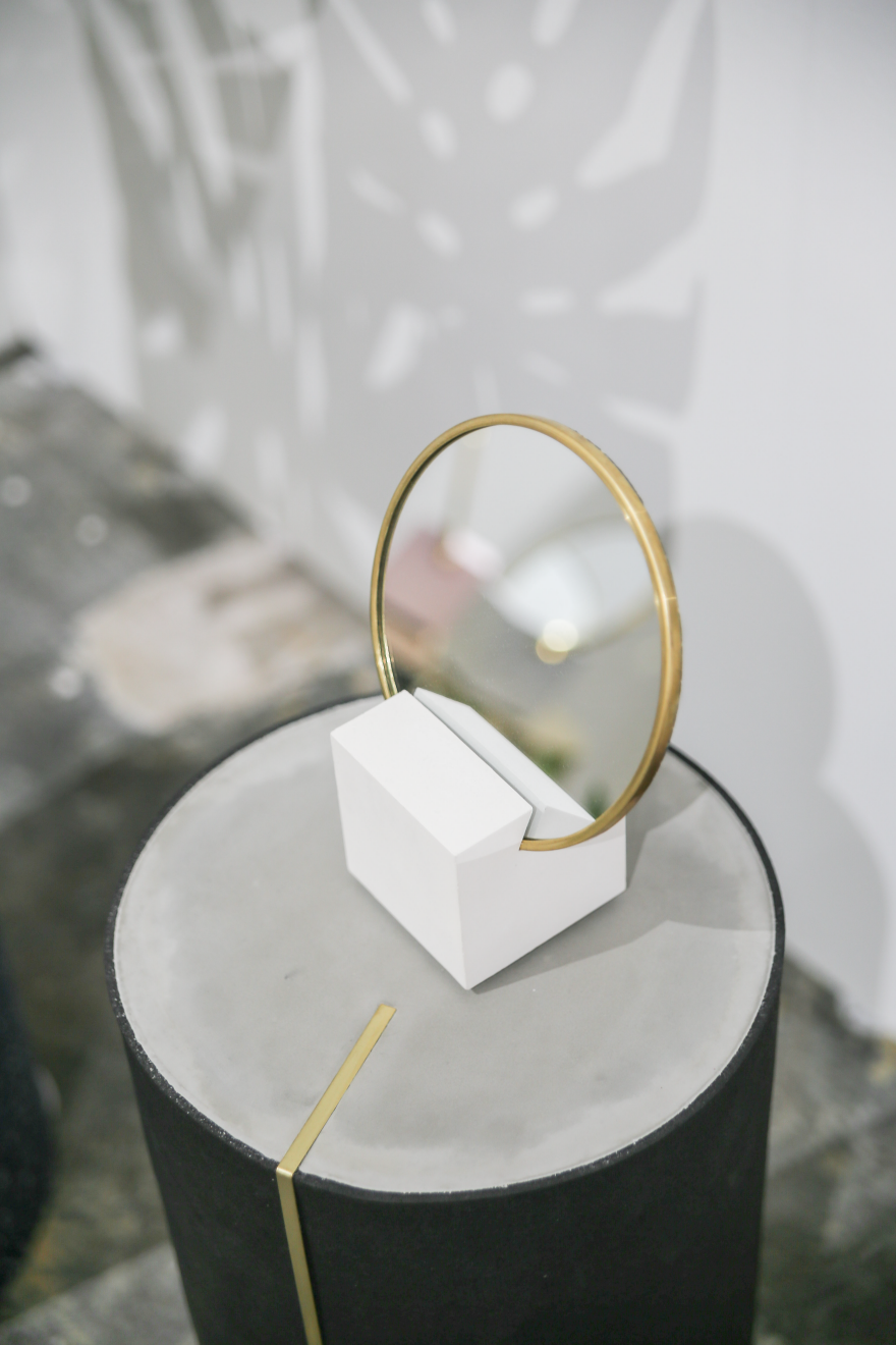
Stark rendering-like shapes and colors were accompanied with all things round and rounded. Anything one could imagine to bend, did end up bent. Round lights, round mirrors, round tables with round cutouts, round vases, round stools—a most condensed celebration of roundness.

Mirrors and tables by Slash Objects
Mirror by Slash Objects
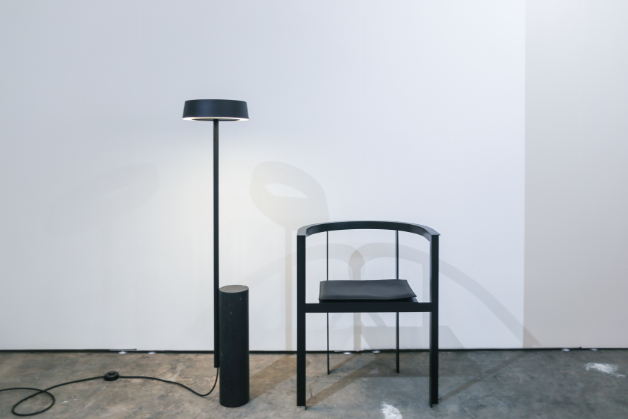
Lamp and chair by New Tendency
Display by Norway x New York
Lighting by Grain
Lighting by Grain
Side tables by Norway x New York
Lighting by Crosby Studios


Lighting by Iacoli & McAllister
Light box by Atelier de Troupe
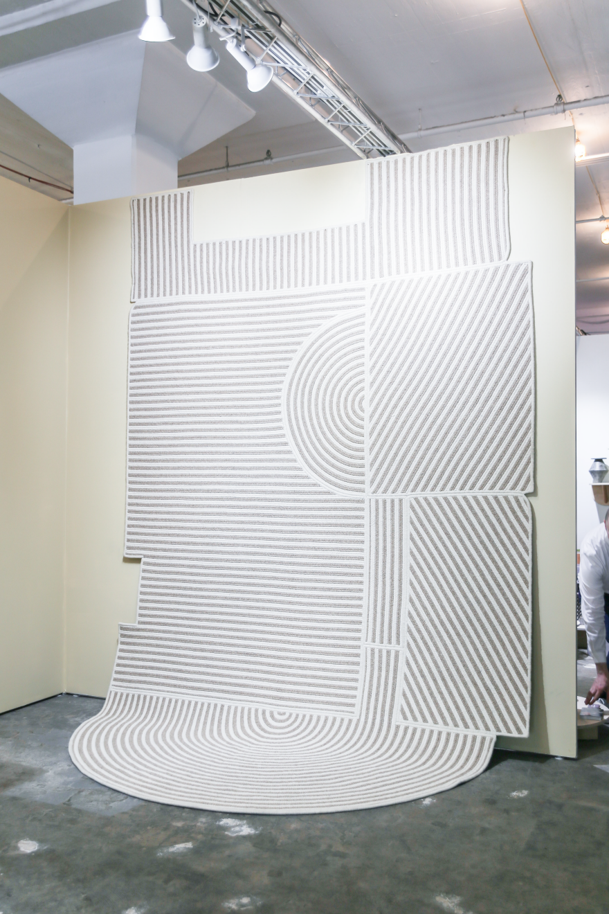
Wallpaper/Carpet by Grain

Clash of Material

Combining materials contrasting in color and texture is a common design approach. At Sight Unseen OFFSITE, the combinations bordered on stark, unexpected and almost uncomfortable—though infinitely novel.

Chair by Nun x Office GA
Stools by Areti
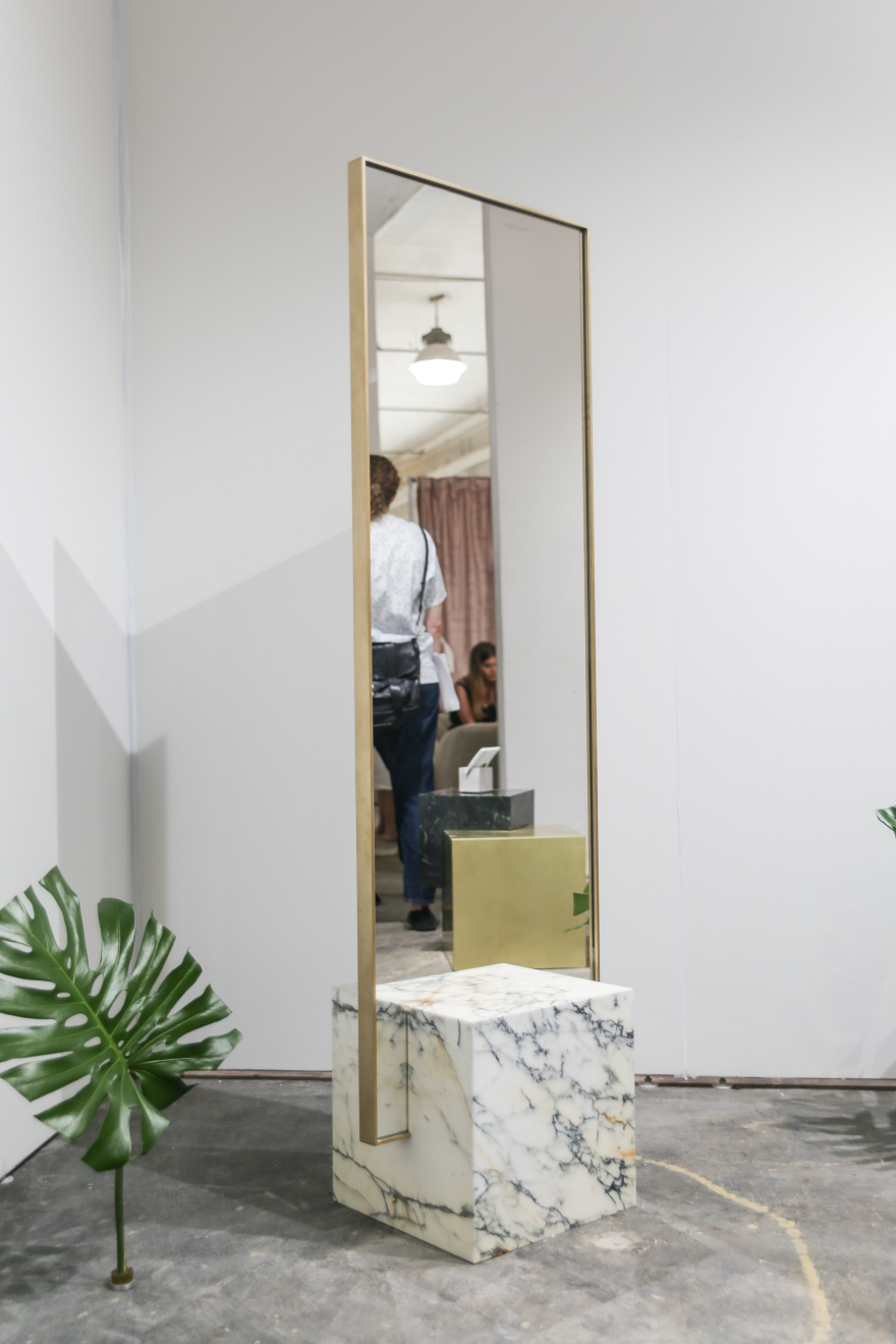
Tall table by Slash Objects
Table by Home Studios
Table by Home Studios (detail)
Mirrors by Another Human
End table by Simon Johns
Mirror by Slash Objects

Mind Games

In a way of playing tricks with perception, designers tried to amuse the eye by moving the unmovable, bending the unbendable and turning the unturnable.

Object by Atelier de Troupe
Rotating Shelving by Crosby Studios


Lighting by Ben & Aja Blanc
Side table, lamp and chairs by Eny Lee Parker
Mirrors by Robert Sukrachand

Want to see more NYCxDesign events worth attending? Visit our Core77 "Navigating New York Design Week" Map

Design Job: Steak Your Claim! Weber-Stephen Products LLC is Seeking a Principal Industrial Designer in Palatine, IL

Bentley's New Trim Package for Falconry Enthusiasts

$
0
0

I don't mean to complain, but there's a lot of times when I'm driving around in my $229,100 Bentley SUV and I still feel like something is missing in my life. While I can distract myself by pursuing my passions, like hunting human beings for sport—they really are the most dangerous animal—or desert falconry, it never really quite solves the problem. I've often wondered how I can fill that void, but the answer has eluded me.

Until now, that is! Bentley has announced that Mulliner, their in-house customization shop, has developed something that's right up my alley: The Bentley Bentayga Falconry package.

…Designed to house everything you need for a successful falconry expedition, fitted into the boot of your Bentayga. Hand-crafted by Bentley's bespoke commissioning division; it is at once practical while delivering the pinnacle of luxury that Mulliner promises.
Each Mulliner Falconry set is made to order and features two bespoke unites [sic] which fit seamlessly in the rear of Bentayga and keeps every piece of equipment you will need for a successful falconry outing to hand. It features two bespoke units – a master flight station and a refreshment case that are fitted to a moveable tray for easy access.
Both the Refreshment Case and the Master Flight station are trimmed in luxurious yet practical natural cork fabric. Crafted from thin sheets of sustainably harvested cork, its pleasing natural patterns draw they eye. It is extremely easy to maintain and is very durable, making it the perfect choice for harsh, rugged environments.
Inside the refreshment case are three metal flasks with durable cups, for tea, coffee or other beverage of your choice. There is also warm blanket and refreshing face cloths for your comfort.
Inside the master flight station, you will find a stowage tray with individual compartments, which can hold your GPS bird tracking unit, binoculars and hand-crafted leather bird hoods and gauntlets.
A beautiful Piano Black veneered drawer features a striking Saker falcon crest. This stores your own GPS tracking antennas, along with various tools and tethers for your birds.
The exquisite Hotspur hide-trimmed cabin of this special Bentayga is finished with a sweeping desert scene, featuring a Saker falcon. Revered today, the breed has been used for hunting for thousands of years. This exquisite feat of marquetry has been created over nine days from 430 individual pieces of wood sourced from around the world.
The cork fabric boot-floor and rear-sill protection cover is neatly integrated into the rear of your Bentayga. This reversible feature, together with the in-car perch, gives you a safe and comfortable space to prepare your bird for flight, with everything you need in easy reach.
There is also a removable perch and tether that fits on the central armrest inside the car, making transporting your falcon safe and comfortable.

I'm told they may also develop an NYC-specific variant dedicated to the burgeoning pursuit of pigeonry.


IKEA Head Designer Marcus Engman on How Their Team is Working to Fight Climate Change

$
0
0

Since taking the role of head designer at IKEA several years ago, Marcus Engman has led a great effort to match the most well-known furniture company in the world with the best designers working in the business today. Why? Because he believes that high-quality design should be accessible to anyone. The desire to spread quality design to the masses, however, does not stem simply from promoting a sophisticated aesthetic; this also has to do with IKEA's progressive efforts to run a sustainable, ethical business dedicated to fighting climate change at a corporate level. As head designer of one of the largest global retail giants, Engman has a lot of responsibility sitting on his shoulders, not only to create beautiful objects but to manufacture them in the most sustainable way the company can manage while also creating something of quality that can last over time.

This week, Engman will be discussing IKEA's Democratic Design model and the impact of their sustainability efforts at the What Design Can Do conference in Amsterdam, this year's speakers focusing on the topic of climate change. Prior to his upcoming lecture, we spoke with Marcus Engman to learn more about what IKEA implements into its current design strategy to fight waste as well as the advantage a large company has in challenging corporate sustainability status quo. 

Why is IKEA concerned with sustainable design efforts?

We want to have a positive impact on the planet. It´s not only about IKEA being a good business in the way we produce, it´s also about IKEA being a good business in what we offer people. Products that are produced in a sustainable way is one aspect, products and solutions that help people lead a more sustainable life is another. products and solutions that help people lead a more sustainable life is another. 

This sometimes takes bold and daring decisions. Like when we decided to go 100% LED. Most people agree that energy consumption must decrease if we are to reach the climate target we are aiming for. So in 2011, IKEA decided to phase out all other light sources and by 2016 IKEA stores only sell energy-efficient LED-lighting. To do that properly, we needed to give everybody the opportunity to make a sustainable choice. And how to do that? By offering as great LED bulbs as possible, at such low prices that as many people as possible can afford to buy them. Since energy consumption must decrease, volume is key. And a low price is the enabler. So the challenge was to develop a one euro LED bulb, which we did. And it was good business, both for IKEA, our customers and the planet.customers and the planet.

Ilse Crawford Collection for IKEA, 2015


According to Pacific Standard, IKEA uses close to 1% of the world's commercial lumber supply—that's a staggering number that incidentally assigns IKEA significant responsibility when it comes to leading sustainable efforts within the global market. How do IKEA's designers work to address environmental issues, and what kinds of sustainable plans do you hope to implement in the future?

At IKEA we have developed a method for how we develop and design our products. We call it Democratic Design and it´s about truly good products. To include form, function, quality, sustainability and a low price in everything we do. So our foundation for design includes sustainability, and it´s both about production and how IKEA, through our products can inspire and help people to lead a more sustainable life.

Speaking particularly about wood, which is a fantastic renewable material, we are working globally with responsible forest programs. We have our own foresters to secure good forest management which of course also included regeneration of forest. We also work with certification programs, at this time 100 % of our forest is responsible sourced and on top of this almost 75 percent of our wood comes from what we define as more sustainable sources (which is FSC certified or recycled).With KUNGSBACKA kitchen front for example we looked at how to make furniture out of waste, as waste is a big environmental challenge and we need to start seeing it as a resource. For the KUNGSBACKA kitchen front system, recycled PET bottles are used to create the thin plastic foil that covers the chip board at the core of the fronts. For one standard- sized kitchen door, some 25 bottles are used; an entire kitchen equals one thousand bottles. The fronts are made from recycled wood from various sources, such as production waste and discarded wooden objects.global responsible forest programs. We have our own foresters to secure good forest management which of course also included regeneration of forest. We also work with certification programs, at this time 100 % of our forest is responsible sourced and on top of this almost 75 percent of our wood comes from what we define as more sustainable sources (which is FSC certified or recycled).With KUNGSBACKA kitchen front for example we looked at how to make furniture out of waste, as waste is a big environmental challenge and we need to start seeing it as a resource. For the KUNGSBACKA kitchen front system, recycled PET bottles are used to create the thin plastic foil that covers the chip board at the core of the fronts. For one standard- sized kitchen door, some 25 bottles are used; an entire kitchen equals one thousand bottles. The fronts are made from recycled wood from various sources, such as production waste and discarded wooden objects.

We hope to achieve and do a lot! But for instance, we want to reduce our dependence on virgin fossil based materials. Thanks to our size, we also believe we can contribute to a change in the industry and to the development of plastics made from recycled or renewable sources. IKEA is moving away from virgin fossil-based plastic materials in favor of plastic produced from more sustainable recycled or renewable sources such as waste or bio-based plastic from different sources.

IKEA's Bang mug

I've read about how IKEA's Bang mug was designed with a particular taper that allowed optimal use of kiln space while the pieces were fired—this is just one clear, ingenious design decision that helped lead IKEA to the status it's at today. Can you tell us more about how you implement manufacturing and packaging into the design process?

The development and design of a product is a team effort. By working together in teams with competencies, ranging from design and engineering to packaging and expertise in the supply chain, we ensure that Democratic Design is being fulfilled and those important aspects such as packaging and manufacturing are part of the process from the beginning. It´s not enough if a product looks great. If it cannot be packed and manufactured in a good way, we have an issue because that will affect the price and in the end our customers. So, at IKEA, design takes place on the factory floor, together with experts from various disciplines.

So how do you juggle a focus on sustainable design with the preservation of an optimal ROI and keeping prices as low as possible? What does IKEA implement into the manufacturing and material sourcing process in order to maintain this balance?

A prerequisite for us to create the low price is efficient usage of material, efficient and innovative processes, get rid of unnecessities like too much paint. Hence, thinking sustainability is part of how we create the low price. Not being wasteful will always lead to a low price. From a sustainability, perspective affordability is very important—if the end solution is high price it will only reach few people with "thick wallets", that we don´t see as a sustainable solution.

Are there any roadblocks or challenges IKEA has been presented with due to the rapid progression of climate change? 

The impact of climate change is visible in many ways. We can see that this will change life at homes for many people. For example, in some areas the water will be scarce; in others, there will be too much water. Even if we do not see all of the impacts today, we are sure many people and businesses are looking into how to both limit impact and how to adapt. We are working hard to reduce our footprint throughout our value chain, from raw material, to design, to production, transport and all the way to customer.

What power does your company have in affecting climate change that others don't? 

I´d say that our size is an enabler. When we do something, it reaches many people. I have mentioned our decision and journey to offer affordable LED bulbs before. Our portable induction hob TILLREDA is another example. It´s 40% more energy efficient than other hob varieties and halves cooking time compared to conventional hobs.

The low price is also an enabler. From time to time I hear the contention that IKEA with our low prices is about throw away over consumption. No, it´s about reaching out to more people, bringing them great value. Because everybody has the right to great design, not only those with big wallets. It´s also about making things better, which requires change. And the main barriers for change are cost of change and daring to change. Low prices helps both. If it´s not expensive you can afford to do it and dare to do it. So with Democratic Design, where form, function, quality, sustainability and price all matter, I believe we enable more people to afford and dare to change in a sustainable direction.

Part of the 2017 Piet Hein Eek Collection for IKEA

Since being appointed head designer at IKEA, you've led a focused effort to invite seasoned, taste-making designers to create pieces for the PS collection with an impressively high level of style. We've also noticed at Core77 the effort to create more intuitive and beautiful joinery, which contributes to the ease of build as well as the overall look of furniture pieces. Do you think this effort in itself to create furniture that people will want to keep for long periods of time contributes to sustainable efforts, and if so, how?

I believe that what is important when making things sustainable is the emotional connection which will make you keep the product longer. The DELAKTIG open platform, which IKEA has developed together with Tom Dixon is designed with longevity in mind. We were looking into ways where the sofa could adapt to the constant changing and disruption in people's lives. We designed a platform which offers endless possibilities as you can click things onto the frame, change the shape, size or color. We chose aluminum to make it light, still very strong but also to offer customers the possibility of change it over time, so that they can live with it for long, very long.

Our easy assembly agenda, which of course also is a disassembly agenda since we know that people nowadays are moving more frequently between homes. So this is also a way for us to prolong the life of our products.

Marcus Engman will be speaking at the "What Design Can Do" conference in Amsterdam on Tuesday, May 23. 

Spotted On Coroflot: A Cube of Coffee

$
0
0

Coffee gear can take over a counter quickly. Is integrated storage a reasonable solution? In a world where pour over coffee takes several discreet tools and a cubic Nescafe unit the size of a microwave is an acceptable appliance, Sam Cho's Coffee Cube suggests a return to the blocky but efficient design of a bygone era. 

Just last week I mentioned my hesitation around concept work, but when it scratches an itch, what can I say? It's a product idea I'd want to tinker with. 

At heart, the Coffee Cube is a drip machine with storage bins. The angular maker would like to do your brewing, hold your grounds and filters, and fit it all in a shape that's mindful of counter space efficiency. 

It may sound simple, or unnecessary, but it's an optimistic idea. Stashing a week's supply of grounds and a full package of filters immediately at hand would make a sleek and snappy coffee station. I know I'd just be happy to reduce the number of half full boxes of filters and mostly-gone containers of beans that seem to reproduce in my kitchen. 

But while squares might work into a counter lineup more neatly, the current angularity of the internal storage containers could make for a poor user experience. Would grabbing a filter be hard? Can you retrieve grounds from a rectangular box with a normal spoon? Would a square-cornered carafe be hard to produce and clean? Plenty of room for awkwardness there, but I can already imagine a few satisfying adjustments that would smooth things along. 

The Cube design has plenty in common with vintage coffee tools by appliance makers like Rams-era Braun, who regularly combined function and storage. Is it time for an integration revamp, or should we stick to Ebay auctions?

KMM 1 and KF 20, by Florian Seiffert and Hartwig Hahlcke for Braun

Reader Submitted: A Simple Brush Design Tweak that Makes Cleaning Toilets Slightly Less... Gross

$
0
0

Since its conception, the toilet brush has been prone to creating less than desirable conditions, including a build up of residue and wastewater when stowed away. Through some very simple design changes, the Balance Brush provides an effortless solution to this.

A perfectly weighted redesign allows the Balance Brush to sit up and drip-dry over the toilet bowl after cleaning, disposing of wastewater down the toilet and preventing a build up of swampy waste when stowed in its holder.

While some toilet brush holders do provide drainage or suspend the brush to help with the drying process, this merely transfers the wastewater and residue from the brush to the holder. The Balance Brush's simple redesign provides the much-needed mechanism to rid itself of waste before it even leaves the toilet.

View the full project here

A Chemical-Free Way to Preserve, and Beautify, Wood: Set It on Fire

$
0
0

In the Manhattan blocks surrounding us are a Maya-Lin-designed museum with exterior wood cladding, a French restaurant with exterior wooden planters, and a bar with an outdoor wooden bench. These wooden surfaces looked great when they were first installed--then went to hell after just one or two NYC winters. If wood is going to sit outside, it needs to be treated in order to weather the elements.

View the full content here

Strain-Relief: Design Tips for Durability and Aesthetic Appeal

$
0
0

You reach over to plug in your phone, and you feel that spark—and not in a good "I love this product!" kind of way. The wire is broken, and yet another charging cable is about to make its way to a landfill, while you have to make a midnight run to the store to be ready for your 6 a.m. Skype conference with Japan.

For such a simple idea, strain relief designs have a huge impact on users, right or wrong. And it's not only in consumer products where we can blame gorilla-like users; even NASA has these issues, as with a recent fire on a shuttle orbiter. When you need your cables to last a long time, how can you create a reliable connector? Can you do this without demolishing that beautiful aesthetic your team has worked so hard on? The following tips will get you the answers you need, and still have you out the door in time for happy hour.

Why Do Good Cables Go Bad?

Tight bends in the cable near the connector cause high stress, fatigue, and failure. The stiff connector interfaces with a very flexible cable, and the point of contact ends up taking the brunt of the movement. Every tug is concentrated on a single point.

Strain is inversely proportionate to the radius of curvature– a fancy way of saying the tighter the bend, the more risk of failure. An easy way to visualize this is to take two paper clips out of your desk drawer and straighten them (for those who want a more detailed, scientific approach, check out the work done by The Royal Institute of Technology in Sweden). With the first paperclip, try bending the wire around a pencil, straightening it, and repeating this several times. The paperclip will bend easily, and is unlikely to break. With the second paper clip, make tight bends, back and forth, and see how many times it can be bent without breaking – my personal best is five repetitions. The lesson is clear: repeated tight bends = failure.

The Solution? Strain Relief

Strain-relief on cables offers mechanical support to the cable, protecting it from tight bends and fatigue loading. But how much is enough?

Of course, you can take the strain equations from bend radii, correlate the strain with stress using the modulus of elasticity of the particular cable material, look up values for maximum stress, figure in a safety factor for material variation, and arrive at a number predicting safe bending allowance for your particular cable. But unless you gain masochistic pleasure from second-order differential equations, I recommend something simpler: the 8X rule.

For any electrical cable, multiply the overall diameter of the cable by eight, and use that as your minimum bend radius. Of course there are exceptions for shielded cables and multi-core shields, but this basic rule is accepted by the National Electric Code, and will get you the relief you need, without adding the cable's stress to your own.

Okay, so now we know why we need strain relief, what strain relief is, and even how tight to make the bends. Can we simplify incorporating it into the design and get a shaken-not-stirred order on the way? Yes, yes we can.

Common Strain Relief Designs

Strain on electrical cables has been around as long as humans have been channeling electricity for our own devious uses, and electrical strain relief designs have been around nearly as long. Today there are several common designs, each with some pros and cons.

Metal Strain Relief

Older designs involved the use of a metal spring surrounding the cable at the cable-connector junction. Simple and effective, just make certain when incorporating the springs into your design that the bend radius will be large enough when the cable is subject to common pulling forces. One of the great things about this design is its classic look, so this makes it a great option for cables in high-end consumer designs.

Older designs involved the use of a metal spring surrounding the cable at the cable-connector junction. Simple and effective, just make certain when incorporating the springs into your design that the bend radius will be large enough when the cable is subject to common pulling forces. One of the great things about this design is its classic look, so this makes it a great option for cables in high-end consumer designs.

Metal strain relief - simple and beautiful

Plastic Designs

Much more common these days are strain relief designs made of flexible plastic. While there are theoretically an infinite number of designs, most designs fall into one of three categories: one-direction, multi-direction and solid.

1. One-Direction Strain Relief

No, we are not talking about using upbeat music to relax. But properly designed, this design is something to sing about. (Almost. Well, not really. Who sings about electrical designs?)

One-direction strain relief is great for relatively predictable applications

Uni-directional designs give bend relief in one direction while remaining stiff in the other. A series of plastic segments which come in contact with one another create a minimum bend radius, and are very effective in that direction. Because this design allows for strain reduction in only one axis, the applications are specific: this design is very useful in applications like mechatronics or robotics where the cable will be bending the same direction every time.

2. Multi-Direction Strain Relief

As with the design above, multi-direction strain relief relies on plastic segments limiting the bend radius, protecting the vulnerable connection. This design, though, allows for movement in two or more directions, alternating the connection points between segments. Because of the flexibility of the design, this is the best option for most consumer products, and is widely available.

Multi-direction strain relief is the most versatile

3. Solid Strain Relief

Increasingly popular for mostly aesthetic reasons, solid strain relief can be seen on everything from lightning cables to vacuum cleaner cords. While it looks great, this design requires extra caution, as often the strain relief area is too stiff, and the strain is concentrated at the junction between the strain relief and the cable. The key here is to make sure that the strain relief is flexible enough to allow the cable to bend inside the strain relief area, not at the junction. Even great designers can get this wrong (I'm looking at you, Mr. Ive).

Solid strain relief gone bad! This method requires extra attention to work correctly

As an additional consideration, cleaning is simplest with solid designs, and so it becomes the only option for food, beverage and medical industries. Just remember to approach the design carefully.

Aesthetic Considerations

With every great design, form follows function, but follows so closely the two are nearly inseparable. Think beyond minimum bend radius and strength of materials to how this will look and feel to the person using this cable every day.

Some designs need classic industrial chic, and metal springs become an obvious choice. For others, sleek minimalism is the order, and solid strain relief wins. The multi-directional segmentation can fit with a playful, funky look. Don't be afraid to get more creative, experimenting with different sizes or even totally out-of-box designs, like the designer of the Snakables cables (full disclosure: I worked on the design of Snakables). For consumer products, this can be a chance to really stand out.

Snakable cables are a playful, but very effective solution

Manufacturing Considerations

Your design is almost complete. But before you put down your pencil and get ready for a chorus of "It's Five O'Clock Somewhere," think about how your beautiful new design will be made. The options are simple: molded or slide-on.

Molded designs incorporate the strain relief directly into plug design, creating a robust unit. While this is attractive and can be very effective, it might require expensive 2-shot molding, and so is best for designs which will be produced in high quantities.

Slide-on designs, as seen in the Logitech mouse, are a low-cost alternative

Slide-on designs are simpler, and can interface with existing plug designs. Many designs are available as off the shelf parts, and so are a great option for new products where your company is not ready to commit to custom tooling.

Additional Design Considerations

There are a few areas where you should pay more attention. Both the medical and food industries have special requirements for cleanability and materials. If your cables will go into harsh environments, you may need to use special materials, and also consider using much larger bends for extreme heat (where electrical resistance increases) or extreme cold (where brittleness increases). Each application has its own demands.

Prototyping Your New Design

All products go through iterations of design-build-test, and strain relief is no exception. Happily, most designs can easily be tested using 3D printing. For designs intended to be manufactured from an elastomer, try printing in a rubber-like material for testing. If your design is destined to be made of a rigid yet flexible plastic, you can print in a strong and flexible nylon material. Designs which will be molded can be printed in halves and glued together, while slip-on designs can be tested in nearly their final form. If you need more details, check out more articles on hardware design.

What a Relief

Easy to design and vital to success, strain relief is just a matter of calculating your minimum bend and choosing the right style for your application. Make sure that the only spark felt with your product is from customers falling in love with a great design.

___________________

This post is provided by Fictiv, the most efficient manufacturing platform for fabricating parts. Powered by a distributed network of highly vetted vendors, the online interface makes it easy for customers to get instant quotes, review manufacturing feedback, and manage orders—all through a single service.


Viewing all 19151 articles
Browse latest View live


Latest Images