Quantcast
Channel: Core77
Viewing all 19142 articles
Browse latest View live

Urban Design Observations, Los Angeles Edition

$
0
0

In L.A.'s tony neighborhood of Marina Del Ray, here's something you'd never see in New York:

Yes, they're free. 

There are three cardboard tubes inside (the side ones are empty). I also found it hilarious that they have instructions for how to use these printed on the bottom of the box face. In fact I'd say everything printed beneath the dispensing hole is a mini design fail, as the text is unnecessary and is obscured by the bags protruding from the holes.

This circular bench seems simple but is attractive, and a fine example of what you can do with a tapering jig for a table saw. I can see the builder in my head making a cut, flipping the piece around its long axis and making the second cut with the jig.

Also, while the bench does not look new, the wood doesn't look like shit like most wooden outdoor stuff does in New York. Los Angeles' better weather makes wood a much better materials choice for outdoor furniture.

Finally, this utility box. 

Unadorned, these things typically look like shit, and I'm impressed that the neighborhood beautification committee, or whatever they have out here, took the time to wrap it in this graphic. It looks a damn sight better than the sheet metal would.


The Lifestyle Applications of Dyneema

$
0
0

We live in an exciting time of material developments. Previously if you wanted to build something durable, the go-to materials were rigid substances like metal and concrete; now materials scientists are smart enough to create brilliantly tough fibers that can be woven into flexible fabrics. Ultra-high molecular weight polyethylene fiber, better known by its trade name of Dyneema, will enable the current generation of designers to create flexible but tough objects and gear that our ancestors could never have envisioned.

DSM, the company behind Dyneema, has created a series of mini-docs called "Trailblazers" that follows the design pioneers who are exploting Dyneema's properties--it's stronger than steel and can be woven into fabric--to create a new class of objects. Here's Canadian designer Conroy Nachtigall developing a super lightweight performance jacket for the frigid outdoors:

Across the world in sunny Marseilles, pro skateboarders and pro jeans-rippers Tim Zom, Samuel Geoni and Michael Kaba are testing denim that has been interwoven with Dyneema:

And over in Japan, outdoor gear designer Jotaro Yoshida creates a lightweight, breathable tent to weather Mount Tanigawa:

Looking to create something practical of your own? Check out Tim Prestero's Tutorial: How to Create Tough, Lightweight and Waterproof Gear Bags From Dyneema and Tyvek.


Prototyping a New Form Factor for the Desktop PC

$
0
0

Unless you're a gaming nerd, I'm willing to bet your desktop PC is ugly and hidden away rather than prominently displayed. It is odd that such a crucial object in our work lives receives such little design attention, but I suppose we all need what PCs deliver more than we need to have a lovely box to look at.

Nevertheless, Matt from the DIY Perks channel decided that while building his own PC, he'd completely rethink the form factor. He opted to go with external heat sinks, which then informed the design:

Here he runs you through his process:

Tools & Craft #91: The Transmission of Power

$
0
0

There have been 5 major upheavals in the development of woodworking tools. Each upheaval changed the way woodworking was done, changed furniture styles, and changed the skill level needed to produce professional work. The dates are approximate.

1. Hand tools mature and become standardized, c. 1750-1850.

Aside for the water or wind powered sawmills, which were not ubiquitous, all work was done by hand. With the arrival of the Industrial Revolution quality steel became more available and at much lower prices. Greater availability of tools along with a population explosion greatly increased both the demand for wooden buildings and the demand for furniture. Tool manufacture became the province of highly specialized industrial firms, working out of several major cities; Sheffield and Birmingham topping the list. Centralized manufacture took advantage of new national transportation networks of canals and railroads which drastically reduced the cost of transport and by extension, further reduced the cost of the end product. Regional makers could not compete. Tool designs standardized. The lowered costs of tools made it possible for more people to answer the demand for wooden products successfully and the standard of finished work became higher and fancier. However all furniture and house construction involved skilled labor working fast.

2. Water and steam powered machinery - the Age of Belt Transmission, c. 1840-1920.

As the Industrial revolution matured precision machines allowed for the construction of the first woodworking machinery. The machines were large, belt driven, and required a lot of capital to obtain, and specialists to maintain. The latter limitations made machinery impractical for smaller shops but in the United States, especially for furniture making, the factory system became the norm and furniture became a factory made item that the middle class could afford instead of purely a bespoke industry for the rich. As the nineteenth century wore on the middle class no longer bought simple joiner's furniture. Instead they bought fancy factory made versions of the latest styles made for the rich.

In house construction the biggest change comes in the 1840's with the introduction of inexpensive, pre-sawn lumber in standard sizes, which completely changes American architecture away from traditional timber framing. While previously standard sized timbers were used for most construction the introduction of framing with 2" x 4" standards greatly lowered the skill level needed for house construction. Fairly early on moldings and other worked details are made by machine. Later in this period pre-made door and windows further standardize construction and lower the needed skill to build a house. The United States was a leader in developing highly specialized machinery for production work in the furniture industry. In England some industrialization took place but there was far more reluctance to industrialize as the piecework system made it impractical for investors. Capital was also much harder to get. Even as late at the 1930's mid-price furniture in London was made by small workshops working with hand tools only. However these shops would take their wood to the local lumberyard for planing.

The picture at the start of this blog entry is of a early planing machine from the early 1850's. While I don't know if this machine was ever built, at this time machinery like this would be found only in saw mills, very large lumberyards, and in the US, large factories.

3. Stationary electric motors, c. 1920-1960.

With stationary electric motors it became possible for small shops to have "machine rooms" and compete with the giant factories. No longer did you need an expert to run a system of pulleys from a central location. Each machine needed could be installed independently, anywhere there was electric power.

4. Portable Power Tools, c. 1940-1990.

The boom in housing after WW2 put a huge strain on the national capacity for building housing. Motors became small enough to make hand held tools and for the first time a portable circular saw, drill, and jig saw could replace hand tools on a job site. Most important of course was that far less skill was needed to use power tools than maintain hand tools in productive condition, so lesser skilled craftsman could be employed. In addition, plywood and other materials that would easily dull hand tools could now be readily used on their own and plywood and other sheet goods replace solid timber wherever possible. Cordless tools, popular since the 1980's have increased the versatility and productivity of on-site building equipment.

5. Prefabrication and outsourcing, c. 1980.

The real change in production since the 1980s has been increased use of prefabricated parts. Even framing elements are routinely assembled in a factory and trucked in. Overseas outsourcing has moved a lot of the core furniture making and building elements overseas. Architectural woodworking for most Americans is no longer the work of a skilled cabinetmaker making a kitchen or library. The actual woodworking is now done at a factory and except on the high end, prefabricated, machine made parts are just assembled at the job site. Furniture is less and less a work of a cabinetmaker or a woodworking factory and more an advanced, automatic production of composite materials and high tech. Furniture, which used to be an expensive capital investment for any family is increasingly a commodity item that you buy, use, and discard like an item of clothing. The overwhelming majority of Americans have very little connection to new furniture built in a traditional manner.

___________________

This "Tools & Craft" section is provided courtesy of Joel Moskowitz, founder of Tools for Working Wood, the Brooklyn-based catalog retailer of everything from hand tools to Festool; check out their online shop here. Joel also founded Gramercy Tools, the award-winning boutique manufacturer of hand tools made the old-fashioned way: Built to work and built to last.

Steven M. Johnson's Bizarre Invention #178: The Viewcab

Maude's Line of Sex Essentials Makes Sex a Well-Designed Experience from Drugstore to Bedroom

$
0
0

Does anyone know a single person that enjoys shopping for sex-related products in drugstores? From hideous packaging to creepy names to the overabundance of available styles—right up to the part where you make uncomfortable eye contact with the cashier—I can't think of a single enjoyable step in the process. Considering that sex should be an enjoyable activity for everyone, shouldn't there be a way to eliminate stress from point of purchase to use?

We've seen designers like Ti Chang redesign vibrators and companies like HEX redesign condoms, which are, of course, major steps in the industry. What we haven't seen until now, though, is a company take a more holistic approach to shifting the experience of purchasing and using sex essentials. New company Maude aims to do just that through a full line of thoughtfully designed products, which includes condoms, two varieties of lubricant and a vibrator. Founders CEO Eva Goicochea and CPO Dina Epstein hope their line will be a much-needed breath of fresh air for consumers of all sexual identities.

Concept + Research

Goicochea and Epstein's decision to tackle this design problem stemmed from frustration with the lack of outside voices in the industry and the separation between protection and toys in drugstores. "Purchasing condoms and toys are two very disconnected experiences that are equally as uncomfortable," said Goicochea. "We wanted to question why these products aren't put together and try to understand why they are positioned and marketed the way they are." Epstein, who has previous experience designing product for Doc Johnson added that, "It's mostly men in boardrooms making all the decisions. There's such a wide variety of products, but they're all coming from the same people."

"To treat all of these items equally was really important to us." -Epstein

To begin approaching possible solutions, Goicochea and Epstein conducted a survey of around 700 people and found that the responses were similar across the board. Overall, consumers of all ages and sexual identities had negative feelings towards the general messaging of sex-related products, and because of this, most didn't have any type of brand loyalty in this space. 

Many survey participants were also concerned with quality, which Goicochea and Epstein were careful to address in their design and manufacturing processes. "We wanted to go to the factories that produced the best quality," assured Goicochea. "We designed the vibe in-house, we worked with factories to formulate the lubricant, and the condoms are from the biggest producer in the world."

Yes, I have red hair, no, this is not me.

In terms of figuring out a target market, the duo wanted to break away from current trends to focus on a broader audience. "Bigger companies can't take risks, and smaller companies tend to speak to smaller groups because it's easier to have one voice instead of saying their products are for everyone," said Goicochea. "I think it's the trend as of late to have a female-focused brand, but what we heard over and over again in the survey was people saying, 'I'm a man, I'm gay or I'm older—I'm not a 25 year old woman, but I still want to talk about this subject."

The Products

The products in Maude's collection are vibe., rise. and shine. vibe. ($45) is a three-speed, cone-shaped vibrator that's approachable, easy to use and purposefully doesn't look anything like a dildo. Goicochea and Epstein noted that during their research, they found that many people, including but not limited to lesbian couples, don't necessarily want a toy that resembles male genitalia. This makes complete sense but is generally overlooked. 

"vibe. is pretty universal in its approach and is meant to be used however you want it to be used," noted Goicochea. The vibrator's instruction guide lists recommended uses ranging from the expected to the unexpected, my personal favorite being hand massager—it really is for the people!

Maude's condoms, named rise. ($12 for a pack of 10), act as the bread and butter of the line since they need the most replacing. Maude's condoms are made by the largest condom manufacturer, so the main difference between rise. and, say, Trojan is the packaging. 

Trojan and almost all other condom brands make use of the classic tear-open packaging, while rise. condoms come in cups that can easily peel open. And to be completely honest, the graphics are way more appealing and less aggressive than this:

In terms of the lubricants, named shine. ($25 for 8oz), the most interesting part of the packaging is the pump bottle, which is similar to liquid soap. So whatever you do, don't put it near the sink. shine. comes in two varieties—silicone and organic for those that like to know their products are all-natural. The product line as a whole is subtly designed, so if you prefer to have your lubricant on your bedside table, it'll at least blend nicely with its surroundings. 

"I left the industry for a reason—your mind can wander with that reason—but I still believed this space needed to be redefined." - Epstein

When you really think about it, little to no condom brands sell their products directly online. "No pun intended, but we wanted to remove the barriers to entry," said Goicochea. "We can't compete with the distribution of Trojan, so the idea is that it's affordable, it's easy to buy on our website, and you're not being tracked the way you would with Amazon. We're trying to compete as best we can online."

The competitive price-points of the entire collection stood out to us, and Epstein noted that, "Nobody that's trying to enter this market really has a background in sex product design, which is part of the reason why our pricing is so good. The factories that we work with are relationships that we've either built over the two and a half years of ideation of the brand or people that I've known for years and years."

What's Next for Maude?

Eva was quick to describe starting your own business like constantly trying to get your footing on a surfboard, but that's not stopping the team from wanting to tackle the next round of sex essentials they feel need an upgrade. "We're going to start thinking through other products in this market that either aren't around or can be reinvented. We have this interesting opportunity to be in places that are unexpected and work with unexpected partners, and that's really the excitement with the first year," Eva explained. "I think I can speak for both of us when I say we're both problem solvers," Dina added. "That never stopped when we were at bigger companies, and now with Maude we're constantly solving problems and our minds are always working. It's wonderful."

Browse Maude's website here to learn more about how the company is redefining the experience of purchasing and enjoying sex essentials.

Production Methods: Here's What You Can Make With a Beading Machine

$
0
0

This video produced by Covell Creative Metalworking shows you a tool I wish we'd had in our ID shop at school: A beading machine. By swapping a variety of dies in, you can prep 2D sheet metal for transformation into some truly wondrous and organic 3D forms.

In the video, the process of using the machine looks like a deliberate, meditative and super-satisfying process once you've got the hang of it, as demonstrator Ron Covell has:

Mr. Covell, if you're reading this, please ditch the DVD format and go with purchasable downloads!

A Mechanical Flipdot Tetris Machine

$
0
0

Playing Tetris is a reliable way of blowing off steam for many, with a side benefit being that the music may irritate your roommate. But if your roommate has become inured to the song, you can ratchet up the sonic presence of your game-playing by constructing a Tetris machine using mechanical flipdots:

If you'd like to build this thing, there's some information to get you started here and here. (Just remember to learn German first.)


Unusual Transportation Concept: Flying Trains

$
0
0

The always-imaginative Russian concept designer Semenov Dahir Kurmanbievich is at it again. This time he's conceived of a mass transit system that combines aspects of an airplane and a train.

Obviously the craft is meant to draw power from the monorail. A monorail system, and the idea of getting the craft up into the air, were presumably chosen as they require less infrastructure-laying than proper train tracks or massive asphalt runways.

Independent of the fact that this will probably never be built, what do you guys and gals think? What do you see as the benefits and drawbacks?


What Was the Purpose of Saloon Doors?

$
0
0

The function of a doorway is to allow people to pass through a wall.

The function of a door is to seal that aperture, providing visual and sonic privacy, protection from the elements and denying access to people who are not supposed to pass through that wall.

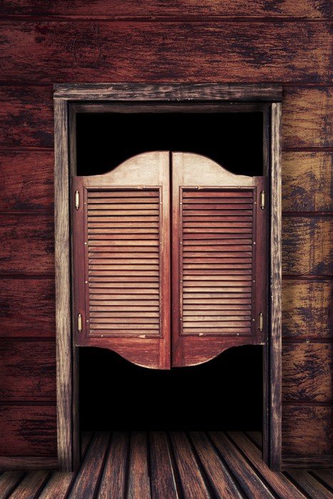
Given those truths saloon doors, of the sort seen in every Western movie, make little sense. Yet we know they existed thanks to not just Hollywood, whose depictions can be suspect, but the actual architectural record. The question is, what was their purpose?

Incredibly dumb and obviously specious theories abound on the internet, and with no Saloon Door Authority to set the record straight, all we can do is use our observation skills as designers to deduce their intended function.

Saloon doors, also known as batwing doors, can be paneled, louvered or planked. But regardless of their construction they consistently have two defining physical characteristics:

1) They do not extend all the way to the floor nor the top of the doorjamb, but instead block the doorway at roughly torso height.

2) They feature bi-directional hinges.

Let's look at characteristic #1 first, and what that says about the door's function. Since they do not seal the doorway, they provide little protection from the elements and are unsuitable for denying access. (Saloons were locked at closing time by an additional set of outer, shutter-like doors.)

What they do provide, most obviously, is a modest visual barrier. Nineteenth-century saloons were places for men to consume alcohol, gamble and hire prostitutes, all pursuits that were at odds with religious and temperance movements of the time. We can conclude that barring passersby from getting an unwelcome eyeful of these sins--while still allowing the sound to pass through, to tempt the intemperate--was one goal of saloon doors.

Why not, then, just have a full door? One explanation might be to save on materials, but that seems untrue; if the sole purpose of the door is to block the view, the outer doors would simply be used and no saloon doors would be installed at all.

I think the explanation lies with characteristic #2. 

Saloon doors feature bi-directional hinges and no door handle--as do the doors to the kitchen of every restaurant I've ever worked in. The purpose of a door with a bi-directional hinge is to allow people whose hands are encumbered to easily pass through them, regardless of whether they're going in or out. If the door is reduced in surface area and split vertically in half, therefore greatly reducing the weight, it makes it even easier to push through.

Coupled with a need to provide a visual barrier to licentiousness, if we think of a saloon needing to be regularly restocked by someone carrying crates of bottles in and out, and patronized by cowboys who might prefer to carry their gear inside rather than leave it sitting outside on a horse without an alarm system, then saloon doors make good sense. I believe these were an early stab at UX.

Design Criticism: Spanish Jewelry Box

$
0
0

This is one of those objects that I find beautiful in one configuration, yet ugly in another. While beauty is a subjective thing, I wanted to go over the object with you and see if we can come to some agreement about universal aesthetics (if such a thing exists).

Here's the object in question. It's a jewelry box, and according to the manufacturer it's an old design that they discovered in a Spanish furniture maker's archives and put back into production.

I think it looks great when it's open.

I particularly like the way that they've sculpted the side wings.

The problems begin for me when it's all closed up, which is presumably the configuration it would most often be seen in.

1. I appreciate that this is built primarily out of solid wood (except for the bottoms of the drawers, which the manufacturer says is made out of plywood), but:

I find the discontinuity of the grain (pieces A thru E), particularly the change in color tones, jarring. Obviously this will differ in each one they produce, but the fact that this is the one they chose to photograph tells me color matching is not a priority.

2. I would prefer that the front face of this be all surface F, so that we are not sending endgrain G. I realize that G is left exposed and protruding in order to provide finger purchase to open it, and I typically prize function over aesthetics, but not in this case. To me, curves H and I deserve not to be broken by the seams there. I might have reduced the lid protrusion to a narrower fingerhold that sets into a slot, rather than having the entire width of the lid exposed like that.

3. I find the difference in grain between surfaces F and J jarring as well. I realize there is no practical way to cut F and J from the same board, but I might have gone with a markedly different, complementary tone between the two rather than have them so close in tone that you notice the difference in grain.

4. I could take or leave this rise, K. I think it breaks the line of that "headboard" unpleasantly, but I can see how some people would like it.

All of this criticism aside, I am glad that they did go to the trouble to make it from solid wood, as problems 1 and 3 could easily have been solved with veneer-over-plywood, which I am really growing to hate.

Your take?

Urban Design Observations, Los Angeles Edition: High & Low in the Hollywood Hills

$
0
0

On my recent trip to L.A. I crashed with a friend in the Hollywood Hills. It is an incredibly unlikely place to site so many houses. It makes San Francisco look flat.

I asked my friend what the story was with this place. She explained that this used to be a big mound of dirt. The owner in the green house above had it excavated, intending to put in landscaping. But as the workers dug they discovered this precarious-looking assemblage of timbers that had apparently been buried for decades.

I've lightened the photo below so you can see what's going on here. The stubby vertical supports, which rest on the retaining wall, have been notched (circled in red) in the manner of a log cabin to accept the horizontal crosspiece. The longer vertical timbers above it are resting on this crosspiece. This was obviously designed to hold the earth in place, so now structural engineers have to be called in to figure out what is and isn't safe to remove.

Work has thus been halted on the Green House renovation, but this thing below remains in place, probably because it's too much trouble to dismantle. The workers who had been renovating the home had rigged up this contraption to haul building materials and workers up to the site. I'm guessing it works by means of a cable laid in the track.

All of the roads in this neighborhood run along the side of the hills, so on one side of each street are the "high" houses, on the other side the "low" houses. (Those are my terms, not the official neighborhood parlance.) I've observed that the houses on the "low" side of the street are often small and humble, like this:

Houses on the "low" side also have very few windows facing the street. I'm told many of the residents are mid-level stars, and the architecture suggests privacy is prized.

In contrast the houses on the "high" side are often taller and grander, and have more windows, presumably to take in the prospect.

There is no consistency of architecture, however. Some of the houses on the "high" side are hideous, like this:

I absolutely hate this cut-out they've placed to the side of the stairs. I suppose it's meant to hold landscaping but it just looks terrible to me.

Around the corner is this riotously colorful house. It reminds me of how automakers paint prototypes in crazy patterns before allowing them onto test tracks, so that spy photographers cannot really deduce the shape of the car.

This addition on the side of the house doesn't really match, and paradoxically looks older than the house does.

More photos on the way.

Joey Zeledón Explains Emotional Ergonomics and How You Can Fit Them into Your Design Process

$
0
0

It's easy to focus on the big picture—so much so that we often lose track of small details that make a whole world of difference, especially in the design process. Seasoned industrial designer Joey Zeledón has taken a step back from this natural tendency to focus on emotional ergonomics in his new book, Touchy/Feely. Touchy/Feely is not only a call to action for designers to consider and understand small but common human to product interactions, but it also isolates and defines a key part in the design process that falls between research and prototyping.

Zeledón's grey and yellow "touchy" illustrations consistently take you back to feelings I guarantee (or, at least hope) you've experienced before—like putting on deodorant or eating a sandwich—and the "feelies" listed on each adjacent page read like strangely relatable poems. On top of all that, it's fun coffee table book and/or nighttime read. We had a brief discussion with Zeledón, during which he went into detail on what emotional ergonomics are and when they should be considered: 

C77: Can you tell me a little more about your industrial design background and why you felt writing Touchy/Feely was important?

JZ: I have had quite a diverse background in the world of industrial design. I started out designing footwear for Clarks Originals and Banana Republic, spent 8 years in consulting with Continuum and Smart Design designing for a lot of different industries, and am now focused on designing healthcare spaces and furniture at Steelcase. And, the common thread in all of my work has been emotional storytelling. The way I see it, Touchy/Feely is the culmination of that thread, and a way to share that process with others on how to tap into the human psyche. We always talk about designing for humans, and I see focusing on the emotional needs of people as fundamental to that.

How long have you been working on Touchy/Feely?

The idea of Touchy/Feely was first conceived when I was working at Continuum in Boston in 2010. I was designing a product where, at the core, what we were trying to do was make people less fearful of using a particular product and build trust. And, we did that by looking for cues in other experiences. So, I started drawing gestures of interactions with different experiences and thinking about the emotions tied to them. I found this exercise so helpful, so it became a regular practice in all of my design work, and Touchy/Feely was born. 

I was thinking of ways to get this idea out into the world and to really pilot it, and I always had a book in the back of my mind. But, it wasn't until a couple years ago that I decided to start piloting the idea on Instagram to see if it had an audience beyond me. I've been posting different Touchies and asking "What's Your Feely?" It has seemed to resonate with a cult following of design nerds like me. Then, about six months ago, my partner Martelle encouraged me to finally put it all into print with a selection of Touchies and Feelies poetry, and we've been working on it together ever since.

How do you personally define "emotional ergonomics" and what it means in the design process?

Essentially, it's a fancy way to say how you feel when you interact with things. As a designer, tapping into peoples' emotions is so important. It can help you create designs that not only address physical needs but emotional ones as well.

How did you research and narrow down the Touchies you decided to publish? There are endless possibilities!

I have an arsenal of these drawings from over the years. In this book, I wanted to show a cross section of Touchies loosely based on a day in the life. Some are gender or age specific, but many are more universal experiences. Intentionally, some are mundane everyday interactions while others have more extreme emotional associations. It was very difficult to down-select to just 100. I was even coming up with more ideas for future drawings as I was trying to narrow down my list. But, eventually, I decided I wanted to find a selection that many people could relate to and that were thought provoking. That said, I have many more Touchies and Feelies up my sleeve.

Why do you feel it's so important for designers to consider the smaller interactions we have with objects on a daily basis?

"You have to really understand the rules about what's familiar before you can break them in a meaningful way."

Humans do many of these small everyday interactions mindlessly as muscle memory. When you take time to reflect and dissect them, you start to see them in different ways. There are behavioral patterns that we have across seemingly very different interactions, and there is opportunity to leverage some of these patterns for emotion-driven design. For example, if you take a look at the envelope Touchy and the Sandwich Touchy, the gestures are very similar. So, perhaps if you are designing an envelope, you could explore designing the adhesive to taste like a pastrami sandwich. Does this make the experience better or worse? I don't know. You have to really understand the rules about what's familiar before you can break them in a meaningful way.

How have you incorporated Touchy/Feely into your design work? During what stages of the design process do you think it'll come in handy most for other designers?

I've applied Touchy Feely on most of my projects. One example is a project I worked on while I was at Smart Design. We designed a new drinking experience for Pepsi-Co's Drinkfinity brand. The tangible elements consisted of a vessel to be filled with tap water and a juice concentrate in the form of a pod. The feeling we wanted to elicit in the interaction was the satisfaction of squeezing a fresh piece of fruit, so we mimicked that exact gesture in the Drinkfinity experience. I think the most useful time for using Touchy-Feely in design is after you have done a little bit of research on the target audience and know what drives them, what their needs are, and how you can tap into their emotional narrative. It's a great tool for ideation.

*******

Touchy/Feely is available for preorder now on Kickstarter.

Design Job: Calling all Social Wordsmiths: Teroforma is Seeking a PR & Social Media Manager

$
0
0

Teroforma is an award-winning product design brand based in historic downtown South Norwalk, CT about 1 hour north of NYC. We are looking to add a PR & Social Media Manager to our corporate team to promote our brand and products in print, on social, and through engagement events

View the full design job here

Airbus Designing Bed-Containing Modules to be Placed in Passenger Jet Cargo Compartments

$
0
0

Remember our deep dive into the parts of the airplane you never get to see, the long-haul crew rest areas? In a few years, passengers may also get to experience what it's like to catch some shut-eye in a dedicated airplane bed. Airbus and Zodiac Aerospace, a French supplier of airplane interior fittings, have announced they're expanding the passenger experience down into the cargo hold with a sleeping area for paying fliers. But instead of permanently retrofitting airplanes, the two companies are collaborating on the design of modules that can be slid into an A330 and will contain sleeping berths.

They're also working up concepts for other living-space-like modules:

And here's a walkthrough of several of these modules ganged together:

"The new passenger modules," Airbus writes, "will be easily interchangeable with regular cargo containers during a typical turnaround if required." The company is betting that long-haul airlines seeking to differentiate their service will buy in, attracted by the flexibility--and the ability to sell what will undoubtedly be a very expensive, if novel, nap.


This "Easy Way to Thread a Needle" Hack Looks Great, But I Can't Get It to Work With Machine Needles

$
0
0

If you regularly use a sewing machine and have declining eyesight, you know that threading that damn needle is the most frustrating part of the process. There are times when I've continued sewing with the wrong-sized needle just because I subconsciously didn't want to insert and thread a new one. And yes, I have this stupid thing below and I hate how junky and inelegant it us.

So when I heard about this easy way to thread a needle, I was super excited to see the video:

First off he's using a hand sewing needle, not a machine needle, the latter of which has the eye just above the point. But I nevertheless went to my sewing machine bench and tried for ten minutes or so to do this with a #9 needle (a 65, for those of you not in America) and absolutely cannot get this to work. It's also pretty precarious because you have to avoid pricking yourself with the point, since that's the end the eye is on.

I'll try it again with a #18 needle when I have time. In the meantime, if any of you use sewing machines and can get this trick to work, please let me know!

How the Eames Lounge Chair is Made

$
0
0

This video is unfortunately peppered with MarketingSpeak--in particular you can skip the first two minutes and 30 seconds--but it does provide a great look at how the Eames Lounge Chair is made.

We urge you to ignore the poorly-written narration, as they say things like "the manufacturing process hasn't changed much in fifty years," then they show you a drag-knife-wielding CNC cutter that I'm pretty sure the Eameses didn't have access to.

Okay, I'll stop complaining. And I'll avoid the temptation of asking you which M-Speak comment causes you to roll your eyes the most. I think I'm just bitter because I can't afford this chair and I pass it every day at a certain store on Greene Street.

I dug the dust collection for the horizontal spindle sander.

A "waffle iron," they say? I'd hate to see how the narration-writer makes waffles.

I also like that there's just one guy whose job is to test each chair out, and I wonder what his credentials are. I'm guessing they introduce him by saying "Best ass in the business, this guy" and every month medical technicians painstakingly record the amount of nerve endings in his ass while referring to clipboards.

See Also:

How the Eames Bentwood LCW Chair is Made

Speculative Futures at PRIMER 18

$
0
0

If you happened to miss last year's inaugural PRIMER17 conference, well, you have another crack at rubbing shoulders and exchanging best practices with others devoted to speculative design, strategic foresight, design futures, and discursive design in general. PRIMER18  will be taking place this May 3–5 at several sites in the SF Bay Area. (Discounts! Core77 readers can take advantage of a 25% discount with web registration code CORE77P18; Educators and non-profits 50% off with EduDiscount50off; and Student tickets are $95 with a valid student ID–contact theprimerconference@gmail.com.)

Speakers include Nick Foster, Head of Design, Google X, and Julian Bleeker, Co-founder and CTO of Omata. Both also co-founders of the Near Future Laboratory.

This year's keynote speakers are futurist and Carnegie Mellon professor, Stuart Candy, and multi-platform designer, Ani Liu fresh from the MIT Media Lab. Others such as Nick Foster, Head of Design at Google X along with his Near Futures Laboratory partner Julian Bleecker will also be sharing the stage. Twenty speakers from industry, academia, and independent practice will speak and run workshops involving present-day project opportunities and challenges, practical and critical frameworks, the sociopolitical implications of design, and no less than the future of humanity itself (which includes speculative practice).

We had the pleasure of attending last year and met the brainchild behind PRIMER and the increasingly international Speculative Futures meetup group, Phil Balagtas. We caught up with him again in the run-up to this year's conference.

Phil Balagtas, Experience Design Director at McKinsey & Company

Where did the PRIMER conference come from?
PRIMER culminated out of the interest of the speculative design community we were building in San Francisco. We started our first meetup in April 2015 as an experiment to see if there were others in the Bay Area that were interested in Speculative & Critical Design. Interest grew quickly and we were thrilled by the feedback and reaction of people in the design community—many people had never heard of speculative design and wanted to know more. So we decided to organize a "glorified meetup" in Feb 2017. It was only meant to be a one day event where we would fly in some of our favorite designers. But the more we worked on it, the more it turned into a full-fledged conference.

What is your background and relation to speculative design / design futures?
I discovered SCD when I was at the California College of the Arts pursuing my masters in 2009. I was desperately seeking a topic area for my thesis and saw Dunne & Raby in the documentary, Objectified. I was fascinated at how they looked at design and what the future meant for designers and interaction design. I quickly started researching everything that was coming out of the RCA and found more and more examples of critical design. It would eventually shape my thesis that year.  After school, I was a bit discouraged w/ my work so I got a job in software in Silicon Valley, all the while poking at SCD and smuggling it into design thinking sessions with our clients hoping it would instill some urgency about the impact they were having on society with their products. But we always found challenges and had to scale back the "speculation" to meet business needs. Years later, I saw a project by the agency, Method, called Method Money (see video below) win an interaction design award. While, not entirely a critical design piece, it gave me hope that there were still others out there practicing speculative design and that it was not just relegated to art schools or museums. That's when I decided to start the Speculative Futures Meetup. So for the past 3 years, we've hosted speakers and I've curated workshops to help our community learn how to think about the future through speculative design. I also speak and teach workshops around the world on the topic. I'll be at InteractOhio from April 25–26 speaking to a digital marketing crowd.

Why call it "Primer"?
We weren't sure what to call this "glorified meetup" at first. I knew I wanted it to have its own unique name. At my day job (at the time I was a designer at General Electric) we always talked about "priming" our customers for design thinking. And always creating a "primer" deck to help introduce people to new ideas. I thought it was perfect for the conference. We believe it means that the things we speculate about, the cultural, economic, political, environmental implications are "priming" our audience and society for possible futures. And we've created this platform not just to share work but to really ignite a concern about how things could be, and how we can avert the dangers and fortify opportunities for designing a better tomorrow.

What has been most surprising for you?
The most surprising thing has really been the growth of our Speculative Futures meetup community. We never intended it to grow beyond San Francisco, but the more I spoke in other cities, the more people wanted to help and grow their own local communities. We're now in 6 cities worldwide: San Francisco, Austin, Indiana, New York, London, Berlin, and soon Australia.

A day of workshops: Actionable Futures Toolkit (Sami Niemelä; Transgenerational Futures (Alana Aquilino); Foresight and Innovation approaches (Frank Spencer); and the Speculative City (Matt Wizinsky).

What's been a great outcome of the conference?
I still recall something someone said at PRIMER 17–"It's nice to know that I'm not alone." I think the most rewarding thing about the conference is seeing people who've come from all over and meet each other and feel thrilled to know there are others out there practicing this work and sharing the same ideas and methodologies. We just want to connect the world, really. We strongly believe in the mission of using speculative design to deliver new agendas at a global scale. So the more people that meet and are inspired and can go back to their home and keep the fire burning and spread the methodologies and ideas, the more grateful we are.

What do you see in PRIMER's future?
We have some exciting announcements we're going to make at PRIMER 18 and all I can say is "growth". The meet ups are already growing and working at a grassroots level. But we're looking forward to how PRIMER can connect even more communities outside of design globally. At PRIMER 18 we've decided to extend our invitation to Futurists, Strategic Foresight practitioners, and even Sci-fi authors. We believe we are all in the same family and can help each other imagine, grow and execute real-world strategies. So you're going to hear from a lot of different people at PRIMER 18, not just Speculative Designers.

www.primerconference.com

www.futures.design

Twitter
@neshacom1

Twitter/Instagram
@futures_design


Honda's Two Design Approaches to Help Stroke Victims Walk

$
0
0

Most people think of Honda as a car and motorcycle company, but they view themselves as a mobility company. That's why, nearly 20 years ago, an internal team of engineers was formed to help a subset of people who are functionally immobile: Stroke victims. By adapting the technology from their experimental bipedal Asimo robot, they reasoned, they could help people with damaged or impaired motor functions walk again.

While the engineers reportedly produced some 30 prototypes, "Grossly simplified, the Honda researchers split walking into two problems: fighting against gravity to maintain standing and generating a force to move forward," according to Exoskeleton Report. So the two prototypes shown to the public each tackled one of these issues. The Bodyweight Support Assist helps with the first problem, and was also envisioned to be able to help reduce strain on factory workers:

The second approach, then called Stride Management Assist, tackles the second issue:

That was just about ten years ago. In the time since, the first prototype has disappeared from the news, whereas the second prototype went into trials about five years ago at the Rehabilitation Institute of Chicago. Then, in 2015, Honda began producing that second design, rebranding it the Walking Assist Device, and leasing it to roughly 250 facilities in Japan. And earlier this year, the company obtained approval in the EU to list it as a medical device, so we assume Europe will see them as well.

At press time there was no word on whether it will become commercially available in the 'States.

Behind the Scenes of COS x Phillip K. Smith III's Reflective 'Open Sky' Installation at Milan Design Week

$
0
0

London-based fashion brand COS has returned to Milan Design Week for a seventh consecutive collaborative installation, following a very successful year with Studio Swine. This time around, COS's collaborator is Palm Springs-based designer Phillip K. Smith III  who has created an otherworldly, reflective environment located within the 16th century Palazzo Isimbardi—the first time COS has selected an outdoor venue.

Immediately entering the Palazzo, visitors are faced with the largest structure in the installation. Almost like a kaleidoscope effect, the mirrors are ever-changing, projecting a different image of architecture and sky every time.  

The large work is accompanied by smaller reflective works in the Palazzo's garden, just a few steps away from the main structure. Out of the hundreds of installations being designed specifically for Instagram selfies these days, it was especially refreshing to come across a mirrored installation designed to help you appreciate more than just your face.

On that note, we sat down with Phillip K. Smith III and COS Creative Director Karin Gustafsson to discuss what went on behind the scenes of Open Sky and to learn more about the materials and fabrication process:

Can you tell me more about how this project came to be?

Karin Gustafsson: We started off by reaching out to Phillip because we really like his work and have been interested in it for some time. We knew by then that we wanted to come back to Salone and do something here again. We've been here since 2012, so this is the seventh time, and we've never been outdoor before this. We invited Phillip over, and we had a first meeting where we shared a bit more about ourselves as a brand, shared our DNA, and our values. Then Phillip shared his work and his vision, and that was really the starting point.

From there did you immediately come up with concepts?

Phillip K Smith III: I just waved my wand! (laughs) No, but the process was great because COS was hands-off in a way. They basically said, "Here is who we are as a company, here is the site, and we look forward to seeing what you'd like to do." Essentially what you see in that courtyard is what I presented at that first meeting. It was very fluid and very free from the beginning. It was more like working with a museum than it was working with a brand.

How long did the entire process take?

PKS: Our first meeting was in September of last year. After that meeting there was a process immediately following where we decided which concepts we liked and began to think about how we could actually build them. That was when the real collaborative spirit started happening. It's COS and Phillip K. Smith III on the banner outside of the building, but there are probably over 100 people who have touched this project, and it couldn't have happened without them. 

That ranges from people in my studio helping with taking this idea from sketch to a three-dimensional digital model, to working with fabricators both here in Milan and in Brooklyn. I worked directly with a company called UAP, Urban Art Projects, to work out a lot of the detailing and to ensure that the simplicity and purity of that concept would be maintained through all of the fabrication. There was a real high level of precision that I was after, so I needed to consider that when I was acquiring a fabricator. These were thoughts between both myself and COS—that there's a respect for precision. It was so nice to be able to work with a client that appreciates precision and understands the kind of simplicity of thought and how complex it can be to project that simple thought.  So, working with the COS team, with UAP, with my studio, with the venue, with the production company here in Milan—it was a lot of different people all pushing towards this goal of getting this thing accomplished and built.

It's always fascinated me how the most simple forms are actually the most difficult to achieve.

PKS: Yes, exactly because the more you distill something—the more you're looking at it—the more you're perceiving it. If I hold up my hand and show it to you in motion, it's really difficult to get a full picture, right? But if I show you my completely still hand, now you're about to notice the wrinkles and all of the subtleties. When there's only a surface presented to you, you really look. And that's the goal of a lot of my work. I've done a whole series of light and shadow pieces that are all white, that are all about presenting light in its simplicity, and there might be three planes of white, and that's it. But there's a real scanning of the surface and then a recognition of how simple and pure and how beautiful it can be. There's a similar thought for, certainly, this courtyard piece as well as the reflectors out in the garden of recognizing the simple, pure beauty of the Renaissance architecture and the Milan sky.

We often work quite big, large and creative from the beginning, but then we reduce. The more you reduce, the more attention to detail you have to have. But that also creates more long-lasting experiences and more long-lasting value in product. Very often, I imagine in your studio, Karin, the struggles of, "How does this go next to that?" or "How do we make that line beautiful and pure?" There are so many detailing questions that come up.

KG: They can be obstacles, but the obstacles make you think and challenge you, and they make you move on. So, it's all for the good—it keeps us on our toes.

Karin, I think what Phillip was just describing is very much parallel with COS's clothing. Many of your silhouettes appear simple on the rack, but then when you try them on, you notice all of these small details that you would have never noticed. Phillip, when you first look at Open Sky, it's this one large piece, and then you really step up close, it becomes so much more.

PKS: It changes wildly, if you step to the left a couple feet or right to the couple feet. Everything changes.

What was your inspiration that lead you to this final point?

The initial inspiration was that square of sky that the palazzo frames itself. I wanted to pull the sky down to the ground. I lived in Rome my fourth year of architecture school, and I understood that courtyard space and the feel of that space because I used to walk through it every day to go to my studio. When I knew I'd be working within a similar kind of space here in Milan, I remembered that square of sky. It's so beautiful and distinct. It's almost like there were blinders of architecture that framed this perfect view. James Turrell's sky spaces are all about that, but here's a sixteenth-century Renaissance architecture doing that 400 years before Turrell, in a way.

I wanted to use the materiality of Milan, and the materiality of Milan in this case that is architecture and the sky—it was about distilling the materials I was working with to architecture and sky. I've had opportunities to do vast projects out in the middle of the desert, but really, if you distill those down, it is about land and sky or water and sky. In this case, it's architecture and sky.

Did you play around with any other materials before you settled on the mirrors?

Reflection is possible through a variety of materials, but my goal was figuring out how I could present the sky and the architecture as purely as possible. Structurally, what has to occur? How does it actually get fabricated? How does it get packed? How does it get assembled? What's the longevity of it? How easily does it scratch or not scratch? All of these very mundane questions were so essential to the project.

Ultimately, the material I selected is a mirror-polished stainless steel. It's a 14 gauge, so it's a little bit thicker than one-sixteenth of an inch. The material couldn't be much thicker because then you can't actually apply it. You'd have to slightly bend it in order to align everything, and if it's an eighth of an inch thick, it's too thick to be able to do that. There are a lot of those mundane things that have to be contained within this circle of fabrication logic, and assembly logic, shipment logic, a person lifting it logic, and then all of it with the litmus test of, is it true to the concept? Are we following and allowing the concept to stay as pure as possible? 

There's a whole structural logic on the inside of the piece that you don't see. You only see two of the 34 ribs where the piece is actually cut on the edges. You see the kind of triangular logic—the structural logic. There's a repetitive modular element that runs throughout the structure, and if you figure out how to make one of those modules, you can, in theory, create the entire piece.

I'm sure there's a lot of beauty within that hidden structural system.

There's a lot of beauty in it. I love talking about that. I resist sharing some of those images because I like maintaining the mystery of the work, but I'll say, a lot of the photos of the piece before any of the concrete panels or the mirror went on were gorgeous. It was like looking at a skeletal structure of a human being; it's gorgeous.

*******

Open Sky will be on view April 17 until April 22, 2018 at Palazzo Isambardi (Corso Monforte 35, 20122 Milan). If you're in Milan, be sure to stop by and see it for yourself.

Viewing all 19142 articles
Browse latest View live


Latest Images