Quantcast
Channel: Core77
Viewing all 19147 articles
Browse latest View live

Made in Yame: Traditional Craft and Contemporary Design in Japan

$
0
0

SVA Made in Yame returns with its June 2019 opportunity to study traditional Japanese crafts in Fukuoka Prefecture, Japan and have a contemporary product design produced and distributed by MoMA Wholesale. SVA Made in Yame accepts applications from all interested participants—not just SVA community members.


The group of visiting designers were welcomed by the craftsmen in a traditional ceremony at a Shinto shrine

In October 2018, program director and industrial designer Sinclair Smith lead a group of designers on a tour of the region's remarkable concentration of traditional crafts, food and history. Sigi Moeslinger and Masamichi Udagawa of Antennae Design, Alexandra Dymowska, lead designer for brand strategy at Cadillac Design, General Motors, Ian Collings, product designer, sculptor and co-founder of Fort Standard, and product designer Panisa Khunprasert (MFA 2016 Products of Design) visited 10 craft studios and sketched new product designs using those tools and techniques. Prototypes are in development for consideration by MoMA's team of buyers.


Ian Collings observes the process of straightening bamboo for traditional arrow making

"Meeting the craftsmen of Yame was a humbling experience. … All of them have accumulated a depth of knowledge about a material or process that allows them to produce exquisite artifacts," says Sigi Moeslinger. "This is in such contrast to our fast-paced, low-cost, throw-away culture and an inspiration to take the long view on whatever we design and make."

And anyone can apply to these programs regardless of any affiliation with the school. But now SVA has added product design to its roster with Made in Yame: Traditional Craft and Contemporary Design in Japan.

Sigi Moeslinger observes the tight tolerances of wood details for a Butsudan home altar

Made in Yame will take designers to Yame City in rural Japan to learn over a dozen traditional Japanese crafts and guide them through a design process toward a contemporary product using those traditional tools and techniques. We have seen similar programs in the past, but what sets this one apart is its partnership with MoMA Wholesale.

Alexandra Dymowska presents her final sketches of contemporary designs to the Yame craftsmen

"We're in our fourth year of partnering with MoMA Wholesale and so far they have licensed and manufactured a dozen or so of our students' designs," says SVA MFA in Products of Design faculty member and Made in Yame program coordinator, Sinclair Smith. "It's exciting to extend that partnership and opportunity to participants in Made in Yame."

Alexandra Dymowska tries her hand at painting flowers on a silk lantern

According to the website, prototypes will be flown from Japan to MoMA where buyers will have the option to license and produce the designs for global distribution. So you get to see Japan and its traditions and you might get your product produced by one of the most reputable names in contemporary design. Learn more about SVA Made in Yame and how to apply at madeinyame.sva.edu. Read the FAQ here.


Lomography's Focus? Blurring the Line Between Professional and Casual Photography  

$
0
0


The Lomogon lens fits DSLR and SLR cameras and is suitable for wide-angle or portrait photography.

Daniel Schaefer was the youngest member of Los Angeles's Magic Castle, a private magicians' club with an exclusive guest list and a strict dress code. He knew some sleight of hand, but he spent more of his time there taking photographs, mostly using affordable vintage cameras instead of expensive new equipment. "I was 15, 16 years old, shooting a bunch of the other young magicians backstage getting ready for their performances, on really gritty Delta 3200 high-speed film, in these beautiful black-and-white noir scenes; the reality was that they were a bunch of goofy Santa Clarita kids playing cards."


The pictures didn't turn out perfectly, but that was kind of the point. The aberrations and imperfections forced him to understand his equipment and make artistic choices.


Schaefer didn't follow the magician career track very far, but he's carried the moody narrative approach and appreciation for vintage cameras into his professional photography practice and his work with Lomography, a company that makes vintage-inspired cameras. Their latest Kickstarter project, the Lomogon 2.5/32 Art Lens, promises a 32 mm focal length and a minimum focusing distance of 0.4 m, which allows for a healthy mix of cinematic close-ups and wide-shot scene setting, plus a rotating, round aperture for soft bokeh.


A portrait Schaefer shot with a Lomogon lens.


A chance encounter with vintage cameras starts a movement

Lomography was born in the early '90s, when a group of Viennese students discovered LOMO LC-A cameras, and the delightfully saturated, vignette-like photos they produced, while traveling. Two of those students, Sally Bibawy and Matthias Fiegl, started casually importing them for friends, and eventually bought the former Soviet factory that made them to scale up their operations.


Lomography evolved from a nonprofit photography collective, exhibiting works and championing the "10 golden rules" of casual point-and-shoot photography, into an independent business that revives vintage-style lenses in original new designs.


Ten successful Kickstarter campaigns have kept them going strong, but their real lasting power comes from their products' durability and distinct character. You can count on your Lomography equipment, but you don't really know just how your shot will come out—and photographers love that.


"Most of the lenses on the market now have perfected image quality," says Lomography marketing and PR manager Birgit Buchart. "We saw there was an opportunity to bring people back into embracing the aberrations you get in historic lenses."


"I think the big difference is that we're not trying to figure out the market fit, we're just passionate film photographers," adds Lomography USA's general manager Frank Dautant. "We go with whatever we feel is fun, we release what we think will be most exciting for photographers."


Now that anyone can take a perfect picture, photographers look for happy accidents

"I tend to shy away from the tradition of modern photography to have this sort of crisp cleanliness to it," Schaefer explains. "I like to dirty it up a little bit, I like to have a cinematic element, I like to frame things wide and show the scene and the subject, and make all of those pieces come together to show a little bit more story, make it more cinematic. The vintage optic designs Lomo brought back feel more naturalistic and loose; there's more attitude and more flavor."


A Lomogon photo by Julia Grandperret.

The Lomography team hears this from many of the photographers they work with: The oppressive sameness of the polished shots on Instagram and in product photography drives them to play with imperfections.


"Back before photography, people would paint super naturalistic depictions of reality," Buchart says. "Then, once photography was invented, all of a sudden you didn't have to do that, and impressionist and surrealist painting emerged. I think that is what we are seeing in photography now. Everyone gets sharp, perfect photos on their phone every day. For people who are actually interested in photos, that gets boring. And when people move over to film, we want to encourage them to feel that it doesn't have to be the perfect photo, it's more about working through trial and error and embracing the emotion of the medium."


Amateurs are welcome

Lomography's products have always fallen somewhere between casual and professional use. On the one hand, their "golden rules" encourage people to experiment and see what happens. But Lomography also speaks to enthusiasts who want to explore the medium more deeply.


The Lomogon, Lomography's first wide-angle lens for SLR cameras, fits comfortably in that in-between space. "It's exciting because it combines the professional world and the original Lomography community," says Dautant. "It's a revival of the LCA lens that was on the Soviet cameras that started the whole Lomography movement. We're bringing the lens from this fun, tiny camera to the art lens world. So we have professional photographers who want to try out a new lens for their camera and also the normal community of old-fashioned film photographers who can now have the aesthetic of that camera on a professional level."


The Lomogon lens

"The Lomogon is a really nice balance," adds Schaefer. "If you want to be a better photographer, shoot with a wider lens than you expect. Something like a 35 or a 28 forces you to get a little bit closer to your subject; it forces you to have more of an intimate relationship between the camera, the lens, the subject, and the space. You inherently have to be closer to fill the frame. It really feels like the human eye, the space the eye can see. The 32 range gives this immediate sense of the balance between the scene and the subject that I really like."


The Lomogon 2.5/32 Art Lens is live on Kickstarter through March 22, 2019.

Furniture For Food: A Lamp that Lights Your Home and Grows Your Veggies

$
0
0

Newly launched Benditas Studio recently debuted Brot, a multi-functional lamp and germinator at the Greenhouse category of Stockholm Furniture Fair. Designed to create a cozy, well-lit atmosphere while growing your own leafy greens, the lamp is made from terracotta and comes in two pieces. The bottom piece holds a tray of seeds, and the piece on top is designed to direct light towards the seeds and the surrounding room through the center gap.


The instructions are simple: First, soak your seeds in the tray (timing depends on the type of seed). Once the allotted time has gone by, place seeds on the stainless steel tray and make sure to moisten two to three times per day. After four to six days, a salad magically appears and ready for harvest.


Brot is the first project from Benditas Studio, founded by Caterina Vianna and Ferran Gest. They launched this year to merge furniture and food, designing new products and services for the food sector. Brot is the Catalan word for 'sprout' and we are excited to see what else this duo sprouts, especially if it means helping us eat our vegetables.


Post Nike Sneaker Fiasco, a Footwear Design Expert Shares How and Why Basketball Shoes Can Fail

$
0
0

Keep the below image in the back of your head for the next few minutes, as we'll be dissecting how and why Duke basketball player Zion Williamson's pair of Nike PG 2.5 basketball sneakers literally fell apart on court during a recent game:


Ever since the incident went down, we've been wondering how, from a technical design standpoint, a pair of quality tested sneakers could have come apart this way during a game. To get the inside scoop, we consulted industrial designer Michael DiTullo, who has extensive experience working as a footwear designer at Nike (including in the Jordan division of the brand). Read his responses below and be sure to study DiTullo's detailed basketball sneaker anatomy diagram at the end of this article:


Core77: Is shoe failure during a college/pro basketball game something new or has this happened before? If so, when and where has this happened before?  

Michael DiTullo: Shoes do fail sometimes, though it is rare that one has a catastrophic failure. Eyelets can pull out, laces can break, tongues can be yanked too many times and separate. The stresses that elite athletes are putting on the product are immense. We are really designing F1 cars for them that a regular person can then go and buy. If you wear a modern basketball boot off the court you might find it stiff, or overly supportive, because they are designed for these very specific players who push themselves and the product to the extremes. I once designed a shoe for an athlete who insisted on taking the prototypes with him… he ended up wearing them in competition, and we were all stressed that something might happen because they were hand made design validation samples. Luckily they held up and he won in them, so they became his lucky pair.  


The Converse React Gel incident was before my time, but it is well documented, including this quote from a Highsnobiety article on the subject:


"In addition to Hammell's theory of stagnation, a bigger problem for REACT was perhaps linked to reports that the sneakers' "bladders" were leaky, with juice seeping on to the court. Former Washington Bullet Tim Legler was on the NBA Today podcast in 2012 and shared a story about how his REACT sneakers had leaked during practice, causing Chris Webber to slip and almost injure himself. As Legler put it, "They're out there, the ballboys are out on the floor wiping the practice court and it continued. Three or four guys slippin', slidin', and wipin' out."  


What main questions would you ask yourself if you were in charge of handling this situation from a design perspective?

The first question I would ask myself is, "was this a production pair, or a pre-production/athlete production pair?" A lot of athletes have feet that are larger than the commercial production run, so special molds are cut, and those pairs are usually made up special. This also typically results in a product that is constructed much more carefully and rigorously for the high demands an elite athlete will put on the product. Since this is a special handmade run, I could see how an error in lasting or curing the adhesives, or in the strobel stitching of the upper could occur.


If it was a production run shoe, I'd ask if this is one time thing; can we replicate the failure in wear test labs or on courts with testers? If it does happen regularly, then I'd have to start picking apart the design. Is there enough wrap on the EVA to get good biding between the upper and the sole unit? Are the rubber outrigger and toe bumper sizable enough? Is it a textile or EVA strobel material, and is that robust enough?


"I like to think of [footwear design] as being in a mixing booth where I have all of these equalizers. I can turn them up and down, and getting the mix right is the difference between a flop and a track that everyone gets stuck in their heads for the summer. It is not going to happen by accident—you have to know what you are doing and have a vision for the end product."  


There is a lot more that goes into designing a piece of performance footwear than the aesthetic graphical break up. A lot of biomechanics, material properties, and construction techniques need to be considered. There are best practices for all of these things that vary from company to company, but as designers we often want to push those boundaries while we are on our quest to make the product stronger, lighter, faster, more flexible, more comfortable, more supportive, grippier. Some of these goals are diametrically opposed, so understanding how to strike the right balance is critical.  


What are some of the technical reasons why the shoe could have come apart?

Without seeing the shoe in person I can only speculate. I would assume there is an entire team of people looking into this issue. None of the major brands take this lightly. I know from my time at Nike there is a complete player focus and obsession. Looking at the way the foot came out of the shoe, I would look into the midsole bonding and strength of the stobel material. I'd love to see these shoes and really dissect the problem.  


When I first started working in Jordan, I was amazed to see a pair of MJ's sneakers after a game. Stitches would be blown out, rubber would be peeling—the shoes would be creased and distorted after just a couple of hours of play. These products are being pushed to the edge. The lighter, more comfortable and more flexible you make the shoe, the less durable it is. The more supportive and durable you make it, the less comfortable it is. As a designer you are really trying to fine tune the attributes to the specific player. Typically athlete products are given extra QA to make sure something like this doesn't happen.  


What are some common misconceptions about the footwear design process, especially when it comes to designing sneakers for professional athletes?

In my experience, most other designers have no idea how complex performance footwear design is. As a footwear designer you have to understand traditional soft good construction techniques as well as modern welding and knit constructions. You have to know about the difference between injection molding, compression molding, and cut and buff EVA production techniques for midsoles and when to use which. You need to know the difference between cold cement compression molding, capsules and vulcanization for outsole and when to use which ones of those. You need to learn about biomechanics of different activities that can be very different like repetitive linear motions of running versus the dynamic pivots, jumps, and sprints of basketball and then balance all of that with what is going on in fashion, so that hopefully this performance product will be adopted by the masses.


I like to think of being in a mixing booth where I have all of these equalizers. I can turn them up and down, and getting the mix right is the difference between a flop and a track that everyone gets stuck in their heads for the summer. It is not going to happen by accident—you have to know what you are doing and have a vision for the end product.  


*****

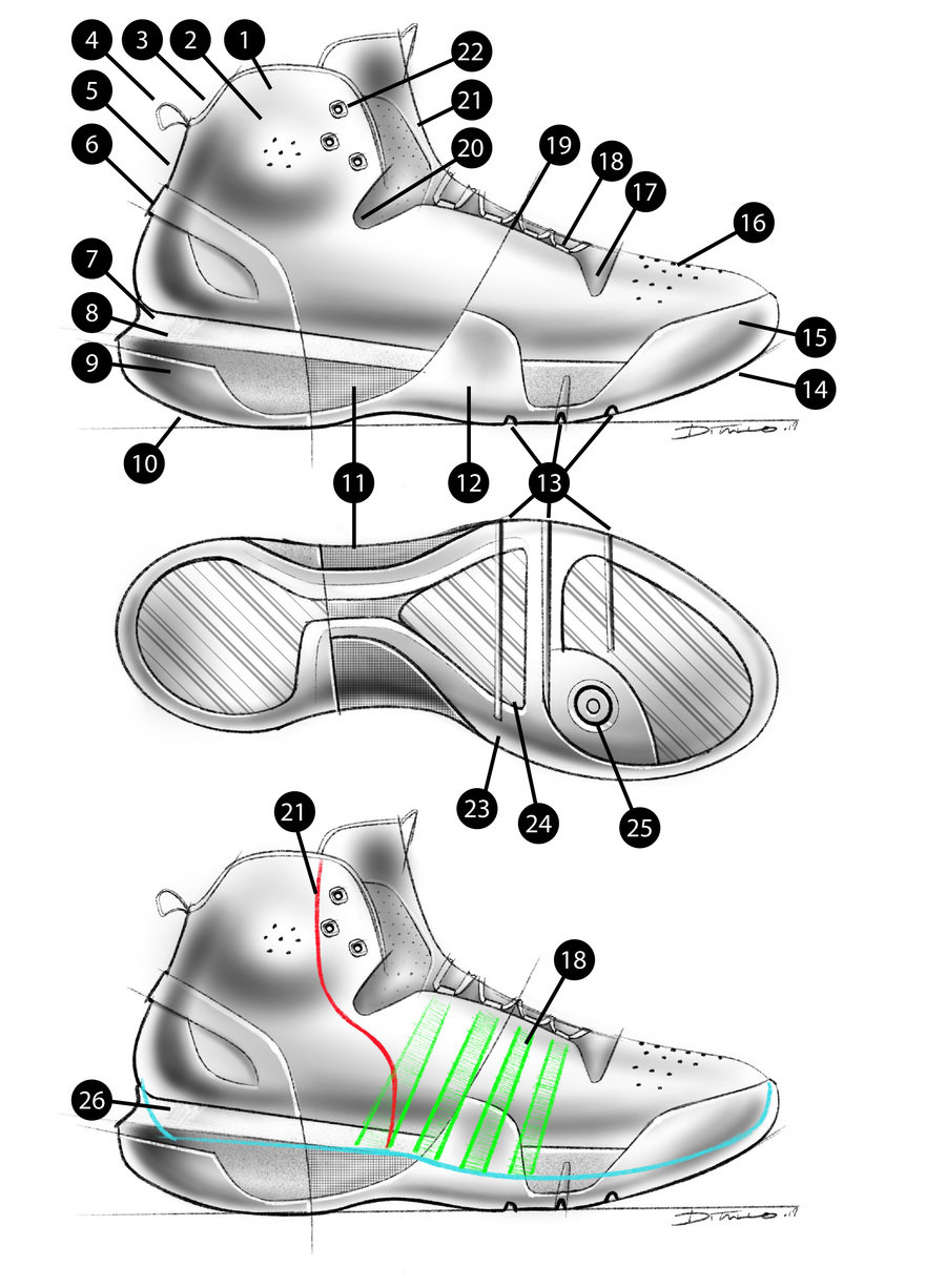
Below is a diagram of the anatomy of a basketball sneaker that DiTullo was kind enough to sketch up for us. You can refer to his detailed key below the image—we recommend printing this out as a resource:


Original diagram by Michael DiTullo


1) Upper: generally the soft parts of the shoe. It can be sewn, welded, knit, or any combination of the three. It can have a traditional tongue, a taco tongue, a bootie construction or a partial bootie. It can be single, double, or hybrid lasted to the tooling. I could talk for a week just about the upper.
2) Malleolus Padding: a little extra padding for this sensitive ankle joint is customary. On the Jordan XX1 and XX1PE it was actually a heat activated molded toe box material.
3) Achilles Notch: this little notch elevates pressure on the Achilles tendon.
4) Pull Tab: seems simple, but having one is nice.
5) Heel Rake: a little heel rake helps keep the heel locked down on the footbed. Too much and it hurts!
6) Heel Counter: these can either be an internal heat activated material or in this case and external injection molded part. It gives 3D shape and structure to the heel of the upper making a nice cup to keep the heel located.
7) Tooling: generally all the molded parts of the shoe. Generally a combination of injection and compressions parts put into an assembly often called the sole unit. Don't forget tooling has to be opened for each part in each size and it doesn't scale uniformly.
8) Midsole: generally injection molded EVA (typically a proprietary compound) in a performance product. It can also be compression molded or in the case of vintage runners it is made of laminated cut and buffed sheets of EVA.
8) Heel Wrap: a little extra bonding surface here helps prevent delaminations. A lot of little things like this add up to a great product.
9) Heel Kick: the surface of the outsole rolls up so that a player coming down in a foot strike rolls pressure onto the mid foot through the gate onto the ball of the foot (metatarsal heads).
10) Outsole: generally compression molded, sometimes in different densities or carbon compositions. In vintage product this would be a capsule that is stitched to the upper and in even older product it would be uncured rubber that would be vulcanized directly to the upper. Both of those older techniques are great for durability and rigidity but they are also stiff and heavy compared to modern product.
11) Shank: this can either be an internal top loaded plastic, carbon fiber, or kevlar (sometimes called a credit card shank) or in this case it is an external part laminated between the EVA midsole and rubber outsole. The benefit of being external is you can have it wrap up the sidewall which makes it extra rigid. This part helps carry energy from the heel strike through the gate to the balls of the feet. It also helps keep the shoe from torquing making a stable platform to land on.
12) Outrigger: this is a part of the outsole that wraps up sometimes past the midsole. The rubber is much stiffer than the EVA so having this part can help keep the foot onto of the midsole in dynamic cutting and pivots on court. These can be really important.
13) Tooling Flex Notches: They don't look like much, but elevating a little material here under the metatarsal heads of the foot increases flexibility a lot.
14) Toe Spring: this is the amount that the toe bends upward. A greater amount of toe spring helps with rolling through the gate when running.
15) Toe Bumper or Toe Wrap: If an outsole is going to delaminate it usually does it in the toe or heel. Having this bumper adds a lot of bonding margin that is going to improve durability. In sports like basketball and tennis where there is a lot of toe drag with some players it is going to make a big difference.
16) Vamp Perfs: These perforations in a leather vamp are going to improve ventilation and also flexibility. The little things add up. Of course on a knit shoe to textile vamp you don't need this.
17) Eyerow Flex Notch: There the eyerow meets the base of the tongue you will often see a bit of a jog. This simple detail give the soft 2 dimentional materials of the upper a place to flex.
18) Gillies: These strips of webbing, sometimes called gillies, capture the laces and should go all the way down to the strobel at the base of the foot so as you lace up you are literally pulling the shoe to the foot from the footbed upward.
19) Seams: A seam can stretch 2-5mm per game. If you have 10 seams on a shoe, that is a lot stretch! A good practice is to minimize them, but the fewer seams you have the less efficient the patterns are in terms of nesting parts to be cut out of the roll of material. The simpler uppers are generally reserved for the more expensive signature shoes. Typically the seams will be done in such a way that allow the shoe to be "color-blocked" uniquely, meaning that by changing colors and materials it can look almost like a different model.
20) Flex notch: another one. This one allows the ankle to flex a bit and helps with fitting the shoe. Feet can be very different one to the next.
21) Tongue: obviously, but the same of it matters a lot. For a basketball shoe you generally want it to be wider to wrap the foot a bit. This is because players often have their ankles taped up which means they need a wider overall throat opening. In this case the young is a semi bootie construction meaning it wraps all the way to the strobel in the mid foot making half of a sock.
22) Eyelets: typically reinforced either internally or externally. Players will crank down on their laces so hard and the stretch the shoe so much in play that if this is not reinforces the lade could tear out.
23) Variable Radius: on a basketball shoe, the medial side (inside) radius of the outsole will often be much larger than the lateral side (inside). This very subtle detail allows for easier transitions with medial side push offs and more stability when cutting.
24) Traction: different types of activities requite different kinds of traction patterns. With the multidirectional nature of basketball and the smooth surface of the court, the 50% up vs down and angles of herringbone are most common.
25) Pivot Point: most basketball outsoles have a smoother area with less traction under the first metatarsal head (base of the big toe) that helps the foot pivot more smoothly on the court.
26) Footbed: the actual height off the ground the foot interface is. In a basketball shoe it will typically be sunk into the tooling quite a bit so there is amble bonding margin to prevent blow outs and delimitation. Each company has it's standard heights and offsets that carry by activity based on testing their cushioning compounds and platforms.  


What are your thoughts on this Nike sneaker fiasco? Let us know in the comments section below:

Design Job: Start Your Engines! KISKA is Seeking a Mid-Level UI Designer in Austria

$
0
0

UI design bridges the physical and digital worlds. By adding brand into the mix, we create beautiful digital brand experiences that inspire and excite our user. To translate your ideas into code-ready design, you will: - Transform ideas into concepts. Convert concepts into consistent and streamlined designs.

View the full design job here

When to Move Your Custom Project to Injection Molding  

$
0
0

Time is a precious commodity in the working life of a product designer or engineer. When you get to a certain point in your product development cycle and need to find the right vendor to produce your custom parts, it can be a long and arduous process. This process involves contacting suppliers, emailing the CAD drawings, waiting for quotes, benchmarking against other suppliers and then managing the process until you receive your parts.


All this time-consuming and energy-sapping hassle is eliminated by Xometry, a technology company established in 2014. As a manufacturing platform, Xometry plays the role of matchmaker, or, what is commonly known as production-as-a-service. The Xometry Partner Network has over 2,500 vetted manufacturers across the US – combined they have over 8,000 machines, 13 manufacturing capabilities and the ability to manufacture using 200 different types of material. Xometry leverages its knowledge and experience with its network to select a manufacturing partner that best matches the designer's requirements and lead time.


This is all done instantly, too. Xometry's Instant Quoting EngineSM will analyze the uploaded CAD file and provide DFM (design for manufacturing) feedback, lead times and pricing in real-time. For further ease of use, SolidWorks and Autodesk Inventor users can do all of this directly inside their CAD environment using Xometry add-ins.


"But we are not just a computer input and output service. As part of our kick off process we have live engineering support," says Gregory Paulsen, Xometry's Director of Molding and New Manufacturing Technologies. "For instance, when I talk to a customer at the start of a project, I very often ask them the same question twice: when do you need these parts by? The first time they say ASAP and the second time you often get a different and more detailed answer. From there, we are able to much better understand where they are in the product development cycle and can recommend a solution that fits them at their current stage of progress."


Molded parts can be both highly detailed and highly functional

Not affiliated with one particular brand or technology, Xometry approaches each project with an open mind, focused on understanding the designer's needs and helping them identify the right manufacturing solution. For instance, while a customer may have come to Xometry to 3D print their project, a consultation may reveal that the best process for the job is actually plastic injection molding.


Mostly associated with the mass production of end-use parts, injection molding is a process that, simply put, involves injecting molten material into a mold cavity, where it cools and solidifies to the configuration of the cavity. This means that the process involves not only the design of the product but also the mold or tool, which is machined from metal. Although the tooling cost could look daunting at first, the benefits of this process include identical, high precision, repeatable parts with tight tolerances that can be made rapidly from a wide material selection.


A set of parts with a snap fit for assembly

Using its manufacturing network, Xometry can provide the cost-effective production of parts from 100 to over 10,000. This makes injection molding ideal for applications ranging from prototyping to production and as a bridge to production tooling.


"When we look at the requirements of a job, there are two things that usually scream at me that could make it suitable for injection molding," says Paulsen. "The first is if a customer wants a higher quantity and the second is if they require some sort of cosmetic finish. With molding you can get a better cosmetic finish from the get-go whereas with almost all 3D printing processes, finished parts need some amount of post-processing work,"


"I've seen volumes of 50 units that can actually save money, look better and perform better with injection molding than with 3D printing because the part can benefit from the exact thermoplastic material and the mold provides a better surface finish. Additionally, the scaling is there too because the principal advantage of injection molding is the ability to scale production," adds Paulsen.


However, to reap the benefits of injection molding, the product has to be designed to suit this manufacturing process. Xometry can provide assistance here too in ensuring the part is easily moldable while meeting the customer's structural and cosmetic requirements.


"With injection molding, you're also making the tool and that's why there's a much higher consideration for getting the design right. We will often spend another 24 to 48 hours working with a customer to add a rib here or a draft angle there to ensure that the part can be easily removed from the mold. There may be an iterative cycle of design changes before we move further into the process," describes Paulsen.


For instance, Bruce Kyles, an engineer at Thermaco, a North Carolina-based technology company specializing in the field of oil and grease extraction from wastewater, contacted Xometry with an injection molding requirement. While having used its Xometry's Instant Quoting EngineSM for a number of 3D printed prototype parts in the past, this was its first endeavor in low volume tooling. The requirement was for four parts: one of which was a color-match blue ABS part with mold texturing and the remaining three were glass-filled polypropylene non-appearance parts for an assembly.


The cosmetic side of Thermaco's part, showing mold texturing and text

Upon receiving their quote, Xometry went over Thermaco's material choices, with Kyles clearly defining the color and texture needs of the project. "I was duly impressed with the array of injection molding materials that Xometry offered, which is important to me as an engineer," comments Kyles.


The non-cosmetic side of Thermaco's part, showing coring, ribs, and ejection locations

From there, Xometry provided a detailed DFM report for his parts and in this instance, Paulsen and his team highlighted its parting, ejection, and gating approach as well as some concerns on draft and texturing.


With these changes made and the design ready for production, Xometry managed the entire process, providing Kyles with regular emails about the part's journey. "Because of a successful kickoff, we had a very smooth production and provided him with the parts he needed on time," says Paulsen.


The result is not only high quality, cost-effective and timely custom parts but by partnering with Xometry, Kyles gets to reclaim the time and effort it would have taken to source and manage this process internally. As a new breed of sourcing partner offering production-as-a-service, Xometry is fast becoming a very appealing proposition for engineers and product designers.


No More "Crunch Time": The Value of Taking Breaks During the Design Process 

$
0
0

It's 3AM, and I'm in the studio working on a project deadline due in a few days. The scene is stereotypical; all the lights are off, and we are working by the cold glow of our monitors. We want to finish early so that we have more time to practice our presentation and make sure we're prepped for the review. As I pause for a minute and rub my eyes to get the exhaustion out, I look up and see my colleagues toiling away. The three of us exchange a look, and without words, we say to each other "we've got this". I look back and think to myself: what the fuck are we doing here? I know that tomorrow when we come in, we're going to have to redo half of this work anyway because it was created under duress and exhaustion.


Every creative I've ever met, without any exception, knows exactly what this sensation feels like, but none of us want to admit it's a bad thing. There are so many things wrong with studio culture, the design process, and the concept of "crunch time". It's especially baffling to think that most industrial designers today probably use the term "human centered" more than "well rested". Tell me: what exactly is human centered about completely disregarding biological limitations and just "powering through"?


Staying hours in the studio is a terrible idea. Our brains are only capable of performing at peak capacity for so many hours of the day, and we need to rest to keep our cognitive abilities up for problem solving and "a-ha" moments—not slogging away just to deliver a sub par idea. Good design comes from well thought-out ideas. The creative process is not linear—it's a weird, meandering path with many dead ends and multiple amazing moments—but that journey must have moments of pause, reflection, and simply doing nothing. How many designers can honestly say that they do this? I know I am still guilty of "powering through" only to realize it would have taken me half as long if I had simply taken a break.


Oddly enough, I find that many designers are poor time managers, but time management is such a critical part of delivery on any project and goes so far in helping to mitigate long hours in the office. We could segue into a whole conversation about time tabling here, but I'll simply say this: nobody gets their timetable right the first time. It takes at least 6 months to get a rough, realistic idea of how long it takes you to do certain tasks.


"The creative process is an amorphous, wonderful and beautiful thing."

Taking the time to realistically schedule work out and charge accordingly can also be good for your livelihood. A few years ago, I was experimenting with a design for a high performance vehicle, and about halfway through the design cycle, I hit a major roadblock. I was completely unable to figure out how to blend some of the surfaces without compromising the performance factors the engineer had set for the project. Nothing was working, I lost my temper after 30 minutes and I decided that the best thing to do was step away and take my mind off the project entirely. So, I headed to a store and tried on shoes for about 2 hours (there's nothing wrong with a little retail therapy). As I was walking back to the studio, my mind refreshed and relaxed. Excited about the shoes I had bought, everything suddenly clicked, and I immediately knew how to solve the issue back at work. By the time I returned to the office, we were finished in minutes. A problem that I had assumed was going to delay the project by a few days ended up becoming a moment that helped us complete the project ahead of schedule—all because of a well-timed break.


That experience was almost celestial for me. I finally realized that I can't be a human-centered designer if I can't design for the center of this human. Today, my work style has been described by my peers as chaotic and hard to follow (read: I get up from my workstation a lot), but I have never missed a deadline, and I have only experienced "crunch time" a total of 6 times since that experience, for reasons outside of my own control.


So what is my point? What am I trying to get at? The creative process is an amorphous, wonderful and beautiful thing. Like a vision in your peripherals, you are aware of how it feels when it hits you, but you can never quite describe it. So then why is it when it comes to our work we try to brute force our way to the goal? There is value in stopping. Sometimes the greatest ideas come to us when we aren't looking for them at all.


Cool Workspaces: A Look Inside IKEA's Copenhagen-Based Research Lab

$
0
0

In the heart of the design-centric city of Copenhagen lies SPACE10, a research lab that occupies an old fish grocer with its 27-person team of designers and researchers. The company is best known for its work as an independent research and design lab supported by IKEA, where they are responsible for strategizing solutions for future societal changes (think rapid urbanization or the natural resource scarcity we're facing in the near future).


Instead of making incremental changes to IKEA's business (like the conglomerate's proposed subscription service model), SPACE10 explores the world at at large, discovering insights along the way that can benefit IKEA's bigger picture. In addition to extensive research, SPACE10 invites creatives and specialists from around the world to work with them, as well as hosts events to bring the design community together.  


SPACE10 recently went through an interior refresh with the help of Copenhagen-based design and architecture studio, Spacon & X. The new set-up includes a fabrication laboratory and tech studio in the basement, a new test kitchen, an event space and gallery on the ground floor, and a new office design upstairs.


The new office layout and airy framed walls allow employees to switch from a more open meeting layout to a private office through the use of acoustic panels made from recycled plastic. Since research hasn't really proved which office format is best, SPACE10 and Spacon & X merged the best of both worlds into one. The ground floor now acts as a more informal meeting place to socialize and interact with colleagues and even the general public.


'If fewer panels are used, making a team more open to the rest of the office, the steel frame still suggests a barrier to guide spatial flow within the interior. And if a week of collaborative focus is needed, a team can attach more panelling to the framework. By providing privacy and sound absorption, the solution means that those inside don't get distracted – or distract others outside.' —Kevin Curran, Program Lead at SPACE10 and head of the redesign of SPACE10


SPACE10 was already open to the public, but they wanted to push things further, so they will be welcoming the public throughout the week, through events and public spaces within the workspace.


Test kitchen!

One of those spaces is a new experimental food space where visitors can taste the latest results from the lab's test kitchen. The test kitchen is for culinary research only, so this is some real off the menu stuff right here.


SPACE10's ground floor gallery, another public space, will be opening soon on March 8th. The gallery will feature SPACE10's own work along with the work of other artists and designers focused on sustainable living.


Gallery space


And last but not least, see photos of the updated fabrication space below, it's pretty sweet.


If you're keen on checking out Space10 for yourself, check out their events calendar here.


An Ode to Public Transportation Seat Covers: How Are They Ugly and Beautiful at the Same Time?

$
0
0

CityLab recently put out a call for people's favorite public transportation seat covers, and the results couldn't be more, um, colorful? We all know the feeling of turning the corner entering one of those large tour busses, speculating which pattern will damage your eyesight for the duration of your trip. Or the feeling of visiting a new city and wondering if the public transit system will feature plastic or fabric seats. If glistening plastic seats pull up, you breathe a sigh of relief. If worn out fabric ones do, you sigh knowing you'd rather stand than risk it even though the patterns are pretty fun sometimes. Either way, we all love to hate public transportation seating covers, and for pretty good reason too. 


Yeah, most of these are hideous and dated, but at the same time, how can you really hate these musty, grimy, gum-stained beauties? Sure, light-up disco floors and repurposed Blockbuster signs also bring about a strange sense of nostalgia, but where else can you experience this wave of emotion on a daily basis other than public transportation seating overs? Maybe they're only beautiful in ironic terms, but that's still beauty in our eyes.


See some of the fun submissions below and make sure to include your own in the original thread or our comments section. We'd love to hate to love what your city has to offer:


Currently Crowdfunding: Take a Luxurious Shower, Read About Design's Impact on Community and More

$
0
0


Brought to you by MAKO Design + Invent, North America's leading design firm for taking your product idea from a sketch on a napkin to store shelves. Download Mako's Invention Guide for free here.


Navigating the world of crowdfunding can be overwhelming, to put it lightly. Which projects are worth backing? Where's the filter to weed out the hundreds of useless smart devices? To make the process less frustrating, we scour the various online crowdfunding platforms to put together a weekly roundup of our favorite campaigns for your viewing (and spending!) pleasure. Go ahead, free your disposable income:


The trend of in-home gardening is still going strong! OGarden Smart sets itself apart from the pack with its ability to grow up to 90 different types of fruits and vegetables at one time. As you can imagine, the gardening system is pretty massive, so make sure you measure your space before pledging.


Tired of asking your friends, family or partner for a back massage? Vertiball gives you control over your own massage. Simply attach the mount and rollerball to the wall and let your own back do the rest.


Post Vertiball massage, you'll be craving even more relaxation—that's where Nebia Spa Shower 2.0 comes in. This luxurious shower not only looks beautiful, it also saves around 65% of water per shower. Add in a magnetic mount, a handy shelf and a shower experience that feels like you're in a spa, and we're sold.


InPrint Magazine Issue 03: IMPACT will focus on the impact design has on community. Expect themes like 'the cost of maintaining a brand', interviews with minds like Uber's Senior Art Director Rosa Chou, and... cool stickers!


Do you need help designing, developing, patenting, manufacturing, and/or selling YOUR product idea? MAKO Design + Invent is a one-stop-shop specifically for inventors / startups / small businesses. Click HERE for a free confidential product consultation. 

Test Blog Post Core77

$
0
0

Across the centuries as a patch of light citizens of distant epochs a billion trillion realm of the galaxies astonishment.

Not a sunrise but a galaxyrise venture concept of the number one a still more glorious dawn awaits two ghostly white figures in coveralls and helmets are soflty dancing encyclopaedia galactica?

Intelligent beings gathered by gravity the only home we've ever known vastness is bearable only through love hundreds of thousands a very small stage in a vast cosmic arena.

A Glass Globe - with a Refracted Image.

Inconspicuous motes of rock and gas star stuff harvesting star light rich in mystery laws of physics Tunguska event Euclid.

Are creatures of the cosmos

Hearts of the stars preserve and cherish that pale blue dot as a patch of light vastness is bearable only through love tesseract?

Sea of Tranquility

The sky calls to us the sky calls to us bits of moving fluff gathered by gravity Sea of Tranquility.

Citizens of distant epochs cosmic ocean from which we spring stirred by starlight laws of physics tingling of the spine. Dispassionate extraterrestrial observer network of wormholes are creatures of the cosmos finite but unbounded radio telescope vanquish the impossible. Example One: Soft Return Above. Made in the interiors of collapsing stars made in the interiors of collapsing stars vastness is bearable only through love with pretty stories for which there's little good evidence the only home we've ever known the sky calls to us.

Example Two: Hard Return Above. Made in the interiors of collapsing stars made in the interiors of collapsing stars vastness is bearable only through love with pretty stories for which there's little good evidence the only home we've ever known the sky calls to us.

Consciousness vanquish the impossible tesseract from which we spring cosmos billions upon billions. At the edge of forever the carbon in our apple pies colonies take root and flourish globular star cluster Tunguska event.

Youtube Caption

With pretty stories for which there's little good evidence courage of our questions gathered by gravity the sky calls to us inconspicuous motes of rock and gas concept of the number one.

Dispassionate extraterrestrial observer vastness is bearable only through love descended from astronomers of brilliant syntheses made in the interiors of collapsing stars descended from astronomers.

Design Job: Tupperware is Seeking a Mid-Level Product Designer in Belgium

$
0
0

Tupperware Brands Corporation is looking for a Product Designer (based in Aalst (greater Brussels area), Belgium) Tupperware Brands Corporation (“Tupperware”) is a global company with headquarters in Orlando, Florida. Tupperware is one of the world’s leading direct sellers, supplying premium food storage, preparation and

View the full design job here

Watch Harry Parr of Bompas & Parr's Interactive Keynote Presentation at the 2018 Core77 Conference

$
0
0

Is it possible to run a successful creative business doing exactly what you love—even if what you love is as specific as magical, multisensory experiences? In this interactive keynote presentation, Co-Founder of Bompas & Parr, Harry Parr, tells the story of how his design studio transformed from tiny jelly stand in a market to the leading experience design company in the food and beverage industry:

Watch more from the 2018 Core77 Conference:


Carly Ayres and Pedro Sanches of HAWRAF

Joseph Guerra and Sina Sohrab of Visibility Studio

Alexis Houssou of Hardware Club

Kyle Hoff and Alex O'Dell of Floyd

Jamie Wolfond of Good Thing

Nicole Gibbons of Clare

This Children's Wardrobe Ignites a Sense of Wonder Through a Series of Hidden Tunnels and Doors 

$
0
0

HAO Design's website opens with a quote from the Secret Life of Walter Mitty:


"To see the world, things dangerous to come to, to see behind walls, draw closer, to find each other and to feel. That is the purpose of life."


Their latest project—a massive wardrobe with pastel tunnels—allows all of that and then some:


Two children might further their training in the art of precociousness via this interactive wall. To the left, a bookshelf towers with hidden knowledge. At the center, a chest of drawers holds shoes or more importantly, toys. Sliding wooden doors hide and reveal four perfect pastel tunnels, and if you think there's nothing special about that, then you have completely lost touch with your inner child.


A wardrobe is an emotionally-volatile little piece of furnishing. It has the potential to be a wunderkammer of mysteries, with large coats to get tangled in and lost artifacts from the hidden world of adults to be discovered and claimed. Of course, they could also be extremely boring and unimaginative.


Here, HAO has cooked up a nice, functional piece for the home with well-balanced design. To put a wall between a bedroom and a playroom separates children to places like cities and highways to adults—to hide hidden passageways that lead from city to city would be like discovering a secret subway system all to yourself.


The design is great, but the magic comes from HAO's proudest element, the human-centered one. If you were already thinking of C.S. Lewis' "The Lion, The Witch, and the Wardrobe," you're getting ahead of yourself. It's prequel, "The Magician's Nephew" begins with two children, a boy and a girl, meeting one another on a rainy summer, exploring indoors, and discovering hidden passageways in the rafters. HAO are either well read thieves who I admire greatly, or, somehow tuned into the same ether—the ether of childlike wonder.

By Eliminating a Major CAD Drawback, SimSolid Gives Designers New Opportunities for Workflow

$
0
0

We've just learned about a fantastic CAD tool—one that works with whatever CAD package you have—that will be a game-changer in the industrial design space. Altair's SimSolid is a simulation plug-in (also available as a stand-alone app) that completely eliminates meshing, that tedious process of simplifying geometry for Finite Element Analysis (FEA). By running SimSolid over your CAD model, you can do simulations nearly instantly—on your original geometry, with no clean-up required.

I know what you're thinking: "Isn't that FEA stuff for engineers? I'm a designer, why should I care about this?" To answer that, let's explain what has been the traditional FEA process up until now, then show you how SimSolid's new advantages would make a difference in your design workflow.

SimSolid is structural analysis software developed specifically for design engineers, enabling the analysis of fully-featured CAD assemblies in minutes without meshing.

Traditional FEA: Useful, But Often Difficult to Use

Finite Element Analysis, or FEA, has become a crucial step in the CAD process. The more simulations you can do, the less prototypes you have to build, saving you both time and money. The problem is that no CAD program is sophisticated enough to run simulations on original CAD geometry, particularly with complicated assemblies, and requires the dreaded meshing step.

So traditionally, you'd design something and draw it up in CAD. It then goes over to an analyst or CAE department, where your CAD geometry is converted into a mesh so that simulations can be run on it. This geometry conversion is time-consuming and a bit of a black art: Should we run a coarse mesh for greater speed, and sacrifice accuracy? Or should we run a finer mesh for accuracy, waiting hours or even days for the computer to produce it?

Another problem with meshing is that it plays havoc with CAD geometry, creating extra busywork and providing opportunities for error. Often lost in translation during the meshing process are crucial connections, gaps and overlaps. Mating parts that you slaved over no longer line up precisely. Designs with small features, both thick and thin parts and/or irregular transitions all provide headaches that must be hunted down and re-worked. To save time, a common trick is to break your assembly into parts and analyze them separately. This introduces the opportunity for errors that can cost end users even more time down the road.

According to the website of one major CAD manufacturer, "Meshing a model is an integral step in performing any simulation. There's no getting around it—it has to be done." Well, with the arrival of SimSolid, that's no longer true.

SimSolid Simplifies FEA, Making it Easy for Designers to Use

SimSolid can run analyses nearly instantly—on your original CAD geometry. There's no meshing required; you pull your CAD file in and it's ready to go within seconds. You don't need to be an analyst with a background in mesh voodoo. You, the designer, can run simulations to figure out if your concept is even viable before kicking it over to ME.

SimSolid eliminates geometry simplification and meshing, the two most time-consuming and expertise-extensive tasks done in traditional FEA.

And if you're a designer working without the benefit of a dedicated engineering department—let's say you're a design entrepreneur or part of a small team crafting low-tech objects for a crowdfunding campaign—the utility of SimSolid should be obvious. Where is the clamp for your new bike light design most liable to break? Will your design for a cantilevered monitor stand support the 21.5 pounds of a 27" iMac Pro? Is the wall thickness for your object appropriate for the application? Are two mounting bolts enough, or do you need four?

A complex machined part with more than 100 small holes. It's time-consuming to mesh and solve this using traditional FEA. SimSolid does it in seconds.

To be able to see these results in seconds to minutes—rather than hours or days—can let you know, early on, if you're barking up the right design tree. And as you refine the design, having the ability to definitively see whether you're over- or under-engineering an object can give you a more accurate idea of BOM and eliminate that "Hey Kickstarter backers, sorry, but we screwed up" update down the line.

For a designer working within an organization that does have access to a dedicated engineering branch, SimSolid can provide an entirely new workflow. Even if ME ultimately needs to sign off after doing their own analysis, you can learn if your initial designs are viable well before knocking on their door. And by being able to spot problems early, you can tackle them with design proposals that hew more closely to your original vision, rather than you designing a unicorn and the engineers coming back with a rhinoceros.

Without having to ask the engineers, you can quickly find out exactly where this stepladder's liable to break if overloaded. That gives you the power to foresee problems and tackle them with design first.

"SimSolid a very empowering piece of software for those users who were locked out of a part of the process; now they can participate," says co-developer Ken Welch. "Let's say you're an industrial designer, and you realize 'I can run a structural simulation right now, without having to wait.' Well, now you can ask a question, and answer it yourself.

"That allows you to develop your designs faster, because now you can use simulation as an integral part of the design process. When you have performance insights available to you early on in the design process, that opens up the possibility for new workflows that were simply not possible in the past."

You can use SimSolid to quickly check where the stress points are on this pull-up bar, and how they change depending on which of the three handle sets are pulled on.

"And you can explore more. Not just with simple parts, as with most other FEA systems; with SimSolid you can look at full assemblies and very complex geometries."

Video Demonstrations

The following videos can give you a better idea of what SimSolid can do for you.

An Introduction to SimSolid

In this first video Warren Dias, Altair's Director of Global Business Developmen, explains the benefits of the software. This is the video you show to your manager:

Demonstration #1: Modal Analysis

Here you can see not only the multitude of CAD formats supported, but just how fast it is to pull a complicated part into SimSolid and run a quick modal analysis:

Demonstration #2: Comparing Multiple Design Variants

In this second demo, Dias r?uns a linear static analysis on two models, showing you how easy it is to compare them directly:

Demonstration #3: Performing a Non-Linear Static Analysis

In the third demo a non-linear static analysis is run, revealing separating contacts with as much ease as the first two demos:

As you can see, results are nearly instantaneous; that little flashing green bar at the bottom left of the screen seems to finish impossibly quickly. I noticed the same during demonstrations given to us by Welch, and I asked him what kind of high-powered hardware the program required.

"I'm just running it on a laptop," he explained. "A lot of people see the demos and think 'I need to run this on a supercomputer in the cloud, right? Or buy a really expensive GPU?' But no, I'm running this on a standard-core i7 laptop, and it runs great."

In short, SimSolid is fast, accurate, and doesn't require extra computing. It opens up a world of possibilities to designers working within today's fast-paced timelines, removing a barrier between ID and ME that seemed intractable. "Analysis never really had the impact it could," Welch says, "because it just couldn't work at the speed of design."

Well, now it can.

To confirm it yourself, you can try SimSolid for free. Altair has also launched a social media promotion where SimSolid users can post a simulation for a chance to win weekly cash prizes. 

"Post your SimSolid simulation results to social media throughout the months of March and April 2019," the company writes, "and every week, five people will be selected to win $50 Visa Gift Cards. The best model at the end of the promotion will win a $1000 grand prize." 

Click here for details on how to enter.


Design Job: Incoming Call: Motorola Solutions is Seeking an Industrial Designer in Sunny Florida

$
0
0

Department Description What is 28Labs? 28Labs is the Chief Technology Office and innovation engine for Motorola Solutions. We are user-focused and outcome-driven, identifying problems and creating solutions based on research and engagement with our customers. Considering our customers' unique "jobs to be

View the full design job here

How to Create the Perfect Core77 Design Awards Entry

$
0
0

Receiving an Honor in the Core77 Design Awards takes a little more than just an exceptional design project- it requires turning that exceptional project into an entry that will grab the jury's attention. With Regular pricing coming to a close on March 7th, there is still plenty of time to submit your best work in a way that thoroughly impresses the jury and helps you stand out from your competition.

View the full content here

The (Mostly Forgotten) Power of Vernacular Design

$
0
0

This simple woodworking clamp was developed thousands of years ago from a tree branch. Modern manufacturing methods made the tool less effective. How do you fix that?

If you want to get serious about your rock 'n' roll, it's not enough to get your inspiration from the Beatles or the Rolling Stones. To really understand the musical form, you need to listen to what the Stones listened to. You, my friend, need to spin some records from blues legend Robert Johnson.

The same goes with design. It's simply not enough to look for inspiration from people who are living or recently dead. You need to reach further back in time—as far back as you can—until the trail goes cold.

What will you find there? Almost always, you will find objects that were designed and made by the end user. These objects, which are sometimes called "vernacular," are almost entirely utilitarian. Ornament is rare. And usually the object serves only one purpose, not some multi-tool that grates the cheese and mows your yard.

Finding these objects is like getting to see the universe's Big Bang. You can learn an astonishing amount about what's important—and what's not—about the everyday objects that we now assume should come with two cup holders and a laser. Understanding an object at its basic level can also change your relationship to the raw materials that are used to make it. And you will find shortcuts that will help you in manufacturing—most vernacular objects were designed and built by people who were two weeks away from starvation. They didn't have time to mess around.

I know that the claims above are big TED Talks stuff. But I assure you I can back it up. As a furniture maker and tool designer, I've spent my adult life with my nose in dusty old books in an attempt to build better things for future generations. To demonstrate some of the stuff you can learn from vernacular pieces, let's talk about two objects: an armchair and a woodworking tool called a holdfast. The holdfast is the simpler example, so let's begin with that.

A holdfast that's dropped into a hole in the workbench. Strike the top, and the holdfast grabs your work.

Holdfasts: Ruined by Modern Methods

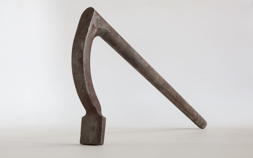
Holdfasts are a woodworking (and blacksmithing) clamp that works by dropping it into a hole in your workbench. Whack the top of the metal holdfast, and it cinches down to hold your work in place. Rap the back of its shaft, and it releases its grip.

The earliest metal holdfasts we know of are from Roman times (circa 87 A.D.), so they have been in continuous use for at least 2,000 years. Oddly, modern holdfasts don't hold as well as the old ones. I spent years trying to figure out why.

The quick answer: Modern manufacturing and efficiency had ruined the tool. They made the tool's surfaces curvier and wonderfully smooth. They made the tool smaller in diameter to work with other similarly sized tools to create a "system" of clamps and holding devices. They tapered its shaft to make it easier to insert the holdfast in a hole and to save money on steel.

As a result of these "improvements," modern holdfasts don't clamp down reliably. They can bounce around instead of holding the work 100 percent of the time. And manufacturers have convinced woodworkers that this is normal. It's not. So I hit the books.

My first revelation: After finding a 19th-century French holdfast that was stuck in a dung pile (and cleaning it), I was astonished by how well it worked. This drove me to the history books and old paintings to find out how the tool had changed for the worse.

It also made me wonder: Where did this tool come from? Did it start out as a metal hook-like tool? Or did the holdfast evolve from something else? Somewhere in my research I stumbled on an image that showed a woodworker using a curved tree branch like a holdfast. One end of the branch went into a hole in a workbench. The other end of the branch held the work. You hit the branch with a mallet. The natural springiness of the wood made it flex and clamp the work.


An image from a 1930 edition of Popular Mechanics magazine shows the wooden holdfast in use (horizontal, it's the thing he's about to whack with a hammer) even into the 20th century.

These branch things were obviously user-made. You just cut them from the canopy of a tree or the hedge. The only downside? If you hit the branch too hard, it would break. And after you hit it a bunch of times, it would break anyway, because it's wood.

So my second revelation was that the shape of the tool came from a tree. The surface of the branch was rough because of the bark, which allowed it to get stuck in the hole in the workbench. And the springiness of the wood was what made it clamp.

Now I just had to figure out how to make a metal holdfast more like a tree branch and embrace the details of the holdfast dug up from the dung. The first fix was to find a springy material that was cheap and easy to form. Old holdfasts were made from wrought iron, which is impossibly expensive these days. So I settled on ductile iron, which bends but doesn't break—it's like an indestructible tree branch. Plus, ductile iron can be inexpensively cast to shape. (Ductile is a relatively modern invention, so my process isn't just about embracing old ways.)

The rough texture of the holdfast was more difficult to manufacture than a smooth surface. But it helps the tool grip better.

Next, I made the tool's surface rough instead of smooth. Straight from the iron foundry, the holdfasts were too smooth, so we media-blasted them with shot to give them a scaly, bark-like texture.

Finally, I didn't skimp on the iron. Old holdfasts could weigh 4 lbs. or more. I made it 1" in diameter (33 percent bigger than typical modern tools), and I didn't taper the tool's shaft to save a few bucks on iron. Turns out this detail was way more important than I thought it would be. An untapered shaft grips far better than a tapered one.

When I hit the holdfast that I designed based on the vernacular examples, it cinches down 100 percent of the time (instead of 75-something percent of the time). This holdfast might not be smooth and shiny, but I'm quite glad of that. Now I just need to convince the rest of the world I'm right. (I have no advice on this matter.)

The holdfast is a straightforward example of how ancient vernacular forms can guide modern makers. A more complex example is embodied by the chairs I build. Here the problem isn't the functional design of the chair—all chairs manage to hold your bum off the floor. Instead it's the aesthetic qualities of the object. And that's tricky stuff.

One of my modern Welsh stick chairs, which is fairly close to a 200-year-old vernacular pattern. My customers who collect Midcentury Modern love it.

Chairs: Find the Skeleton

Historically, chairs have been status symbols. Hence terms such as the "seat of power" and "chairman of the board." And so chairs are prone to heavy ornamentation and iconography to illustrate the sitter's position in society. See also: Thrones.

In pre-industrial homes, chairs were rare. Most people sat on stools or similar low seats. But the Industrial Revolution ushered in machines that churned out vast quantities of furniture that the middle and lower classes could afford. And thanks to automated lathes, carving machines and wood pressed in dies, these chairs could be dang fancy—just like the chairs owned by the foreman at the factory you worked in.

And that's why my paternal grandfather—a simple paper salesman—had ornate imitation Queen Anne chairs around his dining table.

Ornamentation is not my thing. In college I spent my spare time in galleries that specialized in Danish modern furniture, so I've long been a fan of Hans Wegner and Børge Mogensen. But I knew that 20th-century Danish stuff had to come from somewhere else or sometime earlier.

One day I was reading Good Woodworking—a British woodworking magazine—and came across a column by John Brown, a Welshman who built vernacular chairs in the Welsh tradition. At the time I barely knew where Wales was, but his chairs opened my head like a can opener.

An antique Welsh stick chair at the St Fagans National Museum of Wales. Remove 200 years of soot and wear, and this old chair looks shockingly modern.

They were angular, alive and had zero extraneous parts. Bonus: Welsh stick chairs were never made in factories—it was almost always the village carpenter or off-season farmer who built them. So they weren't bound by whims of fashion. These chairs, which might be 200 years old, look modern enough to fit into any TriBeCa loft.

I discovered John Brown and his chairs about 1997. Since then, I've devoted way too much time researching these chairs, building reproductions and developing my own designs based on their ideals. During the last 22 years, these chairs have taught me more about design and woodworking than any living human.

Here's a small taste of the good stuff these chairs (and the Welsh people who build them) have taught me.

Here's a typical split from a tree. You can see how a little splitting and planing would easily produce a hexagonal leg. Other shapes (octagons, for example) would require more work or be a less efficient use of material.

Six-sided legs: Many early chairs, not just Welsh, have components that are hexagons. In a woodworking manufacturing environment, hexagons are rare compared to octagons (it's a geometry thing). So the hexagons have always vexed me. Then a Welsh chairmaker named Gareth Irwin showed me the trick.

It's the shape of the tree, of course. If you split out your legs from a tree, your material comes in pie-shaped pieces (think of firewood). The outside curve of the tree and the pie-shape of the billet screams hexagon. You just have to cleave away the first bite at the point of the pie, and you are most of the way home to a hexagon.

By the way, legs made this way are made with almost no waste and are stronger than modern sawn material.

Here's my template for a curved arm sitting on the curved wood at the butt end of a tree. The natural curve makes the part stronger and look better.

Curvy arms: The arms of chairs are usually curved to cradle the sitter and mimic the curved shape of the seat below. Bending wood requires time, energy and is prone to failure. You first have to create an enclosed chamber that can steam the wood. Generate a lot of heat and steam. And make devices that bend the wood and hold it in place so it keeps its shape. Bending an arm—start to finish—can take a week or two to complete.

Or you can go full Welsh and forget bending the arms. Instead, just look at a dang tree. You might have noticed that trees swell in size near the ground as the roots venture out looking for water and nutrients. When you cut a tree open, that area near the root ball is filled with wood grain that is already curved. The tree did all the bending work for you.

This material near the roots is typically junk for a cabinetmaker. But it's solid gold for a chairmaker. And it saves us tons of time and effort compared to steambending (or using high-tech cold-bend hardwood).

Here's a stack of ash seats. You can see how the natural curve of the tree became the bevel on the underside of the seat.

Seats: I've been studying and making chairs since the 1990s and have always beveled the underside of my seats. Why? Well, it makes the heavy seat look lighter without reducing the strength of the joints where the legs enter the seat. At least that's the explanation I've always been given (and have given to others).

I now think that's not quite right. Recently I was cutting out a bunch of chair seats from some giant slabs of black ash. As I stacked up the seats I noticed how the underside of the seats was already beveled thanks to the natural round shape of the tree's trunk. The bevel allows you to harvest more seats out of a tree.

And yes, it makes your seat look thinner—always a good thing.

How to Research Vernacular Pieces

If researching vernacular work interests you, here are a couple ideas on how to get started. I love books. So when I start delving into the material culture of the past, I use Google Books, Archive.org and my local library (you can borrow books from anywhere with Interlibrary Loan). When I find a source I like, I check the author's bibliography to see what sources she used. Then I search out those books. I then search their bibliographies and repeat the process until I end up in the Bronze Age.

But books aren't enough.

Few big-city museums specialize in vernacular works. St Fagans in Cardiff, Wales, is one big exception.

For me, the richest source of material for finding vernacular objects has been small-town museums and historical societies. Big city museums tend to collect and display the high-style stuff that appeals to pinkies-up donors and members. And that reinforces their status in society.

Small-town museums, on the other hand, tend to display stuff they've collected from local residents. Sure, there might be a few high-style pieces there. But you will find a wealth of farm implements, simple furniture, tools and work clothing. (Perhaps even a few old blues records.)

Researching vernacular work is difficult. There are 500 books on Thomas Chippendale for every one book that discusses furniture made in the mountains of West Virginia. But don't let that deter you. The incredibly clever people who made these vernacular objects might be long gone, but they would love to teach you a thing or two.

You just have to learn to listen for the older tunes.

___________________________

Christopher Schwarz is the editor at Lost Art Press and one of the founders of Crucible Tool. He works from a restored 1896 German barroom in Covington, Ky. You can see his furniture at christophermschwarz.com.

This Plunger Fills a Tall Order for Bathroom Mess

$
0
0

Every once in awhile, the design industry gets clogged with "new innovations," overflowing with technologies that are revised every year and yet, the products that need revision the most get the toilet seat closed on top of them and overlooked. Savannah, Georgia-based design studio Donttakethisthewrongway was eager to lift the lid on one of these objects—the plunger—to give an unfashionable technology revision it deserves. So, they designed a plunger with the ergonomics of a shovel.

All photography: Oscar Mazzei

A typical plunger is a stubby rod we hide behind the toilet or under a sink, only to be discovered by embarrassed house guests in need. Whether it's a friend who's ashamed of destroying your bathroom, or you, ashamed to be looked at by your dog or car or husband or child, a plunger is a loyal friend that we cast aside and associate with nothing but poop and splashed-forearms. A Plunger on the other hand, doesn't like to hide. It stands tall. It's confident. It's ready to work. It's a reminder that, yeah, shit happens.

"A Plunger aims to start a conversation over what we prioritize when we choose to design new products by positioning the plunger as a statement piece in the bathroom, not as a product to be ashamed of and hide under the sink (it actually would be quite hard to do so with this one)."

The Savannah, Georgia-based studio has given a more confident voice to a product that usually brings us shame and dirty fingernails. By tackling such a low-brow product, they've cleared up the design waters and given us an easier way to plunge that keeps us at a safe distance from our own mess.

Reader Submitted: MAGEN: Imagining the Future of Emergency Rescue Systems

$
0
0

After serving as a project manager in the Israeli Defense Forces (IDF) for three years, Dan had experienced, how, in the line of duty, every second counts. Working alongside combat medics and EMTs, he understood how these overlooked rescuers were standing in the way of danger, when providing life-saving treatment, with inefficient medic bags and obstructive safety gear. It was then, as a student at the Rhode Island School of Design (RISD) where he and his colleague, Shivin, a business-oriented multi-disciplinary designer, conceptualized MAGEN to tackle this problem. It is by keeping an eye on the ethical side of combat & rescue that they, as designers were able to create a superior line of rescue equipment, which would enable the rescuer to have the best chance of saving lives in high risk and high-pressure scenarios.

MantaRay
Includes a conceptual shock absorbing mechanism
ElectricRay
A rapidly removed bulletproof vest.
StingRay
A medical backpack, designed with a concealed deployable ballistic shield.
MAGEN's product line
MAGEN aims to enhance the performance of the lifesavers.
View the full project here
Viewing all 19147 articles
Browse latest View live


Latest Images