It is often the case in interaction design that the best solutions simply get out of the way, allowing the user to achieve their goal and get on with their life. With Google Maps, this is certainly the desired outcome. Geographic navigation and search should be smooth, efficient, and ultimately straightforward. When this is successful and the product works as it should, the nuances and details behind these experiences can often go unnoticed, written off as algorithmically derived and invisible.
Since its launch in 2004, Google Maps has come a long way from its relatively simple beginnings as a simple pannable and zoomable road map of the United States and United Kingdom. Today we display business and transit networks, three dimensional cities, natural terrain, and much more. It is a map that serves pedestrians, motorists, tourists, and locals alike. Soon it was not only used it as a "clean" map for wayfinding and browsing but also as a base for overlays, search results, directions, and personal customization—with sources from all over the web. In the same vein as Google's mission, we are organizing the world's information in a geographic context.
The work and evolution behind this ambitious undertaking is a combination of design vision, product strategy, engineering prowess, and ethnographic and usability research. Our User Experience team comprises a small group of designers, researchers, and prototypers in offices around the globe. The research and experience gained in these diverse locations give us insights into real-world usage and help us better serve the needs of our users.
The breadth of our collective work, whether it's anything from helping a local business connect more meaningfully with their customers to helping you find your gate at the airport on time, is harmonized by our common goal to deliver a more complete picture of the Earth. From its roadways and cities to weather patterns and natural wonders, our team is attempting to capture the complexity and variance of these multiple systems in a product that just about anyone can use.
To accomplish this vision, we work in our studios flipping between sketchbooks and whiteboards, Photoshop and Fireworks, visualizing user scenarios and creating new design concepts quickly and in high-fidelity. We complement this process by hacking rendering specs and tweaking Javascript to produce interactive demos. Occasionally, we will even turn to programs like Apple Keynote and Adobe After Effects to quickly demonstrate interactive transitions and animations. These lightweight models give us the ability to test and experiment with highly interactive designs without demanding the resources of a full engineering team. As the design process continues, these prototypes (and static design mocks) are crucial in our early "cafe" usability studies where we often walk a user through a single-outcome user "journey" (e.g. getting directions or finding a hotel).
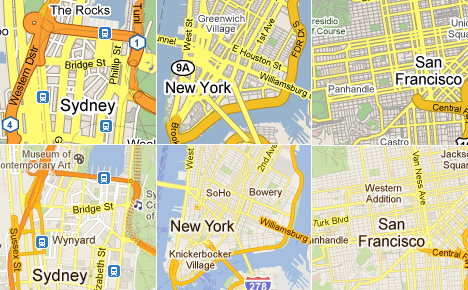
 A snapshot of Google Maps' design evolution 2009 (top) - 2011 (bottom). click for more information.
Synthesizing all of this information in an approachable and aesthetically pleasing way carried obvious challenges. As the product grew and evolved, the map varied widely from one country to another, and the universal familiarity and usability that made Google Maps a success was being undermined by complexity and "feature creep." To better understand which of these variances were useful, we audited the map styles, colors, and iconography of maps all over the world with the help of local users. We examined the leading online and offline mapping providers in each country, in addition to researching local physical signage and wayfinding. This undertaking provided us with a look at mapping as a local exercise—with cultural, ethnic, and region-specific quirks and nuances.
 Our global cartography audit in progress.
With this research in mind, we came to the realization that there was little consistency between this collection of maps and no real indication of a common "correct" palette for color and style rendering. By unifying and simplifying our own Google color palette down from hundreds to a small handful of colors, we were able to produce an experience that provided familiarity and uniformity as you browse the world.
 A sampling of our color palette studies and refinement.