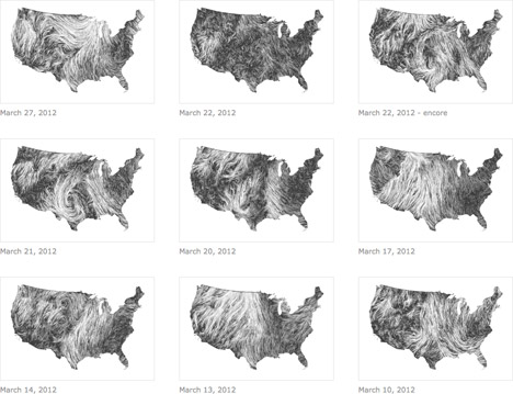
Data visualization, as a specific form of graphic design, is as much a phenomenon of the Information Age as the Internet itself, not least for the sheer amount of data that we generate and consume on an ever more granular level. Besides the fact that we've all seen plenty of examples of bad data viz, even as companies and clients increasingly adopt the format, we've all seen plenty of bad infographics, and particularly egregious examples overcomplicate the matter. Yet this is precisely why data viz remains a promising frontier for the creative expression of quantitative information: at the far end of the specturm, data sets can serve as parameters for mathematically-derived abstract artwork, but those that clearly and compellingly represent a vast amount of data are arguably even more beautiful, as exemplars of visual communication.


Which is a long way of saying that this "Wind Map" by Martin Wattenberg and Fernanda Viégas (a.k.a. Hint.fm) is pretty effin' awesome. Just as the natural world continues to amaze and inspire us, so too do we strive to understand and harness the power of nature: besides capturing the mercurial fluid mechanics of variations in atmospheric pressure, the zoomable wind map demonstrates, say, the regional feasibility of wind power.

Digital artist and designer Jer Thorp brought the Wind Map to our attention on the occasion of Hurricane Isaac; so too are our thoughts are with those weathering the storm in New Orleans...
(more...)


