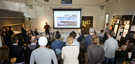

IDEO just completed 24 hours of prototyping in public from Tokyo to San Francisco. We've effectively pulled a global all-nighter. It's left me with the hollow feeling one has after last call, followed by the rush of adrenaline to press on and watch the sunrise. Paul's initial comments were right. It is terrifying to be vulnerable in such a way. Would we have interesting ideas or fall flat under pressure? Would we come across as curious or as self-important? Would the technology work?
Handwringing be damned. The Global Make-a-Thon turned out to be a delightful exploration of personality and meaning. It affirmed our roots in a graphic identity that celebrates personal, community, and collective expression. It taught us about ourselves, what we value, and what we should do next.
Immediately after the Make-a-Thon, a group of 20 designers* from around the globe convened in San Francisco to discuss the concepts on the "UnThemes." The designs are rendered at every degree of fidelity and run the gamut from advanced to bizarre, from systems to illustrations. As we waded through the ideas together, patterns emerged.
First, we LOVE the squares. Nearly every idea submitted used them and with varied expression. The squares became windows to the world, small frames highlighting details, building blocks, sculptural cubes, stamps, video game sprites, and even architecture. These expressions feel like an inevitable build. Rand designed our first logo as a combinatorial geometric frieze of squares. Bierut refined this into a flexible graphic system of marks, typography, and color. Now through this experiment we are seeing hints of our next major evolution: a living platform that is adaptable, reconfigurable, locally nuanced, and contextually aware.
This is most clear when looking at the designs from each studio. The character of the designers and the context of each culture shine brightly. Look at the paper screens from Tokyo, the personal portraits from Mumbai, the experimentation in Boston, or the symbolism from New York. Each of us feels this identity is ours and that's the beauty of it. It's a simple design that becomes a vessel to fill. Even more interesting, it is expression that invites questions and builds rapport. This was a shift we were seeking from the outset. We want to move from an emphasis on declarative expression to a more inclusive identity, to create a bridge between us and our collaborators.


