Quantcast
Channel: Core77
Viewing all 19155 articles
Browse latest View live

Steelcase's Flexible Verb Line of Instructional Furniture

$
0
0

Steelcase-Verb.jpg

Think back to when you were in grade school: Did you like the furniture? The stuff filling the schools of my youth was so crappy and unremarkable that I can barely remember what it looked like.

Perhaps that will be different for the next generation. Steelcase is updating the classroom with their very cool Verb line of furniture, consisting of rollable tables, desks and chairs, a system of whiteboard panels that can be used as both slates and dividers, and an Instructor Station that even has a cupholder to hold a nice, frosty beer. Or maybe it's for coffee, I guess all of our schools were different. In any case, behold:

The Verb line isn't aimed purely at schools, but is also aimed at "corporate learning spaces and project team rooms." But even in the latter spaces, the cupholder is solely installed in the Instructor Station while the regular desks are blank. I kind of like that, as it allows whomever's in charge to lord it over their dehydrated underlings.

(more...)

Say Do Svidanya to the Portyanki: Russian Troops to Get Sock Upgrades

$
0
0

portyanki.jpg

Whether Axis or Allied, there wasn't any army that had it easy during World War II. But I just learned an astonishing fact that hadn't come up in any of my go-to WWII history books: The Red Army did all of their fighting without wearing socks.

Which is not to say they had nothing between their feet and their boots. Russian soldiers were issued portyanki, which are cotton or flannel rectangles of cloth not much larger than a handkerchief. Troops were taught to wrap them around their feet, as seen below, before donning their boots.

If you're wondering why there's color footage of someone doing this, the surprising fact is that portyanki have been a Russian army staple until this year. Although they began phasing them out starting in 2007, it was just this month that Russian Minister of Defense Sergei K. Shoigu issued a call to replace them across the board with proper socks.

The big question is, why did they use these? The answer is manufacturing. While it's well-known that Russian manufacturing might flooded the battlefields, during the second half of the war, with an overwhelming number of T-34 tanks, that industrial largesse did not extend to sock factories. With a finite amount of manpower (womanpower, more than likely) on the home front, and the manufacturing ease of producing cloth rectangles rather than knitted, fitted socks, the decision was made to stick with portyanki.

(more...)

A Chicago Building with a (N)ice Interior

$
0
0

perkins-will-fulton.jpg

Photo courtesy of Perkins + Will

You'd probably never guess what the inside of that building above looks like.

As it says on the side, that's the Fulton Market Cold Storage Company, essentially a ten-storey freezer that opened in Chicago's Meatpacking district in the 1920s. The company recently picked up stakes for a new facility out in the 'burbs, and the Meatpacking space has been sold for development.

Architecture firm Perkins + Will, who are turning two of the storeys into a velodrome, machine shop and workspace for bicycle component manufacturer SRAM, have posted some astonishing photographs of the interior. "Before work could start on the makeover," writes Edible Geography, "the building had to be defrosted. Nine decades of cold storage, combined with a lack of maintenance as the building ran at one-third capacity over the last five years, had left its interior encrusted with ice."

As the developers brought in a series of propane heaters and began cranking them up, here's what happened:

gary-roberts-photog-02.jpg

Photo by Gary Robert

gary-roberts-photog-03.jpg

Photo by Gary Robert

(more...)

A Smartphone with a Flexible Display Remains a Concept... for Now

$
0
0

ChristiandePoorter-iFlex.jpg

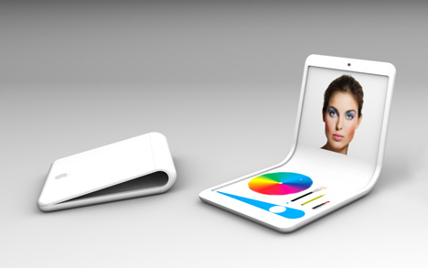
We'll give you just one hint as to designer Christian de Poorter named his latest project, a concept for a phone with a flexible display: it begins with "i" and ends with "flex." The Milan-based designer predicts that "2013 will be the year of flexible displays: not only a technological revolution, but also something that will open new unexplored possibilities," as he duly suggests in the "iFlex," a proposal for a so-called "flexPhone."

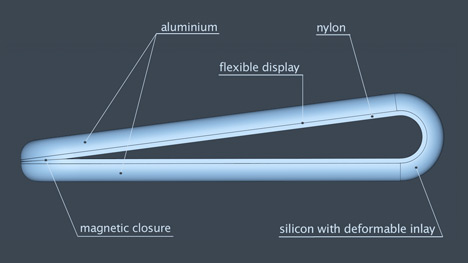
The two [ends] of the rigid flexPhone aluminum case are connected by the central silicone part with deformable inlay so that the device can assume and maintain any desired angle, supporting new usage patterns. The phone has a magnetic lock for the closed position that protects the display from scratches and bumps. The flexible touchscreen display is surrounded by a nylon frame.

ChristiandePoorter-iFlex-materials.jpg

ChristiandePoorter-iFlex-pictureframe.jpg

De Poorter doesn't mention a specific supplier, but surely there have been new developments in flexible touchscreen since last April, when we saw LG's flexible displays and Atmel's XSense technology. If the CST-01 is any indication, e-ink displays are now thinner and less expensive than ever before, and de Poorter might be onto something in his further predictions:

Obviously, the same principle can be applied to tablets and laptops as well. The iFlex concept can give birth to the flexApps, a new generation of software applications that have never been possible with rigid displays. Some new usage examples have already been devised, such as a digital makeup tool for women, a bent-over placeholder for conference speakers with the name for the public on one side and the remaining time on the other, and an alarm clock that can be switched off with a touch of the hand on the top.

ChristiandePoorter-iFlex-modes.jpg

(more...)

Design Management Institute is seeking a Content & Communication Manager in Boston, Massachusetts

$
0
0

coroflot-joboftheday.jpg

Content & Communication Manager
Design Management Institute

Boston, Massachusetts

DMI is seeking an experienced, high-energy content manager and communication professional to work with the President to help solicit and manage a growing library of content and support marketing efforts to identify, attract, and retain a loyal, global community of members and partners online and off.

(more...)

Tidy Up Your Life: An Homage to the Vitsoe 606 Universal Shelving System

$
0
0

Vitsoe606.jpg

The Vitsœ 606 Universal Shelving System is arguably as close to perfection as an article of furniture can possibly be. Designed by Dieter Rams in 1960, long before the lowercase "i" became the de facto indicator of thoughtful minimalism, its beauty lies in the fact that it is a paragon of functionality, as evidenced by nicely executed short film:

Indeed, the iconic shelving unit was the subject matter of choice for a couple of entrants in our "Good Design Is Long Lasting" sketch competition, a collaboration with Phaidon on the occasion of the publication of As Little Design As Possible: The Work of Dieter Rams. Despite the two artists' antithetical approaches to depicting the 606, both Yuka Hiyoshi (top) and Dave Pinter (bottom) successfully capture the spirit of the shelving unit.

1960-Vitsoe-Yuka_Hiyoshi.jpg

1960-Vitsoe-by_Pinter.jpg

Fun fact: The design takes its name from its year (1960) and the fact that it was the sixth Vitsœ product—hence, 60-6.

DieterxRodin.jpg"I can't think of any way to improve the 606..."

(more...)

Holy Cow: Quirky's Moldable Sandpaper

$
0
0

quirky-sandables-01.jpg

quirky-sandables-02.jpg

Call me cheap, but I hate the design of the rubber sanding block, mostly because I can't stand that one-third of each sandpaper strip is wasted in the ends that you have to tuck into the spikes. I save the little perforated, untouched bits but never get around to using them.

A product currently under consideration at Quirky looks to replace the sanding block—and the sandpaper—entirely. Sandables are essentially moldable, elastic, claylike objects embedded with grit.

quirky-sandables-03.jpg

quirky-sandables-04.jpg

(more...)

The U.S. Army's Mobile Digital Fabrication Lab

$
0
0

us-army-elm-01.jpg

Politically speaking, the war in Afghanistan may be winding down; but technologically speaking, things are ramping up. Earlier this month a shipping container was quietly deployed to a remote outpost in Afghanistan. Kitted out by the U.S. Army's Rapid Equipping Force, this particular shipping container is essentially a digital manufacturing lab in a box.

Known as the ELM or Expeditionary Lab - Mobile, the unit contains a 3D printer and a CNC mill (as well as more conventional tools like a plasma cutter, welding gear, a circular saw, a router, a jigsaw and a reciprocating saw). Unsurprisingly, troops on the ground are not using the ELMs to print out heart-shaped gears; rather, the point of the ELMs is to allow last-minute rapid prototyping upgrades to crucial pieces of equipment.

As one example, soldiers discovered that the on-button for one standard-issue tactical flashlight had a raised button that could accidentally be pressed, unintentionally turning the flashlight on while the soldier was moving around. Best case scenario, the thing's in a pocket, you don't realize it's on and the batteries drain down. Worst case scenario, the sudden illumination advertises your position to the enemy while you're sneaking around in the dark.

Under normal Army procurement procedures, designing, commissioning, manufacturing and distributing an updated design would take months or years. But with the ELMs, which come with two digital manufacturing technicians, a solution like this clip-on guard to shield the button can be quickly designed and printed.

us-army-elm-02.jpg

The ELM shipped earlier this month was actually the second; the first was sent to Afghanistan last summer. Following the concept's success, a third ELM is in the works and will reportedly be deployed later this year.

The following video on the ELMs isn't terribly detailed, and features CG footage that doesn't quite track with the narrative, but it's all we've got:

via 3ders

(more...)

A Look at Tactical Tailor, Part 1: The Company's Genesis

$
0
0

tactical-tailor-01.jpg

When it comes to designing for the military, there's not a huge distinction between industrial design and apparel design: Gear is gear. Whether it comes out of a sewing machine or an injection molding machine, form follows function, function is everything, and aesthetics don't matter worth a damn. That makes military design appealing to me (independent of the politics of warfighting).

I'd been hearing good things about this design & manufacturing company called Tactical Tailor, based in Washington state. Here's an example of what they design and make, and some of the thinking that goes into it:

In addition to that plate carrier, they produce literally hundreds of tactical products ranging from pouches, bags, holsters, slings, vests, armor, apparel, you name it. The customer base ranges from individuals to law enforcement entities to government orders that come in the tens of thousands.

(more...)

Noble Desktop Job Board Launch - Powered by Coroflot!

$
0
0


noble-blog-post.png

It is with great excitement that we introduce the newest member of our expanding Job Board Partner Network: Noble Desktop. For over 22 years, Noble Desktop has been training students in computer graphics and web development so we are thrilled to add jobs from Coroflot to this great resource.

As we continue to build our network, each new Partner gives us the opportunity to enhance our offering. Noble Desktop is the first of our Partners to feature a brand new user interface that helps job seekers understand how to search better, and find the jobs they want faster. Take a look at the new interface and wide selection of jobs on the new Noble Desktop Jobs Page.

(more...)

A Look at Tactical Tailor, Part 2: Current-Day Factory Tour

$
0
0

tactical-tailor-02.jpg

Military gear manufacturer Tactical Tailor has gone from being one guy with a sewing machine in a barracks to a 55,000-square-foot design and manufacturing operation employing hundreds of people. Everything from big-ass Sumitomo injection molding machines (with re-grinders to re-integrate the sprue, eliminating waste), Gerber cutting machines and a veritable army of seamsters and seamstresses populate the space, processing the $2.5 million of raw materials constantly on hand to fulfill the never-ending flow of orders.

In this meaty 18-minute video, Director of Sales G.W. Ayers shows us "where the sausage is made," and points the way towards the future success of American manufacturing: Make affordable, useful and high-quality products that people need, and don't rest on your laurels--continue to innovate and refine the product (as seen with their lightweighting Fight Light initiative).

(more...)

Red Dot Award-Winning 'Saddle Lock': Yea or Nay?

$
0
0

LeeSangHwa_KimJinHo_YeoMinGu-SaddleLock-3q.jpg

Not to be a hater, but my number one concern with the "Saddle Lock" concept by Lee Sang Hwa, Kim Jin Ho and Yeo Min Gu is that it's a design for not only the seatpost and saddle but the frame itself. The fact that the hinge is incorporated into the seatpost cluster means that the locking mechanism is part and parcel with the frame itself, seatstays be damned. That said, the Red Dot Design Award-winning concept illustrates a commendable bit of lateral thinking, so to speak, in integrating a locking into the seatpost, which flips between the standard upright position and a lowered, secure configuration.

In complex cities, the number of people using bicycles to travel short distances is increasing. Following the trend, bicycle design has been evolving rapidly. On the contrary, the evolution of the bicycle lock has been slow. When they make a quick stop—such as at a coffee counter or a convenience store—people still look for something to lock their bicycle to. Even though they are only stopping for a few minutes, they must perform quite a number of actions to lock their bike.
Saddle Lock provides a way to quickly lock the rear wheel without the need for additional locking accessories. The seat post swings down around the main frame when a button is pushed. The saddle features a cut-away shape that allows it to sit over the rear wheel. A combination lock allows the release of a special alloy rotating lock that extends from one end of the saddle to the other, securing its connection to the wheel.

LeeSangHwa_KimJinHo_YeoMinGu-SaddleLock-comboDetail.jpg

Stateside cyclists will be quick to note that locking the rear wheel is hardly sufficient for the mean streets of NYC or SF, but that's not the point: The Saddle Lock is a variation on the built-in handcuff-style wheel lock that is commonly seen on imported cruisers and e-bikes, a simple solution for less-larcenous locales.

LeeSangHwa_KimJinHo_YeoMinGu-SaddleLock-COMP.jpg

(more...)

Gemological Institute of America (GIA) is seeking an Instructor, Jewelry Manufacturing Arts in Carlsbad, California

$
0
0

coroflot-joboftheday.jpg

Instructor, Jewelry Manufacturing Arts
Gemological Institute of America (GIA)

Carlsbad, California

GIA is seeking an Instructor, Jewelry Manufacturing Arts with CAD/CAM experience who will be responsible for creating a positive, constructive, and creative learning environment in which to deliver the GIA On-Campus Jewelry Manufacturing Arts Program (JMA). As a developer, the Instructor would create GIA lab class course content consistent with modern industry practices.

(more...)

Putting Things into Perspective: Space Exploration in Fact and in Fiction

$
0
0

BlueMarble-viaWikipedia.jpgImage via Wikipedia

The Internet is a pretty big place, a veritable universe of ideas and images, at once an inventory of just about everything that exists in the natural world and an ever-expanding cosmos in and of itself. Yet as a medium of representation, the 'net borrows much of its source material from real life, and I was duly captivated by this recent short film about the final frontier.

On the 40th anniversary of the famous 'Blue Marble' photograph taken of Earth from space, Planetary Collective presents a short film documenting astronauts' life-changing stories of seeing the Earth from the outside—a perspective-altering experience often described as the Overview Effect.

Although I found the first half of the film to be absolutely riveting, I felt that it dragged a bit in the middle; nevertheless, the remarkable footage is poignant throughout. If the takeaway message of "Overview" rings clear and true, even the less universal aspects of orbit bear further consideration. Commander Sunita "Sunny" Williams' 25-minute tour of the International Space Station makes for a felicitous companion piece to the Planetary Collective short, something like a home video... in space (Kottke calls it the "nerdiest episode of MTV Cribs").

Similarly, the Smithsonian's Air & Space Magazine has just posted a detailed account of the final mission from July 2011, a worthy document of the end of an era. Between Felix Baumgartner's world record freefall, last year's successful Martian reconnaissance mission and more recent news of habitable planets, our species' abiding obsession with space travel not only as a symbolic endeavor but also a commercially viable enterprise... if not an altogether necessary one.

(more...)

After the Mayan Calendar, Fernando Romero's You Are The Context

$
0
0

FREE_YATC_cover2.jpg

In the midst of the Mayan calendar predictions, prophecies came and went and on 12-12-12 in New York, the Mexican architect Fernando Romero released his book You Are The Context at the Guggenheim Museum. The launch was a celebration of what comes next, a young career full of potential and a designer with the means to create change in and out of Mexico.

Romero and his firm FR-EE published the book as a catalog of architecture projects erected and for consideration around the world. In an email he writes, "It is a manifesto of today's context for designers." The book reads like an architecture self-help guide: a serious investigation of trending topics in building and social design: museums, mixed-use, responsible vertical, cities, convention centers, bridges, etc.

The book starts "Since the mid-1960s, as a reaction against the formalism and functionalism of Modernism, the word context has seen a common and frequently used term in architectural discourse." Romero and FR-EE are pushing an agenda with regards to careful attention to the key elements of site, culture, time and society. These are considerations for a future architecture.

free_youarethecontext_4.jpg

You Are The Context is self-published and reads as part calling card/part industry resource. FR-EE hopes to ignite conversations around key issues, shed light on the positive developments in Mexico, and also to bid for some US territory or at least make it's voice more laudable.

Romero won international acclaim for designing Museo Soumaya in 2011, a sequined hourglass of a museum housing Carlos Slim Helú's prestigious art collection in Mexico City. Romero is prone to organic shapes and experimental forms. His mentors include Enric Miralles, Jean Nouvel and Rem Koolhaas.

(more...)

8 Tips for Designing Windows Phone Apps + Lightning Design Reviews!

$
0
0

To help all of our App to the Future entrants create stunning designs, we've asked the Lightning Design Review team to send us their favorite tips for designing Windows Phone Apps. SIGNUP BY TUESDAY for the following Thursday's weekly Lighting Design Review! - core jr

Senior Interactive Designer Lincoln Anderson, who hosts the reviews, analyzed common issues he sees and shares his top eight design tips for Windows Phone.

1. FOCUS
Write a "best-at" statement that clearly outlines what makes your app great and unique from the rest. Use it as a mission statement that guides design and development. Think about how different types of users will employ your app and focus on the top three "user scenarios" that truly support your best-at statement. Make these user experiences truly stellar before adding more features.

For reference: Windows Phone Design Process - Concept

ATTF_sketch.jpg

2. PLAN
Create a navigation flowchart, showing how the pages in your app interrelate. It will give you a clearer picture of how users should get around in your app. Group like pages and then decide if each group should be in panorama, pivot or app bar style based on how users will interact. Even if you're not artistically inclined, sketch simple wireframes for your pages and try different iterations. Sketches are always easier to modify than code.

For reference: Windows Phone Design Process - Structure

ATTF_structure.jpg

3. LOVE THE GRID
Grid based design is nothing new, but did you know that Windows Phone has its own grid? Use it while sketching or creating design comps. There is even a handy overlay included in page template. (It's hidden in the XAML comments.) Flip it on and see the grid in your own application. Snap to it!

For reference: Sketch Templates

ATTF_Sketch_Templates.jpg

4. THEME IT
One of the great things about Windows Phone is that users choose light or dark themes as well as personal accent colors. The entire phone takes on those themes. Don't let your app get left behind, or worse, perform opposite the user's intent. Theme and accent colors are available as resources you can use throughout your app.

For reference: Themes for Windows Phone

ATTF_themes.jpg

5. IT'S ALIVE
Users love apps that feel like they're an organic part of their phone. Make a great live tile experience, even if that's not the main feature of your app. Live tiles pull users back into your app, and give you an edge over the competition. Take a look at the templates and come up with some ideas.

For reference: Tile Design Guidelines for Windows Phone

ATTF_Tile.png

(more...)

MoMA PS1's 2013 Young Architects Program Winner CODA's Party Wall, a Three-Story Facade of Skateboard Offcuts

$
0
0

CODA-PartyWall-MoMAPS1YAP.jpg

Per its progressive mission, the Young Architects Program at MoMA PS1 is a perennial celebration of experimental urban architecture, a design-build complement to their beloved summer event series Warm-Up. Each year for over a decade now, the contemporary art space has solicited proposals for a temporary 'pavilion' in the enclosed schoolyard space, selecting a winner from the five finalists. Earlier this week, they announced that CODA's Party Wall had been selected over proposals by Leong Leong, Moorehead & Moorehead, TempAgency and French 2D [Note: we also covered last year's winner].

CODA-PartyWall-MoMAPS1YAP-final.jpg

CODA-PartyWall-MoMAPS1YAP-renderWide.jpg

The Ithaca, New York-based firm's design is a three-story tall structure that spans much of the length of the courtyard, a freestanding steel scaffolding that is bedecked, in a manner of speaking, with offcuts from fellow eco-minded, Ithaca-based company Comet Skateboards. "Byproducts of Comet Skateboards' manufacturing process, called "bones," are woven together to form an imperfect and porous façade using off-the-shelf hardware."

CODA-PartyWall-MoMAPS1YAP-CometSBfeasbility.jpg

CODA-PartyWall-MoMAPS1YAP-maquetteDetail.jpg

Party Wall sits on a low, stage-like platform—made from the extant VW Dome in the courtyard—which also serves to connect the multiple outdoor spaces of the schoolyard. The movable benches (also "prototyped using the uncut but misprinted bones") can be configured for various scenarios: "not only the pool party, the dance party and some architectural tourists [but also] lectures, classes, discussions, dining, performances, film screenings and even, perhaps, a wedding."

CODA-PartyWall-MoMAPS1YAP-renderBenches.jpg

CODA-PartyWall-MoMAPS1YAP-CometSB.jpg

Full description from CODA after the jump...

(more...)

Eric Standley's Laser-Cut, Hand-Assembled Paper Art

$
0
0

eric-standley-01.jpg

We've seen the insanely complicated things people can do with paper by painstakingly folding it (Matthew Shlian) or cutting it by hand (Bianca Chang). It was just a matter of time before another OCD paper artist/engineer got his hands on a laser cutter and made things really complicated.

Artist Eric Standley, a SCAD grad and now associate professor at SVA's Virginia Tech branch, painstakingly assembles hundreds of sheets of differently-colored laser-cut paper. The intricate shapes evoke stained glass windows or something you would carve if you were imprisoned for 30 years. This man has the focus and patience of a sniper on Adderall.

eric-standley-02.jpg

eric-standley-03.jpg

eric-standley-04.jpg

eric-standley-05.jpg

See more of Standley's stuff here.

(more...)

Points for Creativity: MONIKER Bicycle Handlebars by Taylor Simpson

$
0
0

TaylorSimpson-MONIKER-whatsinthebox.jpgWhat's in the box?

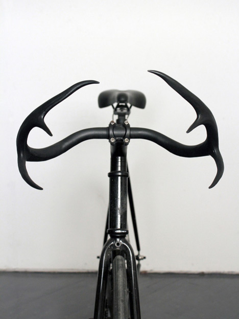
At risk of overexposing conceptual bicycle components today, this reader submission was too good not to post. Taylor Simpson is one short semester away from completing his baccalaureate in communication design at Brooklyn's own Pratt Institute, and he recently sent in a branding/packaging project that he completed last year. A riff on bullhorns, MONIKER is a concept for a set of "handcrafted bicycle handlebars made of genuine deer antler and recycled metal."

I originally came up with the concept of Moniker Cycle Horns while participating in the World's Longest Yard Sale on Route 127 in 2010, an event I look forward to every year. While traveling the sale, I found a pair of genuine deer antlers a local man was selling somewhere in Kentucky. As a cyclist I thought it would be clever to create bicycle handlebars made of animal horns and antlers.

TaylorSimpson-MONIKER-antlers.jpg

TaylorSimpson-MONIKER-boxTextDetail.jpg

Thus, the bars consist of a set of antlers from a six-point buck, bonded to what I assume is a short length of pipe to form the clamp area and painted in a black satin finish. (For better or for worse, the second edition of Bikesnob's cockpit contest has come and gone; there was actually an antler category the first time around.)

TaylorSimpson-MONIKER-deadcenter.jpg

(more...)

Maison Objet 2013: 'Pots' by Benjamin Hubert for Menu

$
0
0

BenjaminHubert-Pots-1.jpg

We've seen plenty of furniture and lighting from prolific designer Benjamin Hubert, as well as the 'groovy' minimalism of the "Plicate" watch, but it's always hard to predict what to expect when a designer tries his hand at other objects. Of course, Hubert is talented enough to put his signature touch of refined restraint on just about any object imaginable, and his new series of vessels is no exception. This past weekend saw the debut of the London-based designer's aptly-titled "Pots" at Maison Objet—designed for Danish brand Menu, the terracotta vases and jars are minimal yet expressive, a perfect example of Hubert's aesthetic.

The storage jars stem from the studio's 'Materials-driven, process-led industrial design approach' researching the typologies and language associated with ancient and contemporary methods of keeping products cool and dry utilising terracotta.

'Pots' feature an exterior of natural, raw terracotta contrasting with the gloss glazed interior and soft rubber lids, providing a multitude of experiences for your senses.

The collection represents an uncompromising contrast between the ancient traditions found in terracotta and the industrial modernity embedded in the mass-produced rubber lids.

BenjaminHubert-Pots-pourer-1.jpg

BenjaminHubert-Pots-storage-3.jpg

BenjaminHubert-Pots-Djembe.jpg

(more...)
Viewing all 19155 articles
Browse latest View live


Latest Images