Quantcast
Channel: Core77
Viewing all 19155 articles
Browse latest View live

Beautiful Architectural Visualizations from Mir

$
0
0

Of all the support branches of design, the ones specializing in visualization have to be the sexiest. One such outfit in Bergen, Norway, has a simple mission: "Mir is a creative studio," they write, "that specialises in portraying unbuilt architecture."

Done for SOM - Beijing/China

While their field surely has a unique set of challenges, to produce the renderings for a design without having to deal with realtors/fabricators/construction teams must bring a particular kind of joy; you get to realize all of the cool stuff, without the real-world headaches. Not to mention they get to work with international architecture firms like Skidmore, Owings & Merrill, Zaha Hadid, Snøhetta, KPF, Gensler and more.

Their work might have them visualizing a building complex in the Nordic countryside:

Done for White - Lund/Sverige

A study facility in Saudi Arabia's Mecca:

Done for Snøhetta - Mekka/Saudi Arabia

A staircase for Zaha Hadid:

Done for Zaha Hadid - Sharjah/UAE

A modernist monolith in South Korea:

Done for KPF - Daegu/Korea

Part of the Hudson Yards project in New York City:

Done for KPF - New York/USA

Or this thing, which…tell you the truth I have no idea what the hell it is or what it does, but apparently it was designed by Gensler NY, though it is not listed as a project on their website:

Done for Gensler NY - Wasteland City/Wasteland

My favorite shot on Mir's site is this rendering of the dining area for a Swiss resort:

Done for Jensen & Skodvin - Vals/Switzerland

That's my favorite not for the beauty of the image, but because as a former waiter prone to bouts of clumsiness, I can picture the event leading to me being fired from this restaurant:

As I carry a tray of martinis to the table at front left, I lose my footing on the slope, fall on my ass, slide into their table with my legs spread, and my crotch slams directly into a table leg. Of the two martini glasses hurled aloft by the incident, one shatters on the table while the other crashes into the back of the head of the person sitting on the stool at right.

Apple Hits a Speed Bump by Making One

$
0
0

With no fanfare nor even a press release, Apple released a new product this week: A $99 external battery case for the iPhone 6/6S. Apple fans will be happy they can purchase a product in the Apple family to extend their battery life; Apple detractors see the case as tacit admission that the native battery isn't adequate.

That's not the debate we're interested in, and you can read that one elsewhere. What we are interested in is the somewhat bizarre industrial design of this thing.

The last cell phone I owned whose design I considered nearly perfect, from a functionality point of view, was the Motorola Star-Tac. When folded up, it was diminutive and unobtrusive. It came with a perfectly-engineered belt-clip case that was a pleasure to slide the phone in and out of, positively locking to keep it in place, yet easy to release. (The tactility of that operation was soooo satisfying.) The phone easily flipped open in one hand. The battery was easy to remove. The buttons were too small and bit mushy, otherwise I'd rate it absolutely perfect. The designers considered nearly every facet of how the phone would actually be used.

That phone came with everything you needed. But those days are long gone. Today when we buy a smartphone we must also purchase a protective case and the batteries are not replaceable. Most smartphones are too bulky to wear in belt clips so the common method of storage is to slide them into a pocket.

If you look at things that are meant to slide in and out of pockets—wallets, cash, automotive key fobs, disposable lighters, pens, pocketknives—you'll see they're all smooth-sided. 

Bristling key rings and baby kangaroos are the only exceptions. 

But the iPhone battery case has this bizarre hump announcing the battery's presence. 

I'm sure the design team pored over the radii and such, but there's no way that hump makes it easier to get in and out of a tight pocket than, say, Mophie's sensibly-shaped Juice Pack. 

Mophie Juice Pack, image via Chip Chick

There's no way that hump helps the phone sit flat on a desk when you press the "home" button.

So why did they do it? Apple has always done whatever they wanted to do, absent any customer feedback, taking Henry Ford's "If I ask my customers what they wanted, they'd have said a faster horse" philosophy. That was fine with me when Steve Jobs was in charge, because he actually knew what I wanted and consistently delivered it. But the Apple sheen has long since worn off for me, as poor software decisions have made their products more difficult to use. (At least for me; I find that the terrible Calendar app will spontaneously erase important information, trying to sync podcasts has become problematic, and when I tried to upgrade my MacBook Pro to the new OS, it crashed my computer and required I re-install my old system off of a back-up.)

As a design lover no longer in love with Apple, I looked to the positive: The existence of Apple and the nature of capitalism requires other companies to compete, improving the field of industrial design as a whole. The fit and finish of products by Apple's competitors is undoubtedly better than it was ten years ago; Cupertino has forced them to up their game. But this battery hump doesn't look like good design to me, or anything that anyone would want to emulate. It just looks weird and out-of-touch.

DiResta's Cut: Lathe Drawer

$
0
0

Jimmy DiResta's lathe bench has been spinning (no pun intended) out of control, in terms of the tools and clutter gathering around it. This month he's got to get it straightened out by building a storage drawer with removable bins. The problem: His legacy lathe bench has an inconveniently-placed piece of angle iron, presumably incorporated by the previous builder for stiffness. How can he get the drawer to clear it?

Watch for your monthly dose of DiResta problem solving—and keep your eyes open for some neat tips, like how to minimize planer snipe and how to quickly transfer radii from rabbeted corners to the drawer bottom that will fit into them:

Reader Submitted: Aviator Chair: A Flat Folding Leather Chair Made Using No Joinery 

$
0
0

The Aviator Chair is a challenge to create a flat folding luxury leather armchair from a single piece of material with no joinery. Created primarily as a personal design challenge, this chair concept explores ideas of manipulating profile cut flat pieces into sustainable, beautiful and functional 3D forms.

Rear detail
Ply half scale
Ply half scale
Ply half scale
Ply half scale
Plywood half scale
Paper 1/5th scale flat
View the full project here

Meaningful Innovation at Autodesk University 2015

$
0
0

Autodesk University 2015 wrapped up in Las Vegas last week with more than 700 sessions and nearly 10,000 attendees—not to mention dancers, a DJ and a parade of Stormtroopers straight out of Star Wars. Opening speakers, including Carl Bass, Autodesk President and CEO, and Chief Technology Officer Jeff Kowalski, noted that technologies like the Internet of Things, robotics, augmented and virtual reality are changing the way we work.

"Generative design, additive manufacturing and the development of new materials are already transforming the shape of manufacturing," said Kowalski. To demonstrate, he shared a first look at a new "Bionic Partition" for Airbus—an onboard wall that weighs less than half the standard weight.

Autodesk CTO Jeff Kowalski shares the Bionic Partition for Airbus

Moving from passive to generative and then onto intuitive and empathic, Kowalski also expects that, instead of designers learning CAD, CAD will learn us. With that, and the convergence of building and manufacturing—long discussed, but now arrived—we have the opportunity to explore meaningful innovation—working through the details to make real innovation happen.

So, how do we incorporate all of these predictions for the future in our practices now? What's important? Bass suggests we'll need to reframe and re-examine our choices and thinking to consider a variety of issues such as whether or not we're working on the right problem and whether or not we can achieve energy efficiency in the making process as well as at end use. And, perhaps the most important consideration: how can we reframe our thinking about people. As Jeff Kowalski noted, "to shift our focus from making people want stuff to making stuff people want" but also to ensure that young, diverse and creative individuals have opportunities to enter the workforce.

Three Innovation Forums themed around "disruptions" explored inspirational case studies. For example, Joel Neidig, Developer and Technology Manager of Itamco, outlined how makers can bring together communication, design, community and augmented reality. Specializing in precision gear manufacturing, Itamco has manufactured robotic test joints that built the international space station for NASA, pump systems in response to Hurricane Katrina and mining trucks that utilize the Internet of Things by putting GPS, LIDAR and cameras into trucks to minimize haul truck mining accidents.

More than 200 exhibitors offered examples of new hardware and software, student designs, hands-on demos and opportunities to give back and make an impact through volunteer efforts. And, of course, there was the robot bartender…


Too Good to be True? Crowdfunded Sneakers Wrapped in Flexible Displays

$
0
0

Here's a crowdfunding campaign that merits skepticism—yet has netted $350,000 on a $25,000 goal. Are backers being had?

A startup called ShiftWear claims they can produce sneakers wrapped in a flexible HD display that can change patterns on the fly. They're saying they'll be ready by next year, and here's what their kicks will allegedly be able to do:

Those are some bold claims. Waterproof, machine-washable, charges the internal battery wirelessly and by walking? Sharp-eyed viewers will note that the display is even depicted to wrap around the eyelets for the laces, which ShiftWear offers as the $1,000 version; lower-priced models starting at $150 will apparently only have the display on a portion of the sneaker.

Readers of the campaign page will note that the company claims the flexible e-paper display has "up to 30 days battery life." But the company has no prototype.

The last time we heard about flexible displays was when LG announced they'd begin mass producing their monochrome EPD (Electronic Paper Display). That was in 2012. But the much-ballyhooed displays were subsequently integrated into only one commercial e-reader, Russia's Wexler Flex One. Any of you ever seen one, or used one? Probably not; it was discontinued the following year.

A consumer electronics giant like LG was only able to produce a monochrome flexible display and could not gain any traction. Now ShiftWear is claiming they can produce a full-color flexible display and that they'll have it on people's feet by Fall of 2016.

Is that even possible? Perhaps. But there's a key difference between Kickstarter and IndieGogo that we fear may be being exploited here:

Kickstarter famously banned renderings back in 2012, stating that "renderings that could be mistaken for finished products are prohibited.... If an obvious simulation or photorealistic rendering is spotted during…review, that project will not be allowed to launch. If a simulation or photorealistic rendering is discovered after a project launches, that project will be canceled."

Two years later at least one news outlet reported that Kickstarter's "ban on simulations and rendered product images has…been removed," and that "projects [can] be listed even without physical prototypes." That's simply not true in all cases: Kickstarter's current Rules page clearly states

When a project involves manufacturing and distributing something complex, like a gadget, we require projects to show a prototype of what they're making, and we prohibit photorealistic renderings.

Indiegogo has no such stipulations.

Silicon City: Computer History Made in New York

$
0
0

We venture to guess that most people won't jump to name New York as a central hub of the technological era, but as the New York Historical Society (NYHS) exhibition "Silicon City" demonstrates, the forebears of the modern computer were working on the East Coast rather than the West. Through 300 artifacts and archival materials, the exhibit retells the lesser-known narrative of the digital revolution, celebrating New York's role in transforming the innovations that define our lives today. 

It all begins with the 1964 New York World's Fair, where the public was first introduced to computing at the IBM Pavilion. Visitors to the NYHS are similarly welcomed by a version of the multimedia installation called "THINK" that was put on by Charles and Ray Eames inside the theatre designed by Eero Saarinen, popularly known as "the egg." From here, the exhibition's timeline progresses through a series of thematic sections beginning with the earliest innovations that set the groundwork for the computer revolution—Samuel Morse's Electric Telegraph (1840s), Thomas Edison's early light bulbs (1880s) and the punched card machines of the 1890s. The exhibit considers the evolution of computing from military research led machines in the World War II era, all the way through the various leaps that eventually led to the personal computer we are all too familiar with. Along the way, the exhibit highlights the important role women played in developing the field of programming. 

New York emerges as a nerve center of innovation. It was the place where AT&T and Bell Laboratories led the way with research that generated pivotal inventions like the first transistor in 1947 and Telstar 1, the satellite used to transmit the first live images from space in 1962, along with developing the infrastructure necessary to support the Internet: digital phone lines, fiber optic cables and satellites. Later, Bell Labs led the development of electronic music and visitors will be happy to see some early computerized musical instruments on display. 

The end of the exhibition focuses on the relationship between technology and design, with a showcase of IBM's evolving branding identity and iconic ephemera produced by designer Paul Rand. Although the industry shifted to the West Coast in the 1980s, New York is currently undergoing a technological revival with several key companies setting their roots within the city. The exhibition closes on this optimistic note, with a multimedia presentation mapping these offices and sharing insight from their leaders. 

"Silicon City" is on view at the New York Historical Society through April 17, 2016.

New York World's Fair IBM Pavilion, 1964
The centerpiece of the IBM Pavilion at the 1964 New York World's Fair was a theater known as "the egg," designed by architect Eero Saarinen.
Photo credit: IBM Corporation Archives
The "People Wall" Inside "The Egg."
Every 15 minutes, 500 visitors entered the "people wall" inside the theater. Here, they were introduced to the magic of the information machine through Charles and Ray Eames' multi-screen media experience "THINK."
Photo credit: Core77
Display of printed ephemera related to the 1964 World's Fair.
IBM looked to designers like Paul Rand to craft its brand identity, and used the 1964 World's Fair as a "coming out party" for the Information Age.
Photo credit: Core77
Installation View
Photo credit: Core77
Display of Thomas Edison's light bulbs, dating back to 1880.
Thomas Edison did not invent computers, but all early computers relied on Edison's work. While refining his light bulb, Edison noticed that electrons in a vacuum flowed from a heated filament to a cooler foil plate. Nearly 30 years later, physicist John Fleming used this "Edison effect" to create the vacuum tube. For the next half century, vacuum tubes were the voltage regulators and current amplifiers at the heart of radios and other electronic devices, including computers.
Photo credit: Core77
The Punched Card System
Population growth complicated the execution of the 1890 national census—it became impossible to finish the headcount before the 1900 census began. Herman Hollerith devised a fast solution, by recording data on punch cards which could be read by tabulating machines. This remained the primary input system for computers until the 1970's.
Photo credit: Core77
IBM Selective Sequence Electronic Calculator Operator Console, 1948.
Designed by Wallace Eckert at Columbia University, IBM's Selective Sequence Electronic Calculator (SSEC) featured 12,500 vacuum tubes and more than 21,000 relays. The first computer to store data, the SSEC calculated the positions of the moon and planets, and was the last electromechanical calculator ever built. The calculator was installed in IBM's New York headquarters, where it was operated from 1948 to 1952.
Photo credit: Core77
Marlyn Wescoff and Ruth Lichterman wiring the right side of the ENIAC with a new program, ca. 1946.
During the 1940s wartime era, women dominated the field of programming, which required the painstaking tasks of connecting cables and setting switches by hand. Jean Bartik, Frances Bilas and other women worked on the Electronic Numerical Integrator And Computer (ENIAC), developed for the Army during World War II.
Photo credit: US Army Archives
Replica of George Stibitz's 1937 Model K Binary Adder.
Bell Labs researcher George Stibitz conceptualized a computer that processed data using electronic relays. To test his theory, he developed the Model K Adder (called "K" simply because he made it in his kitchen). This model pioneered digital computing through binary numbers and through this and subsequent experiments, he became widely regarded as one of the fathers of digital computing.
Photo credit: Core77
Plugboard of UNIVAC 1004 used for punched card data processing, 1963.
Plugboards were an intermediate solution between the hard-wired built-in programming of early tabulators and the software-driven computers of today. Though they still had to be programmed through physical connections, they were a step toward making computers more flexible.
Photo credit: Core77
View the full gallery here

Design Job: Packit LLC seeks a versatile and passionate Junior Soft Goods Product Designer in Westlake Village, CA

$
0
0

Depending on the time of year, responsibilities will fluctuate between design and development with overseas manufacturers. You should have a bachelor’s in Industrial or Fashion Design, a demonstrated commitment to a career in design, along with 1-4 years experience working with soft goods. Strong illustrator capabilities will be necessary.

View the full design job here

L.A. Design Without L.A. Stereotypes

$
0
0

More and more designers are opening studios in Los Angeles, but the city still offers relatively few opportunities to see their work in person. A welcome new venue, at least temporarily, is the downtown showroom Austere, normally dedicated to Scandinavian design but through February 14 hosting Site Specific: L.A., an exhibition of Los Angeles–area design curated by the New York­­–based online magazine Sight Unseen.

Granted, in an ideal world, L.A. design shows would be put on by L.A. curators—but in this case it would be foolish to gripe about so much great work coming together in one place. Sight Unseen’s Monica Khemsurov and Jill Singer gathered a stellar sampling of studios—Tanya Aguiñiga, AQQ Design, B. Zippy, Michael Felix, Ben Medansky, Only Love Is Real, Ouli, Brendan Ravenhill, Eric Trine, Waka Waka and Jonathan Zawada—and they have a refreshingly stereotype-free view of the city’s design scene, as we learned in a quick phone interview with Khemsurov last week.

Core77: With this exhibition, are you trying to make some kind of statement or argument about design in L.A., or is it a bit more informal than that?

Monica Khemsurov: It’s a little more informal than that. We got invited to do a project in the Austere space, which is a beautiful, open, loft-like store in downtown L.A. In the past we’ve been invited to do “takes” on Sight Unseen Offsite, the show we do in New York during Design Week—to move the show to L.A. or Miami or what have you. And Jill and I aren’t really ready to do that. But with Austere, we thought we could do a mini Offsite, where we would focus on local talents that we love and that we think are up and coming. So we invited these designers to show work that makes sense for the context, and we gave them leeway to show what they’re working on at the moment.

Furniture by Waka Waka and wall hangings by Tanya Aguiñiga (who answered our Core77 Questionnaire last January). All photos by Bethany Nauert

Do you think that there is something that distinguishes L.A. design right now from, say, New York design?

With the people that we chose, I would say probably not. I know that some of the design in L.A. tends to fall into that “California chill” kind of vibe. But most of the L.A. design scene doesn’t fall into that—most of it is really contemporary, and I don’t think there’s a specific aesthetic going on. The people that we chose are on the cutting edge of design in the same way someone in New York or in Europe would be. So in terms of the people we’re showing, no, I wouldn’t say that there’s a particular California aesthetic in any way.

Furniture and poster by AQQ Design founder (and erstwhile Core77 contributor) Matthew Sullivan

Would it have been possible to put on a show like this five years ago, when Sight Unseen was first starting out?

Maybe. Certainly some of these people have been working in L.A. for five years, like Brendan Ravenhill, Tanya Aguiñiga and Ben Medansky. So, ten years ago? No. Five years ago? Maybe. Right now? For sure.

To some degree, that follows a pattern of what’s been happening all over the States, which is designers having more of an opportunity to get their work out there, whether it’s through design fairs or online publications or just having a web shop. There’s been a general movement in the States, a more entrepreneurial, DIY feeling with these independent design studios. So I think that’s part of what’s happening in L.A. But you also have some L.A.-specific factors, like the fact that there are a lot of people moving there right now, there’s more culture happening there right now, there are all these new galleries opening. That sort of puts this feeling in the air, I think—this excitement around art and design that wasn’t as apparent five or ten years ago.

Are any of these designers new or new-ish discoveries for you?

Michael Felix is a relatively new discovery; we’ve only known him since last winter. He just launched his collection at Sight Unseen Offsite in New York last May. And he’s really interesting because his family has a furniture-upholstery factory outside of L.A., and so he came in and basically asked himself, How can I work with my family’s factory to make more interesting contemporary pieces?

Only Love Is Real is a new furniture project by Matthew and Carly Jo Morgan. I think they started earlier this year, and this is the first furniture collection. Their stuff is really interesting—very expressive, very sculptural. It does have a little bit of a playful sense of California mysticism, I would say. But the pieces would not be out of place in a gallery in New York.

There’s also Jonathan Zawada—he's new to L.A. He used to live in Australia, and he moved to L.A. a little while back. And Ouli are interesting as well. They had a store in L.A. briefly, but they’re not really out there with their furniture and product design because they both have other jobs. So they’re a little under the radar; I don’t think a lot of people have seen their work.

Site Specific: L.A. is on view at Austere in downtown Los Angeles until February 14.

Ceramics by Ben Medansky
Furniture by Michael Felix and a pendant light by Brendan Ravenhill (who answered our Core77 Questionnaire last year)
Plant stands by Eric Trine (who also answered our Core77 Questionnaire last year), with concrete planters by Laura Cornman
Ceramics by B. Zippy


How to End Spice Storage Madness, Part 1

$
0
0

Countertop and wall-mounted spice racks abound, but a cook who wants or needs something different can find many designs that are somewhat out of the ordinary. Herbs and spices are best stored away from heat and light, and many cooks lack counter space, anyway—so good cabinet storage options are helpful.

The Rubbermaid pull-down spice rack won't fit into all cabinets, but cooks who have large enough cabinets—especially cooks like me who are on the short side—really like this rack. It accommodates a wide range of spice bottles sizes, which is always a concern. A number of purchasers said installation was a bit tricky, but well worth the effort. (Providing clear instructions if the installation process isn't totally obvious is always a good idea.)

The SpiceStack from YouCopia provides similar benefits, except the end users can't see all the spices at once. But the racks come with removable stickers (both preprinted and blank) to apply to the drawers so cooks can tell what's where. This rack nicely accommodates half-height spice bottles, which many spice racks don't. 

The SpiceStack comes in five widths, so there's one to fit almost any cabinet. And there's no assembly to worry about! The racks have non-skid feet to keep them in place.

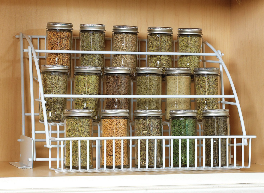
The racks from Vertical Spice provide another way to avoid back-of-the-cabinet non-visible spices. They come in three depths and a range of heights, so there will be something to fit many cabinets.

Purchasers consistently comment on the quality of the materials—the racks have full-extension ball bearing slides—and the ease of installation. This is another product that will accommodate spice bottles with a wide range of shapes and sizes. (I see a bottle in that photo that's one of the larger ones I own, and it fits into this rack just fine while it barely fits into mine.)

The SpiceStor fits a lot of spices into a narrow space; it comes in a "full page" and a "half page" size to accommodate differing needs. It also has some flexibility; it can hang in a cabinet or stand on a pantry shelf. However, it can only be used for round bottles, and some spice bottles are square. Also, some purchasers saidthe clips didn't hold well, especially for glass jars; another said the clips "stretch out and drop the jars of spices." When the fundamentals don't work well, end users won't care about much else.

Other designs provide for under-cabinet spice storage. The Ultimate Spice Rack is a simple design, well executed, that will work nicely for cooks without cabinet space to spare. 

The Magic Spicer uses bottles with magnets in the lids to attach to the magnets in the under-cabinet mounting plate. (Because there are individual magnets in the plate and the lids, the bottles will always line up neatly; that will delight some end users.) This is one of the many spice racks that require the end user to transfer spices from the containers they came in to the bottles the rack uses. For some end users that will be a trivial thing (especially those who buy in bulk) but for others this extra step will be a stumbling block. Also, glass bottles sitting out in the open aren't the best way to keep the herbs and spices fresh.

With the Magic Spicer, the end users decide on the hole size they want for each lid, and then hang it from the plate with the holes open to that size; the bottles are supposed to self-seal. This allows the cook to just pick up the jar and shake. That won't help the end user who wants to use a measuring spoon inserted into the bottle, but it's another feature that some might like.

The KitchenArt Auto Measure Spice Carousel can sit on a countertop (and can be double stacked) but it can also be mounted under the cabinet. Each dispenser has a shaker port, a large-mouth port which accommodates measuring spoons, and an auto-measure dial which dispenses a quarter teaspoon of spices with each turn of the dial. It comes with 44 stick-on labels and six blank ones. The one significant concern noted by some purchasers is that the dispensers don't seal well, which can be a major problem; airtight containers are best for preserving herbs and spices.

Spice racks can also go on cabinet doors. The Rev-A-Shelf adjustable door mount spice rack allows the end user to place the racks so they don't interfere with any cabinet shelves. And the door mount brackets are adjustable; the end user can position the mounting screw so it goes through the thickest part of the cabinet door. One potential drawback: If the bottles don't completely fill up the shelves, they might rattle around when the door is opened and closed.

The Bellemain Spice Gripper Clip Strips would avoid the rattling-around problem, but they have some of the same limitations as the SpiceStor. Many purchasers report they don't hold heavier glass bottles well, and some end users noted that once they are stretched to hold larger bottles they cannot be used later for smaller bottles. 

This type of design seems to call out for plastic spice bottles, as shown in the product illustrations. If that was made clear in the product description, there would be fewer disappointed purchasers.

Researchers Develop Ecologically-Responsible, Algae-Based Ink

$
0
0

Ink is all around us, particularly if you're a sketch-happy designer. And I remember reading that ballpoint pens all use non-toxic ink, so I never thought there was any health concerns involving ink. However, researchers Scott Fulbright and Steve Albers feel that there may be, and that there certainly are environmental concerns:

Regular ink has a problem that most people don't know about: It's dirty, dirty stuff. Most colored pigments found in regular ink are made up of heavy metals like cadmium, copper, chromium, iron, lead, and aluminum.
Carbon black is the most common pigment used in black inks. It's most commonly made from of the incomplete combustion of heavy petroleum products such as tar; that's right, TAR! It's a product that is labeled as carcinogenic by the International Agency for Research on Cancer.
Ink isn't only made of pigments, a considerable amount of ink is made up of binders, carriers, and solvents. Most carriers are petroleum oil, while most solvents used in inks are volatile organic compounds (VOCs), all of which have detrimental human and environmental impacts.

That being the case, Fulbright and Albers—who cut their teeth developing algae for biofuels at Colorado State University en route to earning PhD's—started a company called Living Ink Technologies, for the purpose of creating ecologically-responsible, algae-based ink. And what they've developed comes with a twist or two:

I like the idea of ink coming from algae rather than heavy metals, though I can't see a practical application for disappearing/reappearing ink. Actually, scratch that--if we can figure out how to get this stuff into our fellow renderers' markers, ideally before a presentation, I see an entertainingly prank-filled future!

The Living Ink Kickstarter campaign is here, and has handily surpassed their $15,000 goal with 27 large at press time. There's still over a month left, for pranksters seeking to get in on it.

Adam Savage's Custom Tool Storage Stands

$
0
0

When Mythbustersruns its final episode next year, they'll have created nearly 3,000 experiments total. As one half of the duo, Adam Savage has at least that many tools. How can one possibly corral that number of implements into a manageable system, where things are both easily located and readily extracted?

Operating under the philosophy that "Drawers are where tools go to die," Savage devised a system built around what he calls "First-order retrievability." Here he explains and demonstrates it:

Three Architecturally Unusual Ways to Make an Entrance, and One Amazing Stereo Cabinet

$
0
0

Torggler's Evolution Safety Feature

Remember Klemens Torggler's crazy Stahltür and Evolution doors? We'd joked about them never being available in litigious America due to the inherent safety hazard—but it turns out Torggler has updated the Evolution with a way to ensure your fingers don't get pinched:

For those who prefer to live dangerously, he's also got a version of the original Stahltür mechanism that can now handle a 200 kilogram (440 pound) steel door, shown here:

The Tubakuba Mountain Hub

A very different sort of door that's no less unusual can be found in the entrance to the Tubakuba Mountain Hub, a short-term rental getaway overlooking Bergen, Norway.

Conceived of at a design-build workshop run by OPA Form Architects at the Bergen School of Architecture, the image above is probably a rendering, but the ones below aren't. The structure was actually built.

Norwegian pine is apparently flexible, and by using "curved shavings" of the stuff, the team was able to get it around that radius "mounted in layers to provide sufficient strength."

The actual door on the interior, seen below at left, is Hobbit-sized.

That's because the entrance is child-height. Adults must crawl.

There's not a lot in the interior in the way of amenities…

…but the view overlooking Bergen is pretty nice.

The Sibling/Y3K Entrance & Interior Device

Y3K was the name of a temporary gallery in Melbourne, designed to last for only two years. Architecture firm Sibling provided a rather special door to the space at their request:

If you're like me, you're wondering what the hell's going on here. Your understanding of the purpose depends on your tolerance for architecturespeak:

[This] site-specific intervention [was created] to address the relationship of the space to the street. Here, the established role of the door in creating an impression of what lies beyond is layered with confusion. Retaining the existing door leafs due to a heritage overlay, a polycarbonate, timber and plywood insert forms a new architectural device.
The insertion allows Y3K to constantly manipulate the relationship the gallery has with the public: where the visitor is either welcomed by a large opening or a more complex negotiation is required to enter the space when the door transforms into three flexible walls.

Lauchner's Killer Cabinet

Lastly, we return to Torggler's Evolution mechanism. When designer Craig Lauchner needed an entertainment center for he and his wife, he built one himself, incorporating Torggler-inspired doors:

MUST. BUILD.

Design Job: Come make an impact at Stanley Black & Decker as their next Industrial Design Intern in Towson, MD 

$
0
0

You'll be required to create, test and execute ergonomic solutions at a high level, so you must be adept in the production of 3D concept models (Solidworks, Rhino, Alias, Catia). You'll help develop innovative product concepts and must produce in depth sketches and form development of new consumer products.

View the full design job here

How Do They Get Fillings Inside of Chocolates Without Leaving a Parting Line?

$
0
0

So maybe it's not the production method you working industrial designers have been searching for, but at some point you must have asked yourself: How do they get those printed-looking colored patterns onto individual pieces of chocolate? And how the hell do they get those delicious nuts and gross, creamy jellies into the center of a piece of chocolate that has no parting line on the equator?

Trusty Core77 is here with the answer, friends. And the answer is edible transfer sheets, polycarbonate molds, magnets and a heat gun. First let's look at how they transfer printed patterns onto chocolate:

If it wasn't obvious from the video, the shiny metal sheet he slides the edible transfer sheet onto in the beginning is magnetic. There are magnets embedded in the polycarbonate mold, which holds it fast to the sheet; thus none of the viscous chocolate leaks out while it's "accepting" the colored imprint.

As for how they get stuff into the middle of individual chocolate pieces, this next video starts out using the same pattern trick, then reveals the molding technique:

I started to type "If only plastic could be made to behave that way," but then I realized no client has ever asked a designer to get that disgusting creamy jelly inside an injection-molded part.


Stunning "Reality Editor" Lets You Connect…Everything

$
0
0

The world is already filled with smart people designing and building smart, web-connected objects. But most of these things are siloed off into their own apps, meant to be operated independently of one another. But now a research team at MIT Media Lab led by Valentin Huen, a PhD candidate in the Fluid Interfaces Group, is going to be the group of smart people that ties it all together.

What these guys have come up with is called the Reality Editor, a stunning combination of technologies—AR, Arduino, and clever coding—demonstrated here by Huen:

REALITY EDITOR from Fluid Interfaces on Vimeo.

As you can see, it's something like a universal remote for, well, everything. It's of course dependent on objects having connectivity, which the Arduino-wielding Huen has been familiar with for years. For example, four years ago Huen observed that the Media Lab required both an ID card swipe and a physical key to gain access. He hacked up a simple way to do it with just the card:

office door hack from Valentin Heun on Vimeo.

Once things are connected to the 'net, then it becomes a matter of designing a tweakable interface whereby the user can manipulate them…

…and easily connect one device to another:

What's most encouraging about this is that Huen and his team are considering every aspect of the user experience. No one wants to scroll through an endless series of apps, one to control the lighting, another to control the temperature, a third to control a kitchen appliance, et cetera. The Reality Editor is meant to serve as one-stop shopping, and the team has worked out a simple sequence of events for how the end user gets various objects into the system.

After an object's connectivity is achieved, the system-building sequence begins with a Learn, Setup, Operate phase:

"1. Learn: First, we want to learn everything about the object. How does it work? What settings can we change? What can I do with this object?"


"2. Setup: Second, we want to change the functionality of the object so that it does what we want. For example, setting how long a toaster heats a slice of bread."


"3. Operate: Finally we want to operate the object every day. For example, every morning we want to push one button to get perfectly toasted bread."


Then it starts to get crazy. Once objects are entered into the system via the team's web- and Arduino-based open-source AR platform, called Open Hybrid, the various components of the machine can be isolated—with the functionality of one able to be digitally "borrowed" and applied to the workings of another. For example, the toaster in your kitchen has a built-in timer. But your mixer may not. Here's how Open Hybrid can break that barrier:

With Open Hybrid you have a visual representation of your object's functionalities augmented onto the physical object. Where before an abstract standard needed to be created, you can now just visually break down an object to all its components.
The toaster now consists of a heating element, a setup button, a push slider, and a timing rotation dial. All of these elements are represented with just a simple number between 0.0 and 1.0. This same simple representation applies to the food processor. Visually broken down, the food processor consist of a motor and a 4 step dial.
If you want to connect two objects with Open Hybrid, you are really only connecting the numbers associated with a given object, never objects themselves. For example, if you need a timer for your food processor, just borrow the functionality from your toaster. Connect the toaster's push slider to the timer dial, the timer dial to the 4 step dial of the food processor and finally the dial to the motor. If you now push down the push slider on the toaster, the timer gets started. The signal from the timer gets scaled by the 3 step dial and eventually drives the motor. Once the timer runs out, the food processor stops.
This is the power of Open Hybrid. Now that the interface allows you break down every object to its components, you only need to deal with the smallest entity of a message: a number. As such, Open Hybrid is compatible with every Hybrid Object that has been created, and any object that will be built.

Sound unreal? Well, "The entire platform is ready compiled for you to build and create," the team writes. The Reality Editor can currently be downloaded at the iOS App Store, and you can get your Open Hybrid on right here.

Reader Submitted: WooBots: Transformer Robots Made Entirely From Wood

$
0
0

Introducing WooBots– a high-quality wood robot collection designed for action-packed fun. Specially crafted to transform into different states in just a few seconds, each character is totally unique in design and the limits to creativity are endless.

View the full project here

Wooden Valet Trays, Part 1: Horizontal

$
0
0

Sadly, this here is not a staged photo. I just looked down and this is what my desk actually looks like right now:

That clutter extends throughout my apartment. I could force myself to exercise some discipline to keep the place tidier, or I could just do the American thing and look for something to buy that will ostensibly solve the problem but which I'll never actually get around to using. Like a valet tray.

Brooklyn-based Kaufmann Mercantile makes these gorgeous $79 numbers out of black walnut:

Beautiful as they are, one red flag is that the company, which was formed in 2007 and cut their teeth making leather wallets, seem to think they have solved a problem no woodworker has been able to for centuries: Obviating wood movement. "Because these trays are treated with a low-sheen varnish," they write, "…The tray is extremely stable, and will not be susceptible to moisture, humidity, warping or cracking." All wood is susceptible to moisture, humidity, warping or cracking, no matter how it's sealed. (Interested readers can bone up on that here.)

Also from Brooklyn is MAY Furniture's handsome Riviera Tray, which we're guessing was made on a 10-inch table saw with a box-joint jig.

While there's neatly-placed loose change featured in one of those shots, I'm pretty sure I'd wind up accidentally getting coins jammed in the slots.

Oklahoma-based Two Guys Bow Ties have given their trays some visual pop by laminating in some strips of alternating-color hardwoods:

At press time there were no prices listed on TGBT's website.

Another company going with laminated strips, albeit in visually-busier fashion, is Maxx & Unicorn. This company also hails from Brooklyn—wait a second, what the hell's going on here? Does Brooklyn have the market locked down on wooden valet trays? What is it about riding the J-train that makes you good at carving flat organizational objects? Well anyways, their stuff is damned purty, and ranges from $58 to $95 bucks:

For those seeking a degree of customization, Detroit-based designer Joe Vitale is selling these simple laser-engraved pieces that you can have the message of your choice emblazoned on. And they're made from walnut-veneered and maple-veneered plywood, so these pieces are truly not susceptible to movement.

The ones in this entry are some of the nicer valet trays I've seen. Up next, we'll show you some decidedly…weirder ones that have been popping up.

Slick Gift Picks for Studio-Dwellers

$
0
0

Some people run their work zone like a tight ship, others like more like a ball pit at a Cheezy restaurant, but either way the studio is a vital space for the creative self. Whichever way you (or your favorite design nerd) work, the Hand-Eye studio picks list highlights both quality and durability. So whether you keep it clean and precise or wild and free, all of these finds can keep up and keep that work inspired.

For Japan's Claustrum, minimalism and functionality are both of critical importance. Along with rigorous development and testing, their emphasis on lasting quality has helped them produce one of the most fun and functional desk tools we've found. The Claustrum Magnetic Tape Dispenser is seriously stately and enjoyable to use. It's entirely made of thick stainless, with an interesting floating-tape shape, the ability to accept different tape sizes easily, and a super sharp cutting lip. Most notably, its base is a heavy magnet which lets you attach the upper in any kind of weird configuration you feel like. It also seems like it's referencing some kind of important architecture or industrial form, but we're not certain which. So you can make that up yourself.

Fountain pens are excellent for people who enjoy the personal and tactile part of writing, and Kaweco's Brass Sport is an extra hearty handful. These pens have been made for generations, and the classic pocket-friendly Sport style was updated with a glinty and weighty solid brass body. Writes smoothly, warms to the hand nicely, and will develop a personalized patina with use. Like correspondence, they'll get better with age. 

Hay thinks your straight lines should be having more fun. These wooden triangle rulers mark out measurement in 3D style with pops of contrasting color to keep it extra interesting. Wonderful for anyone who works in metric. Your grumpy ex-pat officemate, perhaps? 

For more studio ideas check out the Hand-Eye Supply Design Under Duress guide!

Decide the Next Product Teardown for the Drafting Table Quarterback

$
0
0

Curious minds of any age can testify to the joy of taking apart a beloved object to see how it works. Under the guidance of Randy Tyner, our Drafting Table Quarterback, we're honoring this tradition with a series of teardowns by designers for designers. In our first installment, we had a side-by-side comparison of a product near and dear to any design student, homeowner or design professional: the 18v cordless power drill. We compared the styling, housing, tooling and assembly of a Ryobi and a Makita drill to find out if there was really a difference between competing brands.

Dear Core77 reader, it's now your time to shine. We have to ask:

What product should we teardown next?

Bigger questions regarding the purpose of creating new products should be considered during the ideation and production process. This is where a product teardown can come in handy—learning why designers and engineers have made certain decisions can help you navigate your next project.

Here's a breakdown of the products we're interested in exploring and why:

Wireless Speakers

What are the key elements of an audio system that contribute to a speaker's sound quality? As speakers have moved from massive, wired audiophile equipment to lightweight, bluetooth-enabled throwaways, what strategies do companies employ to ensure the best sound? To what extent does the shape of the speaker or the materials chosen affect the performance of the product? A teardown of wireless speakers will definitely appeal to any music lover, but any designer interested in how the relationship between external and internal elements of a design contribute to its overall quality should vote for this.

Juicers

There's so much debate fueling the cult of juicing and blending; like, what's the difference between a "centrifugal" vs. a "masticating" juicer, and is one really better than the other? Also, Nutribullet's "nutrition extracting system" term is a slightly irritating farce (it's a blender guys). Either way, we are interested in learning more about what components in juicers make it a high-quality product, and can we find an explanation as to why juicers still demand so many non-dishwasher friendly parts? In a potential product teardown, we could explore the mechanical functions of one of these machines to see if the quality of the design is really worth the price.

Styluses

How does an active stylus stand out from the rest? How much do the internal components contribute to responsiveness and ease of use? In the end, does a top-notch stylus have more to do with the electronics, the form, or a perfect marriage of both? An interesting product that involves both careful technical and form consideration, the stylus is a prime candidate for a teardown. 

Bidet Attachments

Another question you may have never thought about before, but now that you mention it: how do those amazing Japanese toilet bidet attachments work? With so many luxurious functions, any Westerner who has managed to run into one of these leaves mystified and amazed at its wonder. Perhaps with a proper product teardown, we could learn more about its functions and even brainstorm on ways to improve its intuitiveness and style. 

Drones

They say to keep your friends close and your enemies closer—what better way to prepare for impending drone doom than to take one apart and better understand how they work? All jokes aside, this new widespread technology is an interesting product with plenty of mechanical functions worth exploring. 

Vote above for the product you'd love to see torn down! After you've voted, leave us a comment to tell us what you voted for and why.

And if you haven't seen it yet, make sure to check out our original Drafting Table Quarterback comparing two popular power drills here 

Viewing all 19155 articles
Browse latest View live


Latest Images