It can be difficult for the uninitiated to understand what's going on in a bicycle race, particularly during those last few crucial minutes. So here's a brilliant split-screen video put together by Eurosport UK, placing CG with call-outs next to real footage to demonstrate this clever sprint-winning technique that catapults the winner across the finish line:
Clever Bicycle Race Winning Technique Visually Explained
↧
↧
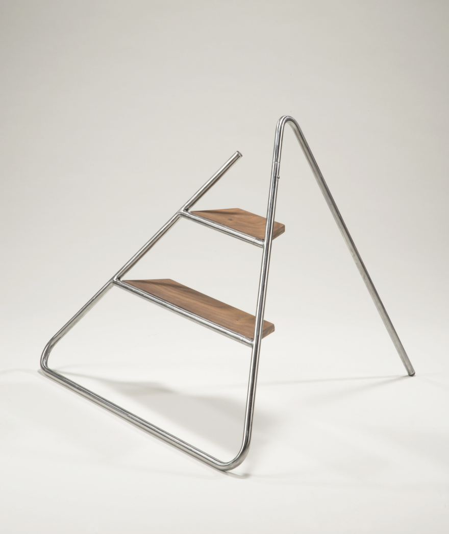
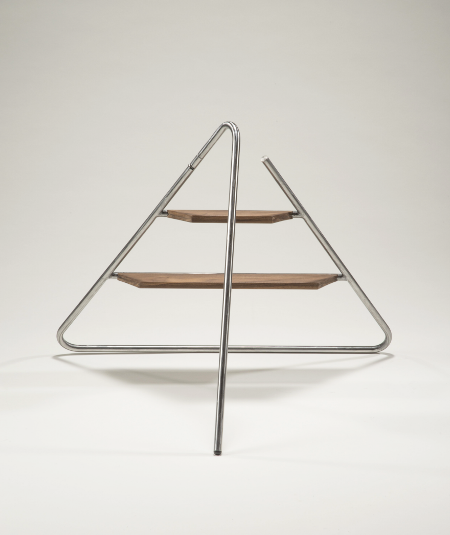
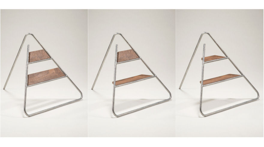
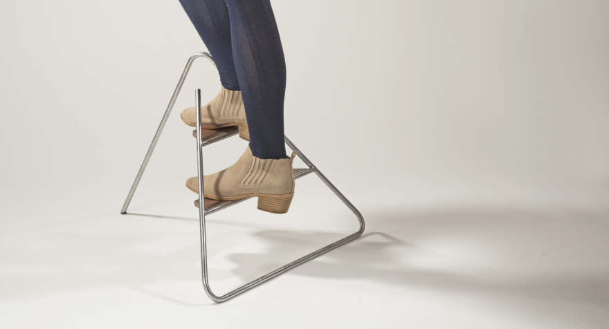
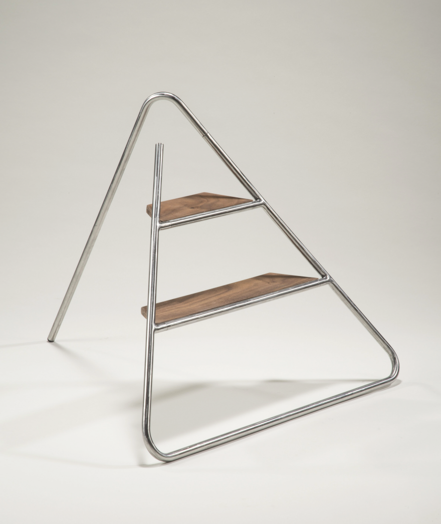
Reader Submitted: Triangle Step Ladder: An Aesthetically Pleasing Step Stool
Everyone needs a little lift off the ground no matter how old or how tall. However, step stools for children are static and stepladders for adults are massive or aesthetically unpleasing - both take up too much space and are not practically designed.
The objective the Triangle Step Ladder is to create a functional and practical stepladder for everyday use. Triangle Step Ladder was inspired by extensive wire model explorations of 2D linear forms transforming to 3D structures with a rotational point(s).
Triangle Step Ladder is composed of very simple and basic mechanisms to easily use in daily life. Made from walnut and 1/2" steel tubing, Triangle Step Ladder is highly durable to be used and stored as a timeless object in the household.
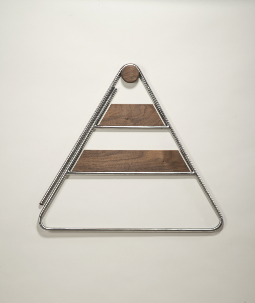
On the wall
The knob can be mounted on the wall to hang the stepladder.

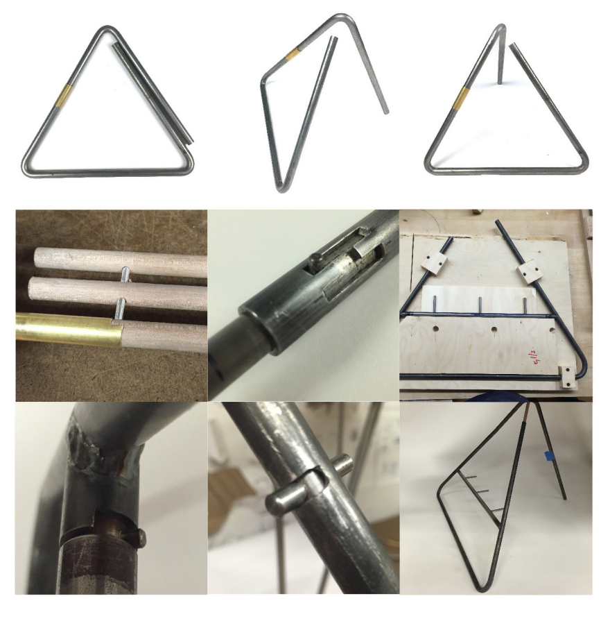
Ideation
Made various models to test out the mechanism and how different parts can be made
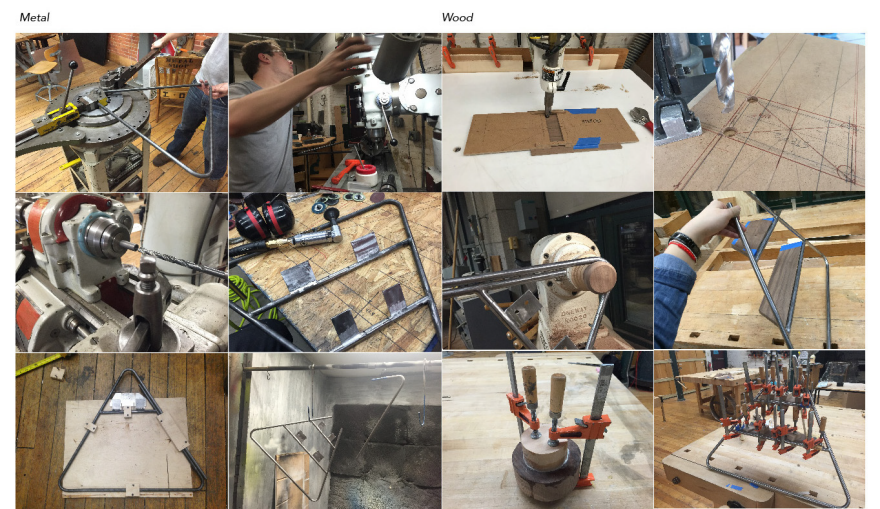
Fabrication
↧
How Can Design Consultancies Track Down Clients?
This week we bring you our pressing topic of the moment straight from our reader-driven discussion boards! A recent topic brought up by chriscarter inspired us to ask our larger audience: what are some good tips for consultancies and small studios in the business of design? Carter gets the conversation started by asking:
"Following on from the discussion on 'who does your sales', I'm really interested in finding out about methods of generating leads and new business. What are other Core77 members' experience of this?
In the small consultancy I work for, part of my remit as a senior member of the design team is to bring in new clients. So far I have succeeded in winning work through a previous employer for a large engineering company. I have attended trade shows and connected with lots of people in various companies we would like to get business in. Is the best approach once you have a connection to simply call them up occasionally to see if they need design support? Is cold calling a successful approach to winning business? I imagine this is a numbers game, whereby you need to contact a number of people before you get a warm lead. What other methods are applicable?
Also, it would be interesting to hear others thoughts on digital marketing strategy. How effective should a consultancy's website / social media be at attracting new business inquiries? Should the website be seen as a key tool to attract new work, or more of a placeholder with which to direct a connection once the initial contact has been made?

This Core77-er's inquiry encouraged a number of different answers. Below, we list a few of our favorite suggestions:
Keep your friends close
"1. Retain [your] current clients. Don't let them jump ship.
2. Networking through current clients. Nothing better than getting a recommendation from a colleague. Works best with larger businesses with multiple business units."
- iab
"Let your contacts know you are there. Send New year's wishes, newsletters, and sometimes just call a contact to ask for information or advice about something."
- ralphzoontens
Web networking is just as good as IRL (if not more)
A trade show always feels like a physical instance of a website to me - only sporadically I have made any true connections there. [My] advice is to show people that you want to work with them. At trade shows have pens and markers ready, participate in events where possible, do small workshops and demonstrations even if they are extremely simple.
- ralphzoontens
Get involved in the design community
Participating in design contests and exhibitions, even if only partially related to your work, can be very fruitful in establishing connections and generating new business. See if you can talk to the organizers, they usually are the ones who know many people, including those high up in the organizations.
- ralphzoontens
We want to hear your thoughts—what are your tips for landing great design gigs? Share your advice in the comment feed below!
(Also feel free to check out the original post and contribute on our discussion board!)
↧
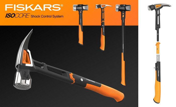
Red Dot Award Winning Tools, Part 1: Old-School and New Age Hammers
Two hammers were among the tools that received Red Dot Awards this year, and they could not be more different. How different can two carpentry hammers be? Not much in terms of their parts; each has a handle, head, striking face, and claw. But the design philosophy behind them can vary greatly, as it did with the Fiskars and Picard hammers below.
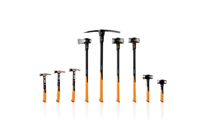
Long known for scissors, rotary cutters, and gardening shears, Fiskars only recently got into striking tools. Their new IsoCore line includes multiple hammers, mauls, and sledges—as well as a pick. Starting from scratch, they were able to incorporate much of the latest thinking into the design of these tools. The goal was to produce tools that are durable, ergonomic, and cool-looking too (kudos to Colin Roberts for his interpretation of Fiskars' design language).
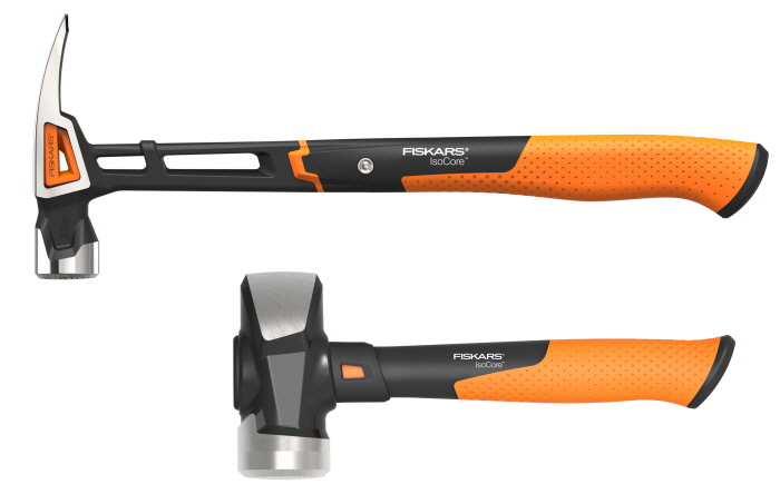
Durability is largely a function of the materials chosen for handles—steel for hammers and fiberglass for mauls, sledges, and the pick. There's no chance the head of the hammer will loosen or come off because the head and handle are forged from a single piece of steel. Openings through the head and handle give Fiskars' hammers a distinctive look and redistribute weight by "removing" material from where it doesn't need to be.

The handle is configured like a truss so the openings don't weaken it.
The ergonomics are a function of the shape and balance of the tools, and the materials chosen for grips. Fiskars devised a multi-piece hammer grip with a polymer (plastic) inner layer, a metallic middle layer, and a rubberized outer layer—which are said to work together to reduce the amount of vibration transmitted to users' arms. Vibration is bad because over time it can contribute to repetitive motion injuries such as tendinitis and carpal tunnel syndrome.
Fiskars stuck with tradition when it came to weight, making 16-ounce models for finish work, 20-ounce models for general carpentry, and 22-ounce models for framing.
 At 15 ounces, the Stiletto Tibone (left) and DeWalt Mig Weld model (right) are lighter than traditional framing hammers.
 A less traditional approach would have been to lighten these hammers by three to seven ounces and make up for the consequent loss of striking force by relying on a faster swing. The best known proponent of this philosophy is Stiletto, the originator of the titanium hammer. In recent years, large companies such as DeWalt have adopted this strategy for some of their striking tools. Still, most hand tool companies continue to offer only "traditional weight" hammers.
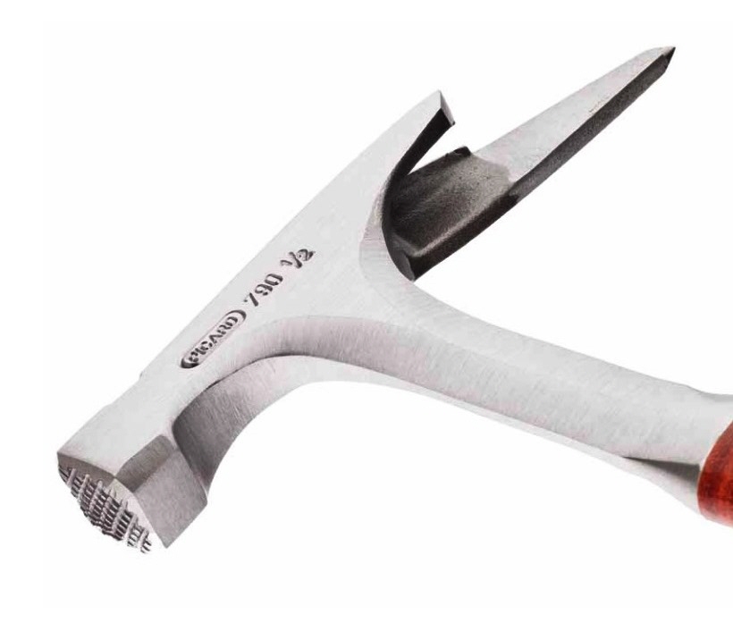
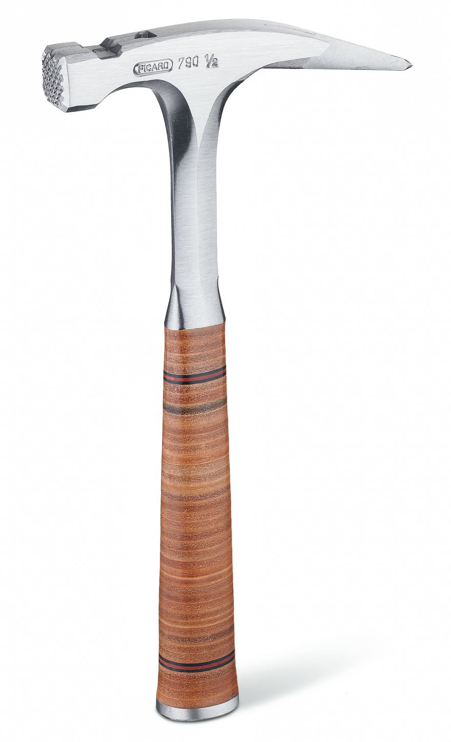 Picard 790 1/2 Latthammer
The Picard 790 1/2 latthammer is an example of a highly evolved traditional design. A lighter version of an existing model (790), its solid steel forging and leather grip remind me of an Estwing hammer I used as a finish carpenter. Retro 25 years ago, leather grips have long since given way to ones made from rubber or plastic.
 Said to adjust to the shape of the user's hand, a leather grip is made by slipping a series of flat leather "disks" over the metal shaft of the handle. A metal cap screwed to the bottom to holds the disks in place.
A latthammer (German for carpenter's roofing hammer) has a square face, a point that extends from one side of the claw, and frequently a magnetic nail starter.
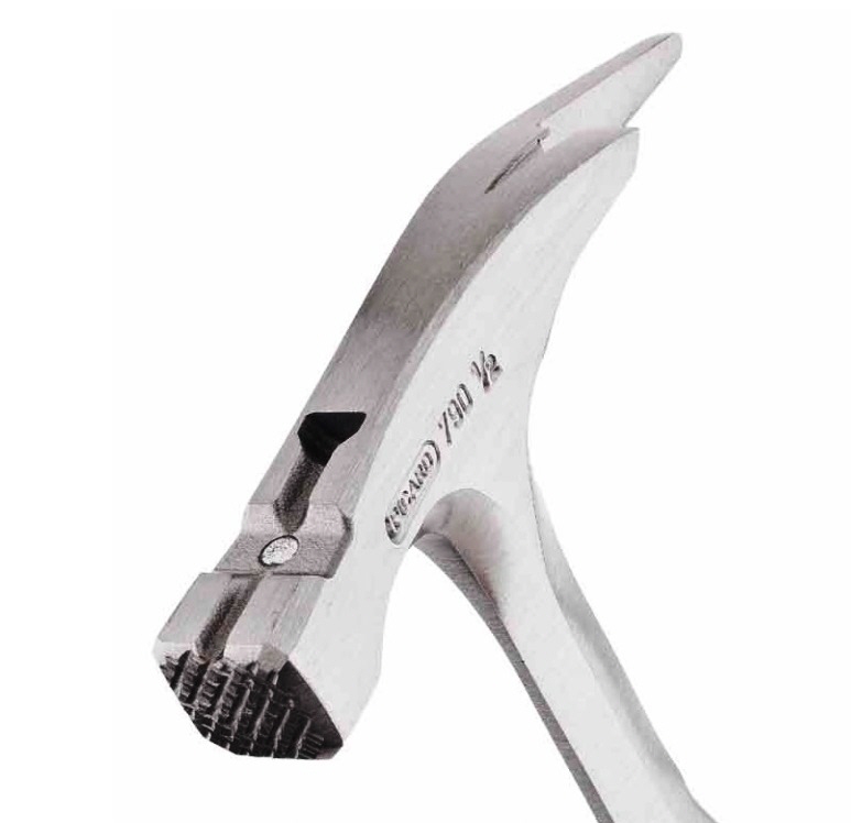
The square face makes it possible to nail closer to inside corners. This hammer is for framing so the face is milled. The face would be smooth if the hammer was intended for finish work. A magnet recessed into the slot on top will hold a nail long enough for the carpenter to start it one-handed.
One of the defining features of a latthammer is the point extending from the back of the head. The point can be used for tasks such as chipping and scraping, and making holes in slate roofing tiles. The claw is shorter than that of American and English Pattern hammers but it's all there and it works.
As for why this is referred to as a roofing hammer, it's probably because most German homes are masonry and the one part of the structure that's sure to be framed from wood is the roof.
↧
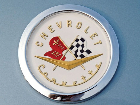
A Visual History of the Corvette Logo
Few American-made cars have inspired motor-headed children and teenagers like the Chevrolet Corvette. Originally introduced in 1953, the venerable 'Vette has gone through seven generations of stylistic changes, and the current model would be unrecognizable to the crowds that flocked to see it at its debut 63 years ago. What do you reckon they'd make of the Corvette's logo changes? And which is your favorite?
Original 1953 Design
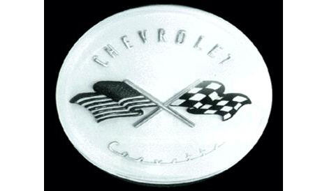
When Chevrolet was preparing their new Corvette sports car in the early '50s, the task of designing the logo fell to Chevy interior designer Robert Bartholomew. Bartholomew's design featured two crossed flags: One, the checkered flag that symbolized race victory, the other, the American Stars 'n Stripes.

Last-Minute 1953 Re-design
However, using the U.S. flag for commercial purposes was illegal. Chevy execs nixed it just four days before the car's unveiling; you can picture Bartholomew sitting at his drafting table going goddammit.) His last-minute replacement was a flag sporting both the Chevrolet logo and a fleur-de-lis, a French symbol that was reportedly part of Louis Chevrolet's family crest.
1953 Actual Design
New badges were whipped up based on Bartholomew's drawings, and the Corvette debuted in 1953 at New York's Waldorf-Astoria hotel, sporting this badge.
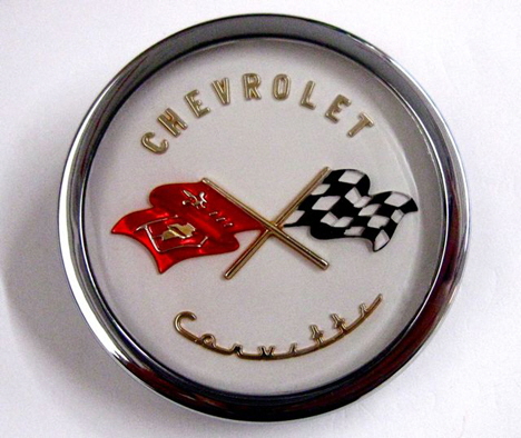
1956 Modifications
Bartholomew's design stuck around until 1956, then underwent multiple tweaks and changes throughout the years. Amassing a photo list has proved trickier than expected, as there were multiple emblems for the hood, tail and fenders, but we've tried to put together a visual chronology focused on the nose badges. In 1956 and '57, the Chevrolet chevron was added to the design.

1958 - 1961
In 1958 we see a typographic update that persists until 1961.

1962
In 1962, the letters were removed from the circle leaving it more Spartan-looking.

1962
The letters didn't go far, by the way. They were simply taken out of the logo and spelled out on the hood of the car instead.
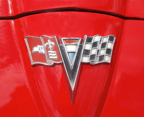
1963 - 1964
1963 brought an interesting change: The American flag is sort of snuck back into the logo (though the French would probably see a Tricolor). The circle is also dispensed with, as the logo is now shaped to follow the pointed "nose" of the new '63 body design.
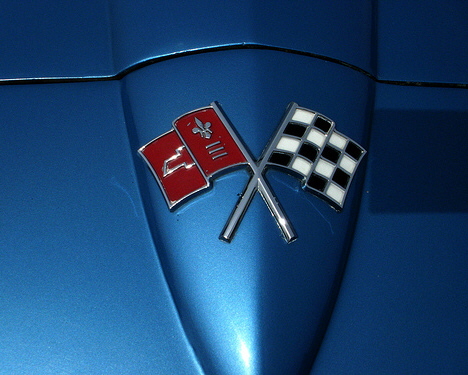
1965 - 1966
In '65 the logo goes even more minimalist, dropping the fluff and keeping just the flags.
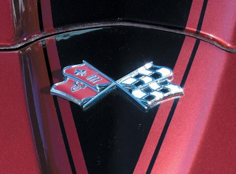
1967 - 1972
In 1967 the flags get an angle change, and the flagpoles each disappear into the bottom of the opposite flag. This reeks of cost-cutting and I find the design ugly. But it would remain the same until 1972.
↧
↧
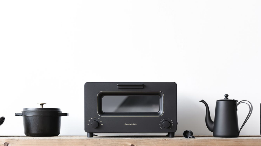
Why Does This Toaster Have You Pour Water Into It?
We're always tickled by the obsessiveness of Japanese product designers, specifically the ones who create objects that monomaniacally perfect a single task. But this here is the first one I've seen that I actually want to buy—and it's a $230 toaster.
What it does is make absolutely perfect toast, using a not-so-secret ingredient: Water.


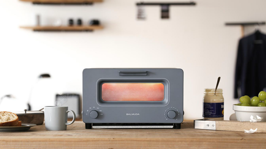

Inventor Gen Terao, who runs a small appliance manufacturing firm outside of Tokyo called Balmuda, stumbled upon the importance of water in toastmaking quite by accident—and it was all due to lousy weather. As Bloomberg explains:
It was at a company picnic on a rainy day, warming bread on a grill, that company founder Gen Terao and his band of product designers accidentally made great toast. After the showers stopped, they tried to reproduce it in a parking lot and realized that water was the key. Thousands of slices later, they figured out that steam traps moisture inside the bread while it's being warmed at a low temperature. The heat is cranked up just at the end, giving it a respectable crust.
"The best results are with croissants," said Mark Oda, who works on web and media content in Tokyo and was among the first to buy Balmuda's toaster. "I can never go back to 5,000-yen toasters."
Sales have been brisk to the point that they've outrun the manufacturing; Gen can't keep up with his shipping target of 10,000 units a month. And, disappointingly, he has no plans to begin selling the Balmuda Toaster in Europe or the U.S.
Gen, if you're reading this and worried about not being able to fill orders, listen to me: Start a Kickstarter. I've seen far crazier things funded and can almost guarantee you'll have eager pledges for a small production run, high price be damned.
Lastly, for product designers who serve the Japanese market, there is a lesson contained within the article:
"Consumers are embracing gadgets that do one thing well," said Hiromi Yamaguchi, an analyst at Euromonitor in Tokyo. "Larger appliance makers are selling products with too many functions, and not a lot of people use them."
↧
Design Job: News You Can Use! The Atlantic is Seeking a Creative Director in Washington, DC
The Atlantic, a brand with a 159-year heritage of outstanding writing and design, is seeking a Creative Director to oversee art direction across all its editorial platforms—including the magazine, the website, video, mobile apps, and live events. Position in Brief Reporting to the Editor in Chief,
View the full design job here↧
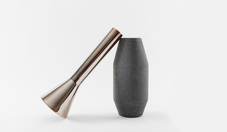
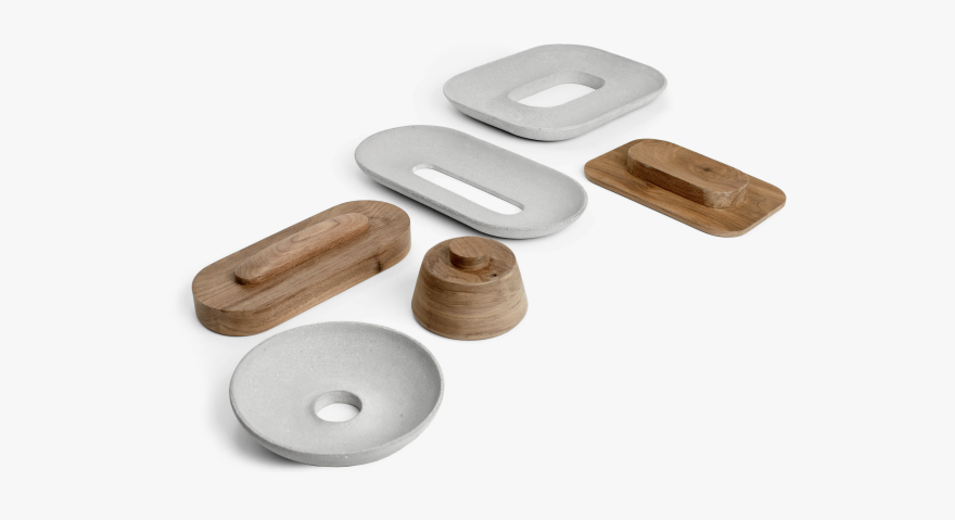
Surprisingly Airy Concrete Housewares
These simple homewares use material interplay with little fuss but a lot of gravity. The series uses interfacing concrete, metals, and hardwood, pairing warm and cool, dense and light. Designed by La Selva Studio for Mexican homeware brand Más, the series was first debuted at Salone de Mobile and is now in production.

The Radial vases feature hefty bases and turned metal collars, highly reflective on the outside and blackened matte within. The shapes vary on an angular oblong theme, with a sharp trumpet opening that would frame dramatic arrangements well.

Rather than permanently integrating the materials, the flared funnel-shaped collars are easily removed to make filling the base with water easier. You could also leave them off to vary the appearance of your vase-scape if you get bored with your angular options.
Similarly paired are the three Flota display trays, made from cool concrete tops with peek-through bases of warm walnut and oak. The tops and bottoms separate for easier cleaning, and could be used for personal or centerpiece use.
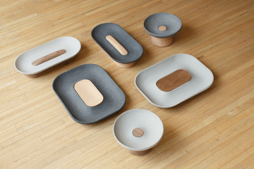
Without hands-on experience I have to wonder whether the two-part design would feel secure enough to move while full. But as stationary objects they're certainly lovely.
The Tenue plates are slim 6mm thick concrete slabs, reminiscent of both traditional stoneware and foodie-favorite slate serving trays. Their thinness tests the normal bounds of concrete, and the sizes range from comfortably handheld to large statement platter.

While concrete homeware is hardly a novel idea, these simple pieces add a bit of cleanliness and haptic interest. The series also includes an angled candle holders with elegantly matched candles, inspired by architect Félix Candela.
For more info, check out La Selva's portfolio here.
↧
The Wave of the Future: Mobile Gas Stations That Come to You

Years ago I heard an older Briton explaining how, as a child, the tales of his first visit to America shocked his English friends at home. "In America you can get a pizza delivered to your house," he told them.
"WOT?" they said. "You mean, ready to eat?!?"
Here in NYC you've long been able to get everything delivered to your door, from Ukrainian desserts to books to illegal drugs hidden in a pizza box. Across the country, Amazon has now acclimated everyone to having anything delivered. Where we once went to stores, we now wait by the buzzer. But if there's one thing I never imagined being delivered, it's gasoline.

Not to your home, of course. But now a rash of startups armed with pickup trucks and smartphone apps will deliver gas directly to your car's gas tank, topping it off when you're not even there. Whether it's parked outside your house overnight or sitting in the parking lot at work, you can leave it empty and come back to it full. Once you've joined their app and hooked up a payment system, you just punch in the desired time and leave your gas door open.

There are at least six players in this market:

Yoshi charges "no fees other than the cost of gasoline" for non-members, though it's not clear how they peg their prices; members who pay a $15 monthly fee pay prices "set to be competitive with the lower priced gas stations in the area." They cover Atlanta, Nashville and the San Francisco Bay area.

Filld charges "the lowest price of the three stations closest to you plus a small delivery fee, typically $3." They cover Silicon Valley and San Francisco.

WeFuel charges a $7.49 fee per fill up and covers Los Altos, Menlo Park, Mountain View and Palo Alto.

FuelMe charges "a small delivery fee," which sounds fishy since that takes longer to type out than a dollar sign followed by a number. Also, bizarrely, their website doesn't even mention what parts of the country they cover.

Purple offers prices "competitive within the average fuel cost in your area," and charges a $6 fee for gas delivered in one hour, or $4 for a three-hour window, their only two options. They're serving Los Angeles, Orange County, San Diego and Seattle.

GasNinjas has the most insane pricing: "We're offering free delivery and you pay the same price as at the pump," they claim. Their only region is Miami.
It will be interesting to see which one comes out on top, if any. I for one like that there's at least a half-dozen players all battling it out; competition is good for consumers and it helps keep the economy stimulated.
I'm certain there's a subset of drivers willing to pay for the convenience of not making a trip to the station, the "time is money" crowd. And services like these will presumably also appeal to people who work late and don't like the thought of driving into a sketchy gas station after hours.

As for how the companies themselves make money, it appears they buy their gasoline wholesale and in bulk. But it's not clear if one will become more profitable than another, nor even if any of them will survive; as with earlier disruptive businesses like Airbnb and Uber, lawmakers have yet to get a handle on what is and isn't quite legal.
For instance, Bloomberg has reported that several months ago, Fire Department officials began poking their noses into these unregulated trucks driving around and dispensing gasoline, apparently didn't like what they found, and made proclamations like "It is not permitted," from a San Francisco Fire Department spokesman, who urges anyone witnessing these refueling acts to drop a dime on the perpetrators.
An L.A. Fire Department Captain was a little more conciliatory, saying that "at this time is it's not allowed as per our current fire code," but that they "are exploring a way this could be allowed with some restrictions."
Chris Aubuchon, Filld's CEO, had the best (and most Silicon-Valley-esque) quote: "You can never ask for permission," he said, "because no one will give it."
↧
↧
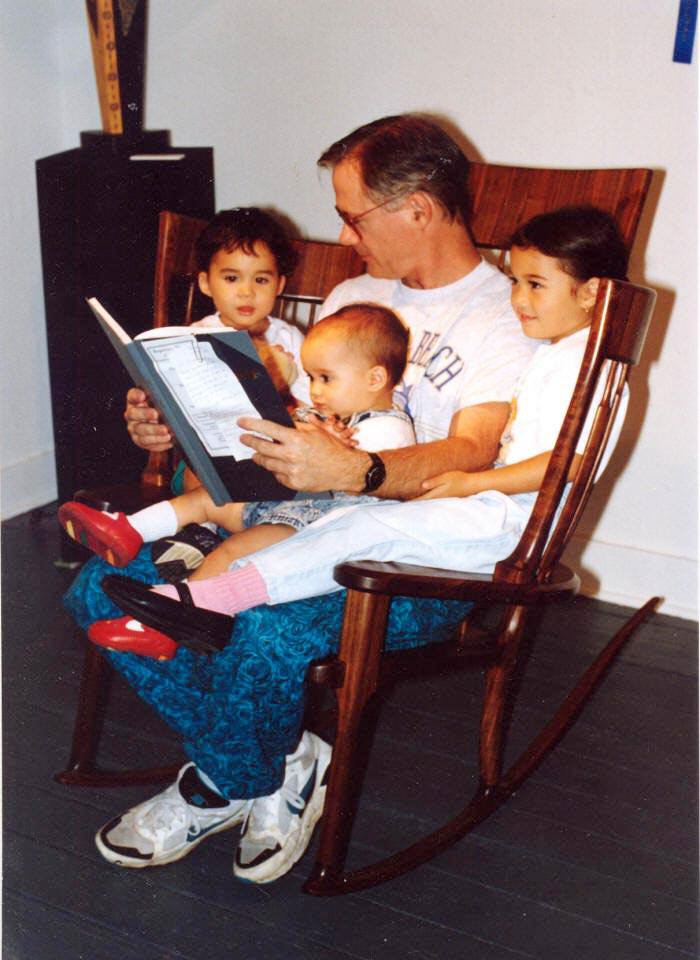
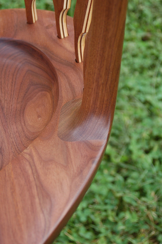
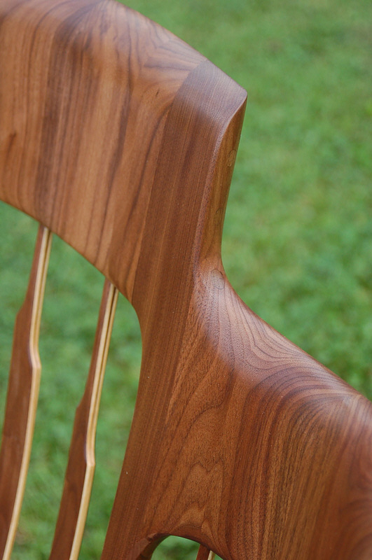
A Rocking Chair Designed for Reading to Multiple Children
We don't often see a classic form factor receive an upgrade that looks like it will stand the test of time. But rocking chair master builder Hal Taylor has pulled it off with his StoryTime Rocking Chair.
As many fathers do, Taylor got into the habit of reading books to his first child. When his second child came along, he found he was able to fit both of them in his lap while reading to them in one of his rocking chairs. But when child #3 came along, he ran out of lap real estate. "[I then] thought, 'Well, I make rocking chairs, I can figure this thing out!'" Taylor writes. Here's what he came up with:
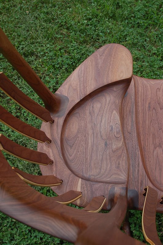
Taylor now produces and sells his StoryTime rockers, which are marvels not only of design and engineering, but craftsmanship.
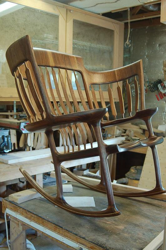
They are both labor- and material-intensive and prices run from $7,000 to $7,500. We dig that he takes the time on his website to explain the cost:
"WHY DOES IT COST SO MUCH!"
 "Every piece of wood in the chair is carefully matched! The seat is bilaterally symmetrical as you can see from this photo, The joint is perfect because it is hand planed, which takes time."
 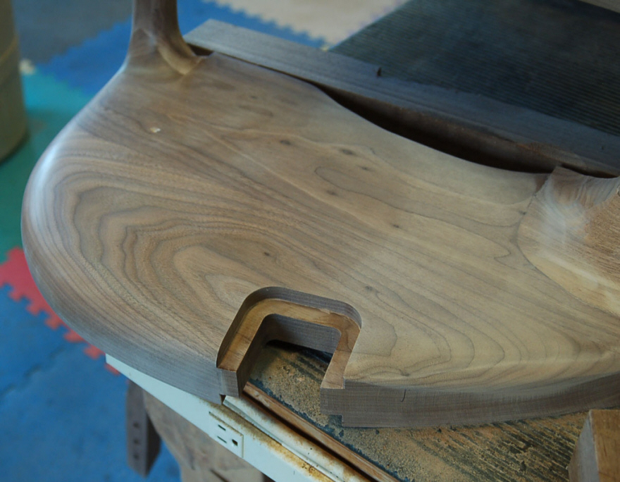 "The joints in this chair, there are six just like this, are quite complex and it takes time to make them perfectly. No chair leaves my shop without perfect joints as you can see below!"
 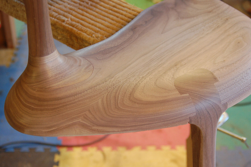 "This is the finished joint from the photo preceding."
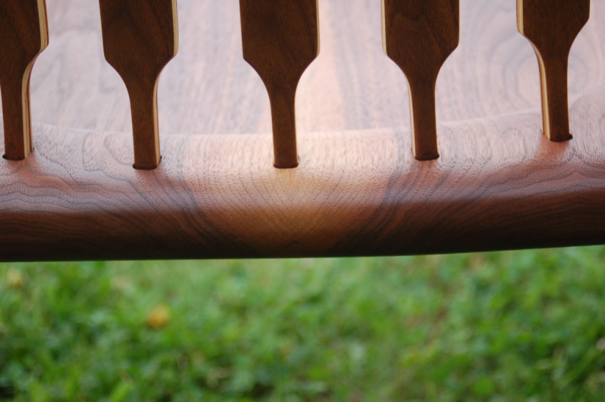
 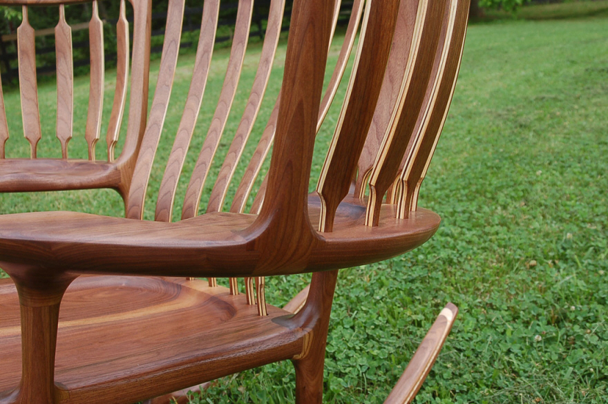 "If you take a close look at the back braces you will see that they are made out of multiple strips of wood. There are over 200 precisely cut and shaped pieces of wood which I use to make up the 19 back braces! That is more pieces than you will find in 20 normal rocking chairs and this is JUST FOR THE BACK BRACES!"
 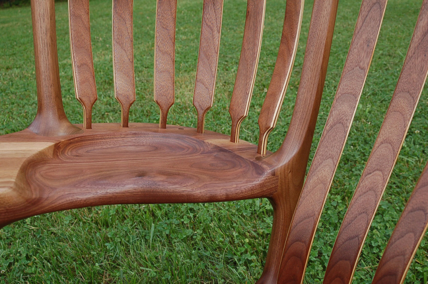 "As you can see in this photo all of the back braces match, looking like twins. I accomplish this by cutting the back braces sequentially from the same carefully selected board."
 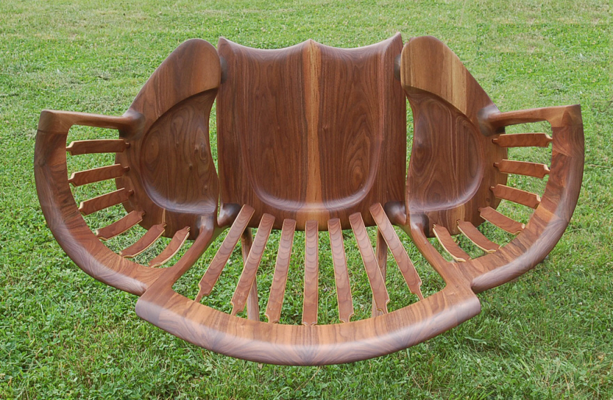 "Every board in the chair is matched to the one next to it. In order to fabricate the three headrests I have to cut 18 separate 5" by 8" billets, cooper the edges (like a barrel) plane the edges by hand and glue them up two at a time. This is how I am able to achieve the amount of curvature in the headrests. If I made a chair like other folks all of the back braces would be straight!"
 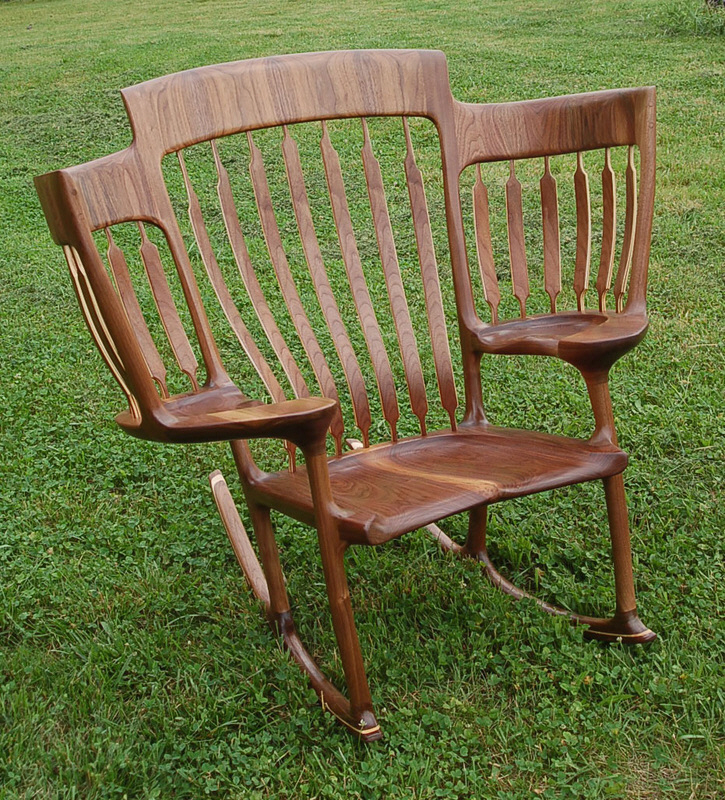 "In order to fabricate one of these chairs I have to cut 262 separate pieces of wood. You can see from this photo how the headrest grain matches, the back braces match and so on. There are 27 pieces of wood in each rocker (the parts that touch the floor) which also match perfectly!"
 "My regular rockers (non StoryTime) sell for five to six thousand dollars," Taylor says. "Looking at that price, it makes the StoryTime, which is almost twice the work, look like a bargain. I have been making rockers since 1992, about 24 years as of this writing.
"Is it a lot of money—YES but ask yourself this question. 'Of all of the things I have spent money on in the last 20 years, how many of them will ever be used by my great grandchildren?' This chair will!"
↧
A Hospital Cabinet Engineered to Avoid Germs

The backless hospital beside cabinet eliminates hard-to-clean areas by using a continuous rotationally moulded form, with smooth surfaces and no joints, junctions or sharp corners to harbor germs.
View the full content here↧
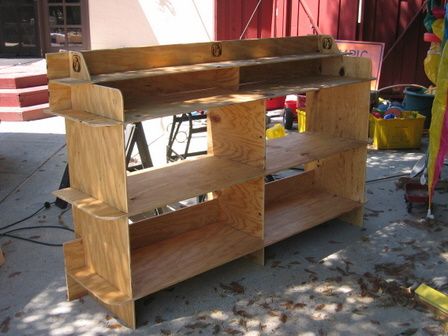
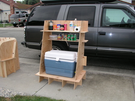
Tools & Craft #8: Rapidly Deployable Lifestyles, Built With Your Own Hands
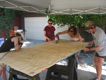
Those of you that went to ID school learned to make things with your hands. For those of you that didn't, or for those of you that did and miss having access to a full shop, this post is about simple furniture that can be easily built—even if you only have very basic tools.
Remember that the path to craft is multifaceted, as is the satisfaction of making something useful with your own hands. Don't let a lack of equipment or instruction stop you, and don't be intimidated by what you see master craftspeople doing. While you can have loads of fun and satisfaction learning fine woodworking, it's also gratifying to make utilitarian stuff quickly and easily.
Summertime provides a great excuse for this latter bit. Here's why.
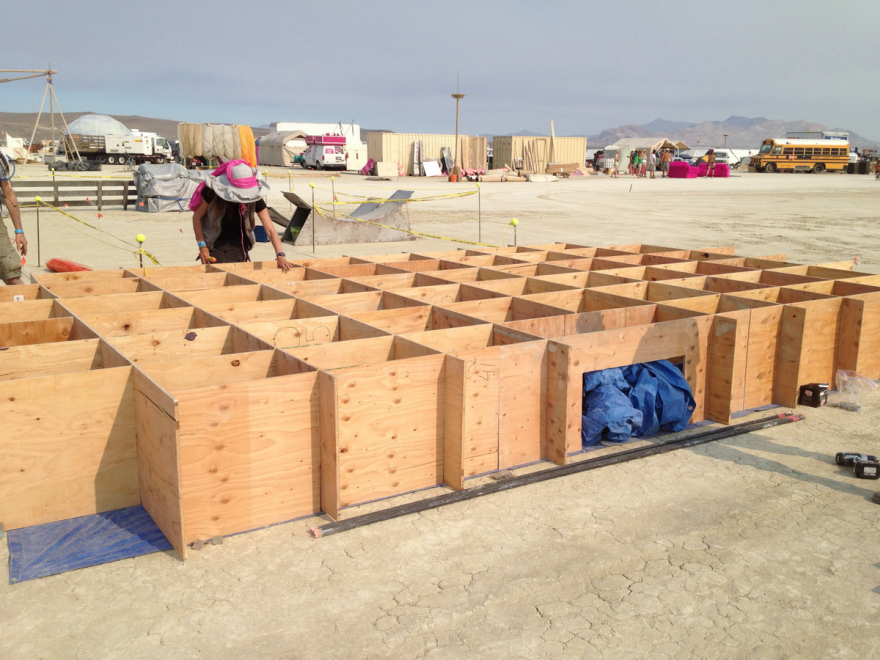
Every year thousands of people, including some friends of mine, go off to Burning Man in the Nevada desert. They come every year, build a city, enjoy the event, and then take the city apart, leaving no trace. Before they depart, tons of furniture will have been quickly built using plans from an organization called Playatech.
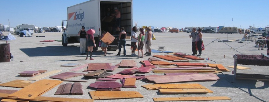


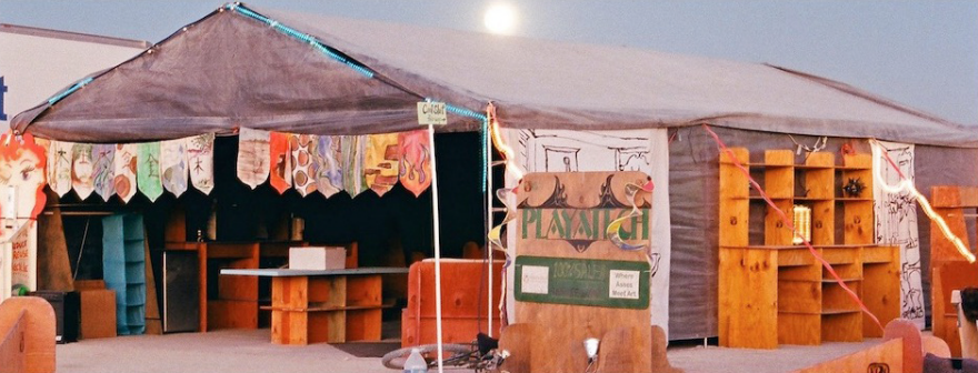
Playatech's motto is "Better living through art" and their catchphrase is "Rapidly deployable lifestyles." To those ends, the company sells plans (ranging from free, to $5, to $10, to $35 for their most elaborate) for simple knockdown furniture that you cut out of plywood and slot together with no fasteners; it's "a complete line of DIY period furniture for the 21st Century maker," in their words.
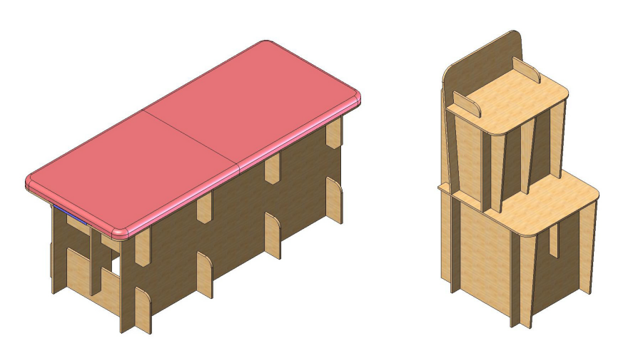
Here's a link to some of their chairs. They're easy to build, clever, modern-looking, and while they may not be as elegant as a Windsor chair—which was designed for mass production using hand tools—they beat the pants off of sitting on the floor.
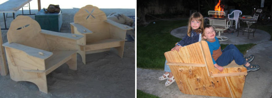
These are all great summer projects where you can quickly get something made for yourself, your kids, gifts for your friends, your summer bungalow (if you have one, I don't), or as a flatpack project you can easily transport to the beach or a cookout. And painting them can be a fun outdoor project. So go ahead. Make some stuff and have fun!

↧
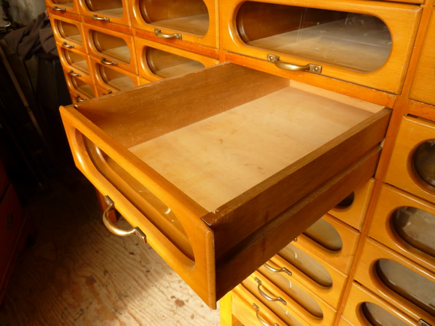
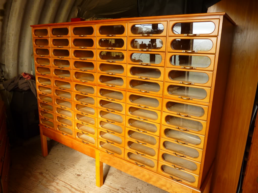
Unusual Furniture Designs: This Haberdashery Cabinet is What Clothing Storage Should Look Like
It's crazy that you're reading this on something that has more technology than the Apollo 11 mission computers, yet you store your clothes in an object whose form factor was designed several centuries ago. The chest of drawers is a completely outdated piece of furniture, yet it is something nearly all of us own, and among the first things people buy when setting up their first apartment.
First off, think of how poor the functionality of your standard dresser is:
Items are stacked and viewed from the top.
You take your freshly-laundered clothes, fold them, and place them in stacks within the drawers. This is the dumbest way to store a collection of items you may want to browse through. There's a reason that file cabinets are designed to store documents vertically; imagine digging through a horizontal stack of paper to find the one you want.
Retrieving an item disturbs the stack.
You go to your dresser to retrieve a particular item of clothing. Unless the target item is right on top, you must root through your stack of clothing. Do you take the time to neaten up the stack each time you retrieve something from the bottom?
No visual signifiers of what's inside.
I'm guessing most of us follow the established order of:
Top Drawers- Underwear & Socks
Middle Drawers- Tops
Bottom Drawers- Pants & Bottoms
Even still, it would be more convenient to see precisely what's within each drawer.
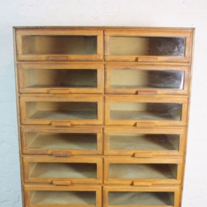
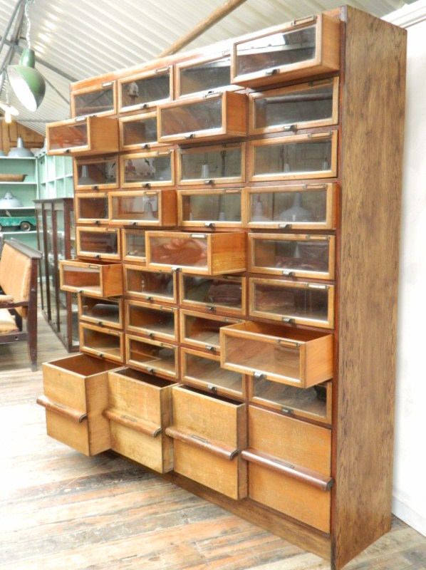
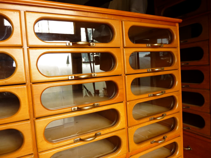
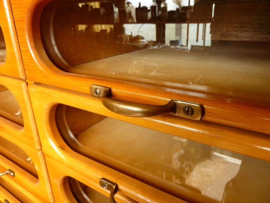
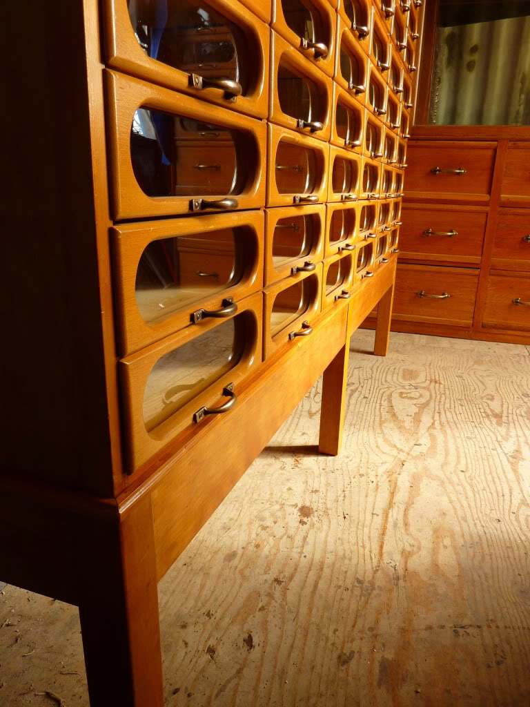
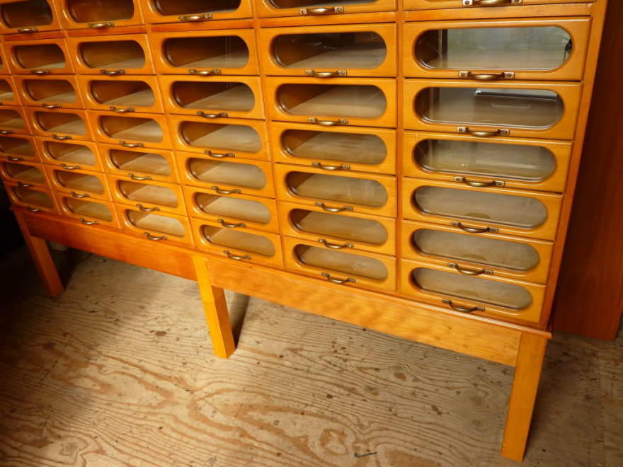
A Better Design: The Haberdashery Cabinet
I've seen a number of these over the years, but this is the handsomest I've come across.
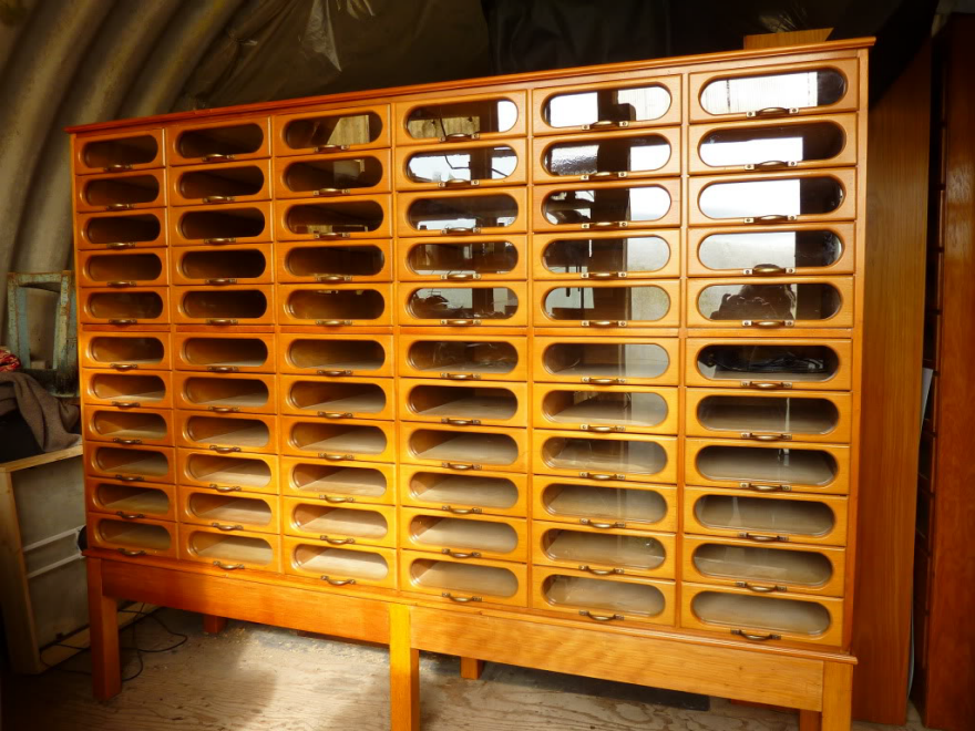
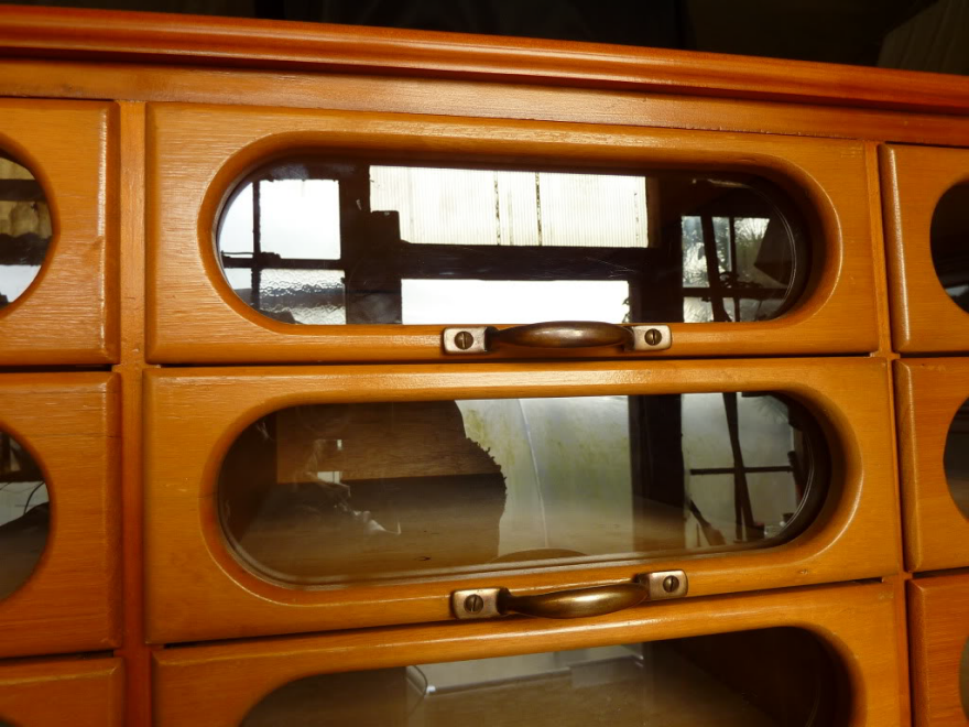
Being designed for a retail environment, efficiency is key, and thus it features the window-fronted drawers that all haberdashery cabinets have.
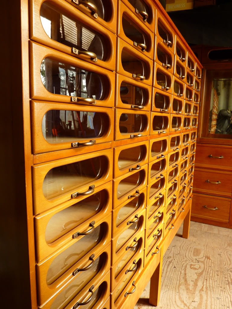
This one, however, is a midcentury piece, and the windows have been framed within a racetrack-shaped aperture in the drawer face.
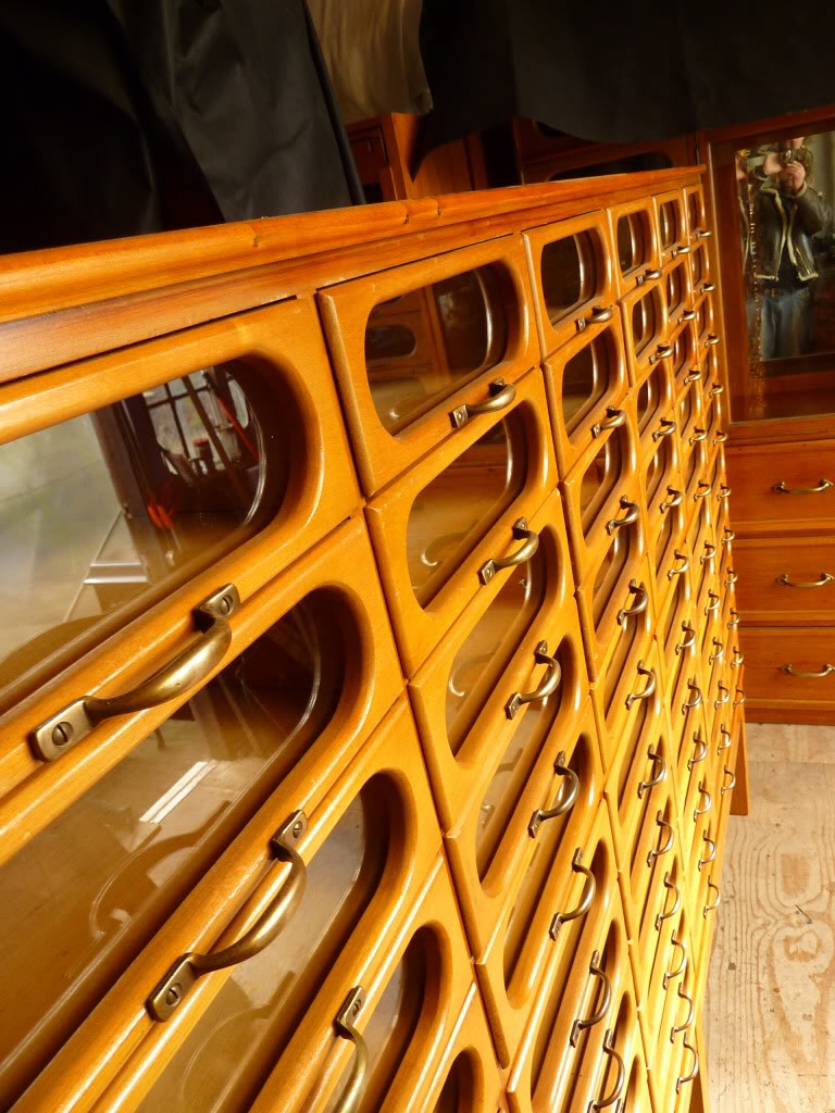
It's a damn sight better looking than the rail-and-stile construction of the average glass-fronted haberdashery cabinet drawer face.
It is also, of course, more wasteful. Consider that the rail-and-stile economically uses thin strips of wood, which could conceivably even be offcuts.
Meanwhile the one pictured here has a singular piece of wood with the racetrack cut out of it. I reckon 75% or more of each drawer face ends up in the burn pile.
But it does address each of the three problems mentioned above. You would easily be able to see what's within each drawer, and swiftly retrieve the item you wanted.
It's not a perfect design, of course. We can see here that glare could be an issue.
Not to mention that if had one of these and used it the way I'd prefer to, which is storing a single item within each drawer, that's not exactly space-efficient. This unit here measures 69 inches high, 84 inches wide and 22.5 inches deep.
While the manufacturer is unknown, they obviously took pride in their work and paid attention to detail. Note the "clocked" screws on the handles, each arranged with their slot vertical.
As for why clothing dressers don't look like this, the answer is obvious: It would be way too expensive to make them this way, from both a labor and materials perspective.
Speaking of cost, this model was up on eBay in the UK and sold for £2,995 (about USD $3,920).
↧
↧
Wise Technology and Stories from a Parallel Universe at the 2016 Core77 Conference
Storytelling is a powerful tool in any discipline. But in the realm of design, storytelling is an integral part of the practice with applications across all phases—from defining the problem, research, prototyping to communicating ideas to the client. At this year's Core77 Designing Here/Now conference we're focusing on new strategies for storytelling as part of our theme on how design-led co-creation will lead interdisciplinary teams to build successful, game-changing products of our near future.

A born storyteller, Eames Demetrios is an author, filmmaker and director of the Eames Office where he communicates, preserves and extends the work and design heritage of Charles and Ray Eames. His current large-scale project is the Kcymaerxthaere, a parallel universe and a global artwork of multi-dimensional storytelling. To date he's installed 123 markers and historic sites in 26 countries on six continents and is currently collecting the works in a print volume after a successful Indiegogo campaign earlier this year. [Read more about the book here.]
In anticipation of Demetrios' upcoming talk about "Experiencing Wise, not Smart, Technology" at September's Core77 Designing Here/Now Conference, we speak to the storyteller about virtual reality, character development and being the Geographer-at-Large of a parallel universe.
 The gwomes, or nation-states, of Kcymaerxthaere overlaid over our world map.
Core77: What was the initial inspiration behind Kcymaerxthaere and when did you start working on the project?
Eames Demetrios: I thought it would be really cool to be able to visit a story—and not just any story, a work of fiction—even fantastical fiction. As I explored the concept, I realized how powerful it would be to help people see the things that aren't there and, above all, to use that as a playpen and framework for storytelling.
The Project started in 2003, but an early incarnation, which is still part of the project, was a story I wrote in 1993.
Why do you work with physical markers? Could the same level of storytelling happen just through digital means?
I don't think it could. Of course, one could tell the story in lots of ways (and we do have other story vectors too and some upcoming) and, indeed, not everyone will visit every site (or can), but my goal is to make most of the world's population within a day's drive of a site. Because even if you visit only one site, it changes your understanding of the experience.
 "Triangles" is installed 20 miles outside of Deming, New Mexico.
Human beings are so good at context—they bring that context to what they see. For example, it is very hard to look at a red car and only see the color red—that's because your brain tells you it is car before your mind even asks (not to be too anthropomorphic about the brain's workings). So by designing the project so the richness of the experience takes a quantum leap from just one marker, it means that even someone (which would be typical of most of the world's population) who saves up for a year for a 1-day bus ride to a site can have the core experience and encounter the rest online or in a book or in a library or school—informed by the experience of physically visiting. That also becomes a locally-facing experience which complements the outwardly-facing (what you might call cultural tourism) aspect. To tell a story to kids in a small town in Indonesia or Indiana and see their faces light up as they realize that THEIR local story is also installed in Indiana (or Indonesia)—and India and Chile and many other places besides—is fantastic.
As an aside: reading is a fundamentally strange activity. Most (by a huge majority) people see what they are reading, but if you had a camera in your eye, you would be seeing letters on page (or stone). So that means what you are seeing is NOT what you are seeing. We are hardwired to conjure. And that ability will be on a stone in 100 years whereas the odds of any specific digital technology being usable in identical form then is pretty low. I am not down on the achievement of virtual reality as most people think of it, and I am not a Luddite, but I really like wise technology. I don't want to have to run wires to remote places, or require it to have signal (and I complain about bad cellular coverage like everyone else), or build a solar panel to power a wifi node. I'd like it to be waiting and ready.
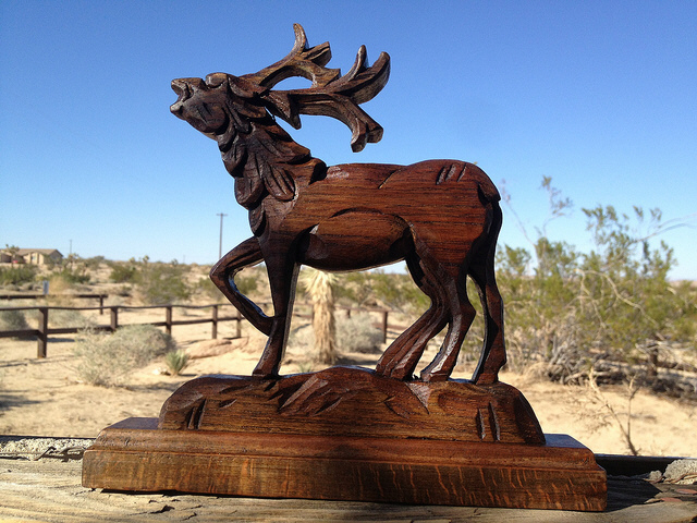 A wood carving from Albania of a gnacien, a seven-legged, deer-like creature.
Kcymaerxthaere has it's own languages, flora and fauna. Why is it important for this parallel universe to have a distinct population different than our own?
I don't know if it is important, but that's just the way Kcymaerxthaere is—or isn't— depending on how you look at it! (Makes it extra fun to be the Geographer-at-Large. And I have always liked to create stories help people imagine what is not there—yet.)
You've been leading workshops around the idea of "Disputed Likeness" where you ask audiences to create representations of a character or creature from the Kcymaerxthaere. What have you learned from the exercise?
I have always been fascinated by the fact that we call create our own images of characters in books. How we can argue over the movie version versus the book (Harry Potter was an amazingly considered example of radically capturing the internalized image of the characters—and yet many people still had their own). But it is not just movies—the image of the Christian Madonna and Child is different in a Russian Icon, an Italian painting, a Kenyan painting, a Mexican mural and a work of outsider art in the US. However, they all look fundamentally the same. Because they represent the same story and a basic shared understanding of that story. Same with the Ganesh image—many different ones. But a child recognizes they are in the same set. Heck, we even argue about who is a better James Bond and that is 6 (or 7—don't get me started) different actual human beings!
 An embroiderer from the Penduka collective in Namibia interprets the story of Eliala Mei-Ning, a singer whose voice was too beautiful to be concealed.
So I wanted the visualization of the world to not even be nailed down 100% — to be precise but uncertain: to be Disputed Likenesses
Besides your recent Indiegogo campaign to create a book, what else can we expect from the project in the near future?
The book (our IndieGoGo campaign) is a huge project—it is a collection of all the markers as of this summer, translated into multiple languages. The idea is give a copy of that book to a library and a school near each Kcymaerxthaere site so that local folks will have access in their own language to the richness of the stories.
Learn more about storytelling and the Kcymaerxthaere at this September's Core77 Conference in Los Angeles. Buy your ticket before July 31st for Early Bird pricing!
↧
Pokémon GO in Real Life
It was a matter of time before somebody did it, and no man better than Casey Neistat on the streets of New York. Here it is, Pokémon GO in real life:
You might wonder why we're posting this here as opposed to merely Tweeting it. It's because I'm mightily impressed with the lunacy that goes on behind the scenes, the combination of logistics, improvising, sweating, pissing off the NYPD, et cetera. However many man-hours you imagine went into the video above, you're wrong:
↧
Design Job: Make Printing a Breeze! HP is Hiring a Mid-Level Industrial Designer in Boise, ID

At HP Inc., we are passionate about reinvention. We believe that technology should make life better for everyone, everywhere. This vision guides what we do and how we do it. From our campus in Boise, ID we are in a relentless pursuit to reinvent business printing as we reinvent ourselves.
View the full design job here↧
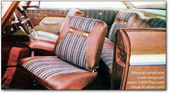
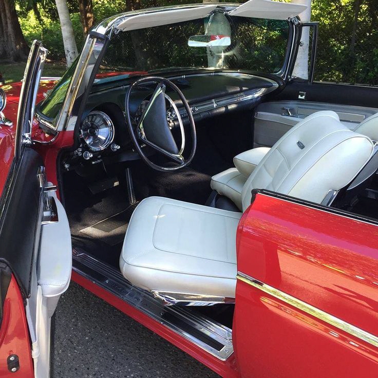
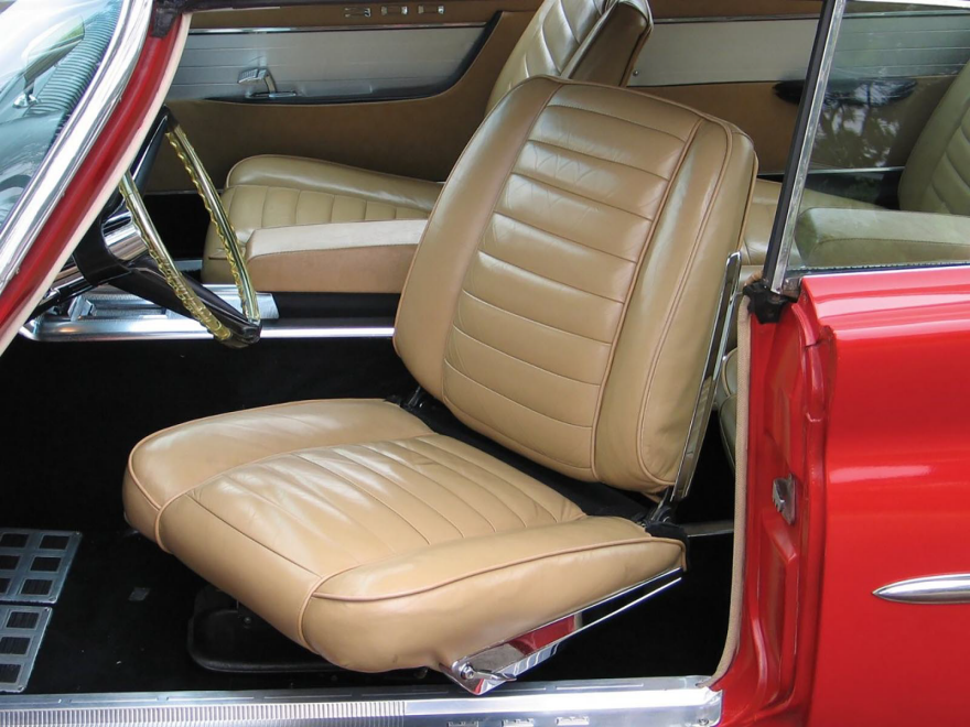
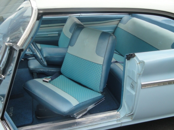
Ergonomic Blast from the Past: Back When Cars Had Swiveling Front Seats
I've often bitched here that cars are not well-designed for getting in and out of. Well, back in the 1950's some unnamed Chrysler designers apparently felt the same way, and designed front seats that swiveled to ease ingress and egress.
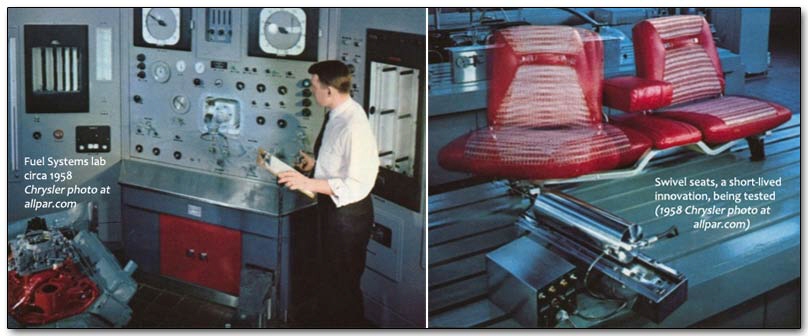
Here we see it offered as a new option on the 1959 Dodge Custom Royal, their top-of-the-line.
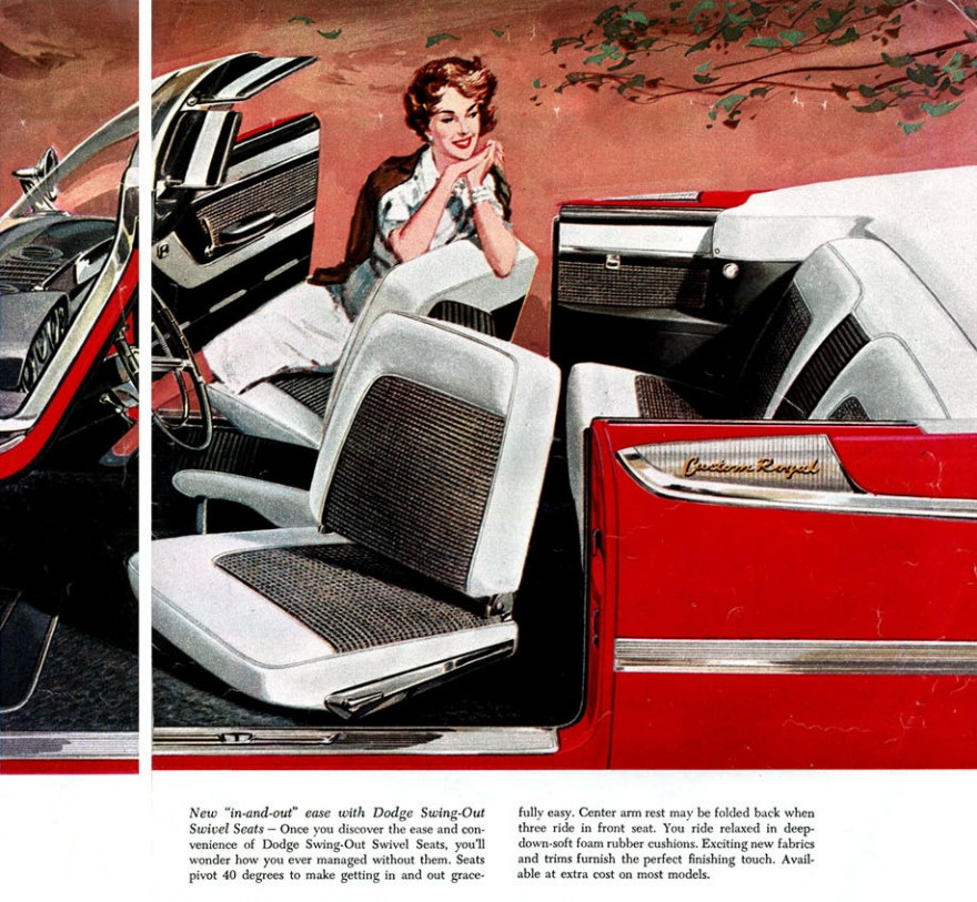
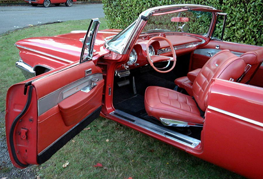
Sister brand Plymouth got 'em too…
…as did the 1960 and 1961 Chrysler Imperials and 300s.
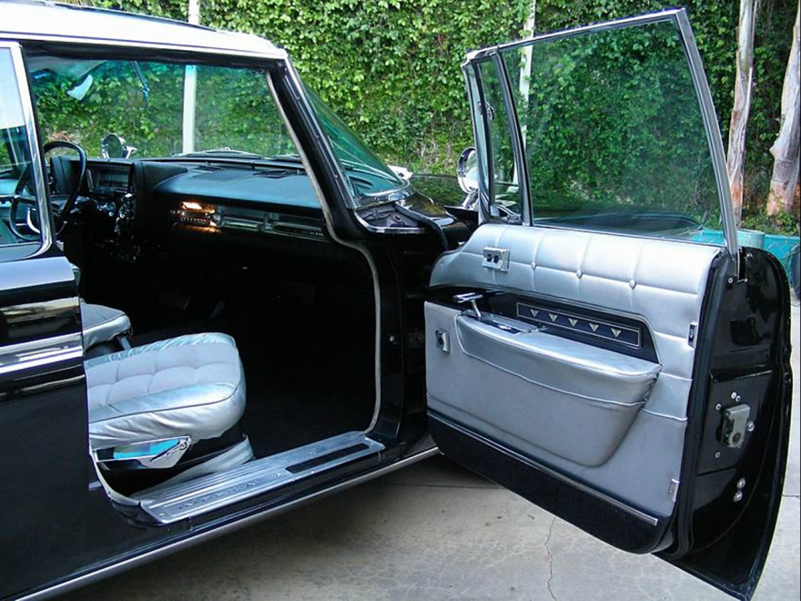
Competitor DeSoto had them in 1960…
…but whatever ad-man they hired touted them not for ergonomics, but for women's dignity. The pencil skirts of the 1950s couldn't make it easy for women to get in and out of cars. They couldn't have pulled a Britney Spears if they tried.

GM took note, and took it even further; the designers of one of their 1961 concept cars, the Buick Flamingo, said "Hell, let's make it turn all the way around." But neither the car nor the seat ever made it into production.
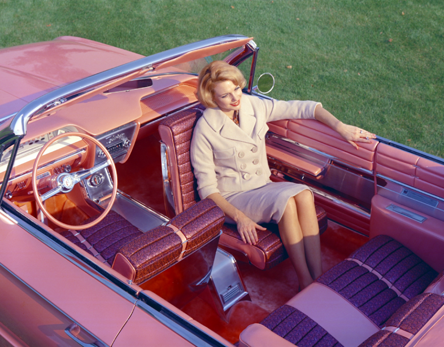 Rehearsing the backhanded compliments she's going to give Stella and Betty at the lady's luncheon
We're sure you want to see one in action, and the only footage we could find is buried within this 27-minute video that we all know you're too busy to watch. So we've cued it up to the exact moment it appears in use:
Leno's car was one of the last Chryslers to offer the swivel-seat option. We're not sure why they went away, but we're guessing it had to do with poor sales.
By the way, for those that do have the time and are car buffs, the entire video is well worth a watch. Jay Leno's Garage is one of the more informative automotive history channels out there, and the car geek that's Jay's guest in this video knows everything about the 1961 Chrysler 300G.
↧
↧
Elon Musk's Secret Master Plan: Tesla Pickup Trucks and "Designing the Machine That Makes the Machine"
After days of Twitter teases, Elon Musk finally released his "Secret Master Plan, Part Deux" yesterday, he and Tesla's road map for the future. It's got several surprises in it and shows that he has been thinking big picture all the while.
The document is dense, so we'll tackle his reveals one at a time, calling out what we think you Core77 readers will find interesting. First up, in his section called "Expand to Cover the Major Forms of Terrestrial Transport," he drops this nugget:
Today, Tesla addresses two relatively small segments of premium sedans and SUVs. With the Model 3, a future compact SUV and a new kind of pickup truck, we plan to address most of the consumer market.
 Speculative rendering by Garrett Bradford
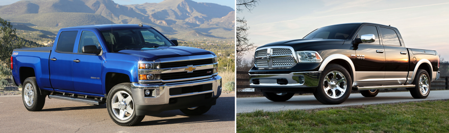
We've all known the Model 3 was coming, but a pickup truck is an interesting proposal that points squarely towards the mass market. One might assume an economy car would fit the mass-market bill, but it's long been established that the best-selling vehicle in America of any sort is a pickup truck. Specifically, the Ford F-150, which has held the title for over a decade. Last year Ford sold a staggering 780,354 of them.

The number two and three best-selling vehicles—again, of any sort—were the Chevy Silverado and Dodge Ram pickups, with 600,544 and 451,116 in sales, respectively. That means a single category of vehicle, the pickup truck, comprised the top three sales positions with a combined 1,832,014 units sold.
We know what you're thinking: How could Tesla possibly produce enough pickup trucks to make a dent in a market of that size, when they're still struggling to meet demand for their Model S and Model X, with 2016 targets of 80,000 and 90,000 vehicles? The answer is Einsteinian, in that problems cannot be solved using the same thinking that created them in the first place. Musk knows this, and that is why "Tesla engineering has transitioned to focus heavily on designing the machine that makes the machine -- turning the factory itself into a product," he writes, emphasis his.
What really matters to accelerate a sustainable future is being able to scale up production volume as quickly as possible…. A first principles physics analysis of automotive production suggests that somewhere between a 5 to 10 fold improvement is achievable by version 3 on a roughly 2 year iteration cycle. The first Model 3 factory machine should be thought of as version 0.5, with version 1.0 probably in 2018.
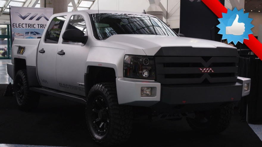
So yes, he's thinking long-term. And if he can pull it off, it will be more than a production miracle. Consider that pickup trucks today are a lot more efficient than they were even a decade ago, but they are hardly clean-running machines. If Tesla can make significant inroads into this market, the environmental impact alone would be noteworthy. But he'll also have competition to contend with in Via Motors.
↧
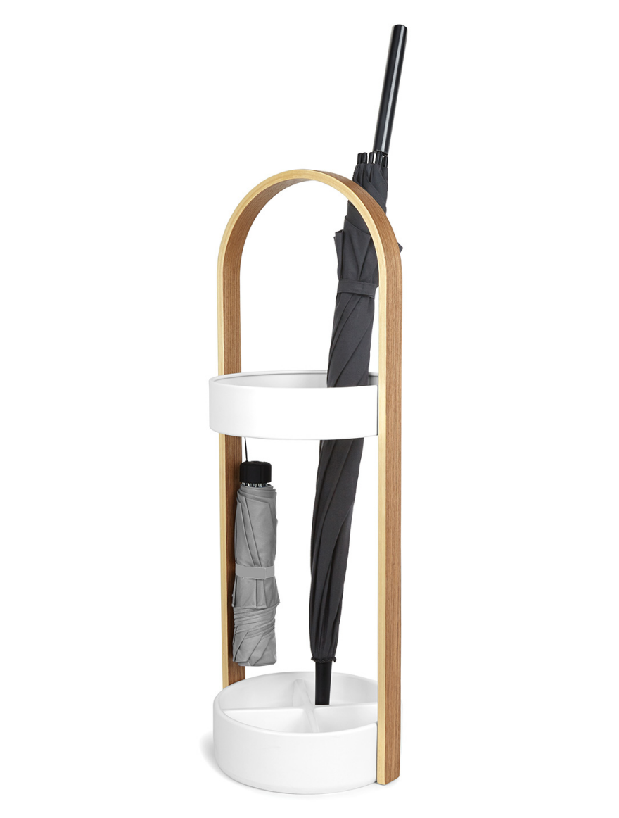
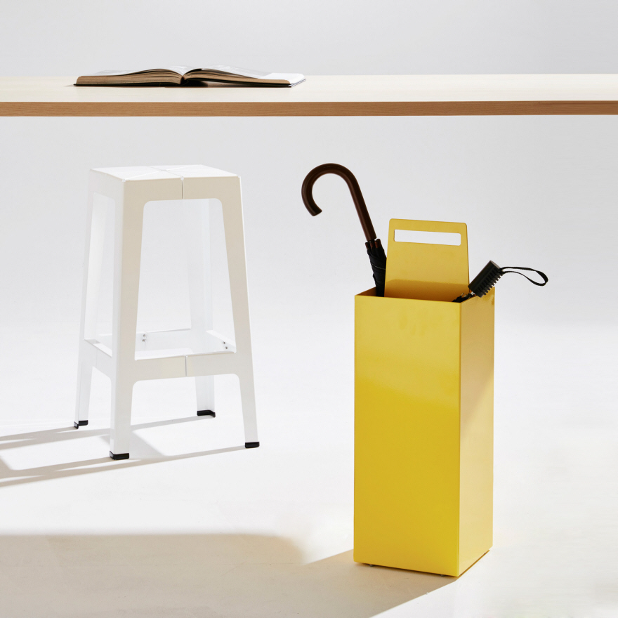
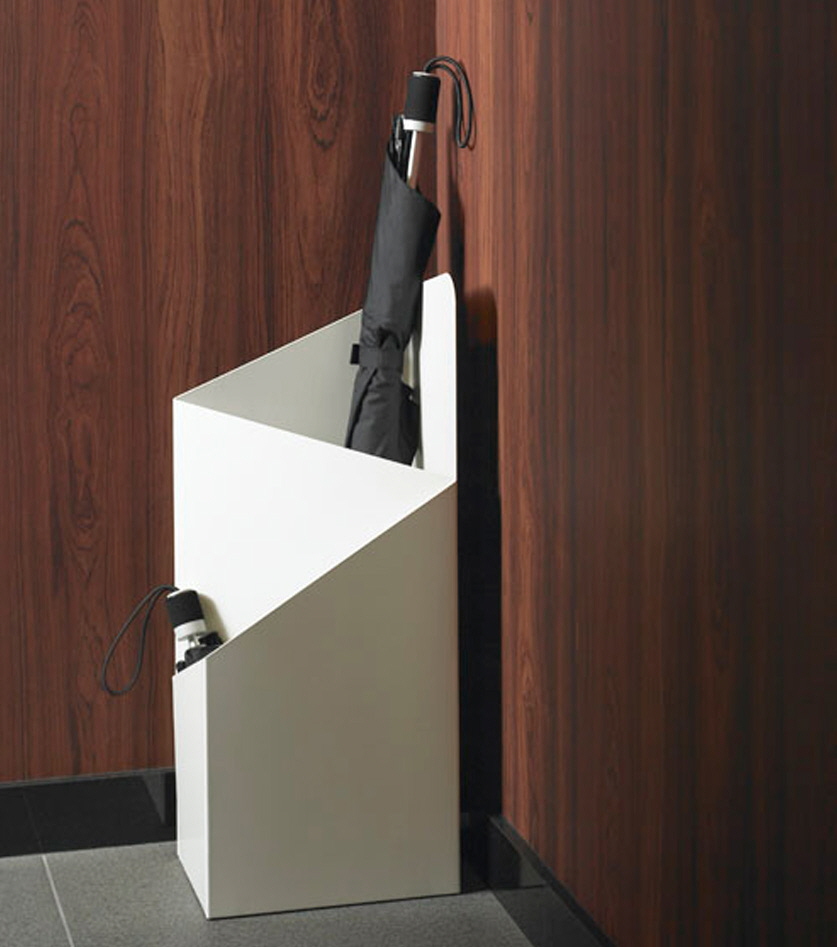
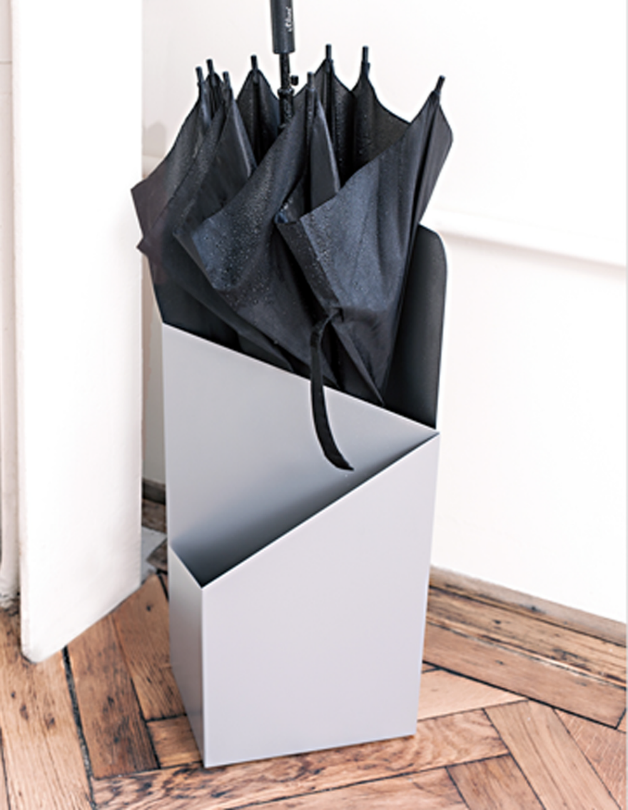
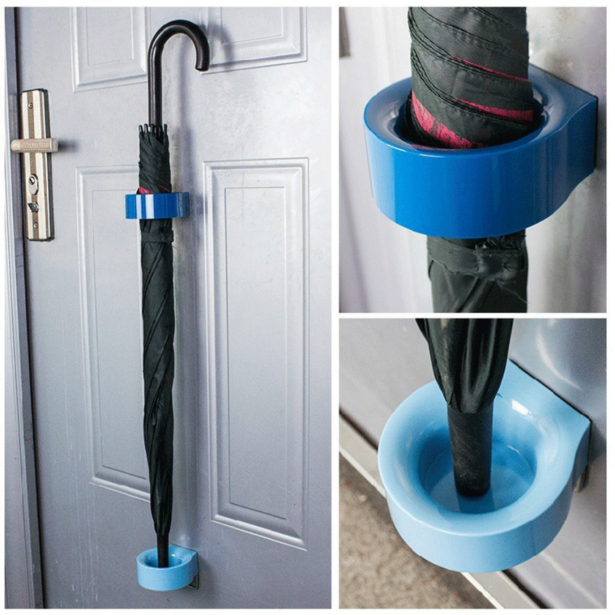
10 Umbrella Stands You Would Actually Want for Your Home
An umbrella stand gives the end user a defined place to stash a collection of umbrellas (rather than having them just shoved into a closet somewhere) as well as a place to put an umbrella when coming in from the rain. As I've noted before, there are many ways designers have approached creating such a simple item.

The Brik from Pedrali is made from rotomolded polyethylene, which makes it suitable for both outdoor and indoor use. Unlike many other umbrella stands, it has separate, somewhat tall compartments for each umbrella. With this design, each umbrella must be folded up before being stored—there's no option to keep it open to facilitate drying. On the other hand, since the umbrellas will never touch, a damp one will not get others wet. The Brik will only work for full-size umbrellas; there's no accommodation for compact collapsible umbrellas.
The Rain Bowl, designed by Sebastian Bergne and manufactured by Driade, is another product that doesn't accommodate compact umbrellas. But it's an interesting design; the umbrella tips go into the individual holes and the rainwater drains into the center bowl. I can see my cats wanting to drink from that center bowl, if enough water drains into it; hopefully they wouldn't disturb the umbrellas.
Of course, there's no way to drain that center bowl except to take the whole thing and dump it out—but the umbrella tips aren't sitting in water, which will be nice when the end user goes to pull one out. The rain bowl is made of cast aluminum.
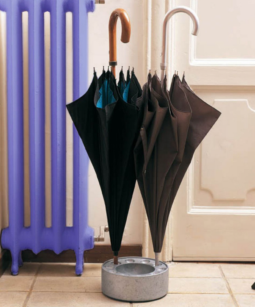
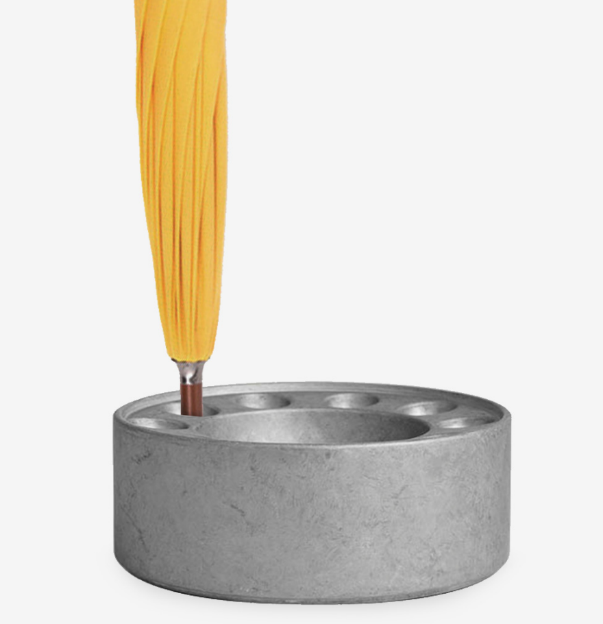
The Vide umbrella stand from Incipit has a interesting way of handling compact umbrellas; it comes with a wooden accessory which fits into one of the holes and provides a place for the umbrellas to hang.
The Vide was designed by Paolo Monaco and Laura Pessoni. It has a glazed ceramic top and a concrete base. That concrete base should give it more heft and make it more tip-resistant.
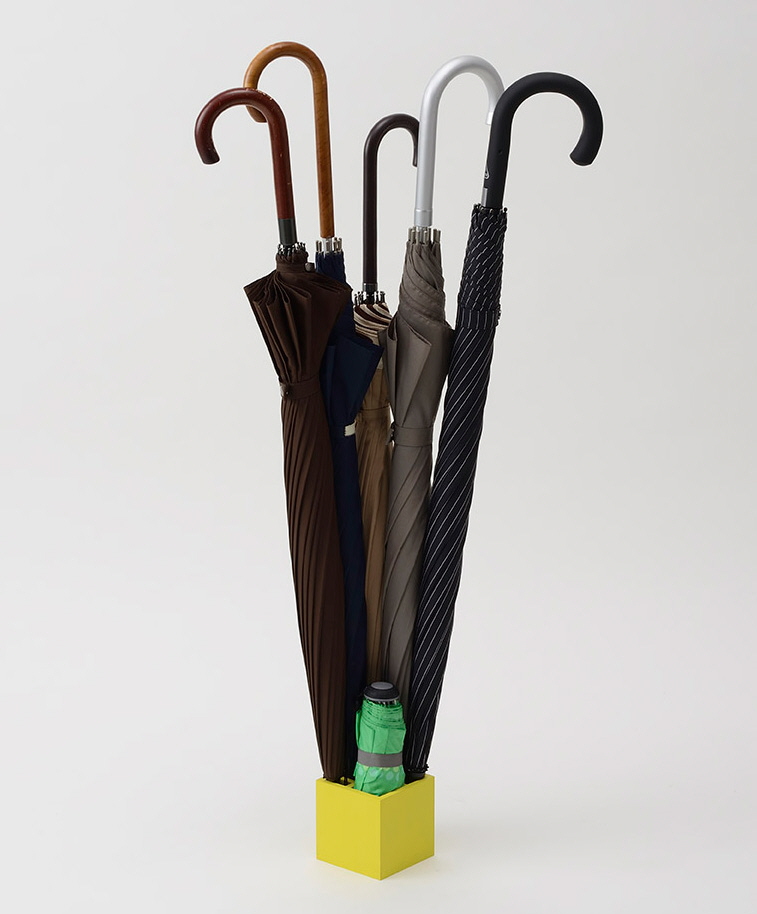
The Splash Square umbrella stand from +d was designed by Yasuhiro Asano. It's another umbrella stand with individual compartments. But this design holds either nine standard umbrellas or five standard umbrellas and one compact folding umbrella.
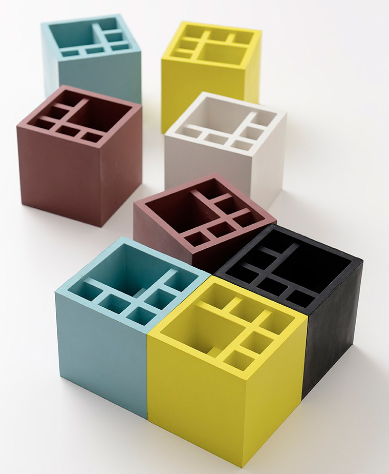

This design fits a large number of umbrellas into a small space. It would seem likely to have stability issues, but maybe having a compact umbrella down low helps with that. It's made from synthetic rubber.
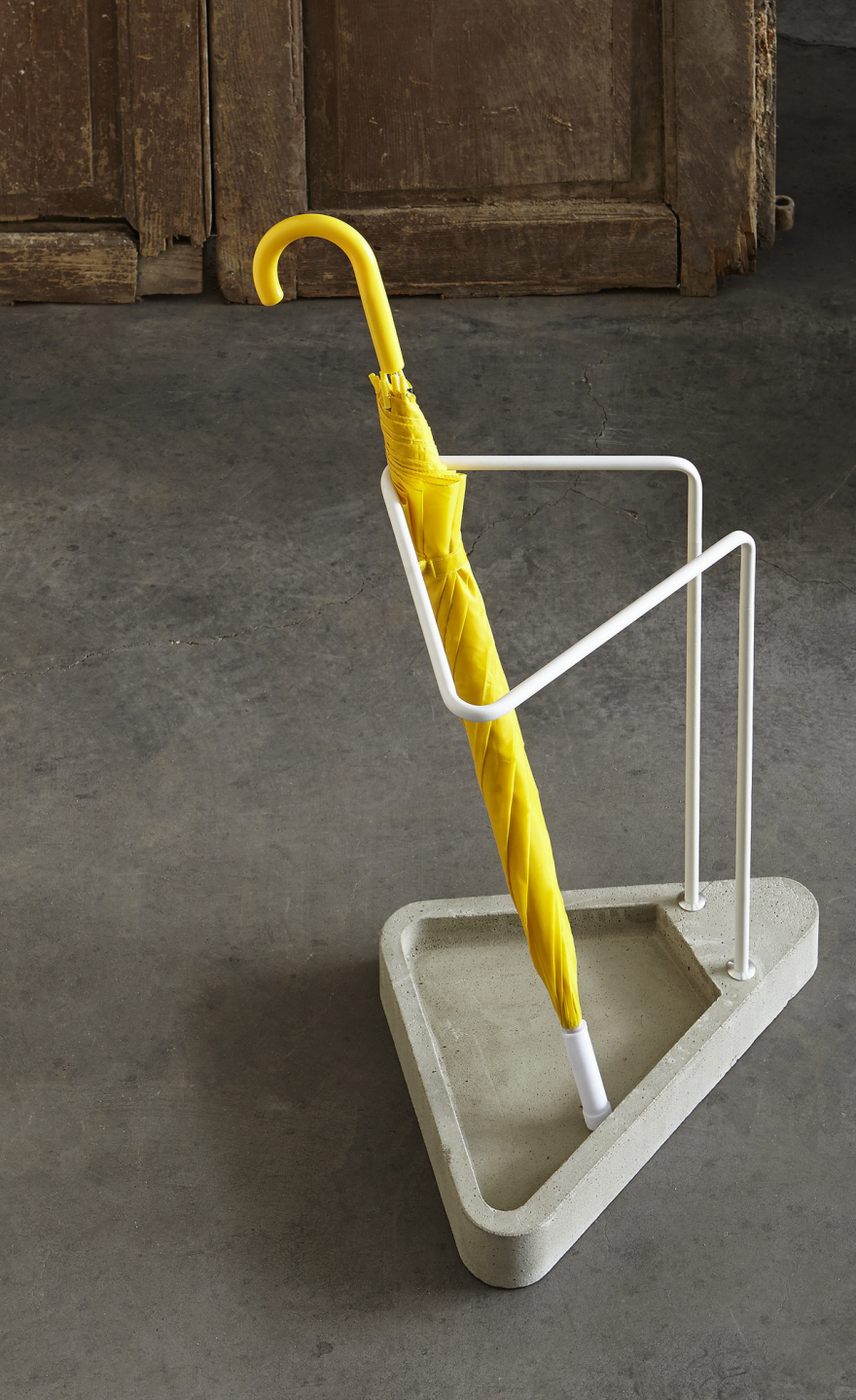
The Waiting umbrella stand from Atipico, designed by Federico Angi, is a simple design made from powder coated steel with a concrete base. It doesn't handle folding umbrellas, but it would be good for those looking for a super-easy storage solution for standard umbrellas—no fussing with getting the tip in the right spot.
The Hub umbrella stand from Umbra, designed by Jordan Murphy, has two hooks on the metal rim for hanging collapsible umbrellas. The base is made from water-resistant resin.

One possible design (or manufacturing) problem: One purchaser noted that "there was some splitting in the wood, as screws were tightened when putting it together."

The Alfred umbrella stand from DesignByThem (designed by Seaton Mckeon, Nicholas Karlovasitis and Sarah Gibson) has an interior shelf, making it very easy to store both standard and collapsible umbrellas.
It's made of powder coated aluminum, and the company says it's suitable for outdoor use (as well as interior).
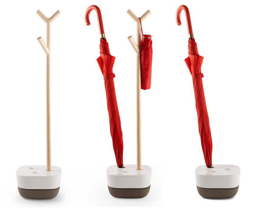
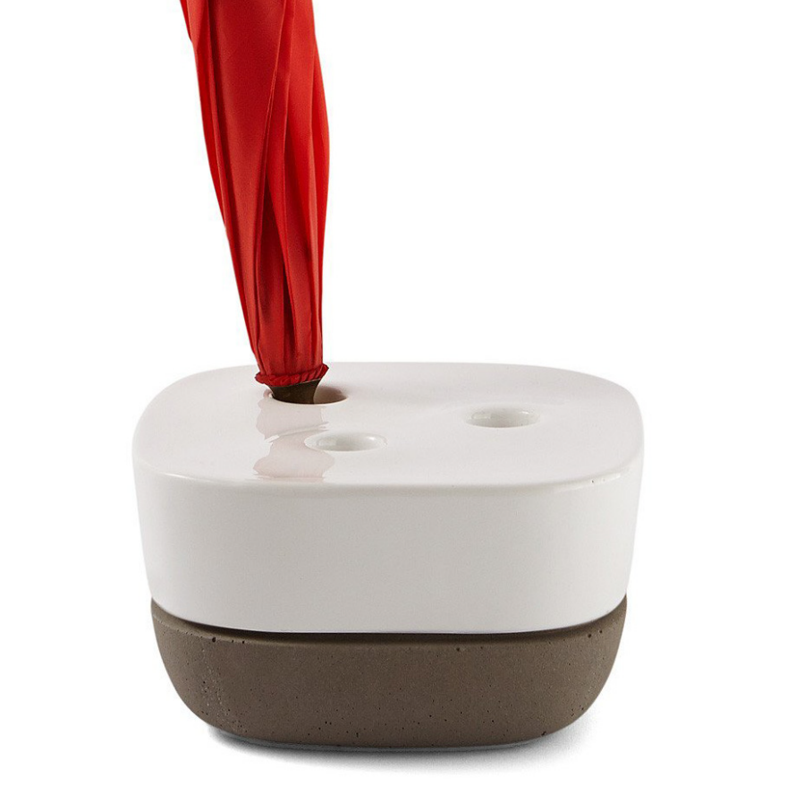
The Via from Mox, designed by Charles O. Job, also accommodates all umbrella sizes, with a front pocket for shorter umbrellas.
It's also one of the umbrella stands that can readily accommodate an umbrella that's left unfolded to dry off.

Because floor space is often at a premium, I'm always interested in wall-mounted products. The Sou umbrella stand from Systemtronic, designed by Tomoya Tabucchi, comes in both a standing and a wall-mounted version.

There are three painted steel panels and two removable containers to hold the umbrellas and pick up any water. The container in front is located halfway up the panel, so it holds small umbrellas; the one back is lower for standard size umbrellas.
And for those end users with a metal surface handy, someone thought to design these simple magnetic umbrella holders. One purchaser noted that the magnets slipped a bit; magnet strength is certainly a design consideration for a product like this.
↧
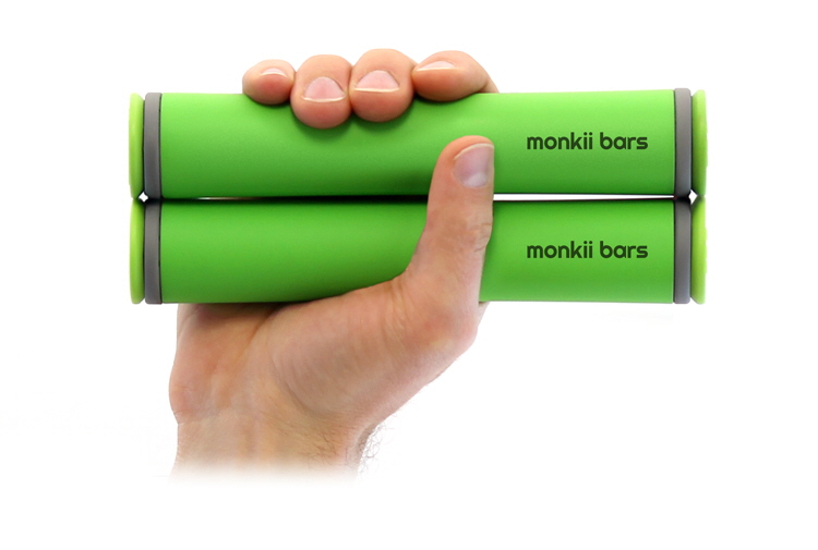
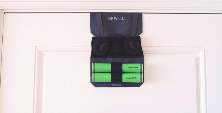
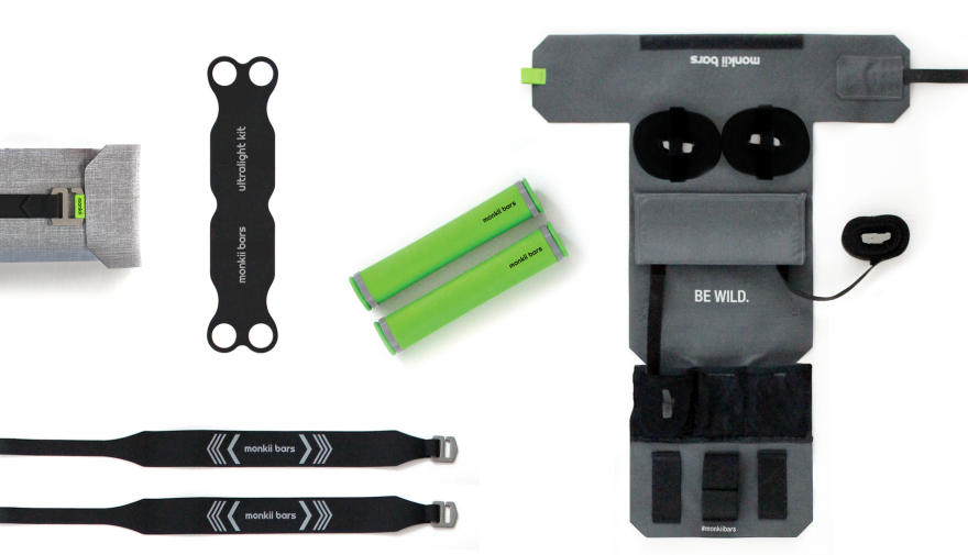
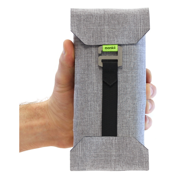
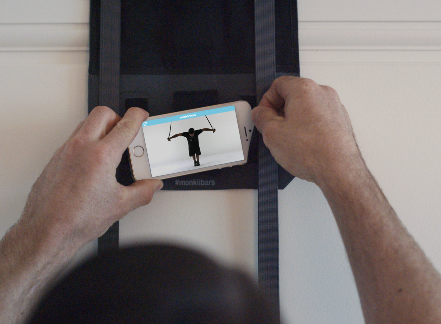
Reader Submitted: Work Out Anywhere With monkii bars 2
monkii bars 2 is a gym you can take anywhere – perfect for travel, home or outside. monkii bars 2 is an incredibly strong yet ultra-light bodyweight trainer that you can use to workout anywhere—designed for people who want awesome workouts without wasting time stuck in the regular gym. monkii bars 2 is your own private gym, personal trainer, and adventure guide built into one portable system.


↧
More Pages to Explore .....


