Quantcast
Channel: Core77
Viewing all 19155 articles
Browse latest View live

A Brilliant One-Handed Shoelace Tying System

$
0
0


Inventor David Knez has devised a simple way to loosen and tighten your shoes using only one hand. This is a very clever use of materials:


In addition to being convenient for the able-bodied, Knez's QuickShoeLace should be a boon for single amputees or those born with only one hand. And if he could design an easier way to grasp the looping part, I'd think the arthritic could benefit from the system too.

It's not at all certain this project will be Kickstarted; at press time there were 11 days left, and Knez was at just $4,500 towards an $18,000 target. If you like the system, please spread the word!


Meet Heng, A Charmingly Inverted Desk Light

$
0
0

At first look Heng is a simple lamp, with a funny cord in the middle. The light, designed by Zanwen Li, really is simple but also more fun than it appears. The bentwood shapes and LED band are everything you'd expect, but to turn the lamp on and off you don't pull the cord down, you lift one half up. 

Unlike most lamps activated by pull-chain (or even button depressing) here the igniting connection is created when the lower of the two balls it lifted into the gentle magnetic pull of the other. Under tension they add a visual element to the lit lamp, and an unusually fun lo-fi interface. 

Having already snatched a Red Dot, the Heng is now on Kickstarter for the low low price of ~$44 USD. While it isn't making any wild or high tech claims, it's still one of the coolest updates on lighting UX we've seen in a while.  


Tool Hacks: This Inexpensive Modification Prevents Your Vacuum Hose from Snagging

$
0
0

A constant irritation I experience in the shop is having the vacuum hose snag on something. Even suspended from a ceiling-mounted bungie, it will sometimes catch the end of the saw track (usually in mid-cut) or the edge of the table if I'm sanding and have given the hose too much slack.

Australian cabinetmaker David Stanton had the same problem, but solved it handily with this inexpensive fix (and no, it's not Festool-specific):

I am so doing this. If anyone's in the same boat, I found braided sleeving, at least with the inside diameter I need for a little over a buck a foot on McMaster. They've got the heat-shrink tubing too, $13 and change for four one-foot lengths (the minimum buy). If anyone else has other sources in other regions, please do list in the comments.


Power Up Your Salads, Mario Style

$
0
0

Just in time for Nintendo's anxiously awaited (and slightly confusing) new Switch presentation, product designer Avichai Tadmor is here to serve us some refreshing OG Mario style. His product, the Ravanello, spins sharp and tangy radishes into cool power-up mushrooms with a few quick twists. 

The tool shaves the radish "stem" much like a pencil, and the tip of the tool neatly notches out those magic mushroom dots. The result is a silly but fun presentation for an often overlooked veggie, perfect for salads, kids' lunches, or preparing to smash through brick walls like a tiny plumber. 

Much like the Switch the Ravanello won't ship for a few weeks, but unlike the Switch it's a cheap level up with little room for awkward surprises.


Design Job: Turn it On! Hudson Valley Lighting is Seeking a Product Designer in Wappingers Falls, NY

$
0
0

Hudson Valley Lighting is a worldwide leader in the design and manufacture of lighting fixtures. Our commitment is to deliver the highest quality products and services. Our highly skilled employees take exceptional pride in producing superior quality products. We are a progressive and growing company looking for an individual

View the full design job here

4 Minimal Grow Lights That Make Me Wish I Were Green

$
0
0

Dark apartments and flourishing indoor greenery aren't mutually exclusive, but they aren't really friends. For winter times or studios with nowhere-facing windows, real plants can take more technology than a green thumb. Much like my recent gripe about SAD lights, I've been surprised at the lack of attractive small scale systems for plant care. There are zillions of chintzy DIY herb gardens out there, but most don't take light into account and do assume you desperately need handholding to find things like basil seeds. There are also plenty of ideas for "discreet home hydroponics" systems out there. All this to say there are options, but if you don't have room or patience for utilitarian plastic hoods, bulky fluorescents, or complicated orchid tanks, the options do get slim. 

The four examples I've found for compact and nicely designed indoor plant lighting systems are each a bit different, but each take on the issues of space-saving, very clean lines, and (above all) providing useful light to real life houseplants.

Kusamono, large

The first is the Kusamono light designed by Florent Corier. It's a bit bigger than many small apartments might initially want to make space for. However I'd argue that it's lean shape and slim profile make it a better fit for dorms, living rooms, offices, and other wide spaces that you're likely to have an underutilized wall or desk. 

Kusamono, lg

Newer on the scene is the brand Bulbo, who are making a niche out of design-minded plant lighting. Their Cynara lamp is a post-mounted bulb and reflector, intended to perch in the same pot as your plant itself. Its color scheme and form would be at home in your pinteresting abode, and the 7 watt bulb incorporates the three tone red/white/blue light scheme that helps simulate outdoor light for better growing. They also make pole lengtheners in case you switch plants, or your green buddy grows too tall for the light.

Bulbo Cynarra, small and large

Bulbo's standalone option is the Quadra, which more directly takes on the issues with boring and badly designed home growing stations. Most domestic options are plasticky, bulky, too-small for many houseplants, and awkward to adjust. The Quadra uses the same bulbs as most small grow kits, but with a drastically improved adjustment system that bumps the height easily, while also allowing for wall- and ceiling-fixed positions. It also comes in the contemporarily beloved white metal/light wood scheme, which won't fuck up your neutral Norwegian modern aesthetic.

Bulbo Quadra, small
Bulbo Quadra wall mounting ideas

Similarly boxy yet versatile, Modern Sprout has a light box that's a bit more contained. Or just folks with plants who need more moisture. Their unit is a mostly closed greenhouse, and a clean example of a self-contained light box that wouldn't look jarring in a well appointed home or office. It can be used both standalone or wall-hanging. The full spectrum LED, multiple timer settings, and boxed-in design would work well for needy cacti or moisture hungry tropical ferns. Choice of lighting levels and an on/off timer let you set it for your green friends' daily needs. Seriously, why is this rare.

Modern Sprout Growhouse

I'd love to see lighting systems like these that also incorporate watering etc. but I have yet to see any that doesn't require proprietary seed discs or a fundamental misunderstanding of why people grow things indoors. In that vein, I have three honorable mentions.

Green Farm Cube

The Green Farm Cube is an intriguing and idealistic option for countertop herb tending. It uses a static water chamber and enclosed system to feed seeds, and offers a digital take on vague stats like when your sprouts might be ready to eat. It's intended to be used for microgreens and quick growing herbs, which could make my squinting about the sprouting timeframe unnecessary. All in all it's a cool enclosed system that wouldn't look like garbage on a counter, provided it earns its keep.

Green Light, I could have loved you

The Green Light, designed by Linda Bergroth and produced by Kekkilä,  gets at the heart of what I really want. The height is adjustable with a simple pin, and the tray features a lip that makes spilling and drainage a non-issue. The colorway was clean and Scandi. Good lighting, good looking, and I'm pretty irritated they aren't easily found anymore.

Similarly, Fiskars' forray into self-contained herb gardens had a good deal of promise: a well balanced LED light, a self watering chamber, and a cool sliding enclosement that could help warmth-seeing plants. It looks like a popcorn maker but will grow your wheatgrass, maybe a little cramped but a good start. Sadly for me, it won a Red Dot and retired to let their kitchen knives have all the glory.  

Did I miss anything awesome or obvious? My plants and I are a little fatigued.

The Nifty Design Features of the German Mess Kit

$
0
0

This here is a brilliant piece of industrial design: It's functional, durable, makes intelligent and economical use of materials and can easily be mass produced. So successful was the design that it was copied by most major competitors. Most importantly, it's long-lived; the original design was created over 100 years ago, and this object's subsequent iterations are still used and prized today by many.

The object in question is the German mess kit (kochgeschirr) used during World War II. Check out some of its design features, demonstrated here by bushcrafter, hunter and reviewer Virtuovice:


The sharp-eyed among you may have spotted this slot--which he does not elaborate on--cut into the inner container:

So what's that for? This, as demonstrated by OutdoorGearReview:


As far as we can tell, the original design of the German mess kit started with the Kochgeschirr M1887, designed in the late 19th or early 20th Century:


As you can see, the panhandle on this design was detachable and carried separately. That allowed it to be used to suspend the pot over a fire:

However, we imagine that having the handle be loose made it easy to lose in the field. A subsequent iteration, the Kochgeschirr M1910, cleverly integrated the handle via hinge and designed it to double as the lock-shut latch, as seen in the video above.

Image via Gerhard03


The M1910 also added the Essbesteck, a Spork ancestor:

Image via Picclick


The dual utensil was designed to wedge perfectly into the container.

Image via IR23
Image via MP44
Image via MP44
Image via MP44


The iteration most are familiar with today is the M31, which was manufactured during World War II. 

This design was more compact and, as with the German-designed "Jerry Can," seems to have been subsequently knocked off by every Army that encountered it: The Soviets, the Finns, the Romanians, the Poles, the Hungarians, the Norwegians, the Swiss. Today you can buy replicas, knock-offs and the real deal on eBay.

Lastly I'll say, I've not seen the locking handle feature shown in the first video in the original German design; I wonder if it's a Japanese upgrade. (By the bye, if any of you cannot understand the first reviewer's accent, list the time code and I'll "translate," as it were.)

Reader Submitted: A Modular Shelving System That Relies on Threaded Wooden Rods


How to Diversify Your Sketching Style

$
0
0

The Core77 discussion board is a great place not only to share your bright and shiny final products, but also your ever-evolving process and progress. Given there are a number of people who utilize the boards in some ways we envisioned it and in many ways far beyond, we love giving shout-outs to those who use the platform to connect with other designers and help other readers learn something along the way. 

One such designer dedicated to sharing her process is Seattle based designer Sophie Horton Jones, who started posting some of her quick concept sketches earlier last year as she was looking for technical feedback from fellow designers. We've enjoyed following her posts and taking a look at her ideas and ongoing sketch challenges.

As a designer who has worked primarily in the toy industry, she has mastered a toy-like aesthetic with thick borders, large annotations, and a playful style:

Character baby monitors with camera and a multitude of sensors (sound, heat, movement etc)


Kids Nutribullet style blender with multi-function cap.

An alarm clock drawn in Procreate
A fun "Happy Toast" sketch

After challenging herself to diversify her sketch abilities to adapt to different design briefs, she started experimenting with design concepts she had previously never tackled in order to challenge her well-engrained methods. 

"I tried a more architectural style," Jones writes, "I love the idea of the drive-through ATM's here... how about a walk through coffee stop? Or moving walkway?! With order point, contactless pay and pickup point?!! Limited menu, limited functions, simple coffee?!" 


A sketch inspired by the Seattle coffee scene made in Procreate ("More of an exercise in sketch style than concept...I'm quite aware that the product itself doesn't make much functional sense!", Jones writes. )

User cwatkinson brought up an interesting point in the feed about the utility of having several sketch techniques you can turn to for different design briefs:

"I had a intern when i was managing a housewares focused design office - the intern had a very similar sketch style but did not see the value in following my advice to try and switch it up based on what he was trying to achieve. his first project was for a design that would communicate sophistication and elegance. Now if you where able to see past the sketch style and envision what the designs would look like he nailed it. Unfortunately when presenting to Marketing / Sales / Engineering / President all they could see and say is that the designs looked "toyish" and did communicate what we where trying to do with the brand.

During the meeting i told everyone that we would take do another round of form studies - after everyone left the intern looked at me and said "you want me to re-sketch these in a different style"" second presentation same concepts different sketch style and they where loved.

Now one does not need to change their style but one should be aware how that style reads to other and if it is visually communicating the desired intent."

After accepting a simple challenge to create a sketch without line work or call outs, she really nailed it with this Fiskars clippers design and seems to have added a whole new sketch style to her repertoire:  

Thanks for sharing your sketch experiments and takeaways, Sophie (which you can check out in full on the original discussion board thread)! 

See more of Sophie Horton Jones's work here

Core77 Reader's Wife Designs the Perfect Beer Can Opening

$
0
0

After seeing our post on The Design Evolution of Beer Can Openings, reader Devin Sidell's wife may have designed the perfect beer can aperture. To get you up to speed, we were discussing how a single opening in a can leads to "glugging," i.e. turbulence while drinking since there's no airflow. Users of early flat-top beer can designs thus punched two holes in them:

Well, Sidell took the time to Photoshop up this clever way to solve the problem using the modern-day tab:

Pretty brilliant, no? "The top being for the intake of air and the bottom for drinking, of course. The tab can already swivel so it can perform the same action twice.

"I'm sure this has already been done," Sidell writes, "but I'm just curious why it's not on cans already."

If it has been done, we can't find it. Here's a photo from the Budweiser Brewery showing a bunch of different can apertures that have been tried over the years:

I don't see any tab-based dual aperture designs there.

About four years ago Miller experimented with a "punch top can" design that had a little second tab the user could punch open with a key or similar. 

Unsurprisingly, a rather stupid news report emerged attempting to sow fear among parents, claiming that the design was meant to encourage the shotgunning of beer:


This is about glugging, people, not shotgunning!

So, Sidell, to address why this hasn't been done: My guess is that A) no company wants to deal with whatever perceived backlash Miller might have faced, and/or B) the added manufacturing cost is perceived as not worth it because C) customers ultimately don't care. This is what I hate about having a design background; you can't help but notice these little ways that an experience could possibly be improved, however minutely, then realize that most of society is not that interested.

In any case, Sidell, or should I say Mrs. Sidell, I like your design! "I…have to give credit to my very creative wife," Sidell writes, "who basically gave me the answer to the design in about .02 seconds of me asking her!"

How to Make a Wallet Out of Hot Glue

$
0
0


This is hilarious, and totally seems like something an ID student would do while procrastinating at the studio. Here the folks at the WEAREX YouTube channel show you how to make a functional wallet using nothing more than a soda can and a hot glue gun:


What's a leather wallet cost these days, fifty bucks? Make one of these and stick the fifty in there. You're welcome.


Design Job: Fetch it! Nerf Dog is Seeking a Product/Industrial Designer in Secaucus, NJ

$
0
0

Fast-paced, entrepreneurial Pet Products Company is looking for a bright, self- motivated individual for a Product / Industrial Designer to assist in our Creative Department. Successful candidate will work closely with lead designers, providing support in varied graphic design projects and day-to-day product development needs. We’re looking for

View the full design job here

Bilco's Barracuda Intruder Defense System

$
0
0

The Bilco Company makes "access products," meaning doors, windows, roof hatches, floor hatches, et cetera. But in a sad sign of the times, they also produce devices designed to prevent access: Mechanical objects that can "lock down vertical doors in a matter of seconds in active shooter situations."

Here's a look at the line-up of their Barracuda Intruder Defense System:

It's kind of a strange situation to have to make products that prevent the functionality of your other products. But that's the world we're living in now. While your chances of being killed in a terrorist or terroristic incident are still infinitesimally small, the desire to be prepared—or plain ol' pure fear—will always create a market demand for security products.

From a business perspective, security products seem like a good area for a design entrepreneur to step into. A guy with a background in Sales once told me that the key to closing a sale is to make the customer feel as if there's a deficiency in their life, and to convince them that buying your product will eliminate that deficiency. Which means that in the security product market, the media is your free advertising and salesforce. With each incident that they publicize and occasionally sensationalize, the message coming from our news outlets are all designed to reinforce the notion that we suffer from a deficiency of safety. I expect products like these to proliferate.


A Watch That Assists Patients in Self-Managing Long Term Health Conditions

$
0
0

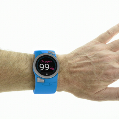
Aseptika Limited (Activ8rlives), developers of a range of self-monitoring medical devices, some in the form of wearable technologies, aimed at assisting patients to self-manage long-term health conditions at home, is already having impact in this field. The early identification via home self-monitoring of an impending change in condition may allow for earlier intervention by starting antibiotics (“rescue pack”) days earlier, thereby reducing the need for lengthy hospitalization.

View the full content here

Wilsonart's Highly Convincing Inkjet-Printed Wood

$
0
0

Wood is a fickle material, and what can be fun for a woodworker can be a headache for an architect, industrial designer or interior designer. I'm talking specifically about board selection. Whereas a woodworker might relish the challenge of working around defects in boards, a designer might require the complete absence of them, or a slightly different coloration, or a more pleasing grain direction that Mother Nature seems unwilling to provide.

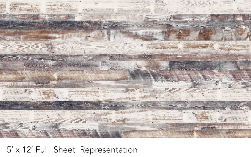
To address this finicky designer market, companies have begun using inkjet printers to digitally create highly tailored facsimiles of wood. As one example, Wilsonart maintains their own digital library of woodgrains and can create laminates on-demand that are highly convincing, at least to the eye; everything from planer marks to sawblade scars to weathering is reproduced with stunning fidelity.

"Antique Limed Pine is a white washed wood of varying sized planks. A rustic beauty with warm white and browns mixed with cool grey and charcoal."
"Repurposed Oak is a sun kissed barnwood. It has a beautiful warm patina that is the perfect rustic look."
"Repurposed Oak Planked is an oak barnwood that is planked with light and dark naturally occurring color variations."
"Antique Barrel was once an old oak whisky cask. The distressed markings and fawn color elevates this design to a refined industrial look."

Here's the same "pattern" as above, but with a slight color variation:

In general, you get four to five feet before the pattern starts to repeat. Some, as with the Antique Limed Pine, repeat randomly. If you just glanced at the photos above, you may not have noticed the repetition; but if you go back and look more carefully you're sure to notice it.

But will your customers?

If you want to learn more about companies using inkjet printers to simulate natural wood, Bill Esler's got an article about it over on Woodworking Network.


Tools & Craft #31: The Architectural Woodwork Inside One of NYC's Most Spectacular Interiors  

$
0
0

Some weekends past I attended a wedding at the Palace Hotel in New York, which has since been purchased and renamed by an Asian luxury hotel operator and will probably be remodeled, if it hasn't already. So I'm glad I have these original photos, however poor the quality. 

The hotel, built about 25 years ago stands behind the Villard Houses, two neo-Renaissance mansions built in 1882. When the hotel was built, there was a move to demolish the houses, but preservationist won and buildings were incorporated into the hotel high rise. It has proved to be a great business decision, and the hotel hosts events and has a bar in part of the space, which is one of the most spectacular interiors in New York City.

From a woodworking perspective it's important to understand several things—that craft and decoration pays off. Without preserving and adapting these rooms to modern usage, the hotel would be one more nondescript business in the city. With preservation they have a competitive edge.

Unlike museum quality work, when you look closely at the carvings, which are opulent and wonderful, you might notice that the gold carvings on first floor are fancier and better executed than the carvings on the second floor. This is an important lesson—most people won't notice, and unlike a few random stellar examples in a museum, the practical exercise of creating a house full of decorations means compromise. I wonder if there are any architects up to the task of designing and orchestrating a neo-Renaissance interior with all the carvings. I bet with CNC for the bulk work, some nice detailed handwork and some cleverness it could look great and be cost effective.

Finally, for all that designers say that older crafts are dead, and people these days want modern looking furniture of glass and steel—it isn't true. If it was true the "Gold Rooms" as they are called, wouldn't be popular. But they are! A lot of the appeal of many of the bars and restaurants in New York are their classic interiors. So the real issue isn't "should a new project be modern or antique?", the real question is how to create a "craft heavy" interior on a reasonable budget.

Incidentally the UN was having a big meeting at the time and the hotel was host to several high level delegations. For the first time going to a wedding I had to pass through security, and there were secret service and swat team members all over the place looking me over.

__________________________________________________

This "Tools & Craft" section is provided courtesy of Joel Moskowitz, founder of Tools for Working Wood, the Brooklyn-based catalog retailer of everything from hand tools to Festool; check out their online shop here. Joel also founded Gramercy Tools, the award-winning boutique manufacturer of hand tools made the old-fashioned way: Built to work and built to last.

A Kinetic Sculpture That Clops

$
0
0

Maurice Montero Sauvage is a quiet builder of complex art. His sculptures feature miniscule hand-worked wooden pieces that suddenly shift into organic movement with the turn of a crank. This piece, titled Gran Cheval, has popped up around the internet with little or no attribution, and few detail shots, which is frustrating bordering on offensive when the construction is so painstaking and nuanced. 

Maurice himself is slightly hard to track down online, which seems fitting for someone this dedicated to skilled handcrafts. However, more takes of this cool sculpture turned up. Check out these closer up views of his Cheval series. They even make realistic hoofbeats!

Check out more mobile artwork on his lightly used Facebook and Instagram pages. 

Design Job: Design and Make Cool Stuff! GAMAGO is Seeking a Freelance Product Developer in San Francisco, CA

$
0
0

GAMAGO is adding a quick and clever freelance product developer to our creative staff. This is a freelance, project-based opportunity. What’s our deal? We’ve been designing and manufacturing awesome shit in San Francisco for the past 16 years. We’re a nimble, fast, consumer product

View the full design job here

9 Tips For Building Your Creative Online Presence

$
0
0

Congratulations, you've made it to 2017. Last year was a rollercoaster ride and it's safe to say we all deserve a pat on the back for getting through it. With each new year comes new opportunities. We're not talking short-term resolutions - we're talking goals to make big things happen. Maintaining a strong online presence is a major step in accomplishing whatever goals you choose to set for yourself, especially if your field requires you to have a portfolio. Whether you're a freelancer looking for gigs or you're on the hunt for a full-time job, the most effective way to show off your work is by creating your own website. If you don't already have a website or online portfolio, make 2017 the year you finally take initiative and build yourself a beautiful home online.

Here are some tips to keep in mind as you begin to build your online presence:

1.Make time and commit

Sure, you can humor the idea of doing little pieces in chunks, but that will most likely result in a website that looks half-finished. Would you want to move into an apartment that was still being built? Probably not. Set aside a few uninterrupted hours of the day, throw on some music, and give your full, undivided attention to this project.

2. Go in with a plan

Before you begin building your website, create a plan. Going into it blindly isn't the worst thing, but it can mean more work overall when you have to go back and tweak things later. Make a bullet list of the categories you want to feature. For example: 'Art', 'Design', 'Photography' etc. Knowing your categories helps you plan a layout faster and also makes it easier to add your work. Figure out the projects you want to feature and make sure you have high resolution files all ready to upload. It's also good idea to put everything in one folder so you can drag-and-drop.

3.Get inspired

Search for peers in your field and look at their websites to get fresh ideas. Track down some pages and get a look at the layout, themes, designs, and content to give you an idea of what might work best for you. On sites like Squarespace, you can even choose from pre-designed templates. All of them are completely customizable, but choosing a template gives you a quick launching off point, and then you can change things like font and colors to suit your taste. When designing your website, find inspiration from fellow creative-types. We think all of these pages look awesome:

Jeff Rogers

Lauren Bohill

Chris Rushing

4. Don't forget social media

It always amazes us how many designers have little to no social media presence. Potential employers often treat a lack of social media pages as a sign that you are behind the times or maybe up to no good. We'll save that lecture for another blog post, but in the meantime, make sure that people can easily connect to your social pages through your website. This is almost as important as providing an email address. Squarespace gives you the option to easily link your social media pages to your website. That way you can always be cross-promoting all of your work and all of your pages. If you already have a decent following on social media, use it to tell people about your upcoming website and get them excited for the launch.

5. Find a platform that's as design-centric as you are

There are loads of sites out there that offer a place to post your work. The key is finding the best fit for what you are looking to accomplish. When it comes to creating your own website, there are a handful of the important features to keep in mind as you build your own. If you're a creative-type, chances are much of your work will be visual. Make sure you consider the visual components and find something that reflects your unique style. Squarespace offers customizable templates that will fit your any of your objectives, visually and professionally. Not only that, but there are useful features like a logo maker, access to Adobe Typekit, and integration with Getty stock images. Signing up means easy access to all of these features, and if you use our promo code CORE77 you can get 10% off!

6. Find an all-in-one platform

One of the reasons why many of us put off building our own website for so long has to do with the fact that most options out there are filled with tedious work and headaches. Avoid sites that require extracurricular tech work on your end. If that means paying a monthly fee for a service like Squarespace, it'll be worth it for the ease of access and the valuable time you save not messing with the backend. With Squarespace you can also sleep comfortably knowing that your site is perfectly optimized for every kind of device - an important feature considering how many people will probably be checking out your work from their phones. The platform grows with its customers, keeping up to date with technology and also allowing you to add in things like e-commerce later on.

7. Score your own domain

Visuals are definitely important, but if you want to look super professional, one way is to have a clean, descriptive web address for your site. This also makes you easier to search, and therefore easier to contact. Plus, if you're lucky you'll score your name (yourname.com), and what could be better than having a domain with your name on it? Squarespace actually gives you a free domain for a year when you sign up for an annual membership, and if your desired '.com' is taken they offer alternative TLDs like '.photo'.

8. Keep it simple

Make sure you don't overwhelm. Choose a design that is attractive and direct. Clutter is bad at home or the office and it's just as bad online. Potential employers should be able to easily access your portfolio, social media, and contact info without having to poke around your site. Remember, you have about 5-15 seconds to catch someone's attention, which is why you want to have a strong visual presence and a simple, direct message about who you are.

9. Make your website a one-stop-shop for all things you

Your website may be the only chance you have to make an impression, so it should be one that is unforgettable. Depending what you are looking to accomplish, you can treat your website as a resume, business card, portfolio, and even a storefront all wrapped in one. You don't want to give people any reason to have to search elsewhere for your work, so take advantage of every feature you can add and customize it to fit your goals. The beauty of a platform like Squarespace is the convenience of features like starter layouts, which come with pre-made standard blocks like "about", "directions", and "contact".

Ultimately, building your personal website is about making your next move. Make 2017 the year you finally share your talents with the world. Having a personalized website you're proud of will be a major motivator to get yourself out there. Squarespace lets you maximize creativity and minimize all of the things that can make creating your own website so annoying.

There is no better time to get started than right now. Use promo code CORE77 and receive 10% off when you sign up for Squarespace!

tracking pixel do not remove


Server-Summoning Buttons and "Leave Me Alone" Shopping Baskets

$
0
0

On a trip to Korea in the 1990s, I discovered every café I went to had a button like this on every table:

It was always off to the side, where you were unlikely to accidentally press it, and sometimes mounted on the wall. As far as I could tell it was wireless. When you pressed it, a waiter or waitress appeared within seconds. My (native) cousin referred to it as the "Yogi-yo" button. (Yelling "Yogi-yo," literally "Hey, over here" is the rather blunt statement one traditionally yelled out to summon staff in Korea.) 

A year later I was living in Japan and found that they had the same system.

It's a brilliant piece of service design, and ought to be standard in restaurants everywhere. Trying to flag down a waiter—particularly in New York, where you're often in a rush to get up and out—seems primitive and catch-as-catch-can in comparison.

A Japanese student temporarily relocated to Boston, and who documented his "culture shock" experiences here, was bewildered to find American restaurants didn't have a call button. Unsure of how to summon the server, he raised his hand, but…

…Someone told me that it is rude to raise your hand to call the waiter [in the U.S.] and I should wait till someone comes. But that's totally inefficient. What should I do if I happen to have some thing extremely spicy and want another glass of water? Should I sit there and wait till my tongue burns off?

While that may seem funny to us Americans, and particularly New Yorkers—as a former waiter I can tell you there are plenty of customers whose tongues I wish had burned off—it is interesting to see how perplexed he is.

In both Korea and Japan I experienced a level of service I've found unmatched in other countries. Staff there are trained with a heavy emphasis on the user's experience. It goes beyond their rehearsed salutations to include physical objects like the call button and this example of shopping baskets, seen below:

To provide a little ethnographic context: Innisfree is a Korean cosmetics brand. In Korea they take cosmetics extremely seriously. Innisfree staff/Korean staff in general are not only highly knowledgeable about their product lines, but are also notoriously eager to help—bordering on pushy. As two commenters on this Reddit thread point out:

Commenter 1: "[Innisfree stores] are usually horrible for introverts. There are 3 salespeople for every customer, hovering around following you all around the store even if you tell them you're fine."
Commenter 2: "In my experience, South Korea had the most aggressive customer service when it came to shopping. If I even showed remote interest in an item of clothing, a person working at the shop would walk over to try to help. It can get really annoying if you're just browsing. [But] if you're [doing focused] shopping it's actually kind of cool. My girlfriend went to a bunch of shops and got fantastic service. The employees would make recommendations, help with sizing, and even would tell her when a piece of clothing wasn't her style."

Thus the Innisfree baskets. Cosmetics pros who know what they want and are just looking to get in and out grab a green basket. Noobs grab an orange one and get the service they need. Even the little icons represent a loner and someone with a staff "buddy."

I realize that the "problems" engendered by the absence of server-summoning buttons and color-coded shopping baskets can seem trite, but I find these simple products to be great examples of what happens when folks really think the user experience through.

Lastly, and this is a bit extreme, but here's what happens "when a befuddled customer at a Japanese subway ticket machine hits the Help button:"

Viewing all 19155 articles
Browse latest View live


Latest Images