Quantcast
Channel: Core77
Viewing all 19155 articles
Browse latest View live

A Tour Inside the Millennium Falcon Reveals Horrible Interior Design

$
0
0

In the new Star Wars promo released this week and featuring Donald Glover, we got a much better look at the interior of the Millennium Falcon than the previous films offered.

I don't have the full back story, but from what I gather, Lando Kardashian has turned this younger iteration of the ship into a sort of party boat/bachelor pad. I've evaluated his design choices and from a functional standpoint, they stink. Let's get into it.

First off look at the walls, which all have dust-collecting crevices. Why make nice, smooth walls when you can put up ones that take you eleven times as long to clean.

Here we see the "Crew Compartment," re-imagined as a lounge set up for entertaining company. 

Here one design choice in particular makes no sense: This circular bench that has a soundsystem speaker protruding from the hub.

And folks, there's a reason why you only see circular benches in public places: They're meant for strangers to sit on as it's impossible to make eye contact with seat sharers. 

Here on this ship, think of how this thing would be used, and in what context: Lando invites you over for a party. You sit down on this thing, but you can't lean back because you don't want to break his speaker. So you do that subway rider thing where you hunch forward and rest your elbows on your knees. At least five other people sit on the bench and all feel compelled to do the same thing, everyone facing outwards, no one socializing, and one of you idiots is facing a wall. Even if the person next to you wanted to talk to you, hearing them might be tough since there's a freaking omnidirectional speaker directly behind you.

Moving on to the galley, the kitchen island has pronounced waterfall edges, which will inevitably lead to broken crockery and glassware. The three inches around the perimeter are unusable as a surface, meaning all of that extra mass is a complete waste of materials.
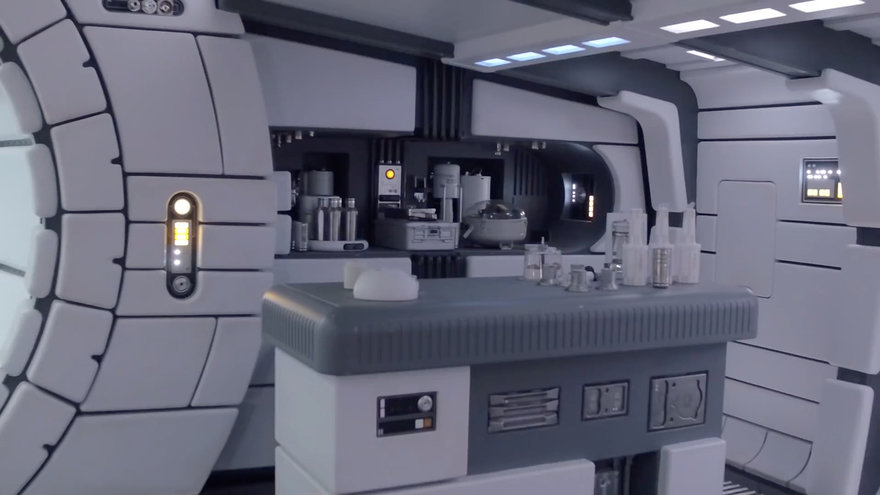
Look at the fluting cut into the skirt of the countertop. Those are there so that when you spill a glass of orange juice, the fluid will run through those channels. So when you go to clean it up it's not just a matter of wiping the edges, but crumpling up a paper towel and getting into those grooves, too. I bet no one takes the time to do this and the insides of those grooves are all sticky.

Over at this console, look at this chair off to the side:

Why is the underside of the headrest upholstered? I've never sat in a task chair and thought "This doesn't offer enough support for my parietal bone."

Then there's the guest bunk. Notice that there's no way to get to the damn thing without climbing all over the "Patent Leather." Also, could you possibly place the "Environment Controls" in a less convenient location to access? I have to get on my knees and awkwardly lean over the back of the banquette to get the A/C going?

More on the shitty design of this bunk--are the contours of the sleeping surface designed to give you scoliosis? Also, it has a padded top, bottom and sides, presumably to protect a sleeping occupant during turbulence in planetary skies. But there's no safety rail preventing you from falling out of the thing and landing on that nice metal table below. So the designers were like, "We want to protect you from bumping into surfaces immediately adjacent to you, but have no problem with you being thrown free of the berth altogether." FAIL.

Now we get to Lando's bedroom. 

He's kind of a sleaze so you don't want look at this room with a black light. Anyways we can see he's got the new Amazon Alexa on a table at left. We can also deduce, assuming he sleeps on this bed with the bizarre jump ramp thing at the end of it, Lando regularly needs to see a chiropractor and can't figure out the source of the trouble. 

The "Fitness Nook" is presumably where he stores a Bow-Flex or something.

The most egregious design deficiency emerges when we see inside Lando's walk-in closet.

Look closely at the closet rods and the hangers.

Let's zoom in further:

What the EFF. Those hangers aren't topped with hooks, but enclosed loops. Hence all the closet rods are protrusions rather than a single tube supported on both ends. If you want the cape at the back, you have to first pull off the five capes on top of it? The people in this universe have figured out hyperdrive technology, but haven't worked out the utility of a hook versus a loop?

I could go off on the cockpit too, but I can't accurately criticize the UI as I don't really know how a craft like this is controlled. We never see Han or Lando shift so it's presumably an automatic. I will say, however, that the "Hyperdrive Controls" look like the first thing someone learns to make in an Intro to the Lathe class.

Lastly, it's no secret why we never saw the bathroom on this ship. It's because the co-pilot is this guy:

What do you think that shower drain, or even a bar of soap, looks like after this lousy Wookiee gets out of the shower?


Connect with Designers at the All New Coroflot

$
0
0

At Core77 we are very proud to share with you our internal team's ground-up rebuild of the Coroflot design portfolio and job site and the launch of a new identity. It is a platform-wide launch focusing on a seamless desktop to mobile experience, and the establishment of a new aesthetic visually and in use. A project many months in the making, it is the result of the dedication and talent of our technology and design team, and a huge leap forward in our ongoing effort to make Coroflot the most effective talent and career community on the web!

While the project was conceptualized and realized in-house we started things off with an identity design exploration by The Collected Works. The brand, type and palette specs they developed gave form to our ambition at an early stage and grew to be not only a touchstone for the visual and interface work which followed but a tonal reference for product and community planning.

Our desire to "open-up" the site with this launch is certainly visible in the overall design but it is also prominent in functional shifts both large and small… Such as the full deconstruction and reconstruction of how users communicate via the site. Transitioning from an email-based system to a near-real time messaging app shortens the communication loop and puts talent and clients in direct contact in a single context. It isn't restricted though so it is easy to strike up a conversation with your fellow Coroflot designers

Similarly your portfolio and profile at Coroflot is now cleaned up in order to facilitate quicker connection and action. Here one of the most significant aspects of the the site relaunch -- page responsiveness -- is visible as your page smoothly rearranges layout across sizes from desktop to mobile. The design seeks to offer a balance for users, with Call-to-Action for fellow designer-types and potential employers alike.

Images now elegantly span the screen on individual project pages, and with just a click the viewer enters into the new slideshow mode -- a consolidation of our previous project presentation methods.

On the business-side of things the new site design integrates our recently expanded recruitment offering; now employers and recruiters alike can place creative talent right at their fingertips with Coroflot Pro Search across a variety of devices. Recruiting workflow is further improved with a new layout for candidate profiles and conversation tracking via the built-in messaging.

The new design introduces some subtle improvements with our famous Design Job Board, where postings provide a vast array of opportunities to thousands of design professionals. The emphasis is on honing the platform for employers: bigger branding, improved presence for a company's info and additional positions and prominent application buttons make for a more beautiful and effective talent acquisition point.

Coroflot was created by designers, for designers, and is still run by designers today. For more than 20 years our focus has been connecting designers and creative companies world-wide. This latest step is a confirmation of that mission and of our dedication to that crucial intersection of ability and need, simultaneously helping designers make their mark in the creative world and enabling employers to recruit exceptional creative talent.

Note, we're not done yet! This launch is a giant step for the site but importantly the effort to get here reflects that every person on the Coroflot staff, and our extended family at Core77, is endlessly enthusiastic about design and our community. So please let us know what you think of our new vibe, but also share with us your thoughts on what you would like next –– we love feedback and want to continue building this community with you in mind.

Looking to share you work?
Join Coroflot

Recruit with Coroflot:
Post a Design Job or Search for Exceptional Talent

Graphic Designer Daniel Carlmatz's Visually Witty Logo Designs

Hell in a Handbasket: A Dutch Eco-Friendly Urinal Design That Plays Advertisements While You Pee

$
0
0

Last year I was disappointed to learn of in-bathroom advertising:

Thankfully I've not seen these at a restaurant near me, but that doesn't mean this particular industry is stalling. From the Netherlands comes this product called Mr. Friendly, a urinal with a built-in monitor for running ads on.

I can't be the only one who, while urinating, focuses on where the stream is going; you have to get that bank shot along the sides to prevent splashback. (Urinals really are the worst design ever.) I wouldn't give that monitor a second of my time, unless it presented real-time AR footage of my aim, overlaying reticles and arrows to provide fine-tuned guidance.

Secondly, this urinal may remain unvandalized in civil Holland. But bring this to America, put it in any bar and I can guarantee you one bro or another will pee all over the screen.

That aside, this urinal is also meant to provide a positive impact on the environment as it's flushless/waterless. It actually uses a rather clever liquid filter design, and if you're curious as to how that works, it's demonstrated (with graphics, not real footage, thankfully) in the video below.

Design Job: Sweet Dreams Included with This Career Opportunity

$
0
0

HotelTonight makes it remarkably easy to book great hotels at amazing rates on your mobile device. Our mission is to make people feel more alive by delivering the unexpected and we’re looking for a Senior Product Designer to help do just that.

View the full design job here

Reader Submitted: The PLUSminus Task Lamp Offers Users a Tactile Lighting Experience

$
0
0

PLUSminus is a task lamp that uses a not yet seen mechanism that's small in size, easy to manufacture and assemble and enables a perfectly smooth motion for the user. It's engineered from the ground up.

View the full project here

Design Job: Have a Love of Pets and an Eye for Design?

$
0
0

For over 10 years, RefinedKind Pet Products has designed and manufactured stylish pet furnishings under the brands The Refined Feline and The Refined Canine.

View the full design job here

Desktop Valets/Organizers, Yea or Nay?

$
0
0

Whether you refer to it as an "Everyday Carry" or not, most of us have things we consistently keep on our person as we leave the house. For some, if not for your correspondent, it makes sense to marshal all of these things onto a dedicated object at the end of each day. Here are some examples of what these objects look like:

Etsy shop SkyWoodStudio
Etsy shop EcoWalnut
Etsy shop ImproveResults
Etsy shop PineConeHome
Etsy shop AmbientWood

We can assume those who use these a) Prefer to see everything in one place and b) Can be assured they will not leave the house without the items they need.

Functionally these organizers never appealed to me, and even if I found one aesthetically pleasing I'd never use it. The objects I need to bring outside of the home are scattered about inside the home, a function of my idiosyncrasies.

Here's what I carry at all times outside, and where they live inside:

Keys. These live in my pants pocket. As I wear the same pants for weeks at a stretch, the main set of keys stay within them each night. As I never leave the house without pants on, I never forget my keys. I have additional keys related to side jobs that occasionally need to be swapped in and out, and these live on hooks by the door.


Cash. Like the keys, these live in my pants. On laundry days I switch the keys and cash from the old pants to the new pants.


Wallet. I'm still carrying this thing, and have not found a better replacement. My wallet lives in a semi-concealed spot near the front door, convenient enough that I automatically reach for it when leaving, but concealed enough that only a determined burglar would find it.


Phone. Generally sits on a horizontal surface close at hand (desk, kitchen counter, shop table). Because it's always nearby, I never forget to grab it when leaving the house.


Vape Pen. Lives in one of four drilled-out wooden blocks scattered around my house (desk, kitchen, shop, sewing machine repair bench). I forget to bring this frequently but am okay with that as I oughtn't be using the damn thing in the first place.


Eyeglasses. I don't like bringing glasses outside the house because I don't always need them and really hate the design of eyeglass cases (too bulky given the contents). But I always bring these if I'm going to be driving a car, going to a large big-box store (something about the lighting in there makes it extra hard for me to read product labels), wielding tools, or to any environment where I will be using a computer. These live on my desk or on my face.


What do you all carry, and how do you organize it inside your house? Do you think desktop valets like the above have merit? And if you've designed one yourself, please post a photo and description in the comments.


Design Discussion: How Would You Design a Modern-Day Grandfather Clock?

$
0
0

Question: If you're re-designing an object that has a long history, do you feel compelled to somehow integrate that history into the design? Or do you feel progress is only made by throwing out the past and reaching for fresh forms?

I'll try to clarify that question using an example.

Grandfather clocks, originally called longcase clocks, were once desirable household items because they kept accurate time. That ability depended on its mechanicals, which in turn dictated their tall form factor.

Verge escapement

A brief explanation: Prior to the invention of grandfather clocks, mechanical clocks were constructed using what's called a verge escapement, what you see at left. An escapement is the mechanism that turns energy into the oscillating motion required to make a clock work.

This is what you'd have seen inside medieval clock towers. The verge--that's the green crown-like wheel--was driven by gears powered by a pendulum that swung in a wide arc, covering roughly 80 to 100 degrees. That long swing, with its attendant air drag, led to inaccuracy over time.


Anchor escapement

Then came, in the mid-17th-Century, the development of the anchor escapement, shown at left. This clever set-up reduced the swing of the pendulum to just 4 to 6 degrees, rather than 80 to 100. This massive reduction meant that not only was the clock more accurate, but they could be built in a form factor that would fit inside of a home.

All of that is a long way of saying, that's why grandfather clocks are shaped the way they are. The clock is at face level for obvious reasons, and the long body, or longcase I should say, is to contain the pendulum and the weights that drive it.


Grandfather clocks were of course superceded in accuracy by electric and quartz clocks in the early 20th Century.

Fun Fact: In the 1920s Herman Miller had a clockmaking division. In 1937 this was spun off under the leadership of Herman's son, Howard. Today the Howard Miller Clock Company still exists--and still makes grandfather clocks.

I looked up some modern-day grandfather clock designs and was disappointed with what I found:

There's no homage paid to the object's original workings. These just seem, at least to me, to be arbitrary forms that achieve height for the face. 

Even a Howard Miller clock you can buy today disappointed me with both its proportions and materials choices.

This is the only one I found that I liked even a little:

This is all subjective of course, but I don't like the way the circular face doesn't quite relate to the top of the form. But overall I like the flowing lines, and to me the flare at the bottom is evocative of the swing of the long-gone pendulum (this clock is powered by a battery).

Your thoughts? If you were tasked with designing a grandfather clock, would you feel beholden to its mechanical history and obsolescence, or would you start from scratch?

Urban Design Observations: Improvised Moving-Van-to-Sidewalk Interface

$
0
0

Someone is moving house, and this moving truck is parked at a skewed angle to the curb.

The movers I observed were rolling a series of boxes and items up this ramp with a dolly. It's obviously made easier if they don't need to deal with the curb.

But by parking at such an angle to the curb, it means they blocked more of the roadway. This wasn't a huge deal, but oncoming cars had to navigate this chokepoint.

The design of this ramp works fine in the 'burbs where they have driveways, but it's ill-suited for the urban environment. Ideally they'd have a different ramp that had the top slanted at an angle, and would be reversible. That way you could flip it over to change from a right-side sidewalk to a left-side sidewalk.

Or do one of you have an idea for how to make one ramp do all three positions? Bear in mind that it's got to be super-strong, so any kind of hinge is going to present a problem.


Tiny, Ambivalent Storage Drawers from Japan

$
0
0

There's a craftsman in Japan going by the handle Conocoto (I looked it up, it's a town in Peru) who makes these tiny, ambivalent storage drawers.

They're designed to hold "nothing particularly," he writes on his Japanese-language blog. "Please store your favorite things like toothpicks and stamps."

Although the jewelry in this photo gives a good indication of the diminutive scale he works in…

…he's also made at least one unit large enough to hold a kitten.

He sells them for a measly ¥1,000 - ¥3,000 (about $9 - $28 USD) on a website called Creema, which appears to be a Japanese version of Etsy. 

Check out his page here.

Design Job: Love Furniture? Now Seeking Production Designers

$
0
0

The Designer will work within regional teams to see projects through from initial concept to production under the direct supervision of the Regional Design Lead. Designers will be required to produce deliverables for multiple projects at one time with minimal supervision.

View the full design job here

What If Lids Could Do More Than Just Seal a Container?

$
0
0

A fluoroelastomer is a variant of synthetic rubber. Chemical- and stain-resistant, it's used to make seals in air conditioners and automobiles. Nendo, however, imagined more domestic applications for the stuff, and partnered with air conditioner manufacturer Daikin, a company well-versed in fluoroelastomers, to make a new series of kitchen objects.

For their "Air Lids" project, Nendo developed five different vessels with fluoroelastomer lids that have more functionality than mere caps:

01. Pick-up lid – a lid that can [gather] seasonings from its container
(Image darkened by us to show form)
02. Press lid – a lid for a liquid container that opens like a mouth when pressing down its top
(Image darkened by us to show form)
03. Pinch lid – a lid that conceals a small spoon, which only appears when pinching its edge
(Image darkened by us to show form)
04. Pull lid – a lid that is stretched from inside the container, closes its mouth with tension
(Image darkened by us to show form)
05. Push lid – a lid that extrudes liquid from the container when being pushed in to it
(Image darkened by us to show form)

I know some of those descriptions sound confusing, but you'll understand them right away when you see how they're used:


Unusual Vintage Storage Furniture: Dental Cabinets

$
0
0

Last weekend I was asked, if I could build any piece of furniture with no production limitations, what would I build? Every designer posed this type of question probably envisions something futuristic, but I had something different in mind. A very unusual antique piece of storage furniture. Knowledgeable vintage hunters may have seen one of these before. You probably haven't, chances are, so I'll describe it here.

Trays, drawers and intriguing swing-out surfaces characterize antique dental cabinets. In the 19th and 20th Century the bulk of a dentist's tools were unpowered hand tools, lots of them, and they needed a way to store everything close at hand. Remember that dentistry is exacting work, and with a patient in pain, they'd want to quickly access a needed tool at a moment's notice, so organization would be of paramount importance. Enter the unsung genius designers who came up with these:

Big whoop, you say, that's not that impressive. Well, that's because I started with a weaker one (although it is still cool, check out the slide-out tray on the left side and the swing-out trays on the right side) and am finishing with a much stronger one:

While there are a variety of cool things that slide out…

…my favorite is all of these swing-out trays with different types of organizers:

Even cooler is that they are all removable.

You can pop each one out as needed, to carry it over to the work. This is made possible by this attachment:

This attachment rides on one of many collars--I assume, I can't quite make it out in the photo--that are mounted to the pivot bar.

Also nifty are these double doors on which to hang things. The second one opens to reveal room for yet more storage.

Lastly it has a mirror up top, presumably so the dentist could check his own pearly whites before heading over to the patient.

Fun fact: Dentistry, in the 19th and early 20th Centuries, was reportedly so expensive that "some people chose to have all their teeth pulled to spare themselves a lifetime of pain. [Dentistry documentarian and history professor Joanna] Bourke says: 'Having all your teeth removed was considered the perfect gift for a 21st birthday or a newly married bride.'" Absent a gifter, most people probably approached the dentist for major procedures the same way we do today: Dread, Care, Loan.

Design Job: Shift to a New Career

$
0
0

At Redshift, in addition to being a top-notch UX designer, and leading cross-functional project teams, senior UX designers are responsible for regularly presenting work to clients, so the ability to communicate confidently and clearly are essential. You must be able to speak fluently about both business objectives and design principles,

View the full design job here

A $345 Automatic Coffee Stirring Device, Yea or Nay?

$
0
0

Every morning I get an ice coffee to go at the diner downstairs. The counterwoman pours ice, milk and coffee into a cup, lids it and hands it to me. I have given up on asking her, for the sake of even mixing, to pour the milk in last (milk is heavier than coffee) because she is set in her ways. So I get the coffee and it looks like this, milk at the bottom, coffee up top:

Instead of grabbing a coffee stirrer, I simply grab the cup by the top and rotate my wrist for ten seconds:

And then it's mixed, like this:

Call me crazy, but that's good enough for me. I don't need a perfect coffee-milk blend so I'm good.

At the Starbucks down the street from me, it's a different story. Every customer there stops at the stirring station, grabs a little wooden stick, stirs up their potion and tosses the mixing stick.

Engineer Scott Amron writes that "400 million stir sticks are thrown in the trash every day. That bothers me. Wooden sticks are bad. Plastic sticks are worse." So he invented something called the Stircle, an automatic coffee stirring device that costs $345:

This is one of those things where I see the need, and Amron's math is compelling…

A Stircle should stir 50,000 cups on about $0.10 of electricity or $0.000002 per stir. So, it costs 99% less to run than stir sticks. It can significantly reduce waste associated with stir stick production, distribution, transport, packaging, labeling, usage and disposal. It can also replace the spoon used by employees behind the counter, ensuring a consistent taste with zero cross-contamination.

…but I still think this is dumb. Not that Amron invented it, but that we as a society need to drink perfectly blended fluids and are willing to rip through forests or build more electronic gizmos to achieve that.

Admittedly, my proposed counter-solution would fail: I'd have us all use our actual wrists to wiggle-shake the drinks, and would be met with a resounding Ain't Nobody Got Time For That.

What say you to the Stircle, and what is your proposed solution?

A Desk Designed with a Transparent Top for Crafters

$
0
0

For me, a desk is where the computer lives, and a workbench is a separate piece of furniture on which I make medium-sized, hard-edged objects primarily out of wood. For people producing smaller and softer craft objects, however, the desk and workbench are one and the same. I came across this design for the EZ View Desk 2.0, which targets the latter category of users, and was interested to see how different its design is from what I think of as a workbench.

First off the top is transparent, which I think is freaking amazing. My benchtop is perforated by holes (think Festool's MFT) to accept clamps, and even if it wasn't, any transparent top would quickly get scratched into opacity by the metal tools I use. But I would love to be able to store this many tools close at hand and be able to see exactly where they all were.

Drawers beneath the top level offer yet more storage, and in the center is a pull-out platform to store a cutting device made by the same manufacturer as the desk.

What appear to be mere cabinet doors from the outside, open to reveal shallow shelves inside the doors on which yet more items can be stored.

Behind the right-side door is yet another drawer, another pull-out platform with full-extension drawer slides, and an open compartment beneath.

The left-side door, however, has no open space behind it. That's because….

…the space behind it is meant to be occupied by a series of removable containers.

While that design choice greatly limits where you can place the desk, I cannot deny the utility of hauling a bin of materials over to your project, to decide which one to select.

This desk has actually been discontinued; the manufacturer, a company called The Original ScrapBox, states they are working on an upgraded design. I'll be curious to see what they come up with for 3.0.

By the bye, the same company manufactures a much larger crafts storage unit, the WorkBox, which we looked at here.

Tools & Craft #94: Why We Need Rough Material, Not Smooth

$
0
0

When I build my first real bit of furniture I didn't have a jointer (hand or power) or a planer, and basically I knew nothing. So off I went to Constantine, which was then in the Bronx, and I bought a pile of ready planed cherry.

I got it home, it warped, and I never got the record cabinet square.

Since then I learned never to buy pre-surfaced wood for anything important.

I've broken that rule for poplar because I can get pretty stable poplar, but nothing else.

Fast forward to today. A salesman for a big lumber yard stopped by to say hello. Then he volunteered the information that his lumber yard, which is one of the few places left in New York City that stocks Walnut and Cherry, no longer stocks it in the rough. And the wood is shipped to them from the mill already planed.

The official reason is that it's what most of his customers - professional cabinetmakers - want. A lot of professionals who use wood, mostly use it for parts of furniture - doors, trim, etc. and don't or can't want to take the time to let the wood settle. Also he says that a lot of his customers can't read the grain unless the wood is planed.

For anyone making traditional hardwood furniture this is a major problem. The minute wood enters a normally heated shop it will start moving and the only way to have a stable project is to first sticker it and then let the wood acclimate to the workshop climate. Then mill it. For project lasting a long time it even make sense to let the wood acclimate to your shop, then mill to a fat dimension, sticker it and let it settle more, and then joint and plane to final dimension.

I should mention that all accurate milling starts with a jointer (either by hand or machine) before using the planer to get the material to thickness. The planer rolls flatten the lumber so you need to joint to first to get a flat reference surface.

If you need to see the grain, ask the lumberyard to skip plane it for you. Skip planing just takes a light pass off the wood removing the high spots and that way you can see the grain.

You can buy planed wood, let it settle and plane it again, that will waste a lot of wood (and if you are milling by hand - more time) and of course cost more.

I don't know where my next solid lumber order is coming from (probably not from around here). :(

___________________

This "Tools & Craft" section is provided courtesy of Joel Moskowitz, founder of Tools for Working Wood, the Brooklyn-based catalog retailer of everything from hand tools to Festool; check out their online shop here. Joel also founded Gramercy Tools, the award-winning boutique manufacturer of hand tools made the old-fashioned way: Built to work and built to last.

Steven M. Johnson's Bizarre Invention #151: Ties for Rainy Weather

Urban Design Observations: The Functional Volume vs. Actual Mass of Trash

$
0
0

At a Dunkin' Donuts in Gowanus. 

Having worked in restaurants for years, it always captures my attention that you can fit 100 new, folded napkins within a certain volume, but crumple them up and you can only fit 10 in the same space. Ditto with coffee cups.

This garbage can isn't full; it's filled with paper bags, receipts, straw wrappers, empty un-nested coffee cups and lids, et cetera, and no one wants to push the garbage down.

When I lived in Japan, I worked at a junior high and got to witness the Japanese school lunch procedure. Lunch is served in the classroom by students, and students also do the cleanup.

Each student gets a box of milk. After finishing his, the boy in front of me removed the straw and compressed his box completely flat. I looked around to see the other students doing the same. All of the flattened juice boxes in the class of 34 then went into a small transparent garbage bag, taking up a minimum of space. 

When I asked the teacher about it, he explained that it only takes the students a few seconds to do, and multiplied across the school, flattened milk boxes required less garbage bags and less trips to ferry said garbage bags. 

I was impressed, and ever since then I compress my own garbage as best I can.

Viewing all 19155 articles
Browse latest View live


Latest Images