Quantcast
Channel: Core77
Viewing all 19155 articles
Browse latest View live

Design Job: Display Your Passion for Crafting Experiences as an Exhibit Designer at Exhibitpro, in Columbus, OH

$
0
0

Are you among the best at what you do? Are you immersed in the latest exhibit design and digital marketing platforms? Do you want to be part of an organization that has tripled its growth over the past five years? If you answered yes to all three of these questions - they want to talk with you. Exhibitpro is a 28 year old, woman owned business located in New Albany, Ohio. They recently moved into a new state-of-the-art facility, and are excited to announce a new opening for an exhibit designer.

View the full design job here

McMansion Hell Site Tackles the Wealthy Suburbs of Washington, D.C.

$
0
0

The last time we checked in on McMansion Hell, founder Kate Wagner was tearing into Betsy DeVos' 22,000-square-foot summer home. For the past few months Wagner has been trawling an area closer to our capital: The wealthy suburbs of D.C., where McMansions proliferate, and she's picked out ten noteworthy examples. Assuming politicians from both of the major parties reside locally, Wagner has discovered that bad design is a non-partisan issue. Some examples:

"#4: Mad Hatter (Fairfax County)"

"#6: Sticker Shock (Loudoun County)"

"#9: Tricorn Turret (Loudoun County)"

See the rest at 50 States of McMansion Hell: Fairfax and Loudoun County, Virginia.

This Bay Area Packaging Designer Paired Silicon Valley Vibes with a Zero-Waste Ethos

$
0
0

Boudin won a Student Runner Up Visual Communication Award in the 2019 Core77 Design Awards.

Boudin, a bakery and restaurant chain based in San Francisco, is famous for its sourdough bread and its "Bowl of Soup," which is a hollowed out sourdough "bowl" with clam chowder in it. It's an inspiringly self-contained, fully edible culinary design. It only makes sense, then, for the brand to follow in its own zero-waste footsteps with the rest of its food packaging.

A result of ArtCenter College's first-ever plastic-free packaging course, designer Yi Mao proposed a rebranding of Boudin's packaging and visual identity that shifted the company toward sustainability and, as Mao deemed it, "the 21st century vibe."

Boudin SF new to-go packaging container -
Core packaging containers for sourdough bread and clam chowder -

Mao's presentation included physical food packaging (the models dictated the size, dimensions, and functionality of real paper pulp containers); reusable cotton carrier bags; and environmentally friendly wrapping papers, container tags, to-go menus, and business cards.

To produce the models, Mao employed a comprehensive range of compostable biomaterials: algae, food waste, grass, mushrooms, plant cellulose and wood pulp.

To-go packaging tag -
New branding identity -

The sustainability aspect was only one of the guiding ethos for the project; the other was modernization. "Cleaner typography and more illustrative graphic elements" as parts of a comprehensive visual system would transform Boudin 'into a brand with a strong contemporary style'," says Mao of the proposal. This restyling incorporated San Francisco's history, as well as the bakery's— Boudin has been a California institution since 1849.


Boudin SF food delivery packaging family -

Deeming the concept "Boudin Yuccies" (which stands for Young Urban Creatives), Mao's pairing of heritage with the crucial element of ecological-mindedness aims to bring the brand's stature as an iconic San Francisco tourist attraction into a new era, one that fuses with Silicon Valley's philosophical and aesthetic direction.

Sounds like a fully baked concept to us.

Environmental design elements -

Learn more about the plastic-free packaging project for Boudin on our Core77 Design Awards site of 2019 honorees

The Jester: A Microphone Designed for Modern-Day Content Creators

$
0
0

Looking at most existing studio microphones, like those above, I can't help but feel that they were designed by an engineer and sheathed by an industrial designer. Maybe that's because manufacturers assume that there just isn't much for a designer to do here; the technological innards of a microphone are well-established, as is the form factor. But Germany-based design firm SMAL begs to differ, and feels the lack of design attention is an inertia-based oversight.

"Besides improvements on a technical level or the type of connection, microphones still look, feel, and are built the same as they used to be," the company writes.

"They never really evolved in the last decades – simply because they didn't need to." SMAL chalks that up to the enduring system of studios themselves, where trained audio technicians are the ones working with the gear. But now, they reckon, modern-day content creators--DIY musicians, podcasters, YouTubers, game streamers--who don't have a headphone-wearing sound engineer advising them through a glass window, could use a pro-quality microphone more in tune with their needs. And design can help.

Thus they've designed the Jester microphone, which addresses what they consider a glaring flaw in modern-day microphones: The complete lack of visual feedback where levels are concerned.

Being caught up in the heat of the moment when recording a gaming session or live broadcasting, the sound recording quality often does not live up to what today's microphones are capable of – simply because there is a lack of feedback about how your live recording actually sounds to your audience.

The Jester Microphone has some smart guiding features built-in, giving constant visual feedback about the recording status and quality, to make sure the recorded live performance comes across to viewers exactly as intended.

For example, the 360° light distributed through the translucent shock mount structure indicates whether or not users have the perfect recording position for optimal quality, by changing its color in real time.

I'm not entirely sure if this is an improvement over keeping your eye on the sound levels on the monitor; I'm thinking specifically of eyelines, because the light is located at the bottom of the mic, where I might not be inclined to naturally look. However, if you were recording in a darkened room, as depicted in their press photos, I suppose the color changes would be more obvious.

The area up top is reserved for another important visual feedback cue: The illuminated mute button. My experience with studio microphones is limited, but with the few that I've used, I've always been surprised that mute notification was relegated to a tiny red dot that wasn't always easy to see. I think SMAL's approach is a welcome improvement.

Additionally, SMAL took the approach that "the workflow and the digital tools content creators use today [warrant] getting rid of redundant physical controls and connectors. The two remaining touch-sensitive 'quick control' surfaces on top of the Jester Microphone can be freely assigned with the functions that are needed, and are large enough to allow fast and precise control.

I'm somewhat wary of this, as an old-fashioned person that prefers physical buttons on the object itself--I find other arrangements, particularly touchscreens, always give me a cognitive disconnect--but I suppose I'm not the target market, and the people that they studied are. "Starting from foundational research and product testing, we quickly went into interviewing and observing real streamers," they explain. "Analyzing the use, workflow, and the different parts of the microphone itself led to insights about opportunities for innovation."

An area that SMAL has addressed pretty niftily is the shock mounts. They've done away with the standard wrestling-ring-crossed-ropes approach, and instead integrated a technique we'd seen flirted with in digitally-fabricated furniture designs:

The shock mount of the Jester Microphone is completely rethought – the 3D-printed flexible structure is now directly integrated into the body, and therefore absorbs unwanted frequencies even better.

The skin of the microphone is a fabric woven in a similar way that modern sneakers are – being more flexible where it needs to move with the shock mount and being denser where it needs to integrate pop-filter capabilities.

The overall design results in a fusion of the aesthetics of high-end audio equipment and lifestyle products – which is a perfect match for the target group.

The Jester has been submitted to the iF Design Awards, and you can check out more of SMAL's work here.

Get $400 Off an SLA 3D Printer--If You Own (Any) FDM 3D Printer

$
0
0

For most individuals or small design firms with digital fabrication needs, an affordable filament-based FDM (fused deposition modeling) machine is going to be the gateway drug into 3D printing. As profits increase, you may step up to an SLA (stereolithography) machine. But here's the thing: Even if you add an SLA 3D printer, you're probably not going to get rid of the FDM model. You'll find it still comes in handy for when you need to, say, quickly crank out multiple parts that don't require the precision and time of the SLA.

"Many businesses use both FDM and SLA machines alongside one another," writes FormLabs, who manufactures SLA machines like the Form 3, above. "This opens access to a wider range of applications supported by low-cost rapid prototyping, high quality, functional parts, and comprehensive material formulations."

To make their point--and hopefully a sale--the company's written up a "How to Optimize Projects With Both FDM and SLA Technologies" article interviewing folks who use both in their workflow. As one example, fabricator Matt Schmotzer, who produces working models of rollercoasters, takes the hybrid approach.

The support structures for the coasters require hundreds of individual members. "Since high detail quality is not a concern, and a large number of prints is required, Matt turns to FDM to quickly print most of the beams." The carriages, on the other hand, require much more detail. "The train models are printed on SLA machines [which] excel at creating final, high-quality end-use parts, and the train models are expected to look as realistic as possible down to the tiny handles on the doors."

You can read a couple more case studies at the article, but here's the main point: If you've got an FDM printer and are looking to add an SLA, FormLabs will knock up to $400 off of their SLA Form 3 printer. All you've got to do is provide proof that you own an FDM machine. If your model is on the list below, you're good to go:

To apply for your discount, click here. The offer's good until December 24th of this year.


Currently Crowdfunding: A Portable Espresso Maker, Magnetic Cutlery, and More

$
0
0

Brought to you by MAKO Design + Invent, North America's leading design firm for taking your product idea from a sketch on a napkin to store shelves. Download Mako's Invention Guide for free here.

Navigating the world of crowdfunding can be overwhelming, to put it lightly. Which projects are worth backing? Where's the filter to weed out the hundreds of useless smart devices? To make the process less frustrating, we scour the various online crowdfunding platforms to put together a weekly roundup of our favorite campaigns for your viewing (and spending!) pleasure. Go ahead, free your disposable income:

Blending style, speed, portability, and top-notch technical features, the Australia-based Raine One is a compelling addition to the electric scooter market, slated for delivery in May 2020.

This wall-mount kit will help you minimize single-use plastics in the home by transforming any threaded bottle into a liquid hand soap dispenser.

The highly portable COFFEEJACK is all you need to brew a perfect shot of espresso—no pods required.

We've featured a number of reusable cutlery projects here, but Magware stands out with a neat magnetic solution that keeps everything together and easy to carry. The Bring-Your-Own-Cutlery movement is going strong.

Denim offcuts combine with resin to create these sturdy shades. While the inside edges are perfectly smooth, the front side retains the tactile feel of denim.

Do you need help designing, developing, patenting, manufacturing, and/or selling YOUR product idea? MAKO Design + Invent is a one-stop-shop specifically for inventors / startups / small businesses. Click HERE for a free confidential product consultation.


Facadism: When Architects are Forced to Design New Buildings Behind Existing Facades

$
0
0

Over a decade ago, an anonymous writer/photographer known as "Gentle Author" set out to write 10,000 stories, at a rate of one per day, about life in London's Spitalfields district. (To our largely Yank audience: Spitalfields could roughly be likened to Manhattan's Lower East Side--formerly working-class, later seeing an influx of creatives and new immigrants, now grown eclectic but gentrified.) The resultant blog is Spitalfields Life, and Gentle Author's deep archive shows that s/he stuck to the plan and aims to complete it.

Among the many urban phenomena within walking distance of GA's stretch of London are multiple examples of a peculiar architectural occurrence: What GA calls "facadism the unfortunate practice of destroying everything apart from the front wall and constructing a new building behind it."

UCL student housing in Caledonian Rd, winner of the Carbuncle Cup 2013. (Image via Spitalfields Life)

Whenever you see an old facade with a new structure behind it, this tells you that a building of distinction once stood there that could not simply be demolished and the compromise which arose was to keep the front wall. None of these facaded buildings should have been destroyed, but it happens because the economic forces driving redevelopment are greater than the legislation to protect what exists already. The recent rise in façadism is a barometer of how far the power balance has shifted away from conservation towards redevelopment. The result has been the loss of too many important and attractive old buildings that once enhanced our city and their replacement with generic monoliths.

Bayswater Rd. (Image via Spitalfields Life)

No-one believes the original building still exists because the front wall still stands. There are a few examples where an attempt has been made to hide the join but, in my experience, this is a fiction that developers do not strive to maintain. Mostly, retaining the facade is an unwelcome condition of planning permission when their preference would have been complete demolition. Abnegating responsibility, the developers either complain that they were forced to keep the front wall or occasionally boast that they retained the period features, while the local community grieves that a beloved building and landmark has been destroyed. Nobody really wins and the uneasy physical form of the buildings manifests the tensions which arise in such compromises.

Staycity Aparthotel, Blackheath Rd, Deptford. (Image via Spitalfields Life)

The front wall alone can never be a sufficient replacement for the loss of a building. Even the assumption that it could be raises questionable notions about how we experience the urban landscape. Cynically, it implies we perceive the world as mere surface and it does not matter if what is behind changes, as long as the superficial appearance is preserved. Yet a facade becomes a mask when it conceals a building's change of use – from a philanthropic institution into luxury flats or from a public building into a corporate headquarters – distracting our attention from the reality of the transformation.

Union Hall, Union Street, Borough, opened as Surrey Magistrates Court in 1782, facaded for offices in 2005. (Image via Spitalfields Life)

Unsurprisingly, architects dislike the requirement of incorporating an existing facade into a new building, which may have been conceived in the hope of fulfilling their own design without such compromise. Yet too often financial subservience overrides self-respect in these cases. No wonder the treatment of the facade is often perfunctory and the resentment is visible. These circumstances explain the strange discontinuities in this hybrid architecture where sometimes a gap is inserted between the facade and the building, and the architectural styles of the facade and the new building are often at odds with each other. It is disappointing when architects pay so little attention to the architectural whole and the rest of us have to live with these grotesque monsters that confront us only with what we have lost.

Archway Rd, Highgate. (Image via Spitalfields Life)

Replica of the facade of Gaumont Cinema 1914 built in 2018 in Pitfield St, Hoxton. (Image via Spitalfields Life)

Corner of Berwick St & Broadwick St, Soho. (Image via Spitalfields Life)

Gentle Author has amassed enough examples of this practice that s/he's released a 122-page book full of them,The Creeping Plague of Ghastly Facadism. The cover's quite cheeky, as it's got both an outer and inner cover:

You can order the book here, and you can check out the original Spitalfields Life blog here.

Michelin Challenges Creatives to Upcycle

$
0
0


Michelin North America is celebrating its 20th global design competition, Michelin Challenge Design, in 2020 by challenging entrants to Upcycle previously recognized works.

"The world is pursuing ways to do more with less by using fewer resources and raw materials in the creation of innovative solutions for people, the planet and the economy," said Nick Mailhiot, chairman of Michelin Challenge Design.

Artists, designers, engineers, architects, urban planners, futurists or teams are challenged to find a second life or purpose beyond reusing and recycling from one or more of 300 previously recognized Michelin Challenge Design entries.

The entries should visually communicate how their repurposed Upcycle design increases societal, environmental or economic value.


Three winners will be honored at a private reception during the Movin'On global sustainable mobility summit, June 3–5, 2020, in Montreal, where their winning entries will be displayed, and design portfolios reviewed and networking opportunities with Michelin Challenge Design jurors.

Portfolio Review: 2019 Michelin Challenge Design second place winner Robert Crick (UK) (center) presents his portfolio to Craig Metros (Ford), Chris Chapman (Hyundai), and Stewart Reed (Jury Chairman) during the Movin'On Summit in Montreal as winner Jintae Tak looks on.

Created by Michelin in 2001 to encourage and recognize young designers around the world, Michelin Challenge Design has become one of the most prestigious global design competitions. Jury members are the advanced design leaders for major mobility producers and experts from the global sustainable mobility community.

Through the first 19 challenges, Michelin has received more than 14,000 entries from 134 countries.

Recent winners and finalists have included entries from: South Korea, India, United Kingdom, Russia, Algeria, United States, Italy, Germany, Columbia, France, Brazil, Portugal, Argentina, Poland, Saudi Arabia, Canada, Czech Republic, Australia, Indonesia, Belgium, Turkey, Mexico, Albania and Bahrain.

You can see all the previous winners of the Michelin Challenge Design on their website. Below is a video documenting the finalists and jury members from the 2019 competition.

Anyone interested in preregistering can do so now at www.michelinchallengedesign.com. The entry portal for submissions will open Jan. 1, 2020, and close on March 1, 2020.


Is Apple Sleeping? Motorola Returns to Human-Focused Design Dominance with Their Incredible Folding Smartphone

$
0
0


If there's a flip phone design that you miss, it's likely Motorola's old Razr, or maybe even the Star-Tac. The flip phone era was fun to experience, from a design perspective, because there was plenty of room for designers to experiment; then everything went Glass Rectangle in 2007, and nowadays manufacturers compete on bezel size and technological features we neither want nor need.

Well, Motorola is showing that they're back in the design game with the resurrection of their Razr brand--which handily combines the smartphone and flip phone form factors:


So how did the designers pull that fancy hinge off? The answer is four years and 26 prototypes. Check out how it works:

I think the outer screen that shows notifications, in the phone's compact form, is brilliant. It's the kind of human-focused touch that Apple no longer possesses, and Motorola's design team (and whatever executive backed them) deserves props. Let the other manufacturers chase technological demons inside the glass rectangle. I don't care about face recognition, don't need a better camera, don't care about meaningless size differences on the millimeter scale. What I want is a phone that actually fits in a pocket and where the screen only gets big when I need it to. And Motorola appears to have delivered.

Next we'll have to wait and see if the thing is actually durable. Fingers crossed.

Unocup Duo Designs Dos Into Uno

$
0
0

Convenience is like coffee (a stimulant), once one gets a taste of it, it's hard to go on without it. Coffee lids, like plastic straws, water bottles, and plastic bags, typify obscene objects of convenience. Briefly utilized, single-use objects that end up having vast, and at this point pretty predictable, long term impact upon the planet. In New York City alone, about 1.5 billion coffee lids are used annually (4 million a day), a slice of the approx. 412,500 lbs of coffee lids that are thrown into the ocean. These large numbers are only a fraction of the actual environmental impact of coffee lids, which also includes the energy used for manufacturing, the extra material (petroleum in the case of many plastics), the shipping, and the storage. Even though many consumers are likely aware that 'disposable' coffee cups are not great for the environment, it's still a struggle to kick that convenience addiction.

Designers Tom Chan and Kaanur Papo don't want to take our convenience from us, but they do think all that waste is troubling. In an attempt to allow habitual coffee consumers around the world to have their coffeecake and eat it too, the duo has developed Unocup, a cup that aims to remove the need for the excess coffee lid, by having the cup's lid built into it's single-material design. The design has been described as, "origami-like," as it relies only on the paper cup material and 3 flaps at the top of the cup that are easily folded to form a lid and opening for sipping. If being eco-friendly isn't enough incentive for users, the cup also claims to offer "less spillage, and sturdier holding" than the lid and cups we're used to.

In my own experience at coffeeshops in New York, the 'disposable' coffee cup and lid is the default. I've yet to encounter a coffeeshop that simply does not offer the 'disposable' cup, but only uses mugs or customer's personal to-go cups. Obviously, this makes sense from a business perspective as the 'disposable' cups and lids meets the industrially-manufactured expectations of the customer: a mode of ingesting coffee that does not require sitting still, and will not be a burden (in the most mild sense) to the customer in any material way. Not to mention the fact that 'disposable' cups are also cheap to manufacture and purchase for businesses. The design of Unocup is an attempt to negotiate with our collective expectations of having coffee-on-the-go. Offering an alternative that is less materials for the consumer to use, and less materials for the business to buy.

Less is good, especially since the 'disposable' coffee cups are rarely ever recycled. With the lids, it is especially terrible as they are often made of centuries-lasting plastics that can often contain harmful chemicals. Even when they are compostable, they still cause big issues if they aren't actually composted. In the US, it isn't as if there are compost bins on every corner, or recycling bins for that matter, and so the likelihood of coffee cups being composted or recycled once a customer leaves the shop drops dramatically. In that sense, all eco-friendly disposable cups are kind of a joke (at least in the US), because obviously to-go cups are explicitly designed to leave the shop.

So if we don't want to change our habits, and if we live in one of the many places where there is no good infrastructure for waste removal, how can we possibly reduce our impact on the environment? Making things simpler might be a start. For businesses switching to the Unocup, it could make sorting trash and trash removal easier. With this single material option, it cuts the amount of necessary sorting in half, making recycling or composting less complicated, which is something that is direly needed in most places.

Making things easier to recycle or compost, makes us all feel better. Which is part of Unocup's goal. To reassure us that we can help the planet, while also drinking from a 'disposable' coffee cup. Typically, when I see "Saving the planet," and "streamlined for mass production," written on the same product page, I am overcome with skepticism. Yet I admit Unocup does offer a notable ecological insight. It reduces. While initial prototypes of the design were called, "Triocup," as the functionality of the cup is contingent on a 3-fold structuring concept. Its new name is much better and ultimately communicates the promise of that reduction: taking two products and making it one, requiring one waste receptacle instead of two.

Lead image photo by Brian Yurasits

The Maximum Viable Product

$
0
0

This essay was originally published by Michael DiTullo on LinkedIn

During the summer I drove from San Diego, CA to Portland, OR with my wife and dog. We stopped off in Redding, California, specifically to experience the Calatrava designed pedestrian bridge that crosses the Sacramento River and connects two portions of the Turtle Bay Exploration Park. All thanks to my wife and partner, Kristina, who plans all of our travel. Not only is the bridge stunning, like all Calatravas, it is also the world's largest functioning sundial. Did the town of Redding need to hire an internationally renown architect to build this bridge? No they didn't. Could it have cost less? I'm sure it could have cost much less. Would Kristina and I have stopped with our dog Enzo to have lunch and enjoy the town if it was just a regular old bridge connecting two parts of a park? No we wouldn't have. The Turtle Bay Exploration Park was packed on a 90+ degree day. Much of this foot traffic seemed to be for that bridge.

It isn't likely that making a functional sundial was part of the brief sent to Santiago Calatrava. We don't even know if the sundial function was part of his original intent. It is possible that during the iterative process Calatrava realized it started to look like a sundial and he perhaps ran with it. This is the benefit of hiring a well trained, experienced, and high skilled professional for a project and giving them a little room to run. This bridge is not the MVP (Minimum Viable Product). If it was, no one would be there. This is the Maximum Viable Product. This is the most he could get through the system, not the least.

As designers we need to not only know how to get things made (#realdesignersship), and not only solve problems for real users (#usercentereddesign) we also have to convince those that hold the final decision making power in the process that they should help us to build things that people love. The goal is to make something of value not only for its immediate utility, but also something that engages that aspirational side of the human psyche. As designers we can do that a bit more than anyone else in the product development process.

We can never forget to advocate not only for industry. Our products have to be profitable and made within the context of commerce. We have to of course design products for users. If we are not solving real problems for real people, what are we actually doing? To those two things I'd like to add a third defining principle, we have to design for culture. We should at least strive to create things that are embraced by the culture as a whole and encourage people to look up toward the horizon. It is a difficult thing to test for and hard to predict, but we can try. By naming and defining it as a goal we at least have a higher chance of achieving that. I talk about some of these thoughts on the about page of michaelditullo.com but seeing the Sundial Bridge in person really drove it home again. On the flip side, the glass and metal floor of the bridge gets so hot there is a sign warning about dog paws, so I had to carry Enzo across, but we didn't mind :-).


Jon Sauer's Incredible Rose Engine Turning Patterns

$
0
0

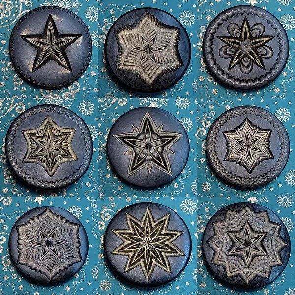
With nearly 30 years of experience on it, Jon Sauer is a master of the tricky-to-use rose engine lathe (which we looked at in "Production Methods: How Complicated Radiating Patterns are Engraved in Metal"). Using this machine here…

…Sauer cranks out ornamental carvings of astonishing intricacy and variety:


He's even released a book of his patterns (though it's currently out of stock) and sells smaller versions of his turnings as buttons on Etsy.

You can see more of Sauer's work here, and/or follow him on Instagram.

Design Job: Combine Your Love of Graphics & Architecture as a Graphic Designer at SHoP Architects

$
0
0

Company: SHoP Architects Location: US – New York, New York Job Level: GRAPHIC DESIGNER Graphic Designer SHoP is seeking a talented, visionary, and motivated Graphic Designer to join our Identity Team. This position serves as an integral part of our public relations and business development capabilities, working

View the full design job here

The Weekly Design Roast, #25

$
0
0

Children's beds, for parents who are very confident in their stud-finding abilities

Benefits of this Lucite bar stool:

1) Curled bottom area catches and displays bar snack crumbs, spilled beer

2) Clear footrest clearly reveals dirt left from shoe soles

3) Scratches easily

4) Becomes more invisible the more you drink

Some assembly (and PhD in Spatial Geometry) required

"I'm going to climb into our 'sofa' now, which of course requires both arms. Can you throw me that book once I'm in the middle?"

Perfect for holding your coffee while you're walking through rain that's coming in at a 45-degree angle. And you can tip it back to drink when the rain comes in from the other direction at a 45-degree angle.


"Hey Jeff, are you and Stacy free this afternoon? I need some extra hands to turn my seating area back into a white sphere"

"The client I designed this for is a couple that fights a lot, but that still want to watch the same TV shows at the same time"

"Most of the time, it's a chair for one. But it transforms, for when you want to sit in a shallow sofa with a backrest at armrest height, and armrests at backrest height, next to someone else."

"By artfully twisting the backrest to change places with the seating surface, I was able to reduce the sofa's capacity from four people to two, without losing the four-person footprint."

This "Telekinetic Obstacle Course" is an alternative to ghosting or having uncomfortable "We need to talk" conversations. Simply put the headset on and stare intently at the objects, saying nothing. After a couple hours/days of this, your girlfriend will break up with you automatically.

Ford Unveils Electric Mustang Mach-E

$
0
0

This week Ford unveiled their electric Mustang Mach-E (which unfortunately sounds like "Mustang Mocky" when said aloud).


I didn't find much to get excited about in the $60,000 car's specs. It's basically a Tesla competitor: Very fast, electric, can be had in all-wheel drive, and has cutesy names for the driving modes like "Whisper, Engage and Unbridled." So instead I've been looking over the physical design of the car in search of something noteworthy.

Supposedly inspired by their storied pony car, the Mach-E's design doesn't appear very Mustang-like to me; it seems they've simply lifted some visual cues from the original model, like the pony badge on the grill and the three-bar taillights.


The crossover SUV form factor and lack of an engine doesn't do much to increase interior storage space. The Mach-E's trunk offers 29 cubic feet of storage space, or 59.6 cubic feet with the seats folded down; my Volkswagen Golf station wagon offers 30.4/66.5 cubic feet, respectively.

The Mach-E does, however, have an extra trunk in the front, occupying the bay typically taken up by an engine. It's only 4.8 cubic feet--"enough to comfortably store the equivalent of a carryon luggage bag," the company writes--but one thing I did find interesting is that it's drainable. "customers can easily pack it full of ice and keep their favorite beverages cold – perfect for that pre-game tailgate or trip to the beach."

The interior has the same issue that most modern-day cars do: A gigantic screen that does not integrate well with the dashboard. I really do feel that in fifty years, design historians will look back at this era of automotive design and say "During this period, no one really knew how to harmonize the then-newfangled touchscreen with the incumbent design of a dashboard."


Ford is also trying out a new feature with the Mach-E: "Phone As A Key technology. Using Bluetooth, the vehicle can detect customers' smartphones as they approach, unlocking the Mach-E and allowing them to start driving without getting their phones out of their pockets or using a key fob. A backup code can be entered on the center touch screen to start and drive the vehicle in the event a phone battery dies."

I'm not sure that's something customers want or need, but that seems to be the way technology is leading us these days. Which brings me back to the overall point of this car: The Big Three auto manufacturers cannot like that upstart Tesla came out of nowhere, became the "It" car, and is now expanding into larger vehicles. Ford, like everyone else, knows they have to go electric to compete. That they chose to slap the Mustang badge on this car makes it seem like this is a marketing-driven vehicle.

Still, I don't doubt that it will sell well. I'm guessing there are enough Boomers with a 60k vehicle budget who well remember the excitement around the original Mustang, released during their youth, and who'd like the benefits of electric. But to me the Mach-E just feels inexorable, and I don't mean that in a good way.

Ford is now taking pre-orders for the car here; a $500 deposit secures yours, which will be ready staring in late 2020.


Yea or Nay? Circular and Radial Bar Graphs for Presenting Information

$
0
0

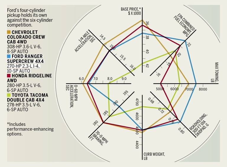
Living on this rural farm, my vehicle situation is opposite from many in the suburbs: I need a truck, but I don't want to get one. Nevertheless I was reading up on the Ford Ranger and its competitors on Car & Driver, when I came across this peculiar take on the bar graph:

Image credit: Car & Driver

What the hey? I found this circular arrangement chaotic, confusing to read and much harder to get a quick visual sense of comparisons.

After poking around a bit, I couldn't find quite the same style as was in the C&D article, but it does seem a subset of information designers have begun toying with circles. I believe they're doing this out of a desire for novelty rather than an urge to more clearly present information. Take a look at this "dazzling" (those are the creator's words) radial bar chart:

Image credit: Vizzlo

Or these circular barplots:

Image credit: Circular Barplots

Image credit: Circular Barplots

Image credit: Circular Barplots


And this circular stacked barplot:

Image credit: Stack Overflow

Even aside from the tiny text, does anybody actually enjoy tilting their heads this way and that? Does anybody actually find these easier to read?

What is the Third Wave of Design? 

$
0
0

Did you miss out on the festivities at this years Core77 Conference, "The Third Wave"? Don't sweat it, as we are rolling out many of our presenters' presentations over the next few weeks.

Those of you who did not attend the the 2019 conference may be asking, "what exactly is the Third Wave?" Luckily, Core77 partner Allan Chochinov started the conference day off with an informative and entertaining explanation.


Hong Kong Protestor's Latest DIY Defense: Tiny Brick "Stonehenges" vs. Police Water Cannon Trucks

$
0
0

Protestors in Hong Kong have been using traffic cones and leafblowers versus tear gas canisters. As the unrest stretches into month five, they've now come up with a low-cost way to stymie police vehicles: They've been building these little brick "Stonehenges," as observers have called them.

I know what you're thinking: Those are a problem for cops on scooters, sure, but not so much for larger vehicles. In fact the structures are not meant to stop vehicles, but simply to slow them down, particularly the ponderous water cannons the police have been rolling out. So what the police now do is first send out a larger vehicle topple the bricks, and then the water cannons roll in afterwards. And as you can see from the video, it does indeed make the journey slower for the latter type of truck:


I'm a Student. Should I Submit My Work to Design Awards?

$
0
0

As a student, it can be difficult to convince yourself to invest money in something related to your professional career such as an awards program, let alone investing in a turkey sandwich for lunch. Though it may seem difficult to envision what applying to something like an awards program gets you, winning one offers several hidden benefits that could help your design career in the long run.

View the full content here

Clever Package Design Trickery: Bike Company Prints Flatscreen TVs on Shipping Cartons, Reduces Damage by 70%-80%

$
0
0

Dutch bicycle manufacturer VanMoof makes high-quality electric bicycles for urban markets. Already a hit back home, in 2015 they began shipping their bikes to the U.S., and ran into a problem: "A lot of them were arriving to their new customers damaged," the company writes. "Annoying for them and expensive for us. We couldn't say for certain, but US handlers didn't seem to take as much care as we'd hoped."

The design team talked the problem through: Should they design sturdier boxes, or come up with better packaging materials, or try different shipping companies out? Then company co-founder Ties Carlier had a clever idea:

Our boxes are about the same size as a really big, expensive, flat-screen television. So we put an image of one on every box. We assumed handlers would care a little more about that. And we were right.

That small tweak had an outsized impact. Overnight our shipping damages dropped by 70-80%. We sell 80% of our bicycles online, which means we still print TVs on our boxes. More than 60,000 of them have now been shipped directly to our riders worldwide.

via Kottke

Viewing all 19155 articles
Browse latest View live


Latest Images