Quantcast
Channel: Core77
Viewing all 19747 articles
Browse latest View live

Color Story: Ombre

$
0
0

Biagetti_river.jpg

It hit first in fashion and then hair, but our favorite ombre trend is in design objects - no surprises there. From luxe to low budget, our favorite new products fall all over the color spectrum, from predictable dark to light color gradients to some eye catching neon hues.

River sofa by Alberto Biagetti
Alberto Biagetti's River collection of living room furniture are the kinds of pieces you make a serious effort to save up for - like open-up-another-bank-account save for. The neon yellow-to-beige and gray-to-navy arm chairs and sofas are the perfect marriage of long term investment and statement furniture. And even if one of these sofas wipes out your savings, it makes such a statement it's not you need to buy any other pieces anyway.

transience_mirror1.jpg

transience_mirror2.jpg

Transience Mirror by Lex Pott and David Derksen
Netherlands-based designers Pott and Derksen allow layers of silver to oxidize to reveal the natural beauty of these mirrors, which come in a variety of geometrical shapes. Though oxidation is usually a random process, Pott and Derksen experimented with controlled degradation of silver to create beautiful shades of golds and browns.

Scholten_Baijings1.jpg

Scholten_Baijings2.jpg

Textiles by Scholten & Baijings
Stefan Scholten and Carole Baijings, also from the Netherlands, created a collection of ombre textiles for Thomas Eyck. From kitchen towels to throw pillows and bed sheets, we want their brightly printed linens in every room.

(more...)


Hasbro is seeking a Digital Designer - Instructional CAD Rendering in Pawtucket, Rhode Island

$
0
0

coroflot-joboftheday.jpg

Digital Designer - Instructional CAD Rendering
Hasbro

Pawtucket, Rhode Island

Hasbro is seeking a Digital Designer to manage the creation, schedule, and refinement of product build assembly instructions and other graphic communication elements for KRE-O, a new construction brand from Hasbro that allows fans to build popular Hasbro brands in a construction play pattern. This new construction line allows Hasbro fans to build and create with their favorite brands like never before.

» view
The best design jobs and portfolios hang out at Coroflot.

(more...)


Why Does Paris Look Like Paris and New York Like New York?

$
0
0

ParisNonParis.png

When you think back on all the cities you've traveled to, what images come to mind? Do you think about people you met or the people you traveled with? The music you heard, food you ate, art you saw or souvenirs you bought? As a lover of architecture both personally and professionally (I'm also an editor at The Architect's Newspaper), my mind automatically flips through a slideshow of building facades, city streets and the unifying architectural details I saw repeatedly over the course of my trip. If this is how you remember cities, too, it turns out you and I aren't the only ones.

Recently, a group of researchers from Carnegie Mellon and the Laboratoire d'Informatique de l'École Normale Supérieure in Paris (also known as the Computer Science department at ENS) developed a software that mines visual data from Google Street View images of cities and defines the most prominent characteristics found in each place. From a bank of 40,000 images, the software worked overnight with 150 processors to detect more than 250 million defining characteristic of twelve major cities, including Barcelona, London, New York and Paris.

The program works by comparing all the images and defining the individual details that differentiate images of one city from another. After some heavy duty computing, the software defined Paris by images of gilded ironwork on balconies, balustrades and cornices over doors and windows as well as the city's signature street signs. It was a little trickier to visually define US cities, which are younger and stylistically less unified than older cities in Europe or Asia, but the software came up with bay windows for San Francisco and fire escapes for New York.

You can learn more from a quick how-to video on the software or test your street smarts by taking the Paris-NonParis test, in which you look at 100 images and take a stab at which city you think they're from (hint: only 50 of them are from Paris).

According to the researchers:

Given a large repository of geotagged imagery, we seek to automatically find visual elements, e.g. windows, balconies, and street signs, that are most distinctive for a certain geo-spatial area, for example the city of Paris. This is a tremendously difficult task as the visual features distinguishing architectural elements of different places can be very subtle. In addition, we face a hard search problem: given all possible patches in all images, which of them are both frequently occurring and geographically informative? To address these issues, we propose to use a discriminative clustering approach able to take into account the weak geographic supervision. We show that geographically representative image elements can be discovered automatically from Google Street View imagery in a discriminative manner. We demonstrate that these elements are visually interpretable and perceptually geo-informative. The discovered visual elements can also support a variety of computational geography tasks, such as mapping architectural correspondences and influences within and across cities, finding representative elements at different geo-spatial scales, and geographically-informed image retrieval.

See also: David Stolarsky's "18,154 Consistent And Regular Views Of New York" for Art Hack Day at 319 Scholes

(more...)


The Design of Design Patents, Part 2: The Price of Protection, by Michael Hages

$
0
0

Loewy2.jpg*The views expressed herein are solely those of the author and do not necessarily represent the view of his firm or its clients.

In the first article of this series, we introduced the idea that valuable design patents are something that designers can, and should, work to obtain. We also explored the misconception that design patents are inherently narrow or easy to get around and discovered exactly where the holes in such a belief lie. In this article, we'll look at how the cost of design patents affects how people perceive their value and what the actual cost of a good design patent strategy should be.

Misconception 2: Design patents are cheap (and why it's a good thing that this is wrong)

Anyone who has participated on both the design and utility side of the patent application process can see a difference in how the applications get written and assembled. Both the amount of information exchanged and the time taken for preparing a utility patent are much greater than when dealing with a design patent application. Of course, this time is ultimately reflected in the cost of the application, which in the case of a utility, is typically expected to be in the range of $8,000 to $12,000. That, however, is for a single application that may only cover limited aspects of a product. Simply comparing this to the cost for a design application, which can be between $2,000-3,000, shows a notable difference in the expected amount of time usually spent on these two types of applications.

Adequately covering a new and innovative product on the utility side, however, can often involve multiple applications, adding up to sometimes more than $50,000 for a single product (and that's just to file the applications). Most of the time, when working on the design side, only a single application is filed. The Patent Office might require an applicant to split up the application into separate applications that cover what they determine to be different designs, even if only slightly different. Such a requirement only incrementally increases the cost, which ultimately pales in comparison to the total on the utility side.

This vast difference in cost certainly makes design patents look cheap. Simply because there isn't much actual legal writing involved, design patents shouldn't cost as much as utility patents. But, they shouldn't be viewed as cheap. There are probably a lot of designers who wouldn't view $3,000 as cheap, but the overall notion, especially from the perspective of someone paying $50,000 to begin the utility patent process, is that design patents comparatively lack value. It's also worth mentioning that there can also be a significant additional cost in actually getting a utility patent through the Patent Office. The cost of so-called patent prosecution can add another $10,000 to $20,000 to the cost of a utility application itself (it can be more in extreme cases) and is also less expensive when dealing with design patents.

(more...)


New Balance Athletic Shoe, Inc. is seeking a Sr. Designer in Lawrence, Massachusetts

$
0
0

coroflot-joboftheday.jpg

Sr. Designer
New Balance Athletic Shoe, Inc.

Lawrence, Massachusetts

New Balance Athletic Shoe, Inc. is seeking a Senior Designer for their Women's Fitness, Women's Lifestyle and Walking team. The designer will work under the design lead to apply his or her strong design skills, innovative thinking, research practices and technical experience in footwear towards creating new products and technologies to advance the performance for the category. In this integral role, the Sr. Designer will shape design direction and design product with an in-depth knowledge of costing and shoe-making, working both independently and with cross-functional teams to build consensus for design and product direction.

(more...)


Going the Ultra Long Distance: Racing Wheelchair Concept by Andrew Mitchell

$
0
0

AndrewMitchell-ULDWheelchair-sunset.jpg

In contrast to the FLIZ bicycle we saw yesterday, designer Andrew Mitchell's Ultra Long Distance Wheelchair concept is an as-yet-unrealized mobility solution for exactly what it sounds like: "Touring bicycles aren't as stripped back as their race equivalent. Grand Touring cars exist to make race cars for the road. This wheelchair follows those principles, make a race wheelchair for ultra long distance use."

AndrewMitchell-ULDWheelchair-frontx2.jpg

AndrewMitchell-ULDWheelchair-brake.jpg

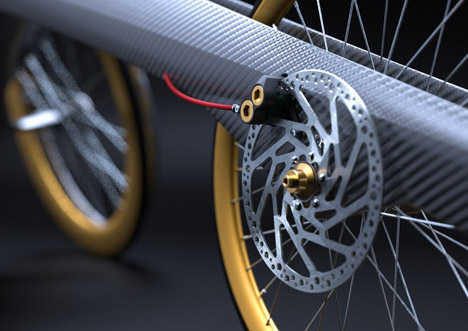
In order to "take advantage of the research that goes into weight reduction and performance" in the high-end bicycle category, Mitchell has incorporated components such as disc brakes and the design language of cycling. He also acknowledges this reference point imparts "highly visible cues to the performance nature of the design."

AndrewMitchell-ULDWheelchair-top.jpg

Indeed, Mitchell notes that the distinctive form has a psychological advantage in addition to the physical one: not only does the aggressive inverted teardrop shape—characterized by its hummingbird-like proboscis—extend the wheelbase for stability, it looks fast.

Much work has been done on the psychological performance that can be gained from having equipment and kit that looks like it is meant to perform. That is why many of the performance components on the design have attention drawn to them through colour and placement in a prominent position.

AndrewMitchell-ULDWheelchair-Ergo.jpg

Of course, these features aren't just for show—Mitchell has done his homework in terms of ergonomics, and physiological considerations are paramount:

The positioning of the rider is very important to ensure maximum efficiency. By keeping the shoulders over the front edge of the driving wheels, the whole body position can be engaged by the rider to provide maximum power. The body and legs are in a more open position, giving good breathing potential, and placing less strain on the lower limbs.
(more...)


Weathering Steel: What It is and Why They Use It

$
0
0

0weathste01.jpg

A few blocks down from Core77 HQ, a new building is going up on Broadway. As you can see in the photo above, the beams are already starting to rust.

A block over from the construction site is the recently-built Mondrian hotel, the facade of which is also starting to rust.

0weathste02.jpg

So what's going on here? Substandard steel from overseas? Not quite. The material being used is called "weathering steel" and it's been in architectural use, albeit sparingly, since the early 1960s.

Weathering steel is calibrated, on a chemical level, to begin rusting immediately on the outside. The rust actually serves as a protective layer, keeping the alloys on the inside safe from corrosion. And interestingly enough, the rust is sort of like human skin; according to Wikipedia, "The layer protecting the surface develops and regenerates continuously when subjected to the influence of the weather."

The reason weathering steel is more of a specialty material and in sparing use is because 1) not everyone is into the aesthetic, and 2) it's tricky to work with. The structure needs to be designed in such a way that water runs off of the steel and never puddles; standing water will stagnate the regeneration process and allow rust to spread unabated, eventually eating a hole clear through the material, like Alien blood on the floor of a spaceship.

Another problem with weathering steel is that during the initial rusting process, it drips yucky orange matter onto the sidewalks below, which will eventually have to be power-blasted off.

(more...)


Going with the Wind: Data Visualization by Hint.fm

$
0
0

WattenbergViegas-HintFM-WindMap-4.jpg

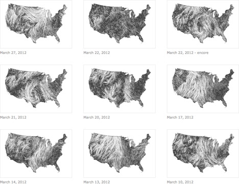
Data visualization, as a specific form of graphic design, is as much a phenomenon of the Information Age as the Internet itself, not least for the sheer amount of data that we generate and consume on an ever more granular level. Besides the fact that we've all seen plenty of examples of bad data viz, even as companies and clients increasingly adopt the format, we've all seen plenty of bad infographics, and particularly egregious examples overcomplicate the matter. Yet this is precisely why data viz remains a promising frontier for the creative expression of quantitative information: at the far end of the specturm, data sets can serve as parameters for mathematically-derived abstract artwork, but those that clearly and compellingly represent a vast amount of data are arguably even more beautiful, as exemplars of visual communication.

WattenbergViegas-HintFM-WindMap-1.jpg

WattenbergViegas-HintFM-WindMap-2.jpg

Which is a long way of saying that this "Wind Map" by Martin Wattenberg and Fernanda Viégas (a.k.a. Hint.fm) is pretty effin' awesome. Just as the natural world continues to amaze and inspire us, so too do we strive to understand and harness the power of nature: besides capturing the mercurial fluid mechanics of variations in atmospheric pressure, the zoomable wind map demonstrates, say, the regional feasibility of wind power.

WattenbergViegas-HintFM-WindMap-3.jpg

Digital artist and designer Jer Thorp brought the Wind Map to our attention on the occasion of Hurricane Isaac; so too are our thoughts are with those weathering the storm in New Orleans...

(more...)


You Must See Ikea's CG (and Their Massive Photo Studio)

$
0
0

0ikeaCg07.jpg

Ikea Communications runs the largest photo studio in northern Europe. Inside their 94,000-square-foot facility an army of carpenters, designers and shooters all plan, build and photograph the faux rooms you see in the Ikea catalog. Here's a brief look at their facility:

Fake rooms still require real skilled labor to produce. The walls need to be painted, the kitchens need to be tiled, the living rooms need to be styled. It's a lot of work, and when the catalog's finished, the rooms get torn down to make way for next year's.

0ikeaCg02.jpg

It's therefore no surprise that Ikea is using more and more digital images in their catalog, like the ones you see here. (That's right, none of these are real.) Yet when I first heard this fact during a presentation at Autodesk headquarters, where a company flack mentioned Ikea uses their software to create the images, all of us journalists in the room snatched up our phones to Tweet this.

0ikeaCg03.jpg

No one can tell the difference between the studio shots and the CG ones, so it makes sense to save on all of the building materials required for the former by shifting focus towards the latter. Currently just 12% of the Ikea catalog consists of digital images, though they're ramping that up to 25% for the next catalog.

(more...)


Let Us Make One More Thing Clear

$
0
0

0mujipppc01.jpg

Proper poker purists would probably protest, but progressive people might potentially prefer playing with these. Muji's partially-transparent PP Playing Cards are produced from polypropylene, making for a pretty product.

Purchase price: $17.95.

0mujipppc02.jpg

Go PP and flush

(more...)


London Design Week 2012 Preview: "Holdfast" by Sam Weller

$
0
0

SamWeller-Holdfast-0.jpg

Although design students are often encouraged to seek inspiration in unlikely places, designers are just as likely to find a muse in everyday experience. For example, we've seen several examples of how, say, the lowly clamp can be elevated beyond its prescribed utility into a one-size-fits-all set of table legs, a clever shelf or even a backlit homage.

In fact, it turns out that one of the designers behind one of these variations on the theme just can't get enough of the humble hardware: as with a previous project, Sam Weller's latest project starts with the clamp, arriving at a very different result. Where "Public Resonance" was a highly conceptual public art piece, "Holdfast" (not to be confused with these) is an investigation into minimalist furniture design.

Holdfast began with the exploration of clamps and their infinite possibilities as both a tool as well as joining device.

The clamp elements that hold this range of furniture together are very simple in form and were based on the holdfast clamping system typically used for holding material to the surface of a workbench. The components are manufactured using a computer controlled wire bending device. The components are then inserted into a through hole and wedged under the material they are supporting, creating tension in the vertical leg and in turn creating a strong stiff supporting structure for shelves as well as side tables, stools and other occasional home furnishings.

SamWeller-Holdfast-2.jpg

SamWeller-Holdfast-3.jpg

Although the legs vaguely resemble Linie58's bent-wire clamp legs, "Holdfast" struts are fixed to the surfaces. Yet they're semi-modular in that the legs take only one V-shaped form, which is arranged to support a shelf or triangular side table.

SamWeller-Holdfast-1.jpg

SamWeller-Holdfast-4.jpg

As always, Weller's got a beautifully-produced video to accompany the images:

(more...)


Diogo Frias - "Andy" for WeWood

Microsoft - Xbox Design is seeking a Visual Designer in Redmond, Washington

$
0
0

coroflot-joboftheday.jpg

Visual Designer
Microsoft - Xbox Design

Redmond, Washington

Microsoft's Interactive Entertainment Business team is seeking a Visual Designer to join their team of producers, user researchers, and interaction, industrial, motion, visual, sensory, brand and integration designers to help us reinvent entertainment led from the living room, powered by the cloud, and available across multiple screens. The ideal candidate has a clear understanding of each facet of the design process—information architecture + interaction design, research + usability, rapid prototyping, visual + motion design, brand integration, and content creation. He or she has demonstrated ability to effectively partner with product planners and managers, program managers and development and test team members to shepherd end to end experiences from concept to ship.

(more...)


Eye Candy: Man vs. Nature, Vying for Beauty Via Time-Lapse Video

$
0
0

0hdtl2f.jpg

As motion-control rigs proliferate, we're seeing a lot of beautiful time-lapse video that allows us to perceive our environments in new ways. Two videos that are currently making the blog rounds are below, and what we found striking was how paradoxically similar and totally different they are.

The first, "Nightfall," was done by filmmaker Colin Rich and is an exploration of Los Angeles. Be sure to maximize it:

(more...)


Byrne's BAM Bike Racks

$
0
0

0byrnebam01.jpg

[photos by Dino Perrucci]

The Brooklyn Academy of Music tapped David Byrne to design their new bike racks, which went up just last week. Ex-Talking Heads frontman Byrne is no stranger to bike rack design—see an earlier project of his here—and was inspired by typography this time around:

When designing these bike racks, I wondered how I could make something that was modular, yet variable—a design that wouldn't always look the same and could vary depending on season and placement. I realized that a few very basic shapes—a semi circle, a line, and a V shape—would allow one to make a good percentage of the letters of our alphabet.

With help and advice from Dero Bike Racks, we figured out how these components could be easily and quickly swapped out to spell different words. For example, the letters could spell out the productions at BAM or any random message for that matter.

Cycling advocate Byrne can often be seen in Brooklyn and on two wheels, and he'll be using the bike rack as much as anyone else. "I get to BAM fairly often," says Byrne, "and the existing racks are often full, so it's great that there will now be more."

0byrnebam02.jpg

See also: Keha3 Reimagines Bike Racks in Its Own Image, That of Nature

(more...)


Towards a New Arcadia: Ton Matton on a Simpler Kind of Life

$
0
0

It's that time of year again: when savvy citydwellers return to the comfort and convenience of their apartments and pick up where they left off before the perennial August slump. (I realize that not all of us—myself included—can afford to take a month-long holiday, but I, for one, felt like a true New Yorker when I realized that I'd skipped down for more sylvan environs for three weekends in a row.)

AVGD-TonMatton-chickens.jpg

But why come back at all? Why do we feel bound to these inconceivably dense networks of assumed responsibilities and overstimulation? There are certainly advantages to settling en masse, living and working with and among our fellow urbanites... but what if there was an alternative? What if we could get off the grid for good? A possibility of escaping forever and never looking back?

AVGD-TonMatton-close.jpg

Idealistic, for sure, but it's an ideal worth exploring, and Dutch architect Ton Matton is the man for the job. After he graduated from Delft Technical University, Matton spent much of the 90's at Rotterdam's Schie 2.0 office, an urban and environmental design studio, establishing himself as a proponent of autarkic (self-sufficient) and otherwise experimental architecture and urban planning. His more recent independent projects include everything from a bus filled with flora (a mobile nature reserve) to cutting the electricity to Wismar University, where he teaches, for a 24-hour period in December of 2009.

AVGD-TonMatton-chalkboard.jpg

It's hard not to be charmed, if not inspired, by the Avant/Garde Diaries' recent profile of Matton, in which he explains his 'bird suburb' and 'climate machine,' among other concepts:

About ten years ago, Ton Matton stumbled upon a deserted schoolhouse in Wendorf, Germany, close to the Baltic coast, and quickly repurposed it as his "Werkstatt Wendorf," a place for experiments and unbounded thinking. A Dutch-born urban planner by trade, Ton moved to the countryside to break free from an everyday grind designing suburbs and performing uninspiring jobs. He now seeks inspiration from neighbors that are completely different than him, explores the area's Communist past, and lives a life predicated on the rhythms of nature. In the individualist mold of Henry David Thoreau, Ton questions social conventions and works out inventive solutions for new ways of living. "Am I an urbanist? Am I an architect? Am I an artist?" he asks. "I don't know [and] it doesn't matter anyhow." Ton provides insight into a life few are willing to commit to, and demonstrates the possibility of creating an alternative economy based on utility, creativity, and respect for people and the planet.

"It's not about being self-sufficient, but about producing something which is not related to money... it's just the beauty of a product."
-Ton Matton

AVGD-TonMatton-coop.jpg

(more...)


A New Bag for a New HP Ultrabook: Win $10K in the HP + Project Runway Design Contest

$
0
0

HP_Ultrabook_Contest.jpg

This post is sponsored by the sleek, stylish, lightweight HP Spectre XT Ultrabook™, inspired by Intel. Design a bag that is just as stylish!

We all have one—you know, one of those bulky, semi-functional laptop bag. It might be utilitarian black or pop paisley, but chances are it's more protection than style statement. There's no room to complain...here's your chance to throw your hat in the ring to win $10,000 and an HP Envy Ultrabook by designing the ultimate laptop bag in the HP + Project Runway Design Contest.

As a sponsor of Lifetime TV's Project Runway, HP has a commitment to style and design. Their new, sleek HP ENVY Ultrabook laptop weighs in just under 4 pounds with a slim profile of 14.72"W x 9.95"D x 0.78" H and is in need of your designs. The jury panel composed of Jill Fehrenbacher, founder of Inhabitat, Mondo Gurerra of Project Runway and LinYee Yuan, Editor at Core77 will be looking for designs that display innovation, style, design details, practicality, marketability and appropriateness for the HP Ultrabook ENVY.

First, design a bag to hold an HP ENVY Ultrabook: the dimensions are 37.4 cm (14.72") W x 25.3 cm (9.95") D x 2 cm (0.78"). Then check out the contest site where you can:

  • Upload up to five images of your design (in a .jpg, .png, or .gif format at 800x600 pixels wide)
  • Enter a Title of your Design
  • Enter a short explanation of your bag design: concept/design/inspiration and include materials used, size/dimensions of bag, and production/manufacturing process

Don't wait, enter your designs today! The deadline for entries is Saturday, SEPTEMBER 8th! The second phase of the contest opens up voting to the public to identify five finalists who will win their own HP Envy Ultrabook. The jury team picks a winner for the $10,000 prize!

A truly original contest needs a true original to kick it off. Watch the official announcement from Project Runway winning designer Mondo Guerra and Inhabitat's Jill Fehrenbacher.

(more...)


With Norman Ibarra's Metrodecks, Everyone Plays Fare

$
0
0

0metrodeck01.jpg

Muji's transparent playing cards are cool, but Norman Ibarra's
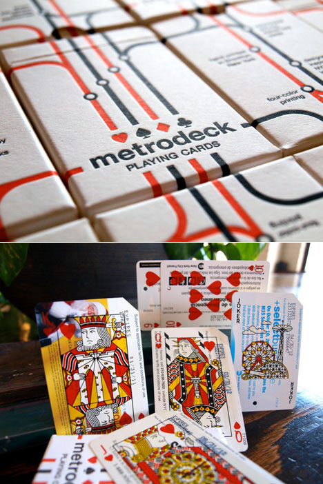
Metrodeck Playing Cards are cool while checking the recycling & sustainability boxes. For two years the Brooklyn-based designer has been collecting those discarded Metrocards you see scattered around various subway stations, and after experimenting with a couple of print shops in Brooklyn, achieved what you see here.

0metrodeck02.jpg

Each face card is individually screen printed in four colors of enamel ink. The deck comes packaged in a custom 2-color, die-cut, and letterpressed tuck box printed by Mama's Sauce Print Shop.

The deck also offers some insight into the city's history by showcasing over ten years of advertising. Each deck has a random assortment of ads dating anywhere between 2001 and 2012. Some cards are truly one of a kind. Due to materials and handcrafting, each deck has slight variations from one piece to the next.

0metrodeck03.jpg

(more...)


NASA Concept Plane Designed to Fly Sideways

$
0
0

0sbidirfw02.jpg

This is the craziest airplane concept we've seen in a while, and NASA's reportedly throwing some cash at it. Its unusual design is meant to solve an aeronautical paradox: To get a heavy metal plane off of the ground, you need a wide wingspan (think B-29 bomber). But if you want to go supersonic, that wide wingspan becomes a liability, and you instead want a slimmer, more rocket-like form factor (think SR-71 Blackbird).

The "Supersonic bi-directional flying wing" has wings of alternating length at each compass point and therefore can solve both situations, by taking off in one orientation, then essentially flying sideways when it's time to go supersonic. I'd like to see video of how this happens in motion, but from what I can see in the stills, it looks like the dual engines up top determine the direction of flight, and that the rest of the plane rotates around them.

0sbidirfw01.jpg

Led by researcher Gecheng Zha at the University of Miami, the SBiDir-FW concept now has $100,000 of NASA cash to play around with, and will get another half mil if early development work looks promising.

If the concept proves workable and gets built, I expect U.S. politicians to engage in sharp debate about whether the plane should initially turn towards the left or the right, in order to get this plane moving in the right direction.

0sbidirfw03.jpg

A whole new way to get airsick?

via dvice

(more...)


Capitol Butter Dish by ODLCO

$
0
0

capitolbutterdish_1.jpg

capitolbutterdish_2.jpg

It's easy to be distracted by the political antics and acrobatics of an election year. Luckily, our friends at ODLCO are here to remind us to focus on the fundamentals and just pass the butter. Their Capitol Butter Dish, designed by Morgan Carter and made by ceramicists in Chicago, cuts through the fat while providing a tabletop spectacle for those who might be prone to debate politics at the kitchen table.

The Butter Dish is a fun take on the building souvenirs found at the local tourist gift shops around Washington DC; keep the going-ons in the hallowed political halls of the nation's capitol on the table. The front "lawn" of the Capitol Building serves as a knife rest reminding your round-table of advisors that the buck stops here.

capitolbutterdish_3.jpg

(more...)


Viewing all 19747 articles
Browse latest View live