Quantcast
Channel: Core77
Viewing all 19773 articles
Browse latest View live

Nice to See: Zooka Bluetooth Speakers Set New Standard for iPad Audio

$
0
0

NEW-Zooka-1.jpg

Portland, OR-based design studio New isn't, um, new to the portable audio game: their portfolio includes work for the likes of Logitech and UltimateEars, among other high-profile clients. However, the "Zooka" bluetooth speaker marks Patrick Triato & co.'s first foray into the exciting (and, at times, lucrative) world of Kickstarted product design.

NEW-Zooka-2.jpg

NEW-Zooka-3.jpg

The "Zooka" is specifically designed for the iPad, which dictates its size (it attaches to the tablet lengthwise) and shape: the ellipsoid tube or 'bar' of speaker has a slot where, again, it can be attached to an Apple device (viewed from the side, it looks like a slightly squished Pac-Man). The speakers themselves—a solid five times louder than the iPad's tinny onboard drivers—are located on either end of the bar, which has an additional cutaway at dead center to accommodate a MacBook Pro without blocking the iSight camera.

NEW-Zooka-4.jpg

Instead of imitating Apple's sleek aluminum aesthetic, New has wisely opted to use medical-grade silicone for "Zooka." The soft-touch exterior offers both superior durability and ergonomics, while its minimalist, monochromatic form factor complements the glass+metal of the devices themselves.

(more...)


CoreToon: The Designer Dorm

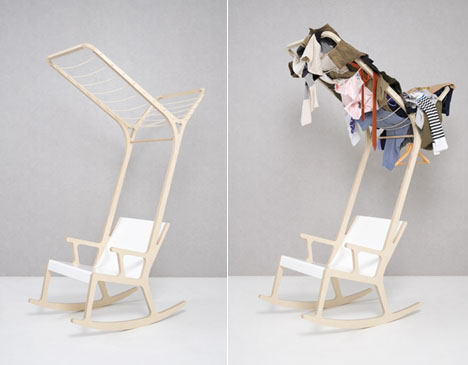
Seung Yong Song's Surprising Spin on Space-Saving Furniture

$
0
0

0sysong01.jpg

Though educated at France's Ecole Superieure d'Art et de Design de Reims, designer Seung Yong Song is based in space-tight Seoul. Song's solution for creating storage space and privacy is to take a common item, the chair, and tweak it in unusual ways:

0sysong02.jpg

0sysong03.jpg

0sysong04.jpg

(more...)


Easy As 123: Porsche 356 in Five-Part Factory Tour from the 60s

$
0
0

MadebyHand-Porsche356-Windshield.jpg
MadebyHand-Porsche356-4x.jpg

This has been online for a while now, but we recently came across this remarkably detailed and well-produced (for the early 60's) documentary on how the iconic Porsche 356 is manufactured. It's not clear as to what year it's from, though we've deduced that the factory produced roughly 7,500 356s during that era, or about 30 per day.

MadebyHand-Porsche356-EngineBlock.jpg

We've pointed out just a few highlights, but frankly it's worth watching nearly every second of the videos—a feat considering that the doc, broken into five parts, clocks in at nearly 45 minutes. The first four parts, which clock in at around ten minutes each, focus on specific parts of the manufacturing process, roughly from the outside in (as per the assembly sequence).

Part 1 focuses on the fabrication of the "famous unitized Porsche car body"; the car "assumes an identity" at 6:48.

(more...)


Purpose is seeking a Freelance Interactive/UX Designer in Rio de Janeiro, Brazil

$
0
0

coroflot-joboftheday.jpg

Freelance Interactive/UX Designer
Purpose

Rio de Janeiro, Brazil

Purpose Brazil is looking for a UX Designer to work at our Innovation Lab in Rio de Janeiro (in-house). They are looking for someone with an understanding of design principles and a proven ability in experience and interaction design for the web. The ideal candidate is passionate about working with social-driven projects and is a creative problem-solver. Strong user-centered design methodologies, information architecture, technology and communication skills are necessary.

» view

The best design jobs and portfolios hang out at Coroflot.

(more...)


Core77 Photo Gallery: New York International Gift Fair Winter 2012

$
0
0

NYIGF-Winter-2012-Gallery.jpgPhotography by Glen Jackson Taylor and Ray Hu for Core77

The winter edition of the New York International Gift Fair kicked the year off with some fresh new kitchenware, lot's of eco-friendly toys, vintage type, jewelry, and bird motifs—seriously, we weren't the only one's making Portlandia jokes.

In the Accent on Design section, Black+Blum dropped three new products, Core-friends House Industries partnered with AMAC to launch a brand new range of their classic plastic boxes, neo-utility introduced the quirky Chick-a-Dee smoke detector, boutique wallpaper firm Carvern presented their "I See You" googly eyes print inviting the visitors to draw directly onto the wallpaper, and Taipei-based Bitplay entertained us with their interactive "BANG!" lamp.

Design collectives American Design Club (AmDC) and Join set up shop in the Javits Center foyer again presenting objects, jewelery, accessories, and stationary from a curated selection of independent young designers. R&L Goods caught our attention with their recycled leather wallets made from finely ground scraps of leather which would otherwise be discarded, the finished material is 90% post industrial waste combined with natural rubber. As far as finding original gift items with integrity, these booths were killing it!

» View Gallery

(more...)


NYC Gets a BIG Heart

$
0
0

0bigheart001.jpg

Folks, today is February 14th. For me that means that tonight the Knicks play the Raptors, but to a more romantically-inclined subset of you, it's Valentine's Day. In celebration of the latter, New York City's Times Square Alliance is once again hosting their annual Times Square Valentine sculpture.

This year's 10-foot sculpture, designed and in built in collaboration between Bjarke Ingels' BIG, fabricators FLATCUT and media design firm Local Projects, has an interesting interactive component:

0bigheart002.jpg

A BIG red heart pulses with glowing light in a grove of glass rods. A single person can activate the beating heart, but joining hands with others will make the heart beat even faster to create a brightly burning heart.

The heart conducts the flow of people, air and touch to bring its heart to life. The 10-foot tall glowing sculpture consists of 400 transparent, LED lit, acrylic tubes that form a cube around a suspended red heart. The transparent tubes refract the lights of Times Square, creating a cluster of condensed city lights around the heart. The hovering heart will pulsate faster reflecting the chain of human energy in the heart of Times Square.

0bigheart003.jpg

I have to say I'm Linpressed.

(more...)


CLOG : APPLE on (Select) Newsstands Now, NYC Launch Event on Friday

$
0
0

CLOG-APPLE.jpg

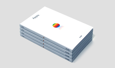
Our friends at CLOG magazine are pleased to announce the release of the second issue of their editorial endeavor, a premium print publication that takes on a single topic at length, from multiple perspectives, thrice annually. Hopefully, four months has been enough time to fully digest their first issue, a thorough exploration of the work of architect Bjarke Ingels, because the February 2012 issue on Apple is even more in-depth, with essays and articles by some 50 contributors in 150 pages of Cupertino-centric commentary.

In June 2011, Steve Jobs presented Apple Campus 2 to the City Council in Cupertino, CA. Due to Apple's high profile and the scale and iconic nature of Foster + Partners' design, the online reaction to the circular new headquarters was immediate and strong. While Apple has been constructing retail stores throughout the world for over a decade and has pioneered innovative building technologies, discussion, even among architects, has typically focused on the company's famed product design. With one of the largest American office projects in history underway in Cupertino, CLOG : APPLE introduces the first comprehensive discussion of Apple's architecture.

CLOG-APPLE-Blueprint.jpg

CLOG-APPLE-iPhones.jpg

As they demonstrated in the multifaceted and thought-provoking first issue, CLOG is a very different kind of architecture magazine, and their examination of the storied technology company is easily as ambitious:

CLOG : APPLE showcases over 50 international contributors, including architects, designers, cartoonists, comedians, engineers and other industry leaders. Highlights include an examination of Steve Jobs's Eichler-designed childhood home; the evolution of Apple's store designs; its leading role in innovative glass engineering; the symbolism and urban implications of the new Cupertino headquarters design; reactions to Apple Campus 2 by notable architects and critics; and an interview with one of Apple Computer's original three founders, Ronald Wayne.

CLOG-APPLE-Footprint.jpg

(more...)


Meet Wendy, HWKN's winning proposal for 2012 MoMA PS1 Young Architect's Program

$
0
0

hwkn1.png

New Yorkers know local architects HWKN for Il Laboratorio del Gelato, where the only thing better than the space is the ice cream, but the firm got their first big break working with Diller Scofidio + Renfro on the High Line. Now they've won MoMA PS1's coveted Young Architects Program, a competition to design the pavilion for the museum's outdoor summertime programming series, Warm-Up. HWKN impressed the jury with their proposal "Wendy," a 5,000-square-foot, star-shaped structure made of stretched nylon coated with a revolutionary new "smog-eating paint." Yeah, it's a paint that removes smog from the air in its immediate environment.

Just how does this wonder-paint work? According to HWKN, Wendy is covered with "nylon fabric treated with a ground breaking titania nanoparticle spray to neutralize airborne pollutants." From the time Wendy is built in late June to the time it's taken down at the end of the summer, principals Matthias Hollwich and Marc Kushner and project architect Robert May estimate that their outdoor pavilion will remove the smog equivalent to taking 260 cars off the road.

"It's pro-active, it's not apologetic," said Pedro Gadanho, the curator of contemporary architecture at MoMA. "It begins to point to a new way to think about sustainability."

The jury was especially won over by the juxtaposition of common construction materials like the scaffolding and the high-tech paint. Furthermore, all the materials can be taken down and reused after the summer programming is over.

hwkn2.png

hwkn3.png

(more...)


Andrew Perkins' Innovative Wood-Metal Blending

$
0
0

0aperkins001.jpg

We like San-Francisco-based furniture designer Andrew Perkins' take on sustainability: "Sustainable design is foremost about the quality and emotional longevity of the object," he writes. "[I know] that if the idea isn't present than the object will not persist."

Here we show two of Perkins' creations that surely will persist. The first are his Alumination Tables, which feature aluminum that has somehow been layered together with maple:

0aperkins002.jpg

The idea of the hybrid is at the heart of this piece. Metal and wood are joined together to create a new material, one that is both structural and beautiful. Layers of aluminum emanate from a wooden center to show the organic potential in a man-made material.
(more...)


iF Design 2012 Gold Award-Winners - Product Design Picks

$
0
0

iF-BMWWelt.jpgAll images courtesy of iF Design Awards

This past weekend saw the first comprehensive iF Design Awards night at Munich's BMW World, which hosted the presentation, dinner reception and late-night afterparty as well as an ongoing exhibition of the 100 Gold Award winners. While the awards program itself has been going strong for nearly five decades now, this is the first year that all four categories of the iF Awards were announced at one time, in a single awards night that was scheduled in conjunction with the first annual Munich Creative Business Week.

iF-AwardsPresentation.jpg

In fact, the gala on Friday, February 10, marked the first time that tickets to the iF design awards presentation were available to members of the general public, and (sub-freezing temperatures be damned) the singular BMW World—the storied automaker's stunning event and exhibition space—saw upwards of 1,700 guests in all.

iF-AwardsReception.jpg

Additionally, the Gold Award-Winners will be on display in the atrium of the museum—which is remarkable in and of itself, home to the largest dynamic LED installation in Europe, some 1.7 million individual LEDs in all—until February 26. (They will be further exhibited at CeBIT in Hannover, Hamburg's HarborCity and in Haikou, China, later this year.)

iFExhib.jpg

The product design category was, as ever, the largest of the four, comprising some two-thirds of the total number of entries and proportionally as many gold awards (60 out of the 100 total). While we agree with the jury's selections of winners from the 863 iF-approved selections (from a total field of 2,923 entries), we'd like to highlight just a few of our favorites.

iF-Prod-Aud-Arkcanary.jpg

I'm surprised we didn't pick up on the Arkcanary II Acoustic iPhone speaker when it was released last year, but we echo the jury's comment that the funky speaker is "somehow charming and humorous."

(more...)


Best of Stockholm Design Week: Note Studio

$
0
0

note1.png

A lot of great studios strutted their stuff at last week's Stockholm Design Week, including Note Design Studio. Their Marginal Notes #2 exhibition showcased an utterly unique approach to design. After a trip "deep into the forest to explore, measure and collect" and take notes on their surroundings, studio mates Alexis Holmqvist, Susanna Wahlin, Johannes Carlstrom, Kristoffer Fagerstrom and Cristiano Pigazzini went back to their office in Stockholm, where they paged through their notebooks, not for the notes themselves, but for the ideas in the margins.

The outcome? According to the studio, "many seemed to have a common theme that we simply called "Base Camp"; the simplistic materials and shapes of scientific field expedition tools adapted to stand wear and tear...We ended up with a diverse collection of colours, shapes, materials and expressions; just the way we like it."

The resulting furniture exhibition at Stockholm Design Week was a mix of those aforementioned simple shapes and clean lines in materials like untreated wood, metal and fabric. The color palette is bright green, red, blue, orange and purple. A good example of their efforts is the Settler seat, a cylindrical, metal bench perched on a wooden stand that was inspired by the logs the studio members sat on in the forest. "The iconic shape of a log on a sawbuck inspired these benches, since a dead tree in the forest is really the best place for a short rest," Fagerstrom says.

Other recent projects include Folded Functionality, a bright, striped room divider made from fair trade materials, the result their collaboration with Afro Art. They also design the friendliest office spaces, coffee shops and banks you're likely to see. And they're Swedish so yes, they've done work for IKEA. Take a look at the rest of their work.

note2.png

note3.png

(more...)


The North Face is seeking a Sr. Designer in San Leandro, California

$
0
0

coroflot-joboftheday.jpg

Sr. Designer
The North Face

San Leandro, California

The North Face is seeking a Senior Designer whose primary responsibilities will be to provide design work of innovative and technologically advanced products that meet the needs of the company's customers and end users and which in turn drives company sales and profits. He or she should be comfortable designing whole collections around coherent themes, functions, prices, etc. and should also have an understanding product design in relation to the company brand. The Designer should be comfortable providing inspiration and foundation to design team for a collection, combining all necessary trend, material and market research into a viable product line.

» view

The best design jobs and portfolios hang out at Coroflot.

(more...)


Embark: Navigating NYC Subways via Good Design

$
0
0

Vignelli.jpgMassimo Vignelli's original 1972 NYC Subway Map

New Yorkers can be finicky about navigating their subway system. In 1972, Massimo Vignelli designed a map for it that was simple, beautiful and readable, and remains iconic to this day. In 1979, after much controversy it was redesigned by Michael Hertz to more realistically represent the trains' paths and the city, in particular Central Park (which Vignelli's map depicted as square rather than rectangle). Hertz's remains the map used today.

Today, with all our devices, data visualizations, and infographics, we are (thankfully) more accepting of designs of abstract representations. And we New Yorkers were desperately in need of some well-designed New York City Subway apps.

The Mass Transit Authority (MTA) knows their audience, and smartly realized they themselves were not the ideal creators for a well-designed, often-used tool such as the NYC subway system app. In July, the MTA posed an "Appquest" challenge, with directives to provide the 8.5 million riders with "access to great apps that improve their transit experience." The MTA released data for use, and encouraged developers to have at it. They now link to 47 apps for smartphones on their site.

Embark NYC won the challenge on February 3 for its simple, focused design. The developers of Embark are four guys—David Hodge, Ian Leighton, Taylor Malloy, and Tom Hauburger—who made their first transit app, iBART for San Francisco, while still in college. Embark now has apps for Boston, London, Chicago, Philadelphia and D.C.

Embark_Screens1.jpgEmbark NYC

I use the NY subway daily, and have tried several transit Iphone apps in a search for one well-designed, which works for all needs. The Maps App covers most of my needs most of the time - but not underground. Some apps, like NYC Mate are comprehensive maps of ALL NY transit: subway, bus and outlying train system; while others, like ITrans, are merely useful as a PDF of the map to view underground. Exit Strategy is great solely in showing where on the train car to get on and off to quickly get to where you are going, and HopStop provides far too much information and detail for daily use.

Embark's functionality focus is simple: make getting from point A to point B as easy as possible. David Hodge, CEO of Embark said that this simplicity is key.

Embark_Screens_2.jpg

"Our feature list might not fully stack up against some other apps, but that's fine," Hodge said. We leave out some of the extraneous features that would take a lot of time to include but only benefit a tiny percentage of users, and instead, we make sure we do a really bang-up job on the features that everyone uses. It's all about being efficient. You can plan a trip in our app faster than any other NYC app."

Embark_Screens_5.jpg

(more...)


2012 IDEA Awards Deadline Extended to February 24

$
0
0

IDEA2012_LateEntryCCbanner.png

It's your lucky day! The IDSA has extended its late entry period for this year's IDEA Awards to give you an extra week and a half to wrapup your entry and get it out the door. Since 1980, the IDSA has been honoring design excellence through their international awards program. This year, the program includes categories that encompass products, ecodesign, interaction design, packaging, strategy, research and concepts.

Dont procrastinate and get your entry in today! Check out some of our favorite picks from 2011—bronze, silver and gold—or head over to the IDEA2012 website for more details to enter! Hurry, the entry period closes on February 24th!

(more...)


What's the Difference Between a Composite and a Monomaterial Composite?

$
0
0

0mmcomp001.jpg

made with Tegris

This is a good week for materials geeks. Readers have written in about two more composite materials, one that fits into the family populated by the Tegris and Pure materials, and one that doesn't. Here's an opportunity to explain the distinction.

The former material is called Curv and produced by Propex Fabrics. Like Tegris and Pure, it's a 100% polypropylene composite, and like Tegris it's used in luggage (this time by Samsonite rather than Tumi). The latter material is Twintex, which has similar stiffness and impact-resistance to the others being discussed here, but which differs in that it's made from polypropylene combined with glass.

While all of the materials here can be referred to as "composites," that word can be misleading, and we ought to explain how its meaning changes when preceded by the word "monomaterial." Twintex is a composite of the two different materials of glass and polypropylene, which is easy enough to understand. But Tegris, Pure and Curv are monomaterial—"made of one thing"—and composites of, essentially, different forms of that same material. When polypropylene is drawn into filaments, and that filament is made into a sort of "yarn" or tape, and that tape is woven into a sheet, and that sheet is then fused together with more sheets like it, you can see that we have a very sophisticated manufacturing process where strength is added at each step without introducing any new materials. They are, essentially, self-reinforcing.

We've also heard that while Tegris may be new to Tumi and many of us, it's not new to boat manufacturers and NASCAR. Function Engineering's Lori Hobson, formerly of product development consultancy MindTribe, has been tracking Tegris since at least 2008. In a materials write-up from that year, she provides crucial statistics that explain how the material stacks up against carbon fiber: While monomaterial Tegris is only 70% as strong, it rings in at just 10% of the cost. "Carbon fiber might be fine for Formula 1 budgets, but what about racing's poorer cousins?" Hobson writes, explaining why NASCAR found Tegris attractive.

Hobson also explains that Tegris doesn't splinter into sharp, unfriendly-to-tires pieces that would litter tracks after impacts. We dug up this cool YouTube video showing what appears to be a javelin being fired at a sheet of Tegris at 100 miles per hour:

(more...)


Bizarre British Anti-Crime Designs from the '50s/'60s

$
0
0

0britcrime.jpg

It's like something out of James Bond's "Q" department: Some very strange British anti-crime designs from the late '50s and early '60s have been archived by UK-based media company British Pathe, including anti-theft briefcases and a silly, if seemingly indestructible, bowler hat. While the entirety of the videos is unembeddable, here's a preview for one of them:

While we'd love to see more than the half-dozen or so items demonstrated, each video's only a few minutes long. The 1959 one can be viewed here, the 1961 video, here.

(more...)


Kickstarter Project: Chatype, Chattanooga's New Visual Identity

$
0
0

chatype1.png

While Robbie de Villiers and Jeremy Dooley want to design the typeface Chatype to celebrate everything that the growing community of Chattanooga, Tennessee has to offer, I'm supporting them on Kickstarter simply because they've created a beautiful font. Not that I don't like Chattanooga, a city that "boasts a burgeoning design community, a music scene that's playing some fierce catch-up, and a culture of entrepreneurship that's gaining national attention," but I'm more interested in de Villiers and Dooley's goal to create a city-wide visual identity based on the European city model.

"We want Chattanooga to be the poster child for municipal branding in America," de Villiers and Dooley say. "Many European cities commission a custom typeface and use it to set themselves apart. If you've ever traveled abroad, you've noticed how signage in different regions seems to really pop - because it's unique and communicates something new on that route. In America, a similar movement is beginning. Chattanooga can spark the typographic revolution!"

Chatype has until March 1st to reach its very reasonable $10,000 goal. If the idea of home-grown visual identity is important to you, consider supporting de Villiers and Dooley.

chatype2.png

chatype3.png

(more...)


DIS(ORDER) Furniture: Household Furniture in Five Interlocking Parts

$
0
0

SanjinHalilovic-disOrder-0.jpg

We see puzzle-inspired furniture concepts like this every so often, but Sanjin Halilovic's DIS(ORDER) Furniture is a nice take on a collection of multifunctional, loosely modular forms that can be combined—á la Tangrams—for a variety of purposes.

The aim established on the very beginning was to get the multifunctional objects which can serve for different usage, which can transform from the shelving system to the objects such as a desk, a chair, mini tables, depending on the disposition of space and the activity of its user (work, relaxation, placing things).

The advantage of this type of design is that nowadays people have less and less space and time, and in that space they need to have different objects which would serve them in their daily activities, because they have the ability to transform—from the shelving system to the desk, chairs, and vice versa.

SanjinHalilovic-disOrder-1.jpg

SanjinHalilovic-disOrder-2.jpg

The Bosnia/Herzegovnian designer completed his degree in product design last year and has a few geometric furniture designs to his name, though he's been working as a graphic designer throughout his studies.

SanjinHalilovic-disOrder-3x.jpg

(more...)


Breathing New Life Into Old Wheels, Part 1: Icon 4x4s

$
0
0

0icon4x4s001.jpg

Years ago, before the J Mays Thunderbird kicked off the American retro car movement, Kevin Pollak was on The Tonight Show discussing an ailing Detroit with car nut Jay Leno. "I think what they need to do is build the '57 Chevy again," Pollak said (I'm paraphrasing from memory). "They must still have the plans sitting on a shelf somewhere. Their current cars suck. The old ones didn't. Dust the old plans off and build it again."

The idea of driving around in a brand-new yet classic automobile is alluring. Taking Pollak's concept further, it would be even better if that classic vehicle was loaded with cutting-edge, modern-day underpinnings. And one man who has turned that concept into reality, in Los Angeles rather than Detroit, is Jonathan Ward.

Ward is the CEO, Lead Designer and Founder of Icon, a company that completely rebuilds three classic off-road vehicles--the Ford Bronco, the Willys Jeep, and the Toyota Landcruiser—and updates them with modern mechanicals and bespoke configurations.

0icon4x4s002.jpg

What Icon does are not mere restorations: In addition to completely modernizing the body, suspension, drivetrain, transmission, motor, steering, electrical, and even the seating, they go as far as building custom chassis, tuning and stretching them as per the configurations' requirements. The key things carried over from the original vehicles are the style and the spirit. Everything else is state-of-the-art.

0icon4x4s003.jpg

"No one has ever applied real craftsmanship to the blank canvas [these vehicles] can be," says Ward. He and his company have stepped in to fill that gap, creating a sort of niche transportation category armed with technology that a Toyota designer from 1959 could never have envisioned (read about the paint, below!). Hit the jump to learn about some of the surprising hardware sources and manufacturing lengths Icon goes to to produce their FJ series.

(more...)


Viewing all 19773 articles
Browse latest View live