Quantcast
Channel: Core77
Viewing all 19151 articles
Browse latest View live

Making Handplane Irons Out of River Sand

$
0
0

When Toshio Tokunaga needs irons for his selection of kanna (handplanes and spokeshaves), he turns to Master Smith Yasuhiko Ohara to have them made from scratch, the traditional Japanese way. Which as it turns out, is quite the pain in the ass—because Japan doesn't have any iron mines. With no ready source of ore, that means they get their iron particles by sifting through the sand at the bottom of a river.

He uses a magnet to pick the stuff out.

Then Ohara builds a tatara, a furnace, out of clay. Amazingly, he builds the furnace anew--by hand--for each job.

Once the fire gets going, it's time to smelt the iron powder.

In his shop, Ohara welds the raw material into blades and hammers them out.

The dude is hardcore. He works in his socks!

And now Tokunaga's got his blade.

Er, blades.


Checker Marathon, America's Generic Automobile

$
0
0

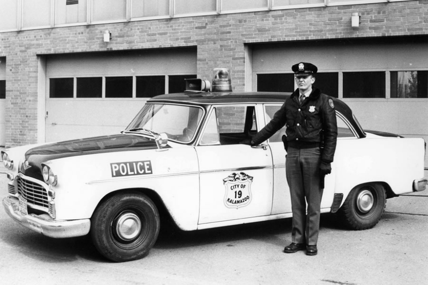
Oddly, one of the most famous automobiles in American history remains nameless for most people. It made billions of trips hauling millions of Americans over its 22 year production run, and outlived the Ford Model T by three years. It appeared thousands of times in countless movies, and if any American over twenty years old was asked to draw a taxi cab, they would likely draw a picture of one of these... even though they've been out of regular service since the early 90's. 

The car is the Checker Marathon. With a bulbous body, sparse trim, bumpers like building girders and ugly unbranded hubcaps, the Marathon is a real-life caricature of 1950's American cars. Its styling was dated and cheap looking even when new, giving it the feel of a Soviet Plymouth knockoff. The "design department" was actually just a corner of the factory that had been partitioned off with a couple of curtains. One might consider the Checker a truly generic American car.

The Marathon ran any number of engines, from Kaiser (as in Kaiser Permanente) inline sixes, to Chevrolet big block eight cylinders, to Oldsmobile diesels. Their running gear was also a mixed bag. They made their own bodies and some suspension parts, but many of their parts were sourced from other American auto manufacturers. By picking and choosing the toughest parts and making their one model in small batches, Checker somehow managed to make an extremely robust car while Detroit was busy making shoddy monstrosities. 

Though the Marathon is known for its ponderous, tractorish handling and a less than velvety ride, it was lauded by its drivers and riders for its ruggedness, spacious passenger compartment, large couch-like seats, and flat floors. They were largely used for commercial purposes by cab companies and police departments, but Checker even sold a few hundred cars a year straight to consumers.

Perhaps Checker Motor's greatest achievement was their record number of back-to-back profitable years. For the six decades following its 1922 debut Checker ended every year well within the black. The first year it took a hit was 1982, the last year the Marathon rolled off the production line. That's particularly surprising considering Checker's 1920's-built-by-hand production methods and incredibly low production numbers, rarely breaking more than 8,000 cars in a year. "Model years" were not a relevant concept at Checker. The cars only changed if required to by regulation or if parts availability demanded it. 

The Marathon died a slow death, with production numbers dwindling through the 70's as The Big Three's large flimsy sedans became too cheap for cab companies to resist. The end of the Marathon was not the end of Checker, but it was the end of their famous cars. Checker Motors lasted until 2009 stamping out body panels for Chevy. When they finally buttoned up their little factory in Kalamazo, it spelled the official end for independent auto manufacturers in the United States. Hudson, Nash, Studebaker, Packard, and AMC had all folded long before the little cab company went bankrupt. But they still live on, immortalized in every film about New York from the 60's or 70's.


At IKEA Temporary, a Concept Kitchen for 2025

$
0
0

It was hard to miss the green and white striped billboards and subway ads dotted around Milan for #IKEATemporary, IKEA's mega pop-up near Zona Tortona. With over 200 products for sale; METOD kitchen vignettes by Matali Crasset, Paola Navone and Studio Irvine;  a fully operational cafeteria serving up those famous Swedish meatballs—including their new "sustainable" veggie meatballs; and a preview of Ilse Crawford's new capsule collection, SINNERLING; the friendly 1,400 square meter space will continue to be a hub of activity throughout the run of the Milan Expo.

Swedish meatballs aside, a wonderful prototype of the future of home cooking is worth the trip to IKEA Temporary. The result of a 2013 collaboration between IKEA, IDEO and the students of the School of Industrial Design at the Ingvar Kamprad Design Centre at Lund University, and the Industrial Design department at Eindhoven University of Technology, the presentation shares learnings gleaned from the work of 54 students across 27 projects and four internships with a built Concept Kitchen for 2025

The prototype touched on four main themes: storage, waste, water and cooking. Although nothing presented was completely revolutionary, the overall vision felt like a cohesive imagining of the near future where daily drone delivery of groceries, grey water management and municipal fees for disposal of waste are the norm. 

Open shelving shows food while a terracotta shelf stores vegetables like onions and potatoes. 

A NOD TO THE PAST IN FUTURE FOOD STORAGE

Returning to the fresh market driven approach to buying food, energy inefficient refrigerators will be a thing of the past. Instead, a cross-functional system of inductive cooling containers and smart packaging with RFID stickers will keep foods at the right temperature, staying fresher for longer. 

Double-walled glass cloches keep food visible, so we don't overbuy. Insets made of porcelain, wood or slate keep food fresher for longer, and can be detached to use as tableware. The magnetic, stainless steel-gadoliminium alloy base is inductively cooled by the shelves. 

Additionally, a return to breathable, cooling terracotta containers is an energy neutral way of storing vegetables like garlic, potatoes and onions.

Waste is sorted by color through an integrated recycling/storage cabinet. 

WASTE NOT WANT NOT 

An integrated recycling system is the main component of IKEA's future waste management approach. Separating non-organic waste by material, the smart system identifies types of waste, vacuum packs and seals it and then prints a record of our waste production along with possible potential future uses. 

In addition, in-home composting becomes the norm with a souped-up garbage disposal system that processes organic waste from the sink, extracts water and produces a compressed puck of compostable material that could be picked up with other waste or used for gardening. The nutrient-rich waste water is piped into the system for watering indoor plants.

GRAY WATER/BLACK WATER

With California's water shortage on the West Coast giving us an unwanted look at future, the design of sinks are becoming a critical avenue for reshaping water usage. A "mindful design" solution from IKEA proposes a pivoting basin that has two plug holes—one for gray water that can be reused for washing up and watering plants and one for black water that would be flushed to the sewage system. 

THE KITCHEN TABLE HUB

What looks like a  typical IKEA kitchen table is actually a multifunctional food hub for preparing, cooking and eating meals. 

The technology consists of a camera and projector positioned above the table and induction coils underneath the table surface. Networked together, they allow the system to recognize objects and their movement and to project a display.

The table becomes a surface for interacting and learning about ingredients. Specially designed cookware activates induction coils to create a cooking surface. 

IKEA's concept kitchen was one of the most thoughtful projects we saw during this year's Milan design week. A glimpse at design-driven technology offers a more humanistic view of future objects that both serve a purpose and offer solutions.

WTC Elevator Displays 360-Degree Animated Time Lapse of New York Skyline

$
0
0

When the new One World Observatory opens next month, those riding the superfast elevator to the top will get a visual treat. It's lined in HD monitors, presenting the illusion that the elevator is glass; as it first rises from the ground floor, riders see Manhattan as it was in the 1500s. And as it ascends, a counter displays the year ticking upwards, while the convincing CG shows Manhattan accordingly sprouting up around you.

It's chilling to see Tower Two briefly blink in and out of existence. As the Times reports,

There would have been no way around Sept. 11, 2001, said David W. Checketts, the chairman and chief executive of Legends Hospitality, the company chosen by the Port Authority of New York and New Jersey in 2013 to operate the three-level observatory.
"The event is certainly a key part of history," he said. "We did not think you could ignore it. Having it appear in the year it did and disappear in the year it did was the respectful way of addressing the fact that it was part of the landscape." Two World Trade Center was the site of the original observatory.

The video animation is beautifully done, and looks a lot better than the version shown last year:

One World Observatory is scheduled to open its doors on May 29th.

A Controlled Loss of Control

$
0
0

What at first glance looks like preparation for the most epic furniture-themed party ever—shiny, reflective chairs and tables resembling inflated Mylar balloons—is, in fact, Zieta Prozessdesign's FiDU collection, constructed entirely of steel. The series, which consists of chairs, stools, tables, accessories and artwork, first made its debut back in 2008, but the Poland and Switzerland–based studio only recently announced its latest addition to the collection, Tafla, a modular set of mirrors, as late-comers to the party.

The large, globular forms look right at home among the other wonky, warped furniture in the collection. Like those objects, the mirrors were made via Free Inner Pressure Deformation (FiDU), which involves inflating sealed pockets made of stainless steel. The process was developed by Zieta Prozessdesign's founder, Oskar Zieta, during his time studying the properties of metal at ETH Zurich.

Zieta Prozessdesign's new inflated-steel mirrors
The mirrors are the latest addition to a furniture line made via Free Inner Pressure Deformation.

For the FiDU collection, large sheets of stainless steel are first laser-cut into two-dimensional shapes. "For the production of the mirrors, we used high-gloss polished stainless steel," Zieta says. "Steel is the main material in which we work and on which the majority of our projects and the whole technology are based. [It] is a very good material for light and shadow manipulating, and in good hands can be perfect to achieve amazing effects."

The individual pieces are stacked together and laser welded along their edges to create fully sealed, flat forms. The pieces are then inflated using pressurized air pumped in through a valve, resulting in an internal pressure that fills the sealed pocket and causes the metal to morph and change shape as it moves to accommodate the new air. After being inflated, the pieces are high-gloss polished to achieve their final reflective gleam.

Stools and a small table made through the same process
Uninflated steel forms

Zieta refers to the process as a "controlled loss of control." While the welded silhouettes give the designer an idea of what the end result will be, Zieta doesn't use a mold to create the objects, so each piece bends and expands differently, depending on the material's natural characteristics and grain. That variation, while now embraced, initially created a lot of frustration. "The most difficult part was the process of pumping and getting nice deformation touches, especially in the corners," Zieta says. "Finally, we managed to get deformation parameters in almost the same way, although it is always the minimum difference error—so every product is a little bit unique and one-of-a-kind." In the video below, Zieta likens the process to carving clay.

At the 2012 edition of the Paris trade show Maison & Objet, Zieta and his team demonstrated how a coat stand could be inflated at home using only a simple bicycle pump. While the FiDU collection itself requires no pumping by the end user, Zieta does believe that the technology could eventually be extended to at-home assembly, reducing shipping costs for an array of metal products that could be flat-packed and assembled upon delivery. Sounds like a party to us.

This was the latest installment of In the Details, our weekly deep-dive into the making of a new product or project. Last week: a terrifyingly cute area rug.

MakerBot Closes Their Stores, Downsizes Staff

$
0
0

On Friday, some 20% of MakerBot staff got a nasty surprise: They'd been fired. The same day, the company announced that they are closing all three of their retail locations. "All my friends at MakerBot just got laid off," wrote an anonymous Redditor. "They say there is currently private security escorting about 100 people out of buildings in their industry city complex in Brooklyn."

Rather than being a sign that the company's in trouble, the upheaval appears to be bean-counter-related; since being acquired by Stratasys in 2013, MakerBot has been due, a pragmatist would say, for some corporate pruning. Friday's press announcement stated that "We've grown more than 600% from 2012 to 2014" and have "achieved market leadership," but apparently there was enough redundancy between MakerBot and the parent company that new MakerBot CEO Jonathan Jaglom saw fit to drop the axe.

The lay-offs are thus not surprising, but the shuttering of the retail outlets is. While MakerBot only had three locations—New York, Boston and Greenwich, Connecticut—the stores were meant to introduce the general public to 3D printing, breaking out beyond the maker-geek barrier. That the company has grown so rapidly, yet are willing to close the stores, indicates the brick-and-mortar locations played a negligible role in the company's growth. Whereas Apple, for instance, has turned their stores into both showrooms and revenue machines, which has proven to be important to that company's bottom line.

One thing that MakerBot has that Apple doesn't is the Thingiverse. And while it still sounds small—just 100,000 3D models have been uploaded, and we'd have thought it'd be millions by now—apparently that community has been strong enough to grow MakerBot so tremendously in such a short amount of time.

It is interesting that Apple's easy-to-understand products—phones, computers, now a watch—have benefitted from having a physical showroom where people can see and learn about them. Whereas the more complicated 3D printer, which you would imagine buyers would want to learn about by seeing and trying first, apparently requires no brick-and-mortar at all.

Surviving Titanic Deckchair Sells at Auction

$
0
0

The phrase "Rearranging the deckchairs on the Titanic" is often used as an indication of folly. But what do those deckchairs actually look like? Few folks have seen them in person.

On Saturday, however, a wealthy collector managed to get his hands on one. Not a replica, but an actual deckchair that was sitting on the Titanic—specifically, on the first-class promenade—when it sank.

You're probably wondering how it subsequently wound up on an auction block in the UK's Wiltshire some 102 years later. Here's how:

Immediately following the Titanic's sinking, ships local to the crash were commissioned for the grisly business of picking up the bodies. One such ship was the Mackay Bennett, a cable repair ship out of Halifax. And in addition of picking up bodies, the crew also fished wreckage out of the water, and some of that wreckage turned out to be furniture. "The Mackay Bennett's log confirms that the crew not only picked up deck chairs (plural) but that the ships carpenter spent time repairing some of them," writes the Henry Aldridge & Son auction house.

One of the sailors on board took home the Nantucket chair you see here as a macabre souvenir, and following his death it changed hands several times until arriving at the Aldridge auction house.

While you'd imagine that everything on the Titanic was custom-built for that ship, the surprising thing is that this piece of furniture is actually second-hand:

Titanic deck chairs were actually a collection of chairs taken from other White Star steamers [and] they bore no characteristic design attributable exclusively to the Titanic. Some bore the distinctive White Star Line Company star carved into their headrests while others did not. Significant variations in the design were evident as well. Nevertheless, known examples of Titanic deck chairs did exhibit certain aesthetic similarities. For instance, all the chairs showed a comparable overall structural style. They all had seats which were caned and seat frames which were interchangeable in the event the seats became damaged.

Speaking of damaged, this one had been so badly damaged that one of the previous collectors never sat it in, but used it as a display piece in his home. Now that the mahogany chair has been professionally restored, however, it fetched top dollar at this weekend's auction: The Guardian reports it sold for "just over £100,000," which is more than US $150,000. That probably called for a rearranging of finances.

Castles Designed with Anti-Ninja Flooring

$
0
0

The problem with ninjas is that they're very quiet. They sneak into your castle at night, evading guards, slitting people's throats and then disappearing into one of those annoying smoke bomb clouds that take forever to air out.

A rare, 17th-Century woodblock-carved ninja selfie

In 16th-Century Japan, rumors of ninja prowess began to spread. And by the 17th Century, clever castle-builders designed a countermeasure to alert sleeping residents if there was a ninja sneaking around.

The design feature was called uguisubari, or "Nightingale floors." When one walked over the floorboards, this precise noise was produced:

The builders achieved this bird-like noise by placing metal against metal. Beneath the joists, they mounted extraneous metal brackets with nails driven through them. As the floorboard is stepped on, the brackets flex, producing the noise. These diagrams give you a not-entirely accurate idea of how it works:

I say the diagrams are not entirely accurate because they give you the impression that the brackets move up and down, and that the mounting nails are the ones producing the noise. That doesn't make sense. If you look at the photo below, you'll see the mounting holes are not slotted, and the brackets are nailed in two places at an angle. This means the brackets cannot possibly slide up and down.

And if you look closer at the photo, you can see telltale nail holes (arrows) indicating this bracket has been repositioned (probably because over time the wear of metal on metal stopped producing the noise). And we can see two bent nails (circled) left behind in the wood:

Those bent nails are not accidents; Japanese carpenters are not known for sloppiness. If we imagine the brackets in their original positions over the old nail holes, we can see that they would clearly overlap with the bent nails. I believe the brackets were designed to have some flex in them, causing them to rub against the bent nails concealed behind them, thus producing the noise.

In any case, Core77 has managed to obtain some exciting security cam footage of an assassination being thwarted by the flooring. In this clip we see a female ninja hellbent on murder—but halfway down the hallway, she realizes she's making too much noise and abandons her mission:


A Year in the Life of Nendo

$
0
0

Walking into the Nendo show during Milan Design Week is almost an other-worldly experience. The massive doors of Milan's Museo della Permanente open up onto a great white entryway leading to their single year solo retrospective.

Second Floor view of Nendo 

2015 has already been an undoubtedly good year for Nendo. The Japanese design firm revealed their innovative suitcase design the kame for Fabbrica Pelletterie Milano—only one of a number of company collaborations. The sheer scope of their work from 2014-2015 is incredible even for this prolific firm—a fact they have capitalized on. Over 100+ products were displayed against a perfect warm white backdrop creating a subtle '!' moments for which the company has become known. 

Since kame, the nendo team has also collaborated with Proteca to produce luggage line 360

While the show included a number of highlights, many of the standouts on the first floor of the two-story exhibition were collaborations with Glas Italia. A major theme that runs through the glass furniture was what can only be described as mastery of the 'considered surface.' The majority of the pieces, while only employing a very limited material pallet of sheet glass, achieved a range of effects purely through their surface treatment.

In soft, Nendo constructed simple rectilinear frosted sheet glass tables, printing a thin gradient along the 45-degree of the miter joint producing a soft glowing effect. The clear mastery of a seemingly simple material truly reflects the light-hearted playful quality balanced with incredible craftsmanship that has become Nendo's signature. 

soft for Glas Italia

The second floor of the exhibition was dedicated to a broad range of products and collaborations including two humorous nods to food design through a partnership with Häagen-Dazs, a design for an ice cream cake titled village and the project chocolatetexture, which won Chief Designer Oki Sato the title of Designer of the year at Maison et Objet 2015.

chocolatetexture showcasing a variety of shapes and textures chocolate could take from a 26x26x26mm cube. 

The fact that most of the projects were created in multiples, gave the the show a nice rhythm. Objects were arranged along plinths that added structure to the large room and allowed visitors to appreciate the evolution of each object as they walked the length of each stand.

5/7 doors is 'lamp' a door and light in one. 

Lining the back wall was a series of seven doors built in collaboration with the Japanese door manufacturer Abe Kogyo commemorating their 70th anniversary.

"All have a basic default design, and each one has been treated with a different idea born from the various techniques and experience held by the company. These doors do not end up being just one-off products. They have opened up new possibilities for various byproducts displaying a wide range of product development for the future" 

The sheer amount and variety of work from product to food, concept and interior architecture is a testament to the agility of the firm. In the 10+ years since establishing their first Tokyo office the company has built an enviable portfolio to say the least. 

We look forward to many more years of Nendo. Much more of their work from Milan Design Week and other exhibitions can be seen on their website

Terrifying Robotic Disembodied Humanoid Arms Permanently Mounted in Your Kitchen

$
0
0

A UK-based company called Moley Robotics is showing off this fairly terrifying "robot chef" they've developed. The good news is that the robot can't chase you around the house when it eventually goes rogue; the bad news is that its humanoid arms probably pack more of a punch than yours do.

First off, take a look at the company's CG demo:

In real life, of course, the thing's arms are considerably less sleek. Watch as this functioning prototype makes a crab bisque:

Now for the unanswered questions:

- How does it keep its "hands" clean?

- What prevents it from developing emotions like fear, hatred and contempt?

- Can it throw a pot of boiling water behind it?

- Who do I call when I catch it collecting and hiding knives?

- In terms of squeezing, can it tell the difference between a lemon and my trachea?

- Is the kill switch far enough away that the arms can't slap my hand away from it?

I know most members of the press seem enthused about the invention, but I am not afraid to ask the hard-hitting questions.

In any case, the arms are expected to go on sale by 2017 for $15,000.

Canada Invents Riderless Bicycles!

$
0
0

In a bid to "encourage people to get on their bikes and contribute to Canada's reputation as a leading cycling nation," Cycling Canada has launched an eye-catching campaign called "Hop On." See, these bikes need you:

The video was put together by Canadian FX house Alter Ego, and impressively, a fair amount of the bikes are not renderings, but real. Here's how they did the compositing:

Cycling Canada Behind The Scenes from Andres Kirejew on Vimeo.

Tonight at Curiosity Club: "Words Can't Be Trusted" With Gus Nicklos

$
0
0

Tonight at the Hand-Eye Supply Curiosity Club we aim small but big - typography is a big idea to tackle! In his talk "Words Can't Be Trusted," designer and typographer Guy Nicklos will take us through the functions and forms of making and using fonts. Starts 6pm at the Hand-Eye Supply store, and streaming on the Curiosity Club homepage!

The word can mean different things depending on who speaks it and in what context. Typography is both technical and aesthetic. Designing a font is part craft / part engineering, and uses both sides of the brain. 

I plan to draw a circle around fundamental and abstract–general and granular aspects of typography (and visual language). Far from linear or comprehensive, I will narrate a miscellaneum of form, discovery, ideas and moments threaded together over images.

Designer Develops Portable "Miniature Lighting Studio" for Macro Photography

$
0
0

In addition to being a product designer, UK-based Samuel Granger is an avid photographer. Those familiar with studio photography know there's already a bewildering array of lighting products on the market, but Granger spotted an unmet need in the area of macro photography.

"Lighting macro photography subjects is very challenging, taking up time and financial resources to achieve the 'right' set-up," Granger writes. "Existing products have the following problems: Lack of lighting control, often very expensive (£200 or above for a flash which can only achieve one lighting outcome), complicated to use, time consuming to set-up or change, restrictive in lighting positions and direction, not very portable."

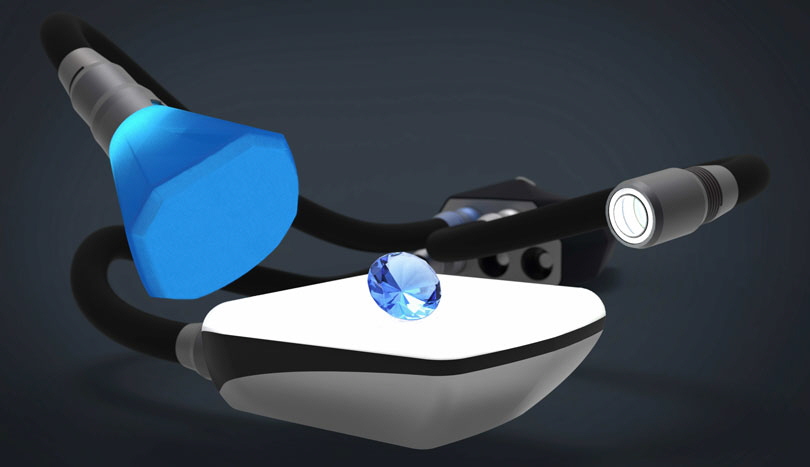
Reckoning he could do better, Granger spent the past year developing Adaptalux, a portable, modular and easily-adjustable lighting rig. Kitted out with LEDs on flexible stalks, a small control center that they plug into and a variety of diffusers that attach with magnets, it's essentially a "miniature lighting studio." 

Granger, now with a team behind him, has got it ready for prime time:

This one's coming down to the wire: The target is roughly US $150,000, and at press time they were at US $103,000 with 12 days left to pledge. Buy-in starts at US $150, and you can get in on it here.

Mininch Does it Again with Second Crowdfunding Smash

$
0
0

Is there a designer among you who doesn't dream of creating a crowdfunding smash hit? Something that asks for seven grand, but nets over a quarter of a million dollars? Do you have an idea for a product that you just know people will want, and can you back that up with the all-important execution--and intangibles? If so, maybe there's a lesson here.

I was mightily surprised when Mininch's original Pen Tool became successful. (And by "successful," I mean they sought $7,000 in funding but racked up $274,794.) While elements of it seemed well-designed, overall it didn't seem terribly practical. In particular it seemed undersized for the bike—and skateboard—repair applications shown in the pitch video. Nevertheless I respect their execution, and post-fulfillment comments on the campaign page are mostly filled with effusive praise of both the tool and the customer service.

That original campaign drew a lot of discussion from the Core77 readership speculating on what drove that amount of funding. Some said the low ($35) buy-in, others said "lack of tool literacy" (which makes no sense; that's like saying the Camry is a bestseller because people don't know how to drive, and doesn't explain what led people to make the purchase). Reader L.M. Lloyd seemed closer to the mark when he wrote: "I think that success on Kickstarter has everything to do with how well the campaign is designed, and next to nothing with how well the product is designed."

Another reader opined that "The big pitch here isn't the Mininch product itself, it's the silent seduction of the 'lifestyle'—as subconsciously conveyed by the video's high production values, hip models, boho sets, lush colors, cool music, etc...ID in thrall to Sales."

Let's circle back to that in a minute, as I must first point out that the Mininch folks have another hit on their hands. While their original tool might have benefitted from a beefier design to tackle the tasks portrayed in their video, they've now gone in the opposite direction, making the tool smaller. Take a look at the ham-handed pitch—er, "lifestyle"—video for their latest product, the Tool Pen Mini:

The developers sought slightly more than last time—$15,000—and were funded within an hour of the campaign going live. That was two weeks ago, and today they're up to $166,000. The numbers contine to tick up: They pulled in fifteen grand just while I was writing this entry.

I can't fault the "lifestyle" they're selling here, which is people fixing things. And unlike the previous tool, I actually see this one as useful; the smaller screws it's meant to remove don't require the torque a beefier handle would enable. I'm still not crazy about the first-in, last-out bit loading, but I do like the windows.

So here's what I think they got right:

Production Value

The lifestyle video, silly as it is, seems more effective than the awkward-designer-talking-to-the-camera-with-shitty-microphone approach that many take on Kickstarter. This one is professionally-lit and -shot. Their camera crew has a good selection of lenses and uses dolly shots, tracking shots, pans and close-ups. They've laid some Adobe After Effects call-outs over the shots without overdoing it.

Global Appeal

There's no language-specific dialogue to follow. The "storyline" is dumbed down enough to reach the masses. Even if you can't read the English-language call-outs, it's not difficult to puzzle out what they're highlighting.

Lifestyle Appeal

Just as Nike appeals to peoples' desires for athletic achievement, whether or not they actually exercise, the Mininch Pen Tool Mini also depicts "a better you," one that fixes things. I think we cannot underestimate the power of presenting people with a better version of themselves, and in today's society--for better or worse--this seems to happen through selling objects.

Low Buy-in

Relatively, anyway. The original Pen Tool started at $35, this one's at $45. Not cheap, but I think a sub-$50 barrier to what's perceived as a unique or quality tool will prompt easy clicks.

Execution

The four-person team not only has two competent designers and a Sales/Marketing guy but, tellingly, a Supply Chain guy who can presumably scale up when demand goes through the roof. Comments from pledgers on late fulfillment are usually amended with tales of excellent customer service, something you don't often hear these days.

Design

Yes, design. Reviews of their original tool are primarily positive; by most accounts the tool does whatever the owners are using them for, and the bit-loading appears to work as advertised. My criticisms of the first tool are not shared by the masses.

_

"I think that it is dangerous," Lloyd wrote on the original tool's entry, "to try and extrapolate design guidelines from things that are successful on Kickstarter." I couldn't agree more. Design is a fraction of it, and I'm sure the first four things in the list above play a much greater role than many suspect.

2015 Core77 NYC Design Map/App – Submit Your Event Now

$
0
0

Calling all New York-bound design enterprises – it is time to get your events listed!  We are very proud to be cooperating with both NYCxDesign and Metropolis magazine on promoting New York's design events and exhibitions this May. 

We will again be printing a tidy run of 20,000 slim and attractive maps to be distributed throughout May and across venues, both large and small – and just like last year we will be complementing it with an online mobile-friendly app.

Have an event, exhibition, or just plain ol' party you would like to get listed?  Follow these three easy steps:  
1. Create a Core77 Account (or log in)
2. Fill out this Form
3. Wait for fame, fortune, and/or drunk hordes to descend upon your location.

That's it.  Let us know if you have any trouble  and be sure to keep an eye out for our app launch in early May.


Heineken Taps into Mexico City

$
0
0

What does a 150 year-old Dutch brewing company know about contemporary Mexican nightlife? Yeah...probably very little. Yet, that's exactly where Heineken has pushed its team of designers, challenging them to rethink clubbing conventions and design Mexico City's newest lounge destination.

Heineken gave us an inside look at Mexico's Pop-Up City Lounge, their nightlife concept presented in conjunction with the metropolis' Mercedes Benz Fashion Week. Set entirely inside two forty-foot shipping crates adjacent to the runway tent, the space includes a full bar, self-serve draughts, and an open area of keg tables and conversation cocoons (more on those later). With ample room for both intimate conversation and bar-front mingling, the space provides a chance to see and be seen—whichever best fits your style and, if you're like us, a preferred proximity to beer.

Heineken isn't the first brand to design a Fashion Week lounge and certainly not the first to utilize a shipping container (we see you,Taco Bell), but it is one of the few in Mexico to give local designers a voice. Six Mexican designers contributed to the conceptualization of the pop-up—including interior designer Victor Hugo Jimenez, whose floating cocoons gracefully nest socialites, insulating their conversation inside geometric spheres.

Jimenez's patterns repeat in Jorge Delfin's uniform designs for the wait staff, which feature green and white tessellating triangles on lucite dresses and wood-cut heels. Servers carry angular LED-lit trays offering chilé smoked beers and chilangos, sweet/spicy beer "hoptails" inspired by citizens of the Distrito Federal.

The camaraderie and collaboration between these six designers can be found in the work scattered throughout the space. Take, for example, the interplay between Jimenez's furniture and Delfin's fashion: loungers unwilling to leave their conversation cocoons can pull at hanging Heineken bottles, which send a signal to the bar for another round. Iridescent lights embedded in the bar staff's uniforms glow green once drinks are on their way.

The Pop-Up City Lounge is a part of Open Design Explorations, Heineken's larger series to redesign the future of nightlife. Now in its third year, this annual program calls upon designers from New York, London, Warsaw, Singapore, Mexico City and beyond to collaborate and produce new features for lounges, bars, clubs and drinking experiences. Their realized designs travel the world as temporary Heineken installations; previous pop-ups have appeared at the London Design Festival andSalone Milan.

Heineken's Mexico City pop-up comes as the beer company looks to solidify its presence in the region, including a$480 million brewery investment. However, as Heineken's Global Head of Design Mark van Iterson points out, the international strategy is ideological as well as opportunistic. "Most beer companies look backward," Iterson says, referencing beer campaigns that use nostalgia, patriotism and clydesdales (get our jist?) to relate to consumers, "Though Heineken has a history, it's a history of innovation. Rather than focus on the past, we use our heritage to support new future initiatives."

Mexico City, too, is all about innovation. Its redefined identity comes partly from necessity—the city is in the98% percentile for annual municipal growth and is undergoing several long-overdue improvements in its education and infrastructure, both expected to impact city's future design landscape. With so many moving parts, Mexico City has no option but to look forward.

As a plus, van Iverson notes, the region's innovation extends to brewing culture. With its tradition in tequila and mezcal, "Mexico has an untapped opportunity in premium beer" he says, "It's prime occasion for a brand to speak with consumers about what they imagine to be the future of drinking."

The Pop-Up City Lounge enjoyed a one-week residency in Mexico City from April 13-17, during Mercedes Benz Fashion Week. The lounge and its design team will travel to Taiwan in September.

Star Destroyer for Sale on Craigslist

$
0
0

Now that you've seen the second trailer for the new Star Wars, you're undoubtedly restless for December. You need something to take your mind off of it; maybe now's the time to fix up that old junker of an RV in the driveway like you've been meaning to.

Or you could step up to the next level and tackle a slightly bigger project:

Yes, some moisture farmer has posted the ad to Craigslist in Humboldt County, California; you can read the rest of the copy at the link above. 

But all may not be as it seems; shortly after his ad went up, it was followed by another person writing a "Buyer beware:"

It's tough to say which of the two is better written, but I have to hand it to the second guy (assuming they're different people...).

Sixteen Rings to Rule Them All (on Twitter)

$
0
0

We're into the first round of the Playoffs, and the NBA has pulled off some clever marketing: Releasing renderings of championship rings emblazoned with all sixteen teams' logos represented. In other words, the perfect image for fans to endlessly re-tweet to their fellow supporters (and at their nemeses).

Eastern Conference:

Western Conference:

Some small, primarily dead version of myself wondered, deep down inside, what one of these rings might look like with a Knicks logo on it. But I think we all know we'll never see one of those in our lifetime.

Small Space Challenge: Storing Bicycles Indoors

$
0
0

Professional organizers know how challenging it can be to store bulky items in small spaces and bicycles are certainly bulky. When they need to be stored inside, we often think first of wall-mounted solutions. But that won't always work; there may not be sufficient wall space, or users may have physical limitations that make it difficult to lift their bikes. So floor stands will be a better choice for some users.

Photo by Takumi Ota

The Milestone from Love One, with its slits in solid stone, seems as though it would hold a bike very securely; I doubt anyone will bump into it and knock the bike over. But at 24 kg (52.9 lbs) it's not something that most buyers will want to have shipped. (It's also quite expensive.) And while many users will want something attractive in their living spaces, the Milestone is more luxurious than needed in most situations. 

Bikerax are designed to make shipping easy. They range in weight from 2.5 kg (for the one-bike size) to 7 kg (for the 5-bike size). They are made from four pieces of plywood, and I think even someone as assembly-challenged as I am could put them together. 

The Velo-Stand from GS Cicleria gently squeezes the bike's rear wheel to hold it securely in place. The stand uses adjustable wing nuts, which seems like a smart design.

Wall-mounted options are still useful for many users, though, and there are numerous designs that can work well.

Many shelf-style bike racks are designed only for top-tube bikes, so it's nice that The Industrial Farmhouse also designs ones that will work for users with diagonal-tube bikes or step-through bikes. Both of these designs have enough room to store a helmet on top.

Alexa Lethen is an industrial designer who developed some clever bike hooks. The knobs are mounted on the wall with a hidden screw, and the hooks fit over the knobs. But when they're not in use, the hooks can just be removed. (That saves space and prevents users from carelessly running into empty hooks and hurting themselves. ) The hooks have rubber coatings to protect the bike frame's finish.

While the Alexa Lethen hooks call attention to themselves by their beauty, the Pincher from Karl Mikael Ling was specifically designed to be visually light—it fades into the background so the bike itself becomes the focal point. The Pincher consists of a steel wire hanger and a solid aluminum mounting plate; the plate has an industrial grade polyurethane pad to protect the wall. The hanger portion can lie flat along the wall when not in use.

Because it's a single piece, the Pincher has less flexibility than the two-hook design to support different frame types; it can only support a top-tube bike. 

Hurdler Studios calls the Clug "the world's smallest bike rack." The clip holds one wheel in place while the other one rests on the floor. For easier cleaning, some users will prefer a product which keeps the bicycle above floor level—but others will appreciate this minimalist design. And the vertical orientation allows the Clug to fit into spaces that don't have the free horizontal wall space for other racks or for hooks.

The Endo from Cycloc has the same vertical orientation as the Clug, but it allows the bike to be stored off the ground as long as it weighs no more than 15 kg. (The Endo will hold bikes up to 20 kg, but the heavier ones require one wheel to rest on the floor.) The large pads with rubber inserts protect the walls.

Gear Up provides a bike rack that goes on the back of the door. There are obvious limitations here; the rack won't work if there's a wall (or anything else) to the side of the door which would keep that door from fully opening when the bike rack was in use. But for some users with limited space, it might be just what they need.

Buyers note that not all doors will have enough top clearance for this rack. They also note that while this is a nice apartment option because it doesn't require any installation that landlords may object to—it just hooks over the door—the optional bottom plate which protects the door does need to be screwed to the door.

And a door that's frequently opened and closed would not be the best place to install this rack, since the movement might jostle the rack and cause some damage to the bike. (Users could take the bike down before opening/closing the door, but that would become tedious if they had to do it very often.)


Design Forever: A Preview of the WantedDesign 2015 Design School Workshop

$
0
0

For the fifth year in a row, Core77 is partnering with WantedDesign to present the on-site design school workshop. Over the course of four days, students from Centro Design School from Mexico City, Art Center College for Design, Pasadena, and Savannah College of Art and Design (SCAD) will be working in collaboration to tackle the topic of product lifecycle in every day objects under the theme, Design Forever. 

With over 1.3 billion tons of waste generated per year, expected to rise to 2.2 billion tons per year by 2025, the issue of waste is becoming more urgent. Led by the Centro Design School from Mexico City, students participating in this year's design school workshop will work to transform an every day object into a product that lasts. Core77 spoke with Sébastian Ocampo, Director of Centro's Product Design department and Cecilia León de la Barra, designer, curator and instructor at Centro, about collaboration, blue sky thinking and leaving your comfort zone.

Core77: What impresses you most about what comes out of these workshops?

First the quality of the experience regardless of the results. Students from different parts of the world share their cultural backgrounds and specific ways of developing a project. In terms of results, there are very strong conceptual proposals—solid and feasible. So it's not only about "blue sky thinking." The collaboration, organic form of working and the different ways of thinking create new, amazing, interesting and innovative ideas. The surprise is in the outcome, nothing comes out as expected.

Where did this year's theme, Design Forever, come from?

Maybe the starting point was a broken coffee machine…the glass container broke and it was impossible to find that separate part so I had to buy a new one.

Also, it's a general issue that worries us and brings along an enormous amount of questions. The theme requires us to look beyond our individual time/conscience and think about the world we want to leave for future generations. So how can we as designers participate, understand, communicate and contribute in making a difference regarding waste and the problem that this represents for all of us.

What are your expectations/hopes for the workshop this year?

To develop pertinent scenarios related to the theme and have a variety of topics. I hope we create a space for discussion and sharing different points of view. We will search to pinpoint the specific aspects that determine the life expectancy of a specific product. Match process to desired results and provoke different minds to come together and think about new ideas. To leave a seed of awareness and to share with the public, we hope, options of how to address this subject. Regardless of the tangible result we expect this workshop to be a pivot for the design community.

What do you think is the most valuable take away for students who participate?

Working with students from different countries and schools. Having the feedback from the teachers and jury, and collaborating with others. Sometimes design seems to be one person working in the void and here students have the opportunity to understand that we have to work together—that this will always be much richer than doing things alone.

Additionally, leaving their comfort zone and working with new people should also create new aspects in their proposals.

Why should design enthusiasts observe the students at work and the final project presentations/critiques?

It's an invitation to question oneself about how we do things and if they can be done better or differently. The design community will also have the opportunity to listen to the feedback from prominent members of the jury. To learn how young designers approach issues that should concern us all and share with them the highlights of the workshop.

WantedDesign's Design School Workshop will take place at WantedDesign Brooklyn, 274 36th Street, in Sunset Park, May 14-18.

Viewing all 19151 articles
Browse latest View live


Latest Images