Quantcast
Channel: Core77
Viewing all 19137 articles
Browse latest View live

FakeID: A Preview of Pratt's MID Thesis Presentation 2015

$
0
0

To look at our class of 22 Masters of Industrial Design (M.I.D.) degree candidates who will graduate from Pratt Institute this May, one would see a collage of designers from a large span of backgrounds, experiences, and skill sets. Pratt's selection process for students has traditionally resulted in this type of eclectic student grouping, ultimately creating a learning environment inundated with endless different views, opinions and design strategies.

Material from Lauren Currier, Nadine Foik and Pachara Kangchirdsri's "Ageless"

Over the course of three years, we have swam upstream towards a main objective: become an "industrial designer." We quickly realized, somewhere along that path, that this particular profession is difficult to define. So, we embraced our dissimilarities and used them as starting points until we each ultimately forged by our own path. Often the results more closely resemble fields other than the one that will be written on our diploma.

This year, our M.I.D. graduating class of 2015 thesis exhibition Fake ID isshowcasing thisexpanding discourse. Acknowledging that many parts of our theses may not reflect "true industrial design," Fake ID plays off of the notion that we as designers intend to sneak into this world using any means necessary, even if it is borrowed, bought, or stolen from other fields.

Detail shot of "Floor Pillows" by Desiree Guedez

The exhibition will showcase these connections through pieces and ideas that live on the boundary between the direct field of study and those that are on the periphery. From collaborations with architecture and wearable technology, to other pursuits within agriculture, food, information and graphic design, community building, and self-reflection: we seek to expand industrial design to as far as it can reach, all in the pursuit of better understanding people, things, and the infinite relationships that can exist between them.

Essay by Keith Holser and Megan Czaja for Pratt Institute M.I.D. Class of 2015.

"More Sky" by Aldana Ferrer Garcia

"Living in an apartment building, there's always a disconnect with nature, the elements or the sky." Aldana Ferrer Garcia's "More Sky" project is a retrofit window system, part pop-up sunroom on a facade part temporary microspace to enjoy the elements. 

"Movement" by Keith Kirkland
"Designed to Grow" by Samantha Katehis

Samantha Katehis' "Designed to Grow" project consists of a 20-page activity book, hydroponic kit and a plant canister to educate children on how their food is grown, processed and sustained. The project, "focuses on products that are meant to empower healther choices, create a basic understanding of local and micro agriculture," explained Katehis, "and foster a new relationship with fruits, vegetables and sustainability."

"Oblio Stool" by Meg Czaja

Inspired by those who need to fidget in order to think, this stool is made with motion in mind. Meg Czaja's maple wood stool is like a balance ball gone Scandinavian. The rubber sphere utilizes a semi-rigid foam interior.

"Tesselate" by Sebastian Jacobo

Tesselate is a "smart fabric" that contracts and expands in response to light. As the designer Sebastian Jacobo explained:

The photosensors are programmed so that they activate a motor located at the base of the system which pulls the fabric up and down according to how much light is sensed. The result is a surface that can flatten and disappear but also transform into a geometric form.
Paho table by Keith Holser

The cement Paho table utilizes a soft mold of wood shavings to "capture the moment of its birth" as the cement is poured into the mold.

Fake ID will take place at Pratt Institute's Brooklyn Fashion + Design Accelerator (BF+DA), located at 630 Flushing Avenue, 7th Floor, in Brooklyn (entrance via Tompkins Avenue). Thesis presentations will be held on Wednesday, April 29 and Thursday, April 30 from 1 to 6 PM with exhibition views to follow. A free public reception will be held from 6-9 PM on Thursday, April 30. A live stream will also available for those who cannot attend. For more information visit www.prattfakeid.com.


The End of Product Failure

$
0
0

What are the odds a new product will still be around in two years' time?

If you ask the Product Design & Marketing Association, they're not good: between 25 and 45 percent of consumer goods in its survey eventually fail in the market. The U.S. Department of Commerce is even more pessimistic, suggesting that 95 percent of new products miss their sales and performance goals. Regardless of whom you believe (or how reliable their methods are), there's no doubt that product innovation is fraught with risk and uncertainty. To a professional designer, these statistics aren't just interesting; they're tragic. The dollars and hours wasted creating the next Zune, PCjr, or Edsel measure in the trillions, and besides clogging stores and landfills, failed products like these represent lost opportunities to make things right.

Those in the innovation business have grudgingly accepted this situation (if it was easy, everyone would do it, right?) but it's beginning to look as though the odds might change. The arrival of improved sensing, processing and prototyping technologies helped usher in the smartphone era and the new DIY economy, but I'd argue that we're just beginning to see how technology might disrupt product innovation. Three technologies in particular could transform not just how we design but how we make the decisions that tell us what to design. Properly applied, they could spell the end of failed consumer products.

Bresslergroup's Chris Murray

How We Decide What To Design Today

New products have a bad track record because they're usually solving the wrong problem.

Successful product innovation hinges on uncovering an unmet consumer or social need, then meeting it. Sounds simple, but in practice there's nothing harder than grasping the true needs of others, or knowing with any kind of certainty whether your new approach is better than the old one. If your product is genuinely innovative to the point where it creates a new category or asks users to adopt a new behavior, the task is even tougher.

So the researchers who work with designers have a dizzying array of techniques for finding out, most of them far more advanced than the focus groups and phone surveys of years past. What we do at Bresslergroup is representative of what happens industry-wide, with researchers working in small teams, spending hours at a time in target users' homes, or following them as they go about their routine, alternately observing (like an ethnographer), measuring (like a scientist) and interviewing (like a journalist). Once the data is gathered, researchers and designers spend time to extract the most compelling user needs and where current products fall short—but that requires a lot of interpretation.

How We'll Decide What To Design in the Future

The hybrid approach we use now does yield valuable insights, but in my experience it's difficult to get an accurate picture of habits and needs in a less than natural setting. I can ask a subject to be honest when I ask personal questions, but they're notoriously bad at it. And I can ask them to pretend I'm not there during observation, but my presence undeniably skews the outcome.

The Internet of Things

It's this gap that I'd like to see bridged with smart, connected devices. The Internet of Things (IoT) has been hyped relentlessly for more than a decade now, with varying results, mostly because gathering a lot of data isn't useful or interesting unless you know what to do with it. Still, Gartner has forecasted that 4.9 billion IoT devices will be in use by 2015—and 25 billion by 2020, with consumer products in the lead.

What if we used all of those smart thermostats to help us to design the next-generation smart thermostat? Going further, what if we could employ those wearable devices to learn how people really use, for example, their kitchen appliances? What if we enlisted that car's in-dash navigation system to discover not just transportation habits but shopping and dining patterns too?

Ethnographic research typically stretches over an hour or two. With IoT we could monitor a product's use over days, weeks and months for a much more accurate picture. For design researchers the world of quantitative big data will merge with qualitative research. This kind of benevolent surveillance would require explicit permission from subjects (and probably payment too), but this is already standard practice in most user research.

Far from replacing in-person inquiry, the data collected by connected devices could make it more useful by adding reliable context and freeing researchers to focus on observing rather than having to simultaneously interrogate participants with streams of questions.

An image from Affectiva, whose software tracks subjects' facial movements

Facial Expression Recognition Software

"The face is the window to the soul." We've all probably heard this at some point, but increasingly we're learning just how clear that window is. Beginning with Paul Ekman's work in the 1960s, research psychologists have come to realize that human facial expressions are not only surprisingly universal but surprisingly honest. It's now generally accepted that subtle facial cues offer a more accurate depiction of someone's reactions and emotional state than their words—a phenomenon Malcolm Gladwell popularized in his 2007 book Blink and that startups like Affectiva have recently used to design some potentially game-changing software.

By tracking subjects' facial movements, and comparing them with a library of expressions, Affectiva's software (along with competing products by companies like Emotient and Eyeris) can infer whether subjects are delighted, frustrated, engaged or confused—often more accurately than a skilled human observer. And unlike human observers, they can scale. Properly applied with the full consent of participants, these tools offer nothing short of an automated, reliable way to know how thousands of people feel when using a new product, digital or otherwise.

One of the great frustrations of product design is that the longer you spend perfecting something, the less you're able to accurately evaluate how it will be received. An objective, digital "observer" could let us look with eyes unclouded by familiarity at thousands of target users.

For designers, this could offer a way around the "curse of knowledge"—our inability to imagine what it's like to use something for the first time, after working on it for months. One of the great frustrations of product design is that the longer you spend perfecting something, the less you're able to accurately evaluate how it will be received. An objective, digital "observer" could let us look with eyes unclouded by familiarity at thousands of target users. When asking "Is this interface intuitive?" or "Is this aesthetic intimidating?" about a prototype product, we'd get a better shot at an answer approaching impartial truth.

Rapid Prototyping

How we create that prototype, though, presents a sticking point.

Gearing up to produce even a small consumer gadget can cost hundreds of thousands or millions of dollars, with an outcome that's far from certain. Short of actual production parts, the best we can usually do is several high-fidelity models or mockups that simulate the look, feel and function of the finished product at significant cost.

In all the discussion of 3D printing and other rapid prototyping (RP) technologies over the past few years, we've tended to focus on the DIY economy and short-run, high-value manufacturing like medical and aerospace. But its biggest impact may be felt in more mundane categories.

Rapid-prototyped versions of a tabletop candle display

It's already common practice to 3D print early versions (prototypes) of new products, so they can be evaluated for function, aesthetics and feel. This has become standard practice at Bresslergroup and other product design consultancies and incubators. As the cost comes down and the fidelity goes up, we're brushing up against a much more exciting possibility, of printing products that people can actually buy.

It's unlikely the economics of RP will make this approach competitive with traditional mass production at any real volume, but that's not the point. By putting a few thousand early versions of a new product on the market, designers stand to learn a tremendous amount about consumer interest and demand, and to get real-world feedback that can be applied in subsequent runs. It's a way of testing the salability of a product, in addition to its usability.

This strategy is equally valuable for startups as it is for large corporations who are starting to employ the same "lean startup" techniques as entrepreneurs to reduce risk—to build, measure and learn in a modest manner before scaling up the volume of a consumer validated product idea. For early adopters, it's a chance to evaluate innovative technology and to walk around with a limited-release edition in their pocket.

Putting Them Together

All three of these technologies have been around for years now, and have proven themselves to have significant value. What I'm proposing is a new use for familiar tools, to solve an old problem—high-risk product innovation—that was once intractable.

The early Internet was full of terrible websites and digital applications that were practically unusable. We owe today's relatively useful, user-friendly online world to a rapid expansion in the skills of digital designers, and to elevated user expectations—but also to some incredibly powerful analytic tools, and entire fields of expertise around digital testing. This kind of iterative, knowledge-based improvement exists for physical products too, but it's far more hit-and-miss; atoms are harder to manipulate than bits.

There are two main reasons why products fail: lack of user need, or the user need isn't as mass-volume as previously thought.

Used in concert, these technologies could close that gap. I think there are two main reasons why products fail: lack of user need, or the user need isn't as mass-volume as previously thought. Nearly every product failure can be traced back to a decision based on this misinformation, so imagine the impact on product innovation if we knew our mistake before committing ourselves.

So when it's time to decide which problem to solve, let the Internet of Things help us do the digging. Let observant software tell us when things are frustrating or perplexing. Unleash a short run of 3D-printed products on the market, and let them tell us whether we got it right. It's at odds with the romantic notion of product design as an instinctive, magical process, but as someone who's designed dozens of products (some of them successful!), I can assure you it takes a lot more iteration than inspiration, and we could use all the help we can get. And couldn't we all do without another Zune?

Note: Bresslergroup advertises through Core77's Design Directory. This essay was independently evaluated by Core77's editorial team.

Buy It Now: The World's Last Mobile Cinema Is On EBay

$
0
0

Even the most romantic school bus to camper conversion pales in comparison with the Bedford SB3 Mobile Cinema. This sort of streamlined British bus-cum-theater is the only remaining survivor of seven. Built by England's Ministry of Technology in the late 1960's, this bus and its six brothers toured the UK to educate engineers, industrial designers, and other industry types on modern production methods. The "cinemas" fanned out to manufacturing facilities in cities and towns across the country, making attendance at these educational tours more convenient. Think: factory chemists drinking tea and eating bangers while watching a film on the newest foam rubber production techniques on their lunch break.

Each cinema was also outfitted with a matching trailer. The trailers held detailed presentations and literature on the subject of the films being shown. Both were built by Coventry Steel Caravans, a high-end english camper manufacturer. The production methods were fairly advanced, the bodies were hand formed out of aluminum; the bubble windows made from custom formed plexiglass. The cinemas themselves were supposed to be a strong show of modern British industrial design.

Originally the cinemas were equipped with a remote controlled Bell and Howell 16mm projector, housed in the bulging "This Island Earth" plexiglass forehead. This unit's projector is still in place, but is no longer functional. The cinema is now equipped with a modern HD digital projector and Dolby 7.1 surround sound. I imagine this would be the ideal viewing venue for the film Speed. You would feel like you were right there in the bus with Keanu.

After being sold off by the government in 1974, all but this lone Cinema have gone missing and are presumed dead. Found in sorry shape when its current owners purchased it, it has undergone an impressive restoration receiving an updated drivetrain and modern heating and air conditioning systems. It comes with its original trailer, which is largely complete but still in need of a full restoration. And it can all be yours for only £120,000 ($184,000 USD)… or best offer!

Organizing the Dirty Stuff

$
0
0

Toilet brushes and plungers are items best kept close to where they're used. Not every bathroom has a nearby under-sink cabinet with room to stash this stuff—and not everyone would want to store these items in such a cabinet, anyway. But leaving something like a plunger sitting out isn't anyone's idea of cool decor, so well-designed storage products really help.

The Ballo toilet brush, designed by Jozeph Forakis for Normann Copenhagen, is an example of one interesting approach; the brush is stored in a base that disguises what's being stored. Replacement brush heads as available, so there's no need to discard the whole product just because a brush wears out or gets too grungy. However, I can also see a child, a cat or a dog treating this as a toy, as it (intentionally) wobbles back and forth, so pet owners and parents of young children might want to look elsewhere. It's made from injection molded polypropylene.

The Kali toilet brush from Authentics, designed by Doshi Levien, is another product providing discreet storage for the brush. It's scaled for those with small bathrooms, at 39 cm tall and 13.5 cm wide; for comparison, the Ballo is 50 cm tall and 22 cm wide. Again, replacement brush heads are available. It's made from ABS.

While some people will want a fully enclosed toilet brush holder, especially those concerned about protecting their children or pets, others will be fine with a holder that is open on one side. The Simplehuman design includes a magnetic collar to secure the brush to the housing, so the brush (and housing) can be moved from one room to another by just holding the handle. This would be nice for anyone who doesn't always have two free hands, or anyone who would have difficulty bending down to grasp the base.

The brush itself has a crescent shape to clean hard-to-reach areas around the rim; the outer bristles are stiff to scrub at stains. This untraditional design has both fans and critics; some find it harder to use than a simpler brush. Since the handle is stainless steel, this brush won't work well for those who use a bleach-based cleaner, unless they are good about ensuring all bleach is washed off the handle before stowing it away. 

Toilet brush holders could also be wall-mounted, as with this one from Blomus. The holder comes off the wall bracket for easy cleaning when needed. This design will appeal to those who have small bathrooms with limited floor space—and anyone who likes to keep things off the floor to make cleaning the floor easier. It might also work well to keep the brush away from a pet or small child. 

Renters  might not be allowed to install the recessed Tino brush holder from Componendo, but it's a nice design for those who don't have that constraint and who have the available wall space. The advantages of the wall-mounted brush holder apply to this design, too. The brush, the box it sits in, and the pivoting plate can all be readily removed for easy cleaning.

Plungers are something most people prefer to keep hidden away, and plunger holders like these will do the hiding. However, some buyers have complained that the plunger handle is too short and the plunger head is too small. Also, having the lid attached to the plunger makes it somewhat awkward to use.

Mary Jo Kringas created the Sani-Plunge when her first child started to crawl around and put everything he could find into his mouth. She began looking for "a plunger holder that would keep him alive at least into adolescence" and had no luck finding what she wanted: a toilet plunger holder that would hide the plunger completely, would not leak any waste water, and would require significant effort for a toddler to get at the toilet plunger itself. So she created what she needed.

The Sani-Plunge is plastic with a hinged flip-top lid. And there's no compromise on the plunger itself; it comes with a 16-inch Perfect Plunger which Kringas says is "the best toilet plunger available anywhere."

Those who don't feel the need for an enclosed plunger could use something like the Simplehuman design, with the same magnetic collar as the company's toilet brush. The company put some consideration into the plunger itself; its flange is "designed with a narrow profile to work more efficiently with modern toilets." 

Of course, the toilet brush and plunger could also be stored together in a single caddy, such as this one from Polder. However, some buyers have complained about the quality: brushes that broke off the handle, plungers that inverted,  and plastic that off-gassed. It's a good reminder that a design needs to factor in the quality of the materials being used. 

Superior Houseware has a bathroom caddy that stores the toilet brush and plunger together in a closed design, with vented holes to allow the tools to dry out after use. It's another product that a parent who's baby-proofing the house might find useful. While the design does a commendable job of fitting both products into a reasonably small container,  the caddy might still be hard to fit into a small bathroom with limited floor space.

The recess-mounted Hy-Dit, made from injection molded plastic, has space for a plunger and a brush (which are included) and even a toilet bowl cleaner. However, the plunger that comes with the Hy-Dit seems to be a sink plunger, not a toilet plunger—if I'm right about that, purchasers may well want to find another plunger that fits. The door is reversible and can therefore be installed on either side, and it can be painted or stained to fit into the rest of the room. 

With the possible exception of the plunger choice, it's a clever design, allowing all the cleaning products to be stored together—off the floor, out of sight, and away from children and pets.

India Mahdavi's Bold Bisazza Tiles are Cement, not Ceramic

$
0
0

Bisazza may be known for their glass mosaics and ceramic tiles, but lately they've branched out into a new material: Cement.

Their new Mahdavi Collection, created by Paris-based designer/architect India Mahdavi, gives a surprising new look to the humble material.

Mahdavi's bold patterns are retro in more ways than one: The tiles are reportedly made by hand (!) with subtle variances from one tile to the next. "Dimensional and chromatic variation is intrinsic of this production process," Bisazza states, "which involves a number of manual steps and is a distinctive feature of the product."

If you're wondering how to maintain them, the answer is: Wax. They come from the factory with two coats on 'em already, and the installer is meant to add a third. Following that, "the surface should be waxed regularly."

And cement though they may be, these were designed for interior use only; the bright colors, it seems, will fade in the face of direct sunlight.

They come in both square and hexagonal, the latter choice being offered for those of you that want your installer to suffer a bit.

Meet an Industrial Designer Who Ditched ID for Something Better

$
0
0

Ben Cramp is a man who had a career in industrial design, and ditched it—twice. The lure of the shop was too strong to keep him behind a desk, and while he still designs, now it's for himself, for objects that he will make in his own shop, with his own hands.

Another lure that proved powerful to Cramp was that of reclaimed wood. There are no sheet goods in his collection of nearly two dozen objects, nor even any recently-felled lumber (save for one local beech tree that was knocked down by a storm); all of the wood he uses used to be something else. And the appeal is easy to see—take, for instance, his French Oak Key Holder:

The Oak used in this Key holder originally served as flooring and walls of French Railway Wagons hauling goods for the SNCF (Société nationale des chemins de fer français). These wagons are up to 80years old and are nearly all now decommissioned and replaced with less romantic steel versions. When we first get our hands on the Oak boards they are coated with decades of soot from the old steam trains that hauled them. Hiding under that soot lays an incredible timber full of characterful burls, knots and cracks. Time has allowed the soot to seep into the cracks and holes beautifully highlighting them in jet black. It's a real privilege to work with timber with such an amazing story and a real joy to give it new meaning and a new life.

Speaking of a new life, Cramp's career arc and story is one that's well worth hearing:

Check out the rest of Cramp's work here.

Art Lebedev Studio's Valikus Patterned Paint Roller

$
0
0

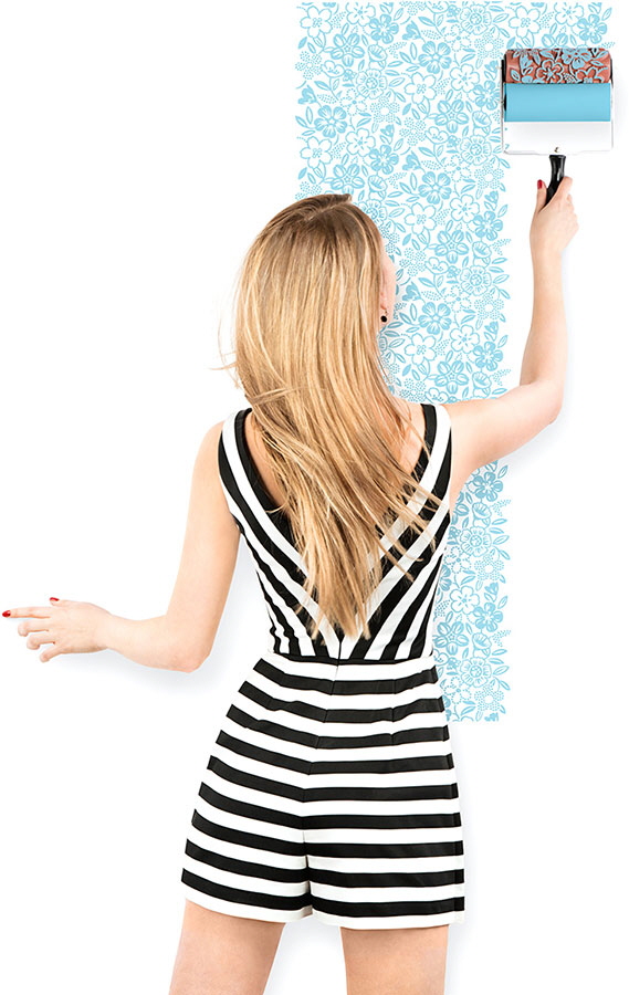
Leave it up to Art Lebedev Studio to recast something as basic as the paint roller in an entirely new light. Their Valikus roller is made from silicon and embossed with a floral pattern. Behind it sits a second roller, which applies paint to the first roller. (Frankly speaking, I can't work out how that second roller is loaded in the first place.)

A steady-handed user can then apply a pattern to a wall thusly:

The tricky part was getting the pattern dense enough to read as a whole, but sparse enough to deal with the eyeballed edge-to-edge alignments. "It has to be both simple and complex at the same time," the team writes. "[The pattern must] align with different [passes] which [are] unavoidable in real life." They experimented with different patterns, which you can see below and read about here.

I think the real challenge would the limitations of the user's height, and keeping the pressure of the stroke even from high to low. If I tried to continue a stroke upwards by dragging a ladder over, I have no faith I'd be able to line the pattern up again.

In any case, it's a cool concept. Oh wait a sec—not a concept; it's actually in production! The Valikus goes for 33 Euros, or about US $36.

The Avengers: Age of Technical Difficulties

$
0
0

The latest installment of The Avengers opens today in the 'States. As usual, the most unbelievable part of the movie will not be a man in a flying iron suit, an angry oversized emerald doctor or an alien attack. It will be that S.H.I.E.L.D. Director Nick Fury will be able to hold a seamless, multiple-continent-spanning teleconference with the Security Council with no latency, crisp high-def images and no garbled audio.

To set the record straight, YouTuber pixelspersecond provides a much more realistic rendition of the inevitable scene:

Happy Friday!


Forming a Hardware Habit: The Story of MOTI and Google's 30 Weeks Program

$
0
0

When is the last time you drank the recommended 8 glasses of water a day? Did you remember to exercise today? 

Habit formation—or rather the difficulty of habit formation is an issue to which most humans can relate. In this amazing world we live in, it seems as though psychology should have a few tips for us on how to make this easier. And if not psychology, then technology should definitely be able to solve the problem...right?

Enter Moti, your new Tamagotchi-like friend who sits in your environment and gives you just the push you need to create that habit you've been trying to get going for years. Moti began as a project of Kayla Matheus, developed through 30 Weeks, a New-York based founders program for designers operated by Hyper Island and supported by Google. The program boasts a lineup of partners and mentors with some familiar names including John Maeda of KPCB, David Kelley of IDEO and the d.School and many more from academia, venture capital and industry. 

"The vision for MOTI is big – it starts with this project but it goes far beyond that. There're a lot of different verticals and use cases we plan to explore." - Kayla Matheus

The 30 Weeks program gathers together a group of smart young people and throws them into the startup scene—prepping them to launch their own companies at the end of the program. 30 Weeks, unlike the classic Y Combinator or Techstars model of incubation and seed investment, runs more like a 'pre-accelerator.' Participants apply and pay to be a part of the program, generally hailing from some sort of design background. 

MOTI comes in 3 shapes.

In the case of Matheus,  it was a background in Mechanical Engineering and Sculpture that led her eventually to a career in design. Upon entering the program, participants are not required to have a solidified idea they want to build a business around—an appealing prospect for Matheus, who otherwise would have considered a traditional graduate school route. 

I knew I was interested in being an entrepreneur, I saw friends who were founders—but I never felt like I had that amazing idea to go after and persue. I realized through my professional work that I wanted to be creating products on my own terms, choosing the problems that I was solving. The thing that attracted me [to 30 weeks] was not coming in with that startup idea. This was space, time and mentorship to help with the initial ideation that would then translate into a startup. That's what I really loved was that it was about my individual development as an entrepreneur and it would give me the breathing room to flesh out what I wanted to do.

Matheus found herself in the right place, surrounded by 16 other design-entrepreneurs she iterated on two separate ideas before settling on MOTI. The project technically, would likely be ill-advised in a traditional accelerators that favor high-potential startups that are light on overhead costs (i.e. not hardware). 30 Weeks however, doesn't mistake fiscal potential for innovation. 

30 Weeks Program: A Founders Program for Designers. 
I knew coming in that I wanted to design a physical thing and really get back to my mechanical engineering roots. So I wrote a breakup letter to the other idea and sent it out to the entire group.  I think the problem with the habit idea was that it wasn't very fleshed out I didn't have the time to do the proper user research and really iterate the way that I had with my first idea. So that's how I decided—it was a lot of struggling between the two and trying to get introspective about why my gut was telling me to go with this idea.

Next on the agenda for MOTI is distributing their first beta-batch of 50 devices that Matheus will be manufacturing in house. These devices will be the basis for the final design iteration of the device before design for manufacturing. We look forward to seeing what Matheus and the rest of the 30 weeks graduates decide to do post-demo day to grow their newly-founded businesses. 

MOTI delivers a friendly reminder to remember your daily habit. 

We wish Matheus and her team the best as they continue with the product post-30 Weeks. You can find out more about their beta-testing round and future product launch on their website

How to See if Someone's Infradrunk

$
0
0
Image Credit: Nadya Peek / CC 2.0 via PopSci

Some folks hide drunkenness well, giving no indication that you ought take their car keys. A breathalyzer would give them away—if one were handy at all times and you could easily get them into people's mouths. But now two physics professors from Greece's University of Patras have devised a better, less invasive way to detect drunkenness: Snapping an infrared photo of the person's face.

Georgia Koukiou and Vassilis Anastassopoulos took thermal photos of the faces of 41 people drinking booze, then studied the before/after images to see what had changed. The difference isn't easily spottable by the human eye; for example, can you tell in the photo below which is the "drunk" shot?

It's the one on the right. What Koukiou and Anastassopoulos discovered was that "mainly the…forehead…changed thermal behaviour with alcohol consumption." As booze gets into the system, a person's forehead becomes flushed, at least to the point that the researchers' algorithm can pick up on it when presented with the photo.

They then tested the algorithm out on "unknown persons," i.e. without having the benefit of a "before" photo to compare to, and found they could detect drunkenness with 90% accuracy.

While the obvious applications would be for DWI checkpoints and bartenders determining when to cut someone off, I'd like to see the system installed on my laptop's webcam. It would prevent me, late at night, from having one beer too many and ordering stuff I don't need off of Amazon.

Via Popular Science

Adventures in Laser Kerf Bending

$
0
0

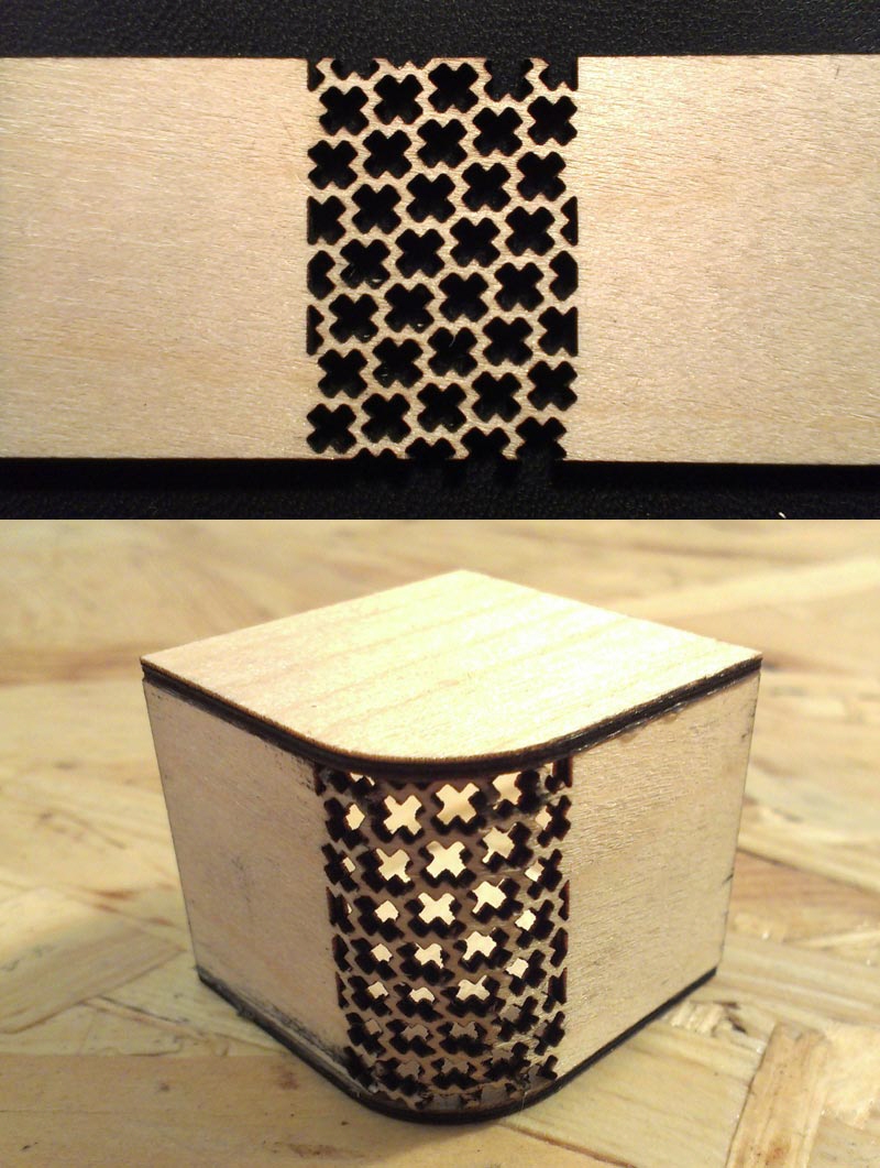
When Shaun Crampton designed a bentwood housing for his self-built radio receiver, he didn't go with steam-bending. Instead the software developer went the lasercutter route, cutting accordion lines to turn the walnut-veneered plywood into its own hinge. The result is not only pleasing to the eye, but looks like something Braun would have designed in the 1930s, had they had access to a lasercutter back then:

Using a lasercutter to create kerf bending patterns or lattice hinges has been popular since affordable laser cutters first hit the market, and in the years since, folks have experimented with plenty of different patterns. A lattice hinge is a great way to provide both form and visual interest, and while the results wear their CNC on their sleeve, so to speak, it's a look that many are happy to live with.

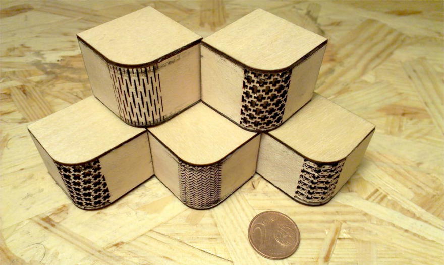
Martin Breuer took an engineer's approach to his tests, producing five variants of his own transmitter box:

On his website he not only rates each design in four categories—Pliability, Tensile Strength, Torsional Strength and Normal Strength—but provides the CAD file for those that want to repeat his experiments.

Patrick Fenner's used a lasercutter to make these sketchbook covers, and has also run a series of kerf-bending tests to determine ideal radii for materials of a given thickness (including plastic). 

You can check those out, along with the files, on Fenner's page.

When it comes to sheer creativity of patterns, Aaron Porterfield seems the cake-taker with these experiments:

Porterfield has an Instructable discussing the merits of each type here. (And like the others, he's included the files.)

Designers & Books Bringing Back "Perfect Reprint" of Iconic Graphic Design Book

$
0
0

The folks over at Designers & Books got their hands on a rare, largely unsung design classic: Ladislav Sutnar's Visual Design in Action, "one of the most beautiful and thought-provoking books on modern communications and graphic design." There's only one problem, and that's that the book has been out of print for over 40 years. So D&B, following their mission, are trying to bring the book back.

The goal of the Kickstarteris to fund production of a perfect replica, including the exceptional printing and production values, of the original book, which uses varied papers to enhance color and differentiate context. Sutnar's own standards were so exacting that when in 1961 he could find no publisher willing to pay the high printing and production costs associated with his design, Sutnar paid Hastings House out of his own pocket to print it.

"Ladislav Sutnar is the most under-appreciated giant in design," says backer Stefan Sagmeister. "Putting Visual Design in Action back into print will make that right."

"Sutnar developed graphic systems that clarified vast amounts of complex information, transforming business data into digestible units," writes Steven Heller, who's been tapped to edit the book and add a new essay about Sutnar.

Interesting tidbit: Sutnar was actually an industrial designer in his native Czechoslovakia, but after fleeing when the Nazis took power in 1939, he reinvented himself as a graphic designer in America.

Also: He's the guy who invented putting parentheses around area codes in phone numbers! Had he lived long enough, he'd probably have come up with the @ and # before their eventual inventors did.

"As impersonal as the area-code design might appear, the parentheses were actually among Sutnar's signature devices, one of many he used to distinguish and highlight information," Heller writes. "Sutnar developed various typographic and iconographic navigational devices that allowed users to efficiently traverse seas of data. His icons are analogous to the friendly computer symbols used today."

Thankfully, the Kickstarter's virtually a sure thing: At press time they were at $73,000 of a $79,000 goal, with a full month left to pledge. At this point the $55 Early Bird Specials are all gone, but there are still some $62 copies left.

Templates Are Dead: 5 Ways Scalable Design Will Change The Way We Build Websites

$
0
0


Websites, like works of art, are best at their most original form. But as templates continue to dominate the space, designers are left to wonder: how can we work to stop promoting the uniformity and unoriginality of templates?

,>

Scalable design enables you to create for multiple screens from the get-go.

Scalable design offers a more open and collaborative process where designers no longer have to work in obscurity and can instead work alongside other team members to ensure that a website meets design expectations. In time, scalable design will change the way we build websites. Here's how: ,>

Here are five ways scalable design will change the way we build websites. 

1. A more personalized web

A profound shift is happening on the Web. From a focus on popularity and immediacy to a focus on relevance and personalization, people bring an infinite amount of ideas, motivations, and behaviors to their Internet experiences. Not only are these changing faster than ever before, but they are also evolving into areas that cannot be predicted. As a result, companies are shaping their offerings to be more relevant to their customers, but they are often building them on aging platforms that do not make personalization scalable.

In the early days of the Web, technology limited the amount of personalization that was possible. Templates are built for the masses, which means they cannot cater to every need of every customer and become dated quickly. Today, those limitations are peeling away. Design system solutions make it possible to deliver individualized experiences to everyone at scale. This individuality requires a whole new approach that does not involve cramming content into containers, but rather understanding the purpose and intention of the content and shaping the design around that. It requires letting algorithms produce the variations and letting the humans direct the art in order to reflect the unbelievable diversity of the Internet. 

2. Minimum input, maximum output

A website is the vehicle that people, like small business owners or artisans, use to communicate and execute their vision, product, or service. But the production of a website is just the beginning of the process, and must continue to reflect the evolving needs of both its creator and its users. While templates require industry-specific knowledge to adapt to each person's needs, scalable designs are already 80% of the way there.

Scalable design breaks up constituent parts to make the design process more accessible.

Scalable design breaks down and compartmentalizes the fundamentals of a traditional template into its core elements. These distinct components can be developed in isolation and reintroduced into the master design system with minimum disruption to the overall project. For example, a design system's typography can be extracted for refinement, exploration, and improvement. Once the new system is completed, it can be introduced back to the master design system without the need to incrementally update hundreds, if not thousands, of mockups, prototypes, or pages. Core changes ripple through the entire site to make it more purposeful, consistent and effective. Furthermore, this compartmentalized approach enables scalable design to deliver varied results for typography, layout, color, and other components to better fit the the dynamic needs of each customer. Compartmentalization turns small contributions into large-scale, impactful improvements. 

3. Remove the barriers of entry

Templates have made web design more accessible to people with no web design experience by removing many barriers to entry. Now, scalable design represents the next step in that evolution by forging a closer synergy between formerly segmented design and development teams. Removing the old chain-of-command approach allows all team members to contribute, encouraging greater collaboration at every level. The result is that production teams are able to operate with less uncertainty and fewer distractions to minimize unnecessary iterating.

This, in turn, allows customers, clients, and stakeholders to focus on what is important to them rather than operate under the arbitrary limitations of old templates that force them into certain alignments or content. This increases satisfaction at all levels.

Extracting core design fundamentals also focuses on the right elements within the right contexts to improve every possible content narrative. Design systems marry the two, which also means that feedback and progress is more focused, more efficient and effective. It allows for better art direction that will result in better, higher-quality results while removing steep learning curves in design or code. This brings us closer to design as a solution, rather than a hindrance.

Scalable design lets websites evolve with content changes.

4. Evolving solutions

Templates are static. They do not grow or evolve with their owners or adapt to content. Changes are almost impossible to make without a massive investment of time and money. Scalable design provides a layer of abstraction that creates a safety net from static solutions. The core fundamentals can be repurposed, reimagined, and redelivered independently from today's "best practices" and then introduced again as more refined and relevant elements that create a more up-to-date, flexible website.

In addition, due to scalable design's compartmentalization of design elements, the opportunity to evolve is constant. For example, elegant solutions for animation rules within a website can easily be shared, forked, and refined through a master scalable design portfolio. This approach not only meets the needs of any one anticipated audience, but also for those audiences not yet anticipated. 

5. Not just for the select few

At it's heart, scalable design is an invitation for more people to get involved and make meaningful contributions no matter their technical aptitude. It allows people who were once hindered by the "what" and "how" of design to shape the "why" by promoting individual contributions on their merit and strength. As a vehicle for communication that provides clarity and focus to the work from the people who make the biggest impact. They translate process, production, and intention into an understandable, accessible format.

Furthermore, scalable design eliminates silos that exist in vision, design, art, and craft. It removes inefficient segmentation of the production process, facilitating worthwhile collaboration that benefits entire projects and teams. Accessible scalable design opens the door for anyone to create smart, adaptive and powerful websites, no matter how advanced or rudimentary their understanding of technical languages or design principals. Now every team member can contribute to the design process, making the final product even better.

What are your thoughts? What experience have you had with scalable design? Please share in the comments. 

Spraypaint-Wielding Drone Helps Pioneer a New Type of Vandalism

$
0
0

Last year street artist Katsu caused a stir with his Drone Paintings. Last week he caused a stir by turning the technology against advertising with a public act of vandalism.

The technology in question is the ability to spraypaint via drone, which produced (in my opinion) some pretty cool paintings exhibited by NYC-based gallery The Hole at the Silicon Valley Art Fair:

Producing those was a lot more complicated than simply attaching a can of Krylon to a Phantom. The artist spent months "[experimenting] with the weight of the paint, the straw for the sprayer, the sensor for the can activation, the flight of the drone and different paint and surfaces," then had to contend with the paint stream getting buffeted by the rotors' wash, and trying to keep the drone righted when the very act of spraying blows it off-course.

But he pressed on, and last week Katsu left his mark (literally) across the gi-normous billboard space just up the block from Core77's NYC HQ, at Lafayette and Houston Street. The target was a multistory Calvin Klein ad featuring Kendall Jenner, and anyone who was around at the right time on Wednesday night might've spotted this:

In addition to drones allowing Katsu to reach places he physically cannot without them, he's fascinated by creating art that is in effect a collaboration between man and machine. "It's really exciting to see and understand and think about what it means that many of the aesthetic decisions in these paintings are not my decisions," he told Motherboard in an interview on the Silicon Valley show.

Obviously the decision to apply this to--or against--advertising is his decision, and one that he's pleased with. ""It turned out surprisingly well," he told Wired more recently, of the anti-Klein stunt. "It's exciting to see [the paint drone's] first potential use as a device for vandalism." If the copycats come, as they surely will, or even if Katsu simply grows more prolific, no billboard will be safe. Which begs the question: What's next?

Circular Wave Pools for Research—and Maybe Olympic Surfing

$
0
0

Last year Edinburgh University got a new pool. But it wasn't for the co-eds to take dips in; the circular 30-meter tank is ringed with 168 controllable paddles, enabling the precise creation of waves, choppy sea patterns, and even waterspouts. Check out the craziness:

The tank calls the FloWave Ocean Energy Research Facility its home, and it can mimic a variety of ocean conditions. An overhead crane can drop scale models of seagoing vessels into the pool, allowing researchers to see how it behaves in say, an Atlantic swell, or if it is struck by a (scaled) 28-meter wave. And in addition to the paddles, there are submerged "flow-drive units" that can create current beneath the surface. Working in concert, the systems provide "unrivalled control and repeatability," allowing developers of watercraft and submersibles to refine their designs based on real-world testing.

To be able to create repeatable waves is vital for testing seacraft. But the same type of science may also be valuable for a very different kind of "testing;" the athletic trials of the Olympics. As adventure sports website The Inertia points out:

In the past, surfing has been the red-headed step child of the Olympics because of the obvious reasons: contestable surf in many of the locations set for Games just isn't there….
But with the advances in wave pool technology snowballing in the last few years, there is a very real possibility of surfing becoming something else entirely: an Olympic sport held outside the ocean in waves that are exactly the same every time–which is exactly what is needed for surfing to be properly judged.

If Olympic surfing happens, the organization supplying the waves will probably be Webber Wave Pools.

Illustration by Paul Roget

The company's donut-shaped design allows for constantly-breaking waves that circle the tank endlessly.

Illustration by Paul Roget

And the wave generators of course offer precise control. Working in concert, they can deliver "a stunning 2,500 waves per hour," the company says, and they reckon that will be the key to making the pools profitable:

Only with a massive wave rate can huge numbers of surfers be fulfilled. Graduate the wave shape and size from the softest easiest beginner waves to the most demanding piping barrels, and you will not just fulfil thousand of surfers but you will totally stoke that same number.

Making a Drip-Free, Car-Friendly Umbrella

$
0
0

Anyone who has grappled with a slick, wet umbrella on a rainy day knows the struggle. Collapsing the thing, you're either going to poke someone in the eye or drench yourself in the very raindrops you were hoping to avoid. Enter the KAZbrella, an inside-out umbrella on a mission to revolutionize the entire industry.

How does it work? While it looks like a traditional umbrella when in use, the KAZbrella—which is now funding on Kickstarter—folds closed from the inside out, with the crown of the canopy sliding downward along the shaft toward the handle. According to its London-based inventor, this creates a couple of major advantages. Most importantly, it means that the dry interior of the umbrella becomes the exterior as it's collapsed, so the user never has to handle the wet material. It also makes getting in and out of the car with an umbrella much easier, as you can see in this promo video:

Jenan Kazim began working on the concept back in 2000, when his mother-in-law complained that dripping wet umbrellas were ruining her hardwood floors. Working full-time as an offshore engineer for Hybrid Energy Services, Kazim started brainstorming potential solutions, developing his ideas on nights and weekends. "Although, I was always thinking and sketching ideas," Kazim admits. That work paid off when the designer was granted a patent for one of his ideas, a pulley-and-string system, in 2010.

In 2012, Kazim was approached by a television company that wanted to include him in a documentary called Make Me A Millionaire Inventor. The inquiry generated more interest in the product and prompted Kazim to pull back on his hours as an engineer to focus more on the umbrella. The project became a family affair later that year when his daughter, Riann Kazim, joined to assist with the 3D drawings for the prototypes, and his wife, Wendy Kazim, became part of the team to help with other aspects of the design. 

From 2012 to 2015, the family worked with 3D-printing facilities to prototype and test their designs, eventually bringing those final prototypes to China for manufacturing. For the final model, the shaft of the KAZbrella is constructed from an aircraft-grade aluminum, with lightweight fiberglass used for the spokes. In addition to the patented pulley-and-string system, Riann Kazim says, "There is another patent on the tensioning system of the canopy which allows the diameter of the canopy to be variable."

Jenan Kazim

Admittedly, the Kazims are not the only ones to attempt an inside-out umbrella. The Japanese company Unbrella has already released a similarly functioning product—but in that design, the umbrella structure ends up on top of the canopy, giving the Unbrella an unusual look that may not appeal to traditionalists. Getting the KAZbrella to look like a normal umbrella was not easy. "The biggest technical challenge was to make the KAZbrella retain the look and usability of a conventional umbrella whilst inverting inside out," Riann Kazim says. "It would have been much simpler to bring out a gimmicky inverted umbrella that did not retain the umbrella look, but that wasn't good enough." 

The other issue is what happens to the water droplets on the KAZbrella once it's collapsed. If you watch the video demo above, you'll see that Jenan Kazim twists and seals his KAZbrella as he walks inside, preventing any water from dripping on the floor (no doubt to his mother-in-law's great joy). Of course, that means that some water remains trapped inside, creating what would seem like the perfect conditions for mold. But the Kazims say that their use of a breathable synthetic fabric with a hydrophobic coating causes most water to roll off the canopy rather than being absorbed into the material—i.e. that there's not that much water trapped inside to begin with. That said, the creators still recommend that, as with a conventional umbrella, users dry off the KAZbrella after use, once they've gotten it to a convenient location. 

Looking back on the development of the KAZbrella, the Kazims believe that the biggest hurdle of all—even more than maintaining the look of a conventional umbrella—has been Jenan Kazim having to balance his career as an engineer with the development of the KAZbrella. The inventor hopes that with the success of the Kickstarter campaign—which has already surpassed its $38,000 fundraising goal with almost a month still to go—he will be able to work on the KAZbrella full-time in the near future.

Tonight At Curiosity Club: Calm Technology with Amber Case 

$
0
0

Tonight at the Hand-Eye Supply Curiosity Club we welcome thoughtful writer, innovator and tech-head Amber Case, giving the talk "Designing Calm Technology." Starts 6pm at the shop and streaming on the Curiosity Club homepage!

We cannot interact with our everyday life in the same way we interact with a desktop computer. Technology shouldn't require all of our attention, just some of it, and only when necessary. How can our devices take advantage of location, proximity and haptics to help improve our lives instead of get in the way? This presentation covers the history of calm technology, wearable computing, and how designers can make apps "ambient" while respecting privacy and security. We'll look at ambient notifications, compressing information into other senses, and designing for the least amount of cognitive overhead.

Amber Case is an entrepreneur and researcher helping Fortune 500 companies design, build, and think through their roadmap for connected devices. She is the former co-founder and CEO of Geoloqi, a location-based software company acquired by Esri in 2012. She spoke about the future of the interface for SXSW 2012's keynote address, and her TED talk, "We are all cyborgs now", has been viewed over a million times. Named one of National Geographic's Emerging Explorers, she's been listed among Inc Magazine's 30 under 30 and featured among Fast Company's Most Influential Women in Technology.

Case is the author of An Illustrated Dictionary of Cyborg Anthropology and Designing Calm Technology from O'Reilly Books (Fall 2015). She is a passionate advocate of privacy and the future of data ownership, and is interested in furthering the ideas of Calm Technology, wearable computing, and the future of the interface. Her current work as Managing Director of Existence at Healthways involves predictive analysis and wellness. Amber lives and works in Portland, Oregon; you can follow her on Twitter @caseorganic and learn more at caseorganic.com.

An Architect's Special Lego Storage Room

$
0
0

Jeff Pelletier is one of those guys who "has known since he was two years old that he wanted to be an Architect," according to his bio on the website of BOARDandVELLUM, the architecture firm where he's Principal. "He was one of those kids playing in a room filled with LEGO bricks who grew up to be an adult practicing architecture in a room filled with LEGO bricks." 

Thus Seattle-based Pelletier has, in the basement of his home, an entire dedicated Lego room. So how does a fastidious architect store roughly 250,000 pieces, and how did he find the space? See for yourself:

For those interested to see what the rest of Pelletier's self-remodeled house looks like—it's pretty damn impressive, having been converted from a boarding home—there's video of it here.

Via Houzz

A Bird That Perfectly Mimics the Sound of Power Tools

$
0
0

Earlier we showed you the amazing structures that bowerbirds build, like little avian architects, to attract mates. But this other bird's mating display is even crazier.

To woo females, male lyrebirds sing songs. The problem is competition: If another nearby lyrebird has a more complicated song, the female will fly there first. So to even their chances, lyrebirds essentially "pirate" the songs around them, reproducing them perfectly.

When they live close to a human environment, this piracy can have unintended effects. Because the lyrebird doesn't know what is a song and what isn't, they'll mimic whatever they hear. In this footage, we hear a lyrebird that has been exposed to a human construction site—and it is astonishing. You'll hear what sounds like a Sawzall cutting steel studs, the unmistakable staccato whine of a power driver, boards being dropped, a hammer tapping wood studs into place, and even a construction worker's voice and laugh!

"True" Mahogany is Getting Harder to Come By

$
0
0

In guest writer Rob Wilkey's excellent series on Wood Species, he ran down nine popular breeds that any designer working with wood ought to know. One of those species was of course mahogany, and you can click here to read about its qualities and what it's best used for.

Sadly, we may have to update that article series before long. As the endangered Honduran mahogany, which purists consider "true" or "genuine" mahogany, continues to run out without adequate replenishment, it's getting pricey. African mahogany is becoming the closest viable substitute.

"Fewer and fewer people are even carrying the genuine Honduras or South American mahogany species," Lou Irion, owner of Pennsylvania-based Irion Lumber, told Woodshop News. "The market has really dropped. Almost everybody's gone to African and it's a combination of regulations and the fact that [genuine] has gotten so pricey. They gone to African because it's more available and more reasonably priced."

Honduran mahogany

While African and Honduran mahogany are both within the same family, they're technically different genuses. So what's the difference to you designer/builders? Opinions in the woodworking community vary; some say the Honduran runs more orangeish while the African looks more pink, while others say they can't be told apart by eye. Online photographs are of little help because you can't tell how the images were shot and/or if they've been color-corrected.

African mahogany

Others claim that African mahogany is less stable (i.e. more prone to wood movement) than Honduran, but we haven't seen any science to back this up, just anecdotal evidence, and without knowing how particular samples were dried, we have to call this inconclusive.

One thing the community does seem to agree on is that African mahogany can be more difficult to carve, producing more tear-out. In one forum, woodworker Jim Tobias summed it up thusly: "African mahogany can be worked with," whereas "Honduran mahogany is a pleasure to work with."

Another thing none can argue with is the price differential. Honduran mahogany currently runs over US $10 per board foot. You'll pay about half that for the African stuff.

Viewing all 19137 articles
Browse latest View live


Latest Images