Quantcast
Channel: Core77
Viewing all 19065 articles
Browse latest View live

A Look at What Apple's Been Cooking

0
0

Apple announced several new products at their media event yesterday. We'll start with the ones of most interest to the general consumer, the iPhone 6S and 6S Plus, which are pushing the UI boundaries with some new tricks.

As we've all grown used to swiping and tapping, we seem to have largely maxed out the capabilities of that interface. So in a bid to add more dimensionality—literally—to the way we interact with touchscreens, Apple has developed what they're calling 3D Touch, which allows a more sophisticated level of interaction:

This is a signature Apple move, demonstrating their prowess at blending both the software and hardware design. But whether 3D Touch will work as well as demonstrated remains to be seen; if you ask me, Apple's got hardware design down cold but has a long way to go before their software reaches the same quality.

On the tablet front, Apple finally announced the much-anticipated iPad Pro, with a screen size rivaling a proper laptop:

It is interesting (some might say silly) to see those two devices begin to converge, and we're curious to see what consumer uptake looks like. While Apple has clearly put in the design work, it is the market who will answer the question: What is the functional difference between a laptop and a tablet, and how does each fit (or not fit) into my life?

I was impressed, by the way, by the magnetic-balls connection of the screen to the keyboard. No energy-sapping Bluetooth required.

The new Apple product most likely to excite working industrial designers is their physically smallest: The Apple Pencil.

How cool did that on-screen ruler feature look?

To be able to electronically draw on something close to the size of 8.5 x 11 sheet of paper is bound to be a boon for sketch-happy ID'ers. Well, sketch-happy ID'ers who don't already have a Cintiq, and are willing to cough up $799 for the iPad Pro and $99 for the Pencil, that is. 

The new iPhones will ship later this month, while the iPad Pro and the Pencil will roll out in November.


Designs for Small Spaces: Transformable Coffee Tables

0
0

I still remember the first time I saw a transformable coffee table, about a dozen years ago in a friends' home—a small place that definitely didn't have room for both a coffee table and a dining table. Now I see clients who struggle with making everything fit in a small home, and dual-purpose furniture can really help. 

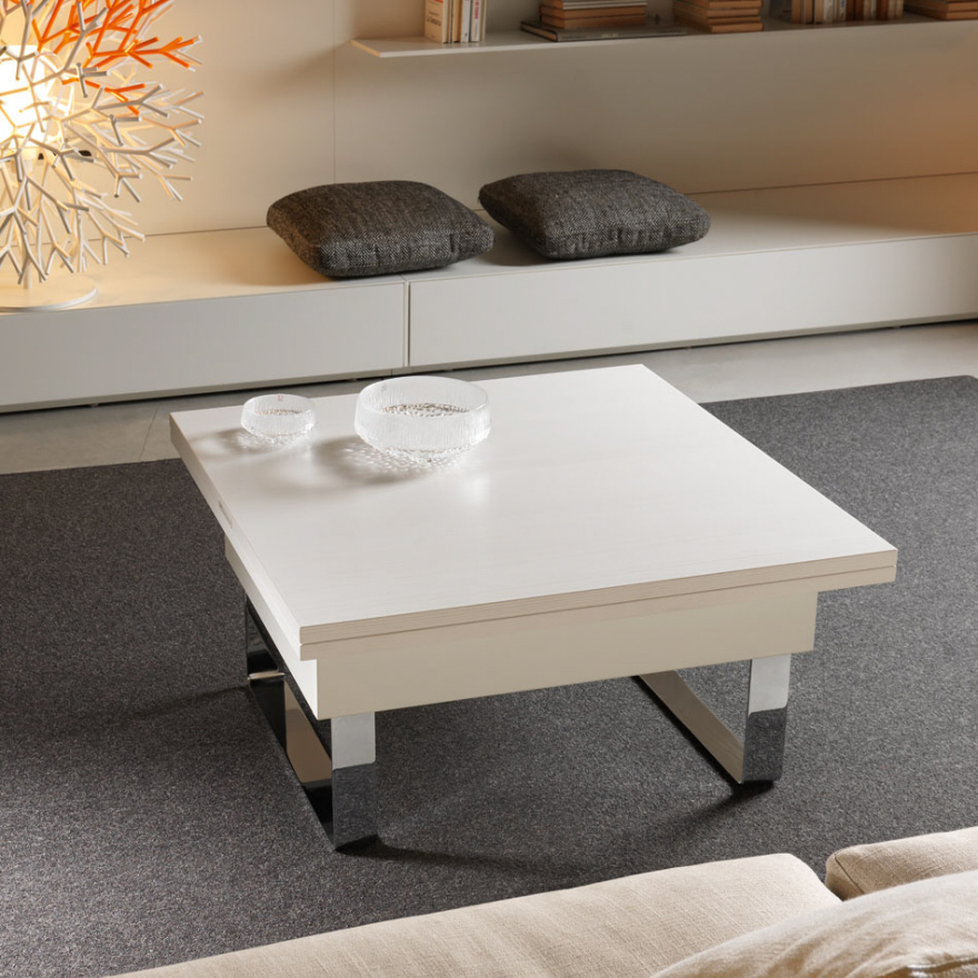
The Mascotte table from Calligaris, designed by Edi and Paolo Ciani, has a number of nice design features. The user just presses a button to select from one of seven heights—so it's extremely easy to adjust, and quite flexible. The tabletop size can be doubled; there's a butterfly opening mechanism for that. And the table has two scratch-resistant rubber wheels, so it's easy to move around.

This video shows just how easy it is to adjust the Mascotte table. It can go from 42 cm to 74 cm (about 16.5 inches to 29 inches), which means it covers standard coffee table and dining table heights.

The mechanism for adjusting the height is obviously a key design decision for such tables. The Paris table from Compar is raised and lowered using a pump mechanism. 

Looking at this video, it seems the Paris table is easy to adjust, too—a smidgen more complex than the Marcotte, perhaps, but still no big deal.

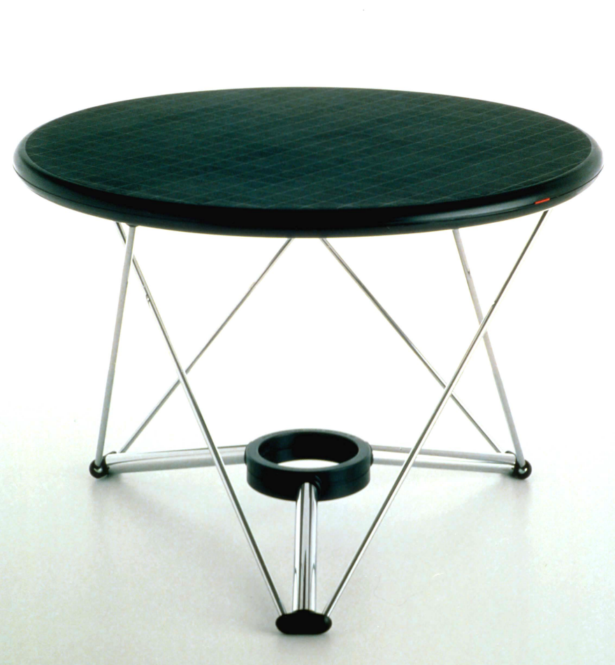
The Lem adjustable table from Magis, which first came out in 1985, was designed by Andries and Hiroko van Onck. They explain how it works: "By unclasping a simple grip under the table top the Lem table height can be adjusted from a coffee table to a dining table...a steelspring is loaded when the table is pushed in the lower position...The three injection molded polycarbonate 'feet' include each two ball joints." 

In 2012 the table was redesigned, changing the central joint of the legs, so it looks a bit different. 

Olsson & Gerthel, one of the many companies selling the table, explain that it's raised or lowered by turning the tabletop. This would seem to indicate the table can be adjusted to any height the end user wants (within the table's range of 43-73.5 cm), and some end users will appreciate that added flexibility.

Sedit makes a number of transformable tables where the tabletop rises up from the base. In some of those tables, such as the Piccolo, the table incorporates a bit of storage—always helpful in small spaces.

The Piccolo is another table that's very easy to open and close, as the video illustrates. However, it's also a table that's limited to two heights. That will be fine for most end users, but others will miss the flexible height options that some other tables provide.

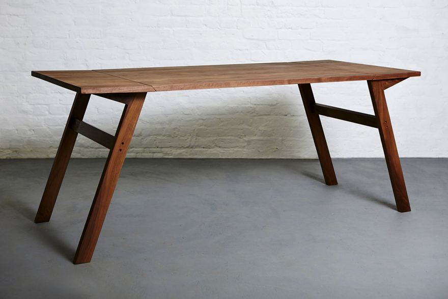
Other tables transform without any mechanical apparatus. One such table is the MK1 from Duffy London. This makes the adjustment a bit more complex—but I don't think I'd have any trouble with this table, and I'm no good at such things. It converts with "two simple movements" per Duffy London, and I could handle that. Still, this wouldn't be the table for certain end users with physical limitations. 

The M-Table from Oito takes a somewhat similar design approach, with legs that pivot to raise or lower the table.

The 3styletable is just what its name indicates; it can serve as a coffee table, a desk, or a dining table. This design requires the end user to reassemble five pieces into different configurations, making it a more complex transformation than most other such tables. It's still not very difficult, but it might not be something the end user would want to do on a daily basis.

The height of the Vidun table from De Padova, designed by Vico Magistretti in 1987, is adjusted with the big wooden screw that forms the base. This particular table wouldn't work so well as a coffee table, though, since it only goes from 63 cm to 80 cm (about 25 inches to 31.5 inches).

Winner of Honda's Global Design Project is a Car/Motorcycle Mash-Up

0
0

Each year Honda holds an internal design competition, pitting their various design studios against each other to create blue-sky concepts. The winner of this year's Honda Global Design Project is Project 2&4, created by two Honda teams that were apparently allowed to collaborate: Their Asaka-based motorcycle design studio and their Wako-based automobile design studio.

The 2&4 is certainly different. The aim of the concept, according to Honda, was "to create an intense driving experience by combining the most thrilling elements of riding a motorcycle with the most engaging characteristics of driving a car."

While the vehicle has four wheels and the stability of a car, the sound of the 1-liter V4 would unmistakably be that of a motorcycle (specifically, the RC213V engine used by their motorcycle racing teams). To heighten the sensation, "the driver's seat [is] uniquely suspended just above the road. The 'floating seat' design places the driver as close to the action as possible, evoking the freedom of a bike and completing the immersion provided by [the vehicle's] extreme performance, [with a] 14,000 rpm red line and unique engineering."

The hybrid design has had a (perhaps calculated) doubling effect on Honda publicity: The 2&4 has been picked up by seemingly every motorcycle and car blog on Earth.

The vehicle will be on display, Honda has announced, later this month at the Frankfurt Motor Show.

Louis Sauzedde's Clever Tricks for Restoring a Ruined Handsaw

0
0

Louis Sauzedde got his hands on a ripsaw in truly horrific condition. As you can see in the photo below, it looks like this thing was tied to the back of a car and dragged down the Interstate:

The teeth on the left have been fixed by Sauzedde, the teeth on the right are as yet untouched.

So how do you fix something this far gone? Obviously with a file, and there are entire books written on the subject of how to sharpen handsaws. But I'm impressed at how Sauzedde, the Master Shipwright of Tips from a Shipwright fame, came up with some very clever tricks to make this famously tedious task easier.

Think about this: Why would you draw angled lines on the table below the saw vise, or remove the file's handle and replace it with a handle that's triangular in cross-section and rotated 10 degrees relative to the top face of the file? (Hint: That latter one's got nothing to do with ergonomics.) Using just your eyes and no jig, what parts of the blade do you have to rely on for visual feedback that you're accurately accomplishing your goal? Watch and learn:

In the second part, Sauzedde uses a cool little tool to alternate the "set" of each tooth:

In America at least, old handsaws are a dime a dozen at yard and garage sales. I've inspected a few and always passed them over because they looked like the one in Sauzedde's videos before he'd tended to them. But seeing how do-able he makes it look to get them cutting good-as-new, I believe I'll pick up the next one I see and give it a whirl. (Anyone got recommendations for a good saw vise?)

Forum Frenzy: A Sketching Exercise

0
0

One of our long-time readers recently took to our Discussion Boards to document his sketching journey as he transitions from Engineering to the career he's always wanted in ID. As he uploads his daily progress (thumbs up for commitment!), the inspiring thread has built up a ton of great pointers from our readers, including this great tutorial from Michael DiTullo showing his sketching process using overlays.

"The first sketch shows me just laying out the perspective and overall organization of all of the inputs on the product," he explains. At this point, it's all about getting "the perspective in place and laying out a rough placement of all the key features. There are 2 main groups. The keyboard, and then everything else. The visual hierarchy should tell that story "

"Then, I start to sculpt the product and get the overall theme of the concept. I could have gone with a very rectilinear theme, which could be a totally viable solution. Likely it is the more appropriate, but for the sake of our learning journey I wanted to start pushing into some complex form. Here you can see how I start to sculpt away the shape."

"Now that I have a sense for what the concept will be, I get a clean sheet and start cleaning up the lines. I'm laying in a lot more detail. I also noticed my keyboard looked a little short so I lengthened it. As a beginner this might be two steps, not one. I also used a straight edge to do the lower and upper lines of the keyboard area and the lower line of the controls area, but not on anything else. Everything else was short enough that I trusted myself. Notice the different levels of pen pressure. smaller details get very light pen strokes, they are less important. The more important larger ideas get heavier lines, and then a sharpie is brought in for an outline and shadow."

"And finally, apply some quick marker to show off the concept: Cool grey 30%, 40%, 50% and a magenta marker."

And the most important thing, as Michael reminds us, is to keep practicing: "Do that 30 times on the same idea and you are going to get some good stuff." Head over to the discussion boards for more sketching eye-candy—and maybe even to share your own tips and encouragement! 

The Tarzan Boat Mobile Floating Water Park

0
0


This is the most fun-looking thing I’ve seen all summer, but has one of the world’s worst soundtracks. Please turn your volume down before checking this out:


That’s the Tarzan Boat, a “mobile floating water park” used by Navy SEALs for training. Okay, not really. It’s a recreational platform aimed at “resorts, marinas, camps, hotels and private dock owners,” and the manufacturers are calling it a moneymaker—not just for them, but for the buyer. They reckon the attraction will bring in “$3,000 to $5,000 a day,” and they aim to help you monetize yours:


This isn't just a boat, it's a business ...and we want you to be very successful because it is our report card to the world.  We don't charge franchise fees or any payments after your purchase, so our reputation is based on your success and we are going to be diligent to make sure you are a hit.


Remember, that Tarzan Boat is designed for commercial use, projected to gross $3,000-$5,000 a day.  We show you the operation of handling customers, payment, location, traffic flow, training your staff, free marketing methods and keeping your overhead very low. 


The turn-key “Business Package” runs a cool $63,700, while those looking to buy one for personal use can knock five grand off of the price.


I say go for the monetization. Furthermore, going back to my earlier thought: I suggest you set one of these up near the Naval Special Warfare Groups base outside of Virginia Beach, post advertisements everywhere claiming you use the Tarzan Boat to train SEALs, and see what happens.

Architecture Firm Designs Batcave-Inspired Carpark, Complete with Hidden Entrance, Under This Stately Manse

0
0

Don't you hate it when your car collection outgrows the parking available at your 1930s-designed Georgian mansion? That was the problem faced by an unnamed homeowner in Melbourne, who contracted local architecture firm Molecule to solve the problem. One of the requirements was that the home's "heritage quality and evident beauty" be respected (i.e., no Modernist Ferris Bueller garage next door, please.)

Here's how Molecule attacked the problem:

Accommodating a collection of cars was a central challenge. The house in its existing state was beautifully sited and scaled on its grounds; we felt that any increase in visual bulk would injure this balance and a commitment was made to treat the garaging as a 'shadow', concealing it in basement format below the existing tennis court and gardens.

Excavating was no problem--it's only money, folks--but there was also the issue of how to provide ingress and egress for the Benzies and their friendsies. The solution was to create a hidden entrance on the tennis courts:

Note that the lid for the hydraulic lamp starts on the baseline portion of the court; I assume they kept natural turf on the court proper to avoiding messing with an in-play ball's bounce.

As for the garage's interior, Molecule took some cues from a certain vigilante:

The secrecy of the underground world introduced notions of an architectural alter-ego, an alternative character that could offer the project its modern-day relevance. The indelible image of Bruce Wayne's garage in The Dark Knight became a totem of the design approach, sponsoring the Batman-inspired naming of the project as the Wayne Residence.

Here's a still from the movie they used for inspiration:

And here's what they came up with for the actual residence:

Bad-ass, no? Those banks of lights, by the way, can be isolated over the individual cars, while LED strips in the floor give it that added light bling:

All that's missing is the floor turntable, but by the looks of it, the owner doesn't need it; look how perfectly dead-center within the boundaries those cars are parked!

Via Open Journal

The Design Firm Is (Walking) Dead

0
0

Hey, long time no see. I'm back. Not from São Paulo anymore but straight from San Francisco, my new home. Just to remind you of what we were discussing before I took this long, but not unjustified, break: the complex and intricate world of service, and how design fits in. 

The reason why my column went silent was because I've launched two books on the subject ever since, the latter one is a free e-book about service design and lean startups called, "Breaking Free from the Lean Startup Religion: The Service Designer Manifesto." It's becoming a religion, so I've decided to play exorcist and release this one for free, you can download it here. During this time I've also coordinated global research on service innovation spanning six different countries. The goal was to assess and measure the consumers' journey performance and innovative potential on services people use to live their everyday lives. The report is out an you can get it here as well. 

Service Design for SMBs

I've been focused on the intersection between service design and entrepreneurship. When you look at the full spectrum of how design thinking is being practiced around the world it is not difficult to realize that the expression "design for all," when it comes to the application of design thinking to services, couldn't be further from being truth. Approximately 99% of the world's service businesses are SMBs— small and medium sized businesses. There are 33 SMBs for every 1000 inhabitants walking on planet Earth. However, the commercial service design practice remains tailored to large enterprises.

The service design practice has been, for over 20 years now, largely out of reach for SMBs like retailers, franchisees, startups, family-owned businesses and the like. And it's not that they don't need it. It's just that there is zero interface for them to get it.

The current model of engagement for design consultancy firms was first designed back in the '80s (and arguably back in the '40s with the Eames and the like) to tap into huge communication and R&D budgets at large enterprises. This, combined with the way design projects are paced, is enough to turn design thinking into a misfit for most small businesses, like the ones you interact with every day in order to live your life.

Ok, so let's move the elephant a bit. You may be wondering, why I this article is titled, "The Design Agency Is (Walking) Dead." What gave me this idea? 

I'll start with the simple version of the answer: I've been there. 

For the last five years I've dedicated myself to introducing and developing the market for design thinking and service design in Brazil. Two years ago, while writing "The Service Startup: Design Thinking gets Lean," I started to sense something was changing regarding a project's sales cycles (the time between the first meeting and deal closure). Cycles were getting fat. This was becoming a general concern—friends working at other firms were also starting to notice it.

So I went on to investigate.

What I've discovered surprised me to the point that I wrote about it in a chapter of the book (even though the book was about entrepreneurship, not design firms). These are facts drawn from personal experience, market research and conversations with clients and designers. Some of these designers work for global design firms, others own small to medium-sized studio shops. I believe all design firms in the end are very tiny and fragile organisms. Hence the importance of this article: If design firms choose to continue moving in the same direction they used to over the last two decades, they will be extinct soon.

The perspectives discussed here are not related specifically to a design firm, design specialization or even to a local market. They represent global forces that are sweeping the market for design consultancies. Some were already deeply felt and as a designer/reader you will be able to relate to it. Others are building up their strength. But if you are a player in this market, my guess is that these remarks may deeply affect decisions in your career and business strategy. Well, it certainly affected mine.

I will start with M&As.

For the fourth year in a row the top management consultancy firms keep devouring design firms. Accenture bought Fjord, McKinsey bought Lunar, Deloitte devoured Doblin, 2nd Road, Ubermind, Flow Interactive, Aqua Media, Banyan Branch, just to name a few. Deloitte seems to be on a strike.

I stopped counting after the 24th design firm acquisition but I'm sure there have been many more. These mergers and acquisitions increase the difficulty for a design firm to pitch and win a project for Fortune 500 organizations. I'll explain. 

We used to come in with a very valuable unique selling proposition: "Hey, we do things differently from the management consultancy dinosaurs you are used to."

Well guess what: we don't anymore.

Some friends argue, "McKinsey will never design like a design firm." And I agree, they probably never will. The design work done by such firms is remarkable and can't be topped by a traditional management consultancy firm no matter who the consultancy acquires. The reason? Those management firms carry deep cultural issues regarding creativity and empowerment.

But now, management consultancies sound (a lot) like design firms. 

The problem is that sometimes this is enough for design firms to lose project opportunities. Consider a management consultancies' power of influence within other large organizations. This can include relationships with the highest ranking officers and members of the board—areas that are no-fly zones for the majority of design consultancy firms.

In this new scenario a design firm may not even be made aware that there is a project opportunity. Management firms are already hooked-in with huge umbrella contracts that allow their clients to use their services in a "pay-as-you-go" fashion without having to comply with the corporate purchase department insanity every time a new project opportunity pops up. If you are a design firm, you will probably notice this dynamic by monitoring the gap between the number of opportunities you were getting from Fortune 500 clients over the last two years, with what you are able to secure right now. It may be an interesting exercise.

Another key insight on why the number opportunities is decreasing came out of a conversation with an old friend. He is in the C-suite at a Fortune 500 company and when interviewing him for my book I asked him about their hiring process for design agencies. His answer: "We learned that design is cool by working on a lot of projects with various iconic firms. But as we decided to use design more regularly, we are not seeking work from big design firms with the same frequency. That is because we have been counting on the help of small firms and freelance designers for the day-to-day activities, like internal workshops and field research, as they can work faster and within the tiny budgets those initiatives usually rely on."

They love design thinking and are internalizing it. Yay! Mission accomplished right? But wait. Now they want it in a sustainable way.

These clients are becoming less willing to constantly engage with the same firms. Keep in mind, these firms invested time and energy in evangelizing Fortune 500 companies on the importance of design. Now, the better the client becomes in ingraining design into their business life cycle, the less they feel like walking that big project approval road again.

As a design firm, it is never good to be left to feed on big projects alone. This usually means projects take too long to receive the green light, aka the long sales cycles. Considering the high burn rate at design firms, long sales cycles often translate into a big challenge.

Ah, and speaking of the devil. Let's talk about the burn rate.

As companies increase their awareness of the importance of design, they also increase their need, of course, to hire designers. Well, who do you think they are feeding on?

Google bought Mike & Maaike and Gecko design. Capital One bought Adaptive Path. Square acquired 80/20. Facebook acquihired (hired the core design talent) Hot Studio and Teehan+Lax, BlueFocus acquired Yves Behar's Fuse Project, the list goes on. And, to tell you the truth, if you are a target firm and your designers are that cool, acquisition may be your best exit strategy. Cause if they don't acquire you, they will keep acquiring your designers until you bite the dust.

Silicon Valley's new enterprises are offering 50% to 100% more in salaries, plus sweetening the deals with crazy bonuses and perks only a venture capital funded business is able to sustain (or even if they can't, they do it anyway). This persuades designers to join these enterprises instead of a keeping their jobs or applying to a design consultancy firm.  

While design firm sales cycles are increasing and deals are getting more difficult to close, designers are leaving.

I confess I've also had this idea in mind—a designer should stay because the nature of the work at a design firm does not compare to the work (doing the same thing everyday) at a startup or a large enterprise. That is until I heard from a friend and designer that there is another side to this story. 

The thing is, yes, it is more fun to keep getting new challenges and messing with new business scenarios. But it is also very frustrating to see many of the things you create not being implemented by large enterprise clients. The ones still spending large sums of money on design firms have serious problems following through with design firm recommendations. On the other hand, in the culture of new ventures change happens in a heartbeat and no one is willing to let good ideas rest. There are no sketched reports resting on bookshelves. They can't afford to move that slowly.

The "like" feature on your Facebook screen was created during an overnight hackathon—from sketch to code in hours. No committee presentation, no political games, and, most importantly, zero (I said zero) hours spent on Illustrator trying to package the idea in order for it to get an "approval-cool" look. Those hours…omg.

It seems like the tempo of the innovation song changed to an up beat and design firms were left alone to sing off-beat. The same companies that influenced and sustained the creation of the iconic Bay Area design consultancy firms are now turning their focus to build up strong internal design teams. You don't hear rumors that a company like Apple or Tesla is hiring external design consultancies. Cause they aren't. And they won't. 

There is always the possibility that these companies will hire outside design firms to create collateral things like the holiday gift box for clients. After all, their internal designers are too busy crafting the new service offerings they are about to announce onstage. Many designers I've been speaking with consider this dilemma a no-brainer. Others are confident that they won't sign up for the 9-to-5 enterprise life but even those designers are unhappy with what they are getting out of their respective design firms.

Funny thing: Design thinking couldn't be more alive.

Actually that's the point, right? The main reason behind this collapse is that design thinking is alive and well. People like it and believe in it so much that they have locked it in as part of the business strategy. Once it is a core part of the business strategy in Silicon Valley, it won't need to be externalized.

I share the belief that design thinking needs to be ingrained in every business we deal with as human beings. Next time you walk around your neighborhood, just take a moment to notice the small service stores, shops and restaurants you depend on to live your daily life. Most of them are not benefiting from service design. Most of them desperately need it. 

Innovation in services needs to be democratized, available for all. It also needs to be fast-paced, quick, iterative and continuous. This is how business enterprises like Tesla, Apple and others are pushing the boundaries of service innovation. The simple formula** of: 

While (Step.(improved)Step++)
{
Experiment(Step);
Step.learn();
}

This is my take on it. I'm far from having answers for this whole situation. Truth is: I'm not even pursuing those answers. New movements and developments will arise leaving this article obsolete in the near future. Personally, I choose to align my service design practice with the "makers" agenda. I believe one can't go wrong with helping entrepreneurs in the service era to think like designers. They are the ones improving the present and designing the future and, as a designer, there's no other place I'd rather be.

**Formula: While there is the chance to improve your solution by one step, you should experiment this step and learn from it.


Red Dot Gives Taipei a Black Eye

0
0

Earlier this month, Red Dot organized the "Formosa Forms: Contemporary Tradition in Taiwanese Design" exhibit at Paris' Maison & Objet. But the design-award-conferring organization is apparently very displeased with their own museum in Taiwan's capital. "At the moment, the situation of the Red Dot Design Museum Taipei is by far the worst of any of our other exhibition spaces worldwide," said Peter Zec, Red Dot founder and CEO, in statement.

To be fair to Taipei, an optimist might say they're in third place; there are only two other Red Dot museums worldwide, the original in Germany and the other in Singapore. But to be fair to Red Dot, the Taipei location is in horrific condition. According to the Focus Taiwan News Channel, Zec's complaints have to do with "the poor quality of the venue at the Songshan Cultural and Creative Park:"

…The construction of the nearby Taipei Dome has created cracks in the museum walls, leakage problems, uneven floors and excessive noise.
Cracked floor
Standing water
Water damage
Five of its displays have even been damaged as a result [and the organization] has complained about the Taipei City Department of Cultural Affairs' failure to conduct repairs.

"This is especially remarkable," said Zec, "in the prelude of Taipei being World Design Capital." Taipei is due to don the title in 2016; and as the China Post reported in 2013, they were the only city to actually submit a bid.

Taipei Mayor Ko Wen-je says that the construction company behind the Taipei Dome should pay for the repairs. That company, the Farglory Group, says they will survey the site and pay for the repairs—if they deem themselves the culprit.

Making an Immersize, Human-Size Kaleidoscope

0
0

While there's certainly no shortage of reasons to be pessimistic about humanity and its future, I would like to take a moment to share a multifaceted glimmer of hope: Somewhere in this world, there exists a giant kaleidoscope that you can walk inside, basking in the glory of your own reflection splintered into an array of color and light.

This is all thanks to Masakazu Shirane and Reuben Young. The collaborators, hailing from Japan and New Zealand, respectively, worked together to construct Light Origami, a dome of reflective panels that create the illusion that you're strolling through a giant kaleidoscope. The installation, which made its debut at Vivid Sydney last May, invites attendees to experience an alternate reality, one where nature is infinite, angular and reflected across a carefully constructed array of aluminum-composite panels.

This isn't Shirane's first life-size-kaleidoscope rodeo. Back in 2013, the Tokyo-based artist worked with Saya Miyazaki to create an immersive, kaleidoscopic mirror tunnel within a shipping container for the Kobe Biennale. With Light Origami, however, Shirane wanted to expand the concept to be larger and even more immersive through the construction of a dome that surrounds the viewer. Inside, it functions a lot like a traditional cylindrical kaleidoscope, except vastly larger—as viewers move through the space, their movements are reflected in the surrounding panels, shifting and altering the composition.

The ambitious project got its start when Young reached out to Shirane in August 2014, thinking the artist's work would be an ideal fit for Vivid Sydney, an 18-day celebration of light, music and ideas. After Shirane agreed to participate, Young was able to get the piece commissioned by Vivid as well as AMP's Amplify Festival, securing the funding necessary to begin work. While Shirane provided the concept and design, Young produced the installation, bringing fabricators and other partners on board to help bring the idea to life.

What started as a team of two quickly grew to include structural engineers, lighting experts, luminaire suppliers, speaker and audio specialists and electrical installers. The global engineering firm Arup, which made its name providing the structural design for the Sydney Opera House, advised on critical structural requirements; the firms Lumenpulse and Light Project manufactured, supplied and programmed the necessary lighting. Another partner, Janz, donated all the audio equipment to be used in the installation. Young also reached out to Inga Liljestrom, an Australian-born composer, to create an original soundscape to be played within the dome.

The design for Light Origami was first modeled in CAD by Shirane before being shared with Thomas Creative, a fabricator that helped determine the best method for construction. Aluminum-composite panels manufactured by Perspex were chosen for having the right balance of strength and flexibility—crucial factors for positioning and installing the final piece. Since the installation would eventually have to be taken apart and shipped elsewhere, paneled architecture made the most sense, given its ease of disassembly and flat-packing.

"I am really careful [with] how the work feels," Shirane says. "As we know, we cannot [rely] only on a digital image. Therefore, I prefer simple structural systems realized by hand." Altogether, 320 shapes were cut from Perspex and painstakingly installed by hand by Shirane, with individual panels connected via a zipper running along the perimeter of each. More than a thousand bolts were used to further secure the structure, while projectors installed within the space cast morphing spectrums of light that move across the reflective panels. The wooden floor also has a mirrored finish; a small window that allows outsiders to peer inside is crafted from a polycarbonate plastic that keeps the illusion consistent across its surface.

"This was a very ambitious project, as we had little time and resources," Young says. "As with any project that combines light, technology, design, music and human interaction, the aesthetic needs to hang together in an integrated way, and that was a challenge. The queues of 30 to 200 people outside the work each night showed us that we'd hit the right mark after a year of careful planning." The duo is already dreaming up future endeavors, including incorporating dimensional projection mapping into future installations. "We want to uplift and inspire people around the world with the work," Young says.

Shirane seconds that goal, and hopes that Light Origami might even improve the lives of its viewers. "The quality of a life must be discussed," the artist says. "It is important for me, as I have an architectural background, to improve the quality of life. My idea is that people should escape to an extraordinary space to recover by themselves and to be released from stressful society at any moment."

While some may wonder if entering a dome awash in moving, flashing lights is the best way to release the stresses of everyday life, you have to admit that it would certainly take you away from reality for a few minutes. Stressed-out Americans interested in giving it a try are in luck (maybe): the installation is supposed to travel to two light festivals in the United States in the coming year. However, just before press time, we received word from Shirane that there is some dispute between him and Young regarding ownership of the project. We will update this page if we're able to learn more about the nature of the dispute (right now the details are fuzzy); in the meantime, we certainly hope that it doesn't prevent Light Origami from landing Stateside this year.

The Winners of Our ID Student's Everyday Carry Photo Contest

0
0

We've got the winners of our Industrial Design Everyday Carry contest. Thanks to all of you who submitted!

In no particular order, the winners are:

Jack Fritzjunker / Sophomore / Iowa State University (Industrial Design)

Jack's multi-stain background, explanatory call-outs with a sense of humor, and the fact that he drinks coffee out of a Mason jar led him to snag a win.

"Wangsta" / Sophomore / University of Cincinnati (Industrial Design)

"Wangsta's" crisp, minimal presentation, excellent usage of gradation and angles to provide visual interest, and well-considered pops of color placed him in the winner's circle.

Connor Beebe / Senior / Wentworth Institute of Technology (Industrial Design)

Connor's no-nonsense shot is perhaps the most faithful to the classic EDC presentation style: He consistently calls out not just the product, but the manufacturer and model name. The sole Senior in the group, Beebe's got the brand awareness he'll use as a working industrial designer.

Fritzjunker, "Wangsta" and Beebe, please keep an eye out for an email to claim your suh-weet $25 Hand-Eye Supply gift certificates.

Thanks to all of you for playing. Whether you won or not, put your carry items to good use this semester!

Parody Perfectly Skewers Trendy Craftspeople Videos

0
0

Whomever wrote this gag has seemingly watched every craftsman video out there. In the following video—of a man purportedly selling artisanal firewood for $1,200 a bundle—they perfectly nail every line, trope, cliché and camera shot of the genre. It is the perfect video, right down to the background music, the cinematography and the name of the company:

Anne Swainson, Founder of America's First Corporate ID Department

0
0

This is the latest installment of our Designing Women series. Previously, we profiled the Danish furniture designer Nanna Ditzel.

If your adolescence occurred in the pre-Internet era, you can probably recall with some excitement the thick catalogs from Sears or Montgomery Ward arriving in the mail. Before flipping to the toys or back-to-school fashions, you most likely spent some time ogling the models in the underwear section, and for this you have designer Anne Swainson to thank.

Anne Swainson, circa 1945. From the Design Archives of the Chicago Athenaeum

Swainson was born in Sweden but she immigrated to the United States, studying Fine and Applied Arts at Columbia University and teaching textile design and applied art in the early 1920s at the University of California, Berkeley. She then became a design director at Chase Revere Copper, which specialized in affordable and stylish metal housewares. In 1931 Swainson was recruited by Montgomery Ward in Chicago to found its Bureau of Design, and from 1931 to 1955 she oversaw the first corporate industrial design department in modern American history. She was also the retailer's first female executive, fundamentally changing the design of the modern mail-order catalog by replacing traditional woodcut imagery with photographs of models interacting with products—and, yes, wearing lingerie.

Redesigned page from a 1941 Montgomery Ward catalog

Her in-house design department, which by 1935 included 18 product and 14 packaging designers, evaluated the thousands of products sold by the Montgomery Ward label and then set about redesigning those that Swainson found lacking. These products ran the gamut from welding equipment to radios, toys to kitchen appliances. Products that were purchased from outside suppliers now had to meet her approval and were repackaged and inscribed with the Bureau's new MW logo in order to unify the retailer's offerings. Although few of the products were actually designed by Swainson personally, under her tutelage a new era of industrial designers flourished, including Dave Chapman and Ellen Manderfield.

The Bureau of Design's stylish Airline radios were hugely popular and brought streamlined Art Deco design to post–World War II American homes. Circa 1939
A Montgomery Ward Airline radio, circa 1939, produced in Bakelite and measuring only six inches wide
A 1939 Montgomery Ward catalog page advertising its smallest Airline radio

A 1956 profile of Swainson in Industrial Design magazine relates a typical workday under her direction in the Bureau: "First you came to work at 7:30, and if you wanted to read the magazines, you came an hour earlier. You got an assignment and on it was marked a time it was to be 'picked-up'…One day's assignment might be a tractor, the next a 10-ton jack. Every beginner learned to draw any kind of ideas fast, accurately, and flawlessly, unless he wished to risk the criticism of a meticulous taskmaster." Thanks to Swainson's industrious department and her pursuit of well designed products for the modern American consumer, Montgomery Ward rebounded from the Great Depression, and by 1939 saw nearly a half billion dollars in sales from its catalog and 618 stores.

Montgomery Ward Auto Toaster, produced in chrome with polychomed Bakelite buttons, circa 1946. From the Design Archives of the Chicago Athenaeum
Montgomery Ward washing machine, circa 1941
Montgomery Ward mixers, circa 1937 and 1940. From the Design Archives of the Chicago Athenaeum

However, the retailer's prominence came to an end during World War II, when Montgomery Ward's leader, Sewell Avery, became mired in labor disputes and failed to foresee the postwar boom and the rise of the suburban middle class. Swainson's Bureau of Design was hit hard by the decline—although Montgomery Ward offered more than 66,000 products, many of which had passed through Swainson's Bureau at one point or another, her staff was drastically cut. By 1955 only Swainson and an assistant remained; they were assigned to a desk in the corridor of Montgomery Ward's warehouse building, where later that year she was found dead of a heart attack at age 55.

1941 Montgomery Ward catalog page
Anne Swainson–designed pitcher for Montgomery Ward, 1936
Anne Swainson–designed covered dish for Montgomery Ward, 1936
Anne Swainson–designed bathroom scale for Montgomery Ward, 1938


Tonight at Curiosity Club: "Why Are There 284 Holes In My New Shoes?"

0
0

Tonight at Curiosity Club we'll talk about oddities, holdouts, and seemingly pointless features in design. Bob Hambly of Hambly and Wooley will give the talk "Why Are There 284 Holes In My New Shoes?" starting at 6pm PT at the Hand-Eye Supply store, and streaming on the (new!) Curiosity Club homepage! 

Bob will take a look at some of the unusual and often functionless design details found in everyday life from areas like fashion, architecture and product design. Gain insights into the history of these design details and why they have remained a part of the design vernacular – even after losing their original purpose.

Educated at the University of the Arts in Philadelphia, Bob's curious mind and knack for personal service set the tone for the H&W team. He directs all brand development projects for H&W ensuring projects are developed and executed with a strategic eye, fresh perspective and meticulous craftsmanship. He is a sought-after lecturer and speaker – recent engagements include delivering keynote addresses at the University and College Designers Association (UCDA) in Phoenix, Arizona and at the SUNYCUAD Conference in Rochester, NY. Bob is Vice-President of Communications for the Association of Registered Graphic Designers (RGD) and is also on their Board of Directors.

Porsche Takes Aim at Tesla, Unveils "Mission E" Concept

0
0

Yesterday at the Frankfurt Motor Show, Porsche pulled the sheets off of their surprising Mission E concept car, an all-electric four-door clearly meant to do battle with Tesla. 

While most are focused on the car’s swoopy styling (it stands just 4’3” tall) and theoretically quick charging time (15 minutes will get the battery to 80 percent), it was the UI/UX features that caught our eye.

Let’s start with the charging process. A piece of the driver’s side quarter panel slides forward, revealing an indicator gauge and a port to plug the cable into. Alternatively, Porsche proposes that Mission E owners can have “a coil embedded in the floor of [their] garage,” and simply charge the car wirelessly by parking over it. (We’re guessing cat owners might want to discourage Tiger from hanging out under the car while this is happening.)


Inside the car is an OLED instrument cluster with a freaking eye-tracking system. According to Porsche, it “knows” what instrument the driver is looking at, and pressing a button on the steering wheel activates that instrument’s interactivity, allowing the driver to navigate within it via “an interplay of eye-tracking and manual activation.”


You’ll notice in this shot that the steering wheel blocks the view of portions of the instrument panel:


Porsche aims to get around this with the eye-tracking gizmos and some fee-yancy display tricks:


The display follows the seat position and body attitude of the driver in what is known as a parallax effect. If the driver sits lower, higher or leans to one side, the 3D display of the round instruments reacts and moves with the driver. This eliminates situations in which the steering wheel blocks the driver's view of certain key information, for instance. All relevant information such as vehicle speed is always within the driver's line of sight.


Then it starts to get outright kooky, with Porsche claiming the car will have…


…A holographic display that extends far into the passenger's side. It shows individually selectable apps, which are stacked in virtual space and arranged by priority with a three-dimensional effect. The driver – or passenger – can use these apps to touch-free control primary functions such as media, navigation, climate control, contacts and vehicle.


The desired symbol is activated by gestures that are detected by sensors. A grasping gesture means select, while pulling means control. Moreover, driver or passenger can use a touch display on the centre console to control secondary functions such as detailed information menus.


Unsurprisingly, there’s no rendering showing the holographic interaction described above, nor the following feature, which we can only describe as weird:


A camera mounted in the rear-view mirror recognizes the driver's good mood and shows it as an emoticon in the round instrument. The fun factor can be saved together with individual information such as the route or speed, and it can be shared with friends via a social media link.


Porsche has released performance figures for the car that have got auto fans excited: A 500km (310 mile) range, 600 horsepower, 0-60 at around 3.5 seconds (a bit slower than the Tesla). But the key numbers they haven’t released is how much the car would cost and what date it would actually become a reality by.


What Does a Ticket to the 2015 Core77 Conference Get You? 

0
0

Decisions, decisions, decisions... How do you decide which design conferences to attend each year? If you seek useful, inspiring, more-bang-for-your-buck content wrapped in an interactive and, dare we say, FUN experience, the newly published schedule for the 2015 Core77 Conference, October 22 - 24, will make your decision to attend much easier. 

Head on over to the conference site and click Schedule to see more details about each of the four sessions we have planned for October 23rd. The first half of the day brings you touch-interactive fabric and DIY ocean exploration in Collaboration Now, followed by a hands on look at water sculptures, manufacturing methods and craft in Making Now. After lunch, you'll hear about the ins and outs of the challenges facing design entrepreneurs in Business Now, then gaze into the near and distant future of UX, software and product development in the final segment, The Future Now.

Each of our presenters is bringing a refreshing perspective on their particular design practice and philosophy to the table, so choosing to attend the 2015 Core77 Conference might be the easiest decision you make all year. Get your tickets today! 

Steven Banken's Beautiful Tannic Acid Dresser

0
0

You could be forgiven for thinking designer Steven Banken created the piece below by stocking up on a selection of MinWax stains:

Instead the Eindhoven graduate, who shares a studio building with Piet Hein Eek, went Walter White and created the gradations via chemistry.

Breaking Good

As Banken explains,

Oak contains high concentrations of tannic acid, which turns into dark blue when it's exposed to steel. The same happens with steel, as a result of a chemical reaction between red iron oxide and tannic acid. To accelerate this normally undesirable process the elements that cause this chemical reaction are applied in liquid form on the other material.
Image via View On Retail

Below is Banken's maddeningly short video showing snippets of the chemistry; there isn't much in the way of instruction, so those interested in pursuing the procedure will have to pull a Jesse Pinkman and start experimenting.

A Camera That Decides Where You Can Take Photographs

0
0

Each morning I pass Manhattan's Central Booking, a/k/a jail. Sometimes a squadcar pulls up and a pair of hotcops transfer an arrestee inside, marching the handcuffed perp through the gate. Two weeks ago, as this familiar sight was unfolding, a hipster walked past, spotted a perp march in progress, pulled his phone out to shoot it, then walked away.

I don't get why people feel compelled to take photos of certain things. Is this guy going to go home and pore over these photos, or frame them for his wall, or post them to his Facebook wall? What is the point of capturing an image?

Artist and interaction design student Philipp Schmitt has undoubtedly asked himself the same question. His latest project, Camera Restricta, is a concept whereby the camera decides whether or not you can shoot a particular thing--or more precisely, at a particular location.

"It locates itself via GPS and searches online for photos that have been geotagged nearby," Schmitt writes. "If the camera decides that too many photos have been taken at your location, it retracts the shutter and blocks the viewfinder." He shows you how it would work in this (fictional) short:

What I'd really like to see, at least on the crowded sidewalks of Manhattan: A camera that won't let you take selfies, so that smoothly-moving sidewalk traffic becomes more important than narcissism.

LoanGifting: How a New Web Platform is Poised to Make a Dent in the Student Loan Crisis

0
0

Sometimes the most powerful work is the result of simple yet strategic connections drawn between previously unconnected factors. In the case of RKS Design's latest project, LoanGifting, the initial idea seemed so straightforward that the whole team was left wondering: "How has nobody come up with this yet?" Stemming from a belief that education is the necessary future, the basic premise of the initiative is to allow family and friends a way of helping their loved ones going through school by creating a platform whereby they can submit payments directly toward their student loan—essentially creating a bridge between the student's debt and their support system. "Universally, families love nothing more than to see their children get educated," notes RKS founder Ravi Sawhney. "Now, we have this crisis where the government doesn't support higher education and people are forced into taking loans, but the underlying need and desire to support those who are seeking higher levels of education is still there...they are the ones who are going to make the world a better place for everyone, right?"

To begin brainstorming ways of addressing this massive issue–currently affecting 40 million individuals—Sawhney brought on a diverse team of practitioners, including Cognitive Anthropologist Dr. Robert Deutsch, who used his analytical background to carry out a series of deep-dive interviews with people affected by the student loan crisis in various ways. "We talked to people about what it feels like to own debt, we talked to people who have advanced degrees and are managing their debt, we talked to people who had to drop out of college because they couldn't bear the financial burden, we talked to parents who support kids and help them pay down their debt and we also talked to philanthropists," explained Sawhney. This empathetic approach revealed vital insight in the form of the recurring image of a once hopeful person, bogged down and drained by the seemingly insurmountable fact of their debt. Herein lies the disconnect that fueled the project: "Debt is a very negative word but taking out a student loan comes from positivity—it means that you're bold, brave, optimistic and that you're investing in your future and in your ability."

A focus on empathy and connection runs throughout the process. Students create personal profiles on the LoanGifting site, allowing them to highlight their individual goals and aspirations. Each profile can be set to either reach the person's close network of family or friends, or opened up to the entire LoanGifting community. While LoanGifting is ultimately a for-profit organization, from the beginning Sawhney has focused on giving back. 10% of profits will go toward building schools in underdeveloped countries and other long-term goals include contributing to scholarship funds at various colleges and universities—at least until they have the means to set up their own funds. "It's not only about helping people see the light at the end of the tunnel, but more so about allowing people to create the light at the end of the tunnel."


J Mays Goes to College

0
0

J Mays, one of the world's most influential automotive designers, will be contributing to the RCA's prestigious Vehicle Design programme as a visiting professor beginning September 2015.

As Chief Creative Officer of Ford, he oversaw the design of many of the brand's best-selling cars including the Fusion/Mondeo, Focus, Fiesta, Taurus, Mustang and F-150 before departing in 2013.

J's influence in the automotive design world is remarkable with a successful and sustained design career in many of the major OEMs: Volkswagen, Audi, BMW, as well as Ford. He has been instrumental in the design of some of the world's best-known and best-loved cars, including the new VW Beetle and Audi TT.

I caught up with J in Chicago and asked him about his role in the RCA, the challenge of getting young buyers into cars, and the advice he'd give himself if he were a young designer today...

Ed Stubbs: Hi J, congratulations on your new role with the RCA. What challenges are you looking forward to?

J Mays: It's something that's worked out really well—my wife works in the UK, and I've got a deep affection for all things English, So I talked with Dale Harrow [RCA Course Director] and we worked out that I could help strategically with the program.

I think I can bring a slightly different perspective, one that's current—having just left the auto industry. When you look at the work coming out of design schools there's no lack of creativity—it's just a case of channeling that talent. So, taking that talent and connecting it back to everyday life is one of the major challenges.

I can add my experience and knowledge to help these students to not lose the magic of their design vision but connect it to something the customer can relate to because, ultimately, they're designing for a customer at the end of the day.

Volkswagen Beetle Concept 1

We know that young people are less interested in cars than they were. How do we get them to fall in love with cars again?

I agree; there are any number of things vying for a young person's attention out there, beyond the automobile. Perhaps part of the problem is the auto-industry just isn't capturing the magic for these guys. Reality isn't an aphrodisiac!

There are a lot of answers out there for moving people from A to B, but there are less that are so well done that they become an irresistible product. So, whether all of us end up in autonomous cars or in a car-share in 15 years, there's still got to be some way of bringing a level of appeal and emotion to those products.

For example, if we're talking about driverless cars, I've seen a lot—but none that I'm itching to get into. At the moment, there doesn't seem to be much design language evident—I'm not saying they have to look like rocket ships but at the same time they're looking like pods and there has to be more to them than that. So, that's the opportunity there.

So, whether all of us end up in autonomous cars or in a car-share in 15 years, there's still got to be some way of bringing a level of appeal and emotion to those products.

We are trying to get the students to think differently about the design process. When you get into the industry you can become overwhelmed with the needs of the product-planners and the marketing people, and somewhere along the line your lovely design gets lost. So we are having a discussion about pausing the design process, backing-up and hitting the reset button to come at it from a different perspective, to use different inspiration.

There's a difference between a flashy design (and there are plenty of those out there) and one that means something to someone. I'm a huge believer that every product has some kind of story and allowing customers to participate in that story is a major part of great design, so I'm also looking forward to getting the students to start to understand that.

2015 Ford Mondeo Wagon

What's your view on disruptive vs harmonious design?

I've got a very clear point of view on that. At the end of the day, you're working for a company, you're trying to attract customers to the brand and you're trying to make people's lives better. So, the idea that you might be trying to provoke customers rather than seduce them seems to be at odds with doing that. Any time we designed a car either at Audi, VW, or Ford we wanted to do something that was going to seduce the customer into the showroom.

What was the project you were most proud of in Ford?

The latest Mustang is a fabulous car—and finally available in RHD in the UK, so that's pretty exciting. It's a great piece of automotive kit for not much money. In the mainstream, the Mondeo looks fabulous out on the roads too.

2015 Mustang GT350

Currently, lots of students come from Asia to learn design here. Do you see that reversing with Western students studying overseas?

In terms of the cultural exchange, a lot of Asian students make their way over to the UK and the US – and are soaking up a lot of the culture here as a result – but it doesn't often happen the other way.

I think it's going to happen but not until we know what we're getting back—at the moment, the Chinese do not have a long automotive design history the way the Brits and the Americans do.

We've had a number of design movements in car design over the years—edge, flame surfacing, retro to name a few—what do you think will be the next big thing?

I'm hoping it's going to be 'meaning'! I'm not a very trendy person; I'm almost anti-trend. Nothing gets older faster than 'new,' following the latest trend and finding a name for your design language. That's passé now.

If you look at the premium brands you won't find them talking about their design language. Chris Bangle may have talked about that with BMW but they haven't referenced that for a long time. None of the premium brands do it; they just have their own brand design.

What you want is longevity—design that has staying power. So, I'm going to be encouraging the students to shy away from trends. Nothing is worse when you see a design and can say: "That was from 2001!" It just ages, really quickly. I'm much more interested in meaning rather than style.

Nothing gets older faster than 'new,' following the latest trend and finding a name for your design language. That's passé now.

Authentic design?

Sure, yeah. Absolutely, something that's not passé.

To aspiring car designers what's the one nugget of advice you wish you'd been given?

Looking back, I wish I'd known a lot more about the realities of the auto industry. You have your education at the design school—and then a completely different education in the first few years of working in industry. So, trying to help brief the kids for a smoother transition to the industry life is bound to help not only the industry, but the students themselves.

You don't want to kill their enthusiasm or their creativity but they need to understand what they're getting into. Having to interact with marketing, product development, finance—there are a lot of players in the game and all them have to work together smoothly. In the best companies they do, but there are lots of companies where it doesn't work very well.

2015 Ford Flex

Agreed—you have to make your design story be understood by as many departments as possible, even if it involves fighting your corner.

Exactly.

What's your dream car and your perfect everyday driver?

As far as my dream car goes, I've driven just about everything that I could imagine but still come back to the car I've got on order—a 2015 Mustang GT350. Awesome. I would also love to have a Ford Flex here in the UK for my everyday driver but unfortunately there is no right hand drive.

J, a pleasure to talk with you and the best of luck with the RCA post, and your other projects.

Viewing all 19065 articles
Browse latest View live


Latest Images