Quantcast
Channel: Core77
Viewing all 19155 articles
Browse latest View live

Design Job: Your Mission as Quality Bicycle Products' New Id'Er Is Simple: "Put Every Butt on a Bike"

$
0
0

s an Industrial Designer for QBP, you will have a key role in utilizing human centered processes to design innovative and technologically advanced products. Expect to work on a variety of projects ranging from small parts and accessories, soft goods, and complete bicycles.

View the full design job here

Where to Get Sustainably-Sourced Wood in NYC: RE-CO BKLYN

$
0
0

When you picture New York City you probably don't envision greenery, but in fact the city has some 5.2 million trees in parks, lining streets and in people's yards in the outerboroughs. Each year, as in nature, a number of them become damaged by storms or age and must be felled.

Because there has been no direct link between the Parks Department and furniture makers in need of the stuff, all of that potentially-usable lumber gets chainsawed up and thrown into a woodchipper.

Enter RE-CO BKLYN, which now serves as that link. "We work with local arborists, tree services and city parks departments to locate downed trees and trees slated for removal locally," the company writes. RE-CO trucks out to the site, lightens the removalist's load by selecting suitable trees, then hauls their bounty back to their facilities, where they slab the trees and kiln-dry them to a moisture content of 6-8%, which is what furniture makers are looking for.

I call it a win-win-win-win: The removalists save time and money by having less material to process and haul to the landfill; the tree didn't go down in vain; RE-CO employs people and stays in business; and local furniture makers get to purchase local wood at lower prices than if it had been shipped in from faraway forests.

Another neat thing about RE-CO's operation is that they know exactly where each tree came from, and they make everything including pricing transparent. When you go to their website, it states each each slab's origin. They photograph each slab, cite its overall dimensions, list the board footage, board-foot price and overall price per slab. Furthermore you can of course search by species. It makes it very easy to peruse their entire collection and drill down to what you're looking for.

Their detailed cataloguing is very well-thought-out, in contrast to the websites of NYC's two big lumber suppliers, Rosensweig and Adriatic, whose websites are clunky, outdated and do not present the information in a way that's easy to assimilate. RE-CO's website is designed as if they really considered what a person looking to buy wood needs to see.

The reason why RE-CO "gets it" and the others don't is probably because RE-CO was started by a group of designer/builders, and hence know exactly how inventory ought be presented to potential buyers. You can see some of their work here, and 360 Woodworking (which sadly appears to have gone bust) has a two-part podcast interview with RE-CO co-founder Roger Benton that you can still access here. Benton's got some great stories about how the company started and some of the challenges they've faced, and it's well worth a listen.


DIY Moldmaking Skills: How to Reproduce a Solid Part as a Thin-Walled, Hollow Cast Part

$
0
0

For those of you doing small-batch production work, here's a super-informative video on how you can take a single solid part, then create molds for it so that you can not only reproduce that part, but also take out most of the unnecessary mass beneath the surface. "This makes the part more economical to cast and produce," says industrial designer Eric Strebel, "particularly when you have to make 130 of them."

Here he shares the benefits of long experience with a bunch of clever tips and tricks on how to do it efficiently:


Today's Urban Design Observation: Hacking Cold- and Wet-Weather UX Improvements Onto a Bicycle

$
0
0

This bicycle shackled to a signpost on Crosby Street seems to be owned by a creative cyclist.

It has been brutally cold lately here in NYC, and the rider has fashioned insulated hand-shields for the handlebars.

It's not uncommon to see local delivery people hack something like this up, but they are usually made out of common plastic shopping bags.

In contrast, this has been made from a bubble-wrap shipping envelope. I imagine the bubbles confer greater insulation.

I took a quick peek inside their satchel to gain some clue as to the rider's identity--are they a deliveryperson, a messenger, a civilian?--but didn't want to look too long as it's nosey and there were other people on the street. Anyways all I caught a glimpse of was something packaged with Japanese script on it. If any kanji/katakana readers can tell me what it says, I'd be obliged.

The rider has also used the tape to widen the mud flap, to catch those splatters that defeat the object's stock width.

It also appears that the tape up front, in the center of the handlebars, does something to lessen the amount of road splatter that reaches the rider.

Because I'm only a casual cyclist, I cannot deduce why the rider has covered so much of the bike in this white tape; to make it easier to see the splatter for cleaning? Hardcore cyclists among you, please explain or offer theories!


Reader Submitted: An ID Student-Designed Environment that Merges Old and New Materials

$
0
0
"Nature or Nurture: a 3D Printed Space" was an exhibition which won the 2017 SOFA CONNECT student competition at Navy Pier in Chicago. The goal of the piece was to construct an inviting space combining found materials with new and innovative technologies in order to spark discussion about how new and old can come together in the modern world to create something beautiful and functional. A team of undergraduate and graduate industrial design students from Purdue University worked together over the course of three months to design, build, test, and execute this project.
Mockup of Concept
Applying Sho Sugi Ban
Testing X-Joints
Testing Bench Joints
Final Bench Design
Testing the Concept
View the full project here

Time Lapse of a Guy Building a Log Cabin All By His Damn Self, Using Hand Tools

$
0
0

This is nuts, and at first a little jarring to watch because it moves so quickly, but ultimately worth it. YouTube channel My Self Reliance lives up to its name as the gent behind it puts up an entire log cabin, then finishes it both inside and out, his damn self. And using hand tools. "Because the cabin is off-grid, I have used hand tools for most of the build and without power, I have no options on site regardless," he explains.

Check it out, and watch for his clever method of shou sugi ban'ing the wood for the roof:

If you prefer a longer, more meditative video of building a home by hand, try this one.


This Wonderful GIF Shows You How to Create a Perfect Ellipse by Repeatedly Folding a Circular Piece of Paper

$
0
0

This took me a second to figure out what they were doing, but when I finally understood it, I went "Holy crap:"

I don't pretend to understand the black geometric magic behind this trick, and I realize that knowing how to do this will save me from neither zombies nor North Korean missiles, but it's a pretty darn cool trick for the bar.

Via Kottke


The Seven-Person "Conference Bicycle"

$
0
0
By Runner1928 - Own work, CC BY-SA 3.0

That's the CoBi, or Conference Bicycle, a three-wheeler that can accommodate seven riders. Artist Eric Staller invented it some years ago, and Google has nine of them on their campus, which they use for team-building exercises and group jaunts:

Apparently some 300 of these have been made at a factory in the Netherlands, and sold to buyers in 18 countries. "The CoBi is used in multiple commercial settings," the company writes, "mostly in the context of bike rental businesses and event management companies. There are entrepreneurs who manage a whole fleet of CoBi's. They are also used in therapy, on college campuses and in companies providing ways for employees to get around and build community."

Each one costs USD $12,750 plus shipping, taxes and duties for American buyers, and €11,000 everywhere else. And if you buy three or more, you get 10% off.

If you'd prefer a boozier version with more rider capacity, check out the City Cycle mobile pub.


4 Trends Designers Should Actually Care About From CES

$
0
0

The future is coming for us. Fast.CES didn't just drive that point home—they drove it, crashed it and exploded it in your face for an entire week. While walking the floor, it was tricky to take our focus off the visual stimulation relentlessly hitting us from every possible direction. Once we made a conscious effort to ignore the laundry-folding robots and speakers that change color not once but six times per second, we walked away with a few notable trends designers can use to prep for the eminent future that faces us.

Friendly Faces

As we become more connected with our devices, it's important for designers to design friendly hardware that both tech enthusiasts and the technologically challenged feel comfortable approaching and interacting with. 

The need for approachable tech was interpreted in two ways at CES: Literally slapping faces on anything that moved and faceless tech that instead evoked emotion through subtle design details. 

3E-A18 Robot
You can turn this one into a rideable scooter, but I think that's it.

Honda's new emotional 3E robots follow you around and get sad when you look sad. Even after a 15 minute presentation, we're not exactly clear on what they do. We're not saying they're wrong, but we're also not saying they're right

In contrast, Hive's new View camera, designed in collaboration with Yves Béhar, doesn't mimic your emotions, but still feels friendly through its carefully designed snap-and-go feature. We'll be covering this in more detail soon, but it felt important to note that tech can feel approachable without having a human face.

Human to Vehicle Interaction 

It came as no surprise that autonomous vehicles of all shapes and sizes reigned supreme at CES. But instead of a focus on exterior design, we noticed more focus placed on cockpit design and the design of the accompanying software. 

By now, it's understood that our cars can drive themselves. The challenge transportation designers are now facing is figuring out how to redirect and reinterpret human energy traditionally spent with hands on the wheel.

Mitsubishi Electric took a directional approach with their autonomous EMIRAI 4 concept car. We first saw the vehicle at the Tokyo Motor Show, but this time we could sit in it! While inside the car, drivers have the option to map their route and search for places to add to their route on a large screen attached to the center console. The dial attached to the screen adds a tactile element to the interaction—you can move it around similar to the Microsoft Surface Studio's wireless knob.

The EMIRAI 4 will only switch to manual mode when it senses the driver staring straight ahead with all focus on the road. I have to say, having my face analyzed by a car was creepy as hell, but I guess there's a safety bonus that comes along with it.

Nissan also went in an interesting direction with their new software development that quite literally reads your mind as you drive. The 15 minute in-person presentation made no sense for this either, but this video does a solid job explaining.

Then there's Nvidia who created a fully-autonomous race car that eliminates the human passenger and cockpit all-together just for fun. Well played.

Electronics that Live in Your Walls

With living spaces decreasing in size and minimalist living proving to be a trend that's here to stay, space-saving designs have become more important than ever. Samsung debuted endless smart appliances at CES, but one trend we noticed across all the company's categories was appliances embedded into walls—the ultimate space saver.

The company's 4 door Flex refrigerator is the ~chill~ version of the smart refrigerator trend that we'd actually want in our kitchens. Unlike the other 3,000 smart fridges we saw at the show, the 4door Flex had no massive screen on front (instead there's a small strip of hidden cameras inside), it didn't try to make the fridge the center of the entire home, and it's built into your wall to save space.

Another design detail worth mentioning is the attractive frame of LED light strips inside of the fridge, which Samsung's design team told us they designed carefully based on making the food inside look its best.

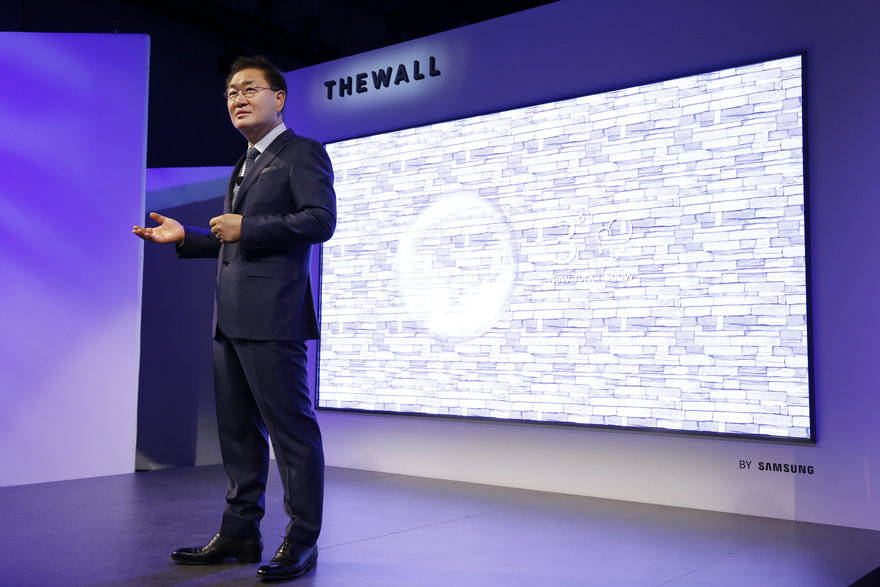
A show stopper in the main hall of CES was a monstrous 146 inch Samsung TV named "The Wall" because—you guessed it—it's in your wall. 

In case the name "The Wall" is somehow confusing or not literal enough, you can configure it to look exactly like a wall. So, not only can it be part of your wall—it is the wall. 

Designing for Universal Audiences

Many designers we spoke with during the show emphasized the importance and challenge of designing products targeting a wide range of consumers, instead of focusing on one niche market per product. Looks like the days of single-use objects designed specifically for millennials may finally be over.

REVL's approach when designing their GoPro competitor, the Arc, was to identify a niche market followed by a period of tackling and adjusting their camera based on key suggestions from vastly different consumers. This way, they were less overwhelmed while designing a product meant for tech-savvy action sport athletes, casual travelers, daily vloggers and more. 

The Arc offers up the option to traditionally edit footage or to let its self-editing app take over the process for you—it picks up on key moments like smiles and tricks so you can avoid sorting through hours of footage.

L'Oreal / La Roche Posay collaborated with Yves Béhar on UV Sense, a battery-free, wearable electronic sensor that detects and tracks individual UV exposure. When speaking with L'Oréal Tech Incubator Global VP Guive Balooch at the show, he discussed his constant excitement when designing products for L'Oréal's extremely broad audience. He's hoping UV Sense will expand that audience to people at risk of skin cancer—including my fair-skinned, redheaded self. 

Humanscale was showing off a wide range of sit/stand desks, but the adaptive QuickStand Eco stood out to us due to its universal appeal. The desk attachment's design allows anyone to turn an already existing desk into a sit/stand desk without going all out and purchasing a new piece of furniture. Reps from Humanscale made it clear that designing for a universal audience is challenging but way worth the research and effort.

*******

Stay tuned for more CES coverage, including details on both Yves Behar collaborations and other interesting products as we continue to decompress!

Designing for Wood Movement, Part 1: The Wrong Way to Build a Tabletop or Panel

$
0
0

Following this Urban Design Observation post, some Core77 readers have asked for a series on how to design for wood movement. I'll start here with some design basics. (And if you want to back up and understand the science behind why wood moves, check out this series on wood movement that we commissioned science writer Christie Nicholson to write.)


It can be helpful to learn from others' mistakes. Here's a video from a DIY website that shows you how to build a wooden tabletop to cover a folding banquet table:

The builder here does not understand that this tabletop will not last, because she has violated a rule of wood movement: Boards will expand and contract along their width with seasonal changes in humidity. This expansion/contraction cannot be restrained, or the boards will crack and split. This is where she made the error:

She has permanently glued and screwed the tabletop within that four-sided, mitered frame. Attaching the skirt to the long edges of the wide boards is no problem, but fastening them to the end grain of the wide boards, as shown in the photo above, is. The builder has constricted the wide boards' movement, and as they grow or shrink in width but are held in place by those end-caps, they will warp and split, making this a short-lived piece of furniture.

Here's another example of a design error:

Unless that center panel is plywood, which does not move, this type of design will fail. As the wood expands and contracts, this is what will happen:

And if those miters are securely fastened together so that they cannot separate at the joint, then the panel itself will warp and crack. Something's gotta give.

Next we'll show you another common "don't," then we'll get to the "do's."

Bad UI Design: Here's How Hawaii's Ballistic Missile False Alarm Happened

$
0
0

On Saturday, folks living in Hawaii received this chilling message on their phones:

My friends and acquaintances who live there posted accounts on social media describing their scrambling panic. "It sucked big time for us here in Hawaii," my buddy Mike, a married father of two, wrote. "For a few minutes, I thought we were done."

About 38 minutes after the alert went out, it was rescinded.

We have to understand how absolutely dangerous that error was, and how it could easily have led to a nuclear war. Because think about how that alert would be perceived in North Korea.

One military pretext for going to war is to falsely accuse another country of having attacked you, as Germany did with Poland to kick off World War II. So when the Hawaii alert went off, the North Korean leadership, paranoid as they are, could easily have thought that the U.S. cooked it up as a reason to attack, and Pyongyang could have then launched their missiles first.

That Pyongyang didn't launch in that time suggests that they either didn't know about the alert, or their nukes might not be ready to go, or that their leadership is a little smarter than we think.

In any case, how the heck did this potentially catastrophic error occur? What is the user interface of the message-sending system? According to The Daily News,

The employee [responsible], who has not been identified, selected a missile launch warning from a drop-down menu instead of selecting an internal test alert that kicks off a new shift, [Hawaii Emergency Management Agency} spokesman Richard Rapoza said.
Not knowing he had selected the wrong option, he clicked "yes" when the computer prompt asked if he would like to continue. The worker realized the epic proportions of his error after receiving the same frightening missile alert on his own phone.

At some point, all of us have selected the wrong thing on a drop-down menu, and all of us have accidentally clicked on a "yes" prompt when we meant to hit "no." I can't blame the guy. I blame the design of the interface. Something this sensitive should not be part of a drop-down menu filled with other more innocuous options.

To prevent accidental panic, we place freaking fire alarms behind glass.

Call me crazy, but I'd argue that a ballistic missile alarm deserves at least the same.


How a Combination of Crossroad Angles and Car's A-Pillars Have Created the Perfect Deadly Intersection for Cyclists

$
0
0

Three people hit by bikes, two of them fatally, over a five-year-span might not sound like much. But any death that would have been preventable with better design is a tragedy. At Ipley Cross in the UK, the intersection of Beaulieu Road and Dibden Bottom has yielded surprisingly consistent car-bicycle impacts, and the last two people to be struck were killed. "Why it that the same collision keeps occurring at this junction?" asked Bez, who writes for cycling magazine Singletrack.

I'll nutshell Bez's description here, but I hope you will click over and read the full article, which goes into much greater detail.

This is an overhead view of the intersection in question. In each of the accidents, the cyclists were traveling south on Beaulieu when they were struck by cars traveling west on Dibden. In each case, it appears neither saw the other until the last moment.

Why does this keep happening? For the following factors. First off here's the blind spot presented by the A-pillar in the Vauxhall Zafira, a not unusual automobile in Europe, that was involved in the first fatal crash. (Remember that this is in the UK and the driver sits on the right.)

Here is the blind spot extrapolated onto an overhead view of the intersection.

Here is how that blind spot tracks, as shown in different colors, as the car approaches the intersection. 

It is possible for a cyclist (represented by aqua blue line in the photo below) to be traveling south at a constant speed and to remain in the driver's blind spot for that entire stretch of road.

That explains the driver not seeing the cyclist, but not the other way around. Bez explains:

[Consider] the angle between the cyclist's line of travel and the line from their eyes to the vehicle which will hit them.
At this location, with this vehicle, it is 94 degrees.
A car which is on a collision course at Ipley Cross with a cyclist who is obscured from the driver's view by the front pillar will approach the cyclist from behind.
Ipley Cross is constructed in such a way that not only is it possible for a careless driver to drive straight into a cyclist without seeing them until a fraction of a second before impact, but under the exact same circumstances it is also possible for that cyclist not to see the car that hits them until the same moment.
If anyone were to take a highway engineer to a wide open space and ask them to design a junction which would readily enable two road users to collide with neither of them ever seeing each other, I doubt any would be able to manage it.
Yet this is precisely what exists.

This article has proven so popular, and drawn so much commentary (and trolling) that the author has gone back to address it all in an addendum. It's a lengthy read, but if you're interested in bicycle safety vis-à-vis infrastructure, I recommend giving it a read.

What the UI Design of the Hawaii Missile Alert Actually Looks Like, and a Suggested Design Improvement

$
0
0

Hawaiian news organization Honolulu Civic Beat has Tweeted this photo of the UI design that led to Saturday's missile alert:

Needless to say the design is insanely bad. We've already covered how important the ramifications of a false alarm are; and whoever designed this couldn't use icons to distinguish these options? Or even boldface, italics, or color?

Former UX designer Luca Milan quickly whipped up a much better alternative:

And some joker posted this hilarious one:

Thankfully, if you read through the comments of the original Honolulu Civic Beat Tweet, you'll see that most commenters agree that design, and not the poor bastard who clicked the wrong text line, is to blame for Saturday's error.

Design Job: From Imported Salamis to Coffee Tins... Trader Joe's is Seeking a Packaging Designer in Boston, MA

$
0
0

We're looking for someone who loves packaging! Someone with a keen eye for design and a knack for noticing details. Someone who lives for great typography and creating customer illustrations. In a nutshell... a packaging designer. You'll be designing for everything from coffees and teas, to health and beauty, to imported salamis and cheeses to produce and prepared meals.

View the full design job here

Developer Asks $1.7M for Frank Lloyd Wright Building, Gets Offer, Then Demolishes the Building Anyway

$
0
0

One of Frank Lloyd Wright's final projects was the Lockridge Medical Clinic in Montana, a building he designed so late into his life that its construction was completed just after his death. Two years ago the building was purchased by Mick Ruis, a multimillionaire horse trainer and real estate developer.

Photo by Brenda Ahearn/Daily Inter Lake. Courtesy of the Frank Lloyd Wright Building Conservancy.

Ruis announced plans to raze the building and turn the property into a three-story commercial retail space. The Frank Lloyd Wright Building Conservancy protested, and Ruis agreed to hand the keys over if someone would buy the property for $1.7 million, with a late 2018 deadline. Luckily, a buyer was found.

Then, on January 2nd of this month, Ruis suddenly announced he was moving the deadline up to January 10th. The existing buyer could not free up the funds to meet the impossibly-short deadline, so the FLWBC frantically tried to find another buyer and asked for a one-week extension.

Photo by Adam Jeselnick. Courtesy of the Frank Lloyd Wright Building Conservancy.

Ruis then raised the stakes, demanding a deposit 50% higher than first agreed upon, and insisting it be nonrefundable.

Photo by Adam Jeselnick. Courtesy of the Frank Lloyd Wright Building Conservancy.

As the FLWBC negotiated, Ruis moved heavy machinery to the site on the afternoon of January 10th and demolished the building overnight.

Photo by Adam Jeselnick. Courtesy of the Frank Lloyd Wright Building Conservancy.

"The building met a backhoe under the cover of night, and there isn't any more we can do," an FLWBC spokesperson told Architectural Digest.

"Any time a historical property changes in ownership this can happen," Barbara Gordon, FLWBC Executive Director, told The Daily Beast. "In this [Whitefish, Montana] situation, the developer wants to develop the downtown area, and this building doesn't fit his plan.

"My impression is that the developer didn't know the significance of Wright. He put his demolition plans on hold when the public outcry happened."

Photo by Adam Jeselnick. Courtesy of the Frank Lloyd Wright Building Conservancy.
Ryan Purdy, Ruis' legal counsel, told The Daily Beast: "The building has been for sale for over a year. It's a little bit frustrating that there are all these people are rushing to get things done when we've had it posted for sale and we've been talking with interested parties for over a year."
Ruis, said Purdy, had delayed development of the site to see if potential purchasers, including preservation groups, would come forward to buy the building. At this stage, said Purdy, "You've got to make choices and decisions."
Asked if Ruis—who declined an interview through Purdy—planned to delay plans to develop the site given the surge of public interest in the possible loss of the building, Purdy gave a succinct answer: "No."
Preservation groups, said Purdy, "have had plenty of time to come in and accomplish something and no one did."

How Is Design Transforming Education?

$
0
0

In conjunction with our 2018 Core77 Design Awards, we've decided to explain a few of the categories in detail that may be difficult to grasp at first glance so you can decide whether or not the project you want to submit fits the mold! In our first article of the series, we dive into the area of Design Education Initiative—not only what it is, but how it's evolved and the word of education and design is rapidly expanding.

When it comes to education, many institutions are beginning to realize if they want their students or employees to survive in the modern age, they must shift their previous perceptions of learning by helping those they teach to gain timely new skills. Today, many kids are actively involved in learning coding and other real-world skills in order to become the inventors of tomorrow. Corporations more than ever are encouraging creative, critical thinking through exercises and experiments to receive the most overall value from their employees.

This ever-morphing zone is precisely what is explored within the Core77 Design Awards' Design Education Initiative category. Whether it's academic, corporate, or experimental, one of the principles that guide every project within the Design Education Initiative space is the term "design thinking". And for this year's 2018 Core77 Design Awards, it's important to us to distinguish the Design Education Initiative category as not only encompassing degree-granting design programs but also programs meant to educate with strong roots in the principles of design thinking.

 Susie Wise, 2018 Core77 Design Awards Design Education Initiative Jury Captain

2018 Design Education Initiative Jury Captain Dr. Susie Wise is involved in program precisely placed between the design and education space as Coach, Designer and Strategic Advisor for School Retool. School Retool is a fellowship for teachers guided by design principles. "What is very design-centric about how we work in School Retool," says Wise," is we really work on introducing school leaders to what we think of as some of the levers of design that are actually theirs to use. Often times you find leaders who think that the way to influence change is to send emails about a new plan; it's a planning centric approach. The more design-centric approach says 'gosh, you have all these levers that can help you build school culture. You could design space. You can design roles. You can design rituals. You can design incentives. You can design communications and process and time.'"

School Retool cue cards

In other words, the principles of design thinking don't need to be explicitly explained in order for those using it to reap the benefits. It's a method for enacting change within the education space, inserting empathy within academic experiences, and supplying students with tools for success.

Last year's winner of the Design Education Initiative award, Montana State's "Farm to Market" class had design and business students team up with local farmers to tackle problems surrounding food waste using design thinking.
1

So what programs fit into the Design Education Initiative space?

The types of projects eligible for Design Education Initiative include but are not limited to:

- Innovative K12 educational programs

- Online or in-person learning programs run by design firms and design-driven corporations

- Museum exhibitions engineered as learning experiences

- Online learning spaces

- Organized "hack-a-thon" type events

- Business/start-up education programs

Think one of your projects from 2017 is a perfect fit for Design Education Initiative?*** Then we'd love to see it. Send in your 2018 Core77 Design Awards entry now!

***This is a Professionals-only category

Today's Urban Design Observation: Boutique Hotel Lounge Table Design Fails

$
0
0

One of those hip little boutique hotels opened up a few years ago on the Bowery. Here it is in Google Street View. They have a lounge downstairs that is open to the elements.

These are the tables the lounge is populated with. As you can see they are custom-made. And they are absolutely horrible.

This tabletop has been fashioned from what looks to be tongue-and-groove flooring. Even when treated properly, wood is a terrible choice for outdoor furniture in a four-season city like New York, and this wood does not look like it's been treated properly.

No design considerations were made for wood movement. The boards have cupped, bowed, moved, split, and done everything but stay still. In this photo you can see the tabletop is bowed along its length.

The table legs have been welded together from square bar stock. Note the napkin shoved under one foot to keep the table level. This table is sitting on a tile floor, so either the tiles weren't laid flat or the table was welded together out-of-square.

And the legs have of course begun to rust.

Note the inconsistency of the very shitty welds.

The materials used aren't even consistent. This table has a plywood core and even that isn't one piece, but two.

No effort has been made to hide the ugly ends of any of these.

It angers me that somebody made these and sold them to this hotel, and whomever's in charge of procurement for the hotel didn't know better than to reject them.

This type of anti-craftsmanship is worse than the other kind, where mom-and-pop stores are trying to build their own displays.

MakerBot Design Series: The Running Shoe

$
0
0

This story is part three of MakerBot's series of design studies, exploring iterative design and the relationship between designers and their tools.

So far we've explored form development with the bike saddle and reverse engineering with the drone rebuild—now it's time to push into something a bit more futuristic.

Footwear design is a deceptively complex category that has much more in common with automotive design than it does with most fashion disciplines. There's ergonomics, mechanics, loads of different material properties, and on top of all of that—aesthetics. that has much more in common with automotive design than it does with most fashion disciplines. There's ergonomics, mechanics, loads of different material properties, and on top of all of that—aesthetics.

Not being trained a footwear designer myself, it's an inspiring albeit daunting path, but that impending challenge is a good feeling and there's no better way to learn than by doing.

1. Select Realistic Shoe Goals

I began this exercise by splitting the shoe geometry into its two components: the sole and the body. Each of these parts have their own anatomies with richly interrelated components, but I'm a shoe rookie and stand almost no chance at getting a shoe right on my first try. In the diagram below you can see how I started to define different planes on the body, but quickly got overwhelmed. Kudos to all of my footwear design counterparts that make this look so easy.

Instead of focusing on designing a game-changing shoe, I'm going to focus on just the sole to test parametric design tools and study exotic geometries.

You've probably seen the cross section of a running shoe sole; some of them are even transparent. They have a patterned honeycomb or lattice geometry that's optimized for high impact resistance and low weight. This is a great opportunity to explore different parametric lattices that can be easily iterated on to change specific performance needs.

2. Create Parametric Lattices

This is Grasshopper, one of my favorite CAD tools. It's a graphical algorithm editor that runs in Rhino and allows the user to create geometries with dynamic parameters in an intuitive drag-and-drop space.

Parametric tools are incredibly powerful when paired with a 3D printer. Once I have a geometry for different lattices defined, I can explore tons of different versions of the pattern in a short period. I export a sole with a wide pattern, a tightly grouped pattern, a thick and a thin pattern. With a single bounding geometry in place, there's no limit to the number of variations I can create—the real constraint is how many I can print and evaluate in a short period.

3. Prepare the Soles for 3D Printing

There are a bunch of different 3D printing technologies out there. Each with its own set of advantages and disadvantages, materials, tolerances, speeds, etc. Adidas rolled out a 3D printed shoe a while ago which may even validate using particular 3D printing technologies for cost-effective, short run manufacturing.

For early studies, we don't need the springy high-tech plastics that will make up the final shoe, we just need speed, reliability, and accuracy. In this case, FDM or Fused Deposition Modeling is the ideal platform (and conveniently the least expensive), and my FDM printer, the MakerBot Replicator+, is a true workhorse for rapid prototyping.

I drag the first batch of iterations into MakerBot Print which will gives me a slicing preview to confirm the STLs are imported correctly. Once imported, I adjust the print settings and start with a sturdy .4mm layer height for the first iterations. Using wider layers at first means there are less possible failure points across the sole, but also a lower resolution or surface quality. Once I confirm .4mm works, I then test .3mm and eventually stick with .2mm—a layer height that offers the right balance between surface quality and structural integrity for this particular print.

4. Explore Applications for Lattices

The parametric geometries I set up could be modified to serve multiple purposes. After printing a variety of soles, I considered how a gradient that transitions from a tightly grouped lattice to a more loosely grouped one could distribute and direct force away from high impact zones. The more I tinkered with the parameters, the more the project felt like a previous concept I explored that went on to win a Red Dot Design Award, pictured below.

Parametric models are becoming increasingly important as the foundation for generative design techniques that incorporate huge data sets for things like material properties and force simulations. Imagine outlining the rough geometry for a sole and setting goals for heat or impact distribution, then sitting back while AI exhaustively explores every permutation of the design before selecting the best one for you. This is the very exciting (and very real) future of product design and additive manufacturing.

5. Revise and Reprint

With five unique variations, I decided to focus on the one that gave the best balance of aesthetics and functionality. There's some stylized and functional lattice at the ball and heel of the sole, localized to the most relevant areas, but not so much that it begins to add visual noise or interfere with the overall shape and look of the shoe.

6. Print the Final sole and Experiment with Materials

Having MakerBot's Experimental Extruder handy, I was also able to prototype the shoe's body and sole in some different flexible plastics, adding an extra layer to my experience. I grabbed some community tested material profiles from the Thingiverse group for MakerBot Labs, then imported them into MakerBot Print and fired up a sole with a popular flexible material called NinjaFlex.

This exercise was a great way to experiment with parametric design in an unrestrictive way. Ultimately, these complex and uneven geometries prove to be a great source for concepts that can only be created with a 3D printer, helping designers push the boundaries of what products and technologies are possible in footwear design and other fields.

*****

MakerBot, the Brooklyn-based 3D printing company, pioneered the first connected desktop 3D printers and operates Thingiverse, the world's largest 3D printing community and file library.

QLine Design's Incredible Hidden Compartment Furniture Designs

$
0
0

We've seen a lot of hidden compartment furniture lately, but this company takes the cake.

QLine Designs is a New-Hampshire-based design/build firm that produces high-quality pieces made from solid wood and using traditional techniques. Decidedly untraditional are the clever ways in which they've added secret storage, accessed in unusual ways.

Check out how their Rotating Table operates:

The clever use of space in their Executive Desk:

The sheer amount of hidden storage in their Design Dresser:

The unusual drawers in their Dining Table:

You can see more of their designs here. And for those of you into shop porn, the company's facility looks pretty killer. They use everything from traditional hand tools up to a CNC mill.

Lastly, the company founder has written a great essay on quality design and construction, and we recommend giving it a read.


Introducing the Layer Knife, Designed for Leucadia by Michael DiTullo

$
0
0

Now that he's established his own design consultancy, veteran industrial designer and Core77's own Michael DiTullo has been branching out into areas of design he's been wanting to explore. "I really love the kitchen space, and I haven't gotten to do many things in that space," DiTullo says, "so I'm super excited about the Layer Knife." One of his consultancy's first projects, the Layer Knife was designed for Leucadia Custom Knives and has just been unveiled.

Leucadia makes high-end knives, which presented DiTullo with a design challenge that went beyond mere function. "Once you get to a certain price point--this is a $750 knife--all the knives are good," he explains. "They're all sharp, they're all made out of high-quality steel, they all have amazing edges, for the most part. So the key differentiator is the design, which is what I loved about this project. The challenge was, how do you bring freshness and newness to that?"

DiTullo found the beginnings of his answer by observing the manufacturing process at Leucadia's facility, and thinking about the materials. "I went down to their shop and watched them shape the plates and I watched them shape the handles. So I'm just kind of taking it in, taking it in, and then that sparked an idea.

"For the handles Leucadia has been using Micarta, which had been around since 1910. It's a super cool material, a composite of paper, canvas, linen, impregnated with resins. It can be worked and shaped like wood and the company was just using slabs of it, which is how all the other knife makers use it."

The final piece in the puzzle came from speaking with the target end users. "I started talking with chefs," DiTullo says, "and learned that they wanted this kind of tapered handle that was thicker towards the top and thinner towards the front. So I wanted to take the material and use really thin layers of it, and expose those layers by varying the section. It naturally produces this beautiful topographical map."

The Layer Knife is being made to order in a limited edition run.


Viewing all 19155 articles
Browse latest View live


Latest Images