Quantcast
Channel: Core77
Viewing all 19151 articles
Browse latest View live

Holy Cow: This Amusement Park Ride is a Giant Rotational Molding Machine

$
0
0

This might be the world's first amusement park ride that resembles a product design production method. The engineers at Swiss outfit ABC Rides have developed the Tourbillon (a French word that is used to refer to everything from merry-go-rounds to whirlwinds and maelstroms), a literal stomach-turner that does, well, this:

You guys reckon they saw a rotational molding machine, then thought about loading it up with humans rather than kayak molds? Whatever the motivation, the machine took three years to develop and rang up a bill of 1.8 million Euros in development costs.

After being strapped in, the intern had second thoughts, but no one could hear his screams

The footage above is of the Tourbillon being tested prior to being shipped to France, where it will be incorporated into an attraction that thrill-seekers can ride for three to six minutes. Unsurprisingly, it's not being billed as a rotational molding machine: Instead they're going with the Contact/astronaut training theme and calling it "Starlight."

Via Airtimers

See also:

- Rotational Moulding DIY

- Flatpack Rotational Molding Machine


Industrial-Strength Storage

$
0
0

When the Armadillo Credenza first landed in our inboxes, quite frankly we didn't know what to do with it. Built from reclaimed steel and glass—with a whopping 60 steel arms, 78 bolts, and a dozen casters—the massive, 500-pound furnishing boasts an unapologetically industrial aesthetic that is either hopelessly clunky or kind of charming, depending on your point of view. The epic accompanying video (below) just made us want to learn more.

The colossal credenza is the work of the Italian-born, Manhattan-based Enrico Marone Cinzano, known for unnatural works inspired—somewhat unexpectedly—by nature itself. In the case of the Armadillo Credenza, the piece draws inspiration from its namesake’s collapsible armor, as well as from the mechanisms used in retractable toolsheds found in the industrial parks around where Cinzano was raised in Turin, Italy. Using steel pantograph arms, those buildings open and close to protect various materials from being exposed to the elements. “I found them very beautiful in their complexity, and the utilitarian aspect made them very real,” Cinzano says. “This combination, and the fact that they could use recycled parts, made me want to make something of them, hence the expandable credenza.”

While working closely with a pair of Turin metalworkers on other projects, the designer saw that once the toolsheds’ mechanics were updated, their original pantograph parts were typically discarded and lay unused on the floor of the shop. “I found it a shame to just let them sit there and asked if we could, with some modifications, use [the parts],” Cinzano says. “At first, they were reluctant because they could not see the end product, but once I discussed my vision for them they completely got it and we started production.”

As with all of Cinzano’s pieces, the credenza is manufactured locally (in this case, in Turin) using reclaimed materials. Cinzano sourced the glass from another local manufacturer, who makes particularly large sheets that occasionally are damaged in production or have slight imperfections. Looking to the retracting toolshed for inspiration once more, Cinzano prototyped large steel frames with glass walls that were scaled to fit the existing armature of the leftover parts. These boxes were then attached to the recovered pantograph pieces, allowing for expansion and contraction. “The credenza is, in some ways, a prototype of a building that comes in one size but then expands to become bigger whilst also retaining its purpose,” Cinzano says. 

Double glass walls inside the credenza along with two levels of internal surfaces dictate where a user can place objects so as to not have them compromised—or crushed—as the furnishing transforms in size, from 51 inches at its smallest to 106 inches when fully expanded. Central shelves make up the highest position, while external ones slide underneath—meaning that a vase placed in the center of the credenza would be entirely unscathed, while anything placed to the left or the right would be knocked over as the furniture unfolds and contracts. Doors operating on eight hinges allow for access to anything within, and the wheels make what might otherwise be a fairly unwieldy piece easy to move.

As for how he arrived at the actual shape and form of the piece, Cinzano describes that as a mostly subconscious process: “Let us say I just have a vision of what can be done with all of it.” Not formally trained in design, Cinzano sees his approach as likely counterintuitive to how most designers work. “I use nature as my guiding force in everything, which can include operating a closed-loop utilization of materials, biomimicry, naturally occurring patters like the Fibonacci sequence, proportions dictated by the golden ratio and so forth,” he says. “Add to the mix the fact that I need to make a functional and purposeful product and, to a certain extent, the process is on an autopilot of sorts—and I absolutely love that.”

While the Armadillo Credenza is currently one of a kind (price available upon request), Cinzano hopes to expand further on the product and use the same concept for new, even more ambitious designs. “I am fascinated by the complexity and aesthetics, not to mention the industrial feel of this unique console,” he says. “In honesty, I am working on applying the same concept on a small home that can expand.” If this potential Armadillo House becomes a reality, we’ll be sure to let you know.

Misburnt CDs + Angle Grinder = Pigeon Throwing Machine

$
0
0

The dumbest thing I've purchased in the past 10 years is a stack of 50 CDs at Staples. It seemed like a good idea back when we used to burn things for friends, but my current computer doesn't even have an optical drive. So there are 40-something blank discs sitting here in a drawer.

I should send them to this guy on YouTube named AJ, who has a solution. "Ever wonder what to do with those CD's that didn't duplicate correctly?" he writes. "When I was challenged with destroying a pile of misprinted and misburned CD's, I came up with this contraption based around a $15 Harbor Freight angle grinder:"

My first thought: Skeet shooting! At 120 millimeters in diameter, a CD isn't far off of the 109.5mm diameter of a clay pigeon. Then again, the latter will fly for well over 50 yards, and something tells me the CDs won't make it that far....

Nifty, Space-Saving Kitchen-in-a-Box

$
0
0

Remember the Hoosier Cabinet, the all-in-one piece of kitchen furniture that predated modern kitchens? Austrian company Camp Champ has a similar offering, this one designed for modern-day camping:

Obviously that's for vehicle-based camping, as you and your mates won't want to haul something built out of marine plywood, even if it does have holes drilled in it for lightness. In terms of design, the company has not skimped on materials, calling their product "[an] homage to ideals of a golden age, in which a piece of equipment was measured by its usability, functionality and aesthetics." Steel hardware, aluminum edging, waterproof, weatherproof and UV-resistant surfaces all wrap the following:

- Generous work and storage space
- Knife block
- Spice rack
- Kitchen utensils
- Trash bag holder
- Includes complete first class equipment for up to 6 people

The company says that once packed up, the vibration-resistant design will keep things from moving around in transit.

The units appear to be made-to-order, and will set you back €5,400, plus whatever it costs to ship it to you from Austria.

The Human Center of Design: In Conversation with Patrice Martin

$
0
0

As part of an ongoing interview series on the Autodesk Foundation's blog, ImpactDesignHub.org, Allan Chochinov, Editor at Large of Core77 and Chair of the MFA Products of Design program at SVA discusses Impact Design with Patrice Martin, Co-lead and Creative Director of IDEO.org. Martin is passionate about the power of design to change lives, and works to not only create solutions, but also to get more people solving problems like designers. Before founding IDEO.org, Patrice was a Design Director with IDEO.

In their talk, Martin discusses how design-led problem solving can be applied to our world's most critical problems. IDEO.org works across a breadth of sectors including reproductive health, financial opportunity and agriculture and recently published The Field Guide to Human-Centered Design, which has been downloaded over 35,000 times since April. As Martin shares in her interview, "Design can change the world because it gets us to new answers and we desperately need new answers..The status quo isn't going to get us there, but creativity and the right questions just might. "

Read the full interview with Patrice Martin on ImpactDesignHub.org

What Exactly is Ticker Tape?

$
0
0

New York City is in a tizzy, as it's been announced that the U.S. Women's National Team will be honored this Friday with a rare ticker tape parade in the Canyon of Hero(in)es, lower Broadway's stretch that is typically reserved for hometown sports teams.

Not exactly ticker tape, but close

One group of people that are bound to be wondering "What exactly is ticker tape?" are Millennials (except for a handful of hipsters who probably collect, refurbish and curate ticker tape machines as a hobby). First off, let's talk about what ticker tape is not:

Contrary to popular belief, what you see above isn't what came to be known as ticker tape; those there are strips of paper that came out of the similar teleprinting machines, which used Baudot's Code and other dot-based code systems to send messages over telegraph lines.

In contrast, ticker tape machines—which like teleprinters, were invented in the 1800s--could print actual alphanumeric characters:

Ticker tape machines were used to send stock prices back and forth across the nation, starting in the 1800s. An operator sat on one end with a special typewriter, and signals representing each typed character zipped along the wires, where the rather beautiful, glass-domed machine on the other end used those signals to turn wheels containing the appropriate character to be stamped. (And actually, "zipped" is a relative term; lag time was reportedly up to 20 minutes.)

The machines created to print the type made a ticking noise as they operated, which led someone working with them to cleverly name them "tickers." (Hey, these were Wall Street guys, not Marketing geniuses.)

The problem with ticker tape is that it tended to pile up, as you see above. Paper recycling technology in the late 19th Century was virtually nonexistent, and the stuff was too small to wipe your butt with, so it would all just wind up in the trash. Until, that is, the Statue of Liberty dedication was celebrated in New York City, in 1886. That's when the folks working on Wall Street had another brilliant idea: Let's throw all this stuff out the f*cking window! The ticker tape parade was born, a tradition that would persist for decades.

Sometimes you'll see photos of ticker tape parades featuring long streamers, rather than short torn strips. That's because, unsatisfied with the level of waste produced, some parade watchers threw entire brand-new rolls of ticker tape down onto the street.

Over the years, the stretch of Lower Broadway near Wall Street became known as the Canyon of Heroes, as veterans, political figures and trophy-bearing local sports teams proceeded along it, being showered with scraps of yesterday's stock figures.

Amazingly, ticker tape machines held on until the 1960s, until they were eventually replaced with the predecessor to the fax machine. You'll find your local Staples does not stock ticker tape. So when the USWNT is feted on Broadway, they'll be showered not with actual ticker tape, but a much more modern variant: Shredded documents.

Why More Men than Women Participate in NYC's Bike Share Program

$
0
0

When New York City's bicycle share program, Citi Bike, rolled out in 2013, we were already well behind the times. The Netherlands and Denmark had them as early as the 1960s, and by the 1990s Paris had rolled out their own. Now a new study [PDF] released by NYU's Rudin Center for Transportation Policy & Management has revealed we're behind in another way: Gender parity.

The study points out that "77.7% percent of member rides were taken by a man." A 2014 study by Hunter College [PDF] on overall city cycling, not just through Citi Bike, states that male riders account for 91% of all riders. "In contrast," says the NYU study, "in European cities with separated bicycle infrastructure, women account for 50% of riders."

So what's going on here? Delving into both reports, the issue appears to be safety. From the NYU report:

[Our research indicates] female riders [opt] for safety: 40 percent of women's top stations are adjacent to or have connections to a bike lane or protected greenway, compared to 30 percent for male- preferred stations. Women also choose stations on lower-traffic streets, with an average of two lanes of traffic, and highly restricted truck access; men's top station streets average 2.6 lanes of traffic and mostly unrestricted truck access.
Finally, these stations vary in their recent safety records: between March 2013 and February of 2014, the stations preferred by women have a lower average number of cyclist injuries in recent memory: 0.8 for female- preferred locations versus 1.3 for male- preferred locations. The locational memory of safety conditions likely affects station and route choices.

The Hunter report seems to back this up: Of all cyclists in NYC, "Female cyclists were far more likely to wear a helmet (51%) than either male recreational/commuter cyclists (32%) or male commercial cyclists (24%)."

I can understand the thinking. Although I am a male, my own cycling preferences fall distinctly into the female behavior category cited in the studies. I signed up for Citi Bike at the beginning, love it and use it religiously, traveling from downtown to as far as the '50s and occasionally into Brooklyn; however I'm not an experienced cyclist—getting on a Citi Bike in 2013 was the first time I'd been on a bicycle since living overseas in the '90s—and am highly safety-concerned. I have seen too many crashes, witnessed too many ambulance scenes, read and heard too many stories, and passed too many white-painted bicycles with flowers laid around them, to take chances.

On top of that, every single NYC cyclist I know—not some of them, all of them—have had at least one crash.

Thus I won't ride without a helmet, and will often pedal far out of my way to get to 1st, 2nd or 9th Avenues, which all have separated bike lanes, rather than taking a more direct route where chances are greater I'll get run over by some yahoo in a Tahoe. New York City motorists are as clueless as they come—I should know, I used to be one—and with more people texting and driving these days, I prefer not to compete with them for road space and count on them to be paying attention.

For Citi Bike to get their female numbers up to their male numbers, they will need the city's cooperation. "With the growth of protected bike lanes and the placement of additional Citi Bike stations near safe routes," the NYU study says, "more women will turn to biking as a safe and convenient travel mode."

A 2013 study on the subject produced by the University of Oregon [PDF] proves this will work:

Cities like Portland, Oregon with high cycling quantities also have higher female cycling numbers. Studies in Portland show that women respond positively to on-street bicycle facilities with a buffer from automobile traffic.
Female ridership shows a stronger relationship to bike paths. Women's data shows a positive correlation between change in infrastructure and change in ridership over time.

Also, getting the gender numbers to line up isn't just about equality: It's simply good for business. If Citibike can increase their female ridership this will be reflected in their balance sheets. And if New York City can roll out more vehicle-separated bicycle infrastructure, that will be better for every cyclist, regardless of gender. 

We will know we've reached that better point when we look around and see as many female riders on blue bikes as men. "Women are early indicators of a successful bike system," Sarah M. Kaufman, one of the authors of the NYU study, told the New York Times. "If you have more women riders, that means it's convenient and safe."

Optimus Svea: Prime Swedish Camp Stoves That Won't Quit

$
0
0

In outdoor gear the meaning of "good design" depends heavily on the needs of the user. However, when a tool has been field tested around the world for over 60 years without needing an overhaul, the quality of its design feels a hell of a lot more objective. The Svea 123 is a camp stove that debuted in 1955, produced by Optimus, a Swedish company with a hand in the stuff-burning game since the 1800s.

The Svea is widely regarded as the world's first "ultralight" camp stove, coming in at just 1.2 pounds (or 19.3 oz), and standing around 4 in. wide by 5 in. tall. Materials have gotten lighter and fancier since 1955, but the genius simplicity of the burner design and stable all-brass construction make this golden can a modern contender among even serious climbers and long distance hikers. It can boil a liter of water in under 7 minutes, simmer subtly when you need it to, run close to an hour on high, weather altitude and unpredictable conditions reliably, and take a hell of a beating.

That ruggedness is a key reason it has maintained popularity—a lucky garage sale goer can still score a used Svea 123R from the '60s in perfect working order. However, the brilliance of the design is in its interesting use of liquid fuel pressurized by heat priming, and released via a simple well protected burner. Particularly ahead of the curve in '55, liquid white gas is still a favorite fuel for outdoor use. It burns hot, efficiently and clean, and using liquid fuels can reduce a lot of the unfortunate waste (and weight) associated with fuel tanks and packaging.

But instead of using a pre-pressurized canister or pumped tank, this little stove boldly requires that you set its exterior on fire to bring the fuel up to pressure. Just drip a little fuel into the top cup of the burner and into the well formed in the top of the fuel tank, let it flame up dramatically to heat the tank, and, when the time is right, turn on the feed to release the now-vaporized fuel. It's technology from an era when kids brought BB guns to school and we all knew how to start campfires without using lighter fluid or needing to Instagram it. But I'm not just being nostalgic. The hands-on nature of the Svea doesn't make it any harder to use, and it gives the user more control and responsibility than most of us are used to. In return we get a stove that will probably outlive us.

They're also entirely rebuildable, and parts are easy to come by since only slight changes have been made over the years. The biggest update since the '50s is visually tiny, but totally awesome: rather than coming with a separate loseable tool to clean the burner's jet, the 123R has a self-cleaner built in. Just turn the fuel key all the way to the left and it clears the jet with a tiny internal needle. No extra external parts, everything fits within the original burner design. And that same fuel key is the only tool needed to take the stove apart! It's lovely engineering.

Wingnuts welcome

The burner isn't especially quiet, and the object itself looks like a conspiracy theorist's radio jammer, but it's one of the most reliable and rugged stoves we've ever used. Vintage design doesn't always mean nostalgic—these things are awesome.

The Svea 123R's cult following continues to grow, and Optimus has branched out in other directions as well. For a more substantial camp stove, the Hiker+ offers a larger unit with a built-in priming pump (no self-immolation required) with a steel case so tough you can jump on it! Check out the Optimus offerings at Hand-Eye Supply.


Storing Vinyl Records on the Wall

$
0
0

Vinyl owners fall into two categories: those who play them and those who don't (but are still sentimentally attached to them). Both types might be interested in products that help them hang part of their collection on the wall, displaying those amazing covers and/or the discs themselves. 

Those who don't play the albums might be fine with frames that are relatively permanent—ones that aren't designed for easy album removal. Basic album frames abound, such as the acrylic one from MCS; it holds the album in place with clips.

Some frames are designed specifically for gatefold sleeves. This one from Frame My Record uses glass with either 45% UV protection or 99% UV protection (for an additional charge). Those who are focused on preservation will appreciate having that option.

Most frames for picture discs are square, but there are some round ones. There's no real functional difference, but the round frames allow for different types of displays. 

Some frames, such as these from The Record Showcase, were designed for record owners who want to display both the covers and the discs themselves.

For vinyl lovers who play their LPs, different designs are required. The frames from Records on Walls make it super simple to take an album down and play it. They are designed to fit almost all LP jackets and can be finagled to fit the few where the fit isn't quite tight enough.

The frames can be installed on a wide range of surfaces using drywall screws, indoor mounting tape or flathead nails. If two of them are put side by side, they can display a gatefold cover.

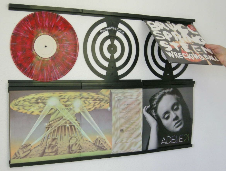
The RecordWall-IT has similar functionality, but also includes a record post for those who want to display the record itself (and aren't concerned about leaving it out with no covering). 

AlbumMount is another open album cover display. Since it's made from two brackets rather than a single piece of plastic, the height can be adjusted if need be. That could make for a slightly unaligned display, though, which will thoroughly annoy some end users. It's  also a very different look, in that the display system is less visible and the albums appear to float.

Other designs look more like standard frames but are designed so that it's easy to add and remove discs. The frames from Rock Art Picture Show are acrylic and include a black mat with a white inner beveled edge; albums slide in and out from the side. That means if there's a row of them the end user would need to remove the frame from the wall to change out the album. 

The acrylic frames from Bands on Your Wall are open at the top; it seems this might accumulate more dust than a side opening. Since the record owner needs access to the top of the frame to reach the album, these frames would need appropriate vertical spacing to avoid the need to remove them from the wall. But it's an intriguing design, with the bolts that hold the frame together at the bottom also serving as a resting points for the album as it floats within the frame.

The acrylic Play & Display Flip Frames from Art Vinyl make it easy to get to the albums no matter how they're arranged. The design includes "sponge fingers" on the back of the frame to adjust to different thicknesses, so the frames work well for anything from a standard LP to a triple LP. And since the frame is fully enclosed, dust should not be an issue.

Are You Selling Your Products Through Amazon? Here's How You Need to Package Them

$
0
0

Much has been made in the press of Amazon's Kiva robots, the small-but-mighty Roomba-sized machines that carry entire racks loaded up with products. Here's some cool footage of them in action at Amazon's latest eight-generation fulfillment center:

While the Kiva units mean human workers no longer have to walk the aisles—instead the shelves come to them—the Kivas won't replace humans anytime soon at Amazon's fulfillment centers. A look inside the inventory receiving area, below, reveals why.

The product designers among you are well familiar with the design and manufacturing processes behind a product. But how many of you are familiar with the last mile before they get to an end user's house? Ever picture your slaved-over items being transferred in and out of different cardboard boxes and riding a series of conveyor belts? That process—and particularly how they are packaged for shipment to the fulfillment center—also requires careful design.

In this look at how Amazon has to deal with incoming shipments, we see why humans are still needed: To deal with the screw-ups made by other humans.

2015 IDEA Bronze Winners Announced!

$
0
0

The first group of winners in IDSA's International Design Excellence Awards (IDEA) have been announced! This year is a momentous one for the prestigious design competition, marking its 35th year during IDSA's 50th anniversary celebrations. We were really happy to see a few of our Core77 2015 Design Awards honorees among the group: Jibo,  Merge and Staples Back-To-School 2015. Though we encourage you to check out all of the winners, we parsed the 83 projects awarded with a Bronze distinction and chose 10 stand-outs. And keep an eye out for the IDSA International Conference on August 22nd, when the remaining Gold and Silver winners will be announced. 

Forest Wizard is a device system that improves detection and treatment of forest fires. Installed as a network in the forest, monitors send alerts to relief workers with the precise location of the fire scene, while an accompanying app sends warnings about danger zones to residents. The system is practical even in non-emergency situations, serving as a trail of markers to guide travel enthusiasts. 

Inspired by sellotape, the student project Easy Welding aims to create a safer, more efficient option for welding work. The strips adhere to metal and contain a metal element inside which fuses to the surface through chemical reactions—significantly decreasing the difficulty of welding and making it much more accessible. 

AnXiang YunNan Steam Pot marries the best of tradition and modern technology—adapting the design of an ancient steam pot from Yunnan, China known for its ability to extract a ton of flavor out of ingredients.

The Air Nut monitors indoor and outdoor environments, with a primary goal of allowing users to better understand their living environments and increase their eco-consciousness. The device monitors temperature, moisture, air quality and air pressure and can also connect to Wi-Fi to function as, for example, an alarm clock. 

Printing Solar-cell: Design & Print Your Own Solar Panel is a cartridge module that prints solar-cells on an everyday ink-jet printer—giving users unprecedented access to solar technology, ease of use and customization options. 

Unlike conventional headphones, AfterShokz Bluez 2  use bone conduction technology to deliver sound through the cheekbones to the inner ears, allowing the ears to remain completely open without forgoing sound quality. 

One Foundation is a disaster relief organization in China, focusing on provinces that are most often struck by earthquakes. Their first product, One Foundation Disaster Relief Tent, is designed from the users point of view and features a simple yet sturdy structure, with optional additional layers of protection and an extendable roof canopy. 

Though the Adidas Smart Ball is designed with 14-17 year old soccer players in mind, it's ingenious feedback system measuring speed, spin and trajectory on a paired device will probably appeal to a wider audience. 

TuffBlocks are intended to take out the most complicated part of deck construction: the foundation. Each piece weighs only 1.5 pounds, but  can support more than 11,000 pounds and is designed to accommodate several standard joists. 

Since we all carry our smartphones around anyway, RYOBI has come up with a way to leverage our device to revolutionize the way we use tools. RYOBI Phone Works uses a series of attachments—including a laser level, moisture meter, stud finder and laser distance measure—and combines their readings with an accompanying app that allows users to create and access project files, create HD images and videos as well as easily upload and share results. 

Making Machines that Walk

$
0
0

Dutch artist Theo Jansen has been working on his Strandbeests, kinetic sculptures capable of locomotion, since the 1990s. As part of their development he's devised wheel-free ways for them to move, like these gear-driven "legs:"

Other artists and creators like Jansen's countryman Janno Smits took note of the former's developments, creating animations like this to deconstruct how they work:

Last year a Jacksonville-based artist named Ron Schroer built a similar movement mechanism to drive his Boneshaker Bigwheel bicycle:

Izzy Swan, too, was bitten by the gear-driven-legs bug. And, Swan being Swan, he of course made his variant powered by a 20-volt drill.

Brilliant Airplane Seat Design to Make Coach Even More Uncomfortable

$
0
0

Zodiac Aerospace's Seats Division bills themselves as "the leading providers of aircraft seats for passengers and crew," with teams of designers specialized in ergonomics and cabin layout. And one of their latest designs, called Economy Class Cabin Hexagon, is a fascinating look at just how many bodies you could cram into Coach at the expense of the passengers' comfort.

The thinking seems to be that airline passengers are all built like Mr. Incredible, with broad shoulders and narrow waists.

If we had those types of bodies, this configuration would at least make physical sense, preventing shoulder-rubbing.

But what about the psychological effect—do you really want to spend JFK-to-LAX seated as if you're being interrogated by two homicide detectives? All that's missing is a bare lightbulb hanging overhead.

The reality, of course, is that none of us are shaped like Mr. Incredible; these days we're more likely to be shaped like Sadness from Inside Out, where we are at least as wide at the bottom as we are at the top. And judging by the lack of armrests you see in the images above, we're apparently meant to spend the flight holding our hands the same way she is.

Beats Teardown Guy Tackles Two Authentic Pairs This Time

$
0
0

Avery Louie, the prototype engineer whose knockoff Beats teardown made the blog rounds last month, has subsequently gotten his hands on two real pairs of Beats. After tearing down the counterfeit pair, Louie had concluded that the hinges were made from metal rather than plastic purely for the purpose of adding weight (and thus a perception of quality). Some of you disagreed, claiming that the hinges would need to be made of metal for durability's sake. Well, here's what Louie has concluded after getting inside the pairs of real Beats:

I stand by my original point that these metal parts are there to add a bit of weight and increase perceived quality with a nice look. With the addition of the metal ear cups, metal now makes up 44 grams of the 130 gram product — 33% of the weight.
Some might assume that the metal hinges are used for function rather than feel. At first glance this seems reasonable but further disassembly reveals that the metal parts are actually mounted to plastic bosses. Nearly all stress on the metal parts is transferred to these plastic features, which are actually smaller than the beefy metal parts.

As you can see, one of said bosses is broken in the photo above, but we assume that happened during the teardown process and not in actual usage.

Louie's also discovered that the hinges in the authentic Beats are made from stainless steel rather than zinc and are a bit thicker (see below, with the magnet sticking to the real deal):

Perhaps most surprising in this new teardown is the BOM. Louie had the counterfeit pair costing $16.82; his estimate for the real deal is $20.19—a difference of $3.37. "Overall," he writes, "the genuine & counterfeit Beats are nearly identical."

And that, folks, is the real problem, not whether or not metal was added for weight. "It is worth spending some time," Louie concludes, "designing ways to prevent your product from being counterfeited." With unscrupulous manufacturers now having achieved a frightening level of duplication, that's easier said than done.

Beats is of course aware that their products are being counterfeited, but the "Spotting Fakes" section of their website seems woefully unaware of just how convincing the knockoffs are: They warn consumers to look out for "unprofessional looking" packaging. As we saw here, the pirates have got it pretty dialed in.

Turning Kickstarter into Kickcontinuer

$
0
0

The company's name might be BigIdesign, but their latest product is tiny. Take a look at this thing:

So, what did you think? Was it innovative? Underwhelming? A novelty that might be useful to have, but that you'd never actually buy? It might be all of those things, but what it certainly is is financially successful: The creators were looking for $2,500 and garnered $43,000 at press time, with 20 days left in the pledging period.

It's just a bit part

As for who those creators are, Chadwick Parker and Joe Huang are a design and manufacturing duo we first looked in on years ago, when they were hawking a small retractable cable reel. While I wasn't surprised to see their names on Kickstarter again, I was surprised to look into the company they've since formed—BigIdesign, which handles design, manufacturing and fulfillment—and find that they've launched no less than fifteen Kickstarter campaigns in total.

Their designs are mostly simple—and oddly, nearly all cylindrical—as well as very doable, like writing implements and desktop organizers. The four campaigns where they deviated from this formula, attempting coasters, notebooks, children's furniture and wallets, all failed. The other 11 have all succeeded, and Parker and Huang are now selling their gear on five continents.

Interestingly enough, while the pair have started 15 campaigns, they've also helped fund 22 other peoples' campaigns, including a competitor's titanium pen.

While we've seen repeaters on Kickstarter before, we've never seen eleven-peaters. BigIdesign illuminates the possibility that one could cautiously launch a successful product company without having to once reach back into your profits to fund the next project, or worry about going belly-up if the new idea doesn't pop.

For those of you thinking of crowdfunding anything, whether one project or fifteen, you'll want to check out "How to Make a Self-Shot Video Look and Sound Good, on the Cheap" and you'll definitely need to read our interview with Alex Daly, "The Crowdsourceress" consultant with the 100% success rate.


Carnegie Mellon's Lego-like Modular Snake Robots

$
0
0

Longtime Core77 readers know that I hate robots and hate snakes, but I fully support the idea of robot snakes. And while Carnegie Mellon's non-snake CHIMP robot did not win the DARPA Robotics Challenge, they've got some snakebots up their sleeve that may prove more promising.

The thing about most robots is that their size is not easily adjustable. You can make them crouch or fold over, but the mass is the same. However, CMU's Modular Snake Robots rectify this by taking a cue from Lego. The developers have come up with short snake sections, each with their own "brain," that can be snapped together before deployment by the operator, who can make snakebots—or crab-bots with snake legs—that are as long or short as s/he wishes.

And as the video below shows, you can even add specialized sections, for instance if you wanted to add wheels:

I think the idea has merit. However, I also think the guy at the end of the video sitting in front of a ROBOT ARM THAT BRINGS A FORK TO HIS FACE is a freaking maniac.

New Star Wars Trailer Reveals Tons of "Real Sets and Practical Effects"

$
0
0

With the new Star Wars trailer already at 69 million hits, the creators knew they'd have to release something special for last week's San Diego Comic-Con, the annual geek gathering that can generate mountains of buzz. Filmmakers typically do this by treating Con-goers to new footage, but director J.J. Abrams opted instead to put together a behind-the-scenes reel.

The surprising reveal is just how many "real sets and practical effects" the filmmakers have gone with. One might imagine a sci-fi spectacle as big as this one to be loaded up with green screen and CGI; instead we're treated to a look at an army of tradespeople, their full-size starships and even the Millennium Falcon being knocked together, 1:1, out of plywood. Not to mention Han Solo getting behind the wheel again while director Abrams peers at him through the windscreen:

Frames of Reference

$
0
0

With the reopening of the Cooper Hewitt last December, museumgoers can once again roam the halls of Andrew Carnegie's magnificent Upper East Side mansion—and now, thanks to a collaboration between the Cooper Hewitt and Warby Parker, they can even do it while sporting a pair of eyeglasses inspired by the mansion and its original owner.

Warby Parker decided to develop the new Cooper frames after its design team was given a tour of the renovated mansion and granted access to the Cooper Hewitt's archive, which included the original eyeglasses worn by Carnegie himself. Since everything turn-of-the-20th-century is now hip again, it wasn't too difficult to imagine the style appealing to today's consumer. "We were really inspired by the design aesthetic of eyewear during that time period, the early 1900s, late 1800s—very small, simple wire frames, which is something and that we already do a bit here at Warby Parker," says Shannon Malone, the company's director of product strategy.

The team started sketching, first drawing designs in Illustrator to get a feel for the aesthetics, then moving to CAD for 3D files of the frames. Those files were sent to one of Warby Parker's partners overseas, who manufactured samples and sent them back to the team in New York. Although the Warby team knew that they would only be introducing one new style, they designed and prototyped more than 20 versions—all centered around Carnegie's original frames, but also drawing inspiration from the mansion itself. Pulling from the crown molding and other ornamentation found inside, the designers created a variety of embellishments, ranging from trimmings on the bridge that went further up the nose to heavy foil designs or filigree-type elements around the lenses. Finding an elegant balance between decoration and function proved to be the main challenge of the project, as many of the more elaborate features left the frames too distracting, or too heavy. After user testing, the team decided to abandon many of these elements in lieu of a simple approach, moving the primary detail to the temple arms.

"One thing that is important about this frame is that the shape itself be very wearable," Malone says. "When we get a series of samples in, we do what we call prototype testing, where we have people with different face shapes and sizes try them on to see how they look on them. It was really remarkable that [the Cooper frames] looked good on just about everyone."

One of the details that did end up making it into the final design was a coil running along the arms of the frame, which was taken from another pair of vintage glasses Warby had in its office. In its original design, the coil was used to make the frames tighter around its wearer's head, but their purpose in the Cooper is purely aesthetic. "We just loved how it looked so much that we applied it to the temple on Cooper," Malone says. "The coil that we used is more sturdy so it's not going to bend [like the original], but it just looked really, really beautiful." The frames are made from a lightweight Japanese titanium in Heritage Bronze, a color inspired by brass details found in the Carnegie Mansion, and then wrapped in wire to create the coiled effect.

Titanium castors, assembled with a soldering process, attach each piece. Screws are added afterward to hold the hinges and lenses in. Tortoiseshell acetate temple tips were inspired by the mansion's mahogany floors. Starting from a full sheet sourced from a family-run Italian factory, the acetate is then cut down to size and individually shaped to create the temple pieces. The final metal frame has a matte finish, achieved through rounds of sandblasting and polishing.

"Because we had so many types of details that we could use and that we liked, it was hard to narrow them down and make the frame simple, stunning, easy to wear and beautiful—but still using some of the design elements that we were excited about," Malone says. "I think we ended up doing a good job of picking design elements that really make the glasses wearable and pay tribute to the Cooper Hewitt and their history without going overboard." The frames were revealed during an event at the museum at the end of June, and are now available online starting at $145.

How to Make Your Laptop Sprout Two Additional Full-Sized Screens

$
0
0

The compromise of mobile computing is that you've got less screen real estate than you'd have on a desktop. But the trio of Belgian entrepreneurs behind the Slidenjoy have come up with a way to let you have your laptop cake and eat it, too.

Their product is a pair of 1920x1080 flatscreen monitors—in 13", 15" or 17" sizes, neatly aligning with MacBook sizes—that slide into a sleeve. This sleeve can be attached to the back of your laptop via magnets, and with the screens deployed, you've got the wraparound monitor set-up favored by everyone from hardcore gamers to day traders.

In the photo below, you can see they've added a little flip-down panel to take the weight of the extra monitors off of your laptop's original hinges, which were obviously not meant to support an additional pair of screens:

However, the developers have also made the incredible claim that each extra monitor will only weigh between 50 and 100 grams (just 1.8 to 3.6 ounces!).

Monitor tanning

Demand for something like the Slidenjoy seems to be high, as the Kickstarter campaign has already exceeded its target; at press time they'd garnered $344,000 over a $331,000 goal, with nearly a month left to pledge. Buy-in starts at €199 (USD $220) for a one-screen model, but the vast majority of backers are ponying up €299 (USD $330) for the dual-sceren version.

By the bye, it occurs to us that the triangular sharing configuration would be perfect for generous folks trapped in that awful Hexagon airplane cabin.

Video Demonstration of the Manual Labor of Design

$
0
0

Industrial design used to be a mess. I don't mean the field, I mean the work. ID'ers of a certain age will remember flushing spray guns in the model shop, the pain of cleaning and refilling a Rapidograph, the horror of knocking a box of mechanical pencil leads onto the floor and watching the leads shatter. Gummy erasers were admittedly fun to absentmindedly knead, but made your sandwiches taste funny come lunchtime.

Then there was the absurd amount of supplies you had to stock: Markers in every color and gradation, aforementioned pencil leads and Rapidograph ink, drafting tape, X-Acto blades, templates, triangles, T-squares, French curves, ship's curves, and rolls and freaking rolls of vellum, trace, mylar, newsprint, etc. It's hard to miss that aspect of the job.

The man fronting this video below is a graphic designer and not an ID'er, but as he demonstrates how people used to do the work before computers, the industrial designers among you will recognize plenty of overlap:

Viewing all 19151 articles
Browse latest View live


Latest Images