Quantcast
Channel: Core77
Viewing all 19151 articles
Browse latest View live

From Japan, a Brilliant Notebook Hack for Organizing Your Notes

$
0
0

My notes are a mess. I desperately wish I could carry just one notebook, but every time I've tried it, I can never find the information I need at the moment I need it. So I've resorted to doing this:

That's me capturing all of my projects on loose sheets of scrap paper with holes punched in them; then I try to organize them in binders with tabs. It's a real pain in the ass and it doesn't work that well. 

So I was elated to find this notebook hack (purportedly from Japan) listed on the HighFive Blog that is perfect for people like me, who do not develop projects one-at-a-time in a linear fashion. Here's how it works:

"Let's imagine you're keeping a notebook for recipes and you just wrote down a Chinese recipe on the first page." [Image/description via HighFive Blog]
"Next you'd go to the last page and create the tag 'Chinese' by writing it on the first line right next to the papers left edge." [Image/description via HighFive Blog]
"Now you'd go back to the first page where the recipe is and on the exact same line as the 'Chinese' label you just wrote you'd make a little mark on the right edge." [Image/description via HighFive Blog]
"You'd make this mark so that even when the notepad was closed the mark would be visible. After repeating this for various recipes you'd now have various tags visible on the notebooks edge. Now if you ever wanted to find a Chinese recipe you'd simply look at the index, locate the Chinese recipes label and look along the visible edge to find every single page which has been tagged as Chinese. Then it's simply a case of flicking to each page." [Image/description via HighFive Blog]

I'm definitely going to try this out.

Anyone have a better/alternate system?


The MicFlip: Reversible USB and Micro USB for Better Last-Mile Ergonomics

$
0
0

You have a beautifully-designed phone/camera/gadget/etc., and a beautifully-designed computer to plug it into for charging. But every time you grab the cable, you first have to spend a second squinting at it to figure out which side is up—on both ends. You have a fifty-fifty chance of getting it wrong every time, which hardly seems like an elegant design solution.

Accessories manufacturer WinnerGear agrees. That's why they developed the MicFlip, which they're billing as the world's first reversible-USB-to-Micro-USB cable. (Yes, on both sides.) They've taken the added step of making the cable a bit more durable than your average Best Buy offering and wrapped it in nylon braiding.

The response has been tremendous: After launching an IndieGogo campaign last week to muster up the scratch for tooling, the project hit its target within a day, and in a matter of days shot past 500% funding. Yesterday morning the development team announced that they've accelerated their manufacturing timeline, expecting to have their factory on-line within two weeks from now, and anticipate they'll start shipping next month.

The $10 Early Birds are unsurprisingly all gone, but those willing to part with $15 can still get in on the campaign. At press time there was 25 days left.

Frederick McSwain on Conquering the World of Corporate Gifting

$
0
0

Name: Frederick McSwain

Occupation: I recently signed on as the chief creative officer of LR Paris, a 50-year-old promotional product and custom gifting studio. My background is in industrial design, focused in home furnishings. So it was a bit of a leap for me to come and oversee a company that does a lot of corporate gifting and quite a bit of small goods and accessories. But I really wanted to bring my aesthetic and my design approach to a different world. I oversee basically everything that's going out the door with LR Paris's name on it, from branding work and sales collateral to the actual products and concepts that we're designing.

Location: New York City

Frederick McSwain

Current projects: Although quite a few of them are confidential, we have ongoing relationships with clients such as Harry Winston, the White House and the Guggenheim, to name a few. And our projects really range from consumer goods to complete brand experiences. A couple of specific projects I can mention are a line of products for the Baccarat Hotel that recently opened in New York, and a new gifting program for Wells Fargo.

Mission: The world of promotional products is a $20 billion industry. But right now, for so many companies, it's an afterthought. They'll spend a lot time on their websites and their consumer-facing establishments, but then they'll buy a beer koozie and put their logo on it. It's completely off-brand. So we really want to reinvent how CMOs and their companies are spending their dollars. We want to give them more value, and we want to make them more design-conscious.

Above and below: some examples of LR Paris's small goods and accessories

When did you decide that you wanted to be a designer? I've always kind of known. I went to school at the University of North Carolina at Wilmington, and I started out doing a double major in biology and fine arts. Initially I wanted to be a fine artist, but along the way I got more and more interested in building. When I was doing a lot of painting, one of the most exciting parts for me was actually building and stretching the canvas.

Then it really dawned on me when I saw a Charles and Ray Eames exhibition at the Library of Congress in the '90s sometime. Seeing that show and their holistic way of thinking—where it wasn't just furniture but photographs and video and sculpture, and this cross-pollination of a lot of different interests—that drove me in the direction of design. There's a Massimo Vignelli quote that I really love: "If you can design one thing, you can design anything." I think design had a certain freedom for me—being able to work with a client, and having that co-design back and forth, could really strengthen the process and lead to something unique.

Education: After this realization, I shifted my focus at UNC-Wilmington to studio and three-dimensional design—that's what my degree is in.

First design job: Although I worked with some designers while I was still in North Carolina, I would say that my first real design job was in 2003 when I went to work for the Conran Shop here in New York City. I started in the buying department, so I learned, first, about Conran's hundreds and hundreds of different vendors from around the world. And I also started to understand the consumer mentality—what motivates someone to purchase something and how much the store layout can change the consumer experience. That was a huge learning experience and a really good jumping-off point for me.

Who is your design hero? Achille Castiglioni. He just had this very global way of thinking when he was putting things together. But one of his most important designs is a tiny light switch that's ubiquitous now; it's on probably half the lamps I have in my apartment. If you're ever in Milan, you have to go see his studio—he was a very, very inspiring individual.

LR Paris products for the new Baccarat Hotel in New York
An umbrella by LR Paris for Carlton House
LR Paris leather travel and desk accessories

Describe your workspace: Very messy. Not only my desk but my computer desktop as well—there are way too many icons that are tattooed all over the screen. It's really in disarray. There are papers everywhere, there are samples everywhere—it just looks like a bomb went off.

Other than the computer, what is your most important tool? The computer is very important, but I think for me it's just the whole process of brainstorming. I really like to work from a conceptual standpoint, and once you have a really strong idea, I think the form, the function and the typology of the object can be informed by that concept.

I'm inspired a lot by culture in general, and how objects are designed for one purpose and re-appropriated for something else. For example, one of the projects I've done was based on the milk crate, which is basically the most popular outdoor furniture in New York City. I like those cues that you get from everyday life. Just being a good observer is something that I find really key in my work.

Milk crate–inspired furniture by McSwain for the 2013 exhibition Off the Grid at Gallery R'Pure in New York
McSwain's Cumulus table, also for Off the Grid

What is the best part of your job? Well, every day is an adventure. As I mentioned, right now we're working with clients ranging from the White House to construction companies to luxury brands to museum stores. So every day brings something different in the door. That definitely keeps me on my toes. Sometimes you can feel a bit schizophrenic, because you're stretching in so many directions, but I think I've gotten good at pushing myself into problem-solving mode quite quickly.

What is the worst part of your job? That's probably the worst part as well. Tackling the corporate world, since it's very alien to me, is almost an educational process. Dealing with clients and trying to teach them how good design that's on-brand can really be a business driver. As I mentioned earlier, for so many companies it's an afterthought. They know they have to give something promotionally, so they just slap a logo on anything. But that's slowly changing. Obviously, if you look at a company like Apple and you see what they've done, there are definitely huge landmarks out in the corporate world for comparison.

What time do you get up and go to bed? I have a 15-month-old son at home, so he wakes me up at about 5:30 in the morning. And then, on average, I try to be in bed by about 10:30.

How do you procrastinate? I just daydream, to be honest. Sometimes it's nice to sit and do nothing.

What is your favorite productivity tip or trick? Maybe singing in the shower. And cleaning. It clears my mind a little bit. But as I said, I'm pretty messy, so my wife and my colleagues are always on me about cleaning up.

Turntable, a 2012 collaboration between McSwain and Brad Ascalon for Neal Feay Studio
Lumen, a combination vase, candle holder and ashtray that also came out of McSwain and Ascalon's 2012 collaboration

What is the most important quality in a designer? I think being able to listen. Being able to put in the research and try to truly understand what your client is looking for. Once you know that, the rest of your job is much easier.

What is the most widespread misunderstanding about design or designers? Especially on the American market, I've noticed that design can be considered almost this add-on cost. Like you go into a store and there's a pair of scissors and then there's a "design" pair of scissors, and the "design" pair costs five dollars more. So I think people in general are a little skeptical of the word design, and they think it just means a higher cost. But obviously both pairs of scissors were designed.

What is your most prized design possession? I'd call it more a piece of art than design, but it's a turned-wood goblet made by an artist from North Carolina named David Sengel. It's all in wood, lacquered black, and there are hundreds of thorns on the stem. It's something I got in the '90s from the artist, and I've carried it around and babied it for 20-plus years now.

What is exciting you in design right now? I just think there's a renewed energy. The most recent New York Design Week, for example, was really spread out, there were so many events going on, and so many kids just out of school were so enthusiastic about getting out there and showing their work. The whole maker movement in Brooklyn, with people taking on their own small manufacturing—there's a renewed energy that's really exciting to see. Ten years ago, I felt like I knew just about everyone in the design world, and now there are so many new faces and new voices. It's really inspiring for me to see this next wave of creatives coming up.

This was the latest installment of our Core77 Questionnaire. Previously, we talked to Incase's VP of brand and creative, Moses Aipa.

Husband-and-Wife Team Designs a Better Way to Store Clothes

$
0
0

Furniture designers have not kept pace with the way we store our clothes—and the sheer amount that we have. Consider how antiquated the chest of drawers is, and what a poor solution it provides in the era of fast fashion. Does it make sense to stack things horizontally, and dig through the entire pile to get to an item at the bottom?

Last year our resident organization expert, Jeri Dansky, found that some folks had thus come up with an alternative method of storing shirts: Like file folders. It makes good sense. And now Joe and Sami Kuipers, an entrepreneurial husband-and-wife team, has taken that concept and designed a simple product and system around it.

I don't say it's the perfect solution, but the Kuipers' EZSTAX system is certainly a great version 1.0 of how we ought to store clothes in the future. I'm also impressed with this early take considering these guys aren't even industrial designers:

I call it clever in that the "hinges" are simply a function of the protrusions nesting into one another. I'm also digging that they're made from recycled materials. Again, it's not perfect—after days of usage the end user will have empty slots in the middle, and refilling them will necessitate removing the ones on top, which is similar to the original problem—but at least these guys are trying. Until furniture designers step up with something new, we'll be looking out for inventive laypeople devising their own solutions.

The Kuipers put the EZSTAX up on Kickstarter, and it's already landed $35,000 on a $10,000 goal, with 25 days left. More power to them.

So, if this is the 1.0, do any of you ID'ers have ideas for the 2.0?

Boston's Disgusting Urban Snow Farms Have Finally Melted

$
0
0

New York City's horrifically humid summer is here, making me miss writing prior posts about snow. In February we looked at implements to get snow off of roofs and a better design for a snow-clearing vehicle. And as the shirt starts sticking to my back this morning, the snow-buried Tateyama Kurobe Alpine Route looks pretty inviting.

Boston got what seemed like that much snow this past winter, and they faced the real problem of where to put it all. So much of it piled up that they set aside "snow farms" where they could dump the stuff to die.

But the stuff didn't die easy. Incredibly, it took until yesterday—yes, July 14th—for the last pile to melt, according to a Tweet from Boston Mayor Marty Walsh.

Here's a time lapse of the pile melting, and it's fairly gross; they started shooting it in late March, when the white pile had already slightly melted and turned brown, going from debris-impregnated snow to snow-impregnated debris.

For perspective on what it used to look like, here's the pile when it was still white in February:

A similar pile at MIT was so clean-looking that students climbed it like a mountain:

MAN that looks pretty good right about now.

Engineer Uses Hydraulics to Develop a Safer Weightlifting Bench

$
0
0

Here's another "design hole," a problem in need of a solution, this one spotted (pun intended) by engineer and fitness enthusiast Dave Vorozilchak. As weightlifters know, maximum gains are achieved by reaching muscular failure; after pushing your body beyond its limits, the failure supposedly "shocks" the muscles into growing post-workout, the better to meet the challenge next time.

This sets up a dangerous situation during bench-pressing. Those who cannot find a spotter in the gym, or who are working out at home alone, know that for safety's sake they should not go for that last rep—but hopped up on endorphins or pure motivation, will try anyway. Some benches are flanked by safety stands, but those who haven't take the time to adjust them to the proper height are still in danger. Lifting an unyielding steel bar, and enough weight to easily crush your ribs or trachea, when your body might be gassed is a terrible idea.

Thus Vorozilchak put his engineering background to use, incorporating the principles of a hydraulic jack. 

                                                                                         * * *

WARNING: If you are squeamish, do NOT watch the video below from roughly 0:49 to 1:00. Those eleven seconds show a solitary weightlifter recording himself and bench-pressing what looks to be a fiendish amount, and as his muscles fail and his arms buckle, the bar begins to come down on his trachea. The footage ends as his legs begin to kick, but with no help in sight, it's not difficult to imagine what happens next.

Vorozilchak's Maxx Bench invention is clever not only from an engineering standpoint, but a business perspective as he's got at least two potential markets. In litigious America, what gym wouldn't pony up the cash for a bench with a safety feature that might prevent them from being sued? Additionally, the design should appeal to those with home gyms who work out alone.  And while he certainly put in the work, he didn't have to re-invent the wheel: Hydraulic jacks are an existing mechanism with proven ability.

As a sign of its appeal, the Maxx Bench has nearly reached its $50,000 Kickstarter target, with $45,000 in pledges at press time and 22 days left in which it will surely clear the remaining five grand.

So, this is a reminder for the designers among you looking to create that hit product: Find a design hole and plug it. Lately we've seen a lot of clever folks who spot things that need improving in their daily lives, from Jim Cash's custom wine cellars to this couple's clothes-organizing system to reversible USB cable connections to a suitcase that turns into shelving

If you look around within your own lifestyle and the things you do each day, you're bound to find something that sucks. Put that ID mind to work, solve it and create!

What Industrial Design Students Had to Carry, Part 1: Drawing Implements

$
0
0

In the entry about the Manual Labor of Design, we see the on-camera designer wielding the former tools of the trade. This gave me a flashback to the sheer amount of items I had to purchase, carry and keep stocked as an Industrial Design major back at design school. Because I came up in the pre-CAD era, the implements we used were similar to what you'd find in an ID program from the 1940s.

I thought I'd list all the crap we had to use here in this series, and ask you current ID students what items your current curriculum demands you own, so that I can do a contrasting follow-up post.

For perspective's sake, remember that I was in design school in the early '90s and was taught to draft by hand. This was before schools gave out email addresses, and when I started school, few people even had computers of their own. So here we go with.... 

Part 1, Drawing implements 

How many different ways are there to make a mark on paper? Plenty—starting sophomore year, all of these items required owning:

Charcoal

Sure these things always broke, but there was no quicker way to get a fast black-and-white gradation on a drawing. Indispensable.

Pastels

For when you needed colored gradations. Faster than using Prismacolors and provided blur you couldn't get with markers.

Berol Prismacolor pencils

Sophomore year I felt you needed at least the 36, but I remember walking past some kids and envying them because they had the 72 and one or two a-holes even had the 120. 

By Senior year I'd wised up and was buying them piecemeal, sticking to just a few go-to colors.

Mechanical pencils and leads

At a minimum you needed the 0.3mm, 0.5mm and 0.7mm for drafting, and of course you had to stock up on those leads.

Kneaded erasers

Not technically a drawing implement, but gummy erasers were the indispensable Command-Z of drafting by hand. These would eventually go dark and bad, or you'd drop them on the dusty floor once too often, and it was always a pleasure to use a new one and smush it apart and back together; I miss that faintly petrochemical smell.

They also provided a handy way to procrastinate:

Rapidographs and ink supply

Disassembling, cleaning and refilling these was a holy pain in the ass, and you quickly learned to do it FAR AWAY FROM YOUR PRESENTATION DRAWING. You also needed them in multiple sizes, for drafting on mylar and such and getting the line weight you needed. I think I had the 0.1, 0.25, 0.5, 0.7, 1.0 and a 2.0mm, the latter one being the only one I never actually used.

Markers

These were more troubling than the Prismacolor pencils for two reasons: One, you couldn't just look at one and know it was going to go dry tomorrow, and two, you needed to purchase them in gradations. For example if you needed blue in your rendering, guess what, you're buying at least five blues in every shade from light to dark.

Need grey? Bad news: You've got to buy both Warm Grey and Cool Grey, in every shade from 10% up to 90%. Keep eating ramen for dinner.

It really bothers me that I can't remember the brand name I used. They were double-sided, with a pointy end and a blunt end, but I don't think they were Prismacolor markers.

Sharpies

A Sharpie on newsprint gives you horrible bleed, making them unsuitable for precise work. But after your buddy had too many beers and passed out at the party, you found that his facial skin was the perfect canvas for accepting the ink.

I started to upload a photo of us ID hooligans drawing on a passed-out Illustration major inside one of Pratt's dorms, but the imagery is too disturbing. Look man, we were barely out of our teen years.

__________________________________________________________________________________

Up next: Drawing & drafting tools and accessories.

Ex-ID students of a certain age: Did I miss anything?

Current ID students: How does this list compare to what's in your bag and on your desk?

Awesome: Nike Designs Sneakers for the Differently-Abled

$
0
0

Earlier we told you about Steven Kaufman, the father that designed easy-on/easy-off shoes after his son was diagnosed with scoliosis. Kaufman deserves all the credit in the world because he undertook the project as a lone entrepreneur. But we're also thrilled to see that the corporate giant of the footwear world, none other than Nike, has also turned their resources towards providing sneakers for the differently-abled.

Nike's awareness on this front came when Jeff Johnson, Nike's first-ever employee and a running pioneer, suffered a stroke. With no functionality in the right half of his body, sneakers were impossible for him to easily don. Nike CEO Mark Parker, upon learning of this, asked Senior Director of Athlete Innovation Tobie Hatfield to create a shoe to fit Johnson's needs. Hatfield's resultant design featured a sort of hinged door at the rear that made donning and doffing much easier, as you'll see in the video below.

Johnson reportedly urged Parker and Hatfield to continue developing footwear along these lines. Enter Matthew Walzer, a 16-year-old Floridian with cerebral palsy. After Walzer posted a social media query to Parker detailing his struggles with footwear, Parker and Hatfield swung back into action, refining the shoe's mechanism into the FLYEASE:

Circulate this story if you can. We all know that Nike is a corporation, and corporations exist to make profits by selling to the mass market. Differently-abled individuals like Walzer and Johnson are not the mass market, statistically speaking, and there is bound to be little profit in targeting this group. But if the brand can achieve the all-important positive publicity for creating shoes like these, they may be motivated to continue—and more kids like Walzer will benefit.


Organizing Baseball Caps

$
0
0

Some households have an abundance of well-loved and well-used baseball caps. And as the baseball cap collection grows, there's an increasing need to consider how the caps are stored.

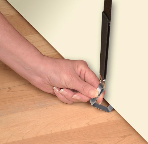
The Cap Rack from Jokari, with its "stretch tension system" and its "lo-profile spring steel door hooks"  will fit on most residential doors. The doors in dorms and commercial buildings, which are usually 1.75 inches thick, require different hooks. (Unfortunately, this information is buried in the installation instructions, and not everyone notices that before purchasing the product.)

But this system seems extremely easy to install; I have no knack for such things, and I could certainly install this one in no time. It can also be modified to hang from a wall.

The major concern expressed by some purchasers is that the caps sometimes fall off those hooks. And, of course, it's hard to see all the caps if the end users double up on a hooks, as Jokari suggests they do.

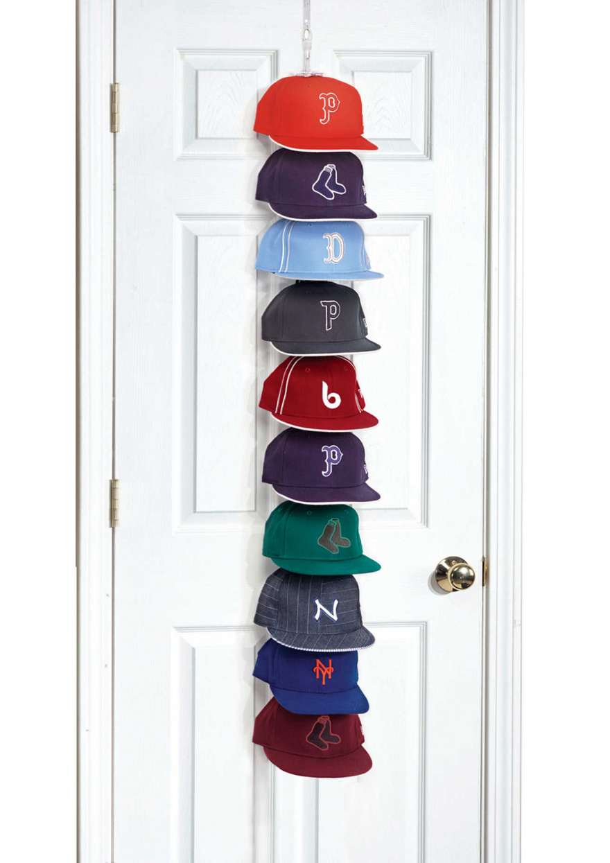
Perfect Curve has a different over-the-door cap rack system where the caps face outward. This makes it easier to see what's what, but will also take a bit more space.  The hook will fit over both residential or commercial doors, and it the rack can also hang from a ceiling hook or get mounted on a wall.

The clips used in this system hold the caps securely and help maintain their shape. The trade-off: It's a little more work to put the caps away than with the Jokari product, and that extra work means some end-users just won't use it.

The 18-cap system has three feet of cord and 6 clips; the 36-cap system has five feet of cord and 12 clips. Each clip can hold three caps. But again, when multiple caps go on a single clip, the bottom ones are hard to see.

Another back-of-the-door design come from Organize It All, with its 24-pocket design. The idea is nice, because it's extremely easy to put the caps away and to see all 24 of them. However, a number of buyers have complained that the pockets aren't deep enough, and their caps fall out. It's interesting that some web sites position this as a baseball cap organizer, and others don't; it may work fine for other types of hats. But it would be nice to see a similar design that did work well for baseball caps.

Caps could also be hung inside a closet, rather than on a door. The New Era Storage System takes a design that's often used for shoes and sweaters and sizes it for caps. The handle, with its hook and loop closure, wraps around a closet rod. However, not all end users will have sufficient closet space for this type of product.

The Cap Hangup from Master Craft Products is a hang-in-the-closet design which takes  much less space. But it will only work with adjustable caps, not fitted ones, since the loops go through the caps' adjustable size tabs.

Wall-mounted baseball cap racks, such as the ones from Stoughton's Woodsmith, provide another design that allows the caps to be stored upright and readily visible. It would be very easy to hang a cap up on this rack, increasing the chances that the rack would actually get used.

While retail fixtures aren't often considered for home furnishings, I can see some of these racks being used for those with larger cap collections—or those who want to use the caps as decor and show them off. The floor model can hold up to 144 caps, which would mean 12 per shelf—more than most people are going to have. But this could also display 12 caps nicely, or provide easy storage for a large collection that's nowhere near 144 caps.

Sometimes end users will want to protect their caps from dust and/or bugs, and the Evelots baseball cap storage bag will provide that protection. It's a product that could possibly go under the bed (although that's inconvenient to get to) or on a closet shelf. One caution: The bag is plastic with no obvious ventilation (unless it's left partially unzipped), which could possibly lead to mold problems if the interior becomes moist. Also, textiles kept in some plastics can cause yellowing of the items stored within it; hopefully this is made from a plastic that doesn't cause such problems. I've seen no complaints about mold or yellowing in the online reviews

Those who really treasure their cap collections might appreciate a product that provides more protection, such as this Neoprene case for transporting and storing baseball caps. It has multiple eyelets for ventilation, and the hard shell would keep it safe from pets and other sources of potential damage. It's not going to keep the caps visible, though, as it's designed more for travel than simply in-house storage.

The Kapz from Rakku was a unique design that seemed interesting. There aren't that many tabletop options, and the Kapz provided a nice display and seemed pretty easy to use. The Kickstarter got canceled, though, and it appears this product never hit the market. 

When Design, Art, Tech and Business Collide: 5 NEW INC Collaborative Projects to Watch

$
0
0

Artwork courtesy of Philip Sierzega. Sugar Crystal Graphics designed by Philip Sierzega as part of Cotton Candy Theremin installation for NEW INC's Showcase at Red Bull Studio's New York.

With less than a year under their belt, NEW INC, the world's first museum-led incubator, launched a number of exciting collaborative projects from their founding class of artists, designers and technologists at Demo Day. By creating a shared workspace and professional development program under the auspices of the New Museum, NEW INC not only nurtures young creative entrepreneurs, but encourages collaborative projects between their members.

In NEW INC director Julia Kaganskiy's introduction at Demo Day, she mapped the landscape from which NEW INC has developed, noting that technology only accounts for 38% of current incubators in the United States. Arguing for a new diversity in tech, NEW INC is adding designers and artists into the mix. NEW INC holds the promise of expanding models and strategies for growing ideas at the intersection of art, culture, technology and business. 

At this year's Demo Day, 19 projects were presented in a rapid-fire series of five minute presentations, sharing with a diverse audience of supporters, advisors and press the result of this year-long experiment in collaboration. As part of Kaganskiy's vision for the incubator, she calls for participants to "fuse artistic provocation with entrepreneurial spirit to enable ideas that make culture better." Although many of the projects launched at Demo Day are still seed ideas, their potential for changing the dialogue around art, commerce and technology are exciting. 

Below, we chose five projects that might inspire or change your own approach to making.

A small sample of possible totem forms, which are unique to the songs they represent. 

Reify, by Allison Wood and Kei Gowda

If you could give a form to your favorite song, what would it be? Reify is a new music platform that wants to change how we experience music by transforming sound into a multi-sensory experience. Led by Allison Wood and Kei Gowda, the team has devised a proprietary method for digitally recording and modeling sounds, ultimately creating what they refer to as totems—small, abstract sculptures 3D printed in various materials (pictured above). Each totem is encoded with music and visuals which can be activated using a mobile app. 

Opening scene of a totem embedded with HEALTH's new single, Dark Enough. 

So far, Reify is one of the fastest growing of the New Inc. companies (with a brand new Kickstarter campaign) and we're very excited to see where they go—at the talk, Wood intimated that they are looking for ways to have the abstract forms become functional objects and are also pursuing a potential radio structure, with musical artists pushing new content to the totem from anywhere in the world.

A rendering of the Solar Incense Generator 

Environmental experiments with ancient technologies, Yusef Audeh

Working at the intersection of architecture, environmental science and technology, Yusef Audeh probes the contested Middle Eastern landscape. His projects investigate ancient Islamic devices and forms of knowledge and interrogates how they might be applied to serve contemporary and future energy needs. One of his earlier projects, the Machine for Raising Water, devised a small-scale hydraulic technology system in the Nile Valley based on the 1000-year-old irrigation device designed by Medieval engineer Al-Jazari. Yesterday he presented the Solar Incense Generator, a project exploring the material culture of incense burning, a practice which dates back to 2000 BC. Audeh recognizes that "incense processes, old and new, have been linked to the production of toxic benzene, hydrocarbons, and respiratory cancer." Alternatively, his work seeks to honor the ancient ritual today by "imagining a ceramic, clean-burning incense steamer that is powered by solar energy."

Specimen by Erica Gorochow, Sal Randazzo and Charlie Whitney

Can a popular game provide insight into how we see color? Specimen, a new color perception game, came out of a creative collaboration between motion graphics designer Erica Gorochow and iOS engineer Sal Randazzo. The two took on the challenge of designing their first game as a way to expand their skillsets and "scratch personal creative itches," Gorochow shares. After basic prototyping, fellow NEW INC-er Charlie Whitney came on board to focus on the organic physics of the game. The team proceeded from animated simulations to dynamic prototypes, refining the gameplay mechanics over the course of the year. As Gorochow stated during yesterday's presentation,"You can't fake fun." Friends were invited to beta test and the genuine reactions encouraged the team to release the game into the wild. Specimen was exhibited at KillScreen's Two5Six festival and was launched yesterday through the iTunes app store for Demo Day.

Exploring music through new technologies, Luisa Pereira

Mobile synth for "Edge of the Universe"

The NYU ITP graduate has a long history of using machines and new technologies to upend certain fundamentals of music. Her Well-Sequenced Synthesizers codes music theories into machines to create a new musical language. Take "The Counterpointer," (above) described as, "a cross between and electronic arpeggiator and a baroque music rule book." Using the rules of counterpoint, a user can compose a melody with layered sounds. Pereira's most recent project, "Edge of the Universe," explored the future of mobile synthesizers through a live performance at the New Museum. Part of the team Odd Division, Pereira created a modular and interactive instrument using 18 Samsung Galaxy S6 Edge phones. Swedish electronic pop darlings Little Dragon performed on this "mobile synthesizer," integrating NASA recordings of space into their songs.

A new way of seeing space and time, by Satellite Lab

The team at Satellite Lab started their presentation with an evocative question we've likely all pondered before: What if you could stop time? Well, it turns out they might be onto something. The team is exploring new forms for filmmaking through their newly patented technology that might radically change the way we envision the world around us. As founder Carlo Van de Roer explains, the system uses "a high speed cinema camera to arrest a moment of time and light sources moving at over 10,000 feet per second" which "creates the ability to control the movement of light sources and the movement of the scene as independent variables, offering a new way to control the representation of time and space."

The NEW INC showcase, which includes nine collaborative projects, will be on view at Red Bull Studios New York, located at 220 W 18th Street through July 30. 

A Camera Bag that Lets You Surreptitiously Take Photos: Yea or Nay?

$
0
0

While the Cloak Bag seems to have won universal praise, I have mixed thoughts about it. First off, take a look at what it does:

Okay, harmless enough, right? The inventor bills its design as anti-crime, hiding its cargo from "people who might be eyeing your camera in sketchy areas." That I don't have a problem with (though the old-school New Yorker in me would argue that you oughtn't be shooting photos in "sketchy areas").

My issue with the bag has to do with how people might actually use the bag. In the past few years I've seen a disturbing trend in NYC that I'll illustrate with three examples:

1. I'm out walking my dogs. Someone talking into their smartphone passes me and says into their phone "Ohmygod canyouhangonasec?" then turns, holds their phone out, and takes a photo of the dogs and my legs. No asking, no eye contact, nothing, then they turn and continue with their conversation. This happens to me maybe two to three times a month.
2. Hordes of European tourists walking through Chinatown, where vendors are running colorful fruit stands, vegetable stands and fish stands. The tourists take out their DSLRs, stand right in front of the vendor, and shoot both the stand and the vendor—and are sometimes pretty in their face about it.
These vendors are working, this is what they do for a living. Can you imagine a Chinese vegetable seller strolling into a French law firm, and just walking around taking photos of people at their desks? What do you think the reaction would be?
3. A hipster girl is walking through Brooklyn on a summer day. A bunch of 50ish Dominican dudes are sitting in front of their buildilng playing dominoes and chewing the fat. The girl takes out her DSLR and starts shooting photos of them from different angles, walking around them as if they're zoo animals that she's going to hang on her wall, or maybe Facebook to friends that live out of town to show them "cool local color."
4. I'm helping a photography crew wrap up a shoot at the studio. As I go to untape the background edge from the floor and roll it up—a procedure that requires me getting down on my hands and knees and doing, like, manual labor—the blonde model runs over and takes a selfie, positioning me on the floor in the background cleaning up the backdrop. I guess your involvement in a photo shoot looks cooler when you have someone doing "work" in the background.

My point is that now that everyone has cameras, I'm amazed at how freely people will photograph other people (or people's dogs) without asking, and apparently purely for their own amusement. It's off-putting, selfish and self-entitled behavior.

That's perhaps too much for me to project onto this one bag, which I should assume was designed for an innocent purpose; the inventor's story sounds sincere. And one of my ID professors used to say "Look, if you design a car, someone will use it to rob a bank," meaning we oughtn't factor potential misuse into our designs.

I see his point, but the thought of people using the Cloak Bag to photograph others, without their knowing it, creeps me out. The behavior exists and I worry the bag will just feed into it.

What say you? Should we factor potential misuse into a design, or is it not our job? And do you think it's okay to photograph people without asking?

What Industrial Design Students Had to Carry, Part 2: Drawing and Drafting Supplies

$
0
0

In Part 1 we looked at all of the things industrial design students had to carry, just to make marks on paper. Chances are a lot of that list overlaps with modern-day ID students' EDC. However, this list is bound to differ, and aren't all exactly things to "carry," but also include things we used to have parked in our dorm rooms/apartments/studio spaces.

Part 2: Drawing and Drafting Supplies

Circle and Ellipse Templates

You could freehand these shapes on sketches, but the templates were a must-have for draftings. As with the markers, the pain in the ass was that you needed to have every ellipse template from thin to fat.

First round draft pick

When you had the ellipse blend into a straight line, you really had to nail the tangency or everything looked off. The rookie move was where your line didn't quite flow into the curve dead-on, and you could either fatten the line weight to try to hide it, or get your money's worth out of the gummy eraser.

These templates also stank to high heaven, by the way. I don't think they ever stop off-gassing.

French Curves

I hated these. They never had the precise curve I needed, and they broke easily when you sat on them. I owned three or four and didn't find them particularly useful.

Compass

For when you had a draft a circle bigger than what the templates had. You'd have to build up several layers of tape at the centerpoint, so that the point on the compass wouldn't put a hole through your drafting.

T-Square and Plastic Triangle

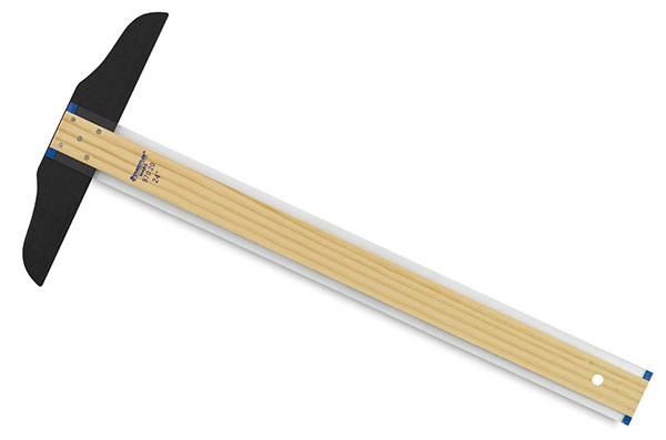
Because how else are you going to get dead-horizontal and dead-vertical lines, besides running a piece of plastic along the edge-banding on your melamine-laminated MDF drafting table? And you wanted to get the T-square with the 1/4" of transparent plastic for the edge, so that you could line it up with existing lines a lot more precisely than with the opaque metal kind.

Protractor

I always disliked using these, because if you were off just a little with your angle mark and projected it far across the page, it was off a lot by the end of the line. If you were lazy like me, that means you mostly worked on things that were rectilinear.

Eraser Shield

This little silver sliver was super-useful, allowing you to quickly mask off parts of the drawing you didn't want to erase. It also let you do dotted lines by allowing the eraser to only come in contact with the evenly-space circles of negative space.

Drafting Table

Mine was similar to the one pictured here, but I didn't have the cool little tray. You had to set the worksurface's angle perfectly so that you could reach the top of the drawing as easily as the bottom. Mine was a pain to adjust because it had four legs that all changed height independently, and the floor of my Brooklyn apartment wasn't level. You had to get under the table, loosen each leg screw, and support the heavy top with your head while adjusting the legs. That was the first time I really understood what "bad design" meant.

Drafting Lamp

Your typical cheapier swing-arm, positioned in a clamp that was placed to provide maximum reach over the table. The springs on these pieces-o'-crap always wore out, and you had to shore them up with rubber bands between the metal bosses or your lamp would start to sag.

Drafting Chair

I always dreamed about buying one of the expensive height-adjustable ones with the gas spring and the footrest, but I didn't have the money and I used a stool I stole from the studio.

Portable Drafting Table

This was for your studio desk at school. Here's the exact model they made us get, which had a built-in horizontal that ran on wires and obviated the need for a T-square. I was surprised that the cheap-looking mechanism actually maintained its parallel-ness pretty well.

Drafting Tape / Drafting Dots

To hold the paper at the table at the four corners. And drafting tape had a weaker adhesion, so it wouldn't tear the corner of your drawing off when you removed it. But every once in a while you'd run out of it after the store had already closed, and you'd use masking tape by doing that thing where you stick and unstick it to your jeans to lower the adhesion.

It was also fun to stick drafting dots to the backs of people's shirts. And then you had no one but yourself to blame when you ran out.

Architect's Scale

If you dropped this and the freaking knife-like edge contacted a table edge on the way down, guess what, you just irreversibly dented it and now you're buying a new one.

On top of that, these objects fomented, in aspiring industrial designers, an early resentment of architects. Because these weren't called Industrial Designer's Scales.

Drawing Figure

The most talented design students didn't need one of these, because they could already picture in their heads what a figure ought to look like for any given pose. So yeah, I needed one of these.

Electric Pencil Sharpener

Went into this one in detail here.

_________________________________________________________________

Up Next: Paper

Ex-ID students of a certain age: I miss anything in this category?

Current ID students: Admit it—you don't know what any of these items are! No, you don't! Look me in the eye, damn you!

Is It Time To Ditch Drag-And-Drop And Finally Learn To Code?

$
0
0

Is it just me or is Squarespace everywhere you look these days?

As if the sheer proliferation of the distinctive image-rich and luxuriously white-spaced templates wasn't enough, it seems that barely a podcast was recorded in 2015 that wasn't brought to you by the site. Flying high on investor capital as the race for the killer website-building tool heats up (other service such as Wordpress and Wix competing hard) the brand has recently also been going after the mainstream with adverts on TV screens—even ascending to the realms of the superbrands with their own esoteric Superbowl commercials the last two years running.

When Squarespace came along and blew other competitors out the water with its seductive styling, product designers the world over rejoiced at finally being able to quickly and easily make homepages for their portfolios and projects that projected an aesthetic of professionalism in keeping with rest of their work, with little or no working knowledge of HTML or CSS.

As the tools' popularity proliferates however, is this illusion going to fade? Is what once seemed like refreshing, cutting-edge web design, now starting to seem common, clumsy and unconsidered? As more users pile in to the backend, is the dream of WYSIWYG website building feeling more and more like page-loading water-torture? Like so many internet phenomenons—could Squarespace become a victim of its own success?

Coding your own: Worth the investment?

The 'to code, or not to code' debate is one that we've returned to again and again on the blog and forum—differing opinion often being found between those who think designers should work more closely with programmers and those who think that designers should focus on building their specialised design skills.

Whilst a large portion of the debate centers around coding functional things like apps and arduinos—what about the humbler ambition of learning to code your own web presence? Most designers have a basic understanding of HTML and CSS, is it worth investing in taking these skills to the next level?

Skeptical of the trumped up hype surrounding coding, I've tended to sit somewhere on the fence of the to-code-or-not debates—harbouring a quiet jealousy for those that can create with code on the web and beyond, but doing little about it. It was only when I opened an agency last year, and was faced with the prospect of building a credible website on bootstrap budget (baulking at resorting to overused templates for something that felt so significant) that I resolved to take the first steps to learning to code.

If there is one thing that's grown as quickly as website building tools over the past decade, its services offering to teach you code. Whilst there are a lot of great free or cheap online tutorial services out there, these services can take vast amounts of time and determination to make any progress and I knew that I would need something much more immersive and intensive if I was going to realistically crack code learning. I signed up for a front-end development course (i.e. HTML, CSS and Javascript) with real-world coding school Steer in London, booked out the week out of office and took the plunge. 

Any cynicism I felt for coding dissolved away within minutes. Having left design school years ago, it was an enormous pleasure to return to an education environment and feel the thrill of learning something completely new. Thanks to some very enthusiastic teaching (cheers Sam!) and being lead through some very real-world tutorials, I was soon building serious things  that I would've been proud to put online. In fact, part of me wondered whether school couldn't have been more like this in general; a small group of motivated people, learning a practical and applicable skill with teachers that really want to see you master it.

Clearly far too proud of my modest achievements at the end of Day 3

So was it worth it? After five days of enjoyable but intensive learning I'd caught the bug and felt equipped to build a credible new homepage from scratch and break free from templates that I'd felt were holding me back. Of course, now I want to tear it up and start over entirely—but that was always the fun of portfolio making wasn't it?

Whilst I still have no ambition to be a fully fledged web-developer, it's so inspiring and empowering to now know (having worked with both templates and developers) I can now bash together a respectable homepage for any future project at little cost and to my own design.

Very rough Cost, Time and Building Potential anlaysis: Time investment of learning may be high but it decreases with time as you get more confident. With so many resources readily available to teach you more, your skills can develop rapidly after you find some level of proficiency

For any designer out there sitting on the fence like I was, wondering whether the time might be write to dip a toe in web development, I can offer up five lessons I've learned from the experience that might help.

1. Front-end development isn't rocket science

If you've got some experience with computers (you probably wouldn't be here if you don't), can find a good teacher and are used to hacking a little bit into code behind a blog or portfolio like I was, you'll find that learning the foundations of HTML and CSS needed to begin building your own sites won't be too much of a stretch at all. In fact, it's something of a relief when someone finally explains what all that HTML you've seen around really means.

2. If you're a designer, you're half way there

On the coding course I took, I felt for people who didn't come from a design background as they struggled so much more with understanding layout and creating assets that they could use. If you're a whizz with graphics and used to working in Adobe you already have the building blocks—now you can fill in the gaps with code.

3. The learning potential is endless

As with anything, the more you learn, the more you know you don't know. At the end of a five day course I could see the enormous iceberg beyond the tip I'd stepped on to. Don't let that put you off though...

4. There's so many great resource out there

Heartwarmingly, there's an enormous community waiting with outstretched arms to welcome you to the coding fold and share a vast amount of knowledge with you. Once you've learnt the basics, you can then go out and search for resources you need to achieve what your trying to build. There's so much stuff out there it can be quite a challenge to filter out exactly what it is you need. Steer have helpfully gathered together some of the best ones.

5. It really does help you work with programmers

Even taking first steps into front end web programming has helped me understand more how programmers of all creeds work, how to communicate better with them and understand what I'm asking of them (sometimes moving something a nudge in one direction or the other isn't as simple as sounds!). You may never be a coder but the more confidence you have in the field the more you can achieve in your collaborations.

––––

What do you think? 

Do you have ambitions to code your own portfolio/project sites or are templates on the likes of Squarespace and Wordpress more than enough for your needs? Can industrial/product designers raise their game by learning to make websites from scratch?

Bringing Back the Art of Drumming with Sensory Persussion

$
0
0

Despite all the advances made in electronic musical instruments over the years, the drum has yet to find and fill it's 21st century potential. Current electronic percussion systems offer flat, one-dimensional effects that lose much of what defines drumming as an art form: nuanced, powerful rhythms born of a very physical interaction between drummer and instrument. While acoustic drums have a very heightened sensitivity—releasing different sounds when hit in the center versus the edge, for example—the currently available electronic counterparts operate in a much more restricted way, releasing just one sound no matter where they are struck.

But the future of drumming is about to change. Tlacael Esparza—a former mathematician whose professional music career includes drumming for Nicolas Jaar—is bringing new light to the instrument with Sensory Percussion, an attachable sensor and accompanying software platform that bridges the best of the acoustic and electronic worlds. 

While the product seems fairly straightforward on the surface, as Esparza recently told us, it is powered by powerful new technologies. "Companies that currently dominate the e-drum market are still not utilizing new advances in machine learning and signal analysis as much as they could," he explains. "Our system takes advantage of state of the art music information retrieval algorithms and is optimized to process a lot of data in real-time." The sensor—which can be attached to the rim of a drum—picks up vibrations from anywhere on the drumhead, which are fed into the system's intuitive software platform which, over time, picks up and conforms to the individual drummer's style. "It has a very quick and easy calibration process where it learns not only the sound of your drum, but also how you hit it. Once the software has a clear sonic picture of your drum, it's up to the drummer to essentially paint electronic sounds onto their drum by assigning samples, synths and effects," says Esparza. 

But perhaps the most important leg up this system has is that it was conceived from the perspective of an active drummer. "Though I have studied mathematics, computer programming and signal processing, I identify as a drummer more strongly than an engineer. I know what it means to work creatively with other musicians in rehearsal spaces, in the studio and on stage and I've fed all of that knowledge into this product."

For a step-by-step look at how the sensor works, check out this introductory video:

While the hefty price tag ($595 just for the starter kit) puts this product in the realm of professionals, the rest of us can look forward to the augmented aural experiences it promises. And, since it's already more than 70% funded on Kickstarter, it seems only a matter of time before we can do so.

Check out this video for a preview of real drummers experimenting with the technology: 

Marshall Develops Smartphone Designed Like One of Their Amps

$
0
0

The most famous movie scene demonstrating a user-interface design has gotta be from This is Spinal Tap. Christopher Guest shows his Marshall amplifier off to Rob Reiner, pointing out that while other amps have volume knobs with tick-marks from 1 to 10, the volume knob on this one goes "up to 11."

Obviously that was just a gag, but now said amplifier manufacturer, Marshall, really is producing something no other amp manufacturer has: A smartphone. Yesterday the company announced they're releasing the London, designed specifically for musicians and music lovers.

What's interesting is that they've carried over the physical design elements from their line of music equipment, with knurling along the edge of the smartphone and along the gold-colored scroll wheel and headphone plugs. The rear of the phone features the familiar alligator-like texture of their amps. A grid of holes above and below the screen announce the presence of two front-facing speakers.

"Two" seems to be a theme here, as the phone is designed with two headphone jacks (each with independent volume control) and two microphones, for recording in stereo on the fly.

Up top is a single gold button that they're calling the "M-Button." Press it once and no matter what else you're doing with your phone, it instantly drops down the screen that controls your music.

Inside the phone is an amped-up soundcard, which "gives the London a separate processor for music, allowing it to play at a higher resolution," the company writes. "Higher resolution means that even the best quality MP3 will sound phenomenally better when played with London. Additionally it lets you play uncompressed music such as FLAC format."

For storage, the phone takes removable Micro SD cards. And another thing that can be taken in and out of the phone is, surprisingly, the battery. The removable lithium-ion battery means you can carry a backup and not have to look around for a charger and plug if your phone dies in the middle of a session.

At just under $600, the Android-based device is priced comparably to an iPhone and is currently up for pre-orders. The first units will begin shipping next month.


The Catzooka: A Bazooka that Can Clone and Launch Attack Cats

$
0
0

Sometime in the past year, California-based Byron Gatt made the startling discovery that his cats have superpowers. Between the two of them they can hover, fire laser beams from their eyes and exercise telekinesis.

Gatt came to the same realization many of us would in this situation: That it would be desirable to create a way to weaponize these felines. After months of work he has perfected the Catzooka, which can quickly clone and deploy the cats for action:

More video documentation of the capabilities of Avery and Leonard, as Gatt's cats are called, exists here.

Via Neatorama

What Industrial Design Students Had to Carry, Part 3: Paper

$
0
0

Sketching, rendering and drafting are such huge parts of industrial design, and all three used to be done on paper. As ID students at Pratt we had to stock a lot of the stuff, and you'd see us riding the subway carrying those huge white plastic Pearl Paint bags filled with different kinds of paper; you had to be careful not to bang the corners into anything on the train or it'd scrunch the edge of the paper.

In Part 1 and Part 2 we went over drawing implements and tools. Now for the crucial stuff: The paper.

Editor's Note: The images used here are for illustrative purposes. As such, some are not ID-related and some aren't even on actual paper. But you'll get the idea.

Part 3: Paper

Tracing Paper Rolls

Rolls of trace were pretty useful for two reasons. The first was the analog version of scrolling: When you were working out an idea, you could just keep unspooling the paper.

Drawing by Thibaut Sally

You could add some quick marker work to trace too (though it didn't hold it as well as Bienfang 360, see below). If you passed one of the better students' desks in the studio, you'd see something like this on a roll of trace:

Drawing from Car Body Design

In addition to white they sold it in some yellowish colors, but I tried one once and hated it.

The second benefit of trace was that it was useful for doing quick overlays, an easy way to gradually refine a concept by tracing the bulk of the drawing beneath the current layer, but altering some of the parts on the new layer.

Drawing via ID Sketching

Tracing Paper Pads

We also had to have trace in pads, which was far more useful than rolls when you were working on something of a fixed size.

Drawing by Bob Borson

Newsprint

Trace was considered pretty disposable, as was newsprint, which you were meant to crank through. We used newsprint almost exclusively in pad form. It was pretty diverse and could take everything from ballpoint pens to charcoal to pastels to Prismacolors.

Drawing by Arne Dassen

Marker Paper

Newsprint made for bloody marker work; for a proper marker rendering you'd step up to something like Bienfang's Graphics 360, which held the ink much better.

Canson Colored Paper

You would typically buy this stuff in shades that matched the marker colors you already owned. Using Canson was a quick way to set the tone (literally) of a rendering, and after you knocked out the marker work you could go over it with fine ink, a white Prismacolor and/or gouache to get convincing breaklines, reveals and highlights.

Vellum

When it came time to do draftings, you switched over to vellum in its familiar orange condom. You could buy this stuff in pads, but it was always easier to transport if you bought the rolls and just cut your sheets to length. With a 24" roll you could cut 18 x 24 sheets or 24 x 36 sheets, making this my go-to. The kind in the photo here has a grid on it, but we always used the blank stuff.

Mylar/Acetate

Mylar (a brand name for acetate film) was sturdier than vellum and more translucent. It also took balls to use because it had a plasticky surface, so you had to break out the Rapidographs and draft in ink. (There were ink erasers, but I never liked using them.) Using the stuff was a good way to get a crisp-looking overlay that you could swap underlays beneath (for different colors, for instance).

This is the kind of look ink on Mylar would give you:

Sketchbooks

Of course, we were all required to carry sketchbooks. I liked how the spiral-bound ones opened flat, so I could get right to the edge of the page, but the binding often got mangled in my bag. I ended up switching over to the book-bound style, but those didn't wear very well either.

Drawing by Spencer Nugent

Also consider that a lot of times, we had to stock all of these types of papers in different sizes. That's a lot of buffalo wings, man.

__________________________________________________________________

Up Next: Tools

Ex-ID students of a certain age: What'd I miss?

Current ID students: How much of this stuff do they make you go through?

The Path to Global Design Director

$
0
0

Whether you just landed your first industrial design internship, are a Junior designer, or managing a small army of industrial design talent, you've probably wondered how high you'll climb the corporate ladder. Of course, the number of rungs on that ladder will vary depending on the size of the organization. With over 30 years of design management experience, Jeff Reuschel, Global Director of Design & Innovation at Haworth, international office furniture manufacturer, offers valuable insight applicable to industrial designers, regardless of their experience and seniority.

When I was a product design student at CCS, I interned for a summer under Reuschel and I thought he'd be the perfect person to ask about how an industrial designer can move into a Director role. During my conversation with Reuschel, it quickly became apparent that each company and employer has a unique hierarchy and path to upper management. Haworth is one of the largest office furniture companies in the world. With international sales at almost $2B annually, over 6,500 employees and 20 factories, Haworth is a privately-owned competitor to Herman Miller and Steelcase. At Haworth, Reuschel is responsible for identifying and establishing the direction of growth in the evolution of the work environment.

Don't be bashful of your ambitions. Most companies will respect your desire to grow to by letting you try something new. - Jeff Reuschel, Global Director of Design & Innovation

Reuschel's style of communication is concise and matter-of-fact. It takes a unique balance of skills to be a global director while retaining a sense of design-based abstract critical thinking. Most people are either right- or left-brain dominant thinkers and few are able to balance creative, abstract thought and analytical reasoning. It was a privilege to speak with Reuschel about his experiences and opinions moving from an entry-level industrial design role to Global Director of Design & Innovation for such a successful and respected company.

Reuschel first explained what the hierarchy of designers and design management looks like at Haworth. Beginning with the Associate and ranging to Director, Haworth has six levels which has much to do with information flow and communication. "In our case, Senior and above may or may not have direct reports," said Reuschel. Often, each will report to the designer above him or her which also ensures each design task is assigned and accounted for.

• Associate Industrial Designer
• Industrial Designer
• Senior Industrial Designer
• Principal Industrial Designer
• Manager of Industrial Design
• Director of Design & Innovation
• Vice President of Design & Innovation

So how does the Director of Industrial Design's job differ from an Associate or Standard Industrial Designer? 

Reuschel highlighted a few key differences. First, an Associate or Standard ID will likely be working on specific products or smaller product groups, such as a storage component, fixture or desktop accessory family. A Director of ID or Manager of ID, on the other hand, will focus on macro projects that address performance, efficiency, process and other organizational matters of the product development pipeline. Another difference is in management. An Associate or Standard ID doesn't spend time managing a design team. A manager assumes responsibility for his team and makes sure that all tasks are accounted for, budgets are met and projects are adequately staffed.

Reuschel offered, "Unfortunately, not all brilliant design minds are natural managers." This is an interesting observation because often, the more experience an industrial designer has, the more designers he or she has to manage. Reuschel quickly noticed my assumption that moving up the chain is a unanimous goal of industrial designers. For those who love creative problem solving but aren't interested in managing a team of designers, remaining a Standard or Senior ID would likely be more ideal.

I was curious to learn more about Reuschel's experience. 

Will Gibbons: How long was it before you entered a senior-level position?

Jeff Reuschel: About ten years.

And how does a designer at Haworth go about getting promoted and taking on more responsibilities?

You basically need to show evidence of performing at the next level before change happens. Most designers organically grow into the next position rather than declaring they're ready or asking for the opportunity.

So, by stepping up, promotion eventually happens?

Yes, you could say that. If a designer begins asking questions that address items outside of his or her responsibility or begin designing solutions for problems that the Senior, Principal or Manager are often tasked with, it becomes apparent that he or she may be ready for more responsibility.

So, rather than gunning for a promotion, a designer should notice when she finds herself seeking bigger-picture solutions?

Yeah, it's never impressed me when someone says, 'I plan to be a Manager before I'm 30.' I'd rather hear what a designer wants to accomplish. For example, tell me that you want to make a specific part of our process more efficient, or help us serve a new market or volunteer to take on the supervision of an intern.

Openest furniture collection designed by Patricia Urquiola. 

What are your favorite aspects of being Global Director of Design & Innovation?

I certainly feel like I have an influence on the efforts of the company. That's not to say that I didn't feel I was making an impact or contribute to the company's success before. But now I make more far-reaching decisions in my current position.

Who do you spend most of your time meeting with? 

My peer group is different now than that of a Standard or Senior ID. I spend more time working with the head of various departments such as engineering and marketing to make sure all their efforts are aligned.

Are there skills required to be a good manager or director that an Associate or Standard ID don't necessarily need? 

Designers are generally more right-brained individuals. This means that they're okay with ambiguity, are able to hold competing ideas long enough to sort them out mentally and they're good at divergent thinking. Those abilities get even more abstracted as you become more of a senior designer.

_____________________________________________________________________________

For example, a less-experienced designer might be asked to design a stool and she will draw upon what she knows a stool to look like and how it is used. A more senior designer might ask what the definition of a stool is and how a stool would be used if we didn't already have preconceived notions of how it functions. Finally, a Director of ID might be questioning if the company should even be designing stools in the first place, if there's another vertical market that they should be investigating or if they should pursue licensing rather than development.

In concluding our conversation, I asked Reuschel if he could offer advice to designers who aspire to move into a managerial role. "Don't be bashful of your ambitions. Most companies will respect your desire to grow to by letting you try something new." He added that you shouldn't go chasing a title or become focused on a particular time line, but focus on contribution. Begin conversations about how you'd like to contribute be it through learning, research, collaborating in new ways or improving a craft or service. Through contribution and continual learning, your role will evolve as you do as a designer.

Lighting the Way

$
0
0

It's been a while since a public-art project on Kickstarter held our attention, but The Wabash Lights initiative has us looking up. The ambitious site-specific installation—the brainchild of two creative Chicagoans, Jack C. Newell and Seth Unger—aims to convert a stretch of elevated train tracks in Chicago into a programmable light show using more than 5,000 LED tubes.

Newell, a writer, director and producer, and Unger, a designer and strategist, began working on the project over four years ago. "It all started from a conversation we had about Chicago civic pride," Newell says. "We wanted to highlight something that was authentically Chicago that we felt was important but possibly overlooked. We turned our attention to the L, specifically the Wabash Avenue tracks. We wanted to create something that would transform the area by embracing and celebrating what was already there, as opposed to cleaning up or destroying the existing character."

The duo originally had ideas to paint the track a brilliant blue or red, but, after several iterations, they arrived at the idea of lights—teaming up with a lighting production partner, Intelligent Lighting Controls (ILC), to develop several different designs until they settled on their current approach. "Before we landed on our idea we asked, What is uniquely Chicago and inherently beautiful but overlooked?" Unger says. "How can we create an inclusive and unique public art experience? We weren't constrained by the medium—meaning we aren't light artists, so this very easily could have been 'The Wabash Quilt' or 'The Wabash Paint Job' or 'The Wabash Statute Garden'—if those had satisfied our interests." Fortunately for Chicago residents, Newell and Unger did not decide to build a giant quilt or paint the town red, opting instead for a serene, multi-colored glow along one of the city's most important arteries.

Their final design will use 520 light tubes, each holding 40 LEDs. The entirety of the installation is estimated to weigh only 9.3 pounds and to use 20,800 watts (175 amps) of power. Each light tube will be controllable down to 1.2 inches, with the ability to flash a range of colors and patterns. Once installed, Chicago residents will be able to program the light display themselves via computer or smartphone. "The interface will be easy enough for a normal person to interface with, and we will have hundreds of pre-programmed 'brushstrokes' that they can choose from," Newell says. "If they are interested in getting more detailed or want more control, we'll have that as an option as well, to let people really get under the hood and create magic."

But first Newell and Unger have had to make some bureaucratic magic happen. For the past 18 months, they've been working closely with the Chicago Transit Authority, the Chicago Department of Transportation and the city government to get approved plans and find out the "who-is-doing-what" of this project. "A lot of people, when they ask about CTA/CDOT, give us a, 'Wow, that must be hard' sort of look," Unger says. "But, to be honest, I think we've both found the experience to be pretty great. These are hardworking people who have incredibly hard jobs, and the only time people talk about them is when something is going wrong. Hopefully, we won't have any of those conversations with them moving forward."

Most of Newell and Unger's conversations with the city agencies have centered around safety and logistics—which have been top priorities for The Wabash Lights all along. The vibrations of the L train produce a washing-machine effect, causing reverberations up and down the tracks but also from side to side. Since the lights are LED, they don't have many internal components that would be affected, but Newell and Unger want to test the effect of these vibrations on the light fixtures themselves as well as on the mounting brackets that will connect them directly to the tracks. Extreme weather conditions in Chicago, oscillating between below freezing to incredibly hot, pose another potential threat.

A drawing of the custom mounting bracket for the attaching the LED tubes to the tracks

To leave as little room for error as possible, Newell and Unger are first running a beta test—and this is what the Kickstarter funds are intended for. They will be mocking up around 12 to 20 lights outside of the Palmer House Hilton on Wabash Avenue, in order to troubleshoot design and interactivity, and test how their specially designed hardware holds up against the elements. Through discussions with the CTA, CDOT and ILC, Newell and Unger have arrived at a custom mounting bracket for attaching the LED tubes to the L tracks. "One of the challenges of the L is that the tracks are not grounded, so there can be no metal to metal contact, unless you want the circuits connected to that metal to melt," Newell says. "So in all of these installations none of the lights can actually touch the L, it's all rubber pads that keep things good there." The bracket will also dampen the train's vibration by allowing for slight movement of the lights, which should help prevent any damage.

With six days to go in their Kickstarter campaign, Newell and Unger are now about 75 percent of the way toward their $55,000 goal. If they meet that goal, and if the beta test is a success, then they will start raising money for the actual installation, which has a far more ambitious funding goal: $5 million, to come via corporate giving, foundation support, grants and private donors.

Ford Developing Second Set of Headlights that Independently Track and Illuminate Roadside Hazards

$
0
0

In separate instances I've seen deer, a brown bear, and a family of turkeys all crossing the road in upstate New York. Nothing is worse than driving around a curve and suddenly seeing something furry moving across your lane. In each instance I was able to hit the brakes in time, with the bear being the one I came closest to hitting, and all of these occurrences happened during daylight hours.

It might've been worse at night, as car headlights point straight ahead, which isn't very helpful when you're rounding a dark curve. The engineers at Ford's Research and Innovation Centre in Aachen, Germany are working on this problem with two solutions.

First off, their Camera-Based Advanced Front Lighting System uses GPS coordinates, cameras and software to understand the configuration of the road ahead. The GPS coordinates key in to existing map information and the cameras actually recognize both lane markings and road signs; the result is that the headlights "know" when you're at an intersection, curve, roundabout etc. and cast light in the relevant directions, giving you a better view of what's around you.

But it's the second feature, called Spot Lighting, that's really cool. An infrared camera in the car's grill looks out for heat signatures, i.e. living creatures, activates a separate light to track and illuminate them, and even activates a secondary separate light to draw a stripe alongside them. It's sort of like you've got someone with night-vision goggles riding shotgun, painting any creatures in the vicinity with a pair of powerful flashlights.

Here's how these systems look in action:

While it appears the road-mapping trick is nearly market-ready—"We expect this technology to be available for customers in the near term," the company writes—the Spot Lighting feature is still in the pre-development phase.

Viewing all 19151 articles
Browse latest View live


Latest Images