Quantcast
Channel: Core77
Viewing all 19151 articles
Browse latest View live

Combat Footage Captured by Jedi Knight with GoPro Camera

$
0
0

For years we've praised GoPro, whose tiny, ruggedized cameras have arguably altered videography more than drones and smartphones. While drones provide interesting overhead angles and iPhones provide serendipitous footage through sheer ubiquity, the folks that strap GoPros to their torsos and hit the record button are usually about to do some crazy sh*t.

So it goes with this video, where an unnamed Jedi Knight decided to turn his GoPro on before assaulting a rocky outcropping swarming with Imperials. And there's some unexpected business at the end when the Walker shows up:


Mark Your Calendars for the Bigger, Better 2015 Core77 Conference

$
0
0

To all those who don't believe a sophomore performance can be as good, if not better than the original, prepare to be challenged by the 2015 Core77 Conference. We took the best parts of our inaugural conference last year and added more of just about everything to deliver a better, more interactive experience called DESIGNING HERE/NOW. 

Our day long conference is comprised of presentations by luminaries from across the spectrum of contemporary design. They will focus on four main themes: In COLLABORATION NOW, they will showcase a series of creative partnerships that have led to exceptional new work. In MAKING NOW, they will delve into the production processes behind a variety of design projects, from furniture and lighting to sculptural fountains and socially-minded crafts. In BUSINESS NOW, they will turn our attention to the challenges and opportunities facing design entrepreneurs. And in THE FUTURE NOW, they will speculate about the near and distant future of software, user experience and product development. 

These are just a few speakers on our growing list of presenters. 

Our growing list of presenters includes Ivan Poupyrev of Project Jacquard, Nadine Schelbert of WET Design, Ryder Ripps of OKFocus and Mickey McManus of MAYA. During the conference they will pose questions like, "What happens when the things we design wake up?" and explore impactful topics such as the use craft to diversify conversations in society. 

All this will take place at the historic Vibiana at the core of Downtown Los Angeles. It's one of Los Angeles' few remaining nineteenth century landmarks and was completed in 1876. The space will accommodate more than twice as many attendees as we hosted last year so we look forward to filling it with lively conversation and exchange of ideas. 

We'll see you at the the Vibiana on October 23rd. 

The conference is complimented by a cocktail party the night before at the Broadway Bar and a Farewell Picnic the day after. Both gatherings are about you, members of the design community. You all have stories, insights, projects, and an assortment of wonderful idiosyncrasies to share with each other and us. Rounding out the conference experience is a trio of Field Trips that will give you guided insider tours to where some of the most interesting design innovation is happening today in L.A. 

The 2015 Core77 Conference won't be the same without you there, so check out the conference schedule,  block out October 22nd through the 24th and get your tickets before they sell out. See you in L.A. this fall!

On the Brooklyn Waterfront, an Innovative "Pump Track" for Skateboarders

$
0
0

At its inception skateboarding was called "sidewalk surfing," as the Californian youths who invented it were seeking a dry-land surfing equivalent. Both sports were initially done barefoot, but over the decades, skateboarders have donned shoes and the sports have diverged widely.

Now some unusual developments are bringing them somewhat closer to convergence. As we wrote back in May, a company called Webber Wave Pools has been developing circular wonders like this:

Webber's creations will enable surfers to ride an endless wave. Similarly, a Swiss company called Velosolutions has developed a paved equivalent that they call Pump Tracks, which enable skateboarders to go 'round and 'round on asphalt undulations, generating momentum through gravity and the up-down pumping of their legs. 

Check out the awesome Pump Track that Velosolutions' U.S. branch has installed along the Brooklyn waterfront:

The newly-built track was put together in partnership with Skateboard Supercross, a/k/a SBSX, an organization dedicated to building a competitive athletic league around tracks like these. Together, the two companies aim to design and build Pump Tracks all around the country. Click here and scroll down if you'd like to put them in touch with your local Parks & Rec.

Lastly, if you're in Brooklyn, get to the Williamsburg track and ride it, because who knows how long it's going to be there? That's prime waterfront real estate, sitting right in the shadow of the Domino sugar factory that's being turned into condos, and the location can't last....

Tonight at Curiosity Club: 120 Years of Buckminster Fuller

$
0
0

Everybody loves Bucky, but what did his visionary work really produce? At tonight's Curiosity Club author and archivist Trevor Blake will open that question and likely leave us with more.  His talk, "Buckminster Fuller At 120"  starts at 6pm PT at the Hand-Eye Supply shop, and streams on the Curiosity Club homepage!

July 12, 2015 would have been R. Buckminster Fuller's 120th birthday. The man who tried to live fifty years in the future died nearly forty years ago. What did Fuller do during his life, what did he predict about the future, and what are the prospects for humanity? This presentation includes the chance to see many rare Fuller artifacts and publications.

Trevor Blake is the author of "The Buckminster Fuller Bibliography" and "The Lost Inventions of Buckminster Fuller." He owns the largest private collection of printed material by and about Fuller in the world, a multi-ton resource open to the public by appointment. Mr. Blake's research was used in the reconstruction of Fuller's Dymaxion Car, and he is a member of the Buckminster Fuller Institute. 

Aino Aalto's Mellow Vitality

$
0
0

In our last post, we looked at Lella Vignelli's often-neglected work as a designer. Today's subject, Aino Aalto, has a strikingly similar biography. 

Aino Aalto, circa 1940, © Artek archive (www.artek.fi)

Like Vignelli, she was educated as an architect at a time when few women were part of the profession, graduating from the Helsinki University of Technology in 1920. Also like Vignelli, she married a gregarious fellow designer, and together they built an international design legacy—but, more often than not, her contributions were overshadowed as her husband's renown grew. (That famous husband was, of course, Alvar Aalto.) Both women played a crucial role in the day-to-day operations of their husband-and-wife businesses, freeing their spouses of many practical worries. As Heikki Alanen, Aino and Alvar's grandson, has written, "[Aino] provided a good balance to the bohemian Alvar, and her calm and punctuality are said to have ensured that competition entries and other projects were finished on time." Sound familiar?

Aino and Alvar first met as students but only grew close in 1924, when Aino joined Alvar's newly formed architecture office (which he had grandly named the Alvar Aalto Office for Architecture and Monumental Art­) in Jyväskylä, Finland. Six months later, they were married. At the office, they worked jointly on competitions and commissions for architecture, interiors and custom furnishings. Because work was often signed by both of them, or simply by the office, it's impossible to strictly define their roles in these collaborative efforts. We do know that Aino would often prepare plans and sketches, because she was considered a more gifted drafter than Alvar, and that she was typically the lead designer of the office's interior commissions.

Sunbed designed by Aino Aalto, circa 1940, and the Sunflower garden table designed by Aino and Alvar Aalto for the Villa Mairea, 1938–39, © Artek archive

To confuse matters, Aino and Alvar also pursued design projects and architectural competitions separately under their own names, often coming together later to execute the winning design. Take, for instance, the somewhat absurd situation of the Finnish Pavilion at the 1939 World's Fair in New York—Alvar entered the competition with two different designs and was awarded both first and second place, while Aino's solo entry placed third. Although the commission was technically awarded to Alvar, the blueprints were ultimately stamped "Aino & Alvar Aalto, architects," and Aino's hand can clearly be seen in the pavilion's exhibition design. 

Finnish Pavilion by Aino and Alvar Aalto at the New York World's Fair, 1939, © Artek archive 
Side Table 606 designed by Aino Aalto in 1932 for the Paimio Tuberculosis Sanatorium, and still in production with Artek today, © Artek archive 

The Aaltos also collaborated on the interior fittings for their buildings, including custom furniture, light fixtures and textiles, which were then put into production and sold to a wider audience. Aino assisted Alvar in designing every fixture and piece of furniture for his competition-winning Paimio Tuberculosis Sanatorium (1929–39), creating bentwood and tubular-steel pieces that are still in production today. Later, Aino would design the interiors of the stunning Villa Mairea in Noormarkku, Finland (1938–39), which she furnished with a combination of Alvar's furniture and her own custom designs, creating a modernist showcase that perfectly complemented Alvar's experimental building. 

(Aino and Alvar's work personalities were apparently highly complementary as well. The art historian Carola Giedion-Welcker has written that Aino's "personality and approach to life lent this collaboration of two architects a far deeper significance than that of a standard business association. A coherent spirit of organization prevailed there, while at the same time it was as if the more mellow vitality of a beautiful plant had been placed in the rectangular orderliness of an office.")

Aino Aalto's design for the interior of Villa Mairea in Noormarkku, Finland, 1938–39, © Artek archive 
Another view of the Villa Mairea interior, © Artek archive 

Aino's greatest contribution to 20th-century design, however, was as the creative director of Artek, a company that she and Alvar founded in 1935 with their patron Maire Gullichsen and the art historian Nils-Gustaf Hahl. Their goal was to synthesize architecture, design and art through the lens of functionalism in order to improve everyday living (the group's founding manifesto can be read here). Establishing Artek also gave the Aaltos the necessary framework for marketing and distributing their furniture locally and abroad. At the company, Aino took on all of Artek's interior design commissions, and as Kaarina Mikonranta notes in her essay "Aino Marsio-Aalto—Interior and Furniture Designer," she "steered the company with her assured aesthetic vision, which marked [the] beginning of the 'Artek syle' of interior decoration. This concept included genuine materials, clear-cut design, practical solutions, an international spirit, and modern art." Aino also designed a large number of exhibitions of Artek's work, most notably at the 1936 Milan Triennial, where she was awarded the Gran Prix for her efforts. In addition to her design duties, Aino took over the role of managing director of Artek in 1941 when Nils-Gustaf Hahl was killed at war, and continued in this dual role until her own untimely death in 1949. (She died, of cancer, just a few weeks before her 55th birthday.)

Aino Aalto's design for an exhibition of Artek furnishings at the 1936 Milan Triennial, which won the Gran Prix, © Artek archive 
Detail from the exhibition featuring Artek furniture and Aino Aalto's Bölgeblick glassware, © Artek archive 

Throughout her career, Aino's work channeled the newly emerging modernist idea that everyday objects should be functional and suited for mass production: "We're not interested in creating luxury items, for that is easy, there's no problem to it . . ." Despite the obvious success of Artek, Aino is probably best remembered today for her instantly recognizable rippled glassware for the Finnish brand Iittala. That collection was born out of a 1932 glass design competition that both Alvar and Aino entered. While his designs failed to place, her pressed-glass tableware service, called Bölgeblick, took second place and was put into production. In 1936, the Bölgeblick line was exhibited at the Milan Triennial, where it won the gold medal for glass design (an excellent showing for Aino, who also picked up the previously mentioned Gran Prix that year). Still in production today, the collection is now known simply as "Aino Aalto," a salute to this trailblazer of Finnish design. 

Pressed-glass tumbler designed by Aino Aalto for the Bölgeblick series, and still in production with Iittala as part of the "Aino Aalto" series. Photo courtesy of Iittala
View from above of a rippled bowl from the Aino Aalto series manufactured by Iittala. Photo courtesy of Iittala
Bowl from the Aino Aalto series manufactured by Iittala. Photo courtesy of Iittala
Butter dish from the original Bölgeblick series by Aino Aalto, produced by Karhula, Finland, 1932
Wooden trays with glass dishes designed by Aino Aalto from the Maija series, produced by Karhula, Finland, 1936
Roll-front Cabinet 430 designed by Aino Aalto, produced by Artek, 1938, © Artek archive 
Chair 615 designed by Aino Aalto and produced by Artek, 1939, © Artek archive 
Adjustable metal pendant lamp with a perforated brass ring, designed by Aino Aalto for the Villa Mairea, produced by Valaistustyö Ky, Helsinki, 1936
Standard Lamp with a white lacquered sheet-metal shade, brass upper section and wood stand, designed by Aino Aalto, produced by Oy Taito Ab, Helsinki, circa 1940s

This was the latest installment of our Designing Women series. Previously, we profiled Marianne Brandt, Belle Kogan, Nanda Vigo, Lora Lamm and Lella Vignelli.

San Francisco's 'Parklets' Transform Sidewalks into Parks

$
0
0

The High Line underscored a simple truth that permeates every city: good public space tangibly generates better quality of life (and extra zeros on nearby real estate). But while many cities are scrambling to transform their own abandoned railways into parks, San Francisco has been quietly revolutionizing its sidewalks with a wholly different tactic: smartly-designed compact public areas called 'parklets.' INTERSTICE Architects' Sunset Parklet (pictured below) is just one of dozens that are quietly reshaping San Francisco's streetscape.

View of INTERSTICE Architects' Sunset Parklet in San Francisco. [Photo by Cesar Rubio via Contemporist]
View of parklet from across the street. [Photo by Cesar Rubio via Contemporist]
"The entire 50 foot long site was conceptually divided into 4 equal 18" parallel strips which start aligned at the uphill eastern edge...Like a coastal edge they continue flat, beach-like until they suddenly diverge vertically to follow seemingly independent programmatic objectives," explain the architects. [Photo by Cesar Rubio via Contemporist]

The first parklet was more art intervention than design project: in 2005 the design studio REBAR dumped sod onto a parking space and planted a tree, creating a small patch of greenspace among the concrete and asphalt. While the intervention was temporary, the idea behind it took root (pun intended). In 2009—the same time the Highline was opening—San Francisco began its Pavement to Parks program dedicated to taking advantage of its unused streetscape. By 2010, the city welcomed its first official parklets, now sanctioned elements of the city's urban design toolkit. Each parklet is temporary, typically lasting a few years, during which time the city studies its impact on traffic and the lives of residents. But what goes into a good parklet, exactly?

Quite simply, it works to transform the local community from mere bystanders into clients. The process begins when the city issues a request for proposals with a particular site in mind. Once a design is selected, it undergoes an extensive period of public outreach, public hearings, design iterations, and government approvals before construction can begin. The Sunset Parklet seen here, occupies just 2.5 parking spaces outside a grocery store and café near Golden Gate Park. It crams multiple amenities useful to residents and nearby businesses—lounge chairs, dining tables, planters, bike parking, dog watering area—into an undulating wooden landscape only 50 feet long and only 6 feet wide.

The design seems to emerge directly out of the street. [Photo by Cesar Rubio via Contemporist]

The Parklet's sculptural form was, according to the designers, inspired by San Francisco's topography: the design features four parallel strips of wood that rise and fall as if they were streets lifted from the city's rolling hills. The strips are initially flat where they host bike parking but quickly become a landscape of angled surfaces for eating, relaxing, and playing. The city's department of public works asks for sustainable designs and the Sunset Parklet is no exception: it was constructed of recycled and reclaimed materials.

[Photo by Cesar Rubio via Contemporist]
[Photo by Cesar Rubio via Contemporist]

Despite the hurdles each parklet represents—in addition to the approvals process, the funding for each project must be raised by local residents and businesses—the city has seen over fifty parklets built in the program's five year history. Perhaps not all new public space and amenities comes from fortuitously-discovered railways?

What Industrial Design Students Had to Carry, Part 4: Tools

$
0
0

All Industrial Design programs have shops filled with stationary, power and hand tools. But students are still required to carry some basics as we learn the craft of putting things together.

Hot Glue Gun

The quintessential tool for adhering anything to anything, and the bond was always guaranteed to last until about five minutes before you were scheduled to present your work.

Soldering Iron and Solder

For making wireframes, wireframes, and more wireframes. And I'm pretty sure the solder we used in the early '90s still had lead in it, which explains me and my classmates' mental states.

Come to think of it, given the fact that we pulled a lot of all-nighters and frequently kept the hot tip of both this and the glue gun right next to a stack of newsprint drawings, I'm kind of amazed that none of us burned the studio down.

Needlenose Pliers

For when you needed to bend small radii for your wireframes and your fingers wouldn't do. This may be the only tool I've got left over from my original ID school toolbox that I still use around the house on a regular basis.

Dremel

To rough things out in blue foam, you needed to use three tools in order:

1. The stationary hotwire cutter in the shop for 2D roughing
2. One of the rasps out of the tool closet for 3D roughing
3. A Dremel to do the fine detail work

This thing would get pretty hot if you used it for too long, but the good news is that at 19 years old carpal tunnel syndrome is still a long ways off.

X-Acto Knife & Blades

Possibly the tool I used the most throughout the entire degree program. Used to cut everything from the various types of paper to acetate to scoring balsa wood, and in a pinch you could get acceptable curves in foamcore if you used it like a slow-motion reciprocating saw.

Utility Knife & Blades

Some students used these to cut the endless matte boards for presentations. At Pratt we used these to settle scores in the cafeteria.

Beveled Matte Cutter

Not everyone had one of these, but I invested in one under the illusion that if I cut my matte board windows at a 45-degree bevel, it would make my presentation drawings look like they didn't suck. And one real benefit of this tool was that with a sharp blade it allowed you to cut through matte boards in a single pass, unlike the multiple passes you'd have to take with a score-settling knife.

Mine didn't look like the one in these photos, by the way; I couldn't find an image for the all-silver one I had as it's no longer made, probably because it sucked.

Metal Ruler with Cork/Rubber/Foam Lining

At some point you cut foamcore with an all-metal ruler or metal T-square flipped over. And the ruler would slip midway through the cut, leaving you with a curved line. Then you'd try to use A-clamps on one end, but the ruler would bow in the middle. So finally you wised up and spent the extra few bucks on a ruler that had some no-slip texture on the back.

Razor Blades

These were cheaper to buy in bulk than utility knife blades, and made a way better cut through 1/4" foamcore. The trade-off was that they were ergonomically poor, especially if you had to do dozens or hundreds of cuts.

Soda Can or Plastic Bottle

Not really a tool, but with all of the blades we went through—X-Acto, utility, razors—you couldn't just toss those things into the garbage when you were done with them or the custodian would have cuts all over his body. So you had to have something on your desk to toss the spent sharps into. If a plastic bottle, the cap was the lid; if a soda can, you taped over the opening, then slit it with the first blade you dropped into it, and the little slit was usually enough to keep the blades from spilling out if you knocked it over.

_______________________________________________________________________

These weren't the sole extent of what we all carried, of course, but this is pretty close to the bare minimum that you'd find in everyone's kit.

Ex-ID students of a certain age: What'd I miss?

Current ID students: Do they make you guys cut matte boards for presentations, or is it all digital now?

Up Next: The actual objects we used in order to carry all of this crap around.

Read the rest of the What Industrial Design Students Had to Carry series here:

Part 1: Drawing Implements

Part 2: Drawing and Drafting Supplies

Part 3 : Paper

How a Failed Super-Blimp Project Led to an Indoor Tropical Island Paradise in the Middle of Germany

$
0
0

The sky was the limit for Cargolifter AG, the German company that designed a gigantic heavy lift airship in the 1990s called the CL 160. The super-blimp was meant to carry 160 metric tons over a distance of up to 10,000 kilometers, all without the need for airports; in a natural disaster, it could carry enough food to feed over 25,000 people for two weeks, and could drop it off in an area inaccessible by conventional vehicles.

To build something that big—the CL 160 would displace over half a million cubic meters—required a big-ass hangar. So in 2000, flush with dot-com cash from an IPO, Cargolifter built a gi-normous hangar nearly a quarter of a mile in length. It's as tall as a football field is long. It's so large that if the Eiffel Tower fell over, you could drag it completely inside the hangar and not bang into anything; there are no support pillars holding up the roof, as it's a completely self-supporting dome.

But within a couple of years, the technically-complicated CL 160 project went bust, having burned through all of the cash before it could produce the blimp. The company was out of money by 2002, and in 2003 they were forced to sell the hangar—which they'd spent €78 million to build—at an eye-watering 80% discount.

A Malaysian company snapped it up, and started doing something pretty bizarre: They spent nine months building a magnificent artificial lagoon and white-sand beach inside. They trucked in palm trees and flew a small army of Balinese craftsmen in to build a Southeast Asian village. By 2004 Tropical Islands was open for business, giving visitors access to a climate half a world away.

For the past ten years they've continued building inside the dome, which now houses the world's largest indoor rainforest. There's a huge sauna/spa complex, a network of water slides, restaurants, shopping, guest lodges and tents you can rent for overnight stays. You can even go freaking BASE jumping inside the thing. 

Look at the scale of this place (and if you're at work, turn your speakers up to annoy your co-workers with the catchy theme song):

The blimp that was meant to be built inside the structure never came to be, but in a supreme bit of irony, there are a couple of airships inside: Visitors can ride a tethered hot-air balloon up to the ceiling, or cruise around inside the dome in a free-floating hot-air balloon.

Here's YouTuber Tom Scott taking in the majesty:


Those Easter Island Statues Aren't Just Heads, They Have Bodies That are Buried Underground

$
0
0

Of all the ridiculous arguments you'll overhear on the NYC subway, most are not worth your time to listen in on; it's obvious that St. Mark's Place is not within "the Lower East Side" and everyone knows that Kanye West does not have a degree in architecture. But this one was too good for me not to surreptitiously lean towards: A woman insisting that those giant head statues on Easter Island actually have bodies below the earth's surface, and her male companion dismissing this as a myth.

Not being up on my Easter Island news, when I got home I had to look it up. Turns out the woman was right, and those heads have torsos that have been buried in volcanic ash. 

As early as 1914, archaeologists have known that the heads were only the exposed parts of the sculptures poking up above the dirt, according to Live Science. They quote archaeologist Dr. Jo Anne Van Tilburg, a rock sculpture expert and director of the Easter Island Statue Project:

The reason people think they are [only] heads is there are about 150 statues buried up to the shoulders on the slope of a volcano, and these are the most famous, most beautiful and most photographed of all the Easter Island statues.... This suggested to people who had not seen photos of [other unearthed statues on the island] that they are heads only.

Why this was considered a myth is not surprising, and is probably due to the following idiotic rendering that someone posted online:

The Easter Island statues do not, in fact, have "gym bodies"--what did they, have memberships to Equinox? In keeping with the way that the actual Rapa Nui tribespeople who carved them look like, they're decidedly a bit less P-90X:

If you were the naysayer riding the 6-train around 5:30pm on Friday, I hope that you Googled it when you got home, and later apologized to your friend.

Trucks Go Deluxe for Big Bucks

$
0
0

I live above a plumbing supply store, so I know what plumbers drive: Trucks and vans. But the other day I ran into a plumber (a fiftyish Master Plumber who owns his own business) whom I hired for a job a few years ago, and he was driving his personal car—a spanking white BMW 850i. Not too shabby.

That tradesmen who earn a good living buy luxury sedans doesn't surprise me; if you spent most of your youth driving a pickup, it makes sense to want to get yourself into a sled with some bling. What does surprise me is the rise of luxury pickup trucks. Because pickup trucks used to be for, well, picking stuff up, like sofas and boilers and the crew of guys that was going to help you build a client's deck.

But in recent years manufacturers have been steadily making trucks more deluxe, adding fittings that run counter to their original utilitarian purposes. Since gas prices have been relatively low in recent years, consumers have been snapping them up. And now Ford is upping the ante with their venerable F-150.

In a press release from this morning, Ford announced that their "New Top-of-the-Line Ford F-150 Limited Is Most Advanced, Luxurious F-150 Ever." 

The seats are covered in Mojave leather, the VIN number is laser-etched onto a plaque embedded in the center armrest/console lid, the power front seats have built-in massage units. There are moonroofs for both the front and rear-seat passengers. The interior trim features "fiddleback eucalyptus wood," i.e. eucalyptus with the curly-figured appearance you'd see on the back of a violin.

Prices haven't been released, but the Detroit Free Press estimates the Limited will "easily top $60,000." Autoblog points out that the truck features "the luxury modifiers we expect from Europeans." Reuters spells out the logic in producing such a truck, pointing out that last month "half of the new F-150 pickup trucks sold by Ford were of its three existing premium models."

So yeah, it looks like this unexpected direction for pickup trucks is turning out to be a lucrative one for the manufacturers. "The new F-150 Limited," writes Ford, "meets the growing, untapped needs of luxury customers looking for exclusivity, convenience and fine craftsmanship that's differentiated from other high-series trucks."

Let's cut through the marketing-speak: Do you guys think these trucks are aimed at tradesmen that have done well and can't kick the truck habit, or white-collar folk who want the blue-collar image?

Drones Hamper Californian Firefighting Efforts

$
0
0

Earlier I bitched about self-entitled folks taking photographs to the potential detriment of others. But this is way, way worse.

On Friday a wildfire broke out in California. Unfortunately for a group of motorists stuck in traffic, the fire happened to intersect with the 15 freeway:

Once it hit the freeway, the blaze actually set an estimated 20-30 cars aflame:

When traffic is jammed bumper-to-bumper and the fire trucks have a hard time reaching the site, there's a firefighting protocol: You send helicopters and airplanes to dump water onto the conflagration. However, in this case no less than five a**holes decided to deploy their camera-equipped drones over the scene to record it, presumably in the hopes of posting a viral YouTube video. There's another protocol, this one aviation-based, dictating that when drones are in the area, you cannot deploy aircraft, for safety's sake. NBC quoted the U.S. Forest Service's John Miller to explain why:

It can kill our firefighters in the air ... They can strike one of these things and one of our aircraft could go down, killing the firefighters in the air. This is serious to us. It is a serious, not only life threat, not only to our firefighters in the air, but when we look at the vehicles that were overrun by fire, it was definitely a life-safety threat to the motorists on Interstate 15.

Luckily no one died—people wisely got out of their cars and fled as they spotted the wildfire approaching—but CNN puts a finer point on the hazard the drones posed:

The 15 to 20 minutes that those helicopters were grounded meant that 15 to 20 minutes were lost that could have led to another water drop cycle, and that would have created a much safer environment and we would not have seen as many citizens running for their lives.

This sounds like a job for Johnny Dronehunter.

Via Gizmodo

Sonos PLAY:1 Tone is a Study in Minimalism

$
0
0

Sonos recently released a new limited edition offering of their flagship PLAY:1 wireless speaker—the Tone is a monochromatic matte black or white speaker in a soft touch finish. To celebrate the release of the newest member of Sonos' suite of products, Core77 spoke to the Tad Toulis, Vice President of Design at Sonos and Core77 contributor. Toulis shares insight on the design process, the challenges facing designers working in consumer audio, and why he's recently been fascinated with Scandinavian design.

**Read more with Tad Toulis in the Core77 Questionnaire

Core77: The PLAY:1 Tone reduces the color of your foundational PLAY:1 speaker to a matte black and matte white. What was the process of arriving at such a minimal treatment?

Tad Toulis: With design at Sonos, we ask ourselves: How do audio products—in this time and place—appear in the world in a way that dovetails with what's happening in technology and sound? From a design perspective, there's a lot of ways to do that. Our number one challenge as a company is that we live in a bunch of environments that we can't control. So we have to design in a way that fits in and stands out in a range of contexts.

With limited edition work, they're either partner driven, relationship driven or concept driven. The PLAY:1 Tone we did on our own initiative because we felt like there was something interesting to say there.

For concept editions, we try to achieve a moment of focus to take advantage of the product in a way that expresses an idea or makes you reconsider how you look at that product. After we had done the Blue Note effort, which was a deep exploration of color, I wanted to figure out a way to map out a different territory that was kind of restrained but would give us a different creative challenge. Tone started emerging because I was really interested in this idea of what the smallest change we could make that would give us the most different effect in the product. And as we started looking at that problem and doing these single color monoblocking experiments, we got purer and purer with that expression. And that idea connected with the sound quality of Sonos products.

So then the question became: How do we reconcile this idea of clear sound with this visual proposition. And when I came across the quote from John Cale that appears on the packaging, "We'd hold a chord for three hours if we could," it felt like a testimony to the highest achievement in an art form. Beyond the physical stamina that it would require, it underlines how much richness such a reduced thing could be. There's a real history of artists working with very reduced palettes that do the same thing—making you look at things differently.

How does a monochromatic black or white speaker make a consumer think differently?

A small idea, paint one white, paint one black, gives you a totally different read of the product. And that includes seeing the grill totally changed from being an element that lives between the top part and the bottom part of the speaker to being a sort of textile. With the soft touch paint, in the matte black or white, it adheres to the grill in a different way giving it a ceramic treatment—awakening how you see something differently but also connecting it to a domestic space, fitting into the home. So it's not just the consumer electronics product, but it's a domesticated object.

With the investment in research and manufacturing, why wouldn't Sonos just add this to it's regular product offering?

We treat the limited edition as a sandbox—it's experimentation, an exploratory lab for designers. I used to be a big fan of François Truffaut and he was a big critic of cinema and then he became a filmmaker. In my case, having been a consultant, having worked a bit in house and having written about design, one of the things that's great about this opportunity is to take what I've observed, built up in my experience, and say, how do we operate as a design team inside this problem space and what do we do with design? The great blessing I have is to be in this company where I sit across hardware and software and have the opportunity to deploy those ideas. That's really the opportunity. So all of it is one body of work.

What role does design have to play in the future of this product category?

Ideas are what make business work. And ideas are what make design work. The idea here is really reflecting on sound. How can we talk about ourselves in a way that connects what we are to how we want to be, visually? Design is emotional but it is also logical. Ideas make it happen but it's the experiment in deployment.

I've recently been really fascinated with Scandinavian design because it is rational with an emotional twist. And that is the wavelength we're trying to mine. We have a phenomenal technical spine, we have phenomenal acoustic performance and we want to deliver an incredible design solution that has a point of view while working with those parts.

The limited edition PLAY:1 Tone is now available at Sonos.com.

What Industrial Design Students Had to Carry, Part 5: Cases to Go Places

$
0
0

Thus far in this series of what ID students had to carry or own in school, we looked at:

- Drawing Implements

- Drawing & Drafting Supplies

- Paper

- Tools

Of course, none of these items carry and organize themselves. So in addition to whatever backpacks and messenger bags each student owned, we had some or all of the following:

ArtBins

Virtually all of us had the ArtBin tacklebox. (I'm surprised to see that the exact same three-tray model I used, which was purchased in the late '80s or early '90s, is still being sold here.)

I also had a smaller one-tray model that I used for "dirty" supplies—charcoal, pastels, solder, etc.—but I can't find an image of that long-discontinued item anywhere.

ArtBins these days seem to have gotten much fancier. The modern-day ones look swoopier and some of them have little flaps up top that provide access to compartments in the lid.

Pencil Cases

The ArtBins only kept things separate on their shelves, where space was limited; so if you had an overflow of pencils/markers/brushes or whatever, you'd have additional plastic rectangles like these with dividers.

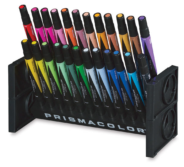
Marker Cases/Stands

Not all of us had these, but you'd see them on some of the desks in the studio. I never considered these a staple, but then again my marker renderings sucked.

ArtBin Telescoping Tubes

To transport rolled-up drawings and draftings, this telescoping ArtBin tube was another must-have. It featured an adjustability ring so that you could alter the overall length; if you didn't lock this down properly, your tube would compress and scrunch your drawing.

The ArtBin tube became a little more fun to wear after Kevin Costner's Robin Hood: Prince of Thieves came out.

I spent a few moments attempting to Photoshop an ArtBin Tube into here, then thought "What am I doing with my time?"

Portfolio Case

Best case scenario was you had your large pads of paper all in one location, either studio or dorm/apartment, but occasionally this set-up didn't work and you had to transport them back and forth. Best then to keep it safe in a portfolio case.

Portfolio cases came in several sizes, and accomplished several things: It kept your pads protected; it made you look like a complete tool; and it visually broadcasted from across the street to the local kids within Pratt's high-crime precinct of the early '90s that you were an easy mark. If you think you can outrun a hard-eyed, boxcutter-carrying 14-year-old with one of these strapped on you, think again.

These things were also  nightmares to carry on windy days.

The Art of Urban Camping, Amsterdam Style

$
0
0

When you think of urban camping you might very well imagine pitching a tent in your friend's back garden or even sleeping on a park bench—solutions that are pragmatic in the moment but not the most inspired or exciting experiences. In an attempt to redefine urban camping, Dutch creatives Annette Van Driel and Francis Nijenhuis have taken over the outskirts of Amsterdam this summer with a unique installation/residence hybrid. 14 architects, designers and artists were invited by the duo to create temporary structures which can be experienced as a sculpture park by day and used as sleep pods by night. The result, which has already garnered visitors from all over the world, offers a unique melding of art and life.

View of campground and campfire, which has been dubbed "The Superfire." [Photo courtesy of Urban Campsite Amsterdam]

Urban Campsite Amsterdam (UCA) is situated in the newest part of Amsterdam, Centrumeiland, the most recent artificial island constructed in the Ijburg neighborhood—a residential area under development to deal with the city's housing shortage— surrounded by the Ij Lake. UCA's exploratory vision has found a great home in this area that exemplifies transition and experimental modes of living. As co-founder Van Driel remarks, "This beautiful piece of land has been a wasteland for a long time; I came up with the idea of a campsite with mobile art to show the outside world how nice the island is."

When setting out to plan the project, "ordinary" was the last thing the dynamic Dutch duo was going for. Embracing the art of urban camping as a collective experience, they created a whole campus including an herb garden staffed by local architecture students, a space for conducting various DIY workshops and a local supermarket as well as a working kitchen and bathroom facilities. Once you have settled in, hammocks provide a place for quiet reflection while a central campfire offers a space for conversation and community. The fire is a keen symbol of UCA's larger goal of encouraging a melting pot of creative minds. "People come from all over the world; we have people from New Zealand and local people from Ijburg sitting next to each other at the campsite," explains Van Driel. This sentiment is shared by the artists and designers who built the installations in an attempt to push the boundaries of how we view and interact with the built environment.

View of the Tribal Toilet Tower by Atelier van Lieshout, made out of discarded ship parts. [Photo courtesy of Urban Campsite Amsterdam]

For the designers, the brief was simple. With sustainability being one of the most important goals of the project, the only stipulation was that the materials the designers selected had to be used in a different way than their intended purpose. As Van Driel notes, this sense of transformation permeates the entire project. "The aim of the installation is to change your view of the surroundings. The installations connect the guests to the place and to the elements of air, sand and water which surround them."

View of campground with Frank Bloem's Kite Cabin in the foreground and Boomhuttenfest's Solid Family and Arjen Boerstra's Attic in the background. [Photo courtesy of Urban Campsite Amsterdam]

Think of UCA as a magical traveling circus, a unique place for exploration where our ideas of architecture and design are pushed to new limits. While UCA cries out for a wider audience to be fully appreciated the world over, Van Driel and Nijenhuis are reluctant to embrace the idea of expansion—at least for the time being. Any moves to other cities would have to maintain the personal touches they have infused the site with. "For us, it's not only a concept but something we really like doing. If somebody else ran the campsite it would be totally different," explains Van Driel. In the meantime, many of the artists remain optimistic that they will be able to find a second home for their structures.

UCA remains open through August 31th. To experience this site for yourself, reservations for each shelter can be made through Airbnb.

Upside Down You Turn Me by Rob Sweere. [Photo courtesy of Urban Campsite Amsterdam]
View of bed inside Upside Down You Turn Me. [Photo courtesy of Urban Campsite Amsterdam]
Three hemispherical windows give multiple—sometimes whimsical—views. [Photo courtesy of Urban Campsite Amsterdam]
Shrink Wrap House by Refunc, made of industrial metal baskets and shrink wrap. [Photo courtesy of Urban Campsite Amsterdam]
Interior view of Shrink Wrap House. [Photo courtesy of Urban Campsite Amsterdam]
Universe 7 by Robbert van der Horst. "With Universe 7, I've tried to escape and to create a possibility for solitude. The sphere itself represents both a globe and traveling in space, yet it is very grounded at the same time. I hope that people who come and sleep in Universe 7 experience a sense of place, and redefine or re-locate themselves while looking at the horizon." [Photo courtesy of Urban Campsite Amsterdam]
Bedbug by Ronnie Kommene& Franka te Lintel Hekkert, made of discarded wood and insulation materials. [Photo courtesy of Urban Campsite Amsterdam]
Interior view of Bedbug. [Photo courtesy of Urban Campsite Amsterdam]
Carved From Wood by Studio Plots. [Photo courtesy of Urban Campsite Amsterdam]
Interior view of Carved From Wood. "The natural materials give an extra dimension to the experience. The interior almost feels like a church...the arcs create a stunning effect," note the designers. [Photo courtesy of Urban Campsite Amsterdam]
Val Ross by Mud Projects. [Photo courtesy of Urban Campsite Amsterdam]
Interior view of Val Ross. "There is so much you can recycle/recreate yourself. For most people the lack of money is the motivator to recycle but it should be about respect for everything around you that will inspire you to re-use your waste," explains the designer. [Photo courtesy of Urban Campsite Amsterdam]

Man Builds Palm-Thatched Huts and Other Structures in the Wilderness, Completely from Scratch, with His Bare Hands

$
0
0

If you had to grab three things from your shop to use for survival in the wilderness, what would you bring? Let's look at some quick options:

Bad Picks

- Tracksaw
- HVLP spray gun
- 1/2"-shank Roman ogee bit
Good Picks

- Hacksaw
- Twine
- Flashlight

As it turns out, you don't even need the good picks to build a habitable shelter. At least not if you're the Australian bloke behind the Primitive Technology blog. Said bloke (sorry, no name available) treks out into the wilderness to experience, firsthand, how our Stone Age forebears built houses several millenia before the Industrial Revolution. Luckily for you and I, he records his experiences in both video and text.

One of his earliest recorded projects was to build a wattle-and-daub hut using whatever was locally available. And by "locally," we mean meters, not miles; the man didn't run down to the hardware store to get an axe, but built his own stone adze instead and built the structure with on-site materials. He built his own primitive step-ladder to get the height needed to reach the roof. He even made—and fired—the freaking mud-clay pot one would use to cook inside such a structure. And all of this stuff was built completely from scratch. Check this out:

Something I dig is that the guy writes follow-up information, revealing how the structure stood up over time. (Though this video was released this week, the actual taping took place two years ago.) As an example:

The roof lasted for a few months before becoming rotten and bug eaten. As an important note the species of palm used in thatching makes all the difference. Had this hut been built in the mountain with wait-a-while palm fronds it would have lasted 2 years at least. Instead it was thatched with alexander palm fronds that deteriorated quickly.


I wasn't to know this and was trying to adapt hut building practice I learned in the mountain to low land conditions (I've built similar huts up the mountain with the same roof shape that have lasted a long time). I hope in future videos to explore better roofing options to use in areas like this.

Perhaps the most amazing part of this man's overall mission is what inspired it: World of Warcraft. As he explains,

I got interested building huts in the bush as a kid playing Warcraft (first game) at a friend's place. I liked how you had to harvest resources, build certain structures before you could unlock different technologies and climb up the tech-tree. I couldn't play it cause my parents wouldn't buy it and I was too cheap to get it myself so I played at "warcraft" in the bush.

I'm actually in favor of these sorts of games (though I haven't played Minecraft yet) cause they teach kids to think and plan through playing a game - sort of teaches them problem solving skills.

This kind of attitude has resonated with viewers; his YouTube channel has garnered over 100,000 subscribers. It's not unusual to find comments like the following after one of his videos: 

"I'd pay just to spend a weekend with you and just learn how to build tools," one viewer writes, "to just experience something authentic and not virtual and build something with my hands."


Removable Shop Drawers for Better Tool Transportation and Storage

$
0
0

Something I like about the EZSTAX system is how the designers have considered the entire process of clothes storage, from laundry room to closet. Thus the system is meant to be brought to the laundry room, with the clothes folded and "loaded" there, then brought back to the larger storage unit and dropped in, pre-organized.

This idea of a storage system with removable, mobile elements is intriguing, so I'm looking around to see if there are any other precedents or applications. The closest I could find is this project on Lumberjocks by user Kabashu, though it's to do with organizing tools rather than clothes.

"[I got] sick and tired of carrying black plastic cases in and out of my shop every time I have a travel job," he writes. "Tired of opening and closing those same cases every time I need a tool in the shop." Here's his DIY solution:

"Problem solved. Things I use the most all in two portable boxes that fit into drawers when I'm in the shop and easily loaded into trailer when working off site. Even made a portable charging station with programmable timer to keep them fresh. Long overdue project!"

Again, this seems like a great 1.0 for what could be a very efficient system. What would those of you with shops do to improve upon this design?

Organizing the Business Cards

$
0
0

While some of us keep all our contact information in digital forms, many people still prefer to keep paper, including business cards. But for business cards to be useful, they need to be kept where they can be found, in some sort of order.

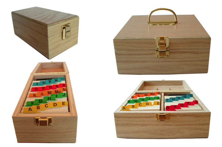
The business card file cabinet from Princess International is a clever idea for those who don't need a mobile solution, and it holds a lot of cards. However, it has the same problem some full-size file cabinets do: Those aren't full-extension drawers, so it's hard to reach any cards in the back.

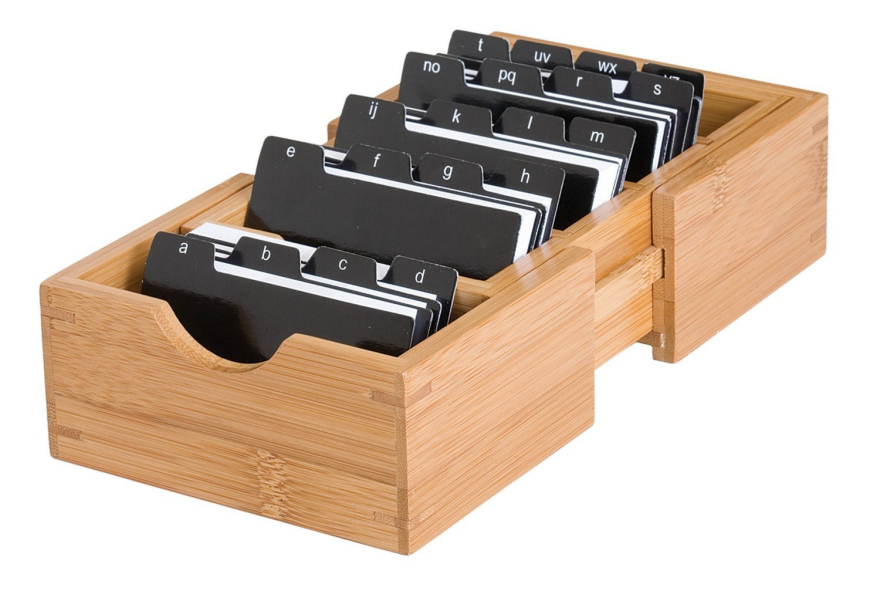
The business card holder from Lipper International has three dividers to help keep the cards upright when the box isn't full—but they can be removed to save space as the box fills. The box is also expandable, so it can accommodate a growing collection while not taking up more desktop space than needed. However, making the box expandable results in two widths, and some purchasers have noted that the index dividers don't quite fit in the narrower sections.

The open top will appeal to those who work best when things are visible and readily accessible, but not those who need to protect the cards from dust or other pollutants. And without a lid, the cards will go flying if the box is accidentally tipped over.

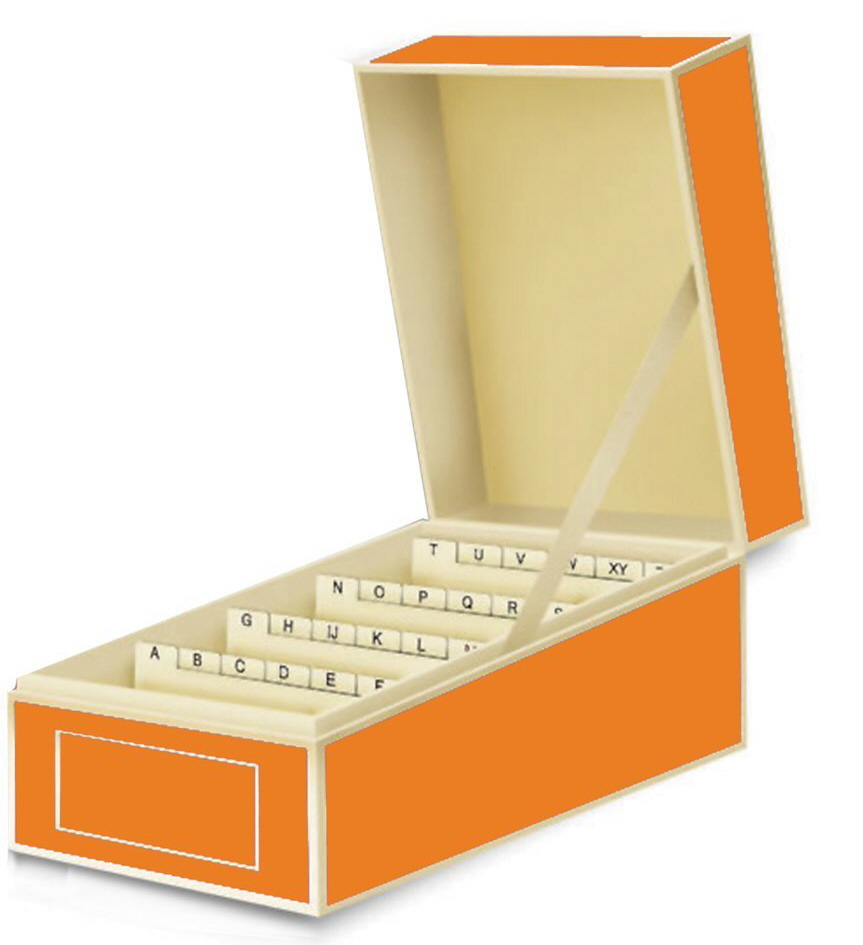
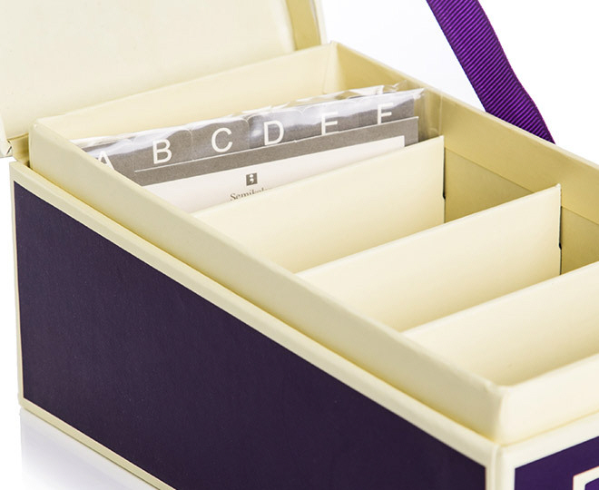
The business card box from Semikolon has a lid—but there's no way to remove the lid entirely, which end users would sometimes like to do. The three internal dividers help keep the cards upright. This box uses individual-letter index dividers, which means the dividers take up more room in the box than if each divider covered a range such as A-C and D-F; however, that's a trade-off many end users are happy to make in order to find cards quicker.

The business card boxes from Organizing For You use a "spring slide assembly" to keep the cards upright. The handle on the double-row box makes it easy to haul this one around if need be. It's designed partly for organizations which collect and share business cards from the members.

The business card box from Helit has a roller-style lid which allows the cards to be covered or not. Since this is a smaller box than some others, it makes sense to have multiple-letter dividers. But the low-contrast design on those dividers might be hard for those with poor eyesight.

The Helit Foster Series, designed by Foster + Partners and made by Helit, includes a number of desktop items; a business card box is one of them. The box is made of high-quality extruded aluminum and it has a fully removable black plastic lid which can be attached to the base of the box. The dividers here are easy to read. 

It's not clear how the dividers are situated in the box; if they are fixed in place this would be limiting, since not all sections would necessarily have the same number of cards. A nice feature is that the dividers seem to tilt forward and back, making it easier to see all the cards as the box gets filled.

This basic business card file sold by The Container Store has one distinct advantage: It doesn't assume the groupings should be alphabetic. I've used this box with clients, and we've created sections based on function: business contacts, friends, medical professionals, etc.

Another desktop alternative is the good old Rolodex rotary file, which is now available with pockets you can insert the cards into. There are both covered and open designs. Each section can include exactly as many cards as needed. It's a design that has endured because it works well for many end users. However, purchasers have noted that sometimes the cards slip out of the pockets.

Those who want to carry their business cards with them will want a business card book or binder. Bound business card books can be frustrating to used because it's hard to keep the cards organized as more get added. But business card binders, which often include index dividers and which allow pages to be added to sections as needed, can solve that problem. (They also allow pages to get replaced if they get torn or soiled.) 

Having seen people put rubber bands around business card books to keep them closed, I appreciate that the EasyPAG organizer comes with an elastic cord.

The Contact Keeper is a unique product, designed so end users can keep business cards together with relevant notes about the person and/or business. It's going to take a lot more space than other business card organizers, but anyone who gets frustrated trying to fit a bunch of notes on the back of a business card might appreciate this design.

"When Furniture Kills:" Let's Cut Through the Hype

$
0
0

There is actually a headline going around this morning that refers to "Ikea's Deathtrap Drawers." Are you kidding me?

Here's what the headline, and other shrill ones like it, are referring to. It's come to light that in 2014, in separate instances, two American children died when they were crushed to death by dresser-drawers from Ikea. The furniture pieces in question were not anchored to the wall, and the children were crushed when the dressers (one roughly 48" tall, the other roughly 30" tall) tipped over onto them.

Details of the deaths are not mentioned, but I think it's a fair bet that the dressers did not spontaneously tip over. Children like to climb things, and if you imagine the top drawer wide open and a child hanging his weight on the front edge of it, you can imagine the rest.

The dressers in question are part of Ikea's Malm line, which are not significantly different than any other mass-market dresser. Ikea has sold them in the millions and each comes with a wall-anchoring kit as well as instructions for how to install it. The story is coming to light now because Ikea has announced they are offering free wall-anchoring kits to the 27 million Ikea customers who have purchased the Malm and other dressers like it from them.

Again, the units originally shipped with wall anchoring kits. Ikea is offering them again in hopes customers will actually use them this time.

The deaths of two children in one year is a terrible thing, but this is not an epidemic. CNN crunched the numbers in a Consumer Product Safety Commission report [PDF] on furniture-based injuries and found that "a child dies every two weeks from furniture or TVs tipping over," and even that is hard to call an epidemic; because according to the CDC, two children die every day from accidental drowning. That should be the cause of more concern, if making a numerical difference is the goal; the drowning deaths outnumber the deaths from falling furniture—including falling TVs—by a factor of 14.

Of course, no child should ever be killed by a piece of furniture, not in an age when we're conquering so many of the things that have cut childrens' lives short for millenia. So where is the problem here? We here in America love to blame people (particularly independent of facts and data), so here are some of the opinions you might hear from the general public:

It's the designer's fault.

Certainly not. Millions of people use these products without issue, and the products were designed to be anchored to the wall.

It's the manufacturer's fault.

Again I have to say no. The manufacturer includes the anchoring kit and instructions.

It's the children's fault.

You just know that some dumb-ass will write this on some internet forum.

It's the parent's fault for not supervising the children.

This is ridiculous. Anyone with children knows 100% omnipresent supervision is not physically possible.

It's the parent's fault for not anchoring the dresser to the wall.

This is where it gets complicated. Here's what USA Today wrote about the matter:

It isn't realistic to expect consumers with small children to anchor all large chests, in part because many can't do it because they live in rental units or there are other issues with their walls, [CPSC Chairman Elliot] Kaye says. And "plenty of parents don't know about the issue," making it far more important for industry to make what could be very inexpensive design changes, he says.

Unfortunately Kaye doesn't mention what those "very inexpensive design changes" are.

For their part, Ikea says they are "[collaborating] with the CPSC to find solutions for more stable furniture."

"We don't know yet what those solutions will be," says Ikea spokeswoman Mona Liss, "but we are committed to working in collaboration to try to find better solutions."

So: What are your suggestions for solving the problem? I'd love to hear some ideas from both a practical designer's perspective, and some blue-sky ideas as if you were an omnipotent government body that had the power to mandate any type of change you saw fit.

A Startling Portrait of African Cities—And How China is Building Them

$
0
0

If a continent's infrastructure is its' bones, then Africa is growing up quickly. From 2000 to 2010, six of the ten fastest growing economies were in sub-Saharan Africa, and the region had to accrue new housing, highways, skyscrapers, factories—much of it financed or constructed by China. Who better to build Africa's new economy? Continent-sized China just had its own growth spurt, one that began thirty five years ago in a few special economic zones (SEZs) and now promises to make Beijing a new megacity five times the size of New York City— a home to 130 million people boasting industries from technology to textiles. China's economy-building industries—construction, real estate financing, urban planning—have found a new home in the African continent. But is Africa filling a Chinese mold? Or is it growing into something entirely different?

Portrait of Chinese construction site manager for a new light-rail line system in Addis Ababa. [Photo courtesy of Michiel Hulshof and Daan Roggeveen]
[Photo courtesy of Michiel Hulshof and Daan Roggeveen]

That question sits at the core of Facing East: Chinese Urbanism in Africa, an exhibition currently on display at New York City's Storefront for Art and Architecture. The exhibit was curated by journalist Michiel Hulshof and architect Daan Roggeveen, both Dutch, who have extensively explored Chinese urbanism in their ongoing Go West Project. For Facing East, the pair travelled to six major African cities—Nairobi, Kigali, Lagos, Addis Ababa, Accra, Dar Es Salaam—over the past three years to photograph, interview and investigate. The exhibition's walls of photographs, along with captions and a short essay, provide a condensed portrait of their experiences. So, what's the verdict? Is Africa, in the words of one Kenyan small-business owner, truly "facing East to our new friends, the Chinese?"

Installation view. [Facing East: Chinese Urbanism in Africa, 2015. Curated by Michiel Hulshof and Daan Roggevan. Storefront for Art and Architecture. Photo by Qi Lin.]
Africans now have a choice between Western and Eastern-driven development and aid. [Facing East: Chinese Urbanism in Africa, 2015. Curated by Michiel Hulshof and Daan Roggevan. Storefront for Art and Architecture. Photo by Qi Lin.]
The show catalogs the broad conditions and consequences of Africa's developing cities. [Facing East: Chinese Urbanism in Africa, 2015. Curated by Michiel Hulshof and Daan Roggevan. Storefront for Art and Architecture. Photo by Qi Lin.]

Facing East does not explore any projects in detail but articulates the broad tensions that are shaping the design and construction of Africa's new infrastructure and cities. While development aid from the West aimed to reduce poverty and improve quality-of-life, China's efforts are purely for-profit ventures. There's no guarantee that rising waters of growth will lift all boats equally. This may be best exemplified by the massive slums that grow around Africa's cities, a product of economic growth—jobs are the in cities—combined with a lack of government planning or services. Hulshof and Roggeveen cite a figure that three quarters of urban Africans live in such slums. This points to the second tension underscored by Facing East: unlike China, Africa is a diverse collection of cultures, governments, religions, and economies.

Aerial view of Kilamba New City. [Photo courtesy of Michiel Hulshof and Daan Roggeveen]
Kilamba New City, a housing development for 500,000 located outside the Angolan capital of Luanda, could have easily been lifted straight from Shanghai or Chongqing. [Photo courtesy of Michiel Hulshof and Daan Roggeveen]
View of the Kenya Commercial Bank Headquarters construction site in Nairobi. [Photo courtesy of Michiel Hulshof and Daan Roggeveen]
View of Thika Superhighway, built by Chinese contractors in Nairobi. [Photo courtesy of Michiel Hulshof and Daan Roggeveen]
Chinese managers oversee Ethiopian workers in this shoe factory in the Eastern Industry Zone—a a Special Economic Zone modeled after Shenzhen. [Photo courtesy of Michiel Hulshof and Daan Roggeveen]

For example, Kilamba New City, a housing development for 500,000 located outside the Angolan capital of Luanda, could've been lifted from Shanghai or Chongqing. But will its inhabitants finds the same industrial jobs that drive China's growth? Will global economics and a host of supporting infrastructure—governmental, physical, and human—make it prosperous? These are difficult questions that only time will answer. Nevertheless, Facing East presents two very different portraits that help give visual substance to that question. The first is physical: sprawling grids of roads, fields of cruciform housing towers, sinuous curves of highways and hardtop, and thick webs of scaffolding. These scenes could've been captured anywhere in China, today or ten years ago, but the second portrait records Africans caught in that growth. It's a Chinese stage but the actors are all-new.

Facing East: Chinese Urbanism in Africa is on view at Storefront for Art and Architecture through August 1st.

Hell in a Handbasket: Amidst the Drought, Californians are Painting Their Dead Lawns Green

$
0
0

This is being presented as a "drought hack," demonstrating how far one can stretch the definition of the latter word.

Amidst California's recent drought, a lot of folks' lawns are unsurprisingly dying. That's what happens when humans try to force particular breeds of nature to exist in inhospitable climates. And so concerned are a subset of Californians with appearances, and so disrespectful are they of nature, that they are now paying in the neighborhood of 25 cents per square foot to have companies spraypaint their lawns green.

To be fair to the painters, both the guy mentioned in the video and this Sacramento-based lawn painter claim their paints are non-toxic. The latter painter claims that "there are no chemicals in the paint that we use, it is and (sic) non-toxic, so it is 100% completely safe for your kids, pets and any other living thing your lawn comes into contact with and for the lawn itself."

I'd like to see more details as to the chemical composition, but none are provided.

Wouldn't a better solution be to do what the southwestern states do, and landscape with cacti and plants that can naturally cut it in the climate?

Viewing all 19151 articles
Browse latest View live


Latest Images