Quantcast
Channel: Core77
Viewing all 19155 articles
Browse latest View live

Guy Throws Basketball Off of Dam to Demonstrate Crazy Effect of Backspin

$
0
0

Last month these guys spent a day doing what most of us do in summer: Repeatedly throwing a basketball off of a 400-foot dam in Tasmania. They were there to break a world record for tallest basketball shot, but ended up making an interesting discovery, or rather illustrating an interesting discovery. Watch what happens when they drop the basketball the second time:

Ridiculous, no? I knew it would have some effect on the ball's path (remember our article on golf balls?) but had no idea it would propel it so dramatically.

After seeing the video, the Veritasium science channel made a video explaining why spin makes such a difference. They also show you footage of ships with crazy-looking cylindrical "sails," as well as an airplane that uses rotating circles instead of wings:


Prototyping the F21 Thread Screen

$
0
0

New York City-based creative agency and rapid-prototyping house BREAKFAST wears many hats marrying advertising, art, graphic design, industrial design and rapid product and prototype production. "We are a unique group with a massively diverse set of skills...as good at engineering as we are at design and ideation," the company writes. "Every employee at BREAKFAST is hands on and have a variety of expertise. We do the work ourselves, and we keep our team small." BREAKFAST lives life in the maker culture fast lane, creating connected devices that are born in technology but exhibit the two primary characteristics embodied in good works of art—timelessness and contemporary relevance.

When clothing retailer Forever 21 wanted a fun technological attraction to connect with their fans around the world, BREAKFAST came up with a massive 11-foot-tall, 2,000-pound monitor to display Instagram shots carrying a "#f21threadscreen" hashtag. The kicker is that the "pixels" are actually multicolored conveyor belts that, when viewed from the front, resemble several thousand spools of thread.

The F21 Screen has over 200,000 custom made parts, including 6,400 specially made, rotating thread spools over which multiple 5½ foot strips of colored fabric rotate; 6.7 miles of fabric set in motion by motors controlled by in-house programmed, designed and manufactured circuitry. What could go wrong?

"This was the first set of modules we put on the superstructure. We purposely wanted to build one column to full height to ensure no unexpected problems arose." Zolty, BREAKFAST Creative Director.

The real story behind BREAKFAST's F21 Thread Screen is one of hard work, experimentation and resiliency in the face of initial failure. Starting with a brief from the retail giant Forever 21 to "do something different," BREAKFAST almost immediately decided to leverage Forever 21's 7.5 million Instagram followers. The #F21ThreadScreen tags are automatically captured, put into a cue and optimized for the 80x80 resolution of the F21 Thread Screen. Then each spool's motor drives the colored fabric band over multiple spools, stopping at the appropriate color/pixel position in the display.

"First PCB to be put together. Most of the components are so tiny that a microscope is required to check if it's been built correctly. There are 200 modules on the screen, each with one of these boards on the back controlling the 36 motors in each module."
"This is an early part of the assembly for the rail that holds the breaker and distribution of where the power comes into the machine." Zolty, BREAKFAST Creative Director.
"This is an accelerated life test machine that we built to see how much wear the fabric belts would be able to take. We simulated many months of wear and stress upon the fabric to ensure they wouldn't fray, lose color, lose their stitches, etc..." 

The decision to integrate the basic building blocks of fashion, thread and fabric, was an organic one. On an interview with Core77, Andrew Zolty, BREAKFAST Co-Founder and Creative Director says, "I don't think there is a single part that didn't go through several iterations." The fact that fabric is a versatile material was an added benefit and was probably the easiest decision made during the process. The F21 Thread Screen required innumerable mechanical and technology decisions, most of which required prototyping to find the optimal solution. 

BREAKFAST prototyped multiple fabrics, using various color printing techniques and elastic fabric combinations to find the perfect mix of surface color and fabric tension. It was apparent quite early on that these were necessary traits since the fabric had to rotate around thread spool bodies at high speeds while retaining mechanical and color integrity. BREAKFAST built test rigs to assess how the fabric would perform over time. They also 3D printed and CNC milled parts before having them injection molded or laser cut to find the best shape and structures.

"We had major problems with static. This is what would happen to the board when the static wasn't getting dissipated correctly. It often would have a foot tall flame that would shoot out it." Zolty, BREAKFAST Creative Director.

Nature does not make exceptions for hard work and the creation of the F21 Thread Screen was a process of testing the laws of nature. Principle among them was static electricity. The Thread Screen comprises multiple modules, and a single module has 36 rapidly rotating spools. Operating them was regularly producing over 20,000 volts of static electricity. The initial grounding system proved to be insufficient. The static would run through the motors, the motor leads, then back to the circuit boards often causing some of the boards to catch fire. The reengineered grounding system now has three redundant systems to ensure all static is properly dissipated.

"This is actually a sad picture. This is a first batch of fabric belts we received. The reason it's sad is if you notice, not a single two are the same length. They were all suppose to be exactly the same within 3 millimeters." Zolty, BREAKFAST Creative Director.

However, one of the biggest hurdles BREAKFAST encountered was the inconsistency in the quality of parts, and their frustrating propensity to change size and shape in response to heat and/or humidity. BREAKFAST found that fabric turning over a wood spool won't keep proper tension if the room heats up just 10 degrees . Despite encountering many challenges during the development of the F21 Thread Screen wall, the final result is mesmerizing, demonstrating that persistence remains an essential ingredient in creating design and technology solutions that resonate.""

"This is a day or two before launch. Mattias Gunneras (co-founder and CTO) is trying to tweak our in-sequence homing to be as full-proof as possible. The in-sequence homing occurs in between each users' photo where the machine looks for a reflective strip on each fabric belt to ensure it's in the position it should be, or adjusts it if not." Zolty, BREAKFAST Creative Director.

A Fictional Lampoon of American Auto Design Becomes a Reality

$
0
0

There are plenty of iconic film cars, from the Back to the Future Delorean to Christine's '58 Fury to James Bond's ever-evolving collection of Aston-Martins. But the only one that made an active commentary on the (then-dismal) state of automotive design was the Wagon Queen Family Truckster from National Lampoon's 1983 Vacation.

The car was written into the script as a simple gag: Family patriarch Clark Griswold is bait-and-switched by an unscrupulous car salesman, shafted out of getting the "Antarctic Blue Super Sports Wagon with the Rally Fun Pack" he'd wanted. The alternative had to look unappealing, and the Warner Brothers prop department responsible for creating the car didn't have to stretch their imaginations to summon up the very worst American automotive styling available in the late '70s and early '80s.

Thus the color of the Wagon Queen Family Truckster was "Metallic Pea." The fake wood paneling extended to the hood. It had eight headlights, each side ringed by an obnoxious eight turn signals. In a nod to poor ergonomics, the fuel inlet was located in the hood—on the passenger side. There were faux intake vents located above the rear wheel wells, as if it were a Countach, and a gaudy metallic logo on the cartoonishly-large C-pillar. The beltline ends abruptly at said C-pillar and with a second, higher beltline materializing to connect to the D-pillar. You might not have thought it was possible to make a 1979 Ford LTD Country Squire station wagon more ugly than it already was, but Warner Brothers pulled it off.

What's strange is that the fictional Wagon Queen Family Truckster spawned a cult following. It's got its own Facebook page, there are artist-created die-cast models and Lego versions of it. But even stranger is that a real-life Griswold family—Steve & Lisa Griswold of Georgia and their brood—decided to build a driveable replica to use for real-life family vacations.

"We are the Griswolds, and, yes, we are heading on vacation," writes Steve. "I have been hearing jokes all my life but love the National Lampoon Vacation movies. So we decided to create our own Griswold Truckster so we can take the kids on some awesome road trips." The Griswolds started with an only slightly-more-modern LTD Country Squire—this one an '84—and turned it into this beast:

These real-life Griswolds have documented the intensive process of transforming the car here.

Nursery Works' Senior Designer on the Making of Its $7,500 Gradient Crib

$
0
0

I don't know about you, but when my opportunity comes to bring a smaller version of myself into this world, you best believe that his or her tiny infant body will only sleep in the most luxurious baby crib money can buy. That's where Nursery Works comes in. The high-end children's-furniture retailer caters to a niche market. Its most expensive product, the Gradient Crib, retails for $7,500 (add $249 if you choose to include white-glove delivery). But what goes into that price tag? A lot, it turns out.

"It's easy to get things to look nice," says Matthew Grayson, a senior designer at Nursery Works. "But getting something that looks nice to also be something you can produce reliably and meet safety standards and to be able to make dozens of them—or hundreds of them—is a lot harder than just making just one nice-looking thing. You have to worry about packaging, fitting it through a doorway, getting it on a truck, not to mention having someone assemble it." Those are welcome challenges for the designer, who has a background in computer science and fine arts as well as an BS in Product Design from the Art Center College of Design, credentials that have allowed him to employ a range of methodologies and techniques to create some of Nursery Works' most extravagant and complex cribs for over three years now—ranging from a model that can convert into an adult-sized desk to one supported by a 24-karat gold base.

What, you want to put an Ikea crib in a house like this?

With the Gradient Crib, Grayson and his colleague Eric Lin began working on the idea in the summer of 2013 as part of a new line for the company. "We were discontinuing a lot of the existing products and moving them to be more high-end," Grayson says. "We were bringing most of the production to the U.S. and came up with a number of early concepts." Narrowing those down to around four concepts, the Gradient Crib in its initial ideation existed as a rectangular crib with a three-dimensional surface on the front.

Grayson and Lin passed designs back and forth for a few months before retiring the idea for a while. "Which is pretty typical for us," Grayson says. "We'll do a first round of design and then put it on the wall and then see how we feel after a couple of months. You let your subconscious work on something and, over that time, we realized that what we had designed was really just a flat, boxy crib with a really intricate front panel."

The designers agreed that to introduce it as a Nursery Works product, they would need to find a way to elevate the design to really take it to the next level. To do that, they needed to make the Gradient Crib more elaborate and compelling. "What we realized was that for that surface to work it really needed to be on a rounder crib, something that didn't have a clear beginning and an end," Grayson says. "So, that's how we arrived at the oval-formed crib."

The Gradient Crib is made in Los Angeles, using only solid maple hardwood.

Grayson began with a wine-glass-shaped crib modeled in SolidWorks, where every slat was the same shape, widening at the base. Using Rhino, multiple surfaces were generated and, one by one, laid across the slats. Those surfaces were then cut away from the slats in a process to see what pattern could still be conveyed at that resolution. With each slab roughly three-fourths of an inch thick, and with around two inches of space between slats, only designs of a particular level of detail could be seen across the crib's exterior. "If you do anything too intricate, it's just not going to pick up the subtle changes and if you do anything too broad then it's not going to look like anything," Grayson says. Moving between SolidWorks and Rhino, Grayson would apply various surfaces to the slabbed model, making adjustments and iterating upon their design over the course of several weeks.

Modeling the gradient

The project picked up again in the fall of 2013 when Grayson and Lin settled on a design they were satisfied with. Imagined in maple hardwood, the final design featured an undulating surface that wrapped around roughly 50 slats to create the exterior of the crib. Nursery Works focuses on small-scale production runs, cutting out many of the problems that typically arise when looking to scale a piece of furniture to mass production. No expense is spared when choosing manufacturing techniques, leading to decisions to employ laser cutting, gold plating and CNC milling in many of its designs. CNC milling was the production method of choice for the Gradient Crib, as the designers worked with a local fabricator in Los Angeles to realize their designs for a full-scale prototype in MDF.

The full-scale prototype gave the designers a sense of what the object would feel like in a home, but little experience of its functionality, so they quickly moved to birch plywood prototypes as they tested construction and assembly. The ability for the crib to convert to a bassinet was an important feature to the designers, as many customers who invest in these pieces look to extend their lifespan. The exterior surface added a layer of complexity to this, and Grayson and Lin had to design the pattern to be continuous, even when panels were removed to complete the transformation. "We didn't want the shape to be lost when you convert to a bassinet," Grayson says. "When you remove that flat panel from the front, you've now taken out a big chunk of that flowing surface. You still want it to be seamless, so you still need it to line up when it's in bassinet form." Grayson and Lin also wanted to avoid any obvious joints where the pieces were coming together, opting instead for invisibly mounted hardware and mattress supports.

Assembling the full-scale MDF prototype
Detail of the slat-on-slat joints
Detail of the screwed and plugged joints

Grayson and Lin tested a variety of ways to connect the hardware and supports, as well, careful to conceal all hardware. Aluminum fasteners were attached into a small pocket underneath the top and bottom rail of the crib, giving a solid anchoring point for assembly while simultaneously hiding all screws from sight. "It's really the most precise way that we could bring it together and allow the crib to remain really sturdy when we're shipping it, or when you're taking it apart into different pieces," Grayson says. Another detail, a separate piece of asymmetrical wood, is popped in during assembly to cover the hardware supporting the mattress, sitting flush to the rest of the crib and keeping the mattress securely in place.

It's that attention to detail—and disregard of typical cost-cutting manufacturing measures—that results in a $7,500 crib. At the end of the day, you can rest easy knowing that your baby is surrounded by some pretty meticulously realized furniture. Maybe it will even subconsciously make your kid love design. A small price to pay, right?

The Zero Waste Movement: This New York City Woman Lives Trash-Free

$
0
0

Every few months I head to the local hardware store for another box of 100 contractor bags. Most of it is for the photography studio that I run, which generates an off-putting amount of garbage, but plenty of the bags go towards my own waste, which I haul out to the curb maybe twice a week. So I was astonished to see that Lauren Singer, who like me lives in New York City, has generated the following amount of trash in two years' time:

I was so stunned that Singer may as well have hit me in the jaw with that jar. How is it possible to live as your average consumer in NYC, eat three square meals a day, buy the things you need to survive, and not generate the 4.3 pounds of trash per day that the average American does? 

Singer was profiled in Laura Ling's "Seeker Stories," providing some insight:

If you're like me, you still had tons of questions after the video: How does she handle takeout food? How does she find package-free cleaning products? Where does she shop? What kinds of compromises does a person have to make in order to live a zero-waste lifestyle? (It should be noted that Singer has not thrown that small jar of trash out but is hanging on to it, so I think it's accurate to say she's living zero-waste.)

Singer has the answer to the questions above, and more, on her Trash is for Tossers website, which details her adventures in zero waste. You'll have to poke around a bit to find specific answers, but that's the point; the more we learn about what Singer's doing and how she does it, the better.

Education Stats: Who Puts in More Hours, Design Students, Architecture Students or Law Students?

$
0
0

The UK's Higher Education Policy Institute has released their annual report [PDF] detailing how many hours college students put in towards learning their chosen field. The students are divided by admittedly rough majors; Architecture students are folded in to "Architecture, Building & Planning" while Industrial Design is lumped in (we assume they counted us) with "Creative Arts & Design." The hours are then broken into three categories: Contact Hours (i.e. classroom time), Independent Study (studio time), and Work Outside University as Part of the Course (internships, we assume).

So, whom do you think puts in more hours, Architecture, Design or Law? Here are the results:

It's not terribly surprising that Med students top the list, but I was surprised to find Design tops Law by one hour a week; assuming a 12-week semester, that's 48 extra hours of instruction per year, nothing to sniff at. I was also surprised that Design students work triple the amount of internship hours that Law students put in.

Of course, the bastards in Architecture kick Design's ass, clocking two more classroom hours a week (96 extra hours a year), a whopping four hours a week of more studio time (192 extra hours a year!), and an hour more each week in internships (48 more hours a year).

Also, this is, kind of depressing: The study lists a lot more survey results than hours logged, and one of the questions was "In which areas would you most prefer your university to save money?" Below you'll see which facilities the majority of students can apparently do without:

Go team.

Lastly, this study was undertaken in the UK, HEPI being a British outfit. So to the design and architecture students outside of Great Britain, how do your hours stack up? Please let us know your country of study and your average numbers for the three categories.

The New "Vacation" Movie Also has a Fake Car

$
0
0

The original 1983 version of Vacation wasn't a great movie, I get it. But at least the Wagon Queen Family Truckster gag was somewhat trenchant, skewering U.S. auto manufacturers of the time for having terrible design sense.

The new 2015 Vacation—centered around original son Rusty Griswold now grown and with a family of his own—comes out this week. It also features a faux car, but if this gag commercial for it is any indication, the scribes behind the newer movie appear to have missed the mark:

Is it me, or is that totally lame? The Wagon Queen's flaws were exaggerations of what one could actually see in American car showrooms at the time: Awful colors, poor proportions, horrific faux wood, excessive fill-in-the-blank. In contrast the "2015 Tartan Prancer" gag tries to be silly for the sake of being silly, adopting a Japanese minivan aesthetic while randomly targeting Albania (its supposed country of origin), nonsensically portraying its people as Tae-Kwon-Do-loving cigarette smokers, which in my eyes renders the bit overtly-manufactured and thus toothless.

After seeing this I then watched a video of the writers/directors discussing the faux car in hopes that there was something clever I'd missed:

Sadly, it seems that these guys have got nothing; there's no real commentary here. I don't mind when we Americans make fun of ourselves, because there's plenty to make fun of and we can certainly take it, but I think if you're going to use another country as a punchline—particularly one that doesn't even have an indigenous auto industry--there has to be a payoff built on something at least resembling truth.

In-Chair Beer Dispensing System (Not Cans or Bottles, But Draft!)

$
0
0

Remember Bottoms Up Beer? That was the system we showed you a few years ago, whereby the company invented a way to fill cups of beer from the bottom of the cup. To refresh your memory:

Obviously that's sped up, but while it looks gimmicky, it's all about efficiency: The system allows the bartender to place multiple cups on the machine, then take the customer's money or take more orders as the cups automatically fill to the exact beer dosage required.

The company estimates that their system serves beer some nine times faster than pouring via tap. In a crowded sports venue that adds up to more cha-ching. But the company is looking past stadiums and targeting a secondary market: You. Here's a home-based Bottoms Up Beer system built into an armchair:

I know what you're thinking: "Yeah, but you've still gotta pony up for the special bottom-filling cups," which from what I can tell run no cheaper than 35 cents a pop. But can you really put a price on convenience? I'll remind you that this system prevents you from having to stand up and walk to the keg, and hold the cup and pull the handle, all of which might burn some of the precious calories you're trying to store.

For those that don't want to hack an armchair system together, the company also sells standalone home units.


Designer/Engineer Builds Steel Treehouse—and the Tree to Hold It

$
0
0

The problem with building a treehouse is finding the right tree. Jono Williams knows this, as he's been building treehouses since childhood, and built this elaborate one as an adult. So for his latest vision, he decided he'd build both the treehouse and the tree.

Williams' Skysphere is a 10-meter-tall steel tower capped with (surprise) a sphere:

Looks like a rendering, doesn't it? These don't:

The New-Zealand-based designer/engineer has spent the past few years DIY'ing it together in his spare time, and settled on this design because it confers the main benefit of a tree—height—without the obstructed views, since the column can be mounted anywhere one can pour a foundation. Not to mention the steel cage structure permits the installation of 360 degrees' worth of windows.

"Too many times I've seen tree houses with the really small windows," Williams writes, "and I'm like 'What's the point [of] building something in a tree when you can't appreciate the surroundings?' With my window (2m high with a circumference of 14m) you won't be short of a nice view – although you will be able to lower curtains if you want."

Circular rooms are great for 360 views, but bring their own problems in terms of furniture. Thus Williams knocked together his own custom built-ins. 

And by "custom" we don't just mean that he made them curved to fit the space; he's also working on a built-in beer refrigerator that automatically dispenses one can at a time through the top of it. Here's the mechanism:

Not as fast as Bottoms Up Beer , but it'll do.

If he gets tired of the view, there's wireless internet, a sound system and a projection screen. Solar panels up top provide the juice. Access is by means of climbing up rungs placed inside the hollow column—Williams says there's enough room inside to ascend while wearing a large backpack—and you can either exit onto the main floor, or continue up to the roof, intended as a stargazing platform. 

To date, Williams has spent NZ $75,000 (about US $50,000) and put in 3,000 hours of elbow grease. He's documented the entire exhaustive process here.

Via Stuff

How to Get Parked Cars Out of Bike Lanes, and Casey Neistat's Entertaining CitiBike vs. Self-Bike vs. Taxi Analysis

$
0
0

It happens every day: The city has graciously created bike lanes along certain avenues, but you don't have to cycle for more than a few blocks before you encounter some jackass in an SUV double-parked right in the middle of one.

New York City is not alone in this, of course; a rather XL-sized cyclist from Brazil finds cars often blocking the bike lanes in his own city, and has come up with his own solution for removing them. What cyclist hasn't fantasized about doing this?

A few years ago we showed you Casey Neistat's analysis of the blocked-bike-lanes problem, and the video was funny enough that it bears a repeat viewing:

Speaking of Neistat and bicycles, I've seen him zip past my block numerous times in the past few years (his studio is nearby) on his own bike. I wondered what he might make of CitiBike, and sure enough, he's made a video analyzing the system in an entertaining way.

He then sent it to the New York Times, who "were forced to reject it due the to gratuitous use of the word ASS," he writes. "I was unwilling to remove the profanity." Here it is, in all its uncut glory:

A Watch with Interchangeable Drop-In Faces and a More Ergonomic Way to Change Straps

$
0
0

One of the perks of a owning smartwatch is that you can quickly change the entire digital face. Now the L.A.-based Covair Watch Company is betting that consumers will want to do that with analog watches as well. Hence they've designed a watch base that will accept multiple faces that the user snaps in and out, as well as a much more ergonomic way to change a watchstrap:

I was skeptical when I heard about the concept, but the video definitely reeled me in a bit. They do make it seem very easy to switch the faces, and I was impressed by the band-changing mechanism, which seems so simple it makes me wonder why no one else had thought of it yet.

Now the question is whether the watch-buying public—of which I am admittedly not a member*—will cotton to it. Covair launched a Kickstarter campaign yesterday morning, and it's too early to tell if they'll hit their $55,000 target.

_______________________________________________________________

*Regular readers will remember how excited I was by the Apple Watch announcement, and how I envisioned it solving a lot of my problems. But when I finally got into an Apple Store to touch a demo unit, I could not figure out how to work it. I'm either getting old or the UI is legitimately confusing. There was also no way to try one on for size.

Those setbacks combined with mixed reviews meant I couldn't justify spending the money. These days the only thing I wear on my wrist is a dog leash attached to two Shiba Inus dragging me toward a fire hydrant, and when I want to know the time on the street, I walk past a parking meter since they all now have built-in clocks.

Ridgid's Tubular Tool Storage, Yea or Nay?

$
0
0

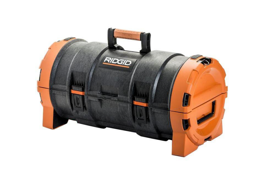
Tons of tool companies have jumped onto the Systainer bandwagon, derivatively creating stacking, rectangular tool storage systems of their own. And while Home Depot's in-house Ridgid brand has followed suit, I was interested to see they've also come up with something quite different: A toolbox shaped like a tube.

I gave it a second look because the form factor is not an obvious choice—so what is the thinking behind it? Ridgid has not released a demo video explaining the design, but I found this video review of the Pro Tube Tool Box, from the guy behind Tool Craze, that at least provides a closer look at the product. (Note that we've set the video embed to skip the first half, in which he covers Ridgid's aforementioned stackable rectangle system.)

As far as I can tell, one potential benefit of the tubular design is that when fully opened, you've got two semicircular-bottomed bins that arguably might be easier to fish around for tools in than if it were rectangular. But does that justify the wasted space? Meaning that the toolbox would occupy a certain volume in your truck, but not all of that space is usable storage.

The second potential advantage I see is that you could certainly store larger tools in this thing, particularly with the tray removed, than you could in a rectangular box.

The third advantage is a Home Depot staple: the price. At less than $30, it seems this thing ought to fly off of the shelves, assuming buyers can make sense of the form factor.

So what do you think, particularly the tool users among you: Does this design represent an improvement over what everyone else is doing, or is it just different for the sake of being different?

Amidst Blazing Temperatures, a "Nugget Ice" Machine Becomes a Crowdfunding Smash

$
0
0

Do you want to know how to raise more than $500,000 in product funding in a single day? Design something that involves ice, and start the crowdfunding campaign during the hottest days of summer.

As the temperature in NYC creeps into the triple digits this afternoon, all I can freaking think about is ice. Yesterday, the Opal Nugget Ice Maker went live on IndieGogo, and the freaking thing raised $516,742 in about 24 hours, blowing way past its measly $150,000 target, and there's still 29 days left to pledge. Here's what it does:

I never realized chewable "nugget" ice was such a big deal to people, but this thing flew off of the virtual shelves. The below-MSRP pricing probably didn't hurt; the machine, which is expected to retail for $499, is being offered at $349 a pop, or $319.50 per machine if you're willing to buy two. (The per-unit pricing gets cheaper if you're willing to buy three, five or ten units, for those of you looking to open illicit cocktail bars.)

Interestingly enough, the Opal is being developed and produced by the FirstBuild Microfactory, that kooky-sounding partnership between GE and Local Motors that we told you about last year. So it looks like that venture is prospering, even as Quirky—whom GE had also backed—is apparently laying off 100-plus employees starting this Friday.

Original Prints of Movies, Music and Photographs are Stored 22 Stories Underground in a Secret Pennsylvania Facility

$
0
0

If you've ever worked in a corporate office, chances are you've seen one of these Iron Mountain file boxes lying around:

I always assumed they were just the people that made the cardboard boxes, and boy was I wrong. Iron Mountain is in fact a gigantic information and records storage company that I wasn't familiar with because I'm not Bill Gates; these are the folks that he stores his enormous collection of Corbis photographs with. As you can imagine, they're not sitting in some warehouse off of the turnpike; Iron Mountain has a special high-security facility, exact location undisclosed, buried 22 stories underground where they store all manner of rare, original prints of creative work.

A former limestone mine, the developed part encompasses nearly 2 million square feet, and has their own full-sized fire engine parked down there in case the shit hits the fan. Check this place out:

All I could think of was, where do those poor 27 office drones get their lunch? Sure they've got a fire truck and some impressive facilities, but I didn't see a Quiznos or a Panera Bread down there.

Tucking Away the TV

$
0
0

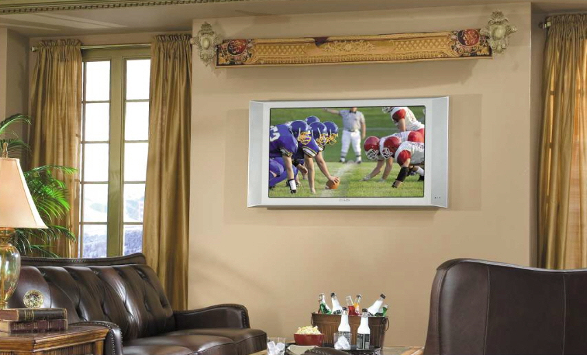
As a professional organizer, I get asked for storage suggestions all the time. And one of the most frequent requests is how to "store" the TV—how to hide a huge flat-screen TV so it doesn't dominate the room when not in use. 

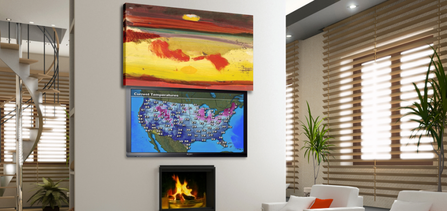
One way to do this is to hide the TV with art. Media Decor has sliding art lifts that move horizontally or vertically, without using any visible tracks. This design allows the end user to use mirrors as well as a wide range of art. It's one of the few designs that uses wrapped canvases, not just framed art. However, it will require significant available space above, below or alongside the TV.

TV CoverUps has a frame that swings outward. This means it doesn't take up much wall space, but having the frame shading the screen might not provide the optimal viewing experience. Also, depending on the placement, people might bump their heads on that frame.

VisionArt uses a motorized retracting canvas with a giclée print; the company says that the print can be rolled up and down an unlimited number of times with no damage. The purchasers can select from a gallery of artwork or provide their own (with proof of ownership) to be reproduced onto the canvas. This accommodates end users who just want to buy an off-the-shelf solution as well as those who want a very personalized product.

Tapestries, Ltd has an LCD cover which might be the easiest product to install, since it doesn't attach to the TV.  It uses a motorized rod and a remote control. 

While all of the prior art-focused designs involve moving the art while the TV stays stationary, Hidden Vision has TV mounts that move the TV around; end users see the art or the TV depending on the positioning. 

The flip-out mounts can extend the TV over a bed for viewing while lying down, which will delight some users and freak out others who don't like heavy things overhead, no matter how securely they are installed.

Flat-screen surrounds (or cabinets) are a low-tech way to hide the TV from view—a nice alternative for users who want to minimize the electronics in a bedroom but can't quite give up having a TV in there.  Cherry Tree Design makes a two-panel and a four-panel model; the four-panel bifold design will require less space on either side of the TV for the doors. There are versions using shoji facings, art glass, photography and fine art.

Cabinets with TV lifts are the other obvious way to hide a television. The quality of the lift mechanism is the most critical issue, but there are other design decisions, too. For example, these cabinets can come with a hinged lid, as this one from Activated Decor does, or they can have a floating lid that goes up and down along with the TV. 

This cabinet from Nexus 21, with its floating lid, has a 360-degree swivel mechanism—something you can't get with a hinged lid. If the cabinet will be used away from a wall, perhaps as a room divider, that swivel mechanism could be important.

Also, items can be positioned on top of a lift cabinet with a floating lid—but I probably wouldn't do that unless they were held in place with museum wax or something similar.

TV lifts can also be incorporated into other furniture, such as this TV bed, with its very slim footboard. This makes for a compact design, but it also reduces flexibility; what if the owners decide, in the future, that they don't want a TV in the bedroom?

Although some of these products are intriguing, it's good to remember that sometimes end users don't need a fancy design. The simplest and least expensive option for hiding the TV screen would be something like this quilted cover that Louise Hornor made for her personal use. Those who aren't as talented are mostly out of luck, though, as commercially available products of this sort are very limited. 


Adding Water to These Cars Reveals a Hidden Paint Job

$
0
0

Thermochromic paint, sometimes incorrectly referred to as thermochromatic paint, is neat stuff. It contains pigments that change color as the ambient temperature changes. And in the labs of a company like the UK's Indestructible Specialist Coating Manufacturer, the temperature at which it changes, and the beginning and end colors, can be selected and calibrated.

Safety-based product design applications are obvious: Imagine a pot handle, or engine part, or machine housing coated with the stuff; as it approaches a temperature too dangerous to touch with bare hands, it turns, say, red.

Practical applications aside, Germany-based grafitti artist Rene Turrek has another use for thermochromic paint. He has combined two of what we assume are his favorite things—high-end automobiles and Marvel's "The Avengers"—to create these weird and surprising pieces of rolling art:

Why a Lamborghini and Captain America? We've no idea. Why not a BMW and the Incredible Hulk?

Turrek has dubbed the project "XCLUSIVECARS," and it seems it will continue beyond these two models; we have no idea where he gets his funding, but according to his Facebook page, he's now gotten his hands on a Ferrari.

"This," he writes, "could be the next XCLUSIVECARS project." 

You guys reckon he'll go with Iron Man this time, or is the red-on-red too on-the-nose?

Samsung Creates Monitor That Will Wirelessly Charge Your Phone

$
0
0

Proving that they're not always chasing Apple, Samsung has designed a unique monitor with a wireless charging feature. Smartphones equipped with the Qi wireless charging standard can be placed onto the center of their SE370 monitor's base, and the juice will flow, absent cables.

I love the idea, and I'm glad Samsung was the first to create one; although I'm a devout Apple user myself, as I've written before I believe that these two giants motivating each other to innovate can only be good for consumers.

That being the case, I still see some 1.0-ishness in this design. First off it wouldn't work for me, as I'm a laptop user who positions my external monitor directly behind my laptop screen and elevated for clearance. To get to my phone I'd have to lower the laptop screen each time.

So let's imagine that I'm one of the desktop users this monitor is designed for. This monitor's charger features a flat design, as most wireless charging stands do, requiring you to lay the phone down on it horizontally. I think that's fine for a nightstand situation, but not appropriate for a workstation.

If I'm at my desk, I want the phone within my peripheral vision at all times. If it's missing because I left it in the breakroom or in my coat where I can't hear it ring, I want to discover that sooner rather than later.

And with the phone on my desk, I want the screen tilted up and facing me. If I forgot to turn the ringer back on after a meeting and a call comes in, I want to see the screen flashing. Or if I'm on a videoconference and a text comes in I'd been waiting for, I want to be able to read it at a glance rather than leaning forward and craning my head, communicating to the others that I'm not paying attention.

These wants or needs, which I assume I'm not alone in, speak of a form factor that isn't flat. I get that wireless charging is about minimalism and making the "dock" as unobtrusive as possible. But I'd prefer the charging mechanism be elevated and angled into a kind of cradle, to place the phone's screen at a more visible angle.

As for it being integrated into a monitor, I'm all for it if the designers can figure out the right form factor. And lastly, I'd wish for it to be off to the side, so we laptop users wouldn't obscure it with our primary screens.

The bottom line is I'm glad Samsung is pushing this initiative, and I eagerly await the 2.0 version.

Once Again a Combination of Design, Fine Woodworking and Roleplaying Games Leads to Tremendous Success

$
0
0

Adults who play role playing games have money, and are willing to spend it on good design. That was the conclusion I came to after seeing Geek Chic's beautiful gaming tables, which carry five-figure price tags and year-long waiting lists. And something I found outstanding about their approach was beyond their design work (which I also liked, by the way); it was that they really paid attention to the customer experience, carefully designing not just the furniture, but the process of how the end user orders one of their products and essentially has their hands held through much of the waiting process during fabrication.

Now another company producing wood products for gamers, this one called Wyrmwood, has again combined good design with clever business sense. First off let's look at their product, which sounds simple, but does something surprising:

I'm not showing you that video to pump up their crowdfunding campaign; it's already over, and they netted $246,719 over a tiny $10,000 goal. No, I'm showing it to you to as an illustration of how designing something relatively simple, but clever, and targeted at a highly specific audience can lead to great success.

If it's not obvious from the video, the guys and gals at Wyrmwood had already designed, and were already selling, their successful dice tower system. What's notable here is that they dreamt of offering it in a much wider variety of wood species—I'm talking 70 and including exotics—that they could not possibly afford to pre-buy the lumber for.

So they turned to Kickstarter to get precise information. By learning exactly how many people wanted exactly how many units in exactly what species of wood, they could order only what they needed. Wyrmwood designer and co-founder Edward Maranville explained their approach to Polygon:

Our Kickstarter is a bit unorthodox, in that the main reason we're running it is to expand our variety of options, not the product itself. While we'd love to offer that kind of variety all the time, we just can't do it from a logistical perspective — we don't have the space for all the lumber, or the inventory.

Keep in mind we offer different sizes and surface options, so if we stocked our 15 product variations in 70 different woods ... it quickly gets very out of hand. But, in the context of a Kickstarter, we can get all the pledges, order exactly what we need and make them in a series of large runs we can manage.

The really clever bit they've pulled off is the part that's easy for Kickstarter novices to overlook: Accurately managing customer expectations. Because Wyrmwood was already tooled up, was already experienced with production times for the existing product and employs enough experienced woodworkers to know that Bubinga and Wenge are a lot trickier to work with than Pine and Walnut, they were able to create a precise system of timelines.

We took our time with the development of the Dice Tower System, refining the production process and figuring out what it takes to make them and how many we can make over a given period. We've set limits on our reward tiers based on this, and so we're staggering out the delivery estimates in batches. The first tier was for 100 backers who would get early delivery a month away. The next is 3 months, the next 5, and we'll simply add on new delivery windows as these fill to ensure we can always deliver on time, as promised.

In other words, these guys didn't...roll the dice with their delivery times. [Cue rim shot.]

"Climate Portal" at Swedish Airport Lets You Experience Faraway Atmospheres

$
0
0

Inside Sweden's Stockholm Arlanda Airport stands a mysterious mirrored box with three doors in it. It looks like a Backscatter machine designed by someone trying to make a splash at the Salone, but in fact it's a Climate Portal; step inside, and you'll suddenly experience the sensation of being in very different weather. "We wanted to create a way for you to experience your destination before even boarding your plane," write the developers. "So you'll know what to expect at the other side of the world."

Each of the three doors contains a different environment: HOT (think Dubai), COLD (like Sweden's own Kiruna in the Arctic Circle), or BIG (like Hong Kong, with accompanying urban imagery).

I'd like to reprogram the portal to really nail specific parts of New York City, for my overseas compatriots who are homesick. Here are my suggestions:

Summertime Canal Street J-train Station
- 110 degrees Fahrenheit/43 degrees Celsius
- 100% humidity
- Floor covered in garbage for atmospheric effect
- Scurrying rats visible amidst the tracks
- Hot, wet wind blows through the chamber to herald the train's imminent arrival
Mott Street in July
- 95 degrees Fahrenheit/35 degrees Celsius
- 95% humidity
- Overpowering scent from nearby fish markets
- Mysterious, pungent brown juice leaking from garbage bags in front of restaurants
Sensation of Walking Down Lower Broadway in August
- 95 degrees Fahrenheit/35 degrees Celsius interrupted every few seconds by blasts of 50 degrees Fahrenheit/10 degrees Celsius blowing out of shoe stores trying to entice you inside with Arctic-level air conditioning and, inexplicably, loud club music
- Your path is constantly impeded by four tourists who have decided to walk abreast on the sidewalk, like they're the Rockettes on stage
- Deafening wail of a passing fire truck blows out your tympanum

Admittedly, it's a work in progress.

French Architect Creates Spider-like Personal Off-Road Vehicle

$
0
0

Pascal Rambaud might be an architect, but that hasn't stopped him from indulging his other passions, like mountaineering and motorsports. Back in the mid-2000s, the latter hobby led him to create an easier way to transport go-karts, which you see here:

That invention, called the DRIV'UP, led to something more complicated that would combine his love of motors with his love of mountains. In 2007 Rambaud began developing a vehicle that was compact, like a go-kart, but which could traverse difficult terrain. Now ready for primetime, he's dubbed it the SWINCAR, and it certainly seems capable of going where other wheeled vehicles cannot:

The electric-powered SWINCAR can run for four hours on a single charge. But perhaps what's most notable about it is its unusual wheels and suspension. When you think of off-roading in a vehicle with that small of a footprint, you probably think of ATVs; those position the rider high up and have their suspension down low, close to the beefy wheels. But the SWINCAR's unique configuration turns this upside down, placing the driver practically at ground level, while moving the mounting points for the suspension far higher, up around where the beltline would be if it was an ordinary car. And the counterintuitively skinny tires seem well-suited to perform the fancy footwork the vehicle is capable of.

Lastly, the SWINCAR boasts a crucial safety feature that your average ATV does not: A rollbar, in case you overestimate the abilities of either the machine or your driving skills.

This is no one-off toy nor vanity project, by the way; Rambaud has partnered with businessman Jerome Arsac and finance/marketing expert Theirry Jammes to form Mécanroc, the company producing and promoting the SWINCAR.

For applications, they foresee uptake by anyone who wants to travel rough terrain without leaving an ecologically-damaging stamp—the electric SWINCAR naturally leaves no emissions and is noiseless—and in addition to those seeking outdoor recreation, the company names both the military and public rescue outfits (think park rangers) as potential target markets.

The company is also seeking distributors, and they reckon the vehicle's unique configuration may help them find some in the existing personal off-road vehicle market. Their "highly differentiated technology [has] no current competitor in the market," they write, and the SWINCAR's unusual design means there's "not [a] conflict with your other product ranges."

Viewing all 19155 articles
Browse latest View live


Latest Images