Quantcast
Channel: Core77
Viewing all 19151 articles
Browse latest View live

Brilliant AR Application: An Expert Can Remotely Overlay Arrows and Data on What You See, Enabling You to Fix Complicated Things

$
0
0

The Model 201-2 was Singer's top-of-the-line sewing machine from the 1930s to the 1950s. It's powerful, quiet, lays down a beautiful stitch, and adjusted for inflation, sold for a couple thousand of today's dollars. I own and have refurbished at least a half-dozen of them.

The machine's bobbin case needs to be periodically removed for maintenance. To do this you need to remove a metal retaining ring, but everyone with vintage Singer experience that I spoke to told me this ring was nearly impossible to remove and even more difficult to get back on. So I kept monkeying with it, and finally saw what Singer's 1930s engineers had intended in terms of functionality—and found it wonderfully elegant. Modern-day folks talked about struggling with the retaining ring for hours, but I figured out how to get it on and off in a manner of seconds simply by following its mechanical design.

Excited, I tried explaining the simple procedure to fellow fixers over e-mail, but no one could understand what the hell I was talking about. In desperation I put together this red-arrow littered photo tutorial which took me hours to produce, thinking all the while, There's got to be a better way!

Well, now there is. A company called ScopeAR has developed Remote AR, a brilliant augmented reality app that allows an off-site expert to see whatever you're seeing—then overlay arrows and text, guiding you to manipulate the correct elements to fix the darn thing. If (like my fellow sewing machine repairpeople) you have no idea what the hell I'm talking about, watch this and it will become instantly clear:

This super-smart app can allow an expert working on things more complicated than sewing machines to be in many places at once, vastly increasing an organization's repair and maintenance effectiveness.

But that's not the real killer app. The way that Remote AR could really make a difference is with the hell that is trying to provide tech support for your elderly parents over the phone:


Building a New Sonic Architecture at the New Museum

$
0
0

Museum displays are typically meant to be seen and not touched, but a recent wave of exhibitions is upending those rules. Take DELQA, an interactive music and light installation opening in the New Museum's NEW INC space on August 6. Showcasing the music of Matthew Dear combined with Microsoft's Kinect technology, the project allows participants to touch, push and poke suspended mesh walls to manipulate a musical composition, creating their own unique experience of the space.

The architecture of DELQA is the work of the Brooklyn design studio The Principals, which last May was invited to join a project team that included Dear, the strategic music agency Listen and the artist and programmer Charlie Whitney. "In the beginning, we talked about examples of sonic architecture, mainly forests," says Drew Seskunas, a co-director of The Principals. "The idea that a forest is a series of architectural narratives: meadows, groves and valleys that sound and wind narratives flow through. Visually and aurally there are connections, but physically there are distances."

Finishing installation at the New Museum prior to the public opening on August 6

This concept of deep forests became the foundation of the project, and The Principals set out to use different densities of mesh netting to create a space rife for exploration. "For DELQA, we felt it was important to test visitors' assumptions, but also to give them a point of reference," Seskunas says, "so the geometries are reminiscent of earth-like landforms and mountain topography." That topography became known as DELQA after Dear sent over a file with a random title of the same name. "A member of the team commented on how it sounded like a distant planet, and all of a sudden it became apparent that that was exactly what we were doing: creating a new world," Seskunas says. "Somewhere out in the unexplored territories, we were discovering DELQA."

The Principals began building physical models and, before long, full-scale prototypes. "Often we work with new geometric systems or material applications, so it's much more efficient to go from prototyping to fabrication in house," Seskunas says. He and his fellow Principals built out a quarter of the final installation in their production studio in Greenpoint, so that the sound designers and programmers on the project team could work off the partially constructed piece to test the technology and various components.

Building the full-scale prototype in The Principals' Brooklyn production studio

For the mesh, The Principals used two different densities—a nylon netting at two-inch density and a fine spandex—and had a factory in New York's Garment District sew several 15-by-12-foot panels for the installation. These panels were then adhered to large aluminum frames, and a Microsoft Kinect was used to map the resulting surfaces to track depth and location as the surface is touched from the opposite side. "Both [mesh densities] have inherent qualities, which we used to define the spatial relationships," Seskunas says. "For instance, people inherently want to climb or lie in the open mesh, which allowed us to use the Kinect to track their movements. In response, certain aspects of the song alter directly to [that information]. The denser mesh has this very tactile quality that, paired with curving forms, creates an architecture people want to touch."

The Kinect is able to sense movement on or within the mesh landscape, transferring that data to a 32-speaker sound system. Listen managed the sound design for the project, and designers Dave Rife, Gabe Liberti and Yotam Mann, working directly with Dear, pulled out different elements from the composition and assigned them to specific inputs. Mapping and tracking information controls elements of these sounds—such as pitch, level and reverb—each linked to a local area of the mesh netting. "When you put this all back together you have a complex landscape, both sonic and architectural, that changes as you interact with it," Seskunas says.

More photos from the prototype construction and testing
Testing the finished installation at the New Museum

For final construction, that quarter of the installation in Greenpoint, along with all the other pieces, will be transported from The Principals' production studio to the New Museum. A ten-foot-tall structural aluminum frame measuring 24 by 32 feet is prepared to be built for the first phase, as lighting and sound teams will attach speakers, lights and Kinects to the frame, placing computers where needed. Once the aluminum frame is constructed, The Principals will begin placing the mesh netting, at which point acoustic, light and interactive testing will also begin. To allow for on-site calibration, the entire installation is required to be built and running at least three days prior to opening—meaning that by the time this article is published, construction has already gotten underway for the public opening on Thursday.

If you're in New York and want to experience DELQA in person, you'll have to act fast—it's only on display for four days, from August 6–9. For those interested in checking out more of The Principals' work, the studio be participating in the stage design of MoMA PS1's Warm Up series again this year. For the August 15 and September 5 shows, a site-specific piece titled "Hold me closer tiny (Air) dancer" will place a field of air dancers along the perimeter of PS1's roof overlooking the dance pit, for an entirely different kind of interactive music experience.

Have a Happy Hand-Eye Birthday!

$
0
0

Hand-Eye Supply has been doling out cool functional tools and good times for five whole years! To celebrate a major handful of good times, we're doing the right thing and having a party

If you'll be in Portland this week, come by the shop on Thursday, August 6, for fantastic food, live music, free stuff, live printmaking, craft beer from Fort George Brewing, and a lot of cool creative company.

Tell your friendly PDX folks and come eat pies!

Midcentury Modern Mad Men Merch, All For Sale

$
0
0

It's weird to think that fictional television shows not only have a cultural impact but can also influence what objects people will buy. When Sons of Anarchy, a show about a rather violent gang of bikers that rode Harleys, was at the height of its popularity, it reportedly led to an increase in sales for Harley-Davidson at a time when they badly needed it. According to a 2014 article in the Hollywood Reporter, "The long-running popularity of Sons of Anarchy . . . has been a godsend for the motorcycle industry, which was hard-hit by the financial crisis."

More from the Reporter:

...Sons of Anarchy has been especially beneficial for Harley; the show has helped make the brand hip with younger riders to the point that Harley now leads the 18-to-34 market. (The maker provides the motorcycles to the show and has a deal with Marvel that has placed bikes in films including Iron Man 3.) Last year, Harley's U.S. sales were up more than 6 percent over 2012.
"We basically saved Harley," says Sons of Anarchy co-star Mark Boone Jr. (Bobby).

Similarly, at the height of the Mad Men craze, Banana Republic released a line of retro menswear. It's also not a stretch to imagine that Design Within Reach's showrooms probably experienced increased foot traffic, as laypeople that didn't have to sit through the History of Furniture Design classes we ID'ers did now had some context for midcentury modern furniture.

Well, cable channel AMC has either hit hard times or is running out of room in its warehouses; the Mad Men–owning network is now auctioning off what seems to be every single item that appeared on the show, which ended its run earlier this year. 

We don't see any Eameses or Saarinens on the list, though there's plenty of furnishings that looks like they were vaguely involved. (They weren't, at least in what's on offer here; the good stuff was presumably snatched up by the show's stars as they vacated the set.) 

There are also appliances, kitchenware and boozing paraphernalia, from ice buckets and bar carts with removable tray-tops to a Japanese-made cocktail-preparing set.

The big-ticket item is Don Draper's 1965 Cadillac. There's no word on whether the thing even runs—"VEHICLE IS SOLD AS IS," the description says, capitals theirs—yet it's up to 25 large at press time. Not too shabby considering "All winning bids"—that's everything sold through the auction, not just the Caddy—"will have a 24% buyers premium added after closing."

If you've got your eyes on the Coupe de Ville, or anything else on the list, you'd better hurry; the auction ends this Thursday.

Design Student Builds on Thingiverse Breakthroughs for 3D-Printed Clothing Project

$
0
0

While 3D printing enables rapid prototyping for product designers—emphasis on "rapid"—the production method's uptake by the clothing industry has been slow. But it seems it will happen, eventually; a few times a year another 3D-printed clothing story comes over the wire (see list at bottom), and the latest concerns Danit Peleg, a recent graduate from Israel's Shenkar College of Engineering, Design and Art.

Peleg designed and printed up a five-piece fashion collection for her degree project, starting last year with a crash course in 3D printing. After experimenting with different affordable printers from Makerbot, Pursa and Witbox (i.e. not the high-end Objets that established designers like Iris van Herpen have access to), Peleg tried and rejected PLA, the typical go-to material. "[It's] a hard and breakable material," she writes. "I was not getting very far because the material is inflexible, which is the key property of a 'real' textile."

Peleg continues:

The breakthrough came when I was introduced to FilaFlex, which is a new kind of filament; it's strong, yet very flexible. Using FilaFlex and the Witbox printer, I finally was able to print my red jacket.
Though it was great to finally be able to print this flexible jacket, I also wanted to see how I could create more elaborate textiles for the rest of the collection.
Now that I found the right material, I started experimenting with different types of patterns. I found Andreas Bastian's Mesostructured Cellular Materials and by combining his incredible structures (and new ones I created with the same approach) and the flexible materials, I could create lace-like textiles that I could work with — just like cloth.

When the history of 3D-printed clothing is written next century, Peleg's pieces will surely seem primitive; but what's interesting about them in 2015 is that she's not just creating geometric lattices to emulate lace, but is cribbing Bastian's structural work (available on Thingiverse) to make her pieces bounce and flow.

Peleg is not 3D-printing clothes just for the sake of being different, and she's not working alone in a lab; instead she's investigating materials, and building on the work of others in the community, in an effort to advance the technology to the next level. And extra points, in our eyes, for doing the work on relatively entry-level machines.

See Also:

Helena Lukášová's work at the 3D Print Design Show

The Premise and Process behind the Verlan 3D-Printed Dress

Digital Fabrication and Fashion Intersect at Paris Fashion Week

Carnegie Mellon & Disney's soft-materials 3D printer

Mimi Vandermolen, the Ergonomics Genius Behind Ford's "Rounded Edge Revolution"

$
0
0

In this week's Designing Women profile, we take a peek into the archives of Ford Motor Company's Design Studio—now celebrating its 80th anniversary—and find an extraordinary woman along the way. 

Mimi Vandermolen posing with the 1993 Ford Probe. All images, unless otherwise noted, courtesy Ford Motor Company Archives. 

Although the studio was established in 1935, it wasn't until the end of World War II that women joined Ford's design team. With men still off at war and automobile manufacturing beginning to ramp up again—all passenger car manufacturing had come to a halt during the war, as factories were retooled for military purposes—they filled an important gap. Illustrator Leota Carroll was the first woman designer hired, and she was followed by a handful of others, including Beth O'Rourke and Doris Dickason (who designed steering wheels and instrument panels), Florence Henderson (ornamentation) and Elre Cambell and Letha Allan (color and trim). But their tenure at Ford was short lived, and by 1948 the female designers had all departed, replaced by men returning home from the front lines. Ford's Design Studio wouldn't hire another full-time female designer until 1970, when Mimi Vandermolen joined the team and became part of a very small minority of female automotive designers worldwide.

Vandermolen was born in the Netherlands and raised in Toronto, where she was one the first women to study industrial design at the Ontario College of Art and Design, graduating in 1969. Her first design job out of school was with Philco, a home appliance company formerly owned by Ford. From there she transferred to Ford's automotive side, where she worked as a trainee on the Mustang II exterior and, later, its interiors. The resulting 1974 redesign was a radical new model type—coming in 19 inches shorter than its predecessor, it had more in common with a Ford Pinto than a first-generation Mustang.

The 1974 Ford Mustang II
This hatchback version of the Mustang II shows the compact Pinto's influence on the redesign
Vandermolen and colleagues at work on the Mustang II

Next, Vandermolen joined the team for the redesigned 1975 Granada, working on both the interior and exterior designs, but the oil crisis hit the auto industry hard and she was laid off from Ford in 1974. Determined to continue her career, she went to work for two years at Autodynamics, which handled outsourced jobs from Ford, General Motors and Chrysler. In 1977, Vandermolen went to Chrysler for a few months but quickly left when Ford invited her back to the interiors department to work on the "Panther" platform that included Ford's full-sized sedans, like the Grand Marquis and Crown Victoria. In 1979, she was promoted to Design Specialist, and around the same time she was invited to join "Team Taurus," the studio behind Ford's game-changing 1986 family sedan.

Vandermolen posing with the 1975 Ford Granada

Vandermolen led the interior design of the soft-shaped Taurus, whose styling was a radical departure from the barge-like sedans cruising the streets at that time. She used the car's interior platform to echo the sedan's exterior curves, and in the process fought to introduce the principles of ergonomics—an area of design that Detroit had been slow to embrace. Many of her user-friendly interior innovations we now take for granted: She pioneered tactile controls that are recognizable by touch, introducing a raised bump on one end of buttons to indicate "on/up/closed" and a depression on the other end for "off/down/open." She also replaced the typical climate control push-pull switches with rotary dials, and created an optional digital instrument panel that gave the interior a futuristic flair. All of this was contained in a dashboard that centralized the controls and put them within easy reach of the driver, whereas virtually every American-made car before the Taurus had a straight dashboard, requiring the driver to lean forward to adjust far-reaching controls. Vandermolen was also concerned with making the seats more ergonomic, rejecting the longtime precedent of straight seat backs that were cushy like a sofa. The process to find a more supportive seat shape took over two and a half years and 100,000 miles in prototype testing, making it the most extensive seat evaluation Ford had ever undertaken. 

When the groundbreaking Ford Taurus was released in 1986, many compared its soft styling to a bar of soap or a jelly bean.
The user-friendly 1986 Ford Taurus interior designed by Vandermolen, who centralized buttons and controls and made them recognizable by touch. From the Collections of The Henry Ford

Car and Driver praised Vandermolen's efforts with a review that called the interior "a bold attempt to reorder the priorities of American-made family sedans." She credited the Taurus's design success to the studio's forward-thinking attitude, saying Team Taurus often asked themselves, "Are you ready to go into the '90s with this car?" Ford called the Taurus a "Rounded Edge Revolution," and it quickly became the country's number-one selling vehicle, making up 25 percent of the automaker's North American sales and steering the company out of a previous downturn.

An optional digital instrument panel gave the Taurus futuristic flair.
Taurus seat prototypes underwent 100,000 miles of testing to make them more supportive and ergonomic for drivers. 

In 1987, Vandermolen was promoted to the position of Design Executive for small cars, overseeing interior and exterior design developments in North America—a first for a woman in the automotive industry—and also running a special studio to develop futuristic design concepts. The first design that Vandermolen headed from start to finish was the 1993 Ford Probe, the second-generation model of the company's small sports coupe. A 1992 Businessweek article credited the Probe's streamlined knobs and door handles, lightweight trunk door and lowered front end to Vandermolen's interest in improving the driving experience for women—her design process included asking her male designers to wear fake fingernails and threatening to make them wear skirts while getting in and out of the car. This focus on women drivers was a point of pride for Vandermolen throughout her long career at Ford; she once told her boss, "If I can solve all the problems inherent in operating a vehicle for a woman, that'll make it that much easier for a man to use."

For a longer read on Vandermolen's career and an interesting window into design at Ford in the '70s and '80s, don't miss the transcript of her 1990 interview for the Automotive Design Oral History Project.

Vandermolen redesigned the 1993 Ford Probe with female drivers in mind; the car was a collaboration between Ford and Mazda. Image via Car and Driver
Interior of the redesigned Probe. Image via Car and Driver

This was the latest installment of our Designing Women series. Previously, we profiled Aino Aalto.

LaCie Celebrates 10 Years of Rugged Hard Drives

$
0
0

In 2007 Apple came out with the iPhone, the indispensable and fragile piece of glass that we end users are constantly buying protective cases for. The previous year, computer hardware company LaCie also came out with an iconic, handheld rectangular product, but this one had physical protection baked right into its design. LaCie's Rugged Hard Drive, debuting in 2006, was a sturdy steel box that came wrapped in a bright orange rubber sleeve for protection.

Why orange? According to designer Neil Poulton,  because the color is synonymous with "boy toys, Tonka Trucks, construction site hard hats, Caterpillar and JCB diggers, inflatable life rafts…but mostly because the rugged is a basketball to be bounced," he explains. "And basketballs are orange."

Poulton's original sketches

The company considers this the Rugged's 10-year anniversary, since the project was initiated in 2005. And as Poulton reveals, the early phases of the project did not go well, nor stand up to executive dentition: "We did about a million hardness tests and still couldn't get the Shore value (durometer/hardness rating) of the bumper right," he explains. "This bed's too hard, this one's too soft. The first Rugged prototype had a hinged rear door flap which LaCie's then-owner physically tore off in a rage. With his teeth."

"Plus," he adds, "we couldn't get the bumper to stick to anything for all the adhesives in the world, so we turned the problem into an easy-to-change after-sales feature. And the waffles were added to box-section strengthen the sheet steel plates which kept bowing in and out with a popping sound. Very rugged."

In the years since, LaCie has tweaked the product, bringing it from a paltry 80GB to a more modern 1TB; they've produced a mini version and a USB key version; they added Thunderbolt connectivity in 2012; and this year's offering, the Rugged RAID, is a 4TB beast with a housing that can handle one ton of pressure.

Along the way they've gained a following among adventure photographers, off-road videographers and even Hollywood TV shows that have to ship footage back and forth; on their blog, the company brags that the Ruggeds are go-to pieces of kit for a National Geographic show traversing Baja, a photographer capturing Antarctica and the oceangoing crew of the Explorer's Network.

It seems the only place this hard drive hasn't yet been is outer space, which is a bit ironic considering the following: When asked what the design inspiration was for the original rugged, Poulton revealed it was "The front bumper of the Captain Scarlet SPV (Spectrum Pursuit Vehicle), from the [British] 1960s Gerry Anderson TV show."

[Rendering by Nick Stevens]

"Captain Scarlet was indestructible," says Poulton, "and so was his SPV."

Designers: Did You Ever Watch the Team That Must Install What You Design?

$
0
0

Imagine you're an architect, or an industrial designer or an interior designer, and you're designing someone's kitchen right down to the cabinets. So you draw your plans up in your perfect little CAD world, where everything is level, plumb and square. Then you spec out quartz countertops, because the material is as attractive and durable as granite, just without the maintenance. There are some irregular cuts to make, but those are easy to draw with your mouse.

Then you send the dimensions off to the fabrication house, kick your feet up and crack a beer.

What happens next is a team of guys have to come into the actual space to measure it precisely. Your dimensions were good enough to calculate square footage and an estimate, but not good enough to set tool to material. Said guys come back two weeks later with the finished surfaces, and are now faced with the fiendish task of getting it all level, square, and most importantly, seamless.

We've been following Frank Howarth's kitchen remodeling project for quite some time, and as talented a builder as he is, architect Howarth knew it was better to call in pros to handle the quartz countertops. Though he didn't do this part of the job himself, he did document all of it, giving you some idea of what these three dudes go through to get kitchens looking purty. He also explains why he really liked watching them do what they do:

How cool are those cam-lever-equipped vacuum clamps? I can't decide if I like that or the string-not-laser measuring contraption.


Watch It Live Now: Transforming Warehouse Structures Into Creative Workspaces

$
0
0
Live from Portland, Oregon! - Carrie Strickland and Bill Neburka of Works Partnership Architecture

Tonight at Curiosity Club: we'll hear from Carrie Strickland and Bill Neburka, architects and principals at Portland's Works Partnership Architecture. They'll share their focus on the possibilities of how cellular environments can adapt to a revolving cycle of inhabitants. In other words, we'll hear about pirating old spaces for cooler new uses! At the Hand-Eye Supply store and streaming on the Curiosity Club homepage at 6pm PST.

The attraction to frame buildings (warehouse structures) being adapted to creative workspace in Portland is a fairly recent phenomenon, but the notions behind the frame is quite historic. Frame buildings allow for ultimate flexibility in use, not just for one singular moment in time. Frames are literally architecture's equivalent of a sheet of graph paper, anonymous and universal, but expectant with future particularities. How a structure's architecture is informed and might be inspired by framed, cellular space will be discussed in an engaging conversation at the Curiosity Club.

Carrie Strickland and Bill Neburka founded Works Partnership Architecture in 2005 and have been pushing the opportunities of architectural design ever since. Today, the bulk of their built work is commercial or mixed-use. Their aesthetic is stripped down and industrial; they think of themselves as pragmatists. One of their most elegant buildings, BSide6, is a vastly updated version of the arcaded structures that gave one stretch of Portland's east side its unique character.

BioLite Shares the Case for Parallel Innovation

$
0
0

Sometimes, all it takes is a spark to launch a potentially world-changing idea. Long eclipsed by coal, oil and renewables, wood is no longer regarded or used as a primary source of energy in the post-industrial world. Yet wood is still widely used for cooking in the developing world. According to the Global Alliance for Clean Cookstoves, nearly half of the world still cooks on open wood-burning fires, and improper ventilation in cooking areas leads to over four million deaths per year.

BioLite, a company who is on a mission to bring "Energy Everywhere," has been developing technologies and products for two seemingly disparate markets—the outdoor camp market and emerging markets in the developing world—through a process of parallel innovation. Using the same fundamental technology, their first product offerings harnessed energy from wood-burning fires to power small consumer electronics like cellular phones, LED lights or headlamps.

As part of an ongoing interview series on the Autodesk Foundation's blog, ImpactDesignHub.org, Core77 spoke with Director of Industrial Design Anton Ljunggren and Director of Marketing Erica Rosen about their insights on building a lean startup, the BioLite parallel innovation strategy, and designing products with true social impact.

Read the full interview with Biolite on ImpactDesignHub.org

Energy Everywhere: BioLite's New NanoGrid System Lights The Way

$
0
0

Obvious though it may be, seeing the forest for the trees is a felicitous reference point when it comes to describing BioLite, a Brooklyn-based company that develops innovative products for two disparate off-the-grid communities. After all, the metaphor is as felicitous for recreational campers as it is in the world of social impact, where initiatives often lose sight of long-term solutions in favor of near-term impact. The company launched with a clean-burning wood stove that converts heat from the fire into electricity. In a process of parallel innovation, the technology serves both avid campers in the outdoor market and home cooks in emerging markets. With its latest product system, collectively known as the NanoGrid, BioLite demonstrates the kind of long-term thinking that is paramount to good design, expanding its ecosystem of products designed to make the most out of limited resources.

The NanoGrid system includes a PowerLight torch and two tethered SiteLight directional lamps.

"BioLite is built on the wood-burning CampStove and HomeStove, which both generate electricity from the heat of the fire," says Anton Ljunggren, BioLite's Director of Industrial Design. "People use the electricity for two primary reasons: phone charging and lighting. To complete the company promise of 'energy everywhere,' we needed a solution for storing the power that the CampStove and the HomeStove produce."

Enter the PowerLight, a three-in-one lantern, torch and powerbank that can hold 16Wh of energy: "Enough to charge three smartphones," says Ljunggren. The energy can also be discharged as light when the device is in either its 200-lumen lantern mode or 250-lumen torch mode. The illumination can be further distributed via tethered SiteLights: dimmable, directional lamps that extend the range up to 10 feet each. A PowerLight parent with two SiteLight children comprises a NanoGrid; a pair of the hemispherical satellite luminaires magnetically snaps together for storage and transport.

The SiteLights are as thoughtfully designed as any of BioLite's products. In order to pack 150 lumens of power into the compact and lightweight form factor of the auxiliary lamps, Ljunggren notes that, "we had to play with the electronics to get the hardware we wanted." He elaborates: "By boosting the power to 13V, we could use a thinner cable which allowed us to fit in 20ft of cable spooled up in a compact form factor of two lights coupling to a sphere the size of a tennis ball."

Meanwhile, if BioLite's wood-burning stoves are built on thermoelectric technology, the core product of the PowerLight is a robust rechargeable lithium-ion battery — the same as that of the Tesla Model S — which is peripheral in more than one sense of the word. "'Edgelighting' means that the light bounces inside the plastic," explains Ljunggren. "The light has to travel meaningful distances inside of the plastic which means that the optical properties of the light guides are important."

Known as "Total Internal Reflection," this phenomenon is just one of the insights that drove the design of the PowerLight and SiteLights. Although acrylic is the most optically clear material, the design team ultimately opted for polycarbonate, which is less brittle, since they, "needed high impact resistant materials for the exposed lightguides to be durable enough for both the outdoors and the emerging markets."

This is what BioLite calls parallel innovation, the underlying principle of developing products that serve both the recreational market and those who'd need them on a daily basis. Another metaphor comes to mind: Outdoor enthusiasts are the proverbial frying pan and emerging markets the flame; the company is forged, so to speak, in both.

In fact, it was off-the-grid scenarios that inspired the NanoGrid in the first place. "The idea of the NanoGrid came from the need of lighting multiple rooms in rural dwellings in India and Sub-Saharan Africa," relates Ljunggren. "Most solar lights in our price range light up one room while the NanoGrid can be extended to light up up to five separate rooms through the daisy chain-able SiteLights."

Thus, both the hardware itself and the system as a whole embody the elegance of efficiency that characterizes all of BioLite's products and its mission as a whole. By using technology to maximize limited resources, the company remains focused on solving problems for those who will benefit most, and the NanoGrid is as much a rechargeable lighting solution as it is an investment in improving users' quality of life in the long term.

To learn more about BioLite's process of parallel innovation, read our interview with the company on ImpactDesignHub.org.

Iwachu Skillets: Effortless Japanese Cast Iron

$
0
0

Cast iron is a known Good. Its even cooking surface, versatility and durability have made cast-iron pans into vital kitchen staples all around the world for hundreds of years. To usefully update such an old technology usually comes down to the details, and Iwachu skillets are a prime example. 

Nambu tekki (or nanbu tekki, depending on which part of the Internet you ask) is a traditional form of ironware, made in Morioka, Japan, for over 400 years. It is still used in simple, high-heat kitchen tools like kettles, griddles and bakeware. This type of ironware is made in a proprietary process resulting in a higher quality material, thinner wall thickness and a satisfying, slightly pebbled non-stick surface. That means you get a lighter weight cast-iron pan without sacrificing even heat or durability. Past their use of this credentialed construction, the key design feature in Iwachu skillets is subtle: their gentle sloping sides and unusually long cut-out handle dramatically improve ergonomics. 

Though they're called "omelette" pans, the graceful shallow shape is good for all kinds of sautes, sauces and bakes. That longer, subtly-curved handle allows better grip, cools faster than traditional handles, and is well angled for fancy wrist-flipping. Pre-seasoned and now available in two sizes, over at Hand-Eye Supply

Double-Faced Watch Design: Luxury Analog on One Side, Apple Watch on the Other

$
0
0

Internet hoaxes abound, but I like to think my BS meter is correctly calibrated. So what's worse than when the needle goes into the red, but the gotta-be-a-gag product you're presented with appears to be real?

Unless Jimmy Kimmel is behind this, it appears an upstart watch company called Nico Gerard is releasing the Pinnacle, a luxury analog watch...that features an Apple Watch on the other side of the band.

Without even getting into the ergonomics, this product doesn't make sense on so many levels. The two most glaring reasons are that one, the $9,300 entry-level version comes with an Apple Watch, but won't ship for another 10 months to a year—at which point the Apple Watch 2.0 will have already been on the market for a few months. Number two, the Pinnacle is described as being water-resistant to a 100 meter depth; the Apple Watch is not designed to be submerged.

I've never heard of the Nico Gerard brand, although admittedly I do not follow the luxury watch market. But the BS meter starts ticking when studying their website, which claims the company is "a technology-driven luxury brand that continues a family tradition of innovation," without naming the family, the traditions or the innovations. And while their watches are apparently "crafted in Switzerland," the company appears to be based in San Francisco, not exactly a historical bastion of fine watchmaking.

In any case, those in the market for this two-faced watch that don't want to wait 10–12 months can pony up for their 18-karat gold edition, which rings in at $112,000 and ships in six to eight months. And if the new Apple Watch is out by then, perhaps they can make an attachment on the band to accommodate a third watch.

DiResta's Cut, Episode 02: Go With the Flow

$
0
0

In this second episode of our "Diresta's Cut" series, Jimmy DiResta starts out with a loose plan that Mother Nature instantly sends off of the rails. After encountering a ruined cedar tree on his property in upstate New York, Jimmy figured he'd make something out of the stump; but after cutting it down, he found the tree had been rotting on the inside, leaving a large vertical void through much of it.

Unfazed, DiResta hauled it down to his tool-filled Manhattan shop, determined to find a beautiful, functional object inside this seemingly worthless hunk of trunk:

Did you miss DiResta's Cut, Episode 01?

Horrifically Dumb Fire Truck Handle Design Has Led Firefighters to Accidentally Crush Their Thumbs

$
0
0

A fire broke out across the street a couple of weeks ago and the building was evacuated. See the doorway directly under the traffic light on the right? I shot this photo right after the FDNY showed up and breached that door. As the smoke began billowing out of the doorway, I watched eight of them strap their gear on, pick up their stuff and calmly trudge into the smoke single-file.

They were as calm as they are because they do this every day, even though they've no idea what kind of danger they're going to find inside. With countless ways for them to be injured on the job, whether by smoke, fire, explosion, falling debris, falling through the floor, etc., they deserve gear they can rely upon to protect them. So I was horrified to read that a handful of FDNY firefighters have sustained terrible hand injuries inside their new fire trucks, with a really, really stupid handle placement to blame. Look at this thing:

Are you kidding me? You can imagine how heavy the door is on a fire truck and how much momentum it closes with. To place a vertical handle so absurdly close to the hinge, and a horizontal handle that extends all the way to the hinge, seems insane; looking at it, you can imagine exactly where the thumb would be floating in the air when pulling the door shut (from either handle) in a hurry from the inside—and firefighters are often in a hurry—and where that thumb would go as the door closes.

Since getting the new trucks, in a six-month period five firefighters have all suffered the same thumb injury, by grabbing either the horizontal or the vertical handle. It's a horrifically bad design, and there are some gruesome photos of the specific injuries sustained here.

The trucks in question were reportedly designed by Kovatch Mobile Equipment, a Pennsylvania-based manufacturer of specialty vehicles. With nearly 60 years in the business, you'd think a company like KME would employ designers more careful with the placement of the handles, but even the company's homepage shows a decided unconcern with ergonomics:

Why would you turn the category headings sideways and make them more difficult to read?

In any case, the five FDNY members who sustained injuries are preparing to file a lawsuit against the city, and given that "The accidents and injuries are remarkably similar," according to their collective lawyer, they probably stand a good chance of winning. In the meantime, the FDNY has taken steps to ensure this doesn't happen to more firefighters; according to the New York Post, "An FDNY spokeswoman said it's already changed the handles and latches to its fleet of 91 KME pumper trucks."

I get that accidents happen, and there's a long discussion about it over at the entry on dresser-drawer accidents. But I think men and women who risk their lives for their jobs deserve the very best design, and it would be nice if there was an intelligent, overseeing design body to ensure that boneheaded handle placements like these never go into production.


An Unusual Bridge-That's-Not-a-Bridge Design

$
0
0

Over 100 years ago the city planners of Newport, in southeast Wales, had a niggling design problem. They needed a commercially-viable way to get people and goods across the River Usk, but could not use the go-to solutions: A ferry wouldn't work, since the river's extreme tides produced lengthy mud flats along the banks, making access impossible; and because tall ships plied the river, any bridge they built would have to be even taller—requiring entry and exit ramps of several miles in length.

Thus they turned to the capable French engineer Ferdinand Arnodin, who had patented a kooky idea for a water-crossing construction back in 1887. He designed and built the Newport Transporter Bridge in 1906, and it's still in use today:

Another great find by Tom Scott.

The Multi-Level, No-Visible-Cars NYC That Might Have Been

$
0
0

On Saturday morning I had to run down to Bed Bath & Beyond in TriBeCa to pick up some kitchen stuff. As I hit the CitiBike station a block away and unlocked my ride, I found the journey downtown much easier than normal because it was Summer Streets.

NYC Summer Streets is an annual event where for three Saturday mornings in a row, the city shuts down all of Lafayette Street and Park Avenue to vehicle traffic. No cars allowed. They thus create an enormous, safe boulevard for bicycles and runners, who can travel all the way from the Brooklyn Bridge up to 72nd Street without having to worry about getting clipped by a Tahoe.

As I traveled down Lafayette, I looked across Collect Pond Park at the enormous New York City Criminal Courts Building, which was designed in the 1930s by architect Harvey Wiley Corbett and still does a brisk business today.

Corbett would have loved the idea of Summer Streets, because if he'd had things his way, all of New York City would look like Lafayette Street on Saturday. Under his concept, pedestrians and bicycles could claim ground level for themselves, while trucks and cars would be with the subways, down underground. 

Way back in 1925 Corbett, who designed and loved skyscrapers, gave an interview to Popular Science magazine. They asked him to look 25 years in the future to talk about what NYC ought to look like in 1950, and here are some of his predictions:

Unlike many other experts, Mr. Corbett does not believe that the future will bring the "decentralization" of our big cities. On the contrary, long study of modern trends in architecture, city planning, and business and social life has convinced him that our cities will become more and more crowded.

Check.

...Facing this contingency, he believes, we of this generation should begin now to plan buildings and highways with an eye on the problem of handling people and traffic of the future.

Oh, why didn't they listen to him.

The streetcar and elevated railway [Editor: Manhattan once had much-used "Els," or elevated subway lines, like Chicago], Mr. Corbett says, will disappear.

Check.

Streets will consist of four or more levels, respectively for pedestrians, slow motor traffic, fast motor traffic, and electric trains, the uppermost level being raised above the present street level.

That would be awesome! Bikes and people in open air, while taxis, Ubers, delivery trucks and subway cars would be underground. Here's a rendering of his concept:

Great blocks of terraced skyscrapers half a mile high will house offices, schools, homes, and playgrounds in successive levels, while the roofs will be aircraft landing-fields, according to the architect's plan.

To be fair to Corbett, 1925 was twelve years before the Hindenburg disaster, in an era when dirigibles were seen to be the future. And for those of you who have had to journey from Manhattan to JFK, how awesome would it be to bike into midtown and take a "spiral escalator" up to your blimp? Sure the air journey would be slower, but it's got to be more pleasant than today's hellish air travel.

Corbett went on to chair the architectural committees for both the 1933 World's Fair in Chicago and the 1939 World's Fair. And he designed the aformentioned NYCCCB in 1941, at the age of 68, his final project prior to retirement.

Harvey Wiley Corbett died in 1954, aged 81, four years after his predicted 1950 NYC never came to pass. I hope he wasn't as disappointed as I am that no one listened to him.

Samsung Invents Washing Machine with a Built-In Sink

$
0
0

I'm a guy who grew up without sisters, so I was surprised when I started seeing what was going on inside of all-female-occupied apartments in my 20s. In Brooklyn and Manhattan at least, where space is tight, the bathrooms were often transformed into chaotically-crowded underwear drying stations; and I came to believe that how hastily your host cleaned them up—or didn't—after unexpectedly inviting you over, was an indication of potential romantic interest:

Hastily tidied up, embarrassed excuses made: You've got a shot. 

Alexander-Calder-esque underwear mobiles left intact, deal-with-it-or-get-out attitude: You're in the Friend Zone.

As a female friend of mine explained, your average women's unmentionables were too delicate to be thrown into the Kenmore with a half-cup of Tide, and wouldn't survive the dryer. Thus they had to be hand-washed in the bathroom sink and hung up to dry. I found this incredible because it seemed it would add at least an hour to every female's weekly chore list, and wondered why no one had designed a washing machine delicate enough to handle the problem.

Apparently no one yet has, but Samsung has developed something rather interesting that eases the task somewhat: A washing machine with a built-in sink, sexily named the WA52J8700APPop the top open and you're greeted by a plastic basin that has a corrugated texture molded into it, so you can use it as a washboard like you're Nellie down by the river circa 1865. 

You can either pre-treat garments that you can then dump directly into the basin for final washing, or use it like a sink for the delicate stuff. Take a look:

Now I know none of you come to Core77 to read about women's underwear, but I have to ask our female readership: Do you in fact have to hand-wash most of your undergarments, or was that just the people I was meeting back then? If you do, how much time does it take? A present-day gym-going female friend of mine mentioned she has to wash a lot of her workout gear by hand; is she the anomaly, or is this considered an acceptable trade-off? I ask because few guys I know would be willing to put up with garments that required that level of care. 

And lastly: Why hasn't anyone invented a lingerie-washing and -drying contraption?

Organizing the Snail Mail

$
0
0

Just because we're all swamped with email, that doesn't mean that physical mail has gone away. Many people I work with struggle with mail—and one of the first issues is where to put all that mail when it first comes into the home, so nothing gets lost. The ubiquitous in/out trays from office supply stores are what many end users think of first, but they often aren't the best solutions.

There are two problems with many stacking trays, such as these from See Jane Work, when they are used to handle incoming mail.  The first is the size; they simply aren't big enough to handle all the mail, which may include large magazines or envelopes. (Also, they tend to work with either U.S. paper sizes or paper sizes used in the rest of the world, but not both.)

The second problem is that the papers in any tray except the top one tend to become invisible. Stacked trays like this can work OK when they are simply used to store different types of paper, but they're not as useful for handling incoming mail.

Some also seem a bit fussy to stack, such as these Bigso letter trays with their clips. Most end users will be fine with this design, but some (such as those with arthritis) may not be. Also, I can see those clips going missing in all too many households.

Not every end user will need stacking trays, but some will want them to separate mail for different people, or to separate types of mail (bills vs. everything else, for example). Trays that can be stacked in a cascade, such as these from Sigel, will make it a bit easier to see everything.

Sigel also provides end users with both inner and outer dimensions on its website, which is extremely helpful. I've seen too many complaints about other trays where users made poor assumptions based on a single set of dimensions and wound up with products that didn't work for them.

The letter trays from Poppin can be stacked in a cascade like the Sigel trays or at right angles, providing another way to keep everything within eyesight.

But these letter trays, used singly or in stacks, still have size constraints. For example, the Poppin trays are only 1.75 inches tall, which won't be enough for end users who get a lot of mail and don't go through it all that frequently. And the 12.5" x 9.75" trays will be too small for some incoming papers, including anything that's U.S. legal size.

For end users who just need a single inbox that's sufficiently large, there's the legal-size double-deep desk tray from Carter, measuring 16" x 11" x 5.5". I wish there were more designs available with similar dimensions—big enough that all the mail fits easily, with no fussing around.

An alternative to the stacking trays is a single multi-tiered product. This avoids any problem with the trays toppling over, but it also gives the end user less flexibility since the number of trays is set. 

The Dania letter tray from Skagerak is designed so the end users can pull out a tray and take it with them, which is a very nice touch. The trays are 40 cm x 28 cm (about 15.75" x 11") so they will accommodate much of the incoming mail, although they are still somewhat shallow.

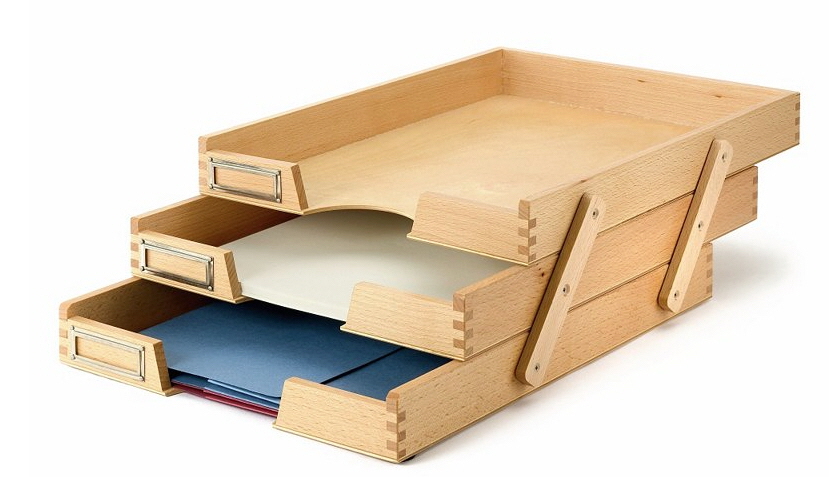
The triple letter tray from Manufactum isn't as large, but the open and close function will appeal to end users who don't want all their papers on display all the time, or who want to keep the cats out of the papers in the lower trays. (It would also make it easier to move the trays from one place to another.) The labels on the drawers remind the end user what's in each tray when it's closed up.

Alba has a three-level letter tray, but I'm not fond of wire letter trays being used for mail and other incoming paper. Some of that paper can be scribbled notes on small scraps of paper, which might fall through the wires. If these trays had a liner of some sort they could work better for the incoming papers.

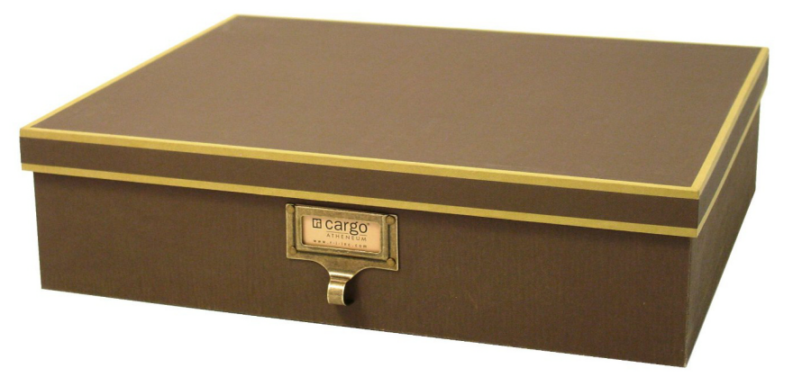
Of course, end users don't need to limit themselves to letter trays when looking for something to serve as an inbox for the mail. Something like this Cargo document box can work well, and can be kept open or lidded depending on the end user's needs at the moment.  At 15" x 12" (and 4" high) it will meet the size requirements of many end users.

End users can also leave the realm of office organizing products entirely. For example, the Parker trays by ducduc were not intended for mail, but they could handle it well. They measure 15"x 13.25" and are 3.75" tall. And all sorts of rectangular crates, boxes and baskets can be used as inboxes, too, even though they are marketed for different purposes.

I also like the idea of trays with a design on the bottom, because for some end users this will serve as motivation to go through the mail and empty the box.

The Original, Real-Life Dystopian Cityscape of Kowloon Walled City, and the Artwork It Inspired

$
0
0

Kowloon Walled City was a crazy social experiment, except there were no scientists in charge; the test subjects were.

On the site of a dismantled Chinese fortress in Hong Kong, refugee squatters began building makeshift homes in the 1940s. What started out as 2,000 refugees in huts gradually grew into 50,000 people crammed into ramshackle, unregulated skyscrapers leaning on each other for support. (It's reported that no architects or engineers were involved in building the structures, which went up to 14 stories, but were somehow erected by the community that lived there.) And amazingly, it all formed a cohesive—and largely contiguous—structure, resembling a castle or fortress.

KWC had water and electricity siphoned from wells and the rest of the city, but was an unregulated mess of ad-hoc infrastructure largely unsupported by government. Police were afraid to venture inside (though unbelievably, postman were reportedly forced to deliver mail there!). It was filled with criminals, drug dealers and prostitutes, as well as honest families, schoolchildren and one-man manufacturing shops. The following illustration shows what a slice of it might look like:

Larger version of this image is viewable here

Tiny, cramped spaces did double duty, with units that were classrooms during the day transformed into strip clubs at night. There were restaurants and gambling dens, hair salons and convenience stores, unlicensed doctors and dentists. So close were the buildings that sunlight was hard to come by on street level; thus fluorescents were hung outdoors at ground level for illumination. Rooftops, meanwhile, became social spaces.

The government finally shut it down in the 1990s and razed it. But in the years during and since, Kowloon Walled City has captured the imaginations of everyone from architects to sci-fi authors to set designers to artists.

Image by Greg Girard

Speaking of artists, photographer Greg Girard, who documented KWC in the 1980s, probably has the best photo essay on it (shot both inside and outside) right here. We also wanted to show you the fantastic KWC-inspired work done by a handful of illustrators:

Image by Keith Perelli
Viewing all 19151 articles
Browse latest View live


Latest Images