Quantcast
Channel: Core77
Viewing all 19132 articles
Browse latest View live

Space Colony Form Factors, Part 1: Bernal Spheres

$
0
0

As fears of overpopulation took hold in the 1970s, NASA began giving serious thought to building space colonies. In the years since, they managed to solve Earth's population problem by sending everyone to live in my neighborhood in Manhattan so that my landlord can keep raising my goddamn rent. But before finding that solution, there were a variety of space colony design renderings produced.

The first question they faced: What should a space colony be shaped like, what should the overall form factor be? I'm not talking about a colony built into the side of an asteroid or on the moon, because we already know the answer to that: You just build a city and put a big glass dome over it, duh. Bor-ing.

The Windex bill would be astronomical

No, I'm talking about an unattached colony that can, like, drift around and stuff. So the first problem to solve for is gravity. Because if space colonists were just floating around all the time, the reduced wear and tear on our footwear would make sneaker companies go bankrupt, and we'd need to have some kind of economy up there.

So to create gravity, a design called the Bernal Sphere was proposed. This was actually an older idea, first conceived of in 1929 by scientist John Bernal. You may recognize Bernal's name as he is not only still alive, but recently gained additional fame for portraying crowd-favorite Shane on "The Walking Dead."

The gigantic Bernal Sphere—designs ranged from two miles to 10 miles in diameter—was meant to be hollow and filled with air, along with 30,000 people that presumably didn't have outstanding debts on Earth. The sphere would be attached at its two "poles" to massive motors that would rotate the thing like a rotisserie.

This would generate gravity-simulating centrifugal force along the internal "equator" of the sphere, along which people could build houses, have picnics and wear out Nikes.

On either side of that equatorial zone would be huge windows, and mirrors positioned outside of the sphere would direct sunlight in through them. In the photo below we're looking into one bank of windows, through which you can see the ring of the opposite bank.

The polar areas of the sphere would presumably be uninhabitable, as you'd get really dizzy there. In the renderings we can see that the polar area is covered in forest, but we could also probably use that area to like, dump old air conditioners and stuff.

So why a sphere, with all that wasted space? The shape was proposed as being optimal for containing pressurized air, which seems like kind of a silly trade-off; can't we just make it whatever shape we want and, like, buy better O-rings somewhere?

Others agreed with me, maybe not about the O-rings, but that the shape was decidedly not optimal. Next we'll look at some better solutions.

Click here for part 2


Space Colony Form Factors, Part 2: O'Neill Cylinders

$
0
0

For forming a free-floating space colony, the Bernal Sphere we looked at earlier solved the problem of gravity, but didn't solve the problem of being, like, totally lame. In an effort to not be totally lame, in 1976 American physicist Gerard K. O'Neill proposed an alternate design comprised of two huge cylinders.

I'm American, so I assumed those pods on the outer ring are jail cells; but I read that they're actually supposed to be farming pods.

These O'Neill Cylinders would each be two miles in diameter and 20 miles long. They would be side-by-side but not directly touching, and would be connected at their ends via rods. Each cylinder would spin to provide internal gravity via centrifugal force, and they would spin in opposite directions. The thinking is that this would keep the collective structure balanced, whereas just one cylinder spinning would cause the craft to veer out of position.

That's the official reason given for having two cylinders, but the wise among us can see the real benefit. Having two cylinders gives the thousands of people living inside each tube a perfect way to discriminate against each other. People in Cylinder 1 could think of people in Cylinder 2 as a bunch of uneducated hicks, and give that cylinder a nickname like the Rube Tube. The people in Cylinder 2 could think of the people in Cylinder 1 as a bunch of pseudointellectual jackasses (though they would not be able to think of a clever nickname for Cylinder 1 because they are a bunch of uneducated hicks).

The other brilliant part of this design is the fact it involves huge cylinders. NASA is comprised primarily of men, and certainly was in the 1970s, and we men love funding huge cylinders. We really enjoy building submarines, blimps and foot-long hero sandwiches. No one can say why.

But the weird part about O'Neill's design is how sunlight is admitted into the interior. Each cylinder is divided into six stripes running lengthwise; in alternating fashion, three of these stripes are habitable land, while the other three are windows to admit sunlight. I call it weird because if the cylinders are constantly spinning, won't that create a potentially-irritating strobe-light effect as the sun whips around and around? If each cylinder were a 20-mile long nightclub I'd call it efficient, but in most of the renderings it looks pretty parksy.

One alternative O'Neill Cylinder design does away with the lengthwise stripes, and instead covers the entire interior with land and has a huge window in one end of each cylinder. With this design you keep the station oriented so that the sun stays put in this end window and appears stationary. But this might suck if you lived at the other end of the cylinder; you'd always feel like you were in the end of a tunnel with a train coming towards you.

By the way, these cylinders are so large that it's believed they can actually have clouds and their own weather systems inside.

So while I am inexplicably drawn to the long, shaftlike shape, I have to dismiss this design unless someone can explain to me how to get rid of the club-lighting effect.

Next we'll look at a design that's a sort of hybrid of these first two concepts.

Click here for part 3

Space Colony Form Factors, Part 3: The Stanford Torus and Beyond

$
0
0

So far we've seen two space colony form factors that arose from a 1975 NASA-backed study. The Bernal Sphere was round, the O'Neill Cylinders cylindrical. This third concept, proposed as part of the same study, is a sort of combination of the two that takes the cylinder and bends it into a circle.

Known as a Stanford Torus, it's named after the university where the study took place. The torus shape—I'm guessing "torus" is either Greek or Latin for donut or bagel—provides its gravity by rotating around its hub, and at a suggested 1.8 kilometers (1.1 miles) in diameter could theoretically support some 10,000 people inside. Sunlight would be bounced from mirrors in the hub into the living space, providing the effect of "overhead" sunlight.

I find the visual effect of being within a large torus more interesting than that of the Bernal Sphere or O'Neill Cylinders; it kind of looks like you're in a valley that slopes up and out-of-view on either side. An additional benefit versus the O'Neill Cylinders is that with the latter, there is a feeling of finite space; jogging along it, you would eventually reach the end and have to turn around. The torus on the other hand provides infinite scroll, which would make chase scenes more entertaining.

Here's a fly-through of what a Stanford Torus might look like:

Design god Syd Mead famously produced renderings of a Stanford Torus in his concept work for the space habitat in the 2013 sci-fi film "Elysium."

However, space geeks are quick to point out that that's not technically a Stanford Torus, because as depicted in the movie, the habitat features no "roof;" the inside of the torus is absent and open-air, allowing ships to fly in and out of it.

That would make it what's known as a Bishop's Ring:

A Bishop's Ring is essentially a gi-normous Stanford Torus, with the theory being that if it were made from carbon nanotubes rather than steel, a much larger structure could be built: Some 2,000 kilometers (1,242 miles, roughly the driving distance from New York City to Miami) in diameter and 500 kilometers (310 miles) wide, providing a livable surface area roughly the size of India. Towering sidewalls stretching 200 kilometers (120 miles) in height would actually obviate the need for a "roof" and the design could be left open-air; science eggheads say the gravity generated would be enough to hold the atmosphere in place, and the open-air design would allow TIE Fighters and such to fly in and out.

Sci-fi author Iain M. Banks has taken the concept of the Bishop's Ring and run with it. In his Culture series of novels, Banks envisions something called Orbitals: huge Bishop's Rings that stretch to 3,000,000 kilometers (1.9 million miles) in diameter, up to 6,000 kilometers (3,728 miles) wide, containing landmasses the size of proper continents.

In Banks' fictional world, these Orbitals are tilted towards a nearby star, and thus their rotation not only provides gravity, but a proper day/night cycle. The theoretical surface area would be up to 120 times more than what we've got on Earth.

While nothing like an Orbital will ever be constructed in our lifetime, Banks' fictional creations did inspire a real-life object that many of you may own: A little video game called Halo. That game and its sequels have netted $3.4 billion in sales since 2001. It's strange to think that a sci-fi author's imagination unwittingly helped propel the Xbox console to success.

Unstructured Seating

$
0
0

Does a comfy chair need to be bulky? Based on many of the offerings on the market, you might conclude as much. But Brandon Kim's new Lilt chair for Bernhardt Design proves otherwise—it is a sleek lounger with a wide seat that seems to balance precariously upon a stainless steel frame running along its edges, without any crossbar supports.

Now based in Manhattan, Kim began working on concepts for Lilt in October 2012, when he was still a student at the Art Center College of Design in Pasadena. (He graduated in 2013.) Bernhardt had approached Kim with a brief for a lounge seat. "From the beginning, there was a goal to create a chair that has a simple and streamlined aesthetic," Kim says. "But, more importantly, the chair had to also be as lightweight as possible. The chair's weight should be proportional to its clean aesthetic." Kim knew that with a stainless steel frame, he had to be prudent with the amount of material used: "In order to limit and reduce the weight as much as possible, an efficient way of supporting the chair was needed instead of adding chunks of metal."

That challenge led the designer to innovate on the structure of the chair itself, re-envisioning how the frame could offer more support with less material. Kim recalled climbing the trees in his backyard and sitting in their branches as a child. Sparked by that memory, the concept for Lilt became centered around the idea of sitting on a tree branch—inspiring a triangular structure in the back legs of the chair.

"The triangular frame structure resembles branches and physically renders a scene of users sitting on a tree," Kim says. Not only did the frame provide an interesting aesthetic detail, it also offered the structural support Lilt needed. The three-way joinery on each side provides extra durability and strength, allowing Kim to forgo any crossbar support in the seat's shell or back. Looking back on the initial concept, Kim admits that it was a bit of a gamble. "I knew it could support a lot due to the x-y-z, three-way joinery," Kim says. "There was no way it was going to wobble, but I was prepared to have to add a crossbar. None of us knew if it would be enough, but after the official stress test, it was surprisingly sturdy." Lilt weighs a little more than 40 pounds and can easily hold more than eight times its weight.

Sketches for Lilt

Right out of school and working with a tight budget, Kim made prototypes sparingly and inexpensively—starting with paper and cardboard scale models while making iterations to his design in CAD. "As a young designer who just got out of a college, the cost for building prototypes isn't easy," Kim says. "Therefore, I tried to be as close as possible to what I wanted to design with the prototypes at the early stage." Kim modeled Lilt in CAD, testing elements like proportions and pitch angles by comparing his chair to others on the market. To do this, Kim downloaded several 3D models of his competitors' chairs and then compared them virtually to Lilt by setting them up side-by-side in render environments. He would then go to furniture stores, sit in the chairs and carefully examine these details in person, making adjustments to his own seat's back in the computer model. "By doing this, I was able to closely predict how my chair would actually feel," he says. "I repeated this step many times until I felt enough and right." When it came time to make a full-scale, functioning prototype, Kim was satisfied with the result. "My prediction happened to be 99% correct," he says.

Building the prototype

Another feature Kim looked at when making these trips to furniture stores was the comfort of the different seats. With no crossbar support, Lilt would need a rigid seat shell—but as a lounge chair, it also needed to be quite comfortable. Kim opted for a quarter-inch-thick thermoformed plastic shell, with a three-quarter-inch foam lining on top. "The seat itself does not contain too much of cushion since the foam is only three-fourths of an inch," Kim says. "However, in my opinion, comfort is not something that can be determined by the thickness of the seat. Of course, a thick soft foam is a very decisive factor, but I believe a harmony between the particular seat height and the precisely right back-pitch angle is the most significant element that affects comfort. Lilt has those elements perfectly orchestrated."

Kim carefully tweaked the chair's lines both for comfort and for overall elegance. Each line follows strict rules. For example, when viewing Lilt from the front, all side contours of the seat shell are laid out to be on the same angle as the four legs. "Every contour line and angle is carefully drawn and orchestrated to really sing the same song," Kim says. He also studied how the chair interacted with each staged render environment. "I wanted a piece that can easily be harmonized in many surroundings as if it was always there," he says. "I believe that's where true elegance comes from."

From initial design to final product—a process which spanned roughly five to six months—Kim says that the design remained largely unchanged. "The shape and form were always there from the beginning," he says. "It's just that making calls on proportion, leg angles, leg thickness, seat height, seat curvature and the pitch of the seat took a long process. . . . Among the list of those decisions, if any of them was off, then the chair would've never become what it's like right now." Lilt is now available from Bernhardt Design (price on request), and more of Kim's work can be found on his website, brandonkimstudio.com.

The Closest Thing We Had to an Industrial Design–based Comic Strip

$
0
0

The longest-running single-artist comic strip in the world was not "Peanuts." It was "Wordless Workshop," a DIY strip begun in 1954 by comics artist Roy Doty. It's the closest thing there's ever been to an ID-based comic strip, in that each installment shows a problem, and how one physically solves it using design.

Published in Popular Science beginning in 1954, the strip started out as a product of its times, with clearly defined gender roles that seem quaint today; the strips typically depicted the housewife experiencing a domestic problem or minor accident, and the handy-with-a-saw husband solving it in his toolshed. (As the times changed, problems evolved from unreturned glass soda bottles to iPad stands, and the female protagonist contributed more evenly.)

As per the title there were no words or text, with each idea being presented only in illustrations. The viewer was still expected to do the math, and it was assumed that every family had saws, hammers and a drill press in the garage. Perhaps most brilliantly, the solutions were all crowdsourced; this allowed readers around the country, folks who might be clever builders but couldn't necessarily draw, to send in descriptions of their problems/solutions for Doty to illustrate. This ensured no shortage of ideas and led to roughly six decades' worth of installments.

"Wordless Workshop" ran from '54 to 1990 in Popular Science, and was then picked up by the Home & Garden Group's Family Handyman magazine without missing a month. The last installment I saw was several issues ago, then they abruptly ended; sadly Doty, a Columbus College of Art & Design graduate who worked into his 90s, passed away earlier this year.

Unfortunately, Doty's website disappeared into the ether after his passing, and the "Wordless Workshop" series will not be handed over to another artist. Amazon, however, has a couple of WW collections in book form, here and here.

Unbelievably Portable Personal Transportation Device from Japan

$
0
0

Japanese inventor Kuniaki Sato has come up with something that beggars belief: A small aluminum platform, about the size of a laptop, that can carry a human being for a distance of 12 kilometers under its own power, and responds to Segway-like leaning for the UI. Take a look at this thing:

The small wheeled device, called the WalkCar, was created by Sato in a bid to demonstrate that Japan is still capable of innovation; it's probably no accident that the name is similar to "Walkman," the product that launched Sony onto the world stage and pushed Japanese electronics prowess into the global consciousness.

You're undoubtedly wondering "How the hell can this thing be real? How can it store that much juice and develop that much torque in such a tiny package?" Details provided by the company are essentially nil, although in this Reuters video, we can see it's charged by USB (!) and hear that it tops out at 10 kilometers per hour:

I think it's safe to say that when the Kickstarter launches this October, the $800 device is going to fly off of the virtual shelves. Sato's company, Cocoa Motors, estimates they'll have units ready to ship by next year.

Simple, Smart Product Design: The Qlipter, a Carabiner for Everyday Life

$
0
0

As I wrote here, a simple carabiner is one of the more useful items that I use on a daily basis. As I was making this discovery, fellow carabiner-lover and entrepreneur Mina Yoo was building a company around one. After giving birth to her first child, Seattle-based Yoo discovered that toting around a newborn baby and all of the attendant gear "is HARD!" Those experiences, combined with her hiking experience, left her wishing she had an extra set of hands. She subsequently designed the Qlipter, a carabiner with some simple modifications and additions:

The design is simple, elegant, functional, and well-conceived. More importantly, it's become a product design success: Yoo's company, Lulabop, has been selling the Qlipter steadily from 2012 to present day, and they've recently signed up a yet-unnamed major retailer and shipped their first order in the thousands.

Here's Yoo explaining how she came up with it:

To those of you who'll sniff that the design doesn't look like much, then that very reaction should tell you something: Look around at what you find lacking in your own life, and figure out what relatively do-able thing you can design to improve it! With a little entrepreneurial spirit, perhaps you could be the next Yoo.

Art Bikes by Handsome Cycles at the Minneapolis Institute of Arts

$
0
0

To celebrate their 100th birthday, the Minneapolis Institute of Arts (MIA) teamed up with Handsome Cycles to bring some of the MIA's most famous masterpieces to life in the form of three art-inspired bikes. According to MIA Venture Innovation Director Hunter Wright, "The MIA is excited to partner with Handsome Cycles, a company that shares the museum's commitment to embracing the local and integrating great design, technology, and experimentation, while staying true to its core values and community. "

In order to create custom bike designs inspired by pieces in the MIA's permanent collection, including paintings by Claude Monet and Frank Stella, and a 1948 Tatra T87 sedan, Handsome reached out to a few other notable Minneapolis-based designers and artisans – KNOCK, inc., TREAT AND COMPANY, Peacock Groove, and Dirt Designs Graphic. The results of the collaboration are pretty impressive… as you can see in the video below.

See images of each of the bikes below. I like many of the details on each of them, so it's hard to pick a favorite. The bike inspired by the 1948 Tatra T-87 sedan is the one that I keep going back to though. I just love the form of the fender skirt, inspired by the car's rear stabilizing fin.

PSFK talked to Handsome's Ben Morrison about each of the bikes. Check out their post for his take on each of the three designs.

Just one last thing to point out… these bikes aren't just one off museum pieces. The limited edition 100 Year Commemorative Bikes will be available for sale (retail $1099.95) at the MIA Shop and at HandsomeCycles.com.

This post originally appeared on Bicycle Design.


Super-Functional Jacket Designed for Air Travel Breaks Crowdfunding Records

$
0
0

World War I fighter pilots wore silk scarves for a very functional reason: In the pre-radar era, pilots spent a lot of time swiveling their heads around looking for the enemy, chafing their necks against their collars. Add some silk and problem solved.

Now a company called Baubax has designed a super-functional piece of clothing to solve the modern-day problems of those who fly—as passengers. Think of the typical inconveniences you encounter on your average airplane trip: Emptying your pockets at the security checkpoint; trying to fish your tablet out of your bag when it's crammed under the seat in front of you; no place to put your drink when the laptop's taking up the tray table; untangling the headphones crammed in your pocket; trying to catch some shuteye in the world's most uncomfortable seats. Baubax's Travel Jacket aims to solve all of these things and more.

The design brain behind the jacket is Yoganshi Shah, who watched her husband, entrepreneur Hiral Sanghavi, constantly fly from their home in the U.S. to the company they co-founded in India. Sanghavi would forget to bring his travel pillow each time, and "Shah finally got fed up watching her husband spend $25 on a pillow every time he traveled," writes Entrepreneur magazine, "and didn't love the stockpile of pillows they were gradually amassing either."

Yoganshi Shah and Hiral Sanghavi

Shah isn't a stay-at-home wife; she's a UX designer and UI expert with a degree from Columbia, and apparently her on-screen design abilities translated well to the physical realm of clothing. Together she and Sanghavi formed Baubax and began ticking off the "pain points" of air travel. The resultant jacket appears to handily solve most.

Kickstarter backers agree. The Travel Jacket campaign sought $20,000; it's now up to $4.6 million (making it the most crowdfunded piece of clothing in history, according to Baubax). I'm watching the pledge numbers steadily tick up as I write this. There are 23 days left to pledge, and Sanghavi and Shaw anticipate being ready to ship by November.

Sunglasses Made from Recycled CDs and DVDs

$
0
0

While zero-waste pioneer Lauren Singer lives a trash-free existence, billions more of us are littering the planet with our waste. Architect Arthur Huang's Miniwiz design company is tackling that problem, by seeking to develop products built primarily from trash.

We last looked in on Miniwiz in 2012, and were pleased to see they're still going strong. Operating under the motto "It's wise to minimize," the company has continued to practice their "urban mining"—that's trawling through their home city of Taipei for waste—and turning trash into cash with products like the following:

Miniwiz's RE-view is a pair of sunglasses made from a polymer-like material created by combining agricultural waste (fibers made from rice husks) with recycled CDs and DVDs. Even the case it comes with, which resembles a McDonald's apple pie package, is made from 100% recycled polypropylene. In a nice ergonomic touch, the form factor of the case is meant to be compressed flat and tucked into a pocket when the glasses are on your face, and can be "popped" back into shape when it's needed again.

Their Eco-Morph Shelf System isn't 100% made from trash, but uses a surprising combination of materials to create a modular shelving system that the end user can assemble themselves. The heart of the system is a series of extruded connectors made from recycled aluminum; into these connectors the end user slides panels made from recycled CDs and DVDs, as with the sunglasses, and these panels can be edged or faced with FSC-certified Teak or Mahogany veneers for a warmer look. LED lighting can be integrated between the connectors.

Miniwiz has developed proprietary techniques for reprocessing recycled materials, enabling them to make the RE-view sunglasses softer and more flexible than a competitor could using the same base material of recycled CDs and DVDs. These guys have the science down. Where they could use a little help is in their marketing. For example, take a look at their Re-Wine Classic product:

While it's admirable that the product is made from 100% recyclable items—recycled thermoplastics and rice husk fibers—this one had me scratching my head a bit; is there a demand for a product used to shuttle single wine bottles from one location to another? It seems to me this would have the greatest impact if they could replace the wine boxes the vineyards use for shipping, but that might be a bridge too far in terms of packaging efficiency and palletization.

Still, Miniwiz is an innovative company with a bold mission, and we'd all be better off if there were more companies like them. The World Economic Forum apparently agrees: This month the WEF gave Miniwiz their 2015 Technology Pioneer Award.

A Driverless, Flying Version of Uber: The Quadro is a Single-Passenger Autonomous 20-Rotor Drone

$
0
0

Thorstin Crijns started his Autonomous Human Transport project for one reason: "To create a fully autonomous quadcopter that can transport people without any human intervention," he writes. "In order to be useful for the common public it should fly without requiring a human pilot."

Sure this sounds kooky, but what impressed us is that Crijns—who's not even a mechanical engineer in his native Holland, but a software engineer—actually built the craft he envisioned, the Quadro, and readily straps himself into it to take short test jumps:

Obviously that's him piloting it, but presumably he's just trying to work out the flight kinks. Those of you physics nerds that want to check out his equations can see them here, and Crijns has more test flight footage here.

Under Crijns' vision (can any Dutch speakers tell me if those two words rhyme?) we'd summon a Quadro via a smartphone app, punch in our destination and it would whisk us away. Obviously there are huge infrastructure challenges beyond the initial ones of making the craft itself safe, meaning government intervention would be required for implementation; think landing zones, traffic patterns and such. And even though I'm afraid of heights, when I ask myself if I'd take one of these in Manhattan, the answer is a resounding "Yes." It can't be any more terrifying than your typical yellow cab ride.

6 New UX Prototyping Tools for Designers

$
0
0

The UX prototyping space is booming. Dozens of solutions are now available for a practice that was done largely with paper and flat deliverables less than a decade ago. Designers can now start building experiences earlier in a product's lifecycle and get real results around decisions through testing these prototypes. These tools help bridge the gap between designers and developers, allowing for ideas to be communicated and realized.

Lean UX delivery process

A catalyst for these new tools is Lean UX — the process of quickly framing your ideas and solving fundamental design challenges without relying on style and pixel perfection. Even if you are not sold on Lean UX, you may want a quick and easy way to explore concepts and interaction. You're in luck. The number of applications available for UX prototyping is staggering. The real challenge will be finding one that is best suited for you. Here are six designer-friendly tools for UX prototyping.

Web Tools 

The evolution of front-end technologies and the popularity of cloud software in recent years has prompted a move from stand-alone applications to web-based tools. Web tools can be easily delivered and supported on demand, and are ideal for sharing and viewing prototypes through the browser.

Marvel - Probably one of the easiest applications to learn. Marvel lets you link screens together by defining hotspots. Transitions, gestures and animations can be added to create a realistic interaction experience. Prototypes are shared and viewed via a URL that is generated when your project is published. There are also iOS and Android apps available for managing projects on and offline. Marvel doesn't contain any drawing tools or a UI library, so it requires that designs be completed in another tool such as Sketch or Photoshop. Marvel has integrated with Dropbox to allow for synchronization of the image files used in your prototypes. There is also a Marvel Sketch plug-in that allows for sending artboards directly to Marvel projects from within Sketch. Marvel's big value is in its simplicity. Provided you have already designed your screens, plan to be up and running with Marvel in a matter of minutes.

Cost: Free, or premium plans starting at $9/month

http://www.marvelapp.com/

InVision - One of the most popular of the new prototyping tools. Like Marvel, it contains no drawing or image creation tools, which allows for a smaller learning curve. Instead, InVision provides a robust set of cloud storage features, plug-ins, skins, transitions and gestures to support prototyping needs. Synchronization of files through Dropbox is supported, or you can use their own InVision Sync client to automatically update your prototypes as you make changes to your files. Photoshop and Sketch integrations make saving designs to projects quite easy. Browser plug-ins for capturing screens and sharing prototypes are also available. InVision's approach focuses on capabilities and integrations to support prototyping rather than trying to replace the tools that are familiar to designers today. InVision has a fast-growing community that provides a good set of examples and solutions to reference.

Cost: Free, or premium plans starting at $13/month

http://www.invisionapp.com

Proto.io - Takes things a bit further by introducing a component library that provides multiple pre-built UI elements for a number of device platforms. Styling, interactions, gestures and transitions can be applied to simulate an experience. UI elements can adapt to the resolution of whichever device you are designing for. You can also apply these properties to your own visual assets that you add to the project. Screens can be created from within the Proto.io editor interface, and multiple states can be created for these screens. Projects are managed from a dashboard interface that supports a team workflow where various roles may be assigned. A Dropbox integration allows image assets to be easily added and managed. All these powerful features make Proto.io a bit more of a challenge to learn. Plan on spending some time getting used to the conventions used throughout the authoring environment.

Cost: $24-$199/month depending on plan

http://www.proto.io/

UXPin - Provides an extremely lightweight web-based prototyping environment and contains a UI component library that can be used to design screens for a number of devices. Properties, interactions and states can be applied to these components. Support for gestures and animation is quite robust, and versions of screens can be made responsive by defining breakpoints. Photoshop and Sketch plug-ins make adding design assets easy. UXPin has put a lot of focus on team workflow and collaboration through features such as screen-sharing and VOIP. Previewing and sharing prototypes is made easy from within the authoring environment. There is even an SMS feature that allows you to send a link to the prototype via a text message. Another stand out feature from UXPin is the ability to conduct user testing with prototypes using built-in video conferencing software. Having an understanding of vector drawing tools like Illustrator will help but if you wish to leverage the full power of UXPin, plan on spending some time getting comfortable with some conventions that you might not be familiar with.

Cost: $13.50-$36/month depending on plan

http://www.uxpin.com/

Stand-Alone Tools

For years, UX design prototyping has involved stand-alone desktop applications that offer a robust set of drawing and editing features. These applications allow designers to work outside of other design programs such as Photoshop or Illustrator if they wish, and instead build rich interactions without having to write HTML code. A major benefit here is that these applications involve a one-time cost as opposed to the ongoing subscription needed for the web-based offerings previously mentioned. Also, copying and pasting work from your existing design applications makes getting assets into your prototypes very easy.

JustInMind - An elegant design application coupled with powerful interaction tools. Like many of the tools mentioned here, it will feel familiar to those who are already acquainted with Photoshop and Illustrator. Dynamic, data-driven content can be applied to designs. Other features include synchronization with Photoshop, integration with user testing tools and services, mobile gestures, transitions, mobile application viewers for iOS and Android, support for conditional logic and team workflow. JustInMind is very much a full-featured prototyping environment that will require a time commitment if you wish to get the most from it.

Cost: $495 per user, or $29/month

http://www.justinmind.com/

Axure - Very early on the scene and continues to be a dominant force in the space. A complete set of drawing and editing tools are available and you get a decent set of UI components out of the box. Adaptive views cater to those who are interested in building responsive prototypes. Axure's user community is very large. Between their community forums and training resources, you'll find countless examples and solutions that can be downloaded and added to your prototypes, along with UI components tailored for many devices. Axure has a robust system that can be leveraged to produce rich examples of interaction using dynamic data. A set of canned conditional cases are available for a number of interactions but if you're comfortable with a little scripting you can construct your own. The deeper you go with Axure the more you'll unlock powerful capabilities, but keeping things simple is very possible as well. Group workflow, version control, and team collaboration features are available in the Pro version. Publishing and hosting prototypes can be done through Axure Share. HTML can be generated from prototypes and saved locally as well.

Cost: $289 Standard, $589 Pro

http://www.axure.com

______________________________________________________

This is by no means a comprehensive list but these tools are getting some traction from the design community today. When evaluating these tools it's important to think about project objectives, team size, workflow, technical understanding and support.

All of the tools mentioned here are free to try. For further reading on these and other tools, Emily Schwartzman at Cooper has put together somedetailed research on prototyping tools that may help in choosing the right solution for you.

Title image courtesy of Nevit Dilmen, via Wikimedia Commons

MIT Figures Out How to Give a Robot the Reflexes of a Human

$
0
0

If I shove you, you might sway for a second, but your body will automatically correct the imbalance and right you. If you don't believe me, try it now; select a co-worker and randomly shove them.

Have you done it? Good. Now we only have a few moments before they call Human Resources, so I'll try to explain this as quickly as possible. 

As we saw in an earlier post, bi-pedal robots often collapse. Relatively simple balance situations that you, me, and your tattling co-worker could easily navigate become major headaches for a robot and its programmers. So rather than try to program in solutions to every conceivable way that a robot could fall down, researchers at MIT's Department of Mechanical Engineering have struck upon a better method: Place a live human being in a synchronized force-feedback rig that's remotely wired in to the robot.

Here's how that would work: 

1. See that HR representative that's currently walking towards you, with the security guard in tow? Imagine you're wired into MIT's rig, with a robot next to you that mimics your motions. 

2. You guide the robot to punch the HR person and clothesline the security guard. As the robot's haymaker connects with Jim from HR, you feel a slight jolt from the resistance of Jim's surprisingly robust jaw. 

3. That jolt might be enough to knock a robot backwards, causing it to topple. But you feel the jolt and automatically absorb it with your heels, lurching slightly to keep your feet, so the robot does too. 

4. With Jim out of the way, you've now got a clear shot to pull off that clothesline on Brian from Security before he tases the living shit out of you.

5. You're now free to hunt down your dime-dropping co-worker and finish what you started.

Here's the system in action:

(You can read more about this robot rig, which they're calling HERMES, on MIT's website.)

With this rig we can effectively feel what the robot feels. The next step is to reverse the process, enabling these powerful machines to experience things like hatred, fear and revulsion.

You Can Stay in the Nakagin Capsule Tower Via Airbnb!

$
0
0

The Nakagin Capsule Tower in Tokyo is one of architecture's more interesting experiments. Under architect Kisho Kurokawa's plan, the NCT complex was actually two towers, to which were affixed minuscule, pre-fab, cube-like apartments (the titular Capsules). The thinking was that residents could eventually upgrade or replace their apartments by popping the old one out and re-installing a new one.

As part of the Metabolism movement, which espoused the fusion of architecture with organic/biological principles, the building was erected in 1972, but never saw the capsule-swaps Kurosawa envisioned; while 20 of the units are still occupied, the building has fallen into a state of disrepair and infrastructure repairs have been deemed too expensive to undertake.

As I wrote in an earlier post, I really dug the design of the NCT's built-in space-saving desks (above) in each unit. But from the photos, you really can't tell how small the space is. You definitely can, however, in the video below, which shows one of the NCT capsules that has been preserved (more or less) in its original state from 1972.

Amazingly, you can spend the night in the NCT as one of the units is up on Airbnb. The first half of the video below is the tour, and the second shows a family of five (!) staying there.

Brilliantly Simple, Low-Tech Device to Help Blind Dogs Navigate

$
0
0

First off, this much-"Liked" video, which has nothing to do with blind dogs, is currently making the social media rounds. In it we see a bulldog who apparently loves cardboard boxes, and is willing to deal with a major inconvenience in order to carry his around:

While that video is funny, seeing it did make me wonder what happens to dogs that truly lose their sight. A recent Reddit post, subsequently covered in animal-lover's website The Dodo, shows a very clever solution constructed by a man in Texas named Jesse Foy. Foy's girlfriend's dog, Buddy, had developed cataracts and could not longer see; discouraged by the loss of sight and unable to navigate without banging into things, the dog simply stopped moving. Thus Foy headed down to the hardware store, then cobbled this together:

It's made, as Foy explains, from "A few bolts, washers, wing nuts and a roll of plastic hanger strap."

Foy readily admits that he did not conceive of the device; the credit for that goes to Silvie Bordeaux, who invented the following several years ago:

Bordeaux invented it for the sake of her own dog, Muffin, who had gone blind. "I was devastated, since he kept bumping into walls and falling down the stairs," Bordeaux writes. "He became very depressed and was afraid to move around. I could not let him out of my sight and carried him around everywhere. I searched the internet extensively for solutions/assistance. That was when I realized that there is a great need for a products to assist blind/visually impaired dogs, so I invented [this device, which I call] 'Muffin's Halo Guide For Blind Dogs.'"

Bordeaux took out a patent and now sells the device online. While the halo iconography and particularly the little angel wings are a bit much for my tastes, I can't deny the device is useful; when dogs go blind, it's not uncommon for their owners to put them down because they simply can't find a solution that will allow the dog to navigate freely. "I was stunned to find out how many dogs are abandoned or put down because they go blind," Bordeaux writes. "Muffin's Halo can now save the lives of many dogs!"

As for why Foy didn't simply buy one of Bordeaux's products, he concluded that it would be too bulky for Buddy, a five-pounder, to carry on his diminutive frame. (Bordeaux does sell her device in a variety of sizes, including a $69.95 XXS; this is pure speculation on my part, but perhaps the price had something to do with the DIY decision.) And from a design perspective, Foy's hack seems better suited for Buddy: The plastic hang-strap has enough give to gently transmit force, whereas the Halo device seems a bit more rigid. Also note the placement of the Halo versus the placement of Foy's device; the latter has the attachment point much lower, and I wonder if that confers some ergonomic advantage.

In any case, I hope folks continue to experiment with and evolve designs like these, hopefully without violating Bordeaux's patent, which I understand must be respected. It costs thousands of dollars to train a seeing-eye dog that can assist blind humans, but if we can make a blind dog's life easier with a few dollars in parts from the local hardware store, that's a hard fact to ignore.


Who Designs the Fiendish Obstacle Courses for "Wipeout," and How Do They Make Them Safe?

$
0
0

With obstacle names like "Big Balls," "Branch in the Face" and "American Sucker Punch," ABC's "Wipeout" competition thrills viewers who enjoy the potent cocktail of athletic competition, slapstick and failure. Or at least it did for the first seven seasons, as it appears it won't be coming back this year. On social media, lamenting fans have thus been circulating their favorite clips of the show, like this one:

The show was filmed at a ranch north of Los Angeles, which obviously did not come with the obstacles pre-built. So who designs and builds these things? The man in charge was Matt Hooper Pennington, who's not only a production designer, but also an extreme athlete during the show's off-season. As he revealed in an AOL interview,

"I've seen a lot of different ways for people to fall," he says, explaining that he created the course for failure. "The show is called 'Wipeout.' If someone can easily get all the way through the course without wiping out, I haven't done my job…. The best part is that whatever you can imagine, you can build here. If you come up with an idea that is absolutely colossal, you can create it."

Pennington's sadistic creations—some inspired by cartoons, he reports—are bolstered with suggestions contributed by staff and other producers. They're then constructed with safety in mind; the show's budget for foam padding alone is "easily more than $100,000 a year," Executive Producer Matt Kunitz revealed in a subsequent interview. A team of 30 people are employed just to pad the structures and contraptions. "I think the cool thing about the show is that the hits look really hard," says Kunitz, "but the reality is, they're always slamming into foam. They're never hitting anything that's going to hurt them."

As for what type of foam it is, "Wipeout" Stunt Producer Jonathan Arthur describes it as "the highest-grade medical foam—it's like you get whacked by a TempurPedic mattress."

Arthur's job is to test the obstacles for safety, and he doesn't do this alone; he runs a team of extremely ballsy, primarily 19-25-year-old crew members nicknamed "The Black and Blue Crew" who volunteer to run the course. Amusingly, they intentionally navigate the obstacles like flailing idiots, simulating what a physically incompetent contestant might do; in this way they hope to guarantee that even the worst of the worst will remain unharmed.

The Black and Blue Crew, by the way, are not professional stuntpeople: "One of them is a professional skier. There are two females who are Marines. And then we supplement them with other just crazy kids, who just want to get out there and constantly test the stunts."

While "Wipeout" is allegedly canceled, competing obstacle course show "American Ninja Warrior" is on the air as we speak, and still pulling down high ratings. Which begs the question, what's the key difference between the two shows? With "American Ninja Warrior," a highly-skilled athlete can actually expect to complete the course on his or her own merits; with "Wipeout," failure in the form of unfair and unknown surprises is baked into the concept. My guess is that in this era of political and economic uncertainty, folks no longer enjoy watching a stacked deck, no matter how clever the contraptions.

Well, it was fun while it lasted!

See Also: Six Ways to Get the Obstacle Course Experience

Beds With Storage, Part 2

$
0
0

Finding enough bedroom storage space can be a challenge for many end users, so beds that incorporate storage can help anyone needing more places to stash some stuff.

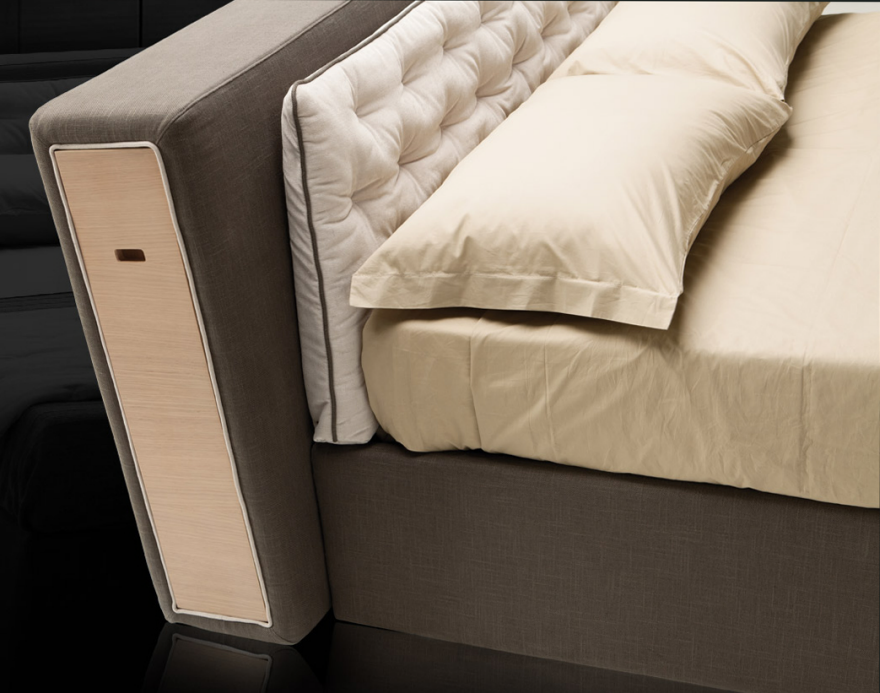
As I've noted before, one of the common places to incorporate storage is under the bed. The other place is in the headboard, and the Buden bed from Viesso uses storage in both places. There's open storage at the foot of the bed, and the headboard has a drawer on either side—especially helpful if there's no room for a nightstand. 

Many storage beds incorporate drawers or cubbies into the base. That can work well, but such designs can be hard on those end users who have trouble with bending down to access those drawers. 

The Avery bed from Serena & Lily uses a different approach: a shelf and eight storage baskets, which are included. This design allows the end user to arrange things in a basket while working at a more comfortable height, and then just drop the basket into place. And end users who would like to pull out a basket and carry everything to another place in the home will also find this useful.

When it comes to headboard storage, I'd recommend against hinged designs such as this one that open from the bottom. I have a bed with this design, and it's very awkward to reach into the storage space when I'm in the bed. However, it is easy to get hit in the head. If you must use such a design, please be sure the latching mechanism is strong enough (another concern I've learned about from personal experience).

A better option for closed headboard storage would be a door that lifts up, such as this one from Prepac.

A different approach to headboard storage is to provide cubbies that hold bins or baskets, such as this child's bed from 4D Concepts. (But please don't call the one with blue bins the boy's headboard and the one with pink and purple bins the girl's headboard, as 4D Concepts does.) Those bins would be great for holding things like pajamas or stuffed animals. But I'd caution about putting things on the top, especially heavy things that aren't secured with museum wax or an equivalent, if the home is in earthquake territory or if there are pets that might push things off the headboard.

An adult version of this headboard approach comes from Lang Furniture, which has cubbies that can hold baskets (which Lang also sells in sets of four). With this design, some cubbies could use baskets to provide concealed storage while others could be left open for quicker access to something like a magazine or a cell phone, or for items to be on display.

Rather than having front-facing shelves, some headboards have shelves to the side. These shelves don't allow the same easy access during the night, but they have the advantage of avoiding any problem with items falling from the headboard onto the bed and its occupants. In this bed, the middle shelf can be placed in one of three positions, which is a nice design feature. 

This bed from Objets Mecaniques has a somewhat similar headboard, but it's more hidden and holds less—a design trade-off. The slanted design might make it more comfortable to read in bed.

The Cayman bed from Milano Bedding hides storage shelves within the headboard. With this design the end users could pull the shelves out before going to bed if they wanted somewhat easier access during the night. (It's still not shelving that could be readily reached from within the bed.) And end users who use this bed will need to have enough space beside the bed for the shelves to be extended. But items could be stored without significant dust problems if the shelves are usually kept closed.

The Somnia bed from Vitamin Design uses the space behind the headboard for storage that isn't shelving. This type of storage would work for things that might roll off  a shelf or for smaller items that don't make good use of shelving space. 

How to Get a Parking Space Back After Someone Swoops In and Steals It

$
0
0

So maybe you're at the dealership and looking to get yourself into a Jeep. The dealer's trying to upsell you on the front tow hooks or maybe even the winch package, and you're not sure you're going to get much use out of either in your warm-weather suburban environment.

So then he says "That's exactly what Randy said," and while you're wondering who Randy is, he explains that last month Randy bought a yellow Wrangler and found that the tow hooks came in very handy in this suburban environment:

Randy's brother Andy, by the way, doesn't like it when you park in his bicycle lane.

Via BoingBoing

"Reverse Graffiti" Technique is a Dam Good Idea

$
0
0

The UK's Green Street Media agency practices spraypaint-free, "eco-friendly" sidewalk advertising, using a powerwasher and a stencil to blast messages into dirty pavement. We showed you some of their stuff here.

This powerwashing "reverse graffiti" method was pioneered by British artist Paul "Moose" Curtis, and it begs the question: Is placing an image or tag on the side of a structure really vandalism, if all you've done is selectively wash the surface? Polish energy company Polska Grupa Energetyczna doesn't think so, and when it came time to give the dirt-encrusted Solina Dam a good washing, they teamed with Polish artist Przemek "Trust" Truscinski to turn the bath into an art project.

According to Citylab,

[The collaboration yielded] a giant eco-mural honoring the wild and plant life found in the Bieszczady Mountains in southeast Poland, where the dam is located. [The mural is] almost 300 feet wide and 177 feet tall….


…The only tool…needed was high-pressure water—no paint required. Men suspended from cables strategically blasted water from power washers to "erase" the grime and create, for example, the texture of fur on a giant wildcat on the right side of the mural, or the scales of fish on the lower half.


Similar artworks are also being created on the sidewalks near the dam, according to a statement from PGE, and the mural is expected to last at least a year.

I don't see any stencils, so I can't fathom how they created the image; is it possible to eyeball something that large, coordinated across the efforts of four sprayers? I'm assuming Truscinski either called on some artist buddies to do the work, or PGE employs some very artistically-talented structure cleaners.

Tianjin Blast: The New Multi-Perspective Disaster-Porn News, Brought to You By Smartphones and Drones

$
0
0

As Chinese authorities scramble to discover* (or cover up) what caused a massive explosion in Tianjin, the internet is now awash in multi-angle, multi-proximity footage of the terrifying blast. In a reminder of what a strange world we now live in, dozens, perhaps hundreds of people captured the explosion on video; Tianjin reportedly has a population of 15 million people, and smartphones are ubiquitous. (For scale, NYC has about 8.4 million residents.)

Of all the shaky footage I've seen, this is the one video that really drove the scale of the multiple blasts home (Warning, language NSFW):

Listening to the audio, I found it somewhat troubling that the girl's reaction was "Are you getting this?" and the guy says "Fuck yeah, I'm video'ing it" while holding the camera steady. After the secondary blast she again checks to ensure "Are you filming this?" and he reassures her that he is, as if that's what matters most in that moment. I'm guessing they were just in shock.

They weren't alone in recording, of course; as the first orange glow caught city residents' eyes, droves of them rushed to windows while whipping out their phones. So numerous is the footage (all shot vertically, of course) that people have begun compiling synchronized split-screen shots in a terrifying sort of disaster porn:

I can't understand Mandarin, but I imagine their dialogue is similar to what the Americans or Canadians are saying in the first video.

There is obviously much more footage than the two videos we've shown here, but we think this is enough to provide a sense of what happened. If you go looking on the internet for more, don't look too hard; there are some disturbing clips out there, including CCTV footage that someone uploaded which shows an unfortunate man getting caught in the blast near a bank of glass doors.

And of course, what is a disaster without a drone. This overhead footage shot the following day provides a sense of the on-the-ground devastation:

When technology companies began placing cameras in smartphones, they probably imagined they were merely providing a convenient way for us to take family photos at the beach. I'm guessing they, along with the drone manufacturers, did not foresee that they would change the way we consume news.

___________________________________________________

*The latest report from Reuters indicates that firefighters may have unwittingly provided the fuel for the explosion, while trying to fight the first, smaller fire:

The warehouse [that was the source of the explosion], designed to house dangerous and toxic chemicals, was storing mainly ammonium nitrate, potassium nitrate and calcium carbide at the time of the blasts, according to police. The official Xinhua news agency has said several containers in the warehouse caught fire before the explosions.
Chemical safety experts said calcium carbide reacts with water to create acetylene, a highly explosive gas. An explosion could be caused if fire fighters sprayed the calcium carbide with water, they said.
Viewing all 19132 articles
Browse latest View live


Latest Images